1212 \vgtccategoryResearch \vgtcpapertypeapplication/design study \vgtcinsertpkg
Scalable Comparative Visualization of Ensembles of Call Graphs
Abstract
Optimizing the performance of large-scale parallel codes is critical for efficient utilization of computing resources. Code developers often explore various execution parameters, such as hardware configurations, system software choices, and application parameters, and are interested in detecting and understanding bottlenecks in different executions. They often collect hierarchical performance profiles represented as call graphs, which combine performance metrics with their execution contexts. The crucial task of exploring multiple call graphs together is tedious and challenging because of the many structural differences in the execution contexts and significant variability in the collected performance metrics (e.g., execution runtime). In this paper, we present an enhanced version of CallFlow to support the exploration of ensembles of call graphs using new types of visualizations, analysis, graph operations, and features. We introduce ensemble-Sankey, a new visual design that combines the strengths of resource-flow (Sankey) and box-plot visualization techniques. Whereas the resource-flow visualization can easily and intuitively describe the graphical nature of the call graph, the box plots overlaid on the nodes of Sankey convey the performance variability within the ensemble. Our interactive visual interface provides linked views to help explore ensembles of call graphs, e.g., by facilitating the analysis of structural differences, and identifying similar or distinct call graphs. We demonstrate the effectiveness and usefulness of our design through case studies on large-scale parallel codes.
Human-centered computingVisualizationVisualization techniquesDendrograms; \CCScatTwelveHuman-centered computingVisualizationVisualization application domainsInformation visualization
Introduction
Large-scale computational resources enable scientists to explore complex scientific phenomena and advance the frontiers of human understanding in many areas, such as medicine [15, 50] and astronomy [44], through computational science simulations. In order to maximize the amount of “science per dollar” and “insights per Watt,” computational scientists and high performance computing (HPC) experts continuously strive towards optimizing the performance of their simulation codes.
The key to improving the performance of such large-scale parallel codes is to understand performance bottlenecks and identify places in the code to fix such bottlenecks. For example, a simulation code may utilize computing resources inefficiently, possibly due to a suboptimal implementation, such as inefficient file I/O or unnecessary communication between processing elements. Diagnosing the true causes of performance bottlenecks typically requires a simultaneous understanding of both performance and the place in code where the performance data was gathered or can be attributed to — a task typically performed by recording and analyzing the execution of different parts of the program through profiling.
There exist several profiling tools [49, 33, 2, 10] that record the application’s calling context (i.e., the call path from each profiled function to program main) and the associated performance metrics (e.g., execution time and memory usage). Combining the calling contexts at different call sites forms a single hierarchy, referred to as the calling context tree (CCT) [5]. A CCT can be further aggregated based on semantic information (e.g., function names) to form call graphs [23]. Call graphs provide a succinct and powerful representation of program execution — nodes of a call graph represent functions, and the edges represent the caller-callee relationship between functions. Studying call graphs helps gain insights into the execution of an application and identify potential bottlenecks and strategies for improvement.
Several visualizations and analysis tools have been developed [40, 49, 2, 18, 30, 14, 43] to assist the exploration of CCTs and call graphs. However, most of these tools do not support exploring and comparing multiple call graphs simultaneously. In particular, to identify optimal execution parameters and configurations, experts often conduct a variety of test runs for varying hardware configurations, system software choices, as well as application parameters, resulting in large ensembles of call graphs. Comparing the call graphs of several executions, therefore, becomes essential to reveal the differences in both the performance metrics and the calling structure. However, existing call graph visualization tools either lack the support for comparative analysis or provide only primitive functionalities, e.g., juxtaposed comparison [43], making an effective evaluation of hundreds of call graphs almost infeasible. Alternative approaches, such as statistical summaries, may be used for computing predefined metrics, but the lack of interactive visual analytic support severely limits the experts’ ability to understand new, unanticipated causes of bottlenecks.
Nevertheless, a recently developed tool, CallFlow [43], opens new opportunities for supporting scalable and interactive visual exploration of ensembles of call graphs. CallFlow visualizes call graphs using Sankey diagrams [47] to indicate the flow and distribution of resources of interest, e.g., execution runtime. CallFlow visualization couples performance metrics with graph operations, such as filtering or aggregation, to visualize call graphs at user-desired details. CallFlow was aimed at inspecting individual call graphs, and the comparison of multiple call graphs required the user to analyze them individually.
To support interactive visual exploration of large ensembles of call graphs, we present an enhanced version of CallFlow. This version supports an ensemble mode (multiple call graphs), a comparison mode (between two call graphs or between a selected call graph and the ensemble), and metrics to identify similar/dissimilar ensemble members.
Contributions. Our main contributions to the visualization community include a novel visual design that enables the exploration of ensembles of call graphs, and an interactive visual analytic tool that demonstrates our design. In particular, our contributions are as follows.
-
•
We introduce a new visual design, ensemble-Sankey, which combines the strengths of resource-flow (Sankey) and box-plot visualization techniques, facilitating the visualization of large ensembles of resource-flow graphs.
-
•
Focusing on the application at hand, we present an enhanced version of CallFlow to support exploration of ensembles of call graphs using new types of visualizations, analysis, graph operations, and features.
-
–
The ensemble view, built upon ensemble-Sankey design, provides a complete, high-level visualization of the ensemble. This view can be used to understand the overall distribution of the concerned profiles as well as identify the behavior of individual runs.
-
–
The module hierarchy view augments the ensemble view by adding execution details within a selected node using icicle plots.
-
–
We complement direct visualizations of call graphs with metrics for identifying similar call graphs and interactively selecting the visualization to show only the call graphs of user’s interest.
- –
-
–
1 Terms and Definitions
Sampled profiles, such as those generated by gprof [23], HPCToolkit [2], and Caliper [10] contain a variety of performance data. At every sampling point, the profiler walks through the execution stack of the program and identifies the full calling context at that call site. Two kinds of information are recorded: contextual information, i.e., the current line of code, file name, the call path, the process ID, and performance metrics such as the number of CPU cycles elapsed, number of floating-point operations, or branch misses occurred since the last sample. Poor application performance or bottlenecks typically refer to large runtimes consumed at various call sites. Two types of timings are usually recorded: exclusive runtime, i.e., the time consumed by a given function, and inclusive runtime, i.e., the recursively accumulated time consumed by a given function and all its callees.
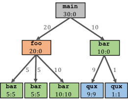
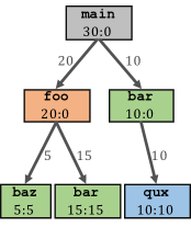
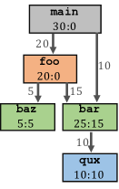
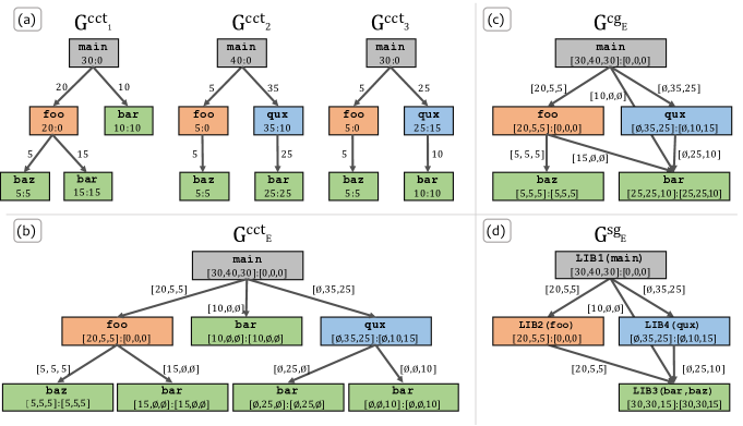
Given the raw profile data, the call paths (see Figure 1a) can then be aggregated to form a calling context tree (CCT), as shown in Figure 1b. Each unique invocation (by call path) of a function becomes a node in the CCT with the corresponding performance metrics aggregated across all invocations, and the path from a given node to the root of the tree represents a distinct calling context. CCTs reduce the number of repeating call sites with the same contextual information and are especially useful for large applications, e.g., with several hundred MPI processes that have the same calling context. A CCT can be further aggregated to provide information concisely into a call graph, which is constructed by merging the call sites that represent the same function. For example, the call graph in Figure 1c combines all call sites of the function bar from different calling contexts. A call graph contains a set of directed edges, each connecting a callee with its calling function. Although call graphs provide an accurate and reduced representation of calling contexts, their visual analysis is nevertheless severely constrained by their scale, especially for large applications with calls to multiple libraries that may lead to hundreds of call sites.
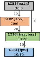
To simplify the visual analysis, CallFlow [43] introduced a super graph, created by aggregating the nodes of a call graph based on tool- or user-defined semantic attributes, e.g., the library name, module name, or file name. Figure 1d shows the higher-level representation given by super graphs. Supernodes (the nodes in a super graph) represent collected call sites with a shared semantic attribute. For example, the supernode lib3 in Figure 1d combines the call sites bar and baz that are part of the same library. Although super graphs are useful for exploring large-scale call graphs, the semantic aggregation leads to loss of detailed information within a supernode, e.g., the calling context and the performance metrics of the functions within a given library. In this work, we introduce new functionality to CallFlow that preserves this information, which can be revealed to the user upon request via the supernode hierarchy view (see Section 4.4.2).
2 Related Work
To reduce visual complexity and improve readability, graph data is often visualized as trees [3, 29], including the case of CCTs and call graphs [1, 42, 7, 43]. Here, we discuss related work in the area of call graphs, tree ensembles, and graphs in general.
Visualization of CCTs and call graphs. Interactive visualization tools for analyzing the performance of large-scale supercomputers have seen significant research and development efforts in recent years [30]. Focusing specifically on CCTs, one class of tools [40, 49, 2, 18] visualize them as collapsible trees, where the user can toggle to show/hide functions as well as sort by the attributes (e.g., inclusive runtime). Several call graph visualization tools employ a node-link layout technique using a graph drawing software like GraphViz [16] and use additional node encoding techniques to represent the data attributes [40, 13, 42]. However, it is well known that node-link layouts lack scalability when dealing with large-scale graphs [19]. Additionally, the node-link layouts lack efficient user interactivity, since the user might require to toggle functions several times for investigation, especially for deep call stacks, and cannot directly support exploring ensembles of CCTs.
To address scalability and interactivity issues, HPCToolkit’s hpcviewer [2] employs additional strategies like automatic hot path extraction within a chosen hierarchy, flattening of calling structure, and zooming interactions to expand the relevant portion of the CCT. Likewise, CallFlow [43] integrates different graph splitting operations to allow the user choose the granularity of the visualization (i.e., CCT, call graph, or super graph). CallFlow employs a Sankey diagram to encode the net inclusive time a function or a module spends in an execution.
Ensembles of call graphs. Supporting visual comparison of multiple call graphs that addresses the specific needs of HPC experts would enable improved diagnosis of issues, especially with the trend to use adaptive execution modes. Williams et al. [53] amplified the importance of comparison, mainly for execution graphs (where each edge represents the dependency between tasks). The authors also proposed a visualization tool that compare only two execution graphs at any time by employing node-encodings to show the differences in the execution graphs. To compare several call graphs, Trevis [1] used a matrix view to visualize pairwise similarity between graphs using a variety of distance measures. However, not only does the similarity matrix suffer from scalability issues, it often requires the user to perform pairwise comparisons [6] by matching individual runs. Nevertheless, the more-general task of exploring ensembles of call graphs and study performance variability is not supported by existing tools. Instead, experts generally visualize the different call graphs individually to understand the general calling structure and use simple statistical measures to understand the distribution of runtimes.
Visual comparison of graphs and trees. Comparison is often a key component of data analysis, especially to form and validate hypotheses [55, 48]. Multiple comparative visualization tools support comparison between two trees (e.g.,, the original Unix diff program, or specialized tools such as TreeJuxtaposer [41], Mizbee [39], Code flows [51]). The challenges in identifying the differences between two trees were summarized by Graham and Kennedy [22], and later generalized by Gleicher et al. [21], who provided a taxonomy of visualization designs to support comparison of two trees. In general, three approaches to comparative designs are juxtaposition (showing different objects separately) [27], superposition [37] (overlaying multiple objects), and explicit encoding [4, 28] (using an alternate visual medium to show differences).
A number of works have focused in comparing multiple trees, especially for phylogenetic trees [11, 17, 36]. These works support various analytical tasks using juxtaposed views combined with user interactions to highlight similarities and differences between two trees. However, these techniques cannot scale to a large number of trees and are designed to address the specific needs for phylogenetic trees. Recently, Barcodetree [35] suggest using a bar-code like visualization for comparing a large number of trees. However, their approach is primarily suited for stable and shallow trees, and cannot be used for call graphs, which are significantly deeper. Focusing on Sankey diagrams in Business Intelligence applications, Vosough et al. [52] provided a novel approach to visualize uncertainty in flow diagrams by imposing gradient-based fading on the boundaries nodes of the Sankey diagram. Although quite powerful, this approach is unable to show the variability in the distribution of the Sankey flow (e.g., inclusive time in call graph nodes).
3 Domain Problem Characterization
Comparing several performance profiles is of significant interest to application developers aiming to identify performance bugs across versions of a code or to understand how different application parameters and/or initial conditions may affect the performance [45, 12]. HPC experts are also interested in evaluating ensembles of performance profiles to assess the role of architecture choices, machine environments, MPI configurations, etc., to identify optimal execution and deployment modes [54, 9]. Especially with increasing computational capabilities, there is a growing need for interactively exploring large ensembles of call graphs — a task not possible to support using current techniques.
Previously, we developed CallFlow [43] to enable interactive exploration of call graphs. Although successful for its target problem, the domain experts frequently reported that CallFlow’s inability to compare multiple call graphs significantly handicapped their analysis. Indeed, comparing many graphs was a tedious task due to the need for manually performed visual comparison via pairwise juxtaposition [43, Fig. 8], which not only imposes significant cognitive burden on the user but also poses obvious scalability challenges.
Requirements. In this work, we tackle this general problem of exploring the performance variability captured by large ensembles of call graphs through a new interactive visual design. Through close collaboration with domain experts at our institute, we identified four specific requirements for a new visualization tool.
R1. Compare two call graphs (i.e., a diff view). In many cases, the users are interested in comparing the performance of two executions. Such a comparison must highlight faster/slower portions of a given execution to enable easy identification of performance bottlenecks.
R2. Visualize performance variability within several call graphs. Working with more than two graphs, users are interested in identifying the performance variability within a single function or a single module (in general, a single supernode). Whereas simpler statistics, such as mean, median, and variance, are easy to compute already, the users are instead looking for a visual depiction of the entire distribution to allow them to understand the overall trend as well as identify outliers.
R3. Visualize additional fine-grained details on demand. Although a simplified visual layout is essential for the complete graph, which are typically very large, additional details, e.g., about the module subtree, should be available to the user on demand.
R4. Interactive exploration and graph operations. The users desire the above functionality as well as several other graph filtering and splitting operations [43] be interactive or near-interactive.
Assumption. We note that different call graphs of the same application may differ in topology, e.g., differences in call paths due to application parameters or MPI implementations. Here, we assume that such differences are minor (e.g., only a few missing nodes or different edges) and that all ensemble members largely have the same topology. Any significant differences (e.g., ensembles representing different applications or completely distinct functionality) are out of scope for our tool and may require different visual encoding than the one adopted here.
4 Visualization of Ensembles of Call Graphs
To build an effective tool supporting visual comparisons, we closely follow the design considerations proposed by Gleicher [20]. After presenting a detailed description of the call graphs and associated the data (Section 4.1), we identify the targets for visual comparative analysis and actions that reveal the relationships between and within these targets (Section 4.2) to support the requirements R1–R4. Next, we present our strategies to scale the comparative visualization to a larger number of call graphs (Section 4.3), followed by the description of the visual design and interactions to support comparison and analysis of ensemble of call graphs (Section 4.4).
4.1 Description of Call Graph Data
The given sampled profiles are converted into GraphFrames using Hatchet [8], an open source profile analysis tool. A GraphFrame () is a Hatchet construct that consists of two data structures: a directed acyclic graph () that represents the CCT or call graph, and a Pandas [38] DataFrame () that stores the associated performance metrics. Hatchet represents collected performance metrics into individual columns of and establishes a consistent indexing scheme to link the call site in to its performance data in , which not only enables combining data operations with graph operations, but also improves the scalability of various analytic tasks.
Each call site in is associated with semantic information from the source code, e.g., load module, file name, line number, obtained either automatically via the profiler or through explicit user annotations. This semantic data is extracted from and stored as additional columns in for fast access. Furthermore, the performance metrics recorded on each call site typically contains metrics from multiple processing units (e.g., MPI ranks). Fast access to the data frame is facilitated through hierarchically multi-indexing , where the indices are module, function name, and MPI rank, respectively. This multi-index representation also facilitates easy integration of higher-order statistical summaries (e.g., variations across runs, and variations among ranks) over different levels of details (e.g., modules, call sites, or anywhere in between).
In the case of ensembles of profiles, each representing the performance of an application under different executions, the different i are stored individually. Generally, meta information about the different executions are available, e.g., machine architecture and/or environment (i.e., the number of cores or processes, maximum available bandwidth, and load capacity of the super computer), or application parameters. These execution parameters are also stored as additional indexed columns in the corresponding i.
4.2 Identification of Targets and Actions
Comparison targets are data entities integral to the comparison task, i.e., the specific data elements being compared. Here, we identify four comparison targets. Whereas the first three targets are explicit, T4 is an implicit target because it is not known from the data itself, but rather is based on analysis of the ensemble [20]. Here, comparing explicit targets is challenging because the comparison with respect to call graphs is difficult, and the ensembles pose scalability issues. On the other hand, the challenge with implicit targets is that they tackle unknown elements that requires user knowledge to interpret the differences.
T1. Calling contexts are an overarching target for our comparative visualization. Any optimization efforts usually focus on identifying parts of the applications that must be improved, for which, understanding the entire calling context of the application is essential to visualize. Furthermore, different execution modes (e.g., MPI libraries and application parameters) may lead to slight differences in the calling contexts. Understanding such differences is also important to reason about the variability in the performance within ensembles.
T2. Performance variability across runs. Production codes with high run-to-run variability may cause unpredictable slowdowns and diminish the reproducibility of successful experiments. Highlighting such variability, at both module (summarized) and call site (detailed) levels, is one of the most critical comparison targets in this work.
T3. Performance variability across MPI ranks. For MPI-enabled applications, the overall performance degrades when the runtime is less uniform across resources [46], e.g., due to load imbalance. Identifying heavily over- or under-utilized resources from the runtime distribution is important to design codes that can achieve peak performance.
T4. Execution parameters. In many cases, an application’s performance may be correlated with certain execution parameters [54]. Therefore, identifying the parameters with more significance can help understand explored multiple optimization strategies simultaneously.
Comparison actions are visualization tasks needed to understand the relationships between and within comparison targets. Formulation of actions influences the visual encoding and the user interactions that link individual visual components. Visualization of ensembles of call graphs broadly require six actions.
A1. Compare calling contexts across runs. Due to potential differences in calling contexts of the different executions (T1), it is essential to highlight any differences, i.e., missing nodes/edges in the graph.
A2. Compare performance variability across runs. Displaying the aggregated performance from individual executions is not a scalable approach considering the effort from the user, and the corresponding visualization complexity. Instead, the recorded performance (T1) and calling contexts (T2) must be summarized not only within a single execution, but also across multiple call graphs.
A3. Compare performance variability across MPI ranks. Summary statistics (e.g., mean runtime) across MPI ranks (T3) is not sufficient to analyze runtime distribution across resources because the distribution is not expected to be normal. To aid the exploration, complete distributions are essential to visualize.
A4. Compare call graphs across levels of detail. Although comparisons across super graphs (semantically aggregated call graphs) is useful, when experts typically identify problem areas, they are interested in looking at selected regions in more detail. Therefore, it is important to manage fine-level details and visualize them upon request.
A5. Compare two call graphs. Differences between two call graphs can exist structurally (T1), as runtime variations (T2, T3), and/or in execution parameters (T4). Simple, visual representations of such differences is of value to the user.
A6. Compare a selected run with an ensemble. Comparison tasks often require a baseline to compare against. For all of our targets (T1–T4), it is important to compare a selected run with the ensemble behavior. An important constraint to consider is that the constructed baseline must match the expert’s understanding of the overall calling context, despite minor differences in the individual ensemble members.
4.3 Development of Strategies
The scale of sampled profiles collected by HPC experts can vary from tens to hundreds depending on the experiment. Hence, it becomes vital for CallFlow as a visual analytic tool to handle scalability arising for three reasons: 1) number of sampled profiles, 2) number of call sites in each profile, and 3) number of ranks associated with each call site in each run. In this section, we detail the strategies we adopt to support scalable analysis of a reasonably-sized collection of profiles.
4.3.1 Construction of Ensemble GraphFrames
GraphFrames (i) are the data source for CallFlow, by feeding appropriate information about the comparison targets to the visual interface upon request. Furthermore, different comparison actions require different data operations (e.g., statistical summaries of data), and/or the graph operations (e.g., grouping, filtering, matching) to be performed before visualizing the results. These operations demand a consistent and scalable approach to store, access, and modify the i. Here, we describe how to concisely represent the entire ensemble as a single ensemble GraphFrame (see Figure 2(d)) that supports all required queries.
Step 1. Unify all DataFrames. First, we perform the unify operation to concatenate i’s into an ensemble dataframe (). This operation is similar to Hatchet’s unify implementation, except for the reindexing step, where we add column “runName” to tag the call sites belonging to individual runs. Consequently, the “runName” column becomes the primary index of the multi-indexed hierarchy of . However, for multiple large call graphs (say 100’s of call sites in each profile), can quickly becomes data-intensive and eventually costing time and memory for various data operations.
To improve the processing time for multiple data operations operation, we abstract the information stored in at two levels of data coarseness (A4), namely module-level and name-level. The module-level granularity groups the data points based on the library (i.e., module column), while the node granularity groups by the call site’s name (i.e., name column). Both granularities of are stored as separate files using the HDF5 [25] data model, which is community standard format used in many scientific applications for storing hierarchical-structured datasets. Additionally, HDF5 allows us to attach semantic information (i.e., library name and call site name) as “attributes” that group data points together for faster data lookup.
Step 2. Unify all calling contexts. Next, we perform the union operation on the i’s to construct an ensemble CCT (). The union operation aggregates the performance metrics for each callsite and merges the calling contexts that share the same caller-callee relationship across i’s. A call site from i is considered equivalent to a call site from j if their complete calling context is same across the two runs. The aggregated performance metrics corresponding to each callsite is stored as vectors. In Figure 2(a), we demonstrate the union operation using three sample i’s comprising of 5 call sites that belong to 4 libraries. Although there are minor differences in the graph (e.g., missing nodes), the union operation accounts for such inconsistencies by assigning a null value () to the missing nodes in any i. For example, whereas the calling contexts of baz remains consistent across the three CCTs, the contexts of bar and qux differ across the runs. The resulting (see Figure 2(b)) represents a super set of the given i’s, preserves all calling contexts, and merges the nodes with identical contexts.
Next, is converted into a ensemble call graph (), according to the usual definition, i.e., call sites with same function name are merged (see Figure 2(c)). The associated vectors are element-wise added to summarize the performance runtime on each callsite. Finally, the call sites are filtered (especially for large call graphs) by inclusive/exclusive runtime using user-defined thresholds, and later grouped with the available semantic information, to construct CallFlow’s module-level super graph, which we call ensemble super graph ().
The final construct, the ensemble GraphFrame () is then created by combining with . The ensemble GraphFrame not only captures all equivalence relationships among call graphs using nodes and the edges store the subtle differences in the performance and calling structure. The aggregated can now be used as the baseline super graph to compare against the ensemble (A3).
Both steps, the unification of DataFrames and the unification of calling contexts, are done as a preprocessing step, to provide the user with options to filter large call graphs and modify the semantic information, if necessary (as done in the original CallFlow [43]). To aid with filtering and grouping operations, the users still have an option to load a single profile using CallFlow and verify the resulting module-level super graph before studying the ensemble.
4.3.2 Enriching Targets into Ensemble GraphFrame
Although, succinctly represents an ensemble of sampled profiles, it does not capture the potentially critical patterns hidden among the comparison targets. Therefore, the next challenge is to develop strategies to help visualize summaries and enable comparison among targets.
Summarize performance metrics across runs. Runtime metrics (i.e., inclusive/exclusive runtime) are valuable indicators of performance slowdown among call sites. For each node in , aggregated runtime metrics are stored as a -vector, where is the number of runs in the ensemble. In the more-common scenario of parallel codes, the metrics are first aggregated across threads/processes/MPI ranks. Such aggregation is important to be able to compare profiles with different number of ranks, e.g., 8 vs. 512, consistently. In particular, to summarize the runtime metrics across multiple executions (T2), we take mean runtime across all ranks in an execution to be the representative runtime for the corresponding run. Given a single value of the metric per node per execution in , we next capture the distribution of the metric across executions for each node to create the ensemble distribution. Here, we compute histograms for each node, the range of which spans minimum to maximum of the runtime for any execution.
Summarize performance metric across MPI ranks Although, the ensemble distribution conveys the trend of the mean runtime per node, it is equally important to study the runtime distribution across MPI ranks (T3). To this end, we preserve the per-rank data on the server, and supply to the visualization upon demand. Such data can be visualized in two ways. We show a box-plot visualization for the run time across MPI ranks for each call site. Box plots are a powerful way to capture the limits, means/medians, and standard deviations/quartiles, as well as outliers in the data. We also show a histogram of the run times per rank for the entire ensemble as well as for a selected target run.
Reveal the subtree within a module. The ensemble super graph is designed to provide a module-level overview (by default). Upon request, the subtree inside a selected module can be extracted revealing further details about the ensemble. For such cases, Previous version of CallFlow [43] used graph splitting operations to reveal call sites of importance, but this demands the user to sort by the exclusive runtimes and then reveal a selected call sites. However, for an ensemble of runs, this strategy fails because it requires the user to compare exclusive runtime from runs, making it challenging to analyze the trend in the distribution, which is critical for the identification task. Instead, it is important to reveal all call sites belonging to a supernode on user’s demand. To this end, we perform a breadth-first traversal on the ensemble CCT () from the entry function of all the supernodes and construct a hierarchy tree, called supernode hierarchy. Using ensures that all call sites present in any call graph are accounted for. Here, we use the from the aggregated runtime metric vector to determine if a particular call site exists in a selected run. To ensure the calling context inside the module to be a tree, we break all the cycles inside the supernode (as already done in CallFlow [43]).
4.4 Design of Visual Analytics System
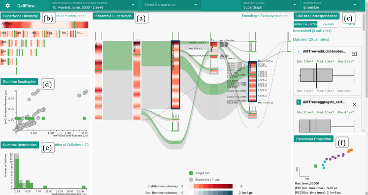
As shown in Figure 3, the visual interface of (the new version of) CallFlow comprises of five inter-linked views and three analytic modes that form a comprehensive visual interface to support the comparison actions. The source code is available in [32].
4.4.1 Ensemble-Sankey: The Ensemble SuperGraph View
Previously, CallFlow [43] utilized the Sankey layout to visualize a (single) super graph. In this work, we expand this visual design to support visualization of ensembles of super graphs, and create a novel design – the ensemble-Sankey. Our decision to preserve and enhance the Sankey layout emanates from the effectiveness of the existing decision. In particular, the resource flow conveyed by Sankey layout provides an excellent way to represent calling contexts and associated performance metrics, as it matches experts’ intuition about the internal representation of the application flow. Furthermore, we assert that perceptual simplicity is vital for the comparison task, as the user has to build the proficiency to “spot the differences” in an ensemble of runs. However, using the existing encoding of nodes and edges are not directly usable for the ensemble, since only a single graph may be visualized. Instead, we adapt node and edge encodings to concisely represent an ensemble in the proposed ensemble-Sankey design.
Ensemble Nodes. In the (standard) Sankey, each supernode is visualized as a rectangular bar, whose height corresponds to the “resource of interest”. For the application at hand, the resource is the total time spent within this module and all its callees (i.e., the sum of the inclusive runtime of all its entry functions) [43]. In the case of ensembles, however, there are many graphs with different values of runtime. Nevertheless, continuing the same interpretation of “resource flow”, it makes sense to aggregate the runtimes across all executions. We therefore scale the height of a given supernode in the ensemble-Sankey proportional to the maximum inclusive metric across all executions because the goal is to show the entire distribution (across executions) onto a single visual element of consistent shape and size. Under such encoding, the “standard supernode” of any given execution simply becomes a subset of the “ensemble supernode”. The width of the rectangle is computed as before [43].
With the inclusive metric mapped to the height of the rectangle, we are also interested in highlighting the exclusive metric. This is achieved by drawing colormapped borders of the node. As above, we use the maximum exclusive metric across all executions, as it can help identify exceptionally slow runs. Although the default border coloring is the (maximum) exclusive metric, the user can interactively avail other options, such as color by (maximum) inclusive metric.
We add borders to supernodes to make room for additional information inside the rectangle. Previously, CallFlow simply colored the entire node, which we will now use to show the distribution of a chosen metric. Although the distribution of inclusive metrics is the most meaningful choice (since the height maps to maximum inclusive runtime), the user may also use an exclusive metric (as shown in Figure 3). In particular, we compute a histogram of the chosen metric and map it vertically to the height of the supernode. Since the true histogram may contain sharp spikes (we do not necessarily expect to find a smooth distribution), we use smooth gradient fading to ensure all peaks are highlighted. Although we could directly compute a density estimate (e.g., using KDE) instead of a histogram to generate a smoother distribution, such techniques introduce additional parameters (i.e., kernel widths), which are typically harder to interpret and may miss features regardless due to an unsuitable choice. Instead, we use histograms (with a customizable bin count) and use linear gradients to smooth the distribution. The resulting ensemble gradient therefore shows the full distribution of the selected metric across runs. The default choice of color for the distribution is a single-hue white–red colormap. The colors are mapped consistently across all nodes to allow evaluation of distributions not just within a single supernode, but also across supernodes (A2).
Additional runtime information can be revealed by toggling the text-guides, which not only display the minimum, and maximum runtimes of the executions among the ensemble, but also mark the bins of the histogram. By default, the text-guides reveal only the number of executions in the corresponding bin, but additional information such as “runName” can be examined by click on the text-guides. For example, in Figure 3, the gradients of the AMTree supernode show the mean exclusive runtime skewed towards the two extremes.
Ensemble Edges. As in the (standard) Sankey, superedges (which connect two supernodes) encode the flow of the inclusive metrics in . However, in the (standard) Sankey, the thickness (in vertical direction) is proportional to the inclusive metric consumed by the target node (i.e., the resource being transferred to a target node). However, this property cannot be enforced for the superedges of an ensemble-Sankey because of the aggregation (max) performed for each supernode. In particular, since the maximum values of child nodes may be from different runs, preventing the sum of all outgoing resources to be equal to the height of the node (minus the exclusive time). As such, there is no single unique mapping that can be defined for the height of the superedge. For example, consider Figure 2(d), where the aggregated metrics for each supernode is the maximum of the corresponding vector, implying the values of the nodes corresponding to LIB1, LIB2, LIB3, and LIB4 to be 40, 20, 30, and 35, respectively. However, the aggregated (max) metrics for the outgoing edges from LIB1 are 20, 10, and 35, respectively, which sum to 65. Such scenarios are common in profiles with high performance variability from different libraries. To present a consistent encoding and interpretation of superedges, we instead scale the two ends of a superedge proportional to the respective nodes, thereby, smoothly varying the height of the superedge (from left to right). In addition to a neat visualization, this encoding facilitates visualizing a superedge with respect to both its source and destination.
4.4.2 Supernode Hierarchy View
While scanning the ensemble gradients, the user is often limited to only exploring the ensemble distribution for the revealed supernodes. Using graph operations, such as splitting, can reveal additional interesting nodes but the graph operation changes the overall context. For example, splitting a supernode by its entry functions would reveal all the entry functions belonging to a supernode, but if there are multiple entry functions, the Sankey layout may change significantly. Through discussions with potential users, we instead choose to visualize the additional details separately, in particular, as a supernode hierarchy using an icicle plot, similar to the flamegraph visualizations [24].
Icicle plot places the call sites of the selected library based on their depth inside the supernode hierarchy from top to bottom. Each call site in the supernode hierarchy is visualized as horizontal rectangular bars. As with the ensemble-Sankey, ensemble gradients and runtime borders are used to encode the ensemble distribution and the runtime distribution for the call site, respectively. Additionally, when a target run is selected, the supernode hierarchy view also enables the comparison of multiple calling contexts (A1), as the nodes with have no ensemble gradients that fill the rectangular bar, allowing the user to identify the missing call sites easily. Furthermore, call sites of interest from the supernode hierarchy can be selected by clicking to reveal all call sites in the module’s context. Revealing a call site’s calling context in the ensemble-Sankey helps compare the runtimes to identify performance slowdowns among call sites (see Section 5.2).
4.4.3 Call Site Correspondence View
Call site correspondence view (see Figure 3(c)) lets us focus on process-level distribution, and also scan call site information based on data and graph properties. Previously, (single) Sankey’s histogram view was used to explore the connection between slowdowns in MPI ranks and the physical domains. However, such cases are very specific to the application in study, and do not add any significant value to the comparison task, which has a broader scope of exploring variations across multiple objectives. Additionally, such histograms would only work where all ensemble members have the same number of MPI ranks.
Instead, we resort to more a traditional visualization — a boxplot to explore the variation in the observed runtime distribution for each call site (A3). Boxplots use quartiles of the distribution to indicate the spread of data, and can also reveal outliers. In this view, we enumerate the call sites that are not present in the ensemble view, and highlight the median, the interquartile range (IQR = Q3Q1), as well as outliers (above and below 1.5 the IQR. Additional information is also provided as text labels (e.g., minimum, median, and maximum runtime).
4.4.4 Complementary Views
Metric correlation view. In order to compare inclusive and exclusive metrics for a given call site, we produce a scatterplot that captures the correlation between the two (Figure 3(c)). Previously, a similar scatter plot was used in single profile analysis to identify expensive call sites within a supernode. For ensembles, each “dot” in the scatter plot represents a callsite for a single run, making it possible to study such correlations across ensemble members, e.g., by comparing a target run to the ensemble, as shown in the figure. The scatter plot itself is also interactive, as hovering over a dot highlights call site by their names for the user to compare the runtime metrics(A1).
Runtime distribution view. To assess the distribution of runtime, we show histograms for the chosen metric (inclusive or exclusive) for a selected supernode in three modes: (1) call site mode, which shows the distribution of runtime metric with respect to individual call sites (i.e., the vertical axis is the number of call sites with a given range (bin) of runtime, as shown in Figure 3(e)); (2) call graph mode, which shows the distribution with respect to the call graphs (i.e., the vertical axis is the number of call graphs with a given range (bin) of runtime); and (3) MPI rank mode, which shows the distribution with respect to the MPI ranks (i.e., the vertical axis is the number of MPI ranks with a given range (bin) of runtime). These distributions are important to explore for a complete understanding of the chosen supernode in an ensemble, with or without a target run.
Parameter projection view. We also include a parameter projection view (see Figure 3(f)), which is an experimental feature to explore the space of parameters that generate the ensemble. Here, we normalize all known execution parameters using min-max scaling (i.e., normalized to range [0,1]), all non-numerical parameters are first mapped to integers. The normalized parameters, along with the exclusive and inclusive runtimes, are then projected to a 2-D space using Multidimensional Scaling(MDS) [34]and clustered using k-means. The intent is to allow the user to explore potential similarities in the execution parameters as well as provide a tool to subselect the ensemble — a task enabled using a lasso in the projection plot. However, an important limitation is the interpretability of such projection, especially due to the string to numerical mapping in certain parameters. Nevertheless, with appropriate caution in mind, the user can use this tool to further explore the data.
4.4.5 Visual Analytic Modes
Ensemble summary mode is the default analytic mode for CallFlow when studying an ensemble of runs (see Figure 5).
Target-ensemble comparison mode is triggered when the user selects a particular execution from the ensemble to study in detail from “Select Target run”, which lists all ensemble members. This operation allows the user to compare a selected run’s performance with the ensemble(A6) across all 6 views. Then, the visual elements belonging to the selected target run are revealed in green through out the system (in Figure 3) – for consistent context, the elements corresponding to the ensemble are shown in gray. In particular, the target superedges are overlaid on top of the ensemble edges to compare the proportion of inclusive runtime that calling contexts (T1). The target-lines (i.e., green colored lines) place the selected run in the distribution for each supernodes. (T2) Boxplots are revealed on top of the ensemble boxplot to compare the process runtimes of the target run vs. ensemble.
Target-target difference mode. During comparative analysis, the user might find two executions that exhibit a variation in the ensemble distribution, or appear an outlier from the projection view. To allow the user study the differences between two supergraphs, we compute a diff call graph that subtracts the mean runtime across supernodes. The resulting diff view is visualized as a Sankey diagram and is colored with a green-red colormap, where hues of red color highlight the performance slowdown and hues of green highlight performance speedup.
5 Case Studies
To demonstrate and validate our visual analytics design, we present 3 case studies illustrating its value to the HPC community.
5.1 Performance Variability due to Application Parameters
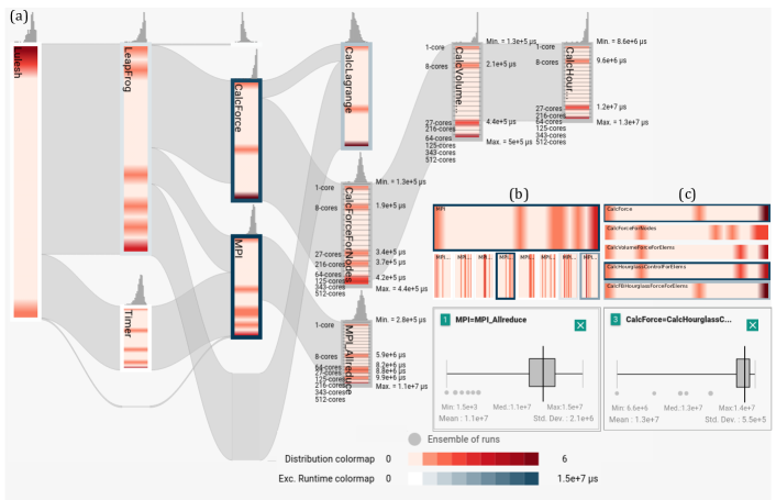
First, we study the performance of a single-process C++ library, AMM, which creates adaptive representations on-the-fly for streaming volumetric data. AMM is currently under development and the code developers are keenly interested in improving its performance for various application parameters. Among others, a key parameter that affects the performance is the type of data stream (i.e., ordering of data, such as row-major and wavelet transform subband order) [26]. With the general goal of obtaining insights into the performance variability of AMM as well as identifying any potential optimization opportunities, experts explore 18 profiles (captured through Caliper [10]) that represent other parametric variations (e.g., data sizes) for three different data streams. Figure 3 shows the CallFlow visualization for the given ensemble.
Although AMM does not use MPI and therefore the corresponding profiles cannot fully leverage the functionality of CallFlow, they make an excellent case study due to high performance variability. Indeed, the ensemble view (Figure 3) shows varied distributions of runtimes across different run modes. AMM makes use of several recursive functions, and despite different recursion depths, the call graphs of the different runs are very similar. Given the application parameters explored here, code developers expected high variation across runs but very similar patterns of variations across modules and call sites. Instead, to the surprise of code developers, the distribution patterns (shown by ensemble gradients) vary significantly across different modules. This behavior hints at problems with recursive functions (e.g., potential memory leaks due to unnecessarily allocating new memory) – a potential improvement in the code that developers are currently exploring.
Through more detailed analysis of the ensembles, e.g., using the supernode hierarchy view and call site correspondence view, it was noted that several get_* functions in modules AMTree and Octree consume significant run time. Through discussions with developers, it was learnt that these functions make use of the default std::unordered_map, and the problem appears to be due to unnecessary hash collisions in the map. Developers are currently experimenting with customizing the usage (e.g., different hash and different bucket counts) as well as a custom data structure to improve performance.
Overall, AMM code developers were very impressed with CallFlow’s capability to easily and concisely describe the performance of the given ensemble and identify potential bottlenecks. In general, performance profiling and optimization is an ongoing process, and with the availability of our effective visual analytic tool, developers will reevaluate the forthcoming development versions of their code.
5.2 Performance Trends for a Weak Scaling Study
Most large-scale parallel applications are designed to utilize several computational nodes and/or several cores per node. Application developers and HPC experts are often interested in scaling studies of such applications to understand whether the codes are leveraging parallelism, e.g., via MPI, effectively. Previously, a typical workflow for such use-cases would be the user generating static charts, e.g., bar plots to determine the changes in the overall run time, perhaps at the module level or call site level. Usually, the level of granularity is scripted in to generate the plot, and then analysis performed, possible across levels of detail. Nevertheless, the lack of an automated UI-based visualization imposes high time-to-insight, even for an expert user.
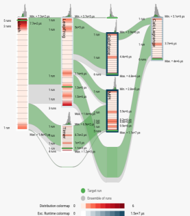
Here, we are given an ensemble of multi-process performance profiles to study weak scaling of a proxy application across eight execution parameters: 1, 8, 27, 64, 125, 216, 343, and 512 processes. In particular, the application is LULESH [31], a Lagrangian shock hydrodynamics mini-application that uses both MPI and OpenMP to achieve parallelism. Recently, a similar case study was conducted by Bhatele et al. [8] to study run-to-run performance differences for identifying the most time-consuming regions of the code. We use a similar collection of profiles and showcase the advantages of visual analytics for such exploration using CallFlow.
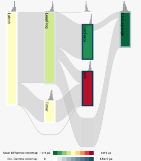
Exploratory overview using ensemble-Sankey. The given profiles are converted into an ensemble super graph, which is shown to the user using our ensemble-Sankey layout (see Figure 4a). Here, contains 33 call sites, which we group into six modules. Immediately, the user is conveyed the overall flow of the resource (runtime) that establishes the context as the user can identify the expected calling pattern. The ensemble gradients on the different modules of the visualization describe the complete distribution, as compared to a summary, e.g., the mean value. The interactivity of CallFlow allows the user to select different ensemble members as target runs — a functionality particularly appreciated by the users because it allows comparing data in the backdrop of a consistent context, e.g., it is straightforward to compare the “widths” of the green (target) edges against the gray (ensemble) edges, in Figure 4a. Thus far, an initial exploration of the data using the ensemble-view provides a good understanding of the collected profiles — not only qualitative but also quantitative (due to the associated labels and colormaps). Overall, although this is a small ensemble, the gradient patterns largely indicate a reasonably good weak scaling.
Pairwise comparison of profiles. In general, the users are often also interested in comparing pairs of profiles within a larger ensemble, e.g., a median profile vs. a slow profile. This is specifically true for the given data set as a curious behavior is observed: two pairs of executions appear out of order in the ensemble-Sankey (labeled later in Figure 5).
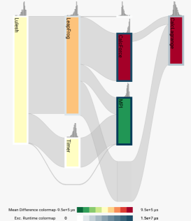
Previously, Bhatele et al. [8] demonstrated their tool, Hatchet, to analyze performance profiles and compute diff between two GraphFrames. Using a color-mapped text-based tree visualization (similar to linux’s tree command), Hatchet helps identify the nodes with positive/negative values with respect to the diff. Visualization of differences using colored text, however, imposes additional perceptual complexity due to a lack of contrast among the colormapped values with respect to the background. Such visualization also suffers from scalability issues and is static with no opportunity for interactive analysis.
Instead, the diff view provided by CallFlow can reproduce such analysis through a more-effective visual medium (see Figs. 4b and 4c). The result highlights not only the modules that are slower (with respect to the diff order) but also communicates the relative degree of performance degradation easily. For example, when scaling from 27 to 64 cores per node (Figure 4b), CalcForce becomes about 5% more slower than CalcLagrange. On the other hand, the MPI module now takes longer when scaled from 125 to 216 cores (Figure 4c). By encoding the pairwise differences onto the ensemble graph, the visualization not only readily highlights the faster/slower modules, but also allows the opportunity to interactively request more information, e.g., through additional views and/or graph splitting operations. Furthermore, even though the diff view is comparing only two graphs, changing the pair through CallFlow UI allows the user to swiftly observe the various pairwise differences within a consistent context (i.e., the same ensemble graph), irrespective of any fine-detail changes in the underlying CCT.
Comparing run-to-run slowdowns. Toward the ultimate goal of identifying call sites that exhibit inconsistent and/or unexpected runtime behavior, further exploration is needed. Here, by toggling the text guides (using the click interaction), the runs corresponding to the different bins in the ensemble gradient are listed along with the bin value representing the gradient (see Figure 4(a)). The text guides reveal two cases of out-of-order runtimes (with respect to increasing core count) for MPI and CalcForce libraries. One way to highlight such differences is using the diff view (Figure 4). Here, we further refine the ensemble view using the interactive split graph operation provided by CallFlow (introduced in the previous version [43]) to reveal the nodes inside these two modules. Indeed, the text labels in the figure help identify the culprit call site hierarchies, [MPI MPI_Allreduce] and [CalcForce CalcForceForNodes CalcVolumeForceForElems CalcHourGlassControlForElems]. A key advantage of using CallFlow is the immediate availability of alternate views, e.g., split ensemble view, supernode hierarchy view, and the call site view (all shown in Figure 4. In particular, the supernode hierarchy in Figure 4(c) reasserts the upward propagation of this behavior. Finally, we look at the summarized distribution of the respective call sites. Even though the box plots highlight the outliers (with respect to the interquartile range), by design, they are incapable of capturing this anomalous behavior in the data (out-of-order runtimes) . We take this opportunity to emphasize that such behavior would also be missed even if the user were to look at box-plot-type visualization outside CallFlow — already a stretch given the usual workflow. Indeed, the true power of the visual analytics enabled by CallFlow lies in its interactive linked views.
6 Discussion
Conclusion. In this paper, we have extended CallFlow to create a scalable, interactive visual analytic tool to study ensembles of call graphs. Working closely with domain experts, we identify the specific problems faced in the analysis of collections of performance profiles, and map them to concrete comparative visualization tasks using the framework of Gleicher et al. [20]. We develop a scalable visual encoding, ensemble-Sankey, to describe the ensemble along with several other linked visualizations.
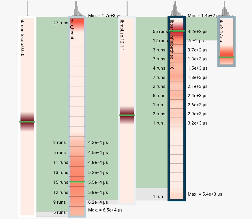
The proposed visual design itself is arbitrarily scalable in size of the ensemble, since we show the distributions of runtimes for each supernode. Nevertheless, practical concerns such as data processing and movement between server and client poses limitations. We will improve the computational aspects of the tool in the future versions. Regardless, the tool itself can easily scale up to about 100 profiles — a moderately-sized use case, and still maintain interactivity. To showcase CallFlow’s scalability to large benchmarking experiments, we show (Figure 6) an ensemble of 100 profiles collected from an OSU_Bcast benchmark across a range of MPI processes (10, 12, 14, and 16).
Expert feedback. Our collaborators comprise HPC researchers and application developers who also participated in the discussion on the design of our system and provided feedback. In this work, we were able to successfully satisfy the requirements arising from the domain problem, and have conducted a preliminary evaluation of the visual tool with two case studies. Overall the utility of the tool was well received. In general, getting an overall context of the ensemble is integral to studying performance profiles. It was noted that the new encoding, the ensemble-Sankey, not only provides a new way of exploring the distributions of interest, but is also remarkably straightforward and intuitive. Other linked views, although not necessarily new visualization contributions, help tie in the various pieces of information to put together a cohesive story about the profiles that the user wishes to understand.
Limitations and future work. Despite the positive reviews, our comparative visualization framework has several directions for improvement. For example, although the users expressed excitement regarding the projection view in order to explore subsets of ensembles, the lack of interpretability disallowed drawing any meaningful insights. We will explore this idea further using tree-comparison metrics instead. More generally, with respect to visualization research, we currently operated under the assumption of a “reasonably” similar ensemble. In the future, we would like to explore visualizing graph ensembles without this limitation. Going forward, we also plan to explore the notion of “ordering” in ensembles, e.g., performance profiles of software development, such as through git history. This additional complexity poses new challenges and it would be interesting to see how a Sankey layout could be expanded to accommodate this new dimension.
Acknowledgements.
We are grateful to Olga Pierce for their feedback that improved the content and readability of this work. This work was performed under the auspices of the U.S. Department of Energy by Lawrence Livermore National Laboratory (LLNL) under contract DE-AC52-07NA27344. LLNL-CONF-809459.References
- [1] A. Adamoli and M. Hauswirth. Trevis: A context tree visualization & analysis framework and its use for classifying performance failure reports. In Proceedings of the 5th international symposium on Software visualization, pages 73–82. ACM, 2010.
- [2] L. Adhianto, S. Banerjee, M. Fagan, M. Krentel, G. Marin, J. Mellor-Crummey, and N. R. Tallent. HPCToolkit: Tools for performance analysis of optimized parallel programs. Concurrency and Computation: Practice and Experience, 22(6):685–701, 2010.
- [3] D. H. Ahn, B. R. de Supinski, I. Laguna, G. L. Lee, B. Liblit, B. P. Miller, and M. Schulz. Scalable temporal order analysis for large scale debugging. In Proceedings of the Conference on High Performance Computing Networking, Storage and Analysis, page 44. ACM, 2009.
- [4] N. Amenta and J. Klingner. Case study: Visualizing sets of evolutionary trees. In IEEE Symposium on Information Visualization, 2002. INFOVIS 2002, pages 71–74. IEEE, 2002.
- [5] G. Ammons, T. Ball, and J. R. Larus. Exploiting hardware performance counters with flow and context sensitive profiling. ACM Sigplan Notices, 32(5):85–96, 1997.
- [6] K. Andrews, M. Wohlfahrt, and G. Wurzinger. Visual graph comparison. In 2009 13th International Conference Information Visualisation, pages 62–67. IEEE, 2009.
- [7] A. Bergel, A. Bhatele, D. Boehme, P. Gralka, K. Griffin, M.-A. Hermanns, D. Okanović, O. Pearce, and T. Vierjahn. Visual analytics challenges in analyzing calling context trees. In Programming and Performance Visualization Tools, pages 233–249. Springer, 2017.
- [8] A. Bhatele, S. Brink, and T. Gamblin. Hatchet: Pruning the overgrowth in parallel profiles. In Proceedings of the ACM/IEEE International Conference for High Performance Computing, Networking, Storage and Analysis, SC ’19, Nov. 2019. LLNL-CONF-772402.
- [9] A. Bhatele, K. Mohror, S. H. Langer, and K. E. Isaacs. There goes the neighborhood: Performance degradation due to nearby jobs. In SC’13: Proceedings of the International Conference on High Performance Computing, Networking, Storage and Analysis, pages 1–12. IEEE, 2013.
- [10] D. Boehme, T. Gamblin, D. Beckingsale, P.-T. Bremer, A. Gimenez, M. LeGendre, O. Pearce, and M. Schulz. Caliper: Performance introspection for HPC software stacks. In Proceedings of the International Conference for High Performance Computing, Networking, Storage and Analysis, page 47. IEEE Press, 2016.
- [11] S. Bremm, T. von Landesberger, M. Heß, T. Schreck, P. Weil, and K. Hamacherk. Interactive visual comparison of multiple trees. In 2011 IEEE Conference on Visual Analytics Science and Technology (VAST), pages 31–40. IEEE, 2011.
- [12] S. Chunduri, K. Harms, S. Parker, V. Morozov, S. Oshin, N. Cherukuri, and K. Kumaran. Run-to-run variability on Xeon Phi based Cray XC systems. In Proceedings of the International Conference for High Performance Computing, Networking, Storage and Analysis, pages 1–13, 2017.
- [13] L. DeRose, B. Homer, and D. Johnson. Detecting application load imbalance on high end massively parallel systems. In European Conference on Parallel Processing, pages 150–159. Springer, 2007.
- [14] S. Devkota and K. E. Isaacs. CFGExplorer: Designing a visual control flow analytics system around basic program analysis operations. In Comp. Graph. Forum, volume 37, pages 453–464, 2018.
- [15] F. Di Natale, H. Bhatia, T. S. Carpenter, C. Neale, S. K. Schumacher, T. Oppelstrup, L. Stanton, X. Zhang, S. Sundram, T. R. W. Scogland, G. Dharuman, M. P. Surh, Y. Yang, C. Misale, L. Schneidenbach, C. Costa, C. Kim, B. D’Amora, S. Gnanakaran, D. V. Nissley, F. Streitz, F. C. Lightstone, P.-T. Bremer, J. N. Glosli, and H. I. Ingólfsson. A massively parallel infrastructure for adaptive multiscale simulations: Modeling RAS initiation pathway for cancer. In Proceedings of the International Conference for High Performance Computing, Networking, Storage and Analysis, SC ’19, pages 57:1–57:16, New York, NY, USA, 2019. ACM.
- [16] J. Ellson, E. R. Gansner, E. Koutsofios, S. C. North, and G. Woodhull. Graphviz and Dynagraph—Static and dynamic graph drawing tools. In Graph drawing software, pages 127–148. Springer, 2004.
- [17] S. Fu, H. Dong, W. Cui, J. Zhao, and H. Qu. How do ancestral traits shape family trees over generations? IEEE transactions on visualization and computer graphics, 24(1):205–214, 2017.
- [18] M. Geimer, F. Wolf, B. J. Wylie, E. Ábrahám, D. Becker, and B. Mohr. The Scalasca performance toolset architecture. Concurrency and Computation: Practice and Experience, 22(6):702–719, 2010.
- [19] M. Ghoniem, J.-D. Fekete, and P. Castagliola. On the readability of graphs using node-link and matrix-based representations: A controlled experiment and statistical analysis. Information Visualization, 4(2):114–135, 2005.
- [20] M. Gleicher. Considerations for visualizing comparison. IEEE transactions on visualization and computer graphics, 24(1):413–423, 2017.
- [21] M. Gleicher, D. Albers, R. Walker, I. Jusufi, C. D. Hansen, and J. C. Roberts. Visual comparison for information visualization. Information Visualization, 10(4):289–309, 2011.
- [22] M. Graham and J. Kennedy. A survey of multiple tree visualisation. Information Visualization, 9(4):235–252, 2010.
- [23] S. L. Graham, P. B. Kessler, and M. K. Mckusick. Gprof: A call graph execution profiler. In ACM Sigplan Notices, volume 17, pages 120–126. ACM, 1982.
- [24] B. Gregg. The flame graph. Communications of the ACM, 59(6):48–57, 2016.
- [25] H. D. F. Group. HDF5 Reference Manual September 2004.Release 1.6.3, National Center for Supercomputing Application (NCSA), University of Illinois at Urbana-Champaign.
- [26] D. Hoang, P. Klacansky, H. Bhatia, P.-T. Bremer, P. Lindstrom, and V. Pascucci. A study of the trade-off between reducing precision and reducing resolution for data analysis and visualization. IEEE Trans. on Vis. and Comp. Graph., 25(1):1193–1203, Jan 2019.
- [27] D. Holten and J. J. Van Wijk. Visual comparison of hierarchically organized data. In Computer Graphics Forum, volume 27, pages 759–766. Wiley Online Library, 2008.
- [28] J. Y. Hong, J. D’Andries, M. Richman, and M. Westfall. Zoomology: Comparing two large hierarchical trees. 2003.
- [29] K. E. Isaacs and T. Gamblin. Preserving command line workflow for a package management system using ASCII DAG visualization. IEEE transactions on visualization and computer graphics, 2018.
- [30] K. E. Isaacs, A. Giménez, I. Jusufi, T. Gamblin, A. Bhatele, M. Schulz, B. Hamann, and P.-T. Bremer. State of the art of performance visualization. In EuroVis (STARs), 2014.
- [31] I. Karlin. Lulesh programming model and performance ports overview. Technical report, Lawrence Livermore National Laboratory (LLNL), Livermore, CA (United States), 2012.
- [32] S. P. Kesavan. Supplementary materials. https://jarusified.github.io/2020-comparison-callflow.html, 2020.
- [33] A. Knüpfer, H. Brunst, J. Doleschal, M. Jurenz, M. Lieber, H. Mickler, M. S. Müller, and W. E. Nagel. The Vampir performance analysis tool-set. In Tools for High Performance Computing, pages 139–155. Springer, 2008.
- [34] J. B. Kruskal. Multidimensional scaling by optimizing goodness of fit to a nonmetric hypothesis. Psychometrika, 29(1):1–27, 1964.
- [35] G. Li, Y. Zhang, Y. Dong, J. Liang, J. Zhang, J. Wang, M. J. McGuffin, and Y. Xiaoru. Barcodetree: Scalable comparison of multiple hierarchies. IEEE transactions on visualization and computer graphics, 2019.
- [36] Z. Liu, S. H. Zhan, and T. Munzner. Aggregated dendrograms for visual comparison between many phylogenetic trees. IEEE transactions on visualization and computer graphics, 2019.
- [37] M. M. Malik, C. Heinzl, and M. E. Groeller. Comparative visualization for parameter studies of dataset series. IEEE Transactions on Visualization and Computer Graphics, 16(5):829–840, 2010.
- [38] W. McKinney et al. Data structures for statistical computing in Python. In Proceedings of 9th Python in Science Conference (SciPy), pages 51–56, 2010.
- [39] M. Meyer, T. Munzner, and H. Pfister. MizBee: A multiscale synteny browser. IEEE transactions on visualization and computer graphics, 15(6):897–904, 2009.
- [40] B. Mohr and F. Wolf. KOJAK–A tool set for automatic performance analysis of parallel programs. In European Conference on Parallel Processing, pages 1301–1304. Springer, 2003.
- [41] T. Munzner, F. Guimbretière, S. Tasiran, L. Zhang, and Y. Zhou. TreeJuxtaposer: Scalable tree comparison using Focus+ Context with guaranteed visibility. In Acm transactions on graphics (tog), volume 22, pages 453–462. ACM, 2003.
- [42] H. T. Nguyen, L. Wei, A. Bhatele, T. Gamblin, D. Boehme, M. Schulz, K.-L. Ma, and P.-T. Bremer. VIPACT: A visualization interface for analyzing calling context trees. In 2016 Third Workshop on Visual Performance Analysis (VPA), pages 25–28. IEEE, 2016.
- [43] H. T. P. Nguyen, A. Bhatele, N. Jain, S. Kesavan, H. Bhatia, T. Gamblin, K. Ma, and P. Bremer. Visualizing hierarchical performance profiles of parallel codes using CallFlow. IEEE Transactions on Visualization and Computer Graphics, pages 1–1, 2019.
- [44] M. L. Norman, B. Smith, and J. Norman. Simulating the cosmic renaissance. Frontiers in Astronomy and Space Sciences, 5:34, 2018.
- [45] T. Patki, J. J. Thiagarajan, A. Ayala, and T. Z. Islam. Performance optimality or reproducibility: that is the question. In Proceedings of the International Conference for High Performance Computing, Networking, Storage and Analysis, pages 1–30, 2019.
- [46] O. Pearce, T. Gamblin, B. R. De Supinski, M. Schulz, and N. M. Amato. Quantifying the effectiveness of load balance algorithms. In Proceedings of the 26th ACM international conference on Supercomputing, pages 185–194, 2012.
- [47] P. Riehmann, M. Hanfler, and B. Froehlich. Interactive Sankey diagrams. IEEE Symposium on Information Visualization, 2005. INFOVIS 2005, pages 233–240, 2005.
- [48] H.-J. Schulz, T. Nocke, M. Heitzler, and H. Schumann. A design space of visualization tasks. IEEE Transactions on Visualization and Computer Graphics, 19(12):2366–2375, 2013.
- [49] S. S. Shende and A. D. Malony. The TAU parallel performance system. The International Journal of High Performance Computing Applications, 20(2):287–311, 2006.
- [50] M. Smith and J. C. Smith. Repurposing therapeutics for COVID-19: Supercomputer-based docking to the SARS-CoV-2 viral spike protein and viral spike protein-human ACE2 interface. 2020.
- [51] A. Telea and D. Auber. Code flows: Visualizing structural evolution of source code. In Computer Graphics Forum, volume 27, pages 831–838. Wiley Online Library, 2008.
- [52] Z. Vosough, D. Kammer, M. Keck, and R. Groh. Visualizing uncertainty in flow diagrams: A case study in product costing. In Proceedings of the 10th International Symposium on Visual Information Communication and Interaction, VINCI ’17, pages 1–8, New York, NY, USA, 2017. Association for Computing Machinery.
- [53] K. Williams, A. Bigelow, and K. Isaacs. Visualizing a moving target: A design study on task parallel programs in the presence of evolving data and concerns. arXiv preprint arXiv:1905.13135, 2019.
- [54] N. J. Wright, S. Smallen, C. M. Olschanowsky, J. Hayes, and A. Snavely. Measuring and understanding variation in benchmark performance. In 2009 DoD High Performance Computing Modernization Program Users Group Conference, pages 438–443. IEEE, 2009.
- [55] J. Zhao, F. Chevalier, C. Collins, and R. Balakrishnan. Facilitating discourse analysis with interactive visualization. IEEE Transactions on Visualization and Computer Graphics, 18(12):2639–2648, 2012.