1178 \vgtccategoryResearch \vgtcinsertpkg
An Information-theoretic Visual Analysis Framework for Convolutional Neural Networks
Abstract
Despite the great success of Convolutional Neural Networks (CNNs) in Computer Vision and Natural Language Processing, the working mechanism behind CNNs is still under extensive discussions and research. Driven by a strong demand for the theoretical explanation of neural networks, some researchers utilize information theory to provide insight into the black box model. However, to the best of our knowledge, employing information theory to quantitatively analyze and qualitatively visualize neural networks has not been extensively studied in the visualization community. In this paper, we combine information entropies and visualization techniques to shed light on how CNN works. Specifically, we first introduce a data model to organize the data that can be extracted from CNN models. Then we propose two ways to calculate entropy under different circumstances. To provide a fundamental understanding of the basic building blocks of CNNs (e.g., convolutional layers, pooling layers, normalization layers) from an information-theoretic perspective, we develop a visual analysis system, CNNSlicer. CNNSlicer allows users to interactively explore the amount of information changes inside the model. With case studies on the widely used benchmark datasets (MNIST and CIFAR-10), we demonstrate the effectiveness of our system in opening the blackbox of CNNs.
Convolutional Neural NetworkInformation TheoryEntropy; \CCScatTwelve
Introduction The Convolutional Neural Networks (CNNs) is a type of deep neural networks that have shown impressive breakthrough in many application domains such as computer vision, speech recognition and natural language processing [1]. Different from the traditional multilayer perceptrons which only consist of fully connected layers, CNNs have additional building blocks such as the convolution layers, pooling layers, normalization layers, dropout layers, etc. Through a combination of these layers, a CNN model can extract features of different levels for generating the final inference result. Despite its great success, one question often raised by the deep learning researchers and users is: “how and what does the network learn?” Because of the lack of theoretical explanation of CNNs, designing and evaluating the model is still a challenge task.
The interpretation of the black box systems in deep neural networks (DNN) models has received a lot of attention lately. Researchers proposed various visualization methods to interpret DNNs such as CNNVis [2], LSTMVis [3], GANViz [4], etc. By making the learning and decision making process more transparent, the reliability of the model can be better confirmed which allows researchers to improve and diagnose the models more effectively. In 2017, the work by Shwartz-Ziv and Tishby [5] tackle the problem using information theory to analyze the learning process of DNNs via a technique called Information Plane. By analyzing the mutual information between layers during training, the author observed that DNNs aim to first compress the input into a compact representation and then learn to increase the model’s generalizability by forgetting some information.
Since a CNN has the ability to reduce the input set into a more compact representation before the inference is made, it can be thought of as an information distillation process. Measuring the change of information from the input during this information distillation process makes it possible to open the black box of neural network models. Although plenty of works have been done to visualize DNNs, to the best of our knowledge, using information theory as a comprehensive analytic tool to visualize and analyze deep learning models has not been fully studied in the visualization community. In this paper, we aim to bring together information theory and visual analytics for analyzing deep learning CNN models.
We take an information theoretical approach to better understand the information distillation process of CNNs. Starting with an overview of the model, we treat the model as a black box and analyze its input and output. Then we get into the details of the model’s building blocks such as layers and channels. There are multiple angles to assess the information, e.g., measure the amount of information inside the input data, between the input and output, between the intermediate layers and among the channels. To systematically formulate the queries, we introduce a data model in the form of a 4-dimensional hypercube that allows users to systematically query the data from various stages of CNN models. The dimensions of this data model represent the input, layers, channels and training epochs. Different slicing or aggregation operations on this hypercube are introduced to glean insights into the model. To calculate the information flow through CNN models, we propose two different types of entropy: inter-sample entropy and intra-sample entropy. Inter-sample entropy is the entropy from a set of samples, including the input and the intermediate results, in their original high-dimensional space, and intra-sample entropy is the entropy for each individual data sample such as an image or a feature map. We design and develop a visual analysis system, CNNSlicer. CNNSlicer aims to reveal the information inside the model and help users understand the learning process of a CNN model or evaluate a well-trained CNN model in the testing phase.
In summary, the contributions of our work are: (1) We propose a novel hypercube data model to help users make more systematic queries to the information available in CNN models. (2) We propose two types of entropy, inter-sample entropy and intra-sample entropy, each reveal different insight into the information distillation process of CNNs. (3) We combine visual analysis of CNNs with information theory and develop a system, CNNSlicer that allows users to perform visual queries into the CNN models.
1 Related work
1.1 Information Theory
Information theory, first introduced by Claude Shannon in 1948, is a theory focusing on information quantification and communication [6]. Shannon also defined several fundamental concepts such as entropy, relative entropy, redundancy and channel capacity to measure information in a statistical way [6]. Among them, entropy, which quantifies the information, choice, and uncertainty [6], is the most fundamental measurement. Even to date, information theory is still popular in areas like mathematics, computer science (e.g., feature selection [7]), electrical engineering (e.g., compression [7]), neuroscience, analytical chemistry [8], molecular biology (e.g., molecular communication [9] and biological sequence analysis [10]), etc. In our work, we want to utilize information theory as an measurement of information and some visualization methods to open the black box of CNNs.
1.2 Visual Analytics for Deep Learning
In both visualization and machine learning fields, an increasing number of researchers are now focusing on developing methods to allow visual analysis of deep learning models to diagnose, evaluate, understand and even refine the model. In visualization community, scientists integrate multiple visual components with proper interactions to let user explore and understand the model. For example, CNNVis [11] was proposed to assist users exploring and understanding the role of each neuron in the model. By only analyzing the input and output, Manifold [12] was designed to help the development and diagnosis of the model. To understand and interpret the Deep Q-Network (DQN), DQNViz [13] encodes details of the training process in the system for users to perform comprehensive analysis. In the machine learning field, there are some popular works on Explainable Artificial Intelligence (XAI) [14], such as saliency map [15], loss landscape visualization [16], sensitivity analysis [17] and deconvolution [18].
2 Background
2.1 Convolutional Neural Network
Different from the traditional multilayer perceptrons (MLPs) which only consist of fully connected layers, Convolutional Neural Networks (CNNs) have more flexibility with various building blocks including fully connected layers, convolutional layers, pooling layers, non-linear activations, dropout, normalization, short-cut, residual blocks, etc. The typical architecture of a CNN model usually starts with a convolutional layer which can extract local spatial correlations. After that, a non-linear activation function is applied to learn the non-linearity of the data and generate what we call activations. The next operation is normally a pooling layer which helps to downsample the features and makes it less sensitive to spatial translations. With the above layers stacked up multiple times, CNNs are able to automatically extract hierarchical features from the input. For a classification task, normally there will be several fully connected layers at the end of the CNN architecture. These fully connected layers can combine and convert the extracted features into probabilities of classes [1]. Besides these basic blocks, domain experts use dropout [19] which can randomly drop network connections during training to address the overfitting problem. Batch normalization [20] which acts like a regularizer, is utilized to stabilize and accelerate the training process.
Consider a standard CNN model as an information distillation process, each layer is basically extracting and purifying the input information into concise representations. Initially, the model has no idea what to filter out given the large number of input samples, where the information distillation is more like a random process. During training, the model’s weights get updated through backpropagation and its output converges to the expected result. When a model is well trained, it can reduce and summarize the input by keeping only the most salient characteristics of the data to perform the underlying inference task. This fundamental nature of CNNs is what motivate us to develop a framework to evaluate and explain how a neural network model process information and how the information flows through the model.
2.2 Information Theory
In information theory, entropy (Shannon’s entropy [6] to be more specific) is a widely used metric to measure the amount of disorder (information) in the system.
During a random process, if an event is more common, the occurrence of this event contains less information than a rare event. This is to say, given a random event, higher probability means lower information content. From this intuition, the information content of a stochastic event can be defined as the negative log of its probability :
| (1) |
In Shannon’s entropy [6], the logarithmic base of the log is 2, so the resulting unit is ”bit”.
For a stochastic system, if each random event can happen with almost the same probability, this system is almost unpredictable. From the information theoretic point of view, the system is more disorder. On the other hand, when only a few events are more likely to happen, the output will be less surprising and hence the system contains less information. Thus, the amount of information for a system, also known as the entropy [6], is defined as the expected value of all random events’ information content:
| (2) |
where is the number of possible stochastic events of the system.
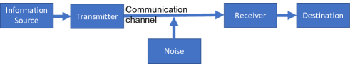
In [6], Shannon also defined a theoretical upper bound for a communication system. The system has six components as shown in Figure 1. The information source produces the original information to be transmitted to the destination. A transmitter encodes the information into a suitable representation that can be transmitted from the transmitter to the receiver through the communication channel. The receiver is a decoder which decodes the received information and send it to the destination. During transmission, the addition of channel noise will cause signal interference. Shannon defined the capacity of a noisy channel by [6]:
| (3) |
where measures the amount of information in the information source and the conditional entropy gives us the amount of uncertainty for the source information given the destination information . In other words, measures the the amount of information loss during the transmission. If has exactly the same amount of information as , then given there would be no uncertainty about . In this case, equals to zero. However, as we have inevitable noise added during transmission, in practice is not zero.
2.3 Information Theory in Deep Learning
Information theory has been employed in deep learning. In information theory, cross entropy measures how different two probability distributions are. In deep learning, the cross entropy loss, which aims to minimize the distance between the predicted labels and the true labels, is widely used in classification tasks. However, information theory can be more powerful.
Actually, there has been some attempt to open the black box of deep learning models via information theory. One of the pioneer work was done by Tishby and Zaslavsky [21]. In their work, they consider a basic layered neural network model as a Markov Chain with every layer only depends on the output of the previous layer. They show that the mutual information between the hidden and input layers can quantify the characteristics of the neural networks. They did not put much effort to further their studies for practical applications, however. Instead, their goal is to give a theoretic bound of the neural networks in an information perspective. The goal of our paper is to shed light on the black box model with the help of information theory and visualization.
As we discuss in Section 2.1, CNNs can be seen as extracting and purifying the input information through consecutive layers. In information theory, entropy can measure the amount of information of a system. Since in our case the system is a neural network model, it would be interesting to know how the entropy changes inside the layered neural network. Since the information is “compressed” into the output-relevant information, one may wonder whether the entropy keeps on decreasing as we get into deeper layers. On the other hand, through iterative training, the optimized model is more sure about what to output given an input. This means the randomness of the system is decreasing when making inferences. Can the entropy of the model reflect this change? Furthermore, how does the entropy of the feature maps from a specific layer change during training? If we can answer the above questions, we are able to improve the transparency of the CNN model through information theory. There are plenty of queries we can make.
3 A CNN Information Analysis Framework
3.1 Requirement Analysis
The purpose of our work is to analyze and visualize CNN models from an information theoretic point of view. After thoroughly discussing with a machine learning and information theory expert, we come up with the following visual analysis requirements:
-
•
R1: Provide an overview as well as the basic building blocks of a CNN model. CNN models have hierarchical structures. To go along with this property, our visual design also requires such a hierarchy. From the overview of the model to the details of the architecture, this top down visualization can assist users to understand the model in a more intuitive way.
-
•
R2: Develop a unified data model for CNNs. As we discuss before, there are various of information queries one can make to improve the transparency of the CNN model. Visualizing all possible queries in a theoretical way would help users to gain a deeper understanding of the model. However, there is a large amount of data generated during the training process and depends on the application, CNN architectures can vary. Thus, a unified CNN model representation is needed.
-
•
R3: Visualize information statistics of the model. To give a clue about how the CNN model makes decisions from an information theoretic perspective, we need to analyze the statistics associated with each building block of the model. However, since there is a huge amount of statistics information to show, we need better data organization and effective visual designs to avoid visual clutter. With detailed statistics about the flow of information, we are able to find interesting directions for further analysis and potential explanation for the model.
-
•
R4: Support multifaceted analysis of the model’s learned features. Besides the statistical information, to get insight into the functionality of the intermediate layers, comprehensive visualization to display detailed multifaceted information in the model is required. For example, the visualization of the various features that the model learned.
3.2 dCNN: A Data Model for CNNs
As we stated before, it is important to formulate the queries systematically to evaluate and interpret the information flow inside a CNN model. In this section, we formalize a data model to represent the information available in CNN models in a comprehensive way, regardless of the specific type of CNN architecture. This data model helps us organize the information queries and make the CNN explanation process more systematic.
The data available in the entire CNN model can be thought of as a four dimensional array, denoted as , where each dimension of the array serves as a key and a specific value of the key is used to slice the array and obtain the information stored within.
The first dimension of the array is the input data (training or testing) dimension, denoted as . Within this dimension, each specific instance, or a value in the dimension represents an input, for example, an input training image. In the case of classification neural networks, the dimension can be further divided into subgroups where each subgroup represents data in a specific class.
The second dimension in the multidimensional array is the layer dimension, denoted as . As we know, a convolutional neural network contains multiple layers, from the input to hidden to the output layers, and each of the layers plays a specific role. For example, the earlier layers are responsible for extracting low level features such as edges and colors. As we go deeper into the model, low level features are combined into high level features such as contours or textures and then objects can be extracted. As each layer acts like a ‘function’ whose output only dependents on the input from the previous layer, the input information get distilled layer by layer. To understand how the information flows through the model, it requires us to query the information shared between layers.
Given a particular layer in the CNN, there exist multiple convolution kernels, also known as filters and the output of which is often called a channel. If we fix at a layer, there can be multiple channels to be chosen for analysis, which prompts the necessity of having the next dimension in the array that represents the channels, denoted as . For any CNN model, it is crucial to have multiple filters to be trained, and as a result multiple feature maps will be produced for a given input. Intuitively, each channel is activated by some specific features in the input. It is also known that more filters does not necessarily guarantee more information from the input to be captured since some filters may be ‘dead’ where no information is extracted. Since the capability of a filter can be checked by the corresponding feature maps, it is reasonable that we focus on feature maps when evaluating the filters.
Finally, a CNN model is trained through many iterations of backpropagation and gradient descent. When the input training data are divided into many small batches, called mini-batches, a backpropagation is conducted for each mini-batch and an iteration that goes through all mini-batches is called an epoch. To track the progress of training for a CNN model over time, we index the data in the last dimension of the four dimensional array by its epoch number, denoted as .
As a result, we propose to use a 4-dimensional hypercube to represent the data related to a CNN model for model evaluation. The four dimensions are: data (), layer (), channel () and training epoch (). We denote this data structure as . We note Inside the four dimensional array, each specific entry is often an array, for example, an input image, a feature map in the hidden layer, or an array of probability values, one for each possible output label. Different slicing or aggregation operations on this hypercube lead to different information queries and facilitate the evaluation and interpretation of the CNN model.
3.3 Slicing dCNN as Information Query
The data model described in Section 3.2 defines a 4-dimensional hypercube to represent all data that can be extracted from a CNN model. To analyze the data in a CNN mode, we can first slice the hypercube based on the analysis need, followed by calculating various entropy measures from the slicing result. Below we first explain the meaning of data slicing. The calculation of entropies is explained in Section 3.4.
-
•
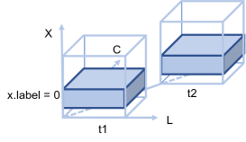
Slicing by Input : This is denoted as , which means we slice the hypercube on the dimension where is a particular instance or a set of instances, and the notation indicates all values in the respective dimension. As an example, , where , returns all intermediate data generated in the hidden layers, channels, and output, for input with a class label 0, in all epochs, as shown in Figure 2. Then measures the entropy of this output set. Of course it may not be so helpful to calculate across so many layers and channels in a CNN and hence we need to further constrain the query.
-
•
Slice by Input, Layer, and/or Epoch: This can be denoted as and/or . When slicing on both and dimensions, we have , where specifies which layer we are interested in for a given input , and is the number of layers in the CNN model. is the collection of all feature maps at layer for all epochs given an input . To track the training process across different epochs, we need to further index the data on the dimension. For example, the entropy measures the entropy of output from layer during training epoch given the input . Also, as an example is the initial condition where the input is the entire set which not gone through any layer of the model, i.e., stays in the input layer 0. So the layer index and the training epoch are all zeros. In this case, measures the entropy, i.e., the diversity of the input set . Besides entropy, it is also possible to calculate the conditional entropy , where and . It describes given the output of layer , how much we know about the output of layer at training epoch . The channel capacity , as defined in Equation 3, shows how much information gets lost between layer and layer at training epoch . This can fulfill our goal of querying the information change between layers.
-
•
Slice by Input, Layer, Channel, and/or Epoch: this is denoted as and/or . Previously, we have and measure the amount of information that a layer contains. However not every channel in this layer is useful. So we can slice the four dimensional array along the dimension to investigate a particular channel. returns the output (feature map) of channel in layer at training epoch given input . specifies which channel we are focused on, and is the number of channels in layer . The entropy measures the information content of the output in channel .
3.4 Entropy Calculation for dCNN
In this work, we adopt entropy as a measure of information content for CNNs. The calculation of entroy, however, needs to be specially tailored to the need of analysis. Specifically, for the four dimensional data model mentioned above, the calculation of entropy depends on how the array is sliced. We propose two types of entropy calculation for our data model. The first entropy that can be calculated is called inter-sample entropy, which is to calculate how diverse the data are in their respective high dimensional space, for example, the entropy of the training image set for classification where each image is a sample from a high dimensional space. This type of entropy is often an indicator whether the data from the input or in the immediate layers of CNNs is sufficiently diverse, and how the information represented in a set of samples are distilled across the different layers of a CNN. To calculate this type of entropy, we need to consider the distribution of the data samples in their embedding high-dimensional space. The second type of entropy is intra-sample entropy. The intra-sample entropy considers the entropy within each data sample. For example, the entropy of an input image or the entropy of a particular feature map. To calculate the intra-sample entropy, we use histogram-based entropy estimation. In this case, a data sample (e.g. an image) is not considered as a high dimensional point but a one-dimensional histogram by the vector component values (e.g. pixel values) where the entropy can be efficiently calculated. Below we describe the calculation methods in detail.
3.4.1 Inter-Sample Entropy Calculation
The purpose of inter-sample entropy calculation is to measure the diversity of the data samples in their embedding space, which is often high-dimensional. The distribution of data samples in the high-dimensional space is the basis for classification, where the task is to identify the decision boundaries between data of different classes. As the set of samples are going through the different layers of a neural network, redundant or irrelevant information for the inference task is discarded which will in turn change the distribution of the layer output. Monitoring how the entropy is changed often provides an important hint on how the neural network is doing. As an example, considering our data model and assuming is the set of all training images in the MNIST dataset where each data sample in is an image of size 28*28 in a 784-dimensional space. If we want to measure the diversity of the training set , we can first slice the CNN data array by , and then calculate the inter-sample entropy, denoted as , to measure whether the input samples have sufficient diversity. Below we explain how the inter-sample entropy is computed.
As defined in Equation 2, when calculating the entropy, we need the probability for each of the states in the system. To obtain the probabilities for calculating the inter-sample entropy, we adopt an idea inspired by an dimensionality reduction technique, Uniform Manifold Approximation and Projection (UMAP) [22]. In UMAP, to create a distribution for high dimensional points, the distance between a pair of samples and is converted into a probability by an exponential distribution function. With the probabilities between all sample pairs, we can then calculate the inter-sample entropy as the expected value of the information content for all sample pairs.
The exponential distribution is widely used to model relationships between random variables. For any data point , the similarity between and another point is given by the conditional probability :
| (4) |
where is the scale parameter of the distribution for each . An adaptive exponential kernel for each point are more powerful to model the real data distribution in high-dimensional space, as a result, each is set to satisfy Equation 5:
| (5) |
where is the number of data points.
To make the above calculation computationally efficient, for each sample, we only consider its k-nearest neighbours in the high-dimensional space when performing the probability calculation. After the calculation, the probabilities are symmetrized and normalized before computing the entropy. To make them symmetric, we average and :
| (6) |
where is the number of data points. Then we normalize the joint probability table. Now we have probability for each of the states, we plug Equation 6 into Equation 2 for inter-sample entropy calculation:
| (7) |
3.4.2 Intra-Sample Entropy Calculation
The intra-sample entropy measures the randomness of the values in each data sample, regardless of the data sample’s embedding dimensionality. For example, when estimating the entropy for an image or a feature map, we only takes the value distributions of the pixels into consideration. In this case, the most commonly used probability estimation approach is based on the histogram. This approach is often adopted to measure the quality of images for image processing applications.
The calculation details are as follows. First, we normalize the value range to , divide the range into for example) adjacent equal-size intervals (bins), and then put the values of a data sample (e.g. an image’s or a feature map’s pixel values) into these bins. The resulting frequency distribution is a histogram. Then we use the normalized frequency distribution as the probability distribution to calculate the intra-sample entropy. Although straightforward, this approach is computationally efficient and still can measure the sharpness or blurriness of value distributions.
One example of using intra-sample entropy is when we want to calculate the randomness within a group of feature maps, which is denoted as where is a set of input images from the same class. This is useful for the evaluation and understanding of CNN’s filters. Because a ‘dead’ filter will not be activated by different inputs, the value distribution on one channel can give some idea about the corresponding filter. It is feasible that we use intra-sample entropy for each feature map and use the averaged result as the final .
4 Information Query via CNNSlicer
In the previous section, we formulate a 4-dimensional hypercube to represent a CNN model. By slicing on the hypercube we can extract information related to the CNN for entropy-based analysis. To meet our requirements stated in Section 3.1, we develop a visual analysis system, called CNNSlicer, with four visual components. In this Section, we describe the visual components of CNNSlicer and show how various entropy measures can assist the analysis of CNN models.
4.1 Query Selection and Visualization
There are various of information queries users can make according to different slicing operations. To assist users to make proper information queries, we design a query view which allows users to form information query in two ways.
The first is through an overview of the CNN architecture as shown in LABEL:fig:queryView(A). With all layers visually available in the CNN architecture, the slicing on the layer dimension becomes more straightforward. Users can make selections of layers in this view for further analysis to support the top-down analysis (R1) of the CNN model. Another way is though a visualization of the data model s shown in LABEL:fig:queryView(B) and LABEL:fig:queryView(C). To have a conceptual understanding of information queries, it can be very helpful to visualize the slicing operations on the data hypercube directly (R2). In LABEL:fig:queryView(B), Users can drag to select layers they are interested in. By dragging on both layer and channel dimensions in LABEL:fig:queryView(C), users can select a specific channel to analyze. After the selection, users need to click the “Query” button to update other visual components.
4.2 Evaluate Input and Output
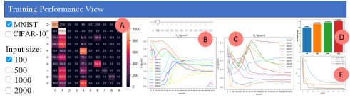
As discussed before, is a special case of slicing on the hypercube, which returns the input to the model. Given the input , output of the CNN model at training epoch can be denoted as , where is the number of layers in the model. If we slice on the input and output layers, answers to the information queries about them (R3) can help users evaluate the training performance of the model. As a result, we design a training performance view, as shown in Figure 4, to show the related statistics. In this section, we present the entropy calculation and related visualizations in detail.
-
•
Information queries about the input. Increasing the training data size will usually improve the model’s robustness and accuracy. However, if the training data is not well distributed, it can lead the model to optimize in a nonoptimal direction and affect the speed of convergence. Therefore, it would be worth to evaluate the diversity of the input. To do this, we use inter-sample entropy to measure the diversity of data samples in high-dimensional space.
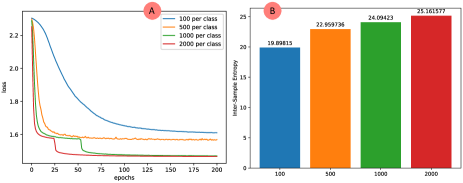
Figure 5: (A) Training loss for datasets with 100, 500, 1000, and 2000 samples per class; (B) inter-sample entropy for datasets with 100, 500, 1000, and 2000 samples per class. Take MNIST dataset as an example. This dataset has ten classes. First, we random sample 100, 500, 1000, and 2000 samples respectively from each class resulting in four datasets () with different sizes. To analysis the diversity of the samples, we calculate the inter-sample entropy with . As shown in Figure 5(B), the horizontal axis shows the number of samples per class and the vertical axis is the inter-sample entropy for the dataset. We retrain the model based on these datasets separately. The training performance (loss) is shown in Figure 5(A) where the horizontal axis represents training epoch and the vertical axis is the loss value. Figure 5(A) and Figure 5 (B) share the same color scheme which makes it easier for users to compare different datasets and connect the training performance with the diversity of training data. For example, blue represents the dataset with 100 samples per class. We find the blue line in Figure 5(A), compared to the other lines, takes more that 150 epochs before the loss becomes flat and stable. The blue bar in Figure 5(B) shows this dataset has relative low inter-sample entropy (i.e., 19.89815) compared to other datasets (i.e., 22.959736, 24.094230 and 25.161577), meaning the data is less diverse. On the other hand, the dataset with 2000 samples per class has the highest diversity, and the training loss is more steep and converges much faster (at about epoch 50).
Thus, we have the conclusion that dataset with high inter-sample entropy, i.e., diversity, do converge faster.
-
•
Information queries about the training performance. Think of the classification process of a CNN model as a communication channel with the input layer transmitting the input to the output layer through the model. We can make information queries about input and output .
As discussed in Section 2.2, measures given the predicted labels being class , how much uncertainty we have about the ground truth labels . On the other hand, measures the randomness of the model’s predictions in the output for the data samples in class at epoch . The calculation of and can be done via the classic Shannon’s entropy definition. That is, for a given class , to calculate we need where . These probabilities can be otained from the model output. Then we can directly use the Shannon’s entropy equation to evaluate.
To clearly visualize the training performance of the CNN classification model, we have a confusion matrix panel and two plots for and as shown in Figure 4(A), Figure 4(B) and Figure 4(C). The confusion matrix shows how confused the model is between two classes. Each row of the confusion matrix represents all instances of predicting an actual class to all other classes, including the correct class. Each column represents all instances of different actual classes predicted as this class. The cell color indicates how many instances are predicted as the column class but actually belongs to the row class. The higher value the darker is the color. In a line chart, the horizontal axis is the training epoch and the vertical axis is the entropy value. Thus, these line charts can assist users to monitor the entropy change over training epochs.
We use the MNIST dataset as an example to demonstrate the usefulness of our visual design. Users can select different input sizes to evaluate. After the selection, the corresponding confusion matrix and line charts get updated. Figure 6 shows a comparison of between datasets with input size 1000 (Figure 6(A)) and 10000 (Figure 6(B)) respectively. We find gets stabilized faster (at about epoch 25) with input size 10000. But still dramatically goes ups and downs until epoch 70 with input size 1000. We conclude that training with larger input data gets stabilized faster, and “stabilized” here means the uncertainty about input class given output gets stable.
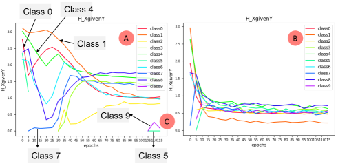
Figure 6: (A) with input size 1000, ; (B) with input size 10000, . 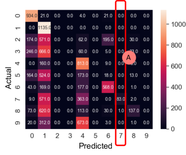
Figure 7: Confusion matrix for training epocch 10. In Figure 6(A), we notice that at the beginning, , and are high which indicates some instances belong to other classes get wrongly classified into class 0, 1 and 4. In Figure 7, the brighter columns (column 0, 1 and 4) in confusion matrix verifies this. In Figure 6(A), is low at the beginning epochs. This means the model does not have too much randomness during prediction for this class. The low entropy here is a reflection of high precision score. As shown in Figure 7(A), among all instances classified into class 7, most of them are actually belong to class 7. The segments in Figure 6(C) shows and are infinity in previous epochs. In Figure 7, we can see column 5 and column 9 are all zeros meaning no instances get classified into these two classes. The model has a hard time learning to predict class 9 and class 5. This is the information we can not get from an overall accuracy score.
From several case studies, we shows that it is effective to use entropy as the evaluation metric when visualizing the training performance. The visualization clearly tells us when the training gets stabilized. Besides, unlike the accuracy measure which only describes how much instances get correctly classified, entropy also encodes information about wrong predictions such as how uncertain (random) the predictions are. Entropy (, ) can help users locate when the model has high precision. However, low entropy does not indicate good performance since all samples can be wrongly classified into one class and still has the low entropy, although the chance for this to happen is not high. .
4.3 Evaluate the Information Between Layers
In the previous sections, we have discussed information queries about input () and output () which are two special cases of . In this section, we evaluate more general case which is the information flow between the intermediate layers. To visualize the amount of information transmitted between layers, we design a layer view to show the information statistics (i.e., inter-sample entropy) (R1, R3). With the help of the CNN architecture view, users can easily slice on the layer dimension of the hypercube. Also, the layer view contains visualization of feature maps (R4) to help users get insight of the layer. Details of information statistics and visual analysis are as follows.
Suppose we are interested in how the information flows from layer to layer during training. Then all layers before can be taken as a transmitter and all layers after can be taken as a receiver. The stacked layers between layer and represent the noisy communication channel. We use the channel capacity in Equation 3 to measure the amount of information between layer and layer at epoch t: where and .
4.3.1 Information between two channels
Normally, each layer’s output has multiple channels generated by different filters. To reduce the analysis complexity and make the explanation process more clear, we consider each channel as one representation of this layer’s output. That is, given a group of input instances, the channel capacity between layer and layer is calculated based on the feature maps from all channel pairs, one channel from layer and another from layer . However, feature maps from layer and layer are in two spaces with different dimensionality. To compute their joint distributions, we adopt a similar idea that uses distances in high-dimensional space between two samples (i.e. two feature maps produced by the same channel from two different input images) as the similarity measurement. Instead of converting distances into probabilities using exponential or Gaussian distributions, we map the distances into a 2-dimensional histogram, where one axis represents the bins that discretize the pairwise feature map distances in a channel of layer , and the other axis represents the bins of the distances in a channel of layer . Any entry in the 2D histogram records the frequency of the joint distance pairs from the two channels, one from layer and another from layer , computed from the feature maps. After the 2D histogram is established, we can compute the joint entropy of two channels, the entropy of each channel and the conditional entropy between the channel pairs by marginalization, and finally, the channel capacity between the channel in layer and the channel in layer . The 2D histograms are useful in this case since it combines these two high-dimensional spaces and study the distance correlation between two filters and can be used to calculate the channel capacity. One alternative approach is to use a 2D-Gaussian distribution that take the distance pairs from two layers as input to do the probability mapping. Due to the computational complexity, we use the approach based on 2D histograms.
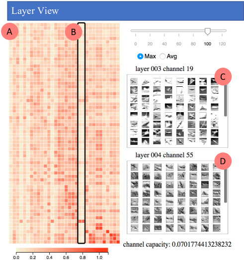
4.3.2 Information matrix between two layers
After we know how to calculate the channel capacity between any two channels, one from each layer, to get a clear insight into the information changes between two layers, we use a sorted heatmap to visualize the matrix of channel capacity between the channels from two layers. An example is shown in Figure 8(A). The horizontal axis of this heatmap are channels of layer and the vertical axis are channels of layer . Color at position in the heatmap encodes the channel capacity between layer and layer using the feature maps from the -th filter of layer and the -th filter of layer . A brighter color indicates a smaller channel capacity between these two channels which means the channel undergoes higher information loss, or less correlation between the two channel outputs. One column of this heatmap represents the channel capacity calculated based on feature maps from one filter in layer and feature maps from all filter in layer . If there are 64 filters in layer , then there will be 64 channel capacity values in this column. Users can sort the heatmap by rows or columns based on the average or maximum value within the row or column vectors. More specifically, by sorting the matrix columns by the maximum values we meana: (1) compute the maximum value of each column; (2) sort these maximum values and keep the sorted indexes; (3) rearrange the columns based on these indexes. We can perform similar operations for rows if so desired. After sorting, patterns of channel capacity between layers become clear. When users click on one rectangle of the heatmap, feature maps from the corresponding“column filter” and “row filter” will show up. Figure 8(C) and Figure 8(D) are the results when we click on the lower left rectangle.
4.3.3 Exploration of Information Matrix
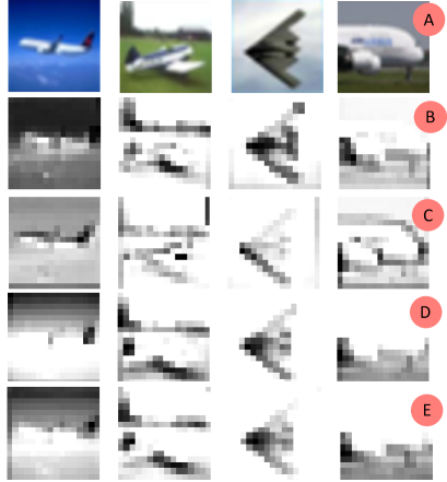
We adopt the CNN classification model in LABEL:fig:queryView(A) trained on the CIFAR-10 dataset for case studies. First we choose layer 3 (horizontal axis) and layer 4 (vertical axis) in the query view shown in LABEL:fig:queryView(A). We select epoch 100 and sort the heatmap by maximum value for each dimension. In Figure 8(A) we find two filters (filter 8 and filter 30 in layer 3) highlighted in the back rectangle in (B) have similar patterns. Our hypothesis is that these two filters are similar. To verify our hypothesis, we visualize the feature maps from these two filters and other two random selected filters in layer 3 as shown in Figure 9. Figure 9(A) are the original input images. In Figure 9, from the second row to the bottom row, they are feature maps from filter 0, filter 24, filter 8 and filter 30 respectively. We can see filter 8 and filter 30 perform similarly (Figure 9(D) and Figure 9(E)) which verifies our hypothesis.
We are also interested in the information flow between layer 2 and layer 3. The control of information flow here is mainly done by max-pooling. When we drag the epoch scrollbar, we can see the change of channel capacity over the training time in Figure 10. From left to right, they are heatmaps of channel capacity at epoch 0, 40, and 120 respectively. Because we are investigating the information change before and after an max-pooling, it makes sense that the diagonal of these heatmaps have highest channel capacity. In the earlier training epochs, there are lots of rows and columns having similar patterns, meaning some filters are redundant. Through iterative training, there are less dark square patterns and similar rows and columns are decreasing which means filters in the convolutional layer before this activation are learning to extract useful features.
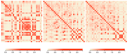
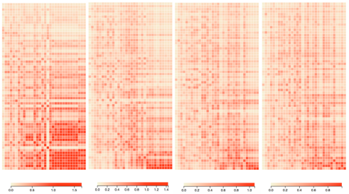
We also compare the channel capacity between layer 1 and layer 5 which are the activations of two convolutional layers. Figure 11 shows heatmaps of channel capacity between these two layers at epoch 0, 20, 80, and 120 respectively. There is an obvious trend that the heatmap is getting brighter (smaller capacity values) and the maximum value of each heatmap is getting lower which means the model is trained to distill the input information and make feature maps tight in high-dimensional space.
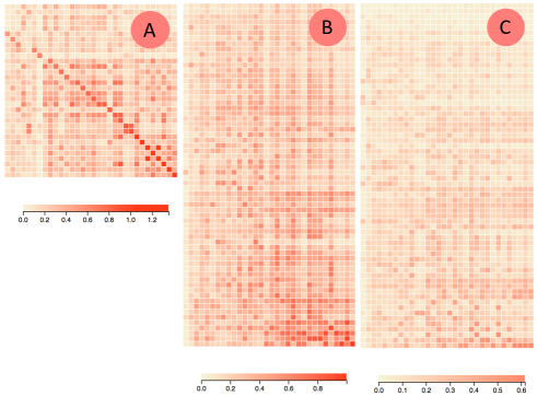
To investigate the connection between the formation flow and the depth of layers, we compare the channel capacity between layer 1 and some latter layers (i.e., layer 3, layer 5, layer 7) at epoch 120. Intuitively, with each layer of the neural network learning to reduce the irrelevant information from input, the channel capacity between the input and deeper layers decreases. This explains the phenomena that at epoch 120, the heatmaps of channel capacity between these layers are getting brighter as we approach to deeper layers, as shown in Figure 12, where (A), (B) and (C) are heatmaps of channel capacity between layer 1 and layer 3, layer 1 and layer 5, layer 1 and layer 7 respectively.
4.4 Evaluate the Information Inside Channels
If we further slice on the channel dimension, we get which is the collection of all feature maps generated by the same filter . Since filters are the most fundamental building blocks of a CNN model, it is important to investigate the information inside each channel in a fixed layer as in . When users select one layer in the CNN architecture view and update the channel view, they can visualize the information statistics for each channel of this layer (R1, R3). To reveal what information get filtered out during the information distillation process, we adopt a Deconvolutional Network (deconvnet) [23] to project a filter’s output back to the input image space (R4).
4.4.1 Information in one channel
The calculation of is as follows: given a set of input , first we compute the intra-sample entropy for each feature map represented as . One feature map corresponds to one input sample, such as as an image. The intra-sample entropy of channel for all input is the average of all the input’s intra-sample entropy. To evaluate a channel’s performance for different classes, we compute the channel’s intra-sample entropies for all different input classes in a training epoch , meaning we calculate where for each .
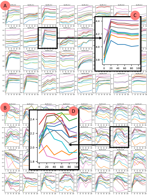
In the channel view we utilize a small multiple chart as shown in Figure 13(A) to visualize all channels’ intra-sample entropies’ changes across all epochs , where the line graph in each box represents a channel, the x axis represents epochs, y axis presents the entropy, and different color lines represent different classes. From this small multiple charts, users can quickly locate channels and epochs they are interested in.
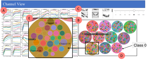
We also employ circle-packing diagrams with two levels of hierarchy, as shown in Figure 13(B)to compare intra-sample entropies between different input classes. The input data are divided into subgroups according to their true labels and every subgroup is represented as a circle in the diagram. The color of this first-level circle represents the class. The size of the first-level circle represents the total randomness, i.e., the entropy, of all feature maps belong to this class in this layer. Inside each first-level circle, there are smaller second-level circles representing channels. The size of the second-level circle is proportional to the intra-sample entropy of the channel. Assuming a CNN model has 32 channels in this layer, then there will be 32 second-level circles inside each first-level circle. The color of the second-level circles represents the channel index. Slicing our hypercube dCNN on the epoch dimension can be sliced by a slider. If users are interested in one class in a particular epoch, they can slice the epoch dimension, click on the first-level circle representing this class, the circle-packing diagram can be zoomed in and show the inner second-level circles. By hovering over the second-level circles, users can check the intra-sample entropies for the corresponding channels.
We utilize a deconvnet which can be thought of as a reversed process of Convolutional Network (convnet) to visualize what information the feature map contains about the input. Deconvnet was used to visualize a trained CNN [18]. In [18], given one input image, feature maps of all channels in a layer are combined and pushed back to the input image space by successively unpool, rectify and filter to get one deconvolutional result. In our work, given one input image, we only use one feature map from the channel we are interested in to get a result in the input image space. Our deconvolutional result can show how much information from the input remains in the selected feature map, i.e., the information distillation result. When users click on one second-level circle, Figure 13(C) will be updated with the deconvolutional results of the feature maps from this single filter.
4.4.2 Exploration of information inside channels
We use the CNN classification model in LABEL:fig:queryView(A) trained on CIFAR-10 dataset for further information investigation. Figure 14(A) is the small multiples chart for layer 1 and Figure 14(B) is for layer 11. By comparing these two plots, we conclude that filters in lower layers are more consistent among all input classes. However, filters of higher layers perform more differently and the behavior depends on the class of the input. This may be because normally filters in lower convolutional layers are trained to extract diverse and detailed features which are common for all classes. But in higher layers, filters need to combine low-level features into class related high-level representations. Besides, since low level feature maps have more high frequency details (contains more irrelevant information), channels in lower layers have relative higher entropies comparing to higher layers as shown in Figure 14(C) and Figure 14(D).
We are interested in channel’s performance differences when classifying different classes. Figure 13(B) is the circle-packing diagram of layer 3 at epoch 80. Among these 11 big circles, 10 of them representing 10 different classes and the remaining circle representing all feature maps regardless of the class. By comparing the size of each circle, we can get an idea of the the intra-sample entropies when we have different input classes. As shown in Figure 13(D), class 0, which is the class “airplane”, has the smallest intra-sample entropies. We also zoom in the circle of class 6 as shown in Figure 13(E), by comparing the size of circles and hovering over the circles to see the intra-sample entropy values, we locate some channels with higher entropies such as channel 23, 18 and 26.
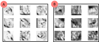
We notice in Figure 13(E), there is a small second-level circle in the top area near channel 23. By hovering over this circle, we find it is the channel 31 with entropy 1.795243. We find in each class, the size of the circle in this color are all relatively small. To gain insight into the function of the corresponding filter, we adopt deconvnet to visualize this filter’s learned features. In class 6, we click on the small circle of channel 31. Figure 15(A) is the deconvolutional result. We also visualize other filters such as filter 23 who has higher inter-sample entropy in Figure 15(B). From Figure 15 we can see the result of filter 31 contains less details compared to filter 23. This means filter 31 distills the input information too much. From our case studies, we demonstrate the hierarchy of circle-packing diagram gives users insight into the performance of filters for different classes.
5 Conclusion and Future Work
In this work, we combine visualization with an information-theoretic approach to help evaluate and understand the information distillation process of CNNs. To begin with, we formalize a data model to store the information available in a CNN model. A four-dimensional hypercube derived from the data model, denoted as dCNN(X, L, C, T), consists of four dimensions (i.e., input(X), layer(L), channel(C) and epoch (T)). By slicing on the hypercube, we are able to systematically formulate various of information queries related to CNNs. Based on the analysis need, we propose two types of entropies: inter-sample entropy and intra-sample entropy and show how they can be computed in their respective space. We also develop a visual analysis system, CNNSlicer, from which users can explore the flow of information acorss the various components of a CNN. We use the MNIST and CIFAR-10 datasets to demonstrate how to use our framework to evaluate and analyze the CNN classification model through CNNSlicer, such as comparing the convergence speed of training, and the information changes between layers inside the model.
In the future, we plan to extend our framework to analyzing other types of deep neural networks such as Recurrent Neural Networks (RNN), Generative Adversarial Networks (GAN), and Attention-based transformers. We will also look into the roles of various neural network components using information theory, such as the activation functions, batch normalization, skip connection, and back-propagation. We will study and compare the landscapes of loss functions for different models using information theory. We believe our information theoretical framework will provide a unique perspective to opening the blackbox of deep learning neural networks.
References
- [1] Asifullah Khan, Anabia Sohail, Umme Zahoora, and Aqsa Saeed Qureshi. A survey of the recent architectures of deep convolutional neural networks. CoRR, abs/1901.06032, 2019.
- [2] M. Liu, J. Shi, Z. Li, C. Li, J. Zhu, and S. Liu. Towards better analysis of deep convolutional neural networks. IEEE Transactions on Visualization and Computer Graphics, 23(1):91–100, Jan 2017.
- [3] H. Strobelt, S. Gehrmann, H. Pfister, and A. M. Rush. Lstmvis: A tool for visual analysis of hidden state dynamics in recurrent neural networks. IEEE Transactions on Visualization and Computer Graphics, 24(1):667–676, 2018.
- [4] J. Wang, L. Gou, H. Yang, and H. Shen. Ganviz: A visual analytics approach to understand the adversarial game. IEEE Transactions on Visualization and Computer Graphics, 24(6):1905–1917, 2018.
- [5] Ravid Shwartz-Ziv and Naftali Tishby. Opening the black box of deep neural networks via information. CoRR, abs/1703.00810, 2017.
- [6] Claude Elwood Shannon. A mathematical theory of communication. Bell System Technical Journal, 27(3):379–423, 1948.
- [7] S. Huang, X. Xu, and L. Zheng. An information-theoretic approach to unsupervised feature selection for high-dimensional data. IEEE Journal on Selected Areas in Information Theory, pages 1–1, 2020.
- [8] Nelson Flores-Gallegos. Provisional chapter shannon informational entropies and chemical reactivity. 2013.
- [9] A. Gohari, M. Mirmohseni, and M. Nasiri-Kenari. Information theory of molecular communication: directions and challenges. IEEE Transactions on Molecular, Biological and Multi-Scale Communications, 2(2):120–142, 2016.
- [10] Susana Vinga. Information theory applications for biological sequence analysis. Briefings in Bioinformatics, 15(3):376–389, 09 2013.
- [11] Mengchen Liu, Jiaxin Shi, Zhen Li, Chongxuan Li, Jun Zhu, and Shixia Liu. Towards better analysis of deep convolutional neural networks. CoRR, abs/1604.07043, 2016.
- [12] Jiawei Zhang, Yang Wang, Piero Molino, Lezhi Li, and David S. Ebert. Manifold: A model-agnostic framework for interpretation and diagnosis of machine learning models. IEEE Transactions on Visualization and Computer Graphics, 25(1):364–373, Jan 2019.
- [13] J. Wang, L. Gou, H. Shen, and H. Yang. Dqnviz: A visual analytics approach to understand deep q-networks. IEEE Transactions on Visualization and Computer Graphics, 25(1):288–298, 2019.
- [14] Alejandro Barredo Arrieta, Natalia Díaz-Rodríguez, Javier Del Ser, Adrien Bennetot, Siham Tabik, Alberto Barbado, Salvador García, Sergio Gil-López, Daniel Molina, Richard Benjamins, Raja Chatila, and Francisco Herrera. Explainable artificial intelligence (xai): Concepts, taxonomies, opportunities and challenges toward responsible ai, 2019.
- [15] Ruth Fong and Andrea Vedaldi. Interpretable explanations of black boxes by meaningful perturbation. CoRR, abs/1704.03296, 2017.
- [16] Hao Li, Zheng Xu, Gavin Taylor, and Tom Goldstein. Visualizing the loss landscape of neural nets. CoRR, abs/1712.09913, 2017.
- [17] P. Cortez and M. J. Embrechts. Opening black box data mining models using sensitivity analysis. In 2011 IEEE Symposium on Computational Intelligence and Data Mining (CIDM), pages 341–348, 2011.
- [18] Matthew D. Zeiler and Rob Fergus. Visualizing and understanding convolutional networks. CoRR, abs/1311.2901, 2013.
- [19] Nitish Srivastava, Geoffrey Hinton, Alex Krizhevsky, Ilya Sutskever, and Ruslan Salakhutdinov. Dropout: A simple way to prevent neural networks from overfitting. Journal of Machine Learning Research, 15(56):1929–1958, 2014.
- [20] Sergey Ioffe and Christian Szegedy. Batch normalization: Accelerating deep network training by reducing internal covariate shift. CoRR, abs/1502.03167, 2015.
- [21] Naftali Tishby and Noga Zaslavsky. Deep learning and the information bottleneck principle. CoRR, abs/1503.02406, 2015.
- [22] John Healy Leland McInnes and James Melville. Umap: Uniform manifold approximation and projection for dimension reduction. ArXiv e-prints, 2 2018.
- [23] M. D. Zeiler, G. W. Taylor, and R. Fergus. Adaptive deconvolutional networks for mid and high level feature learning. In 2011 International Conference on Computer Vision, pages 2018–2025, 2011.