XX \jnumXX \paper8 \jmonthMarch
Department: Head \editorEditor: Name, xxxx@email
Cartolabe: A Web-Based Scalable Visualization of
Large Document Collections
Abstract
We describe Cartolabe, a web-based multi-scale system for visualizing and exploring large textual corpora based on topics, introducing a novel mechanism for the progressive visualization of filtering queries. Initially designed to represent and navigate through scientific publications in different disciplines, Cartolabe has evolved to become a generic framework and accommodate various corpora, ranging from Wikipedia (4.5M entries) to the French National Debate (4.3M entries). Cartolabe is made of two modules: the first relies on Natural Language Processing methods, converting a corpus and its entities (documents, authors, concepts) into high-dimensional vectors, computing their projection on the 2D plane, and extracting meaningful labels for regions of the plane. The second module is a web-based visualization, displaying tiles computed from the multidimensional projection of the corpus using the Umap projection method. This visualization module aims at enabling users with no expertise in visualization and data analysis to get an overview of their corpus, and to interact with it: exploring, querying, filtering, panning and zooming on regions of semantic interest. Three use cases are discussed to illustrate Cartolabe’s versatility and ability to bring large scale textual corpus visualization and exploration to a wide audience.
Introduction The visualization of large collections of documents, or corpora, faces both computational challenges and sense-making issues. These challenges and issues are at the crossroad of Visualization (VIS) and Machine Learning (ML). On the VIS side, the objective is to provide a suitable overview and enable the user to get a quick understanding of the data through an effective 2D representation, as well as to provide means to interact with this representation to explore it in a fluid and controlled manner. On the ML side, the objective is to achieve compressed representations of large corpora — typically using dimensionality reduction techniques — in a way that preserves meaningful arrangements of the material and is computationally efficient.
This article presents a software framework called Cartolabe (cartolabe.fr) comprehensively addressing the above algorithmic challenges related to visualization, machine learning, and sense-making. This system is intended for several application domains, e.g., exploring the state of art in a scientific field, getting an overview of the expertise of an organization or a country through documents, and making sense of a large set of documents produced by citizens over a national debate. Cartolabe addresses several types of needs for mainly three categories of users: i) Organizations interested in sharing large collections of documents, making them readily accessible and searchable online; ii) Experts interested in making sense of their corpus, and exploiting it for diverse information retrieval tasks; iii) Data scientists and NLP experts, interested in the fast assessment of their data summarization and querying pipelines.
From a data compression perspective, Cartolabe extensively relies on ML methods specifically dedicated to natural language processing (NLP) [1, 2] and on dimensionality reduction [3] methods. From an interactive visualization perspective, Cartolabe relies on the state of the art in web-based interactive visualizations, supporting both the general display of a data landscape and the dynamic exploration of the contextual information through querying, progressive filtering, panning and zooming.
The combination of both VIS and ML expertise enables users to visualize collections of millions of documents and to interactively explore the data through progressive computation and visualization [4]. Furthermore, these functionalities are offered on the web, freeing the end-users from deploying or maintaining any infrastructure, storage, or computational resources.
Cartolabe was initially designed to handle a corpus of scientific publications from the HAL repository (hal.archives-ouvertes.fr), containing about 700k documents and 2M authors. Its specificity is to rely on the textual information, as opposed to the other main systems relying on the authorship and citation graphs. This specificity was instrumental in extending Cartolabe to other types of data collections, ranging from Wikipedia (4.5M documents) to Le Grand Débat (4M documents), recording the citizens’ contributions to the national debate organized by the French government in May 2019.
Interactive systems offering map visualizations of large corpora, e.g., PaperScape (paperscape.org), most generally use graph layout techniques to compute the document positions, emphasizing the social ties between articles through co-authors or citations. In contrast, Cartolabe focuses on the document contents: topics or linguistic properties. A topic map provides an intrinsic view of the scientific domains that is complementary to social ties-based maps and, for quite a few tasks, might be less biased. It can be used, for example, to find representative authors around a topic (e.g., to select reviewers), to find representative topics around authors (e.g., to understand the main thematic topics covered by an author), or to find representative articles around a topic (e.g., for literature reviews). Its filtering functionalities also allow Cartolabe to support comparisons across organizations or years. We do not pretend Cartolabe addresses all the issues related to document exploration and distant reading. The IN-SPIRE system [5] has clearly made the point that it was important to provide multiple visualizations and interfaces on document collections to fully grasp their multiple facets; Cartolabe is one component in that landscape, with scalability to tens of millions of documents and higher flexibility in NLP methods for its preparation pipeline.
Cartolabe has become a generic system or a software framework, able to process and visualize a large variety of corpora. It is made of modular building blocks, which can be replaced or customized depending on the different types of entities to visualize and explore.
A particular usage of Cartolabe is to support the visual assessment of new NLP methods, providing a fast and versatile interactive environment to visually explore the extracted concepts and their organization. The system, taking in charge the visualization and interaction parts, allows NLP experts to focus on the data processing methods and to assess the impact of new methods or hyper-parameter settings.
The main three contributions of Cartolabe are: i) to support web-based real-time visualization and filtering of large document collections, up to tens of millions of documents; ii) to provide contextual information during the interactive navigation, allowing for scalable targeted search and filtering; and iii) to provide a platform to test new NLP methods for computing document similarities and search. These contributions rely on the combination of VIS and ML techniques, constructing an annotated landscape and generating tiled density maps to support navigation, search, filtering, and exploration at scale.
The remainder of the paper will describe and exemplify Cartolabe on the HAL use-case. After briefly discussing the state of the art, we give an overview of the Cartolabe architecture and functionalities. Then, we describe the Cartolabe-Data and the Cartolabe-Vis pipelines. Applications (Wikipedia and Le Grand Débat) are discussed further in section ”Use Cases” and a preliminary evaluation in the section ”Evaluation”.
Related works
Cartolabe’s inspiration can be traced back to the Galaxies visualization [5], still used in the IN-SPIRE system from Pacific Northwest National Laboratory. Galaxies builds a scatterplot view based on NLP and projection methods, displaying a few thousand documents according to their similarity. Although the concept remains similar, Cartolabe relies on modern NLP and projection methods that have progressed greatly in the last decades. As noted in the original article, multiple visualizations are needed to reveal different facets of a corpus, and Cartolabe replace, extends, and enhances the Galaxies module in multiple ways: it is more scalable, uses a modern projection method, and can be tailored to use any NLP method available from Python.
According to the survey and taxonomy of text visualization tools by Kucher and Kerren [6] Cartolabe supports the analytic tasks “Text Summarization / Topic Analysis / Entity Extraction”, the visualization tasks “Overview”, “Navigation / Exploration”, and “Cluster / Classification / Categorization”, in the domains of “Scientific Articles / Papers”, “Reviews / (Medical) Reports”, “Editorial Media”, and others not listed. The data it represents are corpora represented as “Networks”, implicitly through -nearest neighbors computation. Cartolabe is a “2D” visualization, representing items as “Clouds / Galaxies” with a “Metric-dependent” alignment. Compared to similar tools listed in the “Text Visualization Browser” (textvis.lnu.se), it can visualize large datasets and is not meant for one specific corpus but is meant to be tailored to different kinds of textual corpora. Cartolabe is both an application and a framework to create corpus visualizations using the Galaxy metaphor.
Several recent visualizations for document corpora use a network layout approach: the document similarities rely on co-authorship or co-citation relationships and a graph layout algorithm computes the document positions based on their connections. Paperscape (paperscape.org) offers a map representing about 1.6M articles from the arXiv repository, enabling its interactive exploration using a scrollable and zoomable tiled structure. The Maps of Computer Science (MoCS) [7] propose a representation of terms from research papers in the DBLP repository, extracting and visually displaying the topics similarity. Various heatmaps can be overlaid to visualize the profile of specific researchers or institutions; however the MoCS system is static and limited in interactive functionalities such as filtering and searching. Another project, VOSViewer [8] aims to visualize bibliometric networks, representing both articles, authors and labs, and using NLP techniques to construct term similarity maps based on a relationship network. Its scalability, as reported in the original article, seems to be limited to some thousands of items (as opposed to tens of millions for Cartolabe).
Another trend is that of multidimensional projections (MDP), mapping high-dimensional points (up to thousands or even millions of dimensions) into low-dimensional ones (typically 2D or 3D; only 2D is considered in this article). The last decade has seen many improvements in the quality, applicability, and scalability of MDP techniques, as detailed in recent MDP surveys [3, 9]. A recent MDP approach, Umap [10], delivers projections with similar quality as those of rigorous mathematical grounding, revealing meaningful global structures, offering the possibility of quickly projecting new points on a learned manifold and having good clustering properties. A main strength of Umap is its reasonable computational complexity.
Contrasting with Paperscape and VOSViewer, Cartolabe relies on the document contents to build their similarity, as opposed to co-authoring and co-citation graphs. This choice was instrumental to extend Cartolabe to various document collections besides scientific articles. Contrasting with Galaxies and MoCS, Cartolabe facilitates the user’s exploration of data through an interactive map, with panning, zooming, and searching functionalities. Finally, Cartolabe uses the Umap projection, projecting millions of points based on their similarity into a 2D map in a few hours on a standard desktop.
Cartolabe shares many of the goals of the UTOPIAN system [11], that is also meant to explore text corpora such as publications, using MDP techniques for visualization and NLP technique for topic analysis. Contrary to Cartolabe, UTOPIAN can refine and change the NLP parameters interactively to tune the analysis and visualization as part of its exploration process. Providing interactive control over the NLP analysis is a very useful tool for application designers but not for Cartolabe target users. Cartolabe performs the NLP analyses offline and does not expose its pipeline to the final users. Whereas UTOPIAN relies on Nonnegative Matrix Factorization for topic modeling, Cartolabe allows choosing among a large variety of modelings, including LSA, LDA, doc2vec, and any other implemented in Python, depending on the characteristics of the corpus. Additionally, UTOPIAN is not designed to scale to millions of documents and is not web-based.
Cartolabe also shares many of the goals of the “BioVis Explorer” [12] that presents all publications in biological visualization using a MDP technique and allows filtering based on different features of its corpus. Compared to Cartolabe, each article is presented as a thumbnail image in a 2D map, allowing an easy selection. However, while the BioVis Explorer visualizes about 150 articles, Cartolabe is meant to scale to tens of millions and therefore should uses a heatmap instead of showing the individual points as thumbnail images. In addition, Cartolabe shows both articles and authors over the same map by considering them both as bag of topics. It actually also considers higher-level entities such as teams, labs, and organizations as bag of topics too; Cartolabe displays them on the same map accordingly.
Cartolabe also shares the goal of Nanocubes [13] to provide interactive visualization, searching, filtering, and aggregation capabilities over the web. Contrary to Nanocubes, Cartolabe uses progressive mechanisms [4] to support these searching and filtering functionalities, simplifying its architecture while sustaining interactive latencies with large data over the web.
Cartolabe
Cartolabe (Figure 1) is a web-based visualization and exploration system originally targeted at an audience of scientists of any discipline, to visualize their publications arranged on the 2D plane according to topic contents. The only requirement on the target users is a general understanding of the considered corpus; no expertise in visualization or data analysis is assumed.
Architecture overview
Cartolabe comprises two modules that can be used independently: a data processing module and a visualization module respectively referred to as Cartolabe-Data and Cartolabe-Vis. Both modules are publicly available (gitlab.inria.fr/caillou/cartolabe-data and gitlab.inria.fr/caillou/cartolabe-visu) and can be customized for various document collections.
Cartolabe-Data uses unsupervised text analysis to build a 2D representation of the document collection. This collection, typically retrieved by harvesting a site through a web API and transformed into a csv file for ingestion in Cartolabe-Data, is first processed to yield a compressed representation including all information required for the visualization (entity labels, 2D coordinates, and nearest neighbors). Cartolabe-Vis imports this file and acts as a visualization server to display the map from web browsers, supporting its flexible exploration by the user.
We first describe the functionalities of the system before detailing its architecture and modules.
Functionalities
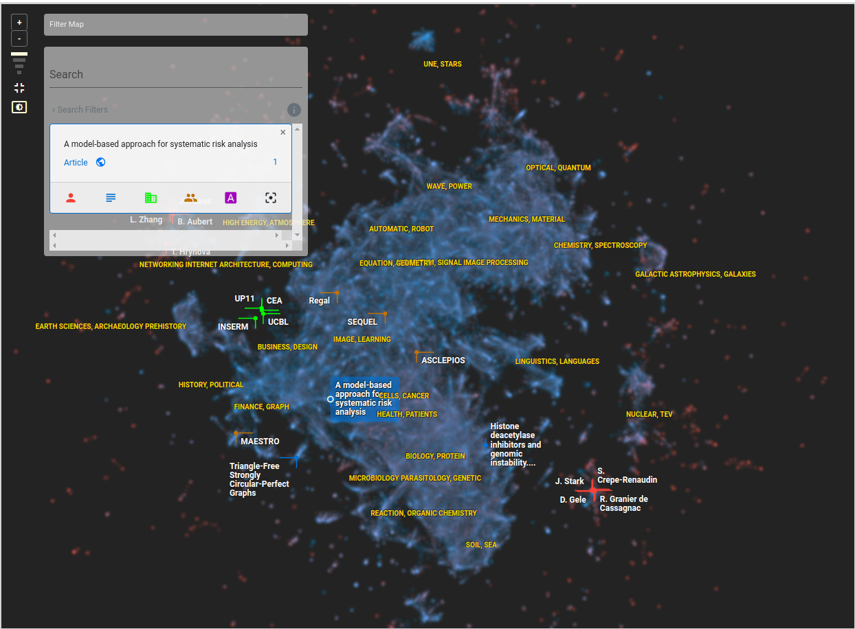
Cartolabe provides a general overview of the document collection (Figure 1). In the HAL application, the main entities are authors (visualized in red) and articles (blue). Both author and article maps are represented as heatmaps, with denser areas being brighter. These maps are blended by default but can be shown separately if the user is only interested in one of the entities, and labels are displayed on top of these density maps to give contextual information and help users identify the specifics of a region:
-
•
Yellow labels characterize thematic regions. For instance, the cluster on the very right of the map includes articles and authors related to “nuclear & TEV”.
-
•
White labels indicate the most important entities in the map, depending on the zoom level. Their color background characterize the type of the entity (articles in blue, authors in red, laboratories in green and Inria “Project Teams” in brown).
This map conveys some organization of the data, displaying well-separated clusters and summarizing their themes (reminding that the textual analysis is unsupervised). Users can pan and zoom the map to get an overview of the data organization; the labels are refreshed accordingly to display the important entities according to the scale and viewport. Users can also select an item on the map and read the associated details on the search box on the top left of the screen, or search for an item based on its name and see where it is located on the map.
Search and Neighborhoods
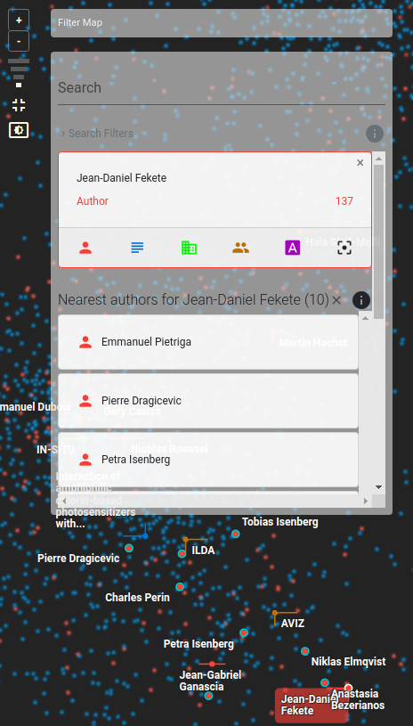
A main functionality of Cartolabe is to retrieve the entities (articles or authors) close to a given entity. This information retrieval ability supports different usages, such as finding experts to review a paper or a technical proposal, or finding papers relevant to a topic to complete a bibliographic study. For instance, let us query an author (here Jean-Daniel Fekete, visible in the bottom of the screen; Figure 2). The most semantically related articles or authors are highlighted in the map and displayed in the search box.
Note that these semantic nearest neighbors might be far from the location of the query, due to artifacts of the dimensionality reduction [3]: entities naturally live in a much higher dimensional space than the 2D space. We shall come back to this issue later (Section ”Landmarks”).
Filters
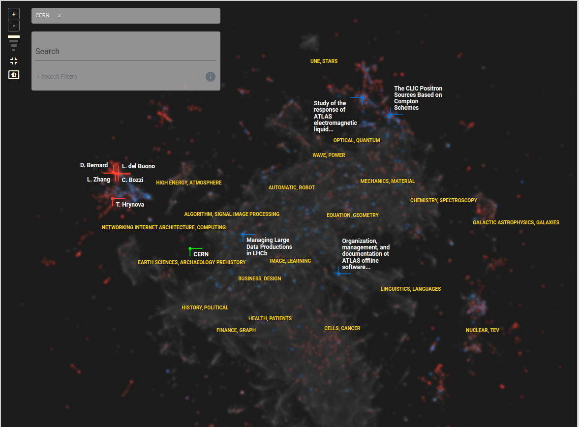
While density maps efficiently aggregate high amounts of information, they make it hard to see details beyond the white and yellow landmarks. To see the actual points in a region and get the details, users can specify a filter and only retain entities that match the filter (type of entity or property). For instance, using the filter “CERN”, Figure 3 shows only articles and authors linked to the CERN Physics Laboratory, greying-out other entities. As intended, this filter makes it clear that the thematic areas most relevant to CERN are astrophysics and particle physics; other areas contain few, if any, publications or authors associated with CERN.
The overall Cartolabe pipeline is detailed in the next two sections, distinguishing Cartolabe-Data and Cartolabe-Vis parts.
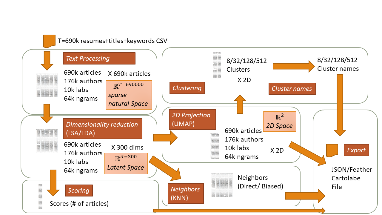
Cartolabe-Data Pipeline
The Cartolabe-Data pipeline is illustrated on Figure 4. The first step is to collect the data, i.e., the document corpus. In the HAL application, the repository is queried through its open API, serving metadata on circa 800k scientific publications and 600k full texts in PDF format, including most (ideally all) articles funded by the French public research.
Note that the corpus involves different types of entities, e.g., articles, authors, laboratories, and institutes. The core of Cartolabe-Data consists in homogeneously and efficiently transforming this textual corpus and all entities therein into a collection of points usable by the visualization engine Cartolabe-Vis.
After pre-processing, the entities are mapped onto a high-dimensional space. Landscapes and clusters are formed and named to facilitate the further navigation of the map. Cartolabe-Data eventually outputs a file storing the 2D coordinates of all the entities and their relationships that will be exploited by Cartolabe-Vis.
Pre-processing
Each article is described by its identifier, title, abstract, keywords, publication date, research domain, authors, and author institutions, each collected automatically from the HAL metadata.
Entities include: words (more specifically n-grams, terms made of sequences of at most words); articles (viewed as bags of words); authors (viewed as bags of articles); and laboratories or institutes (viewed as bags of articles). Only the titles, abstracts and keywords of the articles are used at the moment; we can use the full text or any section that would be the most informative, but due to the lack of quality measures to determine which sections of the text are the most informative ones, we use the simplest parts: the title, the keywords and the abstract. As of Dec. 2019, the HAL collection includes 800k articles, 200k authors, 10k laboratories, and 100k N-grams.
Articles undergo standard NLP pre-processing, including stop words removal and cleanup, only retaining terms with a minimum number of occurrences. This step also determines the size () of the considered vocabulary. Thereafter, a word matrix and an author matrix are computed.
The word matrix is a matrix, with the number of articles and the vocabulary size. is the term-frequency-inverse-document-frequency (tf-idf) of term in document . Likewise, the author (and laboratory) matrix is a matrix, with the number of authors (resp. laboratories), where iff the th author (resp. laboratory) co-authored the th article. Only authors and laboratories with a minimum number of papers (set to 3 in the following) are considered.
Continuous Embedding
Besides their above primary representation, entities are attached a latent representation: a continuous embedding is used to map each entity onto a vector in , with typically in the hundreds. This continuous embedding firstly reduces the dimensionality of the problem by two orders of magnitude, enhancing the computational tractability of our approach. Secondly and most importantly, it supports the definition of a sensible similarity among entities, avoiding the pathologies of Euclidean distance in high dimensional spaces, the so-called curse of dimensionality.
Preliminary experiments were conducted considering Latent Semantic Analysis (LSA) [1] and Latent Dirichlet Allocation (LDA) [2] with ranging from 80 to 500. In the following, we use LSA with that we found effective for HAL after several trials. Each article is therefore represented as a vector of 300 topics (the latent space) computed by LSA; authors are represented in the same space, as well as laboratories, teams, and institutions.
Topology
To each entity are associated its neighbors of each type, where the distance among two entities is their Euclidean distance in the latent space . This topology supports a main Cartolabe functionality, namely visual information retrieval. As explained, users might want to find articles similar to an article, or relevant to a topic. More generally, the topology of the latent space is good iff the user can make sense of the map, finding that similar items are (most of the time) close to each other.
For the sake of real-time querying, the nearest neighbors of each article are pre-computed (); a fast approximate -nn algorithm is used, with quasi-linear complexity in the number of articles.
2D Projection
Cartolabe uses the Umap [10] multidimensional projection technique for its good scalability and stability to project high-dimensional data in 2D, focusing on preserving close neighborhood relationships. Most interestingly, Umap enables to approximate the 2D projection in the case of very large datasets (Section “Use Cases”).
Landmarks
Navigating on the map is facilitated by defining and naming topics. The construction of meaningful cluster topics proceeds by using a k-means clustering on the articles and setting the distance of any two articles to their Euclidean distance in to avoid the issue of so-called stressed entities. This issue reflects the fact that entities related to different themes (e.g., an author working on several topics) that are projected in different regions of the 2D map, will be located in between these regions, and thus far from each of them, hindering its interpretation.
Topics are defined at 4 levels of granularity: 8 top-level, 24 medium-level clusters, 72 low-level clusters and 216 very low-level clusters, from the most general to the finest-grained topics. We selected these values experimentally, too-few would leave large areas unlabeled and too many would overcrowd the display. Each cluster is labeled after the most frequent word or term in the cluster (compared to the other clusters). If there exists no sufficiently frequent word in the cluster’s articles, a second term (the most frequent one in the articles that do not contain the first term) is retained and both terms form the cluster name. A further requirement enforced is that two adjacent clusters should have different names.
Cluster labels are located at the cluster center and displayed in yellow, according to the level of zoom of the viewport. Other landmarks, defined as the most important entities (e.g., prolific authors and highly cited articles according to a score of interest, see below), are displayed in white next to their entity’s position. They appear dynamically according to the viewport, the display density, and their relative score.
Scoring
To each entity is attached a score, expectedly reflecting its interest for the user. The design of more sophisticated scores (e.g., the citation counts for articles) is typically domain-dependent. Note that the modular organization of our pipeline permits specific implementations of the scoring functionality depending on the available data and its semantics. In the HAL application, the scores attached to authors and laboratories (respectively words) are their number of articles (resp. the number of articles they appear in). The score of articles is set to the number of views in HAL. Only the 10 entities with highest score appearing in the viewport are displayed.
Export
The output of Cartolabe-Data is a tabular file that is used as input by the Cartolabe-Vis server. This file contains, for each entity: i) its id, its label, its score, its 2D position, and its type (article, author, …); ii) its 10 nearest neighbors; iii) the relevant metadata depending on the type of the entity (e.g., the HAL link for the articles).
Cartolabe-Vis Pipeline
As described above, Cartolabe-Vis is provided with the data structure generated by Cartolabe-Data. Most generally, this data structure is made of a list of entities or points, where each point is attached to its main features and its 10 nearest neighbors in each category. The simplicity of this data structure is at the core of the Cartolabe genericity, allowing it to handle diverse types of documents and data collections as long as they can be represented as a list of positioned entities.
Visualization
The main goal of Cartolabe is to make sense of large scale data, up to tens of millions of entities. A first functionality thus is to provide a high-level visualization, displaying an overview of the collection. To do so, Cartolabe-Vis creates density map images, reflecting the density of the point distribution in the diverse regions of the 2D space. This functionality is achieved using standard Python libraries: NumPy to compute 2D histograms, SciPy to apply a smoothing Gaussian blur, and Pillow to convert them into images. Still, it is essential for users to interactively zoom, pan, and filter the data according to their exploration. Thus, a multi-scale visualization is produced by i) generating offline static images; ii) tiling them and serving them interactively. The tiled pyramid is created by building static images of each zoom level of the density maps and splitting them into pixel grey-scale tiles. These tiles are sent by the web server application to the browser following the tiled image protocol of D3. We generate a different heatmap for each entity that we want to visualize (authors and articles for HAL). This allows the users to show either of them dynamically. The heatmaps, created as standard grey-scale PNG images, are combined by the browser using standard SVG filters to color and blend them.
The Context
Cartolabe-Vis enables users to look for a specific region or point of interest, through displaying contextual information and/or enabling direct search and filters (below). The contextual information, characterizing the region currently displayed on the screen, consists of labels superimposed on top of the tiled density maps. For the sake of readability, only the top-scored entities and most general clusters located on the viewport are made visible (see “Scoring” Section). We chose a yellow color for the cluster labels to limit their saliency since they remain displayed all the time and are only useful as area landmarks, we do not want them to attract the reader’s attention as much as other landmarks. To be fully readable, the popular entities’ labels appear in white with a black outline. This increases their contrast and they stand out independently of their background. Instead of outlining the labels with a colored border according to their type, we only draw a colored “wedge” in a corner of the label bounding box, pointing to the exact position of the label (see Figure 1). This encoding, similar to a glyph, saves the visualization from becoming overcrowded and is easily understood by users.
Cartolabe-Vis relies on a standard database to efficiently select the most important entities based on their score and position to be labeled on the current viewport.
Contextual Filters
Besides panning and zooming, users can tailor the map to their current goals by using filters, e.g., showing only articles and authors associated with a targeted laboratory (the CERN in Figure 3) and greying out the others. In the HAL application, filters can specify the desired laboratory names (HAL references 10,000 of them) and the publication period (from 2008 to now). Filters can be combined, e.g., enabling to visualize the entities associated with the CERN or INRIA laboratories and published in 2018.
As pre-computing density maps for all possible filter masks is not feasible, contextual filtering proceeds by generating density maps upon users’ query in a progressive way [4]. Specifically, Cartolabe-Vis uses the Roaring Bitmaps library [14] to create and store compressed indices of the entity identifiers associated with each elementary filter value. Cartolabe-Vis thus is provided with a bitmap pre-computed for each map tile, storing all entities located in the tile region, and a bitmap for each filter value (lab and year), storing all ids of all articles matching this filter value. All bitmaps are combined interactively in a few milliseconds to retrieve the identifiers of all articles matching the contextual filter, e.g., the CERN or INRIA articles published in 2018 and falling in the displayed tiles.
Eventually, the selected entities are superimposed on the current density map image. Our library is quite efficient at generating density images, this last operation can be done in reasonable time ( 500ms), creating a tiled portion of the density map matching the users’ criteria that is displayed on top of the shaded overall map. This process is done progressively, using a thin red progress bar on top of the screen as visual feedback indicating that the operation is ongoing during the 500ms to 2s of its duration, taking into account the time to send images through the network.
Progressive computation and rendering is repeated each time the user zooms and pans the map, with controlled caching to improve performance. This progressive generation of a multi-scale filtered density maps is a unique feature of Cartolabe-Vis. It opens new perspectives for implementing scalable web-based visualizations with dynamic queries.
Use Cases
| Dataset | Documents | Size | Computing times | ||
|---|---|---|---|---|---|
| HAL | Scientific publications | Term extraction: | 360 s | ||
| 690,307 | Articles | LSA (300 components): | 2,489 s | ||
| 176,296 | Authors | UMAP: | 5,359 s | ||
| 65,053 | Terms | Clustering: | 338 s | ||
| 10,699 | Laboratories | Nearest neighbors: | 25,994 s | ||
| Wikipedia | Encyclopedia entries | Term extraction: | 26,152 s | ||
| 4,631,475 | Articles | LSA (300 components): | 13,716 s | ||
| 200,000 | Terms | UMAP: | 13,869 s | ||
| Clustering: | 13,898 s | ||||
| Nearest neighbors: | 140,334 s | ||||
| Le Grand Débat | Citizen propositions | Term extraction: | 6,073 s | ||
| 4.300,000 | Propositions | LSA (300 components): | 14,338 s | ||
| 600,000 | Terms | UMAP: | 3,701 s | ||
| Clustering: | 19,240 s | ||||
| Nearest neighbors: | 11,903 s | ||||
Several use cases of Cartolabe are described to illustrate its flexibility (Table 1): basically all key components presented in the previous sections can be replaced with other Python libraries to accommodate other data structures or needs. Interestingly, new algorithms (achieving e.g., word embedding, 2D projection or clustering) can also be integrated into the Cartolabe framework for comparative assessment with the state of the art: Cartolabe is designed to be agnostic about the methods used to generate its data and flexible enough to accommodate most of them. Cartolabe-Data comes with multiple pipelines, including the use cases described below. It also includes examples using different topic modeling methods such as LSA and LDA (used for all the production pipelines). We also provide example pipelines using word embedding methods such as doc2vec and even an example using the MNIST hand-recognition dataset made of images instead of texts to showcase the flexibility of our framework.
Wikipedia
We used the Wikipedia dataset as a scalability study, confirming that Cartolabe can manage millions of documents with no performance degradation. The main difference compared to the HAL application regards the Umap projection: when building a map of all articles in the English Wikipedia, an approximated projection was trained from a uniform sample of 20% of the articles and used for all articles, to preserve the projection performance. Another difference is that a single density map, reflecting the articles and based on the top 200k words, was built instead of two for HAL (one for the articles and one for the authors). Lastly, the scoring functionality was modified to account for the article popularity in Wikipedia, first displaying the most popular articles in the viewport.
Le Grand Débat
The Grand Débat dataset includes the citizens’ full-text contributions in response to the French government questions about societal and political issues. This Grand Débat initiative took place in France from January to March 2019 (granddebat.fr), gathering circa 4M full-text contributions. Cartolabe was successfully used to explore this large and heterogeneous corpus upon an official request from a French regulation organization, to check if the eventual analysis and summary of these contributions were fair and unbiased in terms both of topic coverage and summary contents.
Like for Wikipedia, the real-time performance is enforced by approximating the Umap projection, using a projection model learned from a subset of the data. The filtering options include each one of the 600k extracted terms, supporting the full-text querying of the dataset.
Evaluation
We conducted a usability study approved by our Institutional Review Board with 7 users from our laboratory (face to face before the COVID-19 outbreak) on the HAL dataset. This preliminary study was found insightful, and it will be continued to improve Cartolabe. We had three goals: 1) Verifying the usability of Cartolabe-Vis for our target users; 2) Verifying the quality of Cartolabe-Data regarding the distance measure and its projection; and 3) Collecting feedback on possible improvements regarding both Cartolabe-Data and Cartolabe-Vis.
Demographic The 7 users (2 female, 5 male, age range 30–60) were researchers (2 full professors, 4 assistant professors, 1 researcher). They were recruited by sending an email to the laboratory mailing list. None of them were familiar with visualization or projection methods, and they did not receive any compensation.
Setup The study lasted about one hour. Each user started by reading a consent form explaining the goal of the study, with the ability to ask questions to the interviewer, and then signing the form. Each session was split in four parts: 1) Training; 2) Usability testing; 3) Assessing the metrics and its visualization; and 4) Collecting feedback. Participants filled a questionnaire during and after the study to keep track of their answers and comments.
Training We introduced the main features of Cartolabe-Vis and its UI, starting with the visible features without interaction, then the possible interactions on each of the visualized items and UI areas, explaining the function of each button, text area, and icons. Then, the search capability was explained with several examples.
Usability Testing We asked each user to perform a standardized set of tasks to make sure they understood the training well enough and were able to use Cartolabe by themselves.
Assessing the metrics and its visualization We designed a five steps protocol to assess the quality of the distance metrics and its visualization. 1) We asked users to list the names of french authors well-known in their area of competence, not using any tool. 2) We then asked them to find the authors using Cartolabe and to comment on the cluster names while navigating around; 3) We asked if, in light of the results, Cartolabe appeared trustworthy. Then, we asked to repeat the same task (gather names and check with the tool) for other domains or fields they were familiar with, and report on their findings. 4) We asked to assess the proximity of articles and authors, starting from a recent article well known by the user, select a list of authors related to it and check if they were close in the visualization. 5) We asked to select three PhD students and to assess the accuracy of their clusters and their neighborhoods.
Collecting feedback Users were asked if they wished to continue exploring the map, and then to report at a higher level on what they liked, what they found useful and less useful, difficult, and about the utility of the tool.
Results
We gathered a total of 180 comments, 2/3 were about the UI and visualization, and 1/3 about the metrics.
Usability Testing All the users were able to complete all the tasks we asked them to do after the training, validating the usability of Cartolabe-Vis for the selected tasks.
Assessing the metrics and its visualization Due to limited space, we only report on the results on steps 1–3. Users have listed a total of 28 names at step 1, representative of their domain. 25 have been found on the map at step 2 (90%), 3 were not found, and 2 were found at unexpected positions (missing neighbors artifact from the Umap projection). During step 3, our users have collected 53 names around their areas of interest on the map (including their ground truth), none of which were considered as obvious mistakes (no false neighbors). Therefore, they all considered Cartolabe trustworthy.
All the users who looked at the 10 closest n-grams to an article or an author were satisfied by the results, meaning that the topic modeling results were good for our small sample.
All the users have been able to perform the tasks on metrics and visualization as expected by our protocol and to answer all our questions without major problem, witnessing that Cartolabe is already usable in its current form for neighborhood exploration tasks, and that the NLP and projections were fair to the data.
Collecting feedback The main UI issues raised were: 1) improve the icons and their affordance when they can be used to toggle some features, such as hiding/showing layers under the visualization, 2) add bookmarks to keep track of and retrieve interesting views, 3) improve the highlighting of selected features (selected labels and points not salient enough), and 4) improve the topic clusters labels (shown in yellow) and their stability during the navigation. We are working on addressing these usability issues but were pleased by these initial usability results. We even received an unexpected use case from a PhD student, who realized that the list of well-known authors close to his articles gave him hints on where to apply for a position.
Overall, this preliminary study has validated our design goals. We still need to continue our evaluation with more users, but our protocol seems valid and we will continue to use it to further improve Cartolabe.
Scalability
Cartolabe is scalable to circa ten million documents: it was specifically designed to handle large datasets. While the text processing pipeline might take time to complete, this is an offline process that does not hinder Cartolabe interactive system performance. The use cases described in the previous section demonstrate that Cartolabe can display millions of points in a browser without any visible slowdown. The use of static images as density maps is not affected by the size of the data. Though Cartolabe relies on an external database to index the points and query them to display labels in the viewport, the scalability of existing databases is well documented and can sustain the browsers’ demand. The use of the Roaring Bitmap library to build indices for the filter function also offers high scalability and performs well even with millions of points and filter values.
As for the human side, we believe Cartolabe’s visualization can scale to tens of millions of documents for overview tasks using its heatmap. The labeling and selection mechanisms rely on a good scoring for items that is sometimes difficult to obtain for large datasets. We have been able to get it for HAL with difficulties, Wikipedia provides its access statistics, but arXiv does not. Without these scores, there is no simple way to label the most important items in the visualization and the labels shown are random samples instead of real landmarks. When selecting an author, an article, or a word, we only allow displaying its ten closest neighbors. Some users complained about it and for larger datasets, we will have to increase this number, but this is currently a parameter set in Cartolabe-Data and in Cartolabe-Vis and it can already be changed. More user studies will inform us of possible issues for larger datasets.
Conclusion and Perspectives
The Cartolabe framework is a web-based system aimed at visualizing and exploring large document collections for users interested in these documents but not familiar with visualization and machine learning. This framework, initially designed to explore a scientific publication corpus, has evolved towards a generic system accommodating different document collections. Written in Python, it is freely available online.
The Cartolabe design relies on a multi-scale 2D representation (map) that allow to make sense of large-scale data through an overview, and panning and zooming navigation. In addition, multiple interactive features allow to search, filter, and explore the neighborhoods of selected items or regions.
Our next step will be to launch a call to gather new corpora to further test the genericity of Cartolabe, to perform more exhaustive evaluations of the multiple stages of the system, and to apply it to new interesting corpora needing exploration by topics such as libraries, archives, and software repositories.
References
- [1] S. Deerwester, S. T. Dumais, G. W. Furnas, T. K. Landauer, and R. Harshman, “Indexing by latent semantic analysis,” Journal of the American Society for Information Science, vol. 41, no. 6, pp. 391–407, 1990.
- [2] D. M. Blei, A. Y. Ng, and M. I. Jordan, “Latent Dirichlet Allocation,” Journal of machine Learning research, vol. 3, no. Jan, pp. 993–1022, 2003.
- [3] L. G. Nonato and M. Aupetit, “Multidimensional projection for visual analytics: Linking techniques with distortions, tasks, and layout enrichment,” IEEE Transactions on Visualization and Computer Graphics, pp. 1–1, 2018.
- [4] J.-D. Fekete, D. Fisher, A. Nandi, and M. Sedlmair, “Progressive Data Analysis and Visualization (Dagstuhl Seminar 18411),” Dagstuhl Reports, vol. 8, no. 10, pp. 1–40, 2019.
- [5] J. A. Wise, J. J. Thomas, K. Pennock, D. Lantrip, M. Pottier, A. Schur, and V. Crow, “Visualizing the non-visual: Spatial analysis and interaction with information for text documents,” in Readings in Information Visualization, S. K. Card, J. D. Mackinlay, and B. Shneiderman, Eds. San Francisco, CA, USA: Morgan Kaufmann Publishers Inc., 1999, pp. 442–450.
- [6] K. Kucher and A. Kerren, “Text visualization techniques: Taxonomy, visual survey, and community insights,” in 2015 IEEE Pacific Visualization Symposium (PacificVis). IEEE, apr 2015. [Online]. Available: https://doi.org/10.1109/pacificvis.2015.7156366
- [7] D. Fried and S. G. Kobourov, “Maps of computer science,” in IEEE Pacific Visualization Symposium, PacificVis 2014, Yokohama, Japan, March 4-7, 2014, 2014, pp. 113–120. [Online]. Available: https://doi.org/10.1109/PacificVis.2014.47
- [8] N. van Eck and L. Waltman, “Software survey: VOSviewer, a computer program for bibliometric mapping,” Scientometrics, vol. 84, pp. 523–538, 2010.
- [9] M. Espadoto, R. M. Martins, A. Kerren, N. S. T. Hirata, and A. C. Telea, “Towards a Quantitative Survey of Dimension Reduction Techniques,” IEEE Transactions on Visualization and Computer Graphics, 2019. [Online]. Available: https://doi.org/10.1109/tvcg.2019.2944182
- [10] L. McInnes, J. Healy, and J. Melville, “UMAP: Uniform Manifold Approximation and Projection for Dimension Reduction,” ArXiv e-prints, Feb. 2018.
- [11] J. Choo, C. Lee, C. K. Reddy, and H. Park, “UTOPIAN: User-Driven Topic Modeling Based on Interactive Nonnegative Matrix Factorization,” IEEE Transactions on Visualization and Computer Graphics, vol. 19, no. 12, pp. 1992–2001, Dec 2013.
- [12] A. Kerren, K. Kucher, Y.-F. Li, and F. Schreiber, “BioVis Explorer: A visual guide for biological data visualization techniques,” PLOS ONE, vol. 12, no. 11, p. e0187341, Nov. 2017. [Online]. Available: https://doi.org/10.1371/journal.pone.0187341
- [13] L. Lins, J. T. Klosowski, and C. Scheidegger, “Nanocubes for Real-Time Exploration of Spatiotemporal Datasets,” IEEE Transactions on Visualization and Computer Graphics, vol. 19, no. 12, pp. 2456–2465, 2013.
- [14] D. Lemire, O. Kaser, N. Kurz, L. Deri, C. O’Hara, F. Saint-Jacques, and G. Ssi-Yan-Kai, “Roaring bitmaps: Implementation of an optimized software library,” Software: Practice and Experience, vol. 48, no. 4, pp. 867–895, jan 2018.
Philippe Caillou is associate professor at the CS department of Université Paris-Saclay and CNRS. Contact him at Philippe.Caillou@lri.fr.
Jonas Renault, is Software Engineer at CNRS, part of the CS department of Université Paris-Saclay and CNRS. Contact him at jonasrenault@gmail.com.
Jean-Daniel Fekete, is a Senior Research Scientist at Inria, France, head of the Aviz Project-Team dedicated to visualization and visual analytics, and part of the CS department of Université Paris-Saclay and CNRS. Contact him at Jean-Daniel.Fekete@inria.fr.
Anne-Catherine Letournel, is a Research Engineer at the CS department of Université Paris-Saclay and CNRS, in charge of the software development service for the laboratory. Contact her at Anne-Catherine.Letournel@lri.fr.
Michèle Sebag, is Senior Research Scientist at CNRS, France, head of the A&O team at the CS department of Université Paris-Saclay and CNRS. Contact her at Michele.Sebag@lri.fr.