Path Outlines: Browsing Path-Based Summaries of Knowledge Graphs
Abstract.
Knowledge Graphs have become a ubiquitous technology powering search engines, recommender systems, connected objects, corporate knowledge management and Open Data. They rely on small units of information named triples that can be combined to form higher level statements across datasets following information needs. But data producers face a problem: reconstituting chains of triples has a high cognitive cost, which hinders them from gaining meaningful overviews of their own datasets. We introduce path outlines: conceptual objects characterizing sequences of triples with descriptive statistics. We interview 11 data producers to evaluate their interest. We present Path Outlines, a tool to browse path-based summaries, based on coordinated views with 2 novel visualisations. We compare Path Outlines with the current baseline technique in an experiment with 36 participants. We show that it is 3 times faster, leads to better task completion, less errors, that participants prefer it, and find tasks easier with it.
A screenshot of the tool Path Outlines displaying paths of depth 3 for Laureates in the Nobel dataset. The upper part of the screen is divided between the context zone on the left and the filter panel on the right. The context zone shows the dataset, the set of entities and the length of paths that have been. The lower part of the screen displays the path browser on the left. The right part is left blank for the detail panel, that will appear when a specific path is selected.
1. Introduction
Knowledge Graphs (KG) have become, in recent years, an ubiquitous technology powering search engines (Uyar and Aliyu, 2015), recommender systems (Wang et al., 2018) and connected objects (Le-Phuoc et al., 2016). Institutions (Shadbolt and O’Hara, 2013) and communities rely on them to publish and share their data in an interoperable format (Erxleben et al., 2014). A growing number of companies use them for Corporate Knowledge Management, to support open innovation and market intelligence strategies, as it is acknowledged that “the value [of data] is directly proportional to the interlinkedness of the data” (Pan et al., 2017).
Knowledge graphs can be composed of one or several data sources, also called Linked Datasets. The interoperability is made possible by the representation of information according to a common framework, the Resource Description Framework (RDF) (Carroll and Klyne, 2004). RDF information is atomized in small units named triples. The triples can be combined to form complex statements depending on information needs. For instance, a triple in the Nobel Prizes dataset stating that “Marie Curie is affiliated to Sorbonne University”, and another that “Sorbonne University is located in Paris” can be combined into “Marie Curie is affiliated to Sorbonne University in Paris”. The chaining can be extended to other linked datasets. Such a structure is very expressive and powerful.
However, a drawback of this expressivity is that it makes it difficult for data producers to have an accurate overview of their data and assess their quality (Troullinou et al., 2017). Our goal is to provide meaningful overviews at the right level of abstraction to assess their quality and eventually improve it. Important information about an entity is often 2 or 3 triples away from it, and current summary approaches fail to address chains of properties, also named paths. Most existing tools consider only triples, leaving aside all the statements that can be produced by chaining them. Other tools show summary graphs, presented as node-link diagrams, but their labels are difficult to read, and often laid out in various directions, barely allowing to follow paths. Given the large number of properties even in small databases, the node-link diagrams are either cluttered and unreadable, or reduced to the most frequent classes and properties, offering a very partial overview of the paths available. They also provide metrics, but only at the triple level, displayed when users select an element in the diagram. In all cases, it is somehow possible to mentally recombine the paths, but this implies a high cognitive load (DeStefano and LeFevre, 2007). Furthermore, combining statistics about triples does not provide statistics about paths. With a summary of the Nobel dataset stating that the database contains 911 laureates, 75% being affiliated to a university, and 525 Universities, 85% being located in a city, one could deduce that a laureate can have an affiliation that is located in a city, but there would be no way to know the percentage of laureates that actually do.
As Marchionini and Shneiderman stated in an early paper about hypertext systems, “key design issues include finding the correct information unit granularity for particular task domains and users” (Marchionini and Shneiderman, 1988). We posit that current RDF summary approaches are limited by their granularity, and that the path provides a meaningful granularity and expressivity to summarise Knowledge Graphs for data producers. We introduce path outlines, conceptual objects characterizing sequences of triples with descriptive statistics. To provide an overview, and allow producers to determine which are of interest to them, we design and implement an interface supporting the Information Seeking Mantra: “Overview first, zoom and filter, then details-on-demand” (Shneiderman, 1996). Based on coordinated views with 2 novel visualisations, it allows to represent a very large number of path outlines, browse through them and inspect their metrics. Our contributions are:
-
•
the concept of path-based summaries and an API to analyse them;
-
•
Path Outlines, the design and implementation of an open-source tool to browse path-based summaries; and
-
•
a controlled experiment to evaluate the tool against Virtuoso SPARQL query editor as a baseline.
First, we introduce the difficulties to represent RDF data and visualise paths, and we discuss related work. Then we define the concept of path outlines to support path-based summaries, and we describe our API to analyse them. Next, we report on the interview of 11 data producers to evaluate their understanding and interest. After that, we present Path Outlines, our tool based on coordinated views representing the features of path outlines, to browse such summaries. Eventually, we conduct a use-case based evaluation of Path Outlines with 36 participants, in which we compare it with the Virtuoso SPARQL query editor as baseline.
2. Background and Related Work
We discuss the difficulties to represent RDF data and paths, the types of summaries which are currently available, and the difficulty of writing and running queries for path-based summary information.
2.1. RDF Data
RDF data are collections of statements named triples. Triples are composed of a subject, a predicate and an object, as shown in Fig. 2. Subjects and predicates are always Uniform Resource Identifier (URIs). Objects can be URIs (. 4–9) or literals (e.g., strings, numbers, dates, . 1–3). The same URI can be the subject and object of several triples (. 5, 6, and 7 or . 6, 8 and 9). The triples form a network. The predicate rdf:type (. 4, 7 and 8) indicates that an entity belongs to a class of resources. Predicates and classes of resources are defined in data models called ontologies—somehow equivalent to schemas in SQL databases. For instance, the predicates of the 3 first triples, and the object of the 4th, belong to the FOAF (Brickley and Miller, 2014) (friend of a friend) ontology, dedicated to the description of people and their relationships. Literals can be typed, and string literals can be associated with a language (Fig. 2-a, grey colour). URIs can be prefixed for better readability, as in Fig. 2-c: the beginning, common to several URIs, is given a prefix (a short name), e.g. foaf: instead of http://xmlns.com/foaf/0.1/. Formally, a RDF graph is a set of triples , with , and . is the set of URIs, and the set of literals in the graph.
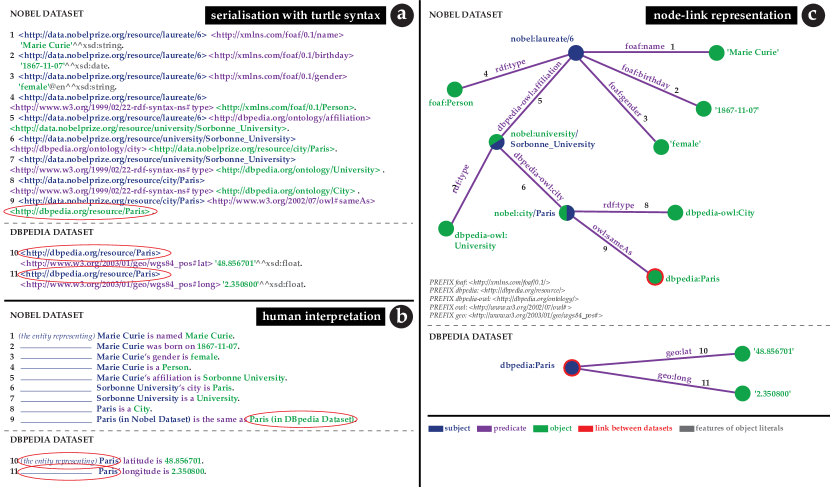
The figure compares 3 representations for RDF samples: a) the Turtle serialisation shows the raw triples, made of URIs and literals; it is verbose and meant for machines, difficult to decipher for humans; b) the interpretation of each triple as a sentence understandable by humans helps understanding the chaining mechanism; c) the visualisation as node-link diagram shows how triples are connected and can be chained. It also helps understanding but demands efforts to decipher.
RDF data are interlinked: a dataset can reference an entity produced in another one (red colour). When this happens, a chain of statements can jump from one dataset to another: the triples in Nobel Dataset la Sorbonne is in Paris, Paris entity in Nobel is equivalent to Paris entity in DBpedia can be completed by those from DBpedia: Paris’ latitude is 48.856701, Paris’ longitude is 2.350800. They can be queried jointly through federated queries.
2.2. Visualisation of RDF Data
Node-link diagrams (Fig. 2-c) are often used to represent RDF datasets (Po et al., 2020). They accurately render their structure and are theoretically appropriate to easily recombine paths (Novick, 2006). However, the readability of paths as sequences is very limited. Huang and Eades remark that people try to read paths from left to right and top to bottom, even when the layout and task require another direction (Huang and Eades, 2005). Van Amelsvoort et al. demonstrate that reading behaviours were influenced by the direction of elements (van Amelsvoort et al., 2013). Ware et al. show that good continuity, edge crossing and path length influence the effectiveness of visually following a path (Ware et al., 2002). A specific type of node-link diagrams, node-link trees, seem to be more efficient for tasks related to following paths, traversing graphs (Novick, 2006; Novick and Hurley, 2001), and reading paths (Lee et al., 2006), probably because they constrain the flow in one direction. In their survey on the readability of hypertext, DeStefano and Lefevre mention several studies showing that the multiplication of possibilities impacts readability negatively (DeStefano and LeFevre, 2007), supporting the same idea. In contrast, PathFinder (Partl et al., 2016) lays flat all possible paths for the graph, allowing to read them easily, but this results in a very long list needing to be paginated even when the graph is small. For a data producer, gaining an overview of the paths in her own dataset is an unresolved problem. There is a need for a layout that would allow to preserve their readability as sequences of statements to let users make sense of them while allowing to see all of them at a glance, easily filtering from the overview to the detail, and selecting them; this is what our tool does.
2.3. RDF Summaries for Data Curation
A RDF summary is a concise description of the content of a dataset, sometimes characterised by descriptive statistics. We consider summaries that are meant for data producers, with the purpose of giving an overview of a dataset. Data profiling systems are tools presenting statistics about the data, such as LODStats (Ermilov et al., [n.d.]), ProLOD (Böhm et al., 2010), LOUPE (Mihindukulasooriya et al., 2015) or AETHER (Mäkelä, 2014). They typically present measures of atomic elements. While such summaries are complete and accurate, they give little information about the content. For a data producer, knowing that, for instance, 37% of all entities have a rdfs:label does not indicate what those labels are about, and is not very helpful to find missing information. Information becomes more meaningful with more context, like considering properties relatively to subjects with a specific type (Issa et al., 2019) (the number of foaf:Document having a rdfs:label), or to objects with a specific type (Spahiu et al., 2016; Dudáš et al., 2015; Dudáš and Svátek, 2015) (the number of Persons having a birthplace that is a City). This leads to more interpretable summaries, but is still limited to triples, not considering chains of statements.
Another approach consists in reconstituting a representative graph as the summary. Smallest representative graphs are used for machine consumption, but are too big to be presented to users. User-oriented summaries limit summary graphs to the most represented classes, and the most represented direct properties between them (Troullinou et al., 2017, 2018; Weise et al., 2016), which make them graspable, yet very incomplete. Those summary graphs preserve access to chains of statements, but the statistics are produced and accessible at the triple level only, when users select an edge on the diagram. Furthermore, as we explained in the previous subsection, the readability of node-link diagrams is limited. Our approach considers an intermediate level as a unit for summaries: the path. This allows us to summarise statements at a granularity that better matches data producers’ needs, including the possible extensions of a path in interlinked datasets, and to provide metrics at this level of granularity.
2.4. Querying Summary Information
SPARQL, the main query language for RDF data, provides a syntax to query triples and paths in a graph. SPARQL also provides aggregation operators that can be applied to the elements we mentioned: entities, properties, triple patterns, possibly specifying the type of the subject and / or of the object, and deeper path patterns. However, queries combining aggregation and paths patterns are complex, and complex queries raise both technical and conceptual issues, as reported by Warren et al (Warren and Mulholland, 2018). From a technical point of view, the cost of a query increases with the number of entities and the length of paths to evaluate. It is also impacted by the fact that a query is federated (targets several datasets), often resulting in network and server timeouts and errors that are difficult to manage in existing systems. From a conceptual point of view, summarising paths patterns for a large number of entities is not a simple mental operation. The task can be alleviated by tools to assist writing queries. YASGUI (Rietveld and Hoekstra, 2017) offers auto-completion, syntax colouring and prefix handling. SPARKLIS (Ferré, 2017) offers the possibility of discovering the model iteratively, enabling at each step to browse the available possibilities for extending the current path. However, such tools support only part of the task. They can be combined, which requires switching from one to another, and planning and thinking with them remains complicated and error-prone. Altogether, there is a need for a tool to facilitate data curation by summarising and visualising paths in RDF data, including extensions to other datasets.
3. Path Outlines
To provide metrics at the granularity needed by data producers to make sense of their datasets, we use paths and formalise the concept of path outlines, making them first-class citizens that can be described, searched, browsed, and inspected.
3.1. Definition
A path outline is a conceptual object providing descriptive statistics about a sequence of statements relative to a set of entities. It consists in: 1) a set of entities sharing a similarity criteria (e.g., all the entities of class Person), for which at least one entity is the subject of a given sequence of properties, 2) the sequence of properties, 3) the set of objects at the end of this sequence, and 4) the set of measures relative to the entities and the objects, as schematised in Fig. 3.
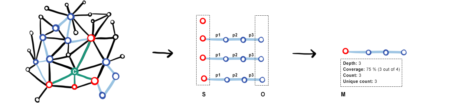
Schematic representation of an example of path outline. On the left a node link diagram symbolises the original dataset. The nodes and edges composing the path of interest are colored; it is difficult to untangle them. In the center the paths are extracted and laid flat one under another. One can see that the starting entity for which the path is missing is also taken into account. On the right the summary shows the sequence of triples that is summarised only once, together with the measures that describe it.
A path of depth is a sequence of triples such that . Using the SPARQL property path syntax, this could be shortened as . To analyse a path outline, we start from a given set of entities sharing a similarity criterion , and we consider a given sequence of properties, such that . is the set of objects at the end of the path outline. We compute a set of measures relative to and , as described in Table 1. Each measure can be a literal value (e.g., a count), a distribution of values (e.g., the number of unique values for URIs), or a range for numerical values.
| Measure | Description |
| depth | number of statements between the set of entities and the set of objects |
| coverage | percentage of entities in the set for which this path exists |
| count | total number of objects in |
| unique count | number of unique values or URIs for the objects in |
| datatypes | only for literals: data type(s) of objects at the end of the path |
| languages | only for string literals, if specified: list of languages of the objects |
| min / max | if numerical values: minimum and maximum value; if strings: first and last value, in alphabetical order |
To write a path, we defined a syntax inspired from XPath (Clark et al., 1999) (Fig. 4). The template string is similar to an XPath query selector: it is a pointer to designate the chains of triples corresponding to the query and summarised by a path outline. The syntax is easy to parse at a glance: the elements are separated by a slash (reminiscent of the syntax of file paths in operating systems). The first chunk is the similarity criteria, the number of stars indicates the depth of the path, and they create a visual articulation to separate the other chunks, corresponding to the properties forming the path. It already forms a graphical object revealing the articulations that will show in our visualisations.
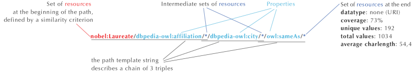
The parts composing the template string are separated by slashes. The first part describes the set of resources at the beginning of the path, here the nobel:Laureates, followed by a slash. Then comes the first predicate (dbpedia-owl:affiliation) followed by a slash, followed by a star, indicating that the objects of this predicate can be of any type. The star also represent the subjects of the next triple, it is not repeated. Then comes the next predicate (dbpedia-owl:city), also followed by a star, and the last (owl:sameAs), followed by a star. The last star corresponds to the set of objects O at the end of the path.
3.2. LDPath API
To analyse the paths, we developed a specific extension to a semantic framework for Knowledge Graph querying111reference to a paper, anonymised for submission. Given an input query, it discovers and navigates paths in a SPARQL endpoint by completing the input query with predicates that exist in the endpoint. LDPath first computes the list of possible predicates and then, for each predicate, counts the number of paths. This is done recursively for each predicate until a maximum path length is reached. The values at the end of each path are analysed to retrieve the features listed in Table 1. LDPath can also, for each path, count the number of joins of this path in another endpoint, and compute the list of possible predicates to extend the path by one statement. The values at the end of the extension are also analysed. The software package consists in recursively rewriting and executing SPARQL queries with appropriate service clauses. The API of this extension is made available for other purposes and can be queried independently of Path Outlines 222link to the API, anonymised for submission.
4. User study 1: Validating the Approach
One of the authors has several years of experience in the Knowledge Graphs community. Taking inspiration from her experience and situations she had observed in professional semantic web meetups and conferences, we designed 6 real-world task scenario involving finding or browsing path-based metrics. For instance, the second scenario was: “Find the datatypes of the set of values at the end of a path. For example, identify if at the end of certain properties there are alternatively dates or URIs, or check if the date formats typed as such and valid”. We interviewed 11 data producers to validate our approach.
4.1. Participants
We conducted a fifteen to thirty-minute interview with 11 RDF data producers recruited via email calls on Semantic Web mailing lists and Twitter. Participants belonged to industry (4), academia (4) and public institutions (3). The datasets they usually manipulated contained data from various domains, ranging from biological pathways to cultural heritage through household appliances. All participation was voluntary and without compensation.
4.2. Set up and Procedure
The interview was supervised online through a videoconference system. We presented each task scenario. We asked participants if they did already perform similar tasks; and if so, how often and by which means; if not, for what reason. We asked them if they would be interested in a tool supporting such tasks. Eventually, we asked them if they could think of other similar or related tasks that would be useful for them.
4.3. Results
We collected answers in a spreadsheet and analysed them with R.
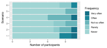
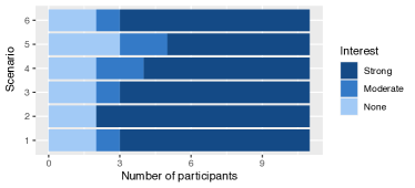
On the left, the stacked chart labeled ’a’ reports the frequency to which participants perform tasks similar to the ones involved in the scenarios we presented. It can be converted into the following table: Scenario Frequency Number of participants Scenario1 Never 8 Scenario1 Often 2 Scenario1 Very often 1 Scenario2 Never 7 Scenario2 Rarely 1 Scenario2 Not so often 2 Scenario2 Very often 1 Scenario3 Never 7 Scenario3 Rarely 2 Scenario3 Not so often 2 Scenario4 Never 6 Scenario4 Not so often 4 Scenario4 Very often 1 Scenario5 Never 9 Scenario5 Not so often 11 Scenario6 Never 8 Scenario6 Rarely 2 Scenario6 Often 1 On the right, the stacked chart labeled ’b’ reports the interest of participants for the scenarios. It can be converted into the following table: Scenario Degree of interest Number of participant Scenario1 None 2 Scenario1 Moderate 1 Scenario1 Strong 8 Scenario2 None 2 Scenario2 Strong 9 Scenario3 None 2 Scenario3 Moderate 1 Scenario3 Strong 8 Scenario4 None 2 Scenario4 Moderate 2 Scenario4 Strong 7 Scenario5 None 3 Scenario5 Moderate 2 Scenario5 Strong 6 Scenario6 None 2 Scenario6 Moderate 1 Scenario6 Strong 8
4.3.1. Current Usage of Path-based Metrics
A few participants already performed tasks that were similar to the ones in our scenarios, as reported in Fig. 5. They used SPARQL query editors (16)333the counts in this paragraph correspond to the number of scenarios, not to the number of participants or content negotiation in the browser (3): they pasted a URI in the browser to see the triples describing it, and copy-pasted other URIs to continue the chaining, entity by entity. The main reason given for not performing a task or performing it too rarely was no tool (14). Those tasks are actually possible with SPARQL, but participants either did not know how to write the queries or regarded it as so complicated that they would not even consider it as an option. The second main reason was time concerns (13): the task was regarded as doable, but it would have taken too long to write such queries.
4.3.2. Interest for Path-based Summaries
Two participants had difficulties in relating to the scenarios. Their use of RDF data was focused on querying single entities rather than sets. They did not feel the need for an overview (although one changed his mind, as explained in § 6.6.6). Most other participants declared a strong interest (Fig. 5): 3 had already well identified their needs, and the others sounded really enthusiastic that we were able to formulate them. Six participants spontaneously mentioned clearly seeing the interest of a tool supporting similar tasks for data reusers, in a discovery context. Only one participant suggested a related task: identify outliers in values of paths typed as numerical values, involving more advanced metrics on paths than the one we had mentioned.
This interview confirmed the interest of data producers for path-based summaries, and the fact that for those who were already gathering very similar information, a SPARQL query editor was the baseline.
5. Path Outlines
To let users browse path outlines, we designed an interface based on coordinated views with two new visualisations (Fig. 1). We present the design requirements and the design rationales for the interface, followed by 2 scenarios of use.
5.1. Design requirements: from overview to detail
The process of browsing through an information space can be well described by the Information Seeking Mantra: “Overview first, zoom and filter, then details-on-demand” (Shneiderman, 1996): The tasks involved in this navigation paradigm are: ‘find the number of items’, ‘see items having certain attributes’, and ‘see an item with all its attributes’. The overview is meant to provide context to users, to ‘gain an overview of the entire collection’. There are several levels of contexts for paths: the dataset, and the starting set of entities. It shall also give them an idea of the main features of the items in the collection, which will allow them to determine what is of interest and what is not, and to progress through the collection, ‘zoom in on items of interest and filter out uninteresting items’, and finally ‘select an item or group and get details when needed’. The particular difficulty with path outlines is that their features are both metrics related to them and the sequences of properties composing them. To address this specificity, our interface combines several coordinated views.
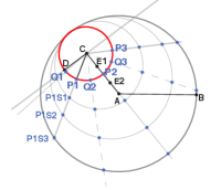
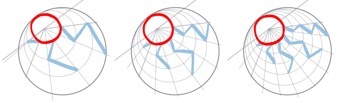
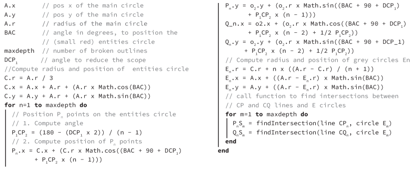
Schema showing the lines used to lay out the broken lines. The left circle shows the points that will be used in the pseudo-code. A is the center of the container circle. C is the center of the circle representing the sets of entities, contained in the main circle, its border is near to the border of the container. The broken lines are little ’legs’ starting from the small circle and spreading like a fan to take the space available in the container. The pseudo code to draw the lines is the following: A.x is the x coordinate of the main circle, A.y is the y coordinate of the main circle, A.r is the radius of the main circle, BAC is the angle in degrees, to position the (small red) entities circle, maxdepth is the number of broken outlines, DCP1 is the angle to reduce the scope.
//Compute radius and position of entities circle C.r = A.r / 3 C.x = A.x + A.r + (A.r x Math.cos(BAC)) C.y = A.y + A.r + (A.r x Math.sin(BAC)) for n=1 to maxdepth do // Position Pn points on the entities circle // 1. Compute angle P1CP2 = (180 - (DCP1 x 2)) / (n - 1) // 2. Compute position of Pn points Pn.x = C.x + (C.r x Math.cos((BAC + 90 + DCP1) + P1CP2 x (n - 1))) Pn.y = o2.y + (o2.r x Math.sin((BAC + 90 + DCP1) + P1CP2 x (n - 1))) Q_n.x = o2.x + (o2.r x Math.cos((BAC + 90 + DCP1) + P1CP2 x (n - 2) + 1/2 P1CP2)) Qn.y = o2.y + (o2.r x Math.sin((BAC + 90 + DCP_1) + P1CP2 x (n - 2) + 1/2 P1CP2)) // Compute radius and position of grey circles En En.r = C.r + n x ((A.r - C.r) / (n + 1)) En.x = A.x + ((A.r - En.r) x Math.sin(BAC)) En.y = A.y + ((A.r - En.r) x Math.sin(BAC)) // call function to find intersections between // CP and CQ lines and E circles for m=1 to maxdepth do PnSm = findIntersection(line CPn, circle Em) QnSm = findIntersection(line CQn, circle Em) end end
5.2. Interface: coordinated views to display complex objects
The interface relies on two new visualisations: the broken (out)lines algorithm – extending a circle packing layout, and the path browser. They are coordinated with several filter panels.
5.2.1. Context overview: circle packing and broken (out)lines
As users open Path Outlines, they see several datasets laid out with a circle packing algorithm (Collins and Stephenson, 2003). Their size is mapped to the number of triples they contain (Fig. 8-1). Using the filter panel (Fig. 8-2), they can select a specific size range or search by name. When they open it in the foreground (Fig. 8-3), datasets that are linked to it also come to the foreground, as small bullets laid out on the side (Fig. 8-8). The different sets of entities sharing the same rdf:type in the main dataset are laid out inside in another circle packing, their size corresponding to the number of entities (Fig. 8-4). The filter panel allows to filter by size and name (Fig. 8-6). As they click on one to open it, other sets become smaller and are aligned on the side to be easily available (Fig. 8-8). The available path outlines depths (Fig. 8-7) are laid out with the broken (out)lines algorithm. It relies on simple geometrical principles. The algorithm is described in Fig. 6. It is inspired by systems that present an overview of a graph with different possible cuts in it, that can be inspected in a coordinated view (Abello et al., 2006; Archambault et al., 2010). The shape of broken (out)lines is reminiscent of a node-link diagram so that users can relate it to a representation they already know, and understand what is displayed below in the path browser (Fig. 8-9). Associated with the circle, they form a glyph (Fuchs et al., 2017), a simple symbol meant to be readable, and yet encoding important attributes of the data. By default, path outlines of depth 1 are selected.
5.2.2. Zoom and filter: the path browser and filter panel
Path outlines being composed of sequences of properties, it would be possible to represent them with a Sankey diagram (Schmidt, 2008; Riehmann et al., 2005), as shown in Fig. 7-a. However, the number of path outlines that could be displayed would be limited, and it would be difficult to follow the edge that the labels relate to and to identify sequences. The path browser keeps the links, but merges the nodes, so that the links do not need to be curved any more: they become rectangles (Fig. 7-b). Merged nodes are turned into vertical rectangles representing entities, allowing to display their rdf:type when it is known. The vertical rectangles are aggregated by property, and the height of a rectangle is proportional to the frequency of the property in all paths. This allows to prioritize the readability of the best represented properties. Even in extreme cases, where the number of properties is very high, the coordination with the filter panel (Fig. 8-10) allows to reach a readable state very quickly: users are typically interested either in inspecting paths that are shared by most of the entities, to know which data can be queried, or in finding entities that are not well shared, in order to fix them. The panel also allows to filter on other features, and gives an overview of the available range for each feature.
The information about sequences is made available through interactivity: hovering a property highlights all possible sequences going through it (Fig. 1); clicking on it selects this property, and filters out properties which are not highlighted. Selected properties form a pattern, and all path outlines that do not match this pattern are filtered out. The search fields with autocompletion above each column also allow to form the pattern. Furthermore, patterns and statistical filters can be combined.
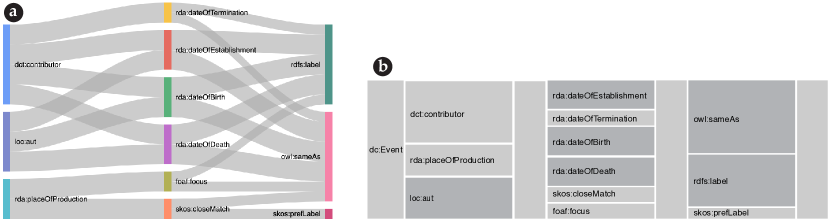
The Sankey diagram and path browsers both lay out the following paths outlines, showing the combination of sequences: dc:Event/dct:contributor/*/rda:dateOfEstablishment/*/rdfs:label/* dc:Event/dct:contributor/*/rda:dateOfTermination/*/rdfs:label/* dc:Event/dct:contributor/*/rda:dateOfBirth/*/rdfs:label/* dc:Event/dct:contributor/*/rda:dateOfDeath/*/rdfs:label/* dc:Event/dct:contributor/*/rda:dateOfEstablishment/*/owl:sameAs/* dc:Event/dct:contributor/*/rda:dateOfTermination/*/owl:sameAs/* dc:Event/dct:contributor/*/rda:dateOfBirth/*/owl:sameAs/* dc:Event/dct:contributor/*/rda:dateOfDeath/*/owl:sameAs/* dc:Event/rda:placeOfProduction/*/skos:closeMatch/*/skos:prefLabel/* dc:Event/rda:placeOfProduction/*/skos:closeMatch/*/owl:sameAs/* dc:Event/rda:placeOfProduction/*/foaf:focus/*/rdfs:label/* dc:Event/rda:placeOfProduction/*/foaf:focus/*/owl:sameAs/* dc:Event/Loc:aut/*/rda:dateOfEstablishment/*/rdfs:label/* dc:Event/Loc:aut/*/rda:dateOfBirth/*/rdfs:label/* dc:Event/Loc:aut/*/rda:dateOfDeath/*/rdfs:label/* dc:Event/Loc:aut/*/rda:dateOfEstablishment/*/owl:sameAs/* dc:Event/Loc:aut/*/rda:dateOfBirth/*/owl:sameAs/* dc:Event/Loc:aut/*/rda:dateOfDeath/*/owl:sameAs/* Reading the sequences is much easier with the path browser.
5.2.3. Details-on-demand: the detail panel
When users hover or selects a single path outline, its statistical description appears in the statistical panel (Fig. 8-11). This panel also offers a list of linked datasets to which the selected path outline can be extended. When a linked dataset is selected, a column is added on the right (Fig. 8-12), to let them browse possible extensions to the path outline. The filter panel (Fig. 8-13) and statistical panel (Fig. 8-14) now apply to the extended path outlines. A line shows the target dataset, inviting users to click it and explore its path outlines.
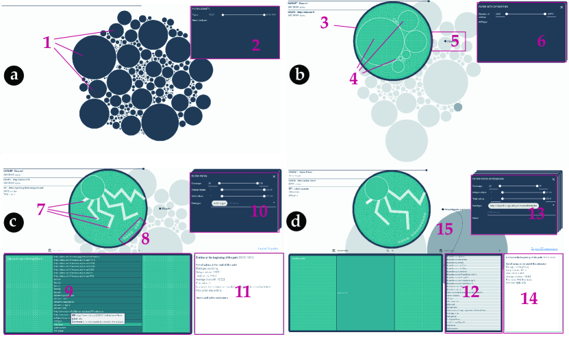
The figure shows four screenshots. The top left one displays all available datasets with a circle packing algorithm, together with a filter panel. The top right one shows that a dataset was selected and is open in the foreground. Available sets of entities are laid out inside with a circle packing algorithm. The bottom left shows one of the sets was selected and is now on the side, with broken lines enabling to select a depth for paths. The path browser has appeared below and displays path outlines of depth one. A property is hovered, and the details for the corresponding path outlines are displayed in the detail panel, right next to the path browser. The last screenshot shows that extensions to an external dataset were selected, so the extension panel is now open between the path browser and the detail panel.
5.3. Scenario of use
5.3.1. Scenario 1
A member of the DBpedia community would like to check the quality of the data describing music albums in the DBpedia dataset. She opens Path Outlines, searches DBpedia in the filter panel (Fig. 8-a2). A dozen of datasets remain, all other are filtered out (Fig. 8-a1). Hovering them she can see each one corresponds to a different language. She clicks on the French version which opens in the foreground (Fig. 8-b3). To find music albums among the many sets of entities, she types music in the filter panel (Fig. 8-b6). Five sets of entities correspond to this keyword (Fig. 8-b5), she hovers them and identifies schema:MusicAlbum, which she selects. This isolates the set, displays its broken (out)lines (Fig. 8-c7), and opens the path browser (Fig. 8-c8). By default, paths of depth 1 (such as http://dbpedia.org/ontology/composer or http://dbpedia.org/ontology/format) are displayed. The interface announces that there are more than 41 000 albums, with 87 paths of depth 1. She wants to check properties with bad coverage, to see if there is a reason for this. She uses the cursor in the filter panel (Fig. 8-c10) to select paths with coverage lower than 10%. She hovers available paths and inspects their coverage. She notices that the property http://fr.dbpedia.org/property/writer is used only once. A property which sounds very similar, http://dbpedia.org/property/writer, is used more than 800 times. To identify the entity she needs to modify, she clicks on the button “See query” that opens the SPARQL endpoint in a new window, prefilled with a query to access the set of DISTINCT values at the end of the path. She will now do similar checks with other paths of depth 1 and paths of depth 2.
5.3.2. Scenario 2
A person in charge of the Nobel Dataset would like to know what kind of geographical information is available for the nobel:Laureates. Could she draw maps of their birthplaces or affiliations? She knows there are no geo-coordinates in the dataset, but some should be available through similarity links. She opens Path Outlines, searches nobel in the filter panel, and opens her dataset. She then selects the nobel:Laureates start set. She starts to look for laureates having an affiliation aligned with another dataset. She selects paths of depth 3. In the first column, she types affiliation. This removes other properties than nobel:affiliation from this column, and properties which are not used in a path starting with nobel:affiliation from other columns. Among properties remaining in the second column, she can easily identify dbpedia:city, which she selects. In the third column, she selects owl:sameAs property. A single path is now selected, summary information appears in the inspector: 72% of the laureates have an affiliation aligned with an external dataset. She selects the link to display extensions in DBpedia. A list of 78 available properties to extend the path in DBpedia appear. She types geo in the search field. A list of 4 properties containing geo:lat and geo:long remains. She inspects the summary information of the extended paths: only 32% of the laureates have geo-coordinates in DBpedia. She repeats the same operations for birthplaces: 96% have a similarity link to an external dataset, among which 61% have geo-coordinates in DBpedia. She can now assess the coverage of the dataset regarding the laureates and their locations, and plan to fix the missing information.
5.4. Implementation
The front-end interface is developed with NodeJS, it uses Vue.js and d3.js frameworks. The code is open source444url of the gitlab repository, anonymised for submission.
6. User study 2: evaluating Path Outlines
We designed an experiment to compare Path Outlines with the virtuoso SPARQL query editor (hereafter SPARQL-V). Although comparing a non-graphical tool with a graphical tool can be controversial, it is the relevant baseline in this case: a SPARQL editor is the only way to fully perform the tasks we are evaluating as of today, and this specific editor is the most used by our target users, as confirmed by participants in study 1. The experiment was a within-subject controlled experiment, with a mixed design (counterbalanced for the two first variables, and ordered for the last one), to compare Path Outlines with SPARQL-V. The first independent variable was the tool, with two modalities: Path Outlines vs SPARQL-V. The second independent variable was the dataset, with two modalities: Nobel dataset vs. Persée dataset. The third independent variable was the task, with 3 modalities: 3 tasks ordered by difficulty (with small adaptations to the dataset). The dependent variables we collected were the perceived comfort and easiness, the execution time, the rate of success and number of errors, and the accuracy of memorising the main features of a dataset. Our hypotheses were:
- H1::
-
Path Outlines is easier and more comfortable to use than SPARQL-V
- H2::
-
Path Outlines leads to shorter execution time than SPARQL-V
- H3::
-
Path Outlines leads to better task completion and fewer errors than SPARQL-V
- H4::
-
Path Outlines facilitates recalling the main features of a dataset compared to SPARQL-V
6.1. Participants
We recruited 36 participants (30 men and 6 women) via calls on semantic web mailing lists and Twitter, with the requirement that they should be able to write SPARQL queries. 5 participants in the interview also registered for the experiment. Job categories included 12 researchers, 10 PhD students, 9 engineers and 3 librarians. 29 produced RDF data and 31 reused them. Their experience with SPARQL ranged from 6 months to 15 years, the average being 5.07 years and the median 4 years 555SPARQL has existed since 2004, the standard was released in 2008. 12 rated their level of comfort with SPARQL as very comfortable, 11 as rather comfortable, 10 as fine, and 3 as rather uncomfortable. 18 used it several times a week, 13 several times a month, 2 several times a year and 3 once a year or less. 23 of them listed Virtuoso among the tools they were using regularly. All participation was voluntary and without compensation.
6.2. Setup
The experiment was mostly supervised online through a videoconferencing system. It was run face-to-face for 3 participants. We used an online form to guide participants through the tasks and collect the results. The form provided links to our tool, to a web interface developed in JavaScript, and to a SPARQL endpoint we had set up for the experiment. In 5 cases, due to restrictions in the network, we replaced the endpoint by the Nobel public endpoint. We used two datasets, Nobel and Persée, which had been analysed with our tool and are hosted in our endpoint. 2 participants stopped after 2 tasks because of personal planning reasons, so we asked the last two participants to complete only 2 tasks to keep the 4 configurations balanced for all tasks.
6.3. Tasks
We designed 3 real world tasks, ordered by difficulty. They involved the 3 nuclear tasks that our interface supports, combined in different ways. On Nobel Dataset, Task 1 (T1) was: Consider all the awards in the dataset. For what percentage of them can you find the label of the birthplace of the laureate of an award? Task 2 (T2) was: Consider all the laureates in the dataset. Find all the paths of depth 1 or 2 starting from them and leading to a piece of temporal information. Indicate the data type of the values at the end of the path. Task 3 (T3) was: Imagine you want to plot a map of the universities. The most precise geographical information about the universities in the dataset seems to be the cities, which are aligned to DBpedia through similarity links owl:sameAs. Find one or several properties in DBpedia (http://dbpedia.org/sparql) that could help you place the cities on a map. The tasks on Persée Dataset were equivalent, with small adaptations to the context.
6.4. Procedure
We sent an email to the participants with a link to the video conference. As they connected, we gave them a link to the form. They were invited to read the consent form. We started with a set of questions about their experience with SPARQL. Then we introduced the experiment and explained how it would unfold. The first task T1 was displayed, associated with a technique and a dataset. We read it aloud and rephrased the statement until it made sense to the participants. Participants were asked to describe their plan before they performed the task. We rated the precision: 0 for no or very imprecise planning, 1 for imprecise planning, 2 for very precise planning. The time to perform the task was limited to eight minutes. If they were not able to complete in time, they were asked to estimate how much time they think they would have needed. Then they rated the difficulty of the task and the comfort of the technique. The next task was the equivalent task T1 associated with the other technique on the other dataset. We counterbalanced the order of the technique and dataset factors, resulting in 4 configurations. After the set of two equivalent tasks, participants were asked which environment they would choose if they had both at their disposal for such a task. The same was repeated for tasks T2, and then T3. In the end, participants answered a multiple-choice query form about the general structure of a dataset: number of triples, classes, paths of length 1 and length 2. To finish with, they were invited to comment on the tool and make suggestions.
6.5. Data collection and analysis
We collected the answers to the form, and analysed with R.
6.6. Results
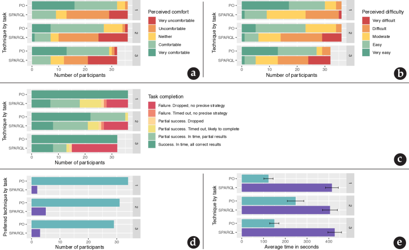
On the first row, the left stacked chart, labeled ’a’, reports the perceived comfort reported by participant on each task with each technique. It can be converted into the following table: Task Technique Perceived comfort Number of participants Task 1 Path Outlines Very comfortable 16 Task 1 Path Outlines Comfortable 16 Task 1 Path Outlines Neither 3 Task 1 Path Outlines Uncomfortable 1 Task 1 Path Outlines Very uncomfortable 0 Task 1 SPARQL-V Very comfortable 0 Task 1 SPARQL-V Comfortable 9 Task 1 SPARQL-V Neither 4 Task 1 SPARQL-V Uncomfortable 16 Task 1 SPARQL-V Very uncomfortable 7 Task 2 Path Outlines Very comfortable 7 Task 2 Path Outlines Comfortable 20 Task 2 Path Outlines Neither 7 Task 2 Path Outlines Uncomfortable 1 Task 2 Path Outlines Very uncomfortable 1 Task 2 SPARQL-V Very comfortable 1 Task 2 SPARQL-V Comfortable 6 Task 2 SPARQL-V Neither 3 Task 2 SPARQL-V Uncomfortable 15 Task 2 SPARQL-V Very uncomfortable 11 Task 3 Path Outlines Very comfortable 13 Task 3 Path Outlines Comfortable 16 Task 3 Path Outlines Neither 1 Task 3 Path Outlines Uncomfortable 1 Task 3 Path Outlines Very uncomfortable 1 Task 3 SPARQL-V Very comfortable 0 Task 3 SPARQL-V Comfortable 7 Task 3 SPARQL-V Neither 5 Task 3 SPARQL-V Uncomfortable 9 Task 3 SPARQL-V Very uncomfortable 11 On the first row, the right stacked chart, labeled ’b’, reports the perceived difficulty reported by participant for each task with each technique. It can be converted into the following table: Task Technique Perceived difficulty Number of participants Task 1 Path Outlines Very easy 17 Task 1 Path Outlines Easy 13 Task 1 Path Outlines Moderate 4 Task 1 Path Outlines Difficult 2 Task 1 Path Outlines Very difficult 0 Task 1 SPARQL-V Very easy 1 Task 1 SPARQL-V Easy 8 Task 1 SPARQL-V Moderate 14 Task 1 SPARQL-V Difficult 12 Task 1 SPARQL-V Very difficult 1 Task 2 Path Outlines Very easy 5 Task 2 Path Outlines Easy 18 Task 2 Path Outlines Moderate 11 Task 2 Path Outlines Difficult 2 Task 2 Path Outlines Very difficult 0 Task 2 SPARQL-V Very easy 1 Task 2 SPARQL-V Easy 5 Task 2 SPARQL-V Moderate 8 Task 2 SPARQL-V Difficult 15 Task 2 SPARQL-V Very difficult 7 Task 3 Path Outlines Very easy 13 Task 3 Path Outlines Easy 14 Task 3 Path Outlines Moderate 2 Task 3 Path Outlines Difficult 3 Task 3 Path Outlines Very difficult 0 Task 3 SPARQL-V Very easy 1 Task 3 SPARQL-V Easy 4 Task 3 SPARQL-V Moderate 8 Task 3 SPARQL-V Difficult 11 Task 3 SPARQL-V Very difficult 8
On the second row, the stacked chart, labeled ’c’, reports the task completion status for each task with each technique. It can be converted into the following table: Task Technique Task completion status Number of participants Task 1 Path Outlines Failure. Dropped, no precise strategy 0 Task 1 Path Outlines Failure. Timed out, no precise strategy 0 Task 1 Path Outlines Partial success. Dropped 0 Task 1 Path Outlines Partial success. Timed out, likely to complete 0 Task 1 Path Outlines Partial success. In time, partial results 0 Task 1 Path Outlines Partial success. In time, all correct results 36 Task 1 SPARQL-V Failure. Dropped, no precise strategy 8 Task 1 SPARQL-V Failure. Timed out, no precise strategy 1 Task 1 SPARQL-V Partial success. Dropped 1 Task 1 SPARQL-V Partial success. Timed out, likely to complete 1 Task 1 SPARQL-V Partial success. In time, partial results 11 Task 1 SPARQL-V Partial success. In time, all correct results 7 Task 2 Path Outlines Failure. Dropped, no precise strategy 0 Task 2 Path Outlines Failure. Timed out, no precise strategy 0 Task 2 Path Outlines Partial success. Dropped 0 Task 2 Path Outlines Partial success. Timed out, likely to complete 1 Task 2 Path Outlines Partial success. In time, partial results 13 Task 2 Path Outlines Partial success. In time, all correct results 22 Task 2 SPARQL-V Failure. Dropped, no precise strategy 9 Task 2 SPARQL-V Failure. Timed out, no precise strategy 1 Task 2 SPARQL-V Partial success. Dropped 1 Task 2 SPARQL-V Partial success. Timed out, likely to complete 4 Task 2 SPARQL-V Partial success. In time, partial results 13 Task 2 SPARQL-V Partial success. In time, all correct results 8 Task 3 Path Outlines Failure. Dropped, no precise strategy 0 Task 3 Path Outlines Failure. Timed out, no precise strategy 0 Task 3 Path Outlines Partial success. Dropped 0 Task 3 Path Outlines Partial success. Timed out, likely to complete 0 Task 3 Path Outlines Partial success. In time, partial results 0 Task 3 Path Outlines Partial success. In time, all correct results 32 Task 3 SPARQL-V Failure. Dropped, no precise strategy 17 Task 3 SPARQL-V Failure. Timed out, no precise strategy 0 Task 3 SPARQL-V Partial success. Dropped 1 Task 3 SPARQL-V Partial success. Timed out, likely to complete 1 Task 3 SPARQL-V Partial success. In time, partial results 5 Task 3 SPARQL-V Partial success. In time, all correct results 8 On the third row, the left stacked chart, labeled ’d’, reports the preferred technique reported by participants on each task. It can be converted into the following table: Task Preferred technique Number of participants Task 1 Path Outlines 34 Task 1 SPARQL-V 2 Task 2 Path Outlines 31 Task 2 SPARQL-V 5 Task 3 Path Outlines 29 Task 3 SPARQL-V 3 On the third row, the right stacked chart, labeled ’e’, reports the average time on each task with each technique. It can be converted into the following table: Task Technique Average time Confidence interval Task 1 Path Outlines 122.6944 21.35482 Task 1 SPARQL-V 414.3889 29.01415 Task 2 Path Outlines 244.0556 39.85904 Task 2 SPARQL-V 405.3889 34.31149 Task 3 Path Outlines 134.8438 22.97322 Task 3 SPARQL-V 427.0312 31.39090
6.6.1. Perceived comfort and easiness
In general, participants found Path Outlines more comfortable than SPARQL-V (Fig. 9a). Several participants said that they would need more time to become fully comfortable with Path Outlines. Five minutes of practice was indeed a very short time, but the level of comfort reported with Path Outlines is already quite satisfactory. The level of comfort reported when performing tasks with SPARQL-V was lower than the level initially expressed. We interpret this as being due partly to the fact that it is uncomfortable to code when an experimenter is watching, and partly to the difficulty of the tasks. Being very familiar with SPARQL does not mean being familiar with queries involving both sets of entities and deep paths. This supports the idea that a specific tool for such tasks can be useful even for experts. Three users mentioned being less comfortable with Virtuoso than with their usual environment. However, Virtuoso was the tool most frequently listed as usual by participants (23). Participants perceived the same tasks as being easier when performed with Path Outlines than with SPARQL-V, as shown in Fig. 9b. We think this is because Path Outlines enables them to manipulate directly the paths, saving them the mental process of reconstructing the paths by chaining statements and associating summary information to them. A participant wrote us an email after the experiment to thank us for the work, saying that “such tools are needed due to the conceptual difficulties in understanding large complex datasets”. Those results are in agreement with H1.
6.6.2. Task execution time
We counted 8 minutes for each timeout or dropout. Participants were quicker with Path Outlines on the three tasks, as shown in Fig. 9e, in agreement with H2. We applied paired sample t-tests to compare execution time, with a log transformation to normalize the distribution, with each technique for each task. There was a significant difference in the three tasks: T1: , T2: , T3: , which shows that participants were significantly faster on each task with Path Outlines than with SPARQL-V. The effect size is very large: the median is 480s with SPARQL-V vs. 119s with Path Outlines on T1, 472.5s with SPARQL-V vs. 215s with Path Outlines on T2, and 480s with SPARQL-V vs. 146.5s with Path Outlines on T3. Those who did not complete the tasks were asked to give an estimation of the additional time they would have needed. We did not use self-estimations to make a time comparison since not all participants were able to answer, and such estimations are likely to be unreliable since time perception and self-perception are influenced by many factors. However, we report them as an indicator: for participants with a very precise plan, it ranged from 30 seconds to one hour; with an imprecise plan, it ranged from 15 seconds to 45 minutes; and with no plan, it ranged from 4 minutes to several hours. Task 2 required them to look at paths of two different depths. Although participants were longer on this task, Path Outlines still outperformed Virtuoso SPARQL query editor, but several participants expressed the wish to see both depths at the same time.
6.6.3. Task completion and errors
Using our tool, only one participant timed out on task 2, all others managed to complete each of the tasks within 8 minutes. With SPARQL-V, there were 37 dropouts (9 on T1, 10 on T2 and 18 on T3) and 15 timeouts (9 on T1, 5 on T2 and 1 on T3). Among the tasks completed in time, 28 did had erroneous or incomplete results with SPARQL-V (11 on T1, 13 on T2 and 5 on T3) versus 13 with our tool (on T2), as summed up in Fig. 9c. The main errors on T1 were that some participants counted the number of paths matching the pattern instead of the number of documents having such paths (either by counting values at the end of the paths or by counting entities without the DISTINCT keyword). It occurred 9 times in SPARQL-V, and never with our tool. Four participants were close to making the mistake but corrected themselves with SPARQL-V, and one did so with our tool. Another error occurred only once with SPARQL-V: the participant started from the wrong class of resource. T2 presented the particular difficulty that temporal information in RDF datasets can be typed with various data types, including xsd:string and xsd:integer. The most common error was to give only part of the results, either because of relying on only one data type, or because it was difficult to sort out the right ones when displaying all of them. It occurred 12 times with both techniques. The mean percentage of correct results was 75% with our tool, versus 50% with SPARQL-V. With SPARQL-V, one participant happened to give all paths as an answer, including non-temporal ones, which we regarded as a partial success. For T3, one participant gave an answer that did not meet the requirement with SPARQL-V, stating that it would be too complicated. Another error which happened 5 times was that the query timed out, although it was correct. There are tricks and workarounds, but in most cases, the time needed to write the query and realise it would time out was already too long to start figuring out a workaround. This is a common problem with federated queries on sets, also reported by Warren and Mulholland (Warren and Mulholland, 2018). Overall, our results are in agreement with H3.
6.6.4. Memorising the main features of a dataset
At the end of the experiment, participants answered MCQ questions about the structure of both datasets. Answers were very sparse, most participants did not remember the information at all, and there was no significant difference between the techniques. We cannot make any conclusion from the data we collected. We think this is related to the fact that participants were fully focused on finishing the tasks in time, and did not have time to look at contextual elements of the interface. Therefore, the results are not in agreement with H4.
6.6.5. Preference
Most participants preferred Path Outlines (34 on T1, 31 on T2 and 29 on T3) versus Virtuoso SPARQL query editor (2 on T1, 5 on T2 and 3 on T3), as shown in Fig. 9b.
6.6.6. Other user comments
Several participants expressed the need for such a tool as Path Outlines in their work and asked if they could try it on their own data. Most of them liked the tool and made positive comments. One participant wrote an email after the experiment to thank us for the work, saying that “such tools are needed due to the conceptual difficulties in understanding large complex datasets”. It is interesting to note that the participant happened to be one of the two participants who had difficulties to relate to the tasks during the interview.
Our tasks are difficult to perform with SPARQL because they need to be decomposed in many steps, combining several types of difficulties, and they require to think in two dimensions: broad to consider sets of entities and objects, and deep to traverse the graph. This is not intuitive, and the cognitive load to remember the sequences of path is heavy. Our tool only required to browse and select, as it used the granularity required by the task.
7. Discussion and Conclusion
RDF data producers face a challenge: the particular structure of their data questions the efficiency of traditional summarisation and visualisation techniques. To address this issue, we presented the concept of path outlines, to produce path-based summaries of RDF data, with an API to analyse them. We interviewed 11 data producers and confirmed their interest. We designed and implemented Path Outlines, a tool to support data producers in browsing path-based summaries of their datasets. We compared Path Outlines with SPARQL-V. Path Outlines was rated as more comfortable and easier. It performed three times faster and lowered the number of dropouts, despite the fact that participants had, on average, 5 years of experience with SPARQL versus 5 minutes with our tool.
We used coordinated views combining new visualisations with filter and detail panels to support the representation and manipulation of those complex objects. A limitation of our combination is that it relies on splitting the paths by depth. While this enabled us to display very high numbers of paths, there are cases where users would prefer to see several depths at the same time, as for Task 2. With the current interface, this means repeating the same task with different depths. In future work, we would like to investigate solutions to go from one depth to another more easily, and/or to inspect several depths at the same time.
The concept of path outlines can be developed to support a wider range of metrics, such as the detection of outliers suggested by a participant in the first study. To go further in this direction, integrating statistics with the content (Perer and Shneiderman, 2009) could make the path overview the entry point for an iterative analysis of the content, as advanced profiling tools in other databases communities start to do (Kandel et al., 2012). This would allow to address more elaborate tasks, such as finding the reasons for a problem pointed out by the summary. Associated to other visualisations, that are still to design and implement, the concept can have many applications. For instance, it can support ontologists in bettering the quality of RDF data models, showing how a modification of a property in the model would impact the potential paths traversing it, addressing their needs to “make changes to the inferred hierarchy explicit” (Vigo et al., 2015).
We believe that the development of Knowledge Graphs will benefit from path-based summaries and tools such as Path Outlines, presenting information to users at a granularity and form matching their needs to make sense of the information contained in Knowledge Graphs. We think that such tools will help overcome some of the complexity at the heart of Knowledge Graphs due to atomizing data as RDF triples, and will leverage high-quality Knowledge Graphs.
References
- (1)
- Abello et al. (2006) James Abello, Frank Van Ham, and Neeraj Krishnan. 2006. Ask-graphview: A large scale graph visualization system. IEEE transactions on visualization and computer graphics 12, 5 (2006), 669–676. https://doi.org/10.1109/TVCG.2006.120
- Archambault et al. (2010) Daniel Archambault, Tamara Munzner, and David Auber. 2010. Tugging graphs faster: Efficiently modifying path-preserving hierarchies for browsing paths. IEEE Transactions on Visualization and Computer Graphics 17, 3 (2010), 276–289. https://doi.org/10.1109/TVCG.2010.60
- Brickley and Miller (2014) Dan Brickley and Libby Miller. 2014. FOAF Vocabulary Specification 0.99. Ontology. http://xmlns.com/foaf/spec/
- Böhm et al. (2010) C. Böhm, F. Naumann, Z. Abedjan, D. Fenz, T. Grütze, D. Hefenbrock, M. Pohl, and D. Sonnabend. 2010. Profiling linked open data with ProLOD. In 2010 IEEE 26th international conference on data engineering workshops (ICDEW 2010). 175–178. https://doi.org/10.1109/ICDEW.2010.5452762 Citation Key: 5452762.
- Carroll and Klyne (2004) Jeremy Carroll and Graham Klyne. 2004. Resource Description Framework (RDF): Concepts and Abstract Syntax. W3C Recommendation. W3C. http://www.w3.org/TR/2004/REC-rdf-concepts-20040210/
- Clark et al. (1999) James Clark, Steve DeRose, et al. 1999. XML path language (XPath).
- Collins and Stephenson (2003) Charles R. Collins and Kenneth Stephenson. 2003. A circle packing algorithm. Computational Geometry 25, 3 (2003), 233 – 256. https://doi.org/10.1016/S0925-7721(02)00099-8
- DeStefano and LeFevre (2007) Diana DeStefano and Jo-Anne LeFevre. 2007. Cognitive load in hypertext reading: A review. Computers in human behavior 23, 3 (2007). https://doi.org/10.1016/j.chb.2005.08.012
- Dudáš and Svátek (2015) Marek Dudáš and Vojtech Svátek. 2015. Discovering Issues in Datasets Using LODSight Visual Summaries. In Proceedings of the International Workshop on Visualizations and User Interfaces for. 77. http://ceur-ws.org/Vol-1456/
- Dudáš et al. (2015) Marek Dudáš, Vojtěch Svátek, and Jindřich Mynarz. 2015. Dataset summary visualization with lodsight. In European Semantic Web Conference. Springer, 36–40. https://doi.org/10.1007/978-3-319-25639-9_7
- Ermilov et al. ([n.d.]) Ivan Ermilov, Michael Martin, Jens Lehmann, and Sören Auer. [n.d.]. Linked Open Data Statistics: Collection and Exploitation. In Knowledge Engineering and the Semantic Web (Berlin, Heidelberg, 2013), Pavel Klinov and Dmitry Mouromtsev (Eds.). Springer Berlin Heidelberg, 242–249.
- Erxleben et al. (2014) Fredo Erxleben, Michael Günther, Markus Krötzsch, Julian Mendez, and Denny Vrandečić. 2014. Introducing Wikidata to the linked data web. In International semantic web conference. Springer, 50–65. https://doi.org/10.1007/978-3-319-11964-9_4
- Ferré (2017) Sébastien Ferré. 2017. Sparklis: an expressive query builder for SPARQL endpoints with guidance in natural language. Semantic Web 8, 3 (2017), 405–418. https://doi.org/10.3233/SW-150208
- Fuchs et al. (2017) J. Fuchs, P. Isenberg, A. Bezerianos, and D. Keim. 2017. A Systematic Review of Experimental Studies on Data Glyphs. IEEE Transactions on Visualization and Computer Graphics 23, 7 (2017), 1863–1879. https://doi.org/10.1109/TVCG.2016.2549018
- Huang and Eades (2005) Weidong Huang and Peter Eades. 2005. How people read graphs. In proceedings of the 2005 Asia-Pacific symposium on Information visualisation-Volume 45. Australian Computer Society, Inc., 51–58.
- Issa et al. (2019) Subhi Issa, Pierre-Henri Paris, Fayçal Hamdi, and Samira Si-Said Cherfi. 2019. Revealing the Conceptual Schemas of RDF Datasets. In International Conference on Advanced Information Systems Engineering. Springer, 312–327. 10.1007/978-3-030-21290-2_20
- Kandel et al. (2012) Sean Kandel, Ravi Parikh, Andreas Paepcke, Joseph M Hellerstein, and Jeffrey Heer. 2012. Profiler: Integrated statistical analysis and visualization for data quality assessment. In Proceedings of the International Working Conference on Advanced Visual Interfaces. 547–554. https://doi.org/10.1145/2254556.2254659
- Le-Phuoc et al. (2016) Danh Le-Phuoc, Hoan Nguyen Mau Quoc, Hung Ngo Quoc, Tuan Tran Nhat, and Manfred Hauswirth. 2016. The Graph of Things: A step towards the Live Knowledge Graph of connected things. Journal of Web Semantics 37 (2016), 25–35. https://doi.org/10.1016/j.websem.2016.02.003
- Lee et al. (2006) Bongshin Lee, Cynthia Sims Parr, Catherine Plaisant, Benjamin B Bederson, Vladislav Daniel Veksler, Wayne D Gray, and Christopher Kotfila. 2006. Treeplus: Interactive exploration of networks with enhanced tree layouts. IEEE Transactions on Visualization and Computer Graphics 12, 6 (2006), 1414–1426. https://doi.org/10.1109/TVCG.2006.106
- Marchionini and Shneiderman (1988) G. Marchionini and B. Shneiderman. 1988. Finding facts vs. browsing knowledge in hypertext systems. Computer 21, 1 (1988), 70–80. https://doi.org/10.1109/2.222119
- Mihindukulasooriya et al. (2015) Nandana Mihindukulasooriya, María Poveda-Villalón, Raúl García-Castro, and Asunción Gómez-Pérez. 2015. Loupe-An Online Tool for Inspecting Datasets in the Linked Data Cloud.. In International Semantic Web Conference (Posters & Demos).
- Mäkelä (2014) Eetu Mäkelä. 2014. Aether – generating and viewing extended VoID statistical descriptions of RDF datasets. In The semantic web: ESWC 2014 satellite events, Valentina Presutti, Eva Blomqvist, Raphael Troncy, Harald Sack, Ioannis Papadakis, and Anna Tordai (Eds.). Springer International Publishing, 429–433. https://doi.org/10.1007/978-3-319-11955-7_61
- Novick (2006) Laura R Novick. 2006. Understanding spatial diagram structure: An analysis of hierarchies, matrices, and networks. The Quarterly Journal of Experimental Psychology 59, 10 (2006), 1826–1856. https://doi.org/10.1080/17470210500298997 the hierarchy depicts a rigid structure of power or precedence relations among items.
- Novick and Hurley (2001) Laura R Novick and Sean M Hurley. 2001. To matrix, network, or hierarchy: That is the question. Cognitive psychology 42, 2 (2001), 158–216. https://doi.org/10.1006/cogp.2000.0746
- Pan et al. (2017) Jeff Z Pan, Guido Vetere, Jose Manuel Gomez-Perez, and Honghan Wu. 2017. Exploiting linked data and knowledge graphs in large organisations. Springer. https://doi.org/10.1007/978-3-319-45654-6
- Partl et al. (2016) Christian Partl, Samuel Gratzl, Marc Streit, Anne Mai Wassermann, Hanspeter Pfister, Dieter Schmalstieg, and Alexander Lex. 2016. Pathfinder: Visual analysis of paths in graphs. In Computer Graphics Forum, Vol. 35. Wiley Online Library, 71–80. https://doi.org/10.1111/cgf.12883
- Perer and Shneiderman (2009) Adam Perer and Ben Shneiderman. 2009. Integrating statistics and visualization for exploratory power: From long-term case studies to design guidelines. IEEE Computer Graphics and Applications 29, 3 (2009), 39–51.
- Po et al. (2020) Laura Po, Nikos Bikakis, Federico Desimoni, and George Papastefanatos. 2020. Linked Data Visualization: Techniques, Tools, and Big Data. Synthesis Lectures on Semantic Web: Theory and Technology 10, 1 (2020), 1–157. https://doi.org/10.2200/S00967ED1V01Y201911WBE019
- Riehmann et al. (2005) Patrick Riehmann, Manfred Hanfler, and Bernd Froehlich. 2005. Interactive sankey diagrams. In IEEE Symposium on Information Visualization, 2005. INFOVIS 2005. IEEE, 233–240. https://doi.org/10.1109/INFVIS.2005.1532152
- Rietveld and Hoekstra (2017) Laurens Rietveld and Rinke Hoekstra. 2017. The YASGUI family of SPARQL clients 1. Semantic Web 8, 3 (2017), 373–383. https://doi.org/10.3233/SW-150197
- Schmidt (2008) Mario Schmidt. 2008. The Sankey diagram in energy and material flow management: Part I: History. Journal of industrial ecology 12, 1 (2008), 82–94. https://doi.org/10.1111/j.1530-9290.2008.00004.x
- Shadbolt and O’Hara (2013) Nigel Shadbolt and Kieron O’Hara. 2013. Linked data in government. IEEE Internet Computing 17, 4 (2013), 72–77. https://doi.org/10.1109/MIC.2013.72
- Shneiderman (1996) Ben Shneiderman. 1996. The eyes have it: A task by data type taxonomy for information visualizations. In Proceedings 1996 IEEE symposium on visual languages. IEEE, 336–343. https://doi.org/10.1109/VL.1996.545307
- Spahiu et al. (2016) Blerina Spahiu, Riccardo Porrini, Matteo Palmonari, Anisa Rula, and Andrea Maurino. 2016. ABSTAT: ontology-driven linked data summaries with pattern minimalization. In European Semantic Web Conference. Springer, 381–395.
- Troullinou et al. (2017) Georgia Troullinou, Haridimos Kondylakis, Evangelia Daskalaki, and Dimitris Plexousakis. 2017. Ontology understanding without tears: The summarization approach. Semantic Web 8, 6 (2017), 797–815. https://doi.org/10.3233/SW-170264
- Troullinou et al. (2018) Georgia Troullinou, Haridimos Kondylakis, Kostas Stefanidis, and Dimitris Plexousakis. 2018. Exploring RDFS KBs using summaries. In The semantic web – ISWC 2018, Denny Vrandečić, Kalina Bontcheva, Mari Carmen Suárez-Figueroa, Valentina Presutti, Irene Celino, Marta Sabou, Lucie-Aimée Kaffee, and Elena Simperl (Eds.). Springer International Publishing, 268–284. https://doi.org/10.1007/978-3-030-00671-6_16
- Uyar and Aliyu (2015) Ahmet Uyar and Farouk Musa Aliyu. 2015. Evaluating search features of google knowledge graph and bing satori. Online Information Review (2015). https://doi.org/10.1108/oir-10-2014-0257
- van Amelsvoort et al. (2013) Marije van Amelsvoort, Jan van der Meij, Anjo Anjewierden, and Hans van der Meij. 2013. The importance of design in learning from node-link diagrams. Instructional science 41, 5 (2013), 833–847. https://doi.org/10.1007/s11251-012-9258-x
- Vigo et al. (2015) Markel Vigo, Caroline Jay, and Robert Stevens. 2015. Constructing Conceptual Knowledge Artefacts: Activity Patterns in the Ontology Authoring Process. In Proceedings of the 33rd Annual ACM Conference on Human Factors in Computing Systems (Seoul, Republic of Korea) (CHI ’15). ACM, New York, NY, USA, 3385–3394. https://doi.org/10.1145/2702123.2702495
- Wang et al. (2018) Hongwei Wang, Fuzheng Zhang, Jialin Wang, Miao Zhao, Wenjie Li, Xing Xie, and Minyi Guo. 2018. Ripplenet: Propagating user preferences on the knowledge graph for recommender systems. In Proceedings of the 27th ACM International Conference on Information and Knowledge Management. 417–426. https://doi.org/10.1145/3269206.3271739
- Ware et al. (2002) Colin Ware, Helen Purchase, Linda Colpoys, and Matthew McGill. 2002. Cognitive measurements of graph aesthetics. Information visualization 1, 2 (2002), 103–110. https://doi.org/10.1057/palgrave.ivs.9500013
- Warren and Mulholland (2018) Paul Warren and Paul Mulholland. 2018. Using SPARQL–the practitioners’ viewpoint. In European Knowledge Acquisition Workshop. Springer, 485–500. https://doi.org/10.1007/978-3-030-03667-6_31
- Weise et al. (2016) Marc Weise, Steffen Lohmann, and Florian Haag. 2016. Ld-vowl: Extracting and visualizing schema information for linked data. In 2nd International Workshop on Visualization and Interaction for Ontologies and Linked Data. 120–127. http://ceur-ws.org/Vol-1704/