Immersive Insights: A Hybrid Analytics System for
Collaborative Exploratory Data Analysis
Abstract.
In the past few years, augmented reality (AR) and virtual reality (VR) technologies have experienced terrific improvements in both accessibility and hardware capabilities, encouraging the application of these devices across various domains. While researchers have demonstrated the possible advantages of AR and VR for certain data science tasks, it is still unclear how these technologies would perform in the context of exploratory data analysis (EDA) at large. In particular, we believe it is important to better understand which level of immersion EDA would concretely benefit from, and to quantify the contribution of AR and VR with respect to standard analysis workflows.
In this work, we leverage a Dataspace reconfigurable hybrid reality environment to study how data scientists might perform EDA in a co-located, collaborative context. Specifically, we propose the design and implementation of Immersive Insights, a hybrid analytics system combining high-resolution displays, table projections, and augmented reality (AR) visualizations of the data.
We conducted a two-part user study with twelve data scientists, in which we evaluated how different levels of data immersion affect the EDA process and compared the performance of Immersive Insights with a state-of-the-art, non-immersive data analysis system.
1. Introduction
Exploratory Data Analysis (EDA) is the process of performing initial inquiries on a dataset, with the goal of discovering interesting patterns, spotting anomalies, testing hypotheses and checking assumptions (Tukey, 1977). In order to make sense of data, data scientists combine many graphical and numerical techniques, drawing elements from statistical inference, clustering analysis, dimensionality reduction, and sensitivity analysis. In this sense, there is no standard workflow for performing EDA, which, in its current form, vastly varies based on the type of data and on the assumptions that an analyst wants to assess. Scripting frameworks (e.g. R, Matlab) and data visualization tools have been developed to assist data scientists during the EDA process, but are mostly desktop-based and do not provide support for collaborative analysis. Over time, researchers have repeatedly tried to propose immersive technologies (such as CAVE systems (Cruz-Neira et al., 1992; Cruz-Neira et al., 1993; DeFanti et al., 2011; Manjrekar et al., 2014), powerwalls (Marrinan et al., 2014; Marai et al., 2016), and virtual and augmented reality headsets) as a possible solution for specific data science tasks, defining a research area known as Immersive Analytics (Chandler et al., 2015; Marriott et al., 2018). The technological improvements and hardware commoditization of head-mounted-displays (HMDs) of the past few years have reignited interest in applying these devices to domains such as EDA, and a few companies have even proposed some first VR-based commercial solutions (3da, tics; vir, AIVR). Despite many successful research demos and various marketing campaigns showcasing the advantages of full immersion and natural interaction with 3D data, no standalone AR/VR software tool—to the best of the authors’ knowledge—has been able to contend with the complexity of collaborative EDA at large and therefore compare favorably with existing desktop-based software tools.
In this work, we take a step back and ask ourselves which level of immersion a fully-fledged exploratory data analysis session would actually benefit from. To delve into this, we leveraged a Dataspace (Cavallo et al., 2019) hybrid reality system, a reconfigurable room-scale environment that builds on the legacy of CAVE2 and other smart workspace concepts (Raskar et al., 1998; Prante et al., 2004; Jones et al., 2014; Farrell et al., 2016; Lischke, 2018), and is characterized by unique flexible data immersion capabilities. In particular, we introduce Immersive Insights, a hybrid analytics Dataspace application for collaborative exploratory data analysis. Immersive Insights attempts to cover a broad range of EDA tasks (including statistical analysis, dimensionality reduction and clustering) in the context of tabular data analysis, freely taking inspiration from the state-of-the-art, desktop-based clustering tool Clustrophile 2 (Cavallo and Demiralp, 2019).
We evaluated Immersive Insights through a two-part user study involving twelve data scientists. In the first part, participants performed a set of EDA tasks using Immersive Insights in different modalities (the Dataspace environment only, AR integration, AR standalone, VR standalone), allowing us to time their performance at different levels of immersion. The second part of the study compares Immersive Insights with its desktop-based counterpart Clustrophile 2, attempting to quantify the eventual performance improvement achieved through immersive technologies during a more complex EDA session.
In the following, we first review the literature on data visualization for EDA, from standard desktop-based tools to immersive environments and AR/VR headsets. Then we briefly describe the Dataspace environment, and articulate the rationale underlying our Immersive Insights implementation. We then describe our user study and its results, concluding with a few considerations regarding the integration of new technologies into EDA and the future of collaborative data analysis.
2. Related Work
We have built our work upon existing software, and the extant literature on EDA, specifically those tools and texts concerning dimensionality reduction and clustering analysis with statistical support. We first consider how state-of-the-art desktop-based tools are currently being used for EDA, and then discuss how researchers have previously attempted to employ immersive environments such as CAVEs, tiled-display walls and head mounted displays (HMDs) for visual data exploration and analysis.
2.1. Tools for Exploratory Data Analysis
2.1.1. Visualizing High-dimensional Data.
Dimensionality reduction (DR) is the process of reducing total features (variables, dimensions) in the data, for purposes of preprocessing or visualization. For example, algorithms such as PCA (Tipping and Bishop, 1999) are often used to reduce total dimensions to two, so as to visualize high-dimensional data on a 2D plane (e.g. in the form of a scatterplot) and therefore interpret similarities among data points and possible structures. Due to the lack of a clear mapping between the axes generated by DR techniques and the original data dimensions, earlier work in data analysis has proposed various tools and techniques to guide users in exploring low-dimensional projections of data (Liu et al., 2017; Engel et al., 2012). Methods such as rotation and isolation (Fisherkeller et al., 1974) enable the user to interactively rotate multivariate data, and statistical information can be used to structure possible visualizations of the data (Asimov, 1985; Seo and Shneiderman, 2004; Wills and Wilkinson, 2008; Wongsuphasawat et al., 2016; Vartak et al., 2015; Demiralp et al., 2017; Cavallo and Demiralp, 2019). Since low-dimensional projections are generally lossy representations of high-dimensional data relations, researchers have introduced visual methods to convey and correct dimensionality reduction errors (Aupetit, 2007; Lespinats and Aupetit, 2011; Chuang et al., 2012; Stahnke et al., 2016). Similarly, enhanced biplots (Coimbra et al., 2016; Gabriel, 1971) and prolines (Cavallo and Demiralp, 2018; Faust et al., 2019) have been introduced to visualize the contribution of data features to the DR plane. Researchers have also used direct manipulation to interactively modify data through DR visualizations (Orban et al., 2019; Jeong et al., 2009) and out-of-sample extrapolation (Bengio et al., 2004; Van Der Maaten et al., 2009). A recent what-if-analysis example is represented by the forward and backward projection interaction introduced by Praxis (Cavallo and Demiralp, 2018).
2.1.2. Identifying Structures in the Data.
Clustering is the task of grouping sets of objects so that members of the same group (“cluster”) are more similar to each other than to those in other groups, according to some specific distance measure. Combined with statistical analysis, clustering is often used in EDA to discover and characterize salient structures in a dataset (Xu and Tian, 2015; Jain
et al., 1999).
To improve user understanding of clustering results across domains, early interactive systems introduced the use of coordinated visualizations with drill-down/up capabilities (Seo and
Shneiderman, 2002) and the visual comparison of different clustering results (Lex et al., 2010; Cao
et al., 2011; L’Yi
et al., 2015; Pilhofer
et al., 2012; Seo and
Shneiderman, 2002).
To contextualize the various assignments generated by clustering algorithms, tools such as ClustVis (Metsalu and Vilo, 2015), Clustrophile (Demiralp, 2016) and ClusterVision (Kwon et al., 2018) coordinate visualizations of discrete clusterings with scatterplot visualizations of dimensionality reductions. Correlation and ANOVA-based significance analyses are seamlessly integrated in the clustering process in Clustrophile 2 (Cavallo and
Demiralp, 2019).
Immersive Insights takes inspiration from Clustrophile 2’s combination of data projections, clustering results, distributional information and significance testing, and complements them with aggregate views to facilitate collaborative analysis.
2.2. Immersive Data Visualization
2.2.1. Virtual Reality Theaters and Tiled Display Walls.
Due to the continuous growth in size and complexity of data digitally collected and stored, researchers have tried to find ways to make sense of these datasets through the development of new visualization instruments. While desktop-based applications can provide overview information through summarization, abstraction, and focus-plus-context techniques, the necessity of fitting vast quantities of data on a single display is often detrimental to multi-scale data exploration (Ni et al., 2006). By surrounding users with visuals through “immersion,” physical data visualization systems have been effective in allowing users to explore 3D spatial data (such as molecules, astrophysical phenomena, and geoscience datasets) and high-dimensional data in general (McIntire and Liggett, 2014). CAVE (CAVE Automatic Virtual Environment), introduced in 1992, was a cube measuring 10 feet on each side, and utilized a set of projectors to allow a small number of researchers to experience stereoscopic 3D graphics on five of its sides. Leveraging improvements in LCD technologies made in the early 2000s, tiled display walls (also known as “powerwalls”) gradually arose as a viable alternative to CAVE systems, offering superior image quality and resolution with relatively low maintenance. Despite renouncing stereoscopic 3D rendering, display walls still enabled the visualization of large datasets, and provided both detail and context. This shift opened up new possibilities for collaborative data analysis, as demonstrated by the use of SAGE (Renambot et al., 2004) (and later SAGE2 (Marrinan et al., 2014)) in the EVL Cybercommons room (Marai et al., 2016; Krumbholz et al., 2005). In recent years, researchers have explored a number of ways to further improve on these two technologies (DeFanti et al., 2011; Manjrekar et al., 2014), by sensibly increasing resolution (Papadopoulos et al., 2015b), providing more flexibility in screen configuration (Ponto et al., 2015), integrating mobile devices (Krum et al., 2014; Horak et al., 2018), and exploring interaction with artificial agents (Farrell et al., 2016; Venkataraman et al., 2016). CAVE2 (Febretti et al., 2013), a system composed of 72 cylindrically-positioned displays, aimed at combining the effectiveness of CAVE systems in visualizing 3D datasets with the capabilities of more recent ultra-high-resolution environments, which were a better fit for 2D data visualization. By combining the SAGE (Renambot et al., 2004) tiled display system and OmegaLib (Febretti et al., 2014) virtual reality middleware, CAVE2 enabled researchers to seamlessly interact with large collections of 2D and 3D data, providing the first full implementation of a Hybrid Reality Environment (HRE) (Febretti et al., 2013).
2.2.2. HMD-based Immersive Analytics.
While CAVE was originally introduced as an alternative to existing bulky desk-based head-mounted displays (HMDs) (Sutherland, 1965), recent technological advances have drastically improved the resolution, field of view, form factor and availability of virtual and augmented reality headsets, which have once again become tractable tools for data visualization (Marriott et al., 2018; Chandler
et al., 2015).
In fact, HMD-based Immersive Analytics (Cliquet et al., 2017) provide an effective solution to the high cost, complex maintenance, and scalability limits of immersive environments (Papadopoulos et al., 2015a).
Millais et al. (Millais
et al., 2018) demonstrate the advantages of using immersion for data exploration in virtual reality, while Butscher et al. (Butscher et al., 2018) examine how immersive technologies can facilitate collaborative analysis to better detect clusters, trends and outliers. However, as outlined by McIntire et al. (McIntire and
Liggett, 2014), the use of stereoscopic displays alone for information visualization still has limitations. While HMDs may be convenient in performing tasks associated with spatial or multidimensional data, they can fall short in displaying statistical and abstract information, which is instead more successfully handled by 2D visualizations (Marriott et al., 2018; Bach et al., 2016).
Dataspace (Cavallo et al., 2019) attempts to bring together the advantages of all the workspaces outlined above, combining high-resolution displays with augmented reality headsets, plus a central interactive table and integrated AI-based cognitive functionalities. Using Dataspace, Immersive Insights enables collaborative analysis of spatial datasets by allowing users to rapidly move between high-resolution statistical information (displayed on 2D screens) and 3D representations of high-dimensional data (visualized in AR).
3. Dataspace
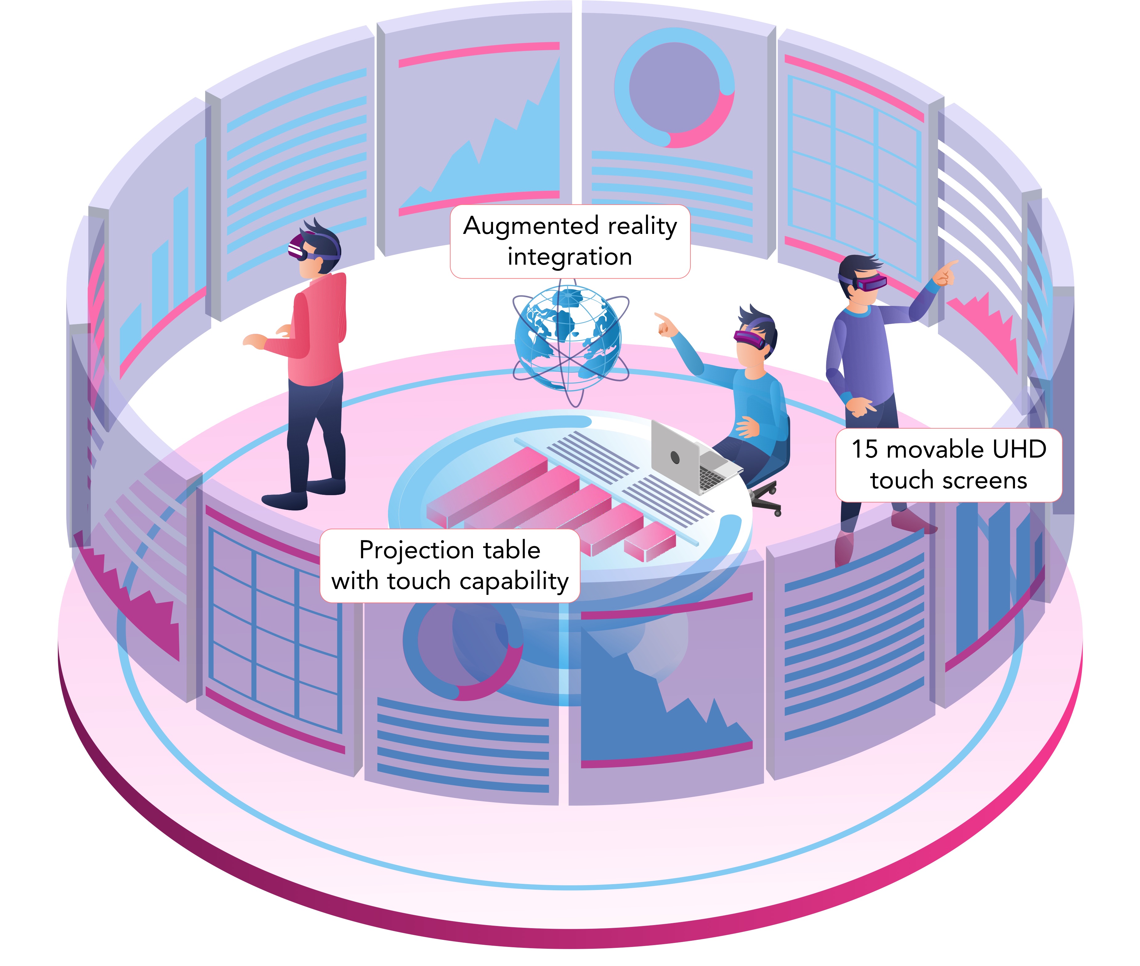
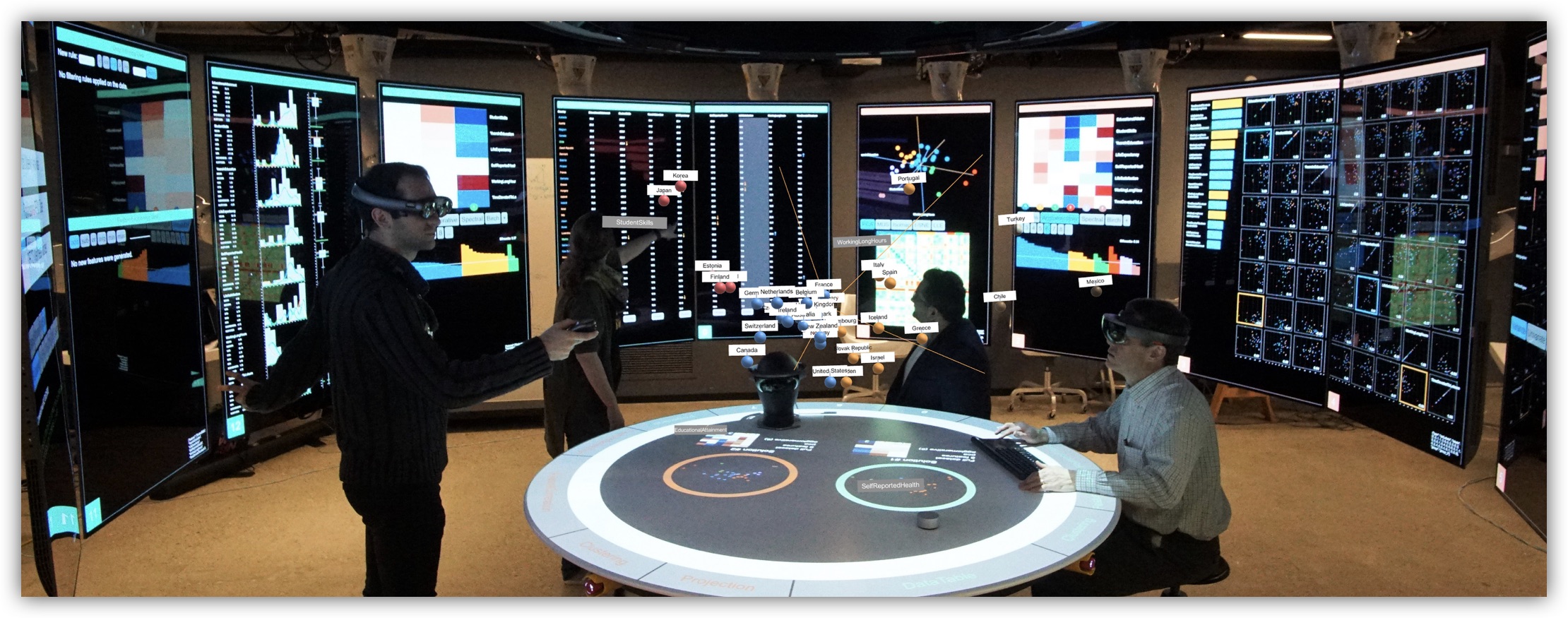
Dataspace (Fig. 2) is a room-sized hybrid reality environment where people can work together and interact naturally with both 2D and 3D information. Dataspace leverages a unique combination of movable high-resolution displays, an interactive projection table, and augmented and virtual reality head-mounted displays, and is specifically aimed at improving the collaborative decision-making process. In this section we briefly outline the main characteristics of the environment to contextualize our Immersive Insights system. We refer readers to the Dataspace paper (Cavallo et al., 2019) for further details.
3.1. The Environment
The primary physical components constituting Dataspace are:
-
•
15 UHD displays with touch capability, which can be moved and rotated in space via robotic arms mounted to the ceiling.
-
•
A central table onto which visual content can be displayed through two HD projectors. Touch and gestures performed on the table are detected through a set of eight Kinect v2 sensors.
-
•
A spatial audio system consisting of 20+2 speakers, and an array of four directional microphones that can be used to detect voice commands and their sources.
-
•
A set of augmented reality headsets (currently Microsoft Hololens and Magic Leap One devices) to interact with spatial or high-dimensional data, often visualized atop the central table.
-
•
A set of virtual reality headsets (Samsung Odyssey) to remotely access the environment and its functionalities, providing a virtual replica of Dataspace and its content.
Dataspace implements a modular software architecture for 1) safely coordinating robotic arms, 2) detecting and tracking people and objects in the environment, 3) controlling screen content and table projections, 4) interpreting speech and generating audio output. The environment adopts web-based rendering through Electron (ele, CSS), promoting high flexibility for application development (e.g. HTML, WebGL) and support for external devices with browsing capabilities (e.g. laptops and smartphones). Thanks to the combination of UHD screens and AR headsets, Dataspace can simultaneously render high-resolution 2D content and 3D information, and may thus be referred to as a hybrid reality environment (Febretti et al., 2013). Dataspace can provide flexible data immersion through its capability to dynamically reconfigure screens in space and through seamless integration with AR and VR devices. Thanks to its spatial awareness system feature, Dataspace can leverage the relative positioning of different environmental elements, enabling a wide set of context-aware interactions. Examples include automatically performing actions on the screen(s) closest to a specific user, orienting table content and lighting towards the person who is currently speaking, physically moving information closer to the user who just performed a gesture, and moving content to different screens through gaze or AR/VR controllers.
4. Immersive Insights
Immersive Insights is a web-based system specifically developed for Dataspace, and aimed at enhancing the EDA experience of a group of data scientists who want to make sense of pre-existing, often unlabeled, datasets. The current version of Immersive Insights focuses on statistical analysis, clustering, dimensionality reduction, and feature sensitivity analysis. In this section we first outline the design challenges characteristic to EDA, and then describe the data flow, visualizations and interactions associated with the Dataspace screens, table, and augmented reality extension.
System architecture.
Immersive Insights’ front end has been implemented with React.js (rea, ctjs) in combination with D3.js (Bostock et al., 2011), and communicates through websockets with a back end implemented in Python. The back end takes care of computational tasks by leveraging standard libraries such as numpy, scikit-learn and pandas, and forwards the results to associated views. Immersive Insights can be run in development mode on a normal laptop and tested in Dataspace, or be directly deployed to the environment as Docker container. We note that our system does not necessarily require Dataspace to work, and can be accessed from any web browser.
4.1. Design Considerations
4.1.1. Getting lost in EDA
Identifying relevant structures in and having insights about unlabeled data is a non-trivial process in which data scientists iteratively apply a varying set of algorithms and statistical methods. There is, by definition, no standard way of performing EDA, and steps such as data preprocessing, dimensionality reduction, clustering, and formulation and validation of hypotheses about the data are continuously and variously used by each analyst.
The absence of a standardized workflow, combined with the wide variety of data analysis tasks and algorithms, poses an initial design challenge involving the reproducibility of EDA sessions. This problem is exacerbated by the multiscale nature of data exploration (Cavallo and
Demiralp, 2019): identifying relevant insights often depends upon the exploration of many different subsets of the original dataset. Techniques such as filtering, isolation, and sub-clustering are commonly used to identify and better understand smaller structures in the data. Similarly, feature selection involves considering subsets not of data samples, but of data dimensions (features), in order to study their statistical significance.
When building software tools to support EDA, it is inherently difficult to keep track of all these iterative data transformations, drill-down operations, and the ways different techniques affect various subsets of the data. This is also the reason why most general-purpose EDA tools do not support collaborative workflows.
A second significant challenge is providing a contextualized understanding of how algorithms apply differently to the data and its various substructures (Tukey, 1977). This generally involves making statistical information available to describe the data subset currently under consideration, and the ability to visually and quantitatively compare that data subset with other subsets, or the original dataset. Standard data visualization techniques such as linked views, focus-and-context, and modal windows are generally used in EDA tools to provide contextualization and comparison capabilities. However, screen size and resolution can limit the amount of contextual information that can be simultaneously displayed, often requiring users to navigate too many tabs or click too many buttons.
4.1.2. The promise of hybrid reality
We propose Immersive Insights as a possible solution to the aforementioned limitations of EDA: workflow reproducibility, contextualization, comparison, and collaboration. To keep track of the analysis workflow, we have based the design of Immersive Insights on the concept of a “data instance” (also referred to as a “solution”): any unique combination of data samples and dimensions that originates from the same, original dataset - and onto which parametric algorithms can be independently applied. Our definition of a “data instance” is analogous to the concept of the “clustering view” proposed in (Cavallo and Demiralp, 2019), where the authors mention screen size as a limiting factor to the number of data instances that can be concurrently analyzed. By redefining classic EDA workflows within the virtuality spectrum, and by leveraging a hybrid reality system with about 20 times the resolution and 100 times the screen surface of a laptop, we attempt to provide a tool with better contextualization and comparison capabilities, supporting simultaneous independent analyses on multiple data instances. To keep track of data instances and foster collaborative analysis, we further combine Dataspace screens with AR devices and the central table, which offers a summary view of the entire session.
4.2. Data Views
Visualizations, statistical information, clustering and projection associated with a specific data instance are grouped into dedicated graphical layouts, called “data views”. Data views can be loaded onto Dataspace screens through voice interaction (e.g. by saying “Show projection view on that screen / on screen number 13”); from the AR headsets; or from a touch menu that can be opened on the table. Whenever a data view is loaded, the robotic arm associated with the screen moves down to bring the screen closer to the user. By default, each view spans one Dataspace screen, but can be arbitrarily extended to occupy multiple screens to accommodate larger amounts of information (e.g. by saying things like “Load X view on screens Y and Z” or “Extend X to N screens”). Each data view is bound to a specific data instance (solution), each of which can be identified by the frame color of the screen. Thanks to this functionality, the same type of data view can be independently used on different screens and bound to different data instances. Despite that the data views implemented in our system largely make use of existing visualizations and interaction types (Becker and Cleveland, 1987; Buja et al., 1991; Wills, 2008), we still find it useful to discuss the rationale behind their design in the context of a hybrid reality environment and as a base for understanding the user study proposed in Section 4.
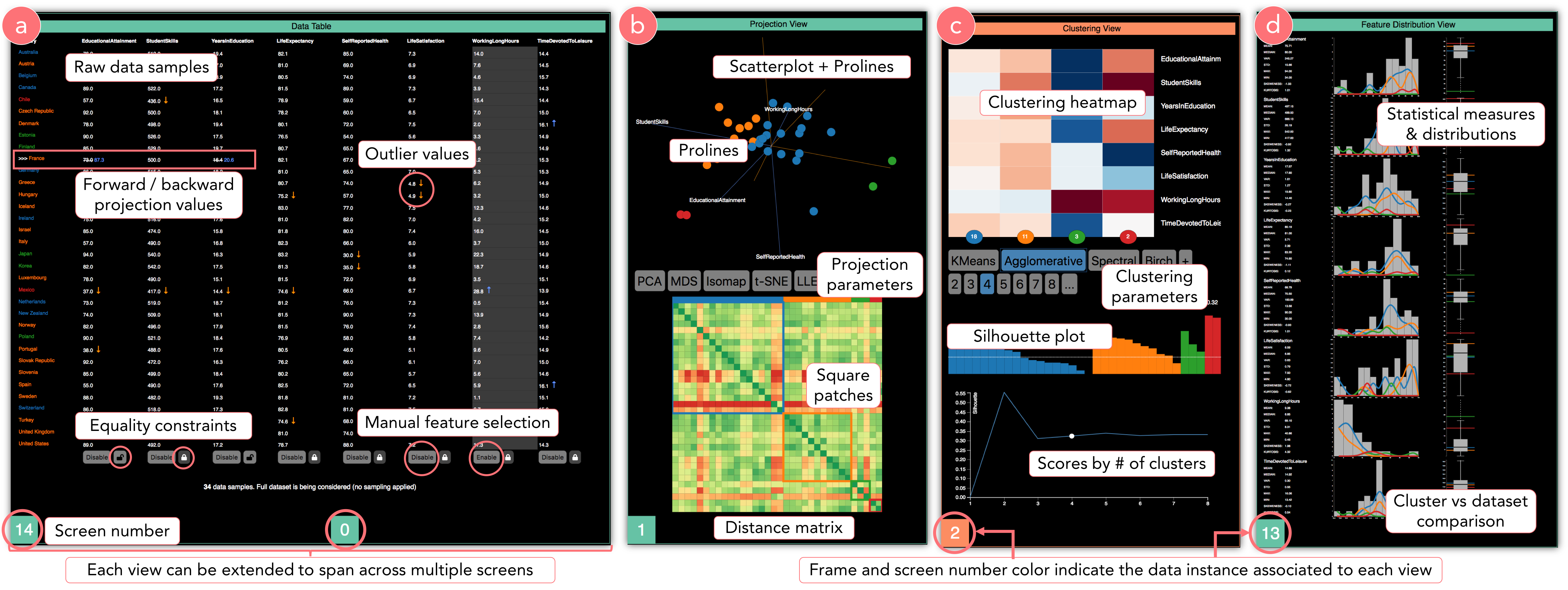
4.2.1. Data table (Fig. 3a)
It is important to provide users with a simple way to access and form initial intuitions about raw data—down to the scale of a single data sample. The Data Table view augments the visualization of data samples with a simple form of outlier detection, and uses color to encode eventual clustering assignments. Touch and voice interactions can be used to select and sort data samples, and to “enable or disable” data features (i.e. consider them or not in the analysis). The Data table also plays an important role in the process of forward and backward projection, explained in Section 3.4. We note that, despite that this view can be easily extended to multiple screens to show more data features, it still does not scale to high-dimensional datasets (Gratzl et al., 2013)—and this is the reason why we included an option to show only the most relevant dimensions identified in the feature selection view.
4.2.2. Projection (Fig. 3b)
Dimensionality reduction algorithms are a convenient way data scientists visualize high-dimensional data. Dataspace’s Projection view enables users to specify a dimensionality reduction algorithm and a varying number of parameters (e.g. distance metric) and visualize the algorithm’s output as a 2D scatterplot, where each data point is colored according to its clustering assignment. While a very powerful means to identify structures and outliers in the data, scatterplots of dimensionally reduced data generally lack interpretability as to the contribution of specific data features to the projection. To mitigate this, we complement the scatterplot visualization with prolines (Cavallo and Demiralp, 2018), a generalized version of biplot (Gabriel, 1971) that introduces axes representative of the original data dimensions. Each proline axis indicates the relevance and directionality of increase for a feature, and provides statistical information about that feature’s distribution. In order to allow further debugging of dimensionality reduction algorithms and, more specifically, of their distance metrics, the Projection view includes a heatmap indicating per-point distances, where rows and columns are sorted by clustering assignments. In the case of good cluster compactness and separation, the heatmap clearly visualizes different “square color patches” along its diagonal. Uniform colors across the distance matrix may indicate instead points that are too far apart from each other in multi-dimensional space (“curse of dimensionality”), requiring a re-definition of the adopted distance metric. Scatterplot points and matrix cells in the Projection view are linked to all other data views associated with the same data instance, enabling the visualization of contextual information after performing a selection on any view.
4.2.3. Clustering (Fig. 3c)
Clustering algorithms are generally used by data scientists to identify groups of data points that have similar features, dividing the dataset into a number of clusters (often user-defined). Each clustering algorithm depends on a varying set of parameters (such as distance metric and number of clusters to apply), and outputs a per-point cluster assignment (“label”) or a probability of belonging to a certain cluster. In Immersive Insights, these algorithmic choices can be expressed through touch from the Clustering view or voice (e.g. by saying, “Apply agglomerative clustering with 4 clusters to solution 1”), and clustering results are broadcasted to all views associated with the current data instance. To facilitate the interpretation of clustering assignments with respect to cluster sizes and statistical properties of each cluster, Immersive Insights’ Clustering view includes a heatmap visualization where columns represent clusters and rows represent data features. The color of each matrix cell encodes the average feature value for a particular cluster, with red being very high and blue very low. By looking at a column vertically, users can quickly spot key features characterizing a cluster; by looking at a specific row, users can compare the values of multiple clusters based on that feature. A fundamental step in clustering analysis involves evaluating the “goodness” of a clustering result, which is generally quantified in terms of cluster compactness and isolation (Liu et al., 2010). The Clustering view displays silhouette score (Rousseeuw, 1987) as a validation metric, and includes a silhouette plot to help scientists understand which data points will likely change a clustering assignment when clustering parameters are changed. A line chart with precomputed silhouette scores further enables users to intuit how cluster separation and compactness vary based on the choice of number of clusters to consider.
4.2.4. Distribution (Fig. 3d)
Statistical information plays a fundamental role in EDA, and visualizing the distribution of each feature helps data scientists understand the properties of their data, as well as debug the outcomes of applying various algorithms (e.g. normalization, skewness of data). Therefore, our distribution view includes distributional information on features, in the form of summary statistics, histograms and box plots. In particular, we use colored overlays and side-to-side summaries to enable statistical comparison of identified structures (selections, clusters) with respect to the full-dataset distribution. This allows users to intuit the size of each cluster, its differentiating features, and its impact on determining the global data distribution.
4.2.5. Correlation
Identifying relevant correlations among data dimensions is another process fundamental to EDA. On top of indicating possible predictive relationships among features, correlations are also used to generate initial hypotheses about the data, and for feature selection. In the presence of multiple variables that are highly correlated, for instance, data scientists may work to remove noise by electing to keep only one such variable, or by substituting in a new feature synthesized from the original ones. Our correlation view displays a bar chart with top pairwise correlations, and a scatterplot matrix of pairwise correlations where each data point is colored based on its clustering assignment.
4.2.6. Feature selection
Feature selection is the process of deciding which of the original data dimensions should be included in an analysis, or fed into an algorithm. This process aims at improving computational performance during analysis, removing noise data, or improving estimators’ accuracy scores on high-dimensional datasets. We consider two types of feature selection: algorithms that can be applied to fully unsupervised data (e.g. PCA, variance, feature agglomeration) and algorithms that rely on labels generated during the clustering process (e.g. univariate selection with chi squared or ANOVA). In the former case, features are ranked based on variation in their distributional information; in the latter, features are ranked based on their relevance (p-value, effect size) in determining a specific clustering outcome. Users can manually decide to enable or disable features or allow the system to automatically select the most n relevant ones.
4.2.7. Feature filtering and engineering
Successful EDA requires the ability to consider meaningful selections from the original data, and alternatively focus analysis on these subsets. For this reason, we include a filtering feature that allows users to select data samples based on AND/OR combinations of different equality and inequality constraints. These constraints are defined through touch, voice, or keyboard input. Once a selection is made or a filter applied, the chosen points are highlighted in all views associated with this data instance. The user may also perform isolation and reprojection, which, respectively, hide all non-selected points from all views, and update scatterplots of dimensionally reduced data by recomputing their projections only on the selected samples. Immersive Insights further allows users to add new features to the dataset that are generated as combinations of existing features, a process often referred to as “feature engineering”.
4.3. Table View: Analysis Overview
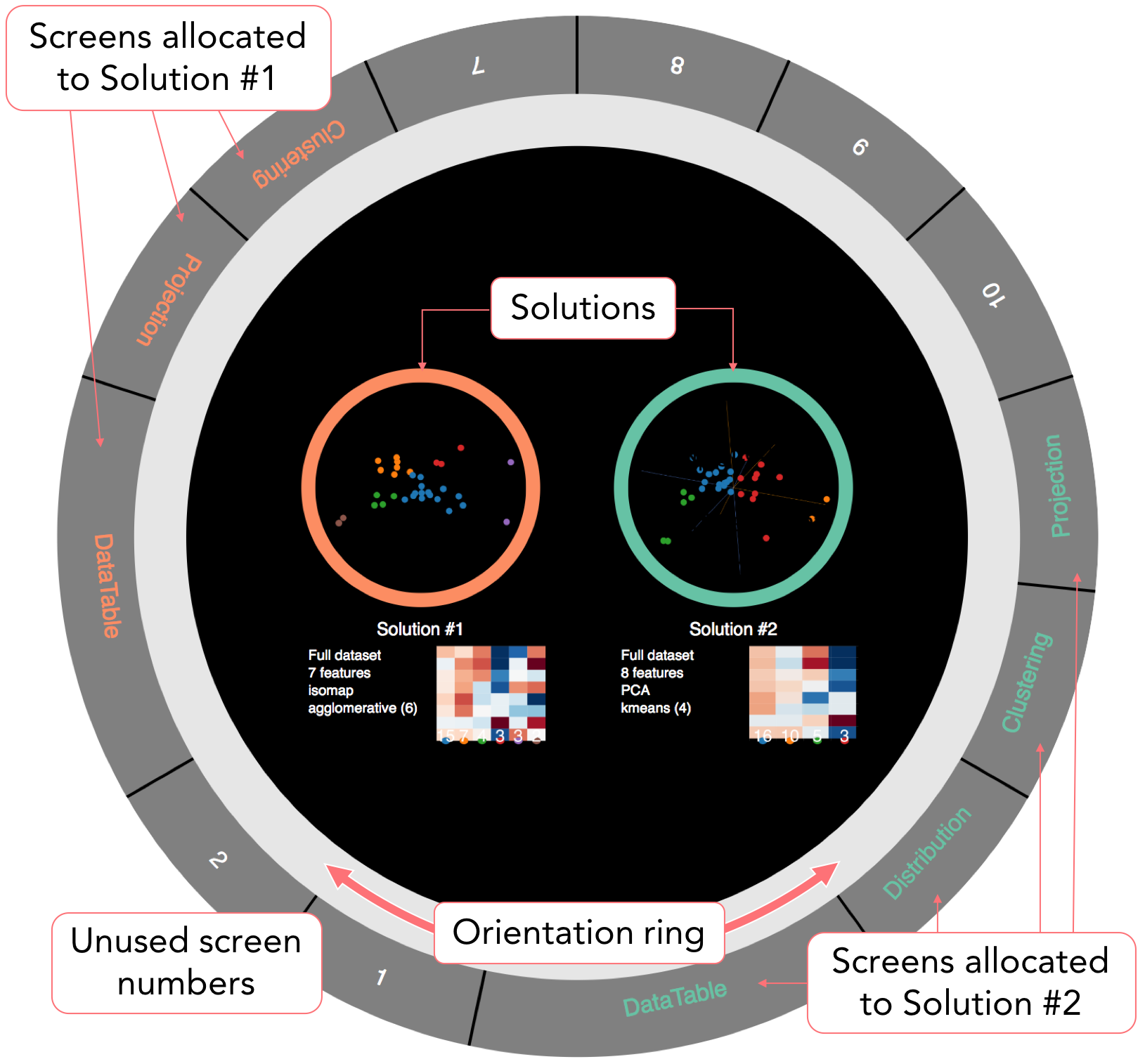
Managing multiple data views and tracking the analysis workflow are non-trivial tasks whose complexity increases in collaborative settings. Immersive Insights allows data scientists access to their own slice of data for personalized analysis through the concept of data instances (solutions), requiring them to keep track of which Dataspace screens and which parameters are associated with each solution. At the same time, it is important to have a central gathering point where users can discuss their opinions on the use of algorithms or on the labeling of data points, facilitating consensus or more efficiently incorporating ideas from alternative procedures. With these considerations in mind, we included a circular view on the central projection table, with the two-fold purpose of orientating users in the environment and enabling comparison of different analysis solutions (Fig. 4). We visualize each data instance by combining the dimensionality reduction 2D scatterplot and the clustering heatmap visualization, which together represent the minimum amount of visual information necessary to qualitatively describe a clustering result (Cavallo and Demiralp, 2019). Textual information about the algorithms generating each solution and their silhouette scores are also shown, providing a simple form of quantitative comparison. By tapping on a particular solution, users can enable or disable the corresponding 3D projection in the AR view, allowing for side-to-side spatial comparison. The Dataspace screen(s) associated with a particular solution can instead be identified by 1) visually matching the color of the solution on the table with the color of the frame of particular Dataspace screen(s), 2) by double-tapping a solution on the table, an action that highlights associated data views and physically brings their screens closer to the table, and 3) by referring to the colors displayed in the outer ring of the Table view. In fact, we have included two interactive rings on the table. The outer ring is divided into small sections of variable radius, each representing a data view and its associated Dataspace screen(s). A user studying the data view on the table in front of him/her can simply look up and find that same view on the screen(s) ahead. When comparing results at the table and preparing for the next steps in the analysis, it is often necessary to reorganize data views. The outer ring supports drag-and-drop interactions, allowing users to move a view to a different screen, extend it to multiple screens, or clear that view. The inner “orientation” ring, on the other hand, is used to rotate the central content of the Table view towards a particular user (Kruger et al., 2004).
4.4. Augmented Reality Integration
Immersive Insights supports the optional use of augmented reality headsets (Microsoft Hololens and Magic Leap One) to complement the data analysis experience. AR devices are used to visualize data atop the central table, but also to provide guidance and information on-demand when interacting with specific Dataspace views. Thanks to the environment’s spatial awareness system, AR-specific interaction such as the use of gaze and airtap (Hololens) and 3D controllers (Magic Leap One) are transformed through raycasting into touch-equivalent events, enabling AR users to perform standard operations on Dataspace screens from a distance.
Enhanced exploration of high-dimensional data
Thanks to their ability to visually summarize a data instance immediately upon being looked at, projection views of dimensionally reduced data (Section 3.2.2) are arguably the most used type of view in Immersive Insights. While they provide users with quick, qualitative intuitions regarding the effects of any algorithm applied to the data, they also generally require the user to turn back and forth in order to look at other complementary views (e.g. clustering, distribution) and quantify the results. Hence, in Immersive Insights we propose a tridimensional, AR version of the Dataspace projection view, to be visualized atop the central table. This makes the view simultaneously visible to all AR users from any location, and allows a seamless transition from AR content to detailed statistical information on the environment’s screens. The ability to visualize an extra dimension in the dimensionality reduction, and the larger surface (volume) available for the projection, together represent an opportunity to improve the interpretability of projection axes, reduce visual clutter, and introduce direct manipulation of data samples. To support sensitivity and what-if analysis, we have introduced a tridimensional generalization of the forward and backward projection interactions originally proposed by Cavallo in (Cavallo and Demiralp, 2018). Through forward projection, the user can specify through voice (or manually from the Data table view) a perturbation in the feature values of a selected data sample (e.g. “Try increasing the ¡feature¿ value of this data point by 5”), and observe how the position of the point changes via an animation displayed in the AR projection view. Conversely, a data scientist can use backward projection by manually dragging a data point around in the projection space, and observing how its feature values would have to change to accommodate the introduced modification. For example, a user might consider an outlier data point, questioning how that point’s feature values would have to change in order for it to belong to the neighboring cluster. Simply dragging the point closer to that cluster helps quantify how much each feature has determined the point’s distance from the cluster. We refer readers to the original paper (Cavallo and Demiralp, 2018) for more details on prolines and forward and backward projections.
Providing guidance during the EDA workflow
On top of using it for a dedicated central projection view, we leverage AR to provide further visual assistance to users during interactions with standard Dataspace views. When the wearer of an AR headset looks at (Hololens) or orients their controller towards (Magic Leap One) a data view, an AR overlay frame is created around the view and a cursor is rendered on the physical screen through raycasting, clarifying which UI elements the user is interacting with. This feature is particularly useful for managing tracking or alignment issues associated with the relationship between the AR view and the physical environment. Similarly, when an action is performed on the data, all views affected by this change are momentarily highlighted in the AR view and virtual arrows are used to indicate updates in views situated behind the user. Similarly, speech transcription in AR allows for real-time feedback when using voice commands, providing a way to debug unsuccessful commands and minimizing the time it takes to correct them (e.g. in the case of incorrectly spelling an algorithm’s name). Finally, AR can be used to provide on-demand information specific to each data view. Due to screen space and readability limitations, it is unreasonable to permanently add more information (such as suggestions or feedback on the choice of algorithms) to existing data views. However, augmented reality allows us to dynamically display additional information without modifying the layout of existing views, and personalize that information for the user who currently needs it. Current implementations of this feature, activated by user proximity to a screen, include bubble overlays with statistical information (e.g. area distribution charts in the Feature selection view, ANOVA p-values in the Clustering view) and simple virtual UIs to facilitate certain tasks (e.g. a slider to modify the number of clusters in the Clustering view).
5. Evaluation
We illustrate here the procedure and results of an initial, two-part user study conducted on 12 data scientists using Immersive Insights. The goal of the first part of the study was to evaluate the contributions and limitations of immersive technologies in EDA at various levels of the virtuality continuum (Milgram and Kishino, 1994), leveraging the flexible data immersion capability of Dataspace and its virtual model (Cavallo et al., 2019). Specifically, we had participants perform very specific data analysis tasks with Immersive Insights in four different Dataspace modalities (Fig. 5): 1) without AR integration, 2) with AR integration, 3) using a virtual representation of Dataspace in AR (i.e. using virtual screens in place of the physical ones), and 4) fully immersed in VR. In the second part of the study, our goal was to evaluate the effectiveness of Immersive Insights in allowing data scientists to collaboratively generate insights, comparing our system with the recent desktop-based tool Clustrophile 2. As opposed to the first part of the study, here we focused on the data analysis session as a whole, allowing participants complete freedom while collaboratively solving a single, complex task. We compared Immersive Insights with Clustrophile 2 for two main reasons: 1) Clustrophile 2 is a fully-implemented system that extends beyond the scope of a simple research prototype, allowing for an end-to-end analysis session; and 2) despite differences among technologies employed, the two systems share a similar design and present almost equivalent functionality. Finally, we conclude by analyzing our results and provide some considerations regarding the use of immersive technologies for collaborative data analysis.
Participants.
We recruited a total of twelve data scientists, four for each of the three data analyst archetypes (hacker, scripter, and application user) identified by Kendel et al. (Kandel et al., 2012). In addition to ensuring full coverage of different types of users, this choice of participants made it easier to compare the performance of our system to the results obtained in the Clustrophile 2 user study. Participants were selected from among 20 candidates who had at least a masters degree in science or engineering and at least two years of work in data science. Selections were made so as to maintain gender parity, with ages ranging from 25 to 43 years old.
Procedure.
Participants were shown a 10-minute video on user interactions in Dataspace, then individually introduced to the physical environment. Assisted by one of our collaborators, participants were then invited to freely analyze a toy dataset focused on indices of wellness for 34 OECD countries (oec, ndex). Initially, each participant was required to individually perform the same data analysis tasks according to only one of the four possible modalities (i.e. three participants per each modality in Fig. 5). In the second part of the study, the same participants were placed in groups of three (one hacker, one scripter and one application user per group), so they could collaborate on a team solution. We performed controlled assignments to balance the distribution of user archetypes and the use of AR and VR headsets. We recorded videos of both parts of the study, asking each group to think through their actions and interactions with teammates aloud. During the user study, analysts were not permitted to ask our collaborators about anything beyond the usage of a particular feature of the system.
5.1. Part 1: EDA and the Virtuality Continuum
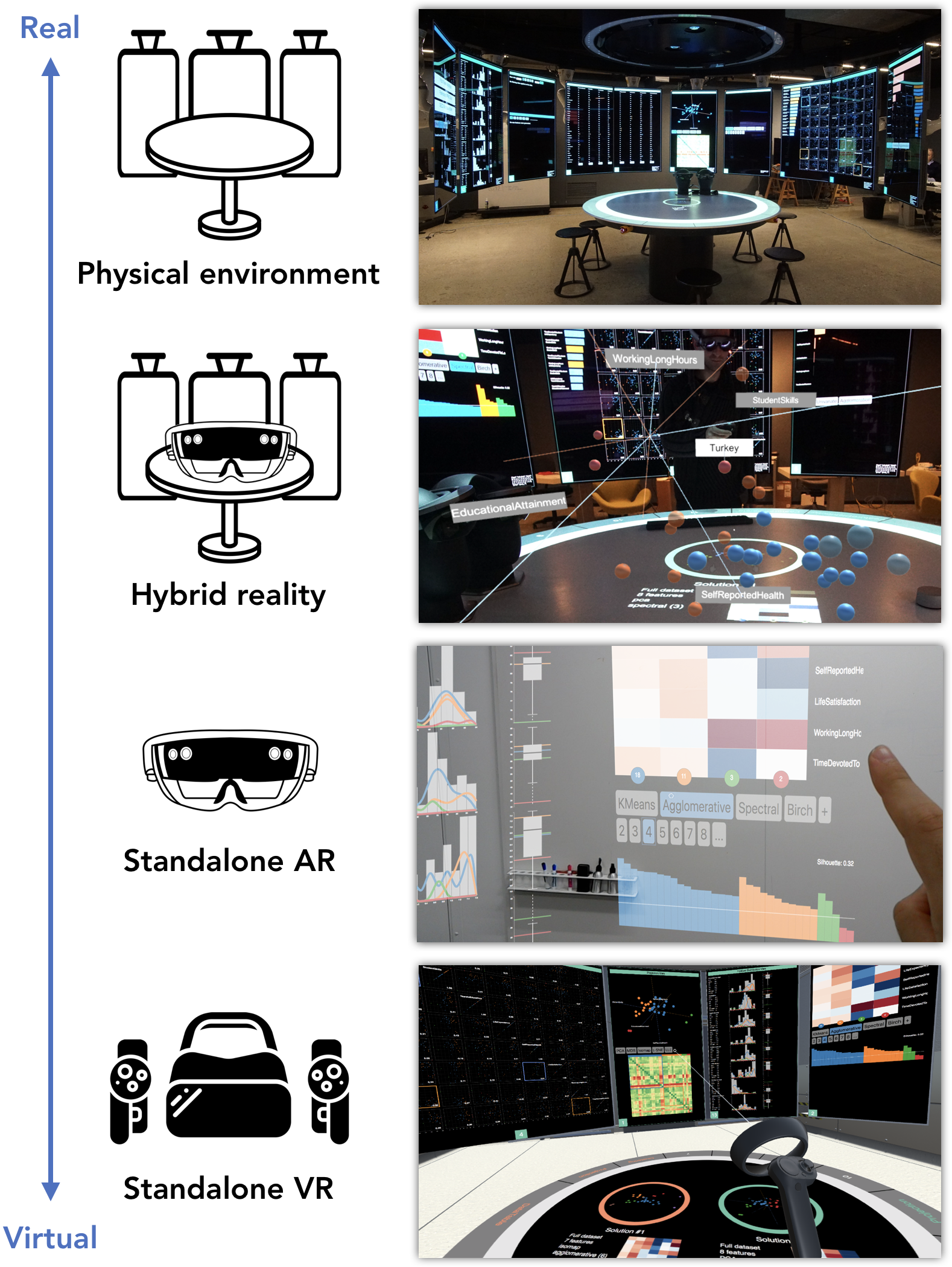
The first part of the study involved individually performing four EDA tasks, comparing their time performance by using Immersive Insights in four different modalities:
-
•
Real environment: only Dataspace screens and table, and their associated touch, gesture and voice interactions, could be used by participants.
-
•
Hybrid reality: AR headsets could be used together with Dataspace physical elements, as described in Section 3.
-
•
Standalone AR: participants wore a Hololens headset and interacted only with a virtual replica of Dataspace (1:1 scale), originally developed by the authors to support remote participation (Cavallo et al., 2019). In this setting, all Immersive Insights functionalities were preserved, but physical screens and table were replaced by digital counterparts, and touch interactions were taken over by raycasting and airtap gestures. Voice commands were still enabled thanks to the device’s microphone.
-
•
Standalone VR: similar to the AR standalone setting, participants used a virtual replica of the Dataspace environment, but were completely immersed in VR through a Samsung Odyssey headset. The usual touch interactions were replaced by raycasting through the Samsung Odyssey controllers, who could also be used to move around the virtual environment using the standard teleportation feature.
The dataset used for the experiment consisted of 200 samples randomly chosen from a larger database of Fitbit activity recordings. Each row was associated with the activity levels of single subject over a period of three months, and was characterized by 19 data dimensions, including average number of steps during weekdays and weekends, gender and age information, and other indices such as stress and wellness score. Each participant performed tasks independently, and, with the exclusion of the first modality, was required to wear the headset (Hololens or Samsung Odyssey) from the beginning until the end of the experiment. In all four modalities, participants started each task with the same initial Dataspace configuration, composed of a total of 10 Dataspace screens displaying each of Immersive Insights’ data views. The tasks, selected to be non-trivial and to involve the use of multiple data views, were the following:
-
•
T1: Identify the person with the highest participation rate among the cluster of subjects who are mostly active on weekdays. Compare that person’s stress and wellness scores with those of the other members of the cluster.
-
•
T2: Explain how age and gender affect preferences regarding days on which to engage in physical activity among the cluster of less active subjects.
-
•
T3: Find out whether, among the group of most active participants, people who engage in activity on weekdays do so more regularly than those who prefer to go running on weekends.
-
•
T4: Considering that the subject with ID 1036 cannot currently change his workout schedule, suggest and quantify what this participant should do to improve his overall wellness score without increasing his stress level.
5.2. Part 2: Hybrid Reality vs Desktop-based
We compared Immersive Insights to Clustrophile 2 by using the same dataset and task proposed by Cavallo and Demiralp in their user study (Cavallo and Demiralp, 2019). Their study design specifically aims at evaluating a real-world, unconstrained EDA session, where participants are asked to answer a single, open-ended research question. Since no univocal solution exists, participants can decide when they have reached a satisfiable result, ending the session. The adopted dataset has 8652 rows and 37 features, and is generated by preprocessing patient data made publicly available by the Parkinson’s Progression Markers Initiative (PPMI). Specifically, this dataset contains UPDRS (Unified Parkinson’s Disease Rating Scale) scores, which consist of a set of clinical measures describing the severity of each individual’s motor condition. We assigned to each of the four groups of data scientists the task of identifying plausible Parkinson’s phenotypes and mentioning aloud during the analysis all relevant insights they gained about the data. Each group started with a data table view spanning two screens, and two Hololens devices available on the table. Since Clustrophile 2 does not support collaborative analysis, we grouped its users by analyst archetype as to match the groups who used Immersive Insights. This way, we were able to compare Immersive Insights’ collaborative results with the cumulative insights individually collected by Clustrophile 2 users. We note that the list of insights shown in Fig. 6 was manually composed by the experimenter at the end of the user study by combining findings (collected through our think-aloud protocol) from the different sessions. The list does not include false insights.
5.3. Results and Discussion
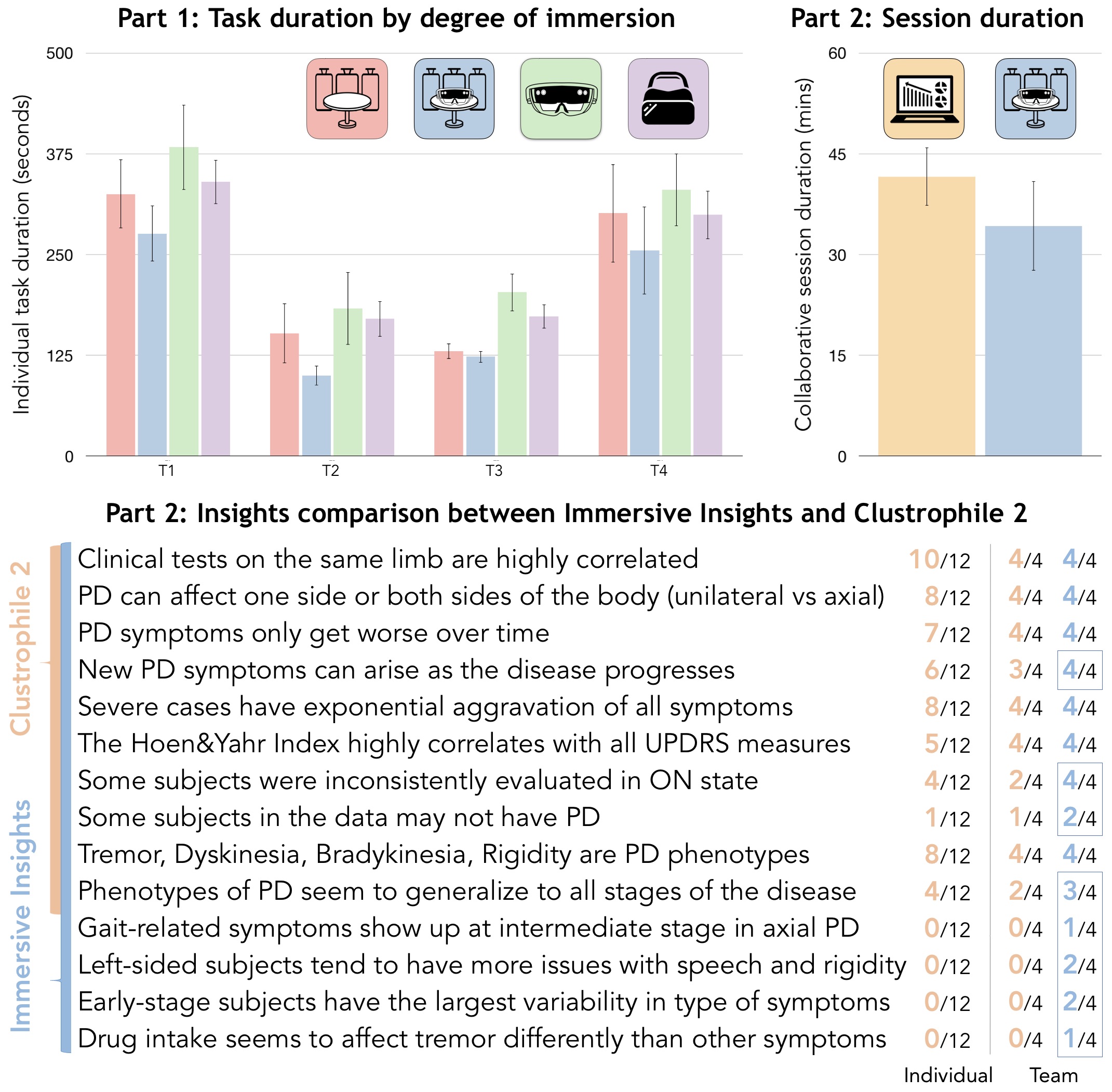
Results of the two parts of the study are summarized in Fig. 6. While the number of participants limits the statistical significance of these initial findings, our results suggest that integrating augmented reality into the EDA workflow can lead to an improvement in task duration. However, results also show that standalone AR and VR underperformed with respect to our hybrid reality solution, indicating that immersive technologies still have a long way to go before entirely disrupting standard EDA methodologies. Immersive Insights users were able to arrive at more insights, and in less time, than Clustrophile 2 users, suggesting that the development of hybrid analytics tools would be beneficial for EDA. Below, we report some considerations and statistics based on direct observation of the participants and post-experiment verbal feedback.
5.3.1. (Confirmed) Limitations and Challenges
While various examples from the literature show that AR and VR headsets can be effectively used to perform specific data analysis tasks (Millais
et al., 2018; Butscher et al., 2018; Marriott et al., 2018), durations recorded in the first part of our study indicate that recent technological advances in interaction, resolution, and field of view of HMD devices are still limiting factors in the application of these technologies to EDA.
In the case of standalone AR, the Immersive Insights modality that scored the lowest performance, task duration was considerably affected by interaction with data views through the Hololens airtap gesture and the gaze-based pointing technique. In particular, airtap proved to involve a steep learning curve and, despite the enlarged size of UI affordances, gaze tracking was imprecise when interacting with views from the middle-to-long distance (57% successful airtap attempts overall). We expect this accuracy to improve with the use of the Hololens clicker device, which was not available in this study.
Limited field of view, a known issue with Microsoft Hololens, played a crucial role in the standalone AR modality, forcing users to frequently rotate their heads and therefore completely lose the advantages of peripheral vision in combining contextual information from multiple (virtual) views. In most cases, participants were required to move very close to various views in order to see tables and statistical information, which were otherwise difficult to interpret due to the device’s resolution.
Standalone VR overall had a better performance than AR, mostly due to the use of hand controllers, the higher resolution and field of view of the Samsung Odyssey, and to the possibility of teleporting in the virtual room (e.g. to next to the virtual screens of interest). Fine-grained UI control through raycasting, however, still proved unreliable with respect to touch interaction, and the HMD’s pixel-density could not match the high resolution statistical info displayed by physical Dataspace screens.
The second part of the study, which involved a more prolonged use of these devices, further confirmed discomfort in wearing headsets (group average of 8.1 minutes of intermittent use, about one fourth of the average session duration), gesture interpretation issues (e.g. an involuntary bloom gesture shut down the Immersive Insights application on two headsets), and difficulties with text input (e.g. users fell back to using the Dataspace mechanical keyboard for filtering operations).
Though their use is tempting, we should not yet conclude that modern HMDs and virtual replicas are ready to render more expensive technologies such as physical collaborative environments obsolete.
5.3.2. Collaborative Hybrid Analytics
Immersive technologies promise to enrich EDA through spatial data analysis, on-demand statistical information, more flexible management of contextual content, and (remote) collaboration. While our user study reported unclear advantages in utilizing depth information while visualizing high dimensional data (Bach et al., 2017), the comparison of Immersive Insights with Clustrophile 2 demonstrated the potential contributions of a hybrid reality approach to collaborative data analysis. By summing the number of parameters applied by each group during a session (e.g. the number of changes in algorithm, metrics, cluster number, and projection), we noted that Immersive Insights users attempted less parameter changes than Clustrophile 2 users (19.7 vs 27.74 average changes), and performed more simultaneous independent analyses (2.7 vs 1.83 average data instances), with an overall 21.6% improvement in total time spent. We believe these results are connected with 1) the intrinsically collaborative setting of Dataspace (e.g. group discussion limited the trial-and-error approaches seen with Clustrophile 2), 2) the Table view (e.g. comparing and keeping track of data instances), and 3) the enhanced ability to contextualize provided by the larger total screen surface and seamless integration with AR augmentations. An average of 1.4 devices were used by each team during the analysis session, with men wearing the headset 2.2 times longer than female participants. We also noted an interesting tendency to pass a device to another member of the team, rather than picking up new devices from the table. To further our understanding of team dynamics in collaborative hybrid analytics, we plan on conducting a more extensive future study, which will also include an evaluation of how remote collaboration through AR and VR may impact the EDA process.
5.3.3. The Need for Flexible Data Immersion
The new wave of AR and VR devices has undoubtedly generated excitement about their applicability to many domains, including EDA, and their use has the potential to benefit various aspects of data analysis. However, our study confirmed that hardware and comfort limitations still inhibit the use of Hololens for extended periods of time during the analysis. We also observed that standalone AR/VR experiences are not suited for a fully-fledged EDA, as many design and interaction challenges still need to be addressed. In fact, while voice commands, wand-based selections, and 3D manipulations can be useful for certain visual analytic tasks, a 2D monitor with touch or mechanical keyboard input remains significantly more efficient for other tasks. While our community continues researching appropriate ways to apply these technologies to data science, we believe AR and VR should be cautiously used to complement existing visual analytics methodologies, rather than imagined as a possible replacement. In particular, we encourage the development of systems that offer multimodal interaction and a flexible level of data immersion, so that users are free to decide at any moment which technology and interactions makes sense to use when performing specific EDA tasks.
6. Conclusion
In this work, we presented Immersive Insights, a hybrid analytics system for exploratory data analysis (EDA) implemented in a Dataspace collaborative environment. Leveraging the flexible degree of immersion provided by Dataspace through its integration with AR and VR devices, we were able to study how these rising technologies can contribute to EDA workflows at different levels of the virtuality spectrum. We also evaluated Immersive Insights by comparing its performance with a similar desktop-based tool during a collaborative analysis session. While we acknowledged that immersive technologies can contribute to reduced analysis time and may facilitate the generation of additional insights, we also demonstrated that AR and VR cannot yet entirely replace non-immersive EDA methodologies. Ultimately, we encourage the development of hybrid systems in which immersive technologies do not aim to take over existing EDA workflows, but try to complement them instead.
References
- (1)
- 3da (tics) 3Data: AI + AR + Visual Analytics. https://3data.io. Accessed: 2019-07-17.
- ele ( CSS) Electron: Build cross platform desktop apps with JavaScript, HTML, and CSS. https://electronjs.org. Accessed: 2019-07-17.
- oec (ndex) OECD Better Life Index. http://www.oecdbetterlifeindex.org/. Accessed: 2019-07-17.
- rea (ctjs) React.js. https://facebook.github.io/react/. Accessed: 2019-07-17.
- vir (AIVR) Virtualitics: Get faster insights through AI+VR. https://virtualitics.com. Accessed: 2019-07-17.
- Asimov (1985) Daniel Asimov. 1985. The grand tour: a tool for viewing multidimensional data. SIAM journal on scientific and statistical computing 6, 1 (1985), 128–143.
- Aupetit (2007) Michaël Aupetit. 2007. Visualizing distortions and recovering topology in continuous projection techniques. Neurocomputing 70, 7-9 (2007), 1304–1330.
- Bach et al. (2016) Benjamin Bach, Raimund Dachselt, Sheelagh Carpendale, Tim Dwyer, Christopher Collins, and Bongshin Lee. 2016. Immersive analytics: Exploring future interaction and visualization technologies for data analytics. In Proceedings of the 2016 ACM on Interactive Surfaces and Spaces. ACM, 529–533.
- Bach et al. (2017) Benjamin Bach, Ronell Sicat, Johanna Beyer, Maxime Cordeil, and Hanspeter Pfister. 2017. The hologram in my hand: How effective is interactive exploration of 3D visualizations in immersive tangible augmented reality? IEEE transactions on visualization and computer graphics 24, 1 (2017), 457–467.
- Becker and Cleveland (1987) Richard A Becker and William S Cleveland. 1987. Brushing scatterplots. Technometrics 29, 2 (1987), 127–142.
- Bengio et al. (2004) Yoshua Bengio, Jean-françcois Paiement, Pascal Vincent, Olivier Delalleau, Nicolas L Roux, and Marie Ouimet. 2004. Out-of-sample extensions for lle, isomap, mds, eigenmaps, and spectral clustering. In Advances in neural information processing systems. 177–184.
- Bostock et al. (2011) Michael Bostock, Vadim Ogievetsky, and Jeffrey Heer. 2011. D3: Data-Driven Documents. IEEE TVCG (Proc. InfoVis) 17, 12 (2011), 2301–2309.
- Buja et al. (1991) Andreas Buja, John Alan McDonald, John Michalak, and Werner Stuetzle. 1991. Interactive data visualization using focusing and linking. In Proceeding Visualization’91. IEEE, 156–163.
- Butscher et al. (2018) Simon Butscher, Sebastian Hubenschmid, Jens Müller, Johannes Fuchs, and Harald Reiterer. 2018. Clusters, trends, and outliers: How immersive technologies can facilitate the collaborative analysis of multidimensional data. In Proceedings of the 2018 CHI Conference on Human Factors in Computing Systems. ACM, 90.
- Cao et al. (2011) N. Cao, D. Gotz, J. Sun, and H. Qu. 2011. DICON: Interactive Visual Analysis of Multidimensional Clusters. IEEE Transactions on Visualization and Computer Graphics 17, 12 (Dec 2011), 2581–2590.
- Cavallo and Demiralp (2018) Marco Cavallo and Çağatay Demiralp. 2018. A Visual Interaction Framework for Dimensionality Reduction Based Data Exploration. In Proceedings of the 2018 CHI Conference on Human Factors in Computing Systems. ACM, 635.
- Cavallo and Demiralp (2019) Marco Cavallo and Çağatay Demiralp. 2019. Clustrophile 2: Guided Visual Clustering Analysis. IEEE transactions on visualization and computer graphics 25, 1 (2019), 267–276.
- Cavallo et al. (2019) Marco Cavallo, Mishal Dholakia, Matous Havlena, Ken Ocheltree, and Mark Podlaseck. 2019. Dataspace: A Reconfigurable Hybrid Reality Environment for Collaborative Information Analysis. In 2019 IEEE Conference on Virtual Reality and 3D User Interfaces (VR). IEEE.
- Chandler et al. (2015) Tom Chandler, Maxime Cordeil, Tobias Czauderna, Tim Dwyer, Jaroslaw Glowacki, Cagatay Goncu, Matthias Klapperstueck, Karsten Klein, Kim Marriott, Falk Schreiber, et al. 2015. Immersive analytics. In 2015 Big Data Visual Analytics (BDVA). IEEE, 1–8.
- Chuang et al. (2012) Jason Chuang, Daniel Ramage, Christopher Manning, and Jeffrey Heer. 2012. Interpretation and trust: Designing model-driven visualizations for text analysis. In Proceedings of the SIGCHI Conference on Human Factors in Computing Systems. ACM, 443–452.
- Cliquet et al. (2017) Grégoire Cliquet, Matthieu Perreira, Fabien Picarougne, Yannick Prié, and Toinon Vigier. 2017. Towards hmd-based immersive analytics. In Immersive analytics Workshop, IEEE VIS 2017.
- Coimbra et al. (2016) Danilo B Coimbra, Rafael M Martins, Tácito TAT Neves, Alexandru C Telea, and Fernando V Paulovich. 2016. Explaining three-dimensional dimensionality reduction plots. Information Visualization 15, 2 (2016), 154–172.
- Cruz-Neira et al. (1993) Carolina Cruz-Neira, Daniel J Sandin, and Thomas A DeFanti. 1993. Surround-screen projection-based virtual reality: the design and implementation of the CAVE. In Proceedings of the 20th annual conference on Computer graphics and interactive techniques. ACM, 135–142.
- Cruz-Neira et al. (1992) Carolina Cruz-Neira, Daniel J Sandin, Thomas A DeFanti, Robert V Kenyon, and John C Hart. 1992. The CAVE: audio visual experience automatic virtual environment. Commun. ACM 35, 6 (1992), 64–73.
- DeFanti et al. (2011) Thomas A DeFanti, Daniel Acevedo, Richard A Ainsworth, Maxine D Brown, Steven Cutchin, Gregory Dawe, Kai-Uwe Doerr, Andrew Johnson, Chris Knox, Robert Kooima, et al. 2011. The future of the CAVE. Central European Journal of Engineering 1, 1 (2011), 16–37.
- Demiralp (2016) Çağatay Demiralp. 2016. Clustrophile: A tool for visual clustering analysis. In KDD IDEA.
- Demiralp et al. (2017) Çağatay Demiralp, Peter J. Haas, Srinivasan Parthasarathy, and Tejaswini Pedapati. 2017. Foresight: Recommending Visual Insights. Proc. VLDB Endow. 10, 12 (2017), 1937–1940.
- Engel et al. (2012) Daniel Engel, Lars Hüttenberger, and Bernd Hamann. 2012. A survey of dimension reduction methods for high-dimensional data analysis and visualization. In Visualization of Large and Unstructured Data Sets: Applications in Geospatial Planning, Modeling and Engineering-Proceedings of IRTG 1131 Workshop 2011. Schloss Dagstuhl-Leibniz-Zentrum fuer Informatik.
- Farrell et al. (2016) Robert G Farrell, Jonathan Lenchner, Jeffrey O Kephjart, Alan M Webb, MIchael J Muller, Thomas D Erikson, David O Melville, Rachel KE Bellamy, Daniel M Gruen, Jonathan H Connell, et al. 2016. Symbiotic cognitive computing. AI Magazine 37, 3 (2016), 81–93.
- Faust et al. (2019) Rebecca Faust, David Glickenstein, and Carlos Scheidegger. 2019. DimReader: Axis lines that explain non-linear projections. IEEE transactions on visualization and computer graphics 25, 1 (2019), 481–490.
- Febretti et al. (2014) Alessandro Febretti, Arthur Nishimoto, Victor Mateevitsi, Luc Renambot, Andrew Johnson, and Jason Leigh. 2014. Omegalib: A multi-view application framework for hybrid reality display environments. In Virtual Reality (VR), 2014 iEEE. IEEE, 9–14.
- Febretti et al. (2013) Alessandro Febretti, Arthur Nishimoto, Terrance Thigpen, Jonas Talandis, Lance Long, JD Pirtle, Tom Peterka, Alan Verlo, Maxine Brown, Dana Plepys, et al. 2013. CAVE2: a hybrid reality environment for immersive simulation and information analysis. In The Engineering Reality of Virtual Reality 2013, Vol. 8649. International Society for Optics and Photonics, 864903.
- Fisherkeller et al. (1974) Mary Anne Fisherkeller, Jerome H. Friedman, and John W. Tukey. 1974. PRIM-9: An interactive multidimensional data display and analysis system. In Proc. Fourth International Congress for Stereology.
- Gabriel (1971) Karl Ruben Gabriel. 1971. The biplot graphic display of matrices with application to principal component analysis. Biometrika 58, 3 (1971), 453–467.
- Gratzl et al. (2013) Samuel Gratzl, Alexander Lex, Nils Gehlenborg, Hanspeter Pfister, and Marc Streit. 2013. Lineup: Visual analysis of multi-attribute rankings. IEEE transactions on visualization and computer graphics 19, 12 (2013), 2277–2286.
- Horak et al. (2018) Tom Horak, Sriram Karthik Badam, Niklas Elmqvist, and Raimund Dachselt. 2018. When David Meets Goliath: Combining Smartwatches with a Large Vertical Display for Visual Data Exploration. In Proceedings of the 2018 CHI Conference on Human Factors in Computing Systems. ACM, 19.
- Jain et al. (1999) Anil K Jain, M Narasimha Murty, and Patrick J Flynn. 1999. Data clustering: a review. ACM computing surveys (CSUR) 31, 3 (1999), 264–323.
- Jeong et al. (2009) Dong Hyun Jeong, Caroline Ziemkiewicz, Brian Fisher, William Ribarsky, and Remco Chang. 2009. iPCA: An Interactive System for PCA-based Visual Analytics. In Computer Graphics Forum, Vol. 28. Wiley Online Library, 767–774.
- Jones et al. (2014) Brett Jones, Rajinder Sodhi, Michael Murdock, Ravish Mehra, Hrvoje Benko, Andrew Wilson, Eyal Ofek, Blair MacIntyre, Nikunj Raghuvanshi, and Lior Shapira. 2014. RoomAlive: Magical Experiences Enabled by Scalable, Adaptive Projector-camera Units. In Proceedings of the 27th Annual ACM Symposium on User Interface Software and Technology (UIST ’14). ACM, New York, NY, USA, 637–644. https://doi.org/10.1145/2642918.2647383
- Kandel et al. (2012) Sean Kandel, Andreas Paepcke, Joseph M Hellerstein, and Jeffrey Heer. 2012. Enterprise data analysis and visualization: An interview study. IEEE TVCG 18, 12 (2012), 2917–2926.
- Kruger et al. (2004) Russell Kruger, Sheelagh Carpendale, Stacey D. Scott, and Saul Greenberg. 2004. Roles of Orientation in Tabletop Collaboration: Comprehension, Coordination and Communication. Comput. Supported Coop. Work 13, 5-6 (Dec. 2004), 501–537. https://doi.org/10.1007/s10606-004-5062-8
- Krum et al. (2014) David M Krum, Thai Phan, Lauren Cairco Dukes, Peter Wang, and Mark Bolas. 2014. Tablet-based interaction panels for immersive environments. In Virtual Reality (VR), 2014 iEEE. IEEE, 91–92.
- Krumbholz et al. (2005) Cole Krumbholz, Jason Leigh, Andrew Johnson, Luc Renambot, and Robert Kooima. 2005. Lambda table: high resolution tiled display table for interacting with large visualizations. In Proceedings of 5th Workshop on Advanced Collaborative Environments, Redmond, Washington. Citeseer.
- Kwon et al. (2018) Bum Chul Kwon, Ben Eysenbach, Janu Verma, Kenney Ng, Christopher De Filippi, Walter F Stewart, and Adam Perer. 2018. Clustervision: Visual Supervision of Unsupervised Clustering. IEEE TVCG 24, 1 (2018), 142–151.
- Lespinats and Aupetit (2011) Sylvain Lespinats and Michaël Aupetit. 2011. CheckViz: Sanity Check and Topological Clues for Linear and Non-Linear Mappings. In Computer Graphics Forum, Vol. 30. Wiley Online Library, 113–125.
- Lex et al. (2010) A Lex, M Streit, C Partl, Karl Kashofer, and Dieter Schmalstieg. 2010. Comparative Analysis of Multidimensional, Quantitative Data. IEEE Trans. Visual. Comput. Graphics 16, 6 (nov 2010), 1027–1035. https://doi.org/10.1109/tvcg.2010.138
- Lischke (2018) Lars Lischke. 2018. Interacting with large high-resolution display workplaces. (2018).
- Liu et al. (2017) Shusen Liu, Dan Maljovec, Bei Wang, Peer-Timo Bremer, and Valerio Pascucci. 2017. Visualizing high-dimensional data: Advances in the past decade. IEEE transactions on visualization and computer graphics 23, 3 (2017), 1249–1268.
- Liu et al. (2010) Yanchi Liu, Zhongmou Li, Hui Xiong, Xuedong Gao, and Junjie Wu. 2010. Understanding of internal clustering validation measures. In Data Mining (ICDM), 2010 IEEE 10th International Conference on. IEEE, 911–916.
- L’Yi et al. (2015) Sehi L’Yi, Bongkyung Ko, DongHwa Shin, Young-Joon Cho, Jaeyong Lee, Bohyoung Kim, and Jinwook Seo. 2015. XCluSim: a visual analytics tool for interactively comparing multiple clustering results of bioinformatics data. BMC Bioinformatics 16, 11 (2015), 1–15.
- Manjrekar et al. (2014) Siddhesh Manjrekar, Shubhrika Sandilya, Deesha Bhosale, Sravanthi Kanchi, Adwait Pitkar, and Mayur Gondhalekar. 2014. CAVE: An Emerging Immersive Technology–A Review. In Computer Modelling and Simulation (UKSim), 2014 UKSim-AMSS 16th International Conference on. IEEE, 131–136.
- Marai et al. (2016) G Elisabeta Marai, Angus G Forbes, and Andrew Johnson. 2016. Interdisciplinary immersive analytics at the electronic visualization laboratory: Lessons learned and upcoming challenges. In Immersive Analytics (IA), 2016 Workshop on. IEEE, 54–59.
- Marrinan et al. (2014) Thomas Marrinan, Jillian Aurisano, Arthur Nishimoto, Krishna Bharadwaj, Victor Mateevitsi, Luc Renambot, Lance Long, Andrew Johnson, and Jason Leigh. 2014. SAGE2: A new approach for data intensive collaboration using Scalable Resolution Shared Displays. In Collaborative Computing: Networking, Applications and Worksharing (CollaborateCom), 2014 International Conference on. IEEE, 177–186.
- Marriott et al. (2018) Kim Marriott, Falk Schreiber, Tim DwyerKarsten, Nathalie Klein, Henry Riche, Takayuki Itoh, Wolfgang Stuerzlinger, and Bruce H. Thomas. 2018. Immersive Analytics. Springer, Cham.
- McIntire and Liggett (2014) John P McIntire and Kristen K Liggett. 2014. The (possible) utility of stereoscopic 3D displays for information visualization: The good, the bad, and the ugly. In 3DVis (3DVis), 2014 IEEE VIS International Workshop on. IEEE, 1–9.
- Metsalu and Vilo (2015) Tauno Metsalu and Jaak Vilo. 2015. ClustVis: a web tool for visualizing clustering of multivariate data using Principal Component Analysis and heatmap. Nucleic acids research 43, W1 (2015), W566–W570.
- Milgram and Kishino (1994) Paul Milgram and Fumio Kishino. 1994. A taxonomy of mixed reality visual displays. IEICE TRANSACTIONS on Information and Systems 77, 12 (1994), 1321–1329.
- Millais et al. (2018) Patrick Millais, Simon L Jones, and Ryan Kelly. 2018. Exploring Data in Virtual Reality: Comparisons with 2D Data Visualizations. In Extended Abstracts of the 2018 CHI Conference on Human Factors in Computing Systems. ACM, LBW007.
- Ni et al. (2006) Tao Ni, Doug A Bowman, and Jian Chen. 2006. Increased display size and resolution improve task performance in information-rich virtual environments. In Proceedings of Graphics Interface 2006. Canadian Information Processing Society, 139–146.
- Orban et al. (2019) Daniel Orban, Daniel F Keefe, Ayan Biswas, James Ahrens, and David Rogers. 2019. Drag and Track: A Direct Manipulation Interface for Contextualizing Data Instances within a Continuous Parameter Space. IEEE transactions on visualization and computer graphics 25, 1 (2019), 256–266.
- Papadopoulos et al. (2015a) Charilaos Papadopoulos, Seyedkoosha Mirhosseini, Ievgeniia Gutenko, Kaloian Petkov, Arie E Kaufman, and Bireswar Laha. 2015a. Scalability limits of large immersive high-resolution displays. In Virtual Reality (VR), 2015 IEEE. IEEE, 11–18.
- Papadopoulos et al. (2015b) Charilaos Papadopoulos, Kaloian Petkov, Arie E Kaufman, and Klaus Mueller. 2015b. The Reality Deck–an Immersive Gigapixel Display. IEEE computer graphics and applications 1 (2015), 33–45.
- Pilhofer et al. (2012) Alexander Pilhofer, Alexander Gribov, and Antony Unwin. 2012. Comparing Clusterings Using Bertin’s Idea. IEEE Trans. Visual. Comput. Graphics 18, 12 (dec 2012), 2506–2515.
- Ponto et al. (2015) Kevin Ponto, Joe Kohlmann, and Ross Tredinnick. 2015. DSCVR: designing a commodity hybrid virtual reality system. Virtual Reality 19, 1 (2015), 57–70.
- Prante et al. (2004) Thorsten Prante, Norbert Streitz, and Peter Tandler. 2004. Roomware: Computers Disappear and Interaction Evolves. Computer 37, 12 (Dec. 2004), 47–54. https://doi.org/10.1109/MC.2004.255
- Raskar et al. (1998) Ramesh Raskar, Greg Welch, Matt Cutts, Adam Lake, Lev Stesin, and Henry Fuchs. 1998. The Office of the Future: A Unified Approach to Image-based Modeling and Spatially Immersive Displays. In Proceedings of the 25th Annual Conference on Computer Graphics and Interactive Techniques (SIGGRAPH ’98). ACM, New York, NY, USA, 179–188. https://doi.org/10.1145/280814.280861
- Renambot et al. (2004) Luc Renambot, Arun Rao, Rajvikram Singh, Byungil Jeong, Naveen Krishnaprasad, Venkatram Vishwanath, Vaidya Chandrasekhar, Nicholas Schwarz, Allan Spale, Charles Zhang, et al. 2004. Sage: the scalable adaptive graphics environment. In Proceedings of WACE, Vol. 9. Citeseer, 2004–09.
- Rousseeuw (1987) Peter J Rousseeuw. 1987. Silhouettes: a graphical aid to the interpretation and validation of cluster analysis. Journal of computational and applied mathematics 20 (1987), 53–65.
- Seo and Shneiderman (2002) Jinwook Seo and B. Shneiderman. 2002. Interactively exploring hierarchical clustering results [gene identification]. Computer 35, 7 (jul 2002), 80–86.
- Seo and Shneiderman (2004) Jinwook Seo and Ben Shneiderman. 2004. A Rank-by-Feature Framework for Unsupervised Multidimensional Data Exploration Using Low Dimensional Projections. In Procs. InfoVis. 65–72.
- Stahnke et al. (2016) Julian Stahnke, Marian Dörk, Boris Müller, and Andreas Thom. 2016. Probing projections: Interaction techniques for interpreting arrangements and errors of dimensionality reductions. IEEE transactions on visualization and computer graphics 22, 1 (2016), 629–638.
- Sutherland (1965) Ivan E Sutherland. 1965. The ultimate display. Multimedia: From Wagner to virtual reality (1965), 506–508.
- Tipping and Bishop (1999) Michael E Tipping and Christopher M Bishop. 1999. Probabilistic principal component analysis. Journal of the Royal Statistical Society: Series B (Statistical Methodology) 61, 3 (1999), 611–622.
- Tukey (1977) John W Tukey. 1977. Exploratory data analysis. Vol. 2. Reading, Mass.
- Van Der Maaten et al. (2009) Laurens Van Der Maaten, Eric Postma, and Jaap Van den Herik. 2009. Dimensionality reduction: a comparative review. J Mach Learn Res 10 (2009), 66–71.
- Vartak et al. (2015) Manasi Vartak, Sajjadur Rahman, Samuel Madden, Aditya Parameswaran, and Neoklis Polyzotis. 2015. SeeDB: Efficient Data-driven Visualization Recommendations to Support Visual Analytics. Proc. VLDB Endow. 8, 13 (Sept. 2015), 2182–2193. https://doi.org/10.14778/2831360.2831371
- Venkataraman et al. (2016) Vinay Venkataraman, Jonathan Lenchner, Shari Trewin, Maryam Ashoori, Shang Guo, Mishal Dholakia, and Pavan K Turaga. 2016. Ceding Control: Empowering Remote Participants in Meetings involving Smart Conference Rooms.. In AAAI Workshop: Symbiotic Cognitive Systems.
- Wills (2008) Graham Wills. 2008. Linked data views. In Handbook of data visualization. Springer, 217–241.
- Wills and Wilkinson (2008) Graham Wills and Leland Wilkinson. 2008. AutoVis: Automatic visualization. Info. Visual. 9, 1 (2008), 47–69.
- Wongsuphasawat et al. (2016) Kanit Wongsuphasawat, Dominik Moritz, Anushka Anand, Jock Mackinlay, Bill Howe, and Jeffrey Heer. 2016. Voyager: Exploratory Analysis via Faceted Browsing of Visualization Recommendations. IEEE Trans. Visualization & Comp. Graphics (Proc. InfoVis) (2016).
- Xu and Tian (2015) Dongkuan Xu and Yingjie Tian. 2015. A comprehensive survey of clustering algorithms. Annals of Data Science 2, 2 (2015), 165–193.