Effective Discovery of Meaningful Outlier Relationships
Abstract.
We propose PODS (Predictable Outliers in Data-trendS), a method that, given a collection of temporal data sets, derives data-driven explanations for outliers by identifying meaningful relationships between them. First, we formalize the notion of meaningfulness, which so far has been informally framed in terms of explainability. Next, since outliers are rare and it is difficult to determine whether their relationships are meaningful, we develop a new criterion that does so by checking if these relationships could have been predicted from non-outliers, i.e., if we could see the outlier relationships coming. Finally, searching for meaningful outlier relationships between every pair of data sets in a large data collection is computationally infeasible. To address that, we propose an indexing strategy that prunes irrelevant comparisons across data sets, making the approach scalable. We present the results of an experimental evaluation using real data sets and different baselines, which demonstrates the effectiveness, robustness, and scalability of our approach.
1. Introduction
As data volumes continue to grow, data-driven policies and decisions are becoming the norm. Consider, for instance, urban data. Increasingly, cities around the world are collecting and publishing open data sets that capture different aspects of urban environments (barbosa@bigdata2014; opendata@book2013; chicagoopendata; nycopendata; sfoopendata; parisopendata; rioopendata). By exploring these data sets and their relationships, it is possible to better understand how different urban components interact. This, in turn, can inform policies, make cities more efficient, and improve their residents’ lives. A notable example of data-driven policy making is the New York City (NYC) Vision Zero initiative (vision-zero), which aims to make streets safer. Based on the observation that there is a relationship between high traffic speed and large numbers of both traffic accidents and pedestrian fatalities, one intervention implemented by the City government was to reduce the speed limit on the streets. Many other actions have been informed by data, including changes to policing strategies in areas with high foreclosure rates (ellen2013foreclosures) and government spending on subsidized housing (schill2002revitalizing).
Hypotheses that serve as the basis for a decision can be tested by looking for corresponding relationships in the underlying data. But when a large number of data sets is available, we also have the opportunity to derive new hypotheses by uncovering previously unknown relationships. The Data Polygamy approach (chirigati@sigmod2016) took a first step in this direction, and proposed a new technique to identify spatio-temporal relationships among data sets. This approach, however, has a limitation: it does not discover relevant relationships involving outliers. These relationships are important because they capture events which are infrequent but have strong effects, such as “uptick in foreclosures leads to increase in crime” (ellen2013foreclosures).
The identification of outlier-based relationships is also useful in the context of data cleaning. Typically in data analysis and predictive modeling, outliers are removed or dampened in order to become acceptable values (dasu2003). However, when outliers are not data errors and carry relevant semantic information, their removal can lead to unreliable results or statistical distortions (dasu@kdd2014). Determining whether outliers should be cleaned requires domain knowledge. However, even when such knowledge is available for large data collections, or for complex analyses that involve multiple data sets with varying levels of quality, manually inspecting the outliers is often infeasible. The presence of a relationship between outliers can not only alert an expert about a previously-unknown interaction, leading to new insights, but may also provide a potential explanation for the outliers. This, in turn, can help guide the decision as to whether the outliers should be cleaned.
In this paper, we define and study the problem of detection of meaningful outlier relationships for temporal data.
Outlier Relationship Discovery: Challenges
There are many challenges involved in the discovery of meaningful outlier relationships in temporal data sets. To devise a method that automatically detects relationships, we need a formal and computable definition of meaningfulness that reflects (or that is close) to users’ intuition (Challenge 1).
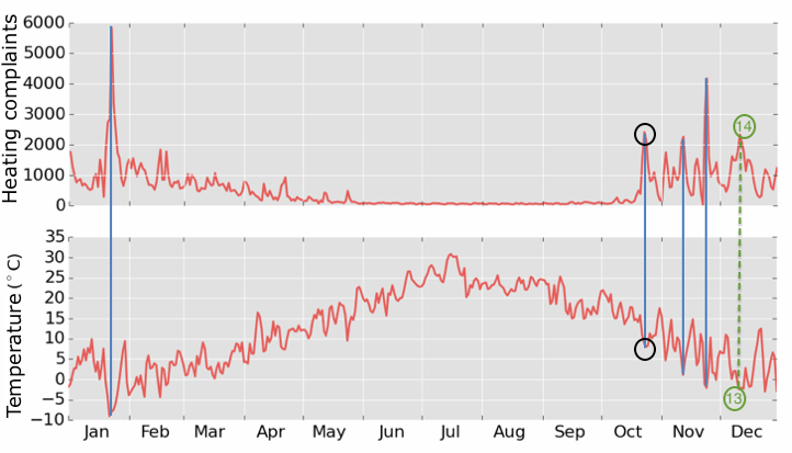
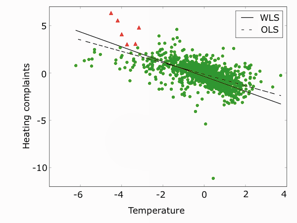
Another challenge comes from the fact that aligned outliers are rare. Consider the plots in Figure 1, which contrast the number of daily New York City (NYC) 311 heating complaints, which indicate lack of heat or hot water in residential buildings (311-heating-complaint), with average temperatures. Note that there is a relationship between outliers in the 311 heating complaints and temperature: peaks in complaints often correspond to abrupt drops in temperature. This suggests that these outliers correspond to real-world events that can be explained, and thus are unlikely to be data errors. Since any given data set contains, by definition, a small number of outliers, there are even fewer aligned outliers between two data sets. Thus, it is difficult to determine if outlier alignments are related in a meaningful way, or if their interaction is simply coincidental (Challenge 2).
Correlation metrics such as Pearson or Rank correlation coefficients are widely used to identify relationships between different indicators. However, they are not reliable for small sample sizes (CRR73). Consequently, these metrics cannot be applied in the identification of relationships involving outliers, as they consist of few data points. On the other hand, if we compute Pearson or Rank correlations over all data points, the discovered correlations (if any) may not correspond to the relationship between the aligned outliers. Consider again the plots in Figure 1. If we take into account only the days with abnormally-high numbers of complaints, there is a strong relationship with aligned drops in temperature. However, when all days are taken into account, the relationship between these two variables is much weaker: while the number of complaints remains almost constant over the warmer months, the temperature keeps varying, attenuating the relationship that can be observed across extreme values.
In data that represents temporal processes, an event that is reflected as an outlier may influence (or be influenced by) other events that occur in nearby time intervals. As shown in Figure 1, while some large temperature drops and complaint peaks co-occur on the same day (blue solid lines), sometimes they occur in close temporal proximity (green dashed line). As another example, if it rains heavily for a few days, effects of the abnormal rainfall can be felt even after the rain subsides. It is thus important to detect extreme values that may not be perfectly aligned in time but are temporally close nonetheless, otherwise relevant explanations may be missed (Challenge 3).
Last but not least, finding meaningful outlier alignments at scale is also difficult (Challenge 4). In a collection of data sets, the number of possible pairwise relationships between attributes across data sets is quadratic in the total number of attributes. For large collections, assessing all pairs to detect meaningful outlier relationships can then be prohibitively expensive.
Our Approach.
To address (Challenge 1), we formalize the notion of meaningfulness. We say that an outlier relationship is meaningful if it can be predicted from nearby non-outliers, i.e., patterns among outliers are coherent with those among near-outliers. This corresponds to the intuition that looking at the data, one can gradually see the relationship coming. We verify this intuition through a user study described in Section 4.
Given a collection of temporal data sets, we must first align them temporally. We introduce a scoring representation that takes into account the cumulative effects of outliers, thus enabling the alignment of both co-occurring and temporally-close outliers (Challenge 3). Next, we assess the relationships between attributes that contain aligned outliers. Given that there can be a large number of pairs, we introduce an index that effectively prunes useless pairs, thus making the approach scalable for large data set collections (Challenge 4).
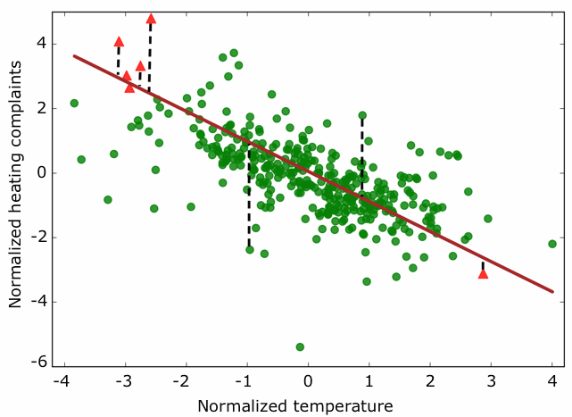
For each pair of attributes that share aligned outliers, we search for data-trends over the space of all aligned values to assess if the outlier relationship is not coincidental. While temporal trends, common in time series studies (hamilton1994time), capture the variation in values of one attribute over time, a data-trend captures the relationship between values of a pair of attributes. In fact, PODS only uses timestamps to find alignments between values from different data sets; time information is not used in the search for data-trends. To verify the existence of a data-trend, we propose a new strategy based on weighted linear regression models (CRR73) that ensures a better fit for aligned outliers and aligned near-outliers (Challenge 2). The intuition behind this fitting strategy is that real-world mechanisms and processes tend to be monotonic, and important relationships usually behave as trends. Consequently, patterns that are observed among aligned outliers are likely to also materialize across aligned near-outliers. Our strategy is illustrated by the red line in Figure 2. Finally, when a data-trend is detected, we assess if it provides evidence that the outlier alignments are statistically significant: we check whether the data-trend can be used to accurately predict the outliers. In the case of Figure 1, for example, the pattern between temperature drops and heating complaint peaks is detected by PODS as statistically significant.
Contributions.
We propose PODS (Predictable Outliers in Data-trendS), a method that, given a collection of temporal data sets, discovers meaningful outlier relationships across them which can then be used to explain the outliers. While the problem of explaining data and queries has been explored in previous work (bailis2017macrobase; chirigati@sigmod2016; roy@vldb2015; wu2013scorpion; zhang@edbt2017), our approach is, to the best of our knowledge, the first to search for explanations by discovering relevant outlier alignments, which are generally rare and hard to evaluate statistically.
Our main contributions can be summarized as follows:
-
•
We propose a formal definition for meaningful outlier relationships and we also formulate the problem of detecting these relationships;
-
•
We design a method for detecting data-trends that can be used to ascertain the statistical significance of outlier alignments, which can serve as a means to explain extreme events and data anomalies;
-
•
We introduce a representation strategy that takes temporal cumulative effects into account, enabling the alignment of values that occur in different yet close time intervals and allowing the efficient detection of relationships for events that have lingering effects;
-
•
We design an index that prunes attribute pairs that do not share aligned outliers, thus making the approach scalable to large collections of data sets;
-
•
We have carried out an extensive experimental evaluation, contrasting PODS with a variety of baselines over real urban data sets from New York City, and report results that demonstrate the effectiveness, scalability, and robustness of our approach. We also discuss the results of a user study which supports our hypothesis that our definition of meaningfulness is intuitive and corresponds to users’ expectations.
Outline.
The problem we address is formally defined in Section 2. Our approach is described in Section 3. We report the setup and results of a comprehensive experimental evaluation in Section 4. Related work is discussed in Section 5. We conclude in Section 6 with a summary of our findings and plans for future work.
2. Definitions and Problem Statement
To the best of our knowledge, the problem of determining whether a relationship across aligned outliers from different sources of data is meaningful has never been formally stated. In fact, the notion of meaningfulness has been framed so far in terms of explainability, i.e., an outlier relationship is meaningful if outliers from one data set explain abnormal points in another data (dasu@kdd2014; wu2013scorpion). By formally defining meaningful outlier relationships, we restrict the scope of their detection while capturing their intuitive aspects, such as the connection with outlier explainability.
In what follows, we introduce basic concepts required to formally state the problem. Let denote a data set, be a numerical attribute in , and be the value of attribute associated with a certain timestamp .
Definition 1 (Outlier Detection Function).
An outlier detection function maps attribute values to representation scores that reflect the degree of outlierness of values . Function must satisfy the following requirement: higher (absolute) scores correspond to more severe outliers.
Note that this requirement is flexible, allowing for different notions of outlierness. For example, it is possible to apply functions to determine outliers based on context or global criteria. Standardized z-scores (CRR73), i.e., the number of standard deviations value is from the mean, and LoOP scores (kriegel@cikm2009) are examples of suitable scores .
Definition 2 (Outliers and Inliers).
Let and be positive and negative outlier thresholds for outlier detection function . Score identifies an outlier if or if ; otherwise, it identifies an inlier.
Suitable outlier thresholds depend on the semantics of function and the scores it derives. If an attribute is normally distributed and represented with z-scores, for example, are commonly used as thresholds for outlier detection (CRR73). We use two outlier thresholds, and , because the distribution of may not be symmetric. Alternatively, the analysis may only concern outliers in one direction (i.e., either very high or very low values). In both cases, it is convenient to have different thresholds for positive and negative values.
Definition 3 (Aligned Scores).
Let and be the representations for attributes and , obtained by outlier detection functions and respectively. Given scores and , and are aligned scores if they are associated with the same timestamp, i.e., .
In Figure 1, for example, each temperature value can be associated through a timestamp alignment with a number of heating complaints. This alignment in time is preserved when the outlier functions are applied to the two attributes, resulting in corresponding scores that are also aligned in time.
Definition 4 (Aligned Outliers).
Let and be the representations for attributes and , and and be subsets comprising all outliers of and respectively. Given scores and , and are aligned outliers if they are associated with the same timestamp, i.e., .
When the scores for both attributes happen to be outliers, the resulting aligned scores are said to be aligned outliers. As a concrete example, consider the data containing daily values for temperature and heating complaints in Figure 1. We plot their aligned z-scores (days work as timestamps in this example) in Figure 2, and use a single outlier threshold . Each red triangle corresponds to aligned outliers and such that and .
Definition 5 (Meaningful Outlier Relationships).
Let and be the representations for attributes and . If there is a statistical model that adequately fits the aligned scores of and , and also fits the aligned outliers of and in particular, we say that there is a meaningful outlier relationship involving these outliers.
In other words, meaningful outlier relationships are predictable given a model between and that adequately fits the observations, i.e., we can see the aligned outliers coming. Intuitively, an adequate model between and is evidence of meaningfulness because there is an expectation that the outlier alignments are not due to chance alone: they follow a pattern that is also present in closeby parts of the data.
Problem Statement.
Given a collection of data sets and the union of their attributes , outlier detection functions for , outlier thresholds and for , representations for , find all meaningful outlier relationships of .
Note that the choice of outlier detection functions depends on a combination of domain and application needs, but in practice the user will likely use only a few functions over all attributes . Our problem statement, however, does not restrict the number of outlier detection functions for flexibility, and also because outlier detection per se is outside the scope of this paper.
3. Discovering Meaningful Outlier Relationships
In what follows, we introduce PODS, a method designed to identify meaningful relationships between outliers. Figure 3 provides a high-level overview of PODS. The method takes as input a set of attribute representations derived by outlier detection functions (Definition 1) and associated timestamps. Different functions can be used as long as they appropriately rank the outliers and normalize values. Attribute Alignment derives a set of attribute pairs by joining the different attributes on their timestamps. Given a pair of attribute representations and , Data-trend Detection verifies whether the aligned scores of and form a data-trend. If a data-trend is detected, Meaningfulness Verification checks whether it helps predict the relationship across aligned outliers. We describe each of these components in detail below.

3.1. Aligning Attributes
There are a number of challenges involved in identifying outlier alignments across different attributes. First, since different attributes have values in different scales, metric distortions may occur making it difficult to compare the values. While this can be addressed by using normalization functions such as z-scores (CRR73) for the selected outlier detection function (Definition 1), these functions have a serious limitation for our problem scenario: since they do not take cumulative effects over time into account, they restrict the alignment of outliers to those that occurred at the same timestamp.
Consider Figure 4(a), which shows average pluviometry levels in NYC for April, 2012. Note that it rained considerably on the and on the (blue circle and pink triangle respectively), but not much on the (green rectangle). This abrupt break in the pluviometry pattern is captured by standard z-scores, as illustrated in Figure 4(b). In practice, however, the heavy rain registered on the and on the may help understand events in other data sets, even if they happened a few days later due to the lingering effects of the heavy rain such as flooding. Thus, to better understand interactions between temporal data sets, it is important to take the cumulative impact of events into account.
One alternative to address this problem would be to align scores with different timestamps. This solution, however, is costly, as it significantly increases the number of possible alignments. More importantly, this strategy is not trivial to tune: how large should the temporal range for score alignments be? And should this temporal range depend on the initial score values? In Section 5, we discuss techniques that can be used to address these issues and their associated performance implications.
Capturing Cumulative Effects.
We propose a new technique that augments scores to capture cumulative effects from outliers. Intuitively, by boosting the score associated with the (Figure 4(c)), the chance of aligning it with outliers from other data sets that capture the effects of the heavy rain (e.g., data sets whose outliers happened a few days later) would increase, thus naturally expanding the explanation power of our approach. The boosting strategy computes a cumulative score for each timestamp and compares it with the original score given by . The larger (absolute) score, referred to as dominant score, is then used to represent the original value. Alignments based on dominant scores are effective at capturing relevant cumulative effects, as we discuss in Section 4.3. Furthermore, they are efficient to compute because two dominant scores have to share the same timestamp in order to be aligned (see Definition 3)—i.e., extra alignments between scores that are only temporally close, which might be quadratic on the number of scores in the worst case, are never computed.
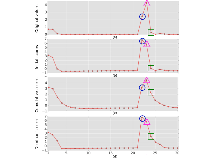
Given a raw attribute , the computation of dominant scores requires just an initial outlier detection function . Cumulative effects are then constructed iteratively and, after a series of comparisons, the dominant scores are generated. Consider, for instance, Figure 4(d), which shows dominant scores as a possible representation for the values in Figure 4(a). These dominant scores are derived after comparisons with z-scores () in Figure 4(b). Note that, for most points, the differences between the z-scores in Figure 4(b) and the dominant scores in Figure 4(d) are minor. However, if preceding values are considerably large, as is the case for day 24 (green rectangles), the dominant score significantly differs from the z-score, carrying the notion of a cumulative effect. Before introducing dominant scores, we need to formally define cumulative scores.
Definition 6 (Cumulative Score).
Let denote a fixed coefficient that regulates to which extent cumulative effects are taken into account, and be the cumulative score associated with an initial score determined by function . Score is computed by the recursive function :
| (1) |
Cumulative scores are calculated in a tunable form, depending on a parameter that can be set by the user.111Alternatively, a value for could be learned, but this is outside the scope of this work. We decided to model the lingering effect of scores in a tunable fashion because this effect could vary depending on the context, as well as on the scale at which measurements are taken (e.g., seconds versus days). In particular, in contexts where there are no lingering effects — or where they are not relevant —, should be set to zero, leading to cumulative scores that are identical to the respective initial scores. Note that cumulative scores are equivalent to exponential moving averages (roberts1959), though in the latter and are typically switched. We decided to model cumulative effects with exponential decay because it is a well understood weighting mechanism that fades quickly with time. This property is important, as it increases the alignments only between outliers that are not too far apart. It is worth noting that the fact that guarantees the decay of cumulative effects. In other words, the impact of a value in is carried over, but it decays to a negligible amount within a few steps. Finally, note that, depending on the values of and , may be larger than . In these cases, we consider that the cumulative effect over is a better representation for than score .
Cumulative scores can, however, have an undesirable consequence: they may dampen outliers. In Figure 4(c), for example, the cumulative score for day 22 (blue circle) is significantly smaller than its corresponding initial score (blue circle in Figure 4(b)). This happens because previous pluviometry levels have very little cumulative impact on the level of day 22. As our goal is the discovery of meaningful relationships across aligned outliers, we cannot use a scoring method that dampens them out. To address this limitation, we introduce the notion of dominant scores, which take both initial and cumulative scores into account without dampening either.
Definition 7 (Dominant Score).
The dominant score between and is computed by the function :
| (2) |
Given outlier thresholds and , the number of outliers generated with function (dominant outliers) is never smaller than the number of outliers generated with function . After all, if is an outlier, we only have if either or . Using dominant scores thus guarantees that no values are dampened. For example, note that every initial peak in Figure 4(b) is represented as a peak in Figure 4(d), which corresponds to the dominant scores.
Alignment Index.
After the dominant scores are generated, the next step is to align attributes that have at least one pair of aligned dominant outliers. Note that, despite requiring a common timestamp, the alignment between dominant outliers implicitly allows the matching of abnormal events that do not occur at the same time, as their effects get carried over.
Verifying which pairs of attributes have aligned dominant outliers can be prohibitively expensive for data set collections that contain a large number of attributes. Furthermore, most data set combinations will have no aligned outliers. To make the alignment process efficient and scalable, we introduce an alignment index, which can be created at the same time the dominant scores are computed, thus incurring no additional overhead.
Each key in this index corresponds to a timestamp and is associated with all attributes with dominant outliers for the timestamp in question. The structure of the index is illustrated in Figure 5.
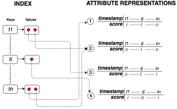
Attributes that are associated with at least one index key in common, i.e., that have at least one pair of aligned dominant outliers, are retrieved for attribute alignment. As we explain in Section 3.2, the alignment of all possible (dominant) scores is critical for data-trend detection. For simplicity, we refer to alignments across dominant scores as dominant alignments. Each point in the scatterplot in Figure 6, for example, corresponds to a dominant alignment between heating complaints and temperatures.
Given the rarity of dominant outliers, and consequently of their alignments, the use of the alignment index substantially reduces the number of pairs of attributes compared. In practice, we expect that most attribute pairs have no aligned dominant outliers, thus being naturally pruned away from the analysis. The impact of this index in the performance of PODS is discussed in Section 4.6.
3.2. Detecting Data-trends
Given the sets and containing the dominant scores for attributes and , respectively, our first task is to check whether there is a data-trend across their aligned values. Data-trends are defined as follows.
Definition 8 (Data-trends).
Given a set of pairs of aligned scores , where , and , if there is a statistically significant linear regression model (CRR73) across these pairs, we say that there is a data-trend.
Linear regression models have traditionally been used to detect linear correlations, so they are a natural candidate for the task of detecting interpretable trend patterns across aligned attributes. In addition, these models have very low space complexity, requiring the computation of only two parameters per regression line (slope and intercept). Finally, they scale well with the number of aligned scores. The use of kernels and other attribute transformations (hastie@statisticallearning) could be useful in the detection of a larger pool of data-trends, but it is outside the score of this paper.
To assess whether the computed regression line is statistically significant, we verify if its slope is not statistically equivalent to zero (CRR73), as detailed later in this section.
Outlier-Biased Weighting Scheme.
Recall that our goal is to discover meaningful outlier relationships that can be seen coming. The intuition is that we expect non-random outlier alignments to follow a pattern that is present in close-by aligned scores (near-outliers), and that this pattern gets increasingly stronger for closer near-outlier alignments.222Recall that close-by aligned scores are near in attribute space — not necessarily in time. Consequently, given that PODS captures such patterns with linear regression models, it makes sense to calibrate them to prioritize the fitting of near-outlier and outlier alignments. For this purpose, we use weighted least squares (WLS) (CRR73) to estimate linear regression models.
Without loss of generality, we assume that and have the same size, and that any given score is aligned with a single score . We then model the relationship between aligned scores (, ) with a linear regression model of on , such that
| (3) |
where is the estimate of for . WLS allows distinct contributions, represented as weights for different pairs (, ), to the estimated model. It estimates and by minimizing the sum of squared residuals, defined as
| (4) |
where weights are set a priori with a weighting scheme.
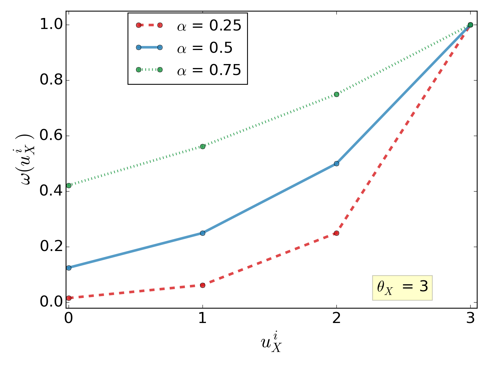
To model the importance of scores based on their distance to outliers, we propose a new outlier-biased weighting scheme for WLS. Our goal is to allow partial weight to near-outliers as function of their deviance, while allowing equal weight to all outliers irrespective of their deviation, so that no single extreme outlier dominates the regression. Let be the dominant score computed for attribute on timestamp . The weight of is given by function , defined as
| (5) |
where is a parameter fixed a priori.
Consider Figure 7, which shows how function varies for different values. In this example, we have a single outlier threshold for simplicity. Note that, as increases, weights get larger for higher values. Moreover, if is not an outlier, the value of function always gets larger as gets closer to , irrespective of . Finally, given and , weight depends on aligned values (, ), and is defined as
| (6) |
To illustrate the advantages of using WLS with the proposed weighting scheme, consider the solid line in Figure 6. By calibrating the contribution of scores differently, the distance from the outliers to the WLS line is smaller than the distance to the dashed line, which was built with an equally-weighted, ordinary linear regression. The WLS line fits the aligned outliers better by design. Moreover, as the figure indicates, this model adequately captures the pattern present in near-outliers.
Checking for Data-trends.
The model represented by is determined by minimizing the sum of squared residuals for (Equation 4). Note that coefficients and would be different if this equation minimized residuals for . The formulation above is thus asymmetric, posing the following limitations: (i) the order of and matters in the investigation of their aligned outliers, which is counterintuitive because relationships between outliers do not have a preferred direction, i.e., outliers in may help understand outliers in and vice-versa; and (ii) an asymmetric formulation can confuse end-users, leading to the belief that outliers of one attribute are causing outliers of another; here, we aim to find explanations through general associations and not causal relations. To address these limitations, we also create a weighted regression model of on , defined as
| (7) |
where is the estimate of for . Coefficients and are estimated with a minimization analogous to Equation 4.
Given the regression models and , we verify if there is a statistically significant linear relationship for at least one of them. If there is no significant relationship, scores in do not tend to change as scores in change, and vice-versa. This happens when coefficients and are not statistically different from zero. Thus, to detect whether there is a significant data-trend between and , we have to apply the regression slope test (CRR73). Given a slope , the test examines the following null () and alternative () hypotheses:
- :
-
:
- :
-
:
The sampling distribution of slope is used to determine whether it is statistically different from zero (CRR73). If the null hypothesis gets rejected for at least one of or , component Data-trend Detection concludes that there is a data-trend across the aligned scores of and . As an example, consider the WLS model of heating complaints on temperatures in Figure 6: the null hypothesis is rejected due to the non-zero slope, i.e., this model corresponds to a data-trend.
3.3. Verifying Meaningfulness
If a data-trend is detected, associated with either regression model or , component Meaningfulness Verification checks if it models the data accurately and if it provides statistical evidence that the outlier relationship is meaningful. Without loss of generality, we assume throughout this section that there is a data-trend associated with regression model of on . Initially, Meaningfulness Verification checks whether has a reasonable goodness-of-fit, defined as follows.
Definition 9 (Reasonable Goodness-of-fit).
Given a set of pairs of aligned scores of and , a linear regression model of on has reasonable goodness-of-fit (CRR73) if a fraction of at least of the variance of the aligned scores is explained by it.
A reasonable goodness-of-fit is important because data-trends that are statistically significant may still capture random patterns that are not faithful to the data. In other words, if the discrepancy between values and is too high, is not reliable enough to help assess the meaningfulness of outlier relationships. In practice, we assess the goodness-of-fit of a data-trend by computing its adjusted r-squared, (CRR73). As an example, consider the WLS model in Figure 6, whose is approximately 0.67. If , for instance, this model would have a reasonable goodness-of-fit.
If the data-trend associated with has a reasonable goodness-of-fit, PODS verifies if the aligned outliers are consistent with it. Formally, let and be subsets comprising all outliers of and respectively. For simplicity, assume that and have the same size and any given score is aligned with a score . Every point in Figure 6, for example, corresponds to an alignment between scores of and . The red triangles in particular correspond to the aligned scores of and . With model , one can generate estimates for scores . To verify the consistency of the aligned outliers with respect to , let be the error distribution of estimates with respect to scores , be the error distribution of estimates with respect to scores (used to build model ), be a high percentile of , such as the percentile, and be a threshold percentage.
Definition 10 (Consistency).
The aligned outliers of and are consistent with a data-trend associated with if at least a fraction of the errors in are bounded by ’s percentile .
Since trend behaviors are usually associated to a certain level of noise, our definition of consistency needs to be resilient and allow for a few exceptions, i.e, a few aligned outliers that may not be in keeping with the data-trend behavior. This is the intuition behind , a threshold that ensures that the majority of the aligned outliers has to be consistent with . As for , it has to be a high percentile of in order to guarantee a high level of significance. Finally, PODS uses the Euclidian distance to calculate error distributions and because it is a common, easy to interpret choice (CRR73). It is, however, possible to apply different error functions.
Consider again Figure 6. If we set as the percentile of , we have that approximately 83% of the errors for the outlying heating complaints generated with the WLS model are bounded by . Consequently, if , the aligned outliers are consistent with this model. In practice, distribution may be too small for reliable percentiles. We thus use the bootstrap method (based on sampling with replacement) for estimating the percentile and its confidence interval (EfroTibs93).
If has a reasonable goodness-of-fit and the aligned outliers are consistent with it, is evidence that the relationship across the aligned outliers is meaningful. Depending on how parameters are set, this is the case in the WLS model in Figure 6, for example. Component Meaningfulness Verification verifies goodness-of-fit and consistency for every model with a data-trend, i.e., if and are associated to data-trends, both are evaluated. Aligned outliers just need to be consistent with one reasonable model (either or ) to be considered statistically significant.
3.4. Putting it all Together
Algorithm 1 details how the different steps described above are combined to discover meaningful outlier relationships. Given a collection of data set attributes, the goal is to output every pair for which there is a meaningful outlier relationship. To this end, we first represent attributes with dominant scores and prevent unnecessary attribute comparisons by using an index. Next, a search for data-trends is performed for every attribute pair that has at least one outlier alignment. Whenever a data-trend is detected for a pair, the search is followed by an analysis of statistical meaningfulness and, when the underlying outlier relationship is considered meaningful, the attribute pair becomes a part of the algorithm’s output.
Algorithm Input - PODS Parameters
The algorithm receives values for , , and as inputs, and they tune the behavior of PODS concerning data-trend detection and verification of statistical meaningfulness. As discussed in Section 3.2, the closer parameter is to 1, the more similar the weights of distinct points are. 333Note that if , the linear regression becomes ordinary, i.e., the weight of every point is the same. The value for depends on how rigorous the requirements of the application are: if , for instance, at least 67% of the aligned outlier errors have to be bound by the model’s error distribution. As for , its value determines the minimum adjusted r-squared above which PODS considers a model reasonable. Note that suitable values for depend on the context: if the relationship between two aligned attributes is expected to be strong, can be higher; if weak to moderate relationships are expected to be the majority, which is common for example in social science scenarios, can be lower (cohen@psychbulletin1992).
Algorithm Input - Application Parameters
Other input parameters include: initial attribute representations computed with compatible representation functions , coefficient for the computation of dominant scores, and suitable outlier thresholds. These parameters do not modify the behavior of PODS (i.e., they do not tune any of its components), and the user sets them according to the application. For example, if the user is interested in relationships across strictly co-occurring outliers, cumulative effects do not have to be modeled and should be set to zero (see Equation 1). Moreover, if attributes can be well approximated by Gaussian distributions, the user can compute z-scores as functions and use outlier thresholds . Alternatively, if the analysis only concerns positive outliers (e.g., very long wait times in doctor’s offices) and values are normally distributed, the user can work with thresholds and . Note that the selection of these parameters, which are core components in the context of outlier detection, are independent of PODS. After all, the goal of our method is the detection of meaningful outlier relationships, not the detection of outliers.
Structure of Algorithm
Algorithm 1 first invokes Attribute Alignment to produce attribute pairs () that have at least one dominant outlier alignment (line 1) and whose values represent dominant scores. PODS then searches these pairs in which the data-trend across aligned outliers is statistically significant (lines 3–15). The first step in the loop executes Data-trend Detection (line 4) to compute weighted regression models and over and . If the slope of model is statistically different from zero, the test in line 6 succeeds. The component Meaningfulness Verification then verifies whether the aligned outliers of and are consistent with model (line 7). If so, pair is added to detected, i.e., the co-occurring outliers of and classified as meaningful (lines 12–14). Otherwise, if the slope of model is statistically different from zero, component Meaningfulness Verification is executed again to perform a similar error analysis for model (lines 9–11). This second check is important because data-trends associated to and are equally relevant for the detection of meaningful outlier relationships. Note that outlier thresholds are passed to the three major components — technically, all of them require a distinction between inliers and outliers. In practice, however, this process is optimized and the separation between inliers and outliers is performed only once.
4. Experimental Evaluation
We performed an experimental evaluation to assess the effectiveness of PODS at detecting meaningful outlier relationships. We quantitatively assess different components of our solution, notably: the usefulness of dominant scores, the benefits of taking cumulative effects into account, the effectiveness of the Outlier-Biased weighting scheme, and the efficiency gains attained by the alignment index as the number of attributes considered increases. In addition to that, we evaluated PODS qualitatively with case studies. Finally, we carried out a sensitivity analysis for parameters , , , and .
One challenge we faced in the evaluation was that since PODS is the first approach for discovering meaningful outlier relationships, there were no existing benchmarks we could use. Therefore, as described in this section, we had to create gold data with input from human annotators.
4.1. Experimental Setup
Data Sets and Attributes.
We used data sets provided by different New York City agencies and the National Oceanic and Atmospheric Administration (NOAA). Table 1 lists the data sets, some of their properties, and examples of attributes used in our experiments. We aggregated the records in these data sets over days, and before aggregation their sizes varied from MBs to GBs.444The data sets are available at https://figshare.com/collections/New_York_City_s_Urban_Data/4273586. The Taxi data can be obtained from https://data.cityofnewyork.us.
| Data Set | Description | Size | Year Range | Agency | Attribute Examples |
|---|---|---|---|---|---|
| 311 | Requests to NYC’s non-emergency complaint service 311 | 1.3GB | 2010-2018 | 311 | Number of complaints in categories: noise, heating, street condition |
| Citi Bike | Data from NYC’s bike sharing system | 7.9GB | 2013-2017 | CitiBike | Number of trips |
| Collisions | Vehicle collision data | 254MB | 2012-2018 | NYPD | Numbers of: collisions, persons injured, cyclists killed |
| Weather | Meteorological data for NYC | 413MB | 2010-2018 | NOAA | Average: pluviometry level, temperature, wind speed |
| Taxi | NYC taxi trips | 170GB | 2009-2016 | TLC | Number of trips, average trip speed |
| Crimes | Criminal offenses reported to the New York City Police Department | 1.4GB | 2006-2015 | NYPD | Number of offenses |
| Turnstile | Turnstile data collected from NYC’s subway system | 7.4GB | 2010-2018 | MTA | Number of subway trips |
Representation Function.
To derive the attribute representations, we used a function based on mean residuals, a simple variation of z-scores, as discussed below. We refer to this function as . The mean residual of a value captures how much it deviates from the overall expected behavior based on its past values. The function is easy to implement, fast to compute, and suitable for both streaming and static temporal data (dasu@pvldb2015).
Definition 11 (Mean Residuals).
Let , and be the size of a time window immediately preceding , corresponding to the interval . Moreover, let and be the mean and standard deviation of the values in . The mean residual of with respect to is given by :
| (8) |
Note that respects the requirements for representation functions presented in Section 2. An advantage of using instead of standard z-scores is that different time window sizes capture different kinds of outliers, from local to global: a small captures local patterns of the original values, while a large captures global peaks and valleys in the raw values. To capture a wider range of temporal effects, from local and seasonal to global events, we experimented with time window sizes of 28, 30, 64, 90, 128, 180, 256, 360, and 365 days, totaling 756 different representations for the 84 attributes we considered. It is important to point out that, despite the flexibility to capture different types of outliers, mean residuals do not explicitly take cumulative effects from previous timestamps into account.
PODS Parameters.
For the weighting scheme, we used a default value of . Since , choosing a value in the middle of the domain generates weights that are neither too similar nor too different for distinct points. We set as the percentile of the model error distribution and , i.e., we expect that at least of the errors for aligned outliers are drawn from the model error distribution with a level of significance (see Definition 10). The rationale behind this value of is the common modeling assumption that, under a fixed normalization, inliers come from the same distribution at a given point in time (an expected distribution), but outliers could come from a number of distinct, unexpected distributions. As a consequence, if most aligned outliers are consistent with the computed data-trend, then we have a strong indication that the outliers can be seen coming. Finally, we use , considered a moderate value, because in urban data or social science contexts, where there is a plethora of intervening variables at play, such values are considered appropriate (cohen@psychbulletin1992).
Application Parameters.
To allow for a balanced contribution from both mean residuals and cumulative scores, we set . For all experiments and gold data (described below), we use a single because this value is commonly used to isolate outliers in distributions that, as is the case with both mean residuals and dominant scores, are symmetric around the mean (Aggarwal2013; Iglewicz1993; pukelsheim1994stats). In such distributions, corresponds to a high level of confidence (e.g., more than 99% for Gaussian distributions) in the outliers.
Standard Values.
For the regression slope test, we reject the null hypotheses at the standard significance level of 0.05.
4.2. Generation of Gold Data
To evaluate the effectiveness of PODS, we need to ascertain whether it is able to discover meaningful outlier-based relationships. Since there are no benchmarks that contain such relationships, we had to create gold data. To do so, we gathered attribute pairs with and without meaningful trend patterns across their aligned outliers. The meaningfulness of a trend pattern was empirically assessed by human annotators, as explained below.
Annotating Examples.
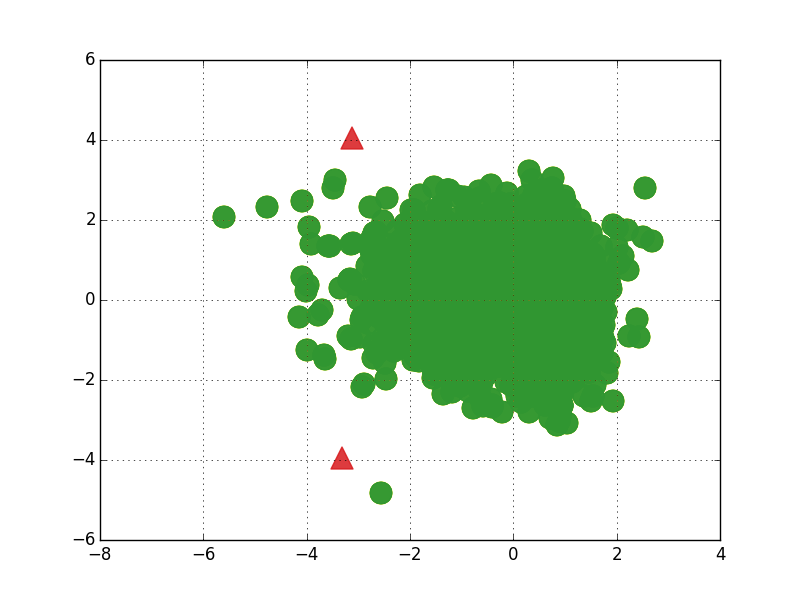
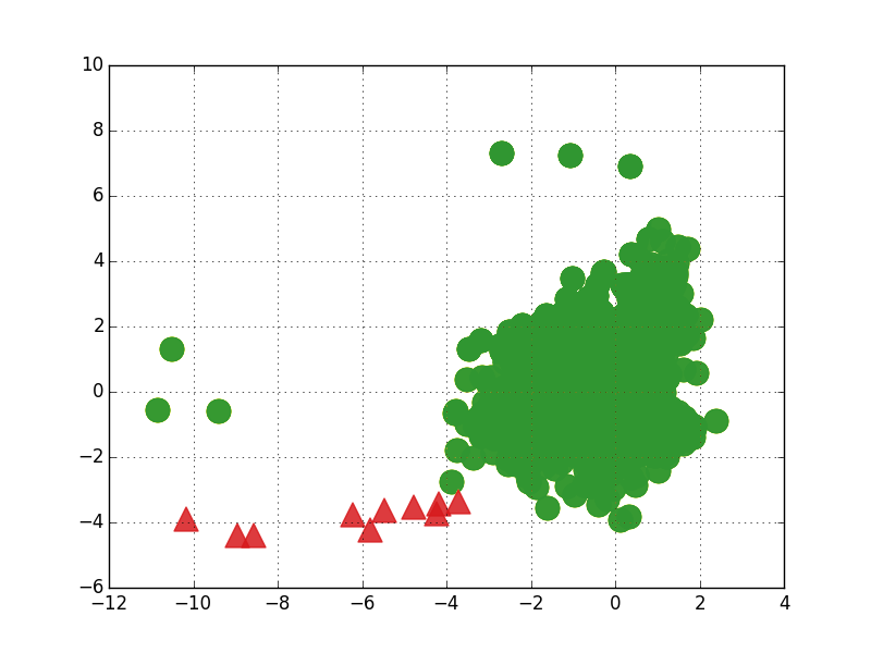
After deriving mean residual representations for the attributes in the data sets listed in Table 1, we derived their corresponding dominant scores. Recall that dominant scores allow potential matches of close-by outliers. The next step was the generation of scatterplots with aligned dominant scores for several randomly selected pair of attributes. The graphs in Figure 8 are examples of the scatterplots we generated. We selected 150 scatterplots and showed them to five annotators, who examined the plots independently.555During the annotation process, we omitted the labels of the scatterplots’ axes to avoid bias in the annotation. In other words, by hiding the labels we guarantee that all annotators have the exact same information about the data. For each scatterplot, we asked the annotators to answer the following question: Do you see a meaningful pattern across the aligned outliers? While annotators interpreted the term meaningful in slightly different ways, they intuitively focused on a few common aspects: the presence of a reasonable number of aligned outliers; the existence of a trend pattern among the outliers; and a certain shape coherence across aligned outliers and/or near-outliers. For each scatterplot, the corresponding attribute pair was thus annotated with one of the following labels:
-
•
clear positive, if all annotators saw a meaningful pattern;
-
•
dubious positive, if most annotators saw a meaningful pattern, but some annotators disagreed;
-
•
clear negative, if no annotators saw a meaningful pattern;
-
•
dubious negative, if most annotators did not see a meaningful pattern, but some disagreed.
Figure 8 provides examples for each label. Finally, we selected 100 pairs to obtain a balance across the different types of alignments in the gold data: positive (25 clear and 25 dubious pairs), and negative (25 clear and 25 dubious pairs). We ran PODS over the gold data and evaluated its performance using recall, precision, and F-measure (baeza2011IR).
Do outliers occur in close temporal proximity?
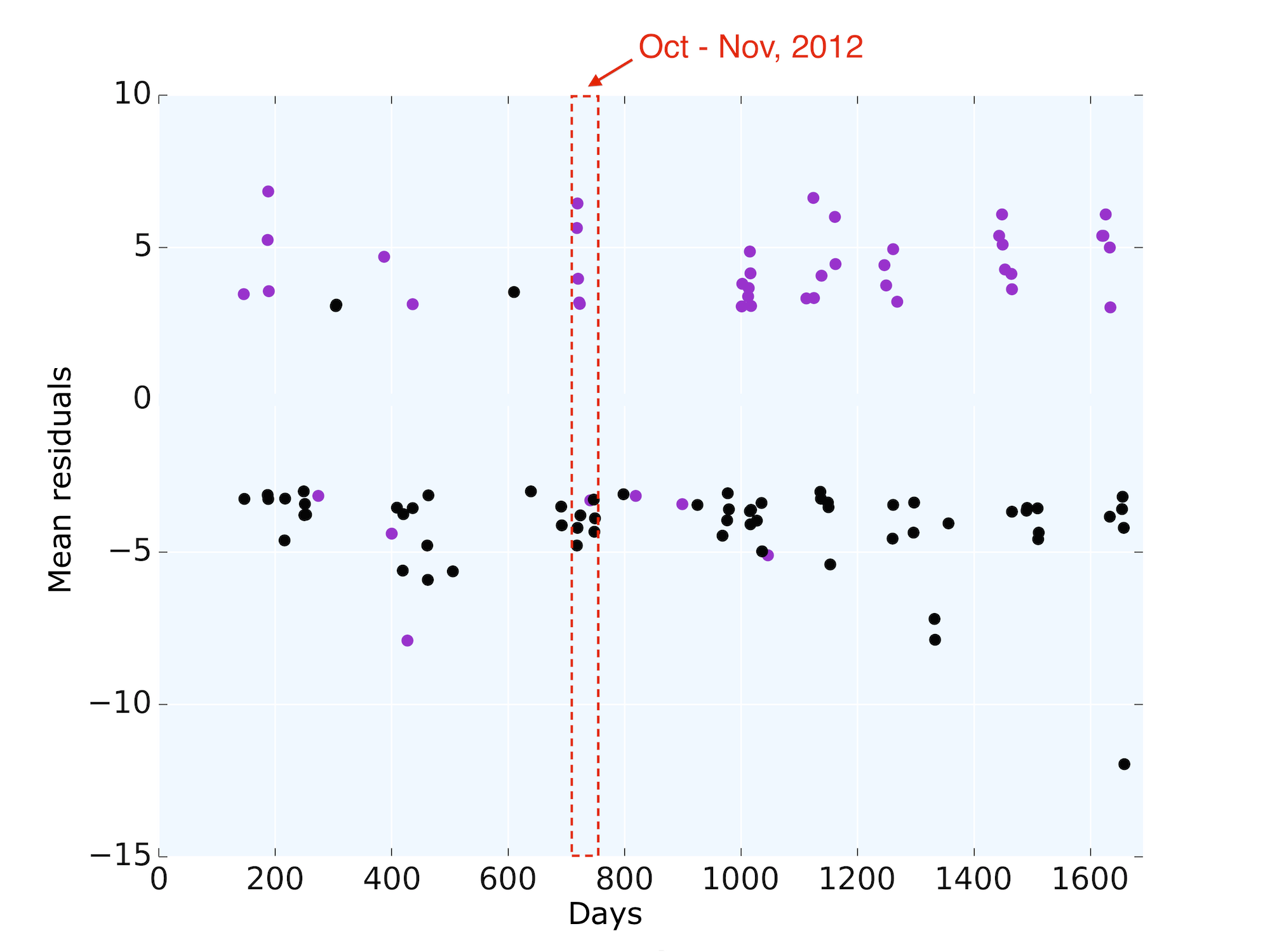
Before constructing the gold data we just described, we needed to check whether taking cumulative effects into account when aligning scores made sense in practice. We then checked, before generating dominant scores for several random pairs of mean residual representations, whether their outliers tended to occur approximately on the same days, i.e., if there is evidence that the incorporation of cumulative effects may help detect pairs of outliers that are slightly mismatched in time. We plotted mean residual outliers associated to different attributes, along with the days on which they occur, and verified whether such days are temporally close. As an example, consider Figure 9, which shows mean residual outliers for heating complaints (purple) and temperature (black) over the course of several years. Note that these outliers generally occur in close temporal proximity, often presenting a temporal mismatch of just a few days. After analyzing several such plots, we observed that slightly mismatched outliers are common. This highlights the importance of modeling cumulative effects — without it, it is not possible to align outliers that do not co-occur but may be semantically related.
4.3. Effectiveness: Quantitative Evaluation
Baselines.
To evaluate the different components of our approach and assess our design decisions, we compared PODS 666We instantiated PODS with the parameter values described in Section 4.1. In this section, every mention of PODS and its results implicitly refers to this particular instantiation. against a series of baselines. The first three are constructed by varying components or fixing the parameters of PODS:
-
•
PODS-Sub - restricts models to aligned inliers, i.e., values in interval , enables us to assess the improvements obtained from building models over all aligned dominant scores;
-
•
PODS-MR - represents attributes with mean residuals, forgoing the use of cumulative effects, i.e., component Attribute Alignment does not generate dominant scores and aligns mean residuals instead. This helps us understand the impact of taking cumulative effects into account;
-
•
PODS-OLS - performs an ordinary linear regression by setting , i.e., it does not weight the regression in order to better fit aligned outliers. By doing so, we can assess the effectiveness of the weighting scheme in Data-trend Detection.
Although traditional correlation metrics, such as Pearson and Spearman’s rank correlations, are not adequate for small sample sizes because of their increased variability, and because their low statistical power might inflate the false positive rate (sample-size; power-failure), we still decided to compare PODS against them. The goal is to understand their limitations and potential qualities in practice, over concrete samples of aligned outliers. To this end, we devised the following baselines:
-
•
Pearson - computation of the Pearson correlation coefficient over all aligned outliers; if the coefficient is larger than 0.30 in modulus, and its p-value is lower than 0.05, the outlier relationship is considered meaningful;777We chose a correlation threshold of 0.30 because it is a standard value for moderate correlations in social and urban sciences (cohen@1988).
-
•
Spearman - computation of the Spearman’s rank correlation coefficient over all aligned outliers; if the coefficient is larger than 0.30 in modulus, and its p-value is lower than 0.05, the outlier relationship is considered meaningful.888Here, we chose a correlation threshold of 0.30 to be consistent with baseline Pearson.
While PODS uses statistics to find meaningful alignments in an unsupervised fashion, we also wanted to investigate how it compares to learning-based approaches. To this end, we experimented with linear SVM (statistical-learning) classifiers fitted over different sets of features. First, we used basic statistical features of attributes to verify to what extent a simple summary helps identify meaningful relationships across outliers. Next, we fitted the classifiers over features obtained with PODS (e.g., regression slopes) to understand whether they work best as input for a machine learning model or as input for the statistical analysis that we propose in our method. Concretely, these baselines were built as follows:
-
•
SVM-Stats - given two attributes represented by dominant scores, the classifier uses as features the mean and standard deviation values of inliers, outliers, and all values. We used the gold data to train the classifier and tested it with leave-one-out cross validation (statistical-learning). The reported results are averages for all cross validation folds.
-
•
SVM-PODS - similar to SVM-Stats, but the features used are derived from the execution of PODS. They are: numbers of aligned values and outliers; ; slopes, intercepts and their p-values; averages of error distributions for inlier, outliers, and all values.
-
•
SVM-Stats-synth - similar to SVM-Stats but, for each one of the 100 pairs in the gold data, we derived 10 synthetic versions by adding to each attribute a Gaussian noise with mean of zero and standard deviation of 0.1. The goal was to introduce variability in a controlled manner for the purposes of bootstrapping additional data (EfroTibs93).999The proportion of true positives and true negatives in this synthetic data set differs from the original gold data by less than 5%. This is evidence that the relationships detected in the gold data set were mostly preserved in the synthetic data, validating the use of the latter in our experiments. We tested the classifier over the synthetic data with leave-one-out cross validation, and report averages over all cross validation folds.
-
•
SVM-PODS-synth: it uses the same data generated for SVM-Stats-synth, but using the features from SVM-PODS.
The main challenge for these classifiers is that they require training data, which is costly to generate because it requires human input. Moreover, note that outliers occur infrequently by definition and, due to that, having a large corpus of labeled outlier relationships is not realistic. Although these limitations suggest that classifiers are not appropriate for the analysis of outlier relationships, we still increased the training data artificially, as explained above, to verify whether the hypothetical use of a larger labeled corpus could boost the classifiers’ performances. We report results for classifiers trained on both gold and synthetic data.
Finally, we also compared PODS against Data Polygamy () (chirigati@sigmod2016). DP identifies relationships across numerical attributes using methods based on computational topology. This comparison required extra steps such as additional human annotation, and described in detail in Section 4.4.
Clear Relationships.
We start by discussing the results obtained for category Clear because its examples have higher quality labels, as all annotators agreed on them. As shown in Table 2, PODS outperforms all listed baselines in terms of F-measure. In comparison with PODS-Sub, PODS has significantly higher recall and comparable precision, suggesting that using all aligned dominant scores instead of just dominant inliers leads to a better overall solution. Moreover, PODS outperforms PODS-MR on all metrics, especially in terms of recall. This indicates that the incorporation of cumulative effects is beneficial. The comparison between PODS and PODS-OLS shows that the latter lacks balance: it has a high precision at the cost of a very low recall. This happens because the aligned outliers are often not consistent with data-trends computed with ordinary linear regressions. In fact, this parametrization () cancels the benefits of the Outlier-Biased scheme, as it does not fit aligned outliers adequately. Consequently, the clear positive examples are not detected as such. This result illustrates the importance of the weighting scheme we propose: by fitting aligned outliers better, PODS detected most clear positive examples. As for Pearson, PODS has lower recall but significantly higher precision because of its ability to prune false positives. In fact, while Pearson detects 12 false positives, PODS only detects 1. As mentioned above, Pearson’s high false positive rate is likely a consequence of its low statistical power when applied over very small samples (sample-size; power-failure). The results for Spearman are more robust in contrast with PODS, with comparable recall and F-measure. Spearman’s precision, however, is considerably lower, also because of a more pronounced false positive rate (the baseline identified 4 false positives). These results suggest that these two baselines — especially Spearman — could be good options for the detection of meaningful relationships over much larger samples of points, but it is hard to trust their statistical validity when there is little data available. Note that given the scarce nature of outliers and their alignments, it is not realistic to expect scenarios with large samples of aligned outliers, further reducing the potential usefulness of these baselines. With respect to SVM-Stats, PODS outperformed it on all metrics. This suggests that basic statistical features, as expected, are not very informative of how meaningful the outlier relationships are. It is interesting to note, however, that this simple classifier performs substantially better than random guess, with recall similar to PODS-Sub’s and PODS-MR’s. SVM-PODS, on the other hand, outperformed PODS on recall: it correctly identified one extra true positive. Despite that, the classifier’s precision is significantly worse than that of PODS. This suggests that the pruning of false positives, using features computed with PODS, is better when a careful statistical analysis is performed, instead of when such features are the input to a classifier. Synthetic results obtained with SVM-Stats-synth and SVM-PODS-synth reinforce the results of SVM-Stats and SVM-PODS respectively.
| PODS | 0.88 | 0.96 | 0.92 |
| PODS-Sub | 0.64 | 1.00 | 0.78 |
| PODS-MR | 0.76 | 0.86 | 0.81 |
| PODS-OLS | 0.44 | 1.00 | 0.61 |
| Pearson | 1.00 | 0.67 | 0.81 |
| Spearman | 0.92 | 0.85 | 0.88 |
| SVM-Stats | 0.68 | 0.58 | 0.62 |
| SVM-PODS | 0.92 | 0.79 | 0.85 |
| SVM-Stats-synth | 0.61 | 0.79 | 0.68 |
| SVM-PODS-synth | 0.86 | 0.75 | 0.80 |
Dubious Relationships.
The results for category Dubious are summarized in Table 3. Note, however, that these results need to be taken with a grain of salt because the annotation quality of Dubious is lower: users disagreed on the labels of all of its examples. In fact, we studied this category mostly to understand how PODS behaves in scenarios where there is label uncertainty. The contrast between PODS and PODS-OLS provides additional evidence that the Outlier-Biased scheme is indeed effective for the detection of meaningful outlier relationships. In comparison with PODS-Sub, PODS has significantly higher recall and F-measure but lower precision. This happens because PODS identified a larger number of false positives (10 out of 25, vs. 1 out of 25 for Clear). Specifically, some dubious negative examples had reasonable regression models (see Definition 9) with values above 0.80, and their aligned outliers were consistent. PODS then concluded that the aligned outliers of these examples were meaningful—and, in fact, some annotators also came to this conclusion because they saw a trend-y pattern in these examples, but as for all examples in the Dubious category, there was no consensus as to whether the outlier relationships were meaningful. Figure 10 shows a concrete example of a Dubious false positive. PODS-MR, our best baseline, performed slightly better than PODS on all metrics. This happened because PODS-MR detected 17 true positives and 9 false positives, while PODS detected 16 true positives and 10 false positives. In the case of the true positive that was not detected by PODS, the incorporation of cumulative effects increased the number of aligned outliers, and about 65% of them were likely to be drawn from the model error distribution. Given that this value is slightly lower than , the example was not identified as positive. As for the false positive detected by PODS but not by PODS-MR, we noticed that the model error distribution was again crucial: the number of aligned outliers bounded by this distribution was slightly higher than , leading to the extra false positive. These results suggest that the incorporation of cumulative effects, although mostly beneficial, may negatively affect the results, especially in cases where the meaningfulness of the relationships is harder to evaluate (category Dubious). As for baselines Pearson and Spearman, results show rather low values for all metrics. Not only do these methods identify a large number of false positives (11 out of 25 and 12 out of 25 respectively), but their ability to detect true positives is also lacking. These results may be a consequence of the fact that Pearson and Spearman’s rank correlations do not handle the increased variability of small samples adequately, leading to unreliable correlation estimates. Moreover, these results reinforce the idea that such baselines are not suitable for the detection of meaningful outlier relationships. With respect to the SVM-based classifiers, we have that both SVM-Stats and SVM-PODS have good recall when compared to the other solutions. In fact, the former detected 17 true positives just like PODS-MR, outperforming PODS on recall as well. Regardless, their significantly lower precision leads to worse F-measure, suggesting that PODS is better suited for the task. The results for SVM-Stats-synth and SVM-PODS-synth are also worse than PODS’s overall, but they show more balance between precision and recall. In this case, more data helped SVM make better predictions. Note, however, that SVM-Stats-synth and SVM-PODS-synth were not run on the original gold data, so comparisons between these classifiers and PODS are limited by design.
| PODS | 0.64 | 0.62 | 0.63 |
| PODS-Sub | 0.32 | 0.89 | 0.47 |
| PODS-MR | 0.68 | 0.65 | 0.67 |
| PODS-OLS | 0.44 | 1.00 | 0.61 |
| Pearson | 0.32 | 0.42 | 0.36 |
| Spearman | 0.48 | 0.50 | 0.49 |
| SVM-Stats | 0.68 | 0.49 | 0.57 |
| SVM-PODS | 0.64 | 0.52 | 0.57 |
| SVM-Stats-synth | 0.59 | 0.62 | 0.60 |
| SVM-PODS-synth | 0.60 | 0.58 | 0.59 |
Discussion.
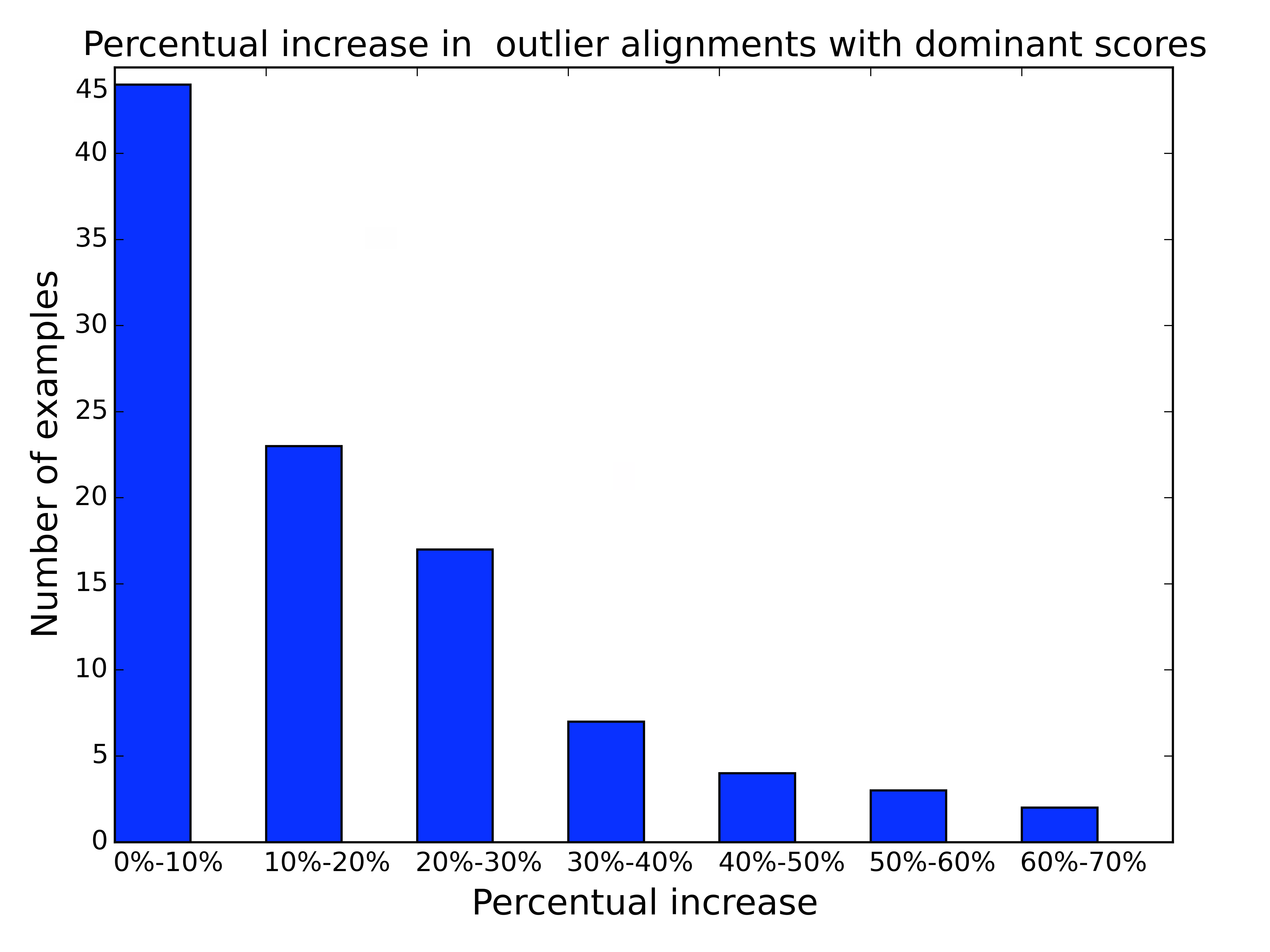
Overall, these quantitative results suggest that the detection of meaningful outlier relationships is a hard problem. They also show that PODS is effective, providing a trade-off between true and false positives that is consistently competitive. The use of cumulative effects increased the number of outlier alignments for most cases, as shown in Figure 11. This factor, along with the Outlier-Biased scheme, specifically contribute to the recall of our solution. Besides that, we noted that component Meaningfulness Verification, by testing the quality of models and the consistency of aligned outliers, significantly contributes to the precision of PODS. These results also indicate that verifying statistical meaningfulness is consistent with, for the most part, the annotators’ idea of meaningfulness.
PODS, as illustrated by these experiments, is particularly useful to further understand whether outlier alignments are likely to be coincidental or, rather, help explain each other. To the best of our knowledge, there is no previous work that specifically addresses a formalization of the concept of meaningfulness that can be backed up statistically and matches users’ intuition. Our solution, however, has certain limitations: the notion of meaningfulness is tied to linear relationships; attributes have to be numerical; outliers need to be large (in modulus); and one needs to calibrate a few parameters. In the future, our goal is to address all these restrictions.
4.4. Effectiveness: Comparison with Data Polygamy
Data Polygamy () (chirigati@sigmod2016) is a framework designed to detect statistically significant relationships between attributes of (spatio-)temporal data sets. To the best of our knowledge, is the published work that is closest to ours in terms of the problem it addresses. Given a pair of attributes as input, models their individual values as scalar functions, which provide a mathematical representation of their topological terrain. The framework then derives a relationship for a pair of scalar functions when their topological features, i.e., peaks and valleys, overlap. generates two types of topological features: salient and extreme. The former corresponds to data values that are moderately different from their (spatio-)temporal vicinity, albeit still quite common in the data; the latter corresponds to outliers among salient features which occur very rarely. We thus focus our comparison on the latter.
Choice of input data for .
We started off by running over all pairs of original attributes from the data sets in Table 1, but the number of extreme features per attribute was fairly small: around three extreme features on average were identified for each original attribute. This resulted in very few overlaps across attributes and no statistically significant extreme relationship. To increase the number of identified extreme features, we then ran over pairs of mean residual representations instead. Mean residual representations, computed with different time window sizes 101010 The time window sizes that we used were of 28, 30, 64, 90, 128, 180, 256, 360, and 365 days, as indicated in Section 4.1., uncover a range of local and global outliers that may not be as visible in the original attributes. Our intuition then was that would identify more extreme features, and potentially more feature overlaps, when executed over pairs of mean residual representations. More extreme features (on average, eight per representation) and extreme feature overlaps were indeed identified, but again no extreme relationships were considered statistically significant. In fact, we noticed that filters out relationships across small samples of extreme features because of the way it tests for statistical significance.
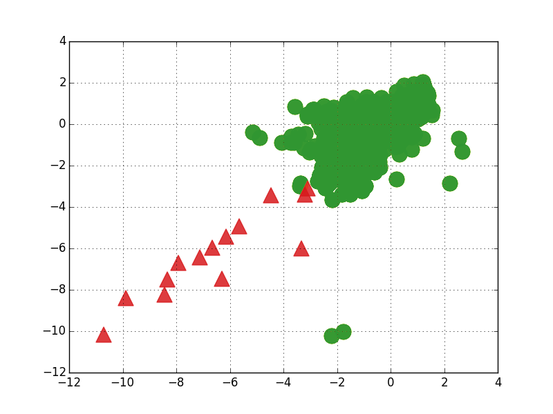
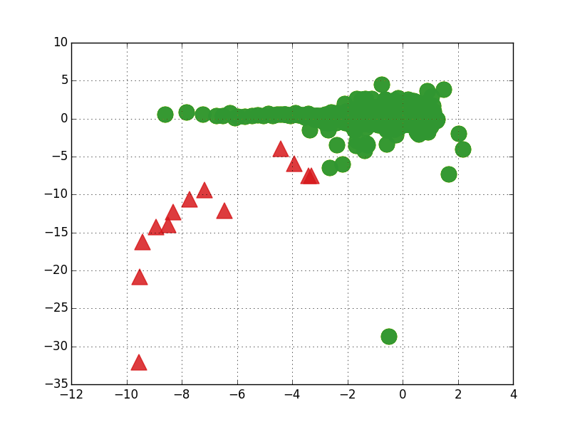
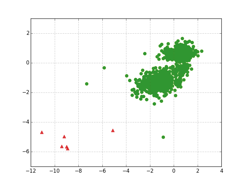
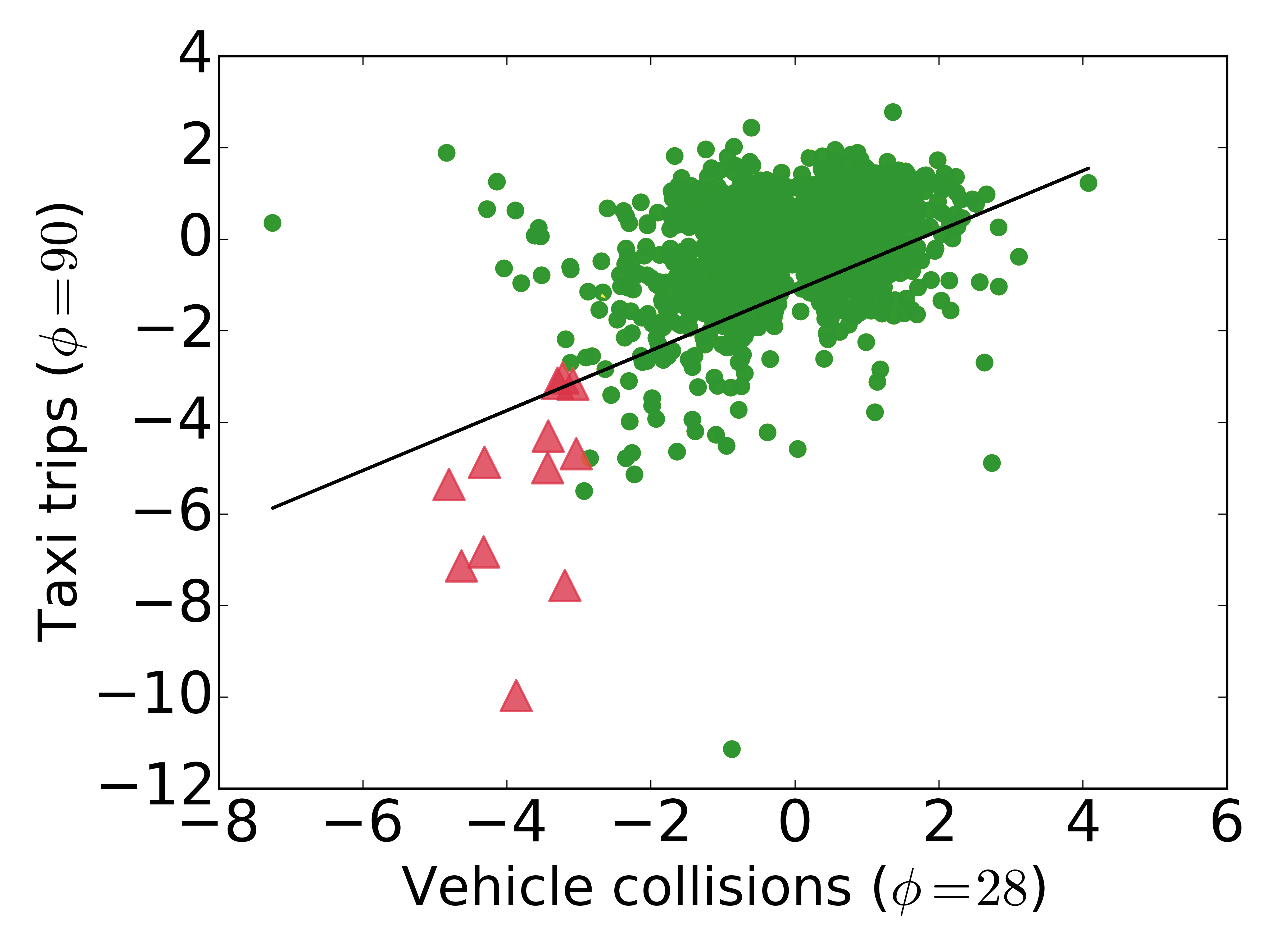
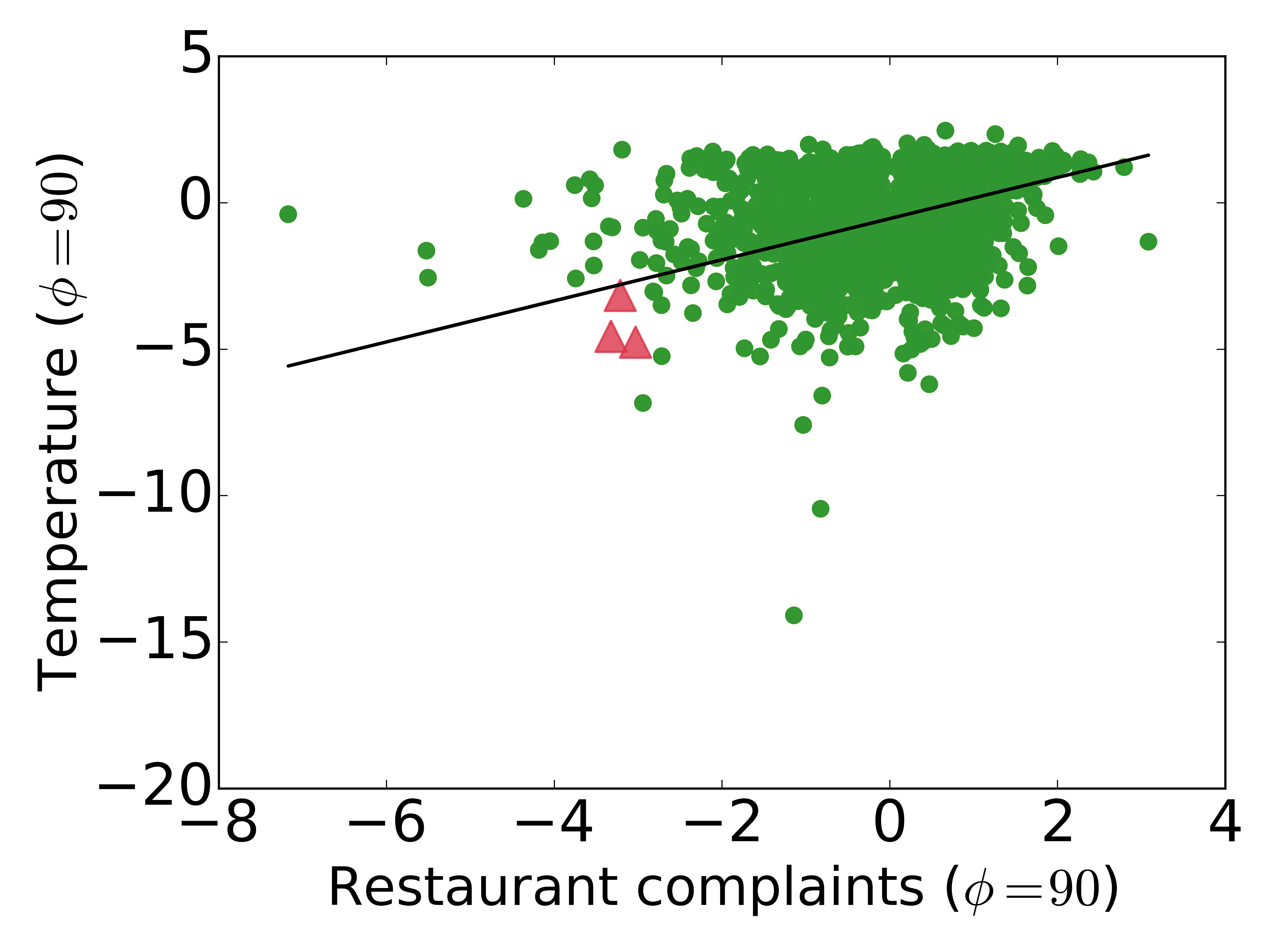
Given that did not consider any extreme relationship significant, we wanted to understand whether PODS detects any of them as meaningful, and if its results are compatible with users’ expectations. To this end, we generated scatterplots like the ones in Figures 12a and 12b for all pairs of co-occurring scalar function values generated by , as long as the pairs had at least one extreme feature overlap. The red triangles correspond to overlapping extreme features, i.e., extreme features that co-occurred on a same day, and the green circles represent other co-occurring scalar function values. The scatterplots were labeled by five different annotators, following a procedure similar to the one described in Section 4.2. We asked each annotator the following question: Do you see a meaningful pattern across the aligned outliers?, indicating that they corresponded to the red triangles. Annotators again interpreted the term meaningful in slightly different ways, but focused on a few aspects: the presence of clusters of red triangles, the existence of a trend pattern across them, a certain shape coherence with close green circles, and the presence of at least two red triangles. For each scatterplot, the corresponding pair of representations was annotated as clear positive, clear negative, dubious positive, or dubious negative, following the same semantics described in Section 4.2. Due to the small number of examples, as there were not many co-occurring extreme features, we focused on the clear positive and clear negative categories, gathering 10 examples of each. Figures 12a and 12b are scatterplots illustrating these two categories.
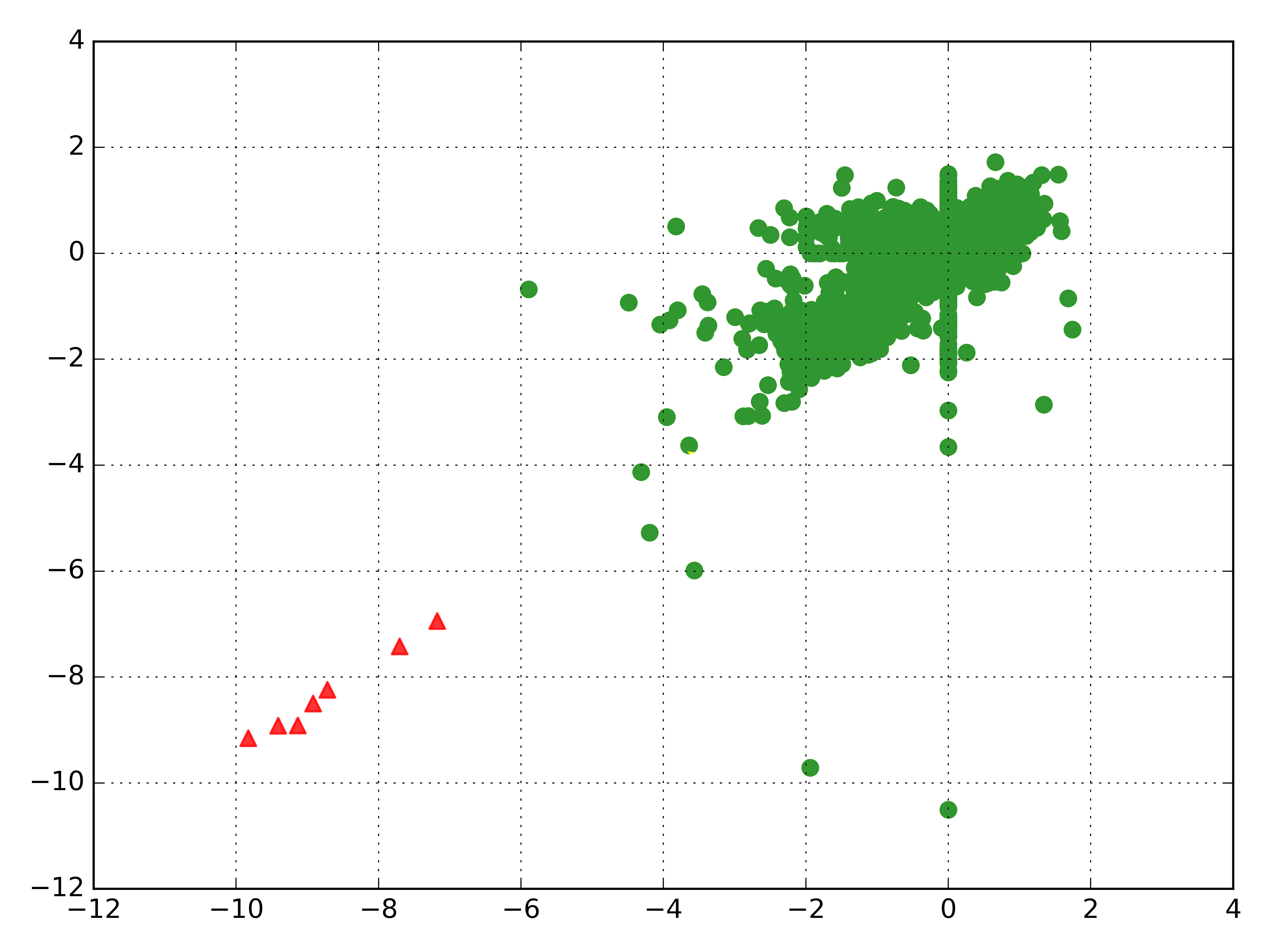
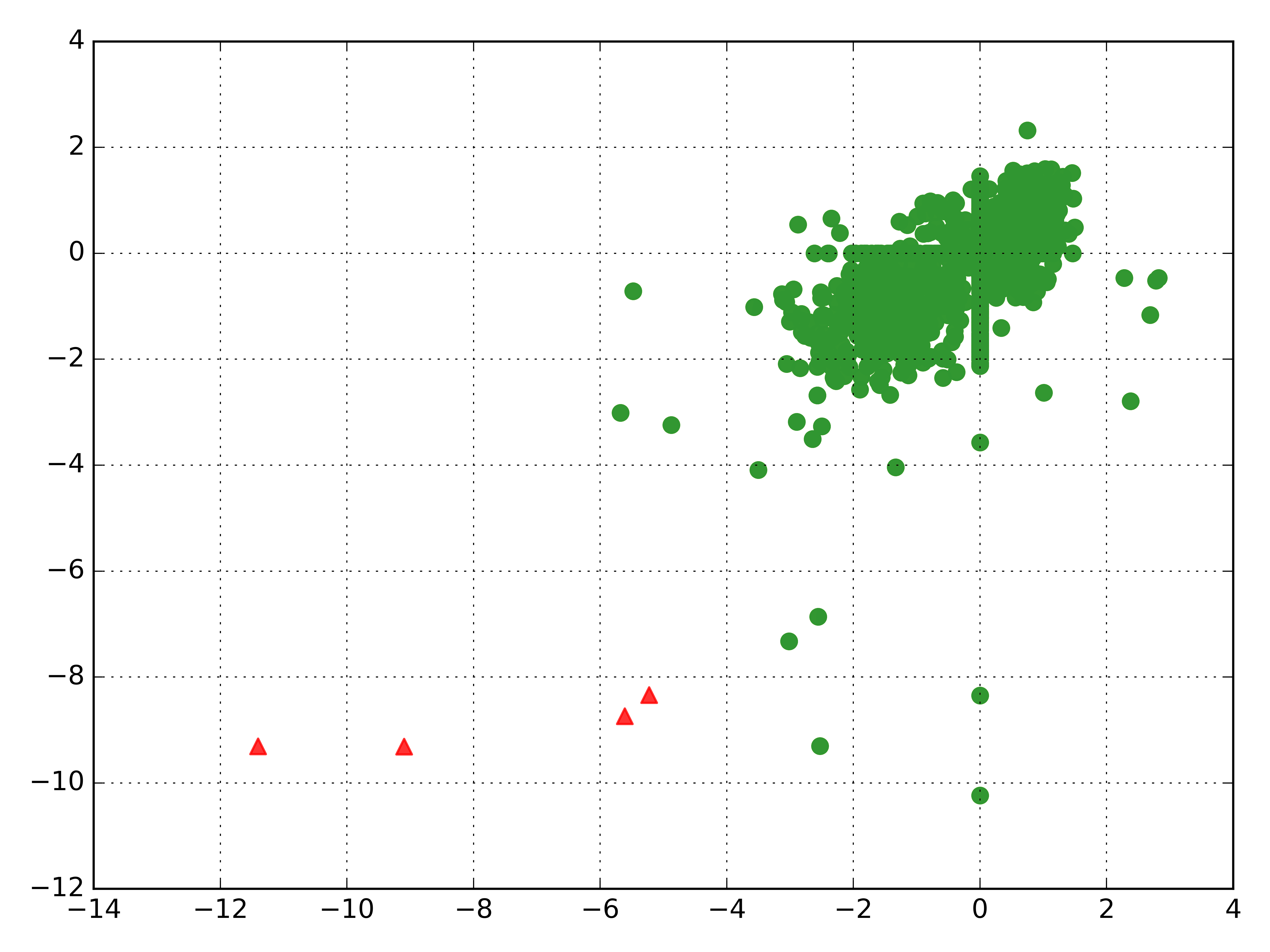
After annotating the -based scatterplots, we ran PODS over their corresponding attribute pairs to verify if it is compatible with the human labeling. It is important to mention that the scalar functions used in satisfy the requirement for outlier detection functions . Consequently, it was straightforward to run PODS over the annotated data. In this experiment, we obtained a recall of 0.90, a precision of 0.64, and an F-measure of 0.75. These results indicate that our approach is useful for capturing patterns across aligned outliers that seem meaningful to users. Still, note that PODS’s precision is significantly lower than its recall. This happened because our method detected examples with a single outlier co-occurrence as meaningful, specifically because the co-occurrence in question was consistent with the computed regressions (see Definition 10). The annotators, on the other hand, did not consider that any meaningful pattern could be drawn from a single outlier co-occurrence. In practice, however, it is possible to have a single outlier co-occurrence that actually uncovers a meaningful relationship: for example, a hurricane in a big city may happen only once, but it does help explain concomitant power outages. Annotators probably did not consider such cases because the semantics of the data (e.g., axes indicating the corresponding original attributes) was not presented to them: without any further knowledge of the data, they relied on a more generic intuition, ruling out relationships involving single outlier co-occurrences. Our conclusion is that hiding the semantics of the data prevented annotation biases, but it also limited our experiment. After all, semantics, just like statistical intuition, plays an important role in understanding whether an outlier relationship is meaningful.
This experiment indicates that is competitive for the detection of significant relationships across salient features, which are relatively common in the studied data sets. However, this does not seem to be the case for relationships across small samples of outliers (extreme features). In fact, did not identify any of the annotated examples as statistically significant, strongly suggesting that PODS is more suitable for the task of detecting important outlier relationships. Although the experiments presented in this section are fairly limited, using small amounts of annotated data, it seems that PODS is capable of providing insights that are useful for outlier relationships, whereas simply filters them out. We believe that both techniques are mainly suited for distinct, albeit strongly related, applications, and their outputs complement one another in the exploration of temporal data.
4.5. Effectiveness: Case Studies
While the experiments in Sections 4.3 and 4.4 provide quantitative evidence of the effectiveness of PODS, in what follows, we use real use cases to assess its usefulness in practice, i.e., if the meaningful outlier relationships it detects are interesting and seem useful.
Criminal Offenses and Temperature.
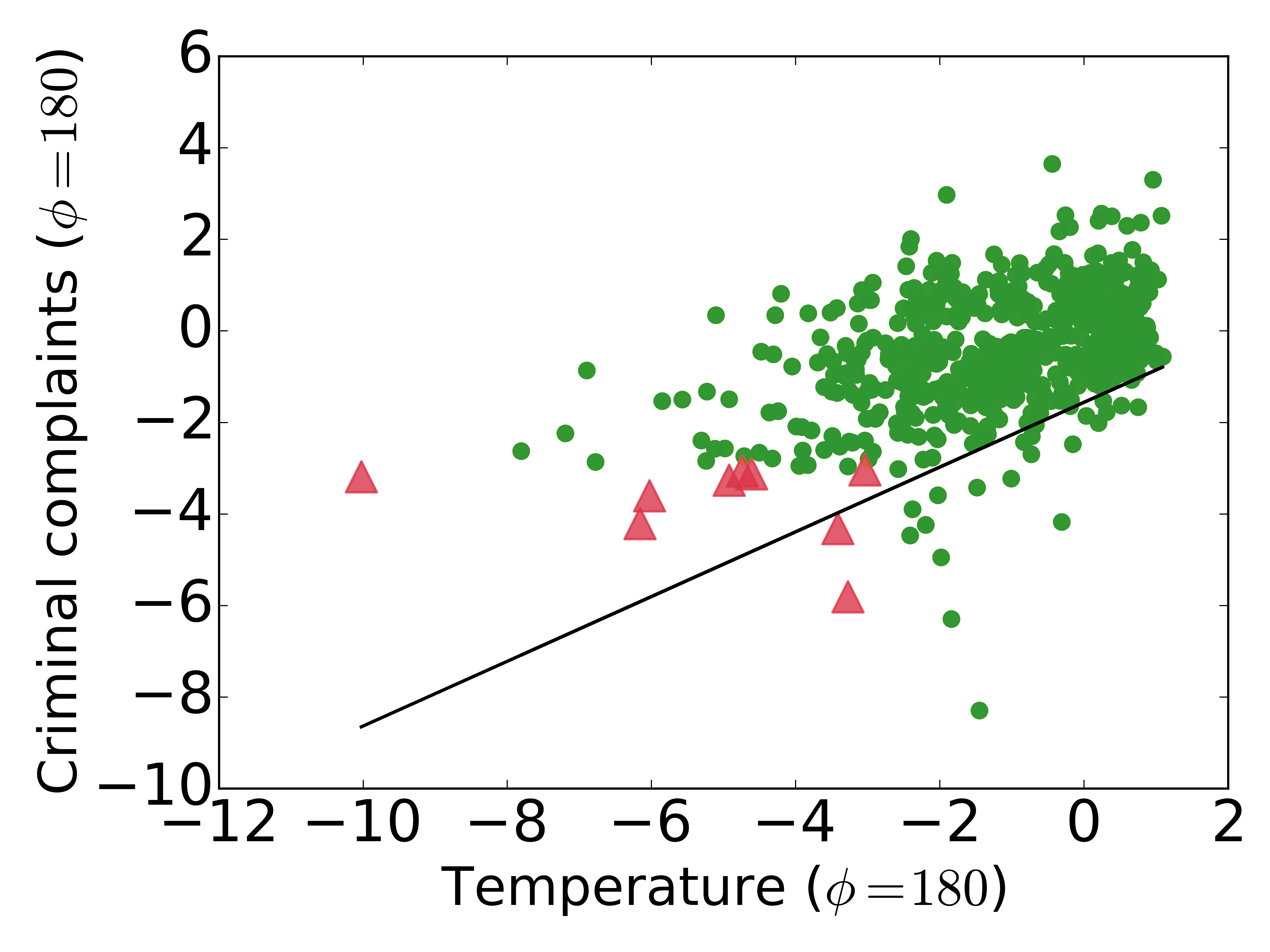
While published studies reported links between high temperatures and increases in criminal activity (chinasi@jurbanhealth), we obtained a new insight through a relationship discovered by PODS: low values for temperature are aligned with low values for offenses. Consider Figure 13a. In the positive quadrant of the plot ( and ), there is indeed a positive data-trend between the two attribute representations, but the alignments are not as extreme as in the negative quadrant. In other words, the explanation of the outliers – in this case, very safe and cold days, complements the prior knowledge that hot days are linked to higher crime. This underscores the utility of techniques like the one we propose, which can be applied in addition to traditional statistical techniques for finding correlations. This finding can have implications for decisions regarding safety investments, made by the NYC administration. As we discussed in Section 1, while our method identifies outlier data-trends that can lead to new hypotheses (e.g., in this case the association between low temperature and low crime), domain experts must further explore the data to prove (or disprove) the hypotheses. In this example, through further investigation, an expert found that in most years, temperatures on December 31st are low. One exception happened on December 31, 2011: a comparatively warm day, with a low temperature of 8C and a significantly higher number of criminal offenses. The relationship PODS discovered followed by additional investigation could help the NYPD construct predictive models that enable them to adjust their policing investments thus leading to cost savings without jeopardizing safety.
Vehicle Collisions and Taxi Trips.
We identified an extreme relationship involving abnormally small numbers of vehicle collisions () and taxi trips (), shown in Figure 13b. The most extreme co-occurrence corresponds to October 29, 2012, during Hurricane Sandy (wikipedia-sandy). However, a pattern can already be seen across less extreme co-occurrences. Two of these co-occurrences correspond to 2013’s Independence Day and Memorial Day holidays. Our hypothesis is that the number of taxi trips is a proxy for the total number of cars in New York City, and while the number of trips does not help understand most variations in the number of collisions, including its peaks, its valleys are a consequence of a quieter period, when many people leave for the holidays.
Restaurant Complaints and Temperature.
An interesting relationship detected by PODS, shown in Figure 13c, involves seasonal negative temperature outliers () and seasonal low numbers of 311 restaurant complaints (). By checking complaint descriptions in the 311 data set, we found that most restaurant complaints have to do with: the presence of pests (e.g., rodents) and garbage in the food preparation area; spoiled food; lack of letter grading;111111In New York City, the Health Department conducts unannounced inspections of restaurants at least once a year. At the end of the inspection, the inspector gives a grade to the restaurant — the fewer violations found, the higher the grade (restaurant-inspection). and foreign objects in the food. Although it makes sense to expect that relatively lower temperatures may attract fewer pests, or even contribute to reduced food spoilage, it is surprising that complaints that seem season-independent, such as letter grading or food contamination, also become infrequent when the temperature suddently drops. In fact, there is evidence that the number of customers in restaurants is relatively constant throughout the seasons—except during Summer, when establishments tend to be more empty (nyc-summer-eat-out)—, and at first we thought that this implied that the number of complaints should also be relatively constant. Despite this evidence, however, some relatively low numbers of complaints are definitely linked to sudden decreases in temperature in the data we studied, and our hypotheses are that (1) either customers complain less on such days because they also go out less (i.e., restaurant attendance is not that constant after all), or maybe spend less time in the establishments, or (2) this association is a data quality issue. This case study is thus surprising precisely because it needs more domain knowledge, or data sources, to be better understood. It raised the question of whether it actually reflects a systematic relationship between restaurant complaints and temperature, or whether it corresponds to a relevant data quality issue. An expert on these data sets could use this finding to help build an informed analysis on the connection between seasonally low temperatures and restaurant complaints, but this is outside the scope of our work.
4.6. Scalability Evaluation
| Sample Size | Total Pairs | Indexed Pairs | Fraction of Pruned Pairs | Time w/o index (min) | Time w/ index (min) | Index Speedup |
| 10 | 45 | 32 | 0.29 | 3.32 | 2.55 | 1.30 |
| 25 | 300 | 209 | 0.30 | 23.96 | 17.01 | 1.41 |
| 50 | 1225 | 798 | 0.35 | 90.33 | 59.12 | 1.53 |
| 100 | 4950 | 2966 | 0.40 | 341.24 | 216.13 | 1.58 |
| 200 | 19900 | 12582 | 0.37 | 1402.75 | 869.19 | 1.61 |
To evaluate the scalability of PODS, we performed two experiments that measure how its execution time increases as the number of attributes grows. The experiments were carried out on a desktop with an Intel(R) Xeon(R) Processor E5-2630 (4x8 cores) running at 2.40GHz, with 32GB of RAM. PODS is implemented in Python 2.7.
In the first experiment, we simulate a scenario where the fraction of pruned attribute pairs is roughly the same for differently-sized collections. First, we generated differently-sized random samples of attributes from our collection (Table 1) and represented them with mean residuals. Next, we compared the execution time of PODS over all distinct pairs in the samples with and without the alignment index.121212Note that, as we experiment with 9 different time window sizes and there are 84 attributes in Table 1, there is a total of 756 mean residual representations for the attributes. The results shown in Table 4 correspond to the median value among 5 cold-cache runs for executions with and without the index. Note that the execution times grow roughly linearly on the total number of attribute pairs, both with and without the index. When the index is used, however, the execution times consistently decrease by about a third — a consequence of pruning around one third of the attribute pairs for every sample size. These results indicate that, although the relationship between the total number of attribute pairs and the execution times does not become sub-linear with the index, the speedup has a significant practical impact, especially for larger attribute samples.
In the next experiment, we simulated a different scenario: as the number of attributes in a collection grows, the fraction of attribute pairs with aligned outliers decreases significantly. In such cases, our alignment index should have a more substantial impact on the execution time of PODS. The motivation behind this experiment comes from traditional indexing scenarios, where the probability of having two items in the same posting list131313Recall that in the alignment index we propose, posting lists are composed of attributes with aligned outliers. decreases as more data is added to the index (baeza2011IR). To run this experiment, we first represented attributes from our collection with mean residuals, and then generated differently-sized attribute samples with the same number of indexable attribute pairs (i.e., pairs with aligned outliers). By keeping the number of indexable pairs constant, we varied the sample size (and, consequently, the total number of attribute pairs) to simulate different levels of index pruning. Next, we compared the execution time of PODS over all samples with and without the alignment index. As before, results in Table 5 correspond to the median value among 5 cold-cache runs. Note that the execution time remains almost constant when the index is used — when it is not, the execution time grows roughly linearly on the total number of attributes. As a consequence, the index speedup significantly increases as the sample size grows. This suggests that the alignment index is particularly beneficial for large collections with a small fraction of indexable pairs, which may be common in practice.
| Sample Size | Total Pairs | Indexed Pairs | Fraction of Pruned Pairs | Time w/o index (min) | Time w/ index (min) | Index Speedup |
| 25 | 300 | 209 | 0.30 | 23.18 | 16.29 | 1.42 |
| 30 | 435 | 209 | 0.52 | 32.54 | 16.42 | 1.98 |
| 40 | 780 | 209 | 0.73 | 59.88 | 16.63 | 3.60 |
| 70 | 2415 | 209 | 0.91 | 186.13 | 16.89 | 11.02 |
Both experiments demonstrate the importance of using an index in distinct scenarios, and indicate that PODS is scalable and can be applied over large collections of data sets. Note that we ran the experiments sequentially, on a desktop. However, the computation is easily parallelizable: each pair can be computed independently. Therefore, the times reported in Tables 4 and 5 would be greatly reduced if the experiments were run in parallel on a cluster.
4.7. Sensitivity to Parameter Variations
In what follows, we assess the robustness of PODS with respect to slight variations in its parameters. The discussion is based on our experiments, the data, and the annotation scheme we used in Section 4.2. Results for gold data categories Clear and Dubious were generated separately.
Parameter .
To understand how robust the Outlier-Biased scheme is, we investigated the impact of variations in parameter . Recall that controls the similarity of the weights for distinct aligned scores. We started with so the weights are neither too similar nor too different for distinct alignments. We then executed PODS over the gold data set, and repeated the process with different values, obtained with variations in the order of . As shown in Figure 14a, variations in lead to very small changes in F-measure. For category Clear, the F-measure varied less than 4% in comparison with the initial value (); for category Dubious, less than 10%. This suggests that PODS is robust with respect to slight variations in .
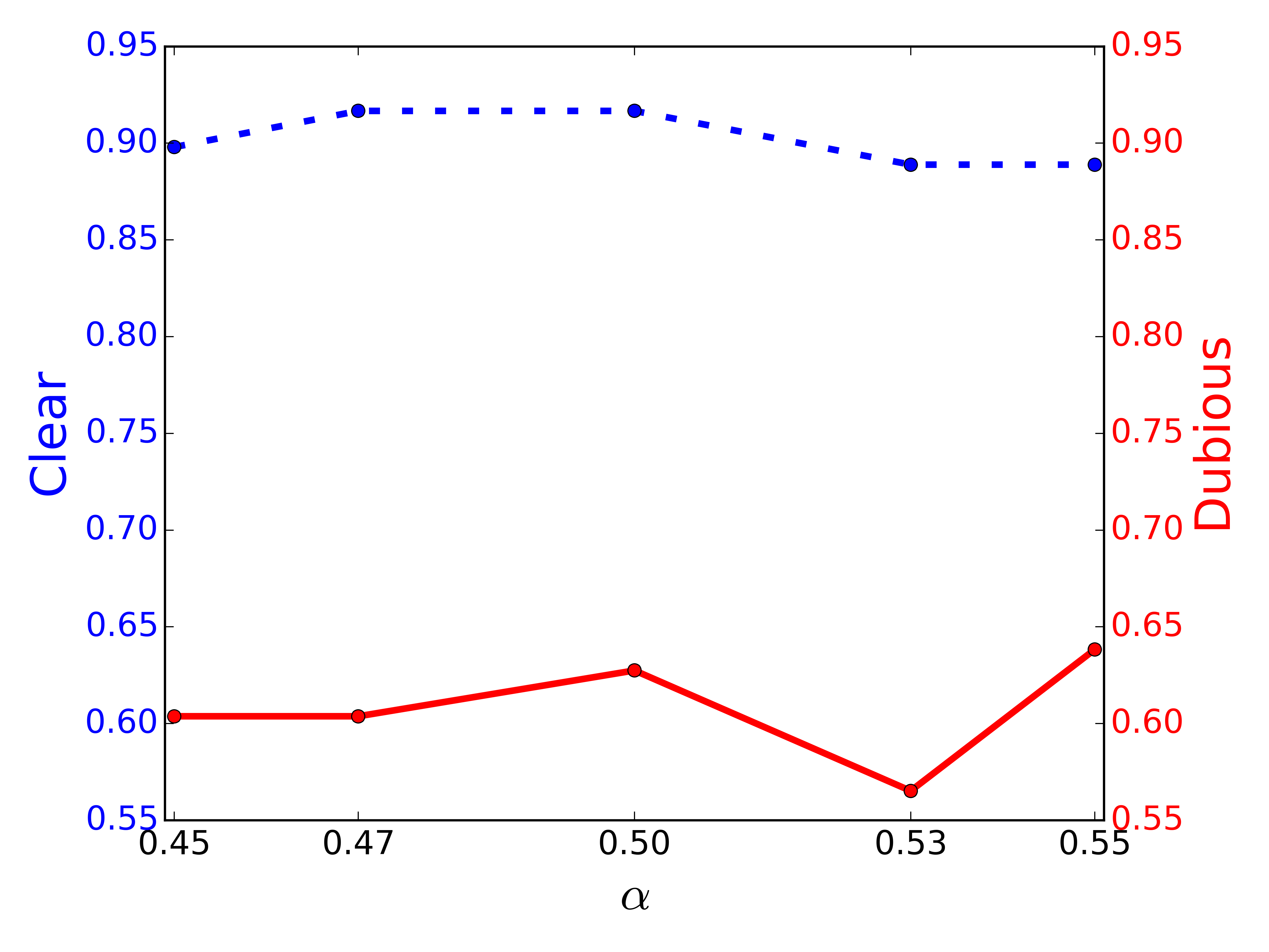
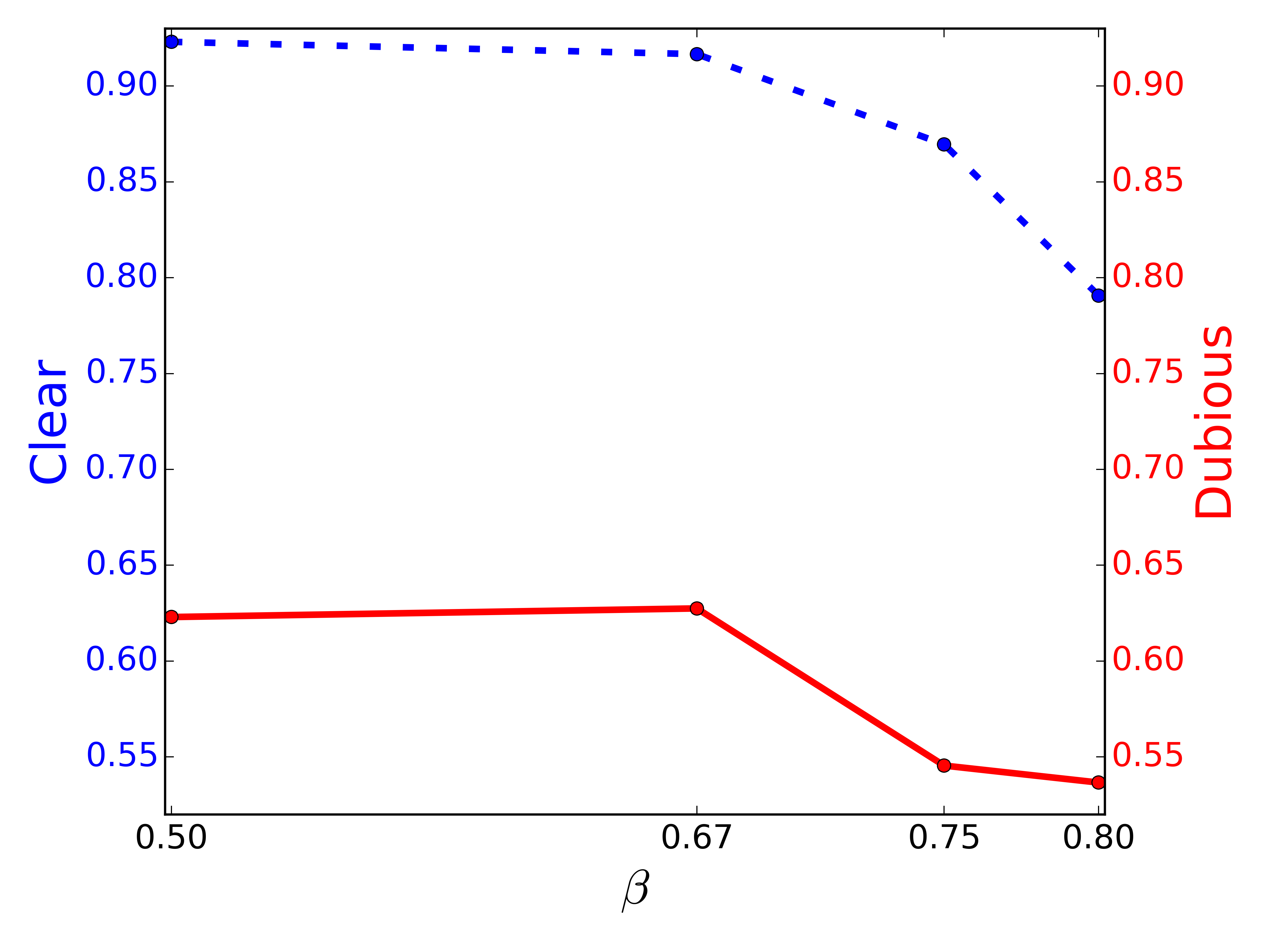
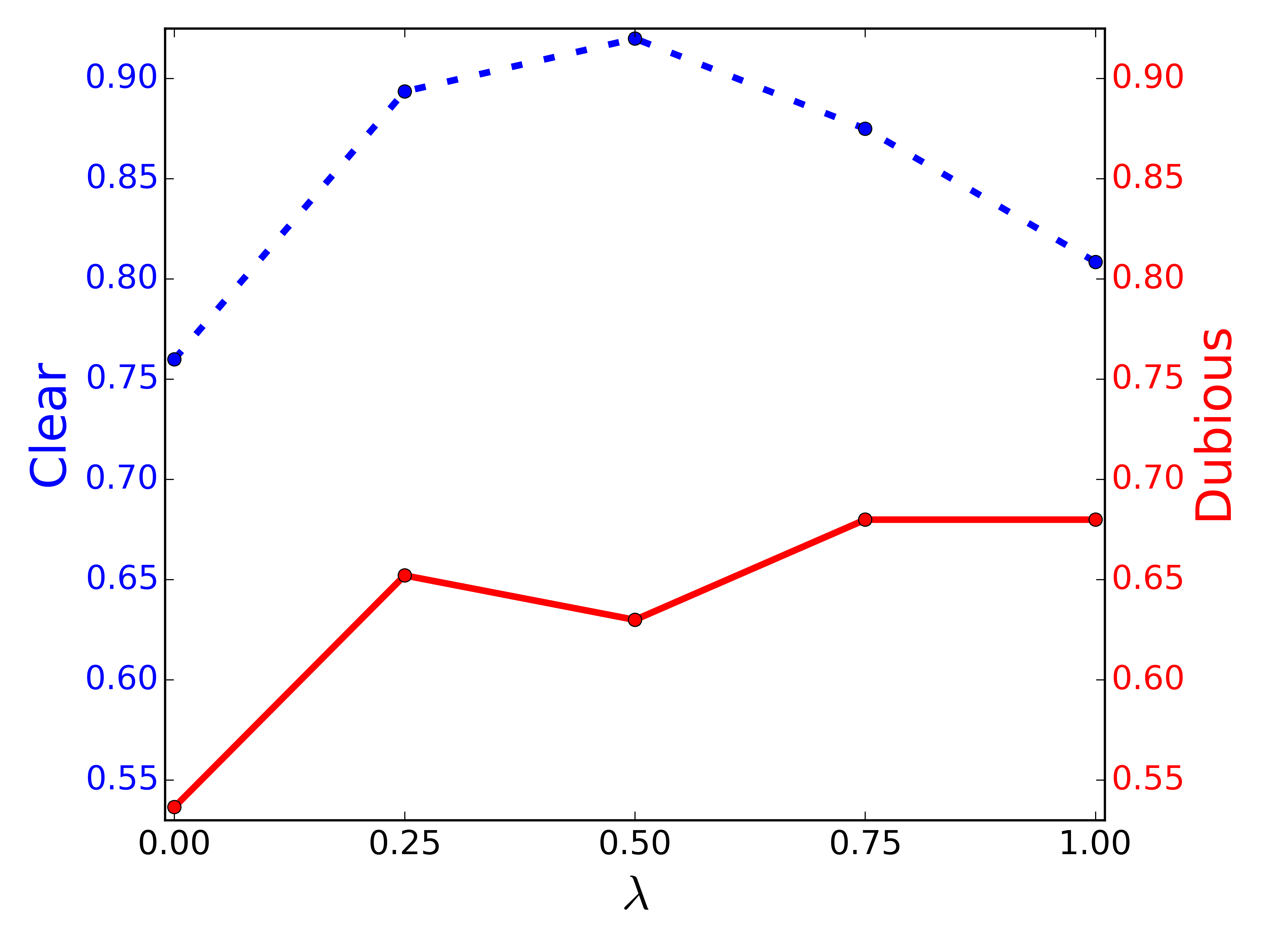
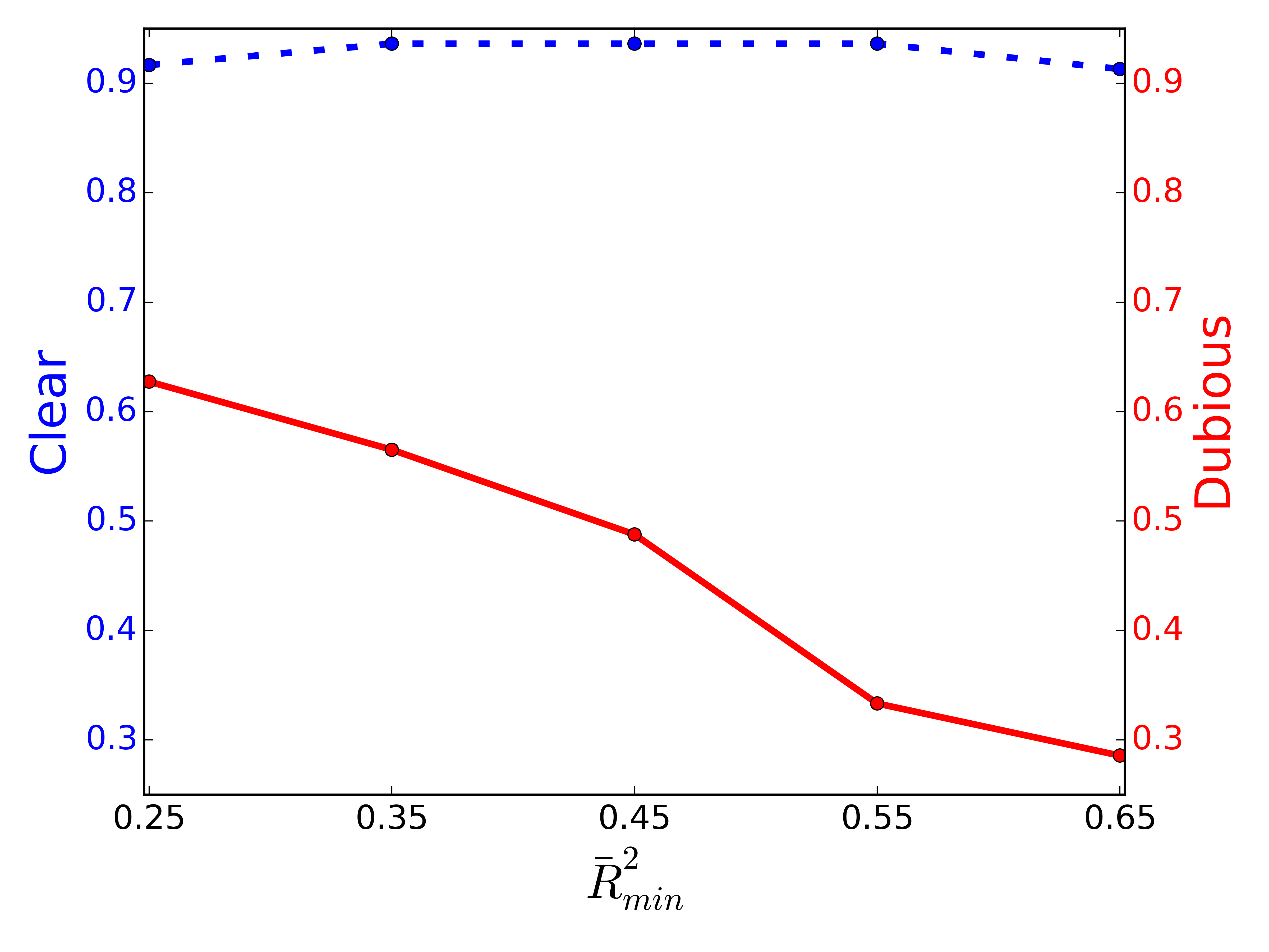
Parameter .
Coefficient controls how many outlier errors need to be bounded by the model’s error distribution—the higher is, the more rigorous is the discovery process. This experiment contrasts results obtained with different choices of . We started with the , executed PODS over the gold data set, and then repeated the process with different values, obtained with variations in the order of . The results in Figure 14b show that lower percentages (a less rigorous verification of meaningfulness) are more adequate for the gold data. To some extent, this is expected: our gold data is derived from urban data sets, and it is likely that there are a number of intervening variables interfering with one another. As a consequence, data-trend patterns may be more unclear (especially for category Dubious), leading to higher outlier errors with respect to the original model.
Parameter .
To understand the role that plays in the dominant scores and the effectiveness of PODS, we investigated the impact of variations in the order of . Recall that the higher is, the more cumulative effects are taken into account. Results illustrated in Figure 14c show that the F-measure changes significantly as we vary . For category Clear, average values yielded the best results. As for category Dubious, larger values are more suitable. These results suggest that, for cases where data-trend patterns are not so clear, as is the case with the examples in Dubious, the use of more cumulative effects help discern true positives from true negatives. Our hypothesis is that matches between close values, promoted by the use of cumulative effects, play an important role in the detection of meaningful outlier relationships in harder scenarios.
Parameter .
As discussed in Section 3.3, a model that fits its observations very poorly is of little use in PODS’s verification of meaningfulness. As a consequence, we reject models whose is below a certain . Picking an adequate value for is difficult and the particular value depends on the application. However, in contexts where there are many variables at play interfering with each other, and the goal is to find data-trend patterns instead of explaining most of the variance in the response variable, moderate values are expected in the models, suggesting that does not necessarily need to be very high (cohen@psychbulletin1992). For completeness, we decided to contrast results obtained with significantly different values. We started with , executed PODS over the gold data set, and then repeated the process with different values, obtained with variations in the order of . The results, shown in Figure 14d, show little change for Clear. In fact, the increase in slightly reduced the number of false positives for this category, while keeping the number of true positives constant up until . On the other hand, the F-measure falls drastically for Dubious as we increase . In the annotation of the gold data, we believe that clear data-trend shapes, usually associated with high , played an important role in the annotators’ notion of meaningfulness. Thus, examples in which there was significant divergence have lower , getting more easily pruned away as increases. Given that the F-measure changes very little for category Clear, results in Figure 14d increase the evidence that moderate values are overall more beneficial for the type of data we examine in this paper.
5. Related Work
Closely related to PODS are strategies to explain outliers. MacroBase (bailis2017macrobase) classifies points in a data stream as interesting or not, and attempts to explain groups of interesting values by highlighting correlations that most differentiate them. Data X-Ray (wang@sigmod2015) identifies and explains errors in data that are inherent to their generation process. It also identifies features that best represent erroneous elements and uses Bayesian analysis to evaluate whether a set of features is associated to the cause of errors. ExStream (zhang@edbt2017) provides explanations for anomalous behavior in streams detected by complex-event processing (CEP) systems that are both concise and have high predictive value. These approaches, however, derive explanations for categorical features, while our goal is to detect meaningful outlier relationships between numerical attributes, which may help explain such outliers.
Approaches have also been proposed to explain outliers in query results. Wu and Madden (wu2013scorpion) and Roy and Suciu (roy@vldb2015) proposed frameworks that formulate explanations for SQL query results as predicates over the input attributes. Miao et al. (miao2019pvldb) proposed a system that attempts to explain outliers in one direction with related outliers in the opposite direction (explanations by counterbalance). As an example, a higher than expected value may be explained by a a lower than expected value present in another answer tuple. In contrast, the explanations derived by PODS are based on whether aligned outliers are linearly related in a statistically meaningful way.
Also related to PODS, albeit less directly, are attempts to explain data anomalies without exploring data relationships. Dasu et al. (dasu@kdd2014) introduced the concept of explainable glitches, which are similar to data integrity violations, and proposed a non-parametric method to empirically generate explanations for them. Others (dang@pkdd2013; knorr@vldb1999) proposed techniques to explain outliers in the context of a single data set, detecting which subset of their attributes contributes most to their outlierness. These ideas help formalize domain knowledge and improve the interpretability of outliers. They may be helpful in the generation of sophisticated outlier detection functions, which can then be combined with PODS to provide even more complex outlier explanations.
Techniques have also been proposed that can help explain numerical features. Ho et al. (ho@bigdata2016) proposed an efficient method that, given two data sets, adaptively identifies time windows where the data present a strong correlation. Chirigati et al. (chirigati@sigmod2016) proposed Data Polygamy (), which uses computational topology techniques to model spatio-temporal data sets as scalar functions, and derives relationships for a pair of functions when their peaks and valleys overlap. They focused on salient features, which can be common in the data — in contrast, our goal is to find meaningful alignments that can help explain outliers. Note, however, that DP also detects extreme features (outliers) in the data and, as discussed in Section 4.4, it is possible to compare against PODS. In fact, our experiments strongly suggest that PODS is more suitable for the detection of important outlier relationships, providing insights that are compatible with users’ intuitions but are filtered out by . Another distinction between these works and PODS is that the latter makes use of cumulative effects to implicitly align extreme values that occur at different but close-by times, whereas the former align data based on an exact matching of their timestamps and thus may miss explanations that involve the lingering effects of extreme events.
Also related to our work are techniques for mining association rules. Korn et al. (korn@vldb2000) and Srikant and Agrawal (srikant@sigmod1996) proposed techniques to mine numerical association rules, but they did not address associations involving numerical outliers, or verify correlations linked to the detected rules. There has also been work on the detection of rare association rules that have low support and high confidence (tsang2013rareassociation; yun2003rareassociation) but, unlike PODS, these have focused on associations across categorical attributes.
This work was motivated by issues we have encountered in urban data with a temporal component. However, it is worth noting that while we take timestamps into account in order to align data, our technique detects data-trends, i.e., trends that materialize over aligned values as they grow more abnormal, without focusing on whether aligned values are temporally close. Thus, approaches to find trends and correlations for time series (see e.g., (hamilton1994time)) are not applicable in our scenario. In addition, these approaches often focus on common patterns, not on outliers.
Finally, there are works which are related because they propose techniques similar to the ones implemented by PODS. Cross-correlation functions (ccf@2006), for example, are related to PODS’s attribute alignment. These functions generate alignments between data points allowing for different temporal lags, but no cumulative effect is taken into account. In other words, only outliers that are present in the initial data can be aligned. In addition, cross-correlation functions are costly and the temporal lags are not straightforward to tune. Rather than explicitly comparing two outliers separated by an arbitrary amount of time, PODS calculates cumulative effects and generates new outlier representations. These, in turn, are aligned if they share the same timestamp. Heteroskedasticity (CRR73), a common application of WLS that compensates for different variability in distinct subsets of the data, is also related to a key component of PODS: the Outlier-Biased scheme. Heteroskedasticity pulls the regression towards matching subsets with less variability which, in our context, does not necessarily correspond to aligned outliers or near-outliers. To the best of our knowledge, our work is the first application of WLS that uses weights following an explicit semantics, specific to the problem of identifying meaningful relationships between outliers.
6. Conclusions
In this paper, we presented PODS, a data-driven approach to detect meaningful outlier relationships. PODS leverages the growing number of available temporal data sets to derive explanations for outliers by discovering meaningful relationships across their aligned outlies. To the best of our knowledge, PODS is the first method that attempts to explain outliers in numerical data by making use of trend patterns (data-trends). We have developed new techniques that efficiently identify related attributes, detect data-trends across their aligned outliers, and verify the statistical meaningfulness of these data-trends. We presented an extensive experimental evaluation, using real urban data sets, which shows that our approach is effective in comparison with totally distinct baselines. Moreover, our experiments show that PODS is robust with respect to slight parameter variations, and scalable.
There are many directions we plan to explore in future work. While our approach currently handles numerical attributes, it would be interesting to investigate techniques that combine both numerical and categorical attributes to derive more complex outlier explanations. In this vein, we are also interested in the exploration of different regression models for the detection of data-trends (e.g., random forests (murphy2013machine)), especially to capture outlier relationships that are nonlinear. We also plan on creating strategies to recommend good parametrizations for PODS, including learning them from data. In addition, we would also like to examine strategies that involve the alignment of more than two attributes, as well as the detection of nonlinear relationships across them. We are also interested in extending PODS for spatiotemporal data, which may be relevant for scenarios where data sparsity is not an issue. Last but not least, we plan to apply PODS on other sources of data, increasing the diversity and depth of our case studies.
References
- (1)
- 311-heating-complaint ([n. d.]) 311-heating-complaint [n. d.]. Heat or Hot Water Complaint. https://www1.nyc.gov/nyc-resources/service/1813/heat-or-hot-water-complaint.
- Aggarwal (2013) Charu C. Aggarwal. 2013. Outlier Analysis. Springer.
- Baeza-Yates and Ribeiro-Neto (2011) Ricardo Baeza-Yates and Berthier Ribeiro-Neto. 2011. Modern Information Retrieval (2 ed.). Pearson Addison Wesley, Harlow, England.
- Bailis et al. (2017) Peter Bailis, Edward Gan, Samuel Madden, Deepak Narayanan, Kexin Rong, and Sahaana Suri. 2017. MacroBase: Prioritizing Attention in Fast Data. In SIGMOD. 541–556.
- Barbosa et al. (2014) Luciano Barbosa, Kien Pham, Cláudio Silva, Marcos R Vieira, and Juliana Freire. 2014. Structured Open Urban Data: Understanding the Landscape. 2 (2014), 144–154. Issue 3.
- Bujang and Baharum (2016) Mohamad Adam Bujang and Nurakmal Baharum. 2016. Sample Size Guideline for Correlation Analysis. World Journal of Social Science Research 3 (03 2016), 37.
- Button et al. (2013) Katherine Button, John Ioannidis, Claire Mokrysz, Brian Nosek, Jonathan Flint, Emma Robinson, and Marcus Munafo. 2013. Power Failure: Why Small Sample Size Undermines the Reliability of Neuroscience. Nature reviews. Neuroscience 14 (04 2013).
- Chicago (2018) Chicago 2018. City of Chicago Data Portal. https://data.cityofchicago.org.
- Chirigati et al. (2016) Fernando Chirigati, Harish Doraiswamy, Theodoros Damoulas, and Juliana Freire. 2016. Data Polygamy: The Many-Many Relationships among Urban Spatio-Temporal Data Sets. In SIGMOD. 1011–1025.
- Cohen (1988) Jacob Cohen. 1988. Statistical Power Analysis for the Behavioral Sciences. Routledge.
- Cohen (1992) Jacob Cohen. 1992. A power primer. 112 (1992), 155–159.
- Dang et al. (2013) Xuan-Hong Dang, Barbora Micenková, Ira Assent, and Raymond T. Ng. 2013. Local Outlier Detection with Interpretation. In ECML/PKDD (3) (Lecture Notes in Computer Science), Vol. 8190. Springer, 304–320.
- Dasu and Johnson (2003) Tamraparni Dasu and Theodore Johnson. 2003. Exploratory Data Mining and Data Cleaning. John Wiley.
- Dasu et al. (2014) Tamraparni Dasu, Ji Meng Loh, and Divesh Srivastava. 2014. Empirical glitch explanations. In KDD. ACM, 572–581.
- Dasu et al. (2015) Tamraparni Dasu, Vladislav Shkapenyuk, Divesh Srivastava, and Deborah F. Swayne. 2015. FIT to Monitor Feed Quality. PVLDB 8, 12 (2015), 1728–1739.
- Efron and Tibshirani (1993) Bradley Efron and Robert J. Tibshirani. 1993. An Introduction to the Bootstrap. Number 57 in Monographs on Statistics and Applied Probability. Chapman & Hall/CRC, Boca Raton, Florida, USA.
- Ellen et al. (2013) Ingrid Gould Ellen, Johanna Lacoe, and Claudia Ayanna Sharygin. 2013. Do foreclosures cause crime? Journal of Urban Economics 74 (2013), 59–70.
- Goldstein and Dyson (2013) Brett Goldstein and Lauren Dyson. 2013. Beyond Transparency: Open Data and the Future of Civic Innovation. Code for America Press.
- Gubner (2006) John A. Gubner. 2006. Probability and Random Processes for Electrical and Computer Engineers. Cambridge University Press.
- Hamilton (1994) James Douglas Hamilton. 1994. Time series analysis. Vol. 2. Princeton university press Princeton, NJ.
- Hastie et al. (2001) Trevor Hastie, Robert Tibshirani, and Jerome Friedman. 2001. The Elements of Statistical Learning. Springer New York Inc.
- Hastie et al. (2009) Trevor Hastie, Robert Tibshirani, and Jerome Friedman. 2009. The elements of statistical learning: data mining, inference and prediction (2 ed.). Springer.
- Ho et al. (2016) Nguyen Ho, Huy Vo, and Mai Vu. 2016. An Adaptive Information-Theoretic Approach for Identifying Temporal Correlations in Big Data Sets. In IEEE Big Data. IEEE Computer Society, 666–675.
- Iglewicz and Hoaglin (1993) Boris Iglewicz and David Hoaglin. 1993. How to Detect and Handle Outliers. American Society for Quality Control, Milwaukee, WI.
- Knorr and Ng (1999) Edwin M. Knorr and Raymond T. Ng. 1999. Finding Intensional Knowledge of Distance-Based Outliers. In VLDB. 211–222.
- Korn et al. (2000) Flip Korn, Alexandros Labrinidis, Yannis Kotidis, and Christos Faloutsos. 2000. Quantifiable Data Mining Using Ratio Rules. The VLDB Journal 8, 3-4 (2000), 254–266.
- Kriegel et al. (2009) Hans-Peter Kriegel, Peer Kroger, Erich Schubert, and Arthur Zimek. 2009. LoOP: local outlier probabilities. In CIKM. 1649–1652.
- Miao et al. (2019) Zhengjie Miao, Qitian Zeng, Chenjie Li, Boris Glavic, Oliver Kennedy, and Sudeepa Roy. 2019. CAPE: Explaining Outliers by Counterbalancing. PVLDB 12, 12 (2019), 1806–1809.
- Murphy (2013) Kevin P. Murphy. 2013. Machine learning : a probabilistic perspective. MIT Press.
- New York City ([n. d.]) New York City [n. d.]. NYC Vision Zero Initiative. http://www1.nyc.gov/site/visionzero/index.page.
- New York City (2018) New York City 2018. NYC Open Data. https://opendata.cityofnewyork.us/.
- nyc-summer-eat-out (2019) nyc-summer-eat-out 2019. The Best Time to Eat Out in NYC Is in the Summer. https://ny.eater.com/2019/6/14/18638711/summer-dining-in-nyc-best.
- ParisData ([n. d.]) ParisData [n. d.]. Paris Data. https://opendata.paris.fr.
- Pukelsheim (1994) Friedrich Pukelsheim. 1994. The three sigma rule. The American Statistician 48 (1994), 88–91.
- Rao (1973) C. R. Rao. 1973. Linear Statistical Inference and Its Applications. Wiley, New York.
- restaurant-inspection ([n. d.]) restaurant-inspection [n. d.]. Food Establishment Inspections. https://www1.nyc.gov/site/doh/services/restaurant-grades.page.
- RioOpenData ([n. d.]) RioOpenData [n. d.]. Portal de Armazenamento de Dados – Rio de Janeiro. http://www.data.rio.
- Roberts (1959) S. W. Roberts. 1959. Control Chart Tests Based on Geometric Moving Averages. Technometrics 1, 3 (1959), 239–250.
- Roy et al. (2015) Sudeepa Roy, Laurel Orr, and Dan Suciu. 2015. Explaining query answers with explanation-ready databases. PVLDB 9, 4 (2015), 348–359.
- San Francisco (2018) San Francisco 2018. San Francisco Open Data. https://datasf.org/opendata/.
- Schill et al. (2002) Michael H. Schill, Ingrid Gould Ellen, Amy Ellen Schwartz, and Ioan Voicu. 2002. Revitalizing Inner-City Neighborhoods: New York City’s Ten-Year Plan. Housing Policy Debate 13, 3 (2002), 529–566.
- Schinasi and Hamra (2017) Leah Schinasi and Ghassan B. Hamra. 2017. A Time Series Analysis of Associations between Daily Temperature and Crime Events in Philadelphia, Pennsylvania. Journal of Urban Health 94, 6 (2017), 892–900.
- Srikant and Agrawal (1996) Ramakrishnan Srikant and Rakesh Agrawal. 1996. Mining Quantitative Association Rules in Large Relational Tables. In SIGMOD. 1–12.
- Tsang et al. (2013) Sidney Tsang, Yun Sing Koh, and Gillian Dobbie. 2013. Finding Interesting Rare Association Rules Using Rare Pattern Tree. Transactions on Large-Scale Data and Knowledge-Centered Systems 8 (2013), 157–173.
- Wang et al. (2015) Xiaolan Wang, Xin Luna Dong, and Alexandra Meliou. 2015. Data X-Ray: A Diagnostic Tool for Data Errors. In SIGMOD. 1231–1245.
- wikipedia-sandy ([n. d.]) wikipedia-sandy [n. d.]. Wikipedia entry on hurricane Sandy. https://en.wikipedia.org/wiki/Hurricane_Sandy.
- Wu and Madden (2013) Eugene Wu and Samuel Madden. 2013. Scorpion: Explaining away outliers in aggregate queries. PVLDB 6, 8 (2013), 553–564.
- Yun et al. (2003) Hyunyoon Yun, Danshim Ha, Buhyun Hwang, and Keun Ho Ryu. 2003. Mining association rules on significant rare data using relative support. Journal of Systems and Software 67, 3 (2003), 181–191.
- Zhang et al. (2017) Haopeng Zhang, Yanlei Diao, and Alexandra Meliou. 2017. EXstream: Explaining Anomalies in Event Stream Monitoring. In EDBT. 156–167.