Selim Mert Kırpıcı Merve Yıldız \IDnotekahvelab@gmail.com \IDnoteAlso at Feza Gürsey Center for Physics & Mathematics, Boğaziçi University, Istanbul
A Meta-Analysis of LHC Results
Abstract
We report the preliminary results of a meta-analysis conducted to examine possible biases in the uncertainty values published in papers by ATLAS and CMS experiments. We have performed this analysis using two independent techniques; a vectoral analysis of the vector graphics files and a bitmap analysis of the raster graphic files of the exclusion plots from various physics searches. In both procedures, the aim is to compute the percentages of the data points scattered within 1-sigma and 2-sigma bands of the plots and verify whether the measured percentages agree with statistical norms assuming unbiased estimations of the uncertainties.
keywords:
LHC, ATLAS, CMS, meta-analysis1 Introduction
The Large Hadron Collider experiments have published hundreds of articles and conference proceedings since they started collecting collision data about ten years ago. While many of these publications are on measurements of the Standard Model and the Higgs Boson, a large fraction relates to searches for new physics beyond the Standard Model (BSM), mainly supersymmetry and other exotic models. None of those searches have yet yielded positive results, but provided constraints on the masses of hypothetical particles, their production cross-sections, and the coupling constants amongst them.
These constraints are often summarized as exclusion limits, obtained through hypothesis testing. The extraction of these limits are quite often a major portion of the analysis as they require a good deal of statistical modelling and a detailed understanding of the behaviour of the detectors. As such, the LHC collaborations form subgroups to set policies regarding which statistical analysis libraries to use and regarding handling of a myriad of different systematic uncertainties from a multitude of sub-detectors.
But are these policies as sound as aimed? How successful are the collaborations in properly estimating the systematic uncertainties? Are the statistical analysis libraries indeed bug-free? Do the various assumptions underlying the statistical techniques hold? For example, how reliable are the ‘‘asymptotic approximations’’ used in many of these analyses [1]? (See for instance the comparison of exclusion limits derived from ensemble tests vs. asymptotic formulae in Figure 7 of [2].) In general, biased estimations can lead to premature rejection of theoretical models or inflate the significance of statistical fluctuations.
In this work, we present the preliminary results of a meta-analysis of 56 articles (Table 2), mostly on exotic BSM physics, from ATLAS and CMS Collaborations published between 2016 and 2018. Our analysis is conducted through two independent methods in order to minimize the possibility of introducing any unintentional biases ourselves. We re-digitize 141 ATLAS and 117 CMS exclusion plots, either in vector graphics form or in the form of bitmaps and then extract the percentages of the observed data points scattered within (green) and (yellow) uncertainty bands. We find that while the fraction of points falling into the band is consistent with 95%, the fraction is higher than 68% for the band, particularly for the CMS plots.
2 Data
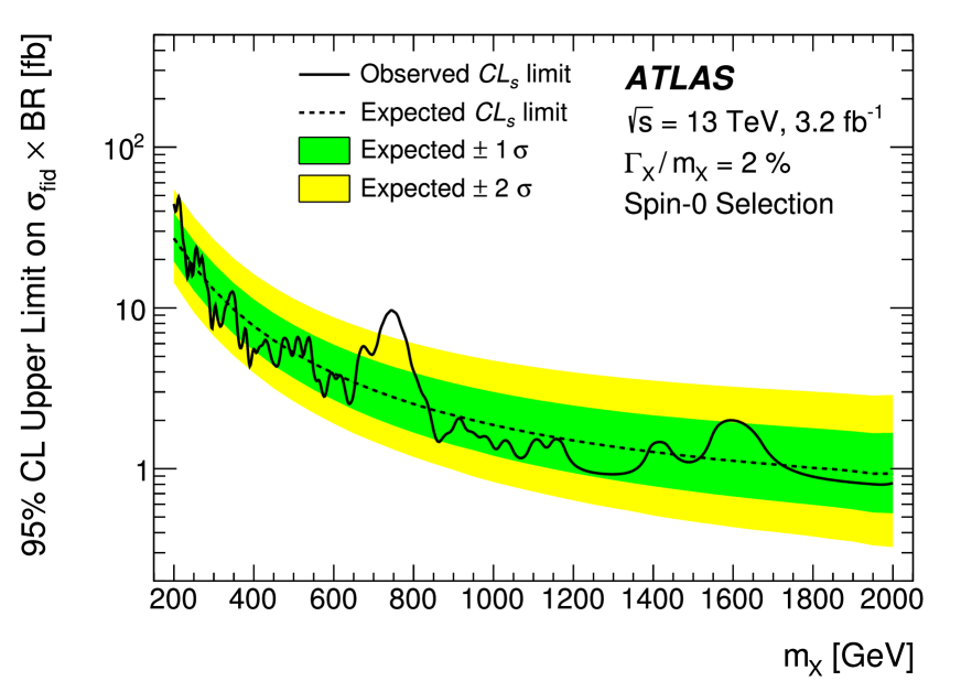
Our dataset is composed of 95% confidence-level exclusion plots, one example of which can be seen in Figure 3.1. These plots show which parts of the parameter space is excluded by the data. Most often the horizontal axis represents an experimentally reconstructed variable, such as the mass of a theoretically predicted new particle, while the vertical axis is the cross section for the production of that particle. The observed limit is commonly plotted with a dark (black or dark blue) solid curve, and in the mass vs. cross-section plots it divides the parameter space into two regions with the above region excluded. In addition, plotted as a dashed curve, we see the expected limit, obtained from Monte Carlo pseudo-data produced with the assumption of no new physics.
The expected limit curve is surrounded by 1 (often green-colored) and (often yellow-colored) bands; indicating how far the expected limit can move due to the statistical fluctuations in the analyses. We expect to see about 68% (95%) of the points that constitute the observed limit curve to be within the 1 () band. It is worth noting that quite often the curves are not smooth, with visible kinks at a number of locations. The reason for this is the way the analyses are conducted: during the production of Monte Carlo signal samples, a finite number of mass (or other model parameter) values are picked for the searched-for hypothetical particle, the cross-section limits are extracted for those discrete samples, and the final exclusion curves are constructed by extrapolation (so they are really piecewise linear functions). Our vector-graphics analysis focuses only on the data points at those kinks, while the bitmap analysis runs on all the pixels making up the exclusion curves.
arXiv codes of the papers processed and the total number of data points that the vector graphics analysis could extract from the plots of each paper. * CMS ATLAS 1606.08076 244 1609.05391 70 1610.08066 58 1606.03833 1008 1606.03977 273 1611.06594 20 1612.05336 32 1612.09516 894 1606.04833 42 1608.00890 78 1701.07409 40 1703.01651 45 1704.03366 30 1703.09127 37 1705.10751 13 1705.09171 239 1706.03794 7 1706.04260 60 1706.04786 351 1707.04147 598 1707.01303 108 1708.01062 20 1709.00384 26 1708.04445 174 1708.09638 470 1709.05406 99 1709.05822 18 1709.08908 68 1709.06783 18 1710.07235 220 1711.00431 10 1711.00752 14 1712.02345 8 1711.03301 48 1712.06518 141 1712.03143 2376 1801.03957 60 1802.01122 64 1801.07893 12 1801.08769 39 1802.02965 60 1803.03838 62 1803.06292 57 1802.03388 192 1803.09678 174 1803.10093 145 1803.11133 340 1804.07321 27 1804.03496 304 1804.06174 66 1805.04758 44 1805.10228 121 1806.00843 41 1804.10823 122 1805.01908 2699 1806.05996 20 *
3 Methods
3.1 Vector Graphics Analysis
For the vector based analysis, EPS or PDF versions of the exclusion plots are collected from the arXiv source files of the respective articles, then converted to SVG file format using the open source program pdf2svg [4] in order to have a single common XML interface to uniformly parse them. All the basic shapes in SVG files are described by XML elements called ‘path’s and various attributes of a path describe the features of the object, such as its color, stroke-shape, etc. Parsing using Python library svgpathtools [5], objects with desired attributes can be filtered by element type as well as attributes using standard regex pattern matching tools like grep.
The first filtering step is to extract the paths representing and bands according to their RGB decimal color codes. The relevant RGB color codes are identified by using the vector graphics editor program Inkscape [6]. During this inspection we have discovered that while ATLAS seems to follow a standard color code for all their plots (with very rare exceptions like the blue exclusion plots of 1804.03496, but ATLAS also provides the standard-colored versions as auxiliary plots on their website [7]), CMS does not have a single standard and thus the analyses of their plots need special care (see Table 3.1).
Different color codes used in ATLAS and CMS exclusion plots. * Color ATLAS CMS Green rgb(0%,100%,0%) rgb(13.33313%,54.508972%,13.33313%) rgb(0%,79.998779%,0%) Yellow rgb(100%,100%,0%) rgb(100%,84.312439%,0%) rgb(100%,79.998779%,0%) rgb(100%,100%,19.999695%) rgb(100%,80.076599%,0%) *
After extracting the paths for the boundaries of the and bands and the paths for the observed exclusion data points (Figure 3.1), the rest of the analysis reduces down to comparison of -coordinates of the data points with those of the color boundaries in order to decide where each data point lands: / regions or beyond. The coordinate information is extracted from the path properties.
Sample exclusion plot from 1606.03833, an ATLAS paper [3], and the extracted ‘skeleton’ of the needed lines.
There is no matching point on the sigma bands for every point on the experimental data line so only the points which have matching counterparts on the three curves are taken into consideration.
3.2 Bitmap Analysis
For the bitmap analysis, we convert the original versions of the exclusion plots that have been collected from the article documents into the PNG format. The PNG files have R, G, B, A values for each pixel that we read using using Pillow [9], a fork of the lightweight Python Imaging Library (PIL).
This analysis depends on successfully identifying the observed limit curve and determining how many of its pixels are surrounded by green, yellow or white pixels. Given the myriad shapes of the curves and 1/2 color bands, some form of color and pattern recognition is needed. The most prominent characteristic of the observed exclusion curve is its black (or very dark) color. In order to make use of this feature, we start by removing other black (or dark) objects (such as letters written in black font or the little ticks placed on the plot axes) from the plots and then scan each column of pixels for remaining clusters of green, yellow and black pixels. These steps are detailed below:
-
•
Find the black rectangular frame that is formed by the axes. Crop the image and leave only the parts falling inside of this frame.
-
•
Get rid of all the black objects (the numbers, letters, each dash of the dashed expected limit curves, etc.) except for the observed limit curve. For this, we first use the findContours function from the OpenCV library [8] to find all the connected regions (contours) in the image [10]. Any contours which could fit into a small rectangle (a rectangle with area smaller than 900 pixels) is removed from the plot (by coloring them blue, a neutral color that does not otherwise appear in the images).
-
•
Get rid of legend boxes (rectangular areas in yellow and green) so that the and bands are the only remaining yellow and green colored regions in the plots. This is performed by a custom-developed function which identifies rectangles that run parallel to the frame borders and paints them blue.
-
•
As the final step, scan every column of pixels one by one. In each column find the group of black pixels (there should remain only one such cluster remaining per column), and examine the color of its neighboring pixels. If both neighbors of the black cluster in a given column is green (yellow), count that column as one data point within the () band. In case one neighbor is yellow and the other is green, count that column as contributing half a datapoint in both bands. And if one neighbor is yellow and the other is white, count that column as contributing half a datapoint only to the band.
On average about 430 columns are handled (and hence 430 data points are extracted from the limit curves) this way for each processed plot. For example for the plot seen in Figure 3.1(a), 416 data points are obtained, with 32 located inside the white regions (outside of the bands); 10 located on the border of white and yellow regions (contributing 5 ‘weighted’ points to the band); 55 located in one of the yellow regions (clearly inside the bands, but outside of the band); 37 located on the border of yellow and green regions (contributing 18.5 ‘weighted’ points to the band); and 282 located in the green band (clearly inside the band). Hence the extracted fractions of points in the () region is 72.24% (91.11%).
4 Results and Discussion
Running over all our dataset, the vector graphics analysis extracts a total of 7079 (5527) data points from the ATLAS (CMS) publications. However before obtaining the cumulative results, we perform one final step: We average out over images that are most likely to be highly correlated. In the publications, the collaborations occasionally show exclusion plots obtained from one particular set of data, but interpreted for modified versions of the signal Monte Carlo samples. (A good example is 1606.03833, which contains multiple copies of Figure 3.1 prepared for various different values of the decay width of resonance .) In order not to bias our meta-analysis, we weigh the data points extracted from a set of such highly-similar figures in such a way that they collectively get treated as if they are coming from one single figure. After this treatment, the effective count of data points is roughly halved.
Results from the vector graphics analysis. * ATLAS CMS Total count of data points 7079 5527 Effective count of data points after handling similar plots 4157.33 2206.75 Fraction of points in the 1 band 68.98% 0.72 74.04% 0.93 Fraction of points in the 2 band 96.03% 0.30 95.23% 0.45 *
The cumulative results of the vector analysis can be found in Table 4. While the fraction of points within the region is consistent with 95% for both experiments, the results are somewhat higher than 68%. The bitmap analysis results are not yet ready for the CMS plots, due to the non-standard use of colors in those publications. The ATLAS results from the bitmap analysis (68.5% and 94.1%) are in good agreement with the vector graphics results.
Unfortunately, for these preliminary results, we are unable to provide reliable uncertainty estimates yet: the values we report in the table are simple binomial errors. We believe any systematic uncertainties due to our ‘‘re-digitization’’ will be negligible in the vector graphics analysis, as the collaborations produce the plots using ROOT with exact fidelity to the actual limit values. We have performed a quick sanity check by identifying the original values of the exclusion limits in the HEPData repository [11] for a couple of the publications and comparing the results produced by our code with a manual counting performed on HEPData points. We have observed excellent agreement. (We would like to use this opportunity to invite the collaborations to be more generous with HEPData. We could identify only 1 ATLAS and 7 CMS publications from our list in the repository.)
In addition to the correct determination of the positions of the data points, an essential component of the metaanalysis is the proper treatment of any correlations between them. Beyond handling of the correlations amongst similar plots in each paper, which we have described in the first paragraph of this section (resulting in the decrease in the effective count of points), we have considered two other sources of possible correlations:
-
•
Correlations over publications that use overlapping analysis selections and datasets. As a very striking example, both of 1606.03977 and 1706.04786 are ATLAS searches for candidates in final states with a charged lepton and missing transverse momentum. The latter paper appears to describe the same kind of analysis as the former but run on a superset of the data. Our default treatment is to neglect all cross-paper correlations, since either the amount of data, or the generated Monte Carlo samples, or the analysis technique, or the list of specific final states vary significantly enough to keep the correlations weak. While we believe this is mostly justified, we have also implemented an alternative treatment: Using python, we extract ‘‘refers-to’’ lists for each of the analysed publications from arXiv.org and create network maps that display which of a given experiment’s publications cites any other publication of that experiment in our list. Most publications are singletons in the map, but some produce small clusters. Then we repeat our metaanalysis either by averaging of results for members of each cluster, or by removing publications from our list until the maps consist of singleton papers only. The second method removes 4 CMS and 8 ATLAS publications, but we are still left with over 5000 data points for each experiment. The final results obtained either way are compatible with the results reported in Table 4.
-
•
Correlations of data points in each plot. As the LHC collaborations use one set of Monte Carlo background events for all the different values of a given signal’s paramaters (like a new particle’s mass) and since those parameters have resolutions possibly larger than inter-point separations in the plots, the closeby data points on each plot are likely to be somewhat correlated. We intend to carefully model such correlations in a future publication. Yet, as a quick self-test, we have repeated the analysis by randomly picking no more than 3 data points per plot, with each point located far from each other to keep the correlations negligible. The results are again compatible with those reported in Table 4, but with much larger uncertainties due to limited statistics. Such an analysis will become more interesting as we include more papers and plots in the future.
As a conclusion, despite the minor issue that our metaanalysis has identified, the overall results from both ATLAS and CMS experiments are quite encouraging. In a world where the scientific endevour has experienced recent reproducibility issues, we are happy to see that the results from the field of experimental high energy physics appear to be sound. We intend to improve the analysis and make it semi-automatic to keep monitoring new publications.
Acknowledgements
We would like to thank the anonymous referree for her/his careful reading of the manuscript and providing ideas for substantial improvements of the present text and for the future of the analysis.
References
- [1] G. Cowan, K. Cranmer, E. Gross and O. Vitells. Eur. Phys. J. C 71 1554 (2011). arXiv:1007.1727. Erratum: Eur. Phys. J. C 73 2501 (2013).
- [2] ATLAS Collaboration. J. High Energy Phys. 10 112 (2017). arXiv:1708.00212.
- [3] ATLAS Collaboration. J. High Energy Phys. 09 001 (2016). arXiv:1606.03833.
- [4] D. Barton and M. Flashchen. pdf2svg: PDF to SVG converter (2008). Available from http://www.cityinthesky.co.uk/opensource/pdf2svg/
- [5] svgpathtools: A collection of tools for manipulating and analyzing SVG Path objects and Bezier curves. Version 1.3.3. Available from https://pypi.org/project/svgpathtools/
- [6] Inkscape: An Open-source vector graphics editor. Free Software Foundation, Inc. Version 0.91. Available from https://inkscape.org/
- [7] ATLAS Exotics Public Results. Available from https://twiki.cern.ch/twiki/bin/view/AtlasPublic/ExoticsPublicResults
- [8] OpenCV: library of Python bindings designed to solve computer vision problems (2018). Available from https://pypi.org/project/opencv-python/
- [9] Pillow: the Friendly PIL fork (2017). Version 4.1.1. Available from https://python-pillow.org/
- [10] S. Suzuki and K. Abe. Computer Vision, Graphics, and Image Processing 30(1) 32 (1985).
- [11] HEPData: Repository for publication-related High-Energy Physics data. https://www.hepdata.net/