Racial Disparities in Voting Wait Times: Evidence from Smartphone Data
Abstract
Equal access to voting is a core feature of democratic government. Using data from hundreds of thousands of smartphone users, we quantify a racial disparity in voting wait times across a nationwide sample of polling places during the 2016 U.S. presidential election. Relative to entirely-white neighborhoods, residents of entirely-black neighborhoods waited 29% longer to vote and were 74% more likely to spend more than 30 minutes at their polling place. This disparity holds when comparing predominantly white and black polling places within the same states and counties, and survives numerous robustness and placebo tests. We shed light on the mechanism for these results and discuss how geospatial data can be an effective tool to both measure and monitor these disparities going forward.
Providing convenient and equal access to voting is a central component of democratic government. Among other important factors (e.g. barriers to registration, purges from voter rolls, travel times to polling places), long wait times on Election Day are a frequently discussed concern of voters. Long wait times have large opportunity costs (Stewart and Ansolabehere 2015), may lead to line abandonment by discouraged voters (Stein et al. 2019), and can undermine voters’ confidence in the political process (Alvarez et al. 2008; Atkeson and Saunders 2007; Bowler et al. 2015). The topic of long wait times has reached the most prominent levels of media and policy attention, with President Obama discussing the issue in his 2012 election victory speech and appointing a presidential commission to investigate it. In their 2014 report, the Presidential Commission on Election Administration concluded that, “as a general rule, no voter should have to wait more than half an hour in order to have an opportunity to vote.”
There have also been observations of worrying racial disparities in voter wait times. The Cooperative Congressional Election Study (CCES) finds that black voters report facing significantly longer lines than white voters (Pettigrew 2017; Alvarez et al. 2009; Stewart III 2013). While suggestive, the majority of prior work on racial disparities in wait times has been based on anecdotes and surveys which may face limits due to recall and reporting biases.
In this paper, we use geospatial data generated by smartphones to measure wait times during the 2016 election. For each cellphone user, the data contain “pings” based on the location of the cellphone throughout the day. These rich data allow us to document voter wait times across the entire country and also estimate how these wait times differ based on neighborhood racial composition.
We begin by restricting the set of smartphones to a sample that passes a series of filters to isolate likely voters. This leaves us with a sample of just over 150,000 smartphone users who voted at one of more than 40,000 polling locations across 46 different states. Specifically, these individuals entered and spent at least one minute within a 60-meter radius of a polling location on Election Day and recorded at least one ping within the convex hull of the polling place building (based on building footprint shapefiles). We eliminate individuals who entered the same 60-meter radius in the week leading up to or the week after Election Day to avoid non-voters who happen to work at or otherwise visit a polling place on non-election days.
We estimate that the median and average times spent at polling locations are 14 and 19 minutes, respectively, and 18% of individuals spent more than 30 minutes voting.111The time measure that we estimate in our paper is a combination of wait time in addition to the time it took to cast a ballot. We typically refer to this as just “wait time” in the paper. One may worry that the differences we find are not about wait times, but rather about differences in the amount of time spent casting a ballot. However, there is evidence to suggest this is not the case. For example, we find incredibly strong correlations between our wait time measures and survey responses that ask only about wait times as opposed to total voting time (“Approximately, how long did you have to wait in line to vote?”). We provide descriptive data on how voting varies across the course of Election Day. As expected, voter volume is largest in the morning and in the evening, consistent with voting before and after the workday. We also find that average wait times are longest in the early morning hours of the day. Finally, as a validation of our approach, we show that people show up to the polls at times consistent with the opening and closing hours used in each state.
We next document geographic variation in average wait times using an empirical Bayes adjustment strategy. We find large differences across geographic units – for example, average wait times across congressional districts can vary by a factor of as much as four. We further validate our approach by merging in data from the CCES, which elicits a coarse measure of wait time from respondents. Despite many reasons for why one might discount the CCES measures (e.g. reporting bias and limited sample size), we find a remarkably high correlation with our own measures – a correlation of 0.86 in state-level averages and 0.73 in congressional-district-level averages. This concordance suggests that our wait time measures (and those elicited through the survey) have a high signal-to-noise ratio.
We next explore how wait times vary across areas with different racial compositions. We use Census data to characterize the racial composition of each polling place’s corresponding Census block group (as a proxy for its catchment area). We find that the average wait time in a Census block group composed entirely of black residents is approximately 5 minutes longer than average wait time in a block group that has no black residents. We also find longer wait times for areas with a high concentration of Hispanic residents, though this disparity is not as large as the one found for black residents. These racial disparities persist after controlling for population, population density, poverty rates, and state fixed effects. We further decompose these effects into between- and within-county components, with the disparities remaining large even when including county fixed effects. We perform a myriad of robustness checks and placebo specifications and find that the racial disparity exists independent of the many assumptions and restrictions that we have put on the data.
In the Appendix, we consider the potential mechanisms behind the observed racial differences. We ultimately find that a host of plausible candidate explanations do little to explain the disparity in our cross-section, including differences in arrival times of voters, state laws (Voter ID and early voting), the partisan identity of the underlying population or the chief election official, county characteristics (income inequality, segregation, social mobility), and the number of registered voters assigned to a polling place; although we do find larger disparities at higher-volume polling locations. Overall, our results on mechanism suggest that the racial disparities that we find are widespread and unlikely to be isolated to one specific source or phenomenon.
Our paper is related to work in political science that has examined determinants of wait times and also explored racial disparities. Some of the best work uses data from the CCES which provides a broad sample of survey responses on wait times (Pettigrew 2017; Alvarez et al. 2009; Stewart III 2013). For example, Pettigrew (2017) finds that black voters report waiting in line for twice as long as white voters and are three times more likely to wait for over 30 minutes to vote. Additional studies based on field observations may avoid issues that can arise from self-reported measures, but typically only cover small samples of polling places such as a single city or county (Highton 2006; Spencer and Markovits 2010; Herron and Smith 2016). Stein et al. (2019) collect the largest sample to date, using observers with stopwatches across a convenience sample of 528 polling locations in 19 states. Using a sample of 5,858 voters, they provide results from a regression of the number of people observed in line on an indicator that the polling place is in a majority-minority area. They find no significant effect – although they also control for arrival count in the regression. In a later regression, they find that being in a majority-minority polling location leads to a 12-second increase in the time it takes to check in to vote (although this regression includes a control for the number of poll workers per voter which may be a mechanism for racial disparities in voting times). Overall, we arrive at qualitatively similar results as the political science literature, but do so using much more comprehensive data that avoids the pitfalls of self-reports. Going forward, this approach could produce repeated measures across elections, which would facilitate a richer examination of the causal determinants of the disparities.
Our paper also relates to the broader literature on racial discrimination against black individuals and neighborhoods (for reviews, see Altonji and Blank 1999, Charles and Guryan 2011, and Bertrand and Duflo 2017), including by government officials. For example, Butler and Broockman (2011) find that legislators were less likely to respond to email requests from a putatively black name, even when the email signaled shared partisanship in an attempt to rule out strategic motives. Similarly, White et al. (2015) find that election officials in the U.S. were less likely to respond and provided lower-quality responses to emails sent from constituents with putatively Latino names. Racial bias has also been documented for public officials that are not part of the election process. For example, Giulietti et al. (2019) find that emails sent to local school districts and libraries asking for information were less likely to receive a response when signed with a putatively black name relative to a putatively white name. As one final example, several studies have documented racial bias by judges in criminal sentencing (Alesina and Ferrara 2014; Glaeser and Sacerdote 2003; Abrams et al. 2012).
1 Data
The three primary datasets we use in this paper include: (1) SafeGraph cell phone location records, (2) Polling locations, and (3) Census demographics.
We use anonymized location data for smartphones provided by SafeGraph, a firm that aggregates location data across a number of smartphone applications (Chen and Rohla 2018). These data cover the days between November 1st and 15th, 2016, and consist of “pings”, which record a phone’s location at a series of points in time. In general, GPS pings are typically accurate to within about a 5-meter radius under open sky, though this varies depending on factors such as weather, obstructions, and satellite positioning (GPS.gov). Pings are recorded anytime an application on a phone requests information about the phone’s location. Depending on the application (e.g. a navigation or weather app), pings may be produced when the application is being used or at regular intervals when it is in the background. The median time between pings in our sample for a given device is 48 seconds (with a mode of 5 minutes).
The geolocation data used in this paper is detailed and expansive, allowing us to estimate wait times around the entire United States. This data, however, naturally raises concerns about representativeness. If we were trying to estimate individual choices, e.g. vote choice, the sample could only produce estimates that are at best representative of the approximately 77% of U.S. adults who owned a smartphone in 2016. While Chen and Pope (2019) show that the data are generally representative of the U.S. along several observable dimensions (with the exception of skewing more wealthy), they may differ on unobservables. However, our goal is to estimate a property of places rather than individuals. That is, we estimate an outcome of queues that have multiple individuals in them. While the restriction to smartphone users may limit the number of wait times we observe, as long as there is a queueing rule at polling places, we should still observe an unbiased estimate of the wait times faced by voters, both those with and without smartphones.222This is not to dismiss the potential issue of missing polling places or times of day. However, a priori, these omissions do not point to systematic bias in a particular direction.
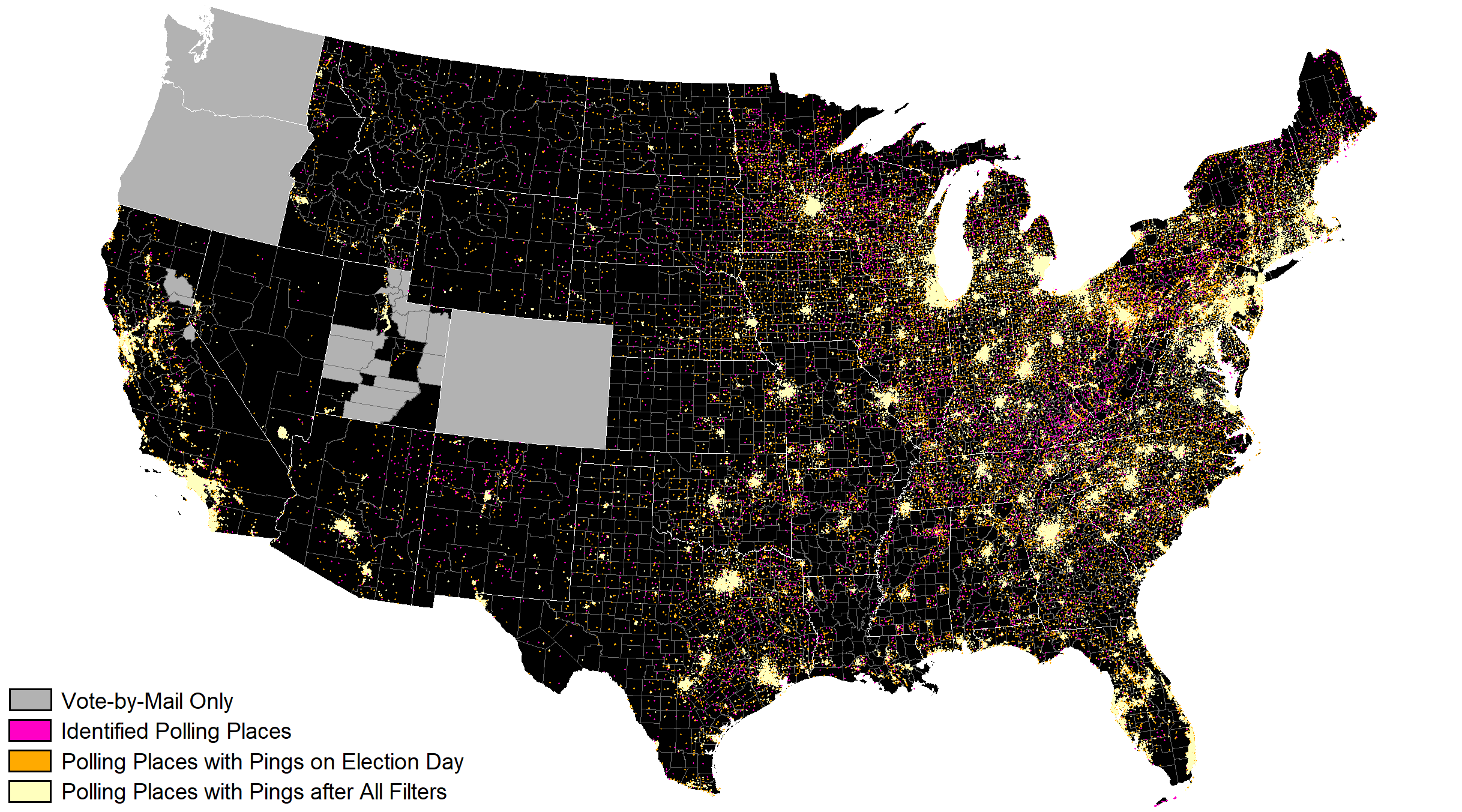
Polling place addresses for the 2016 General Election were collected by contacting state and county election authorities. When not available, locations were sourced from local newspapers, public notices, and state voter registration look-up webpages. State election authorities provided statewide locations for 32 states, five of which required supplemental county-level information to complete. Four states were completely collected on a county-by-county basis. In twelve states, not all county election authorities responded to inquiries (e.g. Nassau County, New York).
When complete addresses were provided, the polling locations were geocoded to coordinates using the Google Maps API. When partial or informal addresses were provided, buildings were manually assigned coordinates by identifying buildings through Google Street View, imagery, or local tax assessor maps as available. Additionally, Google Maps API geocodes are less accurate or incomplete in rural locations or areas of very recent development, and approximately 8% of Google geocodes were manually updated.
Of the 116,990 national polling places reported in 2016 by the U.S. Election Assistance Commission, 93,658 polling places (80.1%) were identified and geocoded and comprise the initial sample of polling places in this paper. Appendix Figure A.1 illustrates the location of the 93,658 polling places and separately identifies polling places for which we identify likely voters on Election Day and pass various filters that we discuss and impose below.
Demographic characteristics were obtained by matching each polling place location to the census block group in the 2017 American Community Survey’s five-year estimates. Census block groups were chosen as the level of aggregation because the number of block groups is the census geography that most closely aligns with the number of polling places and because it contains the information of interest (racial characteristics, fraction below poverty line, population, and population density).
2 Methods
In order to calculate voting wait times, we need to identify a set of individuals we are reasonably confident actually voted at a polling place in the 2016 election. To do so, we restrict the sample to phones that record a ping within a certain distance of a polling station on Election Day. This distance is governed by a trade-off – we want the radius of the circle around each polling station to be large enough to capture voters waiting in lines that may spill out of the polling place, but want the circle to be not so large that we introduce a significant number of false positive voters (people who came near a polling place, but did not actually vote).
We take a data-driven approach to determine the optimal size of the radius. In Panel A of Figure 1, we examine whether there are more unique individuals who show up near a polling place on Election Day relative to the week before and the week after the election (using a 100-meter radius around a polling location).333More precisely, we construct a 100-meter radius around the centroid of the building identified by Microsoft OpenStreetMap as the closest to the polling place coordinates. As can be seen, there appear to be more than 400k additional people on Election Day who come within 100 meters of a polling place relative to the weekdays before and after. In Panel B of Figure 1, we plot the difference in the number of people who show up within a particular radius of the polling place (10 meters to 100 meters) on Election Day relative to the average across all other days. As we increase the size of the radius, we are able to identify more and more potential voters, but also start picking up more and more false positives. By around 60 meters, we are no longer identifying very many additional people on Election Day relative to non-election days, and yet are continuing to pick up false positives. Therefore, we choose 60 meters as the radius for our primary analysis. However, in Section 4.1, we demonstrate robustness of estimates to choosing alternative radii.
For each individual that comes within a 60-meter radius of a polling place, we would like to know the amount of time spent within that radius. Given that we do not receive location information for cell phones continuously (the modal time between pings is 5 minutes), we cannot obtain an exact length of time. Thus, we create upper and lower bounds for the amount of time spent voting by measuring the time between the last ping before entering and the first ping after exiting a polling-place circle (for an upper bound), and the first and last pings within the circle (for a lower bound). For example, pings may indicate a smartphone user was not at a polling location at 8:20am, but then was at the polling location at 8:23, 8:28, 8:29, and 8:37, followed by a ping outside of the polling area at 8:40am; translating to a lower bound of 14 minutes and an upper bound of 20 minutes. We use the midpoint of these bounds as our best guess of a voter’s time at a polling place (e.g. 17 minutes in the aforementioned example). In the robustness section, we estimate our effects using values other than the midpoint.
Another important step in measuring voting times from pings is to isolate people who come within a 60-meter radius of a polling place that we think are likely voters and not simply passing by or people who live or work at a polling location. To avoid including passersby, we restrict the sample to individuals who had an upper bound measure of at least one minute within a polling place circle and for whom that is true at only one polling place on Election Day. To avoid including people who live or work at the polling location, we exclude individuals who we observe spending time (an upper bound greater than 1 minute) at that location in the week before or the week after Election Day. To further help identify actual voters and reduce both noise and false positives, we restrict the sample to individuals who had at least one ping within the convex hull of the polling place building on Election Day (using Microsoft OpenStreetMap building footprint shapefiles), logged a consistent set of pings on Election Day (posting at least 1 ping every hour for 12 hours), and spent no more than 2 hours at the polling location (to eliminate, for example, poll workers who spend all day at a polling place). In Section 4.1, we provide evidence of robustness to these various sample restrictions.
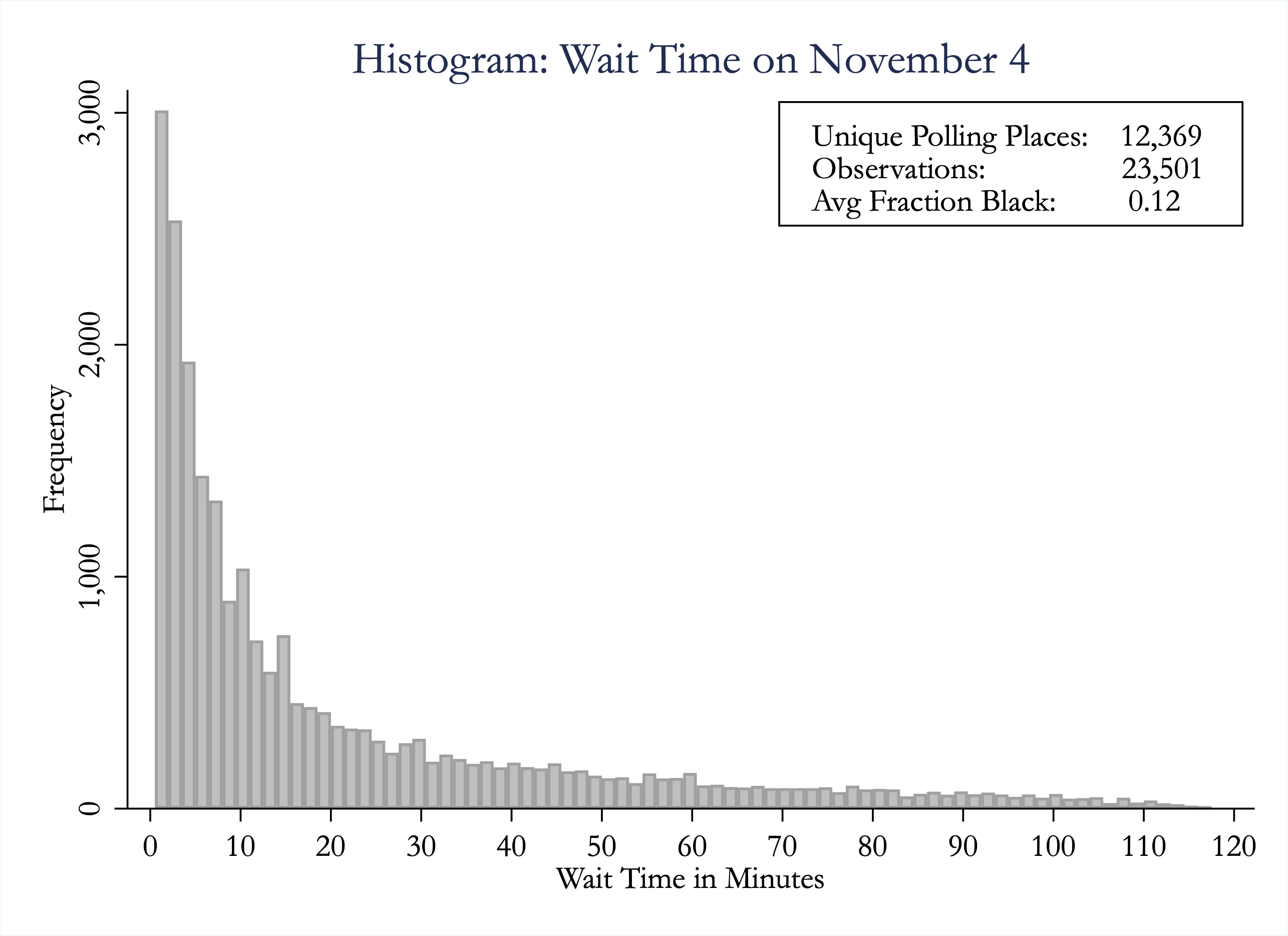
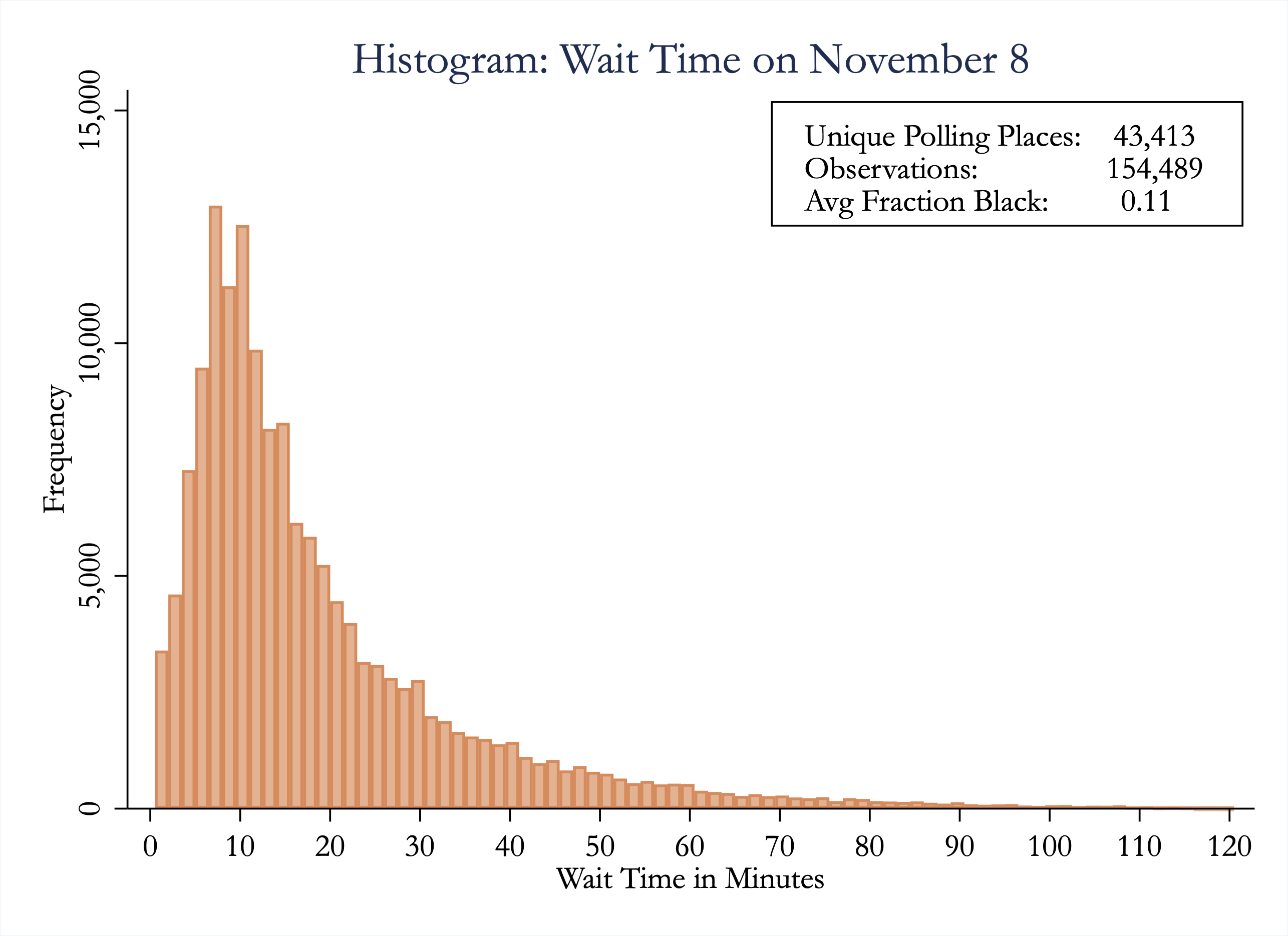
After these data restrictions, our final sample consists of 154,489 individuals whom we identify as likely voters across 43,413 polling locations. Panel C in Figure 1 shows how many people pass our likely-voter filters on Election Day (154,489), and—as a placebo analysis—how many observations we would have on non-Election (“placebo”) days before and after the 2016 Election that would pass these same filters (modified to be centered around those placebo days). This analysis suggests that more than 87% of our sample are likely voters who would not have been picked up on days other than Election Day. In Appendix Figure A.2, we plot the distribution of wait times on each of these placebo non-election days. We find that the wait times of people who would show up in our analysis on non-election days are shorter on average than those that show up on Election Day. Thus, to the degree that we can not completely eliminate false positives in our voter sample, we expect our overall voter wait times to be biased upward. We also would expect the noise introduced by non-voters to bias us towards not finding systematic disparities in wait times by race.
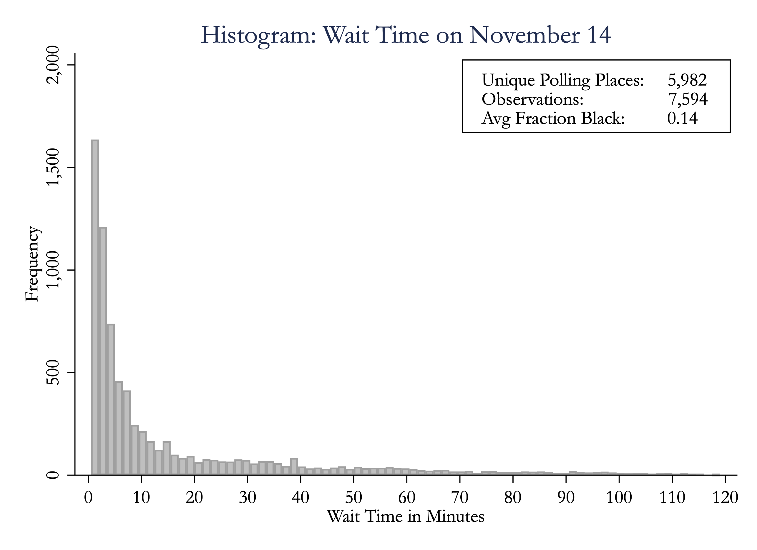
Appendix Table A.1 provides summary statistics for our 154,489 likely voters. We find average voting wait times of just over 19 minutes when using our primary wait time measure (the midpoint between the lower and upper bound) and 18% of our sample waited more than 30 minutes to vote. Weighted by the number of voters in our sample, the racial composition of the polling place block groups is, on average, 70% white and 11% black.
3 Results: Overall Voter Wait Times
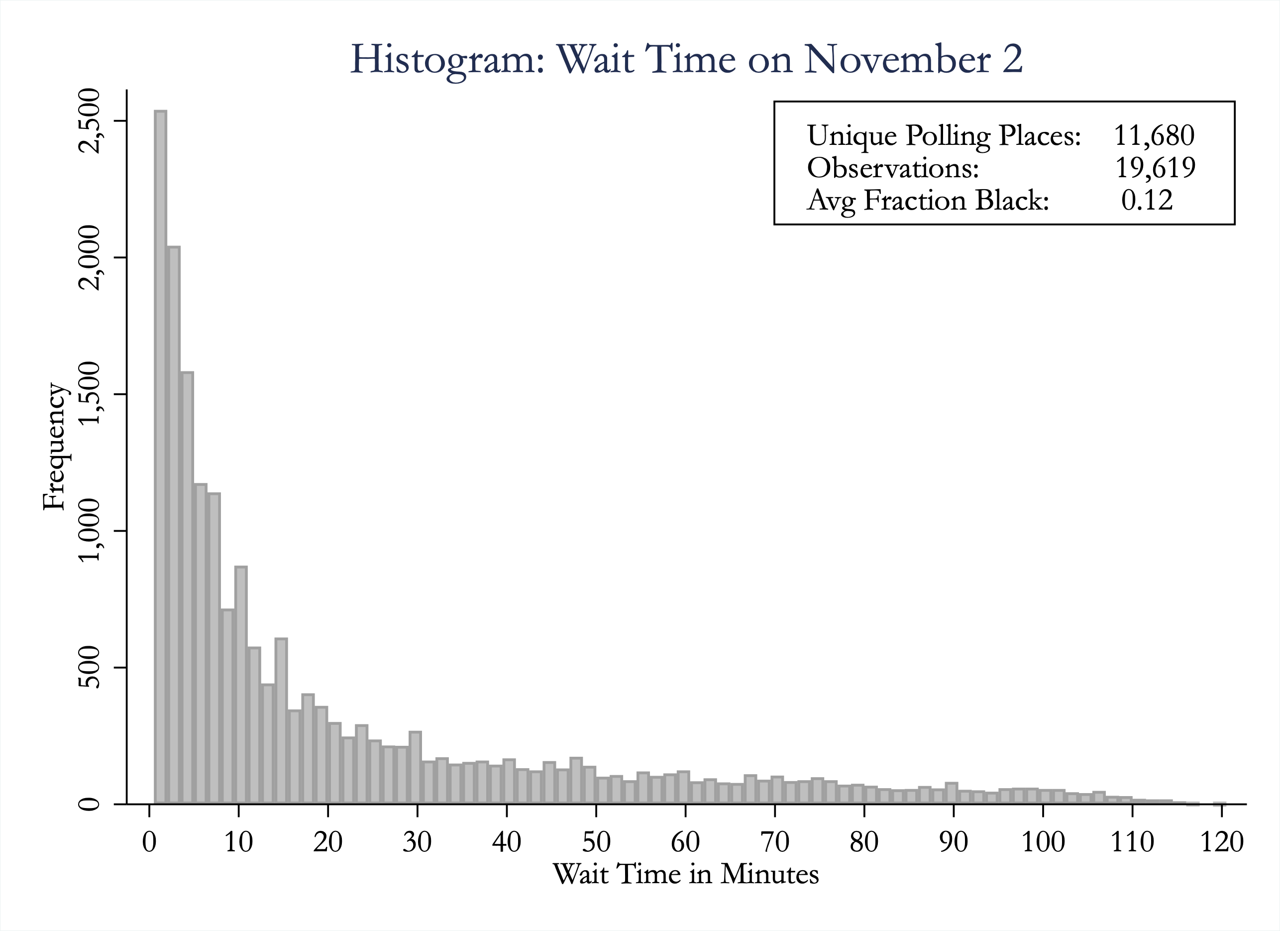
We plot the distribution of wait times in Panel A of Figure 2(d). The median and average times spent at polling locations are 14 and 19 minutes, respectively, and 18% of individuals spent more than 30 minutes voting. As the figure illustrates, there is a non-negligible number of individuals who spent 1-5 minutes in the polling location (less time than one might imagine is needed to cast a ballot). These observations might be voters who abandoned after discovering a long wait time. Alternatively, they may be individuals who pass our screening as likely voters, but were not actually voting.
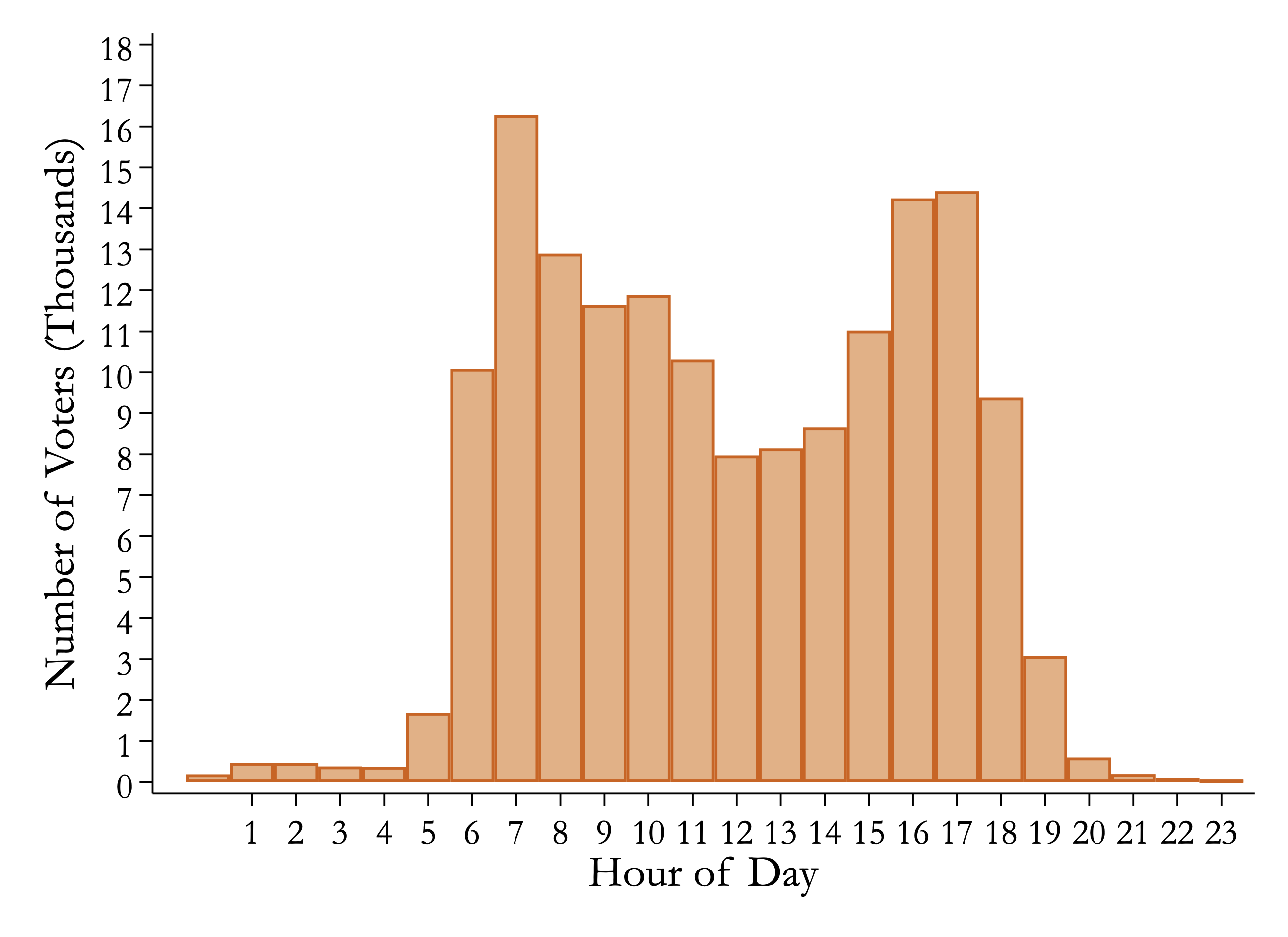
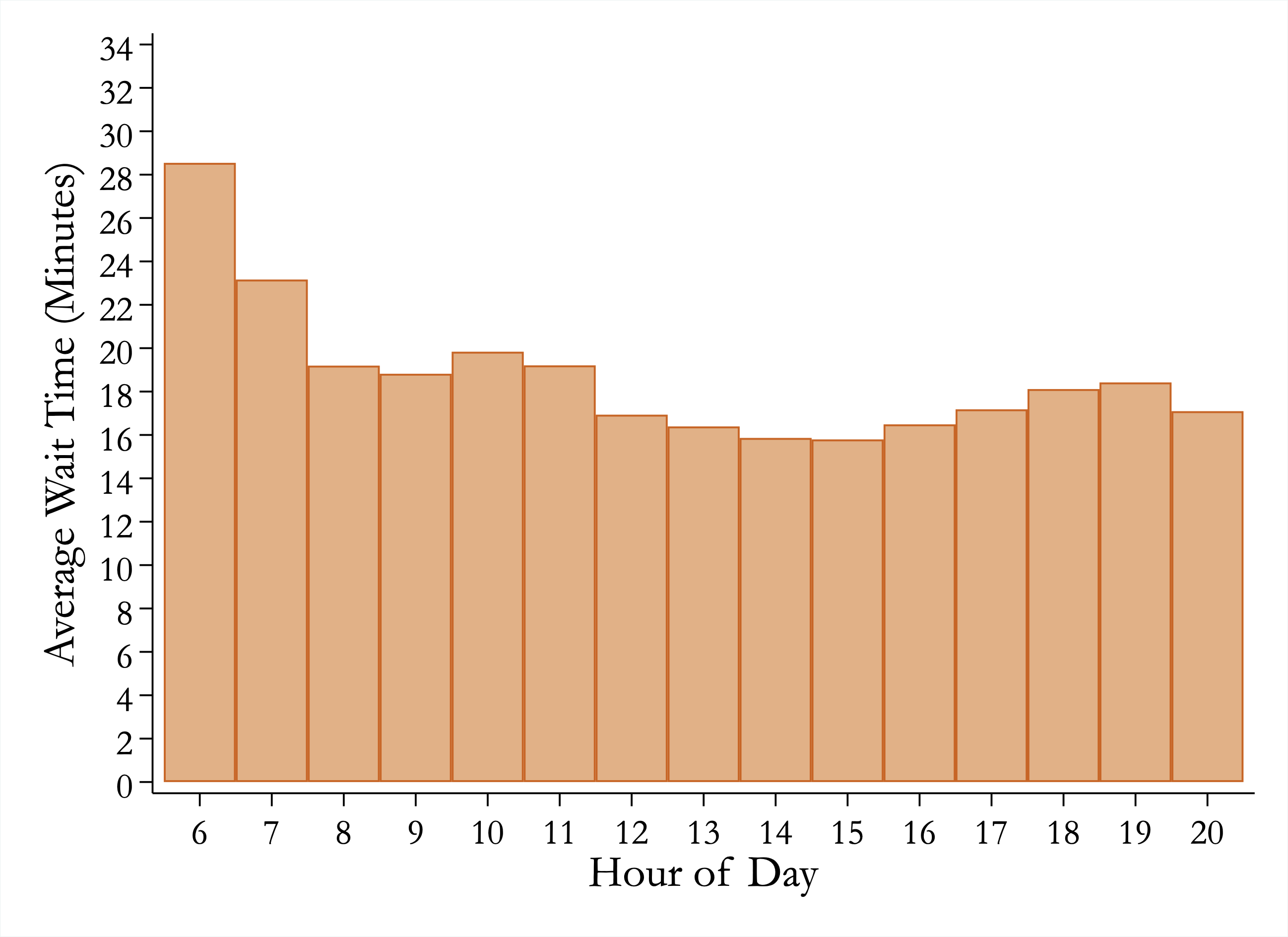
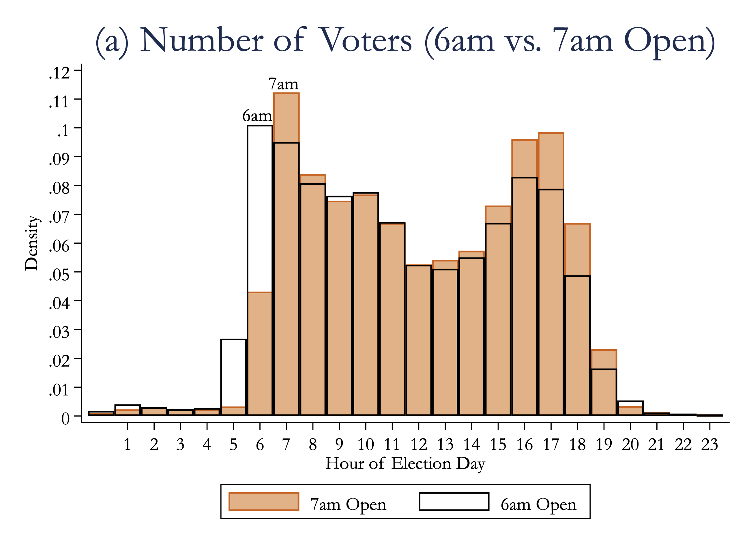
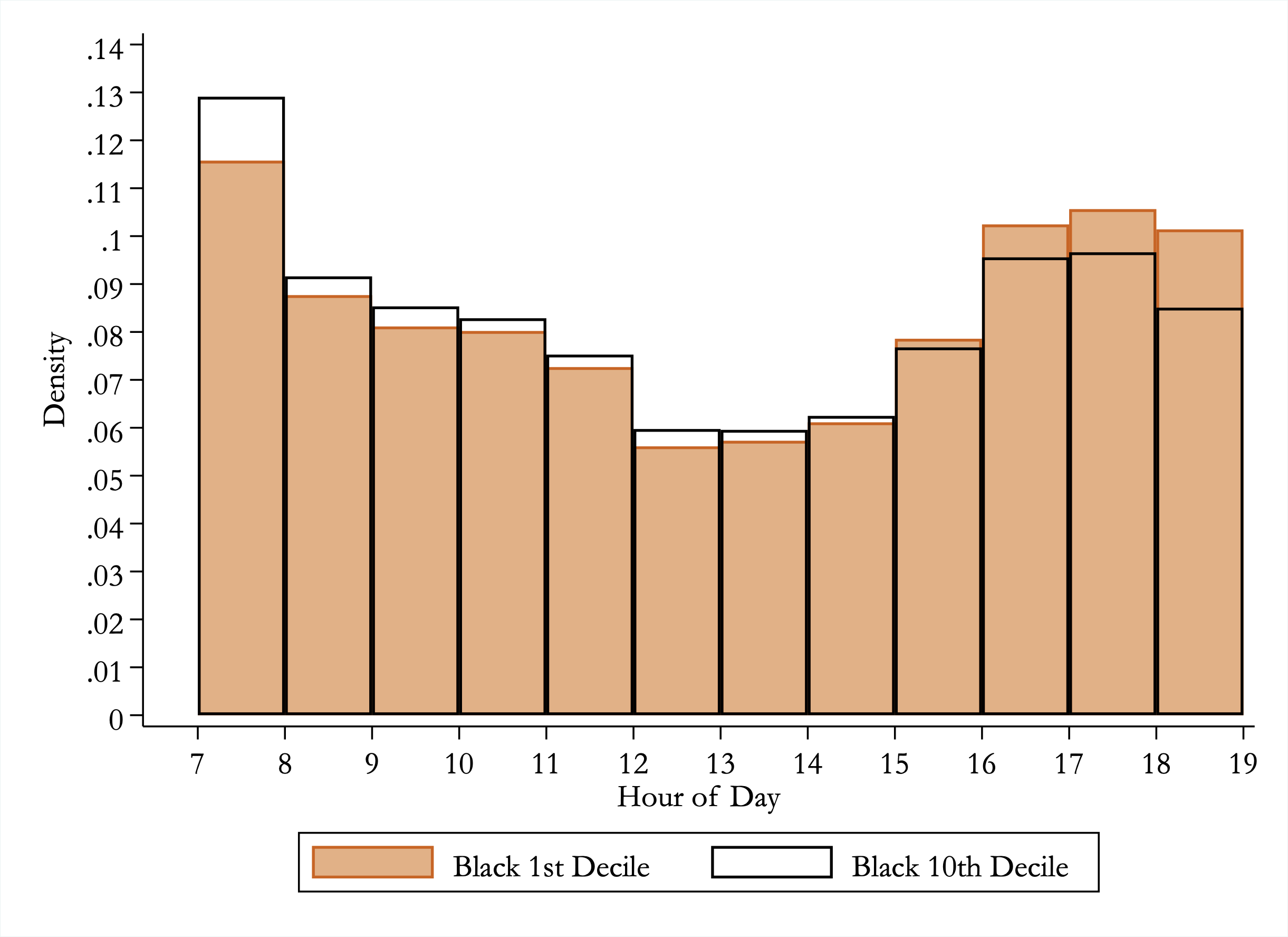
We next display the number of people who arrive to vote at the polling locations by time of day. This descriptive analysis of when people vote may be of interest in and of itself, but it also serves as a validation of whether people in our sample are indeed likely voters (e.g. if our sample consists primarily of people showing up at the polling locations at 3am, then one should worry about whether our sample is primarily composed of voters). Panel C of Figure 2(d) shows the distribution of arrival times where the “hour of day” is defined using the “hour of arrival” for a given wait time (i.e. the earliest ping within the polling place radius for a given wait time spell). As expected, people are most likely to vote early in the morning or later in the evening (e.g. before or after work) with nearly twice as many people voting between 7 and 8am as between noon and 1pm. As a consistency check, Appendix Figure A.3 repeats this figure separately by state’s opening and closing times – the figures show that likely-voter arrivals match state-by-state poll opening and closing times. Finally, Panel D of Figure 2(d) plots the average wait time by time of arrival, showing that the longest averages are early in the morning.
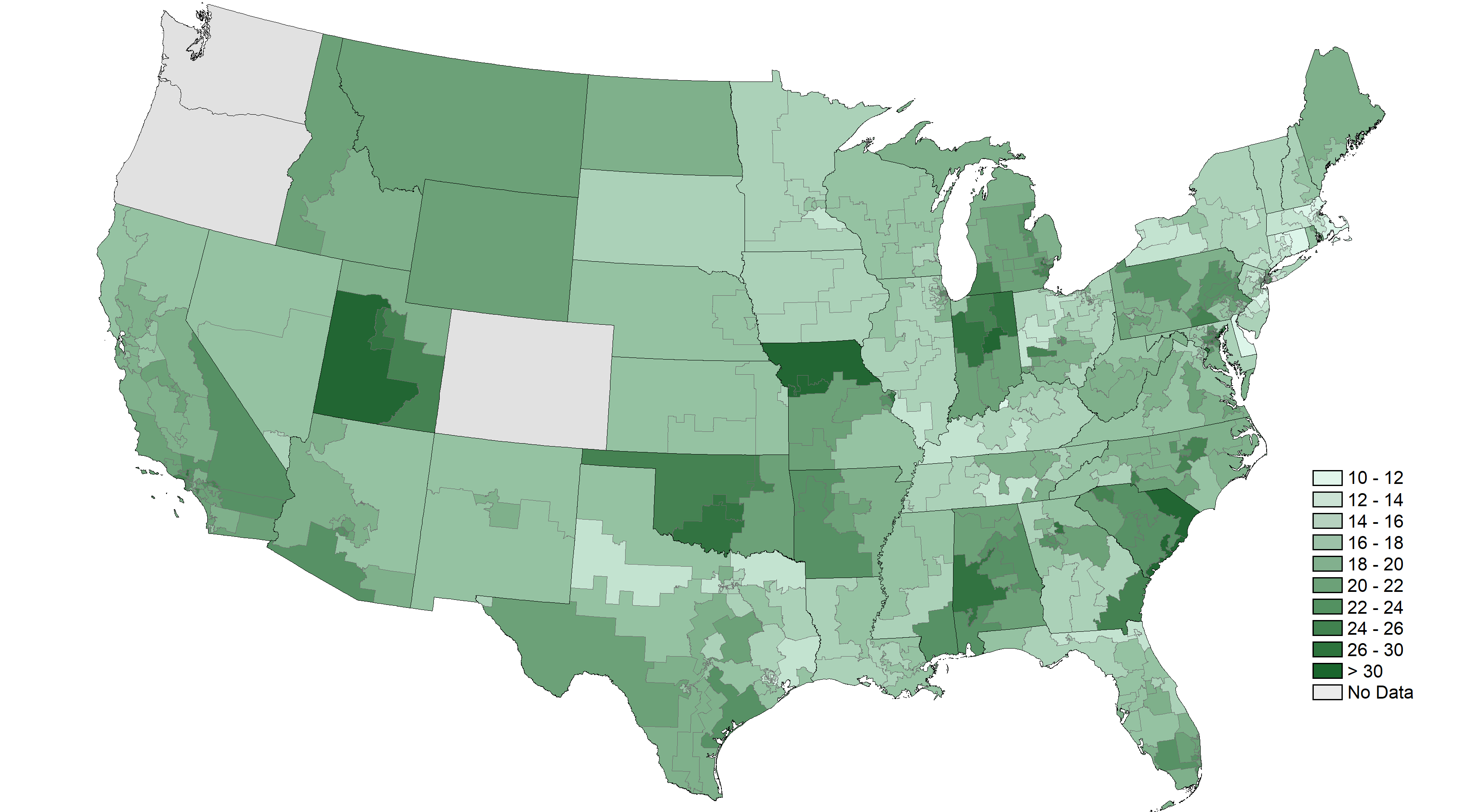
In addition to temporal variation in wait times, we can also explore how voting wait times vary geographically. Appendix Tables C.1 - C.3 report average wait times by state, congressional district, and the 100 most populous counties, along with accompanying standard deviations and observation counts, as well as an empirical-Bayes adjustment to account for measurement error.444Even if all states in the U.S. had the same voter wait time, we would find some dispersion in our measure due to sampling variation. Due to sample size, this measurement error in our estimates would result in the smallest states being the most likely to show evidence of having either very short or very long wait times. Thus, throughout the paper, whenever we discuss voter wait times or racial disparities that have been aggregated up to either the county, congressional district, or state level, we will report estimates that have been adjusted for measurement using a Bayesian shrinkage procedure. This iterative procedure (discussed in detail in Chandra et al. (2016)) shrinks estimates toward the average of the true underlying distribution. The amount of adjustment toward the mean is a function of how far the estimate for each state/county is from the mean and the estimate’s precision. The resulting adjusted estimate is our “best guess” (using Bayesian logic) as to what the actual wait time or disparity is for each geographic unit. Focusing on the empirical-Bayes adjusted estimates, the states with the longest average wait times are Utah and Indiana (28 and 27 minutes, respectively) and the states with the shortest average wait time are Delaware and Massachusetts (12 minutes each). In Panel B of Figure 2(d) we map the empirical-Bayes-adjusted average voting wait time for each congressional district across the United States. Average wait times vary from as low as minutes in Massachusetts’s Sixth and Connecticut’s First Congressional District to as high as minutes in Missouri’s Fifth Congressional District. These geographic differences are not simply a result of a noisy measure, but contain actual signal value regarding which areas have longer wait time than others. Evidence for this can be seen by our next analysis correlating our wait time measures with those from a survey.
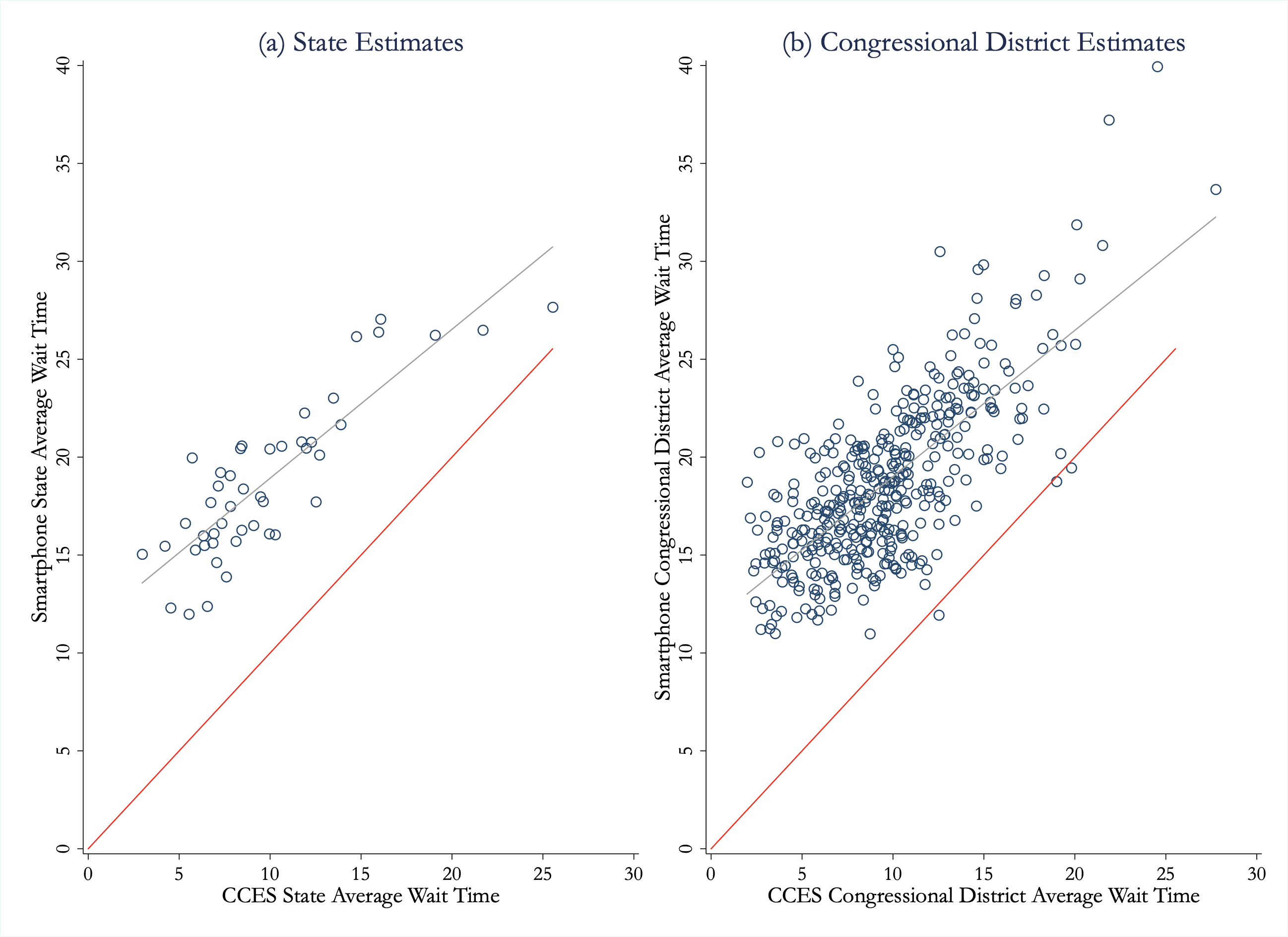
We correlate our average wait time measures at both the state and congressional district level with the average wait times reported by respondents in the the 2016 wave of the Cooperative Congressional Election Study (Ansolabehere and Schaffner, 2017). The 2016 CCES is a large national online survey of 64,600 people conducted before and after the U.S. general election. The sample is meant to be representative of the U.S. as a whole.555https://dataverse.harvard.edu/dataset.xhtml?persistentId=doi%3A10.7910/DVN/GDF6Z0 There are several reasons one might be pessimistic that the wait time estimates that we generate using smartphone-data would correlate closely with the wait times reported from the CCES survey. First, given sample sizes at the state and congressional district level, both our wait times and survey wait times may have a fair bit of sampling noise. Second, our wait time measures are a combination of waiting in line and casting a ballot, whereas the survey only asks about wait times. Third, the question in the survey creates additional noise by eliciting wait times that correspond to one of five coarse response options (“not at all”, “less than 10 minutes”, “10 to 30 minutes”, “31 minutes to an hour”, and “more than an hour”).666There are 34,353 responses to the “wait time” question in the 2016 CCES. We restrict the sample of responses to just use individuals who voted in person on Election Day (24,378 individuals after dropping the 45 who report “Don’t Know”). Following Pettigrew (2017), we translate the responses to minute values by using the midpoints of response categories: 0 minutes (“not at all”), 5 minutes (“less than 10 minutes”), 20 minutes (“10 to 30 minutes”) or 45 minutes (“31 minutes to an hour”). For the 421 individuals who responded as “more than an hour” we code them as waiting 90 minutes (by contrast, Pettigrew (2017) uses their open follow-up text responses.) Lastly, the survey does not necessarily represent truthful reporting. For example, while turnout in the U.S. has hovered between 50 and 60 percent, more than 80% of CCES respondents report voting. Given these reasons for why our wait time results may not correlate well with those from the survey, we find a remarkably strong correlation between the two. Using empirical-Bayes-adjusted estimates for both state-level wait time estimates from the cellphone data and those found in the CCES, we find correlation of 0.86 between the two. We find a similarly strong correlation at the congressional district level (correlation = 0.73). Our wait-time estimates are, on average, slightly longer than those in the survey, which is likely a reflection of the fact that our measure includes both wait time and ballot-casting time. Scatter plots of the state and congressional district estimates may be found in Appendix Figure A.4. Overall, the strong correlations between the wait times we estimate and those from the CCES survey provide validation for our wait time measure (and for the CCES responses themselves).
4 Results: Racial Disparities in Wait Times
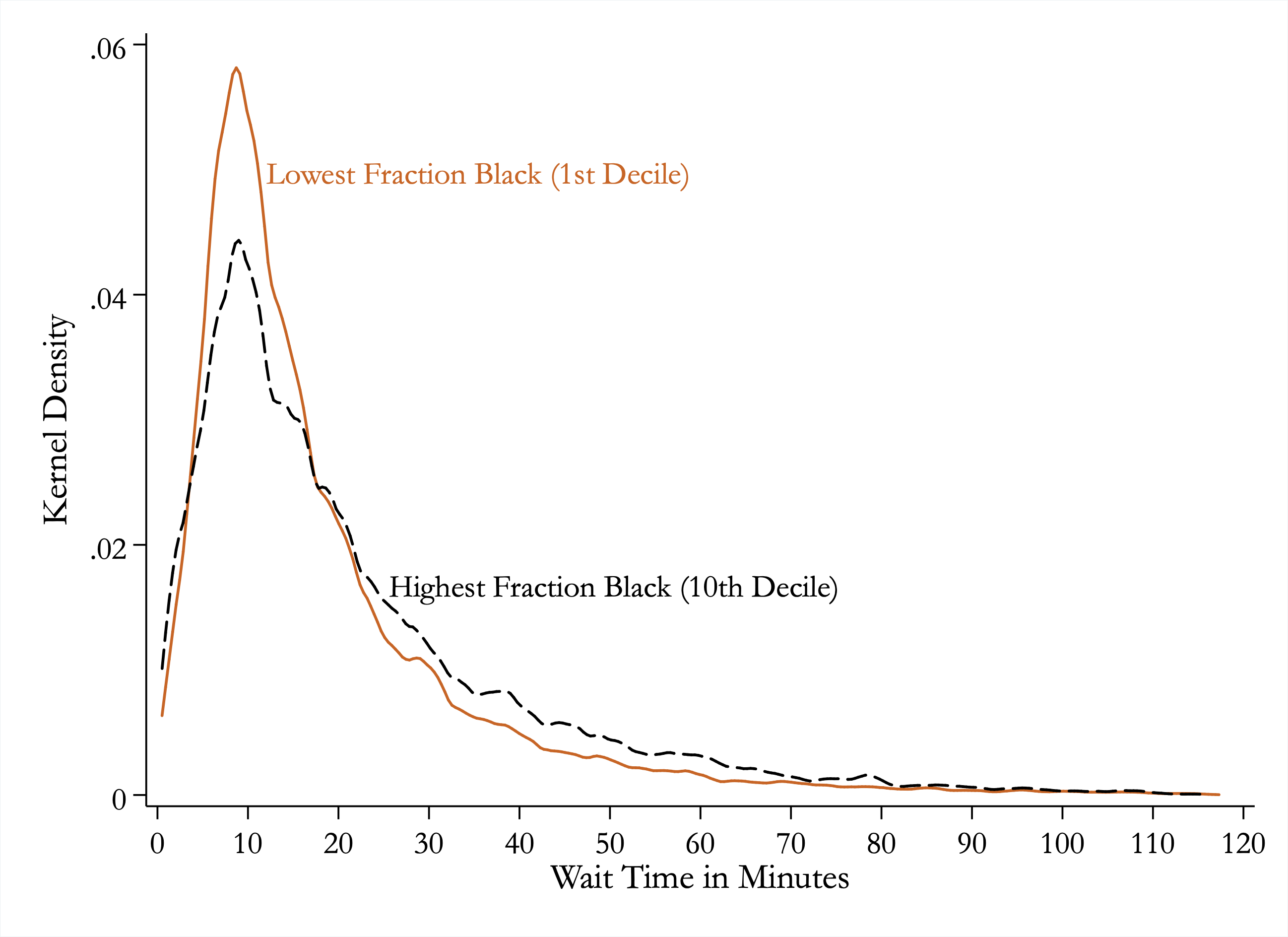
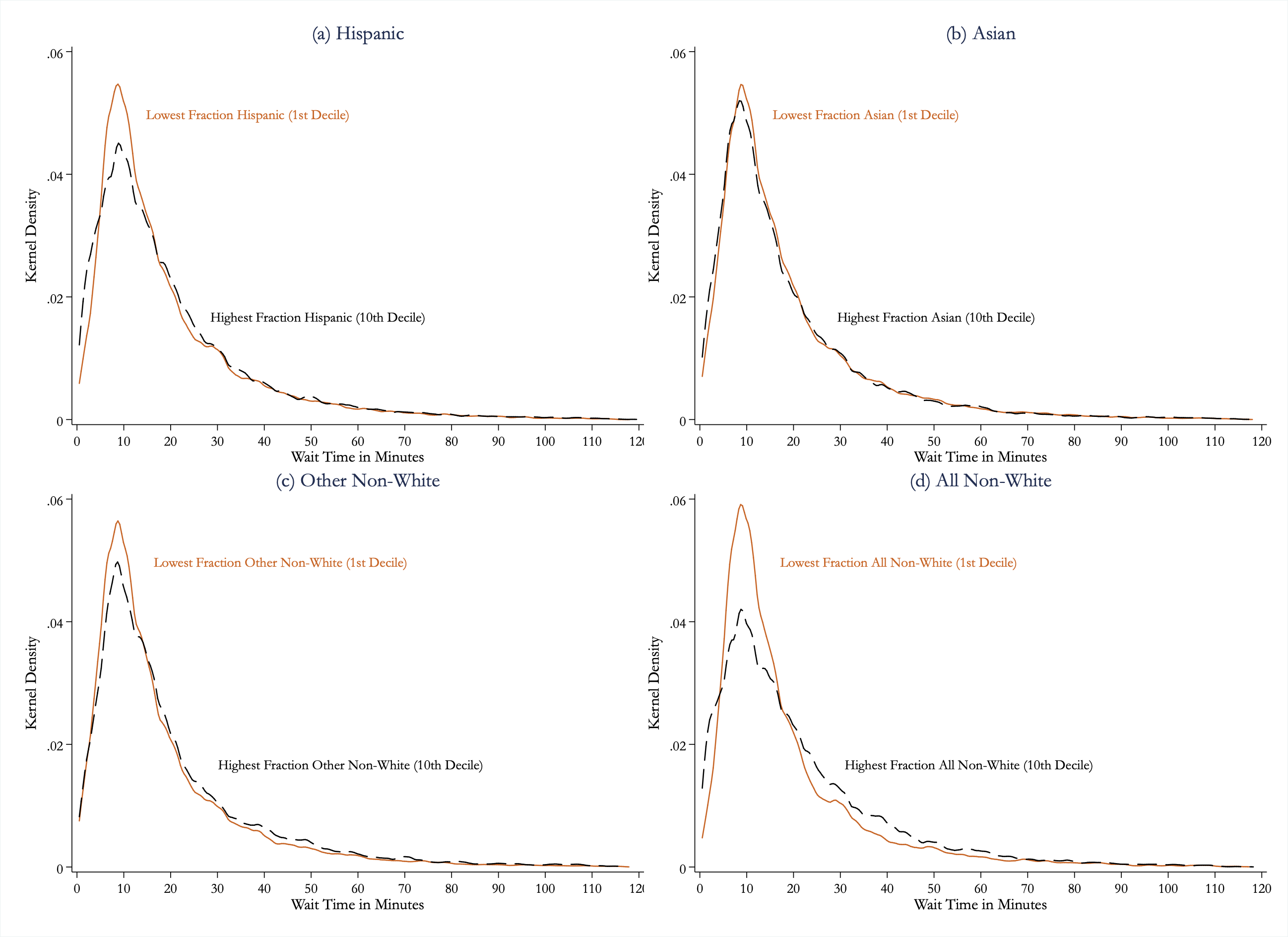
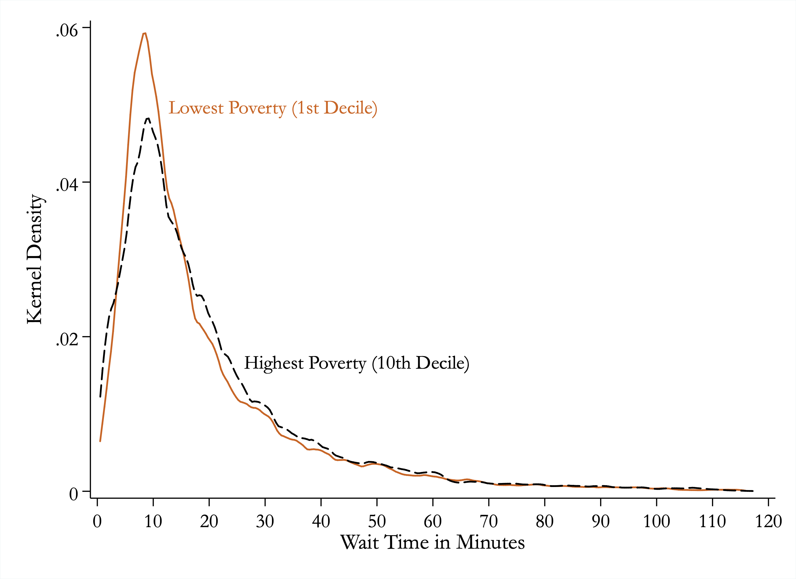
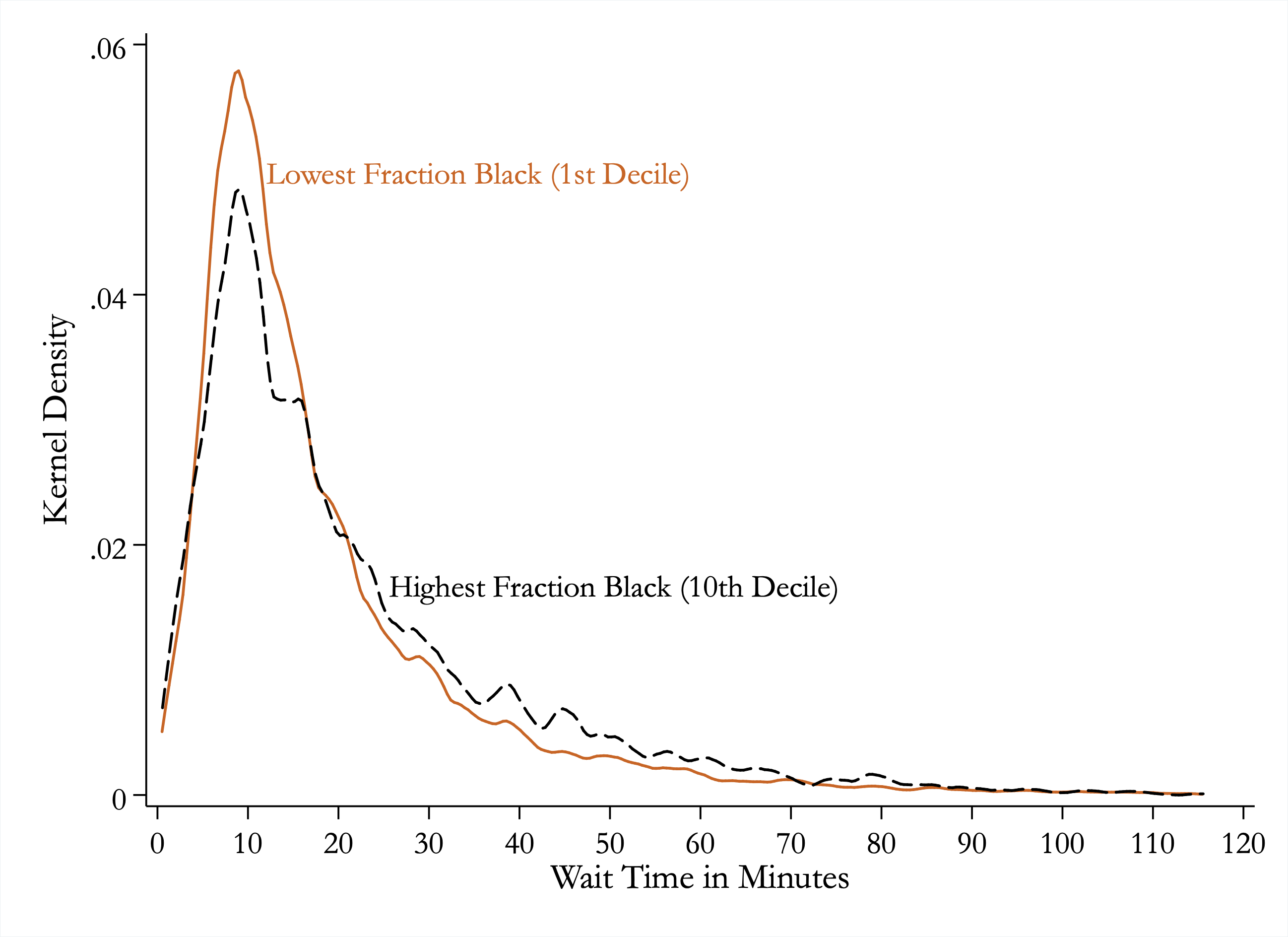
In this section, we provide evidence that wait times are significantly longer for areas with more black residents relative to white residents. We begin with a simple visualization of wait times by race. Figure 3 plots the smoothed distribution of wait times separately for polling places in the top and bottom deciles of the fraction-black distribution. These deciles average 58% and 0% black, respectively. Voters from areas in the top decile spent 19% more time at their polling locations than those in the bottom decile. Further, voters from the top decile were 49% more likely to spend over 30 minutes at their polling locations. Appendix Figures A.5 and A.6 provide similar density functions of wait-time comparisons for other demographic characteristics.
| (1) | (2) | (3) | (4) | (5) | |
| Panel A: Ordinary Least Squares (Y = Wait Time) | |||||
| Fraction Black | 5.23∗∗∗ | 5.22∗∗∗ | 4.96∗∗∗ | 4.84∗∗∗ | 3.27∗∗∗ |
| (0.39) | (0.39) | (0.42) | (0.42) | (0.45) | |
| Fraction Asian | -0.79 | -2.48∗∗∗ | 1.30∗ | -1.10 | |
| (0.72) | (0.74) | (0.76) | (0.81) | ||
| Fraction Hispanic | 1.15∗∗∗ | 0.43 | 3.90∗∗∗ | 1.50∗∗∗ | |
| (0.37) | (0.40) | (0.46) | (0.50) | ||
| Fraction Other Non-White | 12.01∗∗∗ | 11.76∗∗∗ | 1.66 | 2.04 | |
| (1.94) | (1.95) | (1.89) | (1.93) | ||
| N | 154,411 | 154,411 | 154,260 | 154,260 | 154,260 |
| 0.00 | 0.00 | 0.01 | 0.06 | 0.13 | |
| DepVarMean | 19.13 | 19.13 | 19.12 | 19.12 | 19.12 |
| Polling Area Controls? | No | No | Yes | Yes | Yes |
| State FE? | No | No | No | Yes | Yes |
| County FE? | No | No | No | No | Yes |
| Panel B: Linear Probability Model (Y = Wait Time 30min) | |||||
| Fraction Black | 0.12∗∗∗ | 0.12∗∗∗ | 0.11∗∗∗ | 0.10∗∗∗ | 0.07∗∗∗ |
| (0.01) | (0.01) | (0.01) | (0.01) | (0.01) | |
| Fraction Asian | -0.00 | -0.04∗∗ | 0.04∗∗ | -0.02 | |
| (0.02) | (0.02) | (0.02) | (0.02) | ||
| Fraction Hispanic | 0.03∗∗∗ | 0.01 | 0.08∗∗∗ | 0.03∗∗∗ | |
| (0.01) | (0.01) | (0.01) | (0.01) | ||
| Fraction Other Non-White | 0.21∗∗∗ | 0.21∗∗∗ | 0.03 | 0.05 | |
| (0.04) | (0.04) | (0.04) | (0.04) | ||
| N | 154,411 | 154,411 | 154,260 | 154,260 | 154,260 |
| 0.00 | 0.00 | 0.01 | 0.04 | 0.10 | |
| DepVarMean | 0.18 | 0.18 | 0.18 | 0.18 | 0.18 |
| Polling Area Controls? | No | No | Yes | Yes | Yes |
| State FE? | No | No | No | Yes | Yes |
| County FE? | No | No | No | No | Yes |
| ∗ , ∗∗ , ∗∗∗ | |||||
Of course, Figure 3 focuses just on polling places that are at the extremes of racial makeup. We provide a regression analysis in Table 1 in order to use all of the variation across polling places’ racial compositions and to provide exact estimates and standard errors. Panel A uses wait time as the dependent variable. In column 1, we estimate the bivariate regression which shows that moving from a census block group with no black residents to one that is entirely composed of black residents is associated with a 5.23 minute longer wait time. In column 2, we broaden our focus by adding additional racial categories,revealing longer wait times for block groups with higher fractions of Hispanic and other non-white groups (Native American, other, multiracial) relative to entirely white neighborhoods. Column 3 examines whether these associations are robust to controlling for population, population density, and fraction below poverty line of the block group (see Appendix Tables A.2 and A.3 for the full set of omitted coefficients). The coefficient on fraction black is stable when adding in these additional covariates. Column 4 adds state fixed effects and the coefficient on fraction black only slightly decreases, suggesting that racial disparities in voting wait times are just as strong within state as they are between state.
In column 5, we present the results within county. We find that the disparity is mitigated, but it continues to be large and statistically significant. This suggests that there are racial disparities occurring both within and between county. Understanding the level at which discrimination occurs (state, county, within-county, etc.) is helpful when thinking about the mechanism. Further, the fact that we find evidence of racial disparities within county allows us to rule out what one may consider spurious explanations such as differences in ballot length between counties that could create backlogs at other points of service (Pettigrew 2017; Edelstein and Edelstein 2010; Gross et al. 2013).
Panel B of Table 1 is analogous to Panel A, but changes the outcome to a binary variable indicating a wait time longer than 30 minutes. We choose a threshold of 30 minutes as this was the standard used by the Presidential Commission on Election Administration in their 2014 report, which concluded that, “as a general rule, no voter should have to wait more than half an hour in order to have an opportunity to vote” (Bauer et al. 2014). We find that entirely black areas are 12 percentage points more likely to wait more than 30 minutes than entirely white areas, a 74% increase in that likelihood. This remains at 10 percentage points with polling-area controls and 7 percentage points within county.
4.1 Robustness
We have made several data restrictions and assumptions throughout the analysis. In this section, we document the robustness of the racial disparity estimate to using alternative restrictions and assumptions.
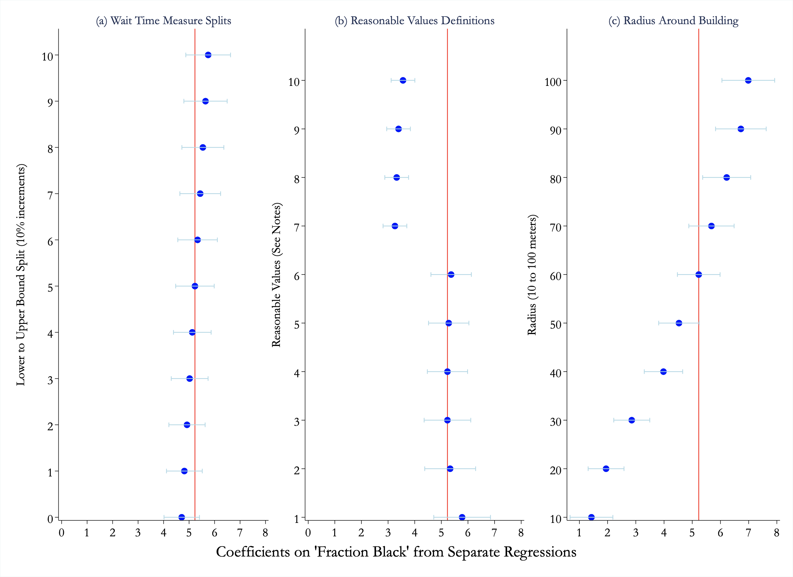
In our primary analysis we use the midpoint between the lower and upper bound of time spent near the polling location as the primary measure of wait time. In Panel A of Figure 4, we vary the wait time measure from the lower bound to the upper bound in 10 percent increments, finding that it has little impact on the significance or magnitude of our estimates. We further vary the wait time trimming thresholds in Panel B and the radius around a building centroid used to identify the polling location in Panel C. While these do move the average wait times around, and the corresponding differences, we find that the difference remains significant even across fairly implausible adjustments (e.g. a tight radius of 20 meters around a polling place centroid). We show the associated regression output for this figure in Appendix Table A.4.
Another set of assumptions was in limiting the sample to individuals who (a) spent at least one minute at a polling place, (b) did so at only one polling place on Election Day, and (c) did not spend more than one minute at that polling location in the week before or the week after Election Day. As a robustness check, we make (c) stricter by dropping anyone who visited any other polling place on any day in the week before or after Election Day, e.g. we would thus exclude a person who only visited a school polling place on Election Day, but who visited a church (that later serves a polling place) on the prior Sunday. This drops our primary analysis sample from 154,489 voters down to 68,812 voters, but arguably does a better job of eliminating false positives. In Appendix Table A.5 and Appendix Figure A.7 we replicate our primary analysis using this more restricted sample and find results that are very similar to our preferred estimates.
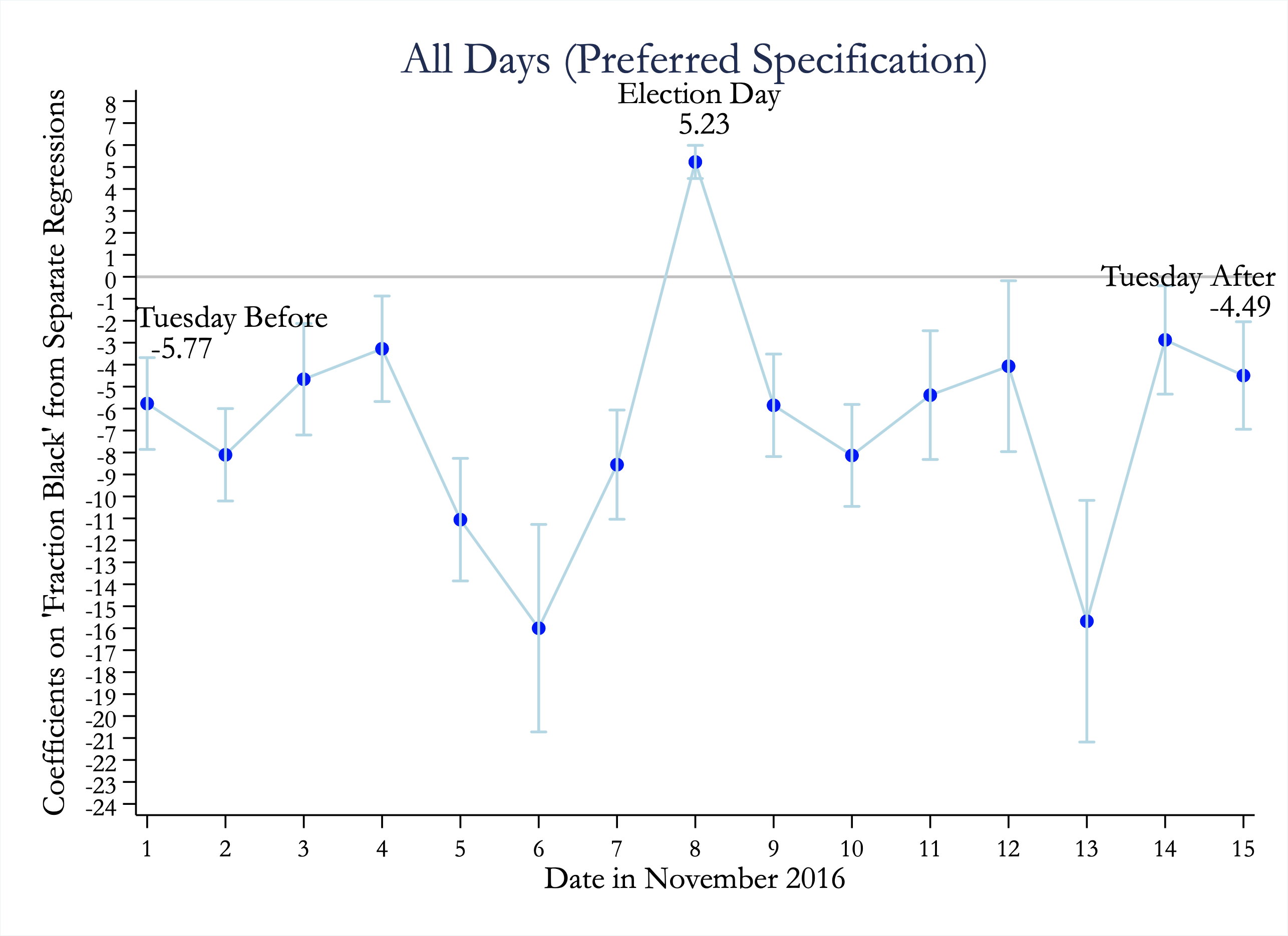
As a placebo check, we perform our primary regression analysis using the same sample construction methods on the non-Election days leading up to and after the actual Election Day. Specifically, we repeat the regression used in Table 2, Panel A, Column 1 for each of these days. Appendix Figure A.8 shows the coefficients for each date. We find that none of these alternative dates produces a positive coefficient, suggesting that our approach likely identifies a lower bound on the racial gap in wait times.
As a final robustness/validation, we correlate the racial disparities in wait times that we identify using the smartphone data with the racial disparities in wait times found using the CCES survey (discussed in the previous section). As we found when correlating our overall wait time measure with the CCES, there is a strong correlation at the state level (0.72). The correlation at the congressional district level is much more modest (0.07).
5 Discussion and Conclusion
Exploiting a large geospatial dataset, we provide new, nationwide estimates for the wait times of voters during the 2016 U.S. presidential election. In addition to describing wait times overall, we document a persistent racial disparity in voting wait times: areas with a higher proportion of black (and to a lesser extent Hispanic) residents are more likely to face long wait times than areas that are predominantly white. These effects survive a host of robustness and placebo tests and are also validated by being strongly correlated with survey data on voter wait times.
While the primary contribution of our paper is to carefully document voting wait times and disparities at the national level, it is natural to ask why these disparities exist. In the Appendix, we explore the mechanism and do not find conclusive evidence in favor of arrival bunching, partisan bias, early voting, or strict ID laws. We find suggestive evidence that the effects could be driven by fewer resources that leads to congestion especially in high-volume polling places. We are left with the fact that these racial disparities are not limited to just a few states or areas with particular laws or party affiliations that might reflect strategic motivations. Rather, there is work to be done in a diverse set of areas to correct these inequities. A simple explanation is that government officials in general tend to focus more attention on areas with white constituents at the expense of those with black constituents. For example, this could be due to politicians being more responsive to white voters’ complaints about voting administration than those from black voters (and relatedly, white voters lodging more complaints), in line with prior work demonstrating lower responsiveness to black constituents across a variety of policy dimensions (e.g. Butler and Broockman 2011; Giulietti et al. 2019; White et al. 2015).
Our results also demonstrate that smartphone data may be a relatively cheap and effective way to monitor and measure progress in both overall wait times and racial disparities in wait times across various geographic areas. The analysis that we conduct in this paper can be easily replicated after the 2020 election and thereby generate a panel dataset of wait times across areas. Creating a panel dataset across the country may be useful to help pin down the mechanism for disparities (e.g. using difference-in-differences designs to test if disparities in voter wait times change when different laws or election officials take over in a state). We hope that future work can build on the results in this paper to provide a deeper understanding of disparities in voting wait times and their causes.
References
- Abrams et al. (2012) Abrams, D. S., M. Bertrand, and S. Mullainathan (2012): “Do judges vary in their treatment of race?” Journal of Legal Studies, 41, 347–384.
- Alesina and Ferrara (2014) Alesina, A. and E. L. Ferrara (2014): “A test of racial bias in capital sentencing,” American Economic Review, 104, 3397–3433.
- Altonji and Blank (1999) Altonji, J. G. and R. M. Blank (1999): “Race and Gender in the Labor Market,” in Handbook of Labor Economics, ed. by O. Ashenfelter and D. Card, vol. 3, 3143–3259.
- Alvarez et al. (2009) Alvarez, R. M., S. Ansolabehere, A. Berinsky, G. Lenz, C. S. III, and T. Hall (2009): “2008 Survey of the Performance of American Elections Final Report,” tech. rep. Caltech/MIT Voting Technology Project.
- Alvarez et al. (2008) Alvarez, R. M., T. E. Hall, and M. H. Llewellyn (2008): “Are Americans confident their ballots are counted?” Journal of Politics, 70, 754–766.
- Ansolabehere and Schaffner (2017) Ansolabehere, S. and B. F. Schaffner (2017): “CCES Common Content, 2016,” .
- Atkeson and Saunders (2007) Atkeson, L. R. and K. L. Saunders (2007): “The effect of election administration on voter confidence: A local matter?” in PS - Political Science and Politics, vol. 40, 655–660.
- Bauer et al. (2014) Bauer, R. F., B. L. Ginsberg, B. Britton, J. Echevarria, T. Grayson, L. Lomax, M. C. Mayes, A. McGeehan, T. Patrick, and C. Thomas (2014): “The American Voting Experience: Report and Recommendations of the Presidential Commission on Election Administration,” 1–71.
- Bertrand and Duflo (2017) Bertrand, M. and E. Duflo (2017): “Field Experiments on Discrimination,” in Handbook of Economic Field Experiments, vol. 1, chap. 8, 309–393.
- Bowler et al. (2015) Bowler, S., T. Brunell, T. Donovan, and P. Gronke (2015): “Election administration and perceptions of fair elections,” Electoral Studies, 38, 1–9.
- Butler and Broockman (2011) Butler, D. M. and D. E. Broockman (2011): “Do politicians racially discriminate against constituents? A field experiment on state legislators,” American Journal of Political Science, 55, 463–477.
- Cantoni and Pons (2019) Cantoni, E. and V. Pons (2019): “Strict ID Laws Don’t Stop Voters: Evidence from a U.S. Nationwide Panel, 2008-2016,” NBER Working Paper 25522, 48.
- Chandra et al. (2016) Chandra, A., A. Finkelstein, A. Sacarny, and C. Syverson (2016): “Health care exceptionalism? Performance and allocation in the US health care sector,” American Economic Review, 106, 2110–2144.
- Charles and Guryan (2011) Charles, K. K. and J. Guryan (2011): “Studying Discrimination: Fundamental Challenges and Recent Progress,” Annual Review of Economics, 3, 479–511.
- Chen and Pope (2019) Chen, K. and D. Pope (2019): “Geographic Mobility in America: Evidence from Cell Phone Data,” Working Paper.
- Chen and Rohla (2018) Chen, M. K. and R. Rohla (2018): “The Effect of Partisanship and Political Advertising on Close Family Ties,” Science, 360, 1020–1024.
- Chetty and Hendren (2018) Chetty, R. and N. Hendren (2018): “The Impacts of Neighborhoods on Intergenerational Mobility II: County-level Estimates,” The Quarterly Journal of Economics, 133, 1163–1228.
- Edelstein and Edelstein (2010) Edelstein, W. A. and A. D. Edelstein (2010): “Queuing and Elections: Long Lines, DREs and Paper Ballots,” Proceedings of the 2010 Electronic Voting Technology Workshop.
- Election Assistance Commission (2017) Election Assistance Commission (2017): “EAVS Deep Dive: Poll Workers and Polling Places,” 1–5.
- Famighetti et al. (2014) Famighetti, C., A. Melillo, and M. Pérez (2014): “Election Day Long Lines: Resource Allocation,” Tech. rep.
- Giulietti et al. (2019) Giulietti, C., M. Tonin, and M. Vlassopoulos (2019): “Racial discrimination in local public services: A field experiment in the United States,” Journal of the European Economic Association, 17, 165–204.
- Glaeser and Sacerdote (2003) Glaeser, E. L. and B. Sacerdote (2003): “Sentencing in Homicide Cases and the Role of Vengeance,” Journal of Legal Studies, 32, 363–382.
- Grimmer and Yoder (2019) Grimmer, J. and J. Yoder (2019): “The Durable Deterrent Effects of Strict Photo Identification Laws,” Working Paper.
- Gross et al. (2013) Gross, D., J. F. Shortie, J. M. Thompson, and C. M. Harris (2013): Fundamentals of Queueing Theory: Fourth Edition, John Wiley and Sons Inc.
- Herron and Smith (2014) Herron, M. C. and D. A. Smith (2014): “Race, Party, and the Consequences of Restricting Early Voting in Florida in the 2012 General Election,” Political Research Quarterly, 67, 646–665.
- Herron and Smith (2016) ——— (2016): “Precinct resources and voter wait times,” Electoral Studies, 42, 249–263.
- Highton (2006) Highton, B. (2006): “Long lines, voting machine availability, and turnout: The case of Franklin County, Ohio in the 2004 presidential election,” PS - Political Science and Politics, 39, 65–68.
- Kaplan and Yuan (2019) Kaplan, E. and H. Yuan (2019): “Early Voting Laws, Voter Turnout, and Partisan Vote Composition: Evidence from Ohio,” American Economic Journal: Applied Economics (Forthcoming).
- Pettigrew (2017) Pettigrew, S. (2017): “The Racial Gap in Wait Times : Why Minority Precincts Are Underserved by Local Election Officials,” Political Science Quarterly, 132, 527–547.
- Spencer and Markovits (2010) Spencer, D. M. and Z. S. Markovits (2010): “Long Lines at Polling Stations? Observations from an Election Day Field Study,” Election Law Journal: Rules, Politics, and Policy, 9, 3–17.
- Stein et al. (2019) Stein, R. M., C. Mann, C. S. Iii, Z. Birenbaum, A. Fung, J. Greenberg, F. Kawsar, G. Alberda, R. M. Alvarez, L. Atkeson, E. Beaulieu, N. A. Birkhead, F. J. Boehmke, J. Boston, B. C. Burden, F. Cantu, R. Cobb, D. Darmofal, T. C. Ellington, T. S. Fine, C. J. Finocchiaro, M. D. Gilbert, V. Haynes, B. Janssen, D. Kimball, C. Kromkowski, E. Llaudet, K. R. Mayer, M. R. Miles, D. Miller, L. Nielson, and Y. Ouyang (2019): “Waiting to Vote in the 2016 Presidential Election: Evidence from a Multi-county Study,” Political Research Quarterly, 1–15.
- Stewart and Ansolabehere (2015) Stewart, C. and S. Ansolabehere (2015): “Waiting to Vote,” Election Law Journal: Rules, Politics, and Policy, 14, 47–53.
- Stewart III (2013) Stewart III, C. (2013): “Waiting to Vote in 2012,” Journal of Law & Politics, 28, 439–464.
- White et al. (2015) White, A. R., N. L. Nathan, and J. K. Faller (2015): “What Do I Need to Vote? Bureaucratic Discretion and Discrimination by Local Election Officials,” American Political Science Review, 109, 129–142.
Appendix A: Figures and Tables


| (1) | (2) | (3) | (4) | (5) | (6) | (7) | (8) | |
|---|---|---|---|---|---|---|---|---|
| N | Mean | SD | Min | p10 | Median | p90 | Max | |
| Wait Time Measures | ||||||||
| Primary Wait Time Measure (Midpoint) | 154,489 | 19.13 | 16.89 | 0.51 | 5.02 | 13.57 | 40.83 | 119.50 |
| Lower Bound Wait Time Measure | 154,489 | 11.26 | 16.19 | 0.00 | 0.00 | 5.52 | 30.62 | 119.08 |
| Upper Bound Wait Time Measure | 154,489 | 27.00 | 20.33 | 1.02 | 9.28 | 20.30 | 54.52 | 119.98 |
| Wait Time Is Over 30min | 154,489 | 0.18 | 0.38 | 0.00 | 0.00 | 0.00 | 1.00 | 1.00 |
| Race Fractions in Polling Area | ||||||||
| Fraction White | 154,411 | 0.70 | 0.26 | 0.00 | 0.27 | 0.79 | 0.96 | 1.00 |
| Fraction Black | 154,411 | 0.11 | 0.18 | 0.00 | 0.00 | 0.03 | 0.31 | 1.00 |
| Fraction Asian | 154,411 | 0.05 | 0.09 | 0.00 | 0.00 | 0.02 | 0.14 | 0.96 |
| Fraction Hispanic | 154,411 | 0.11 | 0.17 | 0.00 | 0.00 | 0.05 | 0.31 | 1.00 |
| Fraction Other Non-White | 154,411 | 0.03 | 0.04 | 0.00 | 0.00 | 0.02 | 0.07 | 0.99 |
| Other Demographics | ||||||||
| Fraction Below Poverty Line | 154,260 | 0.11 | 0.12 | 0.00 | 0.01 | 0.07 | 0.26 | 1.00 |
| Population (1000s) | 154,489 | 2.12 | 1.87 | 0.00 | 0.84 | 1.71 | 3.56 | 51.87 |
| Population Per Sq Mile (1000s) | 154,489 | 3.81 | 9.44 | 0.00 | 0.20 | 1.99 | 7.04 | 338.94 |
| (1) | (2) | (3) | (4) | (5) | (6) | |
| Fraction Black | 5.23∗∗∗ | 5.22∗∗∗ | 4.96∗∗∗ | 4.84∗∗∗ | 3.27∗∗∗ | 3.10∗∗∗ |
| (0.39) | (0.39) | (0.42) | (0.42) | (0.45) | (0.44) | |
| Fraction Asian | -0.79 | -2.48∗∗∗ | 1.30∗ | -1.10 | -0.66 | |
| (0.72) | (0.74) | (0.76) | (0.81) | (0.81) | ||
| Fraction Hispanic | 1.15∗∗∗ | 0.43 | 3.90∗∗∗ | 1.50∗∗∗ | 1.72∗∗∗ | |
| (0.37) | (0.40) | (0.46) | (0.50) | (0.50) | ||
| Fraction Other Non-White | 12.01∗∗∗ | 11.76∗∗∗ | 1.66 | 2.04 | 1.75 | |
| (1.94) | (1.95) | (1.89) | (1.93) | (1.93) | ||
| Fraction Below Poverty Line | 0.06 | -2.03∗∗∗ | 0.28 | 1.10 | ||
| (0.74) | (0.71) | (0.67) | (0.67) | |||
| Population (1000s) | 0.43∗∗∗ | 0.32∗∗∗ | 0.28∗∗∗ | 0.27∗∗∗ | ||
| (0.06) | (0.05) | (0.05) | (0.05) | |||
| Population Per Sq Mile (1000s) | 0.04∗∗∗ | 0.07∗∗∗ | 0.06∗∗∗ | 0.06∗∗∗ | ||
| (0.01) | (0.01) | (0.01) | (0.01) | |||
| Android (0 = iPhone) | 0.38∗∗∗ | |||||
| (0.10) | ||||||
| N | 154,411 | 154,411 | 154,260 | 154,260 | 154,260 | 154,260 |
| 0.00 | 0.00 | 0.01 | 0.06 | 0.13 | 0.17 | |
| DepVarMean | 19.13 | 19.13 | 19.12 | 19.12 | 19.12 | 19.12 |
| Polling Area Controls? | No | No | Yes | Yes | Yes | Yes |
| State FE? | No | No | No | Yes | Yes | Yes |
| County FE? | No | No | No | No | Yes | Yes |
| Hour of Day FE? | No | No | No | No | No | Yes |
| ∗ , ∗∗ , ∗∗∗ | ||||||
| (1) | (2) | (3) | (4) | (5) | (6) | |
| Fraction Black | 0.12∗∗∗ | 0.12∗∗∗ | 0.11∗∗∗ | 0.10∗∗∗ | 0.07∗∗∗ | 0.06∗∗∗ |
| (0.01) | (0.01) | (0.01) | (0.01) | (0.01) | (0.01) | |
| Fraction Asian | -0.00 | -0.04∗∗ | 0.04∗∗ | -0.02 | -0.01 | |
| (0.02) | (0.02) | (0.02) | (0.02) | (0.02) | ||
| Fraction Hispanic | 0.03∗∗∗ | 0.01 | 0.08∗∗∗ | 0.03∗∗∗ | 0.04∗∗∗ | |
| (0.01) | (0.01) | (0.01) | (0.01) | (0.01) | ||
| Fraction Other Non-White | 0.21∗∗∗ | 0.21∗∗∗ | 0.03 | 0.05 | 0.04 | |
| (0.04) | (0.04) | (0.04) | (0.04) | (0.04) | ||
| Fraction Below Poverty Line | -0.02 | -0.05∗∗∗ | 0.01 | 0.03∗ | ||
| (0.02) | (0.02) | (0.01) | (0.01) | |||
| Population (1000s) | 0.01∗∗∗ | 0.01∗∗∗ | 0.01∗∗∗ | 0.01∗∗∗ | ||
| (0.00) | (0.00) | (0.00) | (0.00) | |||
| Population Per Sq Mile (1000s) | 0.00∗∗∗ | 0.00∗∗∗ | 0.00∗∗∗ | 0.00∗∗∗ | ||
| (0.00) | (0.00) | (0.00) | (0.00) | |||
| Android (0 = iPhone) | 0.01∗∗∗ | |||||
| (0.00) | ||||||
| N | 154,411 | 154,411 | 154,260 | 154,260 | 154,260 | 154,260 |
| 0.00 | 0.00 | 0.01 | 0.04 | 0.10 | 0.14 | |
| DepVarMean | 0.18 | 0.18 | 0.18 | 0.18 | 0.18 | 0.18 |
| Polling Area Controls? | No | No | Yes | Yes | Yes | Yes |
| State FE? | No | No | No | Yes | Yes | Yes |
| County FE? | No | No | No | No | Yes | Yes |
| Hour of Day FE? | No | No | No | No | No | Yes |
| ∗ , ∗∗ , ∗∗∗ | ||||||
| (1) | (2) | (3) | (4) | (5) | (6) | (7) | (8) | (9) | (10) | (11) | |
| Panel A: Lower to Upper Bound Split (10% increments) | |||||||||||
| Lower | S1 | S2 | S3 | S4 | Midpoint | S6 | S7 | S8 | S9 | Upper | |
| Fraction Black | 4.71∗∗∗ | 4.82∗∗∗ | 4.92∗∗∗ | 5.02∗∗∗ | 5.13∗∗∗ | 5.23∗∗∗ | 5.33∗∗∗ | 5.44∗∗∗ | 5.54∗∗∗ | 5.65∗∗∗ | 5.75∗∗∗ |
| (0.35) | (0.36) | (0.36) | (0.37) | (0.38) | (0.39) | (0.40) | (0.41) | (0.42) | (0.43) | (0.45) | |
| N | 154,411 | 154,411 | 154,411 | 154,411 | 154,411 | 154,411 | 154,411 | 154,411 | 154,411 | 154,411 | 154,411 |
| 0.00 | 0.00 | 0.00 | 0.00 | 0.00 | 0.00 | 0.00 | 0.00 | 0.00 | 0.00 | 0.00 | |
| DepVarMean | 11.26 | 12.83 | 14.40 | 15.98 | 17.55 | 19.13 | 20.70 | 22.28 | 23.85 | 25.42 | 27.00 |
| Panel B: Reasonable Values (See Notes) | |||||||||||
| RV1 | RV2 | RV3 | RV4 | RV5 | RV6 | RV7 | RV8 | RV9 | RV10 | ||
| Fraction Black | 5.78∗∗∗ | 5.33∗∗∗ | 5.23∗∗∗ | 5.23∗∗∗ | 5.28∗∗∗ | 5.37∗∗∗ | 3.26∗∗∗ | 3.32∗∗∗ | 3.39∗∗∗ | 3.56∗∗∗ | |
| (0.54) | (0.49) | (0.45) | (0.39) | (0.39) | (0.39) | (0.23) | (0.23) | (0.23) | (0.23) | ||
| N | 159,046 | 158,167 | 156,937 | 154,411 | 154,014 | 153,433 | 141,170 | 140,470 | 139,788 | 138,452 | |
| 0.00 | 0.00 | 0.00 | 0.00 | 0.00 | 0.00 | 0.00 | 0.00 | 0.00 | 0.00 | ||
| DepVarMean | 22.92 | 21.79 | 20.63 | 19.13 | 19.17 | 19.24 | 15.64 | 15.71 | 15.78 | 15.91 | |
| Panel C: Radius Around Building (10 to 100 meters) | |||||||||||
| Rad10 | Rad20 | Rad30 | Rad40 | Rad50 | Rad60 | Rad70 | Rad80 | Rad90 | Rad100 | ||
| Fraction Black | 1.43∗∗∗ | 1.95∗∗∗ | 2.86∗∗∗ | 3.98∗∗∗ | 4.53∗∗∗ | 5.23∗∗∗ | 5.68∗∗∗ | 6.22∗∗∗ | 6.72∗∗∗ | 6.99∗∗∗ | |
| (0.39) | (0.32) | (0.33) | (0.35) | (0.37) | (0.39) | (0.41) | (0.43) | (0.46) | (0.48) | ||
| N | 60,822 | 120,921 | 150,994 | 161,728 | 161,140 | 154,411 | 144,880 | 134,133 | 123,417 | 113,797 | |
| 0.00 | 0.00 | 0.00 | 0.00 | 0.00 | 0.00 | 0.00 | 0.00 | 0.00 | 0.00 | ||
| DepVarMean | 12.09 | 14.00 | 15.63 | 17.00 | 18.16 | 19.13 | 20.00 | 20.71 | 21.32 | 21.81 | |
| ∗ , ∗∗ , ∗∗∗ | |||||||||||
| (1) | (2) | (3) | (4) | (5) | |
| Panel A: Ordinary Least Squares (Y = Wait Time) | |||||
| Fraction Black | 4.97∗∗∗ | 4.93∗∗∗ | 4.38∗∗∗ | 4.31∗∗∗ | 2.70∗∗∗ |
| (0.53) | (0.53) | (0.56) | (0.57) | (0.63) | |
| Fraction Asian | -1.98∗ | -3.80∗∗∗ | 0.78 | -2.21∗ | |
| (1.05) | (1.11) | (1.10) | (1.18) | ||
| Fraction Hispanic | 1.21∗∗ | 0.23 | 4.27∗∗∗ | 2.10∗∗∗ | |
| (0.52) | (0.56) | (0.67) | (0.74) | ||
| Fraction Other Non-White | 12.54∗∗∗ | 11.86∗∗∗ | 0.85 | 2.05 | |
| (2.26) | (2.27) | (2.22) | (2.46) | ||
| N | 68,811 | 68,811 | 68,724 | 68,724 | 68,724 |
| 0.00 | 0.00 | 0.01 | 0.06 | 0.14 | |
| DepVarMean | 19.38 | 19.38 | 19.36 | 19.36 | 19.36 |
| Polling Area Controls? | No | No | Yes | Yes | Yes |
| State FE? | No | No | No | Yes | Yes |
| County FE? | No | No | No | No | Yes |
| Panel B: Linear Probability Model (Y = Wait Time 30min) | |||||
| Fraction Black | 0.11∗∗∗ | 0.11∗∗∗ | 0.11∗∗∗ | 0.09∗∗∗ | 0.05∗∗∗ |
| (0.01) | (0.01) | (0.01) | (0.01) | (0.01) | |
| Fraction Asian | -0.00 | -0.04∗ | 0.05∗ | -0.03 | |
| (0.02) | (0.02) | (0.02) | (0.03) | ||
| Fraction Hispanic | 0.03∗∗ | 0.01 | 0.09∗∗∗ | 0.04∗∗ | |
| (0.01) | (0.01) | (0.02) | (0.02) | ||
| Fraction Other Non-White | 0.22∗∗∗ | 0.21∗∗∗ | 0.02 | 0.05 | |
| (0.05) | (0.05) | (0.05) | (0.06) | ||
| N | 68,811 | 68,811 | 68,724 | 68,724 | 68,724 |
| 0.00 | 0.00 | 0.01 | 0.05 | 0.12 | |
| DepVarMean | 0.18 | 0.18 | 0.18 | 0.18 | 0.18 |
| Polling Area Controls? | No | No | Yes | Yes | Yes |
| State FE? | No | No | No | Yes | Yes |
| County FE? | No | No | No | No | Yes |
| ∗ , ∗∗ , ∗∗∗ | |||||
Appendix B: Mechanisms
In Section 4 of the paper, we documented large and persistent differences in wait times for areas with a larger fraction of black residents relative to white residents. In this section, we explore potential explanations for these differences. This descriptive exercise is important as different mechanisms may imply different corrective policies. For example, if wait time disparities are driven by differential job flexibility (and thus bunching in busy arrival hours), the best policy response might be to create Federal holidays for elections (e.g. as proposed in “Democracy Day” legislation). By contrast, if the disparity is driven by inequalities in provided resources, the optimal policy response might be to set up systems to monitor and ensure equal resources per voter across the nation.
The nature of our data does not lend itself to a deep exploration of mechanism. A complete understanding of mechanism would likely need to include a large amount of investigative work including data for the quantity and quality of resources at the level of a polling place. There are also two measurement and identification issues to keep in mind. First, as noted in Section 3, our wait time measure may include voters who abandon the line after discovering a long wait time. Second, our estimates are conditional on a voter turning out. Each of the mechanisms below could affect either of these intermediate outcomes. For example, a Strict ID law could increase the amount of time it takes to process a single voter. However, it may also discourage potential voters from turning out to vote (decreasing the actual queue length for the marginal voter) and it could increase the likelihood that a voter who does turnout would leave the line early (decreasing the average measured time from our method). These two issues thus further caution against using this analysis in isolation to identify the causal effect of addressing these mechanisms. However, in our analysis below, we are able to cast doubt on a few potential mechanisms and draw some tentative conclusions that at the very least may help guide further work that attempts to pinpoint causal determinants of wait times.
B.1 Inflexible Arrival Times
One potential mechanism for the differences in wait times that we find is that areas differ in the intensity of voting that occurs at different times of day. For example, it is possible that polling stations in black and white areas are equally resourced and prepared to handle voters, but that voters in black areas are more likely to show up all at once. This could occur, for example, if black voters have less flexible jobs than white voters and therefore can only vote in the early morning or evening. This mechanism for differences in wait times is a bit more indirect than other potential mechanisms in that it is not driven by less attention or resources being devoted to black areas, but rather is a result of congestion caused by more general features of the economy (e.g. job flexibility).
To test for evidence of this mechanism, Figure B.1 plots the density of arrival time for voters from the most black areas (highest decile) and from the the least black areas (lowest decile).777We restrict the sample to the 32 states that opened no later than 7am and closed no earlier than 7pm, and restrict the range to be from 7am to 7pm in order to avoid having attrition in the graph due to the opening and closing times of different states. We thus exclude the following states from this figure: Arkansas, Georgia, Idaho, Kansas, Kentucky, Maine, Massachusetts, Minnesota, Nebraska, New Hampshire, North Dakota, Tennessee, Vermont. Despite this sample restriction, we find a similar disparity estimate in this restricted sample (coefficient = 5.43; t = 13; N = 124,950) as in the full sample (coefficient = 5.23; t = 14; N = 154,411). A visual inspection of Figure B.1 shows quite minor differences in bunching. Voters in black areas are slightly more likely to show up in the very early morning hours whereas voters in white areas are slightly more likely to show up in the evening.
Figure B.1 does not appear to make a particularly strong case for bunching in arrival times. However, as we showed in Panel B of Figure A.3, wait times are longer in the morning (when black voters are slightly more likely to show up). A simple test to see if these differences are large enough to explain the racial disparities we find is to include hour-of-the-day fixed effects in our main regression specification. These fixed effects account for any differences in wait times that are due to one group (e.g. voters from black areas) showing up disproportionately during hours that have longer wait times. We include hour-of-the-day fixed effects in Column 6 of Appendix Table A.2. The coefficient on fraction black drops from a disparity of 3.27 minutes to a disparity of 3.10 minutes, suggesting that hour-of-the-day differences are not a primary factor that contributes to the wait-time gap that we find.
A different way to show that bunching in arrival times is not sufficient to explain our results is to restrict the sample to hours that don’t include the early morning. In Appendix Table B.1, we replicate our main specification (Column 4 in Table 2), but only use data after 8am, 9am, and 10am. We continue to find strong evidence of a racial disparity in wait times despite the fact that this regression is including hours of the day (evening hours) when white areas may be more congested due to bunching. This table also provides estimates that exclude both morning and evening hours when there are differences in bunching by black and white areas and also restricts to just evening hours where white areas have higher relative volume in arrivals. Once again, we find strong black-white differences in voter wait times during these hours.
We conclude that the evidence does not support congestion at the polls due to bunching of arrival times as a primary mechanism explaining the racial disparity in wait times that we document.
B.2 Partisan Bias
Another explanation for why voters in black areas may face longer wait times than voters in white areas is that election officials may provide fewer or lower quality resources to black areas. Using carefully-collected data by polling place across three states in the 2012 election (from Famighetti et al. 2014), Pettigrew (2017) finds evidence of exactly this – black areas were provided with fewer poll workers and machines than white areas. Thus, it seems likely that differential resources contribute to the effects that we find. An even deeper mechanism question though is why black areas might receive a lower quality or quantity of election resources. In this section, we explore whether partisanship is correlated with wait times.
At the state level, the individual charged with being the chief elections officer is the secretary of state (although in some states it is the lieutenant governor or secretary of the commonwealth). The secretary of state often oversees the distribution of resources to individual polling places, although the process can vary substantially from state to state and much of the responsibility is at times passed down to thousands of more local officials (Spencer and Markovits 2010).888Spencer and Markovits (2010) provide a useful summary of the problem of identifying precisely who is responsible for election administration in each of the 116,990 polling places spread over the country: One major reason why polling place inefficiency has yet to be adequately studied is that the administration of elections in the United States is extremely complicated. Each state creates its own rules, budgets its own money, and constructs its own election processes. In some states, such as Wisconsin and Michigan, local jurisdictions have primary autonomy over election administration. In others, such as Oklahoma and Delaware, all election officials are state employees. Still others share administrative duties between state and local election officials. For example, in California, counties have significant authority, yet they operate within a broad framework established by the Secretary of State. On the federal level, the United States Constitution preserves the right of Congress to supersede state laws regulating congressional elections. The result is a complex web of overlapping jurisdictions and 10,071 government units that administer elections. To complicate matters further, authority in all jurisdictions is ceded to two million poll workers who control the success or failure of each election.
It could be that state and county officials uniformly have a bias against allocating resources to black areas and this creates racial disparities in wait times across the U.S. as a whole. Alternatively, some election officials may be especially unequal in the resources they provide. An observable factor that could proxy for how unfair an election official may be in allocating resource is party affiliation. In 2016, black voters were far more likely to vote for the Democratic candidate than the Republican candidate.999Exit polls suggested that 89% of black voters cast their ballot for the Democratic candidate in 2016 whereas only 8% voted for the Republican candidate (source: https://www.cnn.com/election/2016/results/exit-polls). Given this large difference in vote share, it is possible that Republican party control or overall Republican party membership of an area predicts a motivation (either strategic or based in prejudice) for limiting resources to polling places in black areas.
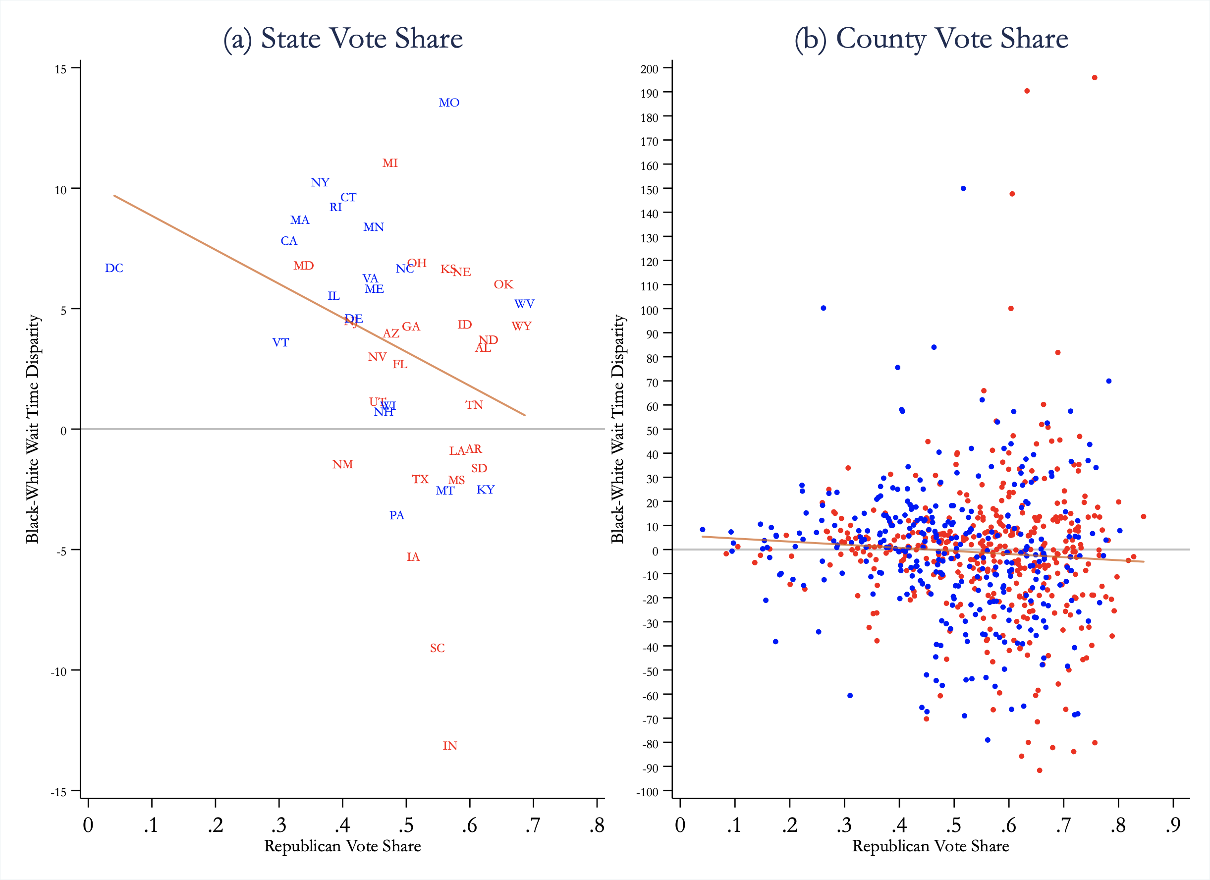
To test for evidence of a partisan bias, we plot empirical-Bayes-adjusted state-level racial disparities in wait times against the 2016 Republican vote share at both the state (panel A of Figure B.2) and county level (panel B of Figure B.2).101010The sample sizes for some counties are very small. Thus, we restrict the analysis to the 718 counties with at least 30 likely voters (and for which the disparity can be estimated) in order to avoid small-sample inference issues. Panel A also color codes each state marker by the party affiliation of the chief elections officer in the state.111111State and county Republican vote shares are taken from the MIT Election Data and Science Lab’s County Presidential Election Returns 2000-2016 (https://dataverse.harvard.edu/file.xhtml?persistentId=doi:10.7910/DVN/VOQCHQ/FQ9NBF&version=5.0). We compute the Republican vote share as the number of votes cast at the County (or State) level divided by the total number of votes cast in that election, and thus states with a Republican vote share under 50% may still have more votes for Trump over Clinton (e.g. Utah). The partisan affiliation of the chief elections officer in the state is taken from: https://en.wikipedia.org/w/index.php?title=Secretary_of_state_(U.S._state_government)&oldid=746677873 The fitted lines in both panels do not show evidence of positive correlation between Republican vote share and racial disparities in voter wait times. If anything we find larger disparities in areas that have a lower Republican vote share.
While this analysis is correlational in nature, it suggests that racial disparities in wait times are not primarily driven by how Republican the state/county is. Rather, both red and blue states and counties are susceptible to generating conditions that lead to black voters spending more time at the polls than their white counterparts.
B.3 County-Level Correlates
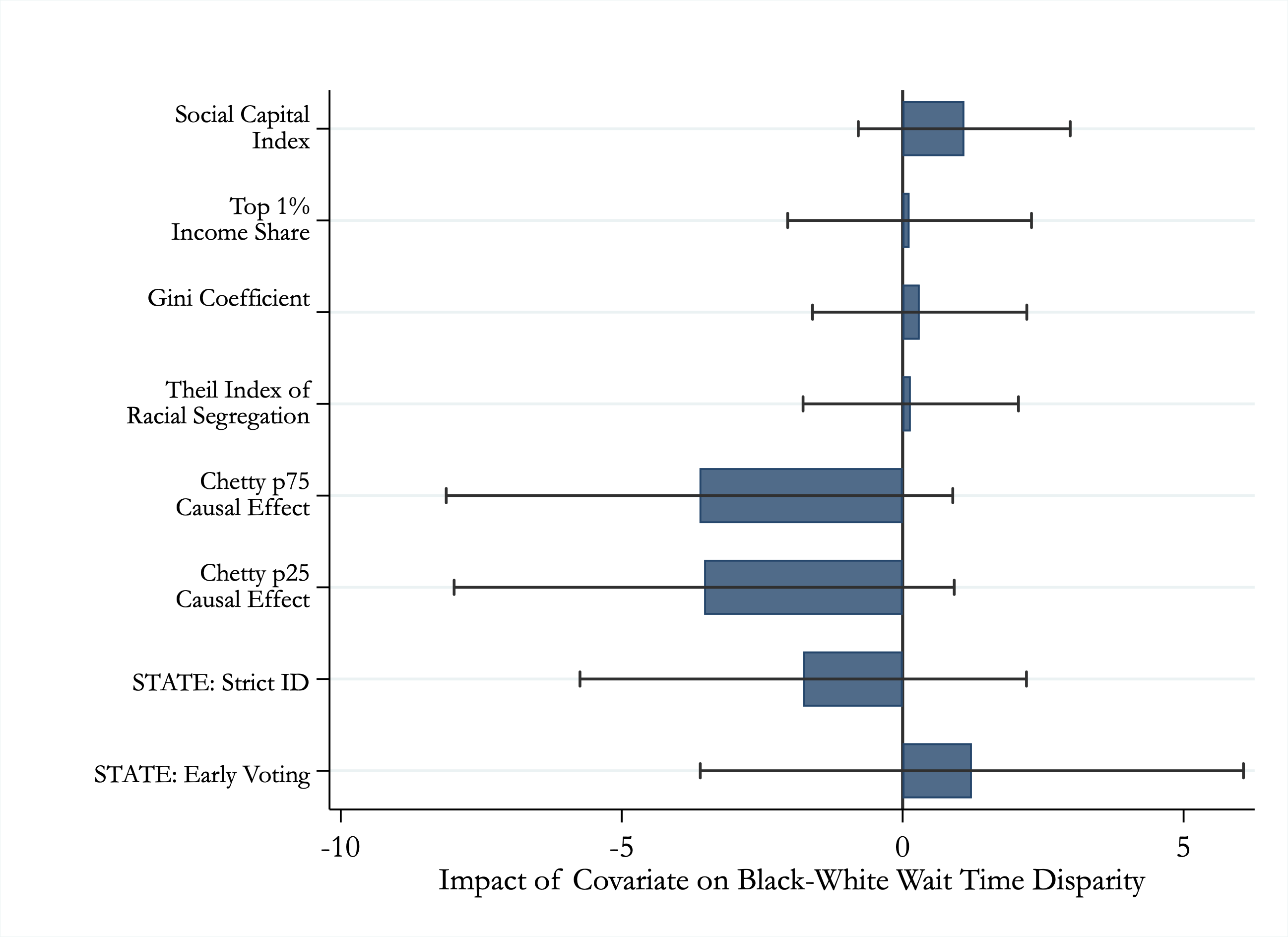
We do not find evidence of a correlation between party affiliation at the county level and racial disparities in wait times. However, there may be other characteristics of counties that correlate with our measure of racial disparities. In Figure B.3, we show estimates of a regression of our measure of racial disparities at the county-level (empirical-Bayes adjusted and limited to those counties with more than 30 observations) against a Social Capital Index, Top 1% Income Share, Gini Coefficient, Theil Index of Racial Segregation, and two measures of social mobility from Chetty and Hendren (2018). Each of these variables is taken from Figure 5 of Chetty and Hendren (2018), corresponds to the 2000 Census, and has been standardized.121212We source these variables from: https://opportunityinsights.org/wp-content/uploads/2018/04/online_table4-2.dta and merge on the Census County FIPS (taken from the 2000 Census in the Chetty and Hendren (2018) data and from the 2017 ACS in our data. We find little evidence that voter wait time disparities are correlated with these additional measures. Overall, we argue that a clear pattern does not emerge where counties of a particular type are experiencing the largest disparities in voter wait time.
B.4 State Voting Laws
A large recent discussion has emerged regarding the impact of Strict ID laws (Cantoni and Pons 2019; Grimmer and Yoder 2019) and unequal access to early voting (Kaplan and Yuan 2019; Herron and Smith 2014) on the voting process. Both of these types of laws have the potential to produce racial inequalities in wait times. For example, Strict ID laws may disproportionately cause delays at polling places in minority areas. The effect of early voting laws is less clear. It is possible that early voting allows voters who would have otherwise faced long lines to take advantage of the early voting process and therefore release some of the pressure at the polling places with the longest waits. However, it is also possible that white voters are more likely to learn about and take advantage of early voting (or that early voting is more likely to be available in white areas within a State that has early voting) which could lead to even longer disparities in wait times if election officials don’t adjust polling place resources to accommodate the new equilibrium.
The final two bars in Figure B.3 show how our measure of racial disparity at the state level interacts with states with early voting laws (N = 34) and states with Strict ID laws (N = 10).131313Following Cantoni and Pons (2019), we source both of these measures from the National Conference of State Legislatures. We use Internet Archive snapshots from just before the 2016 Election to obtain measures relevant for that time period (e.g. for Strict ID laws we use the following link: https://web.archive.org/web/20161113113845/http://www.ncsl.org/research/elections-and-campaigns/voter-id.aspx). For the early-voting measure we define it as any state that has same-day voter registration, automatic voter registration, no-excuse absentee voting, or early voting (Cantoni and Pons (2019) study multiple elections, and thus define this measure as the share of elections over which one of these was offered). States identified as having strict voter ID laws in 2016 are: Arizona, Georgia, Indiana, Kansas, Mississippi, North Dakota, Ohio, Tennessee, Virginia, and Wisconsin. States identified as not having any type of early voting in 2016 are: Alabama, Delaware, Indiana, Kentucky, Michigan, Mississippi, Missouri, New York, Pennsylvania, Rhode Island, South Carolina, Virginia. As can be seen in the figure, we do not find evidence that the variation in wait time disparities is being explained in a substantial way by these laws.
B.5 Congestion
A final mechanism that we explore is congestion due to fewer or lower quality resources per voter at a polling place. Congestion may cause longer wait times and be more likely to be a factor at polling places with more black voters. We do not have a direct measure of resources or overall congestion at the polling place level, but a potential proxy for congestion is the number of registered voters who are assigned to each polling place. We use data from L2’s 2016 General Election national voter file. These data allow us to determine the total number of registered voters who are assigned to vote at each polling place and also the number of actual votes cast. For most voters, their polling place was determined by the name of their assigned precinct; precincts were assigned to one or more polling places by their local election authority. In the rare case where voters were allowed their choice from multiple polling places, the polling place closest to their home address was used. Registered voters and votes cast by polling place are highly correlated (correlation = 0.96) and the analysis below is unchanged independent of what measure we use. We will therefore focus on the number of registered voters for each polling place.
It is not obvious that polling places with more voters should have longer overall wait times. In a carefully-resourced system in equilibrium, high-volume polling places should have more machines and polling workers and therefore be set up to handle the higher number of voters. However, it is possible that the quality and quantity of polling resources is out of equilibrium and does not compensate for the higher volume. For example, polling-place closures or residential construction may increase the number of registered voters assigned to a given polling place and polling resources may not adjust fast enough to catch up to the changing volume. Alternatively, even if variable resource are in equilibrium, there may be fixed differences that lead to longer wait times in high volume areas (e.g. constrained building sizes leading to slower throughput, or a higher risk of technical issues).141414In Appendix Table B.2, we investigate these potential fixed building type differences directly by matching polling place buildings to information on size and types from Microsoft OpenStreetMap. We group building types into 6 categories (Commercial, Medical, Private, Public, Religious, School) and 76 sub-categories (e.g. Commercial is divided into Gym, Hotel, Shopping Center, and 7 other sub-categories). We show in Panel C that building categories and building size are only weakly predictive of fraction black. Panels A and B in turn show that controlling for a second-order polynomial in building size (Column 2), category fixed effects (Column 3), and sub-category fixed effects (Column 4) has little effect on estimates of the racial disparities. This analysis suggests that at least these coarse building characteristics, on their own, do not seem to mediate the relationship. Moreover, this analysis provides some reassurance that the rules for cleaning data—which may differentially affect different building types—do not skew our estimates of the racial disparities.
Following our baseline specifications, we regress voting wait time for each individual in our sample on the number of registered voters assigned to the polling place where they voted. These results can be found in Appendix Table B.3. We do indeed find a positive relationship across specifications with varied fixed effects suggesting that congestion may be an issue in high-volume polling locations.
Given the above association, if polling places with a large fraction of black voters are also more likely to be high volume, this could help explain the black-white disparity in wait times that we have documented. The data, however, do not bear this out. There is not a strong correlation between volume and the fraction of black residents at a polling place (correlation = .03). One way to see this is we run our baseline regressions, but include the number of registered voters in each polling place as a control. The table indicates that this new control does not significantly diminish the racial disparity in wait times and if anything may cause the disparity to become a bit larger in some specifications.
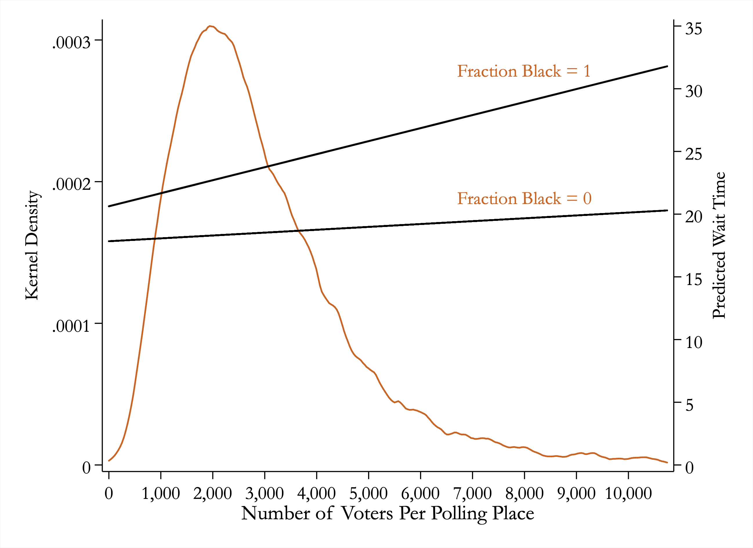
Lastly, we explore whether or not the racial disparity in voter wait times that we document interacts with our proxy for congestion. Is the racial gap in wait times larger or smaller in high-volume polling places? In Appendix Table B.4 we run our baseline regressions and include the number of registered voters in each polling place and also an interaction between registered voters and the fraction of black residents. Across all specifications, we find a significant and robust interaction effect indicating larger racial disparities at higher volume polling places. Figure B.4 helps put this interaction effect in perspective. In this figure, we plot the density function for the number of voters registered in each individual’s polling place in our data (labeled on the left y-axis). We also plot the predicted wait time for an area composed entirely of black residents (fraction black = 1) as well as an area with no black residents (fraction black = 0) by the number of registered voters at the polling place (labeled on the right y-axis). The predicted lines indicate that the black-white disparity in wait times for individuals who vote at a low-volume polling location (10th percentile = 1,150 registered voters) is 3.7 minutes whereas the disparity in high-volume polling locations (90th percentile = 5,242 registered voters) is almost twice as large at 7 minutes.
Thus, we find that the largest racial disparities in voter wait times are in the highest volume polling places. This finding is consistent with several possible stories. For example, this pattern may reflect another dimension of the aforementioned inequality in polling machines, workers, and other support. Black areas may face persistent under-resourcing and these resourcing constraints may be especially harmful at higher volumes of voters. Relatedly, election officials may respond less quickly to adjustments in volume (e.g. caused by polling closures or changes in voter-age population) in areas with higher concentrations of black residents. This off-equilibrium response may lead to the differential gradient we find in volume between black and white areas. Our analysis is correlational and thus does not allow us to make conclusive statements about the exact underlying mechanism. On the other hand, this descriptive exercise can provide guidance on potential sources for the disparity that are worthy of further exploration.
| (1) | (2) | (3) | (4) | (5) | (6) | |
| Panel A: Ordinary Least Squares (Y = Wait Time) | ||||||
| Fraction Black | 4.84∗∗∗ | 2.90∗∗∗ | 2.21∗∗∗ | 1.85∗∗∗ | 1.71∗∗∗ | 1.92∗∗∗ |
| (0.42) | (0.43) | (0.43) | (0.44) | (0.54) | (0.51) | |
| Fraction Asian | 1.30∗ | 0.20 | -0.14 | -0.41 | 0.57 | -1.08 |
| (0.76) | (0.77) | (0.79) | (0.80) | (1.01) | (0.98) | |
| Fraction Hispanic | 3.90∗∗∗ | 3.23∗∗∗ | 3.22∗∗∗ | 3.26∗∗∗ | 0.84 | 5.25∗∗∗ |
| (0.46) | (0.48) | (0.50) | (0.51) | (0.62) | (0.63) | |
| Fraction Other Non-White | 1.66 | 1.14 | 1.40 | 2.20 | 0.53 | 3.02 |
| (1.89) | (1.92) | (2.00) | (2.06) | (2.44) | (2.55) | |
| N | 154,260 | 124,367 | 111,480 | 99,858 | 57,863 | 52,995 |
| 0.06 | 0.04 | 0.04 | 0.04 | 0.04 | 0.04 | |
| DepVarMean | 19.12 | 17.67 | 17.50 | 17.34 | 17.47 | 16.88 |
| Sample? | Full | 10am-3pm | ||||
| Panel B: LPM (Y = Wait Time 30min) | ||||||
| Fraction Black | 0.10∗∗∗ | 0.06∗∗∗ | 0.04∗∗∗ | 0.03∗∗∗ | 0.03∗∗ | 0.03∗∗∗ |
| (0.01) | (0.01) | (0.01) | (0.01) | (0.01) | (0.01) | |
| Fraction Asian | 0.04∗∗ | 0.02 | 0.01 | 0.01 | 0.02 | 0.01 |
| (0.02) | (0.02) | (0.02) | (0.02) | (0.02) | (0.02) | |
| Fraction Hispanic | 0.08∗∗∗ | 0.06∗∗∗ | 0.06∗∗∗ | 0.07∗∗∗ | 0.01 | 0.11∗∗∗ |
| (0.01) | (0.01) | (0.01) | (0.01) | (0.01) | (0.01) | |
| Fraction Other Non-White | 0.03 | 0.01 | 0.03 | 0.05 | 0.02 | 0.04 |
| (0.04) | (0.04) | (0.04) | (0.05) | (0.05) | (0.06) | |
| N | 154,260 | 124,367 | 111,480 | 99,858 | 57,863 | 52,995 |
| 0.04 | 0.03 | 0.03 | 0.03 | 0.03 | 0.03 | |
| DepVarMean | 0.18 | 0.14 | 0.14 | 0.14 | 0.14 | 0.13 |
| Sample? | Full | 10am-3pm | ||||
| ∗ , ∗∗ , ∗∗∗ | ||||||
| (1) | (2) | (3) | (4) | (5) | (6) | (7) | (8) | (9) | (10) | |
| Panel A: Ordinary Least Squares (Y = Wait Time) | ||||||||||
| Fraction Black | 5.23∗∗∗ | 5.41∗∗∗ | 5.69∗∗∗ | 5.55∗∗∗ | 7.57 | 10.60 | 4.10∗∗∗ | 4.54∗∗∗ | 5.62∗∗∗ | 6.36∗∗∗ |
| (0.39) | (0.39) | (0.38) | (0.38) | (6.11) | (6.44) | (1.57) | (0.83) | (0.87) | (0.52) | |
| N | 154,411 | 154,411 | 154,411 | 153,937 | 2,259 | 474 | 10,514 | 37,243 | 44,823 | 59,098 |
| 0.00 | 0.01 | 0.01 | 0.01 | 0.00 | 0.01 | 0.00 | 0.00 | 0.00 | 0.01 | |
| DepVarMean | 19.13 | 19.13 | 19.13 | 19.12 | 19.60 | 20.18 | 19.35 | 19.42 | 20.33 | 17.96 |
| PollingPlaces | 43,385 | 43,385 | 43,385 | 43,220 | 628 | 165 | 3,962 | 12,630 | 12,173 | 13,827 |
| Category FE? | No | No | Yes | No | No | No | No | No | No | No |
| Subcategory FE? | No | No | No | Yes | No | No | No | No | No | No |
| Subsample? | All | All | All | All | Com | Med | Pri | Pub | Rel | Sch |
| Panel B: Linear Probability Model (Y = Wait Time 30min) | ||||||||||
| Fraction Black | 0.12∗∗∗ | 0.12∗∗∗ | 0.12∗∗∗ | 0.12∗∗∗ | 0.15 | 0.17 | 0.09∗∗∗ | 0.10∗∗∗ | 0.12∗∗∗ | 0.14∗∗∗ |
| (0.01) | (0.01) | (0.01) | (0.01) | (0.12) | (0.14) | (0.03) | (0.02) | (0.02) | (0.01) | |
| N | 154,411 | 154,411 | 154,411 | 153,937 | 2,259 | 474 | 10,514 | 37,243 | 44,823 | 59,098 |
| 0.00 | 0.00 | 0.01 | 0.01 | 0.00 | 0.01 | 0.00 | 0.00 | 0.00 | 0.01 | |
| DepVarMean | 0.18 | 0.18 | 0.18 | 0.18 | 0.20 | 0.19 | 0.18 | 0.18 | 0.20 | 0.16 |
| PollingPlaces | 43,385 | 43,385 | 43,385 | 43,220 | 628 | 165 | 3,962 | 12,630 | 12,173 | 13,827 |
| Category FE? | No | No | Yes | No | No | No | No | No | No | No |
| Subcategory FE? | No | No | No | Yes | No | No | No | No | No | No |
| Subsample? | All | All | All | All | Com | Med | Pri | Pub | Rel | Sch |
| Panel C: Do Building Characteristics Predict Race? (Y = Fraction Black) | ||||||||||
| Poll: Medical | 0.03 | |||||||||
| (0.02) | ||||||||||
| Poll: Private | 0.00 | |||||||||
| (0.01) | ||||||||||
| Poll: Public | -0.00 | |||||||||
| (0.01) | ||||||||||
| Poll: Religious | 0.00 | |||||||||
| (0.01) | ||||||||||
| Poll: School | 0.03∗∗∗ | |||||||||
| (0.01) | ||||||||||
| Poll: Building Area | 0.01∗∗∗ | |||||||||
| (0.00) | ||||||||||
| N | 154,411 | 154,411 | ||||||||
| 0.01 | 0.00 | |||||||||
| DepVarMean | 19.13 | 19.13 | ||||||||
| PollingPlaces | 43,385 | 43,385 | ||||||||
| ∗ , ∗∗ , ∗∗∗ | ||||||||||
| (1) | (2) | (3) | (4) | (5) | (6) | (7) | (8) | (9) | (10) | |
| Panel A: Ordinary Least Squares (Y = Wait Time) | ||||||||||
| Fraction Black | 5.20∗∗∗ | 5.21∗∗∗ | 5.18∗∗∗ | 5.18∗∗∗ | 4.97∗∗∗ | 4.96∗∗∗ | 4.80∗∗∗ | 4.82∗∗∗ | 3.32∗∗∗ | 3.36∗∗∗ |
| (0.38) | (0.38) | (0.39) | (0.38) | (0.42) | (0.41) | (0.42) | (0.41) | (0.45) | (0.44) | |
| Voters Per Polling Place | 0.29∗∗∗ | 0.30∗∗∗ | 0.25∗∗∗ | 0.51∗∗∗ | 0.61∗∗∗ | |||||
| (0.07) | (0.07) | (0.07) | (0.06) | (0.05) | ||||||
| Fraction Asian | -0.80 | -0.81 | -2.51∗∗∗ | -2.34∗∗∗ | 1.25∗ | 1.04 | -1.13 | -1.18 | ||
| (0.72) | (0.71) | (0.75) | (0.74) | (0.76) | (0.75) | (0.81) | (0.80) | |||
| Fraction Hispanic | 1.01∗∗∗ | 0.95∗∗ | 0.31 | 0.30 | 3.81∗∗∗ | 3.85∗∗∗ | 1.53∗∗∗ | 1.67∗∗∗ | ||
| (0.37) | (0.37) | (0.40) | (0.40) | (0.46) | (0.47) | (0.50) | (0.51) | |||
| Fraction Other Non-White | 12.49∗∗∗ | 12.97∗∗∗ | 12.32∗∗∗ | 12.67∗∗∗ | 1.96 | 2.26 | 1.95 | 1.90 | ||
| (1.96) | (1.97) | (1.97) | (1.98) | (1.90) | (1.89) | (1.95) | (1.95) | |||
| N | 152,317 | 152,317 | 152,317 | 152,317 | 152,167 | 152,167 | 152,167 | 152,167 | 152,167 | 152,167 |
| 0.00 | 0.00 | 0.00 | 0.01 | 0.01 | 0.01 | 0.06 | 0.06 | 0.13 | 0.13 | |
| DepVarMean | 19.10 | 19.10 | 19.10 | 19.10 | 19.09 | 19.09 | 19.09 | 19.09 | 19.09 | 19.09 |
| Polling Area Controls? | No | No | No | No | Yes | Yes | Yes | Yes | Yes | Yes |
| State FE? | No | No | No | No | No | No | Yes | Yes | Yes | Yes |
| County FE? | No | No | No | No | No | No | No | No | Yes | Yes |
| Panel B: Linear Probability Model (Y = Wait Time 30min) | ||||||||||
| Fraction Black | 0.12∗∗∗ | 0.12∗∗∗ | 0.12∗∗∗ | 0.12∗∗∗ | 0.11∗∗∗ | 0.11∗∗∗ | 0.10∗∗∗ | 0.10∗∗∗ | 0.07∗∗∗ | 0.07∗∗∗ |
| (0.01) | (0.01) | (0.01) | (0.01) | (0.01) | (0.01) | (0.01) | (0.01) | (0.01) | (0.01) | |
| Voters Per Polling Place | 0.01∗∗∗ | 0.01∗∗∗ | 0.01∗∗∗ | 0.01∗∗∗ | 0.01∗∗∗ | |||||
| (0.00) | (0.00) | (0.00) | (0.00) | (0.00) | ||||||
| Fraction Asian | -0.00 | -0.00 | -0.04∗∗ | -0.04∗∗ | 0.04∗∗ | 0.03∗∗ | -0.02 | -0.02 | ||
| (0.02) | (0.02) | (0.02) | (0.02) | (0.02) | (0.02) | (0.02) | (0.02) | |||
| Fraction Hispanic | 0.02∗∗∗ | 0.02∗∗ | 0.01 | 0.01 | 0.08∗∗∗ | 0.08∗∗∗ | 0.03∗∗∗ | 0.04∗∗∗ | ||
| (0.01) | (0.01) | (0.01) | (0.01) | (0.01) | (0.01) | (0.01) | (0.01) | |||
| Fraction Other Non-White | 0.22∗∗∗ | 0.23∗∗∗ | 0.22∗∗∗ | 0.23∗∗∗ | 0.03 | 0.04 | 0.04 | 0.04 | ||
| (0.04) | (0.04) | (0.04) | (0.04) | (0.04) | (0.04) | (0.04) | (0.04) | |||
| N | 152,317 | 152,317 | 152,317 | 152,317 | 152,167 | 152,167 | 152,167 | 152,167 | 152,167 | 152,167 |
| 0.00 | 0.00 | 0.00 | 0.00 | 0.01 | 0.01 | 0.05 | 0.05 | 0.10 | 0.10 | |
| DepVarMean | 0.18 | 0.18 | 0.18 | 0.18 | 0.18 | 0.18 | 0.18 | 0.18 | 0.18 | 0.18 |
| Polling Area Controls? | No | No | No | No | Yes | Yes | Yes | Yes | Yes | Yes |
| State FE? | No | No | No | No | No | No | Yes | Yes | Yes | Yes |
| County FE? | No | No | No | No | No | No | No | No | Yes | Yes |
| ∗ , ∗∗ , ∗∗∗ | ||||||||||
| (1) | (2) | (3) | (4) | (5) | |
| Panel A: Ordinary Least Squares (Y = Wait Time) | |||||
| Fraction Black | 2.79∗∗∗ | 2.79∗∗∗ | 3.01∗∗∗ | 2.45∗∗∗ | 1.08 |
| (0.79) | (0.78) | (0.82) | (0.75) | (0.74) | |
| Voters Per Polling Place | 0.23∗∗∗ | 0.23∗∗∗ | 0.20∗∗ | 0.45∗∗∗ | 0.54∗∗∗ |
| (0.08) | (0.08) | (0.08) | (0.06) | (0.05) | |
| Interaction: Black X VotersPerPoll | 0.81∗∗∗ | 0.80∗∗∗ | 0.65∗∗ | 0.80∗∗∗ | 0.76∗∗∗ |
| (0.27) | (0.27) | (0.27) | (0.23) | (0.22) | |
| Fraction Asian | -0.88 | -2.32∗∗∗ | 1.10 | -1.04 | |
| (0.71) | (0.74) | (0.75) | (0.80) | ||
| Fraction Hispanic | 0.93∗∗ | 0.29 | 3.86∗∗∗ | 1.68∗∗∗ | |
| (0.37) | (0.40) | (0.46) | (0.51) | ||
| Fraction Other Non-White | 12.94∗∗∗ | 12.62∗∗∗ | 2.17 | 1.88 | |
| (1.97) | (1.98) | (1.89) | (1.95) | ||
| N | 152,317 | 152,317 | 152,167 | 152,167 | 152,167 |
| 0.00 | 0.01 | 0.01 | 0.06 | 0.13 | |
| DepVarMean | 19.10 | 19.10 | 19.09 | 19.09 | 19.09 |
| Polling Area Controls? | No | No | Yes | Yes | Yes |
| State FE? | No | No | No | Yes | Yes |
| County FE? | No | No | No | No | Yes |
| Panel B: Linear Probability Model (Y = Wait Time 30min) | |||||
| Fraction Black | 0.07∗∗∗ | 0.07∗∗∗ | 0.08∗∗∗ | 0.06∗∗∗ | 0.03 |
| (0.02) | (0.02) | (0.02) | (0.02) | (0.02) | |
| Voters Per Polling Place | 0.01∗∗∗ | 0.01∗∗∗ | 0.00∗∗∗ | 0.01∗∗∗ | 0.01∗∗∗ |
| (0.00) | (0.00) | (0.00) | (0.00) | (0.00) | |
| Interaction: Black X VotersPerPoll | 0.01∗∗ | 0.01∗∗ | 0.01∗ | 0.01∗∗∗ | 0.01∗∗∗ |
| (0.01) | (0.01) | (0.01) | (0.01) | (0.01) | |
| Fraction Asian | -0.00 | -0.04∗∗ | 0.03∗∗ | -0.02 | |
| (0.02) | (0.02) | (0.02) | (0.02) | ||
| Fraction Hispanic | 0.02∗∗ | 0.01 | 0.08∗∗∗ | 0.04∗∗∗ | |
| (0.01) | (0.01) | (0.01) | (0.01) | ||
| Fraction Other Non-White | 0.23∗∗∗ | 0.23∗∗∗ | 0.04 | 0.04 | |
| (0.04) | (0.04) | (0.04) | (0.04) | ||
| N | 152,317 | 152,317 | 152,167 | 152,167 | 152,167 |
| 0.00 | 0.01 | 0.01 | 0.05 | 0.10 | |
| DepVarMean | 0.18 | 0.18 | 0.18 | 0.18 | 0.18 |
| Polling Area Controls? | No | No | Yes | Yes | Yes |
| State FE? | No | No | No | Yes | Yes |
| County FE? | No | No | No | No | Yes |
| ∗ , ∗∗ , ∗∗∗ | |||||
Appendix C: Geographic Variation
| (1) | (2) | (3) | (4) | (5) | (6) | (7) | |
| Unadjusted | Bayesian | Unadjusted | Bayesian | ||||
| State | N | Mean | Std Dev | Adjusted Mean | Disparity | Std Error | Adjusted Disparity |
| Alabama | 4,410 | 23.04 | 17.25 | 23.03 | 3.46 | 1.86 | 3.46 |
| Arizona | 2,069 | 20.80 | 18.75 | 20.78 | 4.67 | 6.56 | 4.05 |
| Arkansas | 907 | 21.73 | 18.27 | 21.67 | -1.84 | 3.36 | -0.74 |
| California | 11,743 | 20.43 | 17.37 | 20.43 | 8.32 | 2.04 | 7.89 |
| Connecticut | 2,722 | 12.37 | 12.51 | 12.39 | 11.70 | 3.69 | 9.71 |
| Delaware | 688 | 11.91 | 11.68 | 11.99 | 4.85 | 2.50 | 4.67 |
| DistrictofColumbia | 179 | 27.49 | 22.94 | 26.24 | 8.38 | 4.56 | 6.77 |
| Florida | 7,172 | 17.99 | 15.52 | 17.99 | 2.74 | 1.42 | 2.77 |
| Georgia | 5,058 | 20.12 | 18.14 | 20.12 | 4.38 | 1.54 | 4.33 |
| Idaho | 1,274 | 19.23 | 14.99 | 19.22 | 13.12 | 25.23 | 4.41 |
| Illinois | 6,213 | 15.99 | 13.69 | 15.99 | 5.68 | 1.19 | 5.61 |
| Indiana | 4,286 | 27.11 | 23.09 | 27.06 | -15.93 | 2.73 | -13.07 |
| Iowa | 1,667 | 15.44 | 13.17 | 15.46 | -9.66 | 4.72 | -5.23 |
| Kansas | 1,488 | 16.08 | 13.78 | 16.10 | 8.20 | 4.43 | 6.71 |
| Kentucky | 3,166 | 14.61 | 12.64 | 14.63 | -2.99 | 2.00 | -2.44 |
| Louisiana | 2,403 | 16.08 | 14.30 | 16.09 | -0.96 | 1.13 | -0.83 |
| Maine | 463 | 17.66 | 15.13 | 17.69 | 27.35 | 24.83 | 5.90 |
| Maryland | 4,949 | 20.48 | 16.97 | 20.47 | 7.03 | 1.41 | 6.87 |
| Massachusetts | 2,655 | 12.29 | 10.94 | 12.31 | 9.75 | 2.82 | 8.76 |
| Michigan | 9,776 | 22.27 | 16.44 | 22.26 | 11.48 | 1.42 | 11.12 |
| Minnesota | 4,526 | 15.26 | 12.52 | 15.27 | 10.11 | 3.75 | 8.46 |
| Mississippi | 999 | 17.73 | 15.87 | 17.74 | -3.26 | 3.08 | -2.05 |
| Missouri | 6,231 | 26.20 | 20.70 | 26.17 | 15.00 | 2.40 | 13.63 |
| Montana | 307 | 20.53 | 16.56 | 20.45 | -117.11 | 92.15 | -2.48 |
| Nebraska | 1,355 | 16.60 | 16.02 | 16.63 | 13.22 | 9.91 | 6.60 |
| Nevada | 976 | 15.67 | 14.15 | 15.71 | 2.57 | 8.31 | 3.08 |
| NewHampshire | 1,325 | 15.48 | 12.10 | 15.50 | -4.98 | 10.24 | 0.81 |
| NewJersey | 4,446 | 13.89 | 13.24 | 13.90 | 4.64 | 1.58 | 4.57 |
| NewMexico | 484 | 18.53 | 14.48 | 18.54 | -35.21 | 21.06 | -1.39 |
| NewYork | 7,892 | 16.51 | 14.66 | 16.52 | 10.50 | 1.08 | 10.31 |
| NorthCarolina | 4,061 | 20.58 | 16.81 | 20.57 | 6.99 | 1.78 | 6.74 |
| NorthDakota | 424 | 20.03 | 17.76 | 19.97 | 8.97 | 42.73 | 3.79 |
| Ohio | 8,343 | 17.49 | 14.27 | 17.49 | 7.10 | 1.22 | 6.98 |
| Oklahoma | 3,445 | 26.45 | 20.96 | 26.39 | 7.29 | 4.41 | 6.09 |
| Pennsylvania | 6,227 | 20.80 | 18.50 | 20.79 | -4.34 | 2.29 | -3.49 |
| RhodeIsland | 785 | 19.07 | 15.77 | 19.07 | 35.78 | 15.56 | 9.30 |
| SouthCarolina | 4,141 | 26.55 | 22.12 | 26.49 | -11.68 | 3.03 | -9.01 |
| SouthDakota | 429 | 15.55 | 12.81 | 15.62 | -12.56 | 10.26 | -1.54 |
| Tennessee | 2,418 | 16.27 | 15.40 | 16.28 | 0.94 | 1.60 | 1.09 |
| Texas | 7,377 | 16.04 | 16.51 | 16.05 | -2.25 | 1.38 | -2.01 |
| Utah | 1,201 | 27.89 | 22.96 | 27.67 | -34.32 | 51.98 | 1.21 |
| Vermont | 165 | 14.83 | 13.09 | 15.05 | 6.78 | 33.00 | 3.69 |
| Virginia | 9,030 | 17.73 | 15.09 | 17.73 | 6.53 | 1.71 | 6.34 |
| WestVirginia | 600 | 18.38 | 13.69 | 18.39 | 7.29 | 6.96 | 5.28 |
| Wisconsin | 3,728 | 16.62 | 13.80 | 16.63 | 0.83 | 1.99 | 1.05 |
| Wyoming | 286 | 20.65 | 13.15 | 20.59 | 17.90 | 44.06 | 4.35 |
| (1) | (2) | (3) | (4) | (5) | (6) | (7) | |
|---|---|---|---|---|---|---|---|
| Unadjusted | Bayesian | Unadjusted | Bayesian | ||||
| State & District | N | Mean | Std Dev | Adjusted Mean | Disparity | Std Error | Adjusted Disparity |
| Alabama 01 | 518 | 22.38 | 16.63 | 22.28 | -4.95 | 5.06 | -3.40 |
| Alabama 02 | 689 | 21.76 | 15.48 | 21.70 | -4.26 | 6.77 | -2.14 |
| Alabama 03 | 468 | 22.66 | 17.40 | 22.53 | 10.10 | 8.05 | 6.66 |
| Alabama 04 | 272 | 21.06 | 15.10 | 20.95 | -1.92 | 8.59 | -0.16 |
| Alabama 05 | 956 | 22.05 | 17.49 | 21.99 | 13.94 | 5.80 | 10.64 |
| Alabama 06 | 1,061 | 23.91 | 17.42 | 23.83 | 4.86 | 5.08 | 4.20 |
| Alabama 07 | 446 | 27.49 | 19.78 | 27.09 | -0.86 | 5.06 | -0.23 |
| Arizona 01 | 192 | 16.16 | 14.06 | 16.30 | -10.97 | 13.22 | -2.41 |
| Arizona 02 | 193 | 20.02 | 20.16 | 19.88 | 54.76 | 59.49 | 3.49 |
| Arizona 03 | 150 | 23.88 | 19.66 | 23.24 | -75.87 | 39.55 | -2.54 |
| Arizona 04 | 226 | 18.28 | 15.76 | 18.30 | -28.90 | 28.87 | -1.12 |
| Arizona 05 | 375 | 21.59 | 19.48 | 21.44 | -14.55 | 68.23 | 1.57 |
| Arizona 06 | 252 | 21.37 | 19.95 | 21.16 | 76.05 | 39.51 | 6.25 |
| Arizona 07 | 133 | 23.03 | 18.27 | 22.50 | 9.03 | 5.27 | 7.34 |
| Arizona 08 | 334 | 19.98 | 18.04 | 19.92 | -6.32 | 16.88 | -0.03 |
| Arizona 09 | 214 | 23.97 | 20.95 | 23.44 | -36.35 | 24.47 | -3.11 |
| Arkansas 01 | 127 | 19.85 | 16.68 | 19.72 | -2.12 | 8.10 | -0.39 |
| Arkansas 02 | 415 | 20.80 | 17.22 | 20.72 | 1.72 | 3.43 | 1.75 |
| Arkansas 03 | 234 | 23.63 | 20.17 | 23.20 | 14.72 | 47.25 | 2.50 |
| Arkansas 04 | 131 | 23.13 | 19.22 | 22.54 | -5.72 | 11.96 | -0.98 |
| California 01 | 220 | 16.17 | 13.87 | 16.28 | 5.56 | 83.94 | 2.02 |
| California 02 | 125 | 16.96 | 15.52 | 17.12 | -53.21 | 35.46 | -1.90 |
| California 03 | 264 | 19.31 | 14.91 | 19.28 | 0.84 | 8.83 | 1.36 |
| California 04 | 290 | 18.73 | 18.47 | 18.73 | -31.90 | 69.72 | 1.19 |
| California 05 | 184 | 18.76 | 16.51 | 18.75 | 16.49 | 4.45 | 13.83 |
| California 06 | 205 | 18.03 | 15.69 | 18.07 | 2.43 | 10.04 | 2.18 |
| California 07 | 287 | 17.66 | 15.64 | 17.70 | -2.79 | 12.09 | 0.16 |
| California 08 | 164 | 23.89 | 21.22 | 23.21 | 51.09 | 34.65 | 5.53 |
| California 09 | 257 | 16.83 | 14.00 | 16.90 | 18.14 | 11.60 | 8.40 |
| California 10 | 247 | 16.91 | 14.61 | 16.99 | 27.82 | 28.69 | 4.57 |
| California 11 | 274 | 18.64 | 15.72 | 18.64 | 6.48 | 7.40 | 4.75 |
| California 12 | 145 | 17.46 | 20.08 | 17.62 | 17.74 | 29.13 | 3.51 |
| California 13 | 133 | 21.35 | 20.38 | 20.96 | 7.39 | 8.95 | 4.81 |
| California 14 | 174 | 21.43 | 18.91 | 21.15 | -32.29 | 39.81 | 0.00 |
| California 15 | 253 | 18.08 | 15.41 | 18.11 | 2.37 | 11.02 | 2.13 |
| California 16 | 175 | 20.32 | 18.58 | 20.16 | 36.56 | 16.42 | 10.59 |
| California 17 | 219 | 17.76 | 16.05 | 17.81 | 7.62 | 35.34 | 2.36 |
| California 18 | 220 | 19.29 | 16.45 | 19.25 | -35.51 | 33.45 | -0.94 |
| California 19 | 205 | 17.95 | 16.88 | 18.00 | -17.27 | 36.32 | 0.67 |
| California 20 | 112 | 19.68 | 18.48 | 19.54 | 89.54 | 19.14 | 19.24 |
| California 21 | 74 | 17.97 | 14.37 | 18.06 | -6.19 | 16.92 | 0.01 |
| (1) | (2) | (3) | (4) | (5) | (6) | (7) | |
|---|---|---|---|---|---|---|---|
| Unadjusted | Bayesian | Unadjusted | Bayesian | ||||
| State & District | N | Mean | Std Dev | Adjusted Mean | Disparity | Std Error | Adjusted Disparity |
| California 22 | 285 | 21.97 | 18.49 | 21.77 | -63.14 | 24.93 | -6.38 |
| California 23 | 268 | 18.79 | 13.90 | 18.79 | 7.52 | 14.14 | 3.67 |
| California 24 | 171 | 20.40 | 16.93 | 20.25 | 122.44 | 73.82 | 4.45 |
| California 25 | 348 | 22.55 | 17.37 | 22.37 | 31.20 | 12.57 | 12.49 |
| California 26 | 275 | 20.32 | 18.65 | 20.21 | -7.38 | 22.44 | 0.53 |
| California 27 | 214 | 19.71 | 15.37 | 19.65 | 17.63 | 11.57 | 8.21 |
| California 28 | 189 | 22.92 | 19.69 | 22.49 | -3.66 | 52.23 | 1.76 |
| California 29 | 161 | 27.40 | 21.16 | 26.25 | 4.99 | 47.28 | 2.09 |
| California 30 | 271 | 22.53 | 17.21 | 22.31 | 22.10 | 27.85 | 4.09 |
| California 31 | 78 | 26.65 | 22.08 | 24.63 | 43.66 | 47.82 | 3.70 |
| California 32 | 196 | 21.07 | 16.94 | 20.89 | 7.75 | 30.66 | 2.48 |
| California 33 | 234 | 24.59 | 20.65 | 24.06 | -39.32 | 28.35 | -2.29 |
| California 34 | 121 | 23.55 | 19.86 | 22.81 | 9.87 | 38.17 | 2.44 |
| California 35 | 259 | 22.50 | 17.19 | 22.28 | 1.54 | 40.33 | 1.93 |
| California 36 | 250 | 23.53 | 18.64 | 23.19 | 27.06 | 16.95 | 7.93 |
| California 37 | 162 | 24.20 | 20.23 | 23.54 | 7.83 | 6.36 | 5.99 |
| California 38 | 188 | 19.75 | 16.63 | 19.67 | 23.97 | 46.88 | 2.91 |
| California 39 | 286 | 20.45 | 16.40 | 20.36 | -61.49 | 31.34 | -3.53 |
| California 40 | 129 | 21.28 | 16.00 | 21.02 | -42.47 | 23.12 | -4.50 |
| California 41 | 308 | 20.42 | 15.64 | 20.35 | 24.92 | 14.17 | 9.02 |
| California 42 | 496 | 21.04 | 17.86 | 20.96 | 27.76 | 27.67 | 4.73 |
| California 43 | 177 | 23.39 | 18.27 | 22.95 | 0.99 | 5.21 | 1.22 |
| California 44 | 119 | 24.61 | 19.30 | 23.75 | -20.00 | 6.73 | -12.57 |
| California 45 | 378 | 20.62 | 15.45 | 20.55 | -26.77 | 22.53 | -2.40 |
| California 46 | 154 | 26.46 | 24.46 | 25.10 | 51.88 | 125.13 | 2.48 |
| California 47 | 208 | 18.78 | 14.73 | 18.78 | 1.43 | 10.22 | 1.72 |
| California 48 | 277 | 21.19 | 15.79 | 21.07 | -47.61 | 40.00 | -0.85 |
| California 49 | 291 | 21.07 | 17.12 | 20.94 | -12.97 | 67.91 | 1.61 |
| California 50 | 357 | 18.31 | 15.20 | 18.32 | 51.96 | 34.81 | 5.56 |
| California 51 | 141 | 22.20 | 19.01 | 21.77 | 0.06 | 9.88 | 1.06 |
| California 52 | 286 | 20.97 | 19.78 | 20.81 | 103.50 | 55.78 | 5.23 |
| California 53 | 239 | 17.21 | 14.28 | 17.28 | 20.12 | 19.98 | 5.31 |
| Connecticut 01 | 590 | 10.91 | 10.57 | 10.99 | 4.77 | 2.59 | 4.57 |
| Connecticut 02 | 529 | 11.38 | 10.97 | 11.47 | -4.51 | 5.84 | -2.71 |
| Connecticut 03 | 508 | 12.60 | 13.40 | 12.71 | 18.98 | 7.79 | 12.06 |
| Connecticut 04 | 545 | 13.67 | 12.75 | 13.75 | 16.69 | 6.49 | 11.94 |
| Connecticut 05 | 550 | 13.37 | 14.39 | 13.48 | 20.93 | 9.29 | 11.57 |
| Delaware 01 | 688 | 11.91 | 11.68 | 11.98 | 4.85 | 2.51 | 4.66 |
| DistrictofColumbia 01 | 179 | 27.49 | 22.94 | 26.27 | 8.38 | 4.57 | 7.15 |
| Florida 01 | 321 | 16.25 | 13.98 | 16.33 | 8.88 | 4.62 | 7.53 |
| Florida 02 | 173 | 14.52 | 12.70 | 14.72 | 3.44 | 5.89 | 3.02 |
| (1) | (2) | (3) | (4) | (5) | (6) | (7) | |
|---|---|---|---|---|---|---|---|
| Unadjusted | Bayesian | Unadjusted | Bayesian | ||||
| State & District | N | Mean | Std Dev | Adjusted Mean | Disparity | Std Error | Adjusted Disparity |
| Florida 03 | 288 | 17.20 | 15.61 | 17.27 | 0.10 | 11.53 | 1.21 |
| Florida 04 | 285 | 13.07 | 10.86 | 13.20 | -0.64 | 9.89 | 0.72 |
| Florida 05 | 170 | 13.69 | 13.61 | 13.96 | 0.13 | 5.41 | 0.58 |
| Florida 06 | 299 | 17.94 | 15.36 | 17.97 | 8.52 | 7.08 | 6.15 |
| Florida 07 | 277 | 15.61 | 13.57 | 15.72 | -3.66 | 12.73 | -0.03 |
| Florida 08 | 341 | 15.50 | 14.66 | 15.60 | 0.95 | 4.51 | 1.14 |
| Florida 09 | 292 | 18.28 | 15.31 | 18.30 | -18.70 | 7.96 | -10.09 |
| Florida 10 | 249 | 19.59 | 15.15 | 19.55 | -5.24 | 4.70 | -3.80 |
| Florida 11 | 300 | 16.23 | 12.74 | 16.30 | -8.30 | 8.83 | -3.50 |
| Florida 12 | 499 | 17.85 | 13.74 | 17.87 | -1.81 | 16.83 | 1.05 |
| Florida 13 | 261 | 18.75 | 15.52 | 18.75 | 5.58 | 5.05 | 4.76 |
| Florida 14 | 215 | 17.35 | 13.36 | 17.40 | -0.79 | 4.16 | -0.34 |
| Florida 15 | 397 | 17.41 | 13.34 | 17.44 | -0.17 | 8.50 | 0.79 |
| Florida 16 | 346 | 17.68 | 14.68 | 17.71 | 20.91 | 14.74 | 7.48 |
| Florida 17 | 261 | 16.23 | 14.24 | 16.33 | 18.88 | 15.56 | 6.52 |
| Florida 18 | 304 | 19.42 | 17.48 | 19.38 | -3.28 | 11.49 | -0.15 |
| Florida 19 | 215 | 18.26 | 16.86 | 18.28 | 22.18 | 15.83 | 7.28 |
| Florida 20 | 152 | 20.92 | 18.13 | 20.68 | -6.21 | 6.94 | -3.33 |
| Florida 21 | 348 | 20.65 | 17.86 | 20.56 | -5.90 | 5.20 | -4.06 |
| Florida 22 | 305 | 20.27 | 17.63 | 20.18 | 9.94 | 9.64 | 5.86 |
| Florida 23 | 248 | 23.11 | 19.70 | 22.76 | 6.53 | 13.91 | 3.40 |
| Florida 24 | 120 | 21.20 | 16.45 | 20.92 | 6.95 | 6.19 | 5.44 |
| Florida 25 | 193 | 22.54 | 18.68 | 22.19 | -30.83 | 36.47 | -0.22 |
| Florida 26 | 173 | 18.64 | 14.80 | 18.65 | 21.82 | 8.50 | 12.90 |
| Florida 27 | 138 | 22.97 | 20.99 | 22.33 | 12.87 | 15.71 | 4.86 |
| Georgia 01 | 291 | 25.32 | 20.86 | 24.82 | 8.96 | 6.85 | 6.53 |
| Georgia 02 | 255 | 15.21 | 12.71 | 15.32 | 5.79 | 3.11 | 5.41 |
| Georgia 03 | 385 | 16.06 | 14.22 | 16.13 | -3.36 | 3.20 | -2.81 |
| Georgia 04 | 294 | 20.11 | 18.03 | 20.03 | -0.85 | 3.78 | -0.46 |
| Georgia 05 | 273 | 23.84 | 19.13 | 23.49 | -11.33 | 3.36 | -9.82 |
| Georgia 06 | 644 | 17.45 | 15.59 | 17.48 | 3.30 | 5.60 | 2.95 |
| Georgia 07 | 676 | 28.59 | 24.64 | 28.12 | 31.24 | 9.64 | 16.26 |
| Georgia 08 | 207 | 15.55 | 11.80 | 15.66 | -9.62 | 5.87 | -6.37 |
| Georgia 09 | 324 | 16.29 | 12.35 | 16.35 | -1.94 | 11.15 | 0.33 |
| Georgia 10 | 316 | 21.63 | 20.05 | 21.44 | 10.10 | 10.72 | 5.51 |
| Georgia 11 | 655 | 18.85 | 15.42 | 18.84 | 14.01 | 4.98 | 11.37 |
| Georgia 12 | 199 | 14.38 | 13.10 | 14.57 | 2.04 | 3.00 | 2.03 |
| Georgia 13 | 310 | 23.77 | 20.21 | 23.43 | 6.10 | 7.85 | 4.40 |
| Georgia 14 | 229 | 15.10 | 12.00 | 15.22 | 2.32 | 7.38 | 2.18 |
| Idaho 01 | 665 | 20.07 | 14.84 | 20.04 | -15.27 | 23.49 | -0.48 |
| Idaho 02 | 609 | 18.31 | 15.11 | 18.32 | 51.18 | 57.40 | 3.47 |
| (1) | (2) | (3) | (4) | (5) | (6) | (7) | |
|---|---|---|---|---|---|---|---|
| Unadjusted | Bayesian | Unadjusted | Bayesian | ||||
| State & District | N | Mean | Std Dev | Adjusted Mean | Disparity | Std Error | Adjusted Disparity |
| Illinois 01 | 295 | 17.07 | 14.99 | 17.14 | 6.56 | 2.83 | 6.17 |
| Illinois 02 | 224 | 18.22 | 14.32 | 18.24 | 4.82 | 2.60 | 4.61 |
| Illinois 03 | 272 | 18.10 | 13.38 | 18.12 | 11.08 | 11.55 | 5.61 |
| Illinois 04 | 113 | 20.94 | 17.38 | 20.65 | -48.99 | 23.93 | -5.03 |
| Illinois 05 | 183 | 22.94 | 20.49 | 22.47 | 32.84 | 69.70 | 2.65 |
| Illinois 06 | 546 | 15.67 | 14.82 | 15.73 | 66.64 | 41.00 | 5.47 |
| Illinois 07 | 174 | 22.46 | 20.80 | 22.01 | 1.61 | 5.42 | 1.69 |
| Illinois 08 | 412 | 16.28 | 11.54 | 16.32 | -17.80 | 8.66 | -8.74 |
| Illinois 09 | 270 | 17.33 | 13.99 | 17.38 | -5.20 | 11.30 | -0.98 |
| Illinois 10 | 416 | 16.49 | 13.66 | 16.54 | 19.07 | 14.37 | 7.12 |
| Illinois 11 | 588 | 14.74 | 11.43 | 14.79 | 7.47 | 7.64 | 5.28 |
| Illinois 12 | 366 | 13.75 | 11.24 | 13.84 | 7.27 | 3.51 | 6.62 |
| Illinois 13 | 403 | 15.10 | 13.22 | 15.18 | -5.28 | 4.02 | -4.16 |
| Illinois 14 | 669 | 14.04 | 11.85 | 14.09 | -0.57 | 12.51 | 1.04 |
| Illinois 15 | 222 | 14.04 | 12.16 | 14.20 | 2.33 | 4.75 | 2.26 |
| Illinois 16 | 361 | 14.90 | 13.19 | 14.99 | 19.88 | 7.84 | 12.54 |
| Illinois 17 | 210 | 16.57 | 14.09 | 16.67 | 10.21 | 9.22 | 6.17 |
| Illinois 18 | 488 | 14.03 | 11.03 | 14.10 | 5.18 | 9.26 | 3.59 |
| Indiana 01 | 289 | 16.18 | 15.27 | 16.28 | 2.35 | 3.80 | 2.29 |
| Indiana 02 | 484 | 26.12 | 19.25 | 25.82 | -25.16 | 7.96 | -13.85 |
| Indiana 03 | 588 | 29.81 | 23.12 | 29.29 | -24.60 | 11.62 | -8.58 |
| Indiana 04 | 412 | 30.73 | 24.71 | 29.83 | -10.91 | 25.30 | 0.35 |
| Indiana 05 | 823 | 38.27 | 29.21 | 37.23 | -65.07 | 10.93 | -26.63 |
| Indiana 06 | 329 | 22.17 | 17.77 | 22.00 | 6.34 | 16.75 | 3.02 |
| Indiana 07 | 532 | 23.76 | 21.34 | 23.53 | -14.32 | 9.25 | -6.33 |
| Indiana 08 | 324 | 21.95 | 16.61 | 21.81 | 3.32 | 4.29 | 3.08 |
| Indiana 09 | 505 | 20.12 | 16.81 | 20.08 | -14.71 | 19.85 | -1.15 |
| Iowa 01 | 368 | 14.52 | 13.46 | 14.62 | -18.53 | 6.90 | -11.36 |
| Iowa 02 | 374 | 15.60 | 13.09 | 15.67 | -17.36 | 9.45 | -7.67 |
| Iowa 03 | 610 | 15.89 | 12.45 | 15.92 | -6.02 | 7.23 | -3.06 |
| Iowa 04 | 315 | 15.49 | 14.22 | 15.60 | 34.82 | 28.39 | 5.33 |
| Kansas 01 | 220 | 15.96 | 13.53 | 16.08 | -34.21 | 26.88 | -2.12 |
| Kansas 02 | 305 | 16.43 | 14.54 | 16.51 | -0.77 | 9.67 | 0.63 |
| Kansas 03 | 582 | 14.85 | 14.88 | 14.92 | 11.41 | 8.84 | 6.98 |
| Kansas 04 | 381 | 17.76 | 11.17 | 17.78 | 9.70 | 4.91 | 8.04 |
| Kentucky 01 | 277 | 12.69 | 9.34 | 12.79 | 2.75 | 4.87 | 2.58 |
| Kentucky 02 | 627 | 15.25 | 13.04 | 15.30 | 21.00 | 20.37 | 5.36 |
| Kentucky 03 | 775 | 11.65 | 9.17 | 11.69 | 1.08 | 1.73 | 1.11 |
| Kentucky 04 | 720 | 17.54 | 14.65 | 17.55 | 5.64 | 16.91 | 2.84 |
| Kentucky 05 | 170 | 15.06 | 15.60 | 15.32 | -6.24 | 30.51 | 1.21 |
| Kentucky 06 | 597 | 15.04 | 12.94 | 15.09 | 1.07 | 6.59 | 1.36 |
| (1) | (2) | (3) | (4) | (5) | (6) | (7) | |
|---|---|---|---|---|---|---|---|
| Unadjusted | Bayesian | Unadjusted | Bayesian | ||||
| State & District | N | Mean | Std Dev | Adjusted Mean | Disparity | Std Error | Adjusted Disparity |
| Louisiana 01 | 547 | 16.39 | 15.97 | 16.45 | 9.22 | 7.71 | 6.30 |
| Louisiana 02 | 350 | 17.31 | 15.47 | 17.35 | 1.29 | 3.86 | 1.39 |
| Louisiana 03 | 506 | 15.84 | 13.13 | 15.89 | -5.65 | 2.82 | -5.03 |
| Louisiana 04 | 370 | 15.92 | 14.27 | 15.99 | -4.23 | 1.97 | -3.97 |
| Louisiana 05 | 148 | 17.86 | 15.38 | 17.92 | -5.16 | 3.66 | -4.22 |
| Louisiana 06 | 482 | 14.66 | 12.05 | 14.72 | -1.84 | 3.65 | -1.34 |
| Maine 01 | 334 | 17.49 | 13.91 | 17.53 | 16.58 | 20.95 | 4.46 |
| Maine 02 | 129 | 18.09 | 17.96 | 18.16 | 142.74 | 176.10 | 3.04 |
| Maryland 01 | 705 | 15.88 | 13.13 | 15.91 | 4.40 | 5.27 | 3.82 |
| Maryland 02 | 674 | 26.57 | 20.54 | 26.31 | 5.70 | 4.31 | 5.05 |
| Maryland 03 | 672 | 24.44 | 19.76 | 24.26 | -4.15 | 9.02 | -1.23 |
| Maryland 04 | 555 | 23.69 | 17.87 | 23.54 | -1.60 | 3.78 | -1.10 |
| Maryland 05 | 583 | 18.00 | 14.15 | 18.01 | 0.32 | 2.70 | 0.44 |
| Maryland 06 | 695 | 16.30 | 12.97 | 16.33 | 9.31 | 6.14 | 7.11 |
| Maryland 07 | 445 | 22.49 | 18.25 | 22.34 | 9.23 | 3.78 | 8.22 |
| Maryland 08 | 620 | 17.48 | 13.89 | 17.50 | 13.27 | 6.79 | 9.39 |
| Massachusetts 01 | 270 | 12.42 | 13.01 | 12.62 | 9.62 | 13.56 | 4.46 |
| Massachusetts 02 | 376 | 12.07 | 9.65 | 12.16 | 2.97 | 7.51 | 2.58 |
| Massachusetts 03 | 355 | 11.78 | 10.83 | 11.90 | 13.01 | 14.38 | 5.29 |
| Massachusetts 04 | 278 | 12.33 | 9.45 | 12.44 | 3.45 | 9.43 | 2.70 |
| Massachusetts 05 | 241 | 11.70 | 8.88 | 11.82 | 6.74 | 4.49 | 5.85 |
| Massachusetts 06 | 336 | 10.89 | 9.33 | 11.00 | 22.43 | 12.30 | 9.54 |
| Massachusetts 07 | 179 | 18.02 | 15.84 | 18.07 | -4.32 | 4.49 | -3.15 |
| Massachusetts 08 | 331 | 12.77 | 11.77 | 12.90 | 10.33 | 9.15 | 6.26 |
| Massachusetts 09 | 289 | 11.09 | 9.32 | 11.21 | 49.75 | 26.89 | 7.34 |
| Michigan 01 | 316 | 19.24 | 15.51 | 19.22 | -18.95 | 25.02 | -0.71 |
| Michigan 02 | 777 | 19.66 | 13.62 | 19.65 | 2.35 | 8.66 | 2.17 |
| Michigan 03 | 667 | 21.97 | 15.90 | 21.90 | 5.80 | 6.72 | 4.50 |
| Michigan 04 | 450 | 20.28 | 15.21 | 20.23 | -13.66 | 7.45 | -7.64 |
| Michigan 05 | 589 | 23.29 | 17.00 | 23.17 | 7.51 | 3.78 | 6.73 |
| Michigan 06 | 559 | 24.80 | 17.53 | 24.62 | 3.54 | 6.79 | 3.00 |
| Michigan 07 | 603 | 20.62 | 14.20 | 20.59 | 11.11 | 8.62 | 6.94 |
| Michigan 08 | 1,022 | 21.62 | 16.50 | 21.58 | -2.36 | 8.49 | -0.42 |
| Michigan 09 | 874 | 20.22 | 14.19 | 20.20 | 2.14 | 5.99 | 2.09 |
| Michigan 10 | 854 | 18.98 | 13.54 | 18.98 | 8.32 | 7.08 | 6.02 |
| Michigan 11 | 1,154 | 23.13 | 16.65 | 23.07 | 20.40 | 11.38 | 9.46 |
| Michigan 12 | 722 | 24.32 | 17.89 | 24.19 | 18.07 | 11.31 | 8.56 |
| Michigan 13 | 538 | 26.03 | 20.30 | 25.73 | 13.96 | 3.30 | 12.64 |
| Michigan 14 | 651 | 28.15 | 19.34 | 27.86 | 6.67 | 3.30 | 6.16 |
| Minnesota 01 | 347 | 14.31 | 10.08 | 14.38 | -2.88 | 8.75 | -0.64 |
| Minnesota 02 | 903 | 13.60 | 10.42 | 13.63 | 14.82 | 10.52 | 7.68 |
| (1) | (2) | (3) | (4) | (5) | (6) | (7) | |
|---|---|---|---|---|---|---|---|
| Unadjusted | Bayesian | Unadjusted | Bayesian | ||||
| State & District | N | Mean | Std Dev | Adjusted Mean | Disparity | Std Error | Adjusted Disparity |
| Minnesota 03 | 874 | 16.80 | 13.69 | 16.82 | 24.64 | 12.34 | 10.33 |
| Minnesota 04 | 642 | 16.19 | 13.73 | 16.23 | -0.06 | 4.62 | 0.33 |
| Minnesota 05 | 384 | 17.50 | 16.45 | 17.54 | -0.72 | 6.16 | 0.08 |
| Minnesota 06 | 855 | 14.43 | 11.08 | 14.47 | -1.96 | 8.82 | -0.13 |
| Minnesota 07 | 235 | 14.44 | 13.34 | 14.60 | 20.56 | 38.51 | 3.08 |
| Minnesota 08 | 286 | 15.02 | 10.84 | 15.10 | 63.07 | 24.95 | 9.77 |
| Mississippi 01 | 332 | 16.95 | 13.65 | 17.00 | -8.22 | 6.37 | -5.03 |
| Mississippi 02 | 153 | 16.29 | 15.70 | 16.48 | 8.30 | 5.66 | 6.61 |
| Mississippi 03 | 248 | 14.71 | 13.86 | 14.87 | -6.50 | 3.49 | -5.47 |
| Mississippi 04 | 266 | 22.34 | 19.06 | 22.08 | -4.54 | 5.30 | -2.97 |
| Missouri 01 | 634 | 29.49 | 20.63 | 29.11 | 10.67 | 3.11 | 9.81 |
| Missouri 02 | 1,408 | 22.82 | 16.61 | 22.78 | 2.38 | 13.41 | 2.10 |
| Missouri 03 | 814 | 20.43 | 16.33 | 20.40 | 18.00 | 14.16 | 6.90 |
| Missouri 04 | 422 | 20.65 | 17.37 | 20.57 | 31.80 | 20.47 | 7.25 |
| Missouri 05 | 830 | 40.97 | 27.05 | 39.95 | -2.95 | 6.50 | -1.36 |
| Missouri 06 | 980 | 30.85 | 23.01 | 30.51 | 26.29 | 28.53 | 4.43 |
| Missouri 07 | 906 | 20.72 | 14.54 | 20.70 | 75.62 | 32.40 | 7.98 |
| Missouri 08 | 237 | 17.03 | 12.86 | 17.09 | -13.13 | 10.37 | -4.86 |
| Montana 01 | 307 | 20.53 | 16.56 | 20.45 | -117.11 | 92.37 | 0.17 |
| Nebraska 01 | 485 | 17.52 | 17.83 | 17.56 | 78.02 | 34.86 | 7.43 |
| Nebraska 02 | 615 | 16.06 | 15.14 | 16.11 | 8.69 | 10.25 | 5.04 |
| Nebraska 03 | 255 | 16.17 | 14.35 | 16.27 | -10.56 | 22.53 | 0.06 |
| Nevada 01 | 163 | 15.01 | 12.14 | 15.18 | -13.11 | 10.09 | -5.06 |
| Nevada 02 | 291 | 16.06 | 14.62 | 16.16 | -2.79 | 19.71 | 1.06 |
| Nevada 03 | 294 | 14.15 | 11.79 | 14.26 | -5.37 | 14.39 | -0.25 |
| Nevada 04 | 228 | 17.62 | 17.18 | 17.69 | 3.20 | 12.74 | 2.40 |
| NewHampshire 01 | 755 | 16.16 | 12.77 | 16.19 | -3.35 | 11.18 | -0.25 |
| NewHampshire 02 | 570 | 14.58 | 11.09 | 14.62 | -8.54 | 21.88 | 0.29 |
| NewJersey 01 | 432 | 12.18 | 10.03 | 12.26 | 3.56 | 3.71 | 3.34 |
| NewJersey 02 | 324 | 14.45 | 12.68 | 14.56 | 12.78 | 7.42 | 8.63 |
| NewJersey 03 | 411 | 13.06 | 14.13 | 13.21 | -3.95 | 2.49 | -3.56 |
| NewJersey 04 | 458 | 11.17 | 9.65 | 11.25 | -3.30 | 5.38 | -2.01 |
| NewJersey 05 | 415 | 13.93 | 13.78 | 14.04 | -7.09 | 9.67 | -2.45 |
| NewJersey 06 | 426 | 13.98 | 13.25 | 14.09 | 13.04 | 9.82 | 7.27 |
| NewJersey 07 | 566 | 14.28 | 13.59 | 14.35 | 12.02 | 11.34 | 6.07 |
| NewJersey 08 | 64 | 21.06 | 21.45 | 20.39 | 9.94 | 10.50 | 5.52 |
| NewJersey 09 | 252 | 13.16 | 11.61 | 13.32 | 16.17 | 5.74 | 12.31 |
| NewJersey 10 | 194 | 18.30 | 14.51 | 18.32 | -5.83 | 4.06 | -4.60 |
| NewJersey 11 | 447 | 12.84 | 14.02 | 12.98 | 51.94 | 20.36 | 10.90 |
| NewJersey 12 | 457 | 16.47 | 14.40 | 16.53 | -9.00 | 3.25 | -7.83 |
| NewMexico 01 | 171 | 19.62 | 14.14 | 19.57 | -43.72 | 29.29 | -2.49 |
| (1) | (2) | (3) | (4) | (5) | (6) | (7) | |
|---|---|---|---|---|---|---|---|
| Unadjusted | Bayesian | Unadjusted | Bayesian | ||||
| State & District | N | Mean | Std Dev | Adjusted Mean | Disparity | Std Error | Adjusted Disparity |
| NewMexico 02 | 160 | 17.94 | 14.56 | 17.99 | -35.96 | 32.87 | -1.06 |
| NewMexico 03 | 153 | 17.93 | 14.79 | 17.98 | 4.21 | 69.60 | 2.01 |
| NewYork 01 | 743 | 14.97 | 13.46 | 15.02 | 15.31 | 20.04 | 4.41 |
| NewYork 02 | 615 | 13.90 | 11.93 | 13.95 | 17.19 | 4.66 | 14.19 |
| NewYork 03 | 469 | 13.35 | 10.60 | 13.41 | 22.03 | 9.53 | 11.87 |
| NewYork 05 | 379 | 25.07 | 18.19 | 24.78 | 2.50 | 3.10 | 2.45 |
| NewYork 06 | 327 | 18.98 | 14.34 | 18.97 | 24.18 | 12.33 | 10.17 |
| NewYork 07 | 147 | 19.50 | 16.49 | 19.43 | 17.89 | 20.99 | 4.67 |
| NewYork 08 | 260 | 20.29 | 15.11 | 20.21 | 4.75 | 3.28 | 4.45 |
| NewYork 09 | 218 | 22.81 | 17.72 | 22.50 | 4.34 | 3.09 | 4.11 |
| NewYork 10 | 236 | 19.51 | 15.92 | 19.46 | -24.72 | 22.98 | -1.96 |
| NewYork 11 | 413 | 14.70 | 11.88 | 14.77 | -0.13 | 1.87 | -0.05 |
| NewYork 12 | 277 | 20.29 | 18.41 | 20.19 | -19.39 | 7.52 | -11.07 |
| NewYork 13 | 145 | 22.41 | 18.98 | 21.97 | 6.72 | 6.31 | 5.24 |
| NewYork 14 | 205 | 22.52 | 19.45 | 22.17 | -3.87 | 16.19 | 0.47 |
| NewYork 15 | 174 | 20.66 | 16.69 | 20.50 | -0.55 | 7.67 | 0.45 |
| NewYork 16 | 73 | 21.98 | 17.93 | 21.34 | -9.23 | 8.91 | -3.94 |
| NewYork 17 | 159 | 14.83 | 13.00 | 15.04 | -5.32 | 10.97 | -1.13 |
| NewYork 18 | 402 | 13.87 | 11.36 | 13.95 | 3.31 | 4.08 | 3.10 |
| NewYork 19 | 216 | 14.32 | 11.77 | 14.46 | 10.70 | 12.73 | 5.06 |
| NewYork 20 | 291 | 11.98 | 11.19 | 12.14 | 5.93 | 11.29 | 3.59 |
| NewYork 21 | 141 | 14.79 | 15.69 | 15.12 | -8.80 | 16.68 | -0.66 |
| NewYork 22 | 255 | 14.41 | 13.42 | 14.57 | -8.62 | 16.68 | -0.62 |
| NewYork 23 | 135 | 12.04 | 9.72 | 12.28 | 38.25 | 22.84 | 7.34 |
| NewYork 24 | 535 | 16.70 | 14.23 | 16.74 | 11.57 | 4.89 | 9.52 |
| NewYork 25 | 545 | 15.25 | 15.10 | 15.32 | 0.59 | 6.17 | 1.00 |
| NewYork 26 | 253 | 13.08 | 13.02 | 13.28 | 6.15 | 5.45 | 5.10 |
| NewYork 27 | 279 | 13.50 | 11.90 | 13.63 | 44.88 | 36.55 | 4.80 |
| NorthCarolina 01 | 178 | 19.49 | 15.17 | 19.44 | -4.35 | 5.10 | -2.91 |
| NorthCarolina 02 | 558 | 24.58 | 19.29 | 24.37 | -0.10 | 7.07 | 0.64 |
| NorthCarolina 03 | 168 | 19.24 | 16.62 | 19.19 | -8.91 | 7.76 | -4.51 |
| NorthCarolina 04 | 418 | 22.62 | 18.38 | 22.45 | 19.61 | 7.05 | 13.26 |
| NorthCarolina 05 | 263 | 18.70 | 16.35 | 18.70 | 15.29 | 8.64 | 9.19 |
| NorthCarolina 06 | 306 | 18.30 | 13.12 | 18.31 | 3.74 | 5.27 | 3.31 |
| NorthCarolina 07 | 239 | 17.63 | 13.44 | 17.67 | 3.19 | 6.32 | 2.81 |
| NorthCarolina 08 | 381 | 19.74 | 15.93 | 19.70 | 0.04 | 7.30 | 0.76 |
| NorthCarolina 09 | 372 | 20.20 | 15.74 | 20.15 | 4.74 | 6.73 | 3.80 |
| NorthCarolina 10 | 256 | 15.44 | 12.51 | 15.54 | 11.24 | 12.18 | 5.44 |
| NorthCarolina 11 | 176 | 17.66 | 16.80 | 17.74 | -31.10 | 19.22 | -4.53 |
| NorthCarolina 12 | 405 | 25.52 | 19.28 | 25.19 | 3.11 | 5.23 | 2.84 |
| NorthCarolina 13 | 341 | 19.15 | 15.76 | 19.13 | -3.33 | 3.56 | -2.67 |
| (1) | (2) | (3) | (4) | (5) | (6) | (7) | |
|---|---|---|---|---|---|---|---|
| Unadjusted | Bayesian | Unadjusted | Bayesian | ||||
| State & District | N | Mean | Std Dev | Adjusted Mean | Disparity | Std Error | Adjusted Disparity |
| NorthDakota 01 | 424 | 20.03 | 17.76 | 19.97 | 8.97 | 42.83 | 2.31 |
| Ohio 01 | 672 | 20.96 | 14.85 | 20.92 | 11.17 | 3.15 | 10.23 |
| Ohio 02 | 589 | 18.73 | 14.07 | 18.73 | 6.73 | 6.18 | 5.29 |
| Ohio 03 | 542 | 22.11 | 15.98 | 22.02 | 1.51 | 3.70 | 1.57 |
| Ohio 04 | 310 | 12.09 | 9.82 | 12.20 | -8.88 | 3.50 | -7.57 |
| Ohio 05 | 575 | 15.42 | 13.03 | 15.47 | 7.90 | 9.38 | 4.94 |
| Ohio 06 | 260 | 15.19 | 11.01 | 15.27 | 35.86 | 21.81 | 7.38 |
| Ohio 07 | 368 | 15.30 | 13.41 | 15.39 | -13.77 | 7.85 | -7.32 |
| Ohio 08 | 669 | 13.78 | 11.89 | 13.84 | -8.52 | 3.29 | -7.37 |
| Ohio 09 | 383 | 16.21 | 10.98 | 16.26 | 8.64 | 2.74 | 8.12 |
| Ohio 10 | 563 | 24.47 | 19.55 | 24.26 | -13.94 | 3.89 | -11.62 |
| Ohio 11 | 331 | 19.02 | 14.19 | 19.01 | 4.47 | 2.56 | 4.30 |
| Ohio 12 | 774 | 16.74 | 14.03 | 16.77 | 18.83 | 13.19 | 7.67 |
| Ohio 13 | 456 | 16.07 | 12.94 | 16.12 | 17.79 | 6.04 | 13.17 |
| Ohio 14 | 507 | 14.42 | 11.07 | 14.48 | -11.11 | 6.59 | -6.81 |
| Ohio 15 | 701 | 19.05 | 15.20 | 19.04 | 19.26 | 15.02 | 6.87 |
| Ohio 16 | 643 | 15.83 | 13.34 | 15.87 | 11.80 | 14.78 | 4.81 |
| Oklahoma 01 | 968 | 24.53 | 19.67 | 24.41 | 1.42 | 8.22 | 1.65 |
| Oklahoma 02 | 192 | 20.49 | 17.37 | 20.34 | 32.36 | 12.17 | 13.37 |
| Oklahoma 03 | 591 | 25.77 | 20.51 | 25.51 | 11.18 | 29.58 | 2.84 |
| Oklahoma 04 | 728 | 28.65 | 22.58 | 28.29 | -0.68 | 14.28 | 1.16 |
| Oklahoma 05 | 966 | 28.31 | 21.48 | 28.07 | 4.67 | 5.89 | 3.91 |
| Pennsylvania 01 | 132 | 16.60 | 17.65 | 16.83 | 11.11 | 4.88 | 9.17 |
| Pennsylvania 02 | 141 | 18.99 | 20.51 | 18.95 | -0.32 | 4.89 | 0.16 |
| Pennsylvania 03 | 292 | 19.04 | 17.57 | 19.02 | -34.09 | 14.26 | -9.04 |
| Pennsylvania 04 | 479 | 26.11 | 22.47 | 25.71 | -3.17 | 19.10 | 0.94 |
| Pennsylvania 05 | 209 | 24.52 | 21.54 | 23.89 | 118.97 | 40.17 | 8.54 |
| Pennsylvania 06 | 571 | 21.79 | 19.16 | 21.68 | 0.05 | 18.90 | 1.57 |
| Pennsylvania 07 | 512 | 17.64 | 17.11 | 17.67 | -14.90 | 7.70 | -8.13 |
| Pennsylvania 08 | 821 | 22.55 | 18.29 | 22.47 | -27.55 | 11.57 | -9.82 |
| Pennsylvania 09 | 173 | 18.31 | 14.70 | 18.34 | -18.23 | 16.57 | -3.01 |
| Pennsylvania 10 | 214 | 19.63 | 16.74 | 19.57 | 3.65 | 25.74 | 2.16 |
| Pennsylvania 11 | 279 | 23.60 | 22.15 | 23.17 | -15.56 | 18.16 | -1.80 |
| Pennsylvania 12 | 339 | 19.01 | 17.50 | 18.99 | 6.13 | 30.83 | 2.33 |
| Pennsylvania 13 | 326 | 17.68 | 17.50 | 17.73 | 1.25 | 6.56 | 1.48 |
| Pennsylvania 14 | 179 | 16.09 | 13.24 | 16.22 | 7.10 | 4.97 | 5.98 |
| Pennsylvania 15 | 469 | 23.32 | 18.29 | 23.15 | -44.29 | 19.63 | -6.81 |
| Pennsylvania 16 | 405 | 17.49 | 14.55 | 17.52 | 8.14 | 15.10 | 3.70 |
| Pennsylvania 17 | 263 | 22.21 | 16.99 | 22.01 | -10.02 | 8.06 | -4.95 |
| Pennsylvania 18 | 423 | 20.23 | 17.95 | 20.16 | -20.47 | 24.44 | -1.01 |
| RhodeIsland 01 | 354 | 21.33 | 18.65 | 21.19 | 37.64 | 21.09 | 7.98 |
| (1) | (2) | (3) | (4) | (5) | (6) | (7) | |
|---|---|---|---|---|---|---|---|
| Unadjusted | Bayesian | Unadjusted | Bayesian | ||||
| State & District | N | Mean | Std Dev | Adjusted Mean | Disparity | Std Error | Adjusted Disparity |
| RhodeIsland 02 | 431 | 17.22 | 12.66 | 17.25 | 9.56 | 14.58 | 4.21 |
| SouthCarolina 01 | 715 | 34.44 | 25.83 | 33.68 | -26.27 | 12.07 | -8.75 |
| SouthCarolina 02 | 737 | 23.82 | 20.64 | 23.66 | -6.41 | 6.24 | -3.86 |
| SouthCarolina 03 | 449 | 20.12 | 17.60 | 20.06 | -12.50 | 8.35 | -6.14 |
| SouthCarolina 04 | 749 | 25.99 | 20.53 | 25.77 | -2.18 | 8.35 | -0.36 |
| SouthCarolina 05 | 588 | 22.77 | 19.20 | 22.63 | -16.31 | 7.17 | -9.60 |
| SouthCarolina 06 | 315 | 23.37 | 21.02 | 23.04 | 3.53 | 8.24 | 2.85 |
| SouthCarolina 07 | 588 | 31.46 | 23.78 | 30.82 | -31.43 | 7.45 | -18.56 |
| SouthDakota 01 | 429 | 15.55 | 12.81 | 15.62 | -12.56 | 10.28 | -4.67 |
| Tennessee 01 | 286 | 17.26 | 15.53 | 17.32 | -18.24 | 23.23 | -0.95 |
| Tennessee 02 | 279 | 15.30 | 14.64 | 15.43 | 8.72 | 9.45 | 5.33 |
| Tennessee 03 | 344 | 19.39 | 15.95 | 19.36 | 5.48 | 6.74 | 4.29 |
| Tennessee 04 | 264 | 13.85 | 12.34 | 13.99 | -3.60 | 9.93 | -0.68 |
| Tennessee 05 | 287 | 15.01 | 14.75 | 15.15 | 4.55 | 3.88 | 4.17 |
| Tennessee 06 | 301 | 18.68 | 18.16 | 18.67 | 28.58 | 7.90 | 17.58 |
| Tennessee 07 | 242 | 14.65 | 12.59 | 14.78 | 2.04 | 6.05 | 2.01 |
| Tennessee 08 | 241 | 15.66 | 17.61 | 15.86 | 4.04 | 5.98 | 3.44 |
| Tennessee 09 | 174 | 14.68 | 14.20 | 14.91 | 1.92 | 3.37 | 1.93 |
| Texas 01 | 114 | 13.75 | 12.06 | 14.07 | 1.53 | 10.89 | 1.78 |
| Texas 02 | 228 | 14.21 | 17.46 | 14.51 | 14.14 | 14.17 | 5.70 |
| Texas 03 | 355 | 14.12 | 16.41 | 14.29 | 8.47 | 11.24 | 4.65 |
| Texas 04 | 160 | 12.83 | 11.02 | 13.06 | -8.24 | 6.64 | -4.85 |
| Texas 05 | 162 | 16.39 | 19.22 | 16.64 | -3.67 | 10.71 | -0.50 |
| Texas 06 | 285 | 14.22 | 12.10 | 14.34 | 0.09 | 4.40 | 0.42 |
| Texas 07 | 246 | 13.22 | 15.83 | 13.51 | -14.29 | 8.87 | -6.65 |
| Texas 08 | 270 | 15.85 | 16.40 | 16.00 | -11.01 | 16.76 | -1.18 |
| Texas 09 | 134 | 16.33 | 17.47 | 16.59 | -1.14 | 7.46 | 0.06 |
| Texas 10 | 203 | 16.50 | 18.06 | 16.67 | -0.80 | 8.69 | 0.47 |
| Texas 11 | 156 | 15.75 | 17.36 | 16.02 | 12.40 | 27.92 | 3.06 |
| Texas 12 | 246 | 13.24 | 13.18 | 13.44 | 6.08 | 11.82 | 3.56 |
| Texas 13 | 164 | 16.22 | 18.19 | 16.47 | -5.93 | 29.13 | 1.18 |
| Texas 14 | 181 | 16.33 | 17.49 | 16.52 | 7.57 | 7.36 | 5.44 |
| Texas 15 | 135 | 19.37 | 19.61 | 19.27 | -48.73 | 17.28 | -9.75 |
| Texas 16 | 176 | 15.01 | 14.51 | 15.23 | 46.67 | 46.53 | 3.91 |
| Texas 17 | 261 | 20.43 | 17.08 | 20.33 | 3.11 | 13.38 | 2.34 |
| Texas 18 | 184 | 14.18 | 16.06 | 14.50 | -6.57 | 4.66 | -4.89 |
| Texas 19 | 175 | 13.45 | 12.70 | 13.70 | 7.45 | 10.34 | 4.45 |
| Texas 20 | 215 | 16.67 | 15.38 | 16.78 | 34.88 | 20.25 | 7.90 |
| Texas 21 | 242 | 18.86 | 20.60 | 18.85 | 108.93 | 52.16 | 5.81 |
| Texas 22 | 264 | 16.89 | 16.15 | 16.98 | 18.52 | 9.50 | 10.16 |
| Texas 23 | 133 | 22.56 | 22.39 | 21.90 | 64.90 | 56.35 | 3.95 |
| (1) | (2) | (3) | (4) | (5) | (6) | (7) | |
|---|---|---|---|---|---|---|---|
| Unadjusted | Bayesian | Unadjusted | Bayesian | ||||
| State & District | N | Mean | Std Dev | Adjusted Mean | Disparity | Std Error | Adjusted Disparity |
| Texas 24 | 236 | 13.88 | 14.04 | 14.09 | -2.55 | 7.31 | -0.85 |
| Texas 25 | 217 | 18.09 | 16.65 | 18.13 | 2.24 | 10.40 | 2.08 |
| Texas 26 | 410 | 18.40 | 16.74 | 18.41 | 38.07 | 24.20 | 6.82 |
| Texas 27 | 157 | 24.32 | 23.42 | 23.41 | -75.44 | 24.77 | -8.07 |
| Texas 28 | 141 | 18.65 | 17.15 | 18.65 | -7.88 | 16.05 | -0.58 |
| Texas 29 | 147 | 11.72 | 9.40 | 11.94 | 2.51 | 5.20 | 2.38 |
| Texas 30 | 203 | 14.83 | 14.81 | 15.04 | -6.35 | 4.16 | -4.99 |
| Texas 31 | 218 | 15.52 | 15.65 | 15.70 | 12.08 | 18.69 | 4.03 |
| Texas 32 | 312 | 14.74 | 14.62 | 14.88 | 1.60 | 7.16 | 1.73 |
| Texas 33 | 145 | 14.77 | 13.93 | 15.04 | 7.06 | 11.81 | 3.94 |
| Texas 34 | 112 | 19.22 | 19.36 | 19.13 | 11.09 | 44.74 | 2.38 |
| Texas 35 | 166 | 17.69 | 19.91 | 17.80 | -13.70 | 8.79 | -6.41 |
| Texas 36 | 224 | 13.63 | 12.69 | 13.82 | -9.44 | 7.10 | -5.30 |
| Utah 01 | 119 | 18.77 | 14.51 | 18.76 | -57.57 | 9.26 | -28.30 |
| Utah 02 | 253 | 33.75 | 25.70 | 31.88 | 30.66 | 72.88 | 2.56 |
| Utah 03 | 594 | 25.83 | 20.48 | 25.56 | -158.01 | 192.90 | 0.80 |
| Utah 04 | 235 | 31.41 | 26.84 | 29.59 | 63.87 | 87.85 | 2.95 |
| Vermont 01 | 165 | 14.83 | 13.09 | 15.03 | 6.78 | 33.08 | 2.34 |
| Virginia 01 | 1,053 | 16.08 | 13.81 | 16.10 | -4.14 | 8.19 | -1.52 |
| Virginia 02 | 1,022 | 18.78 | 15.44 | 18.78 | 4.57 | 7.22 | 3.60 |
| Virginia 03 | 674 | 21.25 | 19.32 | 21.17 | -1.26 | 3.84 | -0.80 |
| Virginia 04 | 824 | 19.96 | 16.86 | 19.94 | -0.56 | 4.08 | -0.16 |
| Virginia 05 | 535 | 17.89 | 13.99 | 17.90 | 15.11 | 7.00 | 10.42 |
| Virginia 06 | 562 | 18.61 | 15.96 | 18.61 | -7.10 | 8.88 | -2.83 |
| Virginia 07 | 1,049 | 20.08 | 15.48 | 20.07 | -1.75 | 5.48 | -0.81 |
| Virginia 08 | 569 | 17.49 | 15.32 | 17.51 | 14.38 | 6.85 | 10.07 |
| Virginia 09 | 444 | 16.52 | 15.36 | 16.58 | 2.08 | 12.75 | 2.00 |
| Virginia 10 | 1,347 | 14.54 | 11.45 | 14.57 | 13.47 | 10.77 | 6.95 |
| Virginia 11 | 951 | 15.98 | 13.55 | 16.00 | 14.18 | 5.49 | 11.07 |
| WestVirginia 01 | 141 | 15.85 | 13.88 | 16.04 | 2.34 | 12.68 | 2.09 |
| WestVirginia 02 | 333 | 19.50 | 12.00 | 19.48 | 7.08 | 7.20 | 5.19 |
| WestVirginia 03 | 126 | 18.27 | 17.00 | 18.31 | -7.86 | 27.65 | 0.90 |
| Wisconsin 01 | 536 | 17.11 | 15.52 | 17.14 | 2.79 | 6.60 | 2.52 |
| Wisconsin 02 | 525 | 16.82 | 14.17 | 16.86 | 14.09 | 15.11 | 5.37 |
| Wisconsin 03 | 394 | 17.22 | 13.62 | 17.26 | -0.27 | 23.26 | 1.64 |
| Wisconsin 04 | 377 | 15.50 | 13.48 | 15.58 | 3.33 | 2.78 | 3.22 |
| Wisconsin 05 | 662 | 15.67 | 13.22 | 15.71 | -19.14 | 14.96 | -4.06 |
| Wisconsin 06 | 516 | 16.57 | 12.93 | 16.61 | -32.77 | 18.73 | -5.13 |
| Wisconsin 07 | 261 | 17.58 | 13.78 | 17.62 | -30.10 | 58.11 | 0.99 |
| Wisconsin 08 | 455 | 17.15 | 13.44 | 17.18 | 7.23 | 17.75 | 3.13 |
| Wyoming 01 | 286 | 20.65 | 13.15 | 20.59 | 17.90 | 44.17 | 2.72 |
| (1) | (2) | (3) | (4) | (5) | (6) | (7) | (8) | |
|---|---|---|---|---|---|---|---|---|
| Unadjusted | Bayesian | Unadjusted | Bayesian | |||||
| County & State | Population | N | Mean | Std Dev | Adjusted Mean | Disparity | Std Error | Adjusted Disparity |
| Alameda California | 1,629,615 | 430 | 19.31 | 16.95 | 19.29 | 10.76 | 6.89 | 10.54 |
| Allegheny Pennsylvania | 1,229,605 | 572 | 19.02 | 16.73 | 19.01 | -0.91 | 5.13 | -0.91 |
| BaltimoreCity Maryland | 619,796 | 220 | 24.41 | 17.88 | 24.08 | 1.23 | 4.29 | 1.21 |
| Baltimore Maryland | 828,637 | 806 | 31.25 | 20.88 | 30.99 | 1.49 | 4.17 | 1.47 |
| Bergen NewJersey | 937,920 | 433 | 11.45 | 11.12 | 11.52 | 0.87 | 5.80 | 0.85 |
| Bernalillo NewMexico | 674,855 | 161 | 20.30 | 15.10 | 20.19 | -42.40 | 28.36 | -32.35 |
| Bexar Texas | 1,892,004 | 530 | 18.26 | 18.60 | 18.26 | 5.37 | 8.72 | 5.18 |
| Bronx NewYork | 1,455,846 | 355 | 20.59 | 16.59 | 20.52 | -0.64 | 3.99 | -0.65 |
| Broward Florida | 1,890,416 | 560 | 21.55 | 17.64 | 21.48 | -0.08 | 4.67 | -0.08 |
| Bucks Pennsylvania | 626,486 | 712 | 22.94 | 18.60 | 22.85 | -31.53 | 13.08 | -29.58 |
| Clark Nevada | 2,112,436 | 670 | 15.33 | 13.57 | 15.36 | 6.17 | 9.10 | 5.94 |
| Cobb Georgia | 739,072 | 759 | 20.29 | 17.14 | 20.26 | 5.06 | 5.35 | 4.99 |
| Collin Texas | 914,075 | 388 | 14.36 | 16.28 | 14.45 | 7.22 | 10.49 | 6.88 |
| ContraCosta California | 1,123,678 | 471 | 17.71 | 14.66 | 17.72 | 7.23 | 6.92 | 7.08 |
| Cook Illinois | 5,238,541 | 1,603 | 20.10 | 16.25 | 20.09 | 1.26 | 1.52 | 1.26 |
| Cuyahoga Ohio | 1,257,401 | 754 | 16.88 | 13.83 | 16.89 | 6.87 | 1.67 | 6.86 |
| DC DistrictofColumbia | 672,391 | 179 | 27.49 | 22.94 | 26.56 | 8.38 | 4.62 | 8.30 |
| Dallas Texas | 2,552,213 | 767 | 14.64 | 15.16 | 14.68 | -2.28 | 2.11 | -2.28 |
| Davidson Tennessee | 678,322 | 255 | 14.82 | 13.85 | 14.91 | 5.20 | 3.86 | 5.16 |
| Dekalb Georgia | 736,066 | 335 | 18.25 | 16.91 | 18.25 | 0.22 | 2.50 | 0.22 |
| Denton Texas | 781,321 | 346 | 18.62 | 16.93 | 18.60 | 21.07 | 24.12 | 16.94 |
| DuPage Illinois | 931,826 | 697 | 14.37 | 13.09 | 14.40 | 33.82 | 27.92 | 25.61 |
| Duval Florida | 912,043 | 275 | 12.62 | 11.77 | 12.72 | 6.00 | 5.98 | 5.90 |
| ElPaso Texas | 834,825 | 194 | 15.42 | 15.17 | 15.53 | 36.92 | 46.46 | 19.46 |
| Erie NewYork | 923,995 | 407 | 12.58 | 12.49 | 12.66 | 6.57 | 5.33 | 6.49 |
| Essex Massachusetts | 775,860 | 292 | 11.77 | 11.76 | 11.88 | 22.51 | 13.63 | 20.90 |
| Essex NewJersey | 800,401 | 293 | 17.52 | 16.33 | 17.54 | -2.76 | 3.25 | -2.75 |
| Fairfax Virginia | 1,142,004 | 1,262 | 14.75 | 12.45 | 14.77 | 24.18 | 6.77 | 23.73 |
| Fairfield Connecticut | 947,328 | 708 | 12.81 | 11.92 | 12.85 | 13.23 | 5.94 | 13.03 |
| FortBend Texas | 711,421 | 134 | 17.11 | 16.33 | 17.18 | 5.01 | 9.16 | 4.82 |
| Franklin Ohio | 1,253,507 | 1,238 | 20.93 | 16.17 | 20.91 | 4.54 | 3.21 | 4.52 |
| Fresno California | 971,616 | 291 | 19.79 | 16.96 | 19.73 | 14.02 | 14.65 | 12.85 |
| Fulton Georgia | 1,010,420 | 483 | 20.90 | 17.40 | 20.84 | 4.72 | 3.01 | 4.70 |
| Gwinnett Georgia | 889,954 | 779 | 30.16 | 24.64 | 29.82 | 17.67 | 7.87 | 17.22 |
| Hamilton Ohio | 808,703 | 654 | 22.33 | 15.89 | 22.27 | 7.05 | 3.25 | 7.02 |
| Harris Texas | 4,525,519 | 1,282 | 13.61 | 15.20 | 13.64 | 1.31 | 2.72 | 1.30 |
| Hartford Connecticut | 897,417 | 768 | 11.40 | 12.04 | 11.45 | 6.18 | 2.68 | 6.16 |
| Hennepin Minnesota | 1,224,763 | 1,063 | 17.54 | 14.92 | 17.55 | 10.20 | 6.47 | 10.02 |
| Hidalgo Texas | 839,539 | 119 | 20.06 | 20.08 | 19.84 | 1,032.15 | 431.93 | 15.63 |
| Hillsborough Florida | 1,351,087 | 468 | 18.05 | 14.63 | 18.05 | 0.87 | 5.04 | 0.85 |
| (1) | (2) | (3) | (4) | (5) | (6) | (7) | (8) | |
|---|---|---|---|---|---|---|---|---|
| Unadjusted | Bayesian | Unadjusted | Bayesian | |||||
| County & State | Population | N | Mean | Std Dev | Adjusted Mean | Disparity | Std Error | Adjusted Disparity |
| Hudson NewJersey | 679,756 | 10 | 17.93 | 21.48 | 5.01 | 154.65 | ||
| Jackson Missouri | 688,554 | 950 | 42.65 | 26.94 | 41.96 | -7.08 | 6.63 | -6.97 |
| Jefferson Alabama | 659,460 | 854 | 26.41 | 18.03 | 26.29 | 1.94 | 2.58 | 1.94 |
| Jefferson Kentucky | 764,378 | 833 | 12.25 | 10.49 | 12.28 | -0.24 | 2.29 | -0.24 |
| Kent Michigan | 636,376 | 646 | 22.67 | 16.64 | 22.60 | 6.91 | 7.33 | 6.75 |
| Kern California | 878,744 | 259 | 17.76 | 12.33 | 17.77 | -23.78 | 9.84 | -22.93 |
| Kings NewYork | 2,635,121 | 693 | 20.52 | 15.79 | 20.49 | 5.91 | 1.79 | 5.90 |
| Lake Illinois | 704,476 | 522 | 16.03 | 13.07 | 16.06 | 22.98 | 12.30 | 21.62 |
| Lee Florida | 700,165 | 185 | 19.00 | 17.61 | 18.95 | 23.38 | 19.01 | 20.33 |
| LosAngeles California | 10105722 | 2,719 | 22.62 | 18.41 | 22.60 | 4.23 | 2.87 | 4.21 |
| Macomb Michigan | 864,019 | 1,248 | 19.38 | 13.64 | 19.37 | 5.34 | 5.18 | 5.28 |
| Maricopa Arizona | 4,155,501 | 1,378 | 21.61 | 19.29 | 21.58 | 4.01 | 6.58 | 3.93 |
| Marion Indiana | 939,964 | 726 | 23.54 | 20.81 | 23.42 | -15.18 | 7.67 | -14.85 |
| Mecklenburg NorthCarolina | 1,034,290 | 574 | 25.05 | 18.44 | 24.90 | 5.25 | 4.28 | 5.20 |
| Miami-Dade Florida | 2,702,602 | 537 | 21.02 | 17.99 | 20.96 | 4.71 | 3.95 | 4.68 |
| Middlesex Massachusetts | 1,582,857 | 642 | 11.48 | 8.98 | 11.51 | 3.59 | 4.26 | 3.56 |
| Middlesex NewJersey | 837,288 | 558 | 16.95 | 15.04 | 16.97 | 1.01 | 10.70 | 0.93 |
| Milwaukee Wisconsin | 956,586 | 600 | 16.08 | 13.86 | 16.10 | 0.86 | 2.82 | 0.86 |
| Monmouth NewJersey | 627,551 | 448 | 11.00 | 9.89 | 11.06 | -4.22 | 4.49 | -4.20 |
| Monroe NewYork | 748,680 | 556 | 15.24 | 15.05 | 15.29 | 0.45 | 6.19 | 0.43 |
| Montgomery Maryland | 1,039,198 | 829 | 19.90 | 14.41 | 19.89 | 5.99 | 4.98 | 5.92 |
| Montgomery Pennsylvania | 818,677 | 714 | 20.81 | 18.54 | 20.76 | 7.95 | 10.09 | 7.61 |
| NewHaven Connecticut | 862,127 | 536 | 13.46 | 14.59 | 13.53 | 19.11 | 7.62 | 18.66 |
| NewYork NewYork | 1,653,877 | 524 | 20.49 | 18.31 | 20.43 | 2.73 | 5.26 | 2.69 |
| Norfolk Massachusetts | 694,389 | 290 | 12.04 | 9.28 | 12.11 | 3.30 | 4.86 | 3.26 |
| Oakland Michigan | 1,241,860 | 1,843 | 23.23 | 16.57 | 23.20 | 7.12 | 3.24 | 7.09 |
| Ocean NewJersey | 589,699 | 254 | 13.18 | 14.36 | 13.33 | 17.05 | 31.32 | 12.01 |
| Oklahoma Oklahoma | 774,203 | 975 | 28.88 | 21.65 | 28.69 | 5.21 | 5.89 | 5.12 |
| Orange California | 3,155,816 | 1,202 | 21.92 | 17.47 | 21.88 | -19.00 | 22.43 | -15.99 |
| Orange Florida | 1,290,216 | 443 | 19.13 | 14.99 | 19.11 | -4.22 | 4.34 | -4.20 |
| PalmBeach Florida | 1,426,772 | 662 | 20.87 | 18.95 | 20.82 | -2.41 | 4.65 | -2.40 |
| Philadelphia Pennsylvania | 1,569,657 | 286 | 16.08 | 18.40 | 16.16 | 3.75 | 3.58 | 3.72 |
| Pima Arizona | 1,007,257 | 247 | 16.89 | 15.01 | 16.93 | 6.60 | 19.21 | 5.64 |
| Pinellas Florida | 949,842 | 396 | 19.59 | 16.05 | 19.55 | 2.99 | 5.16 | 2.95 |
| Polk Florida | 652,256 | 290 | 16.60 | 14.51 | 16.64 | -5.28 | 6.03 | -5.22 |
| PrinceGeorge’S Maryland | 905,161 | 547 | 21.76 | 16.30 | 21.70 | -1.74 | 3.35 | -1.74 |
| Providence RhodeIsland | 633,704 | 403 | 21.05 | 18.16 | 20.97 | 29.43 | 17.35 | 26.19 |
| Queens NewYork | 2,339,280 | 1,056 | 21.59 | 17.05 | 21.55 | 6.83 | 2.18 | 6.81 |
| Riverside California | 2,355,002 | 1,137 | 21.13 | 17.28 | 21.10 | 26.14 | 10.10 | 25.08 |
| Sacramento California | 1,495,400 | 482 | 17.83 | 15.87 | 17.84 | 0.98 | 7.73 | 0.93 |
| (1) | (2) | (3) | (4) | (5) | (6) | (7) | (8) | |
| Unadjusted | Bayesian | Unadjusted | Bayesian | |||||
| County & State | Population | N | Mean | Std Dev | Adjusted Mean | Disparity | Std Error | Adjusted Disparity |
| SaltLake Utah | 1,106,700 | 226 | 40.18 | 30.62 | 37.21 | -15.85 | 85.33 | -4.77 |
| SanBernardino California | 2,121,220 | 472 | 23.39 | 19.17 | 23.25 | 32.00 | 25.55 | 25.22 |
| SanDiego California | 3,283,665 | 1,085 | 19.22 | 16.80 | 19.21 | 23.30 | 10.77 | 22.24 |
| SanFrancisco California | 864,263 | 169 | 17.67 | 20.16 | 17.71 | 10.04 | 28.83 | 7.32 |
| SanJoaquin California | 724,153 | 172 | 16.75 | 15.40 | 16.81 | 27.33 | 15.04 | 25.00 |
| SanMateo California | 763,450 | 186 | 22.46 | 18.54 | 22.18 | -17.39 | 45.89 | -9.89 |
| SantaClara California | 1,911,226 | 534 | 17.89 | 16.58 | 17.89 | -13.97 | 18.76 | -12.37 |
| Shelby Tennessee | 937,847 | 319 | 14.83 | 14.95 | 14.92 | 1.24 | 2.65 | 1.23 |
| StLouis Missouri | 999,539 | 1,418 | 27.12 | 19.09 | 27.03 | 13.33 | 2.81 | 13.28 |
| Suffolk Massachusetts | 780,685 | 182 | 19.56 | 17.70 | 19.47 | -3.33 | 4.98 | -3.30 |
| Suffolk NewYork | 1,497,595 | 1,707 | 14.01 | 12.22 | 14.02 | 16.65 | 4.00 | 16.54 |
| Tarrant Texas | 1,983,675 | 708 | 14.34 | 13.51 | 14.38 | 3.86 | 4.44 | 3.82 |
| Travis Texas | 1,176,584 | 419 | 21.41 | 20.45 | 21.29 | 26.42 | 11.93 | 24.96 |
| Tulsa Oklahoma | 637,123 | 811 | 23.98 | 19.47 | 23.88 | 1.48 | 8.53 | 1.41 |
| Ventura California | 847,834 | 341 | 20.01 | 17.35 | 19.95 | 1.16 | 19.72 | 0.88 |
| Wake NorthCarolina | 1,023,811 | 720 | 24.40 | 19.21 | 24.29 | 14.55 | 6.45 | 14.30 |
| Wayne Michigan | 1,763,822 | 1,763 | 24.80 | 18.69 | 24.75 | 12.95 | 2.14 | 12.92 |
| Westchester NewYork | 975,321 | 25 | 10.84 | 6.59 | 168.62 | 52.87 | ||
| Will Illinois | 687,727 | 638 | 13.23 | 10.48 | 13.26 | 7.03 | 5.00 | 6.96 |
| Worcester Massachusetts | 818,249 | 383 | 12.28 | 10.26 | 12.34 | -0.89 | 8.09 | -0.89 |