Research
\vgtcpapertypeapplication/design study
\authorfooter
Katherine E. Isaacs is with the University of Arizona
E-mail: kisaacs@cs.arizona.edu.
Todd Gamblin is with Lawrence Livermore National Laboratory
E-mail: tgamblin@llnl.gov
Preserving Command Line Workflow for a Package Management System using ASCII DAG Visualization
Abstract
Package managers provide ease of access to applications by removing the time-consuming and sometimes completely prohibitive barrier of successfully building, installing, and maintaining the software for a system. A package dependency contains dependencies between all packages required to build and run the target software. Package management system developers, package maintainers, and users may consult the dependency graph when a simple listing is insufficient for their analyses. However, users working in a remote command line environment must disrupt their workflow to visualize dependency graphs in graphical programs, possibly needing to move files between devices or incur forwarding lag. Such is the case for users of Spack, an open source package management system originally developed to ease the complex builds required by supercomputing environments. To preserve the command line workflow of Spack, we develop an interactive ASCII visualization for its dependency graphs. Through interviews with Spack maintainers, we identify user goals and corresponding visual tasks for dependency graphs. We evaluate the use of our visualization through a command line-centered study, comparing it to the system’s two existing approaches. We observe that despite the limitations of the ASCII representation, our visualization is preferred by participants when approached from a command line interface workflow.
keywords:
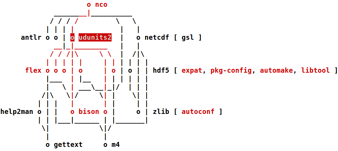
Software visualization, information visualization, command line interface![[Uncaptioned image]](/html/1908.07544/assets/figures/gt-dia-large.png)
ASCII depiction of the package dependency graph of dia (40 nodes), as specified in the Spack package management tool. The dependency cairo and its direct neighbors have been interactively highlighted. \vgtcinsertpkg
Introduction
Building and executing software can be a complicated and frustrating process due to complex requirements in terms of dependencies, their versions and install locations, and how they were compiled. Package management systems, such as Homebrew [22] for OSX systems and APT [41] for Ubuntu systems, have been developed to handle these complexities automatically for most users. Use of these package management systems can thus expand the usability of software by greatly decreasing the burden on users attempting to get software to run.
For users of a particular software application to benefit, someone must first package the software for the system. This is often done by the engineer or scientist who developed the application. Furthermore, the developers of the package management system itself expand and maintain functionality as build systems and architectures evolve. Additionally, power users with unique needs may want to specify additional requirements when building the software. In all of these scenarios, understanding the dependencies of a particular software package can be beneficial. While a list or tree of packages is sufficient for some tasks, sometimes consulting the full set of package relationships is of interest. Generally the relationships among a package and all of its direct and indirect dependencies form a directed acyclic graph (DAG). As these graphs generally are limited to tens of nodes and developers are particularly interested in the dependency paths, the graph is frequently represented as a node-link diagram.
Many package management systems are command line tools. We focus on one such open source tool, Spack [14, 13], which was developed to meet the needs of supercomputing applications. In this context, developers may only be able to access the supercomputer or other remote system via a terminal interface. The most expedient method of visualizing a small DAG often requires several extra steps in transferring the data to a local machine and running a separate program instead of the terminal in which the user was working. This step can represent a significant overhead in terms of the entire analysis needed. These difficulties with accessing plotted data from command line workflows have led to the creation of ASCII charting support in tools such as gnuplot [51] and Octave [12]. To better match the workflow of command line-focused users when viewing a DAG, we propose bringing interactive DAG visualization to the terminal. Our goal is to “meet command line users where they are” when possible.
We developed an interactive, terminal-based DAG visualization to support the analysis of package dependency graphs. The limitations of the terminal pose many challenges. To ensure portability, marks are limited to ASCII characters that cannot be overlaid. Available colors are limited as well. Relatively few marks can be shown simultaneously due to the row and column size of the terminal. With these limitations in mind, we convert a graphical layered graph layout to ASCII. Search and highlight capabilities are available via keyboard commands. We conducted a study comparing the efficacy of the command line workflow with our visualization to the workflows using the existing GraphViz-rendered dot [16, 15] layout and static ASCII representations. We find that despite the limitations of the ASCII visualization, it can be effective in a command line workflow and our study participants preferred it to the existing workflows.
In summary, our contributions are:
1 Related Work
Several graphical visualizations, such as SHriMP Views [43], ExTraVis [10], SolidSX [37], the layouts available through Roassal’s GRAPH feature [6], and the work of Noack and Lewerentz [31], have been proposed for software dependencies, but most focus on the software creation and maintenance aspect—how the dependencies relate to developing the software—rather than the packaging and building process. One difference is that software module dependencies frequently exhibit a containment structure not present in our package dependency data but emphasized by the existing visualizations. Another is that some visualizations make design decisions to accommodate scale or temporal behavior that our package dependency data does not exhibit. Kula et al. [26] developed a system to show changes in a software’s library dependencies over time, but did not directly show the relationship between the libraries, only with the target software. The visualization was for maintainers of the software, not people trying to install the software or develop installation management tools. For a survey of software dependency visualization, see Caserta and Zendra [8].
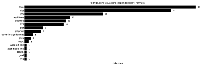
Dependency Visualization in Github Repositories. Many open source software tools offer some form of dependency visualization. We surveyed Github repositories retrieved in a search for “visualize dependencies” 111See appendix for methodology, charts describing all views, tools, and formats observed, and see supplemental materials for a complete list of projects surveyed. to determine what visualizations are available and which are commonly employed by open source developers. We analyzed a broad set of projects including many types of dependency visualizations in computing, not only those used by package managers. Some projects offer multiple visualization features. Of the projects with visualization features (224 total of 483 surveyed), 57.6% use some form of hierarchical layout node-link diagram. Other common representations were force-directed node-link diagrams (23.2%) and indented or node-link trees (15.2%). We also found a few instances of other visualizations showing tree structure (sunburst, treemap, flamegraph, CodeCity), as well as a Sankey diagram, an arc diagram, and a chord diagram. Force-directed layouts and chord diagrams do not capture the DAG structure of package dependency graphs. Trees are useful for some package manager tasks (2), but our work is motivated by supporting graph topology tasks (2.2) that are not well supported by the existing indented trees.
Of the projects in our Github survey, 48.2% use GraphViz in some form, with the most common usage (65.7%, or 31.7% of all projects with visualization features) being to output a dot format file with documentation suggesting rendering with GraphViz’s dot algorithm. The next most common tool was d3js, in use by 21.0% of the projects. ASCII indented trees were found in 9.8% of the projects. Aside from one ASCII graph tool (“ascii-graph”) described below and a single view based on git similar to the one described in 2.1, only the ASCII indented tree and the non-rendered graph description files (e.g., dot, graphML, GEXF) can be viewed from the command line without a separate application, but these do not explicitly show the topological graph features of interest.
Graph Drawing in ASCII. ASCII flow chart tools were initially created to aid print documentation of computer programs. In these depictions, nodes take the form of outlined boxes with labels inset. FlowCharter [18] broke programs into chunks of six to seven nodes at various levels of abstraction in creating flow charts. Knuth [24] printed each box in sequence vertically and routed orthogonal edges along the side.
There are many tools to assist manual creation of ASCII node-link diagrams for electronic documentation, such as Emacs Artist [1], ASCII Flow [20], and AsciiO [19], but fewer that do automatic layout. Graph::Easy [48], vijual [4], and ascii-graphs [38] are general tools for automatically producing static ASCII layouts with similar node styles to FlowCharter and the diagrams of Knuth. As one of our design goals is to represent the graph topology compactly, we did not want to use a boxed node style. Furthermore, of the three, only ascii-graphs offers a hierarchical layout that would match the character of our package dependency graphs.
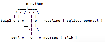
The software reverse engineering framework radare2 [2] can display code branching graphs and call graphs in ASCII. Similar to our approach, it is based on a layered graph algorithm and provides interactivity. It was the only other ASCII graph representation we found that did so. However, we determined the depictions and interactivity were not suitable for the character of our package dependency graphs or the tasks of interest on them. Fig. 1a shows the radare2 call graph of a program we wrote to mimic the dependency graph of python as packaged by Spack (Sec. 2). Fig. 1b shows our depiction of the same graph for comparison.
General image to ASCII converters [32, 29, 45] focus on emulating tone differences across an image and thus are a poor fit for node-link diagrams. Xu et al. [53] present an algorithm for converting vector line art to ASCII, but their method requires several minutes to generate an image, which is unacceptable in our workflow. Furthermore, none of the general ASCII conversion methods preserve the structural meaning of the elements, and thus would require a post-processing step to identify the vertices and edges to support interactivity.
In Table 1, we summarize the most suitable approaches and their support for desired features in representing package dependency graphs.
General Graphical Layout Approaches. Many layered layout algorithms [44] and orthogonal layout algorithms [46] use graphical marks. For a more in depth discussion of these algorithms, see Tamassia [47]. We select a layered layout for conversion to ASCII as described in Sec. 3, finding the structure matches both the tasks and expectations of our users. For example, layered layouts make clear the direction of dependencies by position. Flow direction is not a priority in many orthogonal layouts. The optimally compact grid layout of Yoghourdjian et al. [54] balances directional flow requirements with other orthogonal aesthetic criteria and typographical content constraints by using multiple directions for flow. We chose to not relax flow direction as they do in order to preserve user expectations (i.e., vertical dependency direction), as an evaluation of graph drawing aesthetic criteria for UML diagram comprehension [34] suggests domain semantics play an important role. Dwyer et al. [11] use grouping techniques to decrease edge clutter in directed graphs, making them more compact. However, these techniques use marks to denote group containment and we are constrained in the number of marks we can legibly fit in a terminal window when using ASCII.
| Feature | graphterm | dot | git log | ascii-graphs | radare |
| PDFs | graph | ||||
| displays in | Yes | No | Yes | Yes | Yes |
| terminal | |||||
| matches graph | Good | Good | Poor | Good | Poor |
| semantics | |||||
| compact | Good | N/A | Good | Fair | Fair |
| interactive | Yes | No | No | No | Yes |
2 The Spack Package Management System
We provide background on package management systems and in particular, Spack [14], the package management system used in this work. We describe the current visualization support in Spack. Finally, we perform a task analysis on package dependency graphs that leads to our visualization design.
Package management systems (or package managers) are software tools that aim to ease software installation and maintenance. The term package refers to a particular software application, its related digital artifacts, and the information necessary to automatically install, update, and configure it222The term package is also used in languages such as Java to describe class organization. We do not address that type of package in this work.. Such information includes the other software which must already be installed. We refer to these required software packages as the target package’s dependencies. When installing a package, the package management system will traverse the dependency information and install any dependencies required to build and run the target software.
A package’s dependencies may themselves have dependencies,

some of which may overlap with each other. Thus, the relations among a package and its dependencies form a directed acyclic graph (DAG). Fig. 2 shows a small example in which the target package directly depends on packages A and B. Packages A and B in turn both depend on package C. This is known as a diamond dependency. In the simple case, the package manager need only to ensure packages A, B, and C are installed before installing the target package. However, complications arise when packages A and B require different versions of package C.
Spack is a package management system designed to streamline the process of building software when multiple versions of dependencies may be needed. It is motivated by scientific software on supercomputers—shared systems where different users have different requirements not only in terms of software versions, but also in the compilers and build options used. Spack makes it easier to concurrently build and maintain packages that depend on different versions and build configurations of the same software.
Dependencies in Spack may be fulfilled by one of multiple other packages. For example, many supercomputing programs depend on the message passing interface (MPI) [36]. Several implementations of this interface exist. Spack may choose one or the user may specify which one Spack should build against. System-dependent options, such as MPI availability, along with updates to the package database require users to regenerate dependency graphs they wish to analyze to ensure up-to-date versions that reflects the state of their system.
Access to supercomputing resources is typically via shell, a command-line interface. Developing and testing on supercomputers is essential as supercomputers are the primary targets of large-scale scientific software. Thus, package creation, maintenance, debugging, and distribution is done entirely at the command line, as described by the Spack package creation tutorial 333http://spack.readthedocs.io/en/latest/packaging_guide.html.
2.1 Visualizing Dependencies in Spack
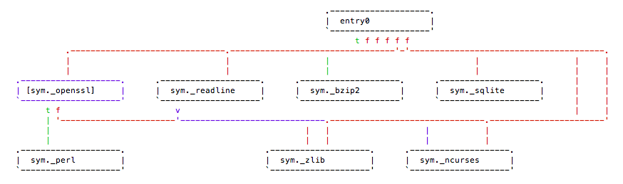
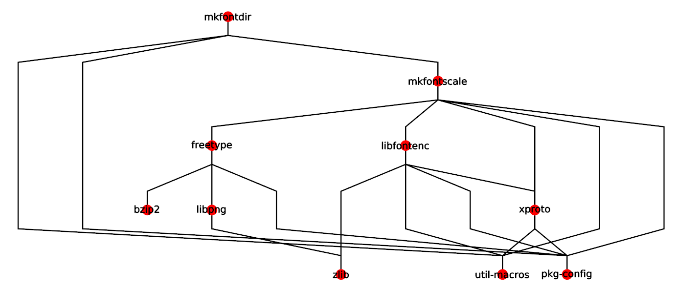
The Spack spec command shows dependencies of a package as an indented ASCII tree. When more information about the build, such as versions and compilers, are known, these are shown in the tree as well (Fig. 3). The tree view emphasizes what a package depends on (i.e., the package’s dependencies). In many situations this is satisfactory. However, some tasks (described in the next section) benefit from viewing the other direction—which packages are affected by a package (i.e. those packages which depend on the target packages). Sometimes an even a more general overview of the dependency structure is desired. In these cases, Spack augments the dependency tree by providing two utilities for inspecting dependency graphs: a dot format description of the graph and an ASCII representation based on the git log --graph command. We briefly describe the git log --graph command and the pre-existing Spack ASCII representation.
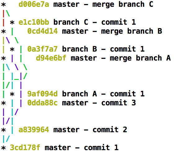
The git command git log --graph provides an ASCII representation of repository commits and their branching behavior. It places no more than one commit per row with the most recent commit (of the current branch) at the top. The sequential connections between two commits are shown using edges drawn using |, _, /, and . Fig. 4a shows an example. The left-most vertical line shows commits to the master (initial) branch. Three more branches are created and merged.
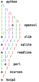
Spack’s graph command adapts the git log --graph algorithm [42] to show the package dependency graph. Unlike commits, package dependencies do not have a temporal order, so a topological sort is used instead. This places the package of interest on the first row with its direct dependencies on the following rows. Fig. 4b shows the Spack dependency graph of python drawn with this git-like approach.
The edge colors denote which dependency the edge leads to. This encoding helps users track an edge across several rows. The sixteen ANSI colors (the eight original and eight high intensity versions) are assigned to the packages in a round-robin fashion.
There are two major advantages to this git-like layout. First, the layout conserves columns, thus fitting in the 80 column limits preferred by some command line users. The conservative use of columns can also be a downside as the resulting graph is visually dense. Second, the git-like layout is an unambiguous representation: when one edge is routed into another, they both exit at the same terminus.
While this heavily vertical style matches well with the pure text git log command, the temporal nature of git commits, and the propensity for long chains in the resultant graph, it obscures the layered nature of dependency graphs. Furthermore, the git-like graphs require many rows, requiring users to scroll even for relatively small graphs. The Spack maintainers we collaborated with (see Sec. 2.2) wanted a more compact representation that used fewer rows.
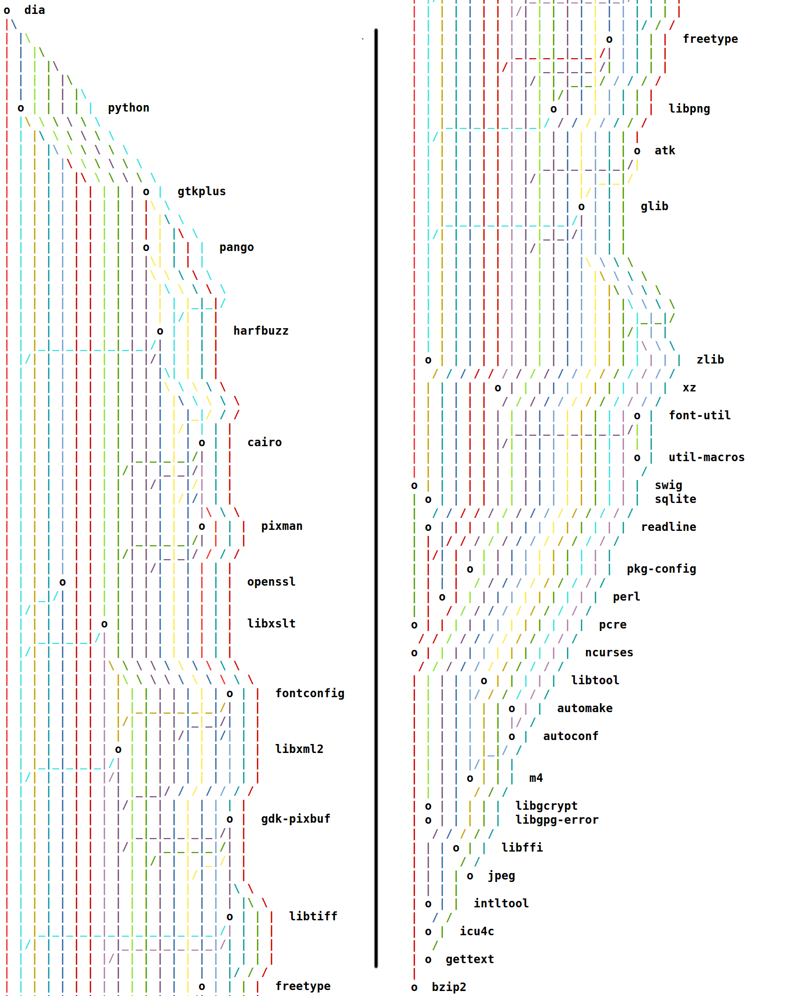
Fig. 5 shows the git-like dependency graph for dia, a package with 39 dependencies (also depicted using our approach in Fig .Preserving Command Line Workflow for a Package Management System using ASCII DAG Visualization). Visually tracking some edges can require several page-up operations. While the edge coloring can help users keep their place, as these are assigned before edge layout, sometimes the same or similar colors cross or appear side-by-side as with the two long red edges in Fig. 5.
2.2 Task Analysis and Abstraction
We seek to improve the dependency graph visualization for Spack. First, we consider how dependency graph visualizations are used. Through a series of interviews with two Spack maintainers (one via a video-conference, four text chats, and an informal in-person discussion, the other via an informal in-person discussion), we identified three user groups and their tasks with respect to dependency graphs. We focus specifically on graph-related tasks, as other tasks, such as simply viewing the set of package dependencies or viewing only what a particular package depends on (rather than what depends on it), are already well supported by Spack’s indented tree listing (Fig. 3).
Audience and Their Tasks. There are three classes of people who consult Spack dependency graphs: Spack power users, package developers, and Spack maintainers/contributors. We discuss their goals below and relate them to the task taxonomy for graphs of Lee et al. [27]. We summarize our classification in Sec. 2. This analysis was reviewed after development by the Spack maintainer we had the most contact with, who is among the authors of this paper.
| Graph Task | Spack Task | Spack Role |
| topology – | Determine packages affected by | users, |
| accessibility | a package | developers |
| Identify diamond dependency | maintainers | |
| browsing – | Find source(s) of a dependency | developers |
| follow path | ||
| overview | Assess trade-offs among options | users |
| Assess complexity to judge | maintainers | |
| performance | ||
| attribute-based | Identify dependency type or install | all |
| (all) | configuration |
Spack users may refer to a package dependency graph to understand relationships between the other packages their target software depends on and thus what optional constraints they may want to specify, such as a particular parallel runtime library. Knowing which other packages may be affected can be useful in their decision-making process. Consider a power user ‘Yulia’ trying to install a scientific package with which she has a passing familiarity. Yulia favors the parallel runtime implementation provided by GroupX because it has yielded performance improvements for her on a previous project. However, she understands other packages are known to perform better with the application suite of GroupY. She wants to examine the graph to assess the potential trade-offs in choosing particular implementations. Recognizing these situations requires identifying direct and indirect connections and gaining a sense of how all the connections work together, in other words, “topology – accessibility” tasks, “overview” tasks, and “attribute-based” tasks in Lee et al.’s taxonomy.
In addition to performing the power user’s tasks for debugging, package developers may examine dependency graphs to verify they have included all the necessary build information in their package. Unexpected dependencies in the graph may indicate an inadequate specification. Tracing a path from the dependency up to its sources, as motivated by a particular error message, can help resolve an error. Consider a package developer ‘Devon’ who is testing his package on a supercomputer accessible by many of his target users. He tries multiple possible configurations and is surprised by some of the ways in which Spack resolves the dependencies. Devon consults the dependency graph to understand why some configuration choices affect other packages in the graph. These tasks utilize both the identification of direct and indirect connections (task: topology – accessibility) as well as following a path (task: browsing – follow path).
Spack maintainers analyze package dependency graphs when debugging, adding features, or testing. Consider a Spack maintainer ‘Mabel’ who is investigating a report of the Spack system failing to build a package due to choices it made while resolving dependencies. Mabel wants to check that the dependencies truly exist and if they conflict with each other in a way Spack was unable to determine. She consults the dependency graph, looking in particular for diamond dependencies and other instances of multiple dependencies as these present difficulties to the dependency resolution algorithm. This is again a task about identifying connections (task: topology – accessibility).
In addition to investigating bugs, Mabel wants to evaluate the performance of the package management system. Should she notice a particular package takes a long time, she can look at the dependency graph to gain a sense of the complexity of any package installation (task: overview). Information about the version, compiler, and options selected for each package, as well as the type of dependency (e.g., required for build only, called by the target, or linked by the target) is also of interest (tasks: attribute-based (all)).
As all users perform topology-based tasks on dependency graphs, node-link diagrams are an appropriate choice to represent them. We note that indented trees may be more suitable for some Spack user scenarios where all packages depending on a particular choice need not be found and indirect connections need not be evaluated. These scenarios are already served by Spack’s indented tree feature, which also includes rich attribute information. The node-link diagram augments this functionality allowing the exploration of more complicated topology-based tasks.
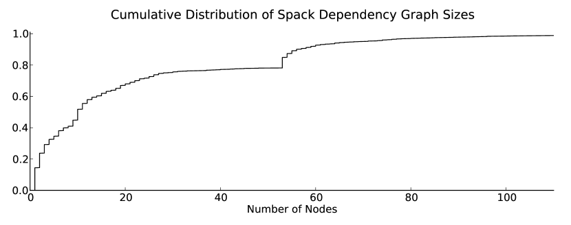
Data. There are over 2,100 packages in the Spack library as of June 2018. The majority of them have dependency graphs with fewer than 50 nodes. Fig. 6 shows the cumulative distribution of graph sizes by node count. Node-link diagrams are effective for representing graphs that are relatively small in size and emphasize topology-based tasks [17, 23] and thus we use them to represent package dependency graphs.
Workflow. Spack is a command line tool. Spack users install packages through the command line. Package developers use the Spack commands spack create and spack edit at the terminal to create and maintain their packages and then test them on their target supercomputers via remote login. Similarly Spack maintainers test and debug the system on the command line via the same interface. As one of the motivations for Spack was streamlining the build process on supercomputing systems, much of this command line access is to a remote, and often secure, system that may not have graphical applications such as a graphical web browser installed. Furthermore, users may have limited privileges and be restricted to command line access.
Typically, to view a graphical visualization, users must shift focus back to their local machine, copy the file from the supercomputer, and launch a local viewer. This adds several steps to the process and takes the user away the rest of their analysis. Utilities like rsync can streamline the file copy process when many packages need to be analyzed in a workflow session. While this may be the case for Spack maintainers, it is not so for users and package developers. In the case that graphical applications are available, the user may view them via X11 forwarding if they had the foresight to login with that option enabled. Depending on the system and their location, this option can induce significant lag. For example, we launched a PDF viewer with a graph through X11 forwarding on one of our users’ systems and incurred a penalty of greater than 10 seconds to launch the viewer and then on the order of 1 second for operations such as redrawing for panning, expanding a drop-down menu, and re-sizing.
During our interviews, the users expressed the desire for an ASCII-based visualization for use on the command line that was more ‘dot’-like than their current one (2.1). We discussed the possibilities of an interactive, browser-renderable tool, especially to support the multi-variate attribute-based tasks, but reception to that proposal was lukewarm. The users were more interested in a console-based tool that would help the majority of their smaller analysis tasks first. Given the command line workflow, the overhead of one-off copying of files, the barriers to using graphical tools, the small size of the graphs, and the need to support topological operations, we agreed that initial request of the users was viable and proceeded to design an improved visualization of package dependencies as ASCII node-link diagrams.
3 graphterm
To support the command-line workflow for Spack community members, we developed graphterm 444http://github.com/kisaacs/graphterm, a Python tool for interactive ASCII dependency graph visualization. graphterm adapts a layered graph layout that uses graphical marks to create a layout using ASCII characters. Unlike the git-like layout, graphterm bundles edges, resulting in ambiguity. Users can resolve the ambiguity via interactive highlighting. We describe the design and implementation of the layout of graphterm in Sec. 3.1. We then discuss the supported interactivity in Sec. 3.2.
3.1 graphterm Layout
From our discussions with Spack maintainers (Sec. 2.2) we concluded that the users conceptualize dependency graphs in a fashion similar to a layered graph layout [44]. One Spack maintainer specifically requested a “dot-like” layout in ASCII. Furthermore, we concluded that such a layout supports their tasks. Users can quickly determine the direction of dependencies by vertical order, unlike in an orthogonal layout which may be more adaptable to ASCII, but does not maintain a vertical or horizontal ordering of nodes.
The layout algorithm (Algorithm 1) starts by obtaining a graphical layered layout. Based on the mark placement and induced crossings therein, it generates a corresponding set of node and edge positions on a grid (Algorithm 2, Algorithm 3). Finally, ASCII characters from the set |, _, /, , o, X are placed to represent those nodes and edges (Algorithm 4). We then place node labels to fit (Algorithm 5).
Converting graphic layout to an ASCII grid. We considered several existing hierarchical and layered graph layouts to adapt to ASCII. The considered layouts included dot, dagre [33], and the hierarchical layouts included in Tulip [3] and OGDF [9]. We chose the Tulip hierarchical layout [3] as a basis because it is a straight-edge layout that uses mostly vertical and diagonal edges with a propensity to re-use vertical edges in our package dependency graphs. This resulted in less clutter in comparison to other layouts as well as marks that were easier to adapt to ASCII.
We run the Tulip hierarchical layout555The figures and study in this paper use the Tulip Python bindings. The version released on Github ports the layout into pure Python. The port differs in some of its sort orders and vertical spacings and thus can produce a slightly different ASCII layout. on the package dependency graph. From the graphical layout, we obtain initial positions for all nodes as well as line segment end points for all edges.
First, we determine sets of and positions of note in the layout—the positions of the nodes, the end points of the line segments, and the positions of the crossings. The layered nature of the layout induces a small set of values. In the Tulip hierarchical layout, dummy nodes are inserted into the graph at the pre-existing layers to aide in edge routing and within-layer node ordering. The location of the dummy nodes correspond to the non-node endpoints of the line segments that compose each edge. Combined with the true nodes, these induce a small set of values. We will ultimately convert these floating point and values to a discrete compact grid (Fig. 8), but first we must add values to the sets to account for edge crossings.
We compute the location of all line segment crossings in the graphical layout. In an early design, we split all segments at their crossings and added the crossing and positions to our sets. While this served to spread out dense sections of the graph, thereby making it possible to follow each edge, it also expanded the needed grid size unnecessarily. The afforded space for dense crossings also detracted from communicating the overall structure of the graph. Thus, in regions with a large number of crossings, we selectively re-route segments to share crossing points. We found a good heuristic was to re-route the incoming diagonal edges of (dummy) nodes.
Adjustments for edge re-use and bundling. Package dependency graphs often have a few nodes with either a high in-degree or a high out-degree. In our chosen layout, this results in several diagonal segments fanning in or out between two layers. Many of the edge crossings are caused by these structures. The large number of segments with slightly different angles is also difficult to represent with our limited set of glyphs (ASCII). In the absence of edge crossings, our choice of line drawing heuristic, described later in this section, results in re-use of horizontal segments created by underscores, similar to the re-use of vertical segments in the original graphical layout.
When we detect crossings between a diagonal segment and a vertical segment, rather than adding the crossing position to our and sets, we alter the crossing position to a set value based on the end (dummy) node of the segment. The altered position, calculated in lines 7-8 of Algorithm 2, uses the end node’s position to guarantee uniqueness in the presence of other such nodes with the same value, choosing a position (routed_y) between the node and the top of the segment (segment.y1). The procedure routes all diagonal segments to that (dummy) node through the same value, thus avoiding increasing our set of values for each crossing. In the case of crossings between two diagonal segments, if such a value has been set by a diagonal-vertical crossing, we use it. If two such values exist, we omit the crossing. Otherwise, we use the computed (true) crossing value.
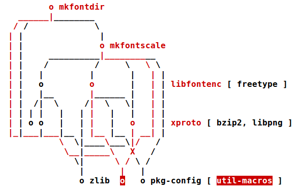
Fig. 7 shows our re-routing rules as applied to the dependencies of mkfontdir. Several edges from the left cross the vertical edge into zlib. Our algorithm re-routes them, resulting in horizontal edges at different heights to util-macros and pkg-config. However, the diagonal edges crossing directly below xproto are not re-routed. We found applying the re-routing to those edges resulted in dense and overly boxy graphs that resembled grids. Our policy was chosen to balance the compactness of the depiction with readability.
Gridding and Character Set. Having calculated the set of unique and values representing (dummy) nodes and crossings, we assign each value to a row or column of a grid. This grid will become our ASCII representation. Conceptually, we consider the upper left corner of each monospaced character cell to be a grid coordinate. We then chose ASCII characters to represent edges between them, deciding on the set |, _, /, , X , preferring the underscore to the dash because its end point is closer to the grid corner. As the crossings are at the grid corners, we do not use + which would be a crossing mid-cell.
A mark cannot be drawn at the corner of four character spaces, so we place the mark for a node (o) in the cell itself. Therefore, any value associated with at least one node is given two grid spaces. Fig. 8 demonstrates this assignment.
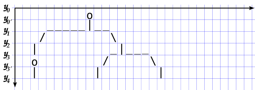
To keep the ASCII layout compact, rather than maintain the relative distances between positions, we assign the values in order in our grid coordinates subject to some expansion function. In our implementation, we use a multiplier to prevent the graph from becoming too dense, as shown in Algorithm 3. Therefore each value is assigned to successively numbered even columns. The values are assigned similarly with the added row for nodes described above.
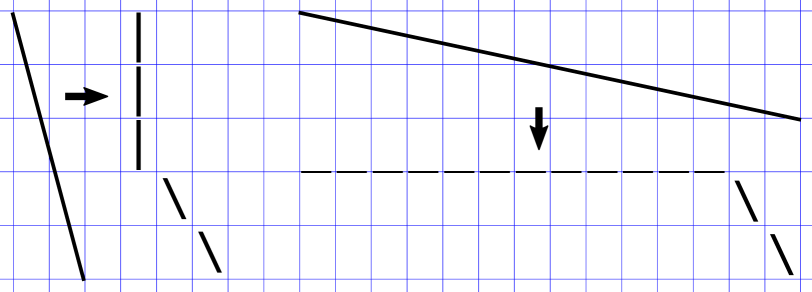
Edge Layout. Once the correspondence between graphical layout positions and grid points are set, we assign ASCII characters to the grid cells. Note that segments may span many grid points and thus many grid cells. We assign nodes (o) and purely vertical segments first. Vertical segments require only successive vertical bar (|) characters.
There are several options for drawing the non-vertical segments. We initially used the grid cells calculated by Bresenham’s line drawing algorithm [7], but this results in unnecessarily crooked “lines”, clutter, and cell collisions. Instead, we break each segment into (horizontal), / (diagonal), and (vertical) pieces summing to the effective displacement. Edges that traverse more horizontally have horizontal and diagonal pieces but no vertical pieces. Edges that traverse more vertically have diagonal and vertical pieces but no horizontal pieces. We draw either the excess horizontal (with underscores in the cell above) or vertical (with vertical bars) first, then the diagonal with slashes. Examples are shown in Fig. 9. The translation is described in Algorithm 4. This drawing scheme leads to straighter segments, which have been shown to support path finding [50]. It also tends to naturally overlap edges, effectively coalescing edge marks along main horizontal and vertical thoroughfares.
Assigning ASCII characters to connect the segments can result in collisions. Different segments may require a different ASCII character in the same grid cell. We appeal to the Gestalt principle of continuation to resolve these collisions. Using line breaks in edges at crossings in this manner has been previously shown to have little effect on readability [39]. We observed that giving precedence to slashes over vertical bars and vertical bars over underscores works to preserve segment continuity. When two opposing slashes conflict, we use an X character (as seen in Fig. 7b).
Labels. After the edges have been drawn in the grid, we place the labels. Ideally, the labels would be placed close to their node. However, we consider the sense of graph structure and the compactness of its representation higher priorities. If there is enough empty space to the left or the right of the node, we place the package name in that space. Preference is given to the right side to match the git-like depiction (Sec. 2.1) where all labels are on the right. Also, this allows the user to follow a link to a node (o) and then continue reading from left to right to see the label.
If there is not enough space for the package name, we place the label to the right of the entire graph. The right-most unlabeled node per row is drawn next to the graph. The rest are drawn in a bracketed list to the right of that label in the left-right order of the nodes. Brackets are used to distinguish this list from the other labels. The rightward placement is again in deference to the git-like layout. The procedure is outlined in Algorithm 5.
We considered balancing the extra labels on the left and right side, based on their position in the grid. However, this moved the structure of the graph further to the right which would require users to shift focus from the cursor which rests in the lower left corner.
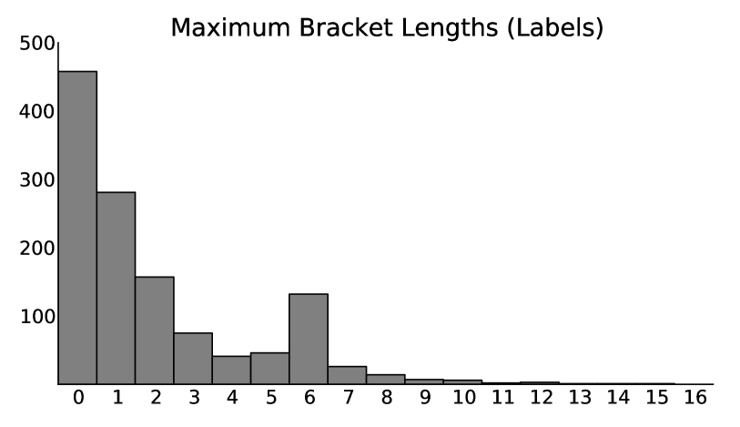
We remark the bracketed list is not ideal, but a trade-off made to emphasize graph topology. One problem is that long lists will be truncated by the edge of the terminal window and require panning. While one could construct a package with an arbitrarily long list of nodes on the same level, in practice we observed the length of the longest list grew with the number of nodes in the graph and most graphs had a maximum list of six or fewer labels (median: 1 label, average: 2 labels). Fig. 10 is a histogram of maximum bracket length across Spack packages.
3.2 graphterm Interactions
We design our interactions controls to match common command line programs. We do this exactly when possible or by metaphor when not. Searching and highlighting a specific node is done by typing the forward slash character followed by the name, as done in less. We expect users may search for a node when they are considering specifying a version or compiler and want to consider how that choice may affect packages depending on that node. Developers and maintainers may want to search for a node to verify its connections when debugging.
Users may traverse the nodes (via highlight) in grid order with the n and p keys, similar to jumping between found matching strings in less. These interactions support examining multiple nodes or gaining and understanding of the edge coalescing for graph overview tasks.
With the exception of the arrow keys, which are not available in all terminals, we did not find consensus for directional movement. Thus, we provide both arrow keys and the set {w, a, s, d} for panning should the graph not fit in the viewable area of the terminal. The latter set was chosen for its prevalence for inputting directional movement in video games. Searching for a node also automatically pans the graph to ensure the node is on screen. Zooming is possible on some terminals by changing the font size.
In addition to helping users disambiguate bundled edges and associate nodes with labels, we expect the automatic highlighting of connected edges and neighbors to a node (as in Fig. Preserving Command Line Workflow for a Package Management System using ASCII DAG Visualization, Fig. 7b, Fig. 11a) to help with connectivity and accessibility tasks like those described in Sec. 2.2. Highlighting has been shown to aid users in these visual graph queries [49]. Users may toggle the highlighting to highlight all nodes with a path to or from the highlighted node instead, along with the edges in those paths (Fig. 11b).
In interactive mode, graphterm exploits the entirety of the terminal window via the terminal-independent ncurses text interface library. Upon quitting interactive mode, the graph is printed to the terminal in the state it was last shown, with the exception that all rows are printed rather than only what would fit in the terminal’s display.
4 Study
Our goal in designing graphterm is to provide dependency graph visualization in the context in which people need to analyze them, at the command line, so as to benefit their workflow. In our discussions, Spack maintainers also expressed a strong preference for a visualization that could be used at a terminal. However, as discussed in Sec. 2.1 and Sec. 3, the ASCII representations have limitations not present in the graphical space. We conduct a study to observe the efficiency trade-offs between the visualizations as well as user preferences when visualizing dependency graphs during a command-line workflow.
Sensalire et al. [40] proposed a taxonomy of software visualizatin tool evaluations. The taxonomy consists of ten dimensions (S1–S10): (S1) tool selection, (S2) participant, (S3) tool exposure, (S4) task selection, (S5) experiment duration, (S6) experiment location, (S7) experiment input, (S8) participant motivation, (S9) participant relation to tool designers, and (S10) analysis of results. We note the relation of our design to thise taxonomy throughout.
We design a within-subjects study comparing the graphterm, git-like, and GraphViz dependency graph visualizations. We hypothesized:
-
H1.
Participants who use command line interfaces will prefer ASCII representations.
-
H2.
Participants who use command line interfaces will perform tasks more quickly using ASCII representations when working at the command line.
-
H3.
There will be no significant difference in accuracy among the visualizations, but participants will be more confident in their answers when using GraphViz.
Tool Selection (S1). We chose GraphViz for comparison because it is widely used, can generate image files from the command line, and is already suggested by Spack. In addition to the git-like ASCII graphs, Spack can output a graph in dot file format. The Spack documentation suggests its use with GraphViz to generate a PDF file.
Koschke [25] surveyed software engineers and found their most commonly used graph layout program was dot. Our survey of Github repositories (Sec. 1) showed the most common approach for generating a visualization of dependencies was outputting a dot format file for rendering with GraphViz. We conclude from these findings that Spack’s use of dot and GraphViz is in-line with current practices and therefore it is appropriate to compare this GraphViz-based workflow to the ASCII visualization workflows. For our study, we preserved the command line suggested by Spack, which was similar to those suggested by many of the Github projects.
Spack’s suggestion of rendering dot to PDF (rather than to PNG) was also kept because PDF readers have built-in functionality for searching and highlighting text, such as the label of a node in the graph, which while not required by the tasks, could be used to help locate nodes specified by the questions.
We kept all of the graph style attributes written into the dot file by Spack. We removed the hash ID from the node labels however as these might confuse participants unfamiliar with Spack.
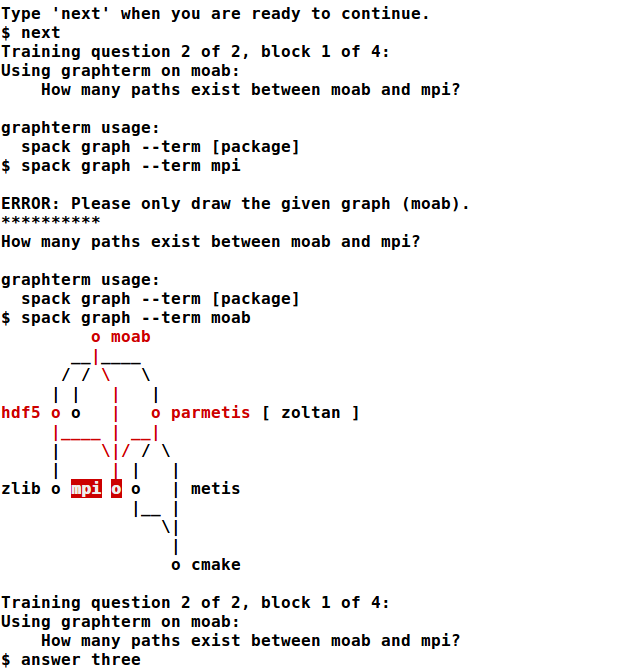
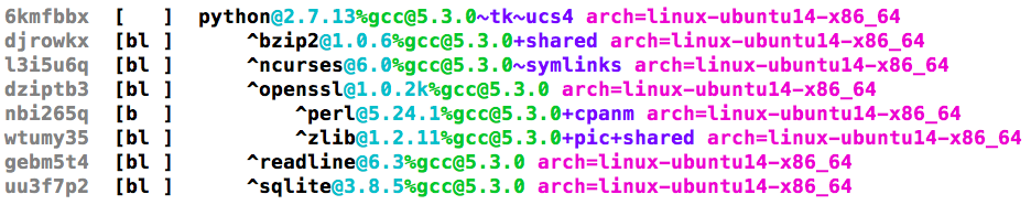
As we want to investigate the utility of the package dependency graph visualizations for the workflow of people using the command line, it was essential that the study be conducted at a command line interface. Our study software displays instructions, tutorials, and questions on the terminal and accepts answers via terminal commands. Fig. 12 shows the interface. Participants were allowed to use the command line as they wished, with the exception that our software prevented them from visualizing the wrong graph or using a disallowed method (e.g. using graphterm during the GraphViz block). This limitation applied only to the spack graph command—participants could render dot files to PNG or look at the raw text format if they chose to do so. Similarly, as we wanted to better emulate real-world Spack workflow, we used Spack to generate the graphs rather than relying on pre-generated graphs.
To measure the efficacy of the workflow, we chose to measure response time in terms of the entirety of the workflow—from question to response, this allowed the user to perform other operations as they wished, as they would be able to in a real setting.
Study Design. Our study is divided into four blocks, one for each visualization workflow (‘tool blocks’) and an additional final block where participants could use the visualization of their choice. The three tool blocks contained five questions each while the user-preference block contained three questions. General command lines (“usage”) were given with each question. In the user-preference block, the questions were prefaced with the phrase ‘Using any method’ and command lines for all three methods were displayed.
The order of the tool blocks and the question order within them was randomized. A brief tutorial describing package dependency graphs was displayed at the beginning of the study. Before each tool block, an explanation of the particular visualization scheme was given, two interactive sample questions with answers were presented, and participants were encouraged to experiment with the tools and given a list of package names with which to do so. At the end of the study, the software asked the participants the open-ended questions:
-
•
“Which graph type do you prefer and why?”
-
•
“What features made the graphs hard or easy to understand?”
The final question solicited any additional comments. Participants required between 45 and 65 minutes of active time to complete the experiment (S5: Experiment Duration).
Task Selection (S4). Participants were asked two types of questions based on the tasks determined in 2: direct connectivity and path counting. The direct connectivity questions ask which packages depend on a given package in the graph (affected by connectivity). This operation occurs when a user is determining which compiler or version to set for a package and how that may affect the packages that depend on it. The path counting questions ask how many paths exist between two nodes of a given graph. This operation can be helpful for debugging or developing new features for the package management system as maintainers try to understand why the system resolved dependencies in a particular way. All questions were open-response to better match real world workflow. We decided against multiple choice questions as we were concerned they would enable process of elimination and guessing.
Experiment Input (S7). We used different graphs for all four blocks to avoid memory effects. To balance the difficulty across the three tool blocks, we chose graphs with similar vertex counts, edge counts, layers, and nodes per layer. Table 3 summarizes the chosen graphs for the tool blocks as well as the preference block666See appendix for further descriptions of the graphs and questions.. The type of question used for each is also listed. Note for the largest graph size, we asked both types of question for the same graph due to the limited selection at that size. To further balance difficulty, we created questions targeting similar layers in each graph with similar answers in terms of numbers of nodes or paths. We chose several graphs per block to test a variety of graphs without incurring tedium and fatigue, which was reported by participants during piloting. All graphs were generated with the --normalize option in Spack to ensure the same structure across different systems.
Experiment Location (S6). To reach a wide audience of participants, we provided both in-person and online options for accessing the study. There were three online options: (1) loading files on a system on which many Spack users have shell access, (2) running the study within a provided virtual machine, or (3) running the study in a Docker [30] container. The in-person and virtual machine versions had default terminal configurations that were screen height, had black backgrounds, and had all other settings left with the system default (e.g, font sizes). We did not do any special configuration on the visualization programs or any PDF or image viewer. Participants were free to alter configurations such as window size and zoom level at any time, including during the training phase.
| Block(s) | # Nodes | # Edges | Question Type |
| Tool | 11 | 22 | Paths |
| Tool | 17-18 | 26-27 | Dependencies |
| Tool | 22 | 45 | Paths |
| Tool | 33-34 | 60-62 | Paths, Dependencies |
| Preference | 19 | 27 | Paths |
| Preference | 31 | 62 | Dependencies |
| Preference | 40 | 79 | Paths |
We verified the time each visualization required was approximately equal between graphs. We measured the time to produce a layout for each experimental object (in random order) seven times on the machine used for the in-person sessions. We chose to compare median time as we observed the distribution of the seven timings was usually either a few milliseconds different or an entire second different. The GraphViz time included the time to render to PDF, but not to open the PDF as we allowed participants to use any viewer they chose. The graphterm time was measured using printing to stdout instead of interactive mode. All experimental objects of approximately the same node count took the same time (in rounded milliseconds) with the exception of the 40 node Preference block graph and the 33-34 node Tool block graph where GraphViz took 1 second longer (three trials took the same time as the other visualizations, four took one second longer).
The version of graphterm used in the study relied on the Tulip Python bindings. The self-contained version currently on Github ports the subset of the Tulip hierarchical layout used by graphterm. This Python-only version is significantly faster both because of the reduced algorithm and not having to connect to the Tulip interface. Our measurements were done using the study version.
Participants (S2, S8, S9) and Tool Exposure (S3). We recruited participants from both the Spack community (including maintainers, package developers, and users) and our organizations’ computing departments. Nineteen people completed the study. We asked participants about their command line usage during the initial questions of our study. Of them, we discarded any results where the participant could not answer the majority of questions in any of the three tool blocks correctly (two participants), where the participant indicated they never use the command line (one participant), or where the participant indicated they did not understand what a path was after training (one participant). This left us with 15 responses (ten men and five women; eight between 18-25 years of age and seven between 26-45 years of age). Six people participated remotely and nine in person. Three of the participants (S1, S2, S3) were Spack users. S1 was also a Spack contributor. S2 indicated they had written small Spack packages.
None of the participants were involved in the analysis or development presented in this paper. None had seen or used graphterm before. Of the 15 participants, 7 had used GraphViz before and 14 had used git. Both groups included all the Spack users. We did not ask whether the participants were familiar with the git log graph command or what their motivation for participating was.
5 Results and Analysis

We analyze the data collected during our study. As the goal of our study was to assess efficiency and preference (S10: Analysis of Results) in comparison to existing approaches, we assess response time, accuracy, and confidence across the three visualizations using a linear mixed effects model. We then examine the preferences of our participants as expressed directly and through tasks. We identify and review common themes communicated by the participants about the visualizations. Finally, we discuss our conclusions based on these results as well as limitations of the study.
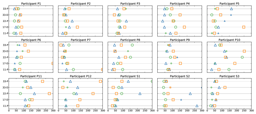
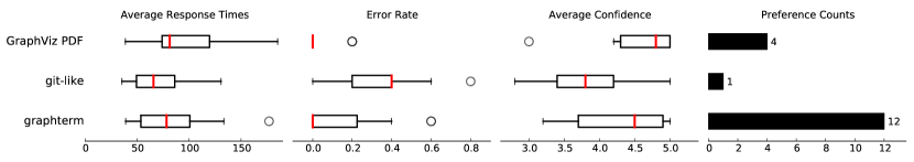
Fig. 13 shows the measured response time and correctness for the tool block responses of each participant, organized by the graph size and question type. Fig. 14 summarizes the spread of average participant response time, error rate, and confidence scores and shows preferences reported by participants.
We measured response time from when the question was shown through when the answer was entered. Based on our pilot, we omitted any single question time longer than five minutes (shown clamped at 300 seconds in Fig. 13). This is generally an indication the participant took a break from the study. In total, we removed four question responses all from different users: two using GraphViz PDFs, one using the git-like visualization, and one using graphterm. In one response, the participant indicated they had left and returned, so we updated the time recording as noted. In scoring the answers, we accepted package names with typos (e.g., ‘xrpoto’ instead of ‘xproto’) as all instances were unambiguous with respect to other names in the graph.
To account for within-subjects variance and missing trials, we built a linear mixed effects model, previously used in the visualization community by Liu and Heer [28]. We model the visualization used and whether the sample was collected in-person or remotely as fixed effects. We model the size of the graph in question (node count) as a random intercept term. As we expect different reactions to the visualization by participant, we model participant as a random slope term modulated by the visualization used. We assess significance with a likelihood-ratio test [52] using a reduced model without the visualization term. Post-hoc analysis on significant findings is performed using Tukey’s all-pairs comparisons with a Bonferroni-Holm correction. For these analyses, we use the R [35] lme4 [5] package for the model and the multcomp [21] package for post-hoc analysis of significant findings.
ASCII Visualizations Resulted in Decreased Response Times. We found a weak effect for visualization method on task completion time, , , with summary coefficients of -26.89 seconds for the git-like visualization workflow and -12.59 seconds for the graphterm workflow, indicating tasks were completed more quickly in the ASCII visualization workflows. Post-hoc analysis showed significance in the difference between the git-like visualization and GraphViz PDF visualization (). This finding partially supports H2, that participants would perform tasks more quickly with ASCII-based workflows when working at the command line.
Analyzing the response logs, we noted Participant S2 wrote detailed comments with their answers in the graphterm block, increasing the time recorded for response in that block. Also, some participants realized that as one graph was the subject of two questions, they need not re-create the GraphViz PDF. They simply re-opened it which resulted in a savings of Spack dependency resolution time, graph rendering time, and possible memory effects.
ASCII Visualizations Resulted in More Errors. We found a significant effect for visualization method on incorrect responses , with summary coefficients of -0.206 for the git-like visualization workflow and -0.094 for the graphterm workflow, indicating more errors occurred for the ASCII-based workflows. Correctness was recorded as a binary value with 1 for correct and 0 for incorrect. Post-hoc analysis showed a significant difference in errors between the git-like method and the GraphViz PDF method (). This finding is contrary to the first part of H3, that there would not be a significant difference in accuracy among the workflows.
We analyzed the response logs for trends and explanations. Participant P5 and P6’s answers in both ASCII visualizations suggest they did not understand the implied edge direction by orientation. Participants P5 and P6 made six of the total ten errors in the graphterm worfklow and four of the 23 total errors in the git-like workflow. Participant P7 was randomly shown several path counting questions in a row during the graphterm block. The dependency questions afterward were answered with the (correct) number of dependencies rather than the names and thus were marked incorrect. Participant P10 made similar mistakes in the git-like block. These mistakes represented two of the ten errors made with graphterm workflow and two of the 23 errors made with the git-like workflow. In contrast, only three errors were made using the GraphViz PDF workflow.
ASCII Visualizations Resulted in Lower Response Confidence. We also found a significant effect for visualization method on response confidence , with summary coefficients of -0.607 for the git-like visualization workflow and -0.283 for the graphterm workflow, indicating participants were less confident in their answers using ASCII visualizations. Participants were asked to rate their confidence on a scale of 1 to 5 after each question. Post-hoc analysis showed a significant difference between the git-like visualization workflow and the GraphViz PDF workflow (). This finding supports the second part of H3, that participants would be more confident when using the GraphViz PDFs.
graphterm Was Preferred By Participants. During the preference block, eleven of the fifteen participants used graphterm most frequently, with nine using only graphterm, including all participants with Spack experience (S1, S2, S3). Two used the GraphViz PDFs exclusively, one used the git-like and GraphViz PDFs equally, and one accessed graphs in a way our system was unable to record (this participant reported preferring graphterm).
When asked directly at the end of the study, eleven of the fifteen participants indicated that they preferred graphterm to the other two visualizations, again including all participants with Spack experience. Participant S3 wrote “after using the --term option, I doubt I will ever use any other graph format except when printing it out: for printing, --dot is better.” Of the other four participants, one indicated they liked both graphterm and GraphViz PDFs, another liked both the git-like visualization and GraphViz PDFs, and two preferred only the GraphViz PDFs. One of the participants who preferred the GraphViz PDFs issued the caveat “if I had more practice with the term graphs, I feel as if that would be more efficient and clear.”
The results of the preference block and the preference question partially support H1, that participants would prefer the ASCII representations. While participants showed preferences for graphterm, preference towards the git-like representation was minimal.
Several participants answered questions in the preference block correctly, even when they had shown less accuracy with the chosen drawing method in its initial block (S2, P7, P9). While P7 can be attributed to misreading the earlier questions, the increased accuracy for S2 and P9 may indicate learning over the course of the study.
5.1 Themes in Participant Responses
We discuss common themes found in comments made by the participants, both in response to the open-ended questions at the end of the study and any comments typed during the study in their answers.
Use of Space. Participant S2 stated an important factor was the “use of screen space both vertically and horizontally,” noting there is more horizontal screen space to spare. Participant P7 preferred graphterm for its “good use of horizontal spacing.” Participant P2 thought the aspect ratio of the git-like visualization was detrimental.
The rank-based nature of all the layouts was considered useful by Participant S1, who noted “The top-to-bottom direction also really simplifies things, in all the graphs.”
Scrolling. Many participants said scrolling was detrimental. This was most prevalent for the GraphViz PDF visualization (S1, S2, P2, P4, P5, P11), but also for the git-like visualization (S1, P4). Participant S1 remarked “its tedious to find nodes and move around the pdf.”
Ambiguity. Several participants expressed some difficulty with the ambiguity of edge connectivity in the graphterm layout (S1, S2, P8), but said the highlighting helped (S1, S2). Some participants noted that understanding edge connectivity was also tricky in the GraphViz PDF (S1, S2, S3, P4) due to crossings, but Participant P11 indicated that it was easier as no edges branched like they do in both the git-like visualization and graphterm. While Participant P6 preferred graphterm and GraphViz PDF to the git-like visualization, they stated none of the tools were easy to understand.
git-like visualization. Several participants indicated the edge coloring helped them trace paths in the git-like visualization (S1, S2, P2, P4, P5), but two experienced difficulty discerning some of the colors (P8, P11). The density of the git-like visualization was considered a negative (S2, P2, P5, P11). Participant S2 wrote “my initial reaction to the large git graphs was a viscrecal [sic] - I do not want to look at this at all.”
GraphViz PDFs. Two of the participants who preferred the GraphViz PDFs (P3, P5) said that the arrowheads clarified what the dependencies were. Participant P3 also said the direct labeling of nodes was helpful. Though participant P11 preferred graphterm, they also remarked they liked the arrows in the GraphViz PDFs.
Three participants expressed distaste for using a PDF reader (S1, S2, P9). Participant S2 wrote that “having to load pdfs is annoying.” While some participants during piloting reported using their PDF reader’s text search to locate a node, this was not reported during our full study. Instead, participants described having difficulty finding a node in the GraphViz layout (S1, S3, P10). Some participants suggested modifying the default GraphViz PDF rendering to have bigger fonts (P8) and shorter edges (S2, P11).
graphterm. Many participants cited the interactive highlighting of graphterm as a key feature (S1, S2, P2, P6, P7, P8, P9, P11, P12). Two participants (S1, P11) suggested enhancing the highlighting modes to color differently for direction or extend by neighborhood.
As expected, the distance between the node and the label was found confusing by participants (S2, P11). Participant P11 wrote “The fact that multiple node names on the same line get grouped together is annoying.”
Some participants indicated the use of the terminal as another reason for their preference (S1, S3, P9). Participant P9 wrote that graphterm “was just RIGHT there, straightforward to use especially when you just want to use the command line the whole time.” Participant S3 disliked that GraphViz “is not terminal based” and liked graphterm’s “keyboard based navigation.”
5.2 Discussion
Based on our quantitative measures, we observe that the workflow using the git-like ASCII visualization leads to faster response times from the command line than workflow using the GraphViz PDFs, but at a cost to accuracy and confidence. While not statistically significant, the workflow with graphterm seems to fall between the two existing Spack dependency graph visualizations on these three measures, from which we infer the graphterm workflow is a viable alternative to the existing Spack graph offerings.
Accuracy is a significant concern when making build decisions. We note none of the three options were strictly error-free. While the GraphViz workflow resulted in three errors total and the graphterm workflow ten, two of the graphterm errors can be attributed to misread questions and six to insufficient training (see Sec. 5.3 below), indicating the error rate in practice may be comparable.
The GraphViz rendered visualizations can directly label the nodes unlike graphterm and are less ambiguous. Yet, the workflow with the graphterm visualization was more preferred. Based on the comments by participants, we believe that the major factors leading to this preference were the terminal-based nature and the interactivity. We interpret the preference for the terminal (when already working at the terminal) to indicate participants are willing to accept a sub-optimal visualization that is convenient to their workflow. However, as the workflow with the git-like graphs were not preferred, this trade-off between visualization and workflow is not absolute. A graphical solution with more customized interactivity may be preferable to all three presented options. When we suggested such a solution to users during our task analysis (Sec. 2.2), they indicated having something at the command line was of greater interest. The preference results are in line with the initial assessment of the domain experts.
Some of the issues participants noted in the GraphViz PDFs could be addressed by having Spack change the graph layout style attributes it writes into the dot file, such as the font size and edge length changes proposed by the participants. Both of these parameters were already explicitly written by Spack.
5.3 Limitations
Our findings are limited by the study design as described below.
Task Design and Study Length. We designed our study questions to test basic graph tasks derived from our task analysis (Sec. 2.2) rather than the more complicated task a real user may have. The more complicated tasks often rely on familiarity with software, its options (e.g., available parallel runtime implementations), and personal taste of the user (e.g., favored compiler). Some, like debugging Spack itself, require knowledge of the Spack codebase. We expect the more complicated tasks will involve several basic graph tasks per dependency graph. The cost of obtaining a graphical representation may be amortized over this process. Alternatively, the barriers to interacting with such a representation, e.g. switching between the terminal and another program, may compound.
Furthermore, while our goal was to examine usage coming from a command line workflow, the repeated visualization of different graphs in sequence likely does not match the workflow of Spack users, who probably visualize graphs more infrequently. Another study which spaces out visualization with other command line tasks may better emulate reality, but would increase the length of the study.
Study length was likely a factor in our ability to recruit Spack users as participants, though it was half the maximum time of two hours suggested by Sensalire et al. [40] when recruiting professionals. A follow-up study could bypass the graph layout time by pre-computing the graphs as these operations were equal across all layouts, at the cost of realism in the presented workflow.
Effect of Study Setup on Response Time. Participants either performed the study on a local machine (11 participants) or were warned ahead of time about viewing multiple GraphViz-rendered files such that they might want to access the study with X11 forwarding enabled (four participants). Participants did not experience the scenario where a separate login operation or file copy was required to view a PDF or image file. Avoiding these scenarios by either working locally or being informed ahead of time may have resulted in quicker task response time when using the GraphViz PDFs.
We used GraphViz in our comparison as it is one of the existing options supported and suggested by Spack, it is widely used in the systems and software space, and visualizations can be generated from the command line in relatively few steps and without users having to learn new technology. We used the dot specification as provided by Spack. A customized graphical visualization or more style specification in the dot file may lead to better performance. Reminding participants that text search is a common feature in PDFs may have helped participants who stated they had difficulty finding nodes. Fully integrating the file copy and graphical viewer launch may also lead to better performance of GraphViz, but would require assumptions that limit portability of Spack or place a per-machine configuration burden on the user. This would increase the cost of the whole of the workflow, especially for users who consult the graphs infrequently and would not be amortizing the setup cost.
Effect of Study Setup on Error Rate. The majority of the errors in the graphterm workflow and several in the git-like depiction workflow came from participants P5 and P6. The responses were indicative of not understanding that edge directionality was implied by vertical positioning, despite being explained in the training phase of both ASCII workflows. Participants S2 and P9 who made errors during the graphterm block did not make the same errors using the graphterm workflow in the preference block, which may indicate improvement over the course of the study. These observations may indicate the training was insufficient, leading to increased errors for the ASCII workflows.
Effect of Free Response Questions. We chose free response questions over multiple choice to better match a realistic scenario and to avoid guess-and-check behavior. This allowed participants to answer questions other than what was posed (e.g., answering the number of packages instead of their names), increasing the error rate for the ASCII workflows. It also lead to increased response times for participant S2 during the graphterm block as this participant wrote comments with their answers.
6 Conclusion and Future Work
We have described and validated a visual solution for analyzing Spack package dependency graphs for command-line workflows. The solution combines ASCII characters with terminal interactivity to provide DAG visualization that supports topology-centric graph tasks identified in our task analysis and abstraction (subsection 2.2). Our DAG visualization software, graphterm, provides a terminal-friendly compact depiction by adapting an existing graphical layout algorithm. These adaptations include selectively re-routing and bundling edges and choice of ASCII marks. The interactivity leverages idioms from widely-used command line tools.
We designed a user study to compare the analysis workflow using graphterm to the workflows using the two existing package dependency visualizations for two of our identified tasks. The study emulated the setting in which Spack users work: the command line interface. Participants in our study preferred the graphterm workflow to the existing approaches. Based on the responses to this study, we conclude that though ASCII-based visualization requires trade-offs not present in the graphical space, it can be a more preferable visualization solution from the perspective of the entire workflow. We hope this demonstration leads to more consideration of making these stark trade-offs to support the analysis of users where they are (in our case, the terminal) and note there is a lot of opportunity for interactive tools in this space.
Having shown the viability of visualizing small graphs in ASCII, we intend to further improve the layered ASCII graph layout algorithm in the future. We focused on bundling and re-routing diagonal edges for clarity and to make the graph less tall. We would like to further explore the affect of the bundling on readability, possibly also considering bundling and re-routing vertical edges to make the graph less wide. Additionally, we plan to explore shifting nodes so there are fewer per line, considering unique marks for the nodes, or adding tooltip-like support to address issues with node labeling.
graphterm was designed with an emphasis on graph topology tasks that we identified as common across the users of package dependency graphs. However, we also identified an interest in graph attribute data among Spack developers. While some of this information is available through the indented trees, no attempt has been made to address this in the existing graph features. We plan to address the multivariate design issues in the ASCII space. We will also experiment with adding interactivity to other Spack analysis commands or implementing support for multiple coordinate views to further support these tasks.
7 Acknowledgements
The authors thank the Spack community, study participants, and reviewers for their time and aid in this research. This work was performed under the auspices of the U.S. Department of Energy by Lawrence Livermore National Laboratory under Contract DE-AC52-07NA27344. LLNL-JRNL-746358.
References
- [1] T. Abrahamsson. Emacs Artist. http://www.lysator.liu.se/t̃ab/artist/, Accessed 2017-03, Updated 2014-03.
- [2] S. Alvarez. radare2. http://github.com/radare, Accessed 2017-03.
- [3] D. Auber. Tulip - a huge graph visualization framework. In M. Junger and P. Mutzel, eds., Graph Drawing Software, pp. 105–126. 2004.
- [4] C. Barski. vijual. http://lisperati.com/vijual/, Accessed 2017-06, Last Updated 2010-01.
- [5] D. Bates, M. Mächler, B. Bolker, and S. Walker. lme4: Linear mixed-effects models using Eigen and S4. arXiv:1406.5823, 2014.
- [6] A. Bergel, S. Maass, S. Ducasse, and T. Girba. A domain-specific language for visualization software dependencies as a graph. In IEEE Working Conference on Software Visualization, pp. 45–49, 2014. doi: 10 . 1109/VISSOFT . 2014 . 17
- [7] J. E. Bresenham. Algorithm for computer control of a digital plotter. IBM Systems Journal, 4(1):25–30, 1965. doi: 10 . 1147/sj . 41 . 0025
- [8] P. Caserta and O. Zendra. Visualization of the static aspects of software: A survey. IEEE Transactions on Visualization and Computer Grahpics, 17(7):913–933, 2011. doi: 10 . 1109/TVCG . 2010 . 110
- [9] M. Chimani, C. Gutwenger, M. Jünger, G. W. Klau, K. Klein, and P. Mutzel. The Open Graph Drawing Framework (OGDF), pp. 543–569. CRC Press, 2014.
- [10] B. Cornelissen, D. Holten, A. Zaidman, L. Moonen, J. J. van Wijk, and A. van Deursen. Understanding execution traces using massive sequence and circular bundle views. In Proceedings of the IEEE International Conference on Program Comprehension, pp. 49–58, 2007. doi: 10 . 1109/ICPC . 2007 . 39
- [11] T. Dwyer, N. Henry Riche, K. Marriott, and C. Mears. Edge compression techniques for visualization of dense directed graphs. IEEE Transactions on Visualization and Computer Graphics, 19(12):961–968, 2013. doi: 10 . 1109/TVCG . 2013 . 151
- [12] J. W. E. Eaton, D. Bateman, S. Hauberg, and R. Wehbring. GNU Octave version 3.8.1 manual: a high-level interactive language for numerical computations. CreateSpace Independent Publishing Platform, 2014. ISBN 1441413006.
- [13] T. Gamblin. Spack. https://github.com/LLNL/spack, Accessed 2017-03.
- [14] T. Gamblin, M. P. LeGendre, M. R. Collette, G. L. Lee, A. Moody, B. R. de Supinski, and W. S. Futral. The Spack package manager: Bringing order to HPC software chaos. In SC15: International Conference for High Performance Computing, Networking, Storage and Analysis, pp. 1–12, Nov. 2015. doi: 10 . 1145/2807591 . 2807623
- [15] E. R. Gansner, E. Koutsofios, S. C. North, and K.-P. Vo. A technique for drawing directed graphs. IEEE Transactions on Software Engineering, 19(3):214–230, 1993. doi: 10 . 1109/32 . 221135
- [16] E. R. Gansner and S. C. North. An open graph visualization system and its applications to software engineering. Software – Practice and Experience, 30(11):1203–1233, 2000.
- [17] M. Ghoniem, J.-D. Fekete, and P. Castagliola. A comparison of the readability of graphs using node-link and matrix-based representations. In Proceedings of the IEEE Symposium on Information Visualization, pp. 17–24, 2004. doi: 10 . 1109/INFVIS . 2004 . 1
- [18] L. M. Haibt. A program to draw multilevel flow charts. In Proceedings of the Western Joint Computer Conference, IRE-AIEE-ACM ’59 (Western), pp. 131–137. ACM, 1959. doi: 10 . 1145/1457838 . 1457861
- [19] K. N. I. Hamouda. AsciiO. http://search.cpan.org/dist/App-Asciio/lib/App/Asciio.pm, Accessed 2017-03.
- [20] L. Hemens. ASCIIFlow. http://www.asciiflow.com, Accessed 2017-03.
- [21] T. Hothorn, F. Bretz, and P. Westfall. Simultaneous inference in general parametric models. Biometrical Journal, 50(3):346–363, 2008. doi: 10 . 1002/bimj . 200810425
- [22] M. Howell. Homebrew, the missing package manager for OS X. http://brew.sh, Accessed November 2017.
- [23] R. Keller, C. M. Eckert, and P. J. Clarkson. Matrices or node-link diagrams: which visual representation is better for visualizing connectivity models? Information Visualization, 5(1):62–76, 2006. doi: 10 . 1057/palgrave . ivs . 9500116
- [24] D. E. Knuth. Computer-drawn flowcharts. Communications of the ACM, 6(9):555–563, 1963. doi: 10 . 1145/367593 . 367620
- [25] R. Koschke. Software visualization in software maintenance, reverse engineering, and re-engineering: A research survey. Journal of Software Maintenance and Evolution: Research and Practice, 15(2):87–109, 2003. doi: 10 . 1002/smr . 270
- [26] R. G. Kula, C. De Roover, D. German, T. Ishio, and K. Inoue. Visualizing the evolution of systems and their library dependencies. In Proceedings of the IEEE Working Conference on Software Visualization, pp. 127–136, Sept. 2014. doi: 10 . 1109/VISSOFT . 2014 . 29
- [27] B. Lee, C. Plaisant, C. S. Parr, J.-D. Fekete, and N. Henry. Task taxonomy for graph visualization. In Proceedings of the AVI Workshop on BEyond Time and Errors: Novel Evaluation Methods for Information Visualization, pp. 1–5, 2006. doi: 10 . 1145/1168149 . 1168168
- [28] Z. Liu and J. Heer. The effects of interactive latency on exploratory visual analysis. IEEE Transactions on Visualization and Computer Graphics, 20(12):2122–2131, Dec 2014. doi: 10 . 1109/TVCG . 2014 . 2346452
- [29] N. Markus̆, M. Fratarcangeli, I. S. Pandz̆ić, and J. Ahlberg. Faster rendering of image mosaics and ASCII art. Computer Graphics Forum, 34(6):251–261, 2015. doi: 10 . 1111/cgf . 12597
- [30] D. Merkel. Docker: Lightweight linux containers for consistent development and deployment. Linux Journal, 2014(239), Mar. 2014.
- [31] A. Noack and C. Lewerentz. A space of layout styles for hierarchical graph models of software systems. In Proceedings of the ACM Symposium on Software Visualization, pp. 155–164, 2005. doi: 10 . 1145/1056018 . 1056040
- [32] P. D. O’Grady and S. T. Rickard. Automatic ASCII art conversion of binary images using non-negative constraints. In Proceedings of the Irish Signals and Systems Conference, pp. 186–191, 2008. doi: 10 . 1049/cp:20080660
- [33] C. Pettitt. dagre. https://github.com/cpettitt/dagre, Accessed 2017-06.
- [34] H. C. Purchase, M. McGill, L. Colpoys, and D. Carrington. Graph drawing aesthetics and the comprehensions of UML class diagrams: an empirical study. In Proceedings of the Australian Symposium on Information Visualization, pp. 129–137, 2001.
- [35] R Core Team. R: A Language and Environment for Statistical Computing. R Foundation for Statistical Computing, Vienna, Austria, 2014.
- [36] Message Passing Interface Forum. MPI: A message-passing interface standard, version 3.1, June 4, 2015.
- [37] D. Reniers, L. Voinea, and A. Telea. Visual exploration of program structure, dependencies and metrics with SolidSX. In Proceedings of the IEEE International Workshop on Visualizating Software for Understanding and Analysis, pp. 1–4, 2011. doi: 10 . 1109/VISSOF . 2011 . 6069461
- [38] M. Russell. ascii-graphs. https://github.com/mdr/ascii-graphs, Accessed 2017-06.
- [39] A. Rusu, A. J. Fabian, R. Jianu, and A. Rusu. Using the Gestalt Principle of Closure to Alleviate the Edge Crossing Problem in Graph Drawings. In Proceedings of the 15th International Conference on Information Visualization, 11. doi: 10 . 1109/IV . 2011 . 63
- [40] M. Sensalire, P. Ogao, and A. Telea. Evaluation of software visualization tools: Lessons learned. In Proceedings of the IEEE International Workshop on Visualizing Software for Understanding and Analysis, pp. 19–26, Sept. 2009. doi: 10 . 1109/VISSOF . 2009 . 5336431
- [41] G. N. Silva. APT Howto. Technical report, Debian, 2001. http://www. debian. org/doc/manuals/apt-howto.
- [42] A. Simpkins and J. C. Hamano. Add history graph API. git repository commit c12172d2eab91b79b8181b04ab5a5332a96e34a8, accessed from https://github.com/git/git June 2017, May 2008.
- [43] M.-A. D. Storey and H. A. Müller. Manipulating and documenting software structures using SHriMP Views. In Proceedings of International Conference on Software Maintenance, pp. 275–284, Oct. 1995. doi: 10 . 1109/ICSM . 1995 . 526549
- [44] K. Sugiyama, S. Tagawa, and M. Toda. Methods for visual understanding of hierarchical system structures. IEEE Transactions on Systems, Man, and Cybernetics, 11(2):109–125, 1981. doi: 10 . 1109/TSMC . 1981 . 4308636
- [45] Y. Takeuchi, D. Takafuji, Y. Ito, and K. Nakano. ASCII art generation using the local exhaustive search on the GPU. In Proceedings of the International Symposium on Computing and Networking, pp. 194–200, Dec. 2013. doi: 10 . 1109/CANDAR . 2013 . 35
- [46] R. Tamassia. On embedding a graph in the grid with the minimum number of bends. SIAM Journal on Computing, 16(3):421–444, 1987. doi: 10 . 1137/0216030
- [47] R. Tamassia, ed. Handbook of Graph Drawing and Visualization. CRC Press, Aug. 2013.
- [48] Tels. Graph::Easy. http://bloodgate.com/perl/graph/manual/, Accessed 2016-09. Updated: 2007-09.
- [49] C. Ware and R. Bobrow. Motion to support rapid interactive queries on node-link diagrams. ACM Transactions on Applied Perception, 1(1):3–18, 2004. doi: 10 . 1145/1008722 . 1008724
- [50] C. Ware, H. Purchase, L. Colpoys, and M. McGill. Cognitive measurements of graph aesthetics. Information Visualization, 1(2):103–110, 2002. doi: 10 . 1057/palgrave . ivs . 9500013
- [51] T. Williams, C. Kelley, R. Lang, D. Kotz, J. Campbell, G. Elber, and A. Woo. gnuplot. http://www.gnuplot.info, Accessed 2017-03.
- [52] B. Winter. Linear models and linear mixed effects models in R with linguistic applications. arXiv:1308.5499, 2013.
- [53] X. Xu, L. Zhang, and T.-T. Wong. Structured-based ASCII Art. ACM Transactions on Graphics, 29(4):52:1–52:10, 2010. doi: 10 . 1145/1778765 . 1778789
- [54] V. Yoghourdjian, T. Dwyer, G. Gange, S. Kieffer, K. Klein, and K. Marriott. High-quality ultra-compact grid layout of grouped networks. IEEE Transactions on Visualization and Computer Graphics, 22(1):339–349, 2016. doi: 10 . 1109/TVCG . 2015 . 2467251
Appendix A Experimental Objects used in Study
| Tool | # Nodes | # Edges | Layers | Nodes per Layer | Question | Question Layers |
|---|---|---|---|---|---|---|
| GraphViz | 11 | 22 | 4 | 1-2-5-3 | paths | 1 & 3 |
| git-like | 11 | 22 | 4 | 1-2-5-3 | paths | 1 & 4 |
| graphterm | 11 | 22 | 5 | 1-1-2-4-3 | paths | 1 & 4 |
| GraphViz | 17 | 27 | 6 | 1-1-4-2-6-3 | dependencies | 5 |
| git-like | 17 | 26 | 7 | 1-2-4-2-1-4-3 | dependencies | 4 |
| graphterm | 18 | 26 | 5 | 1-4-6-5-2 | dependencies | 4 |
| GraphViz | 22 | 45 | 7 | 1-1-1-4-6-6-3 | paths | 1 & 5 |
| git-like | 22 | 45 | 7 | 1-1-1-4-6-6-3 | paths | 1 & 5 |
| graphterm | 22 | 45 | 7 | 1-1-1-4-6-6-3 | paths | 1 & 5 |
| GraphViz | 34 | 62 | 7 | 1-2-4-5-5-11-5-1 | dependencies | 8 |
| paths | 1 & 7 | |||||
| git-like | 33 | 60 | 7 | 1-1-4-5-5-11-5-1 | dependencies | 6 |
| paths | 1 & 7 | |||||
| graphterm | 34 | 61 | 7 | 1-2-4-5-5-11-5-1 | dependencies | 6 |
| paths | 1 & 7 |
We provide more details about the experimental objects used in the study. Table 4 appends information about the number of layers per graph, the division of nodes in each layer, and the layers on which the target nodes for each question resided for the Tool block graphs. In some cases we were able to choose graphs that had similar major dependencies, resulting in highly similar graph structures.
Appendix B Dependency Visualization Features in Github Repositories
We performed a online search for existing methods for visualizing dependencies using the search string “site:github.com visualize dependencies.” We used Google search in an incognito tab of a newly installed Google Chrome with no signed in accounts. We manually retrieved links from the 49 returned pages. Some links were duplicated between results pages. We added additional links found from examining the total ones (procedure described below), resulting in a total of 521 links examined.
We explored each link to determine if it had a dependency visualization feature. If the returned link was not a project page (e.g., it was an issue, feature request, or project file) and did not mention visualization, we navigated to the main project page of the returned link. If the returned link referred to a project we already analyzed, we skipped it. We also skipped projects that were general visualization tools or were not targeted at a computing domain. For example, we skipped all projects where the target of the visualization was biology-related. We included machine learning network visualizations but not sentence structure dependencies in natural language processing or scene graph overlays in computer vision. We skipped links that were blog posts or personal websites. We manually inspected stand-alone code snippets (‘gists’). If the returned link was a discussion thread (e.g., for an issue or feature request) and mentioned a possible outside-project visualization, we followed those links. For projects that were lists of links to other projects, we searched for promising links using the strings ‘visual’ and ‘dependenc.’ Of the 521 links, we found 483 unique projects.
From the main page of any project, we assessed the graph visualization features in the following manner. If we could discern enough information from the link returned by the search (sometimes the manual or wiki) or the README, we associated the found features with the project. If the graph visualization procedure was not fully explained (e.g., an image was shown but the libraries to generate it were not described or text contained something like ‘visualizes with GraphViz’), we performed a directed search of the code to determine what the partial explanation meant. If no visualization procedure was mentioned in the README, we either read the entirety of the source code (for small code bases) or directed our search using Github to search the repository for the terms: (graph, network, tree, visual, view, plot, diagram, layout, svg, png, pdf, html, dot, gexf, graphml, dagre, d3, indent, ascii).
For the keyword search, we used all terms even after finding a visualization so that no keyword or visualization would get preference simply due to order of the search. We manually inspected the snippets returned in the first five pages of results for each term if they existed and searched further on promising leads. We limited the inspection to five pages a priori with the rationale that most users would not look further. Some projects had large numbers of results due to html documentation, repeated use of png or svg assets, or alternate meanings of the search terms (e.g., ‘Visual Studio’ in every code file turning up for ‘visual’). Uses of GraphViz that were documentation-only (e.g., requirements of the documentation tool or library such as Doxygen, not to visualize dependencies) were not counted.
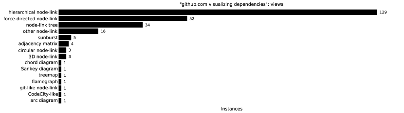
Some of the links found through examining the project links led to external sites. For those we looked at the features, gallery, and documentation pages for evidence of dependency visualization. We did not however read the entire documentation. Often in those cases we were unable to discern exactly how the visualization was accomplished, so data about what libraries or tools were used was not recorded. In our summaries, we consider the libraries used to be ‘unknown’ for these projects.
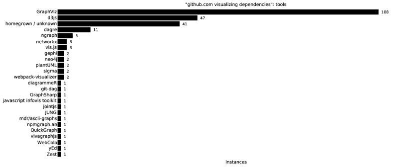
We found dependency visualization features in 224 of the 483 projects. Some projects had multiple visualization options, such as outputting a dot file to be rendered, rendering a png, and having a web application. Of the 224 projects, 108 had a visualization related to GraphViz through either outputting a dot format file (71 projects) or the use of a GraphViz-based rendering or layout algorithm to generate an image file, PDF, HTML file, or application (52 projects). Eighty-three of the projects enabled an HTML viewer for their visualization. In addition to the GraphViz-based ones, 47 used d3js as a central tool (e.g., force-directed layout, tree, Sankey diagram), 11 used dagre, five used ngraph, and three used visjs or networkx. A complete list of tools can be seen in Fig. 16. The most common form of visualization was a layered node-link diagram (e.g., hierarchical layout, dot, Sugiyama) with 129 projects. Fifty projects offered a force-directed layout and 34 showed a tree, 22 of which were drawn with ASCII.
Fig. 15 shows the number of instances of each view we categorized. Fig. 16 shows the number of instances of each tool or library being used to create the visualization. Fig. 17 shows the number of instances of each format returned by the visualization features that we found. Web applications are uniformly categorized as ‘html.’
Included in these supplemental materials is a CSV listing all of the links and their categorization, ordered by Google search ranking.