10.1109/TVCG.2019.2934810 \onlineid1110 \vgtccategoryResearch \vgtcpapertypealgorithm/technique \authorfooter C. Zhu-Tian, Q. Wang, Yong Wang and H. Qu are with Hong Kong University of Science and Technology. E-mail: {zhutian.chen, qwangbb, ywangct}@connect.ust.hk, huamin@cse.ust.hk. Y. Wang is with Microsoft Research. E-mail: wangyun@microsoft.com.
Towards Automated Infographic Design:
Deep Learning-based Auto-Extraction of Extensible Timeline
Abstract
Designers need to consider not only perceptual effectiveness but also visual styles when creating an infographic. This process can be difficult and time consuming for professional designers, not to mention non-expert users, leading to the demand for automated infographics design. As a first step, we focus on timeline infographics, which have been widely used for centuries. We contribute an end-to-end approach that automatically extracts an extensible timeline template from a bitmap image. Our approach adopts a deconstruction and reconstruction paradigm. At the deconstruction stage, we propose a multi-task deep neural network that simultaneously parses two kinds of information from a bitmap timeline: 1) the global information, i.e., the representation, scale, layout, and orientation of the timeline, and 2) the local information, i.e., the location, category, and pixels of each visual element on the timeline. At the reconstruction stage, we propose a pipeline with three techniques, i.e., Non-Maximum Merging, Redundancy Recover, and DL GrabCut, to extract an extensible template from the infographic, by utilizing the deconstruction results. To evaluate the effectiveness of our approach, we synthesize a timeline dataset (4296 images) and collect a real-world timeline dataset (393 images) from the Internet. We first report quantitative evaluation results of our approach over the two datasets. Then, we present examples of automatically extracted templates and timelines automatically generated based on these templates to qualitatively demonstrate the performance. The results confirm that our approach can effectively extract extensible templates from real-world timeline infographics.
keywords:
Automated Infographic Design, Deep Learning-based Approach, Timeline Infographics, Multi-task ModelK.6.1Management of Computing and Information SystemsProject and People ManagementLife Cycle;
\CCScatK.7.mThe Computing ProfessionMiscellaneousEthics
\teaser
![[Uncaptioned image]](/html/1907.13550/assets/x1.png) An automated approach to extract an extensible timeline template from a bitmap image.
a) Original bitmap image;
b) Content understanding including global and local information of the timeline;
c) Extensible template contains editable elements and their semantic roles;
d) New timeline (with mock-up colors) automatically generated with updated data.
\vgtcinsertpkg
An automated approach to extract an extensible timeline template from a bitmap image.
a) Original bitmap image;
b) Content understanding including global and local information of the timeline;
c) Extensible template contains editable elements and their semantic roles;
d) New timeline (with mock-up colors) automatically generated with updated data.
\vgtcinsertpkg
Introduction Graphic designers have been producing infographics in a variety of fields, such as advertisement, business presentation, and journalism, because of their effectiveness in spreading information [20, 52]. To inform data context and engage audiences, infographics are often embellished with icons, shapes, and images in various styles [26]. However, creating infographics is demanding. Designers should consider not only perceptual effectiveness but also aesthetics, memorability, and engagement [9, 19]. Researchers have introduced design tools [26, 55, 52] to alleviate the burden of infographics creation by automating some processes (e.g., visual encoding). However, these tools require users to manually initialize most of the design (e.g., drawing graphical elements). The process remains difficult and time-consuming, especially for laymen, leading to the demand for automated infographic design.
Using templates is an effective approach to enable automated infographic design, which has been widely used in commercial software, such as Microsoft PowerPoint and Adobe Illustrator. These systems can automatically generate infographics by plugging in data to a design template. Although easy to use, these systems typically only provide limited types of templates with default styles, which leads to a lack of diversity. By contrast, many infographics “in the wild” with diverse styles can only be accessed as images in a bitmap format. If users want to follow the styles of these bitmap infographics, they have to manually create their own infographics, which is difficult and tedious.
In this work, we investigate the methods of automatically extracting an extensible template from a bitmap infographic. Compared to editable templates, extensible templates contain not only the editable elements but also the semantic roles of these elements, which enable the automatic extension with updated data. Previous works [38, 39] attempt to extract visual encodings and color mappings from chart images based on rules and machine learning (ML) methods, by utilizing the legends, axes, plot areas, and common layouts. However, the content of infographics can be unstructured and manifold. This makes it challenging to analyze infographic images and extract extensible templates from them. As a first step towards automated infographic design, we focus on the timeline infographics, which have been widely used for centuries and whose design space has been extensively studied [10].
Automatically extracting an extensible template from a bitmap timeline infographic is non-trivial. Particularly, two obstacles stand in the way. First, it is challenging to interpret a bitmap timeline infographic automatically. Understanding the content of the infographic is necessary for automating the extraction. However, the elements in an infographic can be distributed in any place with any style (e.g., shapes, colors, and sizes, etc.) It is difficult for a machine to interpret the infographic that can only be accessed in pixels. Second, it is intricate to convert a bitmap infographic to be extensible automatically. An understanding of a timeline infographic is not enough for using it as a template. Even if the machine has already obtained structural information of the timeline (e.g., type, orientation, and categories and locations of its elements), how to convert the timeline to an extensible template remains unclear, not to mention the information could be incorrect.
To address these challenges, we propose a novel end-to-end approach for automatically extracting an extensible template from a bitmap timeline infographic. Our approach adopts a deconstruction and reconstruction paradigm. We address the first challenge at the deconstruction stage. We propose a multi-task deep neural network (DNN) that simultaneously parses two kinds of information from a timeline image: global and local information. Global information includes the representation, scale, layout, and orientation of the timeline. Local information includes the location, category, and pixels of each visual element on the timeline. These two kinds of information provide a panorama of the timeline. We tackle the second challenge at the reconstruction stage. By utilizing the deconstruction results, we propose a pipeline with three techniques, i.e., Non-Maximum Merging, Redundancy Recover, and DL GrabCut, to extract an extensible template from the infographic. The output can be used to generate new timelines with updated data.
To evaluate our approach, we synthesize a timeline dataset with 4296 labeled images and collect a real-world timeline dataset from the Internet. We report quantitative evaluations of the two stages over the two datasets. We then present examples of automatically extracted templates with various visual styles and timelines automatically generated based on these templates to qualitatively demonstrate the eperformance. The results confirm that our approach can effectively extract extensible templates from real-world timeline infographics. Finally, we discuss lessons learned and future opportunities.
Our primary contribution is an automated approach to extracting extensible templates from bitmap infographic timelines. The approach consists of 1) a multi-task DNN that automatically deconstructs bitmap timeline infographics and 2) a pipeline that automatically reconstructs extensible templates. We evaluate our approach with quantitative evaluations and qualitatively demonstrate its effectiveness with examples.
1 Related Works
This section introduces prior studies that are most relevant to our work, including automated visualization design, computational interpretation of visualization, and deep learning-based object detection.
1.1 Automated Visualization Design
Automated visualization design systems aim at producing visual encodings for given input data based on both the criteria summarized by experts (e.g., Bertin [8], Cleveland and McGill [13]) and constraints defined by users [37]. Prior work on automated visualization design can be classified into two general categories based on how the criteria are derived: rule-based and learning-based approaches.
Mackinlay’s APT system [34] is a pioneering example that enumerates, filters, and ranks visualizations using expressiveness and perceptual effectiveness criteria. It was extended by SAGE [42], BOZ [50], and ShowMe [35] with additional considerations of data properties, low-level perceptual tasks, and candidate groupings. Recent systems like Voyager and Voyager 2 [53, 54] have further recommended data transformation (e.g., normalization) in addition to visual encodings.
Foregoing explicit rules, researchers have recently designed learning-based systems that directly learn visualization designs from visualization corpora. DeepEye [33] applies ML models and design rules to determine whether a visualization is “good” or “bad” and recommends the “good” candidates. Data2Vis [14] uses a Recurrent Neural Network to automatically translate JSON-encoded datasets to Vega-lite [45] specifications. Draco [37] learns weights between hard and soft constraints that represent users’ requirements and design guidelines. VizML [21] trains a fully-connected neural network to predict design choices based on input data. Although we also aim for automated design, these systems, however, cannot be adapted to infographics. They focus mainly on recommending visual encodings for the input data (e.g., how to encode data using visual channels). By contrast, designing infographics requires additional attention to visual styles (e.g., how to embellish the visualization with shapes and icons), which are omitted in these systems. In this regard, our work is inherently different from them.
1.2 Computational Interpretation of Visualization
Computational interpretation of visualization seeks to enable machines to understand the content of visualization images (e.g., data, styles, and visual encodings). According to the targets, prior methods can be divided into two categories: for charts and for infographics.
A general pipeline when interpreting a chart is first to identify the type of the chart via classifications, then detect elements (e.g., marks or text) in the chart, and finally extract the underlying information (e.g., data or visual encodings). As a pioneer, Savva et al. introduced ReVision [46], in which the graphical and textual features are fed into a support vector machine (SVM) model for a chart type classification. ReVision then localizes the marks and extracts data from pie and bar charts by using a carefully designed multi-steps method based on image processing and heuristics. Siegel et al. [48] extended the method of ReVision to handle line charts. They developed a convolutional neural network (CNN) for the chart classification and designed a heuristic approach to use legend information for data extraction. Recently Kafle et al. [23] have used a deep dual-network model to directly parse the data from bar charts without heuristic rules. Instead of extracting the data of charts, Poco and Heer [38] aimed to recover the visual encodings. To complete the task successfully, they proposed a state-of-the-art approach to interpreting the text in a multi-stage pipeline, which combines ML and heuristics methods. Building on this, Poco et al. [39] further explored the color mapping extraction of visualization images.
Apart from charts, researchers have explored the computational interpretation of infographics. Bylinskii et al. [12] used fully convolutional networks (FCNs) to predict the visual saliency of an infographic. Bylinskii et al. [11] also applied DNNs to select representative textual and visual elements from an infographic automatically. On the basis of several deep learning models, Kembhavi et al. [25] designed a multi-stage approach to parse the relationships among elements in diagrams in science textbooks. More recent research investigated using DNNs to detect UI components in mobile apps [31] and icons in infographics [36]. Although these methods enable computational understanding of an infographic from certain perspectives, the information they interpret cannot be used to reconstruct an extensible template (e.g., how to change or extend the content of an infographic is unknown). We take a first step towards the interpretation of infographics for an automated design purpose. Unlike using multiple models and handcrafted features, our approach uses one end-to-end DNN to complete the interpretation.
1.3 Deep Learning-based Object Detection
To extracting an extensible template, we need to understand each object on it. We achieve this goal with deep learning-based object detection. Object detection is a computer vision (CV) task whose goal is to localize each object using a bounding box (i.e., where) and classify its category (i.e., what). Deep learning-based object detection methods can either be one-stage [40, 32, 30] or multi-stage [17, 16, 41, 24]. One-stage models directly predict objects’ bounding box and category without involving intermediate tasks. YOLO [40] is a representative one-stage model that divides the image into small cells and predicts bounding boxes for each cell. One-stage models have the advantage of fast detection in real time, which affects accuracy. By contrast, multi-stage models can predict accurately, but are often less time efficient. Multi-stage models, such as RCNN [17], usually first propose a manageable number of candidate regions (region proposals) that may contain objects. If an object exists within, then they will predict its bounding box and category. Time consumption is not our first priority, so we base our work on a multi-stage model. Mask R-CNN [24] is a leading multi-stage model in several benchmarks. It can further predict the pixels of an object within its bounding box (i.e., Instance Segmentation). We extend Mask R-CNN to interpret not only the information of objects (i.e., local) but also that of the entire timeline infographic (i.e., global). To the best of our knowledge, we are the first to adopt this kind of instance segmentation networks to deal with the infographics interpretation problem.
2 Problem Statement
This section introduces the background of timeline infographics and the problem, overview of the proposed approach, and the datasets.
2.1 Background
Timeline infographics have been recently investigated by Brehmer et al. [10]. We briefly describe the insights from them as follows:
-
•
Timeline Data. A timeline presents interval event data (i.e., a sequence of events), which is different from continuous quantitative time-series data. A timeline infographic for storytelling usually has a small underlying dataset because the storyteller is assumed to have already distilled the narrative points from the raw dataset.
-
•
Timeline Design. A timeline can be described as a combination of three dimensions, namely, representation, scale, and layout. The combination can be used as the type of timelines. No more than five options are available for each dimension (Table 1). Besides, only 20 out of 100 combinations of these options are viable. These dimensions indicate how the events are organized in a timeline. For example, events are placed along a straight line in a linear representation, which is the most common way to represent a timeline. Typically, an event is visually encoded by a graphical mark, such as the rectangles in Figure 1. The position of this mark is used to encode the occurred time of the event. Extra annotations (e.g., text or icons) are added, commonly adjacent to the event mark, to depicts the details of an event.
| Design Options | |
|---|---|
| Representation | Linear, Radial, Grid, Spiral, Arbitrary |
| Scale | Chronological, Relative, Logarithmic, |
| Sequential, Sequential + Interim Duration | |
| Layout | Unified, Faceted, Segmented, |
| Faceted + Segmented | |
In practice, infographic timelines are widely spread in the form of bitmap images. However, they are not easy to reproduce. Given a bitmap timeline, we aim to extract its extensible template (Figure 1) automatically. To this end, two requirements should be fulfilled:
-
•
Parse the content. The machine should first parse the content of the image. A computational understanding of an image can be represented as a structural information, which is necessary for an automation process. However, the infographic image can only be accessed in pixels, which is a byte array with the shape of . A process is required to take the bitmap image as input and output its structural information.
-
•
Construct the template. With the structural information of the image as a basis, the machine should be able to construct an extensible template out of it automatically. The template should contain detail information (e.g., position, color, font, and shape) of the elements to be reused and the elements to be updated. Given the image and its structural information, another process should be involved to extract such types of detail information.
2.2 Approach Overview
To fulfill the two requirements above, we design a two-step approach, starting from defining the input and output of each step.
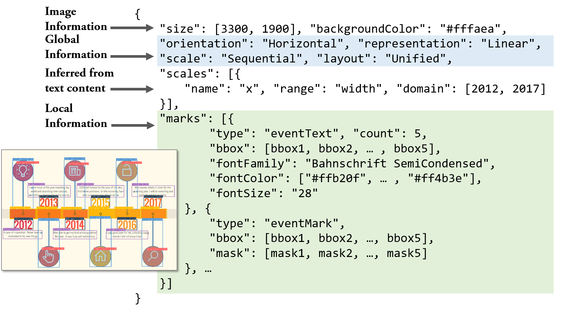
Deconstruction. The goal of the first step (Towards Automated Infographic Design: Deep Learning-based Auto-Extraction of Extensible Timelinea and Towards Automated Infographic Design: Deep Learning-based Auto-Extraction of Extensible Timelineb) is to parse structural information from the input, a bitmap timeline infographic . For the output, we define two kinds of information, namely, the global one and the local one . The global information is about the entire timeline, including its three dimensions mentioned in Table 1 and its orientation. The local information is about each individual element, including its category (what), location (where), and the pixel-wise mask (which pixels). Therefore, the ideal process of the first step can be formulated as a mapping function :
| (1) |
We propose to approximate using a DNN model with a set of parameters . This set of parameters can be learned from a corpus , where each entry is a bitmap image associated with its global and local information. Hence, we can obtain the output via .
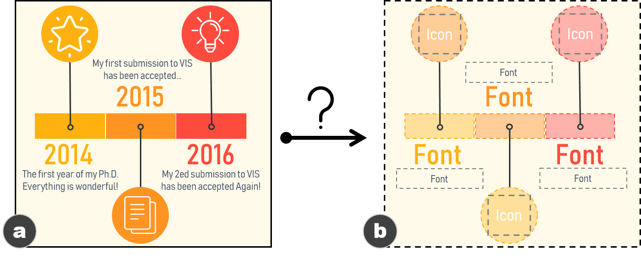
Reconstruction. To reconstruct the extensible template, a function should take the bitmap infographics and its global and local information , as the input, and return the detail information about elements to be reused (e.g., the rectangle and circle marks in Figure 1a) and elements to be updated (e.g., the text and icons in Figure 1a), i.e.,
| (2) |
is a set of elements, each of which is represented as a set of attributes, i.e., . According to and , we can infer attributes of elements in and , such as size, shape, color, position, and offset to others. We highlight the necessary attributes for enabling extensible templates. For , the essential attribute is the graphical marks to be reused (e.g., the rectangle marks in Figure 1a). Hence, we need to segment the pixels of from the original image. As for , the attributes related to the font (e.g., font family, size, color, etc.) must be identified to maintain the styles of the updated content. In addition, we note that the outputs from may not be perfect, reducing the quality of the outputs of . Thus, should be smart enough to correct errors in and as much as possible.
Considering these issues, we design a heuristic-based pipeline, with three novel techniques, as to automatically output and .
2.3 Datasets
We use two datasets to train the model and evaluate our approach. The first one (referred to as ) is a synthetic dataset. We extended TimelineStoryteller (TS) [5], a timeline authoring tool, to generate , covering all types of timelines. The second dataset (referred to as ) consists of real-world timelines, collected from Google Image [4], Pinterest [6], and FreePicker [3] by using the search keywords timeline infographic and infographic timeline. has more diverse styles, especially for marks, and it covers the most common types of timelines. The resolutions of images are in the range of . To scope this work, we focus on timelines that have less than 20 events and whose events have the same number and types of annotations (e.g., text and icon). We also exclude the titles, footnotes, and legends.
| Dataset | #Event | #Event | #Annot. | #Annot. | #Annot. | #Main |
|---|---|---|---|---|---|---|
| Mark | Text | Mark | Text | Icon | Body | |
| 83498 | 61324 | 4030 | 60036 | - | - | |
| 2318 | 2305 | 2227 | 2937 | 1497 | 1340 |
Collection. For , TS allows us to generate timeline images with various visual encodings and styles. We generated timeline images using nine embedded datasets of TS to cover the design space of timelines. To increase diversity, we randomly modified the timeline orientation, the style of graphical marks (including color, size, and shape), texts (font, size, color, offset to others), and the background (color) in a curated range that guarantee the viability of the timeline. We created 9592 timelines in this process.
For , we implemented crawlers to download the search results. The crawling process was manually monitored and stopped when 10 consecutive return results are not timelines. We collected 1138 timelines in this process. Following, four of the coauthors separately reviewed all the timelines to remove the repeated and problematic instances, such as images with heavy watermarks or with low resolutions (i.e., smaller than ), and timelines that out of the scope of this work. They obtained 412 remaining timelines. The scale of is consistent with manually collected visualization datasets in similar research [38, 39, 10]. Among the five representations in Table 1, radial, grid, or spiral representations appear only 19/412 (4.6%) timelines, whereas the rest 393 timelines are with linear or arbitrary representations. This ratio is consistent with [10] (23/263, 8.7%). Considering the scarce number of the radial, grid, or spiral representations, we excluded them in and and focused on the more common linear and arbitrary representations.
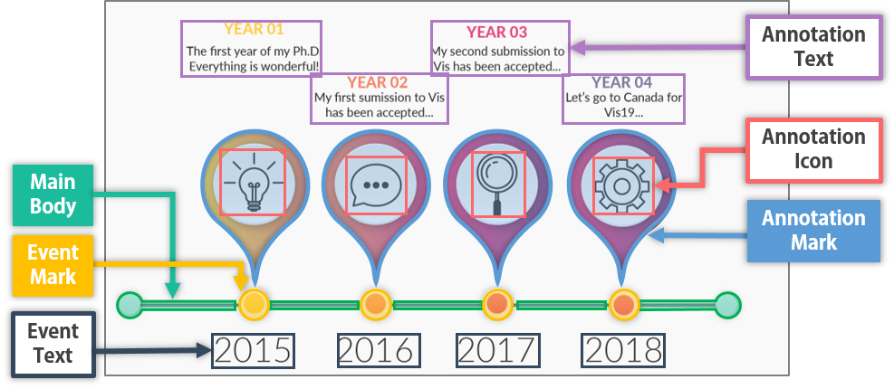
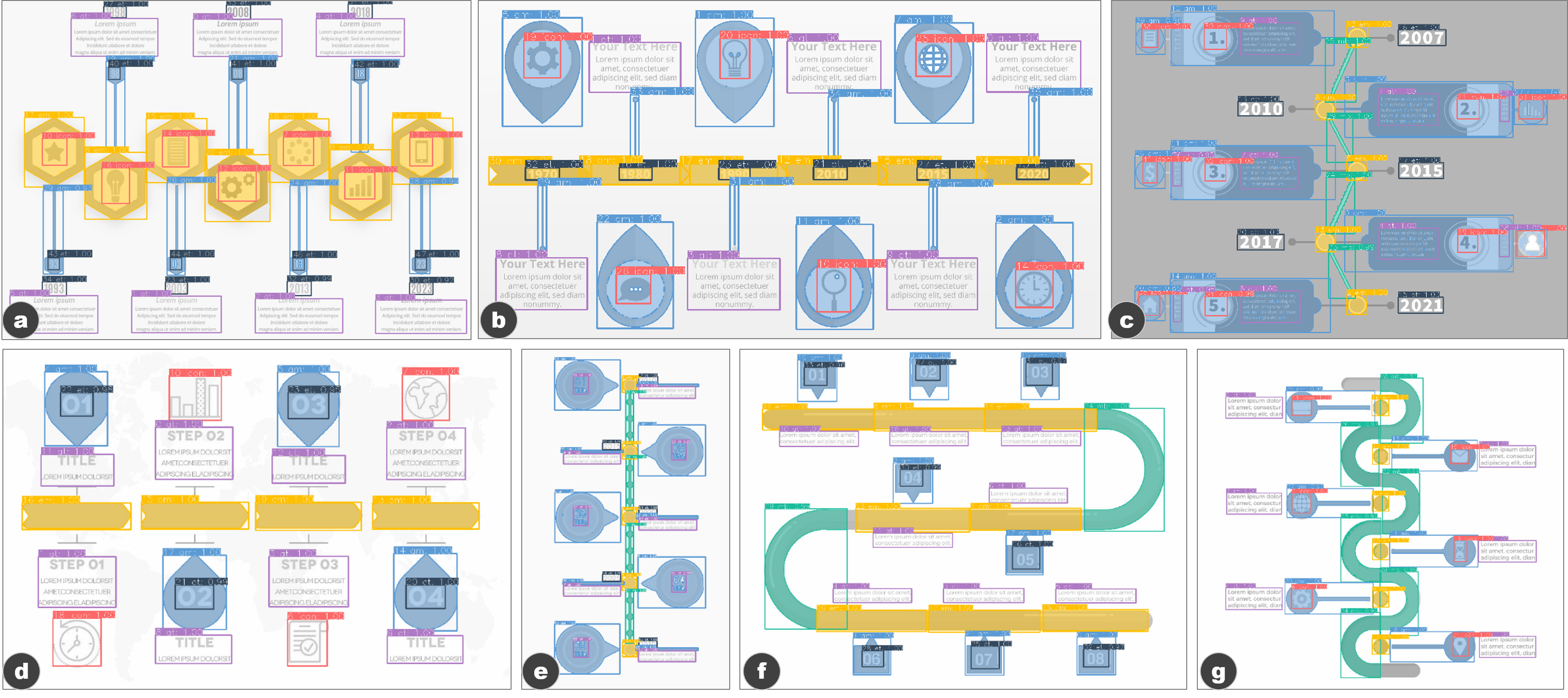
Labeling. To identify the categories of elements in a timeline, four of the coauthors independently reviewed all the timelines in and . Each of them iteratively summarized a set of mutually exclusive categories that can be used to depict elements in a timeline infographic. Gathering the reviews resulted in six categories (Figure 2). We explain the details of these categories in the supplemental material.
Each timeline in was then converted from SVG to bitmap format and annotated with its representation, scale, layout, and orientation. We also analyzed the SVG and the bitmap to generate the annotations for each element in a timeline, including its category (from the label sets in Figure 2), bounding box (referred to as bbox), and pixel-wise mask (referred to as mask). For each timeline in , we manually annotated its representation, scale, layout, and orientation, as well as the category, bbox, and mask of each element, by using our annotation tool that is built on Microsoft PowerPoint. Finally, contains 4296 timelines, whereas contains 393. Figure 3 and Table 2 present samples and statistics of these timelines, respectively.
3 Deconstruction
Parsing bitmap timeline infographics to extract structural information is difficult due to the absence of fixed rules for the styles and layouts of timeline elements. We achieve this goal from two perspectives, global and local. In contrast with prior studies [38, 48] that extracted structural information from charts using different methods in multiple steps, we use a DNN to extract structural information in one shot.
3.1 Parsing Global Information
Our dataset comprises 10 types of timelines. The type, i.e., the combination of the three dimensions in Table 1, is necessary for constructing an extensible template. In addition to the type of timeline, the orientation, which could be horizontal, vertical, and others, is equally indispensable for the template. As type and orientation only involve a few discrete choices, we can identify them through classification.
Taking into account that CNN models have shown excellent capability in chart classification [38, 48, 22], we propose a CNN-based classifier to recognize the type and orientation of a timeline.
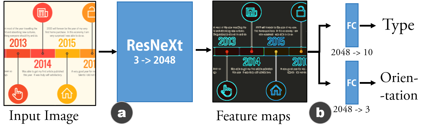
Many CNN architectures have been proposed (e.g., AlexNet [27], GoogLeNet [51]). We use ResNeXt [56] (Figure 4a) to extract the features of a timeline infographic, since ResNeXt achieves state-of-the-art performance in many CV tasks. It takes a 3-channel image (i.e., RGB) as input and output a feature map with 2048 channels. We then use two siblings fully connected (FC) layers (Figure 4b) as Class heads to predict the timeline’s type and orientation based on the feature map.
3.2 Parsing Local Information
After parsing the global information, the machine should further extract the local information of the timeline. We have defined six categories of elements (Figure 2) in a timeline. We need to detect each element in the timeline (where and what) and segment it from others (which pixels).
To tackle these tasks, a possible solution is to solve them one by one using well-established methods. For example, we can use sliding windows [28] to localize elements, then employ SVM to determine the category of the element within, and lastly segment the element from the image. This multi-step solution can be effective and has been used in previous works [38, 48, 22, 25]. However, given the ad-hoc nature, extending this solution to other scenarios is challenging. Therefore, we prefer to adopt a unified method to complete all tasks.
Considering that we have already extracted the feature maps of the infographic in subsection 3.1, we propose to reuse these feature maps, which contain rich information of the image. Specifically, we extend the classification model in Figure 4 by adding components for object detection to parse the local information. We achieve this extension using Mask R-CNN [24], a leading architecture that can detect objects and predict their pixel masks. By this means, our model can simultaneously finish all five tasks (i.e., two global and three local) in one shot. The complete architecture is depicted in Figure 5. We successfully train this multi-task learning model and achieve a good performance.
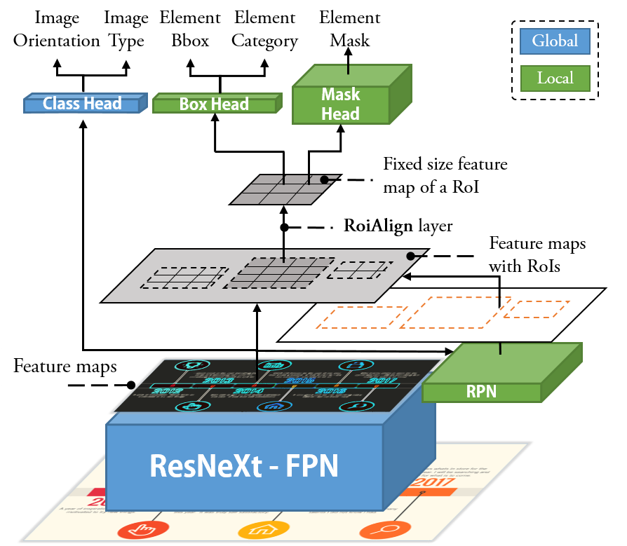
In the architecture (Figure 5), we first extend ResNeXt with Feature Pyramid Network [29] (FPN). FPN is a top-down architecture that can build semantically strong feature maps at multiple scales using the feature maps from ResNeXt. FPN makes our model scale-invariant and able to handle images of vastly different resolution. We then feed the feature maps from the ResNeXt-FPN into a Region Proposal Network [41] (RPN) to localize elements in a timeline. RPN is an FCN that simultaneously predicts element locations (i.e., by bbox) and objectness scores (i.e., whether there is an object within the bbox) in an image. These element location hypotheses are then be used to extract regions of interest (RoIs) from the feature maps. Each RoI is normalized to a fixed size using a RoIAlign layer and then passed to two heads, namely, a Box head and a Mask head. The Box head uses two sibling FC layers to classify the category and regress the bbox of the element. The Mask head uses an FCN for predicting the pixels of the element within the bbox. Additional details on the architecture and training process are presented in the supplemental material.
3.3 Validation
Our model is implemented using Pytorch [7] with two types of CNN backbone, namely, ResNeXt-50 (R50) and ResNeXt-101 (R101), following the standard configurations [56]. R50 has 50 layers, which is more lightweight and easier to train, while R101 has 101 layers, which performs better in CV tasks at the cost of efficiency and is more difficult to train. We trained these two implementations of our model using and together. We randomly split the images in and into such that no testing sample is in the training set. To increase the diversity of the training data, we conduct several data augmentation strategies, including random horizontal or vertical flip, random 90-degree rotations (the labels are updated accordingly), and random color channels swap. Finally, the number of training samples for one epoch is 33760. We evaluated models trained with 10 epochs on the two datasets separately. We first report the performance of parsing global information and then report the average precision () on parsing local information. Reported numbers are averaged over 10 independent runs.
Parsing Global Information. To access the performance of our model on the two classification tasks (i.e., 10 classes of timeline type and 3 classes of orientation), we calculate the precision, recall and F1-score. Table 3 presents the results.
| Dataset / Backbone | Type | Orientation | ||||
|---|---|---|---|---|---|---|
| / R50 | 99.1 | 99.1 | 99.1 | 100.0 | 100.0 | 100.0 |
| / R101 | 99.5 | 99.5 | 99.5 | 100.0 | 100.0 | 100.0 |
| / R50 | 88.7 | 86.4 | 87.5 | 97.7 | 97.1 | 97.4 |
| / R101 | 92.2 | 90.9 | 91.5 | 97.7 | 97.1 | 97.4 |
Both implementations achieve good performance on and . As expected, R101 has a better performance on and than R50. The classification of type on performs worse than that on , which is largely due to the more diversity and small size of . Nevertheless, F1-score is still higher than 90% when using R101.
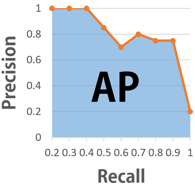
Parsing Local Information. To evaluate the performance of parsing local information, we use the metrics in COCO challenge [1]. COCO is a large-scale object detection and segmentation dataset that contains more than 330K images with high-quality annotations. It uses AP metrics [15] to access the three tasks (i.e., what, where, and which pixels) together. Basically, AP is a measure of precision-recall tradeoff calculated using all possible confidence level that is represented by the classification score associated with each predicted bbox. Intuitively, AP is the area under the precision-recall curve (Figure 6). To calculate the precision and recall at a confidence level, we first need to calculate the intersection over union (IoU) between each predicted bbox and its corresponding ground truth by . If the exceeds a threshold (e.g., 0.5), the prediction is considered as a true positive; otherwise a false positive. We can then further calculate the precision and recall over all confidence level to draw the curve.
| Dataset / Backbone | BBox | Mask | ||||
|---|---|---|---|---|---|---|
| / R50 | 79.0 | 93.6 | 88.0 | 79.8 | 96.4 | 91.6 |
| / R101 | 81.9 | 93.9 | 89.1 | 79.9 | 96.9 | 91.1 |
| / R50 | 53.4 | 79.3 | 61.8 | 56.9 | 80.1 | 61.6 |
| / R101 | 56.4 | 81.7 | 64.9 | 59.1 | 82.5 | 65.1 |
| 39.8 | 62.3 | 43.4 | 37.1 | 60.0 | 39.4 | |
*A state-of-the-art performance on COCO dataset reported by [24].
Table 4 presents the AP of our model on the two datasets. The higher the AP, the better it is. We provide state-of-the-art performance on COCO reported by He et al. [24] as a background, due to the lack of benchmarks. is the average AP over different IoU, from to with step . and is the AP calculated at and , respectively. The larger the IoU, the stricter the metric will be. As indicated in Table 4, our model achieves high AP on bbox detection and pixel segmentation on . This result is because the overall diversity of is limited, the size of is big enough in terms of its diversity, and the auto-generated annotations of are perfect for enabling effective learning. By contrast, has more diversity, a smaller size, and imperfect annotations in comparison with that of , leading to a decrease in performance. Nevertheless, our model still achieves an acceptable performance on , considering the state-of-the-art performance on COCO. We further discuss the annotation perfectness of in subsection 4.5.
4 Reconstruction
After interpreting a timeline infographic, the next problem is how to automatically extract an extensible template from it. We achieve this by a reconstruction pipeline (Figure 7) that exploits the outputs from the previous step. Our pipeline first eliminates the repeated bboxes using Non-Maximum Merging (NMM), and then infers the missing elements using Redundancy Recovery (RR). Next, DL GrabCut is employed to extract high-quality graphical marks for reuse. Finally, the font of event text and annotation text is identified using a publicly available API. A quantitative validation confirms the effectiveness of our pipeline.
4.1 Eliminate Repeated BBoxes: Non-Maximum Merging
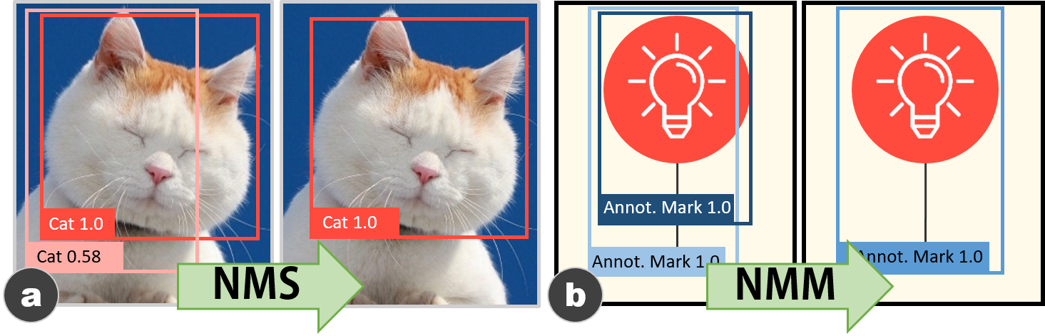
Multiple predicted bboxes may exist on one object, such as the two bboxes in Figure 8a. A commonly used method to remove repeated bboxes for natural images is Non-Maximum Suppression (NMS) [17]. NMS iteratively eliminates bboxes whose confidence score (i.e., the classification score) are less than a predefined threshold. For instance, in Figure 8a, with a threshold of 0.8, NMS will eliminate the pink bbox with 0.58 and output the red one. However, for infographics, a part of an object may still be a “complete” object, which hinders the effectiveness of NMS. For example, in Figure 8b, the mark in the steel blue bbox and the part of it in the deep blue bbox are both valid annotation marks. In such case, each of the two bboxes will be assigned a high confidence score (e.g., 1.0). Therefore NMS cannot eliminate the repeated box.
Therefore, we design NMM to eliminate repeated bboxes. Specifically, for bboxes with the same category, we rank them using the confidence score plus the area (normalize to ). For the top 1 bbox, we merge other bboxes that overlap with it and exceed a IoU threshold to form a union bbox. This process is repeated until all overlapping boxes are merged. Figure 8b shows the boxes before and after NMM. In practice, we apply both NMS and NMM separately and then check the consistency of the shapes between the resulted bboxes and other non-repeated bboxes. The most consistent results are kept.
4.2 Fix Failed Detections: Redundancy Recovery
Our model may miss elements (i.e., false negative) or detect elements with wrong categories (i.e., false positive). To fix these failed detections, we leverage the redundant information of timelines (e.g., each event has the same type of annotations). Specifically, for the elements in a timeline, we first group them along the timeline orientation into clusters, each of which represents an event. Then, we use the statistics of clusters to verify and attempt to fix failed detections.
Incorrectly classified elements. Some elements in an infographic can be classified into wrong categories. For example, a short annotation text with a fancy font can be incorrectly classified as an annotation icon. We adopt a voting mechanism to attempt to fix these misclassifications. For instance, if more than half of the events contain annotation text, then an annotation icon, whose bbox has the same shape as these annotation texts, of an event should be classified as an annotation text. Given an event can have multiple annotation texts, we restrict that only the annotation texts with the consistent shape of bbox can vote for each other. This rule is also applied to other categories.
Missing elements. We also use a similar voting mechanism to infer the undetected elements. For example, in Figure 7a, more than half of the events have an event text. Thus, for the event without an event text (i.e., the event in 2015), we assume it should have an event text. By using heuristic rules, we can estimate the bbox (i.e., x, y, width, height) of its event text based on those of other event texts.
4.3 Elements to be Reused
For an extensible template, certain elements must be reused via segmentation from the infographic image. Our model can predict the pixels (i.e., mask) of each element for the segmentation. However, the quality of these predicted pixels (Figure 9b) may not be accurate enough for template generation.
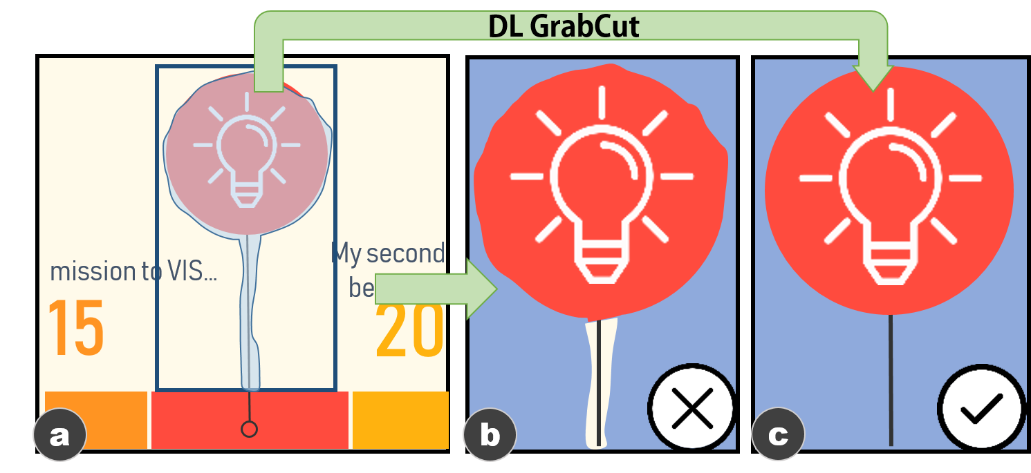
To tackle this issue, we use the outputs from the model (Figure 9a) as the input to GrabCut [43] algorithm. GrabCut is an interactive segmentation algorithm that has been widely used in production tools, such as Microsoft PowerPoint. It performs well especially when the background and foreground are not similar and the edges of the foreground are crisp, which is a good fit for our scenario. To segment an element, GrabCut needs a bbox around the target element as an input. Then, the user can further refine the segmentation results by drawing strokes to mark the probable foreground and background area.
Our idea is to automate this process using the outputs of the model to imitate the user interactions. For each predicted element, we use its bbox as the bbox drew by human and its mask as the user’s strokes to refine the segmentation. By this means, we leverage the semantic information from the DL model and the advantage of GrabCut on image processing to obtain high-quality masks (Figure 9c).
4.4 Elements to be Updated
Among the six categories of elements, three categories of elements need to be updated, namely, event text, annotation text, and annotation icon. Annotation icon can be updated by directly using new icons, whereas event text and annotation text should maintain the same styles with the original infographic, including their font family, color, and size. To identify the font family, we use Font Identifier powered by Fontspring Matcherator [2]. The font size and color can be calculated and extracted from the pixels of the text in the bitmap image. Some annotation text contains title and body text. We heuristically identify the text with the larger font size as the title and the smaller one as the body. To improve the extensibility of the template, we further use OCR engine (i.e., Tesseract [49]) to recognize the content of event text to infer the visual encodings of the timeline following the method in [38]. The final outputs can be depicted using a structural document (Figure 11).
4.5 Validation
To evaluate the effectiveness of our pipeline, we reuse the R101 trained in subsection 3.3. We are interested in two aspects of our pipeline: whether it can correct the failed detections and whether it can refine the segmentation results. We only test our pipeline on , because the prediction results on are good enough to skip the steps that we want to access.
To obtain prediction outputs, we select the confidence level per category based on the precision-recall curve calculated in subsection 3.3. We calculate the precision and recall of the predictions with IoU at 0.5 and 0.75. We then apply our pipeline on the predictions and calculate the gains of precision and recall on each step. We expected the following:
-
•
NMM can improve the precision of bbox and mask predictions as it removes a few false positives.
-
•
RR can improve the precision and recall of bbox and mask prediction as it increases the number of true positives.
-
•
DL GrabCut can improve the precision and recall of mask prediction as it improves the quality of masks.
Table 5 presents the gains on precision and recall after each step. The gains at IoU 0.5 are close to those at IoU 0.75, which means the gains from the reconstruction pipeline are strict and stable. As expected, the NMM shows a gain on the precision of bboxes and masks predictions. We also observe a small gain on recall. The analysis results indicate that such small gain is attributed to the merging results increasing the number of true positives in some cases (e.g., two false positives become one true positive after merging). Moreover, RR shows a gain on the recall of bboxes and masks predictions. These results confirm that our
| BBox | Mask | |||||||
|---|---|---|---|---|---|---|---|---|
| Raw | 82.9 | 80.8 | 74.0 | 72.1 | 85.7 | 81.5 | 75.8 | 72.2 |
| +NMM | +2.3 | +1.0 | +2.3 | +0.8 | +1.9 | +0.6 | +1.8 | +0.3 |
| +RR | +1.6 | +2.5 | +1.6 | +2.3 | +2.3 | +2.1 | +2.3 | +2.0 |
| +DLGC | 0.0 | 0.0 | 0.0 | 0.0 | -2.8 | -5.5 | -4.1 | -3.8 |
| Total | 86.8 | 84.1 | 77.9 | 75.4 | 84.0 | 78.4 | 75.9 | 71.0 |
technique can correct some failed predictions (i.e wrong and missing).
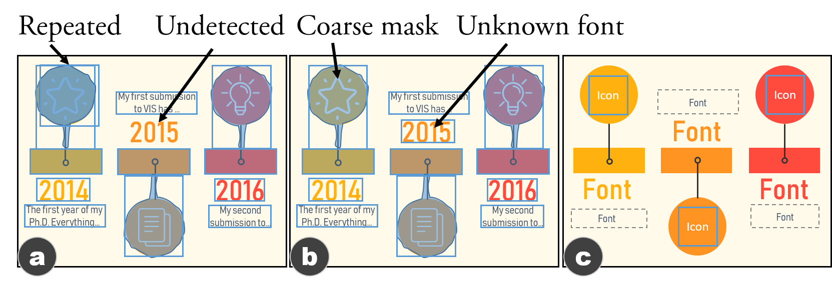
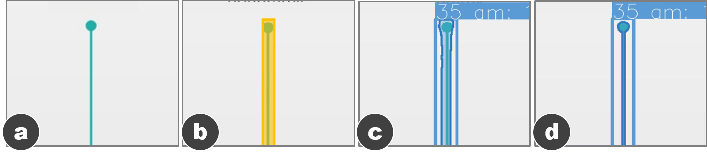
A surprising finding is the decrease in the precision and recall of mask predictions. Our investigation reveals that this decrease is due to the imperfect labels. Figures 13a and 13b show an annotation mark and its label. Figure 13c presents the prediction result and Figure 13d shows the result refined by DL GrabCut. The manually labeled mask encapsulates the graphical mark with empty spaces and a border. Meanwhile, the result from DL GrabCut perfectly matches the graphical mark but not the label. Thus, even the result from DL GrabCut is of high quality, it can also be changed from a true positive to a false positive, leading to a decrease in precision and recall. Hence, we manually compare the segmentation results of each element before and after using DL GrabCut to verify its effectiveness. The comparison confirms the usefulness of DL GrabCut in the pipeline.
5 Extracted Results and Generated Examples
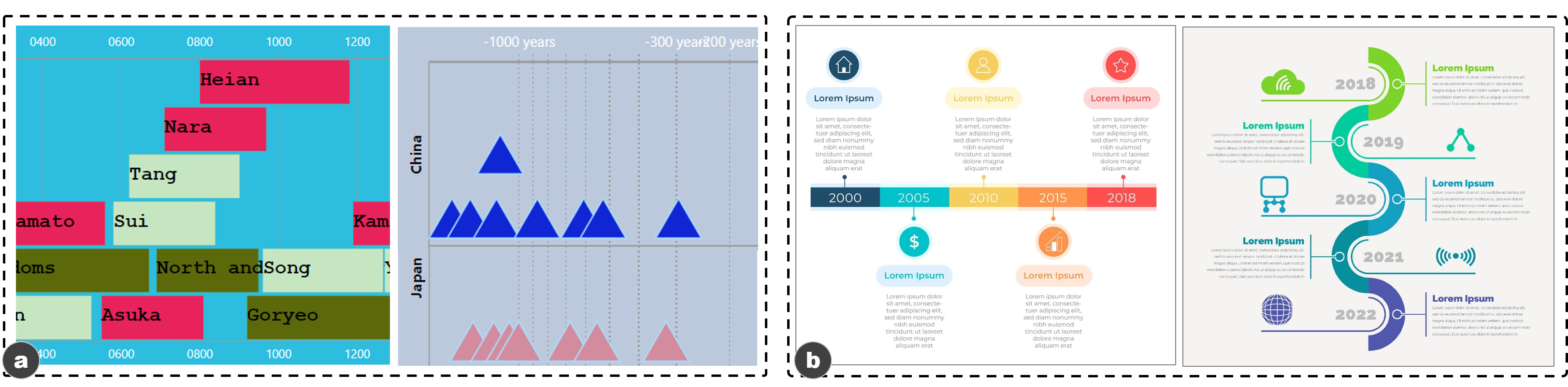
Example extracted results are shown in Figure 12. High-resolution results can be found in the supplemental material. Our approach can extract templates from not only the timelines with linear representations (e.g., horizontal Figure 12b and 12d, and vertical Figure 12e and 12g), but also those with arbitrary representations (Figure 12a, 12c, and 12f). Figure 12d shows that our approach is not affected by the background image.
To present a usage example of these extensible templates, we further implement a timeline renderer by extending TS [5], an open-source tool that allows users to generate timelines for their data automatically. It embeds a collection of heuristics to render timelines based on the timeline representation, scale, and layout chosen by users. Currently, TS provides a set of default styles (e.g., using rectangles as event marks). We reuse and extend the heuristics in the tool and adapt it to our templates, thus enabling generations of embellished timeline infographics. We also add some heuristic rules for effectively using marks in templates, such as looping through the marks when the number of events exceeds that of the marks. We present two examples to illustrate the generation process.
-
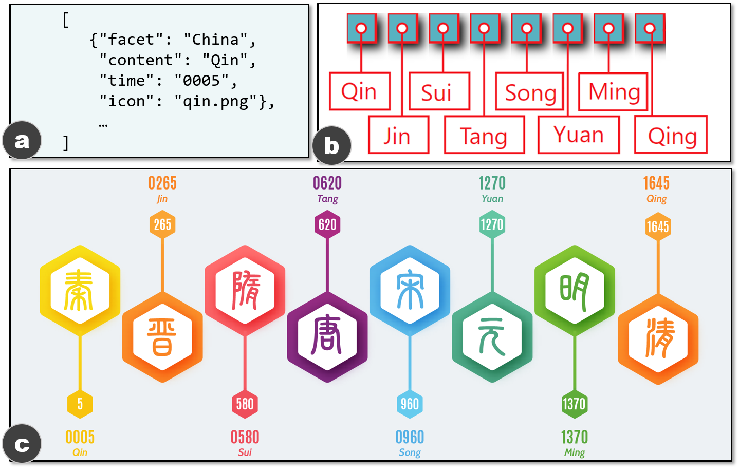
Figure 14: A default timeline generated for the data in a) is shown in b). The result of applying the template from Figure 12a is presented in c). -
•
Generating timeline reusing graphical elements. In this example, we reuse the graphical elements in Figure 12a to generate a new timeline (Figure 14c) for the Chinese dynasties data (Figure 14a). To achieve this, we first use TS to render the data with default styles (Figure 14b). The template is then applied to the default timeline and the underlying data. Specifically, we first substitute marks in Figure 14b (e.g., the rectangles and red circles) with the marks in the template (e.g., event and annotation marks), which are segmented from the existing timeline. The margin and position of each mark are also updated accordingly. Then, the event content is rendered at the position corresponding to each event mark using the font from the template (i.e., annotation text). Next, the time of each event is rendered, though it has not been visualized in Figure 14b, since it exists in the data and the template has slots for the event text. Finally, the icon (i.e., the Chinese character) in the data is displayed in the bbox of the annotation icon for each event. This whole process is finished programmatically and automatically by enumerating and binding the data to the template, as we have the semantic role (i.e., the category) of elements in the template.
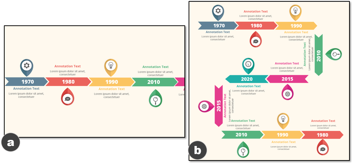
Figure 15: a) A timeline generated by using the template from Figure 12b.
b) The result of applying the representation from Figure 12f to a). -
•
Generating timeline reusing representations. In this example, we reuse the representation in Figure 12f to generate a new timeline (Figure 15b) for mock-up data. To this end, we first render a timeline (i.e., Figure 15a) using the graphical elements from Figure 12b, following the same process mentioned above. The arbitrary representation extracted from Figure 12f is then reused in Figure 15b. Specifically, we enumerate events in Figure 15a and place them one by one according to the position (represented by bbox) of elements in Figure 12f. Finally, two events are adjusted to be vertical after the generation process.
6 Discussion
In this section, we first share the lessons learned from our study, which outline the need for human-ML collaborative authoring tool and graphical image-driven deep learning. Then, we discuss how our work can serve as a basis for future research and acknowledge the limitations.
6.1 Human-ML Collaborative Authoring Tool
Efforts have been made to aid visualization authoring by using ML. As a pioneering work, ReVision [46] uses SVM and multiple rule-based methods (i.e., computational interpretation) to parse the global and local information of bitmap charts. This information is used to help users to redesign problematic charts. Although ReVision successfully decomposes charts, its rules limit its extendibility to tackle more complex visualizations (e.g., infographics). In recent years, given the rapid advances in DL, it is gradually possible to use data-driven models rather than rule-based methods to interpret charts and even infographics. In this work, we explore this direction and contribute a unified model to successfully parse timeline infographics.
Note that our approach aims to use automation to assist, not replace, human designers in the visualization design. We realize that it is important to keep the human in the design process. This is not only because it is difficult to get a perfect model, but also because the design process is creative and subjective, and thus can hardly be fully automatic. First, human interactions can steer the model and refine the model’s results. For example, although we design several automatic post-processing steps to enhance the overall performance of our model, the user can further adjust the model (e.g., the confidence level) for the desired output. Furthermore, the human should be at the center of visualization authoring, while the ML model should assist, rather than replace, the designer. For instance, the generated results of our approach can aid users as stepping stones to initialize the visualization, instead of being the final designs. However, designing human-ML collaborative authoring tools that go beyond asking designers to refine the model results remains underexplored. We envision how to design authoring tools seamlessly integrate imperfect ML models into the design process as an important research direction.
6.2 Graphical Image-Driven Deep Learning
The DL revolution is driven by tasks on natural images. However, the specificity of graphical images (e.g., charts and infographics) leads to requirements that cannot be easily fulfilled by models designed for natural images. We share the lessons learned from our study and hope to inspire more future work on the fundamental designs of DL models.
Translation invariance vs. translation variance In some cases, our model cannot distinguish event marks from annotation marks, when they look identical. Although our reconstruction pipeline can fix such incorrect classification in most cases by using Redundancy Recovery, we note that this issue is caused by a key feature of CNNs, namely, translation invariance. Translation invariance [18] enables a CNN to recognize an object wherever it is displayed in an image. This feature is important in recognizing natural elements (e.g., a cat should always be classified as “cat” wherever it is displayed). However, it is difficult to handle graphical images, as some graphical elements are translation-invariant while others are translation-variant. For instance, in a bar chart image, the bars in the plot area should always be classified as “bar mark”, which requires translation invariance; by contrast, text labels’ roles are usually determined by their positions (e.g., “y-axis label” at the left and “x-axis label” at the bottom) and thus requires translation variance. A possible solution to this problem is to learn and recognize relationships among elements. Capsule network [44] is a network structure that can learn the relationships among elements. Further investigation is required to adapt it to graphical images.
High-level semantics vs. low-level semantics Our network can predict the pixel-wise masks of elements, but their quality is far from perfect. The problem is rooted in the difference between natural and graphical elements. In general, natural elements do not have crisp edges. Thus, most of the models are designed to use low-resolution, semantically-strong features for improved detection, while the precision of segmentation is compromised. By contrast, graphical elements require precise segmentation because of their crisp edges, while high-level semantics are still necessary for detection. This demands a high-resolution, semantically strong features, which is non-trivial to attain. One possible future direction is to use various features for various purposes: low-resolution, semantically strong features for detection; and high-resolution, semantically weak features for segmentation.
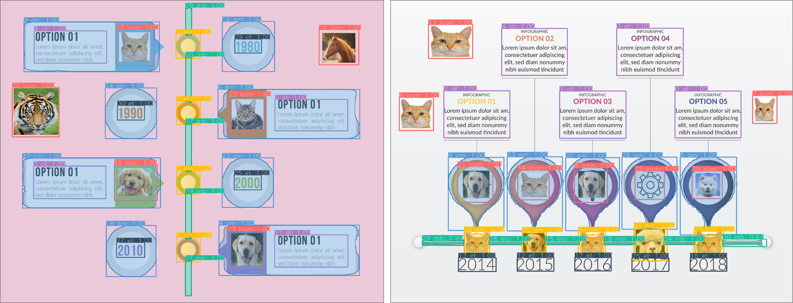
Single vs. hybrid Another difference between natural and graphical images is that graphical images can comprise natural elements and graphical elements. For example, in an infographic, a common practice is to show objects with photos and annotate them with graphical shapes. Such kind of hybrid components requires a model that considers the characteristics of natural and graphical elements. However, some of these characteristics may lead to conflict design requirements, and result in challenges in design models. Although our datasets do not include natural elements, we are interested in the performance of our model on timelines contain graphical and natural elements. Thus, we randomly substitute some graphical marks with photos of animals and then feed them to our model. The results show that our model can still correctly classify the categories of these animals (Figure 16). We regard this performance as a benefit of the pre-trained network. Future research is needed to further understand the generality of these cases.
6.3 Future Work
We propose an end-to-end approach to automatically extract extensible templates from infographic timelines. This work is only a starting point towards automated infographic design. Here, we discuss some promising opportunities that can facilitate the design process of infographics.
From timeline to the others. Although our approach focuses on infographic timelines, it can be generalized to other cases. First, our model can be extended to more than 10 types of timelines once a larger and more diverse dataset is available. The ability of our model to parse infographics mainly depends on the training dataset rather than the rules. Furthermore, the two tasks, namely, parsing the global and local information of a visualization, are not specific to timeline infographics but applicable to other types of visualizations. For example, previous research [46, 38] on charts decomposition also contains similar steps to parse the global and local information. Given that our model is data-driven, it is possible to train the model using other types of visualizations, thereby extending the model to a broader scenario. Finally, besides facilitating visualization authoring, the templates can be used to make static infographics interactive, e.g., using the parsed information to support selection and filtering of elements. The parsed information can also be used for other applications, such as indexing of infographics, retargeting of visual styles, and infographics content analysis.
To sum up, the generalizability of our model is limited by the training data. Generally speaking, DNN models, no matter supervised or unsupervised, require a large amount of training data to achieve high prediction accuracy. For the scenarios where annotated datasets are unavailable, our model has limited applicability. We plan to extend the application scenarios of our approach in the future.
From hybrid to purely learning-based. Although our approach utilizes a heuristic pipeline, it can be improved by substituting the pipeline with a DL model. Our work shows that after extracting the features of an input image, we can decode different image information (e.g., global and local information) by using multi-functional heads. Given that an extensible template can be represented by a structural document (similar to Vega specifications), a potential improvement is to use a recurrent neural network (RNN) to decode the feature maps and directly output extensible templates. Recently, Dibia and Demiralp [14] showed the possibility of translating a JSON-encoded data into Vega-lite specification by using a RNN. Research in CV field also presents models that take images as inputs and return textual data as outputs. The related work suggests the potential to extend our model to an end-to-end model, which takes infographic images as inputs and directly outputs templates. We consider this area as an important future direction.
From template-based to freeform. Lastly, our model shows the ability to learn and understand the content of infographic images. This characteristic indicates several potential directions to facilitate the design process. For example, we can use a trained model to interpret a sketch or materials (e.g., data, icons, and textual description) from users and recommend infographic templates. Another step in this direction is to design mixed initiative authoring systems, including automatically completing or generating designs on the basis of users’ input.
6.4 Limitations
We acknowledge the limitations of our study. First, our datasets are rather limited while the generalizability of our model mainly depends on the data. However, collecting high-quality infographic datasets is not an easy task considering the manual labeling efforts. We plan to open source 111https://chenzhutian.org/auto-infog-timeline our datasets and labeling tools for the community and collect larger-scale infographic datasets in the future. Second, given our work is not aimed at high metric values, we did not optimize our model with bells and whistles, including multi-scale train/test, OHEM [47], and other techniques. Outside the scope of this work, we expect that such improvement skills are applicable to our model. Third, although our approach can automatically extract templates from infographic timelines, its performance can be further improved by involving users’ refinements. For example, we can integrate our approach to infographic authoring tools and thus allow users to interactively refine extracted results. A separate limitation is that the learning process is a ’blackbox’, which calls for investigations on the learning process. Finally, when applying our approach for some purposes (e.g., reusing graphical elements or overall layouts), we suggest that users should note the copyright issue, which is complicated and depends on the law varying among countries, the purpose of usage (e.g., commercial vs. noncommercial), the degrees of the redesign, etc.
7 Conclusion
We contribute an automated approach to extract extensible templates from bitmap infographic timelines. A multi-task DNN is presented to understand and deconstruct bitmap timeline infographics, by classifying the types and orientations of timelines and detecting and segmenting elements on timelines; from these results, a heuristic pipeline is used to reconstruct extensible templates. The extensible templates can be used to automatically generate timeline infographics with updated data. The quantitative experiments and example results confirm the effectiveness and usefulness of our approach. We share lessons learned from our study which make us notice the needs of graphical image-driven deep learning. We also discuss how our work can be extended towards automated infographics design in future researches.
Acknowledgements.
The authors wish to thank Weiwei Cui for valuable feedback on this project, Sikai Cai, Zicheng Xu, Kun Xie for assistance in labeling the dataset, as well as the anonymous reviewers for their valuable comments. This work is partially supported by a grant from MSRA (code: MRA19EG02).References
- [1] Common objects in context. http://cocodataset.org.
- [2] FontsSring font matcherator. https://www.fontspring.com/matcherator.
- [3] FreePik. https://www.freepik.com.
- [4] Google image. https://www.google.com/imghp.
- [5] Microsoft TimelineStoryteller. https://timelinestoryteller.com/app/.
- [6] Pinterest. https://www.pinterest.com.
- [7] Pytorch. https://pytorch.org.
- [8] J. Bertin. Semiology of Graphics. University of Wisconsin Press, 1983.
- [9] M. A. Borkin, Z. Bylinskii, N. W. Kim, C. M. Bainbridge, C. S. Yeh, D. Borkin, H. Pfister, and A. Oliva. Beyond Memorability: Visualization Recognition and Recall. IEEE TVCG, 22(1):519–528, 2016.
- [10] M. Brehmer, B. Lee, B. Bach, N. H. Riche, and T. Munzner. Timelines Revisited: A Design Space and Considerations for Expressive Storytelling. IEEE TVCG, 23(9):2151–2164, 2017.
- [11] Z. Bylinskii, S. Alsheikh, S. Madan, A. Recasens, K. Zhong, H. Pfister, F. Durand, and A. Oliva. Understanding Infographics through Textual and Visual Tag Prediction. CoRR, abs/1709.09215, 2017.
- [12] Z. Bylinskii, N. W. Kim, P. O’Donovan, S. Alsheikh, S. Madan, H. Pfister, F. Durand, B. Russell, and A. Hertzmann. Learning Visual Importance for Graphic Designs and Data Visualizations. In Proc. UIST, pages 57–69. ACM, 2017.
- [13] W. S. Cleveland and R. McGill. Graphical Perception: Theory, Experimentation, and Application to the Development of Graphical Methods. J. Am. Stat. Assoc., pages 531–554, 1984.
- [14] V. Dibia and Ç. Demiralp. Data2Vis: Automatic Generation of Data Visualizations Using Sequence to Sequence Recurrent Neural Networks. CoRR, abs/1804.03126, 2018.
- [15] M. Everingham, S. M. A. Eslami, L. Van Gool, C. K. I. Williams, J. Winn, and A. Zisserman. The Pascal Visual Object Classes Challenge: A Retrospective. Springer IJCV, 111(1):98–136, 2015.
- [16] R. Girshick. Fast R-CNN. In Proc. ICCV, pages 1440–1448. IEEE, 2015.
- [17] R. Girshick, J. Donahue, T. Darrell, and J. Malik. Rich Feature Hierarchies for Accurate Object Detection and Semantic Segmentation. In Proc. CVPR, pages 580–587. IEEE, 2014.
- [18] I. Goodfellow, Y. Bengio, and A. Courville. Deep Learning. MIT Press, 2016. http://www.deeplearningbook.org.
- [19] S. Haroz, R. Kosara, and S. L. Franconeri. ISOTYPE Visualization: Working Memory, Performance, and Engagement with Pictographs. In Proc. CHI, pages 1191–1200. ACM, 2015.
- [20] L. Harrison and K. Reinecke. Infographic Aesthetics: Designing for the First Impression. In Proc. CHI, pages 1187–1190. ACM, 2015.
- [21] K. Z. Hu, M. A. Bakker, S. Li, T. Kraska, and C. A. Hidalgo. VizML: A Machine Learning Approach to Visualization Recommendation. In Proc. CHI, page 128. ACM, 2019.
- [22] D. Jung, W. Kim, B. Lee, B. Kim, and J. Seo. ChartSense: Interactive Data Extraction from Chart Images. In Proc. CHI, pages 6706–6717. ACM, 2017.
- [23] K. Kafle, B. Price, S. Cohen, and C. Kanan. DVQA: Understanding Data Visualizations via Question Answering. In Proc. CVPR, pages 5648–5656. IEEE, 2018.
- [24] Kaiming, He and Georgia, Gkioxari and Piotr, Dollar and Ross, Girshick. Mask R-CNN. In Proc. ICCV, pages 2980–2988. IEEE, 2017.
- [25] A. Kembhavi, M. Salvato, E. Kolve, M. Seo, H. Hajishirzi, and A. Farhadi. A Diagram is Worth a Dozen Images. In Proc. ECCV, pages 235–251. Springer, 2016.
- [26] N. W. Kim, E. Schweickart, Z. Liu, M. Dontcheva, W. Li, J. Popovic, and H. Pfister. Data-Driven Guides : Supporting Expressive Design for Information Graphics. IEEE TVCG, 23(1):491–500, 2017.
- [27] A. Krizhevsky, I. Sutskever, and G. E. Hinton. Imagenet Classification with Deep Convolutional Neural Networks. In Proc. NIPS, pages 1106–1114, 2012.
- [28] C. H. Lampert, M. B. Blaschko, and T. Hofmann. Beyond Sliding Windows: Object Localization by Efficient Subwindow Search. In Proc. CVPR. IEEE, 2008.
- [29] T. Lin, P. Dollár, R. B. Girshick, K. He, B. Hariharan, and S. J. Belongie. Feature Pyramid Networks for Object Detection. In Proc. CVPR, pages 936–944. IEEE, 2017.
- [30] T. Lin, P. Goyal, R. Girshick, K. He, and P. Dollár. Focal Loss for Dense Object Detection. In Proc. ICCV, pages 2999–3007. IEEE, 2017.
- [31] T. F. Liu, M. Craft, J. Situ, E. Yumer, R. Mech, and R. Kumar. Learning Design Semantics for Mobile Apps. In Proc. UIST, pages 569–579. ACM, 2018.
- [32] W. Liu, D. Anguelov, D. Erhan, C. Szegedy, S. Reed, C.-y. Fu, and A. C. Berg. SSD : Single Shot MultiBox Detector. In Proc. ECCV, pages 21–37. Springer, 2016.
- [33] Y. Luo, X. Qin, N. Tang, and G. Li. DeepEye: Towards Automatic Data Visualization. In Proc. ICDE, pages 101–112. IEEE, 2018.
- [34] J. Mackinlay. Automating the Design of Graphical Presentations of Relational Information. ACM TOG, 5(2):110–141, 1987.
- [35] J. D. Mackinlay, P. Hanrahan, and C. Stolte. Show Me: Automatic Presentation for Visual Analysis. IEEE TVCG, 13(6):1137–1144, 2007.
- [36] S. Madan, Z. Bylinskii, M. Tancik, A. Recasens, K. Zhong, S. Alsheikh, H. Pfister, A. Oliva, and F. Durand. Synthetically Trained Icon Proposals for Parsing and Summarizing Infographics. CoRR, abs/1807.10441, 2018.
- [37] D. Moritz, C. Wang, G. L. Nelson, H. Lin, A. M. Smith, B. Howe, and J. Heer. Formalizing Visualization Design Knowledge as Constraints: Actionable and Extensible Models in Draco. IEEE TVCG, 25(1):438–448, 2019.
- [38] J. Poco and J. Heer. Reverse-Engineering Visualizations: Recovering Visual Encodings from Chart Images. CGF, 36(3):353–363, 2017.
- [39] J. Poco, A. Mayhua, and J. Heer. Extracting and Retargeting Color Mappings from Bitmap Images of Visualizations. IEEE TVCG, 24(1):637–646, 2018.
- [40] J. Redmon, S. K. Divvala, R. B. Girshick, and A. Farhadi. You Only Look Once: Unified, Real-Time Object Detection. In Proc. CVPR, pages 779–788. IEEE, 2016.
- [41] S. Ren, K. He, R. Girshick, and J. Sun. Faster R-CNN: Towards Real-Time Object Detection with Region Proposal Network. In Proc. NIPS, pages 91–99, 2015.
- [42] S. F. Roth, J. Kolojejchick, J. Mattis, and J. Goldstein. Interactive Graphic Design Using Automatic Presentation Knowledge. In Proc. CHI, page 207. ACM, 1994.
- [43] C. Rother, V. Kolmogorov, and A. Blake. ”GrabCut”: Interactive Foreground Extraction Using Iterated Graph Cuts. ACM TOG, 23(3):309–314, 2004.
- [44] S. Sabour, N. Frosst, and G. Hinton. Dynamic Routing between Capsules. In Proc. NIPS, pages 3859–3869, 2017.
- [45] A. Satyanarayan, D. Moritz, K. Wongsuphasawat, and J. Heer. Vega-Lite : A Grammar of Interactive Graphics. IEEE TVCG, 23(1):341–350, 2018.
- [46] M. Savva, N. Kong, A. Chhajta, L. Fei-Fei, M. Agrawala, and J. Heer. ReVision: Automated Classification, Analysis and Redesign of Chart Images. In Proc. UIST, pages 393–402. ACM, 2011.
- [47] A. Shrivastava, A. Gupta, and R. B. Girshick. Training Region-based Object Detectors with Online Hard Example Mining. In Proc. CVPR, pages 761–769. IEEE, 2016.
- [48] N. Siegel, Z. Horvitz, R. Levin, S. Divvala, and A. Farhadi. FigureSeer: Parsing Result-Figures in Research Papers. In Proc. ECCV, pages 664–680. Springer, 2016.
- [49] R. Smith. An Overview of the Tesseract OCR Engine. In Proc. ICDAR, pages 629–633. IEEE, 2007.
- [50] C. STEPHEN M. Task-Analytic Approach to the Automated Design of Graphic Presentations. ACM TOG, 10(2):111–151, 1991.
- [51] C. Szegedy, W. Liu, Y. Jia, P. Sermanet, S. E. Reed, D. Anguelov, D. Erhan, V. Vanhoucke, and A. Rabinovich. Going Deeper with Convolutions. In Proc. CVPR, pages 1–9. IEEE, 2015.
- [52] Y. Wang, H. Zhang, H. Huang, X. Chen, Q. Yin, Z. Hou, D. Zhang, Q. Luo, and H. Qu. InfoNice: Easy Creation of Information Graphics. In Proc. CHI, page 335. ACM, 2018.
- [53] K. Wongsuphasawat, D. Moritz, A. Anand, J. Mackinlay, B. Howe, and J. Heer. Voyager : Exploratory Analysis via Faceted Browsing of Visualization Recommendations. IEEE TVCG, 22(1):649–658, 2016.
- [54] K. Wongsuphasawat, Z. Qu, D. Moritz, R. Chang, F. Ouk, A. Anand, J. Mackinlay, B. Howe, and J. Heer. Voyager 2 : Augmenting Visual Analysis with Partial View Specifications. In Proc. CHI, pages 2648–2659. ACM, 2017.
- [55] H. Xia, N. Henry Riche, F. Chevalier, B. De Araujo, and D. Wigdor. DataInk: Direct and Creative Data-Oriented Drawing. In Proc. CHI, page 223. ACM, 2018.
- [56] S. Xie, R. Girshick, P. Dollár, Z. Tu, and K. He. Aggregated Residual Transformations for Deep Neural Networks. In Proc. CVPR, pages 5987–5995. IEEE, 2017.