0 \vgtccategoryResearch \vgtcpapertypeplease specify \authorfooter Bahador Saket, Lei Jiang, and Alex Endert are with Georgia Tech. E-mail:{saket,ljiang87,endert} @gatech.edu. Charles Perin is with University of Victoria, E-mail: cperin@uvic.ca. \shortauthortitleBiv et al.: Global Illumination for Fun and Profit
Liger: Combining Interaction Paradigms for Visual Analysis
Abstract
Visualization tools usually leverage a single interaction paradigm (e.g., manual view specification, visualization by demonstration, etc.), which fosters the process of visualization construction. A large body of work has investigated the effectiveness of individual interaction paradigms, building an understanding of advantages and disadvantages of each in isolation. However, how can we leverage the benefits of multiple interaction paradigms by combining them into a single tool? We currently lack a holistic view of how interaction paradigms that use the same input modality (e.g., mouse) can be combined into a single tool and how people use such tools. To investigate opportunities and challenges in combining paradigms, we first created a multi-paradigm prototype (Liger) that combines two mouse-based interaction paradigms (manual view specification and visualization by demonstration) in a unified tool. We then conducted an exploratory study with Liger, providing initial evidence that people 1) use both paradigms interchangeably, 2) seamlessly switch between paradigms based on the operation at hand, and 3) choose to successfully complete a single operation using a combination of both paradigms.
keywords:
Multi-Paradigm Interfaces, Visualization by Demonstration, Manual View SpecificationK.6.1Management of Computing and Information SystemsProject and People ManagementLife Cycle; \CCScatK.7.mThe Computing ProfessionMiscellaneousEthics \vgtcinsertpkg
Introduction
In this paper, we investigate the challenge of combining interaction paradigms in desktop-based visualization tools with mouse input. Interaction is an essential part of visualizations tools, as it enables people to both construct visualizations and conduct data analyses [yi2007toward, dix1988starting]. There exists a wide variety of visualization tools, and these tools leverage a variety of interaction paradigms. In this paper, we use the term interaction paradigm to refer to the process of how visualization construction is fostered in a tool. Although other terms such as “interaction style” or “interaction model” could also be used, we choose to use the term interaction paradigm similar to [saket2018evaluation, saketVbD].
The visualization community has investigated the effectiveness of interaction paradigms implemented in visualization tools (e.g., [grammel2013survey, Mendez:2018, Mendez:2017]). These studies have built an understanding of advantages and disadvantages of different interaction paradigms. However, studying these paradigms in isolation does not provide a holistic understanding of how one might use several paradigms together. We do not know if combining multiple interaction paradigms in a visualization tool is useful; nor how multiple paradigms can be used in combination. As a first step toward answering these questions, we investigate the use of two mouse-based interaction paradigms in visualization.
The first paradigm we consider is Manual View Specification (MVS) [saket2018evaluation]. MVS is arguably the most widely used paradigm, implemented in well-known visualization tools such as Tableau [Tableau] and Spotfire [ahlberg1996spotfire]. MVS enables people to manually specify mappings (from data to visual encodings) through GUI operations on collections of visual properties and attributes that are presented on control panels. For instance, to create a bar chart, one would specify the visualization type, then map data attributes onto axes, and map additional data attributes to visual encodings. Many tools that have differences in user interface design [grammel2013survey] have a consistent underlying MVS interaction paradigm. For example, Tableau [Tableau] and Polestar [PoleStar] implement MVS by letting people drag and drop attributes onto shelves to set specifications; other tools such as Spotfire [ahlberg1996spotfire] implement MVS by letting people use dropdown menus. MVS tools let the person using the tool specify visual properties, and the system responds by generating the resulting view.
The second paradigm we consider is Visualization by Demonstration (VbD) [saket2018evaluation, saket_CGA, saketVbD]. With VbD, instead of specifying mappings between data attributes and visual encodings directly, people provide partial demonstrations of their intent to the visual representation using direct manipulation of visual marks. For example, using VbD a person might convey their interest in mapping a data attribute to color by coloring one or more data points. The system then interprets the intent of the person and suggests or applies changes to the visualization. VbD leverages research showing the benefits of letting people create spatial representations of data points manually, without formalizing the mappings between data and spatial constructs [huron2014constructive, shipman1999formality].
Both MVS and VbD enable people to iteratively build visualizations by performing visualization operations. Such operations include switching between visualization techniques and mapping data attributes to visual encodings (e.g., size). However, MVS and VbD have intrinsic differences, and both have their own advantages and disadvantages [saket2018evaluation]. MVS tools are easy to learn and fast, because they have high external consistency [Grudin:1989, saket2018evaluation]. On the other hands, VbD tools have higher interaction expressivity, thus increase the levels of perceived control and engagement for the user [saket2018evaluation]. This leads us to consider how complementary these two paradigms are, and if it is possible to leverage the advantages of each, while limiting their respective disadvantages. However, we do not know how to offer the benefits of two different interaction paradigms in a unified visualization tool.
Little work has explored how multiple interaction paradigms that use the same input modality (mouse for MVS and VbD) can be blended into a single visualization tool. We hypothesize that the expressivity provided by VbD can be a beneficial addition to tools that rely on the well-known MVS paradigm. Exploring such multi-paradigm tools poses several challenges. First, it requires careful design and implementation considerations to ensure usability and proper combination of the two paradigms. Second, it requires studying empirically the extent to which such interfaces facilitate common visual analysis tasks, as well as whether they lead to an improved user experience.
To address these research questions, we first create Liger, a visual data exploration prototype that unifies the MVS and VbD paradigms. We use Liger as a testbed to investigate opportunities and challenges in combining multiple paradigms. Through the design and implementation of Liger, we exemplify how interaction paradigms can be blended to generate context that complements the individual paradigms. We then report a qualitative study of Liger with 10 participants that shows how people use both interaction paradigms for data exploration. Further, we discuss varying preferences for interaction paradigms, opportunities and challenges in multi-paradigm interfaces.
1 Related Work
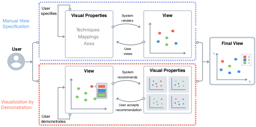
Several visualization process models explain the steps users follow to construct visualizations and conduct visual data analysis [card1999readings, Chi:interactionmodel, Carpendale:thesis]. The “visualization reference model” [card1999readings] introduces the steps of Raw Data Transformation, Data Table Transformation, Visual Properties Specification, and View Rendering for creating and interacting with visualizations. This model and its variations (e.g., [Chi:interactionmodel, Carpendale:thesis]) place Visual Properties Specification before View Rendering. As a result, interaction paradigms following this approach ask users to first map data attributes to visual properties, then have systems render the views based on these mappings. We use this observation to explain the differences between MVS and VbD in the next subsections (see Figure 2).
1.1 Manual View Specification (MVS)
Following the visualization reference model, the MVS paradigm asks users to map data attributes to visual properties prior to rendering the view. This is the case with tools like MS Excel, Spotfire [ahlberg1996spotfire], Tableau [Tableau] and Polaris [polaris:infovis00]. For instance, to create a scatterplot, users must specify the point visualization technique and map data attributes to the and axes. The system then generates the corresponding scatterplot.
Grammel et al. [grammel2013survey] surveyed desktop-based visualization tools with mouse/keyboard input, from which they extracted six categories of user interface design. Four of these categories are most relevant to our work: template editors, shelf configuration, visual builder, and visual data flow. Below, we describe these four designs, emphasizing that they are all variations of the MVS paradigm.
With the template editor design, “the user selects some data and then picks a predefined visual structure in which to represent it. The distinguishing criteria of this approach are the separation between the initial visualization selection steps and the refinement of the selected visualization” [grammel2013survey]. This design requires users to specify data attributes before selecting a predefined visual structure. Tools like Many Eyes [viegas2007manyeyes] and MS Excel implement the template editor design.
The visual builder design often consists of an empty canvas on which visual elements from a palette can be assembled – similar to graphics editor tools such as Sketch and Adobe Illustrator. Visual builder tools, like template editor tools, require users to specify visualization properties prior to rendering the final view. But the approach is different. First, users can draw a customized visual glyph and assemble visual elements together on the canvas. Then, they can manually bind graphical properties of the visual glyph to data attributes. Visualization authoring tools such as Data Illustrator [Liu:2018], Data-Driven Guides [kim2017data], and Charticulator [Charticulator] implement this design.
The data flow design lets users construct visualizations by connecting visual components through links. The final graph of connected components represents the dataflow and the final visual output. While the data flow design has a long history, recent visualization tools such as iVoLVER [Mendez:2017] have revisited this design.
The shelf configuration design lets users specify visual mappings on collections of visual properties and data attributes that are presented on control panels. The shelf configuration design can have variations. For example, tools such as Tableau [Tableau] and Polestar [PoleStar] let people drag and drop attributes onto shelves to set specifications. Other tools such as Spotfire [ahlberg1996spotfire] do so by providing dropdown menus. Regardless of the implementation though, the users’ responsibilities are still to specify visual properties through graphical widgets presented on the interface.
1.2 Visualization by Demonstration (VbD)
In contrast to MVS, VbD [saket2018evaluation, saketVbD, saket_CGA] does not follow the sequential approach to first mapping data attributes to visual properties, then rendering the views. Instead, VbD lets people provide partial demonstrations of their intent at the View level through direct manipulation of visual marks [saket:2017:evaluating, saket:encoding2019]. Then, the system infers lower-level specification and suggests or applies changes at the view level. For example, users could resize a few data points to convey their interest in mapping size to a data attribute. In response, the system extracts data attributes that can be mapped to size and suggests them (see Figure 2).
VbD builds on explorations of demonstration-based approaches in related computing areas. Notably, programming by demonstration [cypher1993watch] enables users to generate code by providing visual demonstrations of intended software functionality. Programming by demonstration incrementally improves the state of the system by continuing to demonstrate further changes or by directly editing the produced code. Other domains that have successfully used the “by demonstration” paradigm include 3D drawing by demonstration [Igarashi:drawing], data cleaning by demonstration [Lin:dataCleaning], and interactive database querying by demonstration [Zloof1975QueryBE].
1.3 Studying the Effectiveness of Interaction Paradigms
Previous research has built an understanding of advantages and disadvantages of different paradigms supported in visualization tools.
Grammel et al. [grammel2010information] studied how visualization novices construct visualizations with a shelf configuration software (MVS). They found that participants in their study had difficulties in breaking down their questions into a set of lower level operations to perform on the interface. We hypothesize this is because specifying the visual properties prior to seeing the visualization is a challenging task for users with little visualization expertise. Another study revealed differences between top-down or bottom-up visualization tools in terms of how visualization novices construct visualizations and make design choices [Mendez:2017]. Results from this study reveal trade-offs between top-down and bottom-up approaches to creating visualizations. In particular, while top-down approaches result in faster data exploration, bottom-up approaches result in more active data exploration processes thus enable users to better reflect on their data, insights, uncertainties, and open questions.
Previous work also found that mixed-initiative systems that combine both breadth and focus approaches help analysts engage in both open-ended exploration and targeted question answering, because it increases data field coverage compared to a traditional focused approaches [2017-voyager2]. Directly comparing how people construct visualizations with a MVS tool and with a VbD tool [saket2018evaluation] showed that each interaction paradigm is more efficient than the other for different visualization operations.
In summary, previous research tells us that: 1) individual interaction paradigms have advantages and disadvantages, 2) mixed-initiative approaches can increase data analysis coverage, and 3) interaction paradigms can be complementary (in particular MVS and VbD). The next steps in this line of research are: i) to understand the feasibility of combining multiple paradigms into a visualization tool that would leverage the benefits of each paradigm – which we address by designing Liger; and ii) to build an understanding of how people might benefit from the availability of multiple paradigms – which we address through a qualitative study where participants used Liger to explore data.
2 Differences Between MVS and VbD
Although both MVS and VbD offer iterative processes for creating visualizations, they have fundamental differences [saket2018evaluation]. One way to look at these differences is to consider the dimensions of visualization construction model and number of intermediary interface elements [saket2018evaluation]. In terms of the visualization construction model, MVS requires people to specify visualization techniques, mappings from data attributes to visual encodings, and other visualization parameters. In contrast, VbD requires people to provide visual demonstrations of incremental changes to the visualization. It then recommends potential visualization techniques, mappings and parameters based on the system’s interpretation of the demonstrations. In terms of number of intermediary interface elements, MVS introduces interface elements (or instruments [beaudouin:2000:instrumental]) such as menus and dialog boxes that act as mediators between the user and the visual representation. In contrast, VbD lets people interact directly with the visual representation rather than external interface elements, as much as possible. Although implementations of VbD usually rely on some external interface elements, for example for accepting or rejecting the recommendations, the number of required interface elements is smaller than with MVS.
MVS and VbD are also different when considering the dimensions of agency and granularity [Mendez:2018]. Agency refers to who is responsible for carrying out the visualization construction process: the user or the tool. For example, Watson Analytics [watson-analytics] gives full agency to the tool while iVoLVER [Mendez:2017] gives full agency to the user. With most MVS tools such as Polestar, Many Eyes, and Spotfire, the agency tends to be more on the user side than on the tool side [Mendez:2018] because design decisions are mostly driven by the user. With VbD, agency is shared between the user and the tool because of the automation that occurs as part of recommending visualizations based on user demonstrations. Granularity refers to the level at which the tool enables the manipulation of both data and visual representations. Most MVS tools have a coarse granularity [Mendez:2018], as they let users operate on data attributes and manipulate groups of marks (e.g., LARK [Tobiasz:2009]). Tools that have a fine granularity like iVolver [Mendez:2017] let users access individual data values and manipulate individual marks. VbD has a finer level of granularity than MVS, as it lets users directly manipulate individual graphical encodings rather than attributes.
3 Liger Walk-through
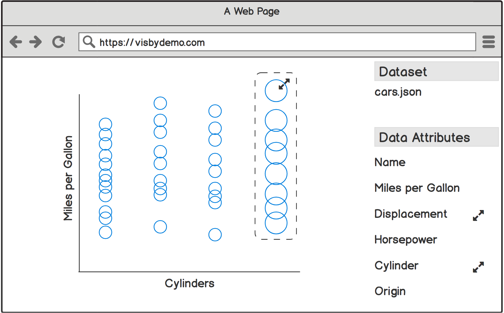
We start by illustrating the multi-paradigm functionality of Liger through a scenario. Suppose Amy is interested in buying a car that would best match her needs and preferences. She opens Liger and loads the car dataset [henderson1981building]. The dataset contains 250 cars, each described through 9 attributes such as number of cylinders and miles per gallon.
Amy first wants to get an idea of the relationship between number of cylinders and miles per gallon. For that, she uses the MVS paradigm. She drags the Cylinders and Miles per Gallon attributes from the Attributes panel (left-most panel in Figure 3) and drops them onto the and axis placeholders in the Encodings Panel (top-right panel in Figure 3). She finalizes her first visualization by selecting the bar chart under the Show Me menu (top-left menu in Figure 3).
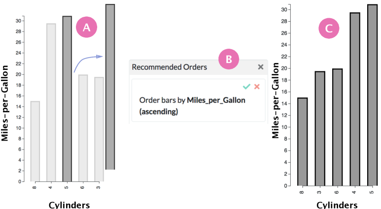
Amy notices that the average miles per gallon of cars varies according to number of cylinders. So she decides to sort the bar chart to see which numbers of cylinders have the highest and lowest average miles per gallon. For that, she uses the VbD paradigm. She selects the tallest bar and drags it the the extreme right of the bar chart to demonstrate her interest in sorting (see Figure 4-A). In response, the Recommendation Panel is updated based on the system’s interpretation of Amy’s demonstration (see Figure 4-B). Amy accepts the recommendation to sort the bar chart by Miles per Gallon in an ascending order; the system updates the bar chart accordingly (see Figure 4-C).
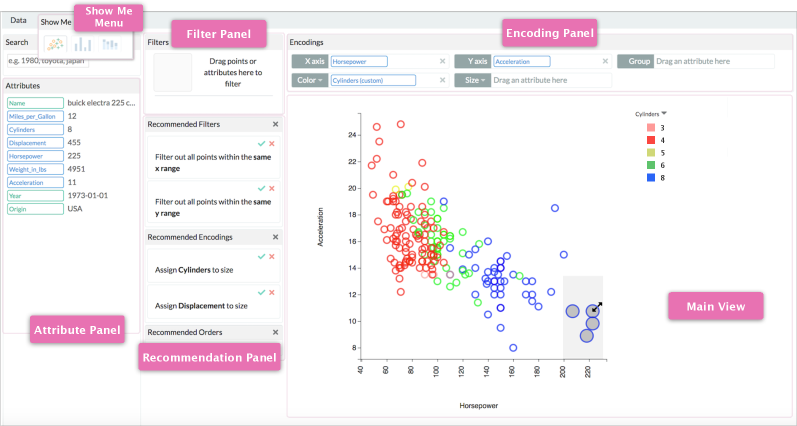
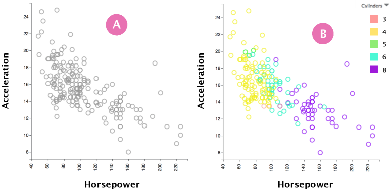
Amy realizes i) that there is not a straightforward relationship between the number of cylinders and the miles per gallon rating; and ii) that the bar chart is not a good visualization for helping her look at individual vehicles. Thus, she decides to look at the relationships between other dimensions (Horsepower, Acceleration, and Cylinders) using a scatterplot. She uses the MVS paradigm to switch from the bar chart to a scatterplot. She drags and drops the Horsepower attribute onto the axis placeholder and the Acceleration attribute onto the axis placeholder (see Figure 5-A). Then she maps the Cylinders attribute to color hue using the same drag-and-drop technique (see Figure 5-B).
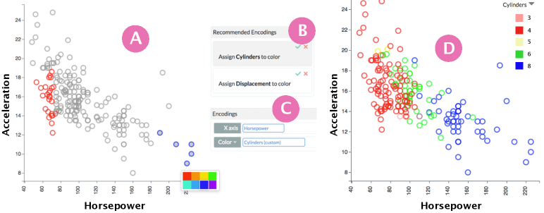
Amy is not very fond of the color scheme automatically assigned to Cylinders. She removes the color mapping, reverting the Main View to the one shown in Figure 5-A. She decides to use the VbD paradigm to create a color scheme that is more her taste. To demonstrate her intent to customize the color palette, she selects and re-colors a few 4-cylinder cars red and a few 8-cylinder cars blue (see Figure 8-A). The system automatically extracts data attributes that can be mapped to color (in this case Cylinders and Displacement) and recommends them (see Figure 8-B). Amy accepts mapping Cylinders to color. The Encoding panel now shows the Cylinders (customized) attribute on the color placeholder (see Figure 8-C) and the color of the data points is updated according to the new color scheme (see Figure 8-D).
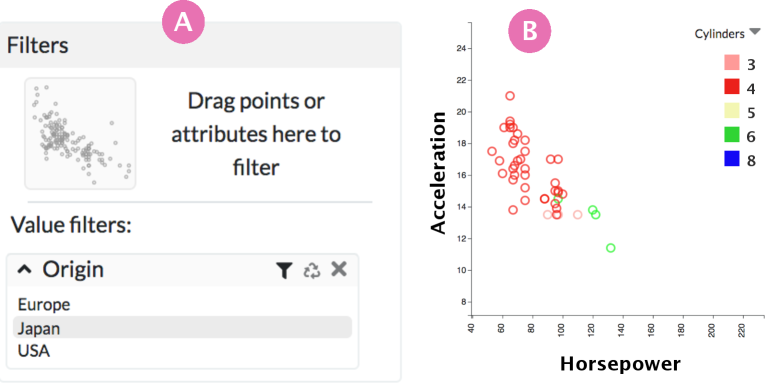
Amy remembers a friend of her’s mentioned that Japanese cars have low fuel consumption. She decided to explore this notion, and uses the MVS paradigm to exclude non-Japanese cars, by dragging and dropping the Origin attribute onto the Filter Panel (see Figure 8-A). The Filter panel now shows the three values for the Origin attribute. She excludes the European and American cars by deselecting these in the filter she created (see Figure 8-A). This updates the overview of the filtered points in the Filter panel and the Main View (Figure 8-B).
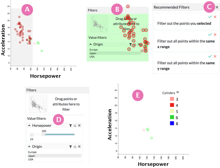
While low consumption is important, Amy does still want some sporty aspects to her driving experience, and thus would like a car with high Horsepower. She uses the VbD paradigm to lasso-select cars with Horsepower below 100 (see Figure 8-A). She demonstrates her interest in filtering out the selected cars by dragging the them out of the Main View and dropping them onto the Filter panel (see Figure 8-B). Amy explores the different recommended options (see Figure 8-C) by hovering over them on the Recommendation Panel, which provides a preview of the change in the main view. She accepts the recommendation to filter out all points within the same range. As a result of this, the system automatically creates a new filter for the Horsepower attribute in the Filter panel. Because the data is quantitative, the filter provides a range slider for Amy to fine-tune the filtering criteria (see Figure 8-D). The Main View updates to reflect the new filter (see Figure 8-E). Amy notices that one of the four cars (in red) has less cylinders than the other three (in green). Given that the cars are similar otherwise, she thinks that the Mazda MX-5 is her best option. After narrowing down her options to only 4 cars, she decides to go test drive each of them.
4 Preliminary Study
Designing a tool that combines paradigms (MVS and VbD in our case) is a challenging endeavor. We faced several design decisions, including: Should each operation be supported by only one paradigm (perhaps the one best suited for the operation) or by both paradigms? Should both paradigms work in conjunction or independently? Thus, we started with a preliminary study to better understand the design space of a multi-paradigm visualization tool by observing the usage patterns and the difficulties people may have for each paradigm.
We first designed a prototype that supports a variety of operations for scatterplots and bar charts. These operations include mapping data attributes to axes and mark properties (e.g., size and color), switching from one visualization technique to another, filtering data points, and sorting according to an axis. Both MVS and VbD had full coverage of the available operations. For instance, to sort a bar chart, one could either: i) with MVS, click the sort button on the control panel (similar to Tableau); or ii) with VbD, drag the shortest/tallest bar to extreme left or right to demonstrate their intent in sorting the bar chart. The system would then interpret the intent and suggest sorting the bar chart.
We recruited four participants (3 male, 1 female). We first explained the tool and available interactions. Then, we asked participants to imagine their employer asked them to analyze a dataset about movies (the Movies dataset [TableauData]) using the tool for 20 minutes, and to report their findings about the data. We encouraged participants to try both paradigms and to verbalize their thought process while exploring the data. Results from this preliminary study emphasized three patterns for constructing visualizations using a multi-paradigm tool:
Pattern 1: Try it out first. Participants performed the same operation using both paradigms one after the other when they first started interacting with the system. Trying out the different paradigms helped them better understand the system and possible interactions.
Pattern 2: Assess and choose. Over time, participants’ choice of paradigm converged toward using the paradigm they found to be most efficient for a given operation. For instance, all four participants preferred using MVS to switch between visualizations as they found this easier and more efficient than using VbD. For some operations like filtering data points or mapping a data attribute to color, they found the two paradigms to be equally effective and used both interchangeably.
Pattern 3: Combine. Participants sometimes combined MVS and VbD to complete a single operation. For example, a participant first used MVS to map a data attribute to color in a scatterplot, by dragging and dropping the data attribute to the color shelf. Then, she said: “I don’t like the colors”, and used VbD to manually color a few data points, representative of a custom color palette she had in mind. The system then recommended color mappings based on these colors.
Based on these three patterns, we iterated over our initial design to develop a new version of our tool, called Liger.
5 Liger
We designed and developed Liger (see Figure 3) as a proof of concept multi-paradigm prototype that blends two interaction paradigms (MVS and VbD). We implemented Liger using JavaScript, TypeScript, and D3 [d3:infovis11]. It is available at https://github.com/liger-vis/LigerPrototype.
5.1 Design Goals
Based on the findings from our preliminary study and lessons learned from previous work [grammel2013survey, Mendez:2018, beaudouin:2000:instrumental, saket2018evaluation, Mendez:2017], we introduce three general design goals for a multi-paradigm tool.
-
Not every operation must be supported by both paradigms.Previousworkindicat