Measuring Scientific Brain Drain with Hubs and Authorities: a Dual Perspective
Abstract
\justifyWe studied international migrations of researchers, scientists, and academics, to better understand the so-called “brain drain” phenomenon, if and how it can be measured, and how it changes over time. We discuss why some trivial measures can be ineffective, and as a consequence, we built the global scientific migration network to identify the most important countries involved in the mobility of scholars, and to study their role at a local and a global scale.
For such a purpose, we analysed a temporal directed weighted network representing scientists moving from one country to another, from 2000 to 2016, built on top of million ORCID public profiles. With the support of the well-known HITS algorithm, we found hubs and authorities to study the interplay between providing and attracting researchers from a global perspective, and its relationship to other structural features.
Our findings highlight the presence of a set of countries acting both as hubs and authorities, occupying a privileged position in the Scientific Migration Network, that is network of the scientific migrations, and having similar local characteristics, i.e., several neighbours with highly differentiated flows of researchers moving from/to them. However, it is striking that some of these countries have a predominant role over the others, and that we can easily observe countries that are extremely more attractive than others, as well as other countries that perform better as exporters than importers of scientists. It is also interesting that hubs and authorities scores can change over time, alongside with their relative discrepancy, and other network measures, suggesting that local and/or global policies can buck the trend.
Keywords: scientific migration, complex networks analysis, hyperlink-induced topic search, science of science
1 Introduction
Human migration has always been a phenomenon of crucial importance in history and it has radically evolved over time, affected by historical and economic events. It is known for shaping local demographics, politics, and regulations; and, also, for influencing global wealth and world-wide society [1], [2].
The definitive outcome of human migration is subtle and extremely unpredictable, especially in the long term, due to the need for addressing different borders: geographical, political, and even cultural [3]. For these reasons, human migration is perceived in many different manners and, consequently, treated by local states with opposite aims: it is sometimes encouraged, rather discouraged [4]. In particular, knowledge, ideas, and information are considered to be among the most relevant assets in today’s economy and are naturally embedded in researchers, scientists, and academics who, through their permanent or temporary mobility paths, move such goods from a location to another [5]. On the long term, international scientific mobility could impact fundamental social and economic aspects of the countries, such as scientific, technological, and productive assets [6]. Please, observe that hereinafter the terms “mobility” and “migration” will be used interchangeably to indicate the event of a researcher moving from one country to another, without differentiating permanent or long stays from short stays such and scholarships or post-doc periods. Albeit, most of the times, this phenomenon lacks the urgency of survival, it is highly competitive in terms of choice of the destination countries, as pointed out in [7].
In this paper, we want to explore scientific migration as a global and inherently interdependent phenomenon. We analyse different frameworks to detect those countries that better attract or repel researchers, to characterise different roles, and to understand how mobility dynamics change over time: the so-called “brain drain” phenomenon. We rely our analysis on ORCID, a growing platform that collects public profiles of researchers.In particular, we employed million public profiles created until 2016 and already used for other preliminary analysis [8]. Given its nature, the (scientific) migration system can be modelled using a network that we define to be temporal, weighted, and directed: it turns out that a complex network perspective is very useful to define relationships between actors involved in this ecosystem, and it also provides a solid ground to define measures and parameters that can be used to study efficiently the mobility phenomenon. In this domain, nodes represent world countries and edges account for a migratory flow from a country to another. Edge weights stand for the size of the migratory flow in terms of migrants, while timestamps represent years from 2000 to 2016. We name such structure scientific migration network (SMN for short).
In our setting, we aim at identifying those countries that are able to provide or attract a large number of outgoing or incoming researchers. Apparently, these characteristics are antithetical and they are worth to account separately. However, in principle, every single node in a directed network can outperform according to both their in-degree and out-degree (or also by their in-strength and out-strength in weighed networks), so we need a measure that allows for nodes to play both roles in the mobility ecosystem. Also, and most importantly, we cannot neglect the global interdependence of the migration phenomenon, and that mobility cannot be simplified in terms of the number of researchers that move from one country to another, neglecting that this can be just one step of a longer path involving many different nodes. In fact, to capture these characteristics, we employ the well-know Kleinberg’s weighted hyperlink-induced topic search (HITS) algorithm on the scientific migration network to identify authorities and hubs [9]. We compare the results obtained by HITS to other local and global measures, to show that that a dual perspective based on hubs and authorities provides more insights to unfold the interplay between exporting and importing researchers on large scale. Further, we investigate the local patterns and characteristics of successors of hubs and predecessors of authorities to derive the motivations behind the HITS algorithm.
Our results show a high correlation between hub and authority countries. In particular, we are able to identify a set of countries that occupies a privileged position in the scientific migration network, being both important hubs and central authorities, since they are able to receive researchers and, at the same time, to provide scientists to the most attractive countries. This finding probably contradicts the common perception that countries attracting researchers are not good providers, and vice versa. Also, we observe that heterogeneity in the local neighbourhood leads countries with very different social and economic background to reach similar hub or authority scores over the years. External factors, e.g., regulations, political alliances, investments in research, development, and education, are expected to play an important role in such results and to add an additional layer of complexity that deserves to be investigated further.
2 Related work
In this section we give an overview of existing related literature, also to better introduce the main contributions of this paper.
2.1 ORCID data
To our knowledge, the first attempt to utilise ORCID data in order to extract meaningful information about the migration of the scientific population has been carried out in [8]. The authors first claim that, despite having biases, ORCID data can be used to survey scientific migration given the high adoption rate by the academic population. Then, they provide a collection of basic statistics about the dataset without deepening the temporal evolution of the phenomenon nor adopting a network approach.
2.2 Network analysis of human migration
Human migration is modelled in terms of complex networks is [10]. Similarly to our case, they define the international migration network as a temporal weighted directed network having countries as nodes and volumes of migrants as edges. Differently from our work, the study by Fagiolo et. al. mostly focuses on the identification of community structures and disassortativity; moreover, it considers the general human migration that has fundamentally different characteristics than the scientific one. Following up this seminal work, many other approaches are proposed with similar purposes, studying for example human migration from a multi-layer perspective using data gathered from social media platforms [11]. A complementary work [12] correlates per-capita income and labour productivity with human migration and network centrality. It has been explored also how to build complex networks from worldwide migration flows to identify a socioeconomic indicator that explains the reasons behind the phenomenon [13]. Robinson et. al. [14] propose a machine learning approach to predict long-term human mobility. Finally, other works, as [15], employ the network structure to unfold information about human mobility from GPS and GSM data.
2.3 Scientific migration
The mobility of scientists is a topic of broad interest that has been investigated in a series of works. The mobility of scientists within and across countries is studied in [16] adopting an economic point of view mixed with the traditional sociology of science. Saxenian [17] and Agrawal et. al. [18] discuss the concept of brain drain and argue that connections between migrant scientists and their home countries are persistent in time and might ease knowledge transfer backward. For these reasons, they call this phenomenon brain circulation or brain bank.
Since reliable data sources about the topic are often problematic, a survey has been devised in [19] with the intent of providing consistent data about cross-country researches. The study documented in [5] explores how Scopus111https://www.scopus.com can be exploited as data source to understand international scientific mobility for countries with high adoption of the platform. In the study, the authors show quantitative metrics and general trends about the observed countries and researchers.
A recent study by Verginer et. al. [20] describes a method to extract mobility networks from a collection of four bibliographic data sources, not including ORCID, to characterise the mobility of scientists at city granularity, finding evidence that global cities attract highly productive scientist early in their careers.
2.4 Applications of the HITS algorithm beyond the Web
Although HITS was initially proposed to better identify the most important Web pages related to a given topic [9], it has been proved to be applicable in many different domains. For instance, the authors of [21] investigated the economic hubs and authorities of the world trade network in time using the HITS algorithm. On the other hand, the HITS algorithm is applied in [22] to a career network for studying careers path of Ph.D.s in Computer Science and for understanding the flow of expertise and talent across organisations. HITS can be extended also to a multi-layer framework, as shown in [23], that investigated how the centrality of a country correlates to the GDP per capita.
3 Dataset and network model
3.1 Dataset
The dataset employed in this work has been assembled by Bohannon and Doran [24] through the gathering of 2.8 millions ORCID public profiles. ORCID is a nonprofit organisation that collects contributions, affiliations, and personal information of the subscribed researchers. Given the affiliation history of each member, we are able to identify the location, in terms of country, of their workplace over time and infer scholars’ migration across different states. In the following paragraphs, we introduce the dataset on annual basis to ease of interpretation and due to data limitations, i.e., the temporal information inserted by the users often lacks of month granularity.
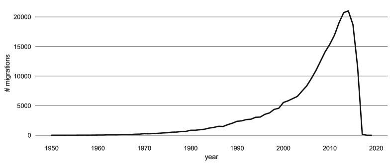
Figure 1 shows the distribution of the number of estimated migrations, i.e., the number of ORCID members that edited their profile to change the country they worked in, per year, from 1950 to 2020. Most of the data is concentrated in the \nth21 century, with a peak in 2014. The decay of recorded migrations after 2014 might be due to temporal bias given by the time when the dataset was gathered, i.e., in 2017. Even if ORCID was founded in 2012, members are allowed to insert information about their previous occupations and their planned ones; as a consequence, we have data about migrations that happened before 2012 and to occur after 2017.
In their work, Bohannon and Doran [8] highlight that ORCID was not designed with the specific aim of tracking researchers’ mobility. Therefore, the data we consider has structural limitations as well as biases. First of all, as already observed, much of the information created by the members is retroactive since it refers to periods preceding ORCID ’s launch in 2012. Therefore, some of the countries that nowadays have changed their political-geographical characteristics, are present in the dataset, making the set of considered countries highly variable year after year. Secondly, since its appearance, ORCID has always focused mainly to younger researchers. In fact, new subscriptions are often referred to researcher that pursued their Ph.D. recently, creating an over representation of this category in the dataset, and reflecting the fact that younger researchers sign-up to ORCID more frequently than elder ones. Finally, countries are not equally represented, namely, the distribution of the number of researchers per country does not follow the distribution of the overall population. Bohannon and Doran compare ORCID data in 2013 about scientific migrations to the UNESCO Science Report222https://en.unesco.org/node/252273 to discover which countries are misrepresented; e.g., China, Russia, and Japan result to be under represented while, e.g, Spain, and Portugal are over represented. For these reasons, we cannot regard the dataset as a definitive picture of the scientific migrations. Nevertheless, we can exploit it to detect regularities and patterns by the construction of a network model, useful in the understanding of the global perspective of the phenomenon, suggesting that experiments and estimations should be re-executed periodically to better monitor the phenomenon, tune previously introduced errors due to misrepresentation, and update information with fresh new data inserted/modified by researchers.
3.2 Data processing

The raw dataset of ORCID database is a collection of files, one for each user that has decided to utilise the platform. As shown in Figure 2, we scan every user file and collect all the affiliation’s changes at a yearly level, gathering both education and employment movements. A scientific migration happens if the country of one of these two affiliations changes. “Ringgold” labels account for the specific institute of the affiliation. The label “Type” retains the information about the nature of the migration. It combines two domains, “xy”, where both can assume the values education (“ed”) or employment(“em”). The set-up of the string allows us to interpret the reason for the researcher’s migration, for example from education to employment: “edem”. In the current work, we have not employed the different reasons behind migration, but we plan to investigate the matter further in future works 333For questions regarding data processing write directly to the corresponding author..
3.3 Network model
We consider a weighted directed temporal network , where is a set of nodes, is a discrete time domain, and is a function defining for each pair of nodes and each timestamp the weight of edge at time . In the following, we refer to the weight of edge at time as , and we consider it missing if . Let and represent the in-strength and the out-strength of node at time , respectively. We also denote by the set of edges existing at time . Finally, let be the weighted adjacency matrix of at time .
In our application domain, we identify the nodes of the network as the countries involved in the scientific migration process (231 in total); an edge between two countries represents a migration route. Each edge between two nodes is attributed with a time and a weight : a quartet represents the migration of researchers from country to country at time . The time domain of the scientific migration network is , composed of 17 years, since most of the data is concentrated between 2000 and 2016, and the geopolitical configuration of the countries is quite stable after 2000. 2014 is the year for which the dataset records the largest amount of information, so we consider it pivotal in the following analysis.
4 From methods to measures
4.1 A strength-based approach
A strength-based approach can be considered a straightforward attempt to numerically quantify the role of a country in the scientific migration network.
We can intuitively define the drain index of a country at time as
| (1) |
namely the number of outgoing researchers (i.e., out-strength) minus the number of incoming researchers (i.e., in-strength) normalised by their sum. It ranges from to , where indicates maximum brain drain (the country is a pure provider) while means maximum brain gain (the country is a pure receiver). Values close to are adopted by those countries having balanced values of out-strength and in-strength.
| ranking | country | |||
|---|---|---|---|---|
| Sint Maarten | ||||
| Eritrea | ||||
| Central African Republic | ||||
| Curacao | ||||
| Saint Vincent | ||||
| Spain | ||||
| United Kingdom | ||||
| France | ||||
| United States | ||||
| Italy | ||||
| Guinea | ||||
| Guyana | ||||
| Belize | ||||
| Niger | ||||
| Chad |
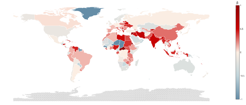
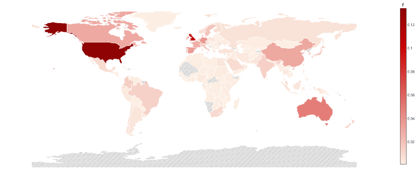
Figure 3 graphically shows the drain index for the year 2014, while Table 1 reports the ranking for specific countries: the five countries of highest , the five countries of lowest , and the five countries of highest out-strength. The countries standing out in Figure 3 are mainly located in Africa, southern Asia and in the Caribbean, while Europe and North America have milder colours. Extreme values of are assigned when the number of migrations of a country is poor and completely unbalanced. For example, Sint Maarten has only two outgoing migrations, resulting in , while Chad has three incoming migrations and no outgoing researchers, then its is . On the other hand, those countries playing a central role in the migration network have usually close to due to the high number of both outgoing and incoming researchers. This is the case of, e.g., the United Kingdom and the United States.
Of course, we would like to focus on countries whose the number of moving scientists is not neglectable. In order to let emerge the network backbone, we apply the link filtering strategy that is proposed in [25]. This operation has the aim to focus on countries that have a leading role in the scientific migration flows, while preserving the structural characteristics of the network as a whole. Figure 4 shows the fraction of nodes, links and weights retained by the filters according to different significance levels .
| 1 Iran | 1 Hungary | 1 Syria |
| 2 Sweden | 2 Cuba | 2 Serbia |
| 3 Greece | 3 Venezuela | 3 Uruguay |
| 4 New Zealand | 4 Uganda | 4 Jamaica |
| 5 Denmark | 5 Zambia | 5 Rwanda |
| … | … | … |
| 38 Mexico | 73 Ethiopia | 117 Macao |
| 39 Austria | 74 Tunisia | 118 Bolivia |
| 40 Chile | 75 Senegal | 119 Guatemala |
| 41 Russia | 76 Estonia | 120 Brunei |
| 42 South Africa | 77 Luxembourg | 121 Mali |
From the rankings displayed in Table 2, and calculated on the network backbones, we intuitively observe that an high instability emerge in such rankings at varying values of . The ranking analysis is an open and very broad subject of interest, but a recent work [26] has shown a pattern throughout its dynamics, and how for example the top part of multiple rankings shared a certain degree of stability. Also in the ranking there are certain positions that carry out specific roles inside the migration system, and we would like to estimate how stable they are over the years. To quantify it we define the Normalised Similarity between two different partial rankings and as:
| (2) |
where , , and V is the set of countries that takes part to the migration network at time and occupy the chosen portion of the ranking. If at time a country is not the partial ranking anymore we place it in the last position of the partial ranking. The term is an upper bound for the sum of all the possible fluctuations, in particular it would happens when all the countries at time t would downgrade at position while all new countries occupy the N position at time , and . In Figures 5(a-c) the Normalised Similarity has been computed for the key positions of subsequent rankings based on , calculated on the network backbone with level , from the year 2000 to the year 2016. As key positions, we consider the top twenties (Fig. 5(a)), the bottom twenties (Fig. 5(b)), and the twenties in the middle (Fig. 5(c)) of each ranking, that should represent respectively the top providers, the top receivers, and the most ’balanced’ countries. We can easily observe that, even with a fixed value of , rankings differ significantly from one year to another; in fact, fluctuates around 0.6, meaning that the ranking calculated at year changes dramatically the following year. The lack of stability over a not-so-fast phenomenon may prevent us to spot any significant patterns or dynamics.
Additionally, we evaluated other strategies for normalising the drain index by considering external data, such as the size of the overall population and the number of researchers in a country. Given the biases in the collected dataset, any normalisation deriving from external sources would be inappropriate because it would misrepresent the results. Moreover, external data have to be temporal, at least of yearly granularity from 2000 to 2016, and available for all the countries included in the dataset. This is the case of the general population, but we cannot discover complete and coherent datasets about the size of the research population of all the studied states. However, we think that Eq. 1 fails mainly because it does not properly represent the complexity of the phenomenon itself: the brain index focuses on spotting ’pure receivers’ and ’pure providers’ in the network, whereas each country may behave accordingly a mixed streams made of scientists moving in and out. As a consequence, such a measure would suffer of a myopic view of the migration ecosystem, because it is a function of local properties only: we miss the opportunity to assess which is the role of a global and heterogeneous structure of the migration network. This is the reason why we propose the application of eigenvector centrality based algorithms to produce rankings more adequate to comparisons [27].
4.2 A global approach
A classic approach to assess the importance of a node in a network taking into account the global link structure is the well-known PageRank [28].
| ranking | 2000 | 2014 | 2016 |
|---|---|---|---|
|
|
|
||
| United States | United States | United States | |
| United Kingdom | United Kingdom | United Kingdom | |
| Germany | Australia | Australia | |
| Spain | Spain | Germany | |
| Italy | Germany | Spain | |
| France | China | China | |
| Canada | France | Canada | |
| Australia | Canada | France | |
| Portugal | Italy | Switzerland | |
| Netherlands | Sweden | Sweden | |
| Sweden | Portugal | Netherlands | |
| Japan | Brazil | Italy | |
| Switzerland | Switzerland | Denmark | |
| Brazil | Netherlands | Portugal | |
| China | Denmark | Japan | |
| South Korea | India | Ireland | |
| Malaysia | Japan | Colombia | |
| Mexico | South Korea | India | |
| Denmark | Belgium | Brazil | |
| Indonesia | Saudi Arabia | New Zealand |
Let be the PageRank matrix of at time , defined as
| (3) |
where is the dumpling factor. Note that, in this work, we consider the edge weights in the definition of . The PageRank vector is obtained by repeating the iteration
| (4) |
until convergence, with initial conditions . is computed for each timestamp, i.e., year, . In the following, we often refer to the PageRank vector as neglecting the subscript.
In Figure 6 we graphically show the PageRank in 2014, while Table 3 reports the rank of the 20 countries having highest PageRank in 2000, 2014, and 2016. As stated above, the drain index does not privilege nodes having high both in-strength and out-strength, and does not account for the importance of the origin/destination of the connections. PageRank is instead able to picture such aspects; in particular, United States and United Kingdom place at the first and at the second position of the ranking, respectively.
On the whole, PageRank is confirmed to be a powerful method to rank the nodes of a network, more stable according to the similarity measure , as shown in Figure 5(d) and in Table 3. However, it assigns to each node a unique score that is not desirable in our setting, since we are instead interested in understanding the interplay between attraction and provision of researchers. Therefore, our analysis is required to rely on more refined and specific metrics that highlight such duality.
4.3 A dual approach: hubs and authorities
We identify the hyperlink-induced topic search algorithm (also known as HITS or hubs and authorities) [9] as the main measure to study our network. The HITS hub vector and the HITS authority vector in of are defined by the limit of the following set of iterations:
| (5) |
and
| (6) |
where and are normalisation factors to make the sums of all elements become unity, i.e., and . The initial HITS values of the scores are and for all .
Note that, in this work, we employ the weighted version of HITS. The non-weighted HITS hub scores and non-weighted HITS authority scores are defined in the exactly the same way, replacing with the unweighted adjacency matrix in Equations 5 and 6. Also in this case, and are computed for each timestamp, i.e., year, . In the following, we often refer to the HITS hub and authority vectors as and neglecting the subscript.
| ranking | 2000 | 2014 | 2016 |
|---|---|---|---|
|
|
|
||
| China | China | United States | |
| United Kingdom | United Kingdom | China | |
| Canada | United States | United Kingdom | |
| United States | India | Germany | |
| South Korea | Spain | India | |
| France | Canada | Spain | |
| Germany | Italy | Canada | |
| India | Germany | Italy | |
| Italy | France | Australia | |
| Spain | Brazil | France | |
| Australia | Australia | Netherlands | |
| Japan | Portugal | Brazil | |
| Brazil | South Korea | Switzerland | |
| Russia | Netherlands | Portugal | |
| Portugal | Japan | South Korea | |
| Mexico | Switzerland | Sweden | |
| Turkey | Sweden | Japan | |
| Switzerland | Iran | Denmark | |
| Colombia | Turkey | Ireland | |
| Taiwan | Colombia | Belgium |
By definitions, a node has large value of if it has many largely weighted links towards successor nodes with high ; similarly, node has large value of if it is reached by predecessor nodes with high throughout largely weighted links. In our specific scenario, provides an indication of which are the countries playing the role of providers, that export many researchers in direction of the most attractive countries; while indicates which are the attractors, whose institutions hire researchers from highly ranked providers.
| ranking | 2000 | 2014 | 2016 |
|---|---|---|---|
|
|
|
||
| United States | United States | United States | |
| United Kingdom | United Kingdom | United Kingdom | |
| Germany | Australia | Australia | |
| Italy | Germany | Germany | |
| Spain | France | Canada | |
| Canada | Canada | Spain | |
| Australia | Spain | China | |
| Portugal | China | France | |
| France | Italy | Switzerland | |
| Japan | Portugal | Netherlands | |
| Netherlands | Sweden | Sweden | |
| South Korea | Switzerland | Japan | |
| Sweden | South Korea | Italy | |
| Brazil | Netherlands | Denmark | |
| Malaysia | Brazil | Portugal | |
| Switzerland | Denmark | Hong Kong | |
| China | Japan | Ireland | |
| Ireland | Hong Kong | Colombia | |
| Mexico | India | Singapore | |
| Taiwan | Singapore | India |
4.4 Null Model
In the rest of our analysis, we employ the configuration model [29] as a null model to test whether the correlation is a non-trivial feature of the scientific migration network or if it is expected by the strength distribution of the nodes. The configuration model rewires the edges preserving the strength distribution of the nodes in each year, namely, an edge can be shuffled only with other edges with the same timestamp. Note that by this hypothesis, in the resulting null model, the edge weight distribution and the number of edges in each year might vary with respect to the original network. In the following results, we consider ten different configurations of the null model.
5 Discussion
To provide a more in-depth understanding of the scientific migration patterns all over the world, we focus on which are the major players that rule it, how their positions have changed over time in the ranking and inside the network structure, with the aim to detect important insight on which are the drivers that control the migration flows.
5.1 Relationships between hub and authorities scores
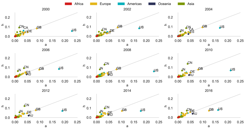
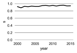
Figure 7 depicts the evolution of hub and authority scores of the nodes of the scientific migration network in time, by means of scatter plots. In all the years, most of the countries clump in the lower-left corner, where both scores are close to 0. Most of the countries have comparable hubs and authority scores, meaning that if a country has a given role in the network as a scientists’ provider, then it is likely that it has a similar role as scientists’ receiver; in fact, as expected, the Pearson correlation between the two hubs/authority variables is quite high, with error always . However, when we calculate our scores in the null model, we find that we should have expected a higher correlation between the two variables. As a consequence, we have some outliers that buck the tends that could not have been expected with the null hypothesis, and that therefore are useful to characterise this peculiar ecosystem. Details on these comparisons are provided in B.
Focusing on these outliers, we have that United States perform significantly better as authority than as hub, even if the corresponding hub values are always among the highest. On the other hand, United Kingdom moves from being equally hub and authority in early ’00 to being more authority by the end of the observed period. It is also easy to notice how China, which is constantly among the top hubs, slowly increases its authority score, with a tendency to the balance between the scores that is graphically represented by the diagonal. Such dynamics are particularly interesting, and they deserve further analysis.
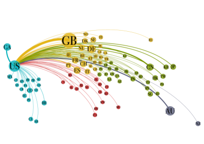
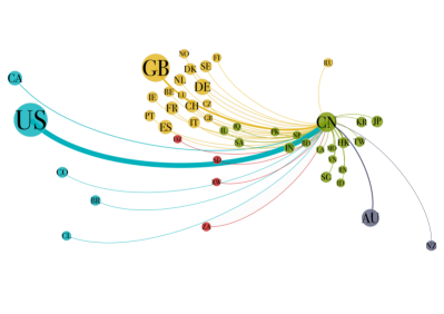
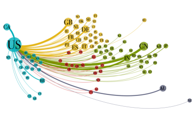
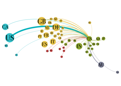
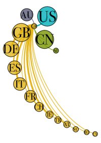
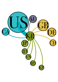
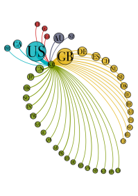
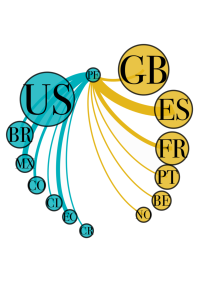
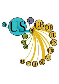
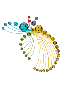
Figure 8 shows the ego-networks of the United States and China in 2016: on top there are the outgoing connections while on the bottom the incoming ones. Colours and size of the nodes, both normalised according to each ego-network, refer to hub scores for the providers countries and authority scores for the receiving ones. Looking at the figures we notice that the United States and China both have many neighbouring countries spread across all the continents, with the United States predecessors and successors being even more scattered. However, we are not able yet to formalise either pattern.
5.2 Analysing local patterns with predecessors and successors
To dive deeper into the factors that contribute to establish a country as leading hub or authority in the scientific migration network, we investigate the homogeneity of the edge weights of the neighbourhood of the nodes. Specifically, we want to understand how the researchers leaving (reaching) a country with high hub (authority) score is distributed over the outgoing (incoming) routes. In order to do so, we employ the Gini coefficient, which measures the degree of inequality of a distribution [30]. Given a population of values, we define the Gini coefficient as
| (7) |
varies between and , where expresses maximal inequality among values while indicates the case in which all the values in are equal.
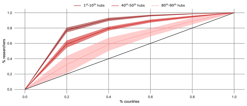
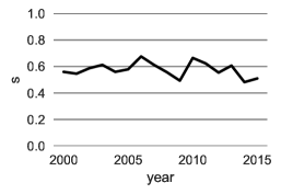
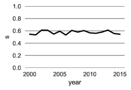
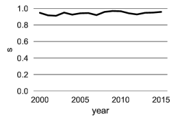
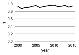
By means of Lorenz curves it is possible to identify the population as the edge weights of outgoing edges or the edge weights of incoming edges when considering a node as hub or authority, respectively. Therefore, we aim at investigating how (un)balanced the migration flows from/towards a country are and how such aspect correlates to and . Figures 9 and 10 compare the mean Lorenz curves, along with 95% confidence intervals, of three different classes of hubs and authorities, respectively. It is immediate to notice that high hub/authority score is associated with high Gini coefficient. The Gini coefficient decreases progressively as we move down with the hub and authority rankings. Then, to obtain an important position in the scientific migration network, a country is required to have strongly differentiated migratory flows from/towards its neighbours.
The behaviour of the missing classes is consistent as shown in Figures 11 and 12 which report the average (over the time domain ) of the Gini coefficient (and the 95% confidence interval) as a function of the hub/authority ranking. Such curves are compared with the null model considering the average of the ten different configurations we generated. The Gini coefficient decreases as and drop, both in the scientific migration network and in the null model, and the curves have very similar functional shapes. The confidence intervals are quite limited in all cases, however they become larger for the lowest positions of the ranking in the scientific migration network where data become more sparse and less significant. The Gini coefficient of the scientific migration network is slightly but significantly higher than the null model; this means that a node occupying the first positions in the hub/authority ranking also shows high disparity in the weights of the connections from/to its predecessors/successors by the intrinsic characteristics of the network.
5.3 Spotting the impact of heterogeneity with case studies
To give more concreteness to our discussion, we extrapolate some case studies from the network. Focusing on the nodes that constantly appear in the network backbones created in different years with equal to 0.2, we plot in Fig. 13 to show the countries that change distinctly their positions in the hub and authority rankings from 2000 to 2016. Among those, we keep also United States and Italy, that are among the countries with less variation in their position, for the sake of comparison.
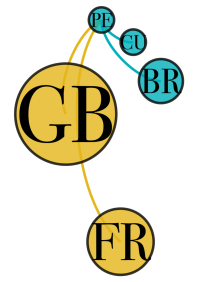
In the authority rank, for example, Peru and Greece’s patterns emerge significantly: Greece loses 21 positions while Peru gains 27. Fig. 14(a) shows how the Gini coefficient of the edges’ weight distributions back up both trends: it decreases among the Greece’s predecessor edges, and it increases for the Peru’s. For example, in 2000 Greece received a lot more of incoming researcher from the United Kingdom (GB) with respect to 2016: see Figures 14(c) and 14(d). This could be dependent on a change of ’homecoming’ habits: maybe more researchers were able to return to Greece after a period abroad in 2000 rather then 2016. At the same time, it is clear (see Fig. 14(a)) how Peru’s predecessors increasingly contributed to incoming streams of uneven strengths over the years, as shown in Fig. 14(g) and 14(h).
W.r.t. the hubs ranking and its variations from 2000 to 2016, we focus on Denmark, that gains an upper position, and to South Korea, that loses some positions (see Fig. 13(b)). Once again, the correlation with the heterogeneity dynamics can be easily spotted in Fig. 14(b). Focusing on ego-networks again, Denmark’s successor edges show an increasing unbalance in their weight distributions (see Figures 14(i) and 14(j)). On the contrary, South Korea shows a small but significant decreasing heterogeneity among its successors’ edges (see Figures 14(e) and 14(f)). Here the effect is less pronounced than in the other case studies, and at first glance the difference between Fig. 14(e) and 14(f) can be misleading: in 2016, South Korea exhibits a much wider range of successor countries in its ego network, and this may be incorrectly interpreted as the emergence of a larger heterogeneity. However, we recall that we are referring to edges weights distributions; in fact, in 2000, an out-of-scale outgoing flow to United States is observed, causing an higher Gini coefficient. Conversely, in 2016, a more homogeneous pattern characterises South Korea’s ego network, despite a growing number of successor countries.
Finally, we wish to stress that Fig. 14 remarks the presence of different heterogeneity’s layers: one layer is characterised by different hub and authority scores, and another layer shows not homogeneous in and out strength distributions. If heterogeneity is a signal of complexity, we can observe once again that the interplay between local and global patterns cannot be neglected to identify constantly changing dynamics and to define future scientific mobility strategies.
6 Conclusions and Future Works
In this work, we study international migrations of researchers, scientists, and academics using a complex network based approach. This is a data driven study which due to the dataset bias cannot be considered definitive. We mainly focus on proposing a methodology to be applied to data extracted from the ORCID platform to find a measure to quantify the phenomenon of the brain drain.
First of all, we discarded the adoption of simplistic measures that take into account only local measurements of scientists moving in or out, because they lead to rankings that change dramatically from one year to another. As a consequence, we propose to preserve the complexity of the migration ecosystem with adequate measures, that also maintain the dual nature of a country as both an importer and an exported of researchers. Therefore, we model the scientific migration by means of a temporal weighted directed network and employ the HITS algorithm with the intent of catching the interplay between streams of incoming and outgoing researchers from a global prospective. We also investigate the local characteristics of successors of hubs and predecessors of authorities to dive deeper into the motivations that establish hubs and authorities.
Our findings identify different positions occupied by the main player in the scientific migration network, as shown in Tables 5, Tables 4, and in C for the complete 2016 rankings. China, United States, and United Kingdom are identified as the leading provider countries during the whole time domain: they never fall below the fifth position. India and Canada, followed by various of European countries, i.e., Germany, Italy, Spain, and France, consistently position after the three leading countries with few fluctuations during the years. South Korea and Russia follow instead negative trends. South Korea is the fifth hub in the scientific migration network during 2000, then loses ten positions by 2016. About the authority score, United States have the best performance during the whole time horizon, while United Kingdom always classifies \nth2. Germany generally occupies the \nth3 position in early 2000, before the growth of Australia. Similarly to the hub score, after the top-4 positions, there is a series of European countries such as Spain, France, and Italy, together with Canada and China. Interestingly, among the best receivers, there are Asiatic countries that are not identified as good hubs, e.g., South Korea, Singapore, and Hong Kong, suggesting important efforts in attracting researchers from all over the world and investing for the return of whom left the countries. These dynamics deserve to be further analysed for uncovering latent causes and factors by the inclusion of complementary sources, e.g., local regulations, political alliances, investments in research, development, and education.
At the same time, the evolution of hubs and authorities’ scores over time, alongside their relative discrepancy, and other network measures, suggest that local policies can buck the trend, as testified by the Gini coefficient.
Also, Gini coefficient decreases as and decrease, as Figures 11 and 12 attest. Complexity in terms of migration patterns seems to co-exist in the best positions of the hub and the authority rankings, in analogy with the economic framework, so that successful countries are extremely diversified in products export [31].
Ranking by means of hubs and authorities scores it is insightful, but just a preliminary step toward a more refined analysis. As future work, we plan to expand the study carried out so far by tackling the correlation between hub and authority scores with respect to metrics of research/academic success and economic indicators, as in [32]; even though not very high due to the presence of countries of high GDP showing poor performances in terms of hub or authority ranking, as also discussed in [33], where the relationship between science and investments shows complex behaviours. Furthermore, we plan to restrict the analysis to a specific geographical region (e.g., Europe) to study migrations at smaller granularity (e.g., cities) or, according to specific science fields in order to understand where skills actually move, and by different career stages, education or employment.
Finally, we plan to adapt our methodology to evolving datasets that grow over time, to deliver a more precise picture as the information increases. In particular, we would like to design a permanent observatory of the scientific migration network, that can keep track over the year of the multiple aspects of this rich and complex phenomenon and this work is an important step in that direction. Moreover, it is important to mention that the ambition of our proposed methodology is that hub and authority scores will be considered in forthcoming biblio-metric observatories and studies, to exploit the interplay of incoming and outgoing scientific migration flows, to better understand the role of single countries in a world-wide interconnected ecosystem.
It would be of interest to replicate our analysis on other data sources to confirm/integrate our results, and to keep updating the analysis to ever evolving global and local scenarios.
List of abbreviations
-
SMN
scientific migration network
-
HITS
hyperlink-induced topic search
-
GDP
gross domestic product
Declarations
Funding
AU acknowledges support from the Lagrange Project of the Institute for Scientific Interchange Foundation (ISI Foundation), funded by Fondazione Cassa di Risparmio di Torino (Fondazione CRT). Additionally, authors have been partially supported by the project “Analisi di Reti Complesse e di Sistemi Socio-Tecnologici”, funded by University of Turin.
Conflict of interest/Competing interests
The authors declare that they have no competing interests.
Availability of data and materials
The “ORCID migrations by person” dataset analyzed during the current study is available in the Dryad Digital Repository, https://doi.org/10.5061/dryad.48s16 [24]. Also, networked data used for our analysis, will be made available on public repository upon paper’s acceptance.
Code availability
Code will be made available on public repository upon paper’s acceptance.
Author’s contributions
Conceptualization: G. Ruffo; Data curation: A. Urbinati, E. Galimberti; Formal analysis: E. Galimberti, A. Urbinati; Methodology: A. Urbinati, E. Galimberti, G. Ruffo; Validation: G. Ruffo, A. Urbinati; Visualization: A. Urbinati, E. Galimberti; Writing - original draft: A. Urbinati, E. Galimberti; Writing - review & editing: A. Urbinati, G. Ruffo.
Acknowledgements
The authors would like to acknowledge Alessandro Flammini and Roberta Sinatra for feedbacks and insightful conversations on a preliminary versions of this work.
References
- [1] OECD, A profile of immigrant populations in the 21st century: data from OECD countries, OECD Paris, Paris, France, 2008.
-
[2]
J. Klugman,
Human
development report 2009. overcoming barriers: Human mobility and development
(2009).
URL http://hdr.undp.org/en/content/human-development-report-2009 - [3] S. Rinzivillo, S. Mainardi, F. Pezzoni, M. Coscia, D. Pedreschi, F. Giannotti, Discovering the geographical borders of human mobility, KI-Künstliche Intelligenz 26 (3) (2012) 253–260.
- [4] F. Schiantarelli, Global economic prospects 2006: economic implications of remittances and migration, The World Bank.
- [5] H. F. Moed, A. Plume, et al., Studying scientific migration in scopus, Scientometrics 94 (3) (2013) 929–942.
- [6] E. Pugliese, G. Cimini, A. Patelli, A. Zaccaria, L. Pietronero, A. Gabrielli, Unfolding the innovation system for the development of countries: co-evolution of science, technology and production, Scientific reports 9 (2019) 16440.
- [7] P. Deville, D. Wang, R. Sinatra, C. Song, V. D. Blondel, A.-L. Barabási, Career on the move: Geography, stratification, and scientific impact, Scientific reports 4 (2014) 4770.
-
[8]
J. Bohannon, K. Doran,
Introducing
orcid, Science 356 (6339) (2017) 691–692.
arXiv:https://www.science.org/doi/pdf/10.1126/science.356.6339.691,
doi:10.1126/science.356.6339.691.
URL https://www.science.org/doi/abs/10.1126/science.356.6339.691 - [9] J. M. Kleinberg, Hubs, authorities, and communities, ACM computing surveys (CSUR) 31 (4es) (1999) 5.
- [10] G. Fagiolo, M. Mastrorillo, International migration network: Topology and modeling, Physical Review E 88 (1) (2013) 012812.
- [11] A. Belyi, I. Bojic, S. Sobolevsky, I. Sitko, B. Hawelka, L. Rudikova, A. Kurbatski, C. Ratti, Global multi-layer network of human mobility, International Journal of Geographical Information Science 31 (7) (2017) 1381–1402.
- [12] G. Fagiolo, G. Santoni, Human-mobility networks, country income, and labor productivity, Network Science 3 (3) (2015) 377–407.
- [13] R. Cerqueti, G. P. Clemente, R. Grassi, A network-based measure of the socio-economic roots of the migration flows, Social Indicators Research (2018) 1–18.
- [14] C. Robinson, B. Dilkina, A machine learning approach to modeling human migration, in: Proceedings of the 1st ACM SIGCAS Conference on Computing and Sustainable Societies, ACM, 2018, p. 30.
- [15] R. Guidotti, A. Monreale, S. Rinzivillo, D. Pedreschi, F. Giannotti, Unveiling mobility complexity through complex network analysis, Social Network Analysis and Mining 6 (1) (2016) 59.
- [16] A. Geuna, Global mobility of research scientists: The economics of who goes where and why, Academic Press, Cambridge, Massachusetts, 2015.
- [17] A. Saxenian, From brain drain to brain circulation: Transnational communities and regional upgrading in india and china, Studies in comparative international development 40 (2) (2005) 35–61.
- [18] A. Agrawal, D. Kapur, J. McHale, A. Oettl, Brain drain or brain bank? the impact of skilled emigration on poor-country innovation, Journal of Urban Economics 69 (1) (2011) 43–55.
- [19] C. Franzoni, G. Scellato, P. Stephan, Foreign-born scientists: mobility patterns for 16 countries, Nature Biotechnology 30 (12) (2012) 1250.
-
[20]
L. Verginer, M. Riccaboni,
Brain-circulation
network: The global mobility of the life scientists, Working Papers 10/2018,
IMT School for Advanced Studies Lucca (2018).
URL https://EconPapers.repec.org/RePEc:ial:wpaper:4/2018 - [21] T. Deguchi, K. Takahashi, H. Takayasu, M. Takayasu, Hubs and authorities in the world trade network using a weighted hits algorithm, PloS one 9 (7) (2014) e100338.
- [22] T. Safavi, M. Davoodi, D. Koutra, Career transitions and trajectories: A case study in computing, in: Proceedings of the 24th ACM SIGKDD International Conference on Knowledge Discovery & Data Mining, ACM, 2018, pp. 675–684.
- [23] G. Bonaccorsi, M. Riccaboni, G. Fagiolo, G. Santoni, Country centrality in the international multiplex network, Applied Network Science 4 (1) (2019) 126.
-
[24]
J. Bohannon, K. Doran, Data from:
Introducing orcid (2017).
doi:doi:10.5061/dryad.48s16.
URL https://doi.org/10.5061/dryad.48s16 -
[25]
M. Á. Serrano, M. Boguñá, A. Vespignani,
Extracting the multiscale
backbone of complex weighted networks, Proceedings of the National Academy
of Sciences 106 (16) (2009) 6483–6488.
arXiv:https://www.pnas.org/content/106/16/6483.full.pdf, doi:10.1073/pnas.0808904106.
URL https://www.pnas.org/content/106/16/6483 - [26] G. Iñiguez, C. Pineda, C. Gershenson, A.-L. Barabási, Universal dynamics of ranking, arXiv preprint arXiv:2104.13439.
-
[27]
A. Altman, M. Tennenholtz,
Ranking systems: The pagerank
axioms, in: Proceedings of the 6th ACM Conference on Electronic Commerce, EC
’05, Association for Computing Machinery, New York, NY, USA, 2005, p. 1–8.
doi:10.1145/1064009.1064010.
URL https://doi.org/10.1145/1064009.1064010 - [28] L. Page, S. Brin, R. Motwani, T. Winograd, The pagerank citation ranking: Bringing order to the web., Tech. rep., Stanford InfoLab (1999).
- [29] M. E. Newman, The structure and function of complex networks, SIAM review 45 (2) (2003) 167–256.
- [30] C. Gini, Variabilità e mutabilità, Reprinted in Memorie di metodologica statistica (Ed. Pizetti E, Salvemini, T). Rome: Libreria Eredi Virgilio Veschi.
- [31] A. Tacchella, M. Cristelli, G. Caldarelli, A. Gabrielli, L. Pietronero, A new metrics for countries’ fitness and products’ complexity, Scientific reports 2 (1) (2012) 1–7.
- [32] A. Fernández-Zubieta, A. Geuna, C. Lawson, Productivity pay-offs from academic mobility: should i stay or should i go?, Industrial and Corporate Change 25 (1) (2016) 91–114.
- [33] R. Van Noorden, Global mobility: Science on the move, Nature News 490 (7420) (2012) 326.
Appendix A Network Model
In Table 6, we show some basic network statistics, grouped by year. For each year we show the number of nodes, i.e., countries that occur as a source or as a destination in that year at least once (), the number of links established during that year between countries (), and the related following measures: the density of the network (); the reciprocity, i.e., the ratio of the number of edges pointing in both directions to the total number of edges in the graph (); the size of the Strongly Connected Component (SCC); and the diameter of the network, i.e., the length of the longest path among the shortest ones.
| year | # nodes | # links | density | reciprocity | SCC | diameter |
|---|---|---|---|---|---|---|
| 2000 | 170 | 1341 | 0.047 | 0.552 | 124 | 5 |
| 2001 | 165 | 1396 | 0.052 | 0.549 | 123 | 6 |
| 2002 | 170 | 1476 | 0.051 | 0.562 | 127 | 5 |
| 2003 | 168 | 1530 | 0.055 | 0.571 | 127 | 6 |
| 2004 | 174 | 1661 | 0.055 | 0.580 | 136 | 4 |
| 2005 | 172 | 1815 | 0.062 | 0.608 | 140 | 5 |
| 2006 | 180 | 1942 | 0.060 | 0.582 | 148 | 5 |
| 2007 | 187 | 2103 | 0.060 | 0.602 | 144 | 5 |
| 2008 | 190 | 2259 | 0.063 | 0.602 | 146 | 5 |
| 2009 | 190 | 2457 | 0.068 | 0.597 | 156 | 5 |
| 2010 | 190 | 2514 | 0.070 | 0.621 | 152 | 4 |
| 2011 | 198 | 2655 | 0.068 | 0.627 | 164 | 5 |
| 2012 | 198 | 2916 | 0.075 | 0.634 | 167 | 4 |
| 2013 | 203 | 3041 | 0.074 | 0.622 | 172 | 4 |
| 2014 | 206 | 3035 | 0.072 | 0.611 | 171 | 5 |
| 2015 | 197 | 2872 | 0.074 | 0.604 | 163 | 4 |
| 2016 | 173 | 2133 | 0.072 | 0.625 | 135 | 4 |
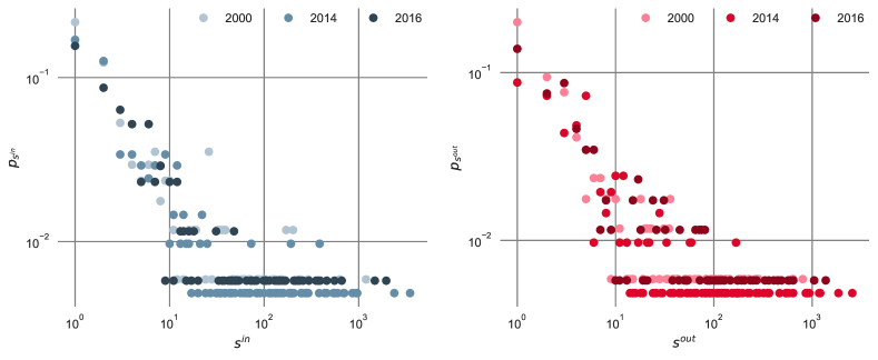
We show in Figure 15 the in-strength and the out-strength distributions in the scientific migration network in 2000, 2014, and 2016. Other years are not reported here, but they show a comparable behaviour: the shapes of the distributions are very similar to each other. Also, there are not notable differences between in-strength and out-strength. Such distributions will come in handy in the following, as input of configuration models that create random graphs preserving in-strength and out-strength sequences.
Appendix B Correlations among measures
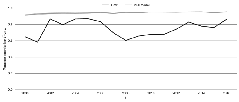
The correlation between and and the evolution of such correlation is an interesting aspect to take into account. We show, in Figure 16, the Pearson correlation between and as a function of the year, and compare it to a null model.
The correlation in the original network is strong during the whole time domain, constantly greater than . The null model has even stronger correlation in all years, with small variation between the different configurations. This means that we should expect more countries of high (low) hub score having also high (low) authority score, and vice versa, in the scientific migration network. The observed behaviour should then rely on different factors, e.g., local patterns than the strength distribution.
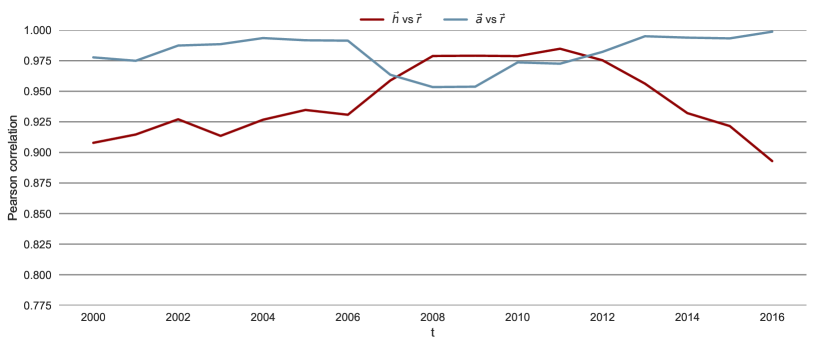
In order to compare the HITS and the PageRank results, in Figure 17 we also visualise the Pearson correlation between and , and . Interestingly, both and are highly correlated to . , in particular, has correlation greater than in all years. This validates the results obtained by the HITS algorithm that has the advantage of depicting two different aspects of the world countries, providing then more accurate indications.
Appendix C HITS complete ranking
2016 rankings of countries according authority and hub scores are reported in this section for illustrative purposes. We are aware that this information will be obsolescent at the time of publication; however this is based on the dataset provided in [24], that has been collected from ORCID in 2017 and made available to the community. We claim that temporal scientific migration networks can be built from actual ORCID data and that always up-to-date rankings and accessory information can be explored by the interested user via a Web based dashboard. However, the implementation of such software architecture is beyond the scope of this paper.
| 1 | United States | 46 | Iran | 91 | Serbia | 136 | New Caledonia |
| 2 | United Kingdom | 47 | Greece | 92 | Albania | 137 | Lithuania |
| 3 | Australia | 48 | Poland | 93 | Palestinian Territories | 138 | Angola |
| 4 | Germany | 49 | Bangladesh | 94 | Iceland | 139 | Timor-Leste |
| 5 | Canada | 50 | Peru | 95 | Algeria | 140 | Mongolia |
| 6 | Spain | 51 | Luxembourg | 96 | Mauritius | 141 | Bolivia |
| 7 | China | 52 | Sri Lanka | 97 | Zimbabwe | 142 | Myanmar [Burma] |
| 8 | France | 53 | Iraq | 98 | Slovakia | 143 | Congo [Republic] |
| 9 | Switzerland | 54 | Hungary | 99 | Malta | 144 | Congo [DRC] |
| 10 | Netherlands | 55 | Kenya | 100 | Tunisia | 145 | Afghanistan |
| 11 | Sweden | 56 | Nigeria | 101 | Madagascar | 146 | Turkmenistan |
| 12 | Japan | 57 | Ethiopia | 102 | Papua New Guinea | 147 | Curacao |
| 13 | Italy | 58 | Vietnam | 103 | Nicaragua | 148 | French Polynesia |
| 14 | Denmark | 59 | Nepal | 104 | Trinidad and Tobago | 149 | Belize |
| 15 | Portugal | 60 | Kazakhstan | 105 | Paraguay | 150 | Libya |
| 16 | Hong Kong | 61 | Uruguay | 106 | Zambia | 151 | Uzbekistan |
| 17 | Ireland | 62 | Philippines | 107 | Mozambique | 152 | Cote dIvoire |
| 18 | Colombia | 63 | Lebanon | 108 | Laos | 153 | Montenegro |
| 19 | Singapore | 64 | Sudan | 109 | Bhutan | 154 | Togo |
| 20 | India | 65 | Uganda | 110 | Rwanda | 155 | Tonga |
| 21 | South Korea | 66 | Estonia | 111 | Azerbaijan | 156 | Saint Vincent |
| 22 | Brazil | 67 | Costa Rica | 112 | Cameroon | 157 | Burundi |
| 23 | New Zealand | 68 | Romania | 113 | Senegal | 158 | Guadeloupe |
| 24 | Belgium | 69 | Ghana | 114 | Brunei | 159 | Niger |
| 25 | Taiwan | 70 | Cyprus | 115 | Grenada | 160 | Swaziland |
| 26 | Austria | 71 | Guatemala | 116 | Jamaica | 161 | Kyrgyzstan |
| 27 | Mexico | 72 | Slovenia | 117 | Syria | 162 | Guyana |
| 28 | Saudi Arabia | 73 | Honduras | 118 | Cape Verde | 163 | Saint Kitts and Nevis |
| 29 | Chile | 74 | Panama | 119 | Morocco | 164 | Belarus |
| 30 | Finland | 75 | Tanzania | 120 | Antigua and Barbuda | 165 | Greenland |
| 31 | Norway | 76 | Benin | 121 | Bahrain | 166 | Bahamas |
| 32 | Malaysia | 77 | Venezuela | 122 | Burkina Faso | 167 | British Virgin Islands |
| 33 | Ecuador | 78 | Ukraine | 123 | Dominican Republic | 168 | Yemen |
| 34 | Turkey | 79 | Croatia | 124 | Somalia | 169 | Maldives |
| 35 | South Africa | 80 | Puerto Rico | 125 | Faroe Islands | 170 | Guinea |
| 36 | Israel | 81 | Kuwait | 126 | Gambia | 171 | Eritrea |
| 37 | Russia | 82 | Oman | 127 | Armenia | 172 | Liberia |
| 38 | Qatar | 83 | Bulgaria | 128 | Cuba | 173 | Macedonia [FYROM] |
| 39 | Thailand | 84 | Macau | 129 | Cambodia | ||
| 40 | Egypt | 85 | Jordan | 130 | Gabon | ||
| 41 | United Arab Emirates | 86 | El Salvador | 131 | Isle of Man | ||
| 42 | Pakistan | 87 | Botswana | 132 | South Sudan | ||
| 43 | Czech Republic | 88 | Sierra Leone | 133 | Guernsey | ||
| 44 | Indonesia | 89 | Fiji | 134 | Latvia | ||
| 45 | Argentina | 90 | Malawi | 135 | Chad |
| 1 | United States | 46 | Qatar | 91 | Kuwait | 136 | Guinea |
| 2 | China | 47 | Argentina | 92 | Cote dIvoire | 137 | Macedonia [FYROM] |
| 3 | United Kingdom | 48 | Vietnam | 93 | Panama | 138 | Azerbaijan |
| 4 | Germany | 49 | Thailand | 94 | Cameroon | 139 | Eritrea |
| 5 | India | 50 | Hungary | 95 | Brunei | 140 | Cambodia |
| 6 | Spain | 51 | Puerto Rico | 96 | Guatemala | 141 | Senegal |
| 7 | Canada | 52 | Ecuador | 97 | Palestinian Territories | 142 | Guadeloupe |
| 8 | Italy | 53 | Sri Lanka | 98 | Rwanda | 143 | Syria |
| 9 | Australia | 54 | Ghana | 99 | Armenia | 144 | Greenland |
| 10 | France | 55 | United Arab Emirates | 100 | Uganda | 145 | Angola |
| 11 | Netherlands | 56 | Philippines | 101 | Guyana | 146 | Timor-Leste |
| 12 | Brazil | 57 | Peru | 102 | Sierra Leone | 147 | Faroe Islands |
| 13 | Switzerland | 58 | Kenya | 103 | South Sudan | 148 | Madagascar |
| 14 | Portugal | 59 | Nepal | 104 | Liberia | 149 | Oman |
| 15 | South Korea | 60 | Lebanon | 105 | Kyrgyzstan | 150 | Zambia |
| 16 | Sweden | 61 | Venezuela | 106 | Swaziland | 151 | Benin |
| 17 | Japan | 62 | Romania | 107 | Cape Verde | 152 | Burundi |
| 18 | Denmark | 63 | Ukraine | 108 | Saint Kitts and Nevis | 153 | Niger |
| 19 | Ireland | 64 | Jordan | 109 | British Virgin Islands | 154 | Turkmenistan |
| 20 | Belgium | 65 | Costa Rica | 110 | Saint Vincent | 155 | Gabon |
| 21 | Turkey | 66 | Serbia | 111 | Malta | 156 | Jamaica |
| 22 | Singapore | 67 | Ethiopia | 112 | Slovakia | 157 | Belize |
| 23 | Austria | 68 | Cuba | 113 | Belarus | 158 | Burkina Faso |
| 24 | Iran | 69 | Luxembourg | 114 | Maldives | 159 | Gambia |
| 25 | Greece | 70 | Morocco | 115 | Libya | 160 | Papua New Guinea |
| 26 | Mexico | 71 | Kazakhstan | 116 | Fiji | 161 | New Caledonia |
| 27 | Finland | 72 | Estonia | 117 | Somalia | 162 | Tonga |
| 28 | Hong Kong | 73 | Sudan | 118 | Botswana | 163 | Montenegro |
| 29 | Egypt | 74 | Dominican Republic | 119 | Congo [Republic] | 164 | Afghanistan |
| 30 | Colombia | 75 | Tanzania | 120 | French Polynesia | 165 | Antigua and Barbuda |
| 31 | Saudi Arabia | 76 | Tunisia | 121 | El Salvador | 166 | Uzbekistan |
| 32 | Taiwan | 77 | Bulgaria | 122 | Bolivia | 167 | Mongolia |
| 33 | South Africa | 78 | Croatia | 123 | Bahrain | 168 | Chad |
| 34 | Israel | 79 | Latvia | 124 | Laos | 169 | Togo |
| 35 | New Zealand | 80 | Zimbabwe | 125 | Mozambique | 170 | Mauritius |
| 36 | Bangladesh | 81 | Grenada | 126 | Bhutan | 171 | Curacao |
| 37 | Malaysia | 82 | Nicaragua | 127 | Honduras | 172 | Guernsey |
| 38 | Russia | 83 | Iraq | 128 | Congo [DRC] | 173 | Isle of Man |
| 39 | Chile | 84 | Malawi | 129 | Algeria | ||
| 40 | Pakistan | 85 | Cyprus | 130 | Trinidad and Tobago | ||
| 41 | Nigeria | 86 | Uruguay | 131 | Iceland | ||
| 42 | Poland | 87 | Slovenia | 132 | Albania | ||
| 43 | Czech Republic | 88 | Lithuania | 133 | Yemen | ||
| 44 | Indonesia | 89 | Bahamas | 134 | Macau | ||
| 45 | Norway | 90 | Myanmar [Burma] | 135 | Paraguay |