with “Tuple Plots” Susan Stepney University of York, UK 12 May 2019
Abstract
Complex systems are described with high-dimensional data that is hard to visualise. Inselberg’s parallel coordinates are one representation technique for visualising high-dimensional data. Here we generalise Inselberg’s approach, and use it for visualising trajectories through high dimensional state spaces. We introduce two geometric projections of parallel coordinate representations – ‘plan tuple plots’ and ‘side tuple plots’ – and demonstrate a link between state space and ordinary space representations. We provide examples from many domains to illustrate use of the approach, including Cellular Automata, Random Boolean Networks, coupled logistic maps, reservoir computing, search algorithms, Turing Machines, and flocking.
Contents
toc
Introduction
Complex systems can have complex and high dimensional state spaces. As we try to understand such systems, it is valuable to be able to visualise their state spaces. But high-dimensional spaces are hard to visualise using conventional orthogonal coordinate systems.
Inselberg [5, 6] introduces parallel coordinates as a technique for visualising high dimensional spaces. Parallel coordinates have been exploited in two main application areas: geometry in higher dimensions () [5, 6]; visualising and exploring large data sets (thousands, or millions, of data points) in high dimensional ( of a few tens) spaces [10].
Here, we generalise the technique to visualise both populations of multiple data points, and the trajectory of a single high dimensional point, in a potentially high dimensional ( of 100s or more) state space.
The structure of this report is as follows. §2 describes Inselberg’s parallel coordinates, and some existing generalisations. §3 introduces plan tuple coordinates, and illustrates them in the context of cellular automata, random boolean networks, coupled logistic maps, reservoir computing, and population-based search. §4 introduces side tuple coordinates, and illustrates them in the context of coupled logistic maps. §5 discusses hybrid tuple coordinates, and illustrates them in the context of Turing machines, and flocking visualisations. §6 discusses further generalisations that could be developed.
Inselberg’s Parallel coordinate plots
2.1 Introduction
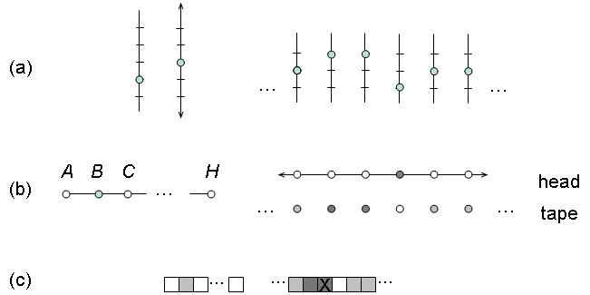
Conventionally, D coordinate systems are drawn with orthogonal axes, with the obvious difficulties of visualisation when , or even on paper; each datum is represented as a single point, with its coordinates given by the projections onto the various axes.
In 1985 Inselberg [5] introduced parallel coordinates. In parallel coordinates, the axes are drawn in 2D space as a set of equally spaced parallel lines (usually arranged vertically like fence posts or a series of axes arranged along a single axis, or occasionally horizontally like ladder rungs or a series of axes up a single axis); each datum is represented as a polyline joining the relevant coordinate value on each axis.
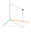
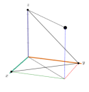
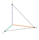
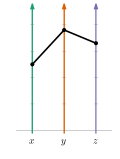
Figure 2.1 demonstrates the approach. There the 3D point is shown in both orthogonal and parallel coordinates. In orthogonal coordinates the point is represented by the black disc, with dashed construction lines added for clarity. In parallel coordinates the point is represented by the polyline passing through the three coordinate values. Unlike the orthogonal form, the parallel coordinate form can be readily extended to higher dimensions, (see figure 2.2).

2.1.1 Notation
Here and later we use the following notation to define the various plot types:
-
1.
the real interval
-
2.
the integer interval
-
3.
a data type : the set of values that the various components of the point to be plotted can take; wlg we assume , if not, assume an injective function is used to make the data values numerical
-
4.
an D point to be plotted:
-
5.
a set of such -D points to be plotted:
-
6.
a D position in the plotting plane:
-
7.
a set of such D positions in the plotting plane:
-
8.
a set of symbols used to plot points in the plotting plane
2.1.2 Definition
Given this notation, we can define the standard parallel coordinates plot as:
2.1.3 Visualising high dimensional geometry
Inselberg’s original emphasis was on geometrical applications in high dimensions (plotting lines, surfaces, hyperspheres, etc, see figures 2.3, 2.4), so the parallel axes are necessarily equally spaced, in order to maintain the relevant geometrical properties.
2.1.4 Visualising data
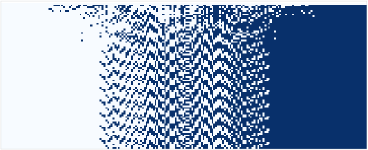
Parallel coordinates are also used for visualising large data sets. Many data points correspond to many lines in the parallel system (see figure 2.5).
Such plots are used in data mining, where the coordinates can be heterogeneous. This leads to techniques for scaling, reversing, and ordering the coordinates to expose patterns and clusters in the data. (See figure 2.6 for the effect of reordering the iris data axes. Reordering is also used to expose structure in RBNs, §3.3.3.) Smoothing the polylines to curves is also used to highlight clustering structure (rather than geometrical structures). This data mining use is often interactive, highlighting subsets of the plot, to help clarify and explore structure in the large number of overlapping data lines.
(a)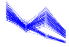 (b)
(b)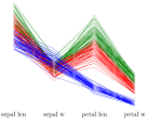
There are uses other than visualisation. For example, Ye and Lin [24] use parallel coordinates to optimise a simulated annealing algorithm in D. They express the D search point in parallel coordinate space, and then approximate its polyline by an D polynomial (where ), thus reducing the dimensionality of the search space.
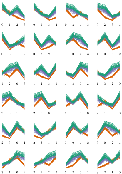
Another example of use is illustrating the algorithm for generating a permutation from a vector of real numbers [9]: the desired permutation is that used to sort the vector into order (figure 2.7).
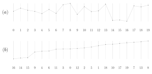
2.2 Polar parallel coordinate plots
Parallel coordinates lay out coordinate axes in parallel on a plane. There are analogous ideas that use different layouts, such as using polar coordinates [20, §9.4.2.3] to lay out the axes in a radial pattern. Such examples are called star plots, or spider plots. See figure 2.8.111Note that these are different from superficially similar radar plots (different authors use different names for these plots; the names used here follow [20, §9.4.2.3, §9.1.6.4]). A radar plot is a 2D plot, in polar coordinates, where the angular dimension represents some continuous or discrete angular variable, such as time of day, month of year, or compass direction, and a single 2D datum is represented as a single point on the 2D plot. In a spider plot, in contrast, the radial lines represent the different axes of the different dimensions, and a single D datum is represented by points on the 2D plot, one per axis, joined by a closed polyline.
Wilkinson calls these multi-dimensional plots “polar parallel coordinates” plots [20, §9.4.2.3], because in his graphics grammar, they are produced by passing a parallel coordinate plot through a polar transform.
This approach has the advantage of not giving undue prominence to the first and last coordinates, and makes ‘shapes’ that are readily comparable. It has the disadvantage of emphasising large values more than small ones, due to area effects.
2.3 Generalisation
Parallel coordinates are one possible way of visualising the large dimensional state spaces of dynamical systems, a formalism suitable for several unconventional computational models [17].
The rest of this report modifies parallel coordinates to visualise the state space trajectories of high dimensional dynamical systems. A trajectory is a time series of state space points. This series could be shown on a single parallel coordinates plot as a collection of lines, but this loses the time ordering. However, many parallel coordinate plots can be reduced to a 1D view without loss of information, and then the time series can be visualised by plotting the time series as a sequence of 1D states.
There are two conceptual steps in this visualisation process:
-
•
a high dimensional space can be represented using coordinate axes that are “flattened”, and laid out in parallel, rather than arranged orthogonally (Inselberg’s parallel coordinates)
-
•
the coordinate axes do not need to be drawn in the plane of the paper; they can be drawn in other projections (see figure 2.9)
These plots exploit the trivial isomorphism between , an dimensional point, and ( times), of 1D points representing the tuple of the point’s coordinates. Plots exploiting the latter structure are here referred to as “tuple plots”, a term that covers all of parallel coordinates, polar parallel coordinates, and the plots developed here in the later chapters. The name is modified to reference the geometry used to draw the individual axes: plan tuple plots (§3) and side tuple plots (§4).
Plan Tuple Plots
3.1 Looking down
3.1.1 Motivation
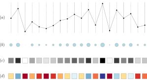
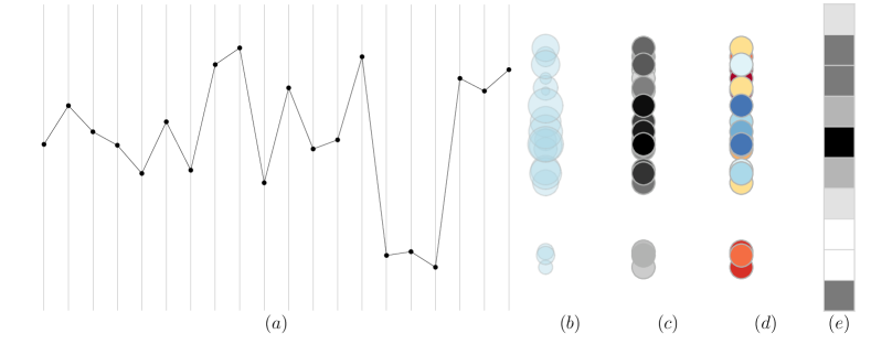
Consider a system with identical dimensions each with values drawn from an ordered set . We could draw this using parallel coordinates. Imagine these axes are lines sicking up from the ground, like fence posts; consider looking “down” on these coordinates from above (figures 2.9b, 3.1), so the line of each fence post is foreshortened into a point.
The lower values are further away, so we might think that perspective would make the circles representing these points look smaller, with say size proportional to value (figure 3.1b). Alternatively, the further away values might appear to be “fainter”, shaded differently, with grey level proportional to value (figure 3.1c). Or we could simply “paint” a suitable range of colours on the axes at different levels (figure 3.1d).
3.1.2 Definition of plan tuple plot
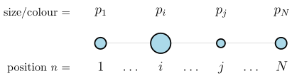
We use this “looking down” idea to define plan tuple plots. We plot one 2D point for each component of the tuple; its position represents the axis index, and its symbol (size, shape, colour) represents its value.
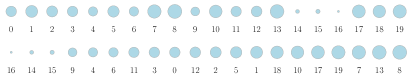
In the basic case, : the points are plotted evenly along the axis, in axis order.
3.1.3 Ensembles and trajectories
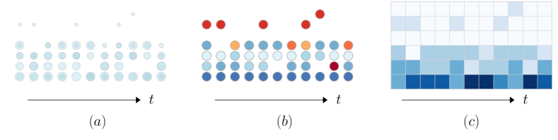
With parallel coordinates, multiple points can be plotted as multiple overlapping polylines. With plan tuple plots, such overlapping would obscure the data.
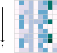
We might wish to display an ensemble of points, representing some population in D space, or a time series of points, representing some trajectory through D space. If we animated a plan tuple plot of a sequences of states, the symbols representing the D point would stay fixed in position (on their axis position), and change in size or colour (as their value changes). We can turn the animation into a static display if we use a 1D plan tuple plot for a single point, and use the second dimension of the plot to display the different points (see figure 2.9b).
Assume we have some indexed set of D points that we wish to plot: . We may wish to permute the points’ indexes to expose structure, unless the indexes represent some intrinsic order, such as time. We can then plot along the axis that intercepts the axis at .
In the basic case, : each point is plotted evenly along the axis, in axis order, at a height up the axis.
If represents time, then is conventionally used, to maintain the temporal order, and to have time increase down the page (figure 3.4).
This trajectory visualisation does not necessarily make cycles in the trajectory immediately visible, but they can be inferred as repeated patterns of states.
3.1.4 Vectors
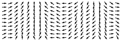
If the values are vector, rather than scalar, we can adapt the symbol used with the plan plot. Each 2D vector value (direction and size) can be plotted as a small arrow. See for example, figure 3.5.
3.2 No information loss
An important feature of the plan tuple plot is that it loses no information, other than possible loss of resolution between the symbols. Where the different values can be suitably distinguished (drawn from a small finite set, say), such as for the CA and RBN examples shown above, there is no loss of resolution. Figure 3.17 shows an example of a plan tuple plot used with continuous-valued data, . Here the grey scales encode the real values with finite resolution; compare orthogonal and standard parallel coordinates, which use position to encode the real values also with finite resolution.
3.3 Examples
3.3.1 Hypersphere surface
Given an D hypersphere of radius , a point on its surface obeys
We additionally ensure that each point has if , by sorting the point’s components into descending order. By symmetry, this is also a point on the sphere, and this sorting helps to expose the structure.
The use of means that points closer to an orthogonal axis, which have one large component value, and the rest small, occur towards the top of the plot; points maximally distant from the orthogonal axes, which have all component values approximately equal, occur lower in the plot.
The resulting ensemble plan tuple plot for , is shown in figure 3.6.
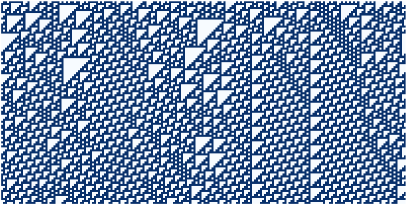
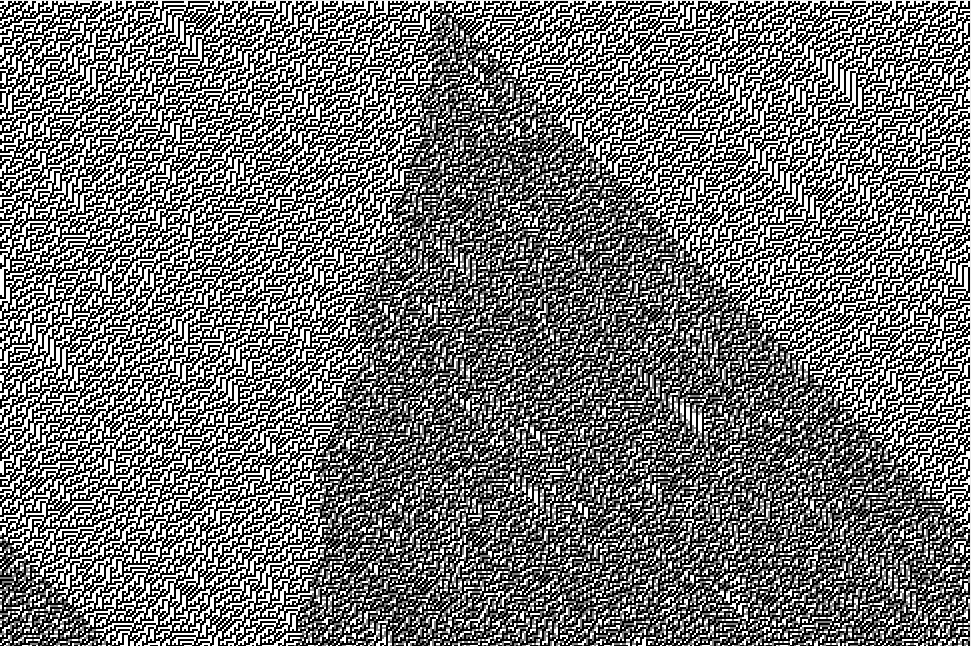
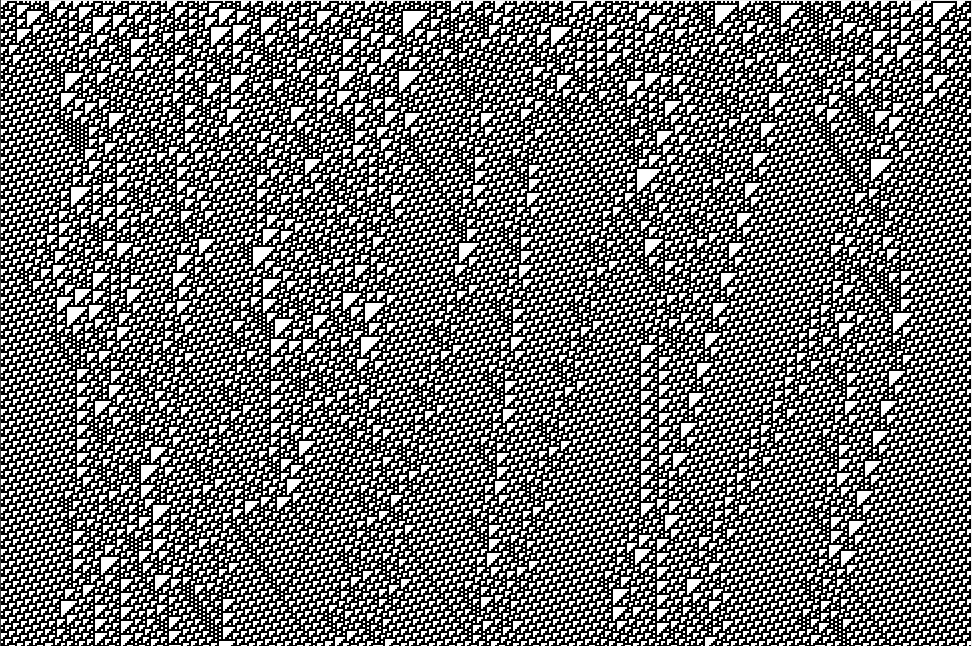
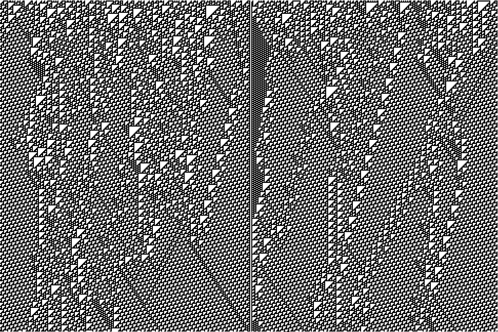
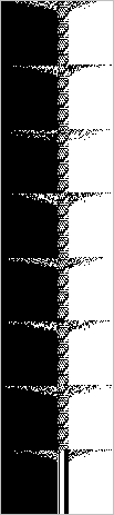
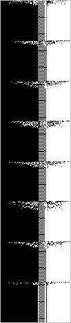
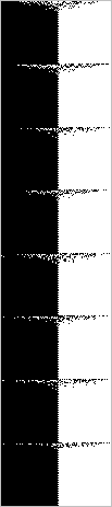
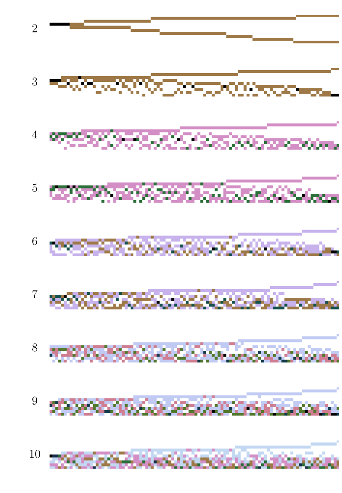
3.3.2 Elementary cellular automata
Consider an elementary cellular automaton (ECA) [21] with nodes. Each node has 3 inputs, from its left and right neighbour, and from itself. The specific ECA is defined by the choice of a boolean function of three inputs. Each node has a binary-valued state. At each timestep, the state of each node is updated in parallel, by applying the boolean function to its inputs.
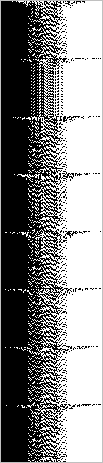
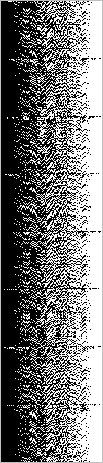
An ECA with nodes laid out in 1D line in (physical) space111The “dimensionality” of the layout in physical space (a 1D line of nodes) is unrelated to the dimensionality of the state space (of D, because there are nodes); if the same nodes were instead laid out in a 2D grid, or even a 27D grid, say, it would not affect the dimensionality of the state space. Instead, this “1D” refers to the topology of the connections between the nodes, and hence the potential information flow between the nodes. has an (abstract) state space of . The parallel coordinate view has one axis line per node, each with two possible values, 0 or 1.
This is identical to the standard display of a 1D ECA. Hence the standard representation is in fact a visualisation of the state space in a plan tuple plot, and the usual time series representation, of consecutive lines of state, is a picture of the trajectory through this state space.
Similarly, one could consider the standard display of a 2D CA, such as Conway’s Game of Life [4], as a plan tuple plot of the state space formed by projecting down on the parallel coordinates arranged in a 2D grid, one coordinate line rising from the site of each cell. A time series plot here is harder, as it would be 3D [23, fig.4.11]. Animation is customarily used to visualise trajectories.
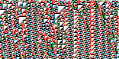
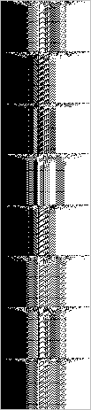
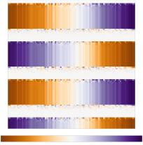
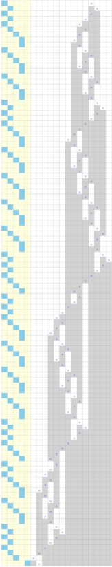
We can use a plan tuple plot to visualise other aspects of the state, such as filtering the plot to expose further structure [23]. For example, figure 3.8 plots the lookup table entry used to produce the state value, in the following way. Consider 1. an D state space 2. an indexed set of points (for calculation purposes) forming a time series of the time evolution of the CA, where ; and a further indexed set of state space points , where (index arithmetic performed modulo ) 3. a plotting function that maps to a set of colours 4. the identity axis position function on axes 5. the reverse index position function on , so that time runs down the plot. This plot highlights structure in the generation process [22, fig.3].
Figure 3.9 shows both state, and lookup entry, plots for several elementary CAs.
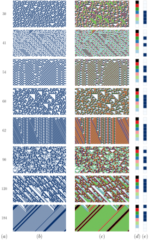
We can use this style of visualisation to get an intuition for various behaviours of CAs.
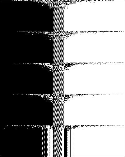
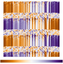
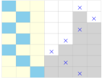
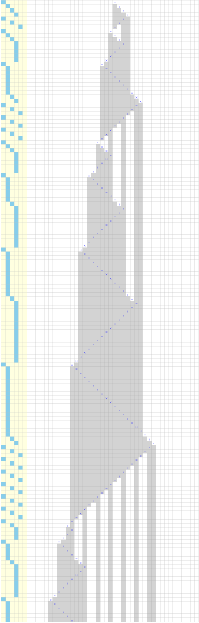
For example, some CA rules demonstrate sensitive dependence on initial conditions: the effect of a minimal (one cell state) change to the initial condition propagates across the system, eventually resulting in a completely different dynamics. See figure 3.10.
(a) ECA rule 45 (b) ECA rule 110
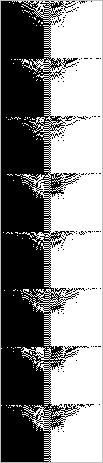
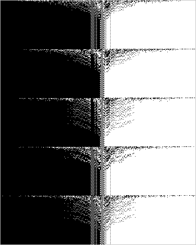
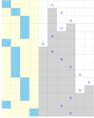
For example, an input might “clamp” part of a CA into particular substate (by fixing the value of some bits for many timesteps). This not only perturbs the system at the point where the bits are clamped, but can also change the global dynamics. Clamping some bits in a CA can result in “walls” across which information cannot flow, isolating regions, and hence changing the dynamical structure of the system. See figure 3.11.
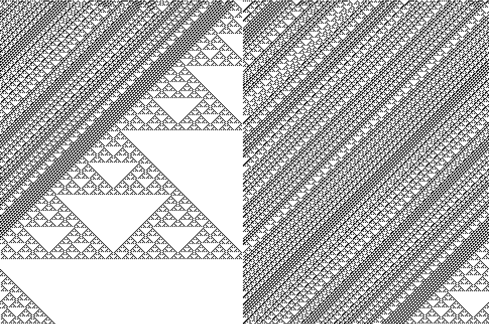
(a) ECA rule 25 (b) ECA rule 110
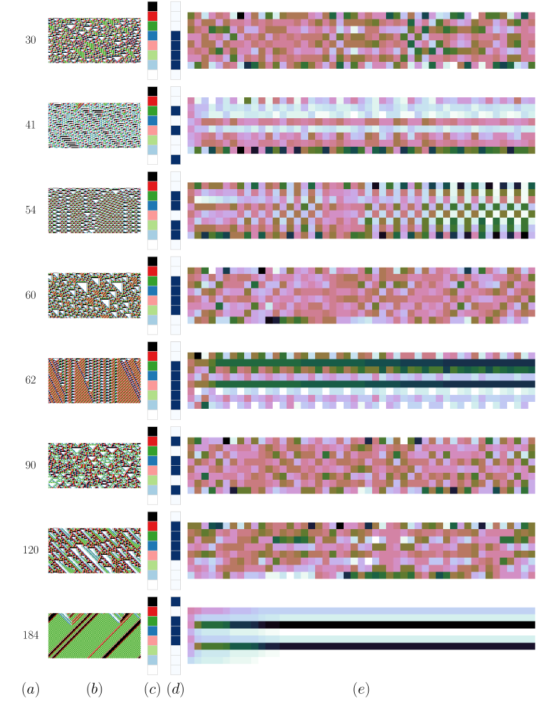
3.3.3 Random boolean networks
A random boolean network (RBN) [3, 8] comprises nodes. Each node has inputs assigned randomly from of the nodes (an input may be from the node itself); the wiring pattern is fixed throughout the lifetime of the network. Each node has its own randomly chosen a boolean function of its inputs. Each node has a binary valued state. At each timestep, the state of each node is updated in parallel, by applying the node’s boolean function to its inputs.
For CAs, the order of the parallel coordinates respects the topology of the space. With RBNs, there is no obvious ordering of the coordinates (nodes). We can impose an ordering that highlights interesting structure, such as exposing the “frozen core” of unchanging values [15, 16].
We can use this visualisation to get an intuition for the documented behaviours of RBNs: their variability, their frozen cores, their attractor structure, their dependence on and canalised functions. See figures 3.14–3.16; see [16] for further examples, including the visualisation of the effect of various network perturbations.


(a) 47 (b) 64 (c) 84 (d) 90 (e) 92 (f) 95 (g) 100
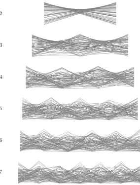
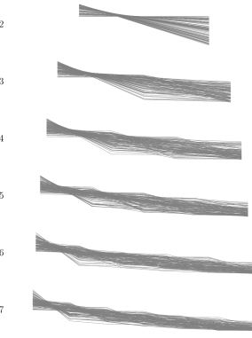
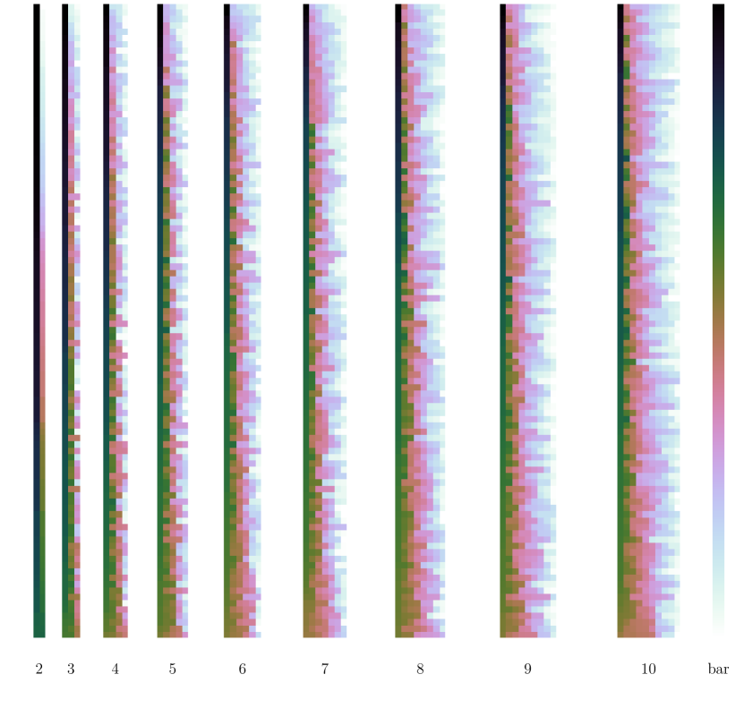
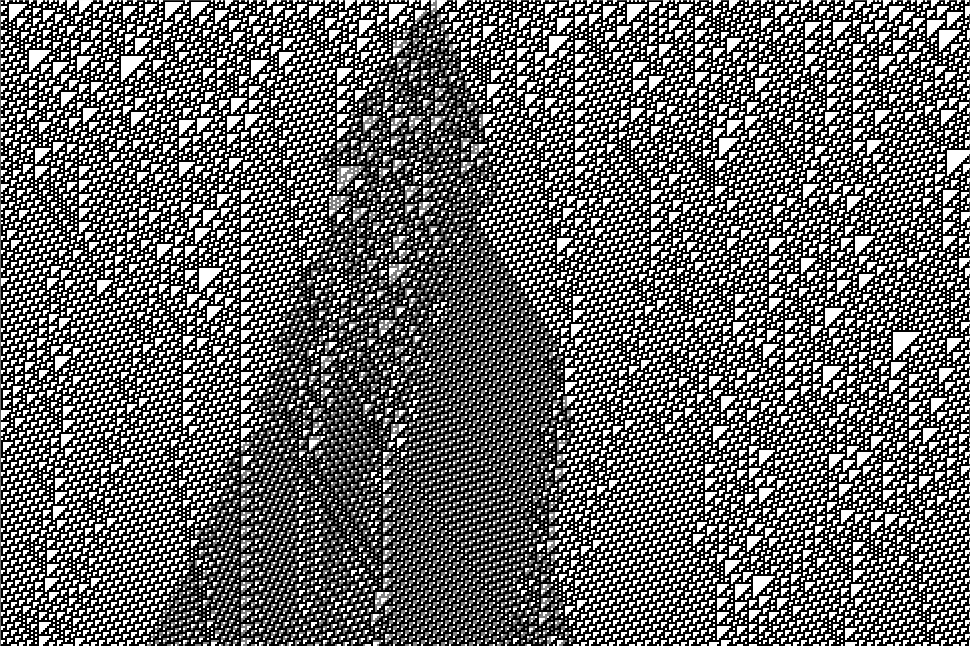
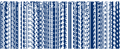
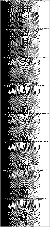
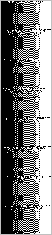
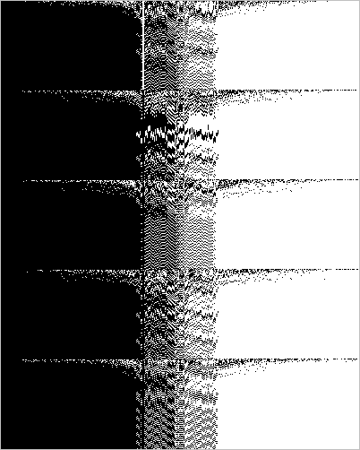
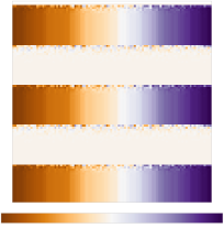
3.3.4 Coupled logistic maps
The logistic map is a well-known 1D discrete time dynamical system. maps can be coupled together to form an D system. For example, Kaneko [7] discusses coupled map lattices, and Sinha and Ditto [11, 12, 13] consider one-way threshold coupled lattices (TCL).
Here we use the Sinha and Ditto example. Consider a set of cells, each with a state . At each timestep, each cell’s state is updated by applying the logistic map at its fully chaotic value: . Next, any ‘excess’ value is transferred: the cells are considered in order ; if cell has a value greater than the threshold parameter , its value is reduced to , and the excess is transferred to cell , increasing its value to . Any excess from the last cell is removed from the system. See algorithm 1.
3.3.5 Reservoir computer dynamics
Reservoir computing [2, 18] is often used as a computational model for unconventional substrates [1]. It comprises an underlying dynamical system (discrete time, continuous space) usually described as a recurrent neural network, plus a training method. Here we look just at the internal dynamics, of a relatively simplified variant (various parameters set to convenient values). The equation used here is:
| (3.1) |
where p is the system state vector (each component thought of as a node, or neuron, in the network); is the timestep; is the gain parameter; W is a random weight matrix connecting the neurons, with weights initially drawn from , then the matrix normalised so that its largest singular value is ; is the input, or driving, signal; v is a random input weight vector, with weights drawn from .
3.3.6 Search algorithms
Here we show some examples of visualising the trajectory of a search algorithm. The task is to search for a permutation that finds the shortest route through several points: the Travelling Salesman Problem.
(a)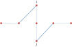 (b)
(b)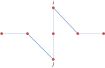
(a) 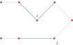 (b)
(b) 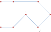
(a) 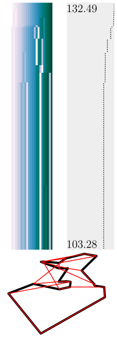 (b)
(b) 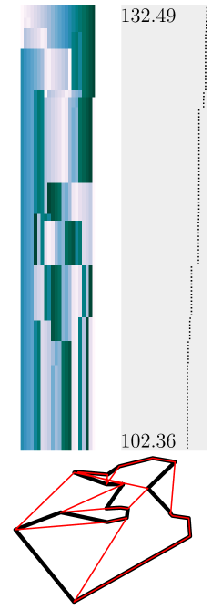 (c)
(c) 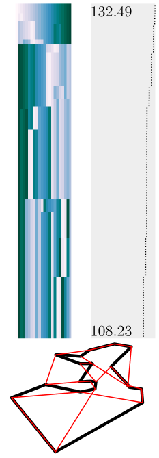
(a) 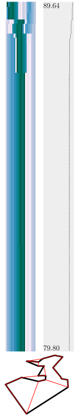 (b)
(b) 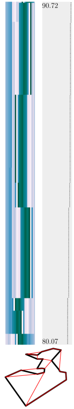 (c)
(c) 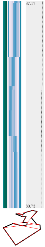
3.4 Axis ordering
We have seen one example of re-ordering the axes to highlight the dynamical structure, in the RBN example, §3.3.3. Additionally, the ECA example, §3.3.3, is naturally in the order that repects the topology. But these are special cases. There is a way to get a “good” (but not necessarily the best) order automatically, by examining the structure of the system.
Consider an D dynamical system expressed as a set of first order ordinary differential equations (the same argument applies to systems defined with a set of discrete time difference equations). In general, we have:
This general case allows every to depend on all of the . However, specific cases can have a more restricted dependence. Instead of considering one D dynamical system, we can consider these as networks of coupled 1D dynamical systems, with the network nodes corresponding to the variables , and edges providing the coupling information linking the nodes that appear in the corresponding .
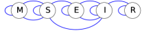
An example is the MSEIR model of infection222en.wikipedia.org/wiki/Epidemic˙model#The˙MSEIR˙model , with equations:
We draw a network with the variables as nodes, and an edge from variable to variable if the equation for contains . We then lay out this network in a line in a way that minimises the length of the edges (since we are interested in edge length, not direction, we form an undirected graph; figure 3.23). This provides a natural order for the axes in the tuple plot, as it best captures the flow of information between the variables represented by each axis.
Consider the Turing Machine that is the current best contender for the 6-state, 2-symbol Busy Beaver333en.wikipedia.org/wiki/Busy˙beaver#Examples . Considering just the states (ignoring symbols and head movements), it has the following possible state transitions: . Drawing these nodes in alphabetical order results in the network shown in figure 3.24a. Rearranging to minimise information communication distance results in figure 3.24b, a candidate axis order (see §5.3.1).
(a)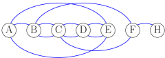 (b)
(b)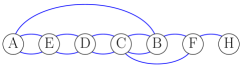
We can use a similar approach to order the nodes in an RBN. For example, figure 3.25 shows Random Boolean network plan plots with three different node orderings shown in figure 3.26. The ordering by minimising the communication distance results in a better plot than random, but in the RBN case there is a further improvement possible, based on the frozen core. The minimal communication distance ordering is a first choice, but the structure of the system may provide a better choice.
(a)  (b)
(b)  (c)
(c) 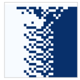
(a) (b)
(b) (c)
(c)
Side Tuple Plots
4.1 Looking sideways
4.1.1 Motivation
Again consider a system with identical dimensions each with values drawn from an ordered set , plotted using parallel coordinates. Consider now looking “across” these coordinates, from the side elevation (figures 2.9c, 4.1). The various coordinate lines are overlaid, and seen as one.
All the values are projected onto this resulting single merged coordinate line. The higher-numbered dimensions are further away, so we might think that perspective would make the symbols representing these points look smaller (figure 4.1b). Alternatively, the further away dimensions might appear to be “fainter” (figure 4.1c). Or we could simply “paint” a suitable colours on each axis (figure 4.1d). Note that values on nearer axes may occlude those on further axes.
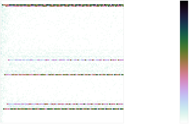
Once there are many dimensions, the side tuple plot is in danger of becoming cluttered with multiple overlapping symbols. An alternative is a density side tuple plot, where the symbol used represents a density histogram of the number of axes that have a value in the given range (figure 4.1e).
4.1.2 Definition of side tuple plot
We use this “looking across” idea to define side tuple plots. We plot one 2D point for each component of the tuple; its position represents its value, and its symbol (size, shape, colour) represents (a) the axis index or (b) the density of axis indexes falling within the spatial extent of the symbol.
The position function allows values to be scaled before being plotted.
5. a density function
6. a plotting function A density side tuple plot displays on the vertical -axis line as the set of bins where each bin is plotted using the symbol . (See figure 4.2b.)
4.1.3 Ensembles and trajectories
We might wish to display an ensemble of points, representing some population in D space, or a time series of points, representing some trajectory through D space. If we animated a side tuple plot of a sequences of states, the symbols representing the D point would stay fixed in size or colour (designating their axis position), and change in position (as their value changes). We can turn the animation into a static display if we use a 1D plan tuple plot for a single point, and use the second dimension of the plot to display the different points (see figure 2.9c).
There is an analogous definition for an ensemble density side tuple plot.
A trajectory through this state space can be visualised by showing consecutive states in consecutive columns as a time series (figure 4.3). This trajectory visualisation does not necessarily make cycles in the trajectory immediately visible, but they can be inferred as repeated patterns of states.
4.2 Information loss
Unlike the plan tuple plot, the side tuple plot can lose some information. For a given point, if different dimensions have the same value, the symbols will be overlayed, and the ‘higher’ numbered dimension data occluded; this can be mitigated to some degree by the use of transparent symbols. The density plot allows the values of all dimensions to be captured, but loses the information of which dimension is which.
4.3 Examples
4.3.1 Hypersphere surface
Figure 4.5 plots 100 points from the surface of a hypersphere in an ensemble side tuple plot. Contrast with the plan tuple plot of figure 3.6.
4.3.2 Elementary cellular automata
See figure 4.4, 4.6. The more chaotic class 3 ECAs have a more uniform distribution in the side tuple plot, whereas the class 2 ECAs have a more varied distribution, indicating that rules are being accessed differently because of their increased structure.
4.3.3 Coupled logistic maps
A particular instance of a threshold coupled lattice is shown in figure 4.7, in a side tuple plot. Contrast with the plan tuple plot of figure 3.17. The different views can be used to highlight different aspects of the system’s trajectory through its state space.
Hybrid Tuple Plots
5.1 Motivation
The plan and side tuple plots defined above assume homogeneous dimensions. Complicated and complex systems can have heterogeneous dimensions, for example, a mix of continuous and discrete dimensions. We can use a hybrid of different appropriate techniques for these different dimensions to get a visualisation of the whole state space.
5.2 Definition of hybrid tuple plots
Assume the full heterogeneous D state space can be partitioned into subspaces: , where each of the subspaces is homogeneous. A hybrid tuple plot then is a concatenation of individual plots appropriate for each of the subspaces.
5.3 Examples
5.3.1 Turing machines
Consider a Turing machine (TM) (see, eg, [14, ch.3]). It has a finite set of (machine) states , a finite tape alphabet , and a transition function which defines how the machine state changes and how the head reads, writes and moves on the tape. The full state space (configuration space) of a TM is , which captures the machine state, the head position, and the tape state.
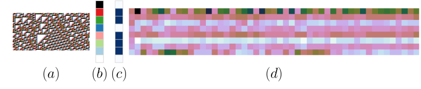
Thus we have a heterogeneous set of coordinates: one for the machine state, , one for the head position, , and an infinite (unbounded) set for the state of the tape at each position, . If we draw the tape state in a plan tuple plot, and suitably arrange the other two coordinates, we can produce a 1D representation of a TM state (figure 5.1), and a visualisation of a TM execution trajectory by a time series of these states (for example, figures 5.2–5.4). This allows visualisation of the relationship between machine state changes and head position, for example.
Note how this involves a design decision on the state component. The states could be displayed using one axis with a -valued state (as in the leftmost axis of figure 5.1a), or as -axes of binary values with the constraint that exactly one of the values may be ‘on’ (the leftmost part of figure 5.1b). We use the latter for the hybrid tuple plots, as it is more visually accessible.
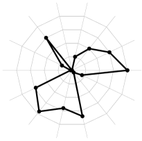
5.3.2 Flocking
Consider an particle flocking simulation, with a D state (phase) space, comprising 3D positions and 3D velocities of the particles. The parallel coordinates are lines, with values from (figure 5.5a). However, these have structure. of the lines represent position, represent velocity. Moreover, triples of lines represent 3D position and 3D velocity of a single particle. First, consider drawing each of these triples in conventional orthogonal coordinates instead of parallel coordinates, reserving the parallel form for the copes of these orthogonal triples (figure 5.5b). Then use the side projected form to overlay the position sets, and the velocity sets separately (figure 5.5c). The resulting hybrid orthogonal/side tuple plot is the same as the ordinary 3D view of -particle positions and -particle velocities in two separate 3D spatial plots. (Note that in typical flocking visualisations, only the spatial aspect is shown; here it is clear that the whole state-space plot includes the velocity part too.)
As with homogeneous side tuple plots, this plot loses information about which point represents which set of axes (which particle). This is particularly important in relating between the position and velocity plots. Colour may be used to highlight particular particles across the plots.
Particle space superficially looks homogeneous in the dimensions, whereas our hybrid form is not homogeneous. In particle state space, rotating the axes in the individual 3D spaces make sense: the choice of 3D spatial axes is arbitrary. However, arbitrary rotations of the axes in the full -D phase space do not make the same kind of sense, as this would merge “individual” particles. The choice of the sets of 6D axes is not arbitrary. Once the subsets of pairs of triples have been identified, however, the sets can be rearranged (essentially relabelling the particles), which demonstrates that a side plot is suitable. The “lost” information is just the arbitrary particle label. The topology on the sets is of a totally connected graph: all particles communicate with all other particles.
(a)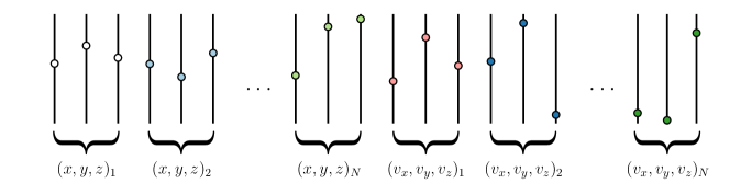
(b)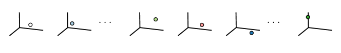
(c)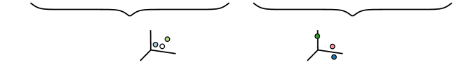
Further work
This report defines how to plot a state space of fixed size at fixed resolution. If this approach helps to make the structure of complex state spaces clear, then there are techniques enhancements that could be developed.
It should be possible to ‘zoom out’, to get a coarse-grained overview of a state structure. In plan tuple plots, zooming out could make (some) axes move closer together and merge, so they are not individually resolved, but display the combined value, or some kind of average value, of the combined state components. Some axes might, for some reason, be ‘closer together’ than others, and so merge first; for example, in a boids plot, the three axes of a single boid’s position or velocity might merge to give a scalar position or speed. This violates Inselberg’s original ‘equidistant axes’ rule, but that rule is used to allow geometrical reasoning over the space, so need be followed only in such cases.
In the trajectory plan or side plots, the time dimension could be coarse grained in a similar manner. If the coarse graining timescale is an attractor cycle length, this would covert a multi-step dynamic behaviour into a single static value.
Correspondingly, it should be possible to ‘zoom in’ to restore the original. In such a case, it might not be immediately obvious at first glance what the underlying dimensionality of the space is: there might be a further zoom in available that would reveal more structure.
Dimensions might be lost on zooming out because they become somehow too small to see: a toroidal tube looks like a 3D tube when close, a 2D torus when zoomed out somewhat, a 1D ring when zoomed out further, a 0D point from a distance, and invisible from a great distance. A flock from a distance might be describable as one macroscopic emergent point entity; closer in the individual boids become apparent, and their microstate dimensions appear.
The number of dimensions might change because the system state becomes larger: a new tape square is added to a Turing Machine; a boid is born; a new object is created in a program.
How to change the number of dimensions the case of discrete time is relatively straightforward: a new dimension axis is added at the relevant timestep. For a case like a Turing Machine or a growing CA, this can be seen as a ‘lazy’ extension of a finite but growing state space. The state space might be seen as hierarchical: a macro-dimension for an object with micro-dimensions for its internals.
For continuous time systems, the mechanism(s) of state space growth are not so clear: a new dimension might initially be very small (and so invisible unless zoomed in sufficiently), then steadily grow or uncurl; there might be some fractal structure; it might “fade in”.
Summary and Conclusions
As new unconventional computational devices are developed, new tools are needed to help explore their behaviour. Visualisation is a powerful tool, and parallel coordinates are one way of visualising high dimensional spaces.
We have described the use of parallel coordinates for visualising state space, and trajectories through that space. Two generalised forms introduced here, plan tuple plots and side tuple plots, can be used to simplify, condense, and clarify the plots.
When the various dimensions of the state space can be interpreted as individuals, such as cells in a CA, or nodes in an RBN or neural network, then the tuple plots coincide with some conventional plots in the literature.
Plan tuple ensemble plots in these cases plot the individuals along a (typically horizontal) line, and indicate their state values through symbols or colour scales. These plots coincide with conventional ways of plotting the time evolution of ECAs (§3.3.2) and RBNs (§3.3.3). Here we generalise, both by highlighting the role of axis ordering to clarify structure (§3.4), and by applying to non-boolean systems (§3.3.4, §3.3.5).
Side tuple plots in these cases plot the individuals along the same (typically vertical) value axis, and distinguish between individuals through symbols or colour scales. These plots coincide with conventional ways of plotting multiple individuals in a single individual’s state space, such as flocking particles (§5.3.2). Here we expose that structure, and generalise to ensembles, typically ordered time series, of such plots.
We have unified these conventional cases into a generalised common framework. With careful design of hybrid coordinate systems that incorporate multiple forms of plot, much information about the dynamics of a system can be compactly encoded and visualised (§5.3.1).
Using these plots in a standardised way should help communicate complex systems dynamics more clearly, with less cognitive load needed for interpreting the various plots.
Bibliography
- [1] Matthew Dale, Julian F. Miller, and Susan Stepney. Reservoir Computing as a Model for In-Materio Computing. In Andrew Adamatzky, editor, Advances in Unconventional Computing, pages 533–571. Springer, 2017.
- [2] Joni Dambre, David Verstraeten, Benjamin Schrauwen, and Serge Massar. Information processing capacity of dynamical systems. Scientific Reports, 2:514, July 2012.
- [3] Barbara Drossel. Random Boolean Networks. In H. G. Schuster, editor, Reviews of Nonlinear Dynamics and Complexity, volume 1. Wiley, 2008. arXiv:0706.3351.
- [4] Martin Gardner. Mathematical games: The fantastic combinations of John Conway’s new solitaire game “life”. Scientific American, 223(4):120–123, 1970.
- [5] Alfred Inselberg. The plane with parallel coordinates. The Visual Computer, 1(2):69–91, 1985.
- [6] Alfred Inselberg. Parallel Coordinates: visual multi-dimensional geometry and its applications. Springer, 2009.
- [7] Kunihiko Kaneko. Spatiotemporal intermittency in coupled map lattices. Progress of Theoretical Physics, 74(5):1033–1044, 1985.
- [8] Stuart A. Kauffman. The Origins of Order. Oxford University Press, 1993.
- [9] John McCaskill, Julian F. Miller, Susan Stepney, and Peter Wills. Encoding and representation of information processing in irregular computational matter. In Susan Stepney, Steen Rasmussen, and Martyn Amos, editors, Computational Matter, pages 231–248. Springer, 2018.
- [10] Rida Moustafa and Ed Wegman. Multivariate continuous data — parallel coordinates. In Antony Unwin, Martin Theus, and Heike Hofmann, editors, Graphics of Large Datasets: visualizing a million, chapter 7, pages 143–155. Springer, 2006.
- [11] Sudensha Sinha and Debabrata Biswas. Adaptive dynamics on a chaotic lattice. Physical Review Letters, 71(13):2010–2013, September 1993.
- [12] Sudeshna Sinha and William L. Ditto. Dynamics based computation. Physical Review Letters, 81(10):2156–2159, September 1998.
- [13] Sudeshna Sinha and William L. Ditto. Computing with distributed chaos. Physical Review E, 60(1):363–377, July 1999.
- [14] Michael Sipser. Introduction to the Theory of Computation. International Thompson Publishing, 1997.
- [15] Susan Stepney. Visualising random boolean network dynamics. In GECCO 2009, Montreal, Canada, July 2009, pages 1781–82. ACM Press, 2009.
- [16] Susan Stepney. Visualising the dynamics of random boolean networks: examples of network size, mutation, canalisation. Technical Report YCS-2010-448, Department of Computer Science, University of York, February 2010.
- [17] Susan Stepney. Nonclassical computation: a dynamical systems perspective. In Grzegorz Rozenberg, Thomas Bäck, and Joost N. Kok, editors, Handbook of Natural Computing, volume II, chapter 52. Springer, 2011.
- [18] D. Verstraeten, B. Schrauwen, M. D’Haene, and D. Stroobandt. An experimental unification of reservoir computing methods. Neural Networks, 20(3):391–403, 2007.
- [19] Janet Wiles and Bradley Tonkes. Visualisation of hierarchical cost surfaces for evolutionary computing. In Proceedings of the 2002 Congress on Evolutionary Computation, pages 157–162. IEEE Press, 2002.
- [20] Leland Wilkinson. The Grammar of Graphics. Springer, 2nd edition, 2005.
- [21] Stephen Wolfram. Statistical mechanics of cellular automata. Reviews of Modern Physics, 55(3):601–644, 1983.
- [22] Andrew Wuensche. Classifying cellular automata automatically; finding gliders, filtering, and relating space-time patterns, attractor basins, and the parameter. Complexity, 4:47–66, 1999.
- [23] Andrew Wuensche. Exploring Discrete Dynamics: the DDLab manual. Luniver Press, 2nd edition, 2016.
- [24] Hong Ye and Zhiping Lin. Speed-up simulated annealing by parallel coordinates. European Journal of Operational Research, 173:59–71, 2006.