The Contribution Plot: Decomposition and Graphical Display of the RV Coefficient, with Application to Genetic and Brain Imaging Biomarkers of Alzheimer’s Disease
Running head: The Contribution Plot
Abstract
1 Alzheimer’s disease (AD) is a chronic neurodegenerative disease that causes memory loss
and decline in cognitive abilities. AD is the sixth leading cause of death in the
United States, affecting an estimated 5 million Americans.
To assess the association between multiple genetic variants and
multiple measurements of structural changes in the brain a recent study of
AD used a multivariate measure of linear dependence, the
RV coefficient.
The authors
decomposed the RV coefficient into contributions from individual variants and
displayed these contributions graphically. We investigate the properties of
such a “contribution plot” in terms of an underlying linear model, and
discuss estimation of the components of the plot when the correlation signal
may be sparse. The contribution plot is applied to simulated data
and to genomic and brain imaging data from the Alzheimer’s Disease Neuroimaging Initiative.
2 Introduction
Alzheimer’s disease (AD) is a neurodegenerative disorder. As a type of dementia, it is a neurological dysfunction that is irreversible, neurodegenerative and progressive, causing memory loss and the decline of cognitive function. AD usually occurs in older people and is considered to be a complex disease driven by a combination of genetic and environmental factors. More than 5 million Americans suffer from AD and it is ranked as the sixth largest cause of mortality in the USA [1].
The Alzheimer’s Disease Neuroimaging Initiative (ADNI) is a longitudinal, multi-site study that started in 2004 to understand the onset, progression, and etiology of AD. One of the ADNI objectives is to identify associations between genetic and brain-imaging biomarkers of AD [2]. Neuroimaging studies such as ADNI feature multivariate datasets, typically comprised of large numbers of genotypes and phenotypes. For example, the dataset in [3] consisted of 75,181 single nucleotide polymporphism (SNP) genotypes and 56 brain phenotypes derived from MRI scans.
To measure the association between multivariate datasets, many different correlation coefficients have been introduced. One of the most popular is the RV coefficient, which measures the linear association between two datasets by estimating the population vector correlation coefficient [4]. When both datasets consist of a single variable, RV is the squared Pearson-correlation coefficient and is the squared population-correlation coefficient.
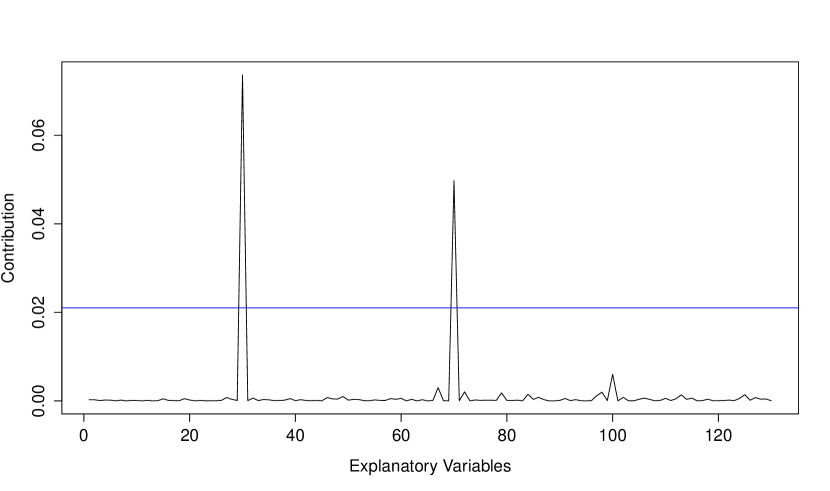
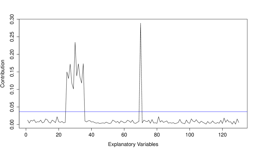
In [3], the RV coefficient is used to summarize the multivariate association between brain phenotypes and SNPs in AD linkage regions. These authors performed a test of the null hypothesis vs the alternative hypothesis and rejected the null hypothesis. In a post hoc investigation, they decomposed the RV coefficient into contributions from each SNP and plotted the result [3, Figure 5]. An example contribution plot using the methods described in Section 3.1 of this article is given in Figure 1. The plot suggests that the association between the multivariate data matrices of explanatory and response variables is driven by the 30th and 70th explanatory variables.
In this report we investigate the properties of the contribution plot in terms of an underlying linear model, and discuss estimation of the components of the plot when the correlation signal may be sparse. The contribution plot is applied to simulated datasets and to genetic and brain-imaging data from the ADNI study.
3 Material and Methods
3.1 The Contribution plot
In this section, we define the RV coefficient and its population counterpart, the multivariate correlation coefficient , following [4]. Our intended use of the RV coefficient is to investigate correlations between matrices of genetic marker genotypes and brain phenotypes, and our descriptions will be in those terms, though the methods apply in any multivariate setting. We decompose into contributions from each genetic marker, and study the form of such contributions under a multivariate linear model for brain phenotypes given genomic data. Finally, we discuss shrinkage estimation of the contributions that may be useful when the correlation signal is sparse. By sparse we mean few non-zero pairwise correlations between genotypes and phenotypes.
Let denote a random vector of explanatory variables and denote a random vector of response variables. A measure of population correlation between and is [5]
| (1) |
where Cov() denotes population covariance. The coefficient may be viewed as an extension of the squared population correlation to the multivariate setting.
Suppose we have independent and identically distributed realizations of and , arranged row-wise as data matrices X() and Y(), respectively. Let denote the th column of X; i.e., the vector of genotypes for genetic marker . Similarly, let denote the th column of Y; i.e., the vector of measurements for phenotype . The multivariate correlation coefficient in equation (1) can be estimated by the RV coefficient, obtained by replacing population covariances such as with their sample counterparts :
| (2) |
Reference [4] and Appendix A of [6] give alternate forms of the RV coefficient.
From equation (2), the contribution of the th genetic marker to the RV coefficient is proportional to
| (3) |
The notation reflects the fact that the contribution of genetic marker to the RV coefficient is an estimate of a corresponding contribution to :
| (4) |
The covariances that comprise can be derived under a linear model for the association between and . Such a model is consistent with the RV coefficient measuring the linear relationship between two multidimensional datasets. In fact,
| (5) |
where is the coefficient of in the regression of on [6]. Equation (5) shows that depends on not only the regression coefficients, but also the variance of and the covariances between and the other components of . Some simplification of the contributions is obtained by scaling each by its standard deviation, so that the variance terms become one and covariances become correlations. Letting and denote the standardized variables, the contribution of genetic marker to is
| (6) |
where is the coefficient of the standardized in the regression of the standardized on . Thus, genetic marker makes a non-zero contribution to if it is directly associated with one or more (i.e., for one or more ) or if it is correlated with one or more that is/are directly associated with one or more (i.e., there is a such that Cor and an such that ). Interestingly, a genetic marker’s indirect associations with phenotypes do not play a role in determining its contribution; we return to this point in the analyses of simulated data.
We now turn to estimation of the contributions to the RV coefficient. The contribution from the th genetic marker is
| (7) |
a sum of squared sample correlations. Our studies of simulated data (Section 4.1) suggest that when the correlation signal is sparse, in the sense that there are few truly non-zero correlations, and the sample size is modest compared to the number of phenotypes, sampling error in estimates of truly zero correlations can obscure the signal of the truly non-zero correlations. A solution is to raise the squared correlations to a power, ; i.e., we consider the contributions
| (8) |
to a modified RV coefficient
| (9) |
for . Raising correlations to powers larger than 2 has the effect of differentially shrinking all estimates toward zero, with estimates near zero shrunken more than those near one. Independently, [7] arrived at the same modified RV coefficient in the context of testing the null hypothesis versus the alternative hypothesis . In their sum-of-powered-correlations test, SPC(), they employ as a test statistic and assess its significance with a Monte Carlo permutation test. They also suggest an adaptive test (aSPC), in which the test statistic is a minimum p-value for the SPC() test over a grid of powers. Though testing is not the focus of this project, we make use of their minimum-p-value idea to select a power for the contribution plot. In particular, our contribution plot is of contributions for the power that minimizes the p-value of the test based on , for values of on a grid. In our study we chose the grid or 4. R [8] code to implement the contribution plot is given in the Appendix.
3.2 Simulated Data Settings
We applied the contribution plot to simulated multivariate datasets consisting of a matrix of explanatory variables X and a matrix of response variables Y. Here we summarize results from three datasets simulated to represent no or sparse association. To investigate the effect of correlation among explanatory variables and correlation among response variables on the properties of the contribution plot, we simulated data with and without these correlations, as described next.
Simulated datasets consisted of explanatory variables and response variables on subjects. We simulated from a multivariate multiple-regression model
in which is a matrix of response variables, is a matrix of explanatory variables generated from , is a coefficient matrix and is an error matrix generated from .
In our simulation model, we vary the parameters , , and B. Let and denote the and identity matrices. We summarize results from three datasets simulated under the following parameter values:
-
•
Dataset 1: No assocaitions
-
–
,
-
–
,
-
–
for all and .
-
–
-
•
Dataset 2: Sparse association; correlated explanatory variables
-
–
=0.9 for and , with all diagonal entries equal to 1 and all other entries equal to 0.
-
–
-
–
so that and are causally associated with and , respectively.
-
–
-
•
Dataset 3: Sparse associations; correlated errors , and hence correlated responses
-
–
-
–
=0.9 for and , with all diagonal entries of equal to 1 and all other entries equal to 0.
-
–
so that and are causally associated with and , respectively.
-
–
Further simulation settings were considered in [6], Chapter 4, but we do not present them here.
3.3 ADNI Data Description
In this section we describe the ADNI data used to illustrate the contribution plot.
3.3.1 Subjects
Both SNP and brain image data considered in this analysis were from the ADNI Phase 1 (ADNI-1) study that was run in the years 2004 through 2009. Our interest was in genetic variation that predicts structural differences in the brain before subjects experience memory loss. Hence we considered data from the 200 cognitively normal (CN) subjects only. Further details about the ADNI-1 study design are available on the ADNI website http://adni.loni.usc.edu/study-design/.
| Chromosome | Gene | No. | Chromosome | Gene | No. |
|---|---|---|---|---|---|
| 1 | CHRNB2 | 1 | 10 | SORCS1 | 94 |
| 1 | CR1 | 15 | 10 | TFAM | 6 |
| 1 | ECE1 | 39 | 11 | GAB2 | 19 |
| 1 | MTHFR | 10 | 11 | PICALM | 23 |
| 1 | TF | 3 | 11 | SORL1 | 33 |
| 2 | BIN1 | 12 | 15 | ADAM10 | 19 |
| 2 | IL1A | 2 | 17 | ACE | 7 |
| 2 | IL1B | 1 | 17 | GRN | 1 |
| 6 | NEDD9 | 69 | 17 | THRA | 3 |
| 6 | PGBD1 | 6 | 17 | TNK1 | 3 |
| 6 | TNF | 1 | 19 | APOE | 1 |
| 8 | CLU | 2 | 19 | EXOC3L2 | 2 |
| 9 | DAPK1 | 82 | 19 | GAPDHS | 3 |
| 9 | IL33 | 14 | 19 | LDLR | 9 |
| 10 | CALHM1 | 3 | 20 | CST3 | 1 |
| 10 | CH25H | 1 | 20 | PRNP | 4 |
| 10 | ENTPD7 | 4 | Total | 493 |
3.3.2 Genotype Data
Genotyping was performed as described in [9]. Genotypes were processed according to standard quality control and imputation procedures to fill in missing values as described in [10]. SNPs were chosen from the top 40 AD candidate genes listed on the AlzGene database as of June 10, 2010. After data processing, 179 subjects with data on 493 SNPs in 33 genes remained for analysis. Table 1 gives a summary of gene names and the numbers of SNPs from each gene. SNP names are given in Appendix C of [6].
3.3.3 Imaging Phenotype Data
The phenotypes, as defined in [11], were derived from baseline MRI scans taken for the ADNI-1 study. The MRI measurements were of volumes or cortical thicknesses of 56 brain regions (Table LABEL:FreeSurfer), adjusted for covariates such as age, gender, education level, handedness and baseline intracranial volume.
| Phenotype ID | Measurement | Cerebral region |
| AmygVol | Volume | Amygdala |
| CerebCtx | Volume | Cerebral cortex |
| CerebWM | Volume | Cerebral white matter |
| HippVol | Volume | Hippocampus |
| InfLatVent | Volume | Inferior lateral ventricle |
| LatVent | Volume | Lateral ventricle |
| EntCtx | Thickness | Entorhinal cortex |
| Fusiform | Thickness | Fusiform gyrus |
| InfParietal | Thickness | Inferior parietal gyrus |
| InfTemporal | Thickness | Inferior temporal gyrus |
| MidTemporal | Thickness | Niddle temporal gyrus |
| Parahipp | Thickness | Parahippocampal gyrus |
| PostCing | Thickness | Posterior cingulate |
| Postcentral | Thickness | Postcentral gyrus |
| Precentral | Thickness | Precentral gyurs |
| Precuneus | Thickness | Precuneus |
| SupFrontal | Thickness | Superior frontal gyrus |
| SupParietal | Thickness | Superior parietal gyurs |
| SupTemporal | Thickness | Superior temporal gyrus |
| Supramarg | Thickness | Supramarginal gyrus |
| TemporalPole | Thickness | Temporal pole |
| MeanCing | Mean thickness | Caudal anterior cingulate, isthmus cingulate, posterior cingulate, and rostral anterior cingulate |
| MeanFront | Mean thickness | Caudal midfrontal, rostral midfrontal, superior frontal, lateral orbitofrontal, and medial orbitofrontal gyri and frontal pole |
| MeanLatTemp | Mean thickness | Inferior temporal, middle temporal, and superior temporal gyri |
| MeanMedTemp | Mean thickness | Fusiform, parahippocampal, and lingual gyri, temporal pole and transverse temporal pole |
| MeanPar | Mean thickness | Inferior and superior parietal gyri, supramarginal gyrus, and precuneus |
| MeanSensMotor | Mean thickness | Precentral and postcentral gyri |
| MeanTemp | Mean thickness | Inferior temporal, middle temporal, superior temporal, fusiform, parahippocampal, and lingual gyri, temporal pole and transverse temporal pole |
3.3.4 Adjustment for Potential Confounders
Following [3], phenotypes and genotypes were adjusted for ethnicity and APOE genotypes. Ethnicity was represented by the top 10 principal components of a genome-wide set of approximately independent genetic markers. Adjusted variables were taken to be the residuals from a linear regression on these principal components and APOE genotype categories.
3.3.5 Standardization
Data cleaning and adjustment for confounders lead to a matrix of explanatory variables X and a matrix of response variables Y. Each column of X and of Y is a residual and therefore has sample mean zero. The final step of data preparation was to standardize each column of X and Y by dividing by their standard deviation.
4 Results
4.1 Simulated Data Results
We applied the contribution plot to each of the datasets simulated as described in Section 3.2. For each dataset we report the p-value for the aSPC test and show the contribution plot. Recall that the contribution plot is of the contributions to for the value that minimizes the p-value of the SPC() test over the grid of values . For comparison, we also plot the contributions to .
Dataset 1: No association
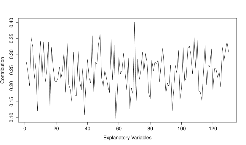
The p-value for the aSPC test on this simulated dataset is 0.5055, correctly suggesting no association. Figure 2 displays the contributions for (top panel) and (bottom panel). The significance threshold for the top panel is 0.5498 and the threshold for the bottom panel is 0.0059; both are outside the range of the vertical axes on the plots. In both panels there are no contributions that meet or exceed the significance thresholds. Thus, all contributions are considered true-negatives.
Dataset 2: Sparse association; correlated explanatory variables
These data were simulated with equi-correlated explanatory variables . The sample correlations between these explanatory variables ranged between 0.77 and 0.97 (median 0.91).
The p-value for the aSPC test on this simulated dataset is 0.0006, reflecting the true association between the 30th explanatory variable, , and the first response variable, , and between the 70th explanatory variable, , and the 10th response variable, . The contributions for and are shown in Figure 3. The broad peak of signal toward the left end of the horizontal axes of the plots reflects the truly-associated . In addition to a signal at , other explanatory variables that are correlated with have comparably-sized contributions, as predicted by equation (6). In particular, combining the data-generating model with the equation for the contributions (equation 6) we obtain:
.
From the equation above, one can argue that and for . Thus we expect the observed peak of contributions at the 30th variable, surrounded by sub-peaks of about 80%-peak-height from indices 25 to 35. The narrow peak near the middle of the horizontal axes in Figure 3 reflects the truly-associated , which is not correlated with any of the other explanatory variables.
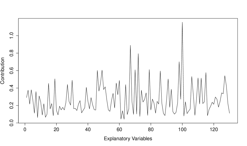
Dataset 3: Sparse association; correlated response variables
For this dataset, the response variables are constructed from equi-correlated errors . Response variable is linearly related to explanatory variable , but are not related to any of the explanatory variables. The linear trend in reduces its correlation with : sample correlations between and responses ranged from 0.50 to 0.71 (median 0.68), while sample correlations among ranged from 0.71 to 0.95 (median 0.92).
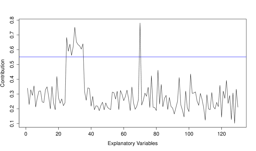
The p-value for the aSPC test on this simulated dataset is 0.0008, reflecting the true association between and and between and . The contributions for and are shown in Figure 4. For contributions to the significance threshold is 1.7055. In the top panel we see that none of the contributions exceed this threshold. The increased threshold in dataset 3 compared to dataset 2 is a consequence of the increased variance in the contributions resulting from positive dependence between response variables. In the top panel of Figure 4, the peak signal is at , which is not truly associated with any of the response variables. By contrast, in the contribution plot of the bottom panel, the contributions of the two truly-associated variables do exceed the threshold.
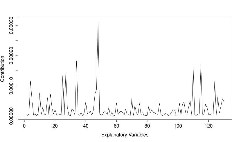
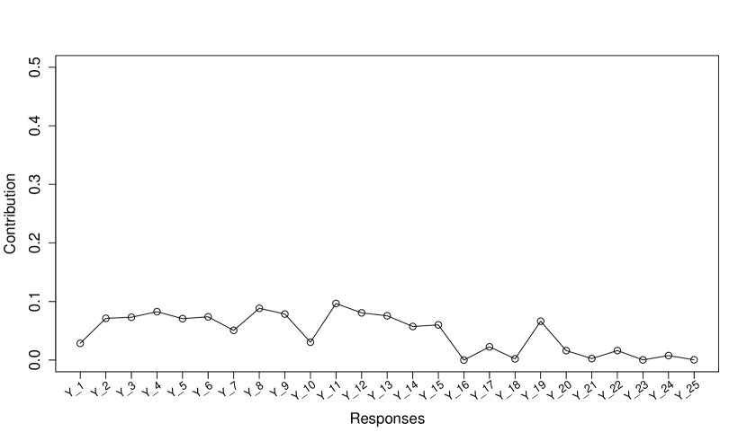
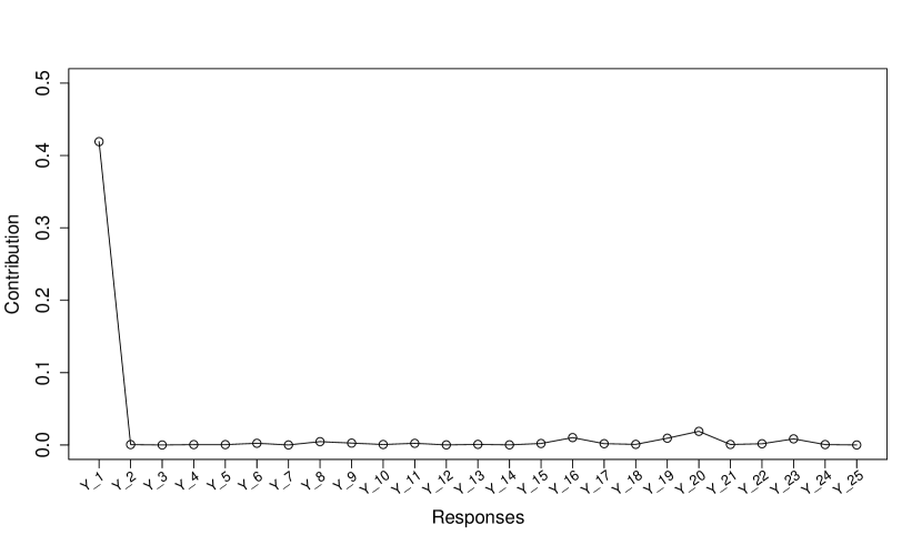
The top panel in Figure 5 breaks down the signal at into its squared sample-correlation components, . The variable appears to be modestly associated with the correlated responses , with the highest pairwise correlation being between and , even though the true population correlations between and these ’s are zero. Essentially, we have one modest sample correlation, by chance, repeated 14 times due to the correlation between the 14 variables . The accumulation of these modest sample correlations leads to the relatively large contribution for in the top panel of Figure 4. The bottom panel of Figure 5 shows the squared sample correlations , where reflects a true association. As predicted by equation (6), the indirect associations between and (due to the modest correlation between and ) do not play a role in determining the contribution of these response variables.

Summary of Simulated Data Analyses The contribution plot is intended as a post hoc investigation of an association between multiple explanatory variables and multiple response variables, to identify particular explanatory variables that may be responsible for the linear association with response variables. Our simulated data examples illustrate two main points about the contribution plot. First, correlation between explanatory variables can widen the peak of a signal, making it difficult to pin-point the particular variable(s) driving an association. Second, increasing the variance of the contributions, either through correlation between the responses or through increasing the number of responses (results not shown), can obscure the signal. However, raising squared correlations to a power can counteract this increase in variance and may allow us to identify the explanatory variables that are responsible for an association.
4.2 ADNI Data Results
The aSPC test of association between the genetic and phenotypic variables gives a p-value of 0.0154. The contribution plot may therefore be viewed as a post hoc investigation of the significant overall association. To select the power for the contribution plot we calculate p-values for SPC() tests. The p-values are 0.683, 0.323, 0.062 and 0.008 for , 2, 3 and 4, respectively, leading to .
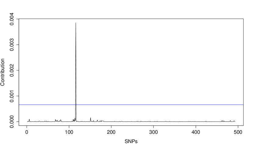
Figure 6 shows the contribution plot (). SNPs on the x-axis are sorted by chromosome number and base-pair location. The spike above the permutation-based threshold is a strong signal of a linear association that comes from the SNP rs16871157 within the NEDD9 gene on chromosome 6.
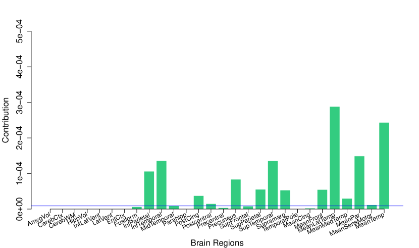
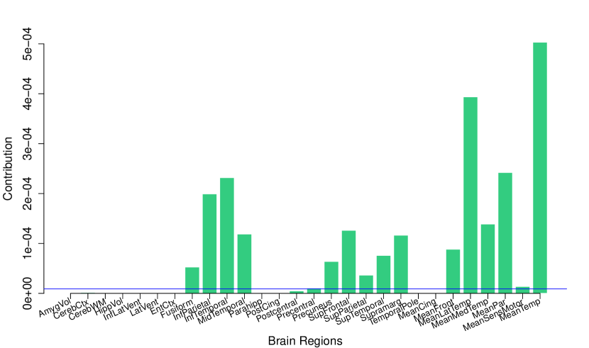
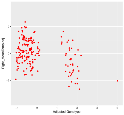
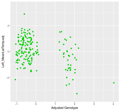
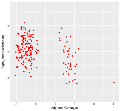
We can further decompose the contribution of rs16871157 by brain region. The results are shown in Figure 7, where the y-axis represents the individual sample correlation to the power of 8 between rs16871157 and the 56 brain regions. Comparing the two panels of the figure, we see that the correlations in the right hemisphere are stronger than those in the left hemisphere, but that the patterns of associations are very similar. Overall, it appears that rs16871157 is associated with measures of cortical thickness, particularly in the temporal lobe of the brain (phenotype MeanTemp).
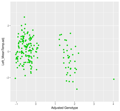
Scatterplots of adjusted MeanTemp and MeanLatTemp thickness by rs16871157 genotypes are shown in Figure 8 for both the left and right hemisphere. In both hemispheres, the distribution of adjusted cortical thickness in CN subjects with the variant allele at rs16871157 is shifted towards negative values compared to the distribution for CN subjects with two copies of the wild type allele, which is centred at zero. Thus, the presence of the variant allele at rs16871157 is associated with reduced cortical thickness in CN subjects.
5 Discussion
Measures of multivariate correlation are used in fields such as neurogenetics to find an association between a multivariate phenotype and a vector of explanatory variables. After an association is found, it may be of interest to identify the explanatory variables that are primarily responsible for the signal. In this report we have developed such a post hoc procedure and applied it to data from the ADNI-1 study. The contribution plot decomposes the RV coefficient into contributions from each explanatory variable and displays them graphically. A significance threshold determined by a permutation procedure may be added to the plot. Explanatory variables with contributions above the threshold are considered noteworthy.
Analyses of simulated datasets demonstrated two main points about the contribution plot. First, localization of the particular variables driving an association is more difficult when there is correlation between explanatory variables than when explanatory variables are uncorrelated. Second, shrinking contributions by raising the component squared-correlations to a power reduces their variance and can reveal truly-associated explanatory variables that would otherwise be hidden.
We applied the contribution plot to the data on CN subjects from ADNI-1. The aSPC test for correlation between SNP genotypes and phenotypes of brain regions of interest was significant (p=0.0154). The contribution plot suggested a sparse signal, driven by a single SNP, rs16871157, within the NEDD9 (Neural Precursor Cell Expressed, Developmentally Down-Regulated 9) gene on chromosome 6. rs16871157 is in an intron of the NEDD9 gene and has no known function. Our results suggest that the variant allele at rs16871157 is associated with reduced cortical thickness in CN subjects. Reduced cortical thickness is associated with symptom severity in mild cognitive impairment and early AD patients, and has been observed in CN patients with amyloid binding [12].
Much of the research to date on NEDD9 has focussed on the association between variation in the gene and different cancers [e.g., 13], but the protein product of NEDD9 is also involved in brain development. For example, [14] found that the NEDD9 protein plays a role in neuronal differentiation. In AD research, the SNP rs760678 in NEDD9 was found to be associated with late-onset AD [15]. However, we note that the phenotypes associated with rs760678 and rs16871157 are quite different (late-onset AD versus baseline cortical thickness) and the two SNPs are in linkage equilibrium in Caucasian populations [estimated in Caucasian populations according to the online tool LDlink; 16].
A reviewer asked about the connection between the contribution plot and sparse canonical correlation analysis [SCCA; 17, 18]. In canonical correlation analysis [CCA; 19], the first pairs of - and -canonical variates are given by and , where and are column-standardized versions of X and Y, is the loading matrix for , and is the loading matrix for . The matrices and are obtained by maximizing the RV coefficient [4]. Our work on the contribution plot suggests an alternative criterion function to maximize, namely , where is the power that minimizes the p-value of the test based on the generalized RV coefficient in equation (9). In the resulting canonical pairs, and variables with low-magnitude correlations are downweighted but not excluded. By contrast, in the canonical pairs from SCCA, and variables with low-magnitude correlations tend to be excluded. Both approaches shrink the loadings in canonical correlation analysis but in different ways. Further investigation and comparison of these contrasting approaches to shrinking the loadings is a direction for future research.
The contribution plot can be extended to the case where study subjects are differentially weighted. The sample for our study was a population sample of CN subjects, and were all equally weighted. If instead we had used the entire ADNI-1 sample, which is enriched for MCI and AD subjects, we would need to correct for the sampling bias by computing weighted covariances or correlations, where the weights are inversely proportional to the probability that each subject is included in the sample [20]. The contribution plot in terms of weighted covariance would be of the same form. See [6], Appendix A for details. Differential weighting also allows one to combine data from different studies whose sampling designs may differ. Note also that the contributions depend only on summary statistics (pair-wise correlations), which makes meta-analysis of summary statistics from multiple studies possible. Such a meta-analysis approach may be useful for data from consortia, such as the ENIGMA Consortium [21]. Investigating the properties of the contribution plot for unequally weighted subjects and meta-analysis is an area for future work.
6 Statements
6.1 Acknowledgment
The authors would like to thank Elena Szefer for preparing the genetic data.
6.2 Statement of Ethics
The authors have no ethical conflicts to disclose.
6.3 Disclosure Statement
The authors have no conflicts of interest to declare.
6.4 Funding Sources
Data collection and sharing for this project was funded by the Alzheimer’s Disease Neuroimaging Initiative (ADNI) (National Institutes of Health Grant U01 AG024904) and DOD ADNI (Department of Defense award number W81XWH-12-2-0012). ADNI is funded by the National Institute on Aging, the National Institute of Biomedical Imaging and Bioengineering, and through generous contributions from the following: AbbVie, Alzheimer’s Association; Alzheimer’s Drug Discovery Foundation; Araclon Biotech; BioClinica, Inc.; Biogen; Bristol-Myers Squibb Company; CereSpir, Inc.; Cogstate; Eisai Inc.; Elan Pharmaceuticals, Inc.; Eli Lilly and Company; EuroImmun; F. Hoffmann-La Roche Ltd and its affiliated company Genentech, Inc.; Fujirebio; GE Healthcare; IXICO Ltd.; Janssen Alzheimer Immunotherapy Research & Development, LLC.; Johnson & Johnson Pharmaceutical Research & Development LLC.; Lumosity; Lundbeck; Merck & Co., Inc.; Meso Scale Diagnostics, LLC.; NeuroRx Research; Neurotrack Technologies; Novartis Pharmaceuticals Corporation; Pfizer Inc.; Piramal Imaging; Servier; Takeda Pharmaceutical Company; and Transition Therapeutics. The Canadian Institutes of Health Research is providing funds to support ADNI clinical sites in Canada. Private sector contributions are facilitated by the Foundation for the National Institutes of Health (www.fnih.org). The grantee organization is the Northern California Institute for Research and Education, and the study is coordinated by the Alzheimer’s Therapeutic Research Institute at the University of Southern California. ADNI data are disseminated by the Laboratory for Neuro Imaging at the University of Southern California.
This work is based on JinCheol Choi’s MSc thesis supervised by B McNeney and was supported in part by the Natural Sciences and Engineering Research Council of Canada.
6.5 Author Contributions
JCC developed and implemented the statistical methods, and drafted the manuscript. DL prepared the phenotype data. MFB supervised data acquisition and preparation of the phenotype data. JG developed the statistical methods, supervised preparation of the genotype data and drafted the manuscript. BM developed the statistical methods and drafted the manuscript. All authors revised the manuscript and approved the final version.
References
- Alzheimer’s Association [2017] Alzheimer’s Association. 2017 Alzheimer’s disease facts and figures. Alzheimer’s & Dementia 13 (2017) 325–373.
- Weiner et al. [2013] Weiner MW, Veitch DP, Aisen PS, Beckett LA, Cairns NJ, Green RC, et al. The Alzheimer’s Disease Neuroimaging Initiative: a review of papers published since its inception. Alzheimer’s & dementia: The journal of the Alzheimer’s Association 9 (2013) e111–e194.
- Szefer et al. [2017] Szefer E, Lu D, Nathoo F, Beg MF, Graham J, et al. Multivariate association between single-nucleotide polymorphisms in Alzgene linkage regions and structural changes in the brain: discovery, refinement and validation. Statistical applications in genetics and molecular biology 16 (2017) 349–365.
- Josse and Holmes [2016] Josse J, Holmes S. Measuring multivariate association and beyond. Statist. Surv. 10 (2016) 132–167. 10.1214/16-SS116.
- Escoufier [1973] Escoufier Y. Le traitement des variables vectorielles. Biometrics 29 (1973) 751–760.
- Choi [2018] Choi J. Decomposing the RV coefficient to identify genetic markers associated with changes in brain structure. Master’s thesis, Simon Fraser University (2018).
- Xu et al. [2017] Xu Z, Xu G, Pan W. Adaptive testing for association between two random vectors in moderate to high dimensions. Genetic epidemiology 41 (2017) 599–609.
- R Core Team [2017] R Core Team. R: A Language and Environment for Statistical Computing. R Foundation for Statistical Computing, Vienna, Austria (2017).
- Saykin et al. [2010] Saykin AJ, Shen L, Foroud TM, Potkin SG, Swaminathan S, Kim S, et al. Alzheimer’s Disease Neuroimaging Initiative biomarkers as quantitative phenotypes: genetics core aims, progress, and plans. Alzheimer’s & dementia: The journal of the Alzheimer’s Association 6 (2010) 265–273.
- Szefer [2014] Szefer EK. Joint analysis of imaging and genomic data to identify associations related to cognitive impairment. Master’s thesis, Simon Fraser University (2014).
- Wang et al. [2011] Wang H, Nie F, Huang H, Kim S, Nho K, Risacher SL, et al. Identifying quantitative trait loci via group-sparse multitask regression and feature selection: an imaging genetics study of the ADNI cohort. Bioinformatics 28 (2011) 229–237.
- Dickerson et al. [2008] Dickerson BC, Bakkour A, Salat DH, Feczko E, Pacheco J, Greve DN, et al. The cortical signature of Alzheimer’s disease: regionally specific cortical thinning relates to symptom severity in very mild to mild AD dementia and is detectable in asymptomatic amyloid-positive individuals. Cerebral cortex 19 (2008) 497–510.
- Izumchenko et al. [2009] Izumchenko E, Singh MK, Plotnikova OV, Tikhmyanova N, Little JL, Serebriiskii IG, et al. NEDD9 promotes oncogenic signaling in mammary tumor development. Cancer research 69 (2009) 7198–7206.
- Vogel et al. [2009] Vogel T, Ahrens S, Büttner N, Krieglstein K. Transforming growth factor promotes neuronal cell fate of mouse cortical and hippocampal progenitors in vitro and in vivo: identification of NEDD9 as an essential signaling component. Cerebral Cortex 20 (2009) 661–671.
- Wang et al. [2012] Wang Y, Bi L, Wang H, Li Y, Di Q, Xu W, et al. NEDD9 rs760678 polymorphism and the risk of Alzheimer’s disease: a meta-analysis. Neuroscience letters 527 (2012) 121–125.
- Machiela and Chanock [2015] Machiela MJ, Chanock SJ. LDlink: a web-based application for exploring population-specific haplotype structure and linking correlated alleles of possible functional variants. Bioinformatics 31 (2015) 3555–3557. 10.1093/bioinformatics/btv402.
- Parkhomenko et al. [2009] Parkhomenko E, Tritchler D, Beyene J. Sparse canonical correlation analysis with application to genomic data integration. Statistical applications in genetics and molecular biology 8 (2009) 1–34.
- Witten et al. [2009] Witten DM, Tibshirani R, Hastie T. A penalized matrix decomposition, with applications to sparse principal components and canonical correlation analysis. Biostatistics 10 (2009) 515–534.
- Hotelling [1935] Hotelling H. Relations between two sets of variates. Biometrika 28 (1935) 321–377. 10.1093/biomet/28.3-4.321.
- Horvitz and Thompson [1952] Horvitz DG, Thompson DJ. A generalization of sampling without replacement from a finite universe. Journal of the American statistical Association 47 (1952) 663–685.
- ENI [2019] The ENIGMA Consortium (2019). http://enigma.ini.usc.edu/; Accessed: 2019-01-30.
- Xu and Pan [2017] Xu Z, Pan W. aSPC: An Adaptive Sum of Powered Correlation Test (aSPC) for Global Association Between Two Random Vectors (2017). R package version 0.1.2.
Figure captions
Appendix: R code to implement the contribution plot
The contribution plot is intended as a post hoc procedure that is applied after a significant adaptive sum of powered correlations (aSPC) test [7]. The aSPC test is implemented in the aSPC() function from the package of the same name [22]. aSPC() takes two multivariate data frames and a grid of values as input, and returns for each the -value for the hypothesis test based on the statistic (equation 9). For the contribution plot, we choose the power with minimum -value over the grid.
For the chosen we calculate the contributions of each explanatory variable to the statistic and the significance threshold, respectively, with the EstContribution() and Threshold() functions given below. The contribution plot can then be created with the generic plot() function in R, as illustrated below.
EstContribution=function(X, Y, alpha=1){
  # Input: Data matrices X and Y, and the power alpha
  # Output: A vector of contribution of each explanatory variable
  #         to the RV(X,Y| \alpha) statistic
  #
  # 1. Generate a matrix of powered covariances between columns of X and Y
  Cov=(cov(X,Y)^(2))^alpha
  # 2. For each explanatory variable, sum the powered correlations.
  Contr=apply(Cov, 1, sum)
  return(Contr)
}

Threshold=function(X, Y, alpha=1, level=0.95, nrep=100){
  # Input: Data matrices X and Y, the power alpha and the number of
  #        permutation replicates for the permutation test.
  # Output: The threshold.
  #
  # Initialize a vector to hold max contribution for each permutation
  maxs = rep(NA,nrep)
  for(i in 1:nrep){
    # record all the maximum contributions based under the estimated
    # permutation distribution
    maxs[i]=max(EstContribution(X[sample(1:nrow(X)),], Y, alpha=alpha))
    # print the process at every 25%
    if(i%%(0.25*nrep)==0){
      print(paste0("<Obtaining Threshold> ", i/nrep*100, "% done"))
    }
  }
  # obtain the threshold value
  return(quantile(maxs, level))
}

# Call to plot() to plot the contributions and threshold.
plot(EstContribution(X, Y, alpha=1), type=’l’, main="X and Y (alpha=1)",
     xlab="Explanatory Variables", ylab="Contribution",
     cex=1.3, cex.lab=1.3, cex.axis=1.3, cex.main=2.5, cex.sub=1.3)
abline(a=Threshold(X, Y, alpha=1),b=0,col="blue")