An InfoVis Tool for Interactive Component-Based Evaluation
Abstract
In this paper, we present an InfoVis tool based on Sankey diagrams for the exploration of large combinatorial combinations of IR components – the Grid of Points (GoP). The goal of this tool is to ease the comprehension of the behavior of single IR components within fully functioning off-the-shelf IR systems without recurring to complex statistical tools.
keywords:
information retrieval systems evaluation , visual analytics , visual component-based evaluation , grid of points1 Motivations
Information Retrieval (IR) systems are constituted of “pipelines” of components such as stop lists, stemmers and IR models, which are stacked together in order to process both documents and user queries and to match them returning a ranked result list of documents in decreasing order of estimated relevance. The performance of IR systems are evaluated in terms of effectiveness that can be determined only after that the system has been built; indeed, no effectiveness prediction about a specific component can be done before it has been tested within a fully functioning IR system.
Currently, the only viable means to determine the contribution to the system effectiveness of single components is to measure their impact on the overall performances by testing all the different combinations of such components. This leads to a very high number of cases to be considered, making the space of system combinations large and complex to explore.
Besides requiring a great deal of effort and resources to be produced, these combinatorial compositions constitute a challenge when it comes to explore, analyze, and make sense of the experimental results with the goal of understanding how different components contribute to the overall performances and interact together. Indeed, it is typically needed to resort to rather complex statistical tools (e.g. multi-way ANalysis Of VAriance (ANOVA) models) requiring a careful experimental design and producing results which call for a considerable extent of expertise to be interpreted [6]. To this end, we developed an extensive set of systems – i.e. the Grid of Points (GoP) 111http://gridofpoints.dei.unipd.it/ – arising from the combinatorial composition of several open-source publicly available components such as stop lists, stemmers, and IR models, and run against different public test collections shared by the Text REtrieval Conference (TREC) international evaluation initiative. Thanks to this GoP, in [8] we presented the deep statistical analyses we run and the insights we gathered about the individual contributions of single IR components to the overall performances of fully working IR systems.
In this paper we present an InfoVis system based on SanKey diagrams – often used in physics to represent energy inputs, useful output, and wasted output – to allow the exploration of the GoP to quickly understand which combinations perform best under specific criteria, how components behave across a wide range of cases, and how they interact together. Our main goal is to give IR researchers and practitioners a fast and easy way to understand and analyze the GoP without recurring to demanding and complex statistical tools.
Hence, the InfoVis tool we present enables the analysis and comparison of a complex set of measures associated with a large combinatorial space of IR systems and the intuitive exploration and understanding of many component configurations. It is thought to be simple to use and to favor interaction, thus it provides functionalities as component filtering, measure selection and tooltips presenting statistical information easy to interpret.
2 Related Work
InfoVis techniques are typically exploited for the presentation and exploration of the documents managed by an IR system [15]. Typical examples are: identification of the objects and their attributes to be displayed [9]; different ways of presenting the data [13]; the definition of visual spaces and visual semantic frameworks [14]. The development of interactive means for IR is an active field which focuses on search user interfaces [10], displaying of results [4] and browsing capabilities [11].
Less attention has been dedicated to the application of InfoVis techniques to the analysis of experimental evaluation results. One example of a system applying visualization to IR is Visual Information Retrieval Tool for Upfront Evaluation (VIRTUE), a visual analytics tool supporting performance and failure analysis [1]. In the same vein, [2] presents an analytical framework trying to learn the behavior of a system just from its outputs for obtaining a rough estimation of the possible effects of a modification to the system. More recently, [12] presented an InfoVis tool to explore pooling strategies.
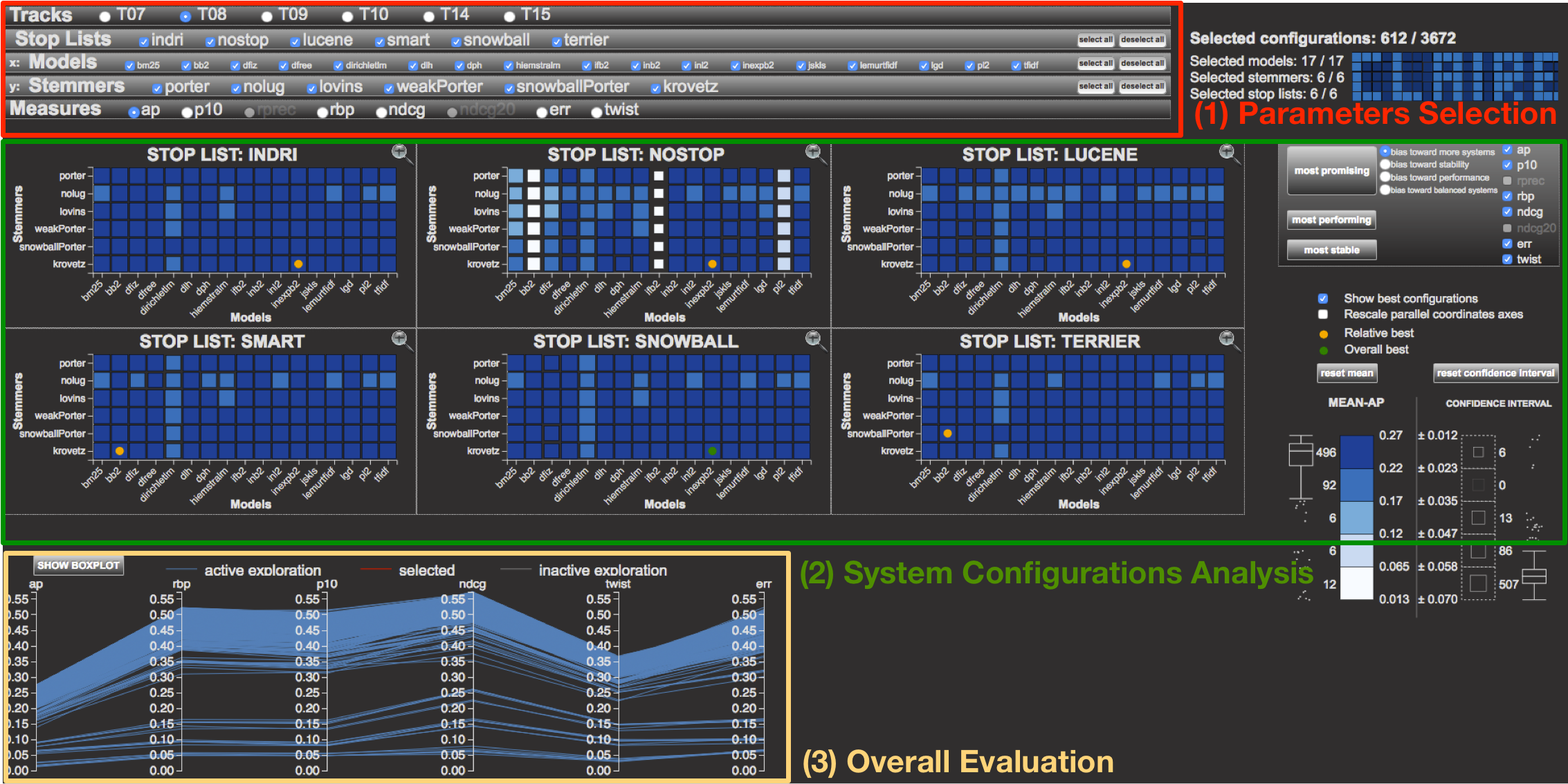
However, to the best of our knowledge only one solution – i.e. the CLAIRE tool [3], see Figure 7 – exists for dealing with large sets of IR systems – the GoP [7, 6] – generated by many IR components which allows the inspection of both configurations and measures. CLAIRE is based on a totally different visual paradigm since it uses tiles, parallel coordinates and boxplots to explore system configurations.
3 Experimental Setting
The GoP data adopted by our InfoVis tool is based on three main components of an IR system: stop list, stemmer, and IR model. We selected a set of alternative implementations of each component and, by using the Terrier v.4.0 222http://www.terrier.org/ open source system, we created a run for each system defined by combining the available components in all possible ways. The selected components are:
-
1.
Stop list: nostop, indri, lucene, snowball, smart,terrier;
-
2.
Stemmer: nolug, weakPorter, porter, snowballPorter,
krovetz, lovins; -
3.
Model: bb2, bm25, dfiz, dfree, dirichletlm, dlh, dph,
hiemstralm, ifb2, inb2, inl2, inexpb2, jskls, lemurtfidf, lgd, pl2, tfidf.
Overall, these components define a runs. The stop lists differ from each other by the number of terms composing them; specifically, indri has 418 terms, lucene has 33 terms, snowball has 174 terms, smart has 571 terms and terrier 733 terms. Stemmers can be classified into aggressive (e.g. lovins) and weaker stemmers (e.g. porter).
The models we employ are classified into the three main approaches currently adopted by search engines: (1) the vector space model – e.g. tfidf and lemurtfidf; (2) the probabilistic model – e.g. bm25 and the Divergence From Randomness (DFR) models; and, (3) the language models – e.g. dirichletlm, hiemstralm and lgd. We considered standard and shared collections with 50 different topics each: TREC Adhoc tracks T07 and T08; TREC Web tracks T09 and T10; and, TREC Terabyte tracks T14 and T15. We evaluate the GoPs by employing evaluation measures: AP, P@10, Rprec, RBP, nDCG, nDCG@20, ERR, and Twist.
Summarizing, the GoP we visualize with the proposed InfoVis tool consists of 612 runs over 6 collections with 50 topics each and evaluated with 8 measures, which amounts to almost 1.5M data points.
4 The InfoVis tool
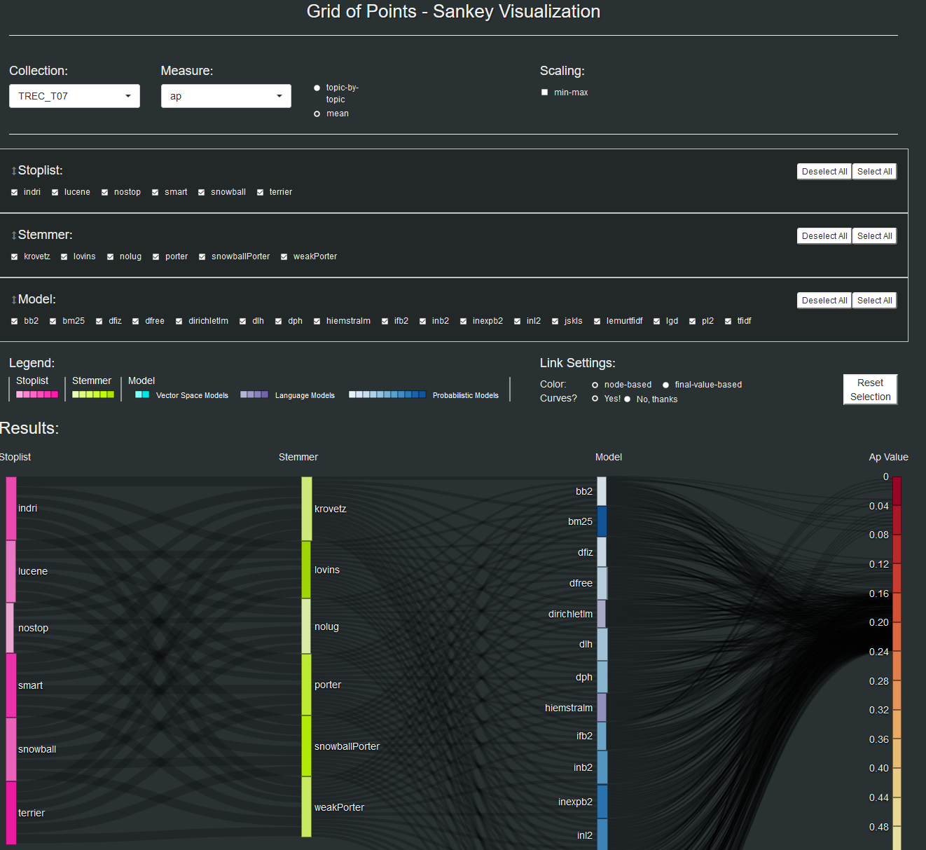
The InfoVis tool we realized, see Figure 6 is composed of two main areas:
- Parameters selection area:
-
(top of Figure 6) it allows the user to load the runs relative to the desired experimental collection, to select the components s/he wants to consider and the evaluation measure to be used.
- System analysis area:
-
(bottom of Figure 6) it allows the actual analysis and exploration of the various components and their evaluation on the basis of the parameters selected above.
4.1 Parameter selection area
In Figure 1 we can see a detailed view of the parameter selection area.
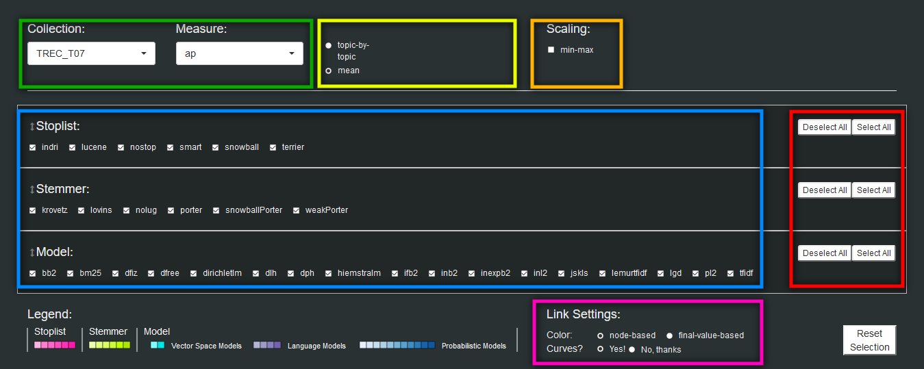
The first two parameters that can be selected (in the green box) are the experimental collection and the evaluation measure of interest. On the left of these two drop down menus we can choose to visualize the system performances topic-by-topic (if this option is selected a new drop-down menu appears allowing the user to select the topic of interest) or on average (e.g. MAP). The “scaling” option enables a normalized visualization of the SanKey diagram (only actual min-max values or the whole range such as for AP). The blue box in Figure 1 shows the control panel enabling the dynamic selection of component families to be visualized in the Sankey diagram.
The three component families (stoplists, stemmers and IR models) can be re-ordered by a simple drag-and-drop action, leading to a dynamic re-ordering of the axes of the Sankey diagram; this is particularly useful when during the data analysis phase we want to highlight the components interaction. The default axes order better shows the interaction between stoplists and stemmers and between stemmers and IR models, but by re-ordering the axes we can highlight, for instance, the stoplists-models interaction.
Below the blue box we can see the legend of the Sankey diagram where three chromatic variations are used to differentiate between the components of each family and sub-family of components: fuchsia for stoplists, green for stemmers, light blue for vector space models, purple for language models and dark blue for probabilistic models. The fuchsia box highlights the link settings where we can choose the shape of the SanKey curves and their color schema – i.e. based on component selection or based on evaluation measure value selection.
Every single interaction with the parameter selection area produces an effect on the SanKey diagram which is rendered dynamically and in real-time; this is intended to ease the interaction with the system and the data analyses to be performed.
4.2 System analysis area
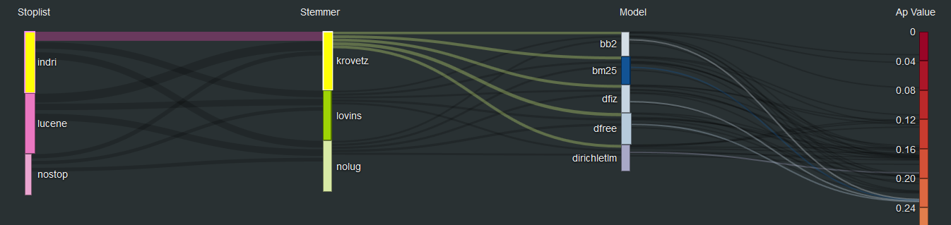
On the bottom of Figure 6 we can see the entire analysis space where all the available components are displayed by the SanKey diagram, whereas in Figure 2 we can see a restricted analysis area where only some specific components have been selected and highlighted for an in-depth analysis of their performances and interactions.
The rightmost column presents the evaluation measure values divided into 25 rectangles of equal size, each one representing a value interval. The color of each rectangle follows the red-yellow-green schema where reddish rectangles are assigned to lower values and the greenish ones to higher values. By the means of a drag-and-drop mouse action it is also possible to re-order the rectangles representing family components. Each single link insisting on these rectangles represents one of the 612 systems and their overall performance values.
A single system is represented by a path, i.e. a series of links connecting one component with the next one. The user can select a set of components (left click on one or more rectangles) to highlight the paths of interest as shown in Figure 2 where we selected the indri stoplist and the krovetz stemmer.
The component columns present a number of rectangles equal to the components selected in the parameter selection area and the size of the rectangle gives a visual idea of the performances of the component it represents. This is done by calculating the marginal arithmetic mean of the performance values obtained by the systems using a specific component; the means are dynamically re-calculated every time a component is filtered out or added to the visualization. In Figure 2, we can see that krovetz has a bigger rectangle than lovins and nolug (meaning no stemmer) showing the positive effect of the krovetz stemmer when interacting with the indri stoplist and the selected models.
The same idea is applied to the link size: the thicker the line the better the interaction between the components it connects. For instance, in Figure 2 we can see that the stoplist-stemmer pair indri-krovetz has higher performances than the pair lucene-krovetz.
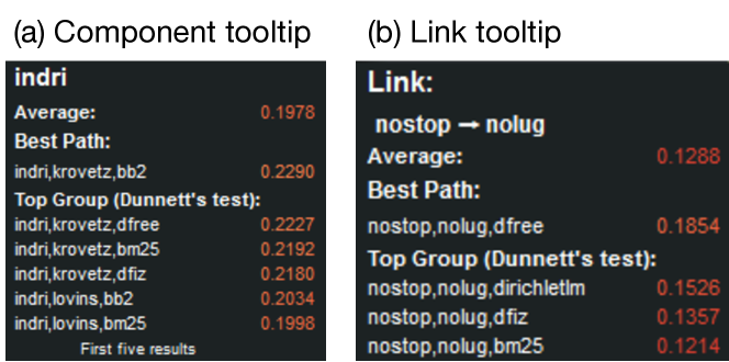
With a mouse-over action on a rectangle or a link, a tooltip reporting the top 5 systems using the selected component (rectangle) or the selected components pair (link) is visualized to the user. The InfoVis system also runs the Dunnett [5] statistical test to determine if the reported means are statistically different one from the other. In Figure 3(a) we can see the tooltip visualized when the indri stoplist is selected: we show the average measure (AP in this case) of all the system using this stoplist, the best system adopting the stoplist and the top group of system adopting the indri stoplist that are not statistically different one from the other. In Figure 3(b) we see the tooltip reporting the statistical information related to the nostop-nolug link.
5 User Evaluation
We did a user study with nine users with a basic knowledge and previous experience with IR systems and experimental evaluation in the field; the study had a twofold goal, to compare the Sankey tool with the CLAIRE system and to conduct an in-depth analysis of the newly proposed Sankey tool. Of course, CLAIRE is a more complex system providing a wide range of functionalities, but we focused on the common features which regards the exploration of the combinatorial space of IR system pipelines.
The test was organized in three phases: (i) in-depth description of the two visual tools and hands-on phase to get to know them; (ii) comparative study: execution of three tasks with both CLAIRE and Sankey (in this phase we divided the users into two groups where one group used firstly CLAIRE and then Sankey and the second group did the opposite); (iii) in-depth analysis: execution of five tasks by using only the Sankey tool. The tasks were centered around core activities enabled by the two visual tools such as the ability to determine the best IR system, the best combination of components, the comparison between two or more alternative components and so on. After the resolution of the first group of tasks the users were required to fill closed questionnaire. After the resolution of the second group of tasks the users were required to fill in an open questionnaire.
The questionnaire relative to the first set of tasks required to get a preference between Sankey and CLAIRE, was composed of two sets of questions; the first set with three questions: (Q1) How intuitive was the Sankey (CLAIRE) tool? (Q2) In your opinion how much useful is the Sankey (CLAIRE) tool to understand the performances of IR systems? (Q3) How much effective was the Sankey (CLAIRE) tool to solve the given tasks? Each question of the questionnaire had to be answered by using an interval Likert scale ranging from 1 to 5 in which each numerical score was labeled with a description: {1: not at all, 2: a little, 3: enough, 4: a lot, 5: quite a lot}.
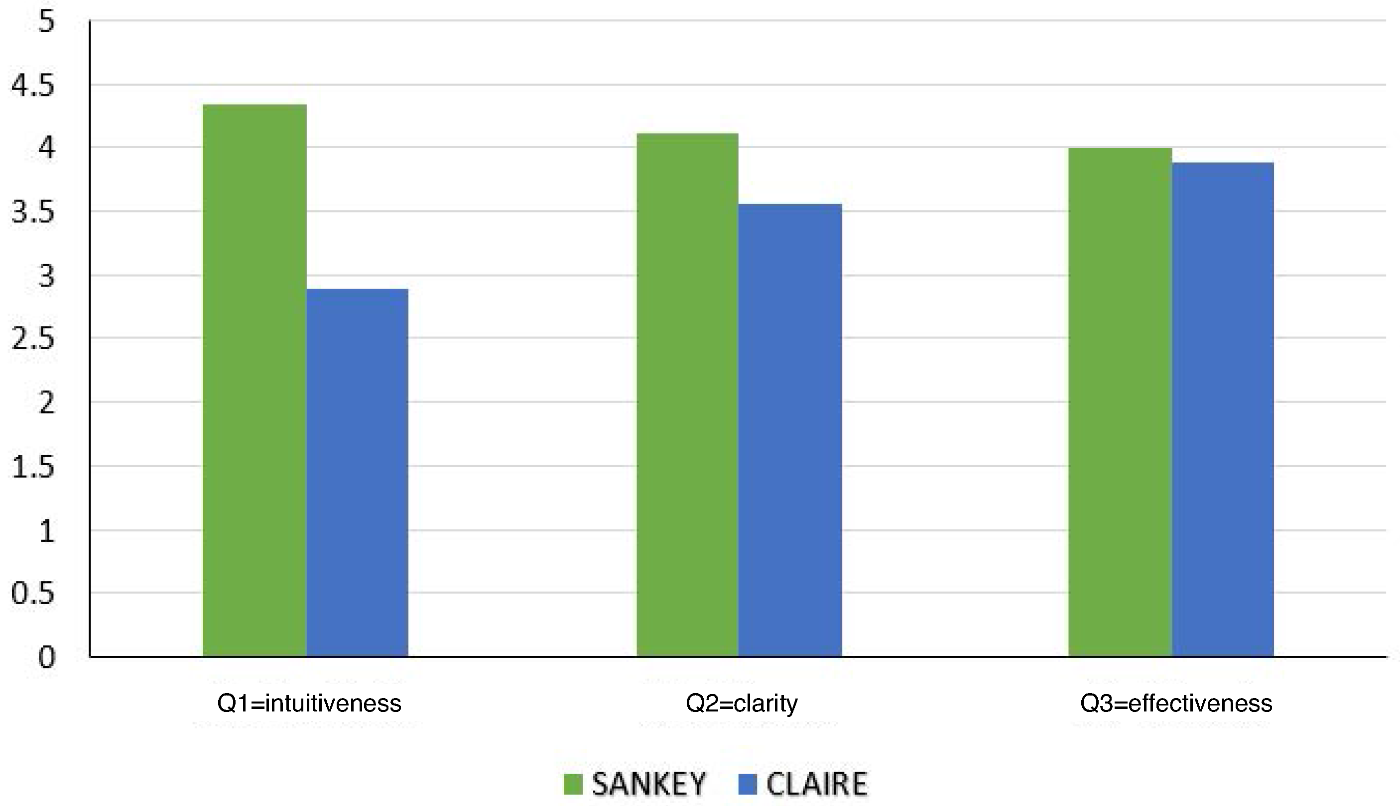
In Figure 4 we can see that both systems were evaluated as clear to use (Q2) and effective (Q3) in both cases with a slight preference for Sankey; but Sankey was considered more intuitive than CLAIRE (Q1).
The second set of questions for the comparative study was: (Q1) Which system does represent better the experimental data? (Q2) Which system does offer the most intuitive interface to interact with the data? (Q3) Which system is more complete to solve the assigned tasks? (Q4) Which system did you prefer to use? Each question of the questionnaires had to be answered by indicating a strong preference (a “2” in our interval scale) or a mild preference (a “1”) for CLAIRE or Sankey where a “0” value indicated equality between the systems.
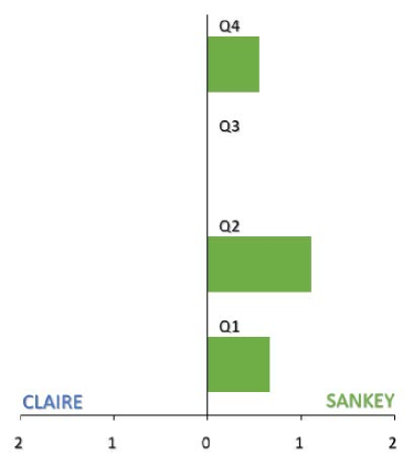
In Figure 5 we can see that on average Sankey was preferred by the users with the only exception of Q3 where the systems were judged equivalent.
6 Final remarks
The InfoVis tool we presented has the goal to ease the exploration and analysis of large experimental GoP enabling IR researchers and practitioners to better understand the performances of single components, their interactions and their impact on off-the-shelf IR systems. The InfoVis tool we propose is highly interactive and remarkably simple as shown by the user study we conducted, yet offering advanced statistical information and analytics functionalities.
The presented tool is available on-line at the URL http://gridofpoints.dei.unipd.it/sankey/ and the source code is openly shared at the URL https://github.com/giansilv/sankey_eval.
References
References
- [1] M. Angelini, N. Ferro, G. Santucci, and G. Silvello. VIRTUE: A visual tool for information retrieval performance evaluation and failure analysis. Journal of Visual Languages & Computing (JVLC), 25(4):394–413, August 2014.
- [2] M. Angelini, N. Ferro, G. Santucci, and G. Silvello. A Visual Analytics Approach for What-If Analysis of Information Retrieval Systems. In Proc. 39th Annual International ACM SIGIR Conference on Research and Development in Information Retrieval (SIGIR 2016). ACM Press, 2016, pages 1081–1084.
- [3] M. Angelini, V. Fazzini, N. Ferro, G. Santucci, and G. Silvello. CLAIRE: A combinatorial visual analytics system for information retrieval evaluation. In IP&M. ACM Press, in print, 2018.
- [4] F. Crestani, J. Vegas, and P. de la Fuente. A Graphical User Interface for the Retrieval of Hierarchically Structured Documents. IP&M, 40(2):269–289, 2004.
- [5] Charles W. Dunnett. A multiple comparison procedure for comparing several treatments with a control. Journal of the American Statistical Association, 50(272):1096–1121, 1955.
- [6] N. Ferro and G. Silvello. A General Linear Mixed Models Approach to Study System Component Effects. In Proc. 39th Annual International ACM SIGIR (SIGIR 2016). ACM Press, 2016, pages 25–34.
- [7] N. Ferro and G. Silvello. 3.5K runs, 5K topics, 3M assessments and 70M measures: What trends in 10 years of Adhoc-ish CLEF? IP&M, 53(1):175–202, January 2017.
- [8] N. Ferro and G. Silvello. Towards an Anatomy of IR System Component Performances. JASIST, 69(2):187–200, 2017.
- [9] R. H. Fowler, W. A. Lawrence-Fowler, and B. A. Wilson. Integrating Query, Thesaurus, and Documents Through a Common Visual Representation. In Proc. 14th Annual International ACM SIGIR Conference on Research and Development in Information Retrieval (SIGIR 1991). ACM Press, 1991.
- [10] M. A. Hearst. “Natural” Search User Interfaces. Communications of the ACM (CACM), 54(11):60–67, November 2011.
- [11] S. Koshman. Testing User Interaction with a Prototype Visualization-Based Information Retrieval System. JASIST, 56(8):824–833, 2005.
- [12] A. Lipani, M. Lupu, and A. Hanbury. Visual Pool: A Tool to Visualize and Interact with the Pooling Method. In Proc. 40th Annual International ACM SIGIR (SIGIR 2017). ACM Press, 2017.
- [13] E. L. Morse, M. Lewis, and K. A. Olsen. Testing Visual Information Retrieval Methodologies Case Study: Comparative Analysis of Textual, Icon, Graphical, and Spring Displays. JASIST), 53(1):28–40, 2002.
- [14] J. Zhang. TOFIR: A Tool of Facilitating Information Retrieval - Introduce a Visual Retrieval Model. Information Processing & Management, 37(4):639–657, 2001.
- [15] J. Zhang. Visualization for Information Retrieval. Springer-Verlag, Heidelberg, Germany, 2008.