auditor: an R Package for Model-Agnostic Visual Validation and Diagnostics
Abstract
Machine learning models have spread to almost every area of life. They are successfully applied in biology, medicine, finance, physics, and other fields. With modern software it is easy to train even a complex model that fits the training data and results in high accuracy on test set. The problem arises when models fail confronted with the real-world data.
This paper describes methodology and tools for model-agnostic audit. Introduced techniques facilitate assessing and comparing the goodness of fit and performance of models. In addition, they may be used for analysis of the similarity of residuals and for identification of outliers and influential observations. The examination is carried out by diagnostic scores and visual verification.
Presented methods were implemented in the auditor package for R. Due to flexible and consistent grammar, it is simple to validate models of any classes.
Keywords machine learning, R, diagnostics, visualization, modeling
1 Introduction
Predictive modeling is a process that uses mathematical and computational methods to forecast outcomes. Lots of algorithms in this area have been developed and are still being develop. Therefore, there are countless possible models to choose from and a lot of ways to train a new new complex model. A poorly- or over-fitted model usually will be of no use when confronted with future data. Its predictions will be misleading (Sheather, 2009) or harmful (O’Neil, 2016). That is why methods that support model diagnostics are important.
Diagnostics is often carried out only by checking model assumptions. However, it is usually neglected for complex machine learning models since many of them are used as if they were assumption-free. Still, there is a need to verify their quality. We strongly believe that a genuine diagnosis or an audit incorporates a broad approach to model exploration. The audit includes three objectives.
-
•
Objective 1: Enrichment of information about model performance.
-
•
Objective 2: Identification of outliers, influential and abnormal observations.
-
•
Objective 3: Examination of other problems relating to a model by analyzing distributions of residuals, in particular, problems with bias, heteroscedasticity of variance and autocorrelation of residuals.
In this paper, we introduce the auditor package for R, which is a tool for diagnostics and visual verification. As it focuses on residuals111Residual of an observation is the difference between the observed value and the value predicted by a model. and does not require any additional model assumptions, most of the presented methods are model-agnostic. A consistent grammar across various tools reduces the amount of effort needed to create informative plots and makes the validation more convenient and available.
Diagnostics methods have been a subject of much research (Atkinson, 1985). Atkinson and Riani (2012) focus on graphical methods of diagnostics regression analysis. Liu et al. (2017) present an overview of interactive visual model validation. One of the most popular tools for verification are measures of the differences between the values predicted by a model and the observed values (Willmott et al., 1985). These tools include Root Mean Square Error (RMSE) and Mean Absolute Error (MAE) (Hastie et al., 2001). Such measures are used for well-researched and easily interpretable linear model as well as for complex models such as a random forest (Ho, 1995), an XGBoost (Chen and Guestrin, 2016) or a neural network (Venables and Ripley, 2002).
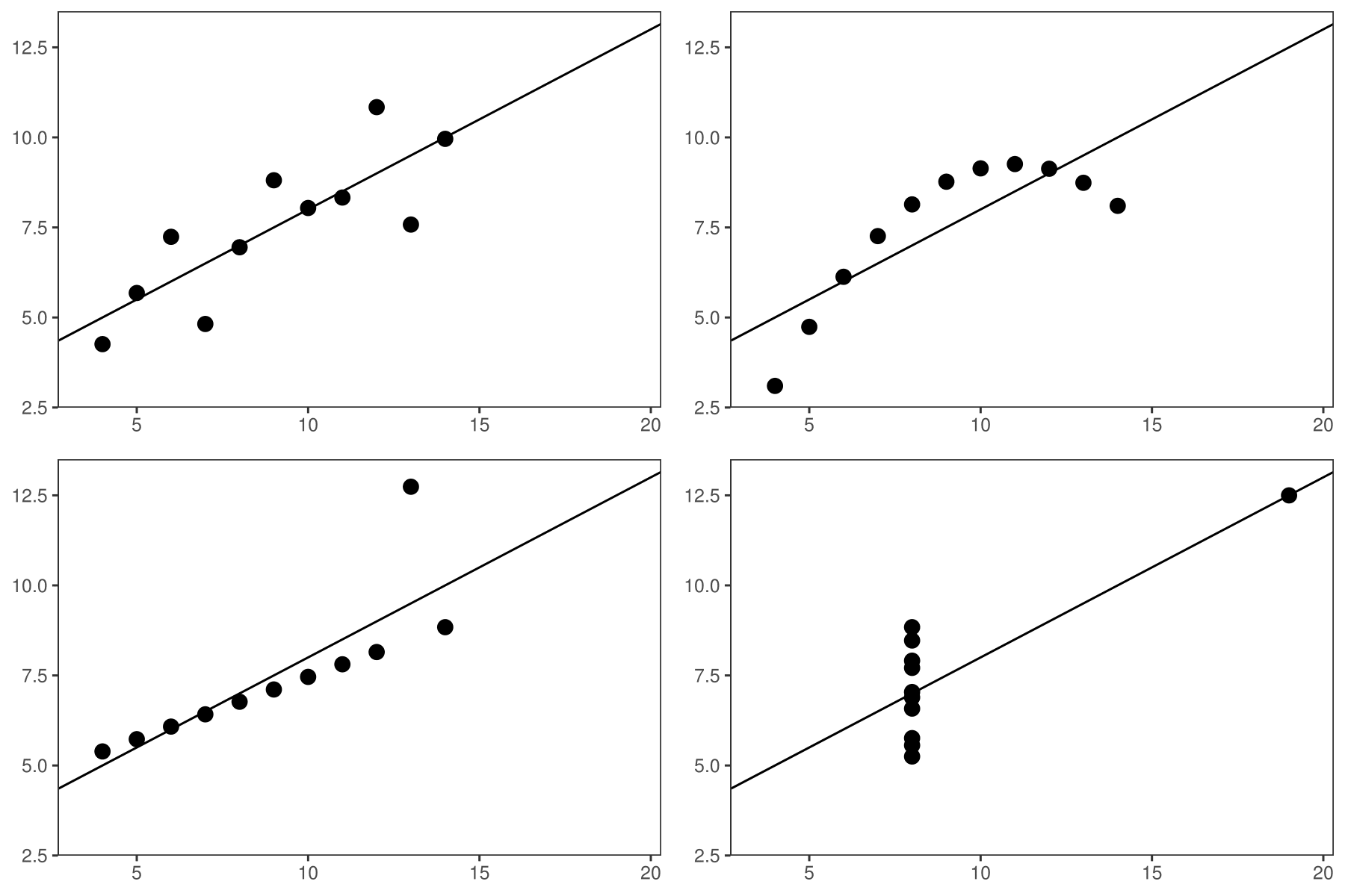
However, no matter which measure of model performance we use, it does not reflect all aspects of the model. As indicated by Breiman (2001), the linear regression model validated only on the basis of may lead to many false conclusions. The best known example of this issue is the Anscombe Quartet (Anscombe, 1973). It contains four different data sets constructed to have nearly identical simple statistical properties such as mean, variance, correlation, etc. These measures directly correspond to the coefficients of the linear models. Therefore, by fitting a linear regression to the Anscombe Quartet we obtain four almost identical models (see Figure 1). However, residuals of these models are very different. The Anscombe Quartet is used to highlight that the numerical measures should be supplemented by graphical data visualizations.
The diagnostics analysis is well-researched for linear and generalized linear models. The said analysis is typically done by extracting raw, studentized, deviance, or Pearson residuals and examining residual plots. Common problems with model fit and basic diagnostics methods are presented in Faraway (2002) and Harrell (2006) Model validation may involve both checking the overall trend in residuals and looking at residual values of individual observations (Littell et al., 2007). Gałecki and Burzykowski (2013) discussed methods based on residuals for individual observation and groups of observations.
Diagnostics methods are commonly used for linear regression (Faraway, 2004). Complex models are treated as if they were assumption-free, which is why their diagnostics is often ignored. Considering the above, there is a need for more extensive methods and software dedicated for model auditing. Many of diagnostics tools. such as plots and statistics developed for linear models, are still useful for exploring any machine learning model. Applying the same tools to all models facilitates their comparison. Yet another approach to auditability of models was proposed in Becker and Chambers (1988).
2 Related work
In this chapter, we overview common methods and tools for auditing and examining the validity of the models. There are several attempts to validate. They include diagnostics for predictor variables before and after model fit, methods dedicated to specific models, and model-agnostic approaches.
2.1 Data diagnostic before model fitting
The problem of data diagnostics is related to the Objective 2 presented in the Introduction, that is, the identification of problems with observations. There are several tools that address this issue. We review the most popular of them.
-
•
One of the tools that supports the identification of errors in data is the dataMaid package (Petersen and Ekstrom, 2018). It creates a report that contains summaries and error checks for each variable in data. Package lumberjack (van der Loo, 2017) provides row-wise analysis. It allows for monitoring changes in data as they get processed. The validatetools (de Jonge and van der Loo, 2018) is a package for managing validation rules.
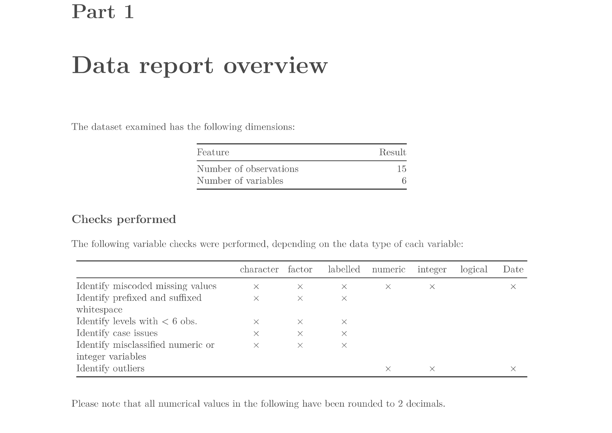
Figure 2: Page from an exemplary report generated with dataMaid package. Here we have a table that summarizes checks for variables. This includes, among others, identification of missing values and outliers. In the further part of the report, there are summary tables and plots for each variable separately. The Figure comes from the report generated with the code from the dataMaid documentation. -
•
The datadist function from rms package (Harrell Jr, 2018) computes distributional summaries for predictor variables. They include the overall range and certain quantiles for continuous variables, as well as distinct values for discrete variables. It automates the process of fitting and validating several models due to storing model summaries by datadist function.
-
•
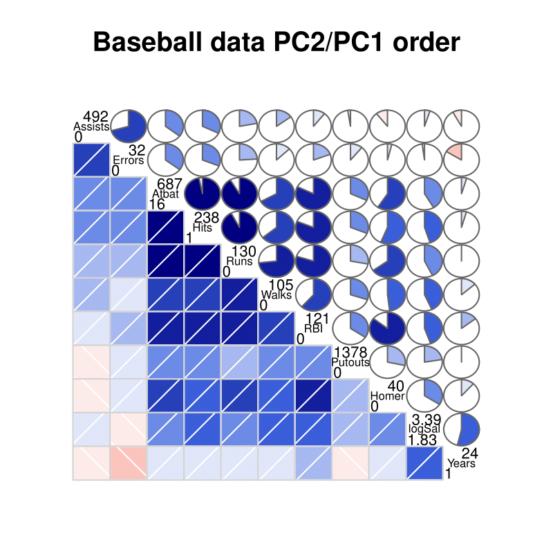
While above packages use pipeline approaches, there are also tools that focus on specific step of data diagnostic. The package corrgram (Wright, 2018) calculates a correlation of variables and displays corrgrams. Corrgrams (Friendly, 2002) are visualizations of correlation matrices, that help to identify the relationship between variables.
2.2 Diagnostic methods for linear models
As linear models have a very simple structure and do not require high computational power, they have been and still are used very frequently. Therefore, there are many tools that validate different aspects of linear models. Below, we overview the most widely known tools implemented in R packages.
-
•
The stats package (R Core Team, 2018) provides basic diagnostic plots for linear models. Function plot generates six types of charts for "lm" and "glm" objects, such as a plot of residuals against fitted values, a scale-location plot of against fitted values and a normal quantile-quantile plot. These visual validation tools may be addressed to the Objective 3 of diagnostic, related to the examination of model by analyzing the distribution of residuals. The other three plots, that include: a plot of Cook’s distances, a plot of residuals against leverages, and a plot of Cook’s distances against may be addressed to the identification of influential observations (Objective 1).
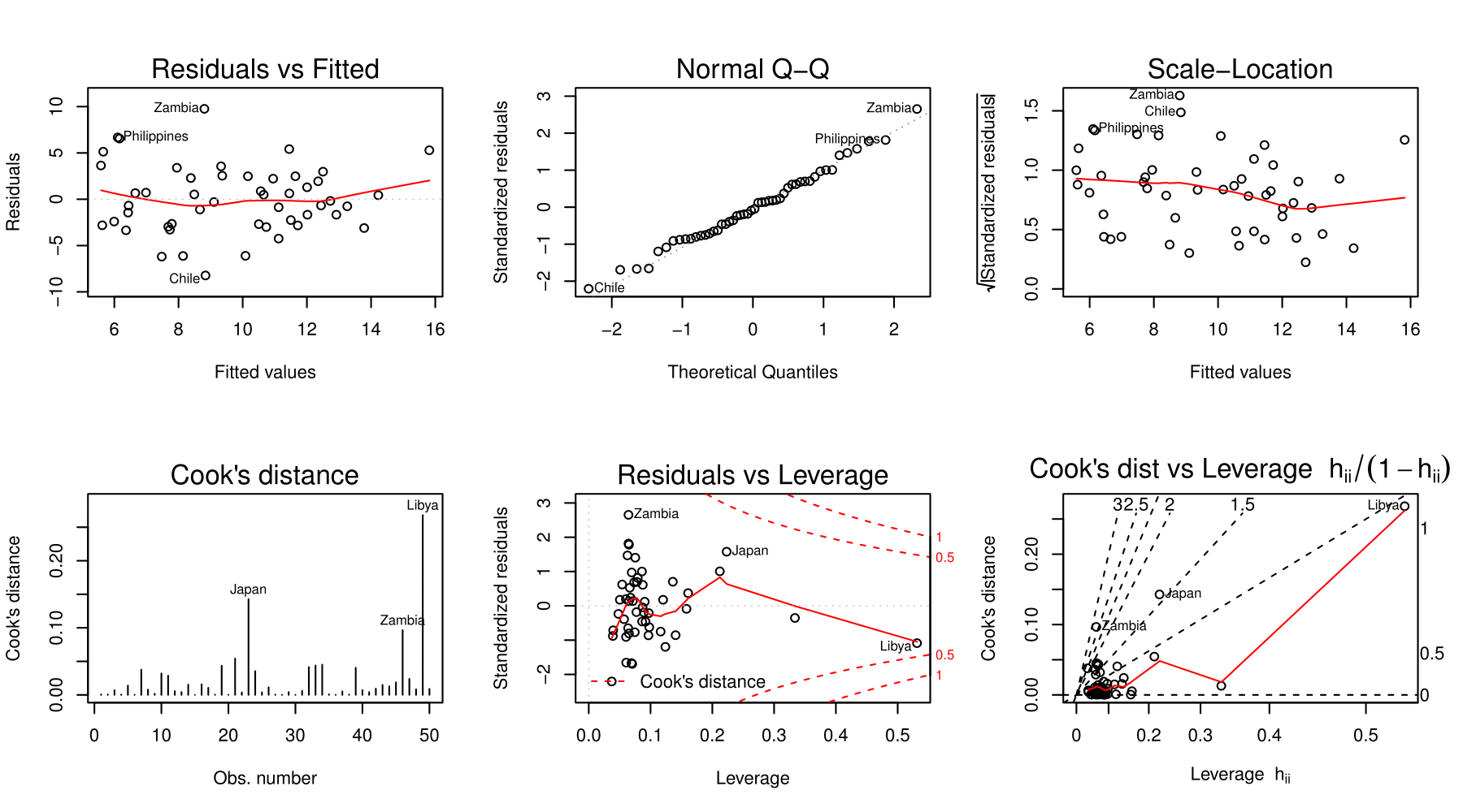
Figure 4: Six diagnostic plots for linear models created with generic plot function. Upper row contains plots related to the distribution of residuals, lower row is related to an influence of observations. Plots are generated with the code included in the documentation of function plot.lm. -
•
Package car (Fox and Weisberg, 2011) extends the capabilities of stats by including more types of residuals, such as Pearson and deviance residuals. It is possible to plot against values of selected variables and to group residuals by levels of factor variables. What is more, car provides more diagnostic plots such as, among others, partial residual plot (crPlot), index plots of influence (infIndexPlot) and bubble plot of studentized residuals versus hat values (influencePlot).
These plots allow for checking both the effect of observation and the distribution of residuals, what address to the Objective 2 and the Objective 3 respectively.
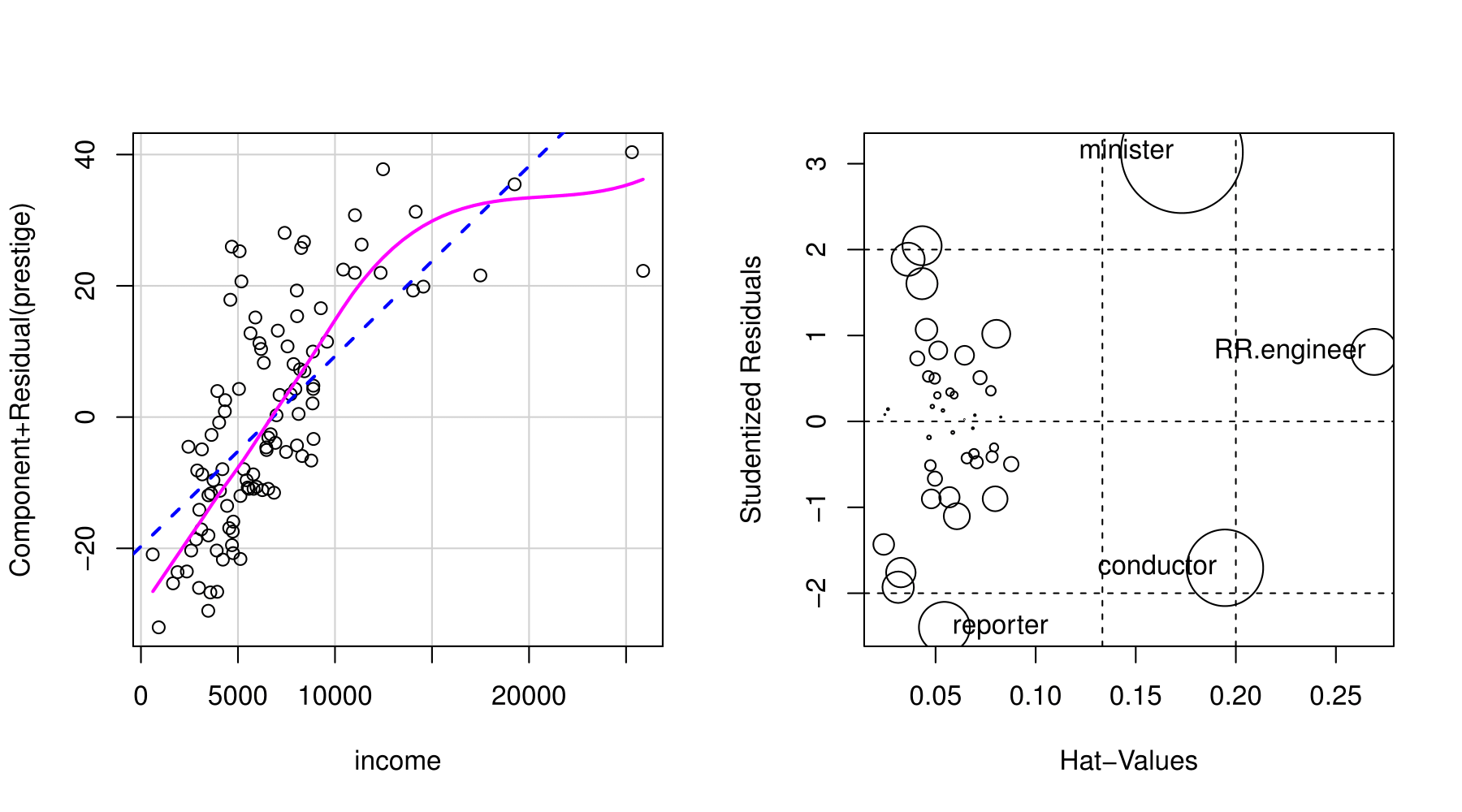
Figure 5: Two diagnostic plots generated with the car package. Left plot is a partial residual plot, right is a bubble plot of studentized residuals versus hat values. The areas of circles represent Cook’s distances. Plots were generated with code from the documentation of car package. -
•
A linear regression model is still one of the most popular tools for data analysis due to its simple structure. Therefore, there is a rich variety of methods for checking its assumptions, for example, the normality of residual distribution and the homoscedasticity of the variance.
The package nortest (Gross and Ligges, 2015) provides five tests for normality: the Anderson-Darling (Anderson and Darling, 1952), the Cramer-von Mises (Cramer, 1928; Von Mises, 1928), the Kolmogorov-Smirnov (Stephens, 1974), the Pearson chi-square (F.R.S., 1900), and the Shapiro-Francia (Sanford Shapiro and S. Francia, 1972) tests. The lmtest package (Zeileis and Hothorn, 2002) also contains a collection of diagnostic tests: the Breusch-Pagan (Breusch and Pagan, 1979), the Goldfield-Quandt (Goldfeld and Quandt, 1965) and the Harrison-McCabe (Harrison and McCabe, 1979) tests for heteroscedasticity and the Harvey-Collier (Harvey and Collier, 1977), the Rainbow (Utts, 1982), and the RESET (Ramsey, 1969) tests for nonlinearity and misspecified functional form. A unified approach for examining, monitoring and dating structural changes in linear regression models is provided in strucchange package (Zeileis et al., 2002). It includes methods to fit, plot and test fluctuation processes and F-statistics. The gvlma implements the global procedure for testing the assumptions of the linear model (find more details in Peña and Slate (2006)).
The Box-Cox power transformation introduced by Box and Cox (1964) is a way to transform the data to follow a normal distribution. For simple linear regression, it is often used to satisfy the assumptions of the model. Package MASS (Venables and Ripley, 2002) contains functions that compute and plot profile log-likelihoods for the parameter of the Box-Cox power transformation.
-
•
The broom package (Robinson, 2018) provides summaries for about 30 classes of models. It produces results, such as coefficients and p-values for each variable, , adjusted , and residual standard error.
2.3 Other model-specific approaches
There are also several tools to generate validation plots for time series, principal component analysis, clustering, and others.
-
•
Tang et al. (2016) introduced the ggfortify interface for visualizing many popular statistical results. Plots are generated with ggplot2 (Wickham, 2009), what makes them easy to modify. With one function autoplot it is possible to generate validation plots for a wide range of models. It works for, among others, lm, glm, ts, glmnet, and survfit objects.
The autoplotly (Tang, 2018) package is an extension of ggfortify and it provides functionalities that produce plots generated by plotly (Sievert et al., 2017). This allows for both modification and interaction with plots.
However, ggorftify and autoplotly do not support some popular types of models, for instance, random forests from randomForest (Liaw and Wiener, 2002) and ranger (Wright and Ziegler, 2017) packages.
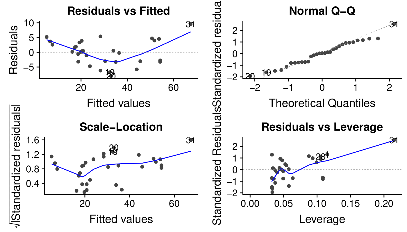
Figure 6: The diagnostic plots for linear model automaticaly generated with autoplot function from the ggfortify package. Plots correspond to the Objective 3 of diagnostic, that covers analysis of distribution of residuals. Plots were taken from the vignette "Introduction toggfortify package". -
•
The hnp package (Moral et al., 2017) provides half-normal plots with simulated envelopes. These charts evaluate the goodness of fit of any generalized linear model and its extensions. It is a graphical method for comparing two probability distributions by plotting their quantiles against each other. The package offers a possibility to extend the hnp for new model classes. However, this package provides only one tool for model diagnostic. In addition, plots are not based on ggplot2, what makes it difficult to modify them.
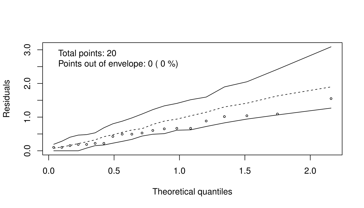
Figure 7: The half-normal plot generated with the hnp function from the hnp package. Here we have residuals and envelope that evaluate the goodness of fit.
2.4 Model-agnostic approach
The tools presented above target specific model classes. The model-agnostic approach allows us to compare different models.
-
•
The DALEX (Descriptive mAchine Learning EXplanations) (Biecek, 2018) is a methodology for exploration of black-box models. Main functionalities focus on understanding or proving how the input variables impact on final predictions. There are also two simple diagnostics: reversed empirical cumulative distribution function for absolute values of residuals and box plot of absolute values of residuals. As methods in the DALEX are model-agnostic, they allow for comparison of two or more models.
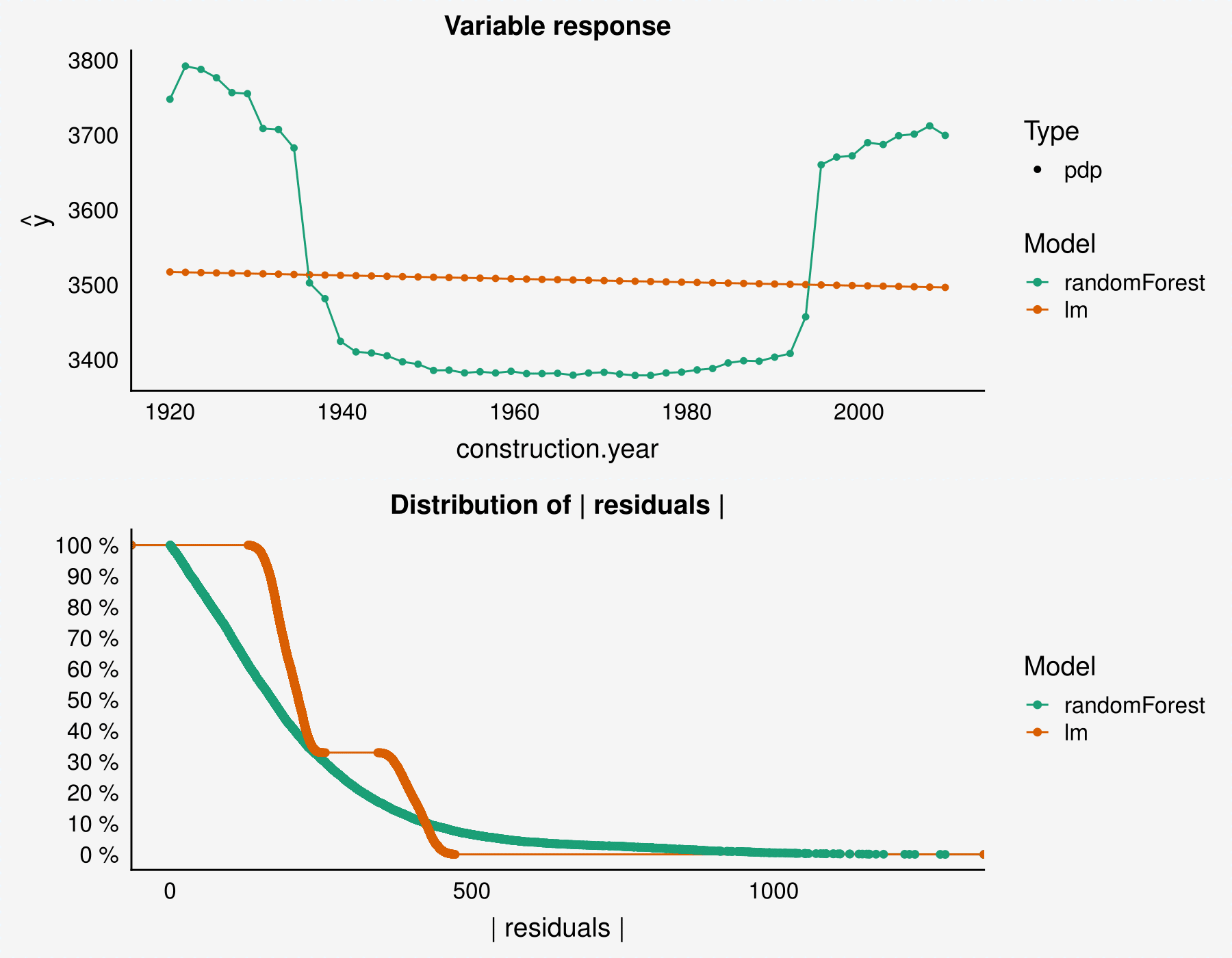
Figure 8: Model explanation plots generated with the DALEX package. The upper plot is a Partial Dependence Plot (Greenwell, 2017). The lower plot is an empirical cumulative distribution function of absolute values of residuals. Plots were taken from Biecek (2018). -
•
The package iml (Molnar et al., 2018) also contains methods for structure-agnostic exploration of model. For example, a measure of a feature’s importance by calculating the change of the model performance after permuting values of a variable.
2.5 Model-agnostic audit
In this paper, we present the auditor package for R, which fills out the part of model-agnostic validation. As it expands methods used for linear regression, it may be used to verify any predictive model.
3 Package Architecture
The auditor package works for any predictive model which returns a numeric value. It offers a consistent grammar of model validation, what is an efficient and convenient way to generate plots and diagnostic scores. A diagnostic score is a number that evaluates one of the properties of a model. That might be, for example, an accuracy of model, an independence of residuals or an influence of observation.
Figure 9 presents the pipeline of the package. Function audit wraps up the model with meta-data, then an audited object is passed to function score or to one of the computational functions. These functions are: model_residual, model_evaluation, model_cooksdistance, model_performance, and model_halfnormal. Results of computational functions are tidy data frames (Wickham, 2014) and then can be passed to the plot function. Once created output of the computational function contains all necessary calculations for related plots. Therefore, generating multiple plots is fast.

Implemented types of plots are presented in Table 1. Scores are presented in Table 2. All plots are generated with ggplot2, what provides a convenient way to modify and combine plots. Most of the plots have also interactive versions, they can be generated by using the function plotD3 instead of the function plot.
Implemented types of plots are presented in Table 1. Scores are presented in Table 2. All plots are generated with ggplot2. This provides a convenient way to modify and combine plots.
| Plot | Function | plot(type = …) | Reg. | Class. |
|---|---|---|---|---|
| Autocorrelation Function | model_residual | "acf" | + | + |
| Autocorrelation | model_residual | "autocorrelation" | + | + |
| Cooks’s Distances | model_cooksdistance | "cooksdistance" | + | + |
| Model Correlation | model_residual | "correlation" | + | + |
| Half-Normal | model_halfnormal | "halfnormal" | + | + |
| LIFT Chart | model_evaluation | "lift" | + | |
| Model PCA | model_residual | "pca" | + | + |
| Predicted Response | model_residual | "performance" | + | + |
| Model Ranking | model_performance | "radar" | + | + |
| REC Curve | model_residual | "rec" | + | + |
| Residuals | model_residual | "residual" | + | + |
| Residual Boxplot | model_residual | "residual_boxplot" | + | + |
| Residual Density | model_residual | "residual_density" | + | + |
| ROC Curve | model_evaluation | "roc" | + | |
| Precision-Recall Curve | model_evaluation | "prc" | + | |
| RROC Curve | model_residual | "rroc" | + | + |
| Scale-Location | model_residual | "scalelocation" | + | + |
| Two-sided ECDF | model_residual | "tsecdf" | + | + |
| Score | Function | score(type = …) | Reg. | Class. |
|---|---|---|---|---|
| Cook’s Distance | model_cooksdistance | "cooksdistance" | + | + |
| Durbin-Watson | model_residual | "dw" | + | + |
| Half-Normal | model_halfnormal | "halfnormal" | + | + |
| Mean Absolute Error | model_residual | "mae" | + | + |
| Mean Squared Error | model_residual | "mse" | + | + |
| Area Over the REC | model_residual | "rec" | + | + |
| Root Mean Squared Error | model_residual | "rmse" | + | + |
| Area Under the PRC | model_evaluation | "auprc" | + | |
| Area Under the ROC | model_evaluation | "roc" | + | |
| Area Over the RROC | model_residual | "rroc" | + | + |
| Runs | model_residual | "runs" | + | + |
| Peak | model_residual | "peak" | + | + |
4 Model audit
Diagnostic allows to evaluate different properties of a model. We divide them into four groups. Each of them is related to one of the following aspects and corresponding questions.
-
1.
First aspect is assessing the goodness-of-fit and whether the model does not miss relevant information (Does the model fit data?). See subsection 4.1.
-
2.
Second one is examining similarity of models (How similar models are?). See subsection 4.2.
-
3.
Third aspect is an evaluation of model performance. (Which model has better performance?). See subsection 4.3.
-
4.
Last one is an identification of influential observations. (Which observations have the most impact on a model?) See subsection 4.4.
These aspects are directly related to the diagnostic objectives described in the Introduction. First two of them are related to the examination of distribution of residuals, which was proposed as the Objective 3. The third aspect is an evaluation of a model performance (Objective 1). The last one refers to influential observations (Objective 2).
We introduce notation to follow throughout the paper.
Let us use the following notation: is a vector in space , is an observed response associated with . A single observation we denote as a pair and is the number of observations.
Let denote a model as a function . Predictions of the model for particular observation we denote as
| (1) |
Row residual or, simply, residual is the difference between the observed value and the predicted value . We denote residual of particular observation as
| (2) |
4.1 Aspect: Does the model fit data?
A good fitted model predicts response variable well. In this subsection, we present methods to assess the goodness-of-fit and check whether the model does not miss any relevant information.
To illustrate applications of the auditor we use an artificial data set apartments available in the DALEX package. First, we fit two models: simple linear regression and random forest.
library("auditor") library("randomForest") data(apartments, package = "DALEX") data(apartmentsTest, package = "DALEX") lm_model <- lm(m2.price ~ ., data = apartments) set.seed(59) rf_model <- randomForest(m2.price ~ ., data = apartments)
Next step is creating "modelAudit" objects related to this two models.
lm_audit <- audit(lm_model, label = "lm", data = apartmentsTest, y = apartmentsTest$m2.price) rf_audit <- audit(rf_model, label = "rf", data = apartmentsTest, y = apartmentsTest$m2.price)Below, we create objects of class "modelResidual". They are required for generating plots.
lm_res <- model_residual(lm_audit) rf_res <- model_residual(rf_audit)
4.1.1 Residuals Plot
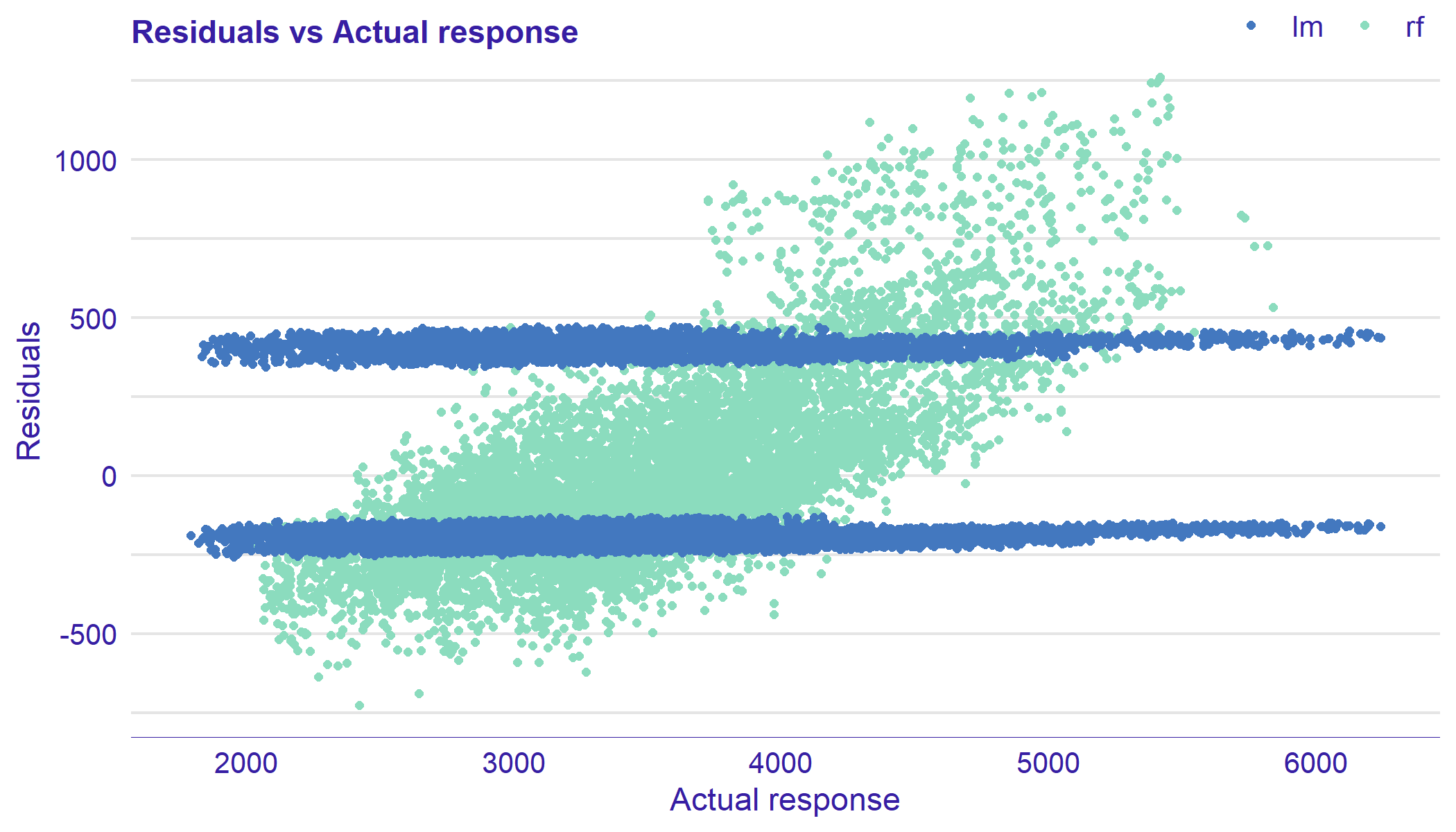
Residuals vs Fitted Values is the most frequently used plot in model validation. It is a scatter plot of residuals on the y axis against fitted values on the x axis. Example plot is presented in Figure 10. On alterations of this plot on the x-axis are values of the variable.
This plot is used to detect dependence of errors, unequal error variances, and outliers. For appropriate model, residuals should not show any functional dependency. Expected mean value should be equal , regardless of values. Structured arrangement of points suggests a problem with the model. It is worth looking at the observations that clearly differ from the others. If points on the plot are not randomly dispersed around the horizontal axis, it may be presumed that model is not appropriate for the data.
This plot is generated by the plot function with parameter type = "residual" or by plot_residual function. Other variants of the Residual Plot may be obtained by parameter variable that specifies the order of residuals on the x-axis. Setting variable = "_y_hat_" puts actual (true) response on the x-axis.
plot_residual(lm_res, rf_res, variable = "_y_hat_") # alternative: plot(lm_res, rf_res, type = "residual", variable = "_y_hat_")
4.1.2 Residual Boxplot Plot
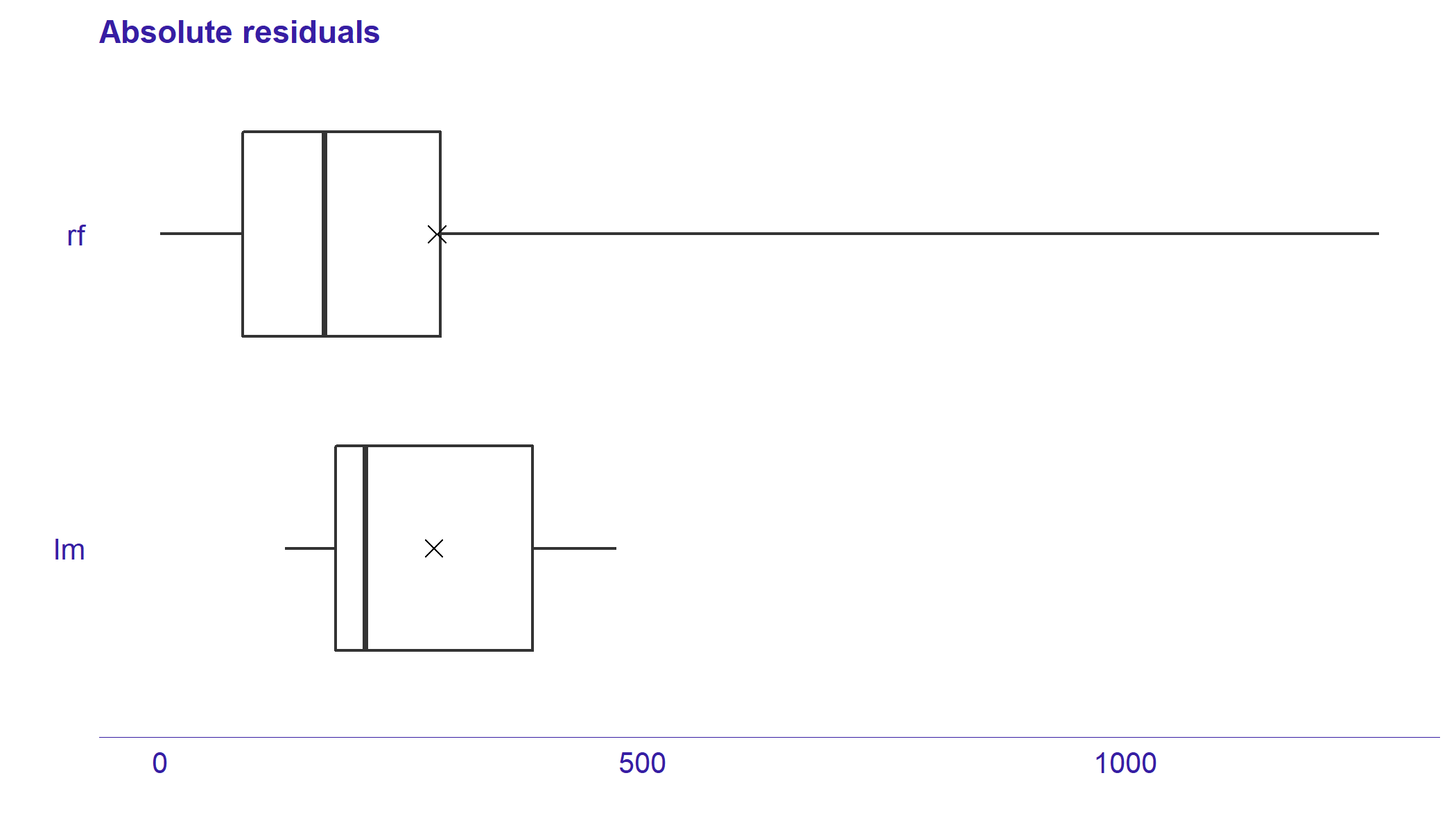
Residual boxplot shows the distribution of the absolute values of residuals . They may be used for analysis and comparison of residuals. Example plots are presented in Figure 11.
Boxplots (Tukey, 1977) usually consists of five components. Box corresponds to the first quartile, median, and third quartile. The whiskers extend to the smallest and largest values, no further than 1.5 of Interquartile Range (IQR) from the first and third quartile, respectively. Residual boxplots consist of the sixth component. Red dot stands for Root Mean Square Error (RMSE).
For the appropriate model, most of the residuals should lay near zero. A large spread of values indicates problems with a model.
This plot is generated by plot_residual_boxplot or by plot function with parameter type = "residual_boxplot" function.
plot_residual_boxplot(lm_res, rf_res) # alternative plot(lm_res, rf_res, type = "residual_boxplot")
4.1.3 Autocorrelation Plot
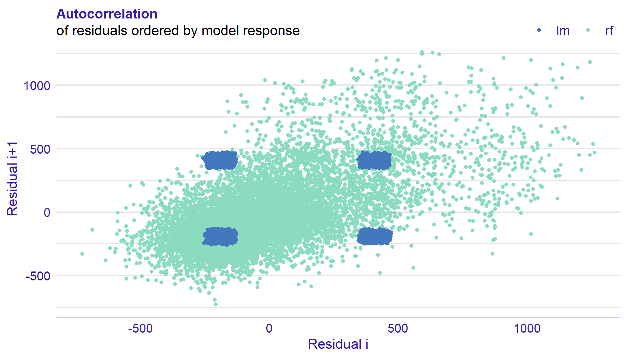
Autocorrelation Plot is a tool for checking whether there is a relationship between residuals on the lag 1. Example chart is presented in Figure 12. It is a scatter plot of -th vs -th residuals, ordered by fitted values or by values of one of the variables.
We expect that model residuals are independent. Therefore, points should be randomly dispersed. The structured arrangement of residuals suggests a problem with the model.
This plot is generated by plot function with parameter type = "autocorrelation" or by function plot_autocorrelation.
plot_autocorrelation(lm_res, rf_res) # alternative plot(lm_res, rf_res, type = "autocorrelation")
As results of plots may be ambiguous, there are two scores implemented in the auditor: Durbin-Watson (DW) and Runs. They help to asses the autocorrelation of residuals.
The Durbin–Watson (DW) statistic is used to detect the autocorrelation in the residuals at lag = 1. It is introduced by Durbin and Watson (1971).
Definition 4.1.
The Durbin-Watson test statistic is given by
| (3) |
It detects only linear autocorrelation and only first order effects.
We treat Durbin-Watson statistic as a score.
Its values lie between and . DW around means no autocorrelation. Small value may be an evidence for positive correlation and large value for negative correlation.
Runs score is the second tool for checking the independency of residuals.
A run is a series of increasing or decreasing values. The is an observed number of runs in residuals ordered by fitted values or values of one of the variables. The is an expected number of runs and is the standard deviation of the number of runs. Runs test statistic was defined by Wald and Wolfowitz (1940).
Definition 4.2.
The Runs test statistic is given by
| (4) |
For random sequence, the distribution of follows the .
We consider values of Runs statistic as scores.
Both presented scores may be obtained by score function with type = "dw" or type = "runs".
score_dw(lm_audit) score_dw(rf_audit) score_runs(lm_audit) score_runs(rf_audit)
4.1.4 Autocorrelation Function Plot
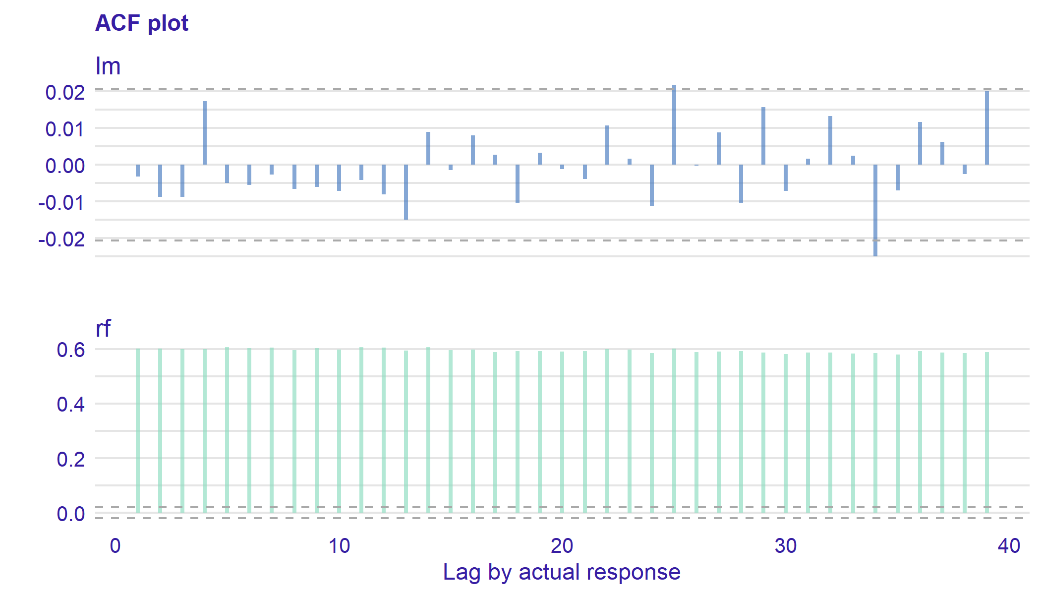
Autocorrelation Function (ACF) is a tool for finding patterns in the data. In particular, the correlation between observations. Figure 13 shows an example of the Autocorrelation Function Plot of residuals.
There are values of ACF on the y axis against lags on the x axis. As the value of autocorrelation of lag always equals , it is skipped. Blue horizontal lines are confidence intervals.
We assume that are observations of a time series with mean . Covariance function and correlation function do not depend on . The following estimators come from Venables and Ripley (2013).
Definition 4.3.
The sample autocovariance function is given by
| (5) |
and the sample autocorrelation function is given by
| (6) |
Now, let us consider residuals as elements of the time series . Autocorrelation Function Plot visualizes the sequence of .
This plot is generated by plot function with parameter type = "acf" or by function plot_acf.
plot_acf(lm_res, rf_res, variable = "_y_hat_") # alternative plot(lm_res, rf_res, type = "acf", variable = "_y_hat_")
4.1.5 Scale-Location Plot
Scale Location Plot is used to visualize the variance of the residuals. Example chart is presented in Figure 14. This plot is similar to the Residuals Plot, but it uses the square root of the standardized residuals instead of raw residuals. Let be mean of residuals,
| (7) |
Definition 4.4.
The standardized residual is the -th residual divided by the residual standard deviation:
| (8) |
On the x axis, there are responses fitted by a model. On the y axis, there are square roots of the absolute value of the standardized residuals. Blue line is an estimate of the conditional mean function. Black dots represent peaks explained below. An alternative version of this plot contains values of one of the variables on the x axis.
The presence of any trend suggests that the variance depends on fitted values, which is against the assumption of homoscedasticity. Not every model has an explicit assumption of homogeneous variance, however, the heteroscedasticity may indicates potential problems with the goodness-of-fit.
This plot is generated by plot function with parameter type = "scalelocation" or by function plot_scalelocation. Variable on the x axis may be specified by variable parameter.
plot_scalelocation(lm_res, rf_res) # alternative plot(lm_res, rf_res, type = "scalelocation")
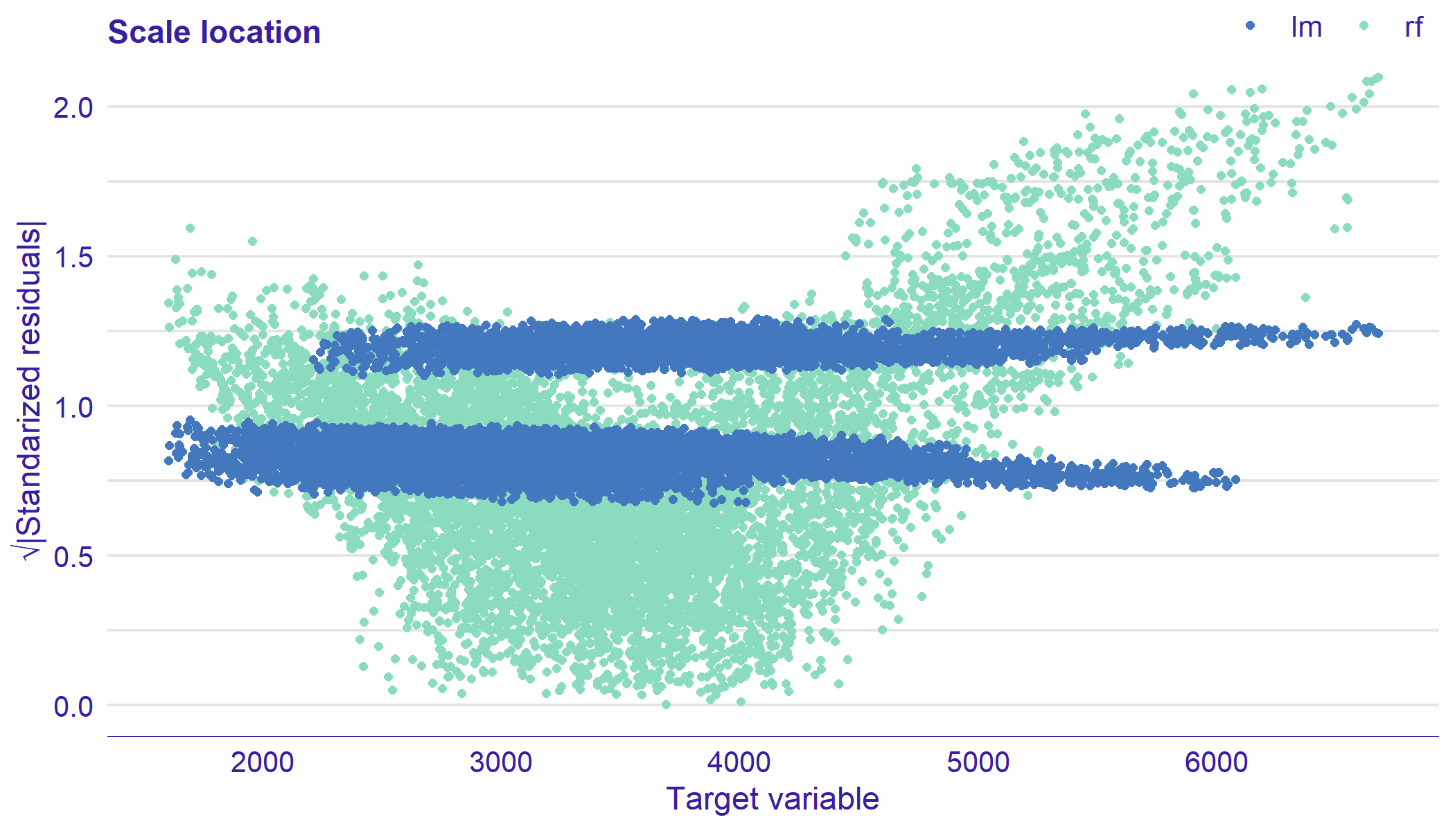
A tool for assesing the homoscedasticity of variance is Peak test introduced by Goldfeld and Quandt (1965). A peak is an occurrence of observation such that for all .
Definition 4.5.
We define Peak score as
| (9) |
Let us note that . If the residuals are heteroscedastic, the Peak score is close to .
Scores may be obtained by score function with type = "peak" or score_peak function.
score_peak(lm_audit) score_peak(rf_audit)
4.1.6 Residual Density Plot
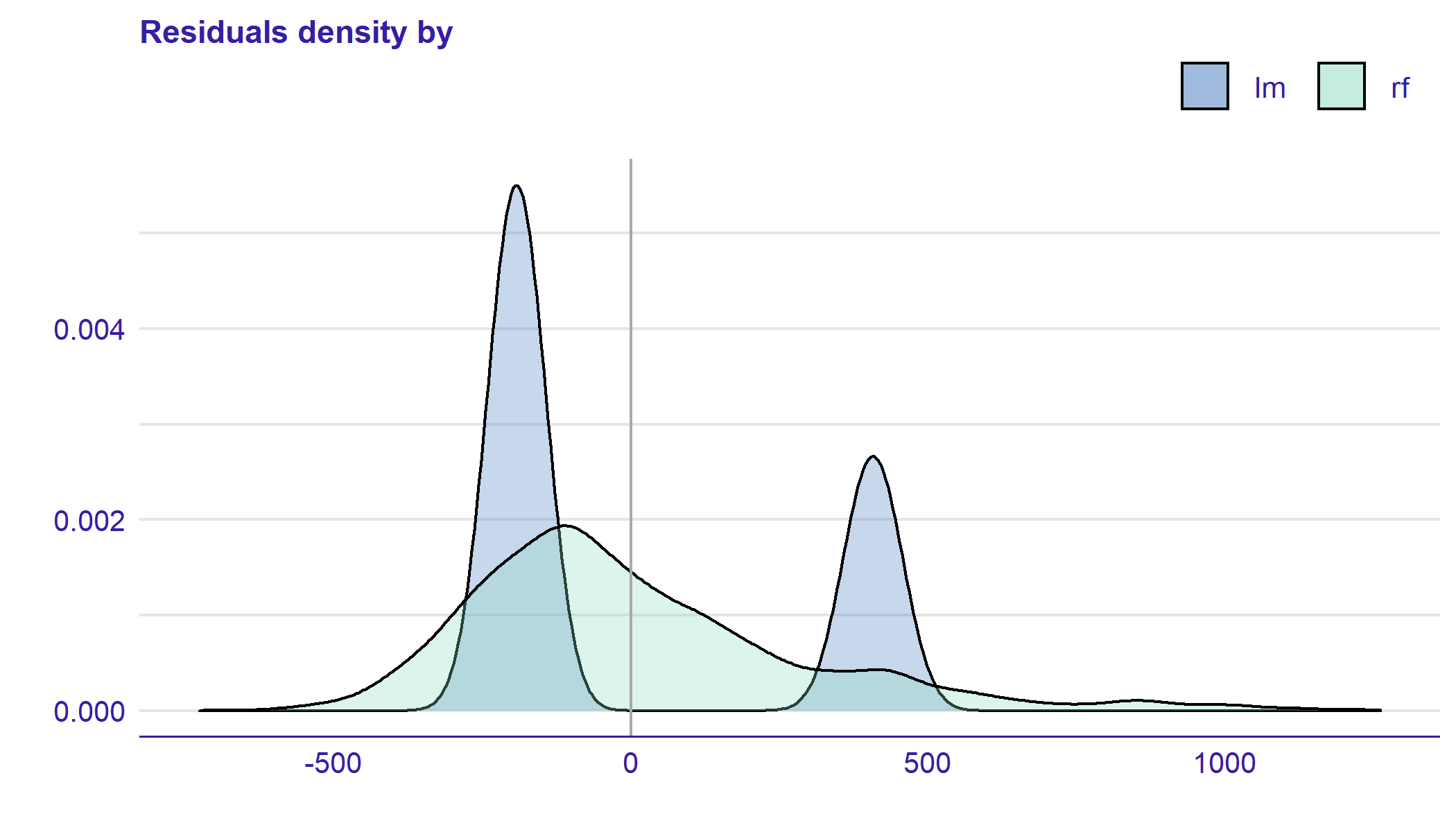
Residual Density plot detects the incorrect behavior of residuals. Example is presented in Figure 15. On the plot, there are estimated densities of residuals. Their values are displayed as marks along the x axis.
For some models, the expected shape of density derives from the model assumptions. For example, simple linear model residuals should be normally distributed. However, even if the model does not have an assumption about the distribution of residuals, such a plot may be informative. If most of the residuals are not concentrated around zero, it is likely that the model predictions are biased.
This plot is generated by plot_residual_density function or by plot function with parameter type = "residual_density".
plot_residual_density(lm_res, rf_res, show_rugs = FALSE) # alternative plot(lm_res, rf_res, type = "residual_density", show_rugs = FALSE)
4.1.7 Half-Normal Plot
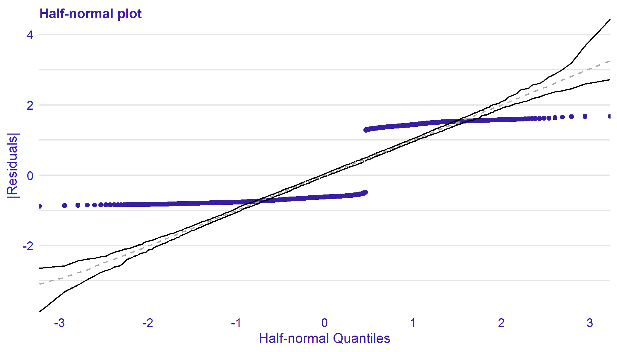
The Half-Normal Plot is one of the tools designed to evaluate the goodness-of-fit of a statistical model. It is a graphical method for comparing two probability distributions by plotting their quantiles against each other.
Points correspond to ordered absolute values of model diagnostic (i.e. standardized residuals) plotted against theoretical order statistics from a half-normal distribution. Lines mark the simulated envelope. The simulation process consists of simulating response variables using the model matrix, error distribution and parameters of an original model. Then the same model is fitted to data with new simulated response variable. The envelopes are formed on the basis of the 2.5 and 97.5 percentiles of the extracted simulated residuals at each value of the expected order statistic. Further details on the half-normal plots with simulated envelopes may be found in Moral et al. (2017).
If residuals come from the normal distribution, they are close to a straight line. However, even if there is no certain assumption of a specific distribution, points still show a certain trend. Simulated envelopes help to verify the correctness of this trend. For a good-fitted model, diagnostic values should lay within the envelope.
This plot is generated by plot function with parameter type = "halfnormal" or by function plot_halfnormal. The parameter quant = TRUE transforms y axis into quantile scale.
lm_hn <- model_halfnormal(lm_audit) plot_halfnormal(lm_hn) # alternative plot(lm_hn, type = "halfnormal")
A useful tool to compare goodness-of-fit of two models is a Half-Normal Score.
Let us consider observations and simulations for each observation. We use the following notation: is a residual of -th observation, is the residual of -th simulation for -th observation.
Definition 4.6.
The score of -th observation is given by
| (10) |
is a number of simulated residuals for observation that are greater or equal than .
Value of close to or means that the original residual stands out from the simulated ones. The closer it is to , the less it deviates from the simulated results.
Definition 4.7.
We define Half-Normal score as
| (11) |
is the sum of the deviations of from .
Let us note that and lower value of score means better model fit.
HalfNormal score is calculated by score function with parameter type = "halfnormal" or by function score_halfnormal. Scores are calculated on the basis of simulated data, so they may differ between function calls.
score_halfnormal(lm_audit)
4.2 Aspect: How similar models are?
In this subsection, we present methods for assessing the similarity of models, understood as the closeness of the residuals structures. The following methods may be used to identify such a similarity or its absence.
4.2.1 Model PCA Plot
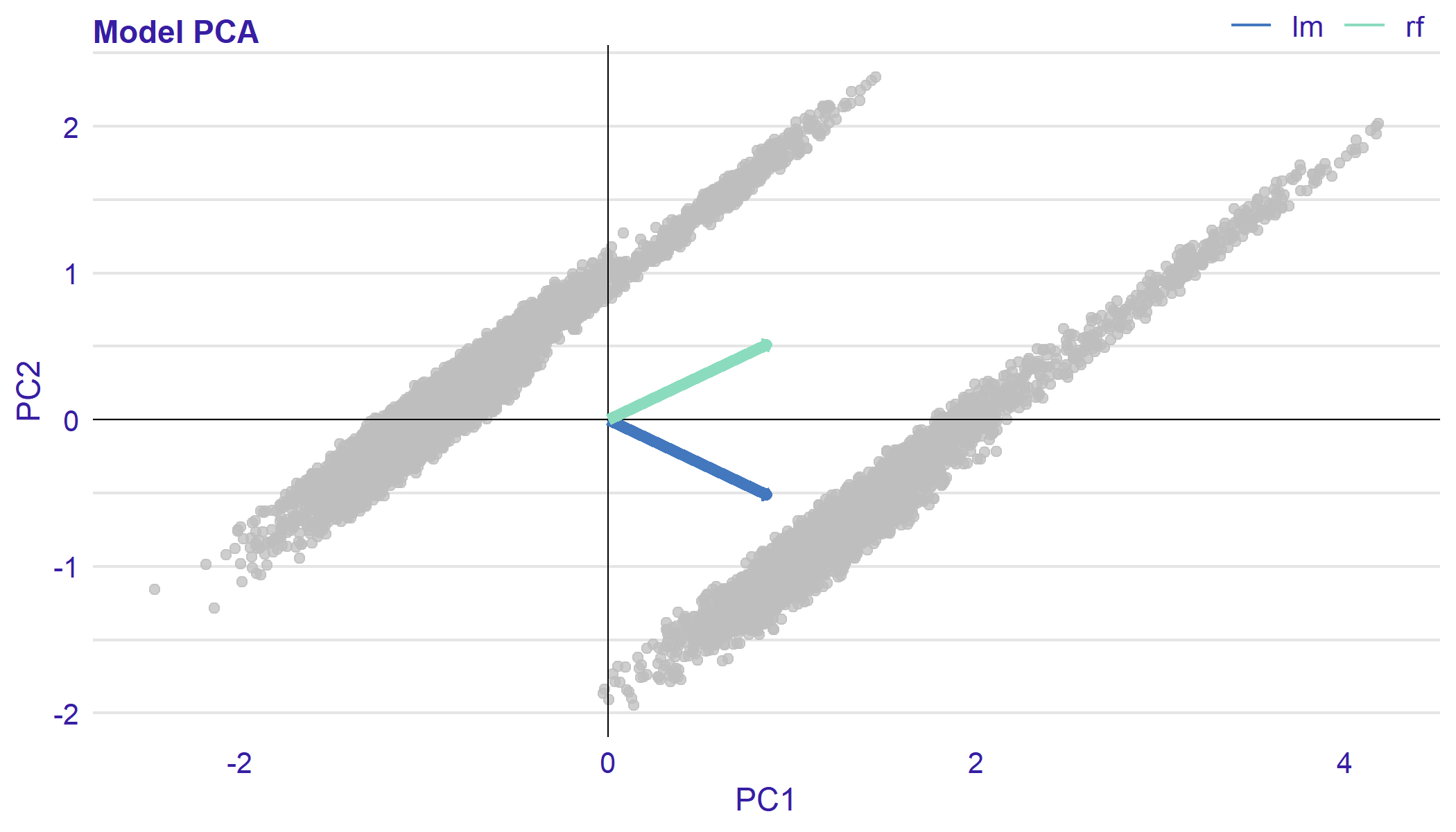
Model PCA plot can be used to assess the similarity of the models in terms of residuals. Example plot is presented in Figure 17.
The idea of PCA is reducing the dimension of the data set matrix by creating a set of linearly uncorrelated variables called principal components. At the same time, keeping as much variance as possible Jolliffe (1986).
Model PCA plot is a biplot introduced by Gabriel (1971). On axis of the plot, there are first two principal components. Grey dots represent observations. Arrows are pointing in the direction of the models projected into a two-dimensional space. The interposition of arrows provides information about the similarity of models in terms of residuals. If they are close to each other, it indicates similar residuals structures.
This plot is generated by plot function with parameter type = "pca" or by function plot_pca.
plot_pca(lm_res, rf_res) #alternative plot(lm_res, rf_res, type ="pca")
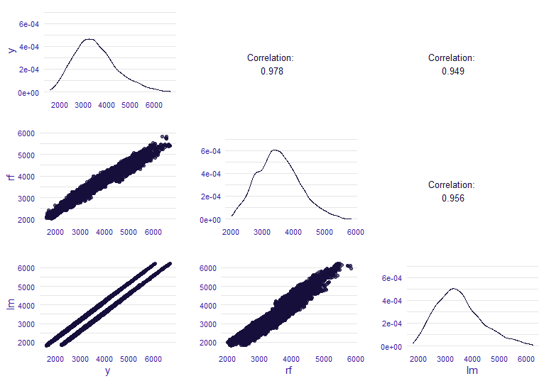
4.2.2 Model Correlation Plot
Model Correlation plot, presented in Figure 18, is a pairs plot of observed response and fitted values of different models. Pairs plot first appeared in Hartigan (1975). In the diagonal, there are estimated densities, in the upper triangle, the correlations between the different models and between models and observed response. In the lower triangle, there are scatter plots of these values.
This plot is generated by plot function with parameter type = "correlation" or by function plot_correlation.
plot_correlation(rf_res, lm_res) # alternative plot(rf_res, lm_res, type = "correlation")
4.3 Aspect: Which model has better performance?
We consider the model performance more widely than the value of one measure. The values and structures of the residuals also help to assess the quality of the model. In this subsection, we present visual methods of evaluating models performance.
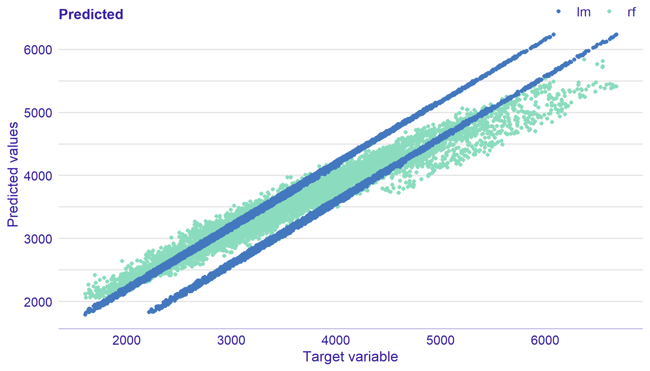
4.3.1 Predicted Response Plot
Predicted Response Plot gives an additional information about model performance. It is a scatter plot of predicted values on the y axis against observed response on the x axis. Example plot is presented in Figure 19. On alterations of this plot on the x-axis are values of one the model variables. Ideally, all points are close to a diagonal line. For the appropriate model, points should not show any functional dependency.
This plot is generated by plot function with parameter type = "prediction" or by plot_prediction function. Other variable on the x axis may be specified by variable parameter.
plot_prediction(lm_res, rf_res) # alternative plot_prediction(lm_res, rf_res)
4.3.2 Plots: ROC Curve and LIFT Chart
In this subsection, we present methods for assessing model performance for classification problem. Most common methods for regression models were inspired by tools for classification.
Let us consider a binary classification problem, in which the responses are labeled either as positive () or negative (). True Positive () is a case that the prediction is and the actual value is also . If the prediction is and the actual value is then it is a False Positive ().
First, we fit two binary classification models on the PimaIndianDiabetes data set from the mlbench package.
library("mlbench") data("PimaIndiansDiabetes") pima <- PimaIndiansDiabetes pima$diabetes <- ifelse(pima$diabetes == "pos", 1, 0) model_glm_class <- glm(diabetes~., data = pima, family = binomial) library("e1071") model_svm_class <- svm(diabetes~., data = pima, probability = TRUE,type = "C-classification")
Next, we create corresponding "model_audit" objects. We use created objects to generate example plots in this subsection.
au_glm_class <- audit(model_glm_class, data = pima, y = pima$diabetes) custom_predict <- function(model, data){ pred <- predict(model_svm_class, pima, probability=TRUE) attr(pred, "probabilities")[,1] } au_svm_class <- audit(model_svm_class, data = pima, y = pima$diabetes, label = "svm", predict_function = custom_predict)
Receiver Operating Characteristic (ROC) curve (See Figure 20) is a way of visualising a classifier’s performance (Swets, 1988). It answers the question of how well the model discriminates between the two classes. The boundary between classes is determined by a threshold value. ROC illustrates the performance of a classification model at various threshold settings.
Let be a threshold. We introduce parametric definition of ROC curve.
Definition 4.8.
The ROC curve is a plot of the True Positive Rate () against the False Positive Rate () on a threshold .
| (12) |
and
| (13) |
Each point on the ROC curve represents values of and of different thresholds.
The diagonal line y = x corresponds to a classifier that randomly guess the positive class half the time. Any model that appears in the lower right part of plot performs worse than random guessing. The closer the curve is to the the left border and top border of plot, the more accurate the classifier is.
This plot is generated by plot function with parameter type = "roc" or by function plot_roc.
glm_class_me <- model_evaluation(au_glm_class) svm_class_me <- model_evaluation(au_svm_class) plot_roc(glm_class_me, svm_class_me) # altrnative plot(glm_class_me, svm_class_me, type = "roc")
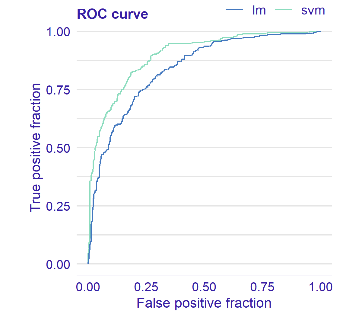
ROC curves usually intersect. Therefore, it is not possible to choose a better model explicitly. A good tool to help assess the quality of a classifier is the Area Under the Curve (AUC) (Bradley, 1997). The AUC is a part of the area of the unit square. Therefore, its value is always be between and . The AUC of a classifier is equal to the probability that the classifier will rank a randomly chosen positive instance higher than a randomly chosen negative one (Fawcett, 2006).
AUC may be obtained by score function with type = "auc" or score_auc function.
score_auc(au_glm_class) score_auc(au_svm_class) # alternative score(au_glm_class, type = "auc") score(au_svm_class, type = "auc")
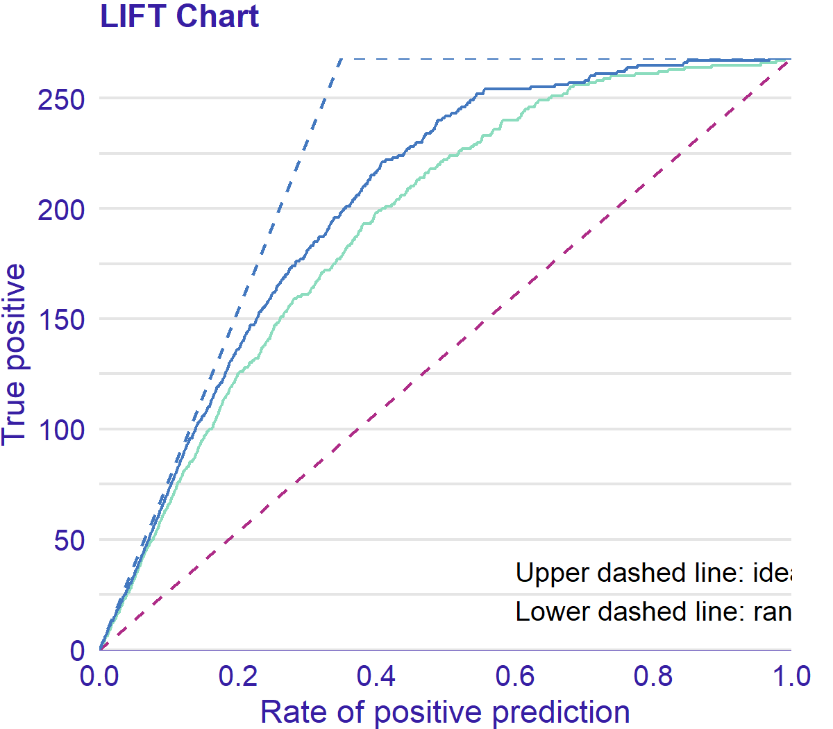
LIFT charts (Witten et al., 2011) also evaluate performance of classification models.
Vuk and Curk (2006) introduced parametric definition of LIFT chart. Let be a threshold.
Definition 4.9.
The LIFT chart is Rate of Positive Prediction () plotted against True Positive (TP) on a threshold .
| (14) |
and
| (15) |
Each point on the LIFT chart represents values of and of different thresholds.
As for ROC curve, LIFT (See Figure 21) illustrates varying the model performance for different thresholds. LIFT chart shows how good the classifier distinguishes between two classes.
A random and ideal models are represented by black and orange curves, respectively. The closer the LIFT get to the orange curve, the better a model is.
This plot is generated by plot function with parameter type = "lift" or by function plot_llift.
plot(au_glm_class, au_svm_class, type = "lift")
4.3.3 REC Curve Plot
Regression Error Characteristic (REC) curve (See Figure 22) is a generalization of Receiver Operating Characteristic (ROC) curve for binary classification described in subsection 4.3.2.
REC curve estimates the Cumulative Distribution Function of the error. On the x axis of the plot there is an error tolerance. On the y axis there is an accuracy at the given tolerance level. Bi and Bennett (2003) define the accuracy at tolerance as a percentage of observations predicted within the tolerance . In other words, residuals larger than are considered as errors.
Let consider pairs as at the beginning of the Chapter 4. Bi and Bennett (2003) define an accuracy as follows.
Definition 4.10.
An accuracy at tolerance level is given by
| (16) |
REC Curves implemented in the auditor are plotted for a special case of Definition 4.10 where the loss is defined as
| (17) |
The shape of the curve illustrates the behavior of errors. The quality of the model can be evaluated and compared for different tolerance levels. The stable growth of the accuracy does not indicate any problems with the model. A small increase of accuracy near and areas, where the growth is fast, signalize bias of the model predictions.
This plot is generated by plot function with parameter type = "rec" or by plot_rec function.
plot_rec(lm_res, rf_res) # alternative plot_rec(lm_res, rf_res)
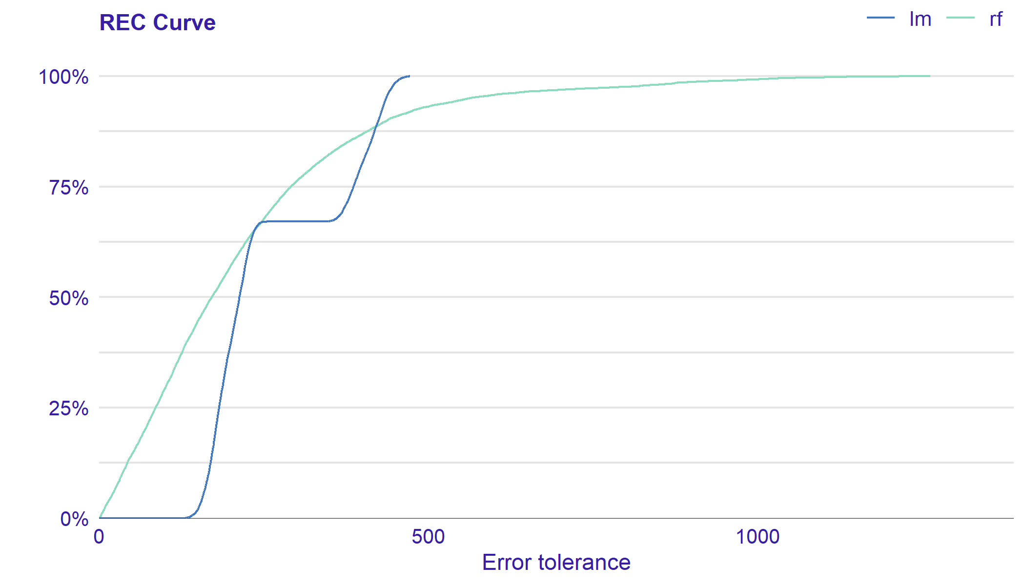
As often it is difficult to compare models on the plot, there is an REC score implemented in the auditor. This score is the Area Over the REC Curve (AOC), which is a biased estimate of the expected error for a regression model. As Bi and Bennett (2003) proved, AOC provides a measure of the overall performance of regression model.
Scores may be obtained by score function with type = "rec" or score_rec function.
score_rec(lm_audit) score_rec(rf_audit) # alternative score(lm_audit, type = "rec") score(rf_audit, type = "rec")
4.3.4 Two-sided ECDF Plot
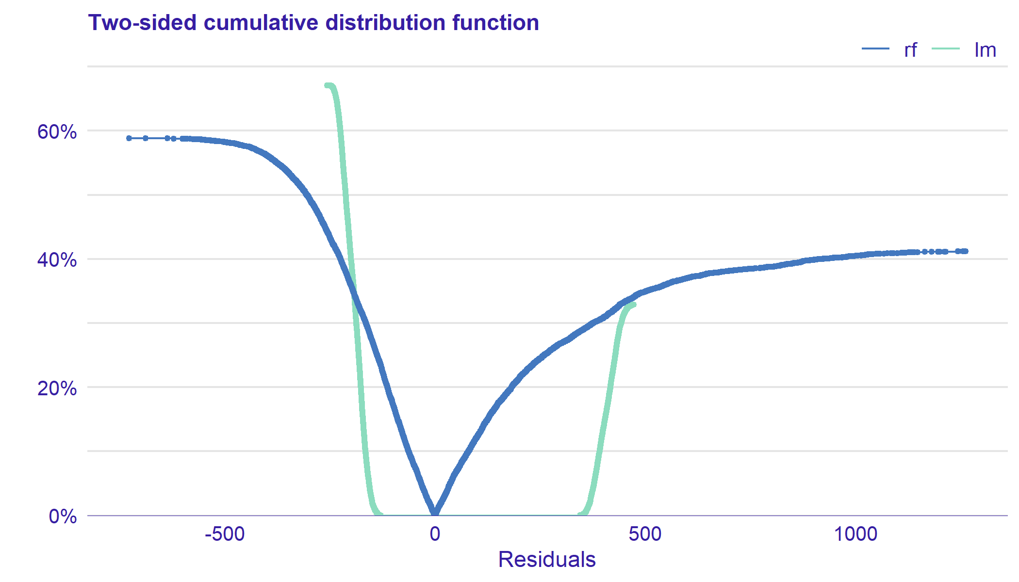
Two-sided ECDF plot (See Figure 23) shows an Empirical Cumulative Distribution Functions (ECDF) for positive and negative values of residuals separately.
Let be a random sample from a cumulative distribution function . The following definition comes from van der Vaart (2000).
Definition 4.11.
The empirical cumulative distribution function is given by
| (18) |
Empirical cumulative distribution function presents a fraction of observations that are less or equal than . It is an estimator for the cumulative distribution function .
On the positive side of the x-axis, there is the ECDF of positive values of residuals. On the negative side, there is a transformation of ECDF:
| (19) |
Let and be numbers of negative and positive values of residuals, respectively. Negative part of the plot is normalized by multiplying it by the ratio of the over . Similarly, positive part is normalized by multiplying it by the ratio of the over . Due to the scaling, the ends of the curves add up to in total.
The plot shows the distribution of residuals divided into groups with positive and negative values. It helps to identify the asymmetry of the residuals. Points represent residuals.
This plot is generated by plot_tsecdf function or by plot function with parameter type = "tsecdf".
plot_tsecdf(rf_res, lm_res) # alternative plot(rf_res, lm_res, type = "tsecdf")
4.3.5 RROC Curve Plot
The Regression Receiver Operating Characteristic (RROC) curve for regression shows model asymmetry, which is an inequality in the number and values of positive and negative residuals. It may be useful for problems, where there is an asymmetric cost of errors. An example of RROC plot is presented in Figure 24.
The RROC curve was introduced by Hernández-Orallo (2013). The base of plot is a shift . It is an equivalent to the threshold for ROC curves presented in subsection 4.3.2. For each observation we calculate new prediction: . Hernández-Orallo (2013) define over- and under-estimation as follow.
Definition 4.12.
Over-estimation depending on shift is given by
| (20) |
Definition 4.13.
Under-estimation depending on shift is given by
| (21) |
The RROC plot consists of under-estimation on the y axis against over-estimation on the x axis. The shift equals is represented by a dot.
The shape of the curve illustrates the behavior of errors. The quality of the model can be evaluated and compared for different shifts. The AOC measures the model insensitivity to asymmetric costs of errors.
This plot is generated by plot function with parameter type = "rroc" or by plot_rroc function.
plot_rroc(lm_res, rf_res) # alternative plot(lm_res, rf_res, type = "rroc")
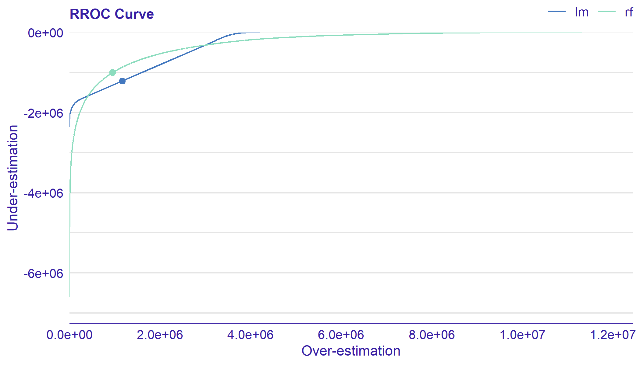
As often it is difficult to compare AOC on the plot, there is an RROC score implemented in the auditor package. This score is the Area Over the RROC Curve (AOC). As Hernández-Orallo (2013) prove AOC equals to the variance of the errors multiplied by a which is independent of the model. Lower values for AOC are better.
Score may be obtained by score function with type = ’rroc’ or score_rroc function.
score_rroc(lm_audit) score_rroc(rf_audit) # alternative score(lm_audit, type = "rroc") score(rf_audit, type = "rroc")
4.3.6 Model Ranking Plot
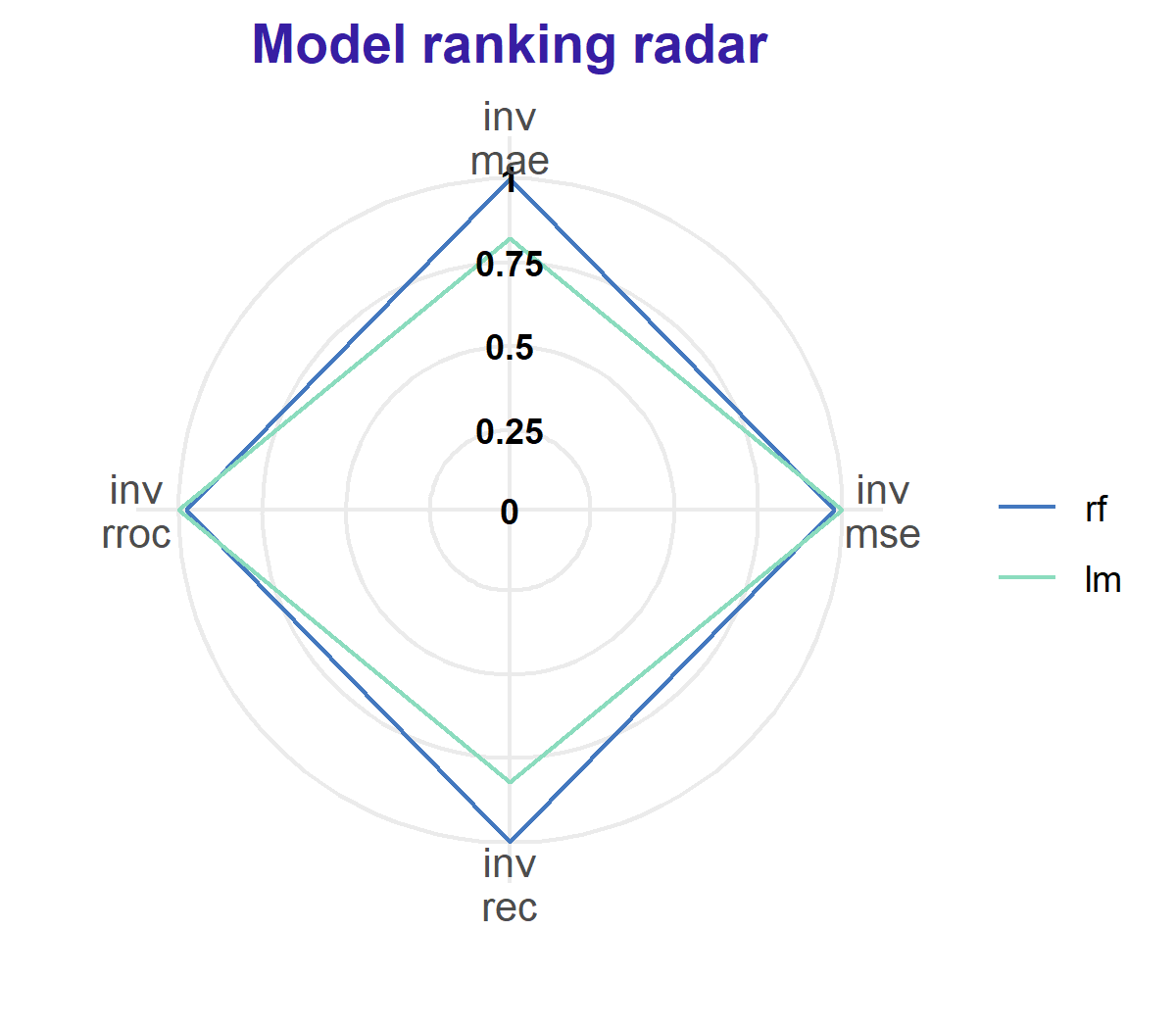
In this subsection, we propose a Model Ranking plot, which compares models performance across multiple measures (see Figure 25). The implemented measures coincide with the scores listed in the Chapter 3.
In previous subsections, we introduced the following scores:
Additional scores implemented in the auditor are:
-
•
MAE (Mean Absolute Error)
(22) -
•
MSE (Mean Squared Error)
(23) -
•
RMSE (Root Mean Squared Error)
(24)
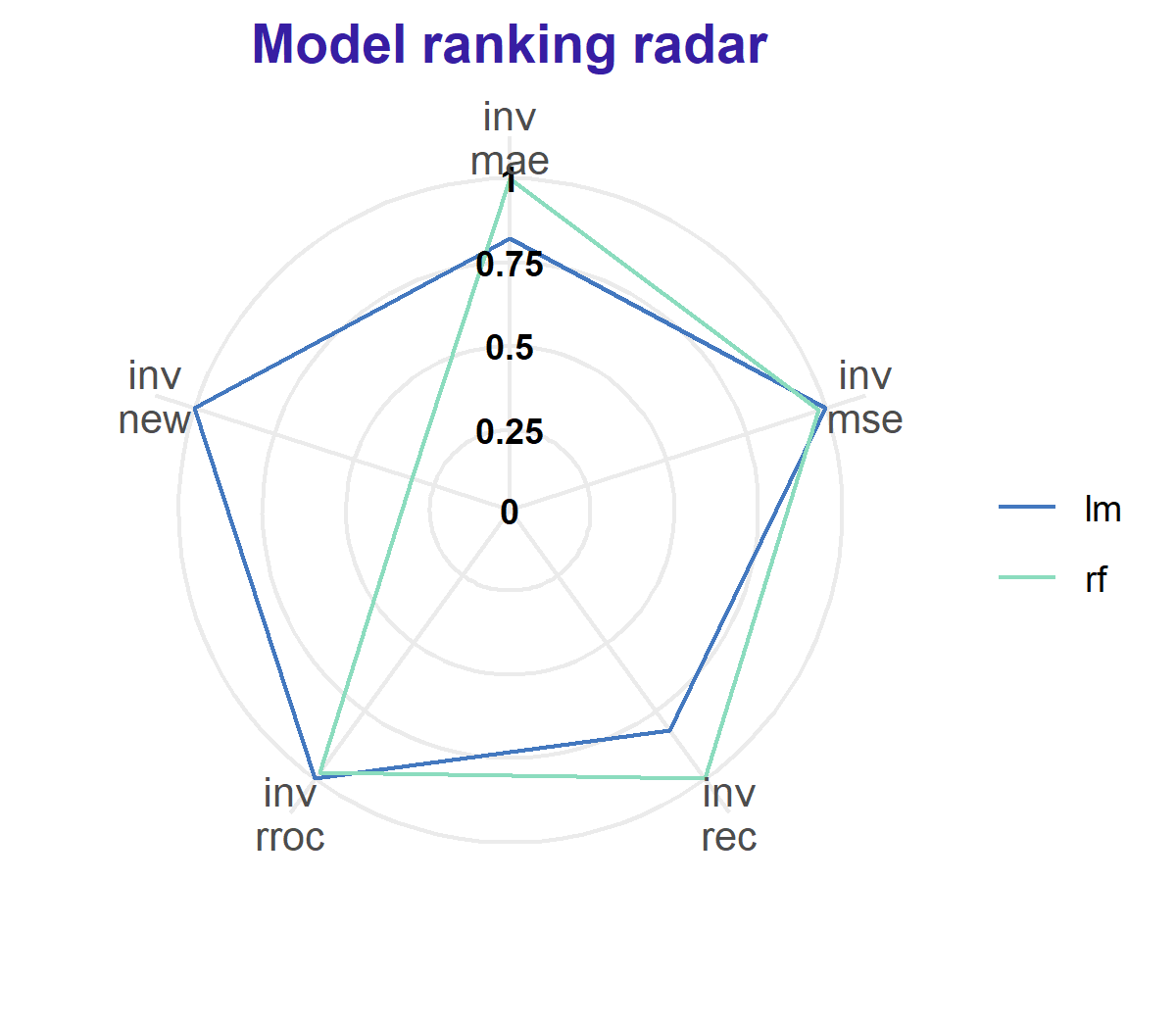
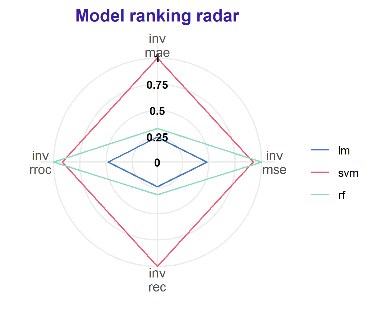
Model Ranking Radar plot consists of two parts. On the left side, there is a radar plot. Colors correspond to models, edges to values of scores. Score values are inverted and rescaled to .
Let us use the following notation: is a model in a finite set of models , where , is a scoring function for the model under consideration, that higher value means worse model performance. The is a performance of model .
Definition 4.14.
We define the inverted score of model as
| (25) |
Models with the larger are closer to the centre. Therefore, the best model is located the farthest from the center of the plot.
On the right side of the plot there is a table with results of scoring. In the third column, there are scores scaled to one of the models.
Let where be a model to which we scale.
Definition 4.15.
We define the scaled score of model to model as
| (26) |
As values of are always between and , comparison of models is easy, regardless of the ranges of scores.
This plot is generated by plot function with parameter type = "radar" or by function plot_radar. The scores included in the plot may be specified by scores parameter.
lm_mp <- model_performance(lm_audit) rf_mp <- model_performance(rf_audit) plot_radar(lm_mp, rf_mp) # alternatve plot(lm_mp, rf_mp, type = "radar")
There is also a possibility to add custom scores (Figure 26). They may be provided by parameter new.score. It requires a named list of functions that take one argument: object of class "model_audit" and return a numeric value. The measure calculated by the function should have the property that lower score value indicates better model.
new_score <- function(object){sum((object$y - object$y_hat)^4)} rf_mp <- model_performance(rf_audit, new_score = list("new" = new_score)) lm_mp <- model_performance(lm_audit, new_score = list("new" = new_score)) plot_radar(rf_mp, lm_mp) # alternative plot(rf_mp, lm_mp, type = "radar")
4.4 Aspect: Influence of Observations
In this subsection, we focus on the impact of individual observation on a model.
4.4.1 Cook’s Distances Plot
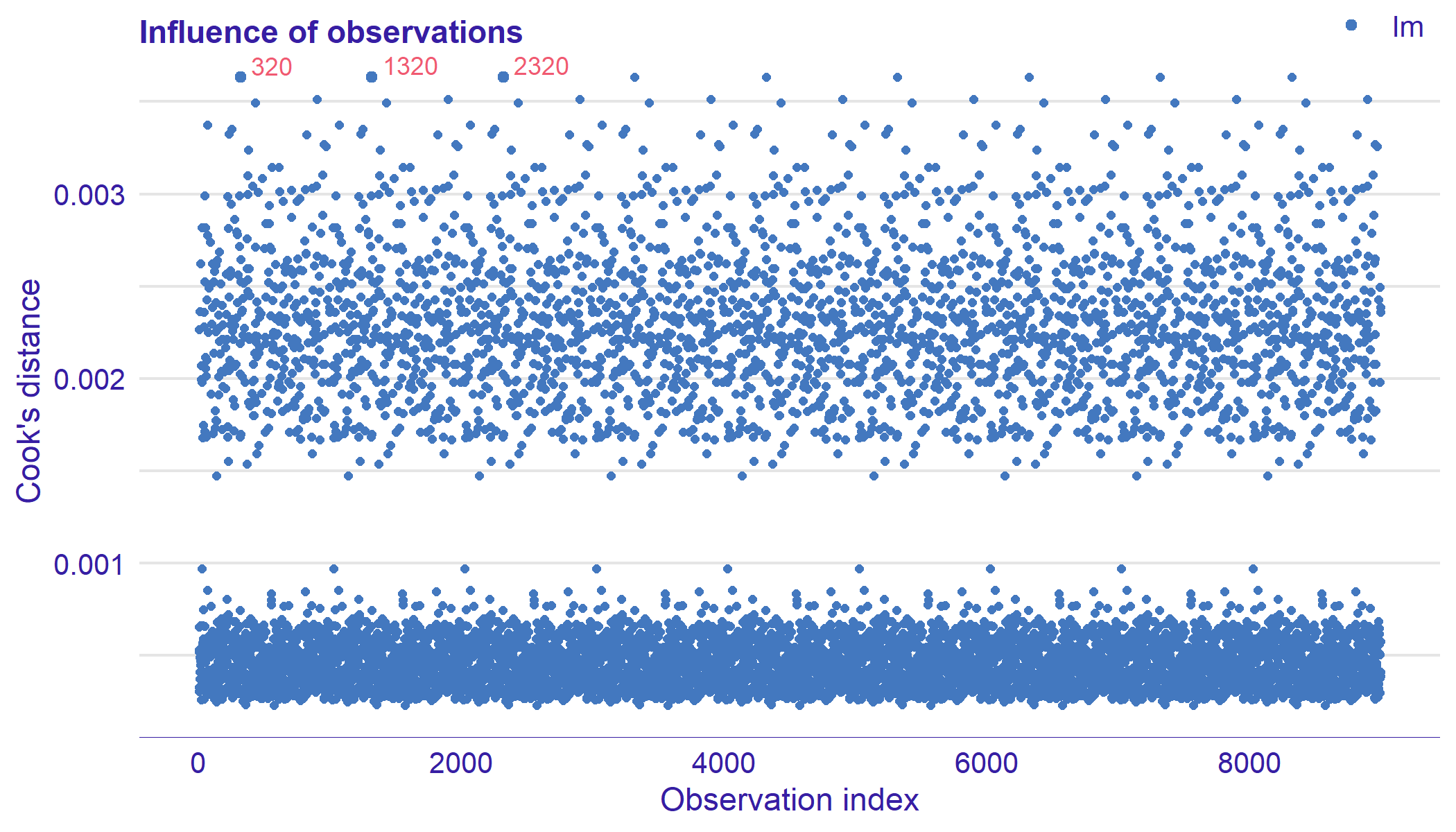
Cook’s distances plot presented in Figure 27 is a tool for identifying observations that may negatively affect the model. They can be also used for indicating regions of the design space where it would be good to obtain more observations. Data points indicated by Cook’s distances are worth checking for validity.
Let us extend the notation provided iat the beginning of the Chapter 4. We denote the number of predictors as and the mean squared error as . We consider recalculated model that is fitted on the original data set with removed -th observation. Let be the prediction of such model calculated for -th observation. Cook (1977) defined the influence of a single observation as follows.
Definition 4.16.
Cook’s distance of -th observation is
| (27) |
Cook’s Distances are calculated by removing the -th observation from the data and recalculating the model. It shows an influence of -th observation on the model.
Cook (1977) proved that for linear models Cook’s distance may be computed in an alternative and computationally convenient way. Let be the design matrix and be a projection matrix. The leverage is the -th diagonal element of . is obtained by
| (28) |
This plot is generated by plot function with parameter type = "cooksdistance" or by function plot_cooksdistance. For model of class "lm" and "glm" the distances are computed from the diagonal elements of the hat matrix. For other models they are computed directly from the definition.
lm_oi <- model_cooksdistance(lm_audit) plot_cooksdistance(lm_oi) # alternative plot(lm_oi, type = "cooksdistance")
5 Example of model audit
This section contains a use-case of model audit. We show an example, where the choice of a model on the basis of a single measurement is not obvious. We illustrate, how to use auditor to analyze and compare models. In addition, we present how to use residual analysis to identify outliers and better understand a model structure.
5.1 The artificial data set
In order to present the auditor we created an artificial data set auditorData. It consists of 2000 observations. We generated first 1998 as follows. Let
-
•
where ,
-
•
where ,
-
•
where ,
-
•
where is from discrete probability distribution,
, , , -
•
where
for .
Let us simulate a response as a function of five arguments: , , , , , where
| (29) |
The -th and -th observations are added manually. They are meant to be outliers. Their values are
| (30) |
and
| (31) |
respectively.
First four of simulated variables are treated as continuous while the fifth one is categorical. In the Table 3 we present first six observations from the auditorData included in the auditor package.
library("auditor") data("auditorData") head(auditorData)
| y | X1 | X2 | X3 | X4 |
|---|---|---|---|---|
| 25.08 | 0.10 | 0.11 | 0.45 | 0 |
| 11.43 | 0.78 | 0.38 | 0.52 | 0 |
| 31.36 | 0.61 | 0.33 | 0.78 | 4 |
| 0.84 | 0.96 | 0.01 | 0.09 | 0 |
| 22.23 | 0.96 | 0.32 | 0.84 | 1 |
| 29.35 | 0.22 | 0.16 | 0.83 | 0 |
Our goal is to predict Y based on selected variables X1, X2, X3 and X4.
5.2 Fitting models
We fit 3 models and audit them. They are: simple linear regression, random forest, and support vector regression. We use randomForest function from randomForest package (Liaw and Wiener, 2002) and svm function from e1071 package (Meyer et al., 2017).
model_lm <- lm(y ~ ., auditorData) library("randomForest") set.seed(1994) model_rf <- randomForest(y~., auditorData) library("e1071") model_svm <- svm(y ~ ., auditorData)
Next step is creating three "modelAudit" objects, corresponding to the models.
au_lm <- audit(model_lm, data = auditorData, y = auditorData$y) au_rf <- audit(model_rf, data = auditorData, y = auditorData$y, label = "rf") au_svm <- audit(model_svm, data = auditorData, y = auditorData$y, label = "svm")
5.3 Model audit
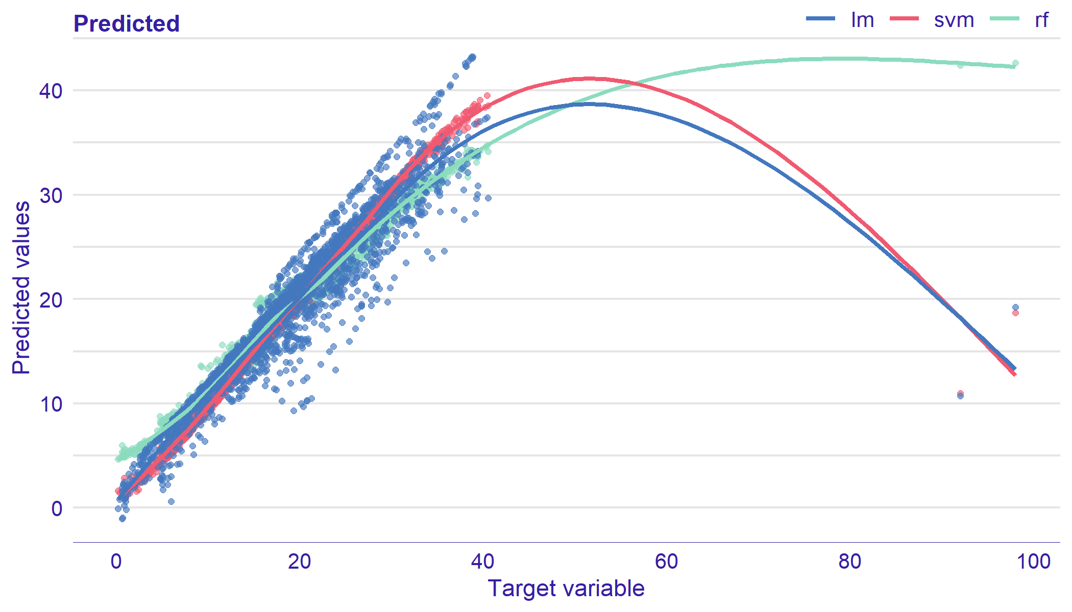
At first, we generate four diagnostic plots. They are: Model Ranking Plot, Predicted Response Plot, PCA of Models, and Residuals Plot. We present results in Figure 28, Figure 29, and Figure 30.
lm_mp <- auditor::model_performance(au_lm) svm_mp <- auditor::model_performance(au_svm) rf_mp <- auditor::model_performance(au_rf) plot_radar(lm_mp, svm_mp, rf_mp)
lm_mr <- model_residual(au_lm) svm_mr <- model_residual(au_svm) rf_mr <- model_residual(au_rf) plot_prediction(lm_mr, svm_mr, rf_mr, smooth = TRUE)
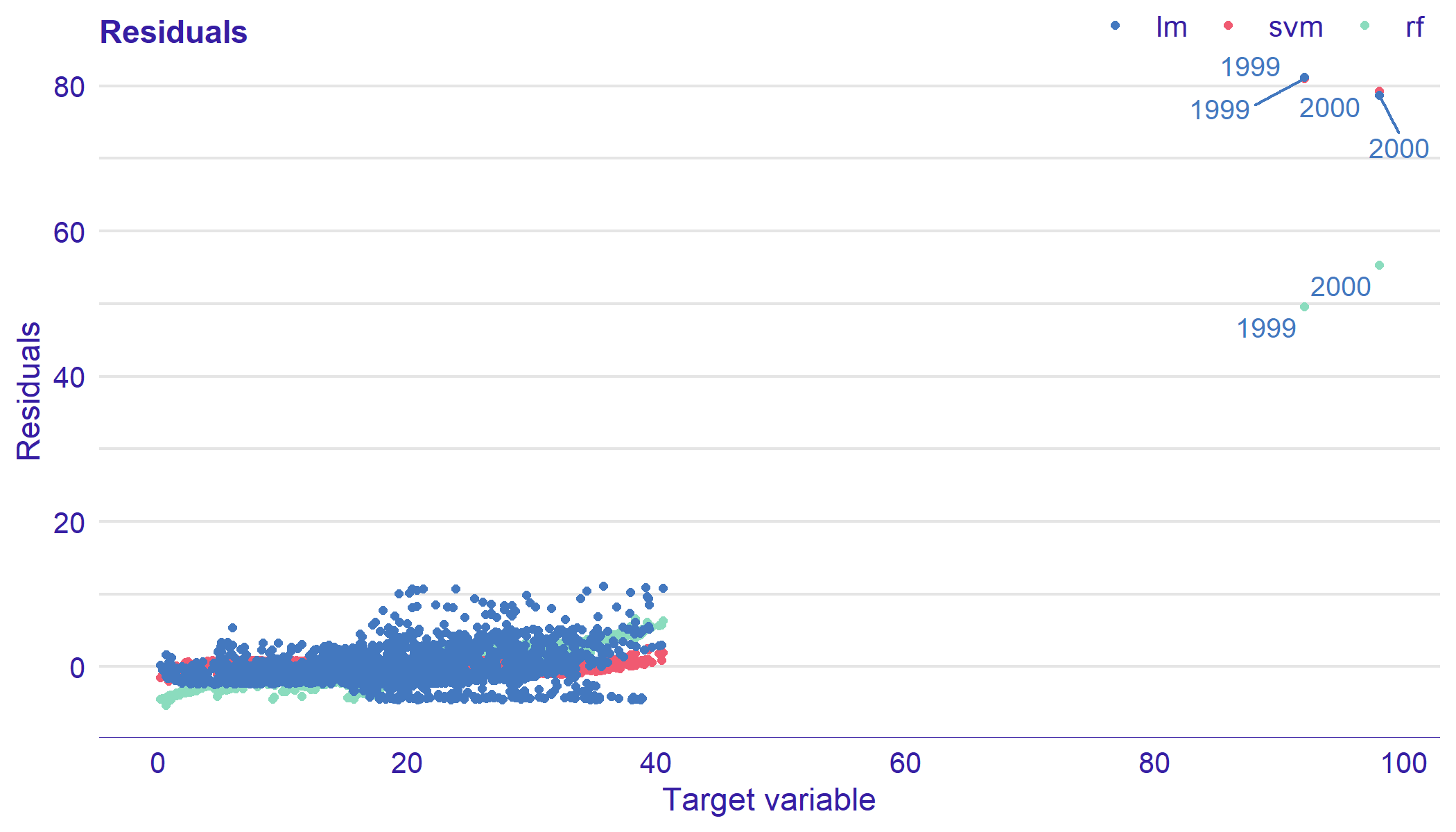
plot_residual(lm_mr, svm_mr, rf_mr, variable = "_y_", nlabel = 6)
On the Model Ranking plot (see Figure 28) we can see that random forest has the best performance in terms of and sores. Support vector regression is the best in terms of and scores. Linear regression appears to have the worst performance in every aspect. As none of the models performs best in terms of all measures, it is clear that Model Ranking plot is not enough to evaluate models. There is a need for further analysis of residuals.
Prediction Response plot (see Figure 29) indicates that there are observations that may be outliers and have significant influence on model’s structures. Most of the residuals of all models are arranged along a black line that shows the ideal trend. While, there is a group of points that clearly stands out from the rest. Further plots allow to take a closer look at these observations.
Residuals plot (see Figure 30) confirms that there are 2 observations that have high influence on the structures of all models. Residuals plot with labeled points shows the numbers of outliers. These are -th and -th observations. The same that we added artificially.
5.4 Removing identified outliers and models improvement
In previous section, we identified two outliers in auditorData. In this section, we remove those outliers, fit models to a new data set, and create "model_audit" objects.
auditorData_clean <- auditorData[-c(1999, 2000), ] model_lm <- lm(y ~ ., auditorData_clean) set.seed(1994) model_rf <- randomForest(y~., auditorData_clean) model_svm <- svm(y ~ ., auditorData_clean) au_lm <- audit(model_lm, data = auditorData_clean, y = auditorData_clean$y) au_rf <- audit(model_rf, data = auditorData_clean, y = auditorData_clean$y, label = "rf") au_svm <- audit(model_svm, data = auditorData_clean, y = auditorData_clean$y, label = "svm")
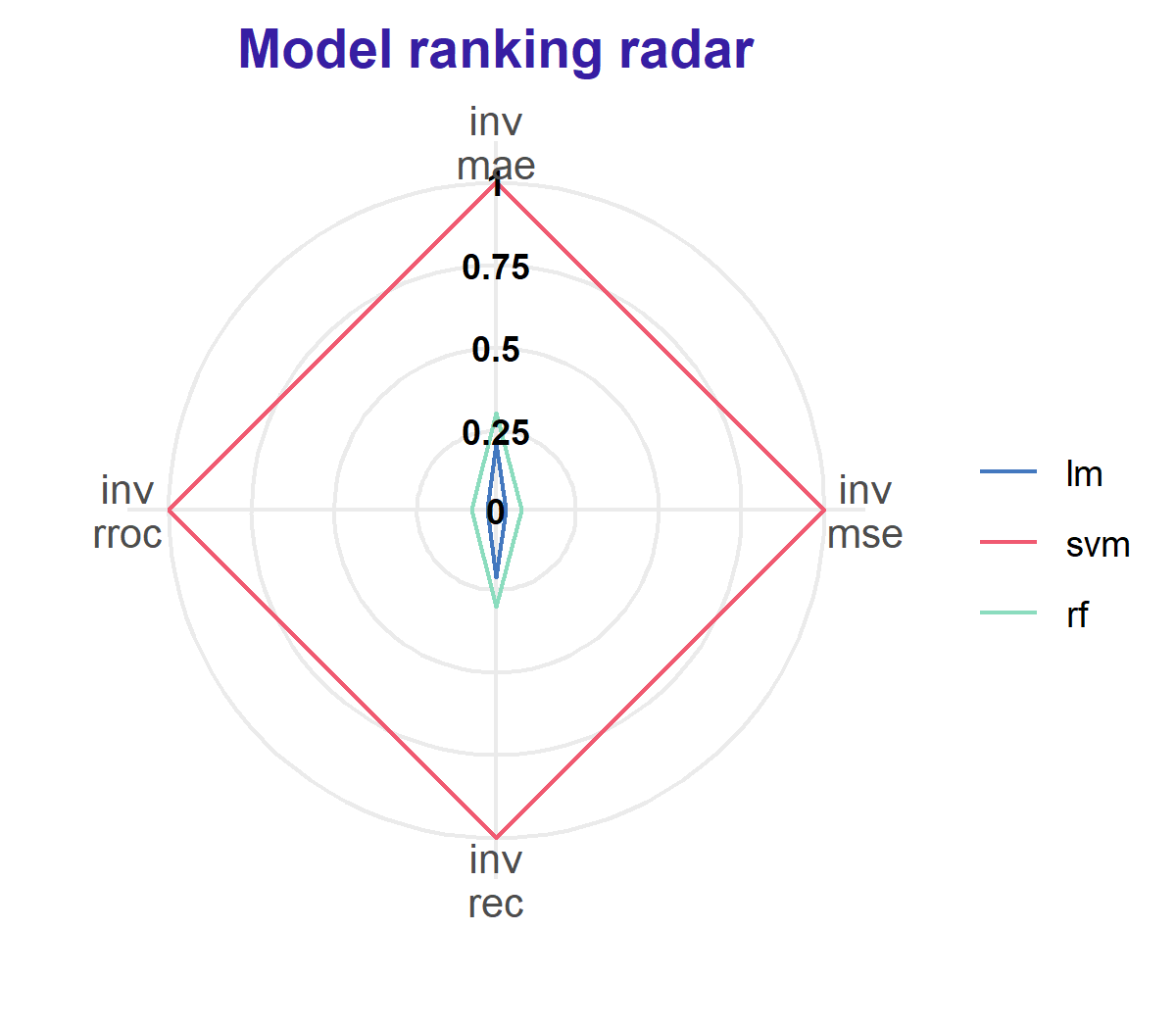
We again generate Model Ranking (See Figure 31) and Predicted Response Plots (See Figure 32). Both of them changed noticeably.
lm_mp_new <- model_performance(au_lm_new) svm_mp_new <- model_performance(au_svm_new) rf_mp_new <- model_performance(au_rf_new) plot_radar(lm_mp_new, svm_mp_new, rf_mp_new)
lm_mr_new <- model_residual(au_lm_new) svm_mr_new <- model_residual(au_svm_new) rf_mr_new <- model_residual(au_rf_new) plot_prediction(lm_mr_new, svm_mr_new, rf_mr_new)
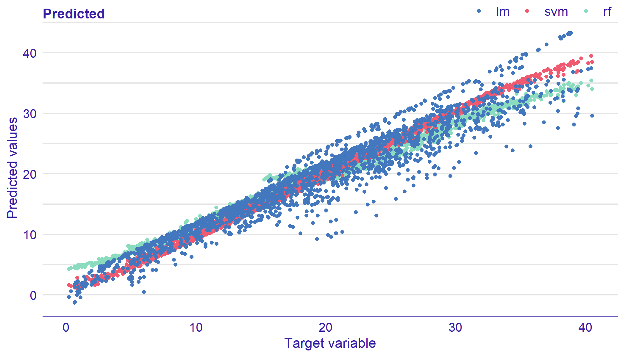
This time, the Model Ranking plot clearly indicates that support vector regression performs best. However, to better exploration of models, it is still worth to carry out a further audit. The Predicted Response Plot shows that residuals of support vector regression are closest to the diagonal line than residuals of other models. Residuals of linear model have the largest dispersion, while random forest residuals indicate over-prediction for small values of observed response and under-prediction for large values.
5.5 Extended model audit
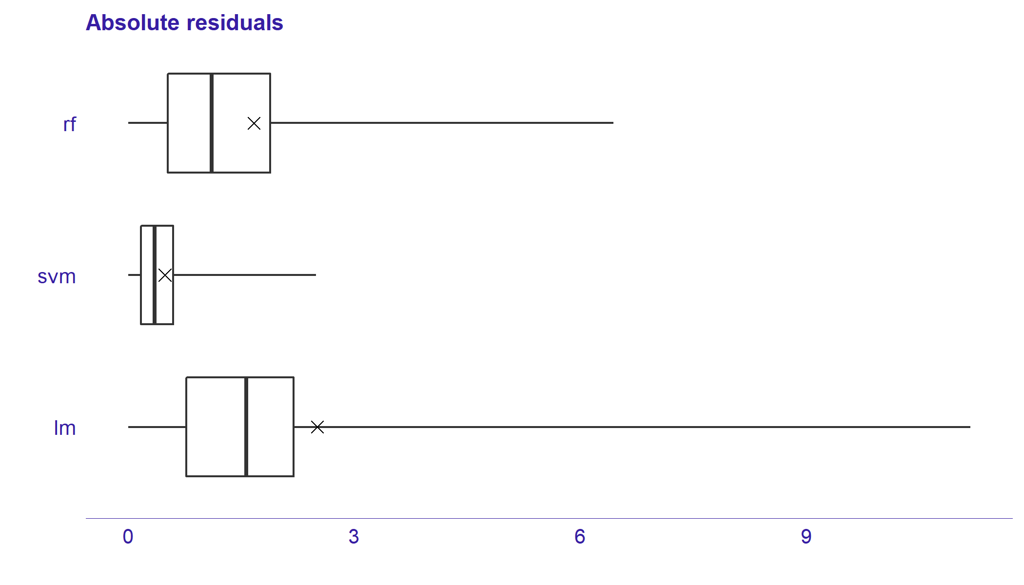
In this section we take a closer look on the residuals. We generate Residual Boxplot and Two-sided ECDF plot for better comparison of models in aspect of residuals.
plot_residual_boxplot(lm_mr_new, svm_mr_new, rf_mr_new)
plot_tsecdf(lm_mr_new, svm_mr_new, rf_mr_new)
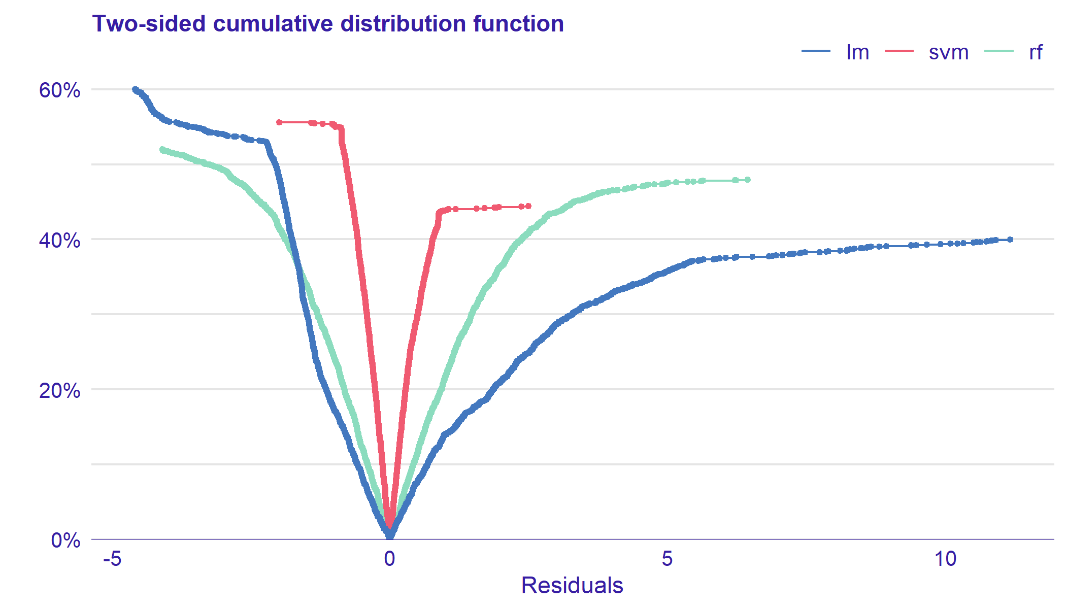
In Figure 31, we noticed that support vector regression has the smallest residuals. By analyzing boxplots (see Figure 33), we can additionally see that random forest has smaller residuals than linear model. Two-sided ECDF plot (see Figure 34) show that conclusions from boxplots are, in general, correct. In addition, we can see that growth of small negatives residuals for random forest and linear model is similar.
Now, we audit residuals due to the model variables. We use Residual Density to understand residual behaviour for different values of the variable.
plot_residual_density(lm_mr_new, svm_mr_new, rf_mr_new, variable = "X4")
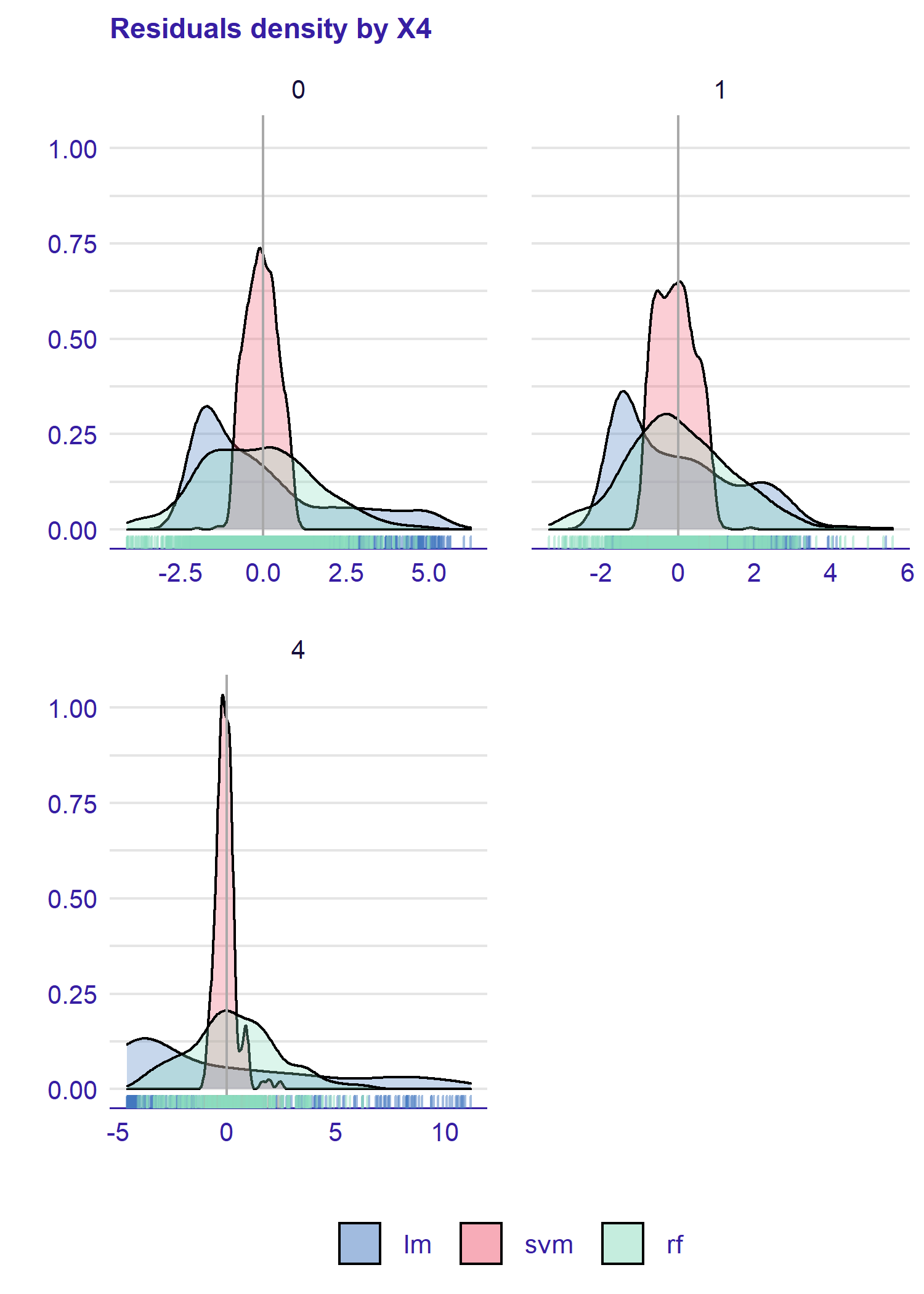
In the Figure 35, we see that structure of residuals for random forest and support vector regression do not vary due to the value of variable. In contrast, there are differences in the shape of the densities for linear model’s residuals. In the data set, we included the variable in the interaction with . Due to its structure, the linear model do not catch this interaction. We use Residuals Plot to examine behaviour of residuals due to second variable included in the interaction.
plot_residual(lm_mr_new, svm_mr_new, rf_mr_new, variable = "X1")
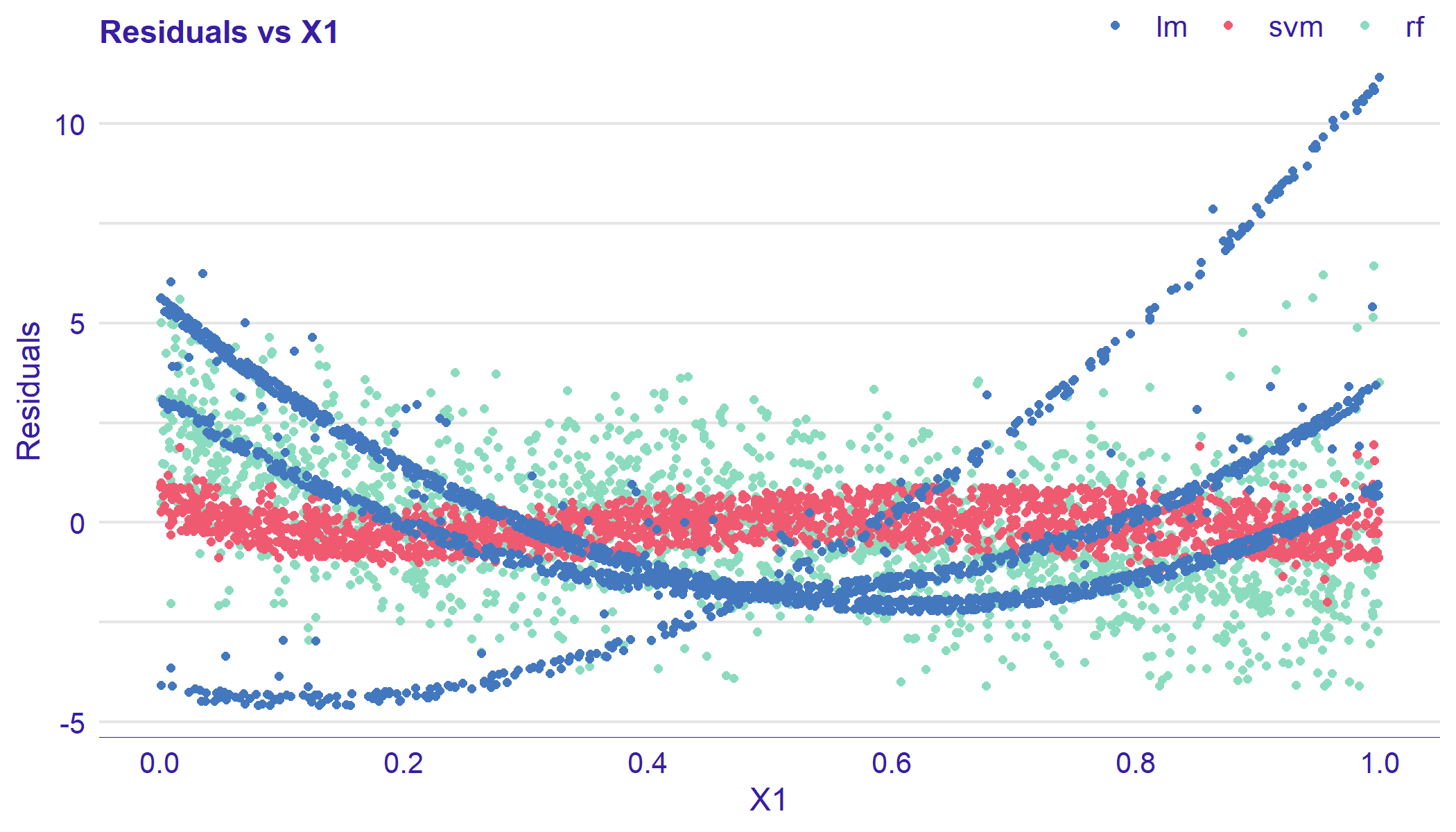
In the Figure 36, we see that residuals form three groups. Based on the previous analysis, we conclude that groups correspond to the levels of the variable.
5.6 Summary
We fitted three different models to the data set auditData. We used Predicted Response, Model PCA and Residuals plots to identify two observations, that highly influenced model’s structures. Then we refitted models on data without outliers. The audit showed that support vector regression has the best performance and we did not identify any serious problems with the structure of the residuals.
6 Conclusion and future work
In this article, we presented the auditor package and selected diagnostic scores and plots. We discussed the existing methods of model validation and proposed new visual approaches. We also specified three objectives of model audit (see Section 1), proposed relevant verification tools, and demonstrated their usage. Model Ranking Plot and REC Curve enrich the information about model performance (Objective 1). Residual Boxplot, Residual Density, and Two-Sided ECDF Plots expand the knowledge about the distribution of residuals (Objective 3). What is more, the latter two tools allow for identification of outliers (Objective 2).
Aside from describing existing methods, we proposed new plots. They are Model Ranking Plot, Two-Sided ECDF Plot.
We implemented all the presented scores and plots in the auditor package for R. The included functions are based on a uniform grammar introduced in Figure 3. Documentation and examples are available at https://modeloriented.github.io/auditor/. The stable version of the package is on CRAN, the development version is on GitHub (https://github.com/ModelOriented/auditor).
In Section 5 we showed the use-case of the model audit with the auditor. We have presented a broad exploration and comparisons of three models by analyzing their residuals.
There are many potential areas for future work that we would like to explore, including more extensions of model-specific diagnostics to model-agnostic methods and residual-based methods for investigating interactions. Another potential aim would be to develop methods for local audit based on the diagnostics of a model around a single observation or a group of observations.
7 Acknowledgements
We would like to acknowledge Aleksandra Grudziąż and Mateusz Staniak for valuable discussions. Also, we wish to thank Dr. Rafael De Andrade Moral for his assistance and help related to the hnp package.
The work was supported by NCN Opus grant 2016/21/B/ST6/02176.
References
- Anderson and Darling (1952) T. W. Anderson and D. A. Darling. Asymptotic theory of certain goodness of fit criteria based on stochastic processes. Ann. Math. Statist., 23(2):193–212, 06 1952. doi: 10.1214/aoms/1177729437. URL https://doi.org/10.1214/aoms/1177729437.
- Anscombe (1973) F. J. Anscombe. Graphs in statistical analysis. The American Statistician, 27(1):17–21, 1973. doi: 10.1080/00031305.1973.10478966. URL https://www.tandfonline.com/doi/abs/10.1080/00031305.1973.10478966.
- Atkinson (1985) A. Atkinson. Plots, Transformations, and Regression: An Introduction to Graphical Methods of Diagnostic Regression Analysis. Oxford statistical science series. Clarendon Press, 1985. URL https://books.google.pl/books?id=oFjgnQEACAAJ.
- Atkinson and Riani (2012) A. Atkinson and M. Riani. Robust Diagnostic Regression Analysis. Springer Series in Statistics. Springer New York, 2012. ISBN 9781461211600. URL https://books.google.pl/books?id=sZ3SBwAAQBAJ.
- Becker and Chambers (1988) R. Becker and J. Chambers. Auditing of data analyses. SIAM Journal on Scientific and Statistical Computing, 9(4):747–760, 1988. doi: 10.1137/0909049. URL https://doi.org/10.1137/0909049.
- Bi and Bennett (2003) J. Bi and K. P. Bennett. Regression error characteristic curves. In ICML, 2003.
- Biecek (2018) P. Biecek. DALEX: explainers for complex predictive models. ArXiv e-prints, June 2018.
- Box and Cox (1964) G. E. P. Box and D. R. Cox. An analysis of transformations. Journal of the Royal Statistical Society. Series B (Methodological, pages 211–252, 1964.
- Bradley (1997) A. P. Bradley. The use of the area under the roc curve in the evaluation of machine learning algorithms. Pattern Recognition, 30(7):1145 – 1159, 1997. ISSN 0031-3203. doi: https://doi.org/10.1016/S0031-3203(96)00142-2. URL http://www.sciencedirect.com/science/article/pii/S0031320396001422.
- Breiman (2001) L. Breiman. Statistical modeling: The two cultures (with comments and a rejoinder by the author). Statist. Sci., 16(3):199–231, 08 2001. doi: 10.1214/ss/1009213726. URL https://doi.org/10.1214/ss/1009213726.
- Breusch and Pagan (1979) T. S. Breusch and A. R. Pagan. A simple test for heteroscedasticity and random coefficient variation. Econometrica, 47(5):1287–1294, 1979. ISSN 00129682, 14680262. URL http://www.jstor.org/stable/1911963.
- Chen and Guestrin (2016) T. Chen and C. Guestrin. Xgboost: A scalable tree boosting system. CoRR, abs/1603.02754, 2016. URL http://arxiv.org/abs/1603.02754.
- Cook (1977) R. D. Cook. Detection of influential observation in linear regression. Technometrics, 19(1):15–18, 1977. ISSN 00401706. URL http://www.jstor.org/stable/1268249.
- Cramer (1928) H. Cramer. On the composition of elementary errors: second paper: statistical applications. Scandinavian Actuarial Journal, 1928(1):141–180, 1928.
- de Jonge and van der Loo (2018) E. de Jonge and M. van der Loo. validatetools: Checking and Simplifying Validation Rule Sets, 2018. URL https://CRAN.R-project.org/package=validatetools. R package version 0.4.3.
- Durbin and Watson (1971) J. Durbin and G. S. Watson. Testing for serial correlation in least squares regression. iii. Biometrika, 58(1):1–19, 1971. ISSN 00063444. URL http://www.jstor.org/stable/2334313.
- Faraway (2002) J. Faraway. Practical Regression and Anova Using R. University of Bath, 2002. URL https://books.google.pl/books?id=UjhBnwEACAAJ.
- Faraway (2004) J. Faraway. Linear Models with R. Chapman & Hall/CRC Texts in Statistical Science. Taylor & Francis, 2004. ISBN 9780203507278. URL https://books.google.pl/books?id=fvenzpofkagC.
- Fawcett (2006) T. Fawcett. An introduction to roc analysis. Pattern Recogn. Lett., 27(8):861–874, June 2006. ISSN 0167-8655. doi: 10.1016/j.patrec.2005.10.010. URL http://dx.doi.org/10.1016/j.patrec.2005.10.010.
- Fox and Weisberg (2011) J. Fox and S. Weisberg. An R Companion to Applied Regression. Sage, Thousand Oaks CA, second edition, 2011. URL http://socserv.socsci.mcmaster.ca/jfox/Books/Companion.
- Friendly (2002) M. Friendly. Corrgrams: Exploratory displays for correlation matrices. The American Statistician, 56(4):316–324, November 2002.
- F.R.S. (1900) K. P. F.R.S. X. On the criterion that a given system of deviations from the probable in the case of a correlated system of variables is such that it can be reasonably supposed to have arisen from random sampling, volume 50. Taylor & Francis, 1900. doi: 10.1080/14786440009463897. URL https://doi.org/10.1080/14786440009463897.
- Gabriel (1971) K. R. Gabriel. The biplot graphic display of matrices with application to principal component analysis. Biometrika, 58(3):453–467, 1971. doi: 10.1093/biomet/58.3.453. URL http://dx.doi.org/10.1093/biomet/58.3.453.
- Gałecki and Burzykowski (2013) A. Gałecki and T. Burzykowski. Linear Mixed-Effects Models Using R: A Step-by-Step Approach. Springer Texts in Statistics. Springer New York, 2013. ISBN 9781461439004. URL https://books.google.pl/books?id=rbk_AAAAQBAJ.
- Goldfeld and Quandt (1965) S. M. Goldfeld and R. E. Quandt. Some tests for homoscedasticity. Journal of the American Statistical Association, 60(310):539–547, 1965. doi: 10.1080/01621459.1965.10480811. URL https://www.tandfonline.com/doi/abs/10.1080/01621459.1965.10480811.
- Greenwell (2017) B. M. Greenwell. pdp: An R Package for Constructing Partial Dependence Plots. The R Journal, 9(1):421–436, 2017. URL https://journal.r-project.org/archive/2017/RJ-2017-016/index.html.
- Gross and Ligges (2015) J. Gross and U. Ligges. nortest: Tests for Normality, 2015. URL https://CRAN.R-project.org/package=nortest. R package version 1.0-4.
- Harrell (2006) F. E. Harrell, Jr. Regression Modeling Strategies. Springer-Verlag, Berlin, Heidelberg, 2006. ISBN 0387952322.
- Harrell Jr (2018) F. E. Harrell Jr. rms: Regression Modeling Strategies, 2018. URL https://CRAN.R-project.org/package=rms. R package version 5.1-2.
- Harrison and McCabe (1979) M. J. Harrison and B. P. M. McCabe. A test for heteroscedasticity based on ordinary least squares residuals. Journal of the American Statistical Association, 74(366):494–499, 1979. ISSN 01621459. URL http://www.jstor.org/stable/2286361.
- Hartigan (1975) J. Hartigan. Printer graphics for clustering. Journal of Statistical Computation and Simulation, 4(3):187–213, 1975. doi: 10.1080/00949657508810123. URL https://doi.org/10.1080/00949657508810123.
- Harvey and Collier (1977) A. C. Harvey and P. Collier. Testing for functional misspecification in regression analysis. Journal of Econometrics, 6(1):103 – 119, 1977. ISSN 0304-4076. URL http://www.sciencedirect.com/science/article/pii/0304407677900574.
- Hastie et al. (2001) T. Hastie, R. Tibshirani, and J. Friedman. The Elements of Statistical Learning. Springer Series in Statistics. Springer New York Inc., New York, NY, USA, 2001.
- Hernández-Orallo (2013) J. Hernández-Orallo. Roc curves for regression. Pattern Recognition, 46(12):3395 – 3411, 2013. ISSN 0031-3203. doi: https://doi.org/10.1016/j.patcog.2013.06.014. URL http://www.sciencedirect.com/science/article/pii/S0031320313002665.
- Ho (1995) T. K. Ho. Random decision forests. In Proceedings of the Third International Conference on Document Analysis and Recognition (Volume 1) - Volume 1, ICDAR ’95, pages 278–, Washington, DC, USA, 1995. IEEE Computer Society. ISBN 0-8186-7128-9. URL http://dl.acm.org/citation.cfm?id=844379.844681.
- Jolliffe (1986) I. Jolliffe. Principal Component Analysis. Springer Verlag, 1986.
- Liaw and Wiener (2002) A. Liaw and M. Wiener. Classification and regression by randomforest. R News, 2(3):18–22, 2002. URL https://CRAN.R-project.org/doc/Rnews/.
- Littell et al. (2007) R. Littell, G. Milliken, W. Stroup, R. Wolfinger, and O. Schabenberger. SAS for Mixed Models, Second Edition. SAS Institute, 2007. ISBN 9781599940786. URL https://books.google.pl/books?id=z9qv32OyEu4C.
- Liu et al. (2017) S. Liu, X. Wang, M. Liu, and J. Zhu. Towards better analysis of machine learning models: A visual analytics perspective. Visual Informatics, 1(1):48 – 56, 2017. ISSN 2468-502X. doi: https://doi.org/10.1016/j.visinf.2017.01.006. URL http://www.sciencedirect.com/science/article/pii/S2468502X17300086.
- Meyer et al. (2017) D. Meyer, E. Dimitriadou, K. Hornik, A. Weingessel, and F. Leisch. e1071: Misc Functions of the Department of Statistics, Probability Theory Group (Formerly: E1071), TU Wien, 2017. URL https://CRAN.R-project.org/package=e1071. R package version 1.6-8.
- Molnar et al. (2018) C. Molnar, G. Casalicchio, and B. Bischl. iml: An r package for interpretable machine learning. Journal of Open Source Software, 3(26):786, 2018.
- Moral et al. (2017) R. Moral, J. Hinde, and C. Demétrio. Half-normal plots and overdispersed models in r: The hnp package. Journal of Statistical Software, Articles, 81(10):1–23, 2017. ISSN 1548-7660. doi: 10.18637/jss.v081.i10. URL https://www.jstatsoft.org/v081/i10.
- O’Neil (2016) C. O’Neil. Weapons of Math Destruction: How Big Data Increases Inequality and Threatens Democracy. Crown Publishing Group, New York, NY, USA, 2016. ISBN 0553418815, 9780553418811.
- Petersen and Ekstrom (2018) A. H. Petersen and C. T. Ekstrom. dataMaid: A Suite of Checks for Identification of Potential Errors in a Data Frame as Part of the Data Screening Process, 2018. URL https://CRAN.R-project.org/package=dataMaid. R package version 1.1.2.
- Peña and Slate (2006) E. A. Peña and E. H. Slate. Global validation of linear model assumptions. Journal of the American Statistical Association, 101(473):341–354, 2006. doi: 10.1198/016214505000000637. URL https://doi.org/10.1198/016214505000000637. PMID: 20157621.
- R Core Team (2018) R Core Team. R: A Language and Environment for Statistical Computing. R Foundation for Statistical Computing, Vienna, Austria, 2018. URL https://www.R-project.org/.
- Ramsey (1969) J. B. Ramsey. Tests for specification errors in classical linear least-squares regression analysis. Journal of the Royal Statistical Society. Series B (Methodological), 31(2):350–371, 1969. ISSN 00359246. URL http://www.jstor.org/stable/2984219.
- Robinson (2018) D. Robinson. broom: Convert Statistical Analysis Objects into Tidy Data Frames, 2018. URL https://CRAN.R-project.org/package=broom. R package version 0.4.4.
- Sanford Shapiro and S. Francia (1972) S. Sanford Shapiro and R. S. Francia. An approximate analysis of variance test for normality. Journal of the American Statistical Association, 67:215–216, 03 1972.
- Sheather (2009) S. Sheather. A Modern Approach to Regression with R. Springer Texts in Statistics. Springer New York, 2009. ISBN 9780387096070. URL https://books.google.pl/books?id=zS3Jiyxqr98C.
- Sievert et al. (2017) C. Sievert, C. Parmer, T. Hocking, S. Chamberlain, K. Ram, M. Corvellec, and P. Despouy. plotly: Create Interactive Web Graphics via ’plotly.js’, 2017. URL https://CRAN.R-project.org/package=plotly. R package version 4.7.1.
- Stephens (1974) M. A. Stephens. Edf statistics for goodness of fit and some comparisons. Journal of the American Statistical Association, 69(347):730–737, 1974. ISSN 01621459. URL http://www.jstor.org/stable/2286009.
- Swets (1988) J. Swets. Measuring the accuracy of diagnostic systems. Science, 240(4857):1285–1293, 1988. ISSN 0036-8075. doi: 10.1126/science.3287615. URL http://science.sciencemag.org/content/240/4857/1285.
- Tang (2018) Y. Tang. Autoplotly - Automatic Generation of Interactive Visualizations for Popular Statistical Results. ArXiv e-prints, Mar. 2018.
- Tang et al. (2016) Y. Tang, M. Horikoshi, and W. Li. ggfortify: Unified Interface to Visualize Statistical Results of Popular R Packages. The R Journal, 8(2):474–485, 2016. URL https://journal.r-project.org/archive/2016/RJ-2016-060/index.html.
- Tukey (1977) J. Tukey. Exploratory Data Analysis. Addison-Wesley series in behavioral science. Addison-Wesley Publishing Company, 1977. ISBN 9780201076165. URL https://books.google.pl/books?id=UT9dAAAAIAAJ.
- Utts (1982) J. M. Utts. The rainbow test for lack of fit in regression. Communications in Statistics - Theory and Methods, 11(24):2801–2815, 1982. URL https://doi.org/10.1080/03610928208828423.
- van der Loo (2017) M. van der Loo. lumberjack: Track Changes in Data, 2017. URL https://CRAN.R-project.org/package=lumberjack. R package version 0.2.0.
- van der Vaart (2000) A. van der Vaart. Asymptotic Statistics. Asymptotic Statistics. Cambridge University Press, 2000. ISBN 9780521784504. URL https://books.google.pl/books?id=UEuQEM5RjWgC.
- Venables and Ripley (2013) W. Venables and B. Ripley. Modern Applied Statistics with S. Statistics and Computing. Springer New York, 2013. ISBN 9780387217062. URL https://books.google.pl/books?id=CzwmBQAAQBAJ.
- Venables and Ripley (2002) W. N. Venables and B. D. Ripley. Modern Applied Statistics with S. Springer, New York, fourth edition, 2002. URL http://www.stats.ox.ac.uk/pub/MASS4. ISBN 0-387-95457-0.
- Von Mises (1928) R. Von Mises. Wahrscheinlichkeit, Statistik und Wahrheit. Number t. 3 in Schriften zur wissenschaftlichen Weltauffassung. J. Springer, 1928. URL https://books.google.pl/books?id=W1IaAAAAIAAJ.
- Vuk and Curk (2006) M. Vuk and T. Curk. ROC Curve, Lift Chart and Calibration Plot. Metodološki zvezki, 3(1):89–108, 2006.
- Wald and Wolfowitz (1940) A. Wald and J. Wolfowitz. On a test whether two samples are from the same population. Ann. Math. Statist., 11(2):147–162, 06 1940. doi: 10.1214/aoms/1177731909. URL https://doi.org/10.1214/aoms/1177731909.
- Wickham (2009) H. Wickham. ggplot2: Elegant Graphics for Data Analysis. Springer-Verlag New York, 2009. ISBN 978-0-387-98140-6. URL http://ggplot2.org.
- Wickham (2014) H. Wickham. Tidy data. The Journal of Statistical Software, 59, 2014. URL http://www.jstatsoft.org/v59/i10/.
- Willmott et al. (1985) C. J. Willmott, S. G. Ackleson, R. E. Davis, J. J. Feddema, K. M. Klink, D. R. Legates, J. O'Donnell, and C. M. Rowe. Statistics for the evaluation and comparison of models. Journal of Geophysical Research, 90(C5):8995, 1985. doi: 10.1029/jc090ic05p08995. URL https://doi.org/10.1029/jc090ic05p08995.
- Witten et al. (2011) I. H. Witten, E. Frank, and M. A. Hall. Data Mining: Practical Machine Learning Tools and Techniques. Morgan Kaufmann Publishers Inc., San Francisco, CA, USA, 3rd edition, 2011. ISBN 0123748569, 9780123748560.
- Wright (2018) K. Wright. corrgram: Plot a Correlogram, 2018. URL https://CRAN.R-project.org/package=corrgram. R package version 1.13.
- Wright and Ziegler (2017) M. N. Wright and A. Ziegler. ranger: A fast implementation of random forests for high dimensional data in C++ and R. Journal of Statistical Software, 77(1):1–17, 2017. doi: 10.18637/jss.v077.i01.
- Zeileis and Hothorn (2002) A. Zeileis and T. Hothorn. Diagnostic checking in regression relationships. R News, 2(3):7–10, 2002. URL https://CRAN.R-project.org/doc/Rnews/.
- Zeileis et al. (2002) A. Zeileis, F. Leisch, K. Hornik, and C. Kleiber. strucchange: An r package for testing for structural change in linear regression models. Journal of Statistical Software, Articles, 7(2):1–38, 2002. ISSN 1548-7660. doi: 10.18637/jss.v007.i02. URL https://www.jstatsoft.org/v007/i02.