Testing SensoGraph, a geometric approach for fast sensory evaluation
Abstract
This paper introduces SensoGraph, a novel approach for fast sensory evaluation using two-dimensional geometric techniques. In the tasting sessions, the assessors follow their own criteria to place samples on a tablecloth, according to the similarity between samples. In order to analyse the data collected, first a geometric clustering is performed to each tablecloth, extracting connections between the samples. Then, these connections are used to construct a global similarity matrix. Finally, a graph drawing algorithm is used to obtain a 2D consensus graphic, which reflects the global opinion of the panel by (1) positioning closer those samples that have been globally perceived as similar and (2) showing the strength of the connections between samples. The proposal is validated by performing four tasting sessions, with three types of panels tasting different wines, and by developing a new software to implement the proposed techniques. The results obtained show that the graphics provide similar positionings of the samples as the consensus maps obtained by multiple factor analysis (MFA), further providing extra information about connections between samples, not present in any previous method. The main conclusion is that the use of geometric techniques provides information complementary to MFA, and of a different type. Finally, the method proposed is computationally able to manage a significantly larger number of assessors than MFA, which can be useful for the comparison of pictures by a huge number of consumers, via the Internet.
Keywords: Sensory analysis, Wines, Projective Mapping, Multidimensional Scaling, Geometric graphs.
1 Introduction and related work
The aim of this work is to introduce and evaluate SensoGraph, a novel approach for the analysis of sensory data using geometric techniques which deal with basic objects in 2D, like points, circles, and segments (Gabriel and Sokal,, 1969; Kamada and Kawai,, 1989). A data collection following the methodology introduced by Risvik et al., (1994) for Projective Mapping is combined with a data analysis using geometric Multidimensional Scaling. A consensus graphic is obtained, showing not only a positioning of the samples, but also connections between samples and the force (strength) of these connections. This aims to be helpful in order to calibrate the significance of the positions on the graphic and to reflect the relations between groups. Moreover, the use of geometric techniques aims to help avoiding possible misuses of statistical techniques. The proposed method is validated by performing four sessions with three types of panels tasting different wines.
Sensory profiling is among the most important and widely used tools in sensory and consumer science (Lawless and Heymann,, 2010), both in academia and industries (Varela and Ares,, 2012). In these two fields, descriptive analysis has usefully linked product characteristics and consumer perception (Varela and Ares,, 2012; Vidal et al.,, 2014). Descriptive panels allow, due to their expertise, to obtain very detailed, robust, consistent, and reproducible results (Moussaoui and Varela,, 2010). However, creating and maintaining a well-trained, calibrated, sensory panel can become too long and costly: For academic research, because of dealing with occasional projects or scarce funding (Lawless and Heymann,, 2010; Murray et al.,, 2001; Varela and Ares,, 2012). For companies, because of reasons like funding limits or difficulty to enrol assessors in a panel during a long time.
Thus, several alternative methods have arisen in the last years (Varela and Ares,, 2012), aiming to provide a fast sensory positioning of a set of products by assessors who are not necessarily trained. Skipping the need to train the panellists allows to elude the need of waiting a long time before obtaining results, as well as the need of agreeing on particular attributes, which may become difficult when working with experts like wine professionals or chefs (Hopfer and Heymann,, 2013). Introduced by Risvik et al., (1994, 1997), Projective Mapping asks the assessors to position the presented samples on a two-dimensional space, usually a blank sheet of paper as tablecloth, following their own criteria: The more similar they perceive two samples, the closer they should position them, and vice versa (Perrin et al.,, 2008). In those seminal works, the data were analysed by generalized procrustes analysis (GPA) (Gower,, 1975) and principal component analysis (PCA) (Gabriel,, 1971), using the RV coefficient (Escoufier and Robert,, 1979) to compare the method with conventional profiling.
More recently, Pagès, (2003, 2005) proposed the use of multiple factor analysis (MFA) (Escofier and Pagès,, 1994) for data analysis, coining the name Napping®. Typically, a two-dimensional graphic is obtained, where proximity of two samples indicates that the panel has globally perceived them to be similar.
The goal of these statistical methods is always to get an average configuration of products called consensus graphic, so it is crucial to assess its stability. Thus, in order to know whether two products are perceived as significantly different from a sensory point of view, the positions on the map given by these statistical methods should include a confidence area, e.g., confidence ellipses (Cadoret and Husson,, 2013).
Projective Mapping has been successfully used with many different kinds of products, among which the application to wine stands out (Piombino et al.,, 2004; Ballester et al.,, 2005; Pagès,, 2005; Perrin et al.,, 2008; Perrin and Pagès,, 2009; Bécue-Bertaut and Lê,, 2011; Ross et al.,, 2012; Hopfer and Heymann,, 2013; Torri et al.,, 2013; Vidal et al.,, 2014). Other examples of beverages analysed by these methods are beers (Chollet and Valentin,, 2001; Abdi et al.,, 2007; Lelièvre et al.,, 2008, 2009; Reinbach et al.,, 2014), citrus juices (Nestrud and Lawless,, 2008), drinking waters (Falahee and MacRae,, 1995, 1997; Teillet et al.,, 2010) high alcohol products (Louw et al.,, 2013), hot beverages (Moussaoui and Varela,, 2010), lemon iced teas (Veinand et al.,, 2011), powdered juices (Ares et al.,, 2011), or smoothies (Pagès et al.,, 2010). The book by Varela and Ares, (2014) details more products to which consumer based descriptive methodologies have been applied.
Until now, all the methodologies proposed for fast sensory evaluation have used statistical techniques to perform the data analysis. This paper introduces and evaluates a novel approach, a combination of geometric techniques to obtain a different kind of consensus graphic, here named SensoGraph. The outcome is a graph representation which combines a positioning of the samples together with connections representing the strength of the relations between them. Such a kind of representation is becoming more and more usual nowadays, among other reasons because of allowing dynamic data visualization (Beck et al.,, 2017), being helpful for big data visualization (Baumann et al.,, 2016; Conover et al.,, 2011; Junghanns et al.,, 2015), and providing apparent graphics suitable for mass media (The Electome and The Laboratory for Social Machines at the MIT Media Lab,, 2016) and the analysis of sports (Buldu et al.,, 2018).
2 Material and methods
2.1 Data collection
In order to validate this proposal, a total of four tasting sessions using Projective Mapping (Risvik et al.,, 1994; Pagès,, 2005) have been performed, with three types of panels tasting different wines.
(A) Panel trained in Quantitative Descriptive Analysis (QDA): A panel trained in QDA of wine, composed of eleven assessors, tasted eight different red wines in one session, all of them elaborated at the winery of the School of Agricultural Engineering of the University of Valladolid in Palencia (Spain). Four of the wines were from cv. Cabernet Sauvignon and the other four from cv. Tempranillo, all of them from the same vintage. This panel was selected and trained using ISO 8586, (2012).
(B) Panel receiving one training session in Projective Mapping: Another panel, composed of twelve assessors with experience in wine tasting, performed two sessions of Projective Mapping; a first session without any experience in the method and a repetition. The same eight red wines were used both for the training and for the final test, all of them elaborated at the winery of the School of Agricultural Engineering of the University of Valladolid in Palencia (Spain) using cv. Tempranillo from Toro appellation (Spain) and the same vintage. These eight wines were different from those tasted by the previous panel. This panel was composed by students of the Enology degree at the University of Valladolid, who had studied three academic years of Enology including a course in Sensory Analysis.
(C) Panel of habitual wine consumers tasting commercial wines: A final panel, composed of twenty-four habitual consumers of wine, performed one session of Projective Mapping. They tasted nine commercial wines, one of them duplicated. Seven of the wines used only one variety: Three of them were cv. Mencía, three more were cv. Tempranillo (one of them from Toro appellation, Spain), and another one was cv. Monastrell. The other two wines were a blend of varieties: The duplicated wine used mainly cv. Cabernet Franc, together with cv. Merlot, Garnacha, and Monastrell. The other wine was mainly cv. Tempranillo, blended with cv. Garnacha and Graciano.
For all the sessions, the number of samples followed the recommendations of Valentin et al., (2016). The samples were simultaneously presented to each assessor. The panellists were requested to position the wine samples on an A2 paper ( cm), in such a way that two wine samples were to be placed close to each other if they seemed sensorially similar, and that two wines were to be distant from one another if they seemed sensorially different. All of this according to the assessor’s own criteria for what close or far mean.
In all the sessions, the samples were served as 25 mL aliquots in standardised wineglasses (ISO 3591,, 1977), which were coded with 3-digit numbers, and all the samples were presented simultaneously using a randomized complete block design. The serving temperature was 14C. All these sensory evaluations were carried out at the Sensory Science Laboratory of the School of Agricultural Engineering, at the University of Valladolid, Palencia (Spain), in individual booths designed in accordance with ISO 8589, (2007).
2.2 Data analysis
The - and -coordinates of each sample on the paper were measured from the left-bottom corner of the sheet. These data were then stored in a table with rows, one for each sample, and columns, with being the number of assessors.
2.2.1 Statistical techniques
On one hand, these data were analysed by statistical techniques with MFA, as proposed by Pagès, (2005), using the R language (R Development Core Team,, 2007) and the FactoMineR package (Lê et al.,, 2008). MFA has become a common choice for the analysis of Projective Mapping data (Varela and Ares,, 2014), and it has been proved to be equal or better than other models like individual differences scaling (INDSCAL) for estimating the consensus configuration (Næs et al.,, 2017). Finally, confidence ellipses were constructed using truncated total bootstrapping (Cadoret and Husson,, 2013) with SensoMineR package (Lê and Husson,, 2008).
2.2.2 Geometric techniques
On the other hand, in order to analyse the data by geometric techniques, we have developed and applied the following method:
Step 1: Geometric clustering (Capoyleas et al.,, 1991) allows to group data using basic operations from two-dimensional geometry, like drawing circles or segments. With the goal of analyzing each tablecloth to connections between the samples, and after exploring a large number of alternatives (de Miguel et al.,, 2013), the Gabriel graph (Gabriel and Sokal,, 1969) was chosen, because of its good behavior and its clustering abilities having been widely checked (Matula and Sokal,, 1980; Urquhart,, 1982; Choo et al.,, 2007).
For the construction of the Gabriel graph, two samples get connected if, and only if, there is no other sample inside the closed disk having the straight segment as diameter. Figure 1 shows how to construct a Gabriel graph. Figure 2 shows another example, with four tablecloths (first row) and their corresponding Gabriel graphs (second row).

Recall that the assessors position the samples on the tablecloth without a common metric criterion, according to their own understanding of close and far. For an example, look at the two leftmost tablecloths in the top row of Figure 2. The square 1-2-3-4 shows different distances in the two tablecloths, with samples 1-2 being much closer in the second picture than in the first one. However, at a glance we would say that both tablecloths provide similar information, namely a group 1-2-3-4 together with the samples 5-6-7 getting further from that group.
This is the kind of information extracted by the Gabriel graph, which therefore leads to the same graph for those two cases. See the two leftmost pictures of the second row in Figure 2, which both show the same connections.
Step 2: A global similarity matrix (Abdi et al.,, 2007) was constructed. Each entry of the matrix stores, for a pair of samples , how many tablecloths show a connection after the clustering step (e.g., entry will equal the number of tablecloths in which the samples and are connected). Figure 2 illustrates (third row, left) the global similarity matrix from four tablecloths for which the clustering Gabriel graph has already been constructed (second row).
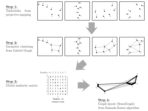
This global similarity matrix can alternatively be seen as encoding a graph, in which entry stores the weight of the connection between vertices and .
Step 3: A graph drawing algorithm (Eades et al.,, 2010) was applied to the graph encoded by the global similarity matrix. Graph drawing algorithms have been used in social and behavioral sciences as a geometric alternative (DeJordy et al.,, 2007) to non-metric multidimensional scaling (Chollet et al.,, 2014). Among the different kinds of graph drawing algorithms, the particular class of force-directed drawing algorithms (Fruchterman and Reingold,, 1991; Hu,, 2005) has been the one chosen, because of providing good results and being easy to understand.
In this class of algorithms, each entry of the global similarity matrix models the force of a spring, which connects and pulls those samples together with that prescribed force. The particular algorithm chosen has been the Kamada-Kawai algorithm, where the resulting system of forces is let to evolve until an equilibrium position of the samples is reached. Technical details can be checked at the paper by Kamada and Kawai, (1989), but for a better understanding of this third step, the reader can imagine that the samples are (1) pinned at arbitrary positions on a table, (2) joined by springs with the forces specified in the matrix, and (3) finally unpinned all at the same time so that they evolve to an equilibrium position.
Figure 2 shows a graphical sketch of these three steps. The equilibrium position reached provides a consensus graphic, here named SensoGraph, which reflects the global opinion of the panel by positioning closer those samples that have been globally perceived as similar. In addition, the graphic shows the connections and represents their forces by the thickness and opacity of the corresponding segments (the actual values of the forces being attached as a matrix). This information allows to know how similar or different two products have been perceived, playing the role of the confidence areas used by other methods in the literature (Cadoret and Husson,, 2013).
2.3 Software
In order to perform the three steps detailed above, a new software was implemented. For convenience, Microsoft Visual Studio together with the programming language C # were used to create an executable file for Windows, which allows to visually open the data spreadsheet and click a button to obtain the consensus graphic. This allows to start using the software with a negligible learning curve.
The implementation of Step 1 above followed a standard scheme for the construction of the Gabriel graph (Gabriel and Sokal,, 1969), computing first the Delaunay triangulation (de Berg et al.,, 2008) and then traversing its edges to check which of them fulfill the Gabriel graph defining condition (that there is no other sample inside the closed disk having that edge as diameter, as stated in Step 1). Note that this is an exact algorithm, and hence there are no parameters to be chosen.
Implementing Step 2 was straightforward, just needing to run through the Gabriel graphs obtained, updating the counters for the appearances of each edge, and storing the results as a matrix. Finally, for Step 3 the algorithm in the seminal paper by Kamada and Kawai, (1989) was used. This algorithm does need the following choices of parameters. The desirable length of an edge in the outcome, for which the diameter of the tablecloths was used as suggested in Eq. (3) in the reference. A constant used to define the strengths of the springs as in Eq. (4) in the reference, which determines how strongly the edges tend to the desirable length. Finally, a maximum number of iterations and a threshold were chosen for the stopping condition of the algorithm. All these choices are rather standard, since our tests did not show huge variability among different choices.
A video showing the software in use has been broadcast (Orden,, 2018) and readers interested in the software can contact the corresponding author. Moreover, the implementation of a Python version and an R package are projected for the future.
3 Results and discussion
3.1 Results and discussion by tasting session
(A) Panel trained in Quantitative Descriptive Analysis (QDA):
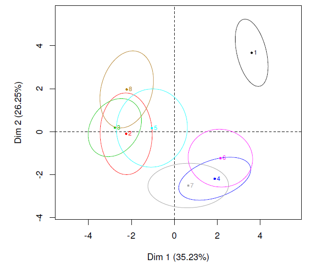
The data obtained by performing Projective Mapping with the panel trained in QDA of wine were processed both by MFA (Fig. 3, left) and by SensoGraph (Fig. 3, right). For MFA, the first two dimensions accounted for 66.53% of the explained variance.
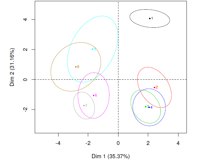
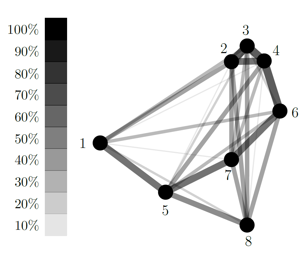
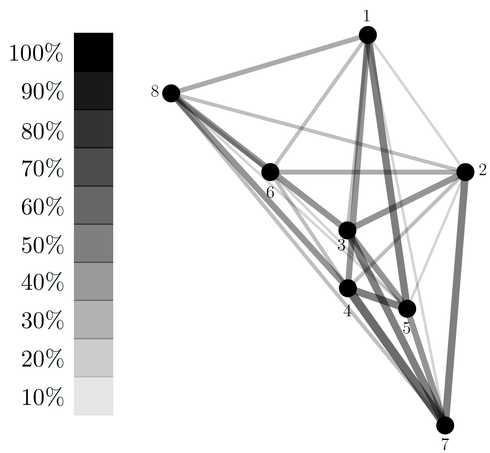
At first glance, the positionings provided by MFA and SensoGraph look similar. Going into details, both graphics show a clear group 2-3-4: the corresponding ellipses in MFA superimpose, meaning that the assessors did not perceived a significant difference among these three samples, while in SensoGraph connections among 2-3-4 have arisen in between 55% and 64% of the tablecloths. (May the reader be interested in checking the actual numbers, these are shown in Table 1.)
In addition, the graphic from MFA suggests a group 5-6-8, with non-empty intersection for their ellipses, and a further group 6-7. This connection 6-7 has appeared in the 55% of the tablecloths in SensoGraph. Further, in SensoGraph the connections in the group 5-6-8 have appeared in percentages from 27% to 45% of the tablecloths. On the contrary, the group 5-7-8 is more apparent, its connections having arisen in between the 36% and the 55% of the tablecloths.
This is because the geometric clustering has joined the sample 5 to the sample 7 in more tablecloths, 55%, than to the sample 6, only 27%. It is interesting to note that this is compatible with the confidence ellipses of samples 5, 6, and 7 in the MFA graphic.
(B) Panel receiving one training session in Projective Mapping:
With the aim of studying how the experience in the Projective Mapping methodology affects the results, MFA and SensoGraph were used to process both the data obtained from a first Projective Mapping session with panellists having experience in tasting wines, Figure 4, and the data the same panel generated in a second session, Figure 5. For MFA, the first two dimensions accounted respectively for 54.54% (Fig. 4, left) and 61.48% (Fig. 5, left) of the explained variance, reflecting the effect of the experience achieved. For this panel, the comparison between MFA and SensoGraph positionings shows a higher coincidence when the percentage of explained variance is higher, i.e., in the second session.
The graphics in Figure 4 are difficult to analyse even for a trained eye, since neither MFA nor SensoGraph show clear groups. The MFA plot shows the ellipses of samples 2-3-4-5-7 superimposed, while all of the ellipses of the remaining samples 1, 6, and 8 do, in turn, superimpose with some of the ellipses in the previous group. In SensoGraph such a group of samples 2-3-4-5-7 appears indeed, at the lower-right corner, with connections ranging from the 8% of tablecloths joining 3-4 to the 58% joining 4-7. Interestingly enough, SensoGraph allows to distinguish the behavior of sample 7, which turns out to be strongly connected to samples 2, 3, 4, and 5 in between the 42% and the 58% of the tablecloths, from the behavior of sample 4, which is poorly connected with samples 2 and 3 since these connections arise, respectively, only at the 25% and the 8% of the tablecloths.
The situation for the repetition session is shown in Figure 5, where the same groups 2-3-5-8 and 4-6-7 are apparent for MFA (left) and SensoGraph (right), with sample 1 clearly isolated. In MFA the corresponding confidence ellipses do actually intersect, while in SensoGraph connections in the group 2-3-5-8 have appeared in between the 33% and the 58% of the tablecloths and those in the group 4-6-7 range between the 42% and the 58%. Here, it is interesting to note that sample 1 is better connected to the group 4-6-7, these connections appearing in between 25% and 42% of the tablecloths, than to the group 2-3-5-8, in between 8% and 33%. (See Table 2 for the global similarity matrices.)
(C) Panel of habitual wine consumers tasting commercial wines:
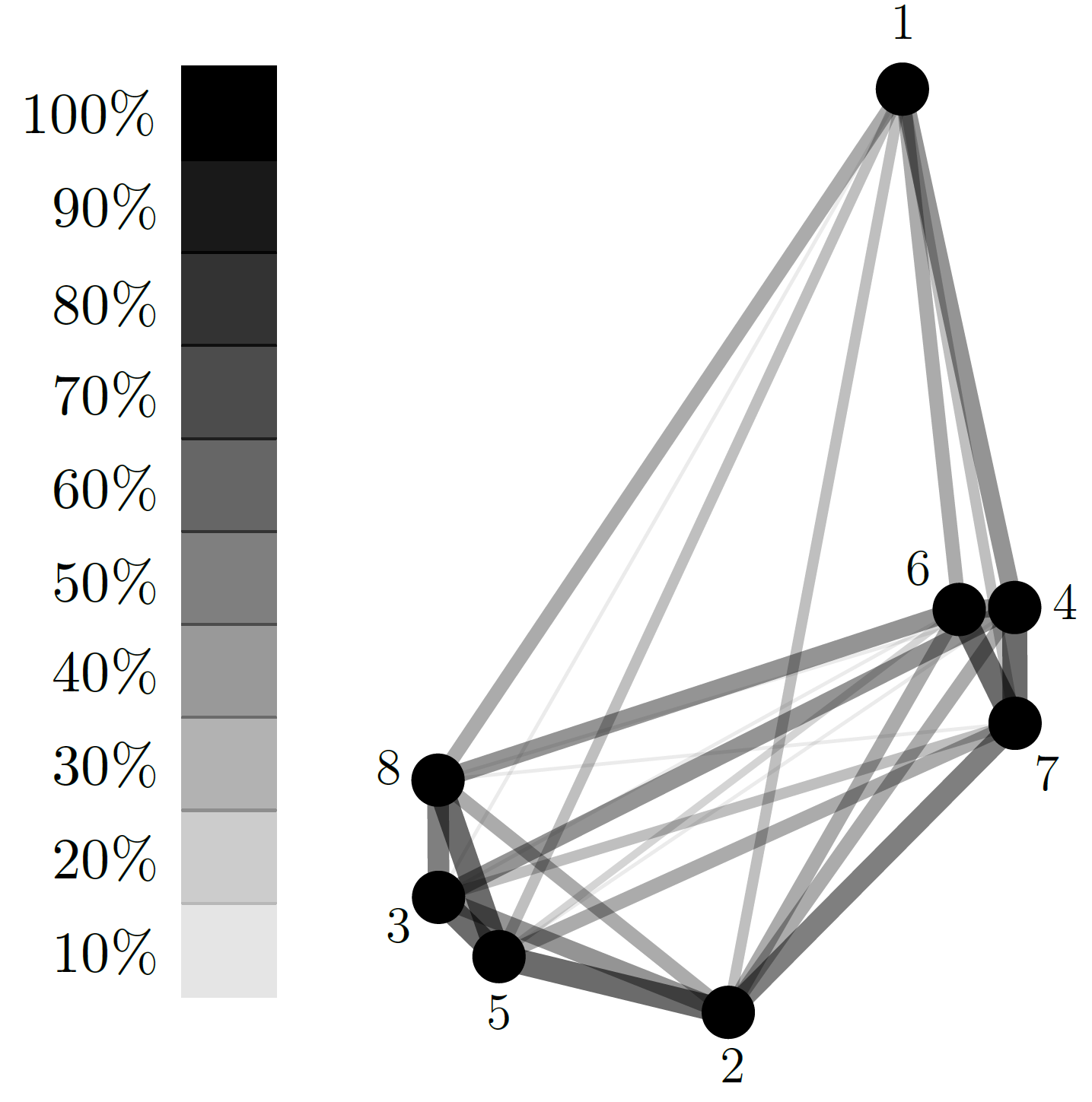
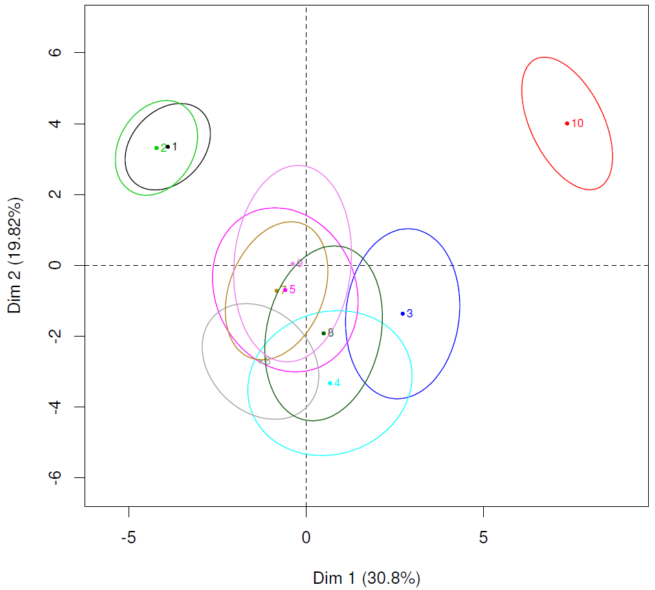
Again, the data were analyzed by MFA and SensoGraph, see Figure 6. For MFA, the first two dimensions accounted for 50.62%. The positionings provided by between MFA and SensoGraph are similar, with samples 1-2 and 10 clearly separated from the others. This sample 10 used only cv. Monastrell and the samples 1-2 correspond to wines elaborated with only cv. Tempranillo. It is interesting to observe that the pairs of samples 1-2 and 5-7 are quite similar in the MFA map, both according to the distances and between the two samples, and according to their corresponding ellipses. However, the pair 5-7 appears farther apart in SensoGraph, as can be checked at the global similarity matrix (Table 3), where the connection 1-2 arises in an 88% of the tablecloths, while the connection 5-7 arises in the 50% of them. This is consistent with samples 1-2 being elaborated with only cv. Tempranillo, while samples 5-7 differ in the grape variety, one of them using only cv. Mencía and the other being a blend of cv. Tempranillo, Garnacha and Graciano.

3.2 General discussion
As a summary of these four experiments, it can be observed that the positionings provided by SensoGraph are similar to those obtained by MFA.
Furthermore, the more trained is the panel, the more clear and similar are the groups in the graphics given by SensoGraph and MFA. This is consistent with the behavior previously observed for statistical techniques, since Liu et al., (2016) reported that, for Projective Mapping, conducting training on either the method or the product leads to more robust results. Actually, observing the percentages of explained variance leads to the conclusion that, the higher the total inertia, the more similar are the positionings for MFA and SensoGraph.
Note that, for Step 3, it would be possible to use the Kamada-Kawai energy (Gansner et al.,, 2004), which is indeed analogous to the stress introduced by Kruskal, 1964a ; Kruskal, 1964b , as an index of how well the graph drawing algorithm has drawn the data in the global similarity matrix. However, this would miss the effect of the geometric clustering in Step 1, for which an index of fit is not available.
In addition, it is interesting that the graphic for the SensoGraph method introduced in this paper does not provide only the positions for the samples, but also a graphical representation of the forces of connections, as well as a global similarity matrix. These connections and forces provide a better understanding of the interactions between groups, as already checked in different research fields (Beck et al.,, 2017; Conover et al.,, 2011; Junghanns et al.,, 2015). Further, these connections and forces help to calibrate the significance of the positioning (Cadoret and Husson,, 2013), with the help of the global similarity matrices.
For an example, they allow to contrast the distances in the map with the information of the tablecloths, as discussed in the last panel above. It is also interesting that for the matrix in Table 1 there is only one entry which is 0, while for those in Tables 2 and 3 there are no zero entries. This means that almost all samples have been connected at least once. Moreover, the connections appearing in the maximum number of tablecloths do so, respectively, in 58%, 64%, and 88% of the tablecloths. These two observations show a large amount of individual variation in the data, which deserves further study.
Finally, concerning the usability of the SensoGraph method, on one hand the Projective Mapping methodology for data collection has already distinguished as natural and intuitive for the assessors (Ares et al.,, 2011; Varela and Ares,, 2012; Carrillo et al.,, 2012). On the other hand, the geometric techniques used for data analysis have been explained using basic geometric objects in 2D, aiming to be readily understood by researchers without any previous experience in the method.
3.3 Computational efficiency
Furthermore, all the geometric techniques used in this work are known to be extremely efficient from a computational point of view (Cardinal et al.,, 2009). In the following, the efficiency of the previous methods is analysed, using the standard big O notation from algorithmic complexity. May the reader be unfamiliar with this notion, a good reference is, e.g., the book by Arora and Barak, (2009). For the sake of an easier reading, a simplified explanation is also provided after the analysis.
First, the time complexity of SensoGraph is in , being the number of samples and the number of assessors as before. Each summand comes from each of the three steps detailed in Subsection 2.2.2, as follows: From the first step, the computation for each of the tablecloths of the Delaunay triangulation (de Berg et al.,, 2008) of samples, in , together with checking which of them does actually fulfill the condition to appear in the Gabriel graph. From the second step, counting the number of appearances of each of the edges over the tablecloths. From the third step, the algorithm by Kamada and Kawai, (1989) takes per each of the constant number of iterations stated in Subsection 2.3.
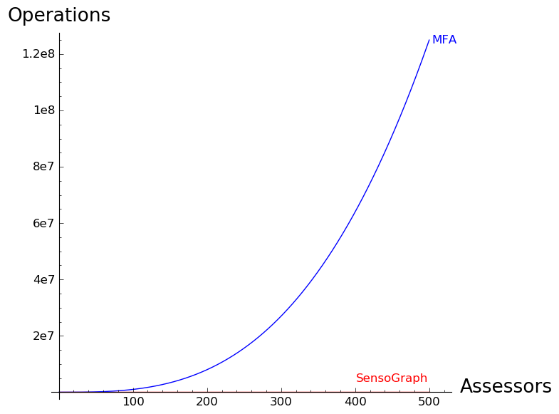
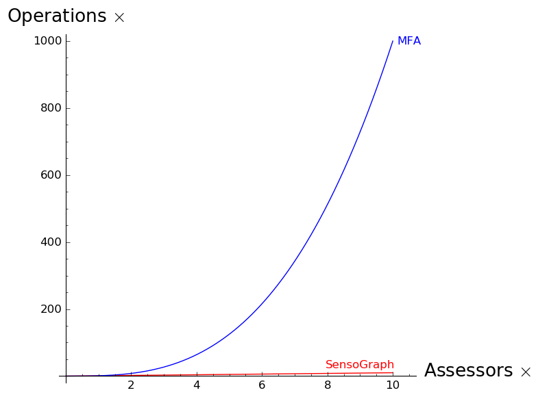
With the number of samples bounded in the order of tens, it is the number of assessors which can grow to the order of hundreds (Varela and Ares,, 2014) or beyond. Hence, the complexity is dominated by the number of assessors, and therefore the time complexity of SensoGraph is in , i.e., linear in the number of assessors. On the contrary, the time complexity of MFA is in , i.e., cubic in the number of assessors, since it needs two rounds of PCA (Abdi et al.,, 2013), whose time complexity is cubic (Feng et al.,, 2000).
An explanation in short of these two complexities is the following: Multiplying the number of assessors by a factor , the number of operations needed by SensoGraph gets multiplied by as well, while the one needed by MFA gets multiplied by . For an example, duplicating the number of assessors (i.e., ), the number of operations needed by SensoGraph gets duplicated as well, while that of MFA gets multiplied by . For another example, if the number of assessors gets multiplied by , so does the number of operations needed by SensoGraph, while the number of operations needed by MFA gets multiplied by . The difference between these two growing rates is small for a number of assessors around 100, but apparent already for 200 and crucial when intending to work with a larger number of assessors, see Figure 7.
Working with a greater number of assessors is likely to become more relevant, since sensory analysis moves towards the use of untrained consumers to evaluate products (Valentin et al.,, 2016). Thanks to its linear time complexity, SensoGraph would be able to handle even millions of tablecloths (de Berg et al.,, 2008), and this opens an interesting door towards massive sensory analysis, using the Internet to collect large datasets (Beck et al.,, 2017; Conover et al.,, 2011; Junghanns et al.,, 2015). This feature can be particularly suitable for the comparison of pictures like, e.g., the one performed by Mielby et al., (2014). The use of photographs as surrogates of samples has been suggested by Maughan et al., (2016) after proper validation of the photographs.
4 Conclusions
The main conclusion is that the use of geometric techniques can be an interesting complement to the use of statistics. SensoGraph does not aim to substitute the use of statistics for the analysis of Projective Mapping data, but to provide an additional point of view for an enriched vision.
The results obtained by SensoGraph are comparable to those given by the consensus maps obtained by MFA, further providing information about the connections between samples. This extra information, not provided by any of the previous methods in the literature, helps to a better understanding of the relations inside and between groups.
In addition, we obtain a global similarity matrix storing the information about how many tablecloths show a connection between two samples. This is useful, for instance, when in the MFA map the distance between a pair of samples is very similar to the distance between a different pair of samples . Comparing the two entries in the global similarity matrix allows to check whether the connections and do actually arise in a similar number of tablecloths or not.
Finally, the time complexity of SensoGraph is significantly lower than that of MFA. This allows to efficiently manage a number of tablecloths several orders of magnitude above the one handled by MFA. This feature is of particular interest, provided the increasing importance of consumers for the evaluation of existing and new products, opening a door to the analysis of massive sensory data. A good example is the comparison of pictures as surrogates of samples, via the Internet, by a huge amount of assessors.
5 Acknowledgements
The authors want to gratefully thank professor Ferran Hurtado, in memoriam, for suggesting that proximity graphs could be used for the analysis of tablecloths. They also want to thank David N. de Miguel and Lucas Fox for implementing in a software the methods used. We are thankful for the very helpful comments and input from two anonymous reviewers.
All the authors have been supported by the University of Alcalá grant CCGP2017-EXP/015. In addition, David Orden has been partially supported by MINECO Projects MTM2014-54207 and MTM2017-83750-P, as well as by H2020-MSCA-RISE project 734922 - CONNECT.
Tables
References
- Abdi et al., (2007) Abdi, H., Valentin, D., Chollet, S., and Chrea, C. (2007). Analyzing assessors and products in sorting tasks: DISTATIS, theory and applications. Food Quality and Preference, 18(4):627–640.
- Abdi et al., (2013) Abdi, H., Williams, L. J., and Valentin, D. (2013). Multiple factor analysis: principal component analysis for multitable and multiblock data sets. Wiley Interdisciplinary reviews: Computational statistics, 5(2):149–179.
- Ares et al., (2011) Ares, G., Varela, P., Rado, G., and Giménez, A. (2011). Are consumer profiling techniques equivalent for some product categories? The case of orange-flavoured powdered drinks. International Journal of Food Science & Technology, 46(8):1600–1608.
- Arora and Barak, (2009) Arora, S. and Barak, B. (2009). Computational complexity: a modern approach. Cambridge University Press.
- Ballester et al., (2005) Ballester, J., Dacremont, C., Le Fur, Y., and Etiévant, P. (2005). The role of olfaction in the elaboration and use of the chardonnay wine concept. Food Quality and Preference, 16(4):351–359.
- Baumann et al., (2016) Baumann, A., Fabian, B., Lessmann, S., and Holzberg, L. (2016). Twitter and the political landscape - a graph analysis of German politicians. In ECIS, page 132.
- Beck et al., (2017) Beck, F., Burch, M., Diehl, S., and Weiskopf, D. (2017). A taxonomy and survey of dynamic graph visualization. In Computer Graphics Forum, volume 36, pages 133–159. Wiley Online Library.
- Bécue-Bertaut and Lê, (2011) Bécue-Bertaut, M. and Lê, S. (2011). Analysis of multilingual labeled sorting tasks: Application to a cross-cultural study in wine industry. Journal of Sensory Studies, 26(5):299–310.
- Buldu et al., (2018) Buldu, J., Busquets, J., Martínez, J., Herrera-Diestra, J., Echegoyen, I., Galeano, J., Simas, T., and Luque, J. (2018). Using network science to analyze football passing networks: dynamics, space, time and the multilayer nature of the game. Preprint arXiv:1807.00534.
- Cadoret and Husson, (2013) Cadoret, M. and Husson, F. (2013). Construction and evaluation of confidence ellipses applied at sensory data. Food Quality and Preference, 28(1):106–115.
- Capoyleas et al., (1991) Capoyleas, V., Rote, G., and Woeginger, G. (1991). Geometric clusterings. Journal of Algorithms, 12(2):341–356.
- Cardinal et al., (2009) Cardinal, J., Collette, S., and Langerman, S. (2009). Empty region graphs. Computational Geometry, 42(3):183–195.
- Carrillo et al., (2012) Carrillo, E., Varela, P., and Fiszman, S. (2012). Packaging information as a modulator of consumers’ perception of enriched and reduced-calorie biscuits in tasting and non-tasting tests. Food Quality and Preference, 25(2):105–115.
- Chollet and Valentin, (2001) Chollet, S. and Valentin, D. (2001). Impact of training on beer flavor perception and description: Are trained and untrained subjects really different? Journal of Sensory Studies, 16(6):601–618.
- Chollet et al., (2014) Chollet, S., Valentin, D., and Abdi, H. (2014). Free sorting task. In Novel Techniques in Sensory Characterization and Consumer Profiling, chapter 8, pages 214–215. CRC Press.
- Choo et al., (2007) Choo, J., Jiamthapthaksin, R., Chen, C.-s., Celepcikay, O. U., Giusti, C., and Eick, C. F. (2007). MOSAIC: A proximity graph approach for agglomerative clustering. In International Conference on Data Warehousing and Knowledge Discovery, pages 231–240. Springer.
- Conover et al., (2011) Conover, M. D., Gonçalves, B., Ratkiewicz, J., Flammini, A., and Menczer, F. (2011). Predicting the political alignment of Twitter users. In Privacy, Security, Risk and Trust (PASSAT) and 2011 IEEE Third Inernational Conference on Social Computing (SocialCom), 2011 IEEE Third International Conference on, pages 192–199. IEEE.
- de Berg et al., (2008) de Berg, M., Cheong, O., van Kreveld, M., and Overmars, M. (2008). Computational Geometry: Algorithms and Applications. Springer-Verlag, Berlin Heidelberg.
- de Miguel et al., (2013) de Miguel, D. N., Orden, D., Fernández-Fernández, E., Vila-Crespo, J., and Rodríguez-Nogales, J. M. (2013). SensoGraph: Using proximity graphs for sensory analysis. In Díaz-Báñez, J. M., Garijo, D., Márquez, A., and Urrutia, J., editors, Proceedings of the XV Spanish Meeting on Computational Geometry, pages 69–72.
- DeJordy et al., (2007) DeJordy, R., Borgatti, S. P., Roussin, C., and Halgin, D. S. (2007). Visualizing proximity data. Field Methods, 19(3):239–263.
- Eades et al., (2010) Eades, P., Gutwenger, C., Hong, S.-H., and Mutzel, P. (2010). Graph drawing algorithms. In Atallah, M. J. and Blanton, M., editors, Algorithms and Theory of Computation Handbook, chapter 6, pages 6.1–6.27. CRC Press, Boca Raton, Florida.
- Escofier and Pagès, (1994) Escofier, B. and Pagès, J. (1994). Multiple factor analysis (AFMULT package). Computational Statistics & Data Analysis, 18(1):121–140.
- Escoufier and Robert, (1979) Escoufier, Y. and Robert, P. (1979). Choosing variables and metrics by optimizing the RV-coefficient. In Rustagi, J., editor, Optimising Methods in Statistics, pages 205–219. Academic Press.
- Falahee and MacRae, (1995) Falahee, M. and MacRae, A. (1995). Consumer appraisal of drinking water: multidimensional scaling analysis. Food Quality and Preference, 6(4):327–332.
- Falahee and MacRae, (1997) Falahee, M. and MacRae, A. (1997). Perceptual variation among drinking waters: The reliability of sorting and ranking data for multidimensional scaling. Food Quality and Preference, 8(5-6):389–394.
- Feng et al., (2000) Feng, G.-C., Yuen, P. C., and Dai, D.-Q. (2000). Human face recognition using PCA on wavelet subband. Journal of electronic imaging, 9(2):226–234.
- Fruchterman and Reingold, (1991) Fruchterman, T. M. and Reingold, E. M. (1991). Graph drawing by force-directed placement. Software: Practice and Experience, 21(11):1129–1164.
- Gabriel, (1971) Gabriel, K. R. (1971). The biplot graphic display of matrices with application to principal component analysis. Biometrika, 58(3):453–467.
- Gabriel and Sokal, (1969) Gabriel, K. R. and Sokal, R. R. (1969). A new statistical approach to geographic variation analysis. Systematic Biology, 18(3):259–278.
- Gansner et al., (2004) Gansner, E. R., Koren, Y., and North, S. (2004). Graph drawing by stress majorization. In International Symposium on Graph Drawing, pages 239–250. Springer.
- Gower, (1975) Gower, J. C. (1975). Generalized procrustes analysis. Psychometrika, 40(1):33–51.
- Hopfer and Heymann, (2013) Hopfer, H. and Heymann, H. (2013). A summary of projective mapping observations–the effect of replicates and shape, and individual performance measurements. Food Quality and Preference, 28(1):164–181.
- Hu, (2005) Hu, Y. (2005). Efficient, high-quality force-directed graph drawing. Mathematica Journal, 10(1):37–71.
- ISO 3591, (1977) ISO 3591 (1977). Sensory analysis – Apparatus – Wine-tasting glass. ISO 3591, International Standardization Office, Geneva, Switzerland.
- ISO 8586, (2012) ISO 8586 (2012). Sensory analysis – General guidelines for the selection, training and monitoring of selected assessors and expert sensory assessors. ISO 8586, International Standardization Office, Geneva, Switzerland.
- ISO 8589, (2007) ISO 8589 (2007). Sensory analysis – General guidance for the design of test rooms. ISO 8589, International Standardization Office, Geneva, Switzerland.
- Junghanns et al., (2015) Junghanns, M., Petermann, A., Gómez, K., and Rahm, E. (2015). Gradoop: Scalable graph data management and analytics with hadoop. arXiv preprint arXiv:1506.00548.
- Kamada and Kawai, (1989) Kamada, T. and Kawai, S. (1989). An algorithm for drawing general undirected graphs. Information Processing Letters, 31(1):7–15.
- (39) Kruskal, J. B. (1964a). Multidimensional scaling by optimizing goodness of fit to a nonmetric hypothesis. Psychometrika, 29(1):1–27.
- (40) Kruskal, J. B. (1964b). Nonmetric multidimensional scaling: a numerical method. Psychometrika, 29(2):115–129.
- Lawless and Heymann, (2010) Lawless, H. T. and Heymann, H. (2010). Sensory evaluation of food: Principles and practices. Springer Science & Business Media.
- Lê and Husson, (2008) Lê, S. and Husson, F. (2008). SensoMineR: A package for sensory data analysis. Journal of Sensory Studies, 23(1):14–25.
- Lê et al., (2008) Lê, S., Josse, J., and Husson, F. (2008). FactoMineR: an R package for multivariate analysis. Journal of Statistical Software, 25(1):1–18.
- Lelièvre et al., (2008) Lelièvre, M., Chollet, S., Abdi, H., and Valentin, D. (2008). What is the validity of the sorting task for describing beers? A study using trained and untrained assessors. Food Quality and Preference, 19(8):697–703.
- Lelièvre et al., (2009) Lelièvre, M., Chollet, S., Abdi, H., and Valentin, D. (2009). Beer-trained and untrained assessors rely more on vision than on taste when they categorize beers. Chemosensory perception, 2(3):143–153.
- Liu et al., (2016) Liu, J., Grønbeck, M. S., Di Monaco, R., Giacalone, D., and Bredie, W. L. (2016). Performance of Flash Profile and Napping with and without training for describing small sensory differences in a model wine. Food Quality and Preference, 48:41–49.
- Louw et al., (2013) Louw, L., Malherbe, S., Naes, T., Lambrechts, M., van Rensburg, P., and Nieuwoudt, H. (2013). Validation of two Napping® techniques as rapid sensory screening tools for high alcohol products. Food Quality and Preference, 30(2):192–201.
- Matula and Sokal, (1980) Matula, D. W. and Sokal, R. R. (1980). Properties of Gabriel graphs relevant to geographic variation research and the clustering of points in the plane. Geographical Analysis, 12(3):205–222.
- Maughan et al., (2016) Maughan, C., Chambers IV, E., and Godwin, S. (2016). A procedure for validating the use of photographs as surrogates for samples in sensory measurement of appearance: An example with color of cooked turkey patties. Journal of Sensory Studies, 31(6):507–513.
- Mielby et al., (2014) Mielby, L. H., Hopfer, H., Jensen, S., Thybo, A. K., and Heymann, H. (2014). Comparison of descriptive analysis, projective mapping and sorting performed on pictures of fruit and vegetable mixes. Food quality and preference, 35:86–94.
- Moussaoui and Varela, (2010) Moussaoui, K. A. and Varela, P. (2010). Exploring consumer product profiling techniques and their linkage to a quantitative descriptive analysis. Food Quality and Preference, 21(8):1088–1099.
- Murray et al., (2001) Murray, J., Delahunty, C., and Baxter, I. (2001). Descriptive sensory analysis: past, present and future. Food Research International, 34(6):461–471.
- Næs et al., (2017) Næs, T., Berget, I., Liland, K. H., Ares, G., and Varela, P. (2017). Estimating and interpreting more than two consensus components in projective mapping: INDSCAL vs. multiple factor analysis (MFA). Food Quality and Preference, 58:45–60.
- Nestrud and Lawless, (2008) Nestrud, M. A. and Lawless, H. T. (2008). Perceptual mapping of citrus juices using projective mapping and profiling data from culinary professionals and consumers. Food Quality and Preference, 19(4):431–438.
- Orden, (2018) Orden, D. (2018). SensoGraph software for sensory data analysis. https://youtu.be/tsL0z8DWl9I. Accessed: 2018-05-30.
- Pagès, (2003) Pagès, J. (2003). Direct collection of sensory distances: Application to the evaluation of ten white wines of the Loire Valley. Sciences des Aliments, 23:679–688.
- Pagès, (2005) Pagès, J. (2005). Collection and analysis of perceived product inter-distances using multiple factor analysis: Application to the study of 10 white wines from the Loire Valley. Food Quality and Preference, 16(7):642–649.
- Pagès et al., (2010) Pagès, J., Cadoret, M., and Lê, S. (2010). The sorted napping: A new holistic approach in sensory evaluation. Journal of Sensory Studies, 25(5):637–658.
- Perrin and Pagès, (2009) Perrin, L. and Pagès, J. (2009). Construction of a product space from the Ultra-flash profiling method: application to ten red wines from the Loire Valley. Journal of Sensory Studies, 24(3):372–395.
- Perrin et al., (2008) Perrin, L., Symoneaux, R., Maître, I., Asselin, C., Jourjon, F., and Pagès, J. (2008). Comparison of three sensory methods for use with the Napping® procedure: Case of ten wines from Loire valley. Food Quality and Preference, 19(1):1–11.
- Piombino et al., (2004) Piombino, P., Nicklaus, S., Le Fur, Y., Moio, L., and Le Quéré, J.-L. (2004). Selection of products presenting given flavor characteristics: An application to wine. American Journal of Enology and Viticulture, 55(1):27–34.
- R Development Core Team, (2007) R Development Core Team (2007). R: A language and environment for statistical computing. Available at http://www.R-project.org.
- Reinbach et al., (2014) Reinbach, H. C., Giacalone, D., Ribeiro, L. M., Bredie, W. L., and Frøst, M. B. (2014). Comparison of three sensory profiling methods based on consumer perception: CATA, CATA with intensity and Napping®. Food Quality and Preference, 32:160–166.
- Risvik et al., (1994) Risvik, E., McEwan, J. A., Colwill, J. S., Rogers, R., and Lyon, D. H. (1994). Projective mapping: A tool for sensory analysis and consumer research. Food Quality and Preference, 5(4):263–269.
- Risvik et al., (1997) Risvik, E., McEwan, J. A., and Rødbotten, M. (1997). Evaluation of sensory profiling and projective mapping data. Food Quality and Preference, 8(1):63–71.
- Ross et al., (2012) Ross, C. F., Weller, K. M., and Alldredge, J. R. (2012). Impact of serving temperature on sensory properties of red wine as evaluated using projective mapping by a trained panel. Journal of Sensory Studies, 27(6):463–470.
- Teillet et al., (2010) Teillet, E., Schlich, P., Urbano, C., Cordelle, S., and Guichard, E. (2010). Sensory methodologies and the taste of water. Food Quality and Preference, 21(8):967–976.
- The Electome and The Laboratory for Social Machines at the MIT Media Lab, (2016) The Electome and The Laboratory for Social Machines at the MIT Media Lab (2016). Clinton and Trump supporters live in their own Twitter worlds. https://vice-prod-news-assets.s3.amazonaws.com/uploads/2016/12/TwitterData1-01.png. Accessed: 2018-01-12.
- Torri et al., (2013) Torri, L., Dinnella, C., Recchia, A., Naes, T., Tuorila, H., and Monteleone, E. (2013). Projective Mapping for interpreting wine aroma differences as perceived by naïve and experienced assessors. Food Quality and Preference, 29(1):6–15.
- Urquhart, (1982) Urquhart, R. (1982). Graph theoretical clustering based on limited neighbourhood sets. Pattern recognition, 15(3):173–187.
- Valentin et al., (2016) Valentin, D., Cholet, S., Nestrud, M., and Abdi, H. (2016). Projective mapping and sorting tasks. In Hort, J., Kemp, S., and Hollowood, T., editors, Descriptive Analysis in Sensory Evaluation, pages 1–19. Wiley-Blackwell.
- Varela and Ares, (2012) Varela, P. and Ares, G. (2012). Sensory profiling, the blurred line between sensory and consumer science. A review of novel methods for product characterization. Food Research International, 48(2):893–908.
- Varela and Ares, (2014) Varela, P. and Ares, G. (2014). Novel techniques in sensory characterization and consumer profiling. CRC Press.
- Veinand et al., (2011) Veinand, B., Godefroy, C., Adam, C., and Delarue, J. (2011). Highlight of important product characteristics for consumers. Comparison of three sensory descriptive methods performed by consumers. Food Quality and Preference, 22(5):474–485.
- Vidal et al., (2014) Vidal, L., Cadena, R. S., Antúnez, L., Giménez, A., Varela, P., and Ares, G. (2014). Stability of sample configurations from projective mapping: How many consumers are necessary? Food Quality and Preference, 34:79–87.