Vis4DD: A visualization system that supports Data Quality Visual Assessment
Abstract
Data quality assessment process is essential to ensure reliable analytical outcomes. This process depends on human supervision-driven approaches since it is impossible to determine a defect based only on data. Visualization systems belong to a class of supervised tools that can make data defect pattern visible. However, their considerable design knowledge encodings and implementations provide little support design to data quality visual assessment. To cover this gap, this work reports the design approach of visualization system based on patterns of data defects structures and assessment tasks. An exploratory case study used this web-based system to explore which and how visual-interactive properties facilitate visual detection of data defect.
Key Words: Data Quality Visual Assessment, Visualization System Design, Information Visualization, Data Defect, Relational Database
1 Introduction
Data Quality Assessment process provides practical inputs to improve and keep data quality at levels required by analytical initiatives. Relevant computational models support such process, especially for data defects whose detection rules are more precise (e.g., Domain Constraint Violation [Borovina Josko et al. 2016]). Such models are based on quantitative or constraint approaches that restrict the human role in interpreting their outcomes [Dasu 2013].
On the other hand, data quality assessment process strongly depends on data context knowledge since it is impossible to confirm or refute a defect based only on data [Dasu 2013]. The context specifies the structure of meaning and relationship between data and an environment (e.g., organization departments). Hence, human supervision is essential throughout this process.
Visualization systems belong to a class of supervised approaches that combine computational capability with pattern-finding and semantic distinctions innate to human beings to permit data quality visual assessment.
Much literature has encoded design knowledge regarding visualization systems, including perceptual-driven [Ware 2004] perspectives. Related to data quality assessment, this knowledge has been encoded through certain implementations [Chen 2015] or evaluation studies [Marghescu 2007]. However, the analysis of this literature mostly reveals concerns about communicating quality metrics measured on data with physical reference (e.g., a map) and little concern on how to permit visual comprehension and assessment of data defect structures on abstract data (e.g., sales and billing).
To address this issue, this works introduces a web visualization system (named Visualization for Defect Detection or ) that supported an exploratory case study to identify which visual-interactive properties were more suitable for certain data defects structures on abstract data [Borovina Josko and Ferreira 2017]. Its design considered data defect structures, strategy patterns of visual assessment tasks and case study goals as inputs.
The work reported here is organized as follows: Section 2 describes requirements and design issues related to system, while Section 3 presents its components. Section 4 conducts a comprehensive walk-through and it briefly discusses certain case study findings. Section 5 outlines related works and Section 6 concludes this work.
2 Vis4DD Problem Domain, Requirements and Design
Data quality visual assessment denotes a nonlinear analytical process of comprehension of current data quality state mediated by visualization systems. Through interactive visual representations, data quality appraisers pursuit and correlate meanings (patterns and relationships) associated with a target defect structure until they integrate semantic evidences to confirm or refute it. Hence, absence of correspondence between a visual representation and this process goal prevents data quality appraisers from accomplishing their work.
Visualization system design is manifold since there are different techniques composition that eventually may lead to an intended result. To offer a proper support to aforementioned problem domain, most features were based on patterns of high-level tasks. These tasks denote cognitive strategies of visual inquiry in assessing data quality according to defect structures.
The requirement analysis stage followed three steps that relied on a 6-year data quality analyst. The first step associated patterns with each data defect of case study interest according to their structure. The second step modelled and formalized high-level assessment tasks. For a complete task notation and formalization discussion, refer to [Borovina Josko and Ferreira 2017, Borovina Josko 2016]. The last step analysed all modelled tasks characteristics to identify strategy patterns in regard to data simplification, space arrangement and visual abstraction. The case study goals added another set of requirements, including color scales, homogeneous visual representation appearance and log recording.
Guided by the requirements analysis outcomes, the design stage followed three steps. The first decomposed the system into components (Section 3), while the second step selected the most appropriate interactive techniques related to each strategy pattern. For instance, in case of space arrangement pattern we selected ordering, attribute arrangement and trellis. The last step followed the case study goals to select visualization techniques of different visual variables (e.g., position, hue, saturation, size, connection) and encoding types (e.g., point, line, proportionality, directed link).
3 Vis4DD System Characteristics
Figure 1 presents architecture style and its components communication flow. These components are based on R language due to its analytic-driven features. visual representations used Shiny framework to compose several visualization techniques, including parallel coordinates, radial graph, heat map, scatter plot matrix and tableplot. This framework provides an easy way to build web interactive solutions through a reactive programming model. Such model permits to control how (reactive conductors) interface parameters (reactive sources) changes elements of visual representations (reactive endpoint).
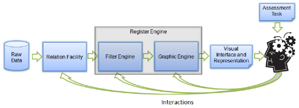
The Relation Facility component enables managing (e.g. loading, discarding) any relation of interest in a R workspace. Relations must be first extracted from source databases as a formatted file to avoid interference in their operations and to provide a static data state for quality assessment. provides different separators and quotes settings to load a formatted file. This operation keeps all original data values untouchable, but it executes certain structural checks (e.g., each line complies with file’s header) and adjusts (e.g., convert numerical attribute into character when one of its value is not numerical).
The Filter Engine selects data of interest according to multiple search criteria or pointing visual items. The multiple criteria denote a set of keywords for categorical attributes or range of values for quantitative attributes. The Graphic Engine builds visual representations based on visualization technique, data characteristics and interactions parameters defined at visual interface. This component can handle all data or selected data regions according to Filter Engine definition. The Register Engine logs automatically all session interactions and their corresponding parameters. It is also in charge of taking visual representation shots when required by a data quality appraiser.
implementation provides a rich set of visualization techniques displayed on independent visual scenes. Each scene allows certain interactions (e.g, geometric zooming, ordering, filtering, attribute arrangement, occlusion reduction) according to the visualization technique characteristics. Moreover, this implementation applies a segmented and unsegmented color scales (based on Hue, Saturation, Lightness model) to ensure value distinctions on dense data spaces and quantitative data isomorphism, respectively.
4 Data Quality Visual Assessment through Vis4DD
4.1 Walk-Through
system starts working by loading the last saved R workspace and setting global parameters. In case of an empty workspace, all visualization techniques remain unavailable until the presence of any relation.
In the early stage of data quality assessment, data quality appraisers may obtain an overall sense of all data and their patterns. They select an appropriate visualization technique to expose all data of a relation of interest. They proceed providing the corresponding target and reference attributes, and may also change default parameters of any interaction. For instance, some data quality appraiser may expose categories in different panels through trellis (e.g., Figure 2a). At the end of this setting procedure, data quality appraisers request the generation of the corresponding visual representation.
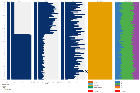
Interactions help data quality appraisers arrange data for comparison and correlation until they can isolate data regions potentially defective. In this stage, filtering and geometric zooming permit an easy and continuous refinement of data regions that are object of quality analysis. In case of strong suspicious, data quality appraisers can mark the defective data items (e.g., Figure 2b) and save the current visual representation. Otherwise, they can return to overall data view (by resetting interactions parameters) and recommences their analysis transitions until confirm or refute the presence of a data defect. At any time, a different visualization technique may be selected reusing the parameters already chosen.
4.2 Case Study Summary
Our exploratory case study used to identify a set of relationships that exposes visual-interactive properties that permit visual assessment of different data defects. One of these data defects (atypical tuple) is outlined in this section. For a depth discussion of all data defects, refer to [Borovina Josko and Ferreira 2017, Borovina Josko 2016].
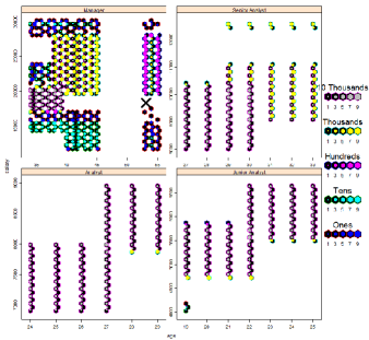
An atypical tuple deviates from the behavior of the remaining tuples of a relation for different reasons [Borovina Josko et al. 2016]. Our case study considered four atypical variants. The and variants denote and of defective values in an attribute, respectively. Most visual representations permitted their assessment, but position-based visualizations were outstanding. They made easy to perceive the structures of both variants, as the atypical “manager salary” indicated in Figure 2a.
Position-based visualizations were also the best option to assess atypical value variant, although they required more interaction actions (e.g., filtering and point displacement). Such variant denotes atypical values interposed among data categories with certain superimposition.
The last variant () denotes unusual combination of values considering multiples attributes. Due to its characteristics, only multidimensional visualizations permitted partial detection of atypical cases through intensive use of filter and zooming interactions. Figure 2b illustrates a variant case involving “years”, “salary” and “age” attributes.
5 Related Works
Knowledge concerning the design of visualization systems is encoded in different perspectives and depth levels. Due to the huge literature and space restrictions, this work only introduces implementation papers. For a broad discussion of such literature and its limitations in regard to data quality visual assessment, refer to [Borovina Josko and Ferreira 2017, Borovina Josko 2016].
Most implementation literature describes visualization systems based on Quality-Aware approach to support Data Quality Assessment [Chen 2015, Kandel et al. 2012]. Such approach optimizes visualization techniques to communicate data quality metrics (extracted by computational resources) about a particular data defect. This sort of communication is useful for those data defects that require low-moderate human supervision (e.g., Domain Constraint Violation [Borovina Josko et al. 2016]) or are visually imperceptible.
However, these optimized visualizations do not consider visual properties according to data defect structure being assessed. Hence, this nonalignment obstructs extraction and comprehension of its meanings due to the distraction effect [Ware 2004].
On the other hand, few literature describes visualization systems that support extensive use of visual exploratory analysis of meanings to determine defective data [Tennekes et al. 2013, Führing and Naumann 2007]. The supervised nature of this visual approach (named Visual Diagnosis-Driven) is basis for those defects whose analysis strongly depends on human supervision and contributions from computational resources (when available) are restricted. However, it is unclear if and how these aforementioned systems considered data defect structures, visual assessment tasks or backing of data quality experts to guide their design choices. Our analysis revealed a lack of proper alignment between chosen visual-interactive properties and data defects intended of assessment.
6 Conclusions
This work reports the design approach and components of visualization system that supports quality visual assessment on abstract data. Its characteristics enabled the analysis of which and how different visual-interactive properties facilitated (or not) the perception and comprehension of meanings in regard to data defect structures that requires high level of human supervision. Nevertheless, neither addresses multiple coordinated views nor offers computational approaches (e.g. data mining methods) for data defects without visual evidence. As future works, it is intended to provide features to associate quality assessment outcomes to data (annotation), extract data straight from relational databases and apply creativity techniques to a broader range of data quality analysts to stimulate new ideas.
7 Acknowledgments
This work has been supported by CNPq (Brazilian National Research Council) grant number 141647/2011-6 and FAPESP (São Paulo State Research Foundation) grant number 2015/01587-0.
References
- [Borovina Josko 2016] Borovina Josko, J. M. (2016). Uso de propriedades visuais-interativas na avaliação da qualidade de dados. PhD thesis, Universidade de São Paulo.
- [Borovina Josko and Ferreira 2017] Borovina Josko, J. M. and Ferreira, J. E. (2017). Visualization properties for data quality visual assessment: An exploratory case study. Information Visualization, 16(2):93–112.
- [Borovina Josko et al. 2016] Borovina Josko, J. M., Oikawa, M. K., and Ferreira, J. E. (2016). A formal taxonomy to improve data defect description. In Gao, H., Kim, J., and Sakurai, Y., editors, Database Systems for Advanced Applications: DASFAA 2016 International Workshops: BDMS, BDQM, MoI, and SeCoP, Dallas, TX, USA, April 16-19, 2016, Proceedings, pages 307–320, Cham. Springer International Publishing.
- [Chen 2015] Chen, C. (2015). A system to support clerical review, correction and confirmation assertions in entity identity information management. PhD thesis, University of Arkansas at Little Rock.
- [Dasu 2013] Dasu, T. (2013). Data glitches: Monsters in your data. In Handbook of Data Quality, pages 163–178. Springer.
- [Führing and Naumann 2007] Führing, P. and Naumann, F. (2007). Emergent data quality annotation and visualization. In Proceedings of the International Conference on Information Quality (ICIQ07), pages 424–430, Cambridge, MA, USA.
- [Kandel et al. 2012] Kandel, S., Parikh, R., Paepcke, A., Hellerstein, J. M., and Heer, J. (2012). Profiler: integrated statistical analysis and visualization for data quality assessment. In Proceedings of the International Working Conference on Advanced Visual Interfaces, AVI ’12, pages 547–554, New York, NY, USA. ACM.
- [Marghescu 2007] Marghescu, D. (2007). User evaluation of multidimensional data visualization techniques for financial benchmarking. In Proceedings of the European Conference on Information Management and Evaluation, pages 341–356. Academic Conferences Limited.
- [Tennekes et al. 2013] Tennekes, M., de Jonge, E., Daas, P. J., and Netherlands, S. (2013). Visualizing and inspecting large datasets with tableplots. Journal of Data Science, 11(1):43–58.
- [Ware 2004] Ware, C. (2004). Information Visualization: Perception for Design. Morgan Kaufmann Publishers Inc., San Francisco, CA, USA.