1014 \vgtccategoryResearch \authorfooter Marco Cavallo is with IBM Research. E-mail: mcavall@us.ibm.com. Çağatay Demiralp is with MIT CSAIL & Fitnescity Labs. E-mail: cagatay@csail.mit.edu. \shortauthortitleMarco Cavallo and Çağatay Demiralp: Clustrophile 2
Clustrophile 2: Guided Visual Clustering Analysis
Abstract
Data clustering is a common unsupervised learning method frequently used in exploratory data analysis. However, identifying relevant structures in unlabeled, high-dimensional data is nontrivial, requiring iterative experimentation with clustering parameters as well as data features and instances. The number of possible clusterings for a typical dataset is vast, and navigating in this vast space is also challenging. The absence of ground-truth labels makes it impossible to define an optimal solution, thus requiring user judgment to establish what can be considered a satisfiable clustering result. Data scientists need adequate interactive tools to effectively explore and navigate the large clustering space so as to improve the effectiveness of exploratory clustering analysis. We introduce Clustrophile 2, a new interactive tool for guided clustering analysis. Clustrophile 2 guides users in clustering-based exploratory analysis, adapts user feedback to improve user guidance, facilitates the interpretation of clusters, and helps quickly reason about differences between clusterings. To this end, Clustrophile 2 contributes a novel feature, the Clustering Tour, to help users choose clustering parameters and assess the quality of different clustering results in relation to current analysis goals and user expectations. We evaluate Clustrophile 2 through a user study with 12 data scientists, who used our tool to explore and interpret sub-cohorts in a dataset of Parkinson’s disease patients. Results suggest that Clustrophile 2 improves the speed and effectiveness of exploratory clustering analysis for both experts and non-experts.
keywords:
Clustering tour, Guided data analysis, Exploratory data analysis, Interactive clustering analysis, Interpretability, Explainability, Visual data exploration recommendation, Dimensionality reduction, What-if analysis, Clustrophile, Unsupervised learning.![[Uncaptioned image]](/html/1804.03048/assets/figures/interface_letters.png)
Clustrophile 2 is an interactive tool for guided exploratory clustering analysis. Its interface includes two collapsible sidebars (a, e) and a main view where users can perform operations on the data. Clustrophile 2 tightly couples b) a dynamic data table that supports a rich set of filtering interactions and statistics and c) multiple resizable Clustering Views, which can be used to work simultaneously on different clustering instances. Each Clustering View provides several ways to guide users during their analysis, such as d) the Clustering Tour. \vgtcinsertpkg
Introduction
The success of exploratory data analysis (EDA) depends on the discovery of patterned relations and structures among data instances and attributes. Clustering is a popular unsupervised learning method [14] used by analysts during EDA to discover structures in data. By automatically dividing data into subsets based on a measure of similarity, clustering algorithms provide a powerful means to explore structures and variations in data. However, there is currently no single systematic way of performing exploratory clustering analysis: data scientists iteratively combine clustering algorithms with different data-transformation techniques such as data preprocessing, feature selection and dimensionality reduction, and experiment with a large number of parameters. This is an iterative process of trial and error based on recurring formulation and validation of assumptions about the data. Data scientists make multiple decisions in determining what constitutes a cluster, including which clustering algorithm and similarity measure to use, which samples and features (dimensions) to include, and what granularity (e.g., number of clusters) to look for.
The space of clusterings determined by different choices of algorithms, parameters, and data samples and attributes is vast. The sheer size of this exploration space is the first challenge in exploratory clustering analysis. Data scientists need tools that facilitate iterative, rapid exploration of the space of data clusterings. The second important challenge is how to efficiently navigate this large space, rather than mere ad-hoc wandering. Therefore, clustering tools would benefit from incorporating techniques that guide users, imposing a structure over the clustering space that leads to efficient navigation. Clustering is unsupervised by definition and we consider here the most common case of complete absence of labels for validation (sometimes referred to as “fully unsupervised clustering”). If formal validation is not possible, how do we estimate the meaningfulness of the outcome of a clustering algorithm? Using the concepts of cluster compactness (closeness of data points within the same cluster) and separation (how far a cluster is from others), different internal validation measures have been introduced to estimate the “goodness” of a clustering and compare it to other clustering results. Though widely used, these metrics fail to incorporate the context of the analysis and the user’s goals, prior knowledge, and expectations, which often have significant role in determining the meaningfulness of a clustering result. Each internal validation metric takes into account slightly different data characteristics and should be carefully chosen based on the clustering task [22]. There is indeed no absolute best criterion that, independently of the data and the underlying task, can establish the best result for the user’s needs.
To address these challenges, we introduce Clustrophile 2, a new interactive tool for guided clustering analysis. Clustrophile 2 guides users in clustering-based exploratory analysis, adapts user feedback to improve user guidance, facilitates the interpretation of clusters, and helps reason quickly about differences between clusterings. To this end, Clustrophile 2 contributes a novel feature, the Clustering Tour, to help users choose clustering parameters and reason about the quality of different clustering results according to user’s analysis goals and expectations. We evaluate Clustrophile 2 through a user study with 12 data scientists of varying skill sets who used our tool to explore and interpret sub-cohorts in a dataset of Parkinson’s disease patients. We find that the Clustering Tour enables data scientists to utilize algorithms and parameters that they are unfamiliar with or hesitant to use. Similarly, the Clustering Tour helps data scientists avoid prematurely fixating on a particular set of data attributes or algorithmic parameters during exploratory analysis. In addition to the Parkinson dataset analyzed in the evaluation study, we use the OECD Better Life (OECD for short) dataset [28] to demonstrate the use of our tool in figures throughout the paper. The OECD dataset consists of eight numerical socioeconomic development indices of 34 OECD member countries.
Below we first summarize related work and then discuss our design criteria for Clustrophile 2. We then present the user interface of Clustrophile 2 along with integrated visualizations and interactions, operationalizing the design criteria presented. Then we introduce the Clustering Tour and the underlying graph model. Next we present a qualitative user study conducted with 12 data scientists, followed by an in-depth discussion of the study results. We conclude by summarizing our contributions and reflecting on lessons learned.
1 Related Work
Clustrophile 2 draws from prior work on interactive systems for visual clustering analysis and guided exploratory data analysis.
1.1 Tools for Visual Clustering Analysis
Prior research applies visualization to improve user understanding of clustering results across domains. Using coordinated visualizations with drill-down/up capabilities is a typical approach in prior interactive tools. The Hierarchical Clustering Explorer (HCE) [34] is an early and comprehensive example of interactive visualization tools for exploring clusterings. HCE supports the exploration of hierarchical clusterings of gene expression datasets through dendrograms (hierarchical clustering trees) stacked up with heatmap visualizations.
Earlier research has also introduced clustering comparison techniques in interactive systems [20, 5, 23, 29, 34]. DICON [5] encodes statistical properties of clustering instances as icons and embeds them in a 2D plane through multidimensional scaling. Pilhofer et al. [29] propose a method for reordering categorical variables to align with each other, thus augmenting the visual comparison of clusterings. Others have proposed similar visual encoding techniques for comparing different clusterings of data dimensions with applications to gene expression datasets in mind. To that end, HCE [34], CComViz [46], Matchmaker[20], StratomeX [21] and XCluSim [23] all encode changes across clusterings of dimensions essentially by tracing them with bundled lines or ribbons.
Researchers have also proposed tools that incorporate user feedback into clustering. Matchmaker [20] builds on techniques from [34] with the ability to modify clusterings by grouping data dimensions. ClusterSculptor [27] and Cluster Sculptor [4] enable users to supervise clustering processes. Schreck et al. [33] propose using user feedback to bootstrap the similarity evaluation in data space (trajectories, in this case) and then apply the clustering algorithm. FURBY[37] lets users refine or improve fuzzy clusterings by choosing a threshold, transforming fuzzy clusters into discrete ones. Sacha et al. [32] introduce a system for crime analysis where users can iteratively assign desired weights to data dimensions.
ClustVis [26] uses both PCA and clustering heatmaps but in isolation without interaction or coordination. Clustrophile [6] coordinates heatmap visualizations of discrete clusterings with scatterplot visualizations of dimensionality reductions. It also enables correlation analysis and ANOVA-based significance along with what-if analysis through direct manipulation on dimensionality reduction scatterplots. Akin to Clustrophile, ClusterVision [19] incorporates significance testing and couples clustering visualizations with dimensionality reduction scatterplots. Clustrophile 2 extends Clustrophile with 1) new features to guide users in clustering analysis, including the Clustering Tour, 2) a new task-driven approach to improve cluster interpretation, and 3) broader and deeper support for visual and statistical analysis, enabling the validation of multiple clustering instances at a time.
1.2 Guiding Users in Exploratory Data Analysis
Earlier work in data analysis propose various tools and techniques to guide users in exploring low-dimensional projections of data. For example, PRIM-9 (Picturing, Rotation, Isolation, and Masking—in up to 9 dimensions) [9] enables the user to interactively rotate multivariate data and view a continuously updated two-dimensional projection of the data. To guide users in this process, Friedman and Tukey [10] first propose the projection index, a measure for quantifying the “usefulness” of a given projection plane (or line), and then an optimization method, projection pursuit, to find a projection direction that maximizes the projection index value. The proposed index considers projections that result in a large spread with high local density to be useful (e.g., highly separated clusters). In a complementary approach, Asimov introduces the grand tour, a method for viewing multidimensional data via orthogonal projections onto a sequence of two-dimensional planes [2]. Asimov considers a set of criteria such as density, continuity, and uniformity to select a sequence of projection planes from all possible projection planes. Hullman et al. [15] study how to generate visualization sequences for narrative visualization, modeling the sequence space with a directed graph. Similar to Hullman et al., Clustrophile 2 also models the visual exploration space as a graph. However, Clustrophile 2 uses an undirected graph model and focuses on modeling the clustering state space. GraphScape [17] extends Hullman et al. with a transition cost function defined between visualization specifications. While GraphScape purely considers chart specifications without taking data or user preferences into consideration, Clustrophile 2 transitions consider data, clustering parameters, and user preferences.
Visualization recommender systems also model the visual exploration space and evaluate various measures over the space to decide what to present the user. For instance, Rank-by-Feature [35], AutoVis [43], Voyager [44], SeeDB [41], and Foresight [7] use statistical features and perceptual effectiveness to structure the presentation of possible visualizations of data. Clustrophile 2 also provides methods for enumeration and ranking of visual explorations. However, while recommendation systems typically focus on suggesting individual charts based on attributes, Clustrophile 2 uses the Clustering Tour to focus on clusterings and their visualizations, complementing existing recommender systems. SOMFlow [32] enables iterative clustering together with self-organizing maps (SOMs) to analyze time series data. To guide users, SOMFlow also uses clustering quality metrics. Clustrophile 2 goes beyond the use of quality metrics, considering user feedback, clustering parameters, and data features along with interpretable explanations to guide users.
2 Design Criteria
We identify a set of high-level design criteria to be considered in developing systems for interactive clustering analysis. These criteria extend the ones proposed in [6] and are based on the regular feedback we received from data scientists during the development of Clustrophile and Clustrophile 2.
D1: Show variation within clusters Clustering is useful for grouping data points based on similarity, thus enabling users to discover salient structures. The output of clustering algorithms generally consists of a finite set of labels (clusters) to which each data point belongs. In fuzzy clustering, the output is the probability of belonging to one of those classes. However, in both cases the user receives little or no information about the differences among data points in the same cluster. Clustrophile 2 combines complementary visualizations of the data—table, scatterplots, matrix diagrams, distribution plots—to facilitate the exploration of data points at different levels of granularity. In particular, scatterplots represent dimensionally reduced data and thus provide a continuous spatial view of similarities among high-dimensional data points.
D2: Allow quick iteration over parameters The outcome of a clustering task is highly dependent on a set of parameters: some of them may be chosen based on the type of data or the application domain, others are often unknown a priori and require iterative experimentation to refine. Clustrophile 2 enables users to interactively update and apply clustering and projection algorithms and parameters at any point while staying in the context of their analysis session.
D3: Promote multiscale exploration The ability to interactively filter, drill down/up, and access details on-demand is essential for effective data exploration. Clustrophile 2 enables users to drill down into individual clusters to identify subclusters as well as inspect individual data points within clusters. Clustrophile 2 lets users view statistical summaries for each cluster and perform “isolation” [10], which enables splitting clusters characterized by mild features into more significant subclusters. Dynamic filtering and selection of single data points are also implemented and coupled with statistical analysis to identify and eventually remove outliers and skewed distributions in the data.
D4: Represent clustering instances compactly It is important for users to be able to examine different clustering instances fluidly and independently without visual clutter or cognitive overload. The Clustrophile 2 interface employs the “Clustering View” element as the atomic component representing a clustering instance, the outcome of a clustering algorithm using a choice of parameters and data features and samples. Clustering View pairs a projection scatterplot and a clustering heatmap using two complementary visualizations. A compact, self-descriptive representation is also useful for visually comparing different clustering instances. Clustrophile 2 lets users work simultaneously on multiple Clustering Views, which can be freely organized by users across the interface and help them keep track of how different choices of features, algorithms and distance measures affect clustering results.
D5: Facilitate interpretable naming How to attach meaning to the “learned” structures in clustering is an important yet challenging problem. It is essential to facilitate the meaningful naming and description of clusters and clustering instances. For each cluster computed, Clustrophile 2 designates the cluster centroid as the cluster representative and assigns its identifier as the cluster name. Clustrophile 2 lets the user freely rename the cluster and its clustering instance according to her understanding of the data.
D6: Support reasoning about clusters and clustering instances Users often would like to know what features (dimensions) of the data points are important in determining a given clustering instance, or how different choices of features or distance measures might affect the clustering, or whether it is a “good” clustering. Users also would like to understand the characteristics of data points in a given cluster that distinguish the cluster from other clusters and how these data points come to be in the cluster. Clustrophile 2 dynamically chooses a combination of metrics based on data and user preferences in supporting clustering analysis. It also includes automated metric suggestions, visual explanations (e.g., decision-tree based cluster visualization), quantitative indicators (e.g., stability and confidence scores), and textual descriptions and hyperlinks to online references to help user better interpret results and make informed decisions, eschewing the blind use of clustering parameters and validation methods.
D7: Guide users in clustering analysis Due to the number of possible combinations, iterative experimentation on different clustering parameters can be non-trivial or time consuming, and becomes even more challenging in a high-dimensional dataset. Furthermore, most users do not know in detail the advantages and disadvantages of clustering or projection methods, sometimes choosing them blindly and simply trying all possible parameter combinations. It is thus important that the system provide assistance to the user in navigating complex clustering spaces, while incorporating the user’s feedback in the process. Clustrophile 2 provides textual explanations with suggestions on when it could be worth using certain parameters with references (hyperlinks) to existing literature. Clustrophile 2 also provides automated suggestions based on the dataset currently being analyzed, on previous computations and on user preferences. Clustrophile 2 introduces a novel feature, the Clustering Tour. The Clustering Tour recommends a sequence of clusterings based on clustering configuration choices, data features, and user feedback. It samples the clustering space, promoting coverage in the absence of user feedback. When the user “likes” a recommended clustering, Clustrophile 2 recommends “nearby” clusterings.
D8: Support analysis of large datasets The ability to interactively explore and analyze large datasets is important for analysts in many domains and has been a major request of our collaborators. Clustrophile 2 adopts caching, precomputation, sampling and feature selection to support analysis with larger datasets. Addressing computational scalability also helps mitigate the visual scalability issues. Clustrophile 2 also supports common interaction techniques such as panning & zooming and visual grouping with smooth convex-hull patches to reduce visual clutter.
D9: Support reproducibility One of the primary motivations for data analysts in using interactive tools is to increase productivity or save time. The iterative nature of a clustering analysis continuously forces users to try out different parameters and features, perform a set of computations, and decide which of the many directions to take next—making the analysis session extremely hard to reproduce. Clustrophile 2 logs each operation performed by users, enabling them to undo/redo single operations, to review the workflow of their analysis and to share it with their collaborators.
3 User Interface and Interactions
In this section we briefly describe the main components of the Clustrophile 2 interface and interactions. Clustrophile 2 has been developed iteratively according to the design considerations introduced in the previous section. We refer back to the relevant design criteria to motivate our design choices. The Clustrophile 2 interface consists of a main central view Fig. Clustrophile 2: Guided Visual Clustering Analysis, two collapsible sidebars (left Fig. Clustrophile 2: Guided Visual Clustering Analysis and right Fig. Clustrophile 2: Guided Visual Clustering Analysis) and multiple modal windows.
The left sidebar (or Navigation Panel) contains a button menu to import datasets from comma-separated-values (CSV) files, load data from previous analyses and export the results (i.e. clusters, chart images) of the current session. Clustrophile 2 supports saving the current state of the analysis (D9) for follow-up analysis and sharing it with contributors who are also listed in the Navigation Panel. The right sidebar (hidden by default) logs operations and parameter changes made by the user (Fig. Clustrophile 2: Guided Visual Clustering Analysise), enabling him to easily revert the analysis to a previous state (D9). A convenient list of the top pairwise feature correlations in the dataset is also displayed, facilitating a quick overview of statistical dependencies. The main view is subdivided into an upper region containing the Data Table (Fig. Clustrophile 2: Guided Visual Clustering Analysisb) and a lower region that displays one or more clustering views (Fig. Clustrophile 2: Guided Visual Clustering Analysisc,d). In fact, Clustrophile 2 enables data scientists to work simultaneously on multiple clustering instances (D4), but at the same time links the coordinated Data Table view to only one instance at a time. The currently selected clustering instance is generally the one the user last interacted with, and its corresponding Clustering View is marked with a blue header. The selected instance and its cluster names are also made available in the Navigation Panel (Fig. Clustrophile 2: Guided Visual Clustering Analysis).
3.1 Visualization Views
Clustering View A Clustering View (Fig. 1) represents a single clustering instance and has the goal of both visualizing the identified clusters and characterizing them based on their distinctive features. In our user interface, the Clustering View also lets the user dynamically change projection and clustering parameters for an associated clustering instance, and keeps them always visible for easier comparison with other Clustering Views.
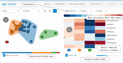
The minimal set of visualizations we choose to summarize a clustering instance consists of a scatterplot (Fig. 1, left) and a heatmap (Fig. 1, right). The scatterplot provides a two-dimensional projection of the data obtained using dimensionality reduction and encodes clustering assignments through color. Since clustering algorithms divide data into discrete groups based on similarity, projections are a natural way to represent different degrees of variation within and between groups as distance between elements (D1). Each cluster of points can also be identified by a colored convex hull, simplifying the visualization in cases with larger numbers of data points (D8).
The heatmap visualizes each cluster based on the aggregate feature values of the data points in the cluster. Each column of the matrix represents a cluster; rows represent data features (dimensions). The color of each cell encodes the average value of cluster members for a specific feature with respect to the feature distribution. For instance, in the heatmap in Fig. 1 the dark red cell indicates that the Red cluster is characterized by very high WorkingLongHours, whereas the dark blue cells indicate that the same cluster has very low EducationalAttainment and StudentSkills (i.e., red means higher values, blue lower values). This way, each cluster can be quickly described (D6) by observing the heatmap vertically (e.g. intense colors indicate the key features identifying a cluster, mild colors indicate average values); similarly, clusters can be compared by looking horizontally at the matrix diagram (e.g., from the second row of the heatmap, it is easy to see that the green cluster is the one with highest StudentSkills). By hovering on each cell, the user can inspect the average feature value of each cluster and the p-value associated with the current selection feature algorithm (which encodes the relevance of a feature). Clusters are ordered from largest to smallest and display their member number and color right beneath each column. Since with high-dimensional datasets (D8) the number of rows would become too large, we display only the top relevant features, which are chosen automatically by a feature selection algorithm (more on this later) or manually selected by the user.
Users can select one or more data points or clusters from both the scatterplot and the heatmap. When a selection is performed, it is reflected in both visualizations and the Data Table. The isolation feature further lets users re-cluster and re-project only the selected points, an operation particularly useful for finding subclusters (D3). From the Clustering View, users can dynamically change the parameters associated to the associated clustering instance. Currently supported clustering methods include K-means, Agglomerative (Hierarchical), Spectral [36], DBSCAN [8], Birch [45], Cure [12] and CLIQUE [1] algorithms that, as applicable, can be combined with ten different clustering metrics and three types of linkage strategies. Six types of projection methods are also available: PCA [39], MDS [18], CMDS [40], t-SNE [24], Isomap [38] and LLE [31]. Users can also define custom projection and clustering algorithms and metrics. We note that by default Clustrophile 2 applies dimensionality reduction and clustering in high-dimensional space, and then visualizes the results using, respectively, a scatterplot and a heatmap.
The user can control the number of displayed clusters through a slider located underneath the heatmap (Fig. 1). Different numbers of clusters are automatically precomputed by Clustrophile 2 based on user settings, so that the user can quickly change the number of clusters without waiting for further computations (D8). Another parameter that can be chosen from the clustering view is the sampling rate of the data; this is useful for doing clustering in the presence of larger datasets (D8).
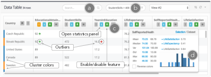
Data Table While the Clustering View provides a high-level summary of a clustering instance, it is fundamental for data scientists to be able to drill down in the data and inspect individual data samples (D3). The Data Table view gives the user the raw data, supporting statistical analysis, automatic outlier detection, selection, and filtering. These features in particular make it possible to reason about how single data points and feature distributions affect the current clustering, and help the user decide which dimensions should be considered or excluded by the clustering algorithm.
The Data Table (Figure Clustrophile 2: Guided Visual Clustering Analysisb) contains a dynamic table visualization of the current dataset in which each column represents a feature (dimension) and each row represents a data sample. The Data Table displays the data and cluster assignments associated only with the currently selected Clustering View. For each row, a vertical colored band encodes the cluster of membership of the associated data sample, whereas a set of green or red arrows respectively identify particularly high or low feature values (“outliers”) with respect to each feature distribution (Figure 2b). Clicking on the buttons next to each feature name orders rows by cluster or by column and displays basic statistics on a particular feature in a pop-up window (Figure 2d). In particular, Clustrophile 2 can compare the statistical values computed on the currently selected rows and those of the whole dataset, plus displaying a histogram plot of the feature distribution. A list of the features that correlate most to the selected feature is also given, allowing quick discovery of data trends. The search functionality (Figure 2a) lets users select data samples using an arbitrary keyword search on feature names and values. Users can also filter the table using expressions in a mini-language (Figure 2b). For example, typing dynamically selects data points across visualizations in which the fields age and weight satisfy the entered constraint. When some rows are selected, the corresponding points of the scatterplot and cluster columns in the heatmap in the current Clustering View are highlighted.

Cluster Details While the Data Table works well for inspecting single data points and feature distributions across the dataset, the Cluster Details modal (Fig. 3) aims at a deeper characterization of a specific cluster (D3). This modal can be opened by double-clicking on any cluster in the user interface and contains statistical information about the members of the cluster—such as most relevant features, top pairwise feature correlations and outliers. The user can use this view to assign a custom name to a cluster or to display the histogram for each feature distribution with respect to the cluster. An automatically generated cluster description containing suggestions for the analysis is also displayed.
3.2 Raising Awareness About Choosing Parameters
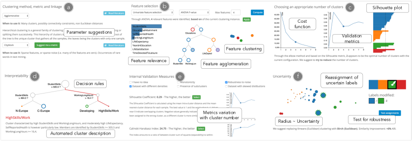
Given the high number of parameter combinations that may influence a clustering outcome, it is important to guide users towards a reasonable choice of parameters in the context of the current analysis. From each Clustering View, the user can access a “Help me decide” panel containing a tab dedicated to each parameter (D7).
Feature selection The choice of which features of the original dataset to feed to the clustering algorithm can strongly influence both the performance and the quality of clustering results. To help the user understand if and which data dimensions should be included in the analysis, Clustrophile 2 provides a list of the most relevant data dimensions according to several feature-selection algorithms useful in removing features with low variance or high pairwise correlation (e.g. variance threshold, feature agglomeration, random projection) and in filtering out noisy or uninfluential features (e.g. univariate feature selection based on chi-squared or ANOVA f-value, and recursive feature elimination [13]). Clustrophile 2 also introduces a hierarchical clustering of the dataset’s features (Fig. 4b), displaying, through a scatterplot and a dendrogram, how data dimensions can be grouped together based on similarity (feature agglomeration).
Sampling In presence of larger datasets (more than 10,000 data samples) Clustrophile 2 suggests that the user perform clustering only after sampling the original data, in order to speed up the computation during the initial data exploration phase. Since the analysis is unsupervised, the user can only either change the percentage of random sampling, or disable sampling when he wants to validate his findings on the whole dataset.
Clustering algorithm, metric and linkage For each possible choice of clustering parameters, Clustrophile 2 provides a textual description with theoretical advantages/drawbacks and use cases for each method (Fig. 4a). For instance, users can learn that Kmeans is not suited in the presence of uneven cluster sizes and non-flat geometries, or that the Cityblock affinity can outperform Euclidean distances in cases with sparse data. For clustering metrics and linkage criteria, Clustrophile 2 can suggest to the user which parameters to use by testing them asynchronously and picking the one that generates the best cluster separation. Hyperlinks to related literature are also included.
Number of clusters Clustering algorithms do not generally output a unique number of clusters, since this is generally a user-defined parameter. By generalizing the idea of the “elbow plot” for the K-means cost function, Clustrophile 2 precomputes a range of clustering solutions, each with a different number of clusters in a user-defined range, and compares them in a line chart (Fig. 4c). In particular, the horizontal axis corresponds to the number of clusters and the vertical axis represents the value of one of the internal validation measures. Based on the metric formulation, the optimal number of clusters is given by the maximum, minimum or elbow value of the line chart [22]. When applicable, Clustrophile 2 complements the line chart with a clustering-algorithm-specific plot (e.g., a dendrogram for hierarchical clustering). A silhouette plot [30] is also included (Fig. 4c, right), providing more detailed information on which clusters should be merged and which data points are critical to determining the optimal cluster number.
Projection Although the dimensionality-reduction method used to visualize the scatterplot does not influence clustering results, it may visually bias how a user perceives the quality of a given clustering instance. To handle this, Clustrophile 2 provides a description and a set of references for each projection method in addition to an automated suggestion. By precomputing each projection, our tool applies to dimensionally reduced data the same internal evaluation metrics used for clustering and suggests a projection algorithm that optimizes cluster compactness and separation in the scatterplot.
3.3 Guiding Users Towards a Better Clustering
Once clustering parameters are chosen, the next step is assessing the quality of a clustering outcome. In the panel “Is this a good clustering?”, Clustrophile 2 aims at helping the user reason about the absolute and relative “satisfactoriness” of the results (D6).
Quantitative validation Since no ground truth labels are available, internal validation measures are the only objective numerical values for assessing the goodness of a clustering instance and comparing it to other instances. Instead of adopting only one metric, Clustrophile 2 acknowledges the pros and cons of each measure and tries to help the user choose the measure that better fits the data and requirements. Using Liu et al.’s work [22], we associate the performance of each validation metric with a set of five conditions: presence of skewed distributions, subclusters and different cluster densities; robustness of the algorithm to noise; and monotonicity of the measure’s cost function. While the first three can be automatically inferred from the data, the last two are dictated by user preferences. For instance, using Silhouette in the presence of subclusters or using Calinski-Harabasz with noisy data could lead the user to a non-optimal cluster choice. On top of briefly describing each measure, Clustrophile 2 filters measures dynamically, showing only those that match the user’s interests and displaying how their values change based on the number of clusters (Fig. 4e).
Interpretability We believe that, in addition to a quantitative evaluation, a qualitative analysis of the clustering results is fundamental in understanding if the user’s goal has been reached. Even if the user is exploring the data freely, it is important to interpret each cluster in relation to its features. To this end, we apply decision trees [3], in combination with cluster average feature values, as an approximate and generalizable solution for cluster interpretability. Once a clustering result is obtained, we use its clustering assignments as ground-truth labels to train a decision-tree classifier, whose decision rules are then displayed in a tree diagram (Fig. 4d). By interactively exploring the decision tree, the user can reason about the main features used to distinguish data points in different clusters. By combining decision tree paths and the information presented in the Clustering View’s heatmap, Clustrophile 2 also provides a textual description of each identified cluster.
Uncertainty Most clustering algorithms output discrete classes of objects: either a data point belongs to cluster or it belongs to cluster . However, as can be seen in the Clustering View scatterplot, the position of some “outlier” data points may suggest a forced clustering assignment. Small differences in clustering parameters can easily cause uncertain data points to change their cluster assignment, unbalancing the size of the clusters involved and sometimes hiding some of their distinctive features. For this reason we believe that being aware of low-confidence clustering assignments is important, and we propose a dedicated panel where these critical points are displayed through a variation of the Clustering View scatterplot (Fig. 4f). When fuzzy clustering confidence values are not available, we use the distribution of per-point silhouette scores to determine which data points are uncertain. In particular, here we let users reassign class for these points and find the combination of parameters that produces the cluster assignment closest to the their expectations. This is currently done by applying all combinations of clustering algorithms and metrics and by ranking the outcomes based on their Adjusted Mutual Information score [42].
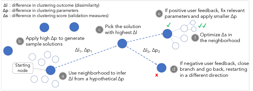
4 Clustering Tour
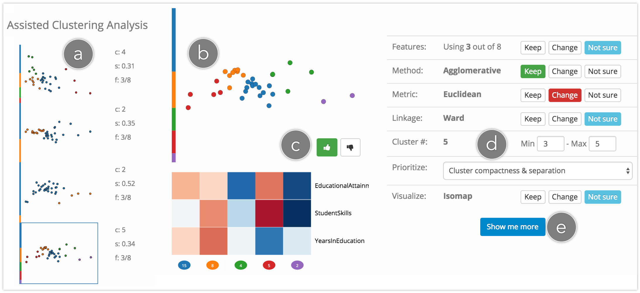
By iteratively changing all clustering parameters, a user can dynamically explore the space of possible clustering solutions until a satisfactory solution or set of insights on the data is found. However, even with guidance in parameter choice, the space of possible parameter combinations and clustering solutions is too large to explore manually. There are certain parameter choices that affect the clustering outcome more than others. Overall, it is useful to let users first explore the parameter choices determining solutions that are very different from each other, metaphorically making large leaps across the space of possible clusterings to enable a quick tour of the data. If the user likes a solution and wants to refine it, then other parameter choices can be made to explore solutions similar to the selected one. With this concept in mind, we introduce a Clustering Tour feature to help the user quickly explore the space of possible clustering outcomes. The interface shown in Fig. 5 contains (a) a list of previously explored solutions, (b) a scatterplot and a heatmap representing the current solution, (c) a set of buttons for the user to give feedback, and (d) a choice of modalities by which the user can constrain how parameters are updated.
4.1 Navigating the Clustering Solution Space
Clustering descriptors To determine which clustering solutions (instances) to recommend to the user, our algorithm considers three clustering descriptors: parameters, labels, and score. Each combination of parameters (including input features, clustering algorithm, similarity measure and cluster number) generates a clustering outcome, which consists of an array of assigned class labels . Through a linear combination of existing internal clustering validation measures, we assign a score for a given clustering instance. If we change some of the clustering parameters by a hypothetical amount , we obtain a second clustering solution whose class assignments differ from the previous ones by and whose score differs by . , which we compute as (Adjusted Mutual Information score [42]), aims to encode how much the two clustering instances (solutions) are semantically different from each other. is instead an indicator of how much the second outcome generates clusters that are more compact and better separated.
The graph model We model the space of possible clustering solutions as an undirected graph, where each solution is a node (Fig. 6). Since we want to prioritize first the exploration of clusterings that have different outcomes (i.e., prioritizing coverage), we set the distance between two nodes to be , so that solutions with similar clustering assignments lie close to each other in the graph. Each edge between two nodes is also associated with the difference in parameters and score between the nodes.
Bootstrap We consider the active clustering instance in the Clustering View to be the entry node of the graph. From here, we want to apply a set of parameter changes that would generate a significant modification in cluster assignments. Since computing the full graph is not feasible, our strategy consists of sampling a set of nodes that are distant from the current one by inferring from a hypothetical . In other words, we want to roughly estimate which parameter changes will create the largest modification in cluster assignments. To achieve this, we assign a weight to each clustering parameter and compute a numerical representation of as , where is the amount of change for parameter (e.g., difference in number of clusters; defaults to one for changes in algorithm). Weights are asynchronously estimated based on the average produced by separately applying a randomized subset of the admissible values for each parameter to the current clustering. For instance, if modifying the number of clusters in the current solution produces on average a higher than changing the clustering metric, cluster number will have a higher weight in determining .
Updating parameters Once parameter weights are computed, we sample a set of possible by prioritizing changes in parameters with higher weight. In the absence of user-specified constraints, a set of alternative values for each parameter is picked through random sampling and, among the generated solutions, the one producing the highest is chosen. We select the data features (dimensions) to be considered for clustering by cyclically applying the feature selection methods described in Section 4.2 and selecting the features with highest relevance and/or lowest pairwise correlation. At the same time, we randomly exclude from the analysis features ranked highly relevant to prevent single features from biasing the clustering result. Once a clustering suggestion is established, we perform a subset of the dimensionality reduction methods in Section 4.1 and apply clustering validation measures on their output to choose the one that best visualizes the separation among clusters.
User feedback Both the clustering result and the dimensionality reduction are shown to the user (Fig. 5), who can continue exploring different solutions by pressing the “Generate new solution” button. When the user is relatively satisfied with the current solution, he can press the “I like it” button to explore the neighborhood of the current node in the graph. In this situation high-weight parameters (often features and cluster number) tend to remain fixed, and lower-weight parameters (e.g., typically the clustering metric) are changed to produce slight variations in the clustering outcome (small ). Only at this stage validation measures are incorporated in generating clustering recommendations. Among the alternative solutions, now the one that generates the highest is chosen. If the user presses the “Very bad :(” button, the Clustering Tour goes back to the previous node of the graph and explores a different direction (i.e. tries to generate a solution with high from the disliked solution). At any point in the Clustering Tour, the user can constrain the variability of available parameters, deciding which ones should be fixed or changed and which ones should be decided by the algorithm. When the user is satisfied, he can decide to apply the identified parameters to the associated Clustering View.
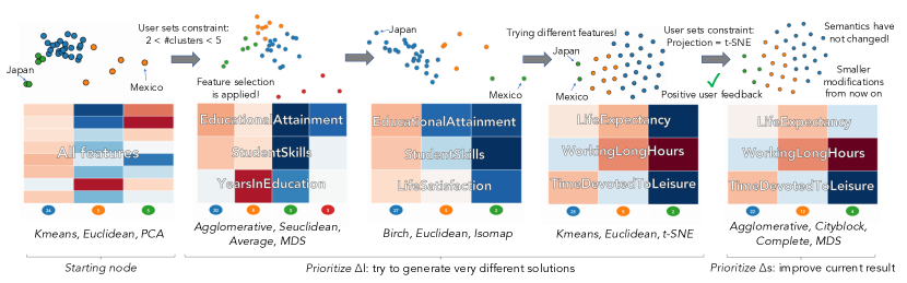
We illustrate in Fig. 7 a sample execution of the Clustering Tour on the OECD dataset, showing the results generated by the algorithm based on user feedback.
| Id | Archetype | Domain | Time | Isolation based on | Features | Feat. Selection | Algorithm | Metric | Projection | Clusters | Cluster Names | Validation | Tour | ||||
|---|---|---|---|---|---|---|---|---|---|---|---|---|---|---|---|---|---|
| 1 | Hacker | No | 69m | - | 17 | Custom | Agglomerative (Complete) | Euclidean | Isomap | 5 |
|
SDbw | No | ||||
| 2 | Hacker | No | 51m | Disease severity | 16 | Custom | Agglomerative (Average) | Cityblock | MDS | 5 |
|
Silhouette | No | ||||
| 3 | Hacker | Yes | 55m | - | 32 | Custom | Kmeans | Euclidean | t-SNE | 4 |
|
SDbw | No | ||||
| 4 | Hacker | Yes | 46m |
|
33 | Custom | CLIQUE | Euclidean | LLE | 3 | Bradykinesia, Tremor, Dyskinesia | - | Yes | ||||
| 5 | Scripter | No | 39m |
|
36 | ANOVA | Kmeans | Euclidean | PCA | 4 |
|
- | No | ||||
| 6 | Scripter | No | 40m | - | 15 | PCA | Birch | Euclidean | MDS | 5 | Mild, Rigid, Tremor, Posture & Gait, Extreme | - | Yes | ||||
| 7 | Scripter | Yes | 62m |
|
33 | PCA | Kmeans | Euclidean | PCA | 4 | Bradykinetic, Tremoring, Gait, Fine movements | - | No | ||||
| 8 | Scripter | Yes | 24m | Drug use | 13 | Custom | Kmeans | Euclidean | CMDS | 4 |
|
- | No | ||||
| 9 | Application user | No | 34m | - | 20 | Custom | Agglomerative (Ward) | Euclidean | t-SNE | 5 |
|
- | Yes | ||||
| 10 | Application user | No | 25m | - | 37 | - | Agglomerative (Complete) | Euclidean | PCA | 3 |
|
Silhouette | Yes | ||||
| 11 | Application user | Yes | 28m | Affected side | 34 | Custom | Kmeans | Euclidean | PCA | 3 | Rigidity, Bradykinesia, Tremor | - | No | ||||
| 12 | Application user | Yes | 27m | - | 37 | - | Agglomerative (Complete) | Euclidean | PCA | 5 |
|
- | No |
5 User Study
We conducted a study with twelve data scientists using Clustrophile 2 to answer an open analysis question about a real-world dataset. We had two goals: 1) understanding how data scientists might use the interactions, visualizations, and user-guidance features of our tool based on their level of expertise and prior knowledge of the data domain, 2) studying the overall workflows adopted by data scientists to arrive to a solution they consider satisfactory in an open-ended analysis task about a real-world dataset, where finding a solution is not guaranteed.
Data We chose a real-world dataset concerning subjects with Parkinson’s disease, in which there is not trivial solution to the clustering problem. The dataset has 8652 rows and 37 features, obtained after preprocessing a subset of the data made publicly available by the Parkinson’s Progression Markers Initiative (PPMI). The data contains records about human subjects associated with the Unified Parkinson’s Disease Rating Scale (UPDRS), which consists of a set of measures that describe the progression of an individual’s condition. The measures are evaluated by interview and clinical observation of human subjects by a clinician, and include symptoms such as rigidity of upper and lower limbs, leg agility, gait, spontaneity of movement, finger and toe tapping, tremor (see [11] for the full list of measures). While most features were UPDRS values ranging from 0 to 4, a few others indicated the overall progression of the disease (Hoen & Yahr stage), the use of medication (ON_OFF_DOSE) and the number of hours passed from when the subject took a drug (PD_MED_USE). Task Participants were asked to complete a single task: “Identify the different phenotypes characterizing Parkinson’s disease in the given dataset.” We defined “phenotypes” as the observable behaviors of a subject due to the interaction of the disease with the environment. We asked our participants to identify one clustering instance that they were satisfied with, assign a name and a description to each of its clusters, and finally explain verbally the significance of their obtained results.
Participants We recruited twelve participants who had worked as data scientists for at least two years. They all had at least a master’s degree in science or engineering. To recruit our participants, we first interviewed 16 candidates and then selected twelve by matching candidates with the three analyst archetypes [16], hackers, scripters, and application users, based on their expertise and domain knowledge. We ensured that we had four participants for each of the three analyst types. Note that hackers have solid scripting and programming skills in different languages, such as C++ and Python, and are capable of developing their own tools for data analysis; scripters are more familiar with scripting (e.g., using R, Matlab, etc.) than programming and generally have a robust background in Mathematics or Statistics; and application users conduct their analysis using spreadsheet applications such as Microsoft Excel or other off-the-shelf data analysis tools such as SAS and SPSS. For each of these three archetypes, we also made sure that we had two participants with domain expertise in Parkinson’s disease or neuroscience, and two participants with no prior knowledge about this data domain—for a total of six domain experts and six novices. Participants ranged from 28 to 47 years old, with an even gender distribution.
Procedure The study took place in the experimenter’s office, where one participant at a time used Clustrophile 2 on the experimenter’s laptop. Participants were first briefed on the study and then given a tutorial on Clustrophile 2 for about fifteen minutes, using the OECD dataset as sample data. After the tutorial, participants were introduced to the test dataset, and the experimenter explained the medical terminology found in feature names (e.g. “pronation-supination left hand”). Regardless of their knowledge of Parkinson’s disease, all participants were tasked with identifying groups of patients with different phenotypes in the dataset. Participants were given two hours to provide a “solution” with which they were satisfied. Using Clustrophile 2’s logging feature, we timestamped and recorded each operation performed by participants. During the analysis session, participants were asked to think aloud and comment on the reasons behind their choices, which we recorded using an audio recorder. Participants could conclude the session and stop the timer whenever they felt they had obtained a satisfactory result. At the end of the analysis session, participants were asked to verbally describe the clusters in their solution, based on insights derived from their analysis. They also completed a followup questionnaire, where they were asked to answer the following questions using free text: Q1) “Are you satisfied with the results or insights you obtained?”, Q2) “Would you be able to obtain a better result with another tool or your own coding skills?”, Q3) “Did naming clusters help you reason about their significance?”, and Q4) “Did Clustrophile 2 help you in deciding the clustering parameters?”.
5.1 Results
We summarize the results of our study in Table 1, reporting for each user their archetype and their expertise in the domain. The clusters identified by our participants are in line with recent work on phenotypes in Parkinson’s disease [11, 25]. Below we discuss the results of this user study in depth, where we use the notation P# to refer to participant number #, and refer back to our design criteria to validate our design choices. We also provide additional insights from the user study in Supplemental Material.
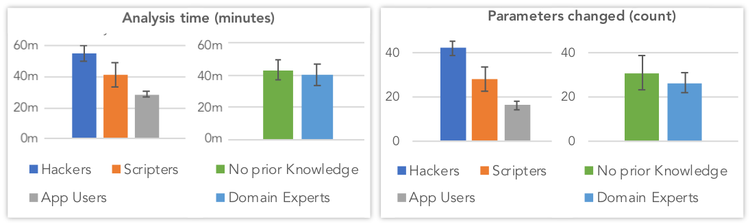
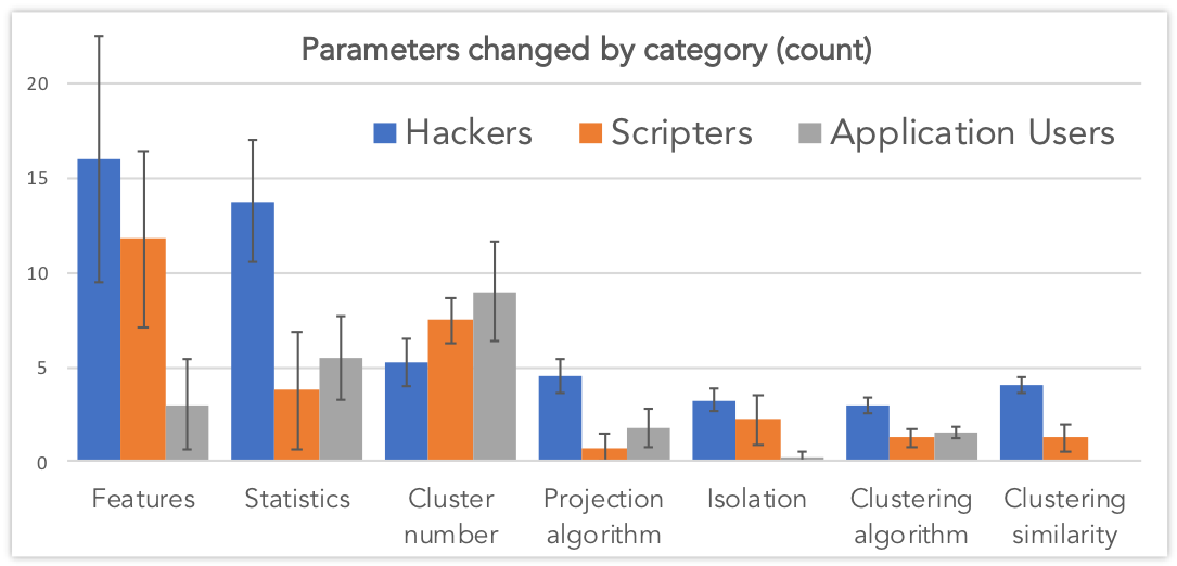
User Archetypes and Domain Knowledge Our study confirmed the relationship between the analyst types and attitude in performing data analysis [16]. For instance, Fig. 8 shows that, on average, hackers seem to invest more time trying out more parameter combinations than the other data analyst types. Similarly, expertise in the neuroscience domain suggests shorter analysis time, possibly due to better knowledge of the data features. In Fig. 9 we break down the interactive parameters changed by participants during their analysis sessions into sub-categories (e.g. how many times they enabled/disabled a feature, how many times they changed the number of clusters). We found that different archetypes tended to use the features available in Clustrophile 2 differently. Even the type of algorithms and methods used seem to be correlated to analyst archetypes, as shown in Table 1. Overall, participants’ answers to Q1 and Q2 demonstrate that Clustrophile 2 supports the analysis style characteristic to all types of data analysts.
Analysis Flow For all participants, the analysis started with a default Clustering View automatically applying PCA and Agglomerative clustering to the data. The first action performed by five out of twelve users was to select features of interest in the data, using either the Data table or the Help me decide panel. Most domain experts removed the non-UPDRS features directly from the Data table, whereas participants without prior knowledge often identified them through the Help me decide panel’s feature selection tab. Five other participants preferred instead to first try out different clustering algorithms and numbers of clusters, observing the resulting changes in the scatterplot and in the heatmap. These users generally later noticed the high influence of non-UPDRS features such as PD_MED_DOSE and Hoen & Yahr, primarily thanks to the heatmap visualization. Then they proceeded in a fashion similar to the domain experts, excluding these features from their subsequent analysis. Finally, two out of twelve users (P6 and P9) preferred to start their analysis with the Clustering Tour. In most cases, the analysis continued with an iterative and cyclic modification of clustering parameters and selected features, until participants realized that they could only find clustering outcomes based on affected side or severity of the disease. These clusters were easily interpreted from the heatmap visualization, which showed a horizontal gradient for increasing severity and an alternate pattern in rows corresponding to the left or right side of the patient’s body.
Here, some participants made stronger assumptions about the data and applied different strategies involving subclustering, filtering and feature selection (D3). In particular, P1, P3 and P9 decided to consider only the features associated with one part of the body in order to remove the separation in left and right side-affected subjects. Similarly, P5 and P11 decided instead to consider only people with one affected side at a time by performing subclustering. Other participants applied an equivalent strategy by filtering data points based on affected side and symptom severity, trying to find relevant insights in a smaller but more significant subset of the original data.
5.2 Discussion
The Importance of Feature Selection The first insight we identified based on the final clustering outcomes in Table 1 and the histogram in Fig. 9 was the relevance of feature selection in clustering analysis. More than any other parameter, the choice of features to feed to the clustering algorithm led users towards a satisfactory result, and at the same time was the part of the analysis participants spent most of their time on. In particular, participants used the feature distribution information available in the Data Table in combination with the statistical analysis methods available in the “Help me decide” panel (D7). Whereas domain experts were often able to spot uninteresting features based on their names (e.g., non-UPDRS features such as ON_OFF_STATE and PD_MED_USE) and directly remove them from the data table, participants with no prior knowledge about the domain made heavy use of principal component analysis (PCA) and univariate feature selection (e.g., ANOVA) to test the relevance of data dimensions. This allowed scripters in particular to quickly spot features that were contributing the most to the clustering outcome, and eventually remove them from the analysis. The hacker archetype often complemented these findings by inspecting the distribution values (e.g., variance) and pairwise correlations of each feature from the Data Table. The application users seemed instead to prefer identifying relevant features and correlations from the horizontal color distribution of cells in the heatmap, expressing a more qualitative approach. After removing a first set of features, participants generally applied different clustering parameters until they realized a second round of feature selection was needed. Here the most used method was feature agglomeration, with which participants tried to agglomerate features based on correlation or semantics (e.g. removing features with high pairwise correlation, keeping only one feature out of four for tremor, keeping the feature with the highest variance for each left-right pair).
Clustering Tour: Exploring Different Perspectives While most participants preferred to adopt trusted parameters, the results in Table 1 show that the four participants who used the Clustering Tour were more eager to adopt less conventional algorithms and metrics, leaving their comfort zone (D7). “I only pushed a button and it already gave me insights I would probably not have found by trying out parameter combinations myself”, commented P9. P4, belonging to the hacker archetype, stated “I generally hate automated features that allow script kiddies to do result shopping (i.e., blindly use system-generated results). However, Clustrophile 2 gives me the possibility to decide myself if solutions are reasonable. I think it’s useful for thinking outside the box.” P9 started using the Clustering Tour in an unconstrained way, whereas the remaining participants started the tour after first setting the number of clusters desired and selecting a subset of the input features. The average number of solutions generated before a participant expressed positive feedback was 3.7, followed by an average of 2.3 iterations in the solution neighborhood. In particular, the Clustering Tour proved to be useful in removing non-relevant features and randomly “shuffling” data dimensions, generating new perspectives on the analysis. P6, for instance, performed his analysis without noticing the large bias introduced by the PD_MED_USE feature until a solution generated by the Clustering Tour excluded it from the analysis, showing a semantically different clustering result. Similarly, P9 realized he could agglomerate features associated with similar tasks after the Clustering Tour proposed a solution based on removing highly correlated features.
(In)Effectiveness of Validation Measures The results of our user study show that validation measures do not perform well in the presence of specific goal-oriented questions that go beyond pure exploration of the data. While most participants did not even consider the use of validation measures, four participants made use of the “’Help me decide” and the “Is this a good clustering?” panels to try to compare measures among different number of clusters and across clustering instances (D6). However, theoretical best cluster separation often suggested considering two or three clusters, less than what we would generally expect while searching for phenotypes. In most cases, changing clustering parameters according to validation measures generally produced clustering outcomes with a different and possibly less interesting semantic meaning. P12 commented “I think it makes more sense to see first if the clusters are interesting from the heatmap, and then simply check if they are not too overlapping in the scatterplot”. We believe validation measures are effective in comparing clustering results only when the latter are not too semantically different from each other (i.e. low ). In particular, we can use validation metrics to filter and rank the solutions automatically generated by our Clustering Tour after the user has expressed positive feedback (i.e. when most influential parameters have been fixed). Separately, we can also use them to select the best projection to visualize a clustering result.
Cluster Naming and Interpretability According to the answers to Q3, seven out of twelve participants stated that having to verbally describe and name clusters through the tool interface significantly helped them better reason about the clustering instance they found (D5). “I personally never did it, but giving a name to a cluster forces you to go beyond the superficial instinct of finding well separated groups. It often makes you realize you are not searching for the right things”, commented P5. Ten participants named their final clusters only by interpreting the colors of each column in the heatmap, whereas two of them complemented this information with the automated cluster descriptions in the “Is this a good clustering?” panel (D6). This proves that the heatmap visualization can be a powerful and self-descriptive yet simple way to semantically summarize clustering results. Likely related to this, and to the fact cluster members changed often during the analysis, only one participant used the cluster naming functionality before being required to provide the final clustering solution. Naming clusters automatically based on the centroid also did not generalize to this dataset, where data points were named based on the subject’s numerical identifier. The automatically generated textual descriptions for clusters that we introduced in this paper are not fit for systematically assigning short, meaningful names to clusters. However, a possible solution could be to generate cluster identifiers semi-automatically by incorporating user feedback on primary features of interest and how they are semantically related to each other.
6 Conclusion
We present Clustrophile 2, a new interactive tool that guides users in exploratory clustering analysis, adapts user feedback to improve user guidance, facilitates the interpretation of clusters, and helps quickly reason about differences between clusterings. Clustrophile 2 introduces the Clustering Tour to assist users in efficiently navigating the large space of possible clustering instances. We evaluate Clustrophile 2 through a user study with 12 data scientists in exploring clusters in a dataset of Parkinson’s disease patients.
Our work here confirms that clustering analysis is a nontrivial process, which requires iterative experimentation over different clustering parameters and algorithms as well as data attributes and instances. We find that, despite the fact that different users exhibit different attitudes towards exploratory analysis, feature selection is where they spend most of their effort. We also find precomputation to be essential for supporting interactive analysis. Fig. 9 shows, in fact, that dynamically changing the number of clusters was a frequent interaction performed by participants. Given the number of repeated operations, caching also proved to be essential. While the relevance of user assumptions and prior knowledge on the data further confirmed that clustering cannot be automated without incorporating these concerns, participants showed a tendency to stick to well-known parameter combinations or blindly attempted multiple combinations by trial and error. This is where the system can come into play and assist the user in making parameters more explainable or in comparing alternative choices through the support of statistical analysis. The Clustering Tour we introduce here demonstrates how to nudge users to think outside the box in exploratory clustering analysis, avoiding premature fixation on certain attributes or algorithmic and parametric choices.
Finally, the ability to compare clusterings through validation metrics does not necessarily improve the clustering interpretability. To this end, we urge the development of clustering tools that facilitate explainability, while keeping in mind that the usefulness of a clustering outcome mostly depends on the underlying data and user task.
References
- [1] R. Agrawal, J. Gehrke, D. Gunopulos, and P. Raghavan. Automatic subspace clustering of high dimensional data for data mining applications, vol. 27. ACM, 1998.
- [2] D. Asimov. The grand tour: a tool for viewing multidimensional data. SIAM journal on scientific and statistical computing, 6(1):128–143, 1985.
- [3] L. Breiman. Classification and regression trees. Routledge, 2017.
- [4] P. Bruneau, P. Pinheiro, B. Broeksema, and B. Otjacques. Cluster sculptor, an interactive visual clustering system. Neurocomputing, 150:627–644, 2015. doi: 10 . 1016/j . neucom . 2014 . 09 . 062
- [5] N. Cao, D. Gotz, J. Sun, and H. Qu. Dicon: Interactive visual analysis of multidimensional clusters. IEEE Transactions on Visualization and Computer Graphics, 17(12):2581–2590, Dec 2011.
- [6] Ç. Demiralp. Clustrophile: A tool for visual clustering analysis. In KDD IDEA, 2016.
- [7] Ç. Demiralp, P. J. Haas, S. Parthasarathy, and T. Pedapati. Foresight: Recommending visual insights. Proc. VLDB Endow., 10(12):1937–1940, 2017.
- [8] M. Ester, H.-P. Kriegel, J. Sander, X. Xu, et al. A density-based algorithm for discovering clusters in large spatial databases with noise. In KDD, vol. 96, pp. 226–231, 1996.
- [9] M. A. Fisherkeller, J. H. Friedman, and J. W. Tukey. Prim-9: An interactive multidimensional data display and analysis system. In Proc. Fourth International Congress for Stereology, 1974.
- [10] J. H. Friedman and J. W. Tukey. A projection pursuit algorithm for exploratory data analysis. IEEE Transactions on Computers, C-23(9):881–890, Sept 1974.
- [11] C. G. Goetz, B. C. Tilley, S. R. Shaftman, G. T. Stebbins, S. Fahn, P. Martinez-Martin, W. Poewe, C. Sampaio, M. B. Stern, R. Dodel, et al. Movement disorder society-sponsored revision of the unified parkinson’s disease rating scale (mds-updrs): Scale presentation and clinimetric testing results. Movement disorders, 23(15):2129–2170, 2008.
- [12] S. Guha, R. Rastogi, and K. Shim. Cure: an efficient clustering algorithm for large databases. In ACM Sigmod Record, vol. 27, pp. 73–84. ACM, 1998.
- [13] I. Guyon, J. Weston, S. Barnhill, and V. Vapnik. Gene selection for cancer classification using support vector machines. Machine learning, 46(1-3):389–422, 2002.
- [14] T. Hastie, R. Tibshirani, J. Friedman, and J. Franklin. The elements of statistical learning: data mining, inference and prediction. The Mathematical Intelligencer, 27(2):83–85, 2005.
- [15] J. Hullman, S. Drucker, N. H. Riche, B. Lee, D. Fisher, and E. Adar. A deeper understanding of sequence in narrative visualization. IEEE Transactions on Visualization and Computer Graphics, 19(12):2406–2415, 2013.
- [16] S. Kandel, A. Paepcke, J. M. Hellerstein, and J. Heer. Enterprise data analysis and visualization: An interview study. IEEE TVCG, 18(12):2917–2926, 2012.
- [17] Y. Kim, K. Wongsuphasawat, J. Hullman, and J. Heer. Graphscape: A model for automated reasoning about visualization similarity and sequencing. In ACM Human Factors in Computing Systems (CHI), 2017.
- [18] J. B. Kruskal. Multidimensional scaling by optimizing goodness of fit to a nonmetric hypothesis. Psychometrika, 29(1):1–27, mar 1964.
- [19] B. C. Kwon, B. Eysenbach, J. Verma, K. Ng, C. De Filippi, W. F. Stewart, and A. Perer. Clustervision: Visual supervision of unsupervised clustering. IEEE TVCG, 24(1):142–151, 2018.
- [20] A. Lex, M. Streit, C. Partl, K. Kashofer, and D. Schmalstieg. Comparative analysis of multidimensional, quantitative data. IEEE Trans. Visual. Comput. Graphics, 16(6):1027–1035, nov 2010. doi: 10 . 1109/tvcg . 2010 . 138
- [21] A. Lex, M. Streit, H.-J. Schulz, C. Partl, D. Schmalstieg, P. J. Park, and N. Gehlenborg. Stratomex: Visual analysis of large-scale heterogeneous genomics data for cancer subtype characterization. In Computer graphics forum, vol. 31, pp. 1175–1184. Wiley Online Library, 2012.
- [22] Y. Liu, Z. Li, H. Xiong, X. Gao, and J. Wu. Understanding of internal clustering validation measures. In Data Mining (ICDM), 2010 IEEE 10th International Conference on, pp. 911–916. IEEE, 2010.
- [23] S. L’Yi, B. Ko, D. Shin, Y.-J. Cho, J. Lee, B. Kim, and J. Seo. XCluSim: a visual analytics tool for interactively comparing multiple clustering results of bioinformatics data. BMC Bioinformatics, 16(11):1–15, 2015.
- [24] L. v. d. Maaten and G. Hinton. Visualizing data using t-sne. Journal of machine learning research, 9(Nov):2579–2605, 2008.
- [25] P. Mazzoni, B. Shabbott, and J. C. Cortés. Motor control abnormalities in parkinson’s disease. Cold Spring Harbor perspectives in medicine, 2(6):a009282, 2012.
- [26] T. Metsalu and J. Vilo. Clustvis: a web tool for visualizing clustering of multivariate data using principal component analysis and heatmap. Nucleic acids research, 43(W1):W566–W570, 2015.
- [27] E. J. Nam, Y. Han, K. Mueller, A. Zelenyuk, and D. Imre. Cluster Sculptor: A visual analytics tool for high-dimensional data. In Proc. IEEE VAST’07, 2007.
- [28] OECD Better Life Index. http://www.oecdbetterlifeindex.org/. Accessed: May 27, 2018.
- [29] A. Pilhofer, A. Gribov, and A. Unwin. Comparing clusterings using bertin’s idea. IEEE Trans. Visual. Comput. Graphics, 18(12):2506–2515, dec 2012.
- [30] P. J. Rousseeuw. Silhouettes: A graphical aid to the interpretation and validation of cluster analysis. Journal of Computational and Applied Mathematics, 20:53 – 65, 1987. doi: 10 . 1016/0377-0427(87)90125-7
- [31] S. T. Roweis and L. K. Saul. Nonlinear dimensionality reduction by locally linear embedding. science, 290(5500):2323–2326, 2000.
- [32] D. Sacha, M. Kraus, J. Bernard, M. Behrisch, T. Schreck, Y. Asano, and D. A. Keim. Somflow: Guided exploratory cluster analysis with self-organizing maps and analytic provenance. IEEE Transactions on Visualization and Computer Graphics, 24(1):120–130, 2018.
- [33] T. Schreck, J. Bernard, T. von Landesberger, and J. Kohlhammer. Visual cluster analysis of trajectory data with interactive kohonen maps. Information Visualization, 8(1):14–29, 2009.
- [34] J. Seo and B. Shneiderman. Interactively exploring hierarchical clustering results [gene identification]. Computer, 35(7):80–86, jul 2002.
- [35] J. Seo and B. Shneiderman. A rank-by-feature framework for unsupervised multidimensional data exploration using low dimensional projections. In Procs. InfoVis, pp. 65–72, 2004.
- [36] J. Shi and J. Malik. Normalized cuts and image segmentation. IEEE Transactions on pattern analysis and machine intelligence, 22(8):888–905, 2000.
- [37] M. Streit, S. Gratzl, M. Gillhofer, A. Mayr, A. Mitterecker, and S. Hochreiter. Furby: fuzzy force-directed bicluster visualization. BMC bioinformatics, 15(6):S4, 2014.
- [38] J. B. Tenenbaum, V. De Silva, and J. C. Langford. A global geometric framework for nonlinear dimensionality reduction. Science, 290(5500):2319–2323, 2000.
- [39] M. E. Tipping and C. M. Bishop. Probabilistic principal component analysis. Journal of the Royal Statistical Society: Series B (Statistical Methodology), 61(3):611–622, 1999.
- [40] W. Torgerson. Multidimensional scaling: I. theory and method. Psychometrika, 17(4):401–419, 1952.
- [41] M. Vartak, S. Rahman, S. Madden, A. Parameswaran, and N. Polyzotis. Seedb: Efficient data-driven visualization recommendations to support visual analytics. Proc. VLDB Endow., 8(13):2182–2193, Sept. 2015. doi: 10 . 14778/2831360 . 2831371
- [42] N. X. Vinh, J. Epps, and J. Bailey. Information theoretic measures for clusterings comparison: Variants, properties, normalization and correction for chance. Journal of Machine Learning Research, 11(Oct):2837–2854, 2010.
- [43] G. Wills and L. Wilkinson. AutoVis: Automatic visualization. Info. Visual., 9(1):47–69, 2008.
- [44] K. Wongsuphasawat, D. Moritz, A. Anand, J. Mackinlay, B. Howe, and J. Heer. Voyager: Exploratory analysis via faceted browsing of visualization recommendations. IEEE Trans. Visualization & Comp. Graphics (Proc. InfoVis), 2016.
- [45] T. Zhang, R. Ramakrishnan, and M. Livny. Birch: an efficient data clustering method for very large databases. In ACM Sigmod Record, vol. 25, pp. 103–114. ACM, 1996.
- [46] J. Zhou, S. Konecni, and G. Grinstein. Visually comparing multiple partitions of data with applications to clustering. In Visualization and Data Analysis 2009, vol. 7243, p. 72430J. International Society for Optics and Photonics, 2009.