Voting patterns in 2016: Exploration using multilevel regression and poststratification (MRP) on pre-election polls
Abstract
We analyzed 2012 and 2016 YouGov pre-election polls in order to understand how different population groups voted in the 2012 and 2016 elections. We broke the data down by demographics and state and found:
-
•
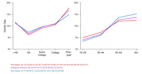
The gender gap was an increasing function of age in 2016.
-
•
In 2016 most states exhibited a U-shaped gender gap curve with respect to education indicating a larger gender gap at lower and higher levels of education.
-
•
Older white voters with less education more strongly supported Donald Trump versus younger white voters with more education.
-
•
Women more strongly supported Hillary Clinton than men, with young and more educated women most strongly supporting Hillary Clinton.
-
•
Older men with less education more strongly supported Donald Trump.
-
•
Black voters overwhelmingly supported Hillary Clinton.
-
•
The gap between college-educated voters and non-college-educated voters was about 10 percentage points in favor of Hillary Clinton
We display our findings with a series of graphs and maps. The R code associated with this project is available at https://github.com/rtrangucci/mrp_2016_election/.
1 Introduction
After any election, we typically want to understand how the electorate voted. While national and state results give exact measures of aggregate voting, we may be interested in voting behavior that cuts across state lines, such as how different demographic groups voted. Exit polls provide one such measure, but without access to the raw data we cannot determine aggregates beyond the margins that are supplied by the exit poll aggregates.
In pursuit of this goal, we can use national pre-election polls in which respondents are asked for whom they plan to vote and post-election polls in which respondents are asked if they participated in the election, both of which record demographic information and state residency of respondents. Using this data, we then build a statistical model that uses demographics and state information to predict the probability that an eligible voter voted in the election and which candidate a voter supports. A model that accurately predicts voting intentions for specific demographic groups (e.g. college-educated Hispanic men living in Georgia) will require deep interactions as outlined in [1]. In order to precisely learn the second- and third-order interactions, we require a large dataset that covers many disparate groups.
Armed with our two models, we can use U.S. Census data to yield the number of people in each demographic group. For each group, we then predict the number of voters, and the number of votes for each candidate to yield a fine-grained dataset. We can then aggregate this dataset along any demographic axes we choose in order to investigate voting behavior.
2 Data and methods
2.1 Data
We use YouGov’s daily tracking polls from 10/24/2016 through 11/6/2016 to train the 2016 voter preference model. We included 56,946 respondents in the final dataset after filtering out incomplete cases. To train the 2012 voter preference model we used 18,716 respondents polled on 11/4/2012 from YouGov’s daily tracking poll.
In order to train the 2016 voter turnout model, we use the Current Population Survey (CPS) from 2016, which includes a voting supplement ([2]). The model used 80,766 responses from voters as to whether they voted in the 2016 presidential election. We used the CPS from 2012 to train the 2012 voter turnout model, which comprises 81,017 voters. We decided to use the CPS to train our model because it is viewed as the gold-standard in voter-turnout polling [3].
We use a modified version of the 2012 Public Use Microdata Sample Census dataset (PUMS) to get a measure of the total number of eligible voters in the U.S. YouGov provided the PUMS dataset with ages and education adjusted to match the 2016 population.
2.2 Methods
Our methodology follows that outlined in [4], [1], and [3]. For voter in group as defined by the values of a collection of categorical variables, we want to learn the voter’s propensity to vote and for whom they plan to vote, by using a nonrandom sample from the population of interest. We assume that an individual voter’s response in group is modeled as follows:
where is if the voter plans to vote for Trump, or otherwise. is the probability of voting for Trump for voter in group . In order to make inferences about without modeling the selection process, we need to stratify our respondents into small enough groups so that within a cell selection is random (i.e. that the responses are Bernoulli random variables conditional only on ). We do so by generating multidimensional cells defined by demographic variables like age, ethnicity, and state of residence that categorize our respondents. This induces data sparsity even in large polls so we must use Bayesian hierarchical models to partially pool cells along these demographic axes.
Upon fitting our model, we can use the posterior mean of , and Census data to estimate an aggregate Trump vote proportion by calculating the weighted average for whatever demographic category we like.
We measure our electorate using six categorical variables:
-
•
State residency
-
•
Ethnicity
-
•
Gender
-
•
Marital status
-
•
Age
-
•
Education
Each variable has levels. State residency has fifty levels. Ethnicity has four levels: Black, Hispanic, Other, and White. Gender has two levels. Marital status has three levels: Never married, Married, Not married. Age has four levels, corresponding to the left-closed intervals of age: . Education has five levels: No High School, High School, Some College, College, Post Graduate.
After binning our Census data by the six-way interaction of the above attributes, we generate table 1. Each row of the table represents a specific group of the population, an intersection of six observable attributes. We refer to each row as a cell, and the full table as a six-way poststratification table. Our table has 33,561 cells, reflecting the fact that not all possible six-way groups exist in the U.S..
| Cell index | State | Ethn. | Gender | … | Educ. | N | |||
|---|---|---|---|---|---|---|---|---|---|
| 1 | AK | Black | Female | … | College | 400 | 0.40 | 0.50 | 80 |
| 2 | AK | Black | Female | … | High School | 300 | 0.30 | 0.60 | 54 |
| … | … | … | … | … | … | … | … | ||
| … | … | … | … | … | … | … | … | ||
| 33651 | WY | White | Male | … | Some College | 200 | 0.40 | 0.40 | 32 |
We then add columns to this dataset that represent the cell-by-cell probability of voting and the cell-by-cell probability of supporting Trump, which can be combined to yield the expected number of Trump voters, , in each cell : where is the expected probability of voting in cell , and is the expected probability of voting for Trump for voters in cell
In order to generate and , we build two models: a voter turnout model and a vote preference model, respectively. Both models are hierarchical binomial logistic regression models of the form:
Each categorical predictor, , is represented as a length- vector, where the elements of the vector map to the effect associated with the level . denotes the set of all categorical predictors included in the model and is a function that maps the -th cell to the appropriate -th level of the categorical predictor. For example, would be a 50-element vector, and is a length- list of integers with values between 1 and 50 indicating to which state the -th cell belongs. Note that the model above can include one-way effects in , as well as two-way and three-way interactions, like state age.
We use rstanarm to specify the voter turnout model and the voter preference model, which uses lme4 syntax to facilitate building complex hierarchical generalized linear models like above. The full model specifications in lme4 syntax are given in the Appendix. rstanarm imposes more structure on the variance parameters than is typical. In our model, is the product of the square of a global scale parameter the -th entry in the simplex parameter , and the cardinality of , . See [5] for more details.
Our voter preference model went through multiple iterations before we arrived at our final model. At first we intended to include past presidential vote. However, PUMS does not include past presidential vote, so we used YouGov’s imputed past presidential vote for each PUMS respondent. This induced too much sparsity in our poststratification frame.
After training each of the models, and generating predictions for voter turnout by cell and two-party vote preference for each cell, we adjusted our turnout and vote proportions in each cell to match the actual state-by-state outcomes as outlined [1].
| stan_glmer() Variable | Description | Type | Number of Groups |
|---|---|---|---|
| y | Vote choice | Outcome variable | - |
| 1 | Intercept | Global intercept | - |
| female | Fem.: 0.5, Male: -0.5 | Global slope | - |
| state_pres_vote | Pre-election poll average | Global slope | - |
| state | State of residence | Varying intercept | 50 |
| age | Age | Varying intercept | 4 |
| educ | Education attained | Varying intercept | 5 |
| 1 + state_pres_vote eth | Ethnicity | Varying intercept and slope | 4 |
| marstat | Marital status | Varying intercept | 3 |
| marstat:age | Varying intercept | 34 = 12 | |
| marstat:state | Varying intercept | 350 = 150 | |
| marstat:eth | Varying intercept | 34 = 12 | |
| marstat:gender | Varying intercept | 32 = 6 | |
| marstat:educ | Varying intercept | 35 = 15 | |
| state:gender | Varying intercept | 502 = 100 | |
| age:gender | Varying intercept | 42 = 8 | |
| educ:gender | Varying intercept | 52 = 10 | |
| eth:gender | Varying intercept | 42 = 8 | |
| state:eth | Varying intercept | 504 = 200 | |
| state:age | Varying intercept | 504 = 200 | |
| state:educ | Varying intercept | 505 = 250 | |
| eth:age | Varying intercept | 44 = 16 | |
| eth:educ | Varying intercept | 45 = 20 | |
| age:educ | Varying intercept | 45 = 20 | |
| state:educ:age | Varying intercept | 5044 = 800 | |
| educ:age:gender | Varying intercept | 542 = 40 |
3 Results
This section presents plots at the county and state level, followed by charts and maps that illustrate the poststratification. In addition to vote intention, the charts and maps also illustrate voter turnout. The county and state level plots use 2016 and 2012 election results and 2010 US census data. The captions of the charts and maps identify which model is used to produce the data illustrated in the figure. The models are defined as follows:
- Model 1
-
is described in Section 2 above.
- Model 2
-
is similar to Model 1 but includes income as a factor variable and omits marital status. The 2016 vote turnout model for Model 2 was fitted to 2012 CPS.
3.1 Election results graphs
The graphs that follow present actual election results by county and by state. They are not model-based, but rather an examination of the Republican vote proportion swing from 2012 to 2016 by county versus various demographic variables measured at the county level.
3.1.1 County-level vote swings

Notes: The county-level Republican swing is computed as Donald Trump’s 2016 two-party vote share minus Mitt Romney’s 2012 two-party vote share. Positive values indicate Trump outperforming Romney, while negative values indicate Romney outperforming Trump. The area of each circle is proportional to the number of voters in each county. Overall, Trump outperformed Romney in counties with lower median income. While Trump mostly outperformed Romney in counties with lower voter turnout, Romney mostly outperformed Trump in counties with larger voter turnout.

Notes: The county-level Republican swing is computed as Donald Trump’s 2016 two-party vote share minus Mitt Romney’s 2012 two-party vote share. Positive values indicate Trump outperforming Romney, while negative values indicate Romney outperforming Trump. The area of each circle is proportional to the number of voters in each county. Overall, Trump outperformed Romney in counties with lower college education. While Trump mostly outperformed Romney in counties with lower voter turnout, Romney mostly outperformed Trump in counties with larger voter turnout.


Notes: The county-level Republican swing is computed as Donald Trump’s 2016 two-party vote share minus Mitt Romney’s 2012 two-party vote share. Positive values indicate Trump outperforming Romney, while negative values indicate Romney outperforming Trump. The area of each circle is proportional to the number of voters in each county. Across all regions there is a trend of Trump outperforming Romney in low income counties and counties with lower college education. The trend of Trump performing well in counties with lower college education is less apparent in western counties.
3.1.2 State-level election results and vote swings

Notes: The state-level Republican share of the two-party vote. States are color coded according to the results of the 2012 election. States won by Mitt Romney are in red and states won by Barack Obama are in blue. The diagonal line indicates that the 2012 and 2016 Republican candidates received identical shares of the two-party vote. In most states Trump received a higher share of the two-party vote. Nationally, Trump got 2 percent more of the two-party vote than Romney.
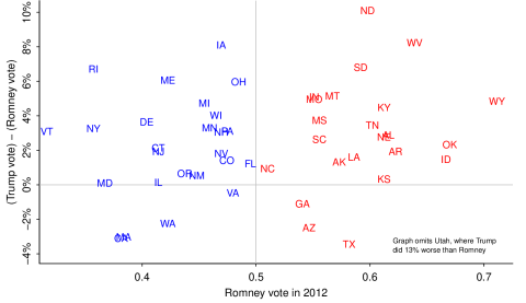
Notes: The state-level Republican swing. States are color coded according to the results of the 2012 election. States won by Mitt Romney are in red and states won by Barack Obama are in blue. Positive values indicate Trump outperforming Romney and negative values indicate Romney outperforming Trump. There is lots of variation among states with Trump outperforming Romney in most states.
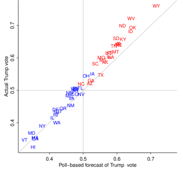
Notes: A state-level comparison between Donald Trump’s actual two-party vote share and his forecasted vote share. States are color coded according to the results of the 2012 election. States won by Mitt Romney are in red and states won by Barack Obama are in blue. Values on the diagonal indicate that Trump’s actual performance was in line with his forecast. In most states Trump outperformed his poll-based forecast.
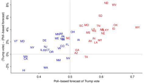
Notes: A state-level comparison of Donald Trump’s actual vote share against his poll-based forecast. States are color coded according to the results of the 2012 election. States won by Mitt Romney are in red and states won by Barack Obama are in blue. Positive values indicate states in which Trump outperformed his forecast and negative values indicate in which Trump’s actual performance fell behind his forecast. Trump did better than predicted in states that Romney won in 2012.
3.2 Poststratification graphs
The graphs that follow are generated using the multilevel regression and poststratification method outlined in the Methodology section.
3.2.1 Gender gap
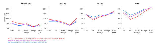
Notes: The gender gap is evaluated as men’s probability of voting for Trump minus women’s probability for of voting for Trump for various education and age levels. Larger values indicate a greater divergence in vote preference between men and women.
(Using Model 1.)
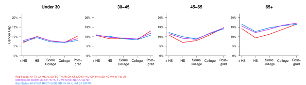
Notes: The gender gap is evaluated as men’s probability of voting for Romney minus women’s probability for of voting for Romney for various education and age levels.
(Using Model 1 with 2012 election results/turnout data.)
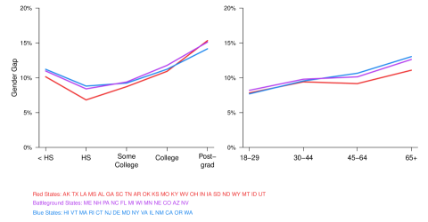
Notes: The gender gap is evaluated as men’s probability of voting for Trump minus women’s probability for of voting for Trump for various education levels. Larger values indicate a greater divergence in vote preference among women and men. Interactions exist between age and education conditional on gender. Overall, the gender gap increases with age. Among voters under 45 the gender gap is lowest for those with a college education, and among voters 45 years or older the gender gap is lowest for those with a high school education.
(Using Model 1.)
Notes: The gender gap is evaluated as men’s probability of voting for Romney minus women’s probability for of voting for Romney for various education levels. Larger values indicate a greater divergence in vote preference among women and men. Interactions exist between age and education conditional on gender.
(Using Model 1 with 2012 election results/turnout data.)
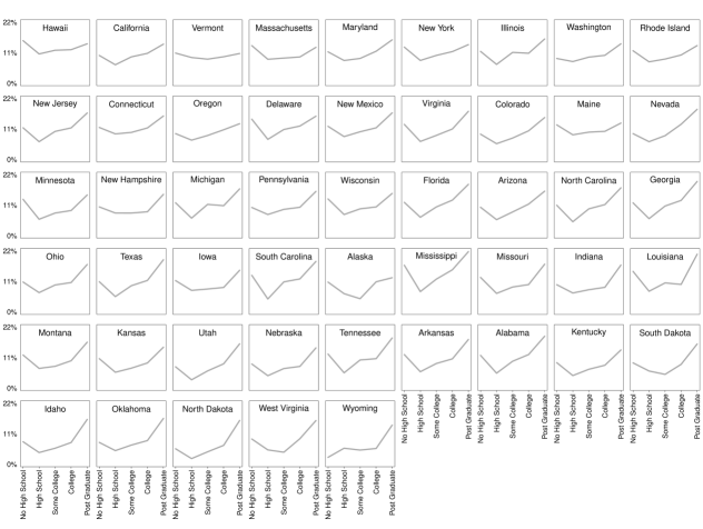
Notes: The state-level gender gap is evaluated as men’s probability of voting for Trump minus women’s probability for of voting for Trump for various education levels. Larger values indicate a greater divergence in vote preference among women and men. In most states, voters with a high school education level tend to have the lowest gender gap and voters with a post graduate education level tend to have the highest gender gap.
(Using Model 1.)

Notes: The state-level gender gap is evaluated as men’s probability of voting for Trump minus women’s probability for of voting for Trump for various education levels. Larger values indicate a greater divergence in vote preference among women and men. The gender gap increases with age in most states, with larger variation in states that supported Clinton.
(Using Model 1.)
3.2.2 Vote by education
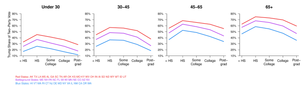
Notes: Republican share of the two-party vote against various education levels. Overall, the Republican share increases with age. The strongest support came from voters with a high school education in each age category, with the exception of 30-45 year olds.
(Using Model 1.)
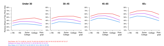
Notes: Republican share of the two-party vote against various education levels. Overall, the Republican share increases with age.
(Using Model 1 with 2012 election results/turnout data.)
3.2.3 Vote by income, age, education, and ethnicity

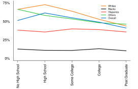
Notes: Republican share of the two-party vote for Whites (orange), Blacks (black), Hispanics (red), other ethnicities (green), and overall (blue). Trump’s share of the vote is highest among white voters with a high school education level.
(Using Model 2 (left) and Model 1 (right).)
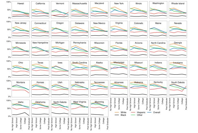
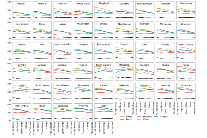
Notes: State-level Republican share of the two-party vote for Whites (orange), Blacks (black), Hispanics (red), other ethnicities (green), and overall (blue). In most states white voters with high school education have the greatest support for Trump and those with post graduate education have the lowest support for Trump.
(Using Model 1.)
Notes: State-level Republican share of the two-party vote for Whites (orange), Blacks (black), Hispanics (red), other ethnicities (green), and overall (blue).
(Using Model 1 with 2012 election results/turnout data.)

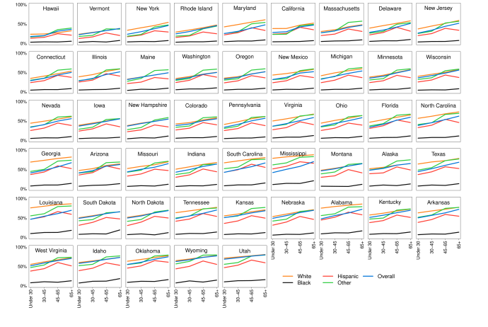
Notes: State-level Republican share of the two-party vote for Whites (orange), Blacks (black), Hispanics (red), other ethnicities (green), and overall (blue). Support for Trump increases with age. Support among Whites is consistently the strongest followed by support among other races and Hispanics.
(Using Model 1.)
Notes: State-level Republican share of the two-party vote for Whites (orange), Blacks (black), Hispanics (red), other ethnicities (green), and overall (blue). Support for Trump increases with age.
(Using Model 1 with 2012 election results/turnout data.)
3.2.4 Voter turnout
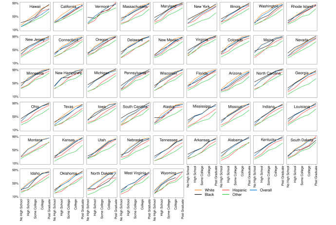
Notes: Voter turnout for Whites (orange), Blacks (black), Hispanics (red), other ethnicities (green), and overall (blue). Voter turnout increases with education. There is not much variation across states. Within states Hispanics typically experienced low voter turnout compared to Whites and Blacks.
(Using Model 1.)

Notes: Voter turnout for Whites (orange), Blacks (black), Hispanics (red), other ethnicities (green), and overall (blue).
(Using Model 1 with 2012 election results/turnout data.)

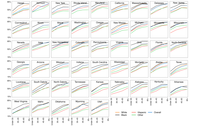
Notes: Voter turnout for Whites (orange), Blacks (black), Hispanics (red), other ethnicities (green), and overall (blue). Voter turnout increases with age. There is low voter turnout among Hispanics across age levels compared to Whites and Blacks.
(Using Model 1.)
Notes: Voter turnout for Whites (orange), Blacks (black), Hispanics (red), other ethnicities (green), and overall (blue).
(Using Model 1 with 2012 election results/turnout data.)
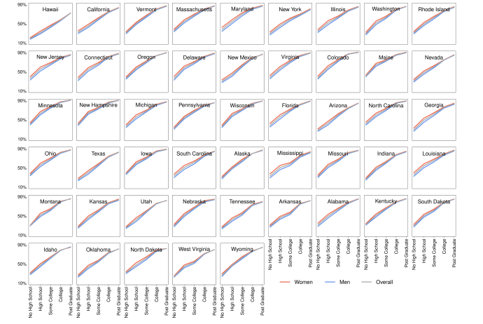
Notes: Voter turnout for women (red), men (blue), and overall (grey). Voter turnout increases with education, with women experiencing a larger voter turnout compared to men.
(Using Model 1.)
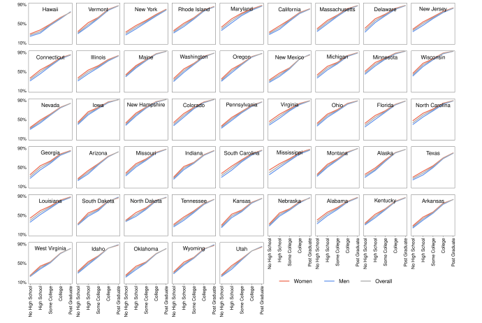
Notes: Voter turnout for women (red), men (blue), and overall (grey).
(Using Model 1 with 2012 election results/turnout data.)
3.2.5 Maps of vote preference
Notes: State-level gender gap evaluated as men’s probability of voting for Trump minus women’s probability for of voting for Trump. Dark green/orange indicates a larger divergence in vote preference between men and women. The greatest divergence exists among older voters with post graduate education. The weakest support exists among young voters with a college education.
(Using Model 1.)
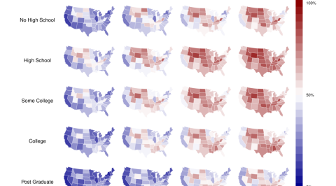
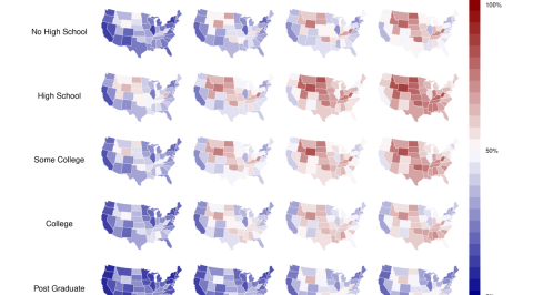
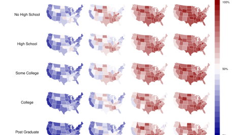
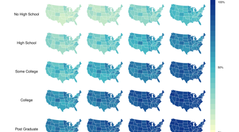
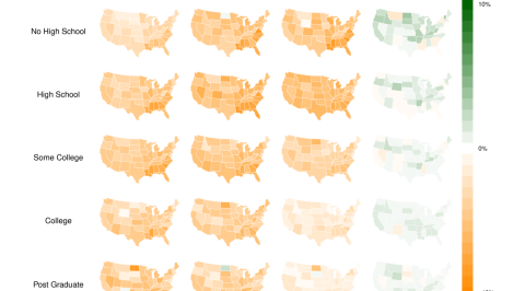
Notes: State-level vote intention by education and age. Dark red indicates stronger support for Donald Trump and dark blue indicates stronger support for Hillary Clinton. Overall, older voters with lower education have stronger support for Trump and younger voters with higher levels of education have stronger support for Clinton. In each age bracket Trump has stronger support among voters with high school and some college education compared to voters with no high school education.
(Using Model 1.)
Notes: State-level vote intention by education and age for women. Dark red indicates stronger support for Donald Trump and dark blue indicates stronger support for Hillary Clinton. Overall, older women have stronger support for Trump. Women with a post graduate education have stronger support for Clinton, and women with a high school education and some college education have stronger support for Trump.
(Using Model 1.)
Notes: State-level vote intention by education and age for men. Dark red indicates stronger support for Donald Trump and dark blue indicates stronger support for Hillary Clinton. Older men have stronger support for Trump whereas younger men have stronger support for Clinton. Overall, men with a post graduate education have stronger support for Clinton, while men with a high school education have stronger support for Trump.
(Using Model 1.)
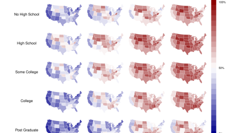
Notes: State-level vote intention by education and age for Whites. Dark red indicates stronger support for Donald Trump and dark blue indicates stronger support for Hillary Clinton. Older voters with less education had stronger support for Trump, whereas younger voters with more education had stronger support for Clinton. In terms of education, the strongest support for Clinton comes from voters with a post graduate education and the strongest support for Trump comes from voters with a high school education.
(Using Model 1.)
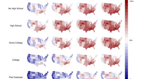
Notes: State-level vote intention by education and age for Blacks. Dark red indicates stronger support for Donald Trump among women and dark blue indicates stronger support for Hillary Clinton. Missing cells are denoted by diagonal lines. Overall, Blacks supported Clinton.
(Using Model 1.)

Notes: State-level vote intention by education and age for Hispanics. Dark red indicates stronger support for Donald Trump and dark blue indicates stronger support for Hillary Clinton. Missing cells are denoted by diagonal lines. A majority of young Hispanics have stronger support for Clinton. Support for Trump increases with age at all education levels. There is not much variation across education levels.
(Using Model 1.)
Notes: State-level vote intention by education and age for ethnicities (not including White, Black, or Hispanic). Dark red indicates stronger support for Donald Trump and dark blue indicates stronger support for Hillary Clinton. Support for Trump increases with age at all education levels. Support for Trump consistently decreases with education (with the exception of the 65+ age bracket).
(Using Model 1.)

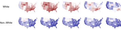
Notes: State-level vote intention for white and non-white voters by education. No college education includes the categories “No High School”, “High School”, and “Some College”. College education includes the categories “College” and “Post Graduate”. Dark red indicates stronger support for Donald Trump and dark blue indicates stronger support for Hillary Clinton. White voters have stronger support for Trump compared to non-white voters, with white voters with no college education having the strongest support. There is little variation in vote preference across these categories for North Dakota, Wyoming, and Idaho, which consistently support Trump. There is also little variation in vote preference across education levels among non-white voters.
(Using Model 1.)

Notes: State-level vote intention for white and non-white voters by education. No college education includes the categories “No High School”, “High School”, and “Some College”. College education includes the categories “College” and “Post Graduate”. Dark red indicates stronger support for Mitt Romney and dark blue indicates stronger support for Barack Obama. White voters with no college education had the strongest support for Romney. Regardless of college education, non-White voters had the strongest support for Obama.
(Using Model 1 with 2012 election results/turnout data.)
Notes: State-level vote intention for white and non-white women by education. Dark red indicates stronger support for Donald Trump among women and dark blue indicates stronger support for Hillary Clinton among women. Support for Trump among white women increases from no high school to high school education levels and declines from high school to post graduate education levels. White women with high school education have the strongest support for Trump. Overall, non-white women have stronger support for Clinton, with the exception of some Midwestern states (e.g. North Dakota and Wyoming).
(Using Model 1.)

Notes: State-level vote intention for white and non-white women by education. Dark red indicates stronger support for Mitt Romney among women and dark blue indicates stronger support for Barack Obama among women. Support for Romney among White women decreased with education. Regardless of college education, Obama had strong support among non-White women.
(Using Model 1 with 2012 election results/turnout data.)

Notes: State-level vote intention for women by education. Dark red indicates stronger support for Donald Trump among women and dark blue indicates stronger support for Hillary Clinton among women. In most states, women with high school education have stronger support for Trump and women with post graduate education have stronger support for Clinton.
(Using Model 1.)

Notes: State-level vote intention for women by education. Dark red indicates stronger support for Mitt Romney among women and dark blue indicates stronger support for Barack Obama among women. In most states, women with high school education had stronger support for Romney and women with post graduate education had stronger support for Obama.
(Using Model 1 with 2012 election results/turnout data.)
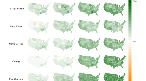
3.2.6 Maps of voter turnout
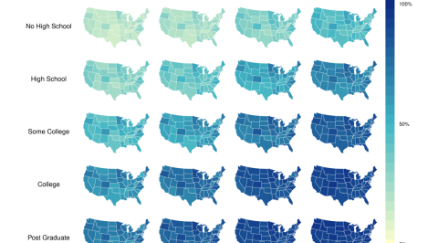
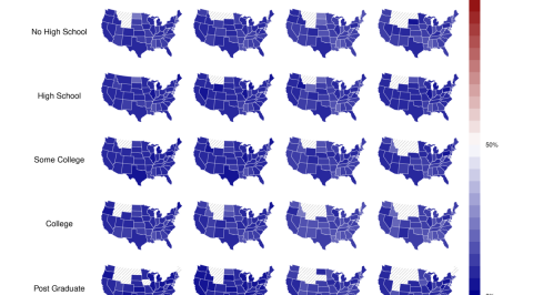
Notes: State-level voter turnout by education and age. Yellow indicates low voter turnout and dark blue indicates high voter turnout. Younger individuals with less education were less likely to vote this election, whereas older individuals with more education were more likely to vote.
(Using Model 1.)
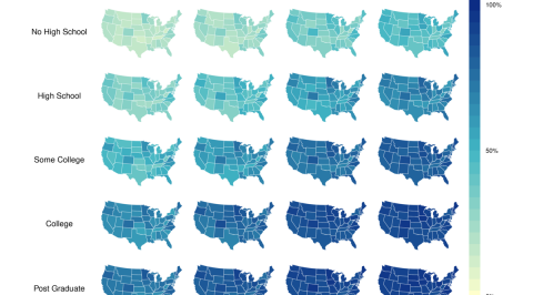
Notes: State-level voter turnout by education and age for women. Yellow indicates low voter turnout and dark blue indicates high voter turnout.
(Using Model 1.)
Notes: State-level voter turnout by education and age for women. Yellow indicates low voter turnout and dark blue indicates high voter turnout.
(Using Model 1.)
Notes: State-level voter turnout gender gap evaluated as voter turnout probability for men minus voter turnout probability for women. Dark green/orange indicates a large turnout gender gap.
(Using Model 1.)
4 Discussion
We keep the discussion short as we feel that our main contribution here is to present these graphs and maps which others can interpret how they see best, and to share our code so that others can fit these and similar models on their own.
Some of our findings comport with the broader media narrative developed in the aftermath of the election. We found that white voters with lower educational attainment supported Trump nearly uniformly. We did not find that income was a strong predictor of support for Trump, perhaps a continuation of a trend apparent in 2000 through 2012 election data. We found the gender gap to be about 10%, which was a bit lower than predicted by exit polls. The marital status gap we estimated was about 2 the figure estimated by exit polls.
Most surprising to us was the strong age pattern in the gender gap. Older women were much more likely to support Clinton than older men, while younger women were mildly more likely to support Clinton compared to men the same age. We are not sure what accounts for this difference. One area of future research is using age as a continuous predictor rather than binning ages and using the bins as categorical predictors.
Our models predict that men in several state by education categories were more likely to support Clinton than women. We do not believe this to be true but rather believe it to be a problem with poststratification table sparsity. In order to reduce the number of poststratification cells, in future analyses we could poststratify by region rather than state. This would likely not have impacted our descriptive precision in this analysis due to the apparently strong regional patterns in voting behavior in this election.
5 Appendix A - Model Code
We specified our voter turnout model as below:
cbind(vote, did_not_vote) ~ 1 + female + state_pres_vote +
      (1 | state) + (1 | age) +
      (1 | educ) + (1 + state_pres_vote | eth) +
      (1 | marstat) + (1 | marstat:age) +
      (1 | marstat:state) + (1 | marstat:eth) +
      (1 | marstat:gender) + (1 | marstat:educ) +
      (1 | state:gender) + (1 | age:gender) +
      (1 | educ:gender) + (1 | eth:gender) +
      (1 | state:eth) + (1 | state:age) +
      (1 | state:educ) + (1 | eth:age) +
      (1 | eth:educ) + (1 | age:educ) +
      (1 | state:educ:age) + (1 | educ:age:gender)
We specified our voter preference model as below:
cbind(clinton, trump) ~ 1 + female + state_pres_vote +
      (1 | state) + (1 | age) +
      (1 | educ) + (1 + state_pres_vote | eth) +
      (1 | marstat) + (1 | marstat:age) +
      (1 | marstat:state) + (1 | marstat:eth) +
      (1 | marstat:gender) + (1 | marstat:educ) +
      (1 | state:gender) + (1 | age:gender) +
      (1 | educ:gender) + (1 | eth:gender) +
      (1 | state:eth) + (1 | state:age) +
      (1 | state:educ) + (1 | eth:age) +
      (1 | eth:educ) + (1 | age:educ) +
      (1 | state:educ:age) + (1 | educ:age:gender)
References
- [1] Yair Ghitza and Andrew Gelman. Deep interactions with MRP: Election turnout and voting patterns among small electoral subgroups. American Journal of Political Science, 57(3):762–776, 2013.
- [2] Sarah Flood, Miriam King, Steven Ruggles, and J. Robert Warren. Integrated public use microdata series, current population survey: Version 5.0. [dataset], 2017.
- [3] Rayleigh Lei, Andrew Gelman, and Yair Ghitza. The 2008 election: A preregistered replication analysis. Statistics and Public Policy, 4(1):1–8, 2017.
- [4] Andrew Gelman and Thomas C Little. Poststratification into many categories using hierarchical logistic regression. Survey Methodology, 23(2):127–135, 1997.
- [5] Stan Development Team. RStanArm: Bayesian applied regression modeling via Stan. R package version 2.13.1., 2016.