.tocmtchapter
HIPie: Hawkes Intensity Process Visualizer
HIPie: Explaining and Predicting the Virality of Youtube Videos
HIPie: Enabling Reasoning about Youtube Video Virality
Will This Video Go Viral? Explaining and Predicting the Popularity of Youtube Videos
Abstract.
What makes content go viral? Which videos become popular and why others don’t? Such questions have elicited significant attention from both researchers and industry, particularly in the context of online media. A range of models have been recently proposed to explain and predict popularity; however, there is a short supply of practical tools, accessible for regular users, that leverage these theoretical results. HIPie – an interactive visualization system – is created to fill this gap, by enabling users to reason about the virality and the popularity of online videos. It retrieves the metadata and the past popularity series of Youtube videos, it employs the Hawkes Intensity Process, a state-of-the-art online popularity model for explaining and predicting video popularity, and it presents videos comparatively in a series of interactive plots. This system will help both content consumers and content producers in a range of data-driven inquiries, such as to comparatively analyze videos and channels, to explain and to predict future popularity, to identify viral videos, and to estimate responses to online promotion.
1. Introduction
The popularity of online videos is typically measured by the number of views they attract from viewers. Understanding online popularity can help content producers to propose better content, and content consumers to deal with information overload. Viral videos quickly catch the attention of the viewers and achieve very high popularity in short periods of time. Explaining what makes videos go viral, and identifying them early would prove useful for advertisers and content providers.
Our tool aims to fill several gaps about the systems that enable users to reason about the popularity of online videos. The first gap concerns the availability of such systems. Despite the range of theoretical models that have been recently proposed for modeling online popularity (Bakshy et al., 2011; Martin et al., 2016; Zhao et al., 2015; Rizoiu et al., 2017), there is no readily available software that allows regular users to easily examine the popularity over time for online videos and forecast their future popularity. The second gap concerns content producers and advertisers who need to choose which videos to promote and to identify potentially viral videos. How can content producers quantify virality and simulate video reaction to online promotions? The third gap sits for content consumers. Most distribution platforms (e.g. Youtube) feature personalized recommendation systems; these usually act as black boxes and make the decision for the user. The open question is how can the user be empowered by enabling her to compare and select content on the fly?
In this work, we answer the above three questions, building upon the current state-of-the-art popularity model, the Hawkes Intensity Process (HIP) (Rizoiu et al., 2017). We introduce the HIP Insights Explorer (HIPie), an interactive web-based application designed to assist users to reason about the popularity and the virality of Youtube videos. It exposes a series of measures derived from HIP – such as the sensitivity to external promotions and the endogenous amplification. It allows one to conduct various tasks, including identifying prospective popular videos, simulating video reaction to promotion schedules, comparing videos from different authors (i.e. Youtube channels) and visualizing the popularity series fitted and predicted by HIP. The most important visualization of HIPie is the endo-exo map (Rizoiu et al., 2017), a projection of videos in the two-dimensional space defined by the endogenous response and exogenous sensitivity. The relative positions of the videos in this space indicate their potential of becoming viral. HIPie allows adding any Youtube video on-the-fly as long as its popularity series are available.
The main contributions of this work include:
-
A web-based interactive tool to visualize and predict future video popularity using the HIP (Rizoiu et al., 2017) popularity model;
-
The endo-exo map visualization, on which the viral potential of videos is compared;
-
HIPie enables a series of applications concerning online popularity, such as comparing videos and channels, identifying future popular videos and simulating video reaction to promotion.
2. Prerequisites
In this section we briefly review the HIP model and how it is used to quantify virality and simulate the effect of promotions.
Explain and forecast popularity with HIP. HIP (Rizoiu et al., 2017) is a novel generative model that explains online popularity series by linking exogenous inputs from public social media platforms, such as Twitter or Youtube, to endogenous responses within the Youtube content platform, which account for the word-of-mouth process occurring around videos. HIP models popularity using:
| (1) |
where is the number of views that the video receives during day and is the volume of exogenous inputs (tweets, shares or promotions). Eq. (1) can intuitively be understood as: the number of views a video receives during day is dependent on its popularity at each previous day decayed by how fast people forget ( is the exponent controlling the power-law decay of social memory). The parameters of HIP () are fit on an observed prefix of the views and the shares series. If future exogenous stimuli are known, the popularity series can be “run forward” by plugging and the past popularity into Eq. (1).
The endo-exo map. Two metrics derived from HIP describe a video’s virality. The exogenous sensitivity quantifies the video sensitivity to the external stimuli . The endogenous response is computed as , where is the popularity series generated by a single initial exogenous impulse. Intuitively, represents the total amount of endogenous amplification that each view generates. Rizoiu et al. (2017) introduce the endo-exo map, which is a two-dimensional space of the exogenous sensitivity and the endogenous response. It is used to identify potentially viral videos, videos with high scores on both dimensions, as well as unpromotable videos.
Viral potential and the reaction to promotions. Rizoiu and Xie (2017) use HIP in an advertisement application, in which the aim is to quantify the effect of promotion on content popularity. The viral potential is the return on investment, or the total number of views generated by a single promotion. They also study the effect of promotion schedules on the views series. They construct the promotion series by allocating to each day an amount of promotions, and by introducing it into HIP alongside with the organic exogenous stimuli to obtain the promoted view series.
3. Applications
HIPie has a series of functionalities that enable users to understand, reason and interact with the popularity of Youtube videos.
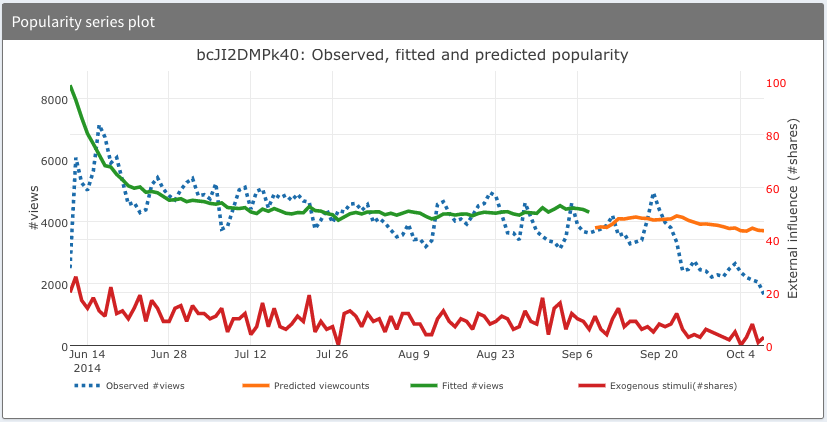
Explain and predict Youtube video popularity (Fig. 1a). For any video, HIPie depicts several popularity series: observed, fitted and forecasted by HIP. Fig. 1a shows the example of a Music video “Footprints” from the Dutch DJ Tiesto (Youtube id: bcJI2DMPk40). It shows the popularity series for the first 120 days after video upload. The dotted blue line represents the observed view counts (i.e., real data) and the red line is the external promotion series. Fitting HIP and forecasting future popularity are performed in a temporal holdout setup. The views and shares series in the first 90 days are used to fit the parameters of HIP. The green line shows the fitted view count series. The orange line represents the predicted view counts series, using the previously fitted parameters and the external promotion series from day 91 to 120. As shown in Fig. 1a and in the online public installation (described in Sec. 4.3), the popularity series fitted by HIP follows closely the observed popularity series. Furthermore, Rizoiu et al. (2017) have shown HIP to be able to forecast future popularity with less than mean absolute percentile error when using shares as the exogenous stimuli series, and when using tweets.
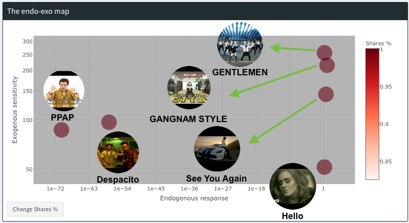
Compare videos (Fig. 1b). HIPie enables users to comparatively analyze videos using the endo-exo map, by showing the amount of views and shares they receive, alongside with the exogenous sensitivity and the endogenous reaction. Fig. 1b shows six of the most popular pop songs on Youtube on the endo-exo map. Each video is presented as a bubble, where the x coordinate is the endogenous response and the y coordinate is the exogenous sensitivity. The color depth of bubbles indicates the amount (in percentage scale) of external promotions that the video receives and the size of bubbles shows the amount of views it receives. “Gentleman” (id ASO_zypdnsQ) and “Gangnam style” (id 9bZkp7q19f0) from the Korean singer Psy occupy the most privileged position on the map, both having a high exogenous sensitivity and a high endogenous response. In comparison, “Hello” by Adele (id YQHsXMglC9A) has lower exogenous sensitivity, while “PPAP” by the Japanese singer Pikotaro (id 0E00Zuayv9Q) has a lower endogenous response.
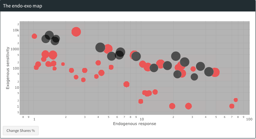
Compare channels (Fig. 1c). In HIPie we use the endo-exo map to visualize groups of videos that belong to the same user-assigned content type, or are from the same author (called channel in YouTube). Fig. 1c shows in black color a scatter plot of videos in the category News&Activism, posted by the reporter Anatolii Sharij covering the 2014 events in Ukraine, and in red color a user (VEGETTA777) focusing on recordings of Game sessions. The game recording videos are generally more popular (bigger bubbles) than the news videos, and this is explained by the former group having higher exogenous sensitivity – higher values of .
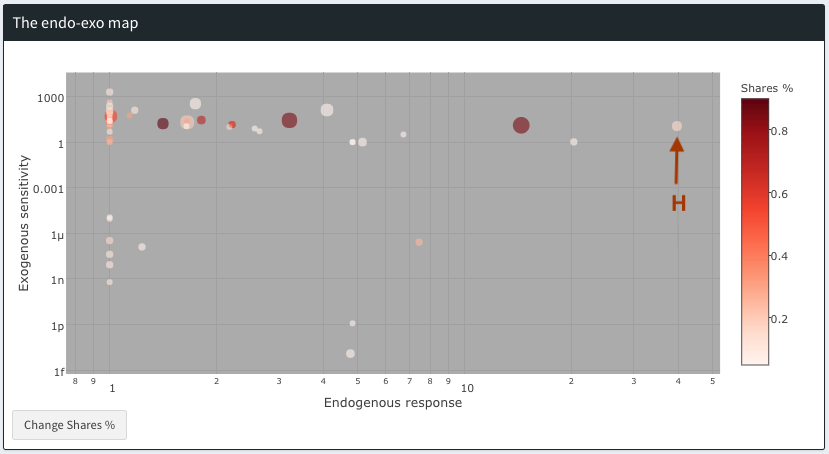
Identify potentially viral videos (Fig. 1d). HIPie allows to identity videos that have the potential of going viral, but are yet to. These are videos with high exogenous sensitivity and high endogenous response (top-right corner of the endo-exo map), but which have received very little external stimuli. Video H from in Fig. 1d – a Japaneese Film&Animation video – is an example of a potentially viral video: it has both high endogenous response and exogenous sensitivity, it has received few promotions (light color) and has achieved little popularity (small bubble size). Every external stimuli that this video receives will generates 450 views.
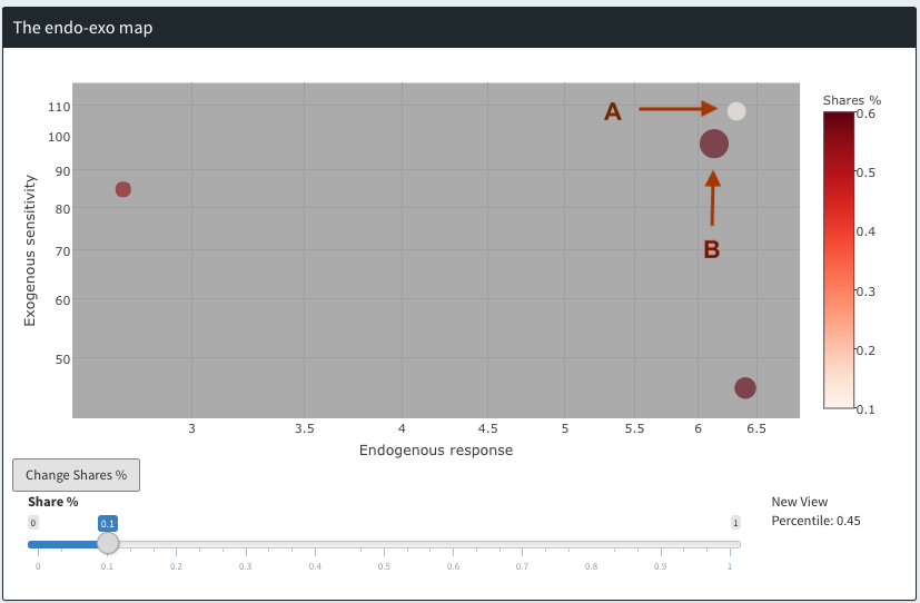
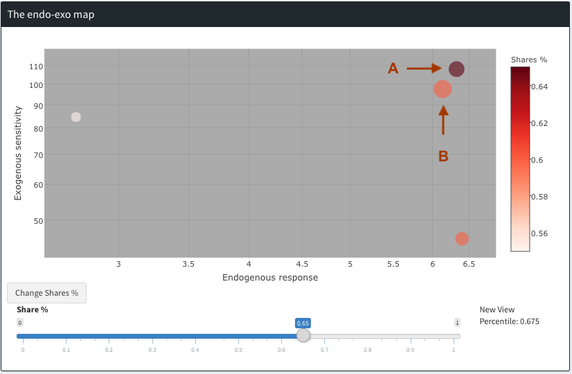
Simulate video response to promotions (Fig. 1e & 1f). HIPie allows simulating “what-if” scenarios: what would be the popularity of a video if it received an additional volume of external stimulation. One can promote (or demote) a video by adding or subtracting a volume of promotion, spread equally among the first 90 days (the even promotion schedule studied by Rizoiu and Xie (2017)). Video A in Fig. 1e is a collection of “ice bucket” challenges (id: 3hSIh-tbiKE) which receives little external stimuli (light color) and low popularity (small bubble). Video B (a Gaming video, id 0lTTWeavl1c) has a similar position on the endo-exo map, but it has a higher popularity due to having received more external stimuli. After promoting video A with an amount of promotions similar to B (i.e. similar color in Fig. 1f), A achieves a similar popularity level as B (similar bubble size).
4. Description of the demo
In this section, we introduce the main interfaces of HIPie (Sec. 4.1), present some implementation choices (Sec. 4.2) and how to obtain, test and use HIPie (Sec. 4.3).
4.1. Main Interfaces
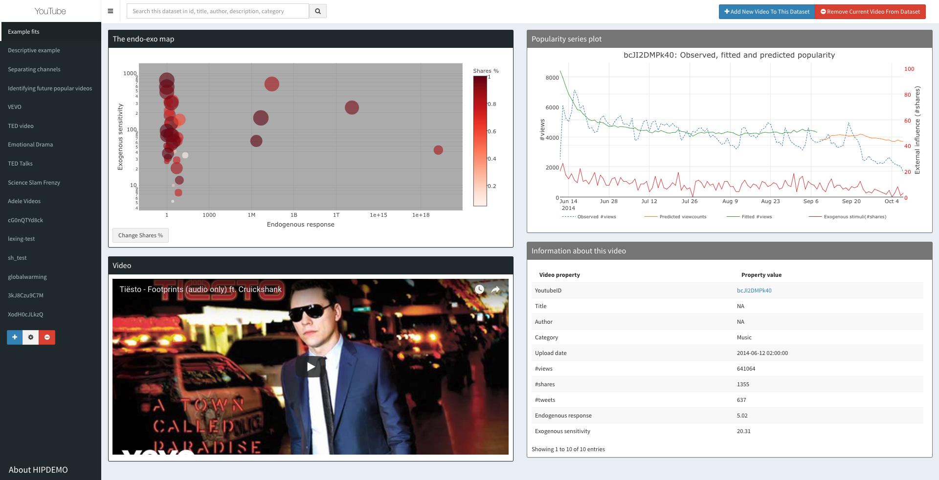
HIPie is designed as an interactive web application. Fig. 2 gives an overview of the main interface of HIPie, containing four panels on the right and a navigation menu on the left. In this section, we describe the main interfaces and functionalities.
The endo-exo map (top-left). This is the most important panel in HIPie. In addition to the characteristics described in Sec. 3, the plot is interactive: hovering over bubbles shows a pop up with additional information about the video (YoutubeID, Author, Title, endogenous response and exogenous sensitivity values, acquired percentiles of views and shares). The user can zoom into certain areas of the map and drag the map. Clicking on bubbles in endo-exo map causes other three panels to switch to the current active video. The rest of the panels in Fig. 2 are updated to show detailed information of the current active video.
The popularity panel (top-right) shows the popularity series of the current active video: observed, fitted and forecasted view counts and observed share counts. Hovering over the plot gives the values of each series at the hovering time point.
The preview panel (bottom-left). This panel allows to play the selected video, while interacting with the other panels.
The video metadata panel (bottom-right). This panel shows detailed metadata information about the current active video: Youtube ID, Title, Author, Category, Upload date, number of views, number of shares and endo-exo values.
Collection management menu. HIPie allows one to create, manage and visualize multiple video collections, using the navigation menu and controls located on the left side of the interface. The default collections cannot be changed.
Adding New Videos. HIPie allows one to add or remove videos from the current collection, by using the buttons in the top-right corner of the interface. A new video is added by inputing its Youtube video ID or video link. A backend process will crawl the video metadata and popularity series using the youtube-insight (Wu et al., 2017) package. Once crawling completes, the first 90 days of the popularity series are used to fit the parameters of HIP. Any Youtube videos can be added to the system as long as its popularity series are publicly accessible and at least 120 days data. After the fitting is completed, the video appears in the corresponding collection.
4.2. Implementation
HIPie is built in R (R Core Team, 2013) using the open-source package Shiny (RStudio, Inc, 2013a), which is dedicated to creating interactive web applications in R. Shiny enables developers to focus on visualization by simplifying front-end design and backend configuration and it provides web-based input and output tools. The other employed packages are chosen for their compatibility with Shiny and for their efficiency. For example, we employ Plotly to construct the interactive visualization experience. It allows one to easily convert static R plots into interactive visualization. We also use ShinyJs to build customized JavaScript interactions between R and the frontend, as it is compatible with default Shiny elements and has many useful APIs. Table 1 lists all the packages employed in HIPie, together with their project links and brief descriptions.
4.3. Obtaining and running the demo
HIPie is open-source and publicly accessible. To download the source code, access a live demo or a quick tour, we provide the following options:
-
•
A public installation of HIPie 111HIPie public installation: http://www.hipie.ml/ is live for testing, requiring only a web browser.
-
•
The source code of HIPie can be accessible from a Github repository222Github repository of HIPie: https://github.com/computationalmedia/hipie/. Simply clone the repository and follow the instructions in the README file to run a local installation.
-
•
For a quick tour of the various usages and capabilities of HIPie, we provide a short Youtube video333Screencast for HIPie: https://youtu.be/x5xIf4vUScI/.
| Package | Description |
|---|---|
| HIP (Rizoiu et al., 2017) | An open-source implementation for modeling online popularity with HIP444HIP code: https://github.com/andrei-rizoiu/hip-popularity/. |
| Shiny (RStudio, Inc, 2013a) | An integrated package for implementing web apps in the R language. |
| ShinyJs (Attali, 2016) | A tool that allows JavaScript functions to be called inside R programs. |
| ShinyDashboard (Chang, 2016) | Interface which bootstraps and provides several themes for web page UI. |
| Plotly (Sievert et al., 2016) | An interactive plotting library for many programming languages including R. |
| Shiny Server (RStudio, Inc, 2013b) | Server for Shiny applications. |
| youtube-insight (Wu et al., 2017) | An integrated Youtube data crawler555youtube-insight code: https://github.com/computationalmedia/youtube-insight/. |
5. Related work
Recent results in popularity modeling feature a range of theoretical models to explain and predict online content popularity (Bakshy et al., 2011; Martin et al., 2016; Mishra et al., 2016; Zhao et al., 2015; Rizoiu et al., 2017). However, the choice of publicly available platforms that implement these models for the non-scientific user is rather limited.
Khosla et al. (2014) implement a web-based demonstration666Demonstration from Khosla et al. (2014): http://popularity.csail.mit.edu/ for predicting image popularity before publishing the images. Their system computes a popularity confidence by taking image content and a range of social factors into account. Castillo et al. (2014) create FAST777Platform by Castillo et al. (2014): http://fast.qcri.org/ (Forecast and Analytics of Social Media and Traffic) for predicting views of news article, by leveraging anonymous real-time page view data. Xie et al. (2016) provide a tool888Tool from Xie et al. (2016): http://research.pinnacle.smu.edu.sg/clear/ that uses real-time Twitter data to identify potential viral topics and predict their total popularity.
HIPie differs from the aforementioned works in several ways. First, it aims to be more than a demonstration of a scientific algorithm: it is a visualization platform dedicated to users. It has multiple visualization components and the user-friendly interaction enables this platform to easily convey the modeling outcome. Second, this platform is built for Youtube video popularity modeling, while other platforms generally deal with Twitter, news article, etc. Third, it is open-source and it allows developers to integrate it with other popularity models and additional data sources.
References
- (1)
- Attali (2016) Dean Attali. 2016. shinyjs Easily Improve the User Experience of Your Shiny Apps in Seconds. https://CRAN.R-project.org/package=shinyjs R package version 0.9.
- Bakshy et al. (2011) Eytan Bakshy, Jake M Hofman, Winter A Mason, and Duncan J Watts. 2011. Everyone’s an influencer: quantifying influence on twitter. In WSDM ’11. 65–74.
- Castillo et al. (2014) Carlos Castillo, Mohammed El-Haddad, Jürgen Pfeffer, and Matt Stempeck. 2014. Characterizing the life cycle of online news stories using social media reactions. In CSCW ’14. ACM, 211–223.
- Chang (2016) Winston Chang. 2016. shinydashboard: Create Dashboards with ‘Shiny’. https://CRAN.R-project.org/package=shinydashboard R package version 0.5.3.
- Khosla et al. (2014) Aditya Khosla, Atish Das Sarma, and Raffay Hamid. 2014. What makes an image popular?. In WWW ’14. ACM, 867–876.
- Martin et al. (2016) Travis Martin, Jake M. Hofman, Amit Sharma, Ashton Anderson, and Duncan J. Watts. 2016. Exploring Limits to Prediction in Complex Social Systems. In WWW ’16. 683–694. https://doi.org/10.1145/2872427.2883001
- Mishra et al. (2016) Swapnil Mishra, Marian-Andrei Rizoiu, and Lexing Xie. 2016. Feature Driven and Point Process Approaches for Popularity Prediction. In CIKM ’16. 1069–1078.
- R Core Team (2013) R Core Team. 2013. R: A Language and Environment for Statistical Computing. R Foundation for Statistical Computing, Vienna, Austria. http://www.R-project.org/
- Rizoiu and Xie (2017) Marian-Andrei Rizoiu and Lexing Xie. 2017. Online Popularity under Promotion: Viral Potential, Forecasting, and the Economics of Time. In ICWSM’17. 182–191.
- Rizoiu et al. (2017) Marian-Andrei Rizoiu, Lexing Xie, Scott Sanner, Manuel Cebrian, Honglin Yu, and Pascal Van Hentenryck. 2017. Expecting to be HIP: Hawkes Intensity Processes for Social Media Popularity. In WWW ’17. ACM Press, Perth, Australia., 735–744.
- RStudio, Inc (2013a) RStudio, Inc. 2013a. Easy web applications in R. http://www.rstudio.com/shiny/.
- RStudio, Inc (2013b) RStudio, Inc. 2013b. Shiny Server. URL: https://www.rstudio.com/products/shiny/shiny-server/.
- Sievert et al. (2016) Carson Sievert, Chris Parmer, Toby Hocking, Scott Chamberlain, Karthik Ram, Marianne Corvellec, and Pedro Despouy. 2016. plotly Create Interactive Web Graphics via ‘plotly.js’. https://CRAN.R-project.org/package=plotly
- Wu et al. (2017) Siqi Wu, Marian-Andrei Rizoiu, and Lexing Xie. 2017. Beyond Views: Measuring and Predicting Engagement on YouTube Videos. arXiv:1709.02541 (2017).
- Xie et al. (2016) Wei Xie, Feida Zhu, Jing Jiang, Ee-Peng Lim, and Ke Wang. 2016. Topicsketch: Real-time bursty topic detection from twitter. TKDE 28, 8 (2016), 2216–2229.
- Zhao et al. (2015) Qingyuan Zhao, Murat A Erdogdu, Hera Y He, Anand Rajaraman, and Jure Leskovec. 2015. SEISMIC: A Self-Exciting Point Process Model for Predicting Tweet Popularity. In ACM SIGKDD Conference on KDD.