Overlaying Quantitative Measurement on Networks: An Evaluation of Three Positioning and Nine Visual Marker Techniques
Abstract
We report results from an experiment on ranking visual markers and node positioning techniques for network visualizations. Inspired by prior ranking studies, we rethink the ranking when the dataset size increases and when the markers are distributed in space. Centrality indices are visualized as node attributes. Our experiment studies nine visual markers and three positioning methods. Our results suggest that direct encoding of quantities improves accuracy by about compared to previous results. Of the three positioning techniques, circular was always in the top group, and matrix and projection switch orders depending on two factors: whether or not the tasks demand symmetry, or the nodes are within closely proximity. Among the most interesting results of ranking the visual markers for comparison tasks are that hue and area fall into the top groups for nearly all multi-scale comparison tasks; Shape (ordered by curvature) is perhaps not as scalable as we have thought and can support more accurate answers only when two quantities are compared; Lightness and slope are least accurate for quantitative comparisons regardless of scale of the comparison tasks. Our experiment is among the first to acquire a complete picture of ranking visual markers in different scales for comparison tasks.
Index Terms:
Quantitative network, network visualization, graph layout, user study, visual marker.1 Introduction
![[Uncaptioned image]](/html/1711.04419/assets/x1.png)
|
Many real-world datasets can be described as networks: entities are represented as nodes [1] and the presence or absence of an edge linking two nodes describes the presence or absence of direct connectivity, often defined by thresholding correlation strength between nodes [2]. Interpreting complex networks of relationships is, however, challenging, and that fact makes visualization an indispensable tool in practice for deciphering unexpected or revealing interesting results [3].
One way to identifying important design guidelines is through ranking studies. Cleveland and McGill [4] and Mackinlay [5] have characterized and ranked effectiveness by visual markers. In network visualizations, important nodes can also be quantified. For example, betweenness centrality measures the number of shortest paths between any two nodes that pass through this node [6]. As a result, betweenness centrality identifies hubs (nodes with high degree), modularity (a measure of the organization in modules with high clustering), and hierarchy (a measure of how hubs are connected in space) [7]. Other centrality indices are also useful. For example, the degree centrality of a node is proportional to the degree or the number of edges linked directly to it and thus reveals the neighboring relationships.
Despite recent great strides in computational solutions, design guidelines for aggregating quantitative data on networks are few [8]. Ghoniem, Fekete, and Castagliola reported that the accuracy (i.e., the percentage of correct answers) was around - using force-directed layout and increased to - with matrix for tasks of 50-100-node networks [9]. This work did not treat node connectivities as a visual variable and participants must visually compare the quantities through graph-node-positioning techniques. The study reported here instead shows empirically that direct encoding of quantitative measurement can increase accuracy to for networks with similar complexities.
The graph drawing community has demonstrated extensively that node and edge esthetics affect efficiency and effectiveness. Positioning techniques influence graph reading effectiveness [10]: one should reduce overlapping edges and nodes and avoid long and convoluted edges [11, 12, 13]. Recent studies also address important issues of temporal data visualization [14] and preserving mental maps [15]. A survey of specific network uses in brain imaging of functional magnetic resonance imaging (fMRI) network visualizations reveals that coloring is the most common encoding solution [16] even though it may not be optimal for showing quantities [17, 18]. One reason is that there are few guidelines for overlaying markers over networks to encode attributes.
The goal of this work is to answer the following questions: How much improvement can a direct encoding of node attributes of quantitative measures make? How various positioning or layout are ranked? Which encoding improves the performance the most and what is their ranking? This study focuses on the effects of network layout (or positioning; three levels) and visual markers (nine types) in representing quantitative data on the efficiency and effectiveness of multi-scale comparison tasks (Table I). We have made use of the aggregation technique called attached-juxtaposition [12], where attributes are displayed side-by-side with the graph. We examine marker efficiency for tasks related to three aspects: ease of seeing network comparisons at scale, ease of network traversal, and multi-scale marker distinguishability. We have used brain networks to guide our tasks to associate data and task scales to real-world uses.
Given our clinical setting, we chose a gray background with white graph features, as shown in Table I, which is suitable to dim medical exam rooms. It could be argued that black features on a white background would be a more common and generic setting, but our pilot study with six participants revealed no statistically significant differences between these two color schemes (Appendix A includes the pilot study results.)
Our contributions here include:
-
•
A network visualization taxonomy including layout and visual marker selections;
-
•
An empirical evaluation of positioning and marker effectiveness in network comparison tasks;
-
•
A characterization of visual markers that may explain the performance differences; and
-
•
Design recommendations for aggregating quantities in network visualizations based on network structures and marker effectiveness.
2 Background and Related Work
This section discusses two challenges that have influenced the choices of connectivity visualization methods: positioning and network properties visualizations. We follow Henry, Fekete, and McGuffin [19] in using “graph” to refer to the topological structure without associated attributes and “network” for a graph with an arbitrary number of attributes associated with its vertices and edges. For matrices, “rows” and “columns” are the visual representation of vertices and “cells” are the visual representation of edges.
2.1 Node Positioning
The first challenge in network visualization is to choose the node positioning or layout algorithms, often with the goals of placing nodes to represent groups, child-parent relationships, adjacencies, or relative physical node proximity, and other aesthetic criteria. Nodes belonging to the same group or adjacent neighbors are placed closer. Irimia et al. [20] use Circos [21] for circular layouts that facilitate the display of relationships between positions by links and heat maps. Concentric circles are used to present the subdivision of the hierarchical structures that is also adopted in our study. The matrix views show connectivities on a grid on which connections are labeled in cells; these matrix representations can reveal both local and global connectivities [22, 23] and are used in comparison studies to differentiate two node attributes [8].
2.2 Network Attributes Visualization
The second challenge in network visualization is to represent vertices or edge properties. Often the goal of a visualization is to maximize the information content while minimizing superfluous graphical elements, i.e. to preserve a high data-to-ink ratio [24]. Among many marker encoding designs for quantitative data, color, node size, and edge width may be the most popular approaches. For example, the connectome viewer toolkit [25] and Bassett et al. [26, 27] represent connection strengths with edge thickness to demonstrate the small-world attributes. However, edge thickness may not be scalable, especially when edge density becomes so great as to cause occlusion.
A recent survey on analyzing brain network visualization reports that of the images in published results use color [16]. However, understanding of coloring in visualization remains limited. We know that coloring generally facilitates visual grouping [28, 8], although common sense suggested that coloring could be poor for show- ing quantities. However, many coloring design depend on application area, and our current study also showed that the many hues in the color map of Kindlmann, Reinhard, and Creem [29] assist comparison and achieve the most accurate results.
2.3 Network Effectiveness
Node positioning affects human accuracy in judging node connectivities [9] and quantitative marker effectiveness for set or grouping tasks [30, 31]. Overlaying colors on nodes and explicitly showing groups by drawing boundaries have been found necessary, as have other properties such as symmetry, spatial proximity, and associated set relationships [32]. GMap [33], BubbleSets [34] and LineSets [35] address domain-specific grouping. Compared to these important grouping studies, our study includes a set of new comparison tasks not directly considered in previous work. First, here we study the overlay of an extensive set of visual markers on nodes. Second, quantitative data comparisons offer design guidelines for comparisons at different spatial distributions, such as within closely proximate regions (e.g., nodes belonging to a set), while others may be distributed in space (e.g., neighboring nodes). The proximity differences perhaps influence context and thus layout effectiveness when the nodes to be compared in close proximity would lead to better comparison performance and further away nodes count on more effective visual marker solutions. As a result, markers supporting effective comparison must be distinguished for designers to make sound design choices.
In the area of quantitative attribute comparisons in complex real-world scenarios, the empirical studies most similar to ours are performed on geospatial data where nodes are also spatially distributed (e.g. [36]). For example, Garlandini and Fabrikant compared size, color value (lightness), color hue, and orientation for change detection, whether or not a change exists and if so where and of what kind, and discovered rank order differences. That study found that, consistent with the 2D marker ranking of Mackinlay [5], size was most and orientation was least accurate marker for quantitative data and hue was most visually salient [36]. Their spatial context is largely, however, not a network but a map and the tasks are also different [37]. The applicabilities of their design guidelines to networks need to be reassessed because graph efficiency is affected by the presence and absence of edges [30] as well as the size and density scales [9], symmetry and orthogonality [38], and rendering [39].
Two domains of network use have to our knowledge benefited from important quantitative markers in network uses: genomics [40] and connectomics [41]. Understanding multi-attribute visualization in genomics and brain networks has recently been proposed as a leading design challenge. Here we follow up on pioneering work in fundamental graph and geospatial studies to place the value of overlaying quantitative data over networks on a firm empirical foundation by developing and applying metrics for measuring effectiveness and efficiency.
3 Experiment
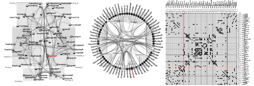
Our experiment used a within-participant design with two independent variables: layout (three levels: projection, circular, and matrix) and visual markers (nine levels: length, shape, density, slope, angle, size, texture, hue, and lightness) (Fig. 1). Dependent variables include accuracy, task completion time, and subjective ratings.
3.1 Domain-Specific Data Selection
Tasks and datasets derived from real-world data provide the best and most realistic foundation for relevant and generalizable findings [42]. For this reason, we draw on our existing expertise and collaborators to base our study on data and tasks from brain connectivity research. However, these tasks and data are still generally valid across many applications relevant to networks.
Our study uses 27 brain network cohorts (15 normal and 12 diseased brains) in the Network Based Statistic Toolbox sample data [1]. The left and right brain hemispheres contain a hierarchical structure: four lobes (frontal, parietal, temporal, and occipital lobes) are used in this dataset and our study. The next level is the 74 cortex and subcortical brain regions where differences in brain connectivities are extracted by structural correlations [20]. Edges (connectivities) between nodes are defined by all pair correlation strengths of numeric values. These correlations can be either positive or negative. Here we use correlation strengths, i.e. the absolute values of the correlations.
3.2 Independent Variables: Positioning and Visual Markers
We describe a taxonomy to design quantitative networks with three positioning and nine visual markers (Table I).
3.2.1 Three Positioning Techniques
Projection. The project shows a 2D projected view. A node layout algorithm overlays a placement grid and places nodes and labels at the nearest available grid point, as in Chen et al. [43]. A light-gray bounding box contains all nodes belonging to the same parent. Some parents (e.g., parietal and temporal lobes) overlap due to the 2D projection, but can be differentiated by the bounding box and by hovering the mouse pointer over the label to highlight all sibling nodes. We apply geometry-based edge bundling [44] to reduce visual clutter caused by overlapping edges.
Circular. The circular layout reflects the symmetry and hierarchy in data. Following the design in Irimia et al. [20], the left and right symmetrical structures are symmetrically placed on the left and right half-circles. The four parent nodes are ordered in 2D from top to bottom following their anatomical locations in 3D. Hierarchical edge bundling [45] of the connectivity shortens edges within the same lobe compared to those between different lobes.
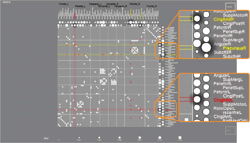
Matrix. The order of nodes in the matrix is the same as those in the circular layout in order to preserve the symmetric structure and the order in the anatomical regions. Edge connectivity between two nodes is shown in solid white in the matrix cell. The small cell sizes challenge the labeling, however, as noted by Alper et al. [8]. We label and display the attributes by placing them beside the rows and columns in a jigsaw pattern; i.e., the markers except the length are arranged in two lines so that each marker can occupy two cell widths. The length bars are not constrained by space issues and use a single column, as in Henry et al. [46]. Labels are placed next to node markers and are displayed vertically at the top of the view and horizontally on the right. In cases where two matrices are displayed side-by-side, the matrix on the right does not display any labels since they can be shared with the labels on the left. White horizontal and vertical lines separate the lobes.
3.2.2 Nine-Centrality-Attribute Encoding
We select nine visual markers to encode node attributes (here centralities): length, angle, slope, area, density, light- ness, hue, texture, and shape.
General criteria for marker size. We follow the psychophysics literature on marker distinguishability in choosing marker sizes and use the same size whenever possi- ble to ensure fair comparison of these nine marker types. Human comprehension of high spatial frequencies can reach eight to ten degrees per cycle without causing visual blurring [47]. Here we select the texture marker to contains at most ten cycles. This indicates that marker size could be as small as . When a viewer is about 400mm from the screen, the marker size should be 7mm, so we fix circular markers at 7mm diameter.
Length and area are size encodings. Length maps the value linearly to the height of a bar. The maximum length is mapped to 20mm and the width of the bar to 2.5mm, given the screen space.
Angle and slope are orientation encodings. The angle encoding resembles a pie chart in which the angle indicated in white is proportional to the underlying numerical value. We render the area within that angle also in white. The slope encoding uses half circles ranging from to . This clock-like marker starts by pointing to the left and rotates clockwise to its maximum pointing to the right.
Density is defined as the amount of black on white. One-pixel-wide black dots are randomly placed in the circular mark and the number of dots is linearly mapped to the centrality indices. For the experiment monitor of a resolution display with pixel size , a mark of diameter has area , which contains approximately 578 pixels.
Lightness and hue are two color components. Lightness goes from black to white and is linear to the centralities. The hue markers use the isoluminant map in Kindlmann, Rein- hard, and Creem [29]. Though hue, unlike lightness, is not perceived as ordered [48], using a large spectrum could help distinguish small differences in encoded values (depending on the color resolution) and facilitate fast comparison.
Texture is defined by frequency of black-white strips to indicate encoded centrality, following methods in Bertin [49] and MacEachren [18]. Frequency increases linearly with centralities to a maximum of .
Shape is defined using the ordered glyphs of 2D superellipses [50, 51] generated by the following parametric equations: , , where = -1 () or 0 () or 1 (), A is the radius, and is the angular position of a vertex on the marker’s boundary, ranging from to . Hence the shape morphs gradually from a near-star to a near-square where the curvatures of the shape boundary vary to show ordering in the data [52]. We use a log function to map the centrality data to the control parameter , where and , , and are empirically chosen, so that the entire centrality range is mapped to a visually differentiable curvature range. For each , the marker area is normalized to the circular area in other visual markers by changing the marker’s diameter to avoid confounding area cue.
3.3 Tasks
Four task types are selected to measure the effectiveness and efficiency of positioning and encoding techniques. The first task is a change-detection task while the last three tasks address hub finding in local and global networks involving various scales of network tracing and comparison.
Task 1 (Change-detection) (Fig. 2). In which graph does the highlighted node have a higher degree of centrality? This task is a change-detection task asking participants to compare centrality changes directly in two networks. The two network visualizations are placed side by side. To select the answer, participants use the mouse to right-click one of the two networks to indicate the one with higher centrality.
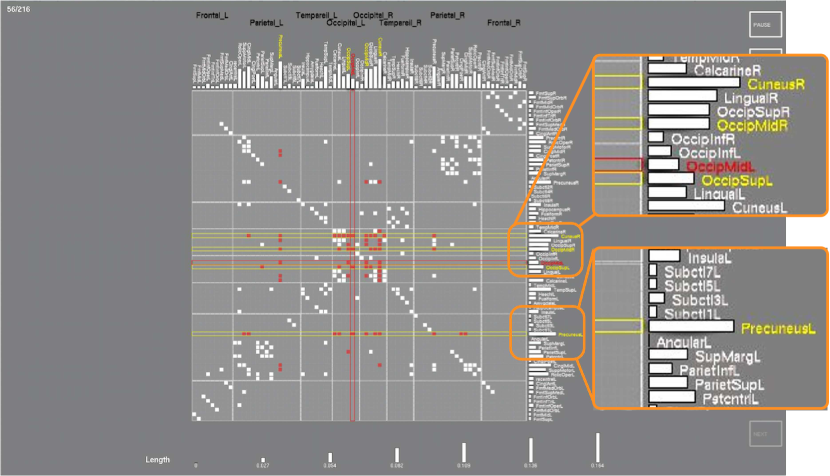
Task 2 (NeighborHub) (Fig. 3). Among the neighbors of the highlighted node, which has the highest betweenness centrality? This task asks participants to find the hub within a set of nodes that are connected to the node highlighted in red. To complete this task, participants must first find the neighbors of the task-node through edge tracing, then compare the centrality measures of all neighbors to locate the largest one, and then right-mouse click to any part of the answer node (e.g., node or node label) to mark the answer.
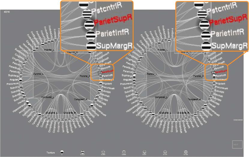
Task 3 (LobeHub) (Fig. 4). Of all the nodes in the highlighted brain lobe, which has the highest centrality? This task requires participants to find the node with highest centrality of all nodes within the lobe with name highlighted in red. To complete this task, participants first need to recognize the hierarchical relationships, i.e., find all nodes contained in a lobe, and then compare the values of those nodes.
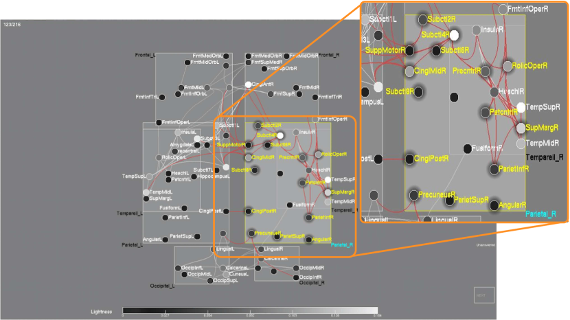
Task 4 (HemisphereHub) (Fig. 5). Of the neighbors of the highlighted node, which one has the highest centrality in the opposite hemisphere? This task requires participants to find the hub on the other symmetry part connected to the region. To complete the task, the participant must use symmetry to find the neighbors on the other side before finding the one with the highest centrality.
3.4 Interaction
We have designed and implemented interaction techniques to make perceiving structures and quantitative data easier in different layout methods. Hovering over the parent node label highlights all sibling nodes; left-clicking a node highlights all neighboring nodes; left-clicking an edge highlights the nodes the edge links to. These text labels of the highlighted nodes are shown in yellow and the highlighted nodes are haloed to differentiate them from the task node in red. During the experiment, the task node is always highlighted in red but changes to cyan if the participant selects the task node. To support multistage interaction, we also let participants click on a highlighted yellow node to see all edges linked to this node shown in cyan.
In matrix view, the associated column and row of the task-node are also in red or cyan to help participants find the neighbors and overcome in part the difficulty of tracing edges. These task-related red nodes are always visible during task execution.
3.5 Data
Our data are carefully chosen based on results of three pilot studies: we balance the size of the network so that the results will be above guessing rate, yet not so simple that all answers will be correct.
Edge density. We sample the edges (originally ) based on network efficiency, which is the ratio of the number of edges to the number of all possible edges in the network [53]. We keep the (or 135 edges) sparse and top (or 270 edges) dense edges of all edges in the two edge densities; these densities are the same as used in Alper et al. [8]. However, the total edge count in our study is nearly four times that in Alper et al. [8] because the number of nodes is doubled.
Data complexity is chosen at three different levels from low to high so as to cover a broad range of real-world conditions. For task 1, the degree difference in each of paired networks is 1 or 2 or 3 for both dense and sparse networks. Since the dense cases have nodes with higher degree, the same degree difference results in smaller marker difference and thus be more difficult to distinguish.
Tasks 2, 3, and 4 measure betweenness centrality to define hub nodes. To determine the hub candidates, we calculate the distribution of betweenness centrality of all nodes in the mean graph, computed by averaging all 27 matrices for each of the pairwise correlations, to determine the betweenness centrality () thresholds. The thresholds are for both sparse and dense conditions; a node is a hub candidate when for that node. The data are chosen from the set of hubs. To ensure legibility, we also select hub nodes whose centrality is at least higher than any other nodes that are also neighbors of the task node (for tasks 2 and 4) or are in the same lobe (for task 3), so that the markers encoding these values can be distinguished visually.
For task 2 on the NeighborHub tasks, since a pilot study shows that the number of neighbors of the task node strongly impacts task performance, we first identify all hubs for each network, then examine all the neighbors of all these hub nodes and select nodes with degree meeting the following criteria: in the sparse case, nodes with degree 2, 3, and 4; in dense networks, the degrees are 4, 5, and 6 for low, medium, and high data-complexity conditions respectively. For task 3 on the LobeHub task, we select lobes that contain at least one hub node. For task 4, we first identify all hubs for each network and all neighbors of these hubs that are located in the opposite hemisphere of the brain. Of these neighboring nodes, we select those with degree within the ranges [2,3], [4,5], and [5,7] in the sparse condition and [4,5] [6,7], and [8,10] in the dense conditions for low, medium, and high data-complexity conditions, respectively.
3.6 Hypotheses
We have the following working hypotheses.
-
•
H1. For change-detection tasks, we would not observe differences in correctness among three layout approaches.
This is because these three methods lay out nodes at about the same spatial proximity.
-
•
H2. Circular and matrix would be more accurate than projection in the LobeHub tasks, but circular and projection would be more accurate than matrix in NeighborHub and HemisphereHub tasks.
This is because circular would support tasks that require hierarchy and symmetry reading; projection supports symmetry but would be slow in hierarchy; matrix supports better hierarchy but perhaps not symmetry. We believe this positioning would have influenced users for interpreting quantitative data visualizations in network structures.
-
•
H3. For change-detection tasks, the ranking of the visual markers would partially follow the Mackinlay order for quantitative data comparison of length, angle, slope, area, density, lightness, and hue.
We think this ranking hypothesis would be supported because this task is a simple comparison of two quantitative values.
-
•
H4. For multi-scale comparisons, the rankings for hue, texture, and shape would improve, though they were ranked the last three in the Mackinlay order for showing quantities.
This ranking hypothesis about hue, texture, and shape would be supported because of our design choices. The hues are monotonic, texture design combines size encoding, and curvatures in shapes are pre-attentive and thus support efficient visual comparison. The presence of these new features in the visual markers makes us to believe it is important to rank the marker effectiveness.
-
•
H5. Length and area in general would lead to the most accurate answers and would consume the least amount of time.
This is because length and area are generally easier compared and would be the more salient than color and orientation [36].
3.7 Study Design
We use a full-factorial design with two independent variables: layout (three levels) and visual marker (nine levels) (Table II). We also selected three levels of data complexity (low, medium, and high) and two levels of edge density (sparse and dense) in order to include a broad range of data. The three layout methods are combined with the three data complexities in a Latin square. Participants performed one of the three squares using the nine markers with both sparse and dense edge densities. Thus, each participant performed (layout-data complexity) 9 (markers) 2 (edge density)=54 trials in each task and a total of 216 trials for all four tasks. The 54 trials in each task were randomly ordered to avoid learning effects. All participants completed all trials in task 1 followed by all trials in task types 2, 3, and 4 in that order.
| Participant | Layout- | Marker | Edge |
| ID | data complexity | type | density |
| Projection-low | |||
| 1-6 | Circular-medium | ||
| Matrix-high | Sparse () | ||
| Circular-low | 9 types | and | |
| 7-12 | Matrix-medium | dense () | |
| Projection-high | |||
| Matrix-low | |||
| 13-18 | Projection-medium | ||
| Circular-high |
3.8 Participants
Eighteen participants volunteered for the study and received minimum wage compensation. Their ages ranged from 18 to 29 with average 22.4 (standard deviation=3.0); eight are female. Seven studied computer science (4 females), one computer engineering, two mechanical engineering, two human-computer interaction (one female), one psychology (female), one in biology (one female), and one Asian studies (female). The three brain scientists participated in the study and were evenly distributed in these three participant ID groups. Females were also distributed in these three groups as evenly as possible.
3.9 Procedure
The experiment was conducted in a quiet lab. The display was a Dell monitor; the screen resolution was . Participants first completed a consent form and then a background survey. Three layout and nine markers were introduced. The training session ensured that the participants had fully understood all encoding approaches and the task requirements. They were given nine practice tasks for each task type. Answers were shown on the screen in the training session to let the participants learn by fixing their mistakes. The training session were not timed and participants were instructed to fully understand the tasks and encoding methods before proceeding to the formal testing, when participants completed tasks independently and were allowed to quit the study or take breaks at any time. During the formal testing, our program logged task completion time, all interaction, and participants’ answers. Participants completed a post-questionnaire to rate the techniques and were interviewed for comments.
4 Results
This section presents statistical analysis results.
| Task | Variable | Statistical test | ES |
|---|---|---|---|
| Accuracy (marker) | =23.3, p=0.003 | 0.15 | |
| Change- | Accuracy (layout) | 0.05 | |
| detection | Time (marker) | 0.30 | |
| Time (layout) | , p0.0001 | 0.44 | |
| Accuracy (marker) | , p0.0001 | 0.20 | |
| Neighbor | Accuracy (layout) | , p=0.01 | 0.10 |
| Hub | Time (marker) | , p0.0001 | 0.66 |
| Time (layout) | , p0.0001 | 1.34 | |
| Accuracy (marker) | , p0.0001 | 0.19 | |
| Lobe | Accuracy (layout) | , p0.0001 | 0.21 |
| Hub | Time (marker) | , p0.0001 | 1.13 |
| Time (layout) | , p0.0001 | 0.55 | |
| Accuracy (marker) | , p=0.02 | 0.14 | |
| Hemisphere | Accuracy (layout) | , p0.0001 | 0.17 |
| Hub | Time (marker) | , p=0.001 | 0.39 |
| Time (layout) | , p0.0001 | 1.40 |
4.1 Analysis Approaches
We collected 3,888 data points (972 from each of the four tasks) and analyzed the results by task using the statistics analysis software SAS. and values of the main effects and their interaction with task completion time are computed with a general linear model (GLM) procedure. For significant main effects, a post-hoc analysis with Tukey’s honest significant difference (HSD) test is used. The correctness data are binary (correct or incorrect) and are analyzed using logistic regression and reported using the value from the Wald test. When the value is less than 0.05, variable levels with confidence interval of pairwise difference of odds ratios not overlapping are considered significantly different. The test with the “freq” procedure is used to examine whether or not there is a significant correlation between the main effect (either positioning or marker) and accuracy.
We measure effect sizes using Cohen’s for time and Cramer’s for correctness to understand the practical significance [54]. We used Cohen’s benchmarks for “small”(0.07-0.21,) “medium” (0.21-0.35,) and “large” () effects. We separate our analyses by task and give the summary statistics in Table III and Figs. 6-9.
4.2 Summary Statistics by Tasks
All subfigures in Figs. 6-9 use confidence intervals in the error bar. The colored dots along the same horizontal line indicate significantly different pairs in the post-hoc analysis. For each task, we plot the statistics for positioning and marker types vs. accuracy and completion time.
‘
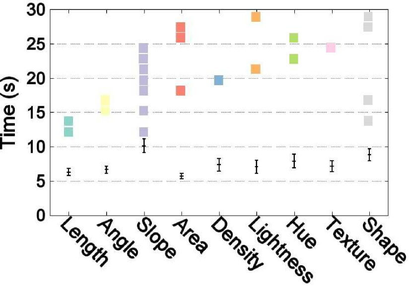
4.2.1 Task type 1: Change-detection Tasks
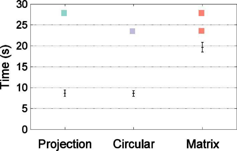
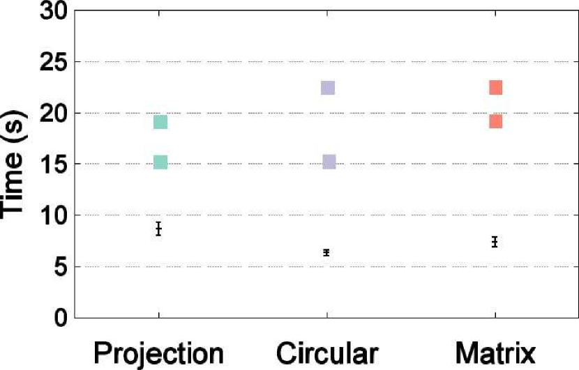
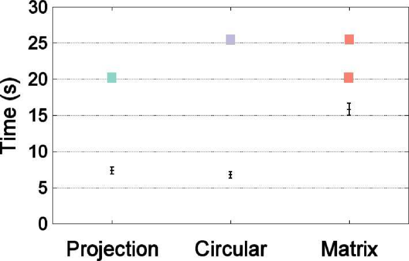
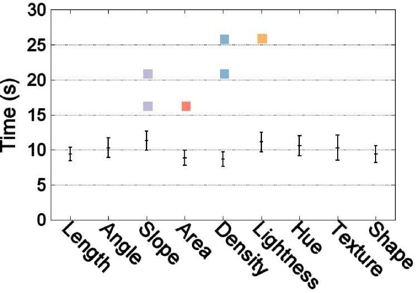
This task asks participants to compare which is larger between the same node in two different networks placed side by side. We observe a significant main effect of layout on time (Fig. 6(b)) and the effect size is large (d=0.40). The post-hoc analysis shows that two methods of projection-matrix and projection-circular belong to different groups, revealing that projection forms a group by itself and circular and matrix are in the same group.
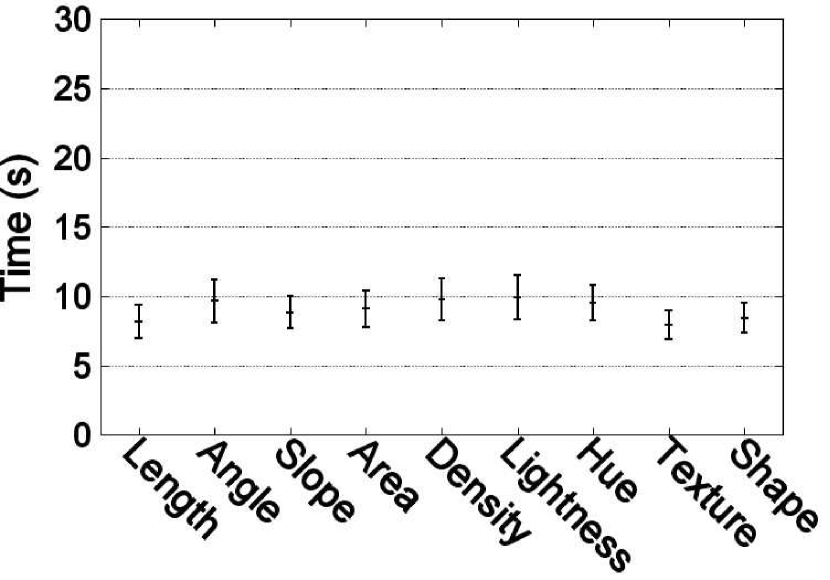
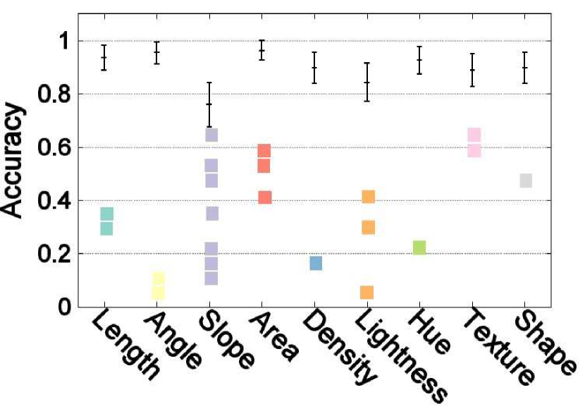
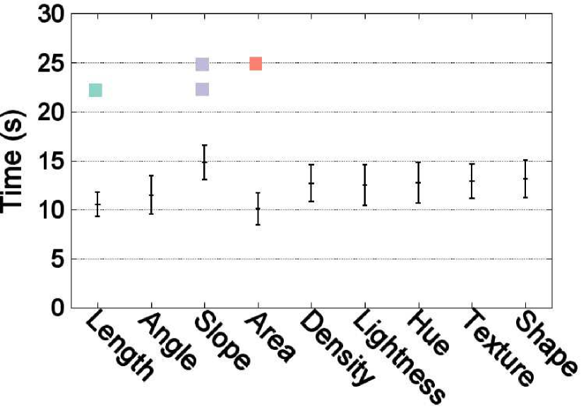
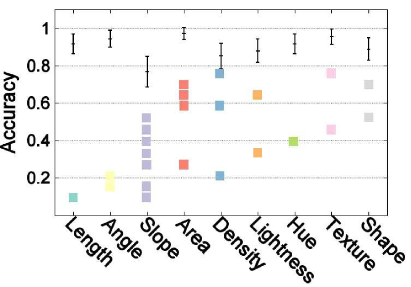
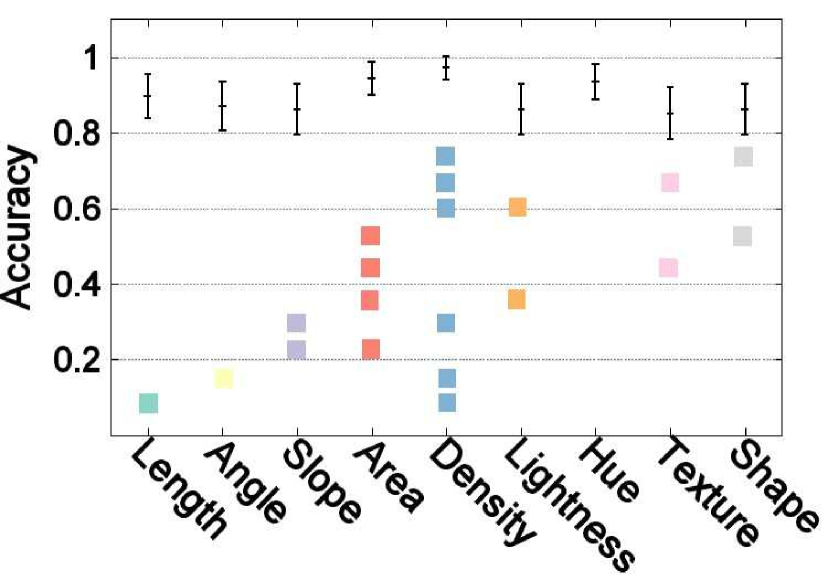
We also observe a significant main effect of marker on correctness (Fig. 6(c)), though the effect size of accuracy on encoding is small (). The marker groups revealed in post-hoc analysis are listed in Fig. 6(c). We observe three groups: lightness and density (as expected) are in the least accurate group and in contrast hue-variation increases accuracy and falls into the same group as the most efficient texture, length, area, angle, and shape. Slope can be in either group.
4.2.2 Task type 2: NeighborHub Tasks
This task asks participants to locate extremes in neighboring nodes that might be spatially distributed in different regions. Both layout and markers are significant main effects on both accuracy and completion time (Table III). The effect sizes of the marker and layout on time are both large.
4.2.3 Task type 3: LobeHub Tasks
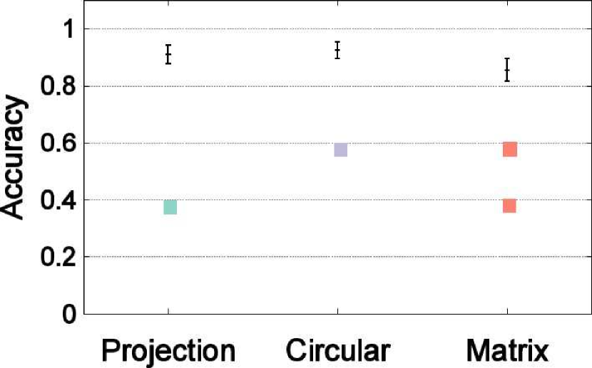
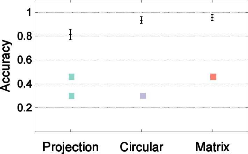
This task asks participants to locate the extreme values of nodes within closely proximity. Both main effects of positioning and marks are significant for both completion time and correctness. The effect size is large for time but not accuracy. Here circular and matrix have the most accurate answers (Fig. 8(a) and also take the least time for task completion (Fig. 8(b)). If we balance the accuracy and time and group techniques whenever possible, the post-hoc analysis reveals two groups: the matrix-circular group and the projection group.
The effect of visual markers on correctness is also significant (Table III), with area, texture, and angle being the most accurate and slope and density being the least accurate. Area and length have the shortest task completion time; slope extends task completion time. The post-hoc analysis of accuracy reveals three larger groups: area, texture, angle, length, and hue achieve the most accurate answers, density and slope the worst, with shape and lightness in between.
4.2.4 Task type 4: HemisphereHub Tasks
This task asks participants to locate symmetry and find extremes in neighbors belonging to the other half of the symmetrical network. We also observe significant main effects of both layout and encoding on correctness and time (Fig. 9 (a)-(d)). Circular leads to the most accurate answers, followed by projection and matrix. Circular and projection lead to fast task completion. To balance correctness and accuracy, projection and circular are in the same group, leaving matrix a group by itself.
Among the visual markers, density surprisingly led to the most accurate result, followed by the hue and area. The other group in the post-hoc analysis includes all other markers: length, angle, lightness, shape, slope, and texture.
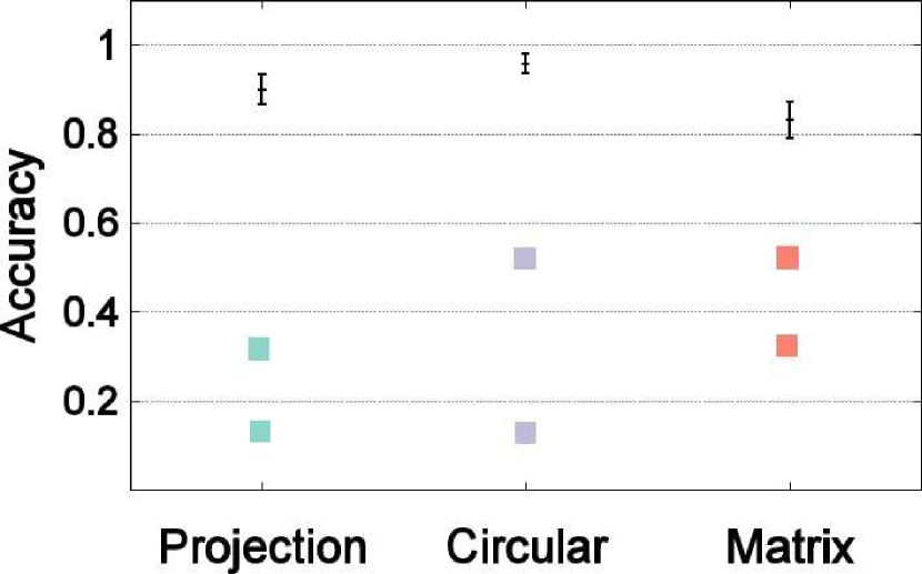
4.2.5 Subjective Rating
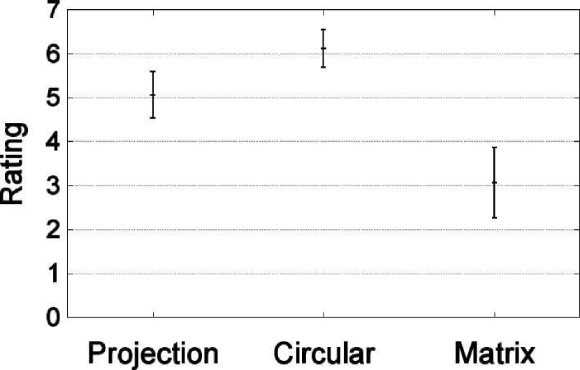
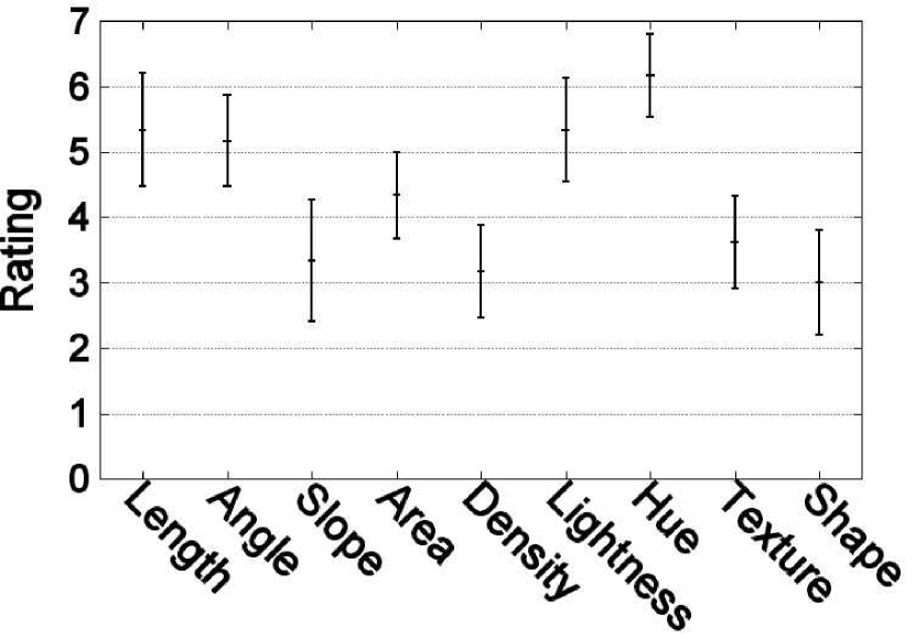
Fig. 10 shows the subjective ratings of layout and visual marker based on perceived usefulness, i.e., how effective participants think certain techniques could help them with their tasks during the experiment. Overall, participants prefer the circular layout, followed by projection and then matrix. This result is mostly in consistent with their objective performance results. Participants rate hue the highest, followed by lightness among those marker types. Participants do not think that shapes are useful.
5 Discussion
This section contains the design knowledge we have gained from the ranking analysis and hypothesis testing and our explanation of the study results.
5.1 Direct Encoding of Quantitative Values for Comparison Tasks
Our tasks are similar to that of Ghoniem, Fekete, and Castagliola [9] and our results indicate that visualizing quantitative variables as much as possible increased task accuracy by in comparing quantitative values. While this work considers only one dimension, a logical next step is to study the multivariate data analysis important in genomics [40] and connectomics [41].
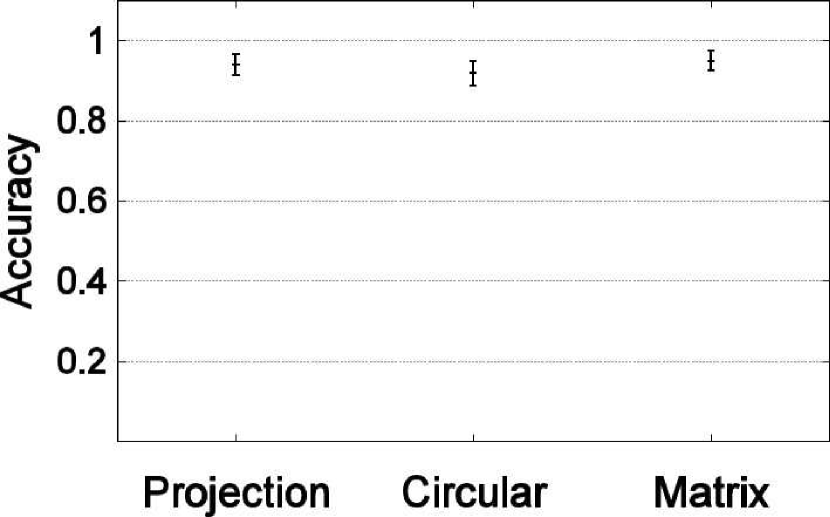
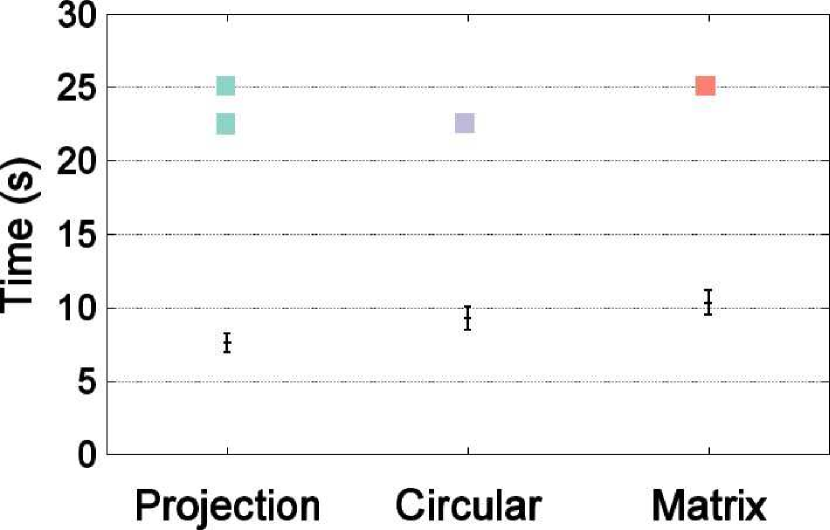
5.2 Ranks of Visual Encoding
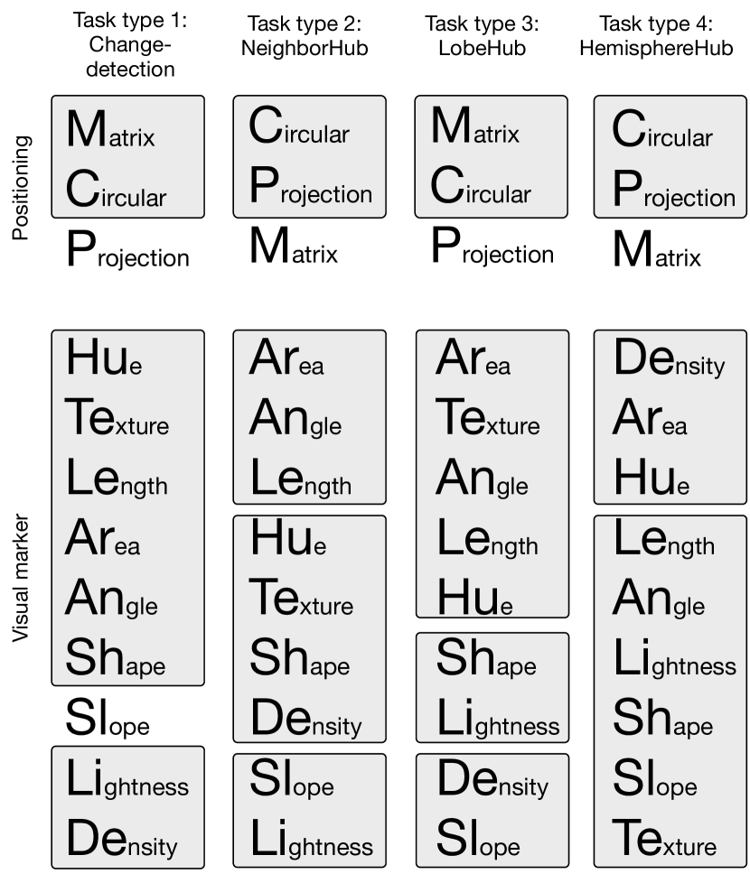
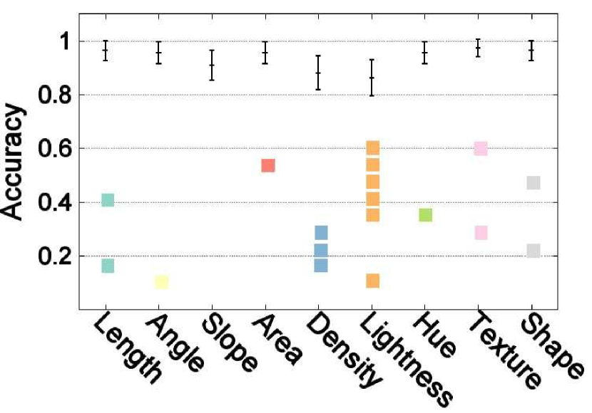
Fig. 11 shows the variable ranking from this study. Since one of our goals is to rank the positioning and marker encodings, we have balanced accuracy and time and group techniques together when handling layout; To the visual marker ranking, we have followed Mackinlay [5] by accuracy only. We group two markers if they are not in significantly different groups in the post-hoc analysis reported in Figs. 6-9.
Our results in general are also consistent with those of Garlandini and Fabrikant’s work [36] in terms of rank order of size, hue, and orientation for change detection. Their work found that size was most and orientation was least accurate and hue was most visually salient. Our variable space is larger than theirs. Our rank of hue is much higher perhaps because our multiple-hue map supports clear differentiation of close numerical values [55].
We can make several interesting observations. For the positioning techniques, circular is always among the best; matrix is superior for tasks that do not require symmetry detection (e.g. for Change-detection and LobeHub) or when nodes are close adjacent to each other (e.g., nodes in LobeHub are closer than NeighborHub).
Among the nine visual markers, hue and area are the two markers that are always in the top groups; length is also except for the final complex HemisphereHub task type. This result is considered to be significant, especially considering that color is the most used quantitative data encoding in the brain science domain [16]: our results demonstrate that a carefully chosen color map can be effective to address complex data visualization. An immediate future direction is to study what color maps would be more effective for a broader range of comparison tasks. Since lightness in general is less accurate despite its monotonic luminance, our results show that adding hue variations would be more effective in showing quantitative values and our adoption of the multi-hue clearly shows that hue supports discriminations at various scales.
Another interesting result relates to shape: shape appears to be good for simple comparison (e.g., change-detection) but poor for many comparisons. This result might show that shape with curvature is difficult to scale, even though two-curvature comparison is among the easiest.
Texture is suitable for local closely adjacent comparisons (e.g., Change-detection and LobeHub) but when distances between nodes increase, texture does not fit well (e.g., neighborHub and HemisphereHub). Slope, lightness, and density are the three visual markers frequently ranked low which is in consistent with literature. It is unclear why density is appeared to be the best for complex HemisphereHub tasks.
5.3 Hypothesis Testing
For change-detection tasks, we would not observe differences in correctness among the three layout approaches. [Supported]
H1 is supported (Fig. 6(a)). It is not surprising that these three positioning techniques produce about the same accuracy, since we believe the result is influenced mainly by the spatial proximity of the two values compared, and the proximities of all side by side comparisons in the three positioning techniques are the same. Matrix takes longer and projection is most efficient (Fig. 6(b)), perhaps because participants tend to get an overview of the entire layout before answering the questions. Projection is most straightforward in layout, followed by circular and matrix views, as remarked by our brain scientist collaborators.
H2. Circular and matrix would be more accurate than projection in the LobeHub tasks, but circular and projection would be more accurate than matrix in NeighborHub and HemisphereHub tasks. [Supported]
This hypothesis is supported. One way to explain the efficiency of circular and matrix views for local region search tasks, such as the LobeHub tasks, is that the ordering and alignment of the nodes on these two methods improve accuracy. These tasks also do not need symmetrical search, which would otherwise work badly for the matrix. Circular may have the most ordered linear arrangement of nodes in a lobe which might explain its lowest task completion time.
The order of the layout efficiency changed for the NeighborHub and the HemisphereHub tasks, where the projection and circular lead to more accurate answers than the matrix. For all these three tasks, participants need to conduct two subtasks: (1) visual search of those nodes within a lobe (for lobeHub), or a region (for neighborHub), or a hemisphere (for hemisphereHub) and (2) comparisons of centrality measures on these nodes. The result that comparison becomes worse for matrix than circular and projection on NeighborHub and HemisphereHub tasks can be explained by the two different types of structural symmetry: orthogonal for matrix and mirror for the other two methods. Here orthogonal symmetry on two perpendicular axes in matrix increases task completion time. That matrix increases task time can also be explained by the lack of patterns in neighboring node search, causing difficulty in finding neighboring nodes.
That projection is always worse than circular can be perhaps explained by its lack of boundary which makes interactive visual search of neighbors harder. Though it is also generally believed that our boundary-supporting Gestalt principle of “closure” facilitates grouping, that humans use convex hulls to enforce closure [56], and that proximity also implicates groups and similarity [57], none of these benefited projection, as was true for the three medical professionals as well. We may want to use projections with caution, as in Jianu et al. [58], for brain image comparison tasks.
For Change-detection tasks, the ranking of the visual markers partially follow the Mackinlay order for quantitative data of length, angle, slope, area, density, lightness, and hue. [Partially supported]
For mark effectiveness, the general rank order of selected marker types follow the original Mackinlay order reasonably well only for length, area, and lightness. Here hue showed greater competency and fell in the same group as the most effective length. One explanation is the color marker choices – multiple hues are effective for finding large and small [55]. The curvatures used in the shapes are not as pre-attentive, especially for complex tasks involving many item comparisons, but can be effective for two items; this shows its scalability limitations, as we expected, perhaps because of participant lack of familiarity with shape markers.
H4. For multi-scale comparisons, the rankings for hue, texture, and shape would improve, though they are ranked as the last three in the Mackinlay order for showing quantities. [Partially supported]
This hypothesis was partially supported: ranking improved for hue and texture but not shape. Texture led to the most accurate answers, especially for the change-detection and LobeHub tasks, perhaps because this band texture allows both size and frequency detection.
There is great interest in the community in using shape or glyphs in design. Though we have adopted ordered glyphs, the accuracy of this ordered glyph and task-completion time are not as good as we had hoped. Our result would suggest that single-variable encoding with shape has limited use, and yet multiple encodings of shapes (e.g., tensor encodings in 2D brain imaging visualization in Laidlaw et al. [59] and tensor glyphs in Schultz and Kindlmann [50]) and Kindlmann [60] need to be studied since they make possible new relationship tasks for which design recommendations are just appearing [61]. Hue also improves performance and leads to about the same accuracy as area, suggesting that combing multi-hues and luminance convey order effectively.
H5. Length in general would lead to the most accurate answers and would consume the least amount of time. [Partially supported]
Our results are contrary to those in Cleveland and McGill [4]. Length was better in Cleveland and McGill study while area and angle were more accurate than length for the relatively complex tasks in task types 2-4. This has to do with the limited number of distinguishable steps. Cleveland and McGill’s experiments on reading charts drill down to very small differences in encoded value, while in our experiments, our task-generation criteria ensure that the difference is relatively large (); this eliminates cases with very small visual difference, where the aligned length encoding should be superior.
5.4 Quantitative Overlaying on Topological Networks
Our study fills in the literature by looking at node attribute encoding for network visualization. Our major take-away messages are that this explicit encoding improves accuracy by at least compared to the former empirical study results and ranking orders for comparison tasks at various scales of node distributions. These results can assist visualization designers to choose quantitative encoding methods for network comparison tasks.
We focus on evaluating the effectiveness of several visual markers in conveying node attributes on three layout conditions. A somewhat surprising result was that hues in various scale conditions works well except in searching among a large group of neighboring nodes. In addition to brain network visualization, many other networks such as biological pathway visualizations also require encoding quantitative values. Brain-image-based visualization tools (such as AFNI [62], BrainVoyager [63], and LONI [64]) rely heavily on color to represent statistics of brain regions. Network-based visualization tools (such as BrainNet Viewer [65] and Connectome Viewer [25]) use color and size pervasively to encode node attributes. Our study has shown that visual variables other than hue and area (as well as carefully designed texture) can in many cases achieve similar if not better performance. For network layout, we note that though the brain research community has adopted some layout techniques to show brain region clusters [66], inefficient text labeling or additional views are required to associate nodes with individual brain regions.
5.5 Strength and Limitations
The strength of the present experiment is its inclusion of a broad range of visual variables and several commonly used layout methods. Nine markers and three layout techniques are carefully compared. The reliability of the experiment is enhanced by the well-controlled task difficulty. Difficulty is controlled according to each task and the underlying data characteristics. This reduces the influence of data variation on human performance and makes it more likely that the performance variability we see actually comes from a variation in effectiveness among the different visual markers and layout methods. Our experiments have limitations: like any lab study involving human participants, our study results may be different if we use medical professionals.
6 Conclusion
Our study evaluates network visualization by selecting and comparing nine visual markers and three layout methods. Our experimental results provide the following recommendations for designing single-variate network visualizations.
-
•
Positioning techniques influence task effectiveness; positioning that is closely proximate to task conditions is likely to achieve the best performance.
-
–
When tasks are related to symmetrical structure, use circular or projection symmetrical positioning.
-
–
When tasks are related to reading from a set of randomly distributed values in closely proximate spatial locations (brain lobes), use matrix or circular positioning.
-
–
-
•
For pairwise comparison tasks, monotonic luminance multi-hue, texture, length, area, angle, and curvature-inspired shape achieve the best results.
-
•
For multiple comparisons in closer adjacent areas, area, texture, angle, length, and hues are the best.
-
•
Avoid lightness and slope as much as possible for data comparison.
Appendix A Pilot Study Results: Comparison of Two Background Coloring Schemes
We have compared the white and the gray background color schemes to understand the effect of background on task completion time and accuracy (i.e., percentage of correct answers.) The gray-background coloring scheme uses gray as the background color and outline the markers in black to increase contrast. The white-background networks depict the figures in black (Fig. 12). This study follows the same procedure as the formal study except that we only tested the sparse graph and half of the participants did black and half white first. Data assignment was randomized. This pilot study showed that the background was not a significant main effect either on task completion time or on accuracy using the same statistical measurement methods as the formal study (Table IV).
| Task | Variable | Statistical test |
|---|---|---|
| Accuracy (marker) | =5.72, p=0.7 | |
| Accuracy (layout) | =2.75, p=0.25 | |
| Change- | Accuracy (background) | =1.40, p=0.24 |
| detection | Time (marker) | , p=0.41 |
| Time (layout) | , p0.0001 | |
| Time (background) | , p=0.64 | |
| Accuracy (marker) | , p=0.25 | |
| Accuracy (layout) | , p=0.14 | |
| Neighbor | Accuracy (background) | , p=0.25 |
| Hub | Time (marker) | , p=0.065 |
| Time (layout) | , p0.0001 | |
| Time (background) | , p=0.44 | |
| Accuracy (marker) | , p=0.86 | |
| Accuracy (layout) | , p=0.32 | |
| Lobe | Accuracy (background) | , p=0.8 |
| Hub | Time (marker) | , p0.0001 |
| Time (layout) | , p=0.08 | |
| Time (background) | , p=0.22 | |
| Accuracy (marker) | , p=0.42 | |
| Accuracy (layout) | , p=0.43 | |
| Hemisphere | Accuracy (background) | , p=0.90 |
| Hub | Time (marker) | , p=0.68 |
| Time (layout) | , p0.0001 | |
| Time (background) | , p=0.89 |
Acknowledgments
The authors would like to thank Drs. Susumu Mori, Judd Storrs, and Kenneth L. Weiss for their input on the task selection. The authors would also like to thank the participants for their contributions and the anonymous reviewers for their insights. Special thanks to Katrina Avery for revising the manuscript. This work was supported in part by National Science Foundation (NSF) awards IIS-1302755, CNS-1531491, ABI-1260795, EPS-0903234, and DBI-1062057. Any opinions, findings, and conclusions or recommendations expressed in this material are those of the authors and do not necessarily reflect the views of the National Science Foundation.
Jian Chen is the corresponding author.
References
- [1] A. Zalesky, A. Fornito, and E. T. Bullmore, “Network-based statistic: identifying differences in brain networks,” NeuroImage, vol. 53, no. 4, pp. 1197–1207, 2010.
- [2] M. Rubinov and O. Sporns, “Complex network measures of brain connectivity: uses and interpretations,” NeuroImage, vol. 52, no. 3, pp. 1059–1069, 2010.
- [3] D. S. Margulies, J. Böttger, A. Watanabe, and K. J. Gorgolewski, “Visualizing the human connectome,” NeuroImage, vol. 80, pp. 445–461, 2013.
- [4] W. S. Cleveland and R. McGill, “Graphical perception and graphical methods for analyzing scientific data,” Science, vol. 229, no. 4716, pp. 828–833, 1985.
- [5] J. Mackinlay, “Automating the design of graphical presentations of relational information,” ACM Transactions on Graphics, vol. 5, no. 2, pp. 110–141, 1986.
- [6] U. Brandes, “A faster algorithm for betweenness centrality*,” Journal of mathematical sociology, vol. 25, no. 2, pp. 163–177, 2001.
- [7] J. Wang, X. Zuo, and Y. He, “Graph-based network analysis of resting-state functional MRI,” Frontiers in Systems Neuroscience, vol. 4, p. 16, 2010.
- [8] B. Alper, B. Bach, N. Henry Riche, T. Isenberg, and J.-D. Fekete, “Weighted graph comparison techniques for brain connectivity analysis,” in Proceedings of the ACM SIGCHI Conference on Human Factors in Computing Systems, 2013, pp. 483–492.
- [9] M. Ghoniem, J.-D. Fekete, and P. Castagliola, “A comparison of the readability of graphs using node-link and matrix-based representations,” in IEEE Symposium on Information Visualization, 2004, pp. 17–24.
- [10] H. Lam, T. Munzner, and R. Kincaid, “Overview use in multiple visual information resolution interfaces,” IEEE Transactions on Visualization and Computer Graphics, vol. 13, no. 6, pp. 1278–1285, 2007.
- [11] H. Purchase, “Which aesthetic has the greatest effect on human understanding?” in Graph Drawing. Springer, 1997, pp. 248–261.
- [12] C. Vehlow, F. Beck, and D. Weiskopf, “The state of the art in visualizing group structures in graphs,” in Eurographics Conference on Visualization (EuroVis) - STARs. The Eurographics Association, 2015.
- [13] W. Huang, M. L. Huang, and C.-C. Lin, “Evaluating overall quality of graph visualizations based on aesthetics aggregation,” Information Sciences, vol. 330, pp. 444–454, 2016.
- [14] F. Beck, M. Burch, S. Diehl, and D. Weiskopf, “A taxonomy and survey of dynamic graph visualization,” in Computer Graphics Forum, 2016.
- [15] D. Archambault, H. Purchase, and B. Pinaud, “Animation, small multiples, and the effect of mental map preservation in dynamic graphs,” IEEE Transactions on Visualization and Computer Graphics, vol. 17, no. 4, pp. 539–552, 2011.
- [16] M. Christen, D. A. Vitacco, L. Huber, J. Harboe, S. I. Fabrikant, and P. Brugger, “Colorful brains: 14 years of display practice in functional neuroimaging,” NeuroImage, vol. 73, pp. 30–39, 2013.
- [17] S. K. Card and J. Mackinlay, “The structure of the information visualization design space,” in Proceedings on IEEE Symposium on Information Visualization, 1997, pp. 92–99.
- [18] A. M. MacEachren, R. E. Roth, J. O’Brien, B. Li, D. Swingley, and M. Gahegan, “Visual semiotics and uncertainty visualization: An empirical study,” IEEE Transactions on Visualization and Computer Graphics, vol. 18, no. 12, pp. 2496–2505, 2012.
- [19] N. Henry, J.-D. Fekete, and M. J. McGuffin, “Nodetrix: a hybrid visualization of social networks,” IEEE Transactions on Visualization and Computer Graphics, vol. 13, no. 6, pp. 1302–1309, 2007.
- [20] A. Irimia, M. C. Chambers, C. M. Torgerson, and J. D. Van Horn, “Circular representation of the cortical networks for subject and population-level connectomic visualization,” NeuroImage, vol. 60, no. 2, pp. 1340–1351, 2012.
- [21] M. Krzywinski, J. Schein, I. Birol, J. Connors, R. Gascoyne, D. Horsman, S. J. Jones, and M. A. Marra, “Circos: an information aesthetic for comparative genomics,” Genome Research, vol. 19, no. 9, pp. 1639–1645, 2009.
- [22] D. S. Marcus, M. P. Harms, A. Z. Snyder, M. Jenkinson, J. A. Wilson, M. F. Glasser, D. M. Barch, K. A. Archie, G. C. Burgess, M. Ramaratnam et al., “Human connectome project informatics: quality control, database services, and data visualization,” NeuroImage, vol. 80, pp. 202–219, 2013.
- [23] S. Mori, K. Oishi, A. V. Faria, and M. I. Miller, “Atlas-based neuroinformatics via MRI: harnessing information from past clinical cases and quantitative image analysis for patient care,” Annual Review of Biomedical Engineering, vol. 15, pp. 71–92, 2013.
- [24] E. R. Tufte and P. Graves-Morris, The visual display of quantitative information, 1983.
- [25] S. Gerhard, A. Daducci, A. Lemkaddem, R. Meuli, J.-P. Thiran, and P. Hagmann, “The connectome viewer toolkit: an open source framework to manage, analyze, and visualize connectomes,” Frontiers in Neuroinformatics, vol. 5, p. 3, 2011.
- [26] D. S. Bassett, J. A. Brown, V. Deshpande, J. M. Carlson, and S. T. Grafton, “Conserved and variable architecture of human white matter connectivity,” NeuroImage, vol. 54, no. 2, pp. 1262–1279, 2011.
- [27] D. S. Bassett and E. T. Bullmore, “Small-world brain networks revisited,” The Neuroscientist, p. 1073858416667720, 2016.
- [28] R. A. LaPlante, L. Douw, W. Tang, and S. M. Stufflebeam, “The connectome visualization utility: Software for visualization of human brain networks,” PloS one, vol. 9, no. 12, p. e113838, 2014.
- [29] G. Kindlmann, E. Reinhard, and S. Creem, “Face-based luminance matching for perceptual colormap generation,” in Proceedings of the conference on Visualization, 2002, pp. 299–306.
- [30] B. Saket, P. Simonetto, S. Kobourov, and K. Börner, “Node, node-link, and node-link-group diagrams: An evaluation,” IEEE Transactions on Visualization and Computer Graphics, vol. 20, no. 12, pp. 2231–2240, 2014.
- [31] R. Jianu, A. Rusu, Y. Hu, and D. Taggart, “How to display group information on node-link diagrams: an evaluation,” IEEE Transactions on Visualization and Computer Graphics, vol. 20, no. 11, pp. 1530–1541, 2014.
- [32] B. Alsallakh, L. Micallef, W. Aigner, H. Hauser, S. Miksch, and P. Rodgers, “The state-of-the-art of set visualization,” in Computer Graphics Forum, vol. 35, no. 1, 2016, pp. 234–260.
- [33] E. R. Gansner, Y. Hu, S. G. Kobourov et al., “Visualizing graphs and clusters as maps,” IEEE Computer Graphics and Applications, vol. 30, no. 6, pp. 54–66, 2010.
- [34] C. Collins, G. Penn, and S. Carpendale, “Bubble sets: Revealing set relations with isocontours over existing visualizations,” IEEE Transactions on Visualization and Computer Graphics, vol. 15, no. 6, pp. 1009–1016, 2009.
- [35] B. Alper, N. Riche, G. Ramos, and M. Czerwinski, “Design study of linesets, a novel set visualization technique,” IEEE Transactions on Visualization and Computer Graphics, vol. 17, no. 12, pp. 2259–2267, 2011.
- [36] S. Garlandini and S. I. Fabrikant, “Evaluating the effectiveness and efficiency of visual variables for geographic information visualization,” in International Conference on Spatial Information Theory. Springer, 2009, pp. 195–211.
- [37] S. I. Fabrikant, D. R. Montello, M. Ruocco, and R. S. Middleton, “The distance–similarity metaphor in network-display spatializations,” Cartography and Geographic Information Science, vol. 31, no. 4, pp. 237–252, 2004.
- [38] H. C. Purchase, “Metrics for graph drawing aesthetics,” Journal of Visual Languages & Computing, vol. 13, no. 5, pp. 501–516, 2002.
- [39] M. Tory, C. Swindells, and R. Dreezer, “Comparing dot and landscape spatializations for visual memory differences,” IEEE Transactions on Visualization and Computer Graphics, vol. 15, no. 6, pp. 1033–1039, 2009.
- [40] N. Gehlenborg, S. I. O’donoghue, N. S. Baliga, A. Goesmann, M. A. Hibbs, H. Kitano, O. Kohlbacher, H. Neuweger, R. Schneider, D. Tenenbaum et al., “Visualization of omics data for systems biology,” Nature methods, vol. 7, pp. S56–S68, 2010.
- [41] J. W. Lichtman, H. Pfister, and N. Shavit, “The big data challenges of connectomics,” Nature neuroscience, vol. 17, no. 11, pp. 1448–1454, 2014.
- [42] J. M. Wolfe, “Use-inspired basic research in medical image perception,” Cognitive Research: Principles and Implications, vol. 1, no. 1, p. 17, 2016.
- [43] J. Chen, P. S. Pyla, and D. A. Bowman, “Testbed evaluation of navigation and text display techniques in an information-rich virtual environment,” in Proceedings of IEEE Virtual Reality, 2004, pp. 181–289.
- [44] W. Cui, H. Zhou, H. Qu, P. C. Wong, and X. Li, “Geometry-based edge clustering for graph visualization,” IEEE Transactions on Visualization and Computer Graphics, vol. 14, no. 6, pp. 1277–1284, 2008.
- [45] D. Holten, “Hierarchical edge bundles: Visualization of adjacency relations in hierarchical data,” IEEE Transactions on Visualization and Computer Graphics, vol. 12, no. 5, pp. 741–748, 2006.
- [46] N. Henry and J.-D. Fekete, “Matrixexplorer: a dual-representation system to explore social networks,” IEEE Transactions on Visualization and Computer Graphics, vol. 12, no. 5, pp. 677–684, 2006.
- [47] P. G. Barten, Contrast sensitivity of the human eye and its effects on image quality. SPIE Press, 1999, vol. 72.
- [48] D. H. Chung, D. Archambault, R. Borgo, D. J. Edwards, R. S. Laramee, and M. Chen, “How ordered is it? On the perceptual orderability of visual channels,” Computer Graphics Forum, vol. 35, no. 3, pp. 131–140, 2016.
- [49] J. Bertin, Semiology of graphics: diagrams, networks, maps. University of Wisconsin Press, 1983.
- [50] T. Schultz and G. L. Kindlmann, “Superquadric glyphs for symmetric second-order tensors,” IEEE Transactions on Visualization and Computer Graphics, vol. 16, no. 6, pp. 1595–1604, 2010.
- [51] N. Seltzer and G. Kindlmann, “Glyphs for asymmetric second-order 2D tensors,” in Computer Graphics Forum, vol. 35, no. 3, 2016, pp. 141–150.
- [52] C. Forsell, S. Seipel, and M. Lind, “Simple 3D glyphs for spatial multivariate data,” in IEEE Symposium on Information Visualization, 2005, pp. 119–124.
- [53] E. Bullmore and O. Sporns, “The economy of brain network organization,” Nature Reviews Neuroscience, vol. 13, no. 5, pp. 336–349, 2012.
- [54] J. Cohen, Statistical power analysis for the behavioral sciences (2nd ed.). New York: Academic Press, 1988.
- [55] C. Ware, “Color sequences for univariate maps: Theory, experiments and principles,” IEEE Computer Graphics and Applications, vol. 8, no. 5, pp. 41–49, 1988.
- [56] F. van Ham and B. Rogowitz, “Perceptual organization in user-generated graph layouts,” IEEE Transactions on Visualization and Computer Graphics, vol. 14, no. 6, pp. 1333–1339, 2008.
- [57] S. I. Fabrikant and A. Skupin, “Cognitively plausible information visualization,” Exploring Geovisualization, pp. 667–690, 2005.
- [58] R. Jianu, C. Demiralp, and D. H. Laidlaw, “Exploring brain connectivity with two-dimensional neural maps,” IEEE transactions on visualization and computer graphics, vol. 18, no. 6, pp. 978–987, 2012.
- [59] D. H. Laidlaw, E. T. Ahrens, D. Kremers, M. J. Avalos, R. E. Jacobs, and C. Readhead, “Visualizing diffusion tensor images of the mouse spinal cord,” in Proceedings of IEEE Visualization, 1998, pp. 127–134.
- [60] G. Kindlmann, “Superquadric tensor glyphs,” in Proceedings of the Sixth Joint Eurographics-IEEE TCVG conference on Visualization. Eurographics Association, 2004, pp. 147–154.
- [61] E. Maguire, P. Rocca-Serra, S.-A. Sansone, J. Davies, and M. Chen, “Taxonomy-based glyph design-with a case study on visualizing workflows of biological experiments,” IEEE Transactions on Visualization and Computer Graphics, vol. 18, no. 12, pp. 2603–2612, 2012.
- [62] R. W. Cox, “AFNI: what a long strange trip it’s been,” NeuroImage, vol. 62, no. 2, pp. 743–747, 2012.
- [63] R. Goebel, “BrainVoyager: ??past, present, future,” NeuroImage, vol. 62, no. 2, pp. 748–756, 2012.
- [64] D. E. Rex, J. Q. Ma, and A. W. Toga, “The LONI pipeline processing environment,” NeuroImage, vol. 19, no. 3, pp. 1033–1048, 2003.
- [65] M. Xia, J. Wang, and Y. He, “BrainNet Viewer: a network visualization tool for human brain connectomics,” one, vol. 8, no. 7, p. e68910, 2013.
- [66] S. M. Nelson, A. L. Cohen, J. D. Power, G. S. Wig, F. M. Miezin, M. E. Wheeler, K. Velanova, D. I. Donaldson, J. S. Phillips, B. L. Schlaggar et al., “A parcellation scheme for human left lateral parietal cortex,” Neuron, vol. 67, no. 1, pp. 156–170, 2010.
![[Uncaptioned image]](/html/1711.04419/assets/x27.png) |
Guohao Zhang is a PhD student at University of Maryland, Baltimore County. He received his B.E. degree in Engineering Physics from Tsinghua University in 2012. His research interests include design and evaluation of visualization techniques and 3D visualizations. He is a student member of IEEE. |
![[Uncaptioned image]](/html/1711.04419/assets/x28.png) |
Alexander P. Auchus Dr. Alexander P. Auchus holds degrees from Johns Hopkins University and from Washington University in St.Louis. He is an elected fellow of the American Neurological Association, the American Academy of Neurology, and the American Geriatrics Society. He has served on the faculty of Emory University, Case Western Reserve University and University of Tennessee. His present position is Professor and McCarty Chair of Neurology at the University of Mississippi Medical Center. Dr. Auchus’??s research interests are in neuroimaging biomarkers for Alzheimer’s disease and other dementias. |
![[Uncaptioned image]](/html/1711.04419/assets/x29.png) |
Peter Kochunov Dr. Peter Kochunov is a professor in the Maryland Psychiatric Research Center and an active collaborator on projects within the Neurobehavioral Research Division. Dr. Kochunov is also Head of the Human MRI group for the RII and a staff scientist at the Southwest Foundation for Biomedical Research. He is a board certified medical physicist with an active research program in genetic imaging. ??Besides his research, Dr. Kochunov has directed a variety of graduate courses on medical imaging and fMRI techniques. He also is the developer of the BrainVisa Morphological extensions. |
![[Uncaptioned image]](/html/1711.04419/assets/x30.png) |
Niklas Elmqvist Dr. Niklas Elmqvist received the Ph.D. degree in 2006 from Chalmers University of Technology in G’́oteborg, Sweden. He is an associate professor in the College of Information Studies at University of Maryland, College Park, MD, USA. He was previously an assistant professor in the School of Electrical & Computer Engineering at Purdue University in West Lafayette, IN. He is a senior member of the IEEE and the IEEE Computer Society. |
![[Uncaptioned image]](/html/1711.04419/assets/x31.png) |
Jian Chen Dr. Jian Chen received the PhD degree in Computer Science from Virginia Polytechnic Institute and State University (Virginia Tech). She did her postdoctoral work in Computer Science and BioMed at Brown University. She is an Assistant Professor in the Department of Computer Science and Engineering at The Ohio State University, where she directs the Human-in-the-Loop Visual Computing Lab. She is also affiliated with the Ohio Translational Data Analytics Institute. Her research interests include design and evaluation of visualization techniques, 3D interface, and immersive analytics. She is a member of the IEEE and the IEEE Computer Society. |