0 \vgtccategoryResearch \vgtcinsertpkg
Foresight: Rapid Data Exploration Through Guideposts
Abstract
Current tools for exploratory data analysis (EDA) require users to manually select data attributes, statistical computations and visual encodings. This can be daunting for large-scale, complex data. We introduce Foresight, a visualization recommender system that helps the user rapidly explore large high-dimensional datasets through “guideposts.” A guidepost is a visualization corresponding to a pronounced instance of a statistical descriptor of the underlying data, such as a strong linear correlation between two attributes, high skewness or concentration about the mean of a single attribute, or a strong clustering of values. For each descriptor, Foresight initially presents visualizations of the “strongest” instances, based on an appropriate ranking metric. Given these initial guideposts, the user can then look at “nearby” guideposts by issuing “guidepost queries” containing constraints on metric type, metric strength, data attributes, and data values. Thus, the user can directly explore the network of guideposts, rather than the overwhelming space of data attributes and visual encodings. Foresight also provides for each descriptor a global visualization of ranking-metric values to both help orient the user and ensure a thorough exploration process. Foresight facilitates interactive exploration of large datasets using fast, approximate sketching to compute ranking metrics. We also contribute insights on EDA practices of data scientists, summarizing results from an interview study we conducted to inform the design of Foresight.
keywords:
Exploratory data analysis, guided exploration, recommendation, statistics, visualization, sketching, scalable analytics.Introduction
Exploratory data analysis (EDA) [30] is a fundamental process for understanding and reasoning about data in which analysts search for interesting patterns and relations, ask questions, and (re)form hypotheses explaining these patterns or relations. To this end, analysts derive insights from the data by iteratively computing and visualizing summary statistics, correlations, outliers, empirical distributions, density functions, clusters, and so on.
EDA Challenges: Although the capabilities of EDA tools continue to improve, most tools often require the user to manually select among data attributes, decide which statistical computations to apply, and specify mappings between visual encoding variables and either the raw data or the computational summaries. This task can be daunting for large datasets having millions of data items and hundreds or thousands of data attributes per item, especially for typical users who have limited time and limited skills in statistics and data visualization. Even experienced analysts face cognitive barriers in this setting. Limitations on our working memory can cause large complex data to be overwhelming regardless of expertise, and our tendency to fit evidence to existing expectations and schemas of thought make it hard to explore insights in an unbiased and rigorous manner [23, 31]. Thus, people typically fail both to focus on the most pertinent evidence and to sufficiently attend to the disconfirmation of hypotheses [22]. Time pressures and data overload work against the analyst’s ability to rigorously follow effective methods for generating, managing, and evaluating hypotheses.
Foresight: We address this problem by introducing Foresight, a system that facilitates rapid discovery of large, high-dimensional datasets through “guideposts.” In Foresight, a guidepost is a visualization corresponding to a pronounced instance of a statistical descriptor of the underlying data. Examples of descriptors include dispersion, skew, distributional tail weight, linear correlation between attributes and , clustering of -values according to -values, and the presence of -value outliers. A guidepost would then correspond to low dispersion, strong linear relationship, tight clustering, and so on. Foresight enables a user to jump-start the exploration process from automatically recommended visualizations, and then gives the user increasing control over the exploration process as familiarity with the data increases. The resulting efficiency in exploration can save users time and dramatically improve their productivity, thereby expanding the depth and breadth of generated hypotheses. Our approach, in which visualizations are recommended according to objective criteria, also helps analysts focus their attention on evidence that is highly diagnostic for, or disconfirming to, current hypotheses.
Structured Exploration: The key idea is to facilitate exploring data attributes that have strong statistical features. This imposes a structure over the space of data visualizations that leads to efficient navigation, rather than mere ad hoc wandering. We build on earlier work in guided and intelligent analytics systems, both research and commercial [11, 21, 25, 35]. Each statistical descriptor in Foresight has one or more strength metrics that we use for ranking guideposts, e.g., the Pearson correlation coefficient to measure the strength of a linear relationship. Similarly, each descriptor has one or more visualizations, i.e., chart types, that we have selected by considering established practice as well as findings of graphical perception research. For a given descriptor, different metrics impose different rankings on the descriptor instances; Foresight allows users to interactively change ranking metrics to enable structured exploration of the data from multiple perspectives.
Scalability Through Sketching: To achieve interactive performance when ranking guideposts, we use approximation techniques. Specifically, the dataset is preprocessed to compute sketches that will support fast approximate guidepost querying.
Overall, we contribute (1) an interview study providing insights into EDA practices of data scientists, (2) a novel framework for exploring datasets through ranked and neighborhood-based visualizations of data attributes that manifest strong statistical properties,(3) an exploration engine supporting a faceted interface for recommending and selecting visualizations that satisfy user-specified constraints on data attributes and ranking-metric values, and (4) sketch composition for fast approximate computation of ranking metrics and visualizations.
In the following, we first provide a usage scenario to demonstrate how an analyst might employ Foresight, followed by a discussion of prior work. We then present an interview study that we conducted with data scientists to inform our design of Foresight and discuss the design considerations arising from both our interview findings and prior art. Next, we present details of our framework, including the measures used for ranking and recommending guideposts and the sketching algorithms applied for scalable computation of the statistical descriptors. We conclude the paper by discussing future research directions.
1 Usage Example
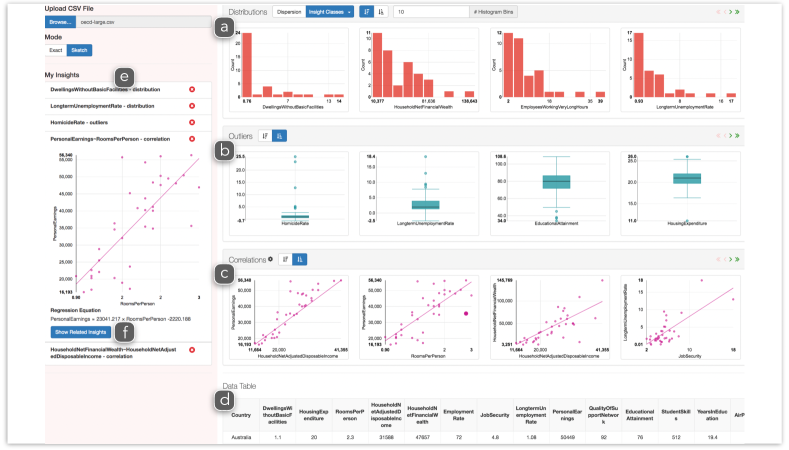
We describe how an analyst uses Foresight to explore a dataset containing well-being indicators for the OECD member countries. This dataset contains 25 distinct attributes (indicators) for about 35 countries and is included in our demo mainly as an illustration and for ease of comprehension. Foresight is intended to facilitate interactive exploration of datasets with data items of the order of 100K having hundreds of attributes.
The analyst loads the OECD dataset in Foresight and eyeballs various guideposts displayed in the carousels corresponding to each descriptor type (Figure 1a-c). She starts by checking univariate distributions as ranked by Foresight. To gain intuition on how the system ranks the histogram distributions, she flips between ranking criteria, and decides that she is happy with the system’s suggested ranking. She notices that Personal Earnings has the usual, skewed bimodal shape of an income distribution. She can flip through the distributions carousel and bookmark (Figure 1e) interesting guideposts to revisit later. In particular she bookmarks the Employees Working Very Long Hours histogram, quickly checks the data points at the long tail of the distribution and takes note of the countries Turkey, Mexico, and Japan.
She observes that a few data attributes have normal distributions but most have right or left skewed distributions. She switches to the skewness criterion of Foresight ranking to focus on highly skewed attributes. Foresight suggests Job Security has the highest skew. Our analyst notes Turkey and Mexico are among the countries with lowest job security and Japan is the country with highest job security. She next examines the outlier guideposts provided by Foresight. Enjoying the ease with which she can identify attributes having significant outliers, she saves the first three outlier guideposts, Homicide Rate, Long Term Unemployment Rate, and Education Attainment. She also notes that Turkey and Mexico are outliers in Education Attainment. Mexico is an outlier in Homicide Rate but Turkey is not. Neither Turkey and nor Mexico seems to suffer, however, from a high Long Term Unemployment Rate. Greece and Spain are outliers in this category.
Already having a good sense of the individual data attributes, our analyst moves to examine the correlations recommended by Foresight. She flips the ranking order and notices that Self Reported Health has no correlation with Time Devoted To Leisure. Intrigued with this lack of correlation, she brings this guidepost into focus by bookmarking and clicks on the related guideposts button. Foresight updates its recommendations by choosing a subset of guideposts within the neighborhood of the guidepost. The analyst explores the newly recommended correlations through multiple ranking metrics such as Pearson correlation coefficient, and quickly sees the guidepost showing a strong negative correlation between Working Long Hours and Time Devoted To Leisure since it is one of the top ranked correlation guideposts recommended. She finds this assuring but adjusts the correlation threshold slider to filter out very high correlations to focus on non-trivial relations at this stage, given the data attributes are particularly descriptive.
The analyst then goes back to the univariate distributional guideposts. The recommendations within these classes which have already been updated based on the previous selection show that Time Devoted To Leisure has a Normal distribution while Self Reported Health has a left-skewed distribution. Having gained greater familiarity with the OECD dataset, our analyst wonders about the factors that affect Self Reported Health. She clicks on the distribution of Self Reported Health adding this as one of the focal guideposts. Foresight recommends a new set of correlated attributes in which she finds that Life Satisfaction and Self Reported Health are highly correlated.
Satisfied with her preliminary discoveries (and armed with deeper questions about OECD countries than ever before), our analyst saves the current Foresight state to revisit later.
2 Related Work
Foresight builds on earlier work on automated visualization design, visualization recommendation systems and scalable data analytics. Prior work has proposed models and tools (e.g., [19, 24, 4, 7, 14]) to automatically design effective visualizations, building on Bertin’s study [2] of visual encoding variables and earlier graphical perception research, e.g., [5, 26, 15, 18, 19, 27]. We consider established practices in statistical graphics as well as findings of graphical perception research in deciding chart types and visual encoding for guideposts.
Earlier work has introduced interactive systems and recommendation schemes [25, 34, 20, 35, 8, 32, 33, 3, 36, 28, 37, 29] to guide users in exploratory data analysis and visualization design. Foresight builds on this work and is closest in underlying principles to the Rank-by-Feature framework [25] and AutoVis [35]. Both tools use statistical criteria over data attributes in recommending or ranking visualizations. The Rank-by-Feature framework also uses overview visualizations of statistical features. Foresight differs from Rank-by-Feature and AutoVis in three aspects. (1) Foresight employs a basic but larger set of statistical descriptors frequently used by analysts in EDA and provides browsable, faceted views with more flexible user control over ranking metrics. (2) Foresight considers a notion of neighborhood, enabling users to effectively explore visualizations related to an anchored (focused) visualization. (3) Also, Foresight enables the fast approximate computation of statistical descriptors through sketching.
Researchers have long realized that merely applying raw processing power by itself is insufficient to guarantee interactive response times [10], and proposed methods that fall into one of the two categories in general: precomputation and sampling [9]. In data visualization, precomputation has traditionally referred to processing data into formats such as prespecified tiles or cubes to interactively answer queries via zooming, panning, brushing, and so on; see, e.g., [1, 13, 17, 16]. To efficiently compute statistical descriptors over large datasets, Foresight uses sketching [6], an approximate querying technique based on the precomputation of synopses of a dataset that can subsequently be composed to rapidly compute approximations to the exact query responses.
3 Interview Study
To inform the design of Foresight, we conducted semi-structured interviews. Our goal was to obtain a preliminary understanding of EDA practices, patterns and challenges. Our study follows [12] in part, but focuses on the EDA aspects of data analysis in the context of predictive modeling. We recruited ten participants from data science teams within IBM Research by directly emailing them. Although our pool of participants may not be completely representative of the broad community of data analysts, we found their responses to be very helpful in designing Foresight. We aimed to find answers for the following questions in our interviews.
-
How do analysts start exploratory data analysis?
-
What tools do analysts generally work with?
-
What visualizations and statistics do analysts frequently use?
-
How do analysts decide on what is “interesting” in data?
-
What strategies do analysts use with large data?
-
What are productivity challenges in general and for specific tools?
We interviewed participants in person or via video conferencing. Each interview was recorded with an audio recorder while three interviewers took notes independently. We now summarize our findings.
3.1 Results
EDA in Data Analysis Process: Where does EDA fall in the data analysis pipeline? The interviews indicate that EDA primarily happens between profiling and modeling tasks. Once the data was ready for analysis, our participants (10/10) spent most of their time trying to understand the “nature” of the data. Within this process, analysts spent considerable time on first-order understanding: what data attributes meant, how they were correlated, how they related to each other semantically and causally in the given data domain.
Junior versus Senior Analysts: The interviews suggested a clear separation between senior and junior data analysts in how they approach EDA. Senior analysts, defined as having more than five years of experience, spent a significant amount of time on domain understanding through close collaboration with clients. They emphasized the importance of understanding semantic relationships and relied less on machine learning based automated techniques than junior analysts. Junior analysts transitioned faster from the EDA phase to the modeling phase than did senior analysts.
Stratified Greedy Navigation: Results indicate that analysts use a stratified navigation strategy in their analysis, moving from simpler, univariate properties to more complex, multivariate relations. They started the exploration by examining attribute names and what they might mean, and then computed quantities such as min, max, summary statistics, and, for categorical variables, the most frequent data values. They then moved to univariate densities and histograms, and looked for outliers. Analysts used basic visualizations related to these measures, including bar charts of histogram density estimates, box plots, and Pareto charts.
Next, they looked at bivariate relations, primarily computing correlations and visualizing them with scatter plots. Only one analyst considered trivariate correlations. Such a stratified, low-to-high order work flow allows analysts to terminate the EDA phase as soon as they are satisfied with the results, thereby minimizing effort [23].
As analysts moved up in the exploration hierarchy, they used a greedy strategy for focusing on the attributes. We conjecture that the greedy strategy might also be motivated by a desire to minimize cognitive costs. This strategy is dangerous, though: an analyst can become “trapped” at a local “optimum” and thereby miss important, relevant insights.
Tools: Our analysts had multiple tools in their toolset, aimed at different purposes. All participants used Python together with one or more Python libraries/tools. Those participants who had used primarily R, Matlab or Java (Weka) in the recent past were transitioning to greater use of Python, because it supports a broad range of data analysis tasks in a scalable manner. R was used for its rich statistical computation and particularly for its popular visualization library (ggplot). Participants frequently used visualizations such as histograms, scatter plots, box plots and q-q plots. Some also noted using dimensionality reduction as well as clustering, visualized via scatter plots, dendogram trees and heat maps.
Handling Big Data: Most of the analysts (8/10) had experience with big-data analysis. They primarily used random and guided sampling. Some (2/8) applied techniques to match the sample distribution to that of the original data. Analysts performed their exploratory data analysis on sampled datasets and applied predictive modeling to the complete data. In general, our analysts were not concerned with offline scalability for predictive modeling and noted that they were satisfied with capabilities of, e.g., the Python libraries such as Pandas and PySpark. The main problem was that the prediction computations had to be done outside the exploratory data analysis workflow.
Challenges: Once the data was readied for analysis, the time spent on EDA dominated the time spent on either modeling or reporting. The main productivity challenge for most of our participants (7/10) was not knowing either where to start or how to go about effectively exploring the data attributes. The problem was exacerbated when the data had many attributes, as participants needed to explore a large number of both individual features and correlated feature pairs when creating a model. New analysts can easily feel overwhelmed. One junior analyst noted that complexity of the tools (“many options and different ways of achieving the same functionality”) magnified the required amount of time and effort.
4 Design Criteria
Our design of Foresight is influenced by the following criteria. We determined these criteria based on our findings from the interview study, our own experience in EDA and prior research.
1. Organize exploration around statistical descriptors. The system should treat descriptors as first class entities and organize its visualizations and recommendations around them. Foresight supports a wide variety of descriptors, which in turn determine the data dimensions and visualizations that are shown.
2. Use descriptor strength to drive the promotion of data variation. The system should enable the exploration of the data attributes based on the interesting statistical features that they possess. Foresight shows carousels corresponding to a range of different descriptors, and ranks specific instances according to an insight-specific metric within each carousel.
3. Give user control over the definition of descriptor strength. Users should be able to change the metric used to rank the instances of a descriptor. Foresight enables users to interactively change the ranking metrics.
4. Enable scalable analytics. The system should enable exploratory data analysis with large data. Foresight uses sketching algorithms to effectively compute approximate rankings and overview visualizations over large data sets, and allows users to override system defaults for sketch-based computations.
5. Use the best visualizations for communicating statistical descriptors. The tool should display its recommendations using the most appropriate visualizations for each descriptor. When constructing guideposts, Foresight adapts visualizations informed by best practices and graphical perception.
6. Facilitate stratified work flow to minimize the cost of exploration. The system should support focused as well as broad exploration in a layered, simple-to-complex fashion. In Foresight, the carousels are ordered so that univariate descriptors are shown first. Each carousel provides a different perspective into properties of the data. Crucially, Foresight also supports focused exploration and recommends “related” guideposts anchored at the focused guidepost.
7. Enable access to raw data on demand. Users should able to directly examine the raw data, without leaving the context of data exploration. Foresight displays the data in a table view and enables fluid transitions between guideposts and the data rows and columns governing the guideposts.
5 Guideposts
In this section, we first describe the basic concepts of guideposts and guidepost queries, and the statistical descriptors on which they are based. We then outline the set of descriptors currently supported in our Foresight prototype.
5.1 Exploring Data with Guidepost Queries
The input data to Foresight is a matrix , where each row represents one of data items and each column represents one of the attributes of an item. A descriptor of the data is a statistical property defined in terms of data attributes for some ; we focus throughout on descriptors with , such as the dispersion or skew of an attribute, or , such as linear correlation or two-dimensional clustering for a pair of attributes. The instance set for a descriptor is the set of -tuples of attributes upon which the descriptor can be defined. For example, given a data set with attributes , the instance set corresponding to the descriptor “linear correlation” would contain all pairs with such that and are both real-valued attributes. We require that each descriptor have one or more associated strength metrics that can be used to rank the -tuples of attributes in the instance set, e.g., the Pearson correlation coefficient for the descriptor above. Similarly, each descriptor must have one or more associated data visualizations, i.e., charts.
A guidepost for a given descriptor and strength metric is a data visualization corresponding to an -tuple of attributes from the descriptor’s instance set, where the member is highly ranked according to the strength metric. A descriptor can also have one or more associated overview visualizations that display the values of a strength metric over all tuples in the instance set. For example, an overview visualization for the descriptor above might comprise a heat map where the and coordinates correspond to the different attribute pairs and the color and the size of a circle centered at encodes the Pearson correlation coefficient.
A basic guidepost query for a descriptor returns the visualizations for the highest-ranked attribute tuples according to the selected descriptor strength metric, e.g., the attribute pairs with the highest Pearson correlations. This represents the first level of exploration, where the user selects a descriptor and the system returns the strongest examples of its instance set.
In a second level of exploration, the user can gradually take control of the exploration process as they become familiar with the data. In particular, the system can recommend guideposts that are “nearby” to a particular guidepost selected by the user. As a simple example, suppose that the initial descriptor is “linear correlation” as above. The system executes a basic guidepost query and produces visualizations corresponding to the pairs having the highest Pearson correlation coefficient. Suppose the user brings into focus a particular guidepost, i.e., the visualization for a particular pair . One natural notion of a “neighborhood” of can be defined as the set of pairs of the form having the highest correlation coefficients. That is, we have fixed the attribute and only allowed the attribute to vary in our search, thereby filtering the set of attribute pairs considered. We can define a neighborhood in a similar manner, by fixing , and can also define as the set of most highly correlated attribute pairs in .
In a third level of exploration, at any point during the EDA process the user can step back and look at the overview visualization of a descriptor. This helps ensure that, in the analogy with gradient descent, the EDA process does not get inadvertently “trapped” in some local “neighborhood” of attribute tuples. This capability is particularly important in cases where many attribute tuples have similarly high descriptor-metric scores, so that the particular set visualized for the user is somewhat arbitrary. In practice, the ability to effectively navigate out of a local guidepost neighborhood helps analysts avoid prematurely fixating on a particular set of data attributes during exploratory data analysis.
5.2 Foresight’s Statistical Descriptors
Foresight is designed to be an extensible system where new descriptors can be “plugged in,” along with their corresponding ranking measures and visualizations. In this section, we discuss the specific descriptors supported by our current Foresight prototype. Denote by and the sets of attribute columns in that contain numeric and categorical values. Foresight currently supports six distinct descriptors of statistical properties, each with a preferred ranking metric and visualization method. In our description, we denote by a numeric column with mean and standard deviation , and by a categorical column. For each descriptor, the ranking metric is italicized.
1. Dispersion: Dispersion measures the extent to which the data is concentrated around the mean. We use a robust scale-invariant statistical measure to quantify dispersion, namely the quartile coefficient of dispersion. For a given numeric column , let and denote the first and third quartile values, i.e., the 0.25 and 0.75 quantiles. The quartile coefficient of dispersion is defined as . We visualize dispersion via a histogram.
2. Skew: Skewness is a measure of asymmetry in a univariate distribution. We measure skewness with standardized skewness coefficient and visualize it via a histogram.
3. Heavy tails: Heavy-tailedness is the propensity of a distribution towards extreme values. We measure heavy-tailedness with kurtosis and visualize it via a histogram.
4. Outliers: We measure the presence and significance of outliers or extreme values using the Tukey test. In a Tukey box-and-whisker plot, the “inlier range” between the whisker endpoints for a column is defined as , where and are the first and third quartile values as before. Data values that fall outside this range are considered outliers. We visualize outliers using box-and-whisker plots, and use the number of outliers as the strength for ranking.
5. Heterogeneous frequencies: For a categorical column (or a discrete numerical column ), high heterogeneity in frequencies implies that a few values (“heavy hitters”) are highly frequent while others are not. We measure the heterogeneity strength of column using the normalized Shannon entropy. We visualize heterogeneity in frequencies with a Pareto chart.
6. Linear Relationship: We measure the strength of a linear relationship between two columns using the absolute value of the Pearson correlation coefficient and visualize it via a scatter plot with the best-fit line superimposed.
6 Facilitating Scalability Through Sketching
We use sketching [6] to speed up the computation of strength metrics. Some strength metrics are fast and easy to compute. For instance, skewness and kurtosis can both be computed for numeric columns in a single pass by maintaining and combining a few running sums. For the remaining metrics, sketches—lossy compressed representations of the data—are crucial in order to preprocess the data in a reasonable amount of time. Foresight integrates and composes a variety of sketching and sampling techniques from the literature, namely quantile sketch, entropy sketch, frequent items sketch, random hyperplane sketch, and random projection sketch; see, e.g., [6]. For example, we precompute a sketch for each numeric -row column , where is a suitable randomly chosen mapping to a binary vector of length . Then a good approximation to the correlation coefficient between columns and can be quickly computed on the fly as , where is the number of entries where and differ. Our initial experiments (without parallelism) show accuracy and speedup in preprocessing. Due to space restrictions, we defer the complete details of sketch composition to the full research version of this paper.
7 Conclusion and Future Work
We present Foresight, an interactive system that enables rapid, structured exploratory data analysis via statistical guideposts. Our approach uses recommendations to guide users in exploring unfamiliar large and complex datasets, and gradually gives them more and more control over the exploration process. We report insights from an interview study into EDA practices of data scientists, informing the design of EDA tools at large.
We have introduced a basic notion of neighborhood search and will investigate the topology of visual analysis space more deeply in future work. Our system is designed to allow easy incorporation of different notions of “neighborhood.” For instance, one can envision a notion in which, say, the neighborhood of a guidepost for single attribute is defined in terms of the most highly correlated pairs of the form .
Foresight enables users to exert control over guidepost rankings by adding constraints or filters on the strength metric to their queries. Constraints with respect to statistical significance, in the spirit of, e.g., [38], can be incorporated directly into the strength metric. For example, a modified metric value for linear correlation can be obtained by multiplying the Pearson correlation by zero if the -value of an associated test statistic is less than an appropriate significance value.
Using sketching and indexing methods, our system can currently handle datasets with large numbers of rows and moderate numbers of columns. We plan to improve scalability with respect to the number of columns by incorporating parallel search methods that speed up guidepost queries. We also aim to support additional descriptors, e.g., scagnostics as in [34].
Finally, in ongoing work, we are evaluating Foresight through a human-subjects experiment with data scientists to better understand the merits and limitations of our approach.
References
- [1] L. Battle, R. Chang, and M. Stonebraker. Dynamic prefetching of data tiles for interactive visualization. In ACM SIGMOD, pp. 1363–1375, 2016.
- [2] J. Bertin. Semiology of Graphics. University of Wisconsin Press, 1983.
- [3] F. Bouali, A. Guettala, and G. Venturini. VizAssist: an interactive user assistant for visual data mining. Vis. Comput., 32(11):1447–1463, 2016.
- [4] S. M. Casner. Task-analytic approach to the automated design of graphic presentations. ACM Trans. Graphics, 10(2):111–151, 1991.
- [5] W. S. Cleveland and R. McGill. Graphical perception: Theory, experimentation, and application to the development of graphical methods. J. Amer. Statist. Assoc., 79(387):531–554, 1984.
- [6] G. Cormode, M. N. Garofalakis, P. J. Haas, and C. Jermaine. Synopses for massive data: Samples, histograms, wavelets, sketches. Found. Trends in Databases, 4(1–3):1–294, 2012.
- [7] Ç. Demiralp, C. Scheidegger, G. Kindlmann, D. Laidlaw, and J. Heer. Visual embedding: A model for visualization. IEEE CG&A, 2014.
- [8] D. Gotz and Z. Wen. Behavior-driven visualization recommendation. In ACM IUI, pp. 315–324, 2009.
- [9] J. M. Hellerstein. Interactive analytics. In Readings in Database Systems. MIT Press, 5th ed., 2015.
- [10] J. M. Hellerstein, R. Avnur, A. Chou, C. Hidber, C. Olston, V. Raman, T. Roth, and P. J. Haas. Interactive data analysis: The Control project. IEEE Comput., 32(8):51–59, 1999.
- [11] IBM Corporation. IBM Watson Analytics. https://www.ibm.com/analytics/watson-analytics/, 2017. Accessed: 2017-02-15.
- [12] S. Kandel, A. Paepcke, J. Hellerstein, and J. Heer. Enterprise data analysis and visualization: An interview study. In IEEE VAST, 2012.
- [13] S. Kandel, R. Parikh, A. Paepcke, J. M. Hellerstein, and J. Heer. Profiler: Integrated statistical analysis and visualization for data quality assessment. In ACM AVI, pp. 547–554, 2012.
- [14] G. Kindlmann and C. Scheidegger. An algebraic process for visualization design. IEEE TVCG, 20:2181–2190, 2014.
- [15] S. Lewandowsky and I. Spence. Discriminating strata in scatterplots. Journal of American Statistical Association, 84(407):682–688, 1989.
- [16] L. Lins, J. T. Klosowski, and C. Scheidegger. Nanocubes for real-time exploration of spatiotemporal datasets. IEEE TVCG, 19(12):2456–2465, 2013.
- [17] Z. Liu, B. Jiang, and J. Heer. imMens: Real-time visual querying of big data. Comput. Graphics Forum, 32:421–430, 2013.
- [18] A. MacEachren. How Maps Work: Representation, Visualization, and Design. Guilford Press, 1995.
- [19] J. Mackinlay. Automating the design of graphical presentations of relational information. ACM Trans. Graphics, 5(2):110–141, 1986.
- [20] J. Mackinlay, P. Hanrahan, and C. Stolte. Show me: Automatic presentation for visual analysis. IEEE TVCG, 13(6):1137–1144, 2007.
- [21] Microsoft Corporation. MS PowerBI. https://powerbi.microsoft.com, 2017. Accessed: 2017-02-15.
- [22] R. S. Nickerson. Confirmation bias: A ubiquitous phenomenon in many guises. Rev. General Psych., 2(2), 1998.
- [23] P. Pirolli and S. Card. The sensemaking process and leverage points for analyst technology as identified through cognitive task analysis. In Intl. Conf. Intelligence Anal., vol. 5, pp. 2–4, 2005.
- [24] S. F. Roth, J. Kolojejchick, J. Mattis, and J. Goldstein. Interactive graphic design using automatic presentation knowledge. In ACM CHI, pp. 112–117, 1994.
- [25] J. Seo and B. Shneiderman. A rank-by-feature framework for unsupervised multidimensional data exploration using low dimensional projections. In Procs. InfoVis, pp. 65–72, 2004.
- [26] R. N. Shepard. Toward a universal law of generalization for psychological science. Science, 237:1317–1323, 1987.
- [27] B. Shortridge. Stimulus processing models from psychology: can we use them in cartography? The American Cartographer, 9:155–167, 1982.
- [28] T. Siddiqui, A. Kim, J. Lee, K. Karahalios, and A. Parameswaran. Effortless data exploration with zenvisage. PVLDB, 10(4):457–468, 2016.
- [29] B. Tang, S. Han, M. L. Yiu, R. Ding, and D. Zhang. Extracting top-k insights from multi-dimensional data. In ACM SIGMOD, pp. 1509–1524, 2017.
- [30] J. W. Tukey and P. A. Tukey. Computer Graphics and Exploratory Data Analysis: An Introduction. In Proc. 6th Ann. Conf. Exposition: Comput. Graphics ’85, Vol. III, Technical Sessions, pp. 773–785, 1985.
- [31] A. Tversky and D. Kahneman. Judgment under uncertainty: Heuristics and biases. In Utility, Probability, and Human Decision Making, pp. 141–162. Springer, 1975.
- [32] M. Vartak, S. Huang, T. Siddiqui, S. Madden, and A. Parameswaran. Towards visualization recommendation systems. In DSIA Workshop, 2015.
- [33] M. Vartak, S. Rahman, S. Madden, A. Parameswaran, and N. Polyzotis. SeeDB: Efficient data-driven visualization recommendations to support visual analytics. PVLDB, 8(13):2182–2193, 2015.
- [34] L. Wilkinson, A. Anand, and R. Grossman. Graph-theoretic scagnostics. In Procs. InfoVis, pp. 157–164, 2005.
- [35] G. Wills and L. Wilkinson. AutoVis: Automatic visualization. Info. Visual., 9(1):47–69, 2008.
- [36] K. Wongsuphasawat, D. Moritz, A. Anand, J. Mackinlay, B. Howe, and J. Heer. Voyager: Exploratory analysis via faceted browsing of visualization recommendations. IEEE TVCG, 22(1):649–658, 2016.
- [37] K. Wongsuphasawat, Z. Qu, D. Moritz, R. Chang, F. Ouk, A. Anand, J. Mackinlay, B. Howe, and J. Heer. Voyager 2: Augmenting visual analysis with partial view specifications. In ACM CHI, 2017.
- [38] Z. Zhao, L. D. Stefani, E. Zgraggen, C. Binnig, E. Upfal, and T. Kraska. Controlling false discoveries during interactive data exploration. In ACM SIGMOD, pp. 527–540, 2017.