none \isbn
Exploring Dimensionality Reductions with Forward and Backward Projections
Abstract
Dimensionality reduction is a common method for analyzing and visualizing high-dimensional data across domains. Dimensionality-reduction algorithms involve complex optimizations and the reduced dimensions computed by these algorithms generally lack clear relation to the initial data dimensions. Therefore, interpreting and reasoning about dimensionality reductions can be difficult. In this work, we introduce two interaction techniques, forward projection and backward projection, for reasoning dynamically about scatter plots of dimensionally reduced data. We also contribute two related visualization techniques, prolines and feasibility map, to facilitate and enrich the effective use of the proposed interactions, which we integrate in a new tool called Praxis. To evaluate our techniques, we first analyze their time and accuracy performance across varying sample and dimension sizes. We then conduct a user study in which twelve data scientists use Praxis so as to assess the usefulness of the techniques in performing exploratory data analysis tasks. Results suggest that our visual interactions are intuitive and effective for exploring dimensionality reductions and generating hypotheses about the underlying data.
doi:
keywords:
Dimensionality reduction; interaction; bidirectional binding; visual embedding; forward projection; backward projection; PCA; autoencoder; prolines; feasibility map; what-if analysis; Praxis.1 Introduction
Dimensionality reduction (DR) is an effective technique for analyzing and visualizing high-dimensional datasets across domains, from sciences to engineering. Dimensionality-reduction algorithms such as principal component analysis (PCA) and multidimensional scaling (MDS) automatically reduce the number of dimensions in data while maximally preserving structures, typically quantified as similarities, correlations or distances between data points. This makes visualization of the data possible using conventional spatial techniques. For example, analysts generally use scatter plots to visualize the data after reducing the number of dimensions to two, encoding the reduced dimensions in a two-dimensional position.
DR Challenges: Most DR (also called manifold learning or distance embedding) algorithms are driven by complex numerical optimizations. Dimensions derived by these methods generally lack clear, easy-to-interpret mappings to the original data dimensions, forcing users to treat DR methods as black boxes. In particular, data analysts with limited experience in DR have difficulty in interpreting the meaning of the projection axes and the position of scatter plot nodes [40, 8]. What do the axes mean? is probably users’ most frequent question when looking at scatter plots in which points (nodes) correspond to dimensionally reduced data. Most scatter-plot visualizations of dimensionally reduced data are viewed as static images. One reason is that tools for computing and plotting these visualizations, such as Matlab and R, provide limited interactive exploration functionalities. Another reason is that few interaction and visualization techniques that go beyond brushing-and-linking or cluster-based coloring to allow dynamic reasoning with these visualizations.
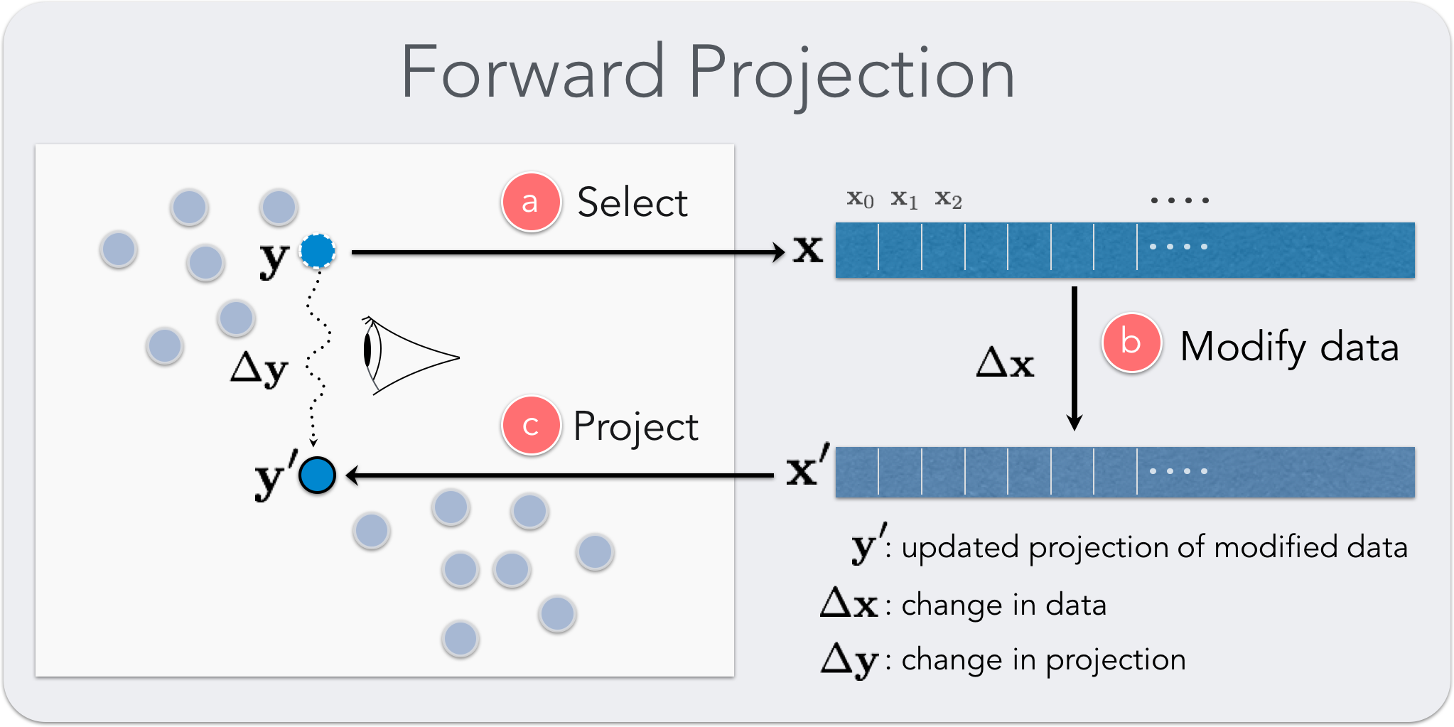
Enriching User Experience with DRs: In this paper, we introduce two interactions, forward projection and backward projection (Figure 1), to help analysts explore and reason about scatter plot representations of dimensionally reduced data, facilitating a dynamic what-if analysis. We contribute two related visualization techniques, prolines and feasibility map, to facilitate the effective use of the proposed interactions. We also introduce Praxis, a new interactive DR exploration tool implementing our interaction and visualization techniques for data analysis.
Our techniques enable users to interactively explore: 1) the most important features that determine the vertical and horizontal axes of projections, 2) how changing feature values (dimensions) of a data point changes the point’s projected location (two-dimensional representation) and 3) how changing the projected position of a data point changes the high-dimensional values of that point. We demonstrate our techniques first using a PCA-based linear DR and then a nonlinear, deep autoencoder-based [22] DR.
We assess the computational effectiveness of our methods by analyzing their time and accuracy performances under varying sample and dimension sizes. We then conduct a user study in which twelve data scientists performed exploratory data analysis tasks using Praxis. The results suggest that our visual interactions are scalable and intuitive and can be effective for exploring dimensionality reductions and generating hypotheses about the underlying data.
We also observe that our techniques belong to a class of interactions that bidirectionally couple the data and its visual representation: dynamic visualization interactions [47]. We look at dynamic visualization interactions under the visual embedding model [14] and discuss the properties of effective interactions that the model suggests.
2 Related Work
Our work is related to prior efforts in understanding and improving user experience with dimensionality reductions.
2.1 Direct Manipulation in DR
Direct manipulation has a long history in human-computer interaction [43, 28, 6] and visualization research (e.g. [41]). Direct manipulation techniques aim to improve user engagement by minimizing the perceived distance between the interaction source and the target object [23].
Developing direct manipulation interactions to guide DR formation and modify the underlying data is a focus of prior research [9, 16, 19, 24, 25, 49]. For example, X/GGvis [9] supports changing the weights of dissimilarities input to the MDS stress function along with the coordinates of the embedded points to guide the projection process. Similarly, iPCA [24] enables users to interactively modify the weights of data dimensions in computing projections. Endert et al. [17] apply similar ideas to additional dimensionality-reduction methods while incorporating user feedback through spatial interactions in which users can express their intent by dragging points in the plane.
Our work is closely related to earlier approaches using direct manipulation to modify data in DR visualizations [24, 46, 39, 11, 32]. Like our forward projection and unconstrained backward projection techniques, iPCA enables interactive forward and backward projections for PCA-based DRs. However, iPCA recomputes full PCA for each forward and backward projection, and these can suffer from jitter and scalability issues, as noted in [24]. Using out-of-sample extrapolation, forward projection avoids re-running dimensionality-reduction algorithms. From the visualization point of view, this is not just a computational convenience, but also has perceptual and cognitive advantages, such as preserving the constancy of scatter-plot representations. For example, re-running (training) a dimensionality reduction algorithm with a new data sample added can significantly alter a two-dimensional scatter plot of the dimensionally reduced data, even though all the original inter-data point similarities may remain unchanged. In contrast to iPCA, we also enable users to interactively define constraints on feature values and perform constrained backward projection.
We refer readers to a recent survey [38] for a detailed discussion of prior research on visual interaction with dimensionality reduction.
2.2 Visualization in DR Scatter Plots
Prior work introduces various visualizations in planar scatter plots of DRs, in order to improve the user experience by communicating projection errors [10, 42, 3, 31], change in dimensionality projection positions [24], data properties and clustering results [42, 13], and contributions of original data dimensions in reduced dimensions [18]. Low-dimensional projections are generally lossy representations of the original data relations: therefore, it is useful to convey both overall and per-point dimensionality-reduction errors to users when desired. Researchers visualized errors in DR scatter plots using Voronoi diagrams [3, 31] and corrected (undistorted) the errors by adjusting the projection layout with respect to the examined point [10, 42].
Biplot was introduced [18] to visualize the magnitude and sign of a data attribute’s contribution to the first two or three principal components as line vectors in PCA. Prolines reduce to biplots when PCA is used for dimensionality reduction. Our proline construction algorithm is general and reflects the underlying out-of-sample extension method used. On the other hand, biplots are based on singular-value decomposition and always use PCA forward projection, regardless of the actual DR used. Additionally, prolines differ from biplots in being interactive visual objects beyond static vectors and are decorated to communicate distributional characteristics of the underlying data point.
Stahnke et al. [42] use a grayscale map to visualize how a single attribute value changes between data points in DR scatter plots. We use feasibility map, a grayscale map, to visualize the feasible regions in the constrained backward projection interaction.
2.3 Out-of-sample Extension and Back Projection for DR
We compute forward projections using out-of-sample extension (or extrapolation) [45]. Out-of-sample extension is the projection of a new data point into an existing DR (e.g. learned manifold model) using only the properties of the already computed DR. It is conceptually equivalent to testing a trained machine-learning model with data that was not part of the training set. For linear DR methods, out-of-sample extension is often performed by applying the learned linear transformation to the new data point. For autoencoders, the trained network defines the transformation from the high-dimensional to low-dimensional data representation [4].
Back or backward projection maps a low-dimensional data point back into the original high-dimensional data space. For linear DRs, back projection is typically done by applying the inverse of the learned linear DR mapping. For nonlinear DRs, earlier research proposed DR-specific backward-projection techniques. For example, iLAMP [15] introduces a back-projection method for LAMP [26] using local neighborhoods and demonstrates its viability over synthetic datasets [15]. Researchers also investigated general backward projection methods using radial basis functions [33, 2], treating backward projection as an interpolation problem.
Autoencoders [22], neural-network-based DR models, are a promising approach to computing backward projections. An autoencoder model with multiple hidden layers can learn a nonlinear dimensionality reduction function (encoding) as well as the corresponding backward projection (decoding) as part of the DR process. Inverting DRs is, however, an ill-posed problem. In addition to augmenting what-if analysis, the ability to define constraints over a back projection can also ease the computational burden. Praxis also enables users to interactively set equality and boundary constraints over back projections through an intuitive interface.
We presented initial versions of forward projection, backward projection, and prolines earlier as part of Clustrophile, an exploratory visual clustering analysis tool [13]. We give here a focused discussion of our revised interaction and visualization techniques, introduce Praxis, a new visualization tool that implements our techniques for exploratory data analysis using DR, and provide a thorough computational and user-performance evaluation. The current work also introduces feasibility map, a new visualization technique to facilitate backward projection interactions.
3 Interacting with Linear Dimensionality Reductions
We demonstrate our methods first on principal component analysis (PCA), one of the most frequently used linear dimensionality-reduction techniques; note that the discussion here applies as well to other linear dimensionality-reduction methods. PCA computes (learns) a linear orthogonal transformation of the empirically centered data into a new coordinate frame in which the axes represent maximal variability. The orthogonal axes of the new coordinate frame are called principal components.
To reduce the number of dimensions to two, for example, we project the centered data matrix, rows of which correspond to data samples and columns to features (dimensions), onto the first two principal components, and . Details of PCA along with its many formulations and interpretations can be found in standard textbooks on machine learning or data mining (e.g., [5, 21]).
3.1 Forward Projection
Forward projection enables users to interactively change the feature values of a data point and observe how these hypothesized changes in data modify the current projected location (Figure 2). This is useful because understanding the importance and sensitivity of features (dimensions) is a key goal in exploratory data analysis. In the case of PCA, we obtain the two-dimensional position change vector by projecting the data change vector onto the principal components: , where .
3.2 Prolines: Visualizing Forward Projections
It is desirable to see in advance what forward projection paths look like for each feature. Users can then start inspecting the dimensions that look interesting or important.
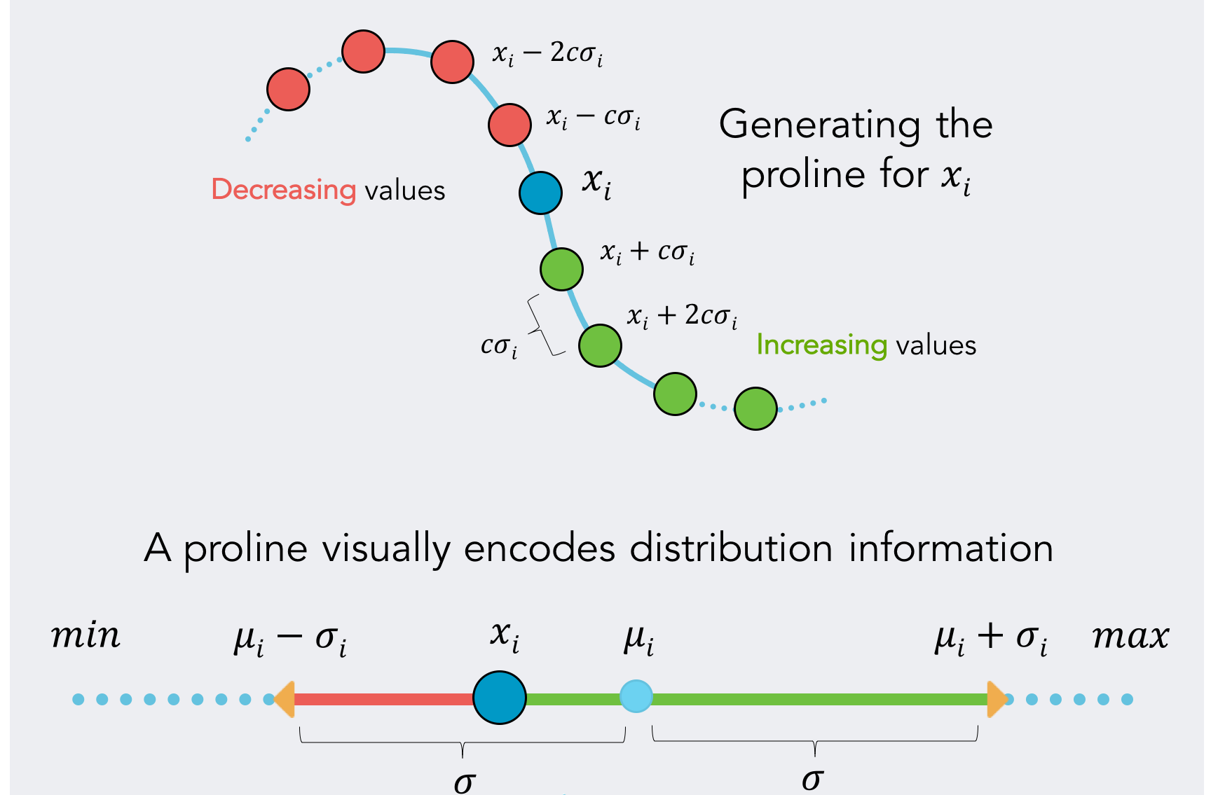
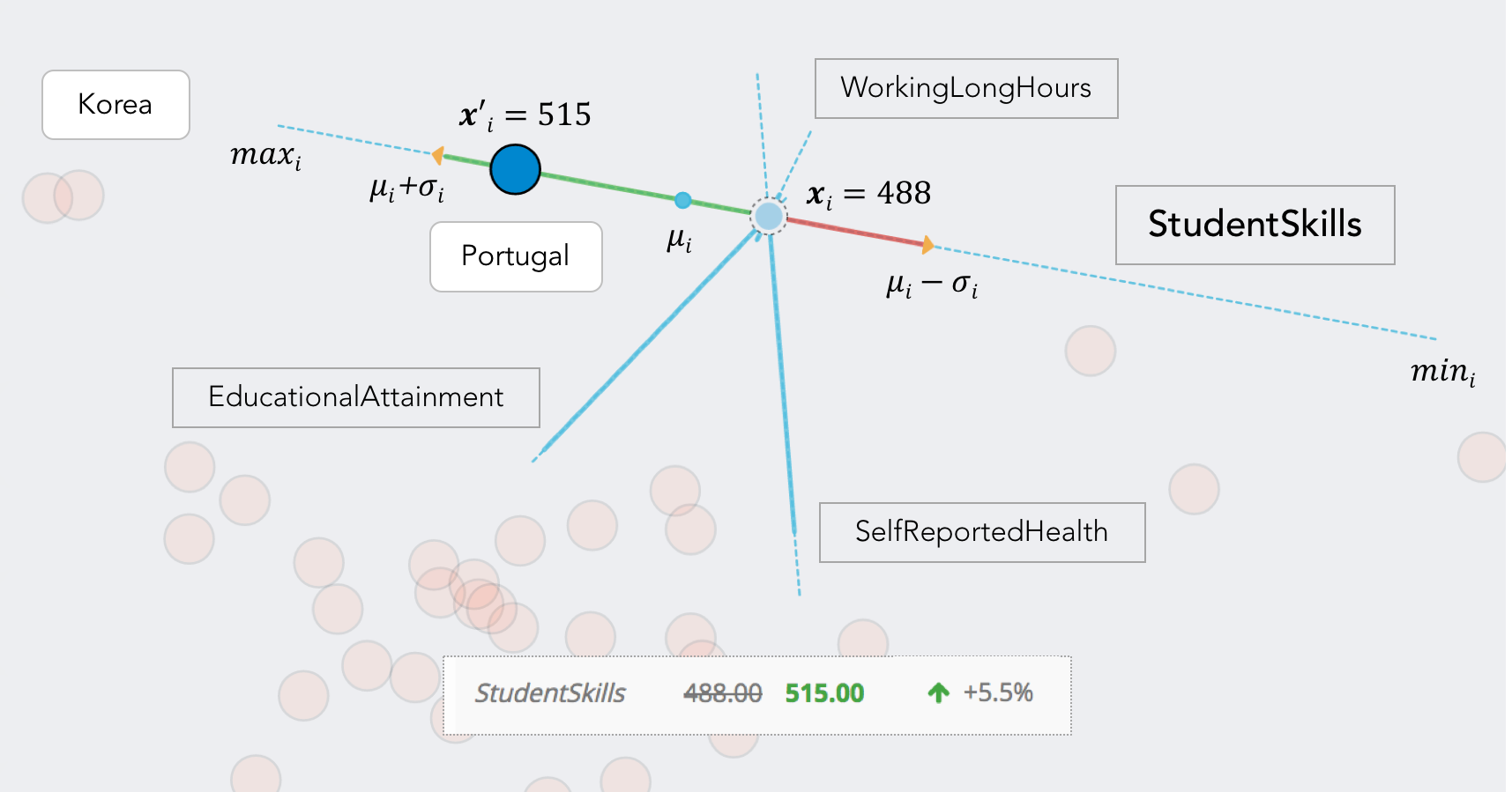
Prolines visualize forward projection paths using a linear range of possible values for each feature and data point (Figures 3). Let be the value of the th feature for the data point . We first compute the mean , standard deviation , minimum and maximum values for the feature in the dataset and devise a range . We then iterate over the range with step size , compute the forward projections as discussed above, and then connect them as a path. The constant controls the step size with which we iterate over the range and is set to for the examples shown here.
In addition to providing an advance snapshot of forward projections, prolines can be used to provide summary information conveying the relationship between the feature distribution and the projection space. We display along each proline a small light-blue circle indicating the position that the data point would assume if it had a feature value corresponding to the mean of its distribution; similarly, we display two small arrows indicating a variation of one standard deviation () from the mean (). The segment identified by the range is highlighted and further divided into two segments. The green segment shows the positions that the data point would assume by increasing its feature value; the red one indicates a decreasing value. This enables users to infer the relationship between the feature space and the direction of change in the projection space.
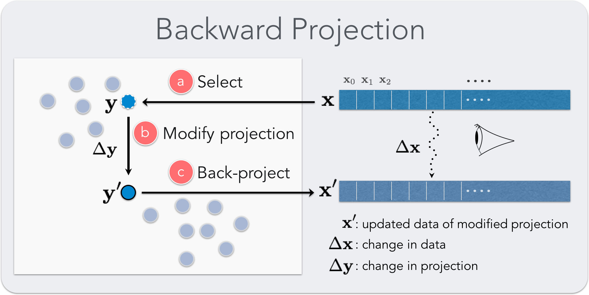
3.3 Backward Projection
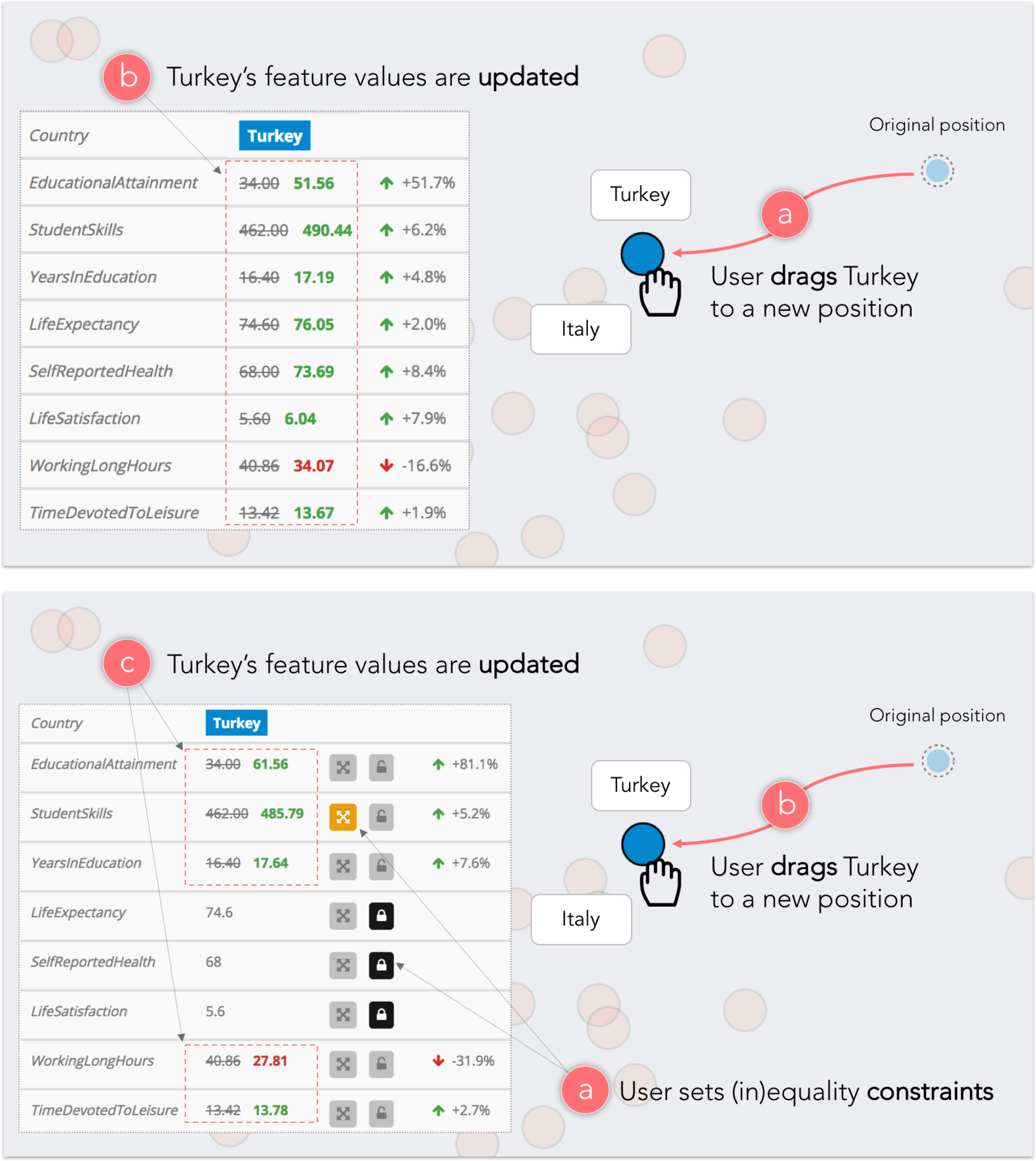
Backward projection as an interaction technique is a natural complement of forward projection. Consider the following scenario: a user looks at a projection and, seeing a cluster of points and a single point projected far from this group, asks what changes in the feature values of the outlier point would bring the outlier near the cluster. Now, the user can play with different dimensions using forward projection to move the current projection of the outlier point near the cluster. It would be more natural, however, to move the point directly and observe the change.
The formulation of backward projection is the same as that of forward projection: . In this case, however, is unknown and we need to solve the equation.
As formulated, the problem is underdetermined and, in general, there can be an infinite number of data points (feature values) that project to the same planar position. Therefore, we propose both unconstrained and constrained backward projections, for which users can define equality as well as inequality constraints.
In the case of unconstrained backward projection, we find by solving a regularized least-squares optimization problem:
| subject to |
Note that this is equivalent to setting .
For constrained backward projection, we find by solving the following quadratic optimization problem:
| subject to | |||||
is the design matrix of equality constraints, is the constant vector of equalities, and and are the vectors of lower and upper boundary constraints.
3.4 Guiding Backward Projections
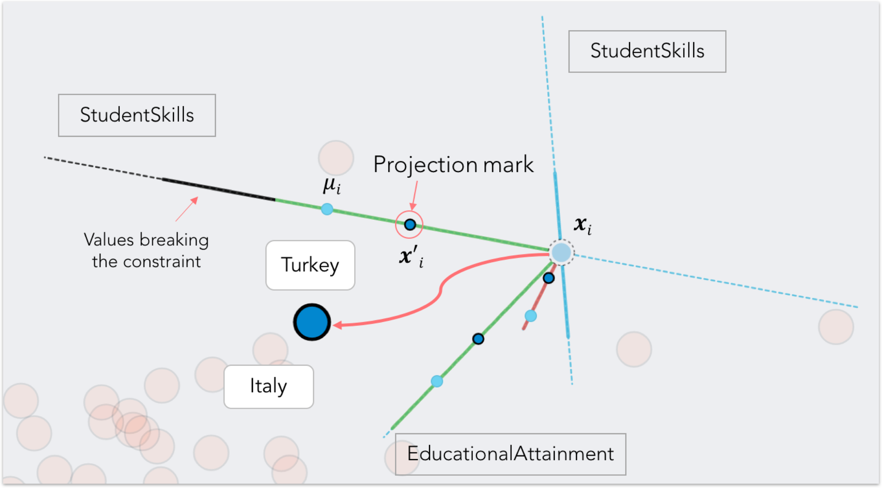
Projection Marks: It is important to note that, since more than one data point in the multidimensional space can project to the same position, forward and backward projections may not always correspond. For this reason, we add to our prolines visualization a set of projection marks (Figure 6) dynamically indicating the current value for each feature while the user performs backward projection. At the same time, dragging a data point highlights the green or red segment of each proline based on the increase or decrease of each feature, showing which dimensions correlate to each other. By combining forward projection paths to backward projection, the user can infer how fast each value is changing in relation to its feature distribution.
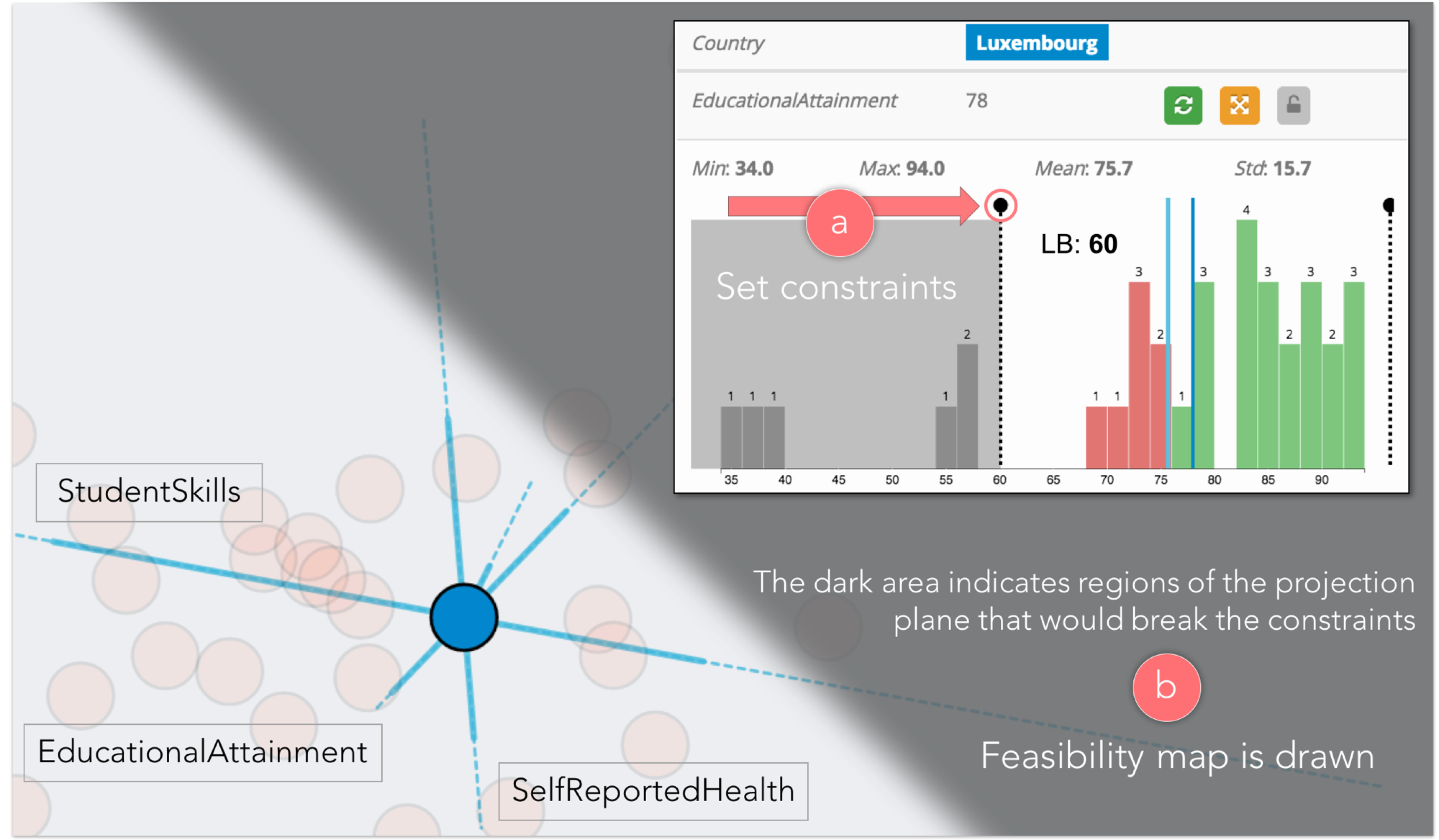
Feasibility Maps: Constrained backward projection enables users to semantically regulate the mapping into unprojected high-dimensional data space. For example we don’t expect an Age field to be negative or bigger than 150, even though such a value can can constitute a more optimal solution in an unconstrained backward projection scenario.
We propose the feasibility map visualization as a way to quickly see the feasible space determined by a given set of constraints. Instead of manually checking if a position in the projection plane satisfies the desired range of values (considering both equality and inequality constraints), it is desirable to know in advance which regions of the plane correspond to admissible solutions. In this sense, feasibility map is a conceptual generalization of prolines to the constrained backward projection interaction.
To generate a feasibility map, we sample the projection plane on a regular grid and evaluate the feasibility at each grid point based on the constraints imposed by the user, obtaining a binary mask over the projection plane. We render this binary mask over the projection as an interpolated grayscale heatmap, where darker areas indicate infeasible planar regions (Figure 7). With accuracy determined by the number of backward projection samples, the user can see which areas a data point can assume in the projection plane without breaking the constraints. Note that, when dealing with linear dimensionality reduction techniques, the feasibility map originates boundaries that are orthogonal to the prolines of the constrained features. Nevertheless, generating the feasibility map by sampling the projection plane has the advantage of being independent of the dimensionality technique used.
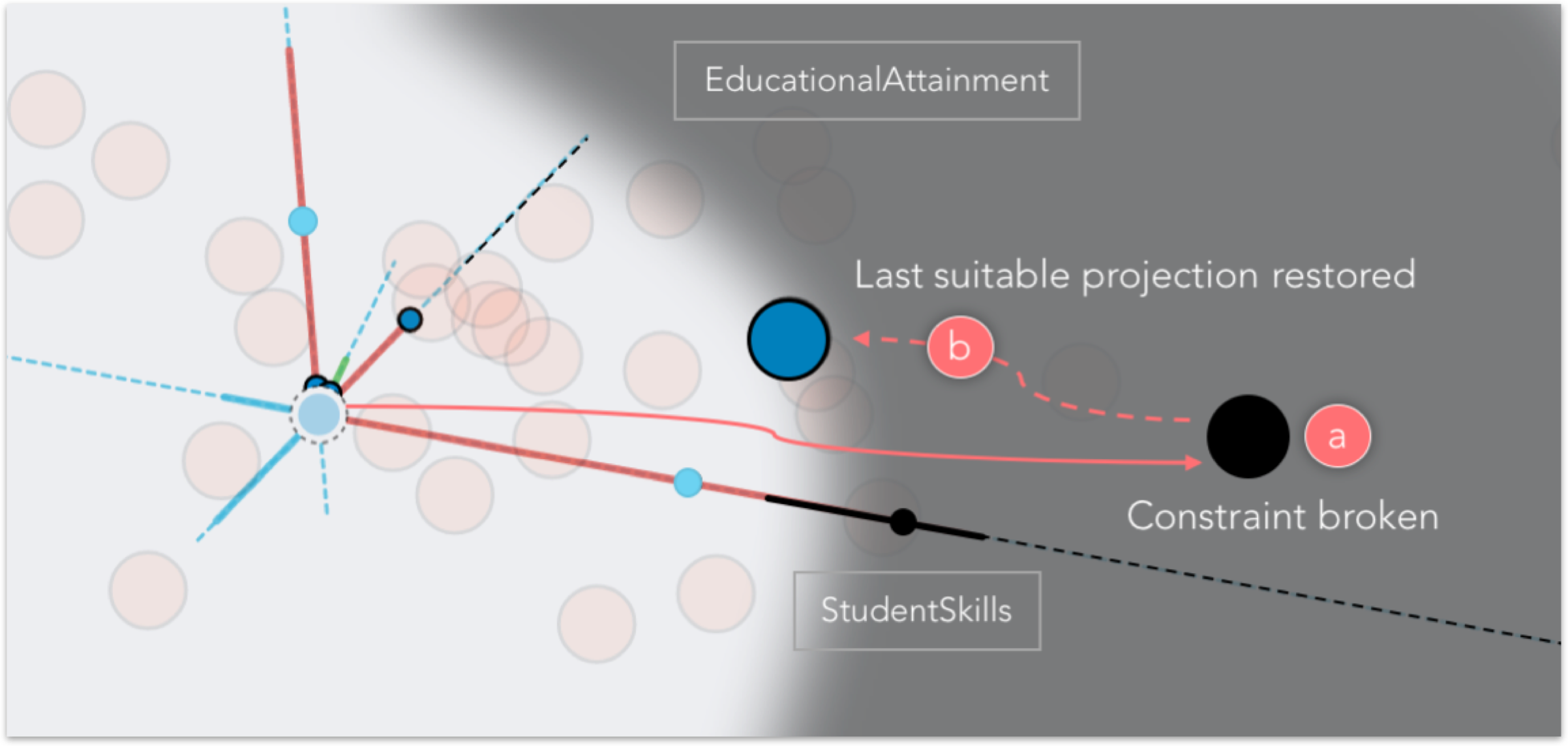
In backward projection, if a data point is dragged to a position that does not satisfy a constraint, its color and the color of its corresponding projection marks turn to black. If the user drops the data point in an infeasible position, the point is automatically moved through animation back to the last feasible position to which it was dragged (Figure 8).
4 Praxis
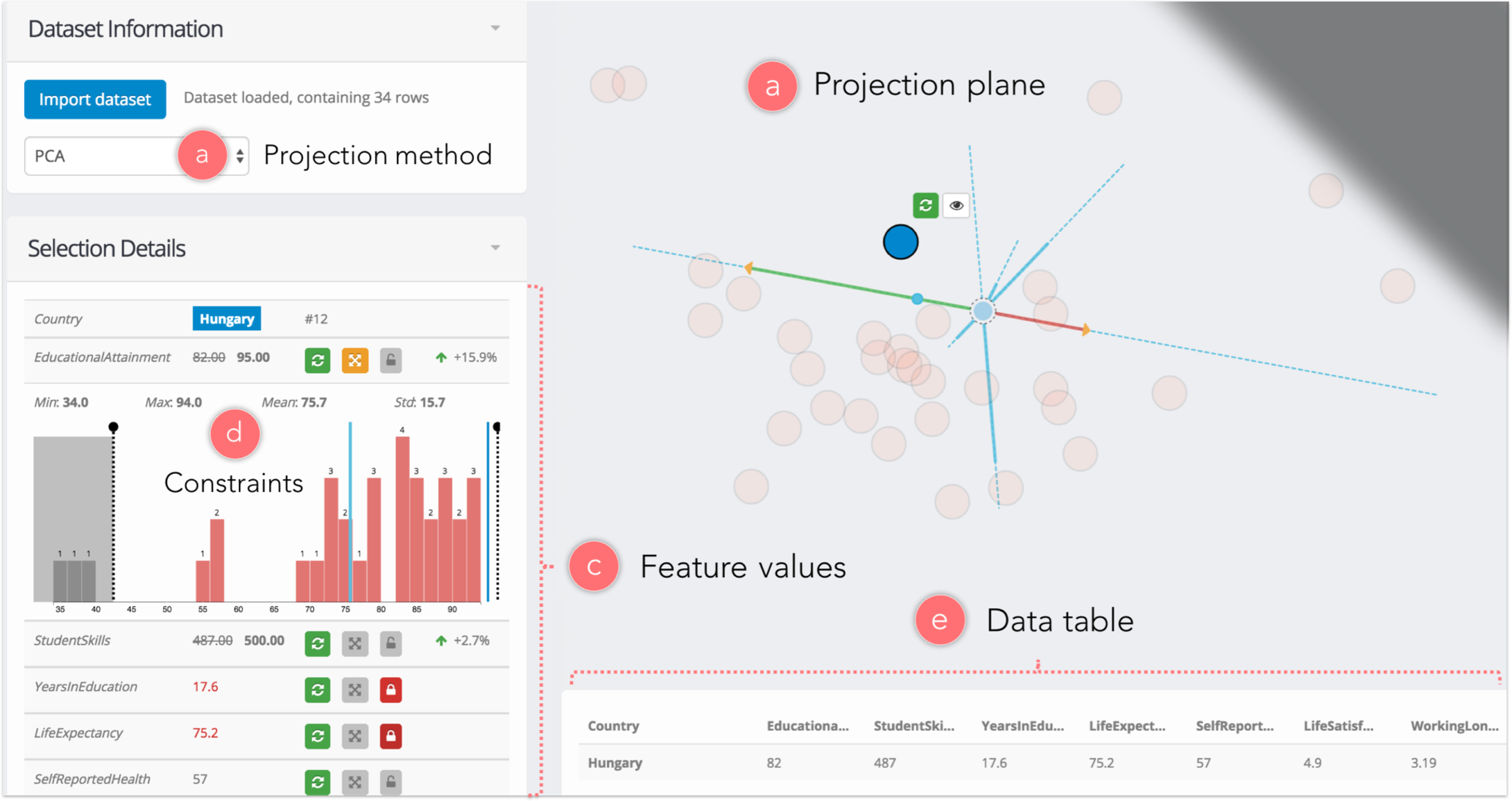
To study the usage of our interaction and visualization techniques, we introduce Praxis, a new interactive tool integrating them. Through a data panel (Figure 9b), users can load a dataset in CSV format and visualize its PCA projection as a scatter plot (Figure 9a), using the first two principal components as axes of the projection plane.
Results of forward and backward projection, along with the two visualizations prolines and feasibility map, are displayed in the projection plane. The id (name) of a data point is shown on mouse hover, while clicking performs selection, showing its feature values in a dedicated sidebar panel (Figure 9c). In particular, the Selection Details panel is used for performing forward projection (clicking on a dimension makes its value modifiable) and for inspecting changes in feature values when backward projection is used. Three buttons enable (respectively for each feature) 1) reset it to its original value, 2) enable/disable inequality constraints and 3) lock its value to a specific number (equality constraint).
Double-clicking the row associated with a feature displays a histogram representing its distribution below the selected row, showing some basic statistics (Figure 9d). The current value of the feature is represented by a blue line and a cyan line indicates the distribution mean. Bins of the histogram are colored similarly to prolines: green for increasing values, red for decreasing values with respect to the original feature value. Dragging one of the two black handles lets the user set or unset lower and upper bounds for a feature distribution, thus defining a set of constraints for a specific data point.
Finally, selecting a data point in the projection plane displays two buttons that respectively enable 1) resetting its feature values (and position) to their original value and 2) showing a tooltip on top of its currently nearest neighbors, in order to facilitate reasoning about the similarity with other data samples (especially when performing backward projection).
Praxis is a web application based on a client-server model. We implemented its interface using Javascript with the help of D3 [7] and ReactJS [36] libraries. A separate analytics server carries out the computations required by the projection computations. We implemented the server in Python, using the SciPy [27], NumPy [48], scikit-learn [35] and CVXOPT [12] libraries. We solve the backward projection generated quadratic optimization problems using CVXOPT [12].
5 Evaluation
To evaluate our methods, we first conduct a user study with analysts and then perform a computational model analysis assessing accuracy and scalability.
5.1 User Study
We evaluate user experience with our techniques through a user study with twelve data scientists. We have two goals. First, to assess the effectiveness of our projection and visualization techniques in what-if analysis of dimensionally reduced data. Second, to understand how the use of the techniques differs for changing task type and complexity.
Participants: We recruited twelve participants with at least two years’ experience in data science. Their areas of expertise included healthcare analytics, genomics and machine learning. Participants ranged from 25 to 55 years old, and all had at least a Master’s degree in science or engineering. Ten participants regularly applied dimensionality reductions in their data analysis, using Matlab, R and Python. All participants were familiar with using PCA, while six had used MDS before. Four participants cited additional projection methods that they had previously used, including t-SNE and autoencoder.
Tasks and Data: Participants were asked to perform the following six high-level tasks using Praxis. We used a tabular dataset [42, 34] containing eight socio-economic development indices for thirty-four countries belonging to the Organisation for Economic Co-operation and Development (OECD). The dataset was a CSV file with 34 rows and nine columns, where one column represented country names. Participants were free to use any combination of interactions and visualizations to complete a given task.
-
T1:
What four development indices contribute the most in determining the position of points in the projection plane? Can you rank them based on their relevance?
-
T2:
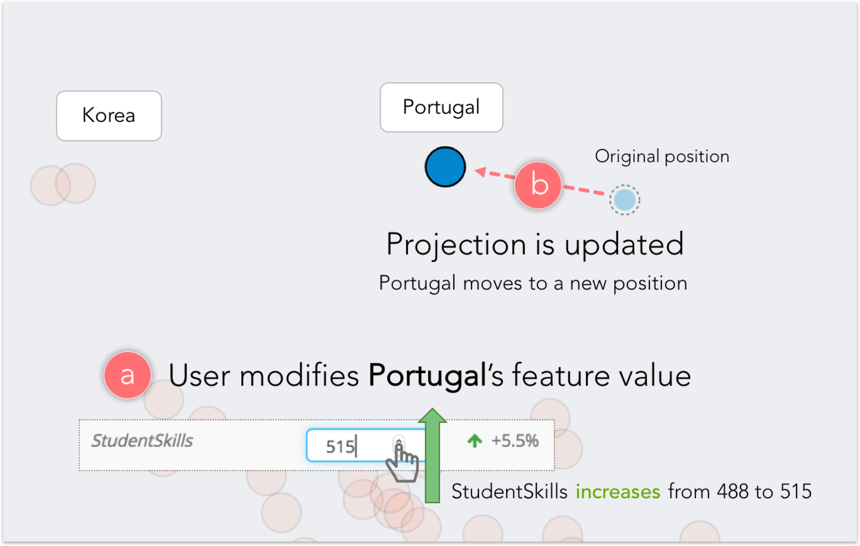
Can you explain why Portugal is in that specific position of the projection plane, distant from the other European countries?
-
T3:
Suppose Chile has a near-term plan to attain a development level similar to Greece but could increase spending in only one of the development index areas. On which area would you advise the Chilean government to focus its resources?
-
T4:
Consider the cluster formed by Turkey and Mexico. Compare it to the cluster formed by Asian countries.
-
T5:
Suppose Israel cannot increase its education spending for the foreseeable future due to budgetary constraints. Would it be reasonable for the country to attain a development level similar to Canada?
-
T6:
Given that the Italian government would not allow WorkingLongHours to increase beyond the distribution mean, say which countries could be considered similar to Italy if it was able to improve its StudentSkills index value to 500.
Procedure: The study took place in the experimenter’s office; one user at a time used Praxis running on the experimenter’s laptop. The study had three stages. In the first, participants were briefed about the experiment and filled out a pre-experiment questionnaire eliciting information about their experience in data science and use of dimensionality-reduction techniques. In the second stage, participants were introduced to the Praxis interface and to our techniques via a training dataset. Five minutes were dedicated to showing each user how to perform forward projection, backward projection and constraints formulation. Participants were then introduced to a new dataset and asked to complete the six tasks above. Task duration was manually timed and subject responses were collected through think-aloud protocol. Participants had at most two trials to perform each task; in the event of a failure, they moved on to the next task. For each task we also recorded whether the task was completed with or without the experimenter’s help. In the last stage, participants were asked to complete a post-experiment questionnaire to gather subjective feedback.
| performance | techniques used | ||||||
| Task | C | H | I | forward | prolines | backward | feasibility |
| T1 | 10 | 2 | 0 | 2 | 12 | 0 | 0 |
| T2 | 12 | 0 | 0 | 0 | 12 | 0 | 0 |
| T3 | 11 | 1 | 0 | 8 | 9 | 4 | 0 |
| T4 | 12 | 0 | 0 | 1 | 12 | 2 | 0 |
| T5 | 11 | 1 | 0 | 2 | 12 | 11 | 0 |
| T6 | 9 | 2 | 1 | 2 | 2 | 2 | 10 |
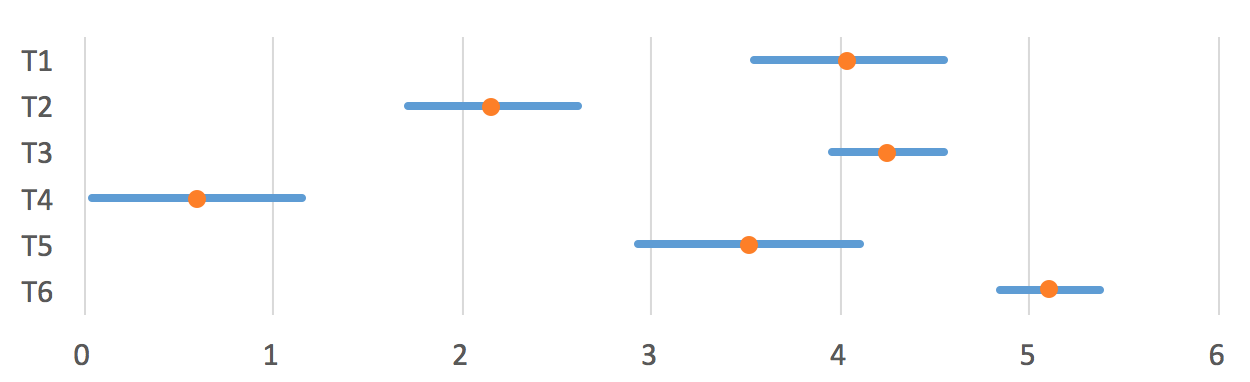
Results and Discussion: We adopt a task performance criterion similar to that employed in [42]. For each task, we count the number of participants who completed the task (C), completed the task with help (H) or were unable to complete the task (I). Similarly, we also report the frequency of the interaction (forward projection and backward projection) and visualization (prolines and feasibility map) techniques used by users to complete each task. We list these results in Table 1. Figure 10 shows the average log time spent on each task, inclusive of the cases in which the participant didn’t complete the task. All the completed tasks were performed in less than 30 seconds. Task completion times and their standard errors reflect the intrinsic complexities of the tasks.
Overall, prolines proved to be a simple yet powerful visualization technique for exploring dimensionally reduced data as well as reasoning about the dimensionality reduction. Prolines were used 59 times by participants over the course of the six tasks performed. One participant mentioned he particularly liked “how prolines generate meaningful axes in a scatter plot where a clear mapping to data dimensions is unclear,” whereas another described prolines as a “great way to understand dimensionality reductions, especially for people who used to treat them as a black box.” The second most frequently used technique was backward projection, (used 19 times, followed by forward projection (15 times). Note that the use of forward projection always involves displaying prolines, which incorporates paths of forward projection locations for hypothetical feature values. Participants used forward projection when they wanted to interactively change the feature values and see precisely the projection change of the corresponding data point. In particular, one participant declared, “I feel backward projection is more natural to use and useful to see which features correlate to each other, but I would prefer forward projection for more precise control over feature values.” Also, despite its lower incidence of use, feasibility map was employed by the participants when the task was sufficiently complex (T6).
5.2 Model Analysis
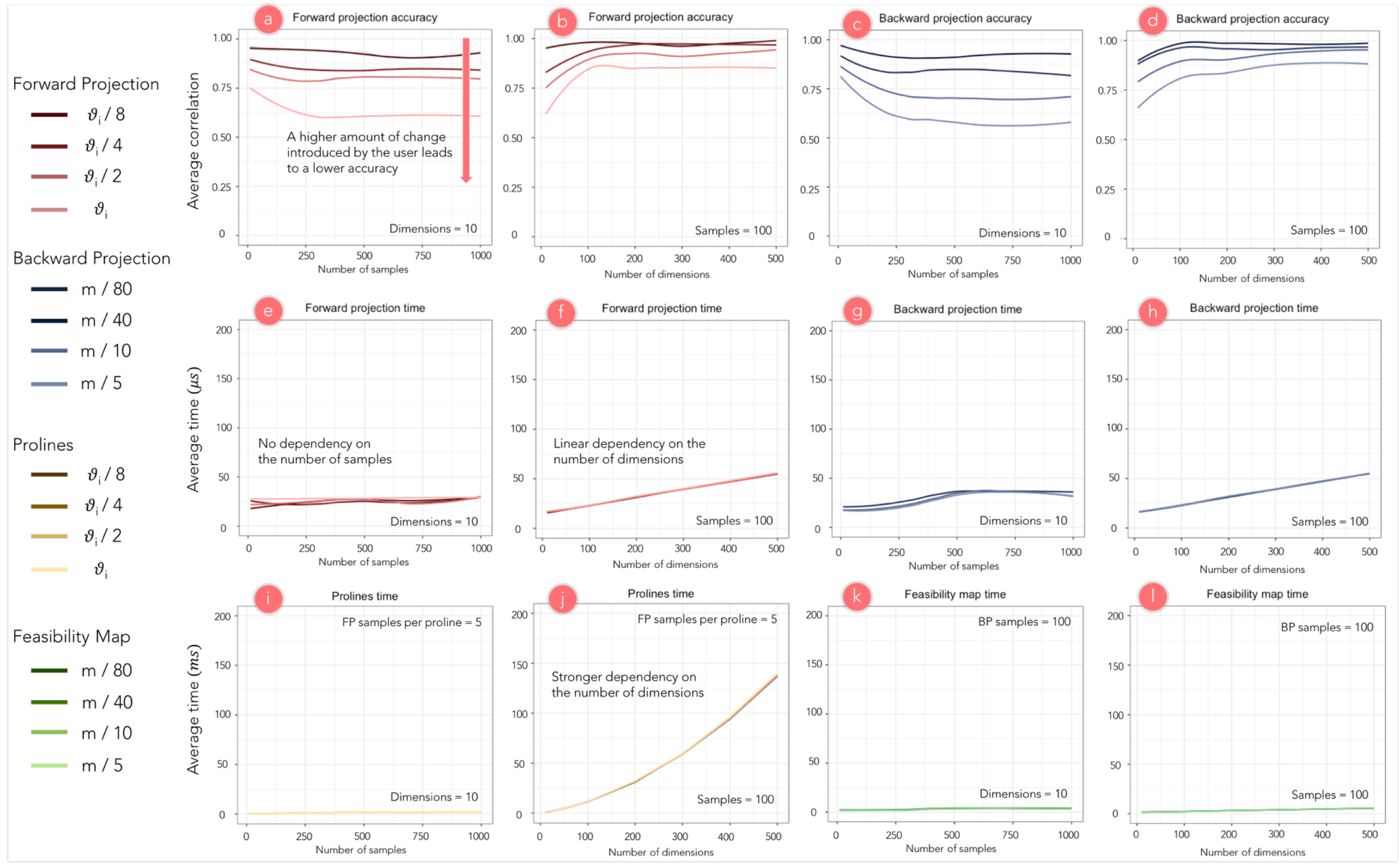
Since they are intended for use in interactive applications, the computational complexity of the proposed techniques needs to adhere to certain responsiveness requirements. At the same time, forward and backward projection methods need to be accurate enough at estimating changes in the dimensionally reduced space as well as in the underlying multidimensional data so as not to lead the user to false assumptions. We evaluate our proposed techniques for PCA in terms of time and accuracy over varying number of samples and dimensions of the input dataset and also over the amount of change introduced by the user (i.e. how much a feature value is modified in the case of forward projection, how much a data point is moved in the case of backward projection).
In our evaluation we iteratively perform forward projection and unconstrained backward projection on automatically generated Gaussian random multivariate distributions, changing either the number of data samples or the number of data dimensions and leaving the other one fixed. We apply our techniques for each data point of the original distribution. The forward projection algorithm is then applied to each dimension with an amount of change in , where is the standard deviation for the current feature. Backward projection is performed in eight possible directions of movement (horizontal and vertical axes plus diagonals), with an amount of change in , where is the width of the projection plane. Accuracy and time performances are determined for each execution of the two techniques and then averaged over all dimensions (directions), data samples and test iterations. All experimental results presented were generated on a MacBook Pro, 2015 edition.
Time Performance: Figure 11 shows that the execution time for both forward projection (e,f) and backward projection (g,h) is on the order of microseconds and is not influenced by the number of samples nor by the amount of change; charts i and h show a linear dependence on the number of dimensions that does not, however, significantly affect the time performance. Even when dealing with larger datasets (e.g. 500 samples, 100 dimensions), both techniques are suitable for interactive data analysis tools. Figure 11 also shows the time performance of prolines (i,j) and feasibility map (k,l), respectively assuming the computation of each proline with an average resolution of 5 forward projection samples and the generation of the feasibility map with a resolution of 100 backward projection samples. In particular, we note that the time to compute prolines depends linearly on the number of dimensions.
Accuracy: To assess the accuracy of our techniques, we introduce a new similarity criterion for data-point neighborhoods in dimensionally reduced spaces. For each execution of the algorithms on a data point, we compute two sets of neighbors: 1) the closest neighbors in the projection plane after performing forward projection or after moving the data point with backward projection, and 2) the closest neighbors in the projection plane after performing the dimensionality reduction on the multidimensional data, after it has been modified through forward projection or by backward projection. Optimally, these two neighborhoods should contain the same elements, which should have the same relative distance from the data point on which the technique is performed. We define a neighborhood correlation index , where is the percentage of elements that appear in both neighborhoods, whereas is the percentage of elements whose distance from the data point considered remains in the same order. The index varies between 0 and 1, with 1 corresponding to very similar neighborhoods. Figure 11 shows that the accuracy of both forward projection (a,b) and backward projection (c,d) is mostly insensitive to the number of samples or dimensions. Instead, we notice a strong dependence on the amount of change introduced by the user. This shows that our proposed techniques are well suited for local changes in the data, and greater user modifications could possibly alter the properties of the dimensionality reduction.
6 Interacting with Nonlinear Dimensionality Reductions
We have so far demonstrated our interaction methods on PCA, a linear projection method. What about interacting with nonlinear dimensionality reductions? There are out-of-sample extrapolation methods for many nonlinear dimensionality-reduction techniques that make the extension of forward projection with prolines possible [4]. As for backward projection, its computation will be straightforward in certain cases (e.g. when an autoencoder [22] is used). In general, however, some form of constrained optimization specific to the dimensionality-reduction algorithm will be needed. Nonetheless, it is highly desirable to develop general methods that apply across dimensionality-reduction algorithms.
Below we discuss an application of our techniques to an autoencoder-based nonlinear dimensionality reduction.
6.1 Autoencoder-based dimensionality reduction
An autoencoder is an artificial neural network model that can learn a low-dimensional representation (or encoding) of data in an unsupervised fashion [37]. Autoencoders that use multiple hidden layers can discover nonlinear mappings between high-dimensional datasets and their low-dimensional representations. Unlike many other dimensionality-reduction methods, an autoencoder gives mappings in both directions between the data and low-dimensional spaces [22], making it a natural candidate for application of the interactions introduced here.
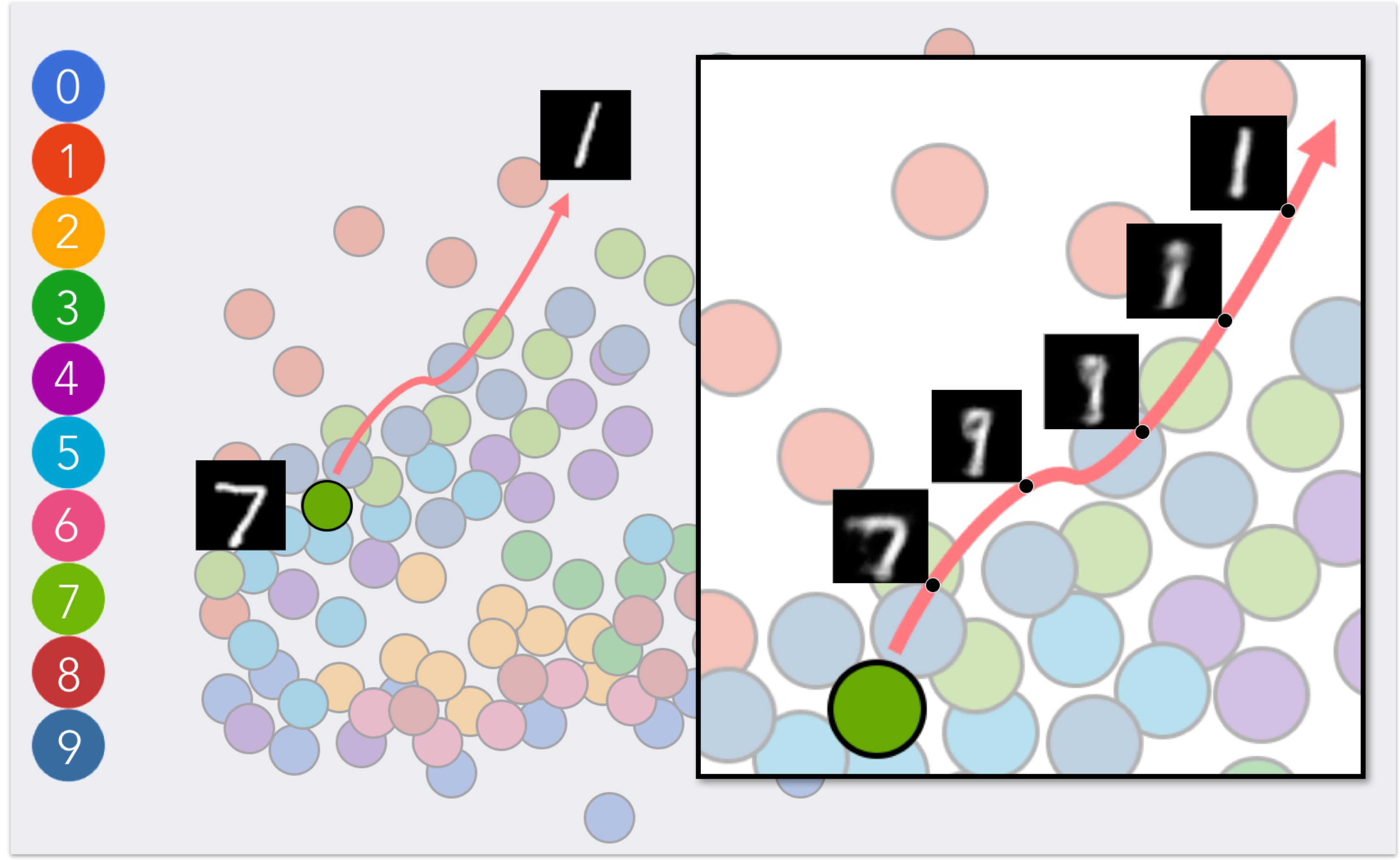
Figures 12 shows how backward projection can be applied in exploring a two-dimensional, autoencoder-based projection of handwritten digits from the MNIST database [30]. To this end, we first train an autoencoder with seven fully connected layers using the 60,000-digit images from the training set of the MNIST database.
Each image had . The seven layers of the autoencoder had sizes 784, 128, 32, 2, 32, 128 and 784. After training the network, we plot the encoded low-dimensional representations of 100 digits from the MNIST test set as circular nodes in the plane. We color each node by their associated digit. By performing backward projection on a data point, it is possible to observe the change in its feature values (pixel intensities) as the point is moved around the projection plane. Our technique shows, in this case, how one handwritten digit can gradually be transformed into another.
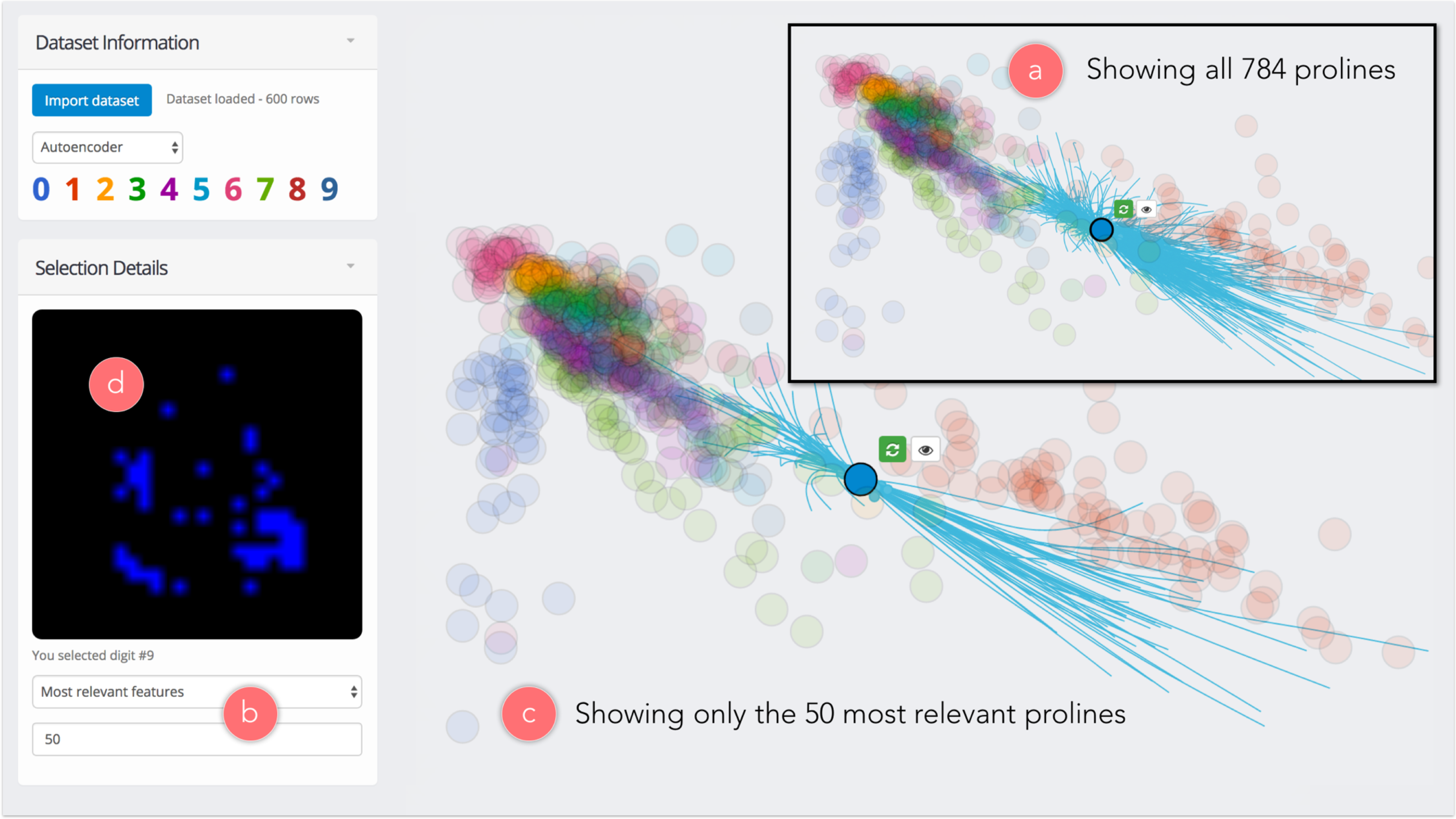
Using the same neural network model, we integrate support for autoencoder-based dimensionality reduction in our tool Praxis. In particular, Figure 13 shows prolines are not straight lines for non-linear dimensionality reduction methods.
7 A Model for Dynamic Visualization Interactions
The interaction techniques introduced here belong to a class of interactions that tightly couples data with its visual representation so that when users interactively change one, they can observe a corresponding change in the other. For example, through forward projection, users observe how the visual representation (2D position) changes as they change the value of a dataset’s attributes. Conversely, users can see how the data changes through backward projection as they change the visual representation. This class of interactions is essential for realizing dynamic visualizations (e.g. [47, 29]) and we call them dynamic visualization interactions or dynamic interactions for short.
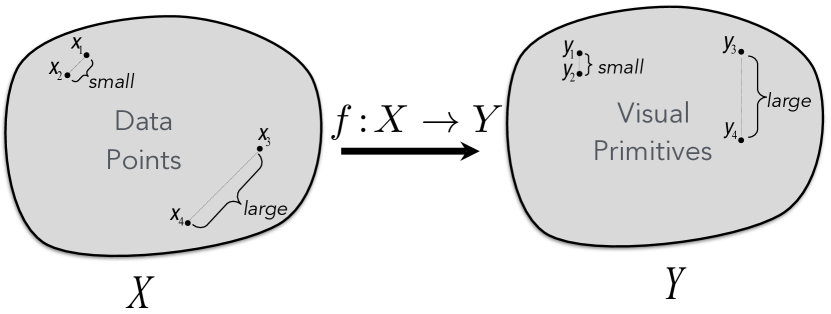
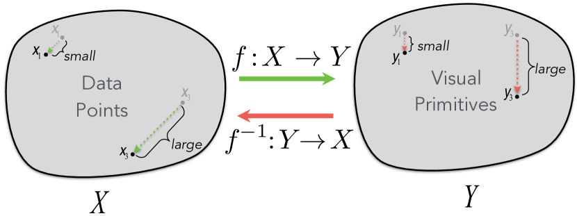
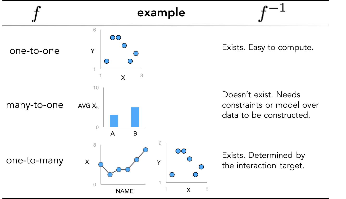
We now look at dynamic interactions under the visual embedding model [14]. The visual embedding model provides a functional view of data visualization and posits that a good visualization is a structure- or relation-preserving mapping from the data domain to the range (co-domain) of visual encoding variables (Figure 14). Visual embedding immediately gives us criteria on which dynamic interactions should be considered effective (Figure 15): 1) a change in data (e.g., induced by user through direct manipulation) should cause a proportional change in its visual representation and 2) a perceptual change in a visual encoding value (e.g., by dragging nodes in a scatter plot or changing the height of a bar in a bar chart) should be reflected by a change in data value that is proportional to the perceived change. However, to enable a dynamic interaction on a visualization, we need to have access to both the visualization function and its inverse . The visual embedding model also suggests why implementing back mapping to the data space can be challenging.
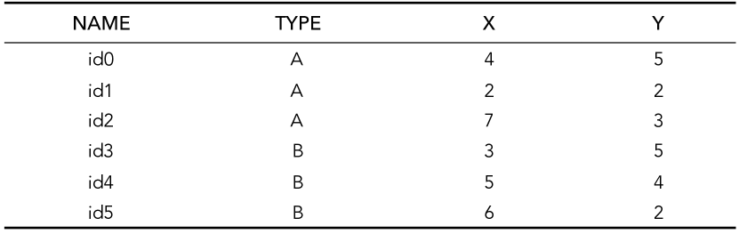
We consider three basic forms of the visualization function in Figure 16 through examples using a toy dataset in Figure 17. When the visualization function is one-to-one, a dynamic interaction over is straightforward as exists. When is one-to-many (still invertible but not necessarily a proper function), exists and is determined by the target of interaction. Consider the example in Figure 16. We visualize how X values change for each NAME with a line chart. We also visualize the correlation of X and Y with a scatter plot. If a user moves a point up or down in the line chart, the corresponding change in X can be easily computed and the scatter plot can be updated in a brush-and-link fashion. Essentially, the one-to-many case can be seen as a collection of multiple one-to-one visualizations.
The most interesting case is when is many-to-one and hence not invertible. A frequent source of such visualization functions is summary data aggregations, which are lossy. We can consider dimensionality reduction as a form of aggregation. A simple example of a many-to-one visualization is the bar chart (Figure 16) that shows the mean X for the data points grouped by TYPE, A and B. Now, in a dynamic interaction scenario, how should we update the data values if a user changes the heights of the bars? Our backward projection solves a similar problem under a more complex visualization function, dimensionality reduction. In general, constructing a dynamic interaction over many-to-one visualization functions would require imposing a set of assumptions over data in the form of, e.g., constraints or models. This presents a challenging yet important future research direction.
8 Visual Analysis Is Like Doing Experiments
This paper introduces forward projection, backward projection, and the related visualizations, prolines and feasibility map, to improve user experience in exploratory data analysis using DR. We demonstrate these techniques on PCA- and autoencoder-based DRs. We also contribute a new tool, Praxis, implementing our techniques for DR-based data exploration. We evaluate our work through a computational performance analysis, along with a user study. Our visual interactions are scalable, intuitive to use and effective for DR-based exploratory data analysis. We situate our techniques in a class of visualization interactions at large that we discuss under the visual embedding model.
Data analysis is an iterative process in which analysts essentially run mental experiments on data, asking questions, (re)forming and testing hypotheses. Tukey and Wilk [44] were among the first in observing the similarities between data analysis and doing experiments, listing eleven similarities between the two. In particular, one of these similarities states that “Interaction, feedback, trial and error are all essential; convenience is dramatically helpful.” In fact, data can be severely underutilized (e.g., dead [20, 47]) without what-if analysis.
However, to perform data analysis as if we are running data experiments, dynamic visual interactions that bidirectionally couple data and its visual representations must be one of our tools. Our work here contributes to the nascent toolkit needed for performing visual analysis in a similar way to running experiments.
9 Acknowledgments
The authors thank Paulo Freire for inspiring the name “Praxis.”
References
- [1]
- [2] Elisa Amorim, Emilio Vital Brazil, Jesús Mena-Chalco, Luiz Velho, Luis Gustavo Nonato, Faramarz Samavati, and Mario Costa Sousa. 2015. Facing the high-dimensions: Inverse projection with radial basis functions. Computers & Graphics 48 (2015), 35–47.
- [3] Michael Aupetit. 2007. Visualizing distortions and recovering topology in continuous projection techniques. Neurocomputing 70, 7-9 (2007), 1304–1330.
- [4] Yoshua Bengio, Jean-François Paiement, Pascal Vincent, Olivier Delalleau, Nicolas Le Roux, and Marie Ouimet. 2003. Out-of-Sample Extensions for LLE, Isomap, MDS, Eigenmaps, and Spectral Clustering. In NIPS.
- [5] Christopher M. Bishop. 2006. Pattern Recognition and Machine Learning. Springer-Verlag.
- [6] Alan Borning. 1981. The programming language aspects of ThingLab, a constraint-oriented simulation laboratory. ACM TOPLAS 3, 4 (1981), 353–387.
- [7] Michael Bostock, Vadim Ogievetsky, and Jeffrey Heer. 2011. D3: Data-Driven Documents. IEEE TVCG 17, 12 (2011), 2301–2309.
- [8] Matthew Brehmer, Michael Sedlmair, Stephen Ingram, and Tamara Munzner. 2014. Visualizing dimensionally-reduced data: Interviews with analysts and a characterization of task sequences. In Procs. BELIV.
- [9] Andreas Buja, Deborah F Swayne, Michael L Littman, Nathaniel Dean, Heike Hofmann, and Lisha Chen. 2008. Data Visualization With Multidimensional Scaling. Journal of Computational and Graphical Statistics 17, 2 (2008), 444–472.
- [10] Jason Chuang, Daniel Ramage, Christopher Manning, and Jeffrey Heer. 2012. Interpretation and trust. In Procs. CHI.
- [11] Tarik Crnovrsanin, Chris Muelder, Carlos Correa, and Kwan-Liu Ma. 2009. Proximity-based visualization of movement trace data. In Procs. IEEE VAST.
- [12] CVXOPT 2016. http://cvxopt.org/. (2016). Version: 1.1.9.
- [13] Çağatay Demiralp. 2016. Clustrophile: A Tool for Visual Clustering Analysis. In KDD IDEA.
- [14] Çağatay Demiralp, Carlos Scheidegger, Gordon Kindlmann, David Laidlaw, and Jeffrey Heer. 2014. Visual Embedding: A Model for Visualization. Computer Graphics and Applications (2014).
- [15] Elisa Portes dos Santos Amorim, Emilio Vital Brazil, Joel Daniels, Paulo Joia, Luis Gustavo Nonato, and Mario Costa Sousa. 2012. iLAMP: Exploring high-dimensional spacing through backward multidimensional projection. In Procs. IEEE VAST.
- [16] Alex Endert, Patrick Fiaux, and Chris North. 2012. Semantic interaction for visual text analytics. In Procs. CHI.
- [17] A. Endert, C. Han, D. Maiti, L. House, S. Leman, and C. North. 2011. Observation-level interaction with statistical models for visual analytics. In Procs. IEEE VAST.
- [18] Karl Ruben Gabriel. 1971. The biplot graphic display of matrices with application to principal component analysis. Biometrika (1971), 453–467.
- [19] Michael Gleicher. 2013. Explainers: Expert Explorations with Crafted Projections. IEEE TVCG 19, 12 (dec 2013), 2042–2051.
- [20] Peter J. Haas, Paul P. Maglio, Patricia G. Selinger, and Wang Chiew Tan. 2011. Data is Dead…Without What-If Models. PVLDB 4, 12 (2011), 1486–1489.
- [21] Trevor Hastie, Robert Tibshirani, Jerome Friedman, and James Franklin. 2005. The elements of statistical learning: data mining, inference and prediction. The Mathematical Intelligencer 27, 2 (2005), 83–85.
- [22] Geoffrey E Hinton and Ruslan R Salakhutdinov. 2006. Reducing the dimensionality of data with neural networks. Science 313, 5786 (2006), 504–507.
- [23] Edwin L Hutchins, James D Hollan, and Donald A Norman. 1985. Direct manipulation interfaces. Human–Computer Interaction 1, 4 (1985), 311–338.
- [24] Dong Hyun Jeong, Caroline Ziemkiewicz, Brian Fisher, William Ribarsky, and Remco Chang. 2009. iPCA: An Interactive System for PCA-based Visual Analytics. Computer Graphics Forum 28, 3 (2009), 767–774.
- [25] S. Johansson and J. Johansson. 2009. Interactive Dimensionality Reduction Through User-defined Combinations of Quality Metrics. IEEE TVCG 15, 6 (nov 2009), 993–1000.
- [26] Paulo Joia, Danilo Coimbra, Jose A Cuminato, Fernando V Paulovich, and Luis G Nonato. 2011. Local affine multidimensional projection. IEEE TVCG 17, 12 (2011), 2563–2571.
- [27] Eric Jones, Travis Oliphant, Pearu Peterson, and others. 2001. SciPy: Open source scientific tools for Python. (2001). http://www.scipy.org/.
- [28] Alan Kay and Adele Goldberg. 1977. Personal dynamic media. Computer 10, 3 (1977), 31–41.
- [29] Brittany Kondo and Christopher Collins. 2014. Dimpvis: Exploring time-varying information visualizations by direct manipulation. IEEE TVCG 20, 12 (2014), 2003–2012.
- [30] Yann LeCun, Corinna Cortes, and Christopher JC Burges. 2016. The MNIST database of handwritten digits, 1998. (2016). http://yann.lecun.com/exdb/mnist/
- [31] Sylvain Lespinats and Michael Aupetit. 2010. CheckViz: Sanity Check and Topological Clues for Linear and Non-Linear Mappings. Computer Graphics Forum 30, 1 (2010), 113–125.
- [32] Gladys MH Mamani, Francisco M Fatore, Luis Gustavo Nonato, and Fernando Vieira Paulovich. 2013. User-driven Feature Space Transformation. Computer Graphics Forum 32 (2013), 291–299.
- [33] Nathan D Monnig, Bengt Fornberg, and Francois G Meyer. 2014. Inverting nonlinear dimensionality reduction with scale-free radial basis function interpolation. Applied and Computational Harmonic Analysis 37, 1 (2014), 162–170.
- [34] OECD Better Life Index 2016. http://www.oecdbetterlifeindex.org/. (2016). Accessed: Dec 24th, 2017.
- [35] F. Pedregosa, G. Varoquaux, A. Gramfort, V. Michel, B. Thirion, O. Grisel, M. Blondel, P. Prettenhofer, R. Weiss, V. Dubourg, J. Vanderplas, A. Passos, D. Cournapeau, M. Brucher, M. Perrot, and E. Duchesnay. 2011. Scikit-learn: Machine Learning in Python. JMLR 12 (2011), 2825–2830.
- [36] ReactJS 2017. https://facebook.github.io/react/. (2017). Version: 15.6.1.
- [37] D. E. Rumelhart, G. E. Hinton, and R. J. Williams. 1986. In Parallel Distributed Processing: Explorations in the Microstructure of Cognition, Vol. 1, David E. Rumelhart and James L. McClelland (Eds.). Chapter Learning Internal Representations by Error Propagation, 318–362.
- [38] Dominik Sacha, Leishi Zhang, Michael Sedlmair, John A Lee, Jaakko Peltonen, Daniel Weiskopf, Stephen C North, and Daniel A Keim. 2017. Visual interaction with dimensionality reduction: A structured literature analysis. IEEE Transactions on Visualization and Computer Graphics 23, 1 (2017), 241–250.
- [39] Tobias Schreck, Jurgen Bernard, Tatiana von Landesberger, and Jorn Kohlhammer. 2009. Visual cluster analysis of trajectory data with interactive Kohonen maps. Information Visualization 8, 1 (2009), 14–29.
- [40] Michael Sedlmair, Tamara Munzner, and Melanie Tory. 2013. Empirical Guidance on Scatterplot and Dimension Reduction Technique Choices. IEEE Trans. Visual. Comput. Graphics 19, 12 (2013), 2634–2643.
- [41] B. Shneiderman. 1983. Direct Manipulation: A Step Beyond Programming Languages. Computer 16, 8 (1983), 57–69.
- [42] Julian Stahnke, Marian Dörk, Boris Müller, and Andreas Thom. 2016. Probing Projections: Interaction Techniques for Interpreting Arrangements and Errors of Dimensionality Reductions. IEEE TVCG 22, 1 (2016), 629–638.
- [43] Ivan E Sutherland. 1963. Sketchpad: A man-machine graphical communication system. In Procs. Spring Joint Computer Conference.
- [44] John W Tukey and MB Wilk. 1966. Data analysis and statistics: an expository overview. In Procs. Fall Joint Computer Conference.
- [45] LJP Van der Maaten, EO Postma, and HJ Van den Herik. 2009. Dimensionality reduction: A comparative review. Technical Report. TiCC, Tilburg University.
- [46] Christophe Viau, Michael J McGuffin, Yves Chiricota, and Igor Jurisica. 2010. The FlowVizMenu and parallel scatterplot matrix: Hybrid multidimensional visualizations for network exploration. IEEE TVCG (2010), 1100–1108.
- [47] Bret Victor. 2013. Media for Thinking the Unthinkable. https://vimeo.com/67076984. (2013). Accessed: Dec 24th, 2017.
- [48] Stefan van der Walt, S. Chris Colbert, and Gael Varoquaux. 2011. The NumPy Array: A Structure for Efficient Numerical Computation. Computing in Science & Engineering 13, 2 (2011), 22–30.
- [49] M. Williams and T. Munzner. 2004. Steerable, Progressive Multidimensional Scaling. In Procs. IEEE InfoVis.