\pkgggRandomForests: Exploring Random Forest Survival
random forest, survival, vimp, minimal depth, \proglangR, \pkgrandomForestSRC, \pkgggRandomForests, \pkgrandomForest
\Abstract
Random forest (Breiman:2001) (RF) is a non-parametric statistical
method requiring no distributional assumptions on covariate relation to
the response. RF is a robust, nonlinear technique that optimizes
predictive accuracy by fitting an ensemble of trees to stabilize model
estimates. Random survival forests (RSF)
(Ishwaran:2007a; Ishwaran:2008) are an extension of Breimans RF
techniques allowing efficient non-parametric analysis of time to event
data. The \pkgrandomForestSRC package (Ishwaran:RFSRC:2014) is a
unified treatment of Breimans random forest for survival, regression and
classification problems.
Predictive accuracy makes RF an attractive alternative to parametric
models, though complexity and interpretability of the forest hinder
wider application of the method. We introduce the \pkgggRandomForests
package, tools for visually understand random forest models grown in
\proglangR (rcore) with the \pkgrandomForestSRC package. The
\pkgggRandomForests package is structured to extract intermediate data
objects from \pkgrandomForestSRC objects and generate figures using
the \pkgggplot2 (Wickham:2009) graphics package.
This document is structured as a tutorial for building random forest for
survival with the \pkgrandomForestSRC package and using the
\pkgggRandomForests package for investigating how the forest is
constructed. We analyse the Primary Biliary Cirrhosis of the liver data
from a clinical trial at the Mayo Clinic (fleming:1991). We
demonstrate random forest variable selection using Variable Importance
(VIMP) (Breiman:2001) and Minimal Depth (Ishwaran:2010), a
property derived from the construction of each tree within the forest.
We will also demonstrate the use of variable dependence and partial
dependence plots (Friedman:2000) to aid in the interpretation of
RSF results. We then examine variable interactions between covariates
using conditional variable dependence plots. Our aim is to demonstrate
the strength of using Random Forest methods for both prediction and
information retrieval, specifically in time to event data settings.
\PlainauthorJohn Ehrlinger
\PlaintitleggRandomForests: Exploring Random Forest Survival
\Shorttitle\pkgggRandomForests
\Plainkeywordsrandom forest, survival, vimp, minimal depth, r, randomForestSRC, ggRandomForests, randomForest
\Submitdate
\Address
John Ehrlinger
Microsoft
One Memorial Drive Cambridge, MA 02142
E-mail: john.ehrlinger@gmail.com
URL: https://github.com/ehrlinger/ggRandomForests
1 Introduction
Random forest (Breiman:2001) (RF) is a non-parametric statistical method which requires no distributional assumptions on covariate relation to the response. RF is a robust, nonlinear technique that optimizes predictive accuracy by fitting an ensemble of trees to stabilize model estimates. Random Survival Forest (RSF) (Ishwaran:2007a; Ishwaran:2008) is an extension of Breiman’s RF techniques to survival settings, allowing efficient non-parametric analysis of time to event data. The \pkgrandomForestSRC package (http://CRAN.R-project.org/package=randomForestSRC) (Ishwaran:RFSRC:2014) is a unified treatment of Breiman’s random forest for survival, regression and classification problems.
Predictive accuracy make RF an attractive alternative to parametric models, though complexity and interpretability of the forest hinder wider application of the method. We introduce the \pkgggRandomForests package (http://CRAN.R-project.org/package=ggRandomForests) for visually exploring random forest models. The \pkgggRandomForests package is structured to extract intermediate data objects from \pkgrandomForestSRC objects and generate figures using the \pkgggplot2 graphics package (http://CRAN.R-project.org/package=ggplot2) (Wickham:2009).
Many of the figures created by the \pkgggRandomForests package are also available directly from within the \pkgrandomForestSRC package. However \pkgggRandomForests offers the following advantages:
-
•
Separation of data and figures: \pkgggRandomForests contains functions that operate on either the rfsrc forest object directly, or on the output from \pkgrandomForestSRC post processing functions (i.e., plot.variable, var.select) to generate intermediate \pkgggRandomForests data objects. \pkgggRandomForests functions are provide to further process these objects and plot results using the \pkgggplot2 graphics package. Alternatively, users can use these data objects for their own custom plotting or analysis operations.
-
•
Each data object/figure is a single, self contained unit. This allows simple modification and manipulation of the data or ggplot objects to meet users specific needs and requirements.
-
•
We chose to use the \pkgggplot2 package for our figures for flexibility in modifying the output. Each \pkgggRandomForests plot function returns either a single ggplot object, or a list of ggplot objects, allowing the use of additional \pkgggplot2 functions to modify and customize the final figures.
This document is structured as a tutorial for using the \pkgrandomForestSRC package for building and post-processing random survival forest models and using the \pkgggRandomForests package for understanding how the forest is constructed. In this tutorial, we will build a random survival forest for the primary biliary cirrhosis (PBC) of the liver data set (fleming:1991), available in the \pkgrandomForestSRC package.
In section 2 we introduce the pbc data set and summarize the proportional hazards analysis of this data from Chapter 4 of (fleming:1991). In section 3, we describe how to grow a random survival forest with the \pkgrandomForestSRC package. Random forest is not a parsimonious method, but uses all variables available in the data set to construct the response predictor. We demonstrate random forest variable selection techniques (section 4) using Variable Importance (VIMP) (Breiman:2001) in subsection 4.1 and Minimal Depth (Ishwaran:2010) in subsection 4.2. We then compare both methods with variables used in the (fleming:1991) model.
Once we have an idea of which variables we are most interested in, we use dependence plots (Friedman:2000) (section 5) to understand how these variables are related to the response. Variable dependence (subsection 5.1) plots give us an idea of the overall trend of a variable/response relation, while partial dependence plots (LABEL:partial-dependence) show us the risk adjusted relation by averaging out the effects of other variables. Dependence plots often show strongly non-linear variable/response relations that are not easily obtained through parametric modeling.
We then graphically examine forest variable interactions with the use of variable and partial dependence conditioning plots (coplots) (chambers:1992; cleveland:1993) (LABEL:conditional-dependence-plots) and the analogouse partial dependence surfaces (LABEL:partial-plot-surfaces) before adding concluding remarks in LABEL:conclusion.
2 Data summary: primary biliary cirrhosis (PBC) data set
The primary biliary cirrhosis of the liver (PBC) study consists of 424 PBC patients referred to Mayo Clinic between 1974 and 1984 who met eligibility criteria for a randomized placebo controlled trial of the drug D-penicillamine (DPCA). The data is described in (fleming:1991, Chapter 0.2) and a partial likelihood model (Cox proportional hazards) is developed in Chapter 4.4. The pbc data set, included in the \pkgrandomForestSRC package, contains 418 observations, of which 312 patients participated in the randomized trial (fleming:1991, Appendix D).
R> data("pbc", package = "randomForestSRC")
For this analysis, we modify some of the data for better formatting of our results. Since the data contains about 12 years of follow up, we prefer using years instead of days to describe survival. We also convert the age variable to years, and the treatment variable to a factor containing levels of c("DPCA", "placebo"). The variable names, type and description are given in Table 1.
| Variable name | Description | Type |
|---|---|---|
| years | Time (years) | numeric |
| status | Event (F = censor, T = death) | logical |
| treatment | Treament (DPCA, Placebo) | factor |
| age | Age (years) | numeric |
| sex | Female = T | logical |
| ascites | Presence of Asictes | logical |
| hepatom | Presence of Hepatomegaly | logical |
| spiders | Presence of Spiders | logical |
| edema | Edema (0, 0.5, 1) | factor |
| bili | Serum Bilirubin (mg/dl) | numeric |
| chol | Serum Cholesterol (mg/dl) | integer |
| albumin | Albumin (gm/dl) | numeric |
| copper | Urine Copper (ug/day) | integer |
| alk | Alkaline Phosphatase (U/liter) | numeric |
| sgot | SGOT (U/ml) | numeric |
| trig | Triglicerides (mg/dl) | integer |
| platelet | Platelets per cubic ml/1000 | integer |
| prothrombin | Prothrombin time (sec) | numeric |
| stage | Histologic Stage | factor |
2.1 Exploratory data analysis
It is good practice to view your data before beginning analysis. Exploratory Data Analysis (EDA) (Tukey:1977) will help you to understand the data, and find outliers, missing values and other data anomalies within each variable before getting deep into the analysis. To this end, we use \pkgggplot2 figures with the facet_wrap function to create two sets of panel plots, one of histograms for categorical variables (Figure 1), and another of scatter plots for continuous variables (Figure 2). Variables are plotted along a continuous variable on the X-axis to separate the individual observations.
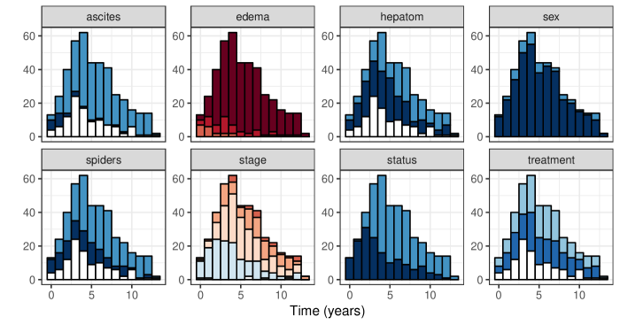
In categorical EDA plots (Figure 1), we are looking for patterns of missing data (white portion of bars). We often use surgical date for our X-axis variable to look for possible periods of low enrollment. There is not a comparable variable available in the pbc data set, so instead we used follow up time (years). Another reasonable choice may have been to use the patient age variable for the X-axis. The important quality of the selected variable is to spread the observations out to aid in finding data anomalies.
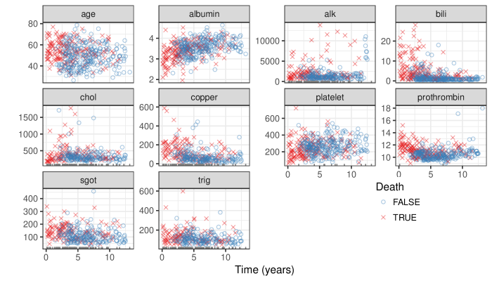
In continuous data EDA plots (Figure 2), we are looking for missingness (rug marks) and extreme or non-physical values. For survival settings, we color and shape the points as red ‘x’s to indicate events, and blue circles to indicate censored observation.
Extreme value examples are evident in a few of the variables in Figure 2. We are typically looking for values that are outside of the biological range. This is often caused by measurements recorded in differing units, which can sometimes be corrected algorithmically. Since we can not ask the original investigator to clarify these values in this particular study, we will continue without modifying the data.
| pbc | pbc.trial | |
|---|---|---|
| treatment | 106 | 0 |
| ascites | 106 | 0 |
| hepatom | 106 | 0 |
| spiders | 106 | 0 |
| chol | 134 | 28 |
| copper | 108 | 2 |
| alk | 106 | 0 |
| sgot | 106 | 0 |
| trig | 136 | 30 |
| platelet | 11 | 4 |
| prothrombin | 2 | 0 |
| stage | 6 | 0 |
Both EDA figures indicate the pbc data set contains quite a bit of missing data. Table 2 shows the number of missing values in each variable of the pbc data set. Of the 19 variables in the data, 12 have missing values. The pbc column details variables with missing data in the full pbc data set, though there are patients that were not randomized into the trial. If we restrict the data to the trial only, most of the missing values are also removed, leaving only 4 variables with missing values. Therefore, we will focus on the 312 observations from the clinical trial for the remainder of this document. We will discuss how \pkgrandomForestSRC handles missing values in subsection 3.3.
2.2 PBC Model Summary
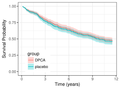
We conclude the data set investigation with a summary of(fleming:1991) model results from Chapter 4.4. We start by generating Kaplan–Meier (KM) survival estimates comparing the treatment groups of DPCA and placebo. We use the \pkgggRandomForests gg_survival function to generate these estimates from the data set as follows.
R> # Create the trial and test data sets. R> pbc.trial <- pbc R> pbc.test <- pbc R> R> # Create the gg_survival object R> gg_dta <- gg_survival(interval = "years", R+ censor = "status", R+ by = "treatment", R+ data = pbc.trial, R+ conf.int = 0.95)
The code block reduces the pbc data set to the pbc.trial which only include observations from the clinical trial. The remaining observations are stored in the pbc.test data set for later use. The \pkgggRandomForests package is designed to use a two step process in figure generation. The first step is data generation, where we store a gg_survival data object in the gg_dta object. The gg_survival function uses the data set, follow up interval, censor indicator and an optional grouping argument (by). By default gg_survival also calculates confidence band, which we can control with the conf.int argument.
In the figure generation step, we use the \pkgggRandomForests plot routine plot.gg_survival as shown in the following code block. The plot.gg_survival function uses the gg_dta data object to plot the survival estimate curves for each group and corresponding confidence interval ribbons. We have used additional \pkgggplot2 commands to modify the axis and legend labels (labs), the legend location (theme) and control the plot range of the y-axis (coord_cartesian) for this figure.
R> plot(gg_dta) + R+ labs(y = "Survival Probability", x = "Observation Time (years)", R+ color = "Treatment", fill = "Treatment") + R+ theme(legend.position = c(0.2, 0.2)) + R+ coord_cartesian(y = c(0, 1.01))
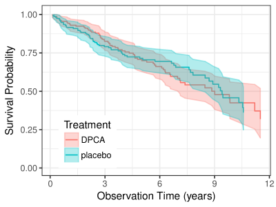
The gg_survival plot of Figure 3 is analogous to(fleming:1991) Figure 0.2.3 and Figure 4.4.1, showing there is little difference between the treatment and control groups.
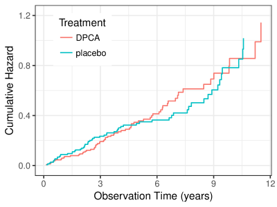
The gg_survival function generates a variety of time-to-event estimates, including the cumulative hazard. The follow code block creates a cumulative hazard plot (fleming:1991, Figure 0.2.1) in Figure 4 using the same data object generated by the original gg_survival function call. The red DPCA line is directly comparable to Figure 0.2.1, we’ve add the cumulative hazard estimates for the placebo population in blue.
R> plot(gg_dta, type = "cum_haz") + R+ labs(y = "Cumulative Hazard", x = "Observation Time (years)", R+ color = "Treatment", fill = "Treatment") + R+ theme(legend.position = c(0.2, 0.8)) + R+ coord_cartesian(ylim = c(-0.02, 1.22))
In Figure 3, we demonstrated grouping on the categorical variable (treatment). To demonstrate plotting grouped survival on a continuous variable, we examine KM estimates of survival within stratified groups of bilirubin measures. The groupings are obtained directly from(fleming:1991) Figure 4.4.2, where they presented univariate model results of predicting survival on a function of bilirubin.
We set up the bili groups on a temporary data set (pbc.bili) using the cut function with intervals matching the reference figure. For this example we combine the data generation and plot steps into a single line of code. The error argument of the plot.gg_survival function is used to control display of the confidence bands. We suppress the intervals for this figure with error = "none" and again modify the plot display with \pkgggplot2 commands to generate Figure 5.
R> pbc.bili <- pbc.trial R> pbc.bilibili, breaks = c(0, 0.8, 1.3, 3.4, 29)) R> R> plot(gg_survival(interval = "years", censor = "status", by = "bili_grp", R+ data = pbc.bili), error = "none") + R+ labs(y = "Survival Probability", x = "Observation Time (years)", R+ color = "Bilirubin")
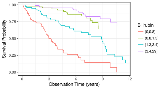
In Chapter 4,(fleming:1991) use partial likelihood methods to build a linear model with log transformations on some variables. We summarize the final, biologically reasonable model in Table 3 for later comparison with our random forest results.
| Coef. | Std. Err. | Z stat. | |
|---|---|---|---|
| Age | 0.033 | 0.009 | 3.84 |
| log(Albumin) | -3.055 | 0.724 | -4.22 |
| log(Bilirubin) | 0.879 | 0.099 | 8.90 |
| Edema | 0.785 | 0.299 | 2.62 |
| log(Prothrombin Time) | 3.016 | 1.024 | 2.95 |
3 Random survival forest
A Random Forest (Breiman:2001) is grown by bagging (Breiman:1996) a collection of classification and regression trees (CART) (cart:1984). The method uses a set of bootstrap (bootstrap:1994) samples, growing an independent tree model on each sub-sample of the population. Each tree is grown by recursively partitioning the population based on optimization of a split rule over the -dimensional covariate space. At each split, a subset of candidate variables are tested for the split rule optimization, dividing each node into two daughter nodes. Each daughter node is then split again until the process reaches the stopping criteria of either node purity or node member size, which defines the set of terminal (unsplit) nodes for the tree. In regression trees, node impurity is measured by mean squared error, whereas in classification problems, the Gini index is used (Friedman:2000).
Random forest sorts each training set observation into one unique terminal node per tree. Tree estimates for each observation are constructed at each terminal node, among the terminal node members. The Random Forest estimate for each observation is then calculated by aggregating, averaging (regression) or votes (classification), the terminal node results across the collection of trees.
Random Survival Forest (Ishwaran:2007; Ishwaran:2008) (RSF) are an extension of Random Forest to analyze right censored, time to event data. A forest of survival trees is grown using a log-rank splitting rule to select the optimal candidate variables. Survival estimate for each observation are constructed with a Kaplan–Meier (KM) estimator within each terminal node, at each event time.
Random Survival Forests adaptively discover nonlinear effects and interactions and are fully nonparametric. Averaging over many trees enables RSF to approximate complex survival functions, including non-proportional hazards, while maintaining low prediction error. (Ishwaran:2010a) showed that RSF is uniformly consistent and that survival forests have a uniform approximating property in finite-sample settings, a property not possessed by individual survival trees.
The \pkgrandomForestSRC rfsrc function call grows the forest, determining the type of forest by the response supplied in the formula argument. In the following code block, we grow a random forest for survival, by passing a survival (Surv) object to the forest. The forest uses all remaining variables in the pbc.trial data set to generate the RSF survival model.
R> rfsrc_pbc <- rfsrc(Surv(years, status) ., data = pbc.trial, R+ nsplit = 10, na.action = "na.impute", R+ tree.err = TRUE,importance = TRUE)
The print.rfsrc function returns information on how the random forest was grown. Here the family = "surv" forest has ntree = 1000 trees (the default ntree argument). The forest selected from ceil randomly selected candidate variables for splitting at each node, stopping when a terminal node contained three or fewer observations. For continuous variables, we used a random logrank split rule, which randomly selects from nsplit = 10 split point values, instead of optimizing over all possible values.
3.1 Generalization error
One advantage of random forest is a built in generalization error estimate. Each bootstrap sample selects approximately of the population on average. The remaining of observations, the Out-of-Bag (BreimanOOB:1996e) (OOB) sample, can be used as a hold out test set for each tree. An OOB prediction error estimate can be calculated for each observation by predicting the response over the set of trees which were not trained with that particular observation. Out-of-Bag prediction error estimates have been shown to be nearly identical to –fold cross validation estimates (StatisticalLearning:2009). This feature of random forest allows us to obtain both model fit and validation in one pass of the algorithm.
The gg_error function operates on the random forest (rfsrc_pbc) object to extract the error estimates as a function of the number of trees in the forest. The following code block first creates a gg_error data object, then uses the plot.gg_error function to create a ggplot object for display in a single line of code.
R> plot(gg_error(rfsrc_pbc))
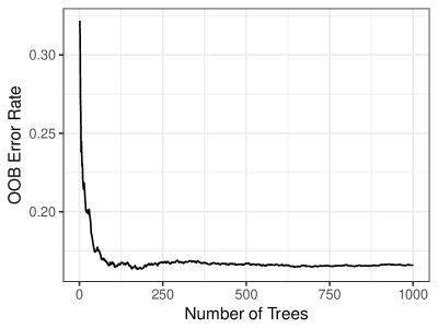
The gg_error plot of Figure 6 demonstrates that it does not take a large number of trees to stabilize the forest prediction error estimate. However, to ensure that each variable has enough of a chance to be included in the forest prediction process, we do want to create a rather large random forest of trees.
3.2 Training Set Prediction
The gg_rfsrc function extracts the OOB prediction estimates from the random forest. This code block executes the data extraction and plotting in one line, since we are not interested in holding the prediction estimates for later reuse. Each of the \pkgggRandomForests plot commands return ggplot objects, which we can also store for modification or reuse later in the analysis (ggRFsrc object). Note that we again use additional \pkgggplot2 commands to modify the display of the plot object.
R> ggRFsrc <- plot(gg_rfsrc(rfsrc_pbc), alpha = 0.2) + R+ scale_color_manual(values = strCol) + R+ theme(legend.position = "none") + R+ labs(y = "Survival Probability", x = "Time (years)") + R+ coord_cartesian(ylim = c(-0.01, 1.01)) R> show(ggRFsrc)
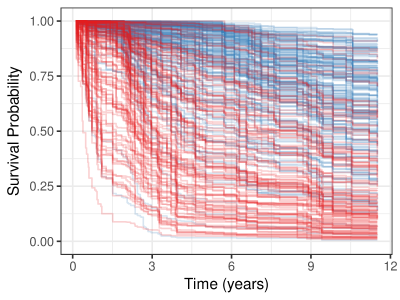
The gg_rfsrc plot of Figure 7 shows the predicted survival from our RSF model. Each line represents a single patient in the training data set, where censored patients are colored blue, and patients who have experienced the event (death) are colored in red. We extend all predicted survival curves to the longest follow up time (12 years), regardless of the actual length of a patient’s follow up time.
Interpretation of general survival properties from Figure 7 is difficult because of the number of curves displayed. To get more interpretable results, it is preferable to plot a summary of the survival results. The following code block compares the predicted survival between treatment groups, as we did in Figure 3.
R> plot(gg_rfsrc(rfsrc_pbc, by = "treatment")) + R+ theme(legend.position = c(0.2, 0.2)) + R+ labs(y = "Survival Probability", x = "Time (years)") + R+ coord_cartesian(ylim = c(-0.01, 1.01))
The gg_rfsrc plot of Figure 8 shows the median survival with a shaded confidence band for the DPCA group in red, and the placebo group in blue. When calling gg_rfsrc with either a by argument or a conf.int argument, the function calculates a bootstrap confidence interval around the median survival line. By default, the function will calculate the conf.int=0.95 confidence interval, with the number of bs.samples equal to the number of observations.
3.3 Random forest imputation
There are two modeling issues when dealing with missing data values: How does the algorithm build a model when values are missing from the training data?, and How does the algorithm predict a response when values are missing from the test data?. The standard procedure for linear models is to either remove or impute the missing data values before modelling. Removing the missingness is done by either removing the variable with missing values (column wise) or removing the observations (row wise). Removal is a simple solution, but may bias results when either observations or variables are scarce.
The \pkgrandomForestSRC package imputes missing values using adaptive tree imputation (Ishwaran:2008). Rather than impute missing values before growing the forest, the algorithm takes a just-in-time approach. At each node split, the set of mtry candidate variables is checked for missing values. Missing values are then imputed by randomly drawing values from non-missing data within the node. The split-statistic is then calculated on observations that were not missing values. The imputed values are used to sort observations into the subsequent daughter nodes and then discarded before the next split occurs. The process is repeated until the stopping criteria is reached and all observations are sorted into terminal nodes.
A final imputation step can be used to fill in missing values from within the terminal nodes. This step uses a process similar to the previous imputation but uses the OOB non-missing terminal node data for the random draws. These values are aggregated (averaging for continuous variables, voting for categorical variables) over the ntree trees in the forest to estimate an imputed data set. By default, the missing values are not filled into the training data, but are available within the forest object for later use if desired.
Adaptive tree imputation still requires the missing at random assumptions (Rubin:1976). At each imputation step, the random forest assumes that similar observations are grouped together within each node. The random draws used to fill in missing data do not bias the split rule, but only sort observations similar in non-missing data into like nodes. An additional feature of this approach is the ability of predicting on test set observations with missing values.
3.4 Test set predictions
The strength of adaptive tree imputation becomes clear when doing prediction on test set observations. If we want to predict survival for patients that did not participate in the trial using the model we created in Section 3, we need to somehow account for the missing values detailed in Table 2.
The predict.rfsrc call takes the forest object (rfsrc_pbc), and the test data set (pbc_test) and returns a predicted survival using the same forest imputation method for missing values within the test data set (na.action="na.impute").
R> rfsrc_pbc_test <- predict(rfsrc_pbc, newdata = pbc.test, R+ na.action = "na.impute", R+ importance = TRUE)
The forest summary indicates there are 106 test set observations with 36 deaths and the predicted error rate is . We plot the predicted survival just as we did the training set estimates.
R> plot(gg_rfsrc(rfsrc_pbc_test), alpha=.2) + R+ scale_color_manual(values = strCol) + R+ theme(legend.position = "none") + R+ labs(y = "Survival Probability", x = "Time (years)") + R+ coord_cartesian(ylim = c(-0.01, 1.01))
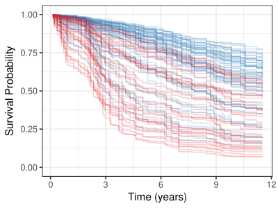
The gg_rfsrc plot of Figure 9 shows the test set predictions, similar to the training set predictions in Figure 7, though with fewer patients the survival curves do not cover the same area of the figure. It is important to note that because Figure 7 is constructed with OOB estimates, the survival results are comparable as estimates from unseen observations in Figure 9.
4 Variable selection
Random forest is not a parsimonious method, but uses all variables available in the data set to construct the response predictor. Also, unlike parametric models, random forest does not require the explicit specification of the functional form of covariates to the response. Therefore there is no explicit -value/significance test for variable selection with a random forest model. Instead, RF ascertains which variables contribute to the prediction through the split rule optimization, optimally choosing variables which separate observations.
The typical goal of a random forest analysis is to build a prediction model, in contrast to extracting information regarding the underlying process (Breiman:twoCultures:2001). There is not usually much care given in how variables are included into the training data set. Since the goal is prediction, investigators often include the “kitchen sink” if it can help.
In contrast, in survival settings we are typically also interested in how we can possibly improve the the outcome of interest. To achieve this, for understandable inference, it is important to avoid both duplication and transformations of variables whenever possible when building our data sets. Duplication of variables, including multiple measures of a similar covariate, can reduce or mask the importance of the covariate. Transformations can also mask importance as well as make interpretation of the inference results difficult to impossible.
In this Section, We explore two separate approaches to investigate the RF variable selection process. Variable Importance (subsection 4.1), a property related to variable misspecification, and Minimal Depth (subsection 4.2), a property derived from the construction of the trees within the forest.
4.1 Variable Importance
Variable importance (VIMP) was originally defined in CART using a measure involving surrogate variables (see Chapter 5 of (cart:1984)). The most popular VIMP method uses a prediction error approach involving “noising-up” each variable in turn. VIMP for a variable is the difference between prediction error when is randomly permuted, compared to prediction error under the observed values (Breiman:2001; Liaw:2002; Ishwaran:2007; Ishwaran:2008).
Since VIMP is the difference in OOB prediction error before and after permutation, a large VIMP value indicates that misspecification detracts from the predictive accuracy in the forest. VIMP close to zero indicates the variable contributes nothing to predictive accuracy, and negative values indicate the predictive accuracy improves when the variable is misspecified. In the later case, we assume noise is more informative than the true variable. As such, we ignore variables with negative and near zero values of VIMP, relying on large positive values to indicate that the predictive power of the forest is dependent on those variables.
The gg_vimp function extracts VIMP measures for each of the variables used to grow the forest. The plot.gg_vimp function shows the variables, in VIMP rank order, labeled with the named vector in the lbls argument.
R> plot(gg_vimp(rfsrc_pbc), lbls = st.labs) + R+ theme(legend.position = c(0.8, 0.2)) + R+ labs(fill = "VIMP > 0")
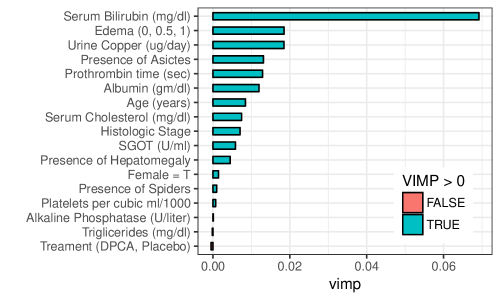
The gg_vimp plot of Figure 10 details VIMP ranking for the pbc.trial baseline variables, from the largest (Serum Bilirubin) at the top, to smallest (Treament (DPCA, Placebo)) at the bottom. VIMP measures are shown using bars to compare the scale of the error increase under permutation and colored by the sign of the measure (red for negative values). Note that four of the five highest ranking variables by VIMP match those selected by the(fleming:1991) model listed in Table 3, with urine copper (2) ranking higher than age (8). We will return to this in subsection 4.3.
4.2 Minimal Depth
In VIMP, prognostic risk factors are determined by testing the forest prediction under alternative data settings, ranking the most important variables according to their impact on predictive ability of the forest. An alternative method uses inspection of the forest construction to rank variables. Minimal depth (Ishwaran:2010; Ishwaran:2011) assumes that variables with high impact on the prediction are those that most frequently split nodes nearest to the root node, where they partition the largest samples of the population.
Within each tree, node levels are numbered based on their relative distance to the root of the tree (with the root at 0). Minimal depth measures important risk factors by averaging the depth of the first split for each variable over all trees within the forest. The assumption in the metric is that smaller minimal depth values indicate the variable separates large groups of observations, and therefore has a large impact on the forest prediction.
In general, to select variables according to VIMP, we examine the VIMP values, looking for some point along the ranking where there is a large difference in VIMP measures. Given minimal depth is a quantitative property of the forest construction, Ishwaran:2010 also derive an analytic threshold for evidence of variable impact. A simple optimistic threshold rule uses the mean of the minimal depth distribution, classifying variables with minimal depth lower than this threshold as important in forest prediction.
The \pkgrandomForestSRC var.select function uses the minimal depth methodology for variable selection, returning an object with both minimal depth and vimp measures. The \pkgggRandomForests gg_minimal_depth function is analogous to the gg_vimp function. Variables are ranked from most important at the top (minimal depth measure), to least at the bottom (maximal minimal depth).
R> varsel_pbc <- var.select(rfsrc_pbc) {Soutput} minimal depth variable selection …
———————————————————– family : surv var. selection : Minimal Depth conservativeness : medium x-weighting used? : TRUE dimension : 17 sample size : 312 ntree : 1000 nsplit : 10 mtry : 5 nodesize : 3 refitted forest : FALSE model size : 14 depth threshold : 6.7549 PE (true OOB) : 16.502
Top variables: depth vimp bili 1.708 0.067 albumin 2.483 0.012 copper 2.904 0.015 prothrombin 2.931 0.014 chol 3.227 0.006 platelet 3.329 0.000 edema 3.333 0.016 sgot 3.677 0.007 age 3.702 0.009 alk 4.039 0.001 trig 4.514 0.000 ascites 5.194 0.013 stage 5.247 0.007 hepatom 6.476 0.003 ———————————————————– {Sinput} R> gg_md <- gg_minimal_depth(varsel_pbc, lbls = st.labs) R> # print(gg_md)
The gg_minimal_depth summary mostly reproduces the output from the var.select function from the \pkgrandomForestSRC package. We report the minimal depth threshold (threshold 6.755) and the number of variables with depth below that threshold (model size 14). We also list a table of the top (14) selected variables, in minimal depth rank order with the associated VIMP measures. The minimal depth numbers indicate that bili tends to split between the first and second node level, and the next three variables (albumin, copper, prothrombin) split between the second and third levels on average.
R> plot(gg_md, lbls = st.labs)
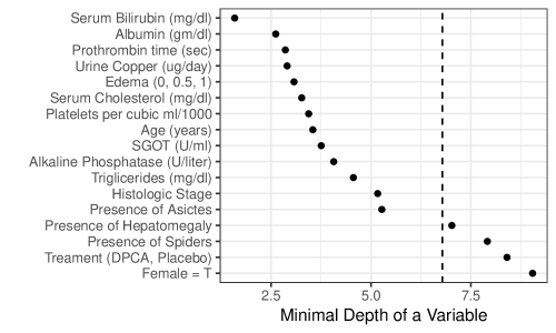
The gg_minimal_depth plot of Figure 11 is similar to the gg_vimp plot in Figure 10, ranking variables from most important at the top (minimal depth measure), to least at the bottom (maximal minimal depth). The vertical dashed line indicates the minimal depth threshold where smaller minimal depth values indicate higher importance and larger values indicate lower importance.
4.3 Variable selection comparison
Since the VIMP and Minimal Depth measures use different criteria, we expect the variable ranking to be somewhat different. We use gg_minimal_vimp function to compare rankings between minimal depth and VIMP in Figure 12.
R> plot(gg_minimal_vimp(gg_md), lbls = st.labs) + R+ theme(legend.position=c(0.8, 0.2))
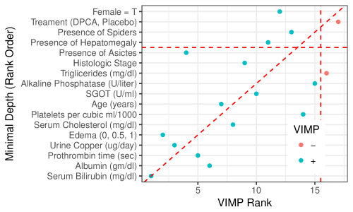
The points along the red dashed line indicate where the measures are in agreement. Points above the red dashed line are ranked higher by VIMP than by minimal depth, indicating the variables are more sensitive to misspecification. Those below the line have a higher minimal depth ranking, indicating they are better at dividing large portions of the population. The further the points are from the line, the more the discrepancy between measures.
| Variable | FH | Min depth | VIMP |
|---|---|---|---|
| bili | 1 | 1 | 1 |
| albumin | 2 | 2 | 6 |
| copper | NA | 3 | 3 |
| prothrombin | 4 | 4 | 4 |
| chol | NA | 5 | 10 |
| platelet | NA | 6 | 16 |
| edema | 5 | 7 | 2 |
| sgot | NA | 8 | 8 |
| age | 3 | 9 | 7 |
| alk | NA | 10 | 13 |
| trig | NA | 11 | 15 |
| ascites | NA | 12 | 5 |
| stage | NA | 13 | 9 |
| hepatom | NA | 14 | 11 |
We examine the ranking of the different variable selection methods further in Table 4. We can use the Z statistic from Table 3 to rank variables selected in the(fleming:1991) model to compare with variables selected by minimal depth and VIMP. The table is constructed by taking the top ranked minimal depth variables (below the selection threshold) and matching the VIMP ranking and(fleming:1991) model transforms. We see all three methods indicate a strong relation of serum bilirubin to survival, and overall, the minimal depth and VIMP rankings agree reasonably well with the(fleming:1991) model.
The minimal depth selection process reduced the number of variables of interest from~17 to 14, which is still a rather large subset of interest. An obvious selection set is to examine the five variables selected by(fleming:1991). Combining the Minimal Depth and(fleming:1991) model, there may be evidence to keep the top 7 variables. Though minimal depth does not indicate the edema variable is very interesting, VIMP ranking does agree with the proportional hazards model, indicating we might not want to remove the edema variable. Both minimal depth and VIMP suggest including copper, a measure associated with liver disease.
Regarding the chol variable, recall missing data summary of Table 2. In in the trial data set, there were 28 observations missing chol values. The forest imputation randomly sorts observations with missing values into daughter nodes when using the chol variable, which is also how \pkgrandomForestSRC calculates VIMP. We therefore expect low values for VIMP when a variable has a reasonable number of missing values.
Restricting our remaining analysis to the five(fleming:1991) variables, plus the copper retains the biological sense of these analysis. We will now examine how these six variables are related to survival using variable dependence methods to determine the direction of the effect and verify that the log transforms used by(fleming:1991) are appropriate.
5 Variable/Response dependence
As random forest is not parsimonious, we have used minimal depth and VIMP to reduce the number of variables to a manageable subset. Once we have an idea of which variables contribute most to the predictive accuracy of the forest, we would like to know how the response depends on these variables.
Although often characterized as a black box method, the forest predictor is a function of the predictor variables We use graphical methods to examine the forest predicted response dependency on covariates. We again have two options, variable dependence plots (subsection 5.1) are quick and easy to generate, and partial dependence plots (LABEL:partial-dependence) are more computationally intensive but give us a risk adjusted look at variable dependence.
5.1 Variable dependence
Variable dependence plots show the predicted response relative to a covariate of interest, with each training set observation represented by a point on the plot. Interpretation of variable dependence plots can only be in general terms, as point predictions are a function of all covariates in that particular observation.
Variable dependence is straight forward to calculate, involving only the getting the predicted response for each observation. In survival settings, we must account for the additional dimension of time. We plot the response at specific time points of interest, for example survival at 1 or 3 years.
R> ggRFsrc + geom_vline(aes(xintercept = 1), linetype = "dashed") + R+ geom_vline(aes(xintercept = 3), linetype = "dashed") + R+ coord_cartesian(xlim = c(0, 5))
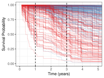
The gg_rfsrc of Figure 13 identical to Figure 7 (stored in the ggRFsrc variable) with the addition of a vertical dashed line at the 1 and 3 year survival time. A variable dependence plot is generated from the predicted response value of each survival curve at the intersecting time line plotted against covariate value for that observation. This can be visualized as taking a slice of the predicted response at each time line, and spreading the resulting points out along the variable of interest.
The gg_variable function extracts the training set variables and the predicted OOB response from rfsrc and predict objects. In the following code block, we store the gg_variable data object for later use (gg_v), as all remaining variable dependence plots can be constructed from this object.
R> gg_v <- gg_variable(rfsrc_pbc, time = c(1, 3), R+ time.labels = c("1 Year", "3 Years")) R> R> plot(gg_v, xvar = "bili", alpha = 0.4) + #, se=FALSE R+ labs(y = "Survival", x = st.labs["bili"]) + R+ theme(legend.position = "none") + R+ scale_color_manual(values = strCol, labels = event.labels) + R+ scale_shape_manual(values = event.marks, labels = event.labels) + R+ coord_cartesian(ylim = c(-0.01, 1.01))
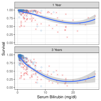
The gg_variable plot of Figure 14 shows variable dependence for the Serum Bilirubin (bili) variable. Again censored cases are shown as blue circles, events are indicated by the red x symbols. Each predicted point is dependent on the full combination of all other covariates, not only on the covariate displayed in the dependence plot. The smooth loess line (cleveland:1981; cleveland:1988) indicates the trend of the prediction over the change in the variable.
Examination of Figure 14 indicates most of the cases are grouped in the lower end of bili values. We also see that most of the higher values experienced an event. The “normal” range of Bilirubin is from 0.3 to 1.9 mg/dL, indicating the distribution from our population is well outside the normal range. These values make biological sense considering Bilirubin is a pigment created in the liver, the organ effected by the PBC disease. The figure also shows that the risk of death increases as time progresses. The risk at 3 years is much greater than that at 1 year for patients with high Bilirubin values compared to those with values closer to the normal range.
The plot.gg_variable function call operates on the gg_variable object controlled by the list of variables of interest in the xvar argument. By default, the plot.gg_variable function returns a list of ggplot objects, one figure for each variable named in xvar. The remaining arguments are passed to internal \pkgggplot2 functions controlling the display of the figure. The se argument is passed to the internal call to geom_smooth for fitting smooth lines to the data. The alpha argument lightens the coloring points in the geom_point call, making it easier to see point over plotting. We also demonstrate modification of the plot labels using the labs function and point attributes with the scale_ functions.
An additional plot.gg_variable argument (panel = TRUE) can be used to combine multiple variable dependence plots into a single figure. In the following code block, we plot the remaining continuous variables of interest found in Table 4.
R> xvar <- c("bili", "albumin", "copper", "prothrombin", "age") R> xvar.cat <- c("edema") R> R> plot(gg_v, xvar = xvar[-1], panel = TRUE, alpha = 0.4) + R+ labs(y = "Survival") + R+ theme(legend.position = "none") + R+ scale_color_manual(values = strCol, labels = event.labels) + R+ scale_shape_manual(values = event.marks, labels = event.labels) + R+ coord_cartesian(ylim = c(-0.05, 1.05))
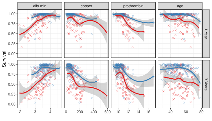
The gg_variable plot in Figure 15 displays a panel of the remaining continuous variable dependence plots. The panels are sorted in the order of variables in the xvar argument and include a smooth loess line (cleveland:1981; cleveland:1988) to indicate the trend of the prediction dependence over the covariate values. The se=FALSE argument turns off the loess confidence band, and the span=1 argument controls the degree of smoothing.
The figures indicate that survival increases with albumin level, and decreases with bili, copper, prothrombin and age. Note the extreme value of prothrombin (> 16) influences the loess curve more than other points, which would make it a candidate for further investigation.
We expect survival at 3 years to be lower than at 1 year. However, comparing the two time plots for each variable does indicate a difference in response relation for bili, copper and prothrombine. The added risk for high levels of these variables at 3 years indicates a non-proportional hazards response. The similarity between the time curves for albumin and age indicates the effect of these variables is constant over the disease progression.
There is not a convenient method to panel scatter plots and boxplots together, so we recommend creating panel plots for each variable type separately. We plot the categorical variable (edema) in LABEL:fig:variable-plotCat separately from the continuous variables in Figure 15.
R> plot(gg_v, xvar = xvar.cat, alpha = 0.4) + labs(y = "Survival") + R+ theme(legend.position = "none") + R+ scale_color_manual(values = strCol, labels = event.labels) + R+ scale_shape