Learning Interpretability for Visualizations using Adapted Cox Models through a User Experiment
Abstract
In order to be useful, visualizations need to be interpretable. This paper uses a user-based approach to combine and assess quality measures in order to better model user preferences. Results show that cluster separability measures are outperformed by a neighborhood conservation measure, even though the former are usually considered as intuitively representative of user motives. Moreover, combining measures, as opposed to using a single measure, further improves prediction performances.
1 Introduction
Measuring interpretability is a major concern in machine learning. Along with other classical performance measures such as accuracy, interpretability defines the limit between black-box and white-box models (Rüping,, 2006; Bibal and Frénay,, 2016). Interpretable models allow one to understand how inputs are linked to the output. This paper focuses on visualizations that map high-dimensional data to a 2D projection. In this context, interpretability refers to the ability of a user to understand how a particular visualization model projects data. When a user chooses a particular visualization, he or she implicitly states that he or she understands how the points are presented, i.e. how the model works. Interpretability is then defined through user preferences and no a priori definition is assumed.
Following Freitas, (2014) and others, Bibal and Frénay, (2016) highlights two ways to measure interpretability: through heuristics and user-based surveys. Tailored quality measures for visualizations are examples of the heuristics approach. Surveys can be used to qualitatively define the understandability of a visualization by asking for user feedback. Both approaches are complementary, but only a few works (e.g. Sedlmair and Aupetit, (2015)) attempt to mix them to assess the relevance of several quality metrics for visualization. This paper bridges this gap through a user-based experiment that uses meta-learning to combine several measures of visualization interpretability.
Section 2 presents some visualization quality measures that are used during meta-learning. Section 3 introduces a family of white-box meta-models to find a score of interpretability. Then, Section 4 describes the user experiment that is used to model interpretability from user preferences. Finally, Section 5 discusses the experimental results and Section 6 concludes the paper.
2 Quality Measures of Visualizations
One can consider two types of quality measures for visualizations: one type uses only the data after projection and the other compares the points before and after projection. Typical measures of the first type focus on the separability of clusters in the visualization. Sedlmair and Aupetit, (2015) reviewed, evaluated and sorted such measures in terms of algorithmic similarity and agreement with human judgments. They confirmed the top position of distance consistency (DSC) as one of the best measures (Sedlmair and Aupetit,, 2015). Let be the set of points of the projection, the set of classes and the centroid of class , then (Sips et al.,, 2009):
Two other top measures in Sedlmair and Aupetit, (2015) are the hypothesis margin (HM) and the average between-within (ABW). HM computes the average difference between the distance of each point from its closest neighbor of another class and its closest neighbor of the same class (Gilad-Bachrach et al.,, 2004). ABW (Sedlmair and Aupetit,, 2015; Lewis et al.,, 2012) computes the ratio of the average distance between points of different clusters and the average distance within clusters.
In order to compare visualization algorithms, Lee et al., (2015) propose a measure of the second type modeling neighborhood preservation. Their measure, , can be defined as follows. Let be the number of points in the dataset, the number of neighbors, the nearest neighbors of the th point in the original dataset and the nearest neighbors of the th point in the projection,
measures the average preservation of neighborhoods of size . Lee et al., (2015) then use the area under the curve for different neighborhood sizes in order to compute .
3 Meta-Learning with Adapted Cox Models
The main goal of this paper is to evaluate whether combining state-of-the-art measures of different types improve the modeling of human judgment. To asses this, we set up an experiment asking users to express preferences between visualizations shown in pairs (see section 4 for more details) and then used these preferences to determine an interpretability score. Since our dataset is composed of preferences between visualizations, our learning problem is rooted in preference learning. For this kind of problem, an order must be learned based on preferences (Fürnkranz and Hüllermeier,, 2011). Our dataset consists of a set of visualizations and a set of user-given preferences expressing that is preferred over for some pairs of visualization .
The preference learning algorithm considered for modeling user preferences must be interpretable, such as with a logistic regression (Arias-Nicolás et al.,, 2008), so that knowledge about the measures used as meta-features can be gained. To solve this problem, we consider a well-known interpretable model used in survival analysis, the Cox model (Cox,, 1972; Branders,, 2015). We adapted the Cox model to fit our preference learning problem. Indeed, in the case of pairwise comparisons of objects, the partial likelihood of a Cox model can be adapted as follows:
This adapted Cox model learns a preference score using measures presented in section 2 as features of visualizations and . This regression differs from a true logistic regression in that there is no intercept term. The term can be interpreted as an understandability score for visualization .
4 User-Based Experiment
As mentioned in section 3, an experiment was set up to collect preferences from users. Visualizations presented to users were generated from the dataset MNIST with various numbers of classes (from 2 to 6) using t-SNE (van der Maaten and Hinton,, 2008) with various perplexities between and the dataset size in a logarithmic scale. Each user was interviewed after the experiment to discuss his or her strategies for choosing between visualizations. We then used this information to better understand cases where Cox models were not in agreement with user preferences.
The population of our experiment consisted of 40 first-year university students. They were instructed to select, from two displayed visualizations, the one for which they best understood “how the computer had positioned the numbers”. In addition to these two options, they could also select “no preference”, in which case the comparison was not used for learning. Successive comparisons were assumed to be independent, meaning that no psychological learning bias was assumed to be involved.
A total of 3294 preferences was collected. Because each user may have a different strategy while choosing visualizations, they were grouped into batches per user. For a given user, a random subset of his or her preferences was selected, with the total number of preferences being the same for all users. Thanks to this subsampling, all users had the same weight when modeling the overall strategy. The number of preferences per user was set at 30, which let aside 10 users that provided less than 30 preferences; our dataset was composed of 900 preferences. 1000 user permutations were performed. For each permutation, 2/3 of the users were used for training the Cox model and 1/3 for testing. The performance measure was the percentage of agreement between users and the model. We used the same performance measure to individually compare the visualization measures used as meta-features.
5 Discussion
In addition to the two types of measures presented in section 2, the number of classes was also considered for meta-learning (Garcia et al.,, 2016). In the case of a tie (i.e same number of classes), one of the visualization was chosen randomly. Table 1 shows the means and standard deviations computed on the 1000 permutations and table 2 presents the percentage of win against other measures. Measure wins against measure if has better performances than for the permutation .
| number of classes | ABW | HM | DSC | Cox | |
|---|---|---|---|---|---|
| 63.6% 0.1 | 65.6% 0.1 | 67% 0.2 | 68.5% 0.2 | 71.5% 0.1 | 76.4% 0.2 |
| number of classes | ABW | HM | DSC | Cox | ||
|---|---|---|---|---|---|---|
| ABW | 84.5% | |||||
| HM | 88.3% | 67% | ||||
| DSC | 97.5% | 89.6% | 70% | |||
| 100% | 99.3% | 98.2% | 87.1% | |||
| 100% | 100% | 100% | 100% | 99.3% |
Among the measures of the first type discussed in section 2, DSC performs well in its group but is beaten by , the measure of the second type. Interestingly, obtains very good results despite the fact that it does not directly apply the well-known user-strategy of cluster separability (Sedlmair and Aupetit,, 2015), a strategy that was confirmed during the interviews. Indeed, measures of the second type use the original high-dimensional data in their computation, which is not possible for a human. In both table 1 and 2, the Cox model outperforms individual measures. Similar results were observed using all 3129 preferences from the same 30 users.
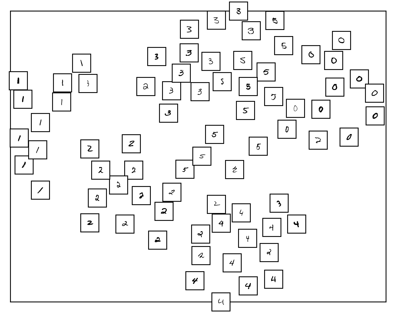
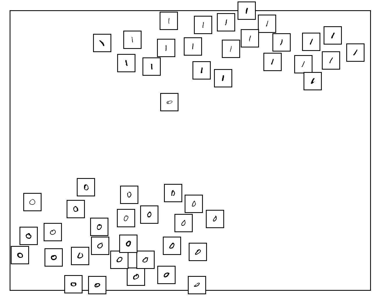
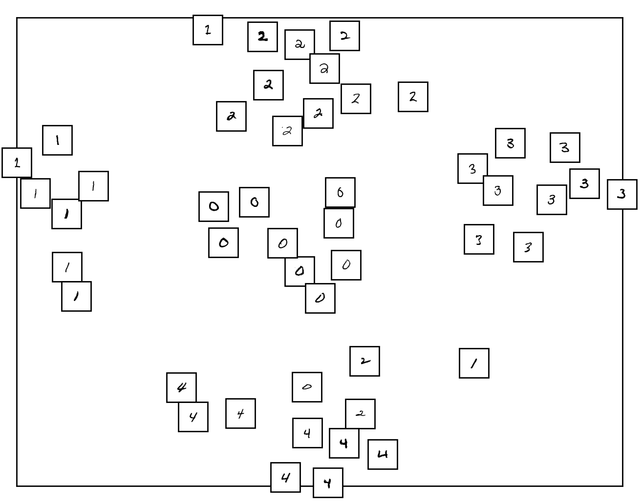
In order to understand why the Cox models fail in 23.6% of the cases on average, we checked judgment errors from Cox by referring to what users said during the interviews. We could observe that involving users open the opportunity for mistakes or unusual behaviors, as we can see in figure 1. Furthermore, in a few cases, when the user has no preference but distinguishes a semantic pattern that makes sense for him or her in the visualization, he or she tends to choose it (see figure 1).
In order to assess the importance of each visualization measure in the score of Cox, we varied the L1 penalization to enforce sparsity. is selected first. Then ABW is added with an improvement of roughly 3.5%. The number of classes is added as a third measure, which improves the model by roughly 1.5%. Other additional measures only offer a minor improvement.
6 Conclusion
Using an adapted Cox model to handle the task of preference learning, we observed the modeling power of a measure taking into account elements that a human being cannot handle, such as . Furthermore, we confirmed the position of DSC as leader of its category. Finally, we showed that using a white-box model to aggregate state-of-the-art measures can improve the prediction of human judgment using information of measures from different families. Further work needs to confirm the results obtained with t-SNE for MNIST on a wide range of datasets and visualization schemes.
Acknowledgments
We are grateful to Prof. Bruno Dumas for his help for the design of the experiment involving users. We also thanks Dr. Samuel Branders for fruitful discussions and sharing resources on Cox models.
References
- Arias-Nicolás et al., (2008) Arias-Nicolás, J., Pérez, C., and Martín, J. (2008). A logistic regression-based pairwise comparison method to aggregate preferences. Group Decision and Negotiation, 17(3):237–247.
- Bibal and Frénay, (2016) Bibal, A. and Frénay, B. (2016). Interpretability of machine learning models and representations: an introduction. In Proc. ESANN, pages 77–82, Bruges, Belgium.
- Branders, (2015) Branders, S. (2015). Regression, classification and feature selection from survival data : modeling of hypoxia conditions for cancer prognosis. PhD thesis, Université catholique de Louvain.
- Cox, (1972) Cox, D. R. (1972). Regression models and life-tables. Journal of the Royal Statistical Society. Series B (Methodological), 34(2):187–220.
- Freitas, (2014) Freitas, A. A. (2014). Comprehensible classification models: a position paper. ACM SIGKDD Explorations Newsletter, 15(1):1–10.
- Fürnkranz and Hüllermeier, (2011) Fürnkranz, J. and Hüllermeier, E. (2011). Preference learning. Springer.
- Garcia et al., (2016) Garcia, L. P., Lorena, A. C., Matwin, S., and de Carvalho, A. (2016). Ensembles of label noise filters: a ranking approach. Data Mining and Knowledge Discovery, 30(5):1192–1216.
- Gilad-Bachrach et al., (2004) Gilad-Bachrach, R., Navot, A., and Tishby, N. (2004). Margin based feature selection-theory and algorithms. In Proc. ICML, page 43, Banff, Canada.
- Lee et al., (2015) Lee, J. A., Peluffo-Ordóñez, D. H., and Verleysen, M. (2015). Multi-scale similarities in stochastic neighbour embedding. Neurocomputing, 169:246–261.
- Lewis et al., (2012) Lewis, J. M., Ackerman, M., and De Sa, V. (2012). Human cluster evaluation and formal quality measures: A comparative study. In Proc. CogSci, pages 1870–1875, Sapporo, Japan.
- Rüping, (2006) Rüping, S. (2006). Learning interpretable models. PhD thesis, Universität Dortmund.
- Sedlmair and Aupetit, (2015) Sedlmair, M. and Aupetit, M. (2015). Data-driven evaluation of visual quality measures. Computer Graphics Forum, 34(3):201–210.
- Sips et al., (2009) Sips, M., Neubert, B., Lewis, J. P., and Hanrahan, P. (2009). Selecting good views of high-dimensional data using class consistency. Computer Graphics Forum, 28(3):831–838.
- van der Maaten and Hinton, (2008) van der Maaten, L. and Hinton, G. (2008). Visualizing data using t-sne. Journal of Machine Learning Research, 9:2579–2605.