Conditional Visualization for Statistical Models:
An Introduction to the \pkgcondvis Package in \proglangR
Mark O’Connell, Catherine B. Hurley, Katarina Domijan
\PlaintitleConditional Visualization for Statistical Models:
An Introduction to the condvis Package in R
\Shorttitle\pkgcondvis: Conditional Visualization for Statistical Models
\Abstract
The \pkgcondvis package is for interactive visualization of sections in data
space, showing fitted models on the section, and observed data near the
section. The primary goal is the interpretation of complex models, and showing
how the observed data support the fitted model. There is a video accompaniment
to this paper available here. This is a preprint version of O’Connell et al. (2016).
\Keywordsinteractive, graphics, regression, classification, blackbox models
\Plainkeywordsinteractive, graphics, regression, classification,
blackbox models
\Address
Mark O’Connell
Department of Mathematics & Statistics
Logic House
Maynooth University
Co. Kildare, Ireland
E-mail:
1 Introduction
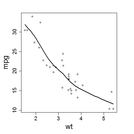
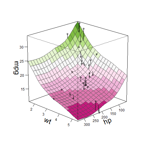
When a model consists of a single continuous predictor and a single response, the fitted model is simply visualized as a curve in two dimensions. When a model involves two predictors, it may be visualized as a surface in three dimensions; either as a contour plot or a perspective mesh. When a model involves more than two predictors, there is no direct way to visualize the model behaviour (see Figure 1). Clearly, there is a need for producing low-dimensional visualizations of models in high-dimensional space. One approach is conditional visualization.
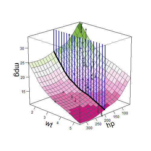
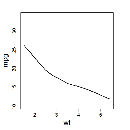
In a geometric sense, conditional visualization means taking a section. Consider a simple model with two predictors, relating \codempg to \codewt and \codehp in the \codemtcars data in \proglangR (\proglangR Core Team, 2016). The fitted model may be visualized as a surface as in Figure 2(a). If we want to visualize the modelled effect of \codewt conditional on \codehp, we take a section. The intersection of the fitted model and the section is then a curve in two dimensions as in Figure 2(b). In this way, conditional visualization offers a way to produce low-dimensional visualizations of models in high-dimensional space. It is important to note that such sections typically have no observed data lying on them, and so it is difficult to understand how the observed data support the fitted model. In \pkgcondvis, we choose to display observed data points which are deemed to be near the section (discussed further in Section 2.4).

1 predictor 2 predictors …more predictors
1.1 Example: Forced expiratory volume (FEV) data
The FEV dataset in Kahn (2005) provides some useful discussion material for conditional relationships in statistical models. It originally appears in an earlier edition of Rosner (2010); we use the copy provided in the \pkgcovreg (Niu and Hoff, 2014) package. We use this data to launch into an example of the use of \pkgcondvis. The dataset concerns the relationship between lung health and smoking in children. The response is forced expiratory volume (FEV, the amount of air an individual can exhale in the first second of a forceful breath, used as a proxy for lung health), and the predictors are gender, age, height and smoking status (binary).
In making a plot of FEV versus smoking status, we get our first surprise (see Figure 3).
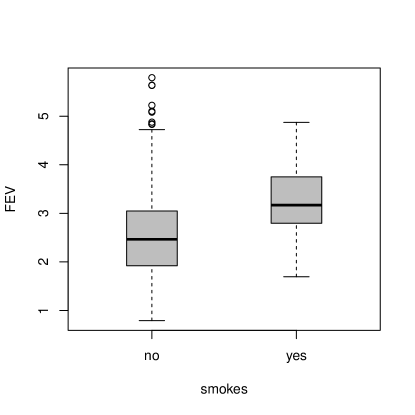
In the marginal view, it seems as though smoking is associated with better lung health! To illustrate the use of \pkgcondvis, we fit a support vector machine (Smola and Vapnik, 1997) from the \pkge1071 (Meyer et al., 2015) package. {Code} R> library("e1071") R> m1 <- svm(fev gender + smoke + age + height, data = fev) We then call \codeceplot and start looking at sections through the fitted model, investigating the modelled effect of smoking on FEV, conditional on the other predictors. (There is a video demonstration of this example, and a Shiny application demo.) {Code} R> ceplot(data = fev, model = m1, sectionvars = "smoke", type = "separate")
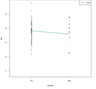
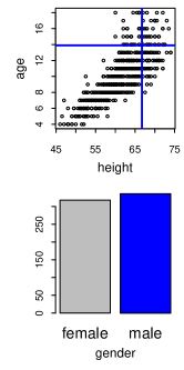
Taking a section around age = 14, height = 67, with either gender, shows a more sensible result (see Figure 5). In these parts of the predictor space, the fitted model suggests that smoking is associated with slightly lower FEV values. This is an example of Simpson’s paradox, where the modelled conditional association is of opposite sign to the apparent marginal association. The observed data near these sections also seem to support the fitted model, although it is worth noting that, for each section, there are consistently more observations in the non-smoking group compared to the smoking group.
Taking a section around age = 6, height = 55, gender = female, the model is suggesting that smoking is related to higher FEV values (see Figure 5),
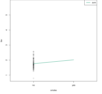
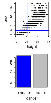
as in the marginal view before! Why is this? On examining the section, we see there are no observed data points in the smoking group in this part of the data space. It is not surprising that there are no 6 year old smokers. Such a prediction for 6 year old smokers should clearly be considered an extrapolation and held in suitable suspicion accordingly. This example demonstrates how ‘black-box’ models can mislead analysts just as easily as more rigid linear models. A good defence against this is to take sections through the model and see how nearby observed data support the model.
1.2 Outline
The remainder of the article proceeds as follows: Section 2 gives an overview of the \pkgcondvis package, explaining the basic ideas behind it. Section 3 gives more detail on how to use \pkgcondvis, describing available options and showing some code examples. Section 4 briefly discusses some other approaches to conditional visualization in the literature and in \proglangR. Section 5 concludes; giving a short summary, some strengths and limitations of \pkgcondvis, and finally an outlook on further work. The appendix provides information on the supplementary materials.
2 Overview
2.1 Basic workflow
The \pkgcondvis package is available from CRAN and can be installed using {Code} R> install.packages("condvis") The source code is also hosted at Github, where bug reports and feature requests are welcome.
The main function in \pkgcondvis is \codeceplot, which produces a visualization consisting of two main parts; a section in data space, and condition selector plots for interactively choosing the section. The default behaviour is to place all graphics on a single device with base \proglangR graphics, but options exist to place the section and condition selectors on separate devices, and to produce a Shiny (Chang et al., 2016) web application with the same displays in a web browser.
Any usage of \codeceplot begins with a dataset and a fitted model object in \proglangR (see Figure 6). This is minimally sufficient to call \codeceplot if model terms can be extracted from the model object. In most cases, we will want to specify the response and the predictor(s) of interest, the predictor(s) along which we want to take a section. These are specified as the character name of the variable in the dataframe.
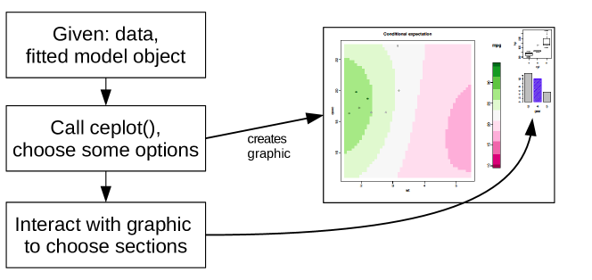
For a very simple example of the workflow in \pkgcondvis, we can fit a linear model to the \codemtcars data, and then call \codeceplot, specifying \codehp as the predictor along which to take sections. {Code} R> m2 <- lm(mpg wt + hp, data = mtcars) R> ceplot(data = mtcars, model = m2, sectionvars = "hp") In this case, the response variable can be extracted from the fitted model, and so does not need to be specified.
Sections through fitted models are evaluated using the generic \codepredict function, so this currently works for models with standard predict methods. Models of class \codelm, \codeglm, \codegam, \codesvm (Meyer et al., 2015), and \coderandomForest (Liaw and Wiener, 2002) are examples of such models. For basis expansions in linear models, the \codeAsIs function (for example, \codeI(x^2)) must be used in the formula, unless the user explicitly wants to investigate the model in the expanded data space. The same goes for interactions, which should be specified using \codea*b or \codea:b as necessary, rather than adding constructed variables to the dataframe. If a fitted model object does not have a suitable \codepredict method, a S3 wrapper object may be used to standardize the model object’s external behaviour under a \codepredict call.
2.2 Choosing sections: Condition selector plots
In \pkgcondvis, choosing a section is treated as choosing a point in the space of the conditioning predictors. This could be accomplished by keyboard input or sliders for continuous predictors, and a dropdown menu for categorical predictors. Such a simple approach would quickly succumb to the curse of dimensionality however, and it would be difficult to choose sensible sections. By sensible, we mean that a section is roughly in a part of the data space where there are observed data points, and not an unwitting extrapolation.
We give three ways to graphically choose a section.
-
•
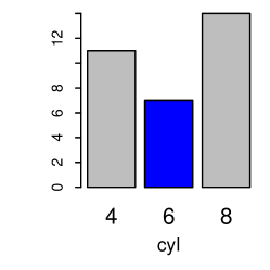
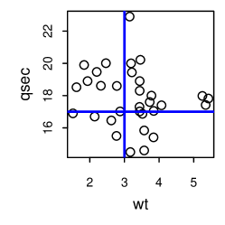
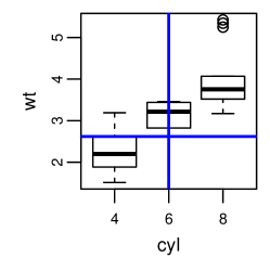
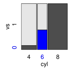
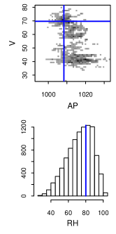
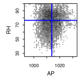
Univariate and bivariate displays: histograms, barplots, scatterplots, boxplots, and spineplots (see Figures 9 and 9). These are the default condition selectors, because they are easy to use and provide some way to avoid the worst extrapolations. The scatterplot condition selector is changed to a 2-D histogram when there are more than 2,000 observations and the \pkggplots (Warnes et al., 2016) package is installed (see Figures 13 and 14).
-
•
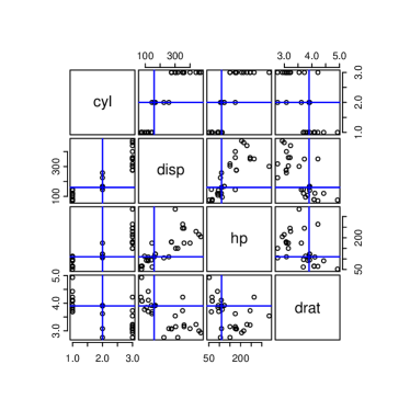
Full scatterplot matrix (see Figure 9). This provides every possible bivariate view of the data. It provides more views in which to detect extrapolation, but can be very cumbersome. Factors are coerced to integers for visualization.
-
•
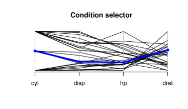
Parallel coordinates plot (see Figure 9). Relatively neat and easy to understand, but spotting extrapolations is not straightforward. Factors are coerced to integers for visualization.
2.3 Ordering condition selector plots
For each approach to graphically choosing sections, we have the choice to order or group the conditioning predictors to provide for effective exploration of the predictor space. For bivariate displays, we arrange the conditioning predictors in pairs using a greedy algorithm that aims to reduce the chance of unwitting extrapolation (when compared to using univariate views).
For example, in comparing a scatterplot option to the alternative of two histograms, we consider the ratio of the area of the convex hull of the data in the bivariate view to the area of the bounding rectangle. If this ratio is near 1, the scatterplot does not offer any extra help over two histograms in avoiding extrapolations. As this ratio gets smaller, it becomes more important to take account of the bivariate relationship. In the same manner, when comparing a spineplot option to the alternative of two barplots, we consider the ratio of the number of observed factor combinations to the total possible number of factor combinations.
This is a simple approach, intended only to give a default ordering – independent of the model or response – for users who have not supplied an ordering. We anticipate that individual users will provide their own ordering, based on variable importance measures or pre-existing knowledge of the variables. For example, with a motor insurance pricing model, a salesperson may wish to have quick access to the effect of voluntary excess or engine size (inputs which may be changed) in negotiating a policy, but may not have any need to understand the effect of age or claims history (inputs which cannot be changed).

2.4 Visualizing sections
We limit ourselves to conditioning on all but one or two predictors, so we visualize the intersection of sections and fitted models as either curves or surfaces (categorical responses are shown as colours, or converted to integers for visualization). The section visualizations used are summarized in Figure 10.
response
cont


 cat
cat


 1 cont
1 cat
2 cont
2 cat
1 cont 1 cat
section predictors
1 cont
1 cat
2 cont
2 cat
1 cont 1 cat
section predictors
The visualizations are chosen according to the type of response, and the type of predictors we are interested in investigating. Two of the cells in Figure 10 are left blank because with binary logistic regression, the probability (continuous) of class membership might actually be a more suitable response to visualize rather than the expected class. If we are only interested in expected class membership, then it is better to visualize a section along two predictors. In Section 1.1, we show an example of a section with a continuous response and a categorical predictor of interest.
After we visualize fitted models on the section, we must choose which observed data to display. We choose observed data according to their distance from the section.
As in Section 2.2, we consider both the section and observed data as points in the space of the conditioning predictors. As a result, we can take a dissimilarity measure defined between two points as the dissimilarity between the section and an observed data point
where represents the th observation on the conditioning predictors, and gives the current section in the conditioning predictors. is the generalized Minkowski distance on the numeric elements, is the number of mismatches on the categorical elements, and is a scaling constant (argument \codelambda to \codeceplot). This distance is calculated after standardizing the continuous elements of the conditioning predictors to have zero mean and unit variance.
We then have a function which assigns colours to observations based on their distance from the section:
where is a threshold parameter given by the user (argument \codethreshold to \codeceplot). Letting equal 0 gives exact conditioning, that is, we only plot points on the section. Increasing gives more approximate conditioning. Setting means that only observations which match the section on categorical predictors may be considered to be near the section. The correct way to achieve this with \codeceplot is to leave \codethreshold = NULL, which requires all factor levels to match but is more computationally efficient.
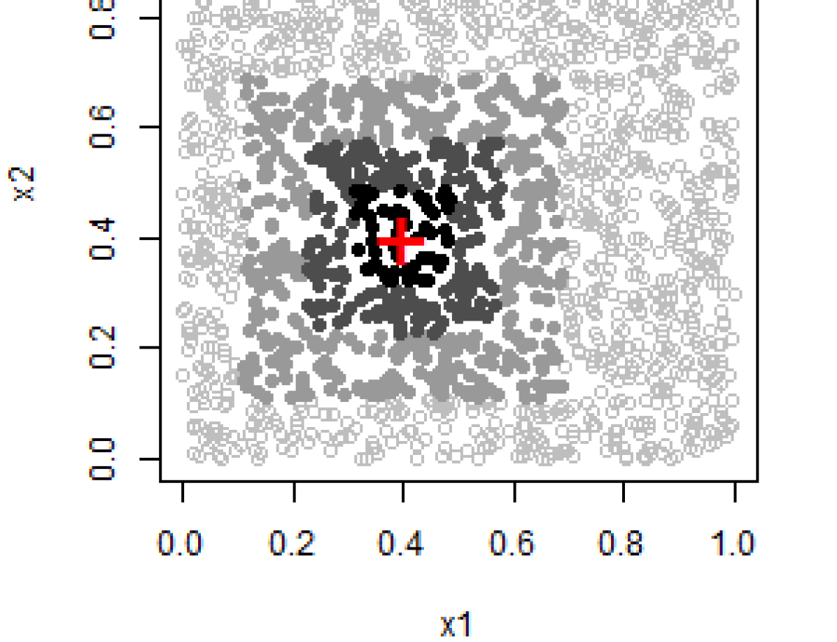
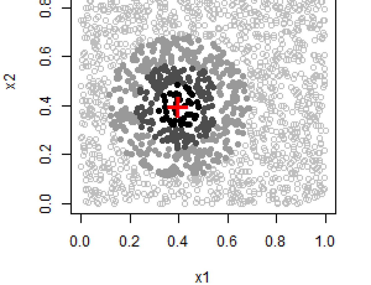
The \pkgcondvis package currently implements two special cases of the Minkowski distance, namely maximum norm and Euclidean distance. The maximum norm is the limit of the Minkowski distance as tends to infinity
The maximum norm results in conditioning very much like that of trellis (Becker et al., 1996), where intervals on conditioning predictors are used to choose observations to plot on a single panel. Euclidean distance is the Minkowski distance with equal to 2. See Figure 11 for an example of both distance measures with two conditioning predictors.
2.5 Interactive graphics platform
The interactive graphics in \pkgcondvis have been implemented using base \proglangR graphics. Extensive use is made of \codegetGraphicsEvent and related functions in \pkggrDevices (\proglangR Core Team, 2016), which were introduced in \proglangR 2.1.0, released in April 2005. The decision to develop \pkgcondvis on this platform was motivated chiefly by the desire to keep software dependencies to a minimum. The main non-standard dependency of \pkgcondvis is the XQuartz (www.xquartz.org) device on the Mac OS.
The secondary benefit of developing interactive graphics in \proglangR is the huge wealth of static graphics which are already available in both the standard \proglangR distribution and its extension packages. If we can interact with the \proglangR graphics device, we do not need to port these plots to another language/platform in order to interact with them. In this package alone, we take advantage of the following graphics: histogram, barplot, scatterplot, boxplot, spineplot, 2-D histogram, 3-D perspective mesh, and parallel coordinates plot.
The Shiny web applications implemented in \pkgcondvis provide an alternative to the default implementations, and allow the graphics to be deployed to a web page for others to use. On Mac OSX, Shiny becomes the default for \codeceplot in the absence of XQuartz. See Section 4.2 for further discussion of interactive graphics.
3 Using the package
3.1 Graphic type and layout
There are three layout options for the interactive graphics created by \codeceplot:
-
•
The default option is to place the section and condition selector plots on one device, with the section being the largest graphic on the left, and the condition selector plots arranged in columns on the right.
-
•
The separate111Special care should be taken when using this option with R version 3.2.2, as closing the non-interactive device (the one showing the section) can cause a crash (see Bug 16438 at bugs.r-project.org) option is set using \codetype = "separate" when calling \codeceplot. This places the section on one device, and the condition selector plots on a second device. This option gives the flexibility to use the scatterplot matrix and parallel coordinates plots for condition selectors.
-
•
The Shiny option is set using \codetype = "shiny" when calling \codeceplot. This gives an arrangement similar to the default above, but is implemented as a web application. This option allows some extra interactivity, such as changing the distance function type and threshold value, and the ability to deploy your interactive graphic to the internet for sharing.
3.2 Interacting with the graphics
The main user interaction with \pkgcondvis is through clicking on condition selector plots in order to select sections to visualize. When the section being visualized is a three-dimensional perspective mesh, it may be rotated using the arrow keys. In the default plot, the perspective mesh may also be rotated by clicking and dragging with the mouse. In Shiny, the rotation may instead be adjusted using sliders. When using the default or separate plots, a snapshot of the current visualizations may be taken by pressing the ‘s’ key. A pdf snapshot is then saved to the working directory. In Shiny, the button for this is labelled “Download snapshot (pdf)”.
3.3 Examples
The following examples use the FEV data again, as well as the powerplant data from Tüfekci (2014), and the wine data from Aeberhard et al. (1992).
FEV data
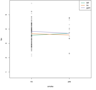
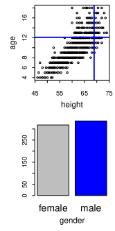
We use the FEV dataset from Section 1.1 for another example here. This time, we are not addressing any new question, rather we are just exploring a few different fitted models. This example shows the default plot arrangement on a single device, and the comparison of several models on a 2-D section. {Code} R> library("randomForest") R> library("mgcv") R> m3 <- list( + RF = randomForest(fev ., data = fev), + lm = lm(fev ., data = fev), + gam = mgcv::gam(fev smoke + gender + s(age) + s(height), + data = fev)) R> ceplot(data = fev, model = m3, sectionvars = "smoke") See Figure 12 for a snapshot of the interactive graphic resulting from this call to \codeceplot.
Powerplant data
The powerplant data were collected for the purpose of predicting full load electrical power output of a powerplant. The underlying processes are well understood, but require the difficult computation of differential equations in order to model them. Tüfekci (2014) suggests machine learning techniques as an alternative and proceeds to fit several different ‘black-box’ models. One interesting aspect of this article is that, in presenting these complex models to an arguably non-statistical audience, there are no graphics produced to visualize a predictor effect.
We fit two models to the powerplant data – a support vector machine with a radial kernel, and an additive model with smoothing splines for each predictor.
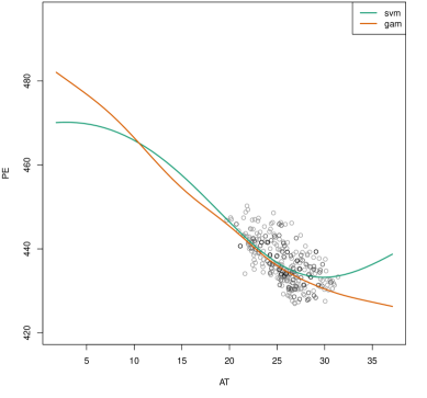
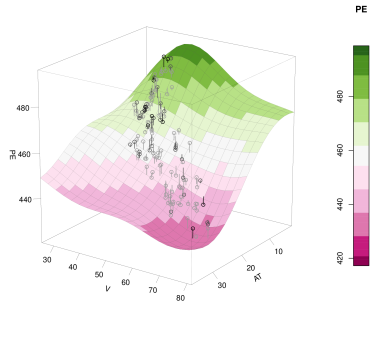
R> data("powerplant") R> library("e1071") R> library("mgcv") R> m4 <- list( + svm = svm(PE ., data = powerplant), + gam = gam(PE s(AT) + s(V) + s(AP) + s(RH), + data = powerplant)) The first call to \codeceplot shows how the support vector machine fits the data, showing how some of the modelled effect curvature occurs in regions of the data space with no observed data. {Code} R> ceplot(data = powerplant, model = m4["svm"], sectionvars = "AT", + type = "separate") The next call to \codeceplot compares the support vector machine to the additive model (Figure 13, or Shiny demo), showing how both models fit the data in a similar way in regions of the data space near observed data. {Code} R> ceplot(data = powerplant, model = m4, sectionvars = "AT", + type = "separate", threshold = 0.5) The final call to \codeceplot demonstrates a 3-D section. {Code} R> ceplot(data = powerplant, model = m4["svm"], + sectionvars = c("AT", "V"), type = "separate", view3d = TRUE, + threshold = 0.2) See Figure 14 for a snapshot of this example. There is a video demonstration of this example here.
Wine data
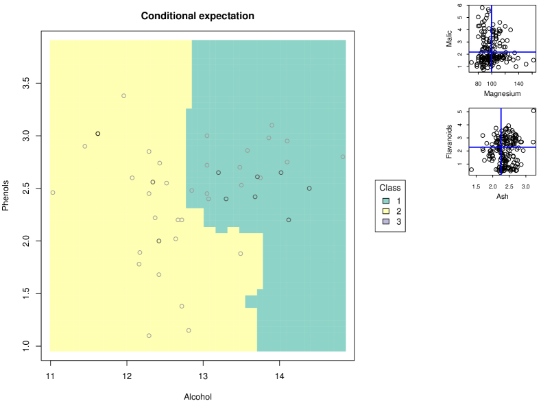
The wine data are the results of a chemical analysis of wines grown in the same region in Italy but derived from three different cultivars. The basic task is to produce a classifier which can take the chemical measurements and identify the correct cultivar. For illustration purposes, we fit a \coderandomForest (Liaw and Wiener, 2002) classifier on six of the predictors. (Shiny application demo.) {Code} R> library("randomForest") R> data("wine") R> wineClass) R> m5 <- randomForest(Class Alcohol + Malic + Ash + Magnesium + + Phenols + Flavanoids, data = wine) It is difficult to comprehend how a classifier assigns regions to different classes in six dimensions, but visualizing this on a two-dimensional section is straightforward. We first take sections along the predictors \codeAlcohol and \codePhenols, using the option to create a Shiny web application. {Code} R> ceplot(data = wine, model = m5, sectionvars = c("Alcohol", "Phenols"), + type = "shiny") Next, we visualize sections on the same predictors, but use the parallel coordinates condition selector. {Code} R> ceplot(data = wine, model = m5, sectionvars = c("Alcohol", "Phenols"), + type = "separate", selectortype = "pcp", threshold = 2)
4 Related work
4.1 Related work in the literature
Trellis graphics (Becker et al., 1996) are separate plots visualizing subsets of the data. Conditioning on continuous variables is achieved by the intersection of intervals on each variable. Nason et al. (2004) apply the trellis technique to the conditional visualization of fitted models, calling the resulting plots CARTscans. Embedded plots (Grolemund and Wickham, 2015) are a collection of graphs organized in a larger graphic, that can display more complex relationships than typically possible. Furnas and Buja (1994) discuss the use of sections and projections in exploring high-dimensional space.
Partial residual plots (Larsen and McCleary, 1972; Ezekiel, 1924) produce a single plot showing the effect of one or two predictors, conditional on the remaining predictors and a fitted additive model. Cook (1993, 1996) notes that the model used in the construction of a partial residual plot must be reasonably well specified for the conditioning predictors in order to have a valid plot. Partial residual plots are also known as component + residual plots.
ICE plots (Goldstein et al., 2015) show sections through a fitted model at observed data points. The main aim is to allow interpretation of ‘black-box’ model effects, and give an impression of extrapolation behaviour. Partial dependence plots (Friedman, 2001) predate ICE plots, but can be interpreted as the average of the sections shown in an ICE plot.
Trellis offers a simple, interpretable approach, but it is difficult to apply it to fitted models, especially with continuous predictors. Partial residual plots are limited by their dependence on a fitted additive model. ICE plots can visualize more complicated non-additive models, but run into problems of overplotting and do not explicitly show the observed data.
4.2 Related work in R
Conditional visualization
The \pkglattice (Sarkar, 2008) package is an implementation of trellis graphics in \proglangR. The \codecoplot function in \pkggraphics (\proglangR Core Team, 2016) also provides a conditioning plot following the trellis method. The \pkgeffects (Fox, 2003) package produces partial residual plots and related graphics for additive models. The \pkgvisreg (Breheny and Burchett, 2016) package produces partial residual plots for additive models as well as extensions to the non-additive case. The plot method \codeplot.gam in both \pkggam (Hastie, 2015) and \pkgmgcv (Wood, 2016) allows the production of two-dimensional and three-dimensional partial residual plots for models of class \codegam. The \pkgICEbox (Goldstein et al., 2015) package implements ICE plots. These are all static visualizations.
Interactive graphics
Many approaches to interactive graphics in \proglangR port the graphics to another language for the interactive functionality, for example: \pkgiplots (Urbanek and Wichtrey, 2013), \pkgshiny (Chang et al., 2016), \pkgggvis (Chang and Wickham, 2016). The main approach in \pkgcondvis is to interact directly with graphics produced by \proglangR code, displayed on standard \proglangR graphics devices. This is achieved using functions contained in the \pkggrDevices package (\proglangR Core Team, 2016), which is distributed with the basic \proglangR installation. The use of \pkggrDevices for interactive graphics can also be seen in the Association Navigator of Buja et al. (2010), and the \pkgsudoku (Brahm et al., 2014) package. The supplementary material contains three \proglangR scripts to demonstrate the use of \pkggrDevices in producing basic interactive graphics with \proglangR.
4.3 Contribution
The \pkgcondvis package takes the approach of visualizing the model in data space (see discussion by Wickham et al. (2015)). Out of the related methods mentioned previously, \pkgcondvis is most similar to CARTscans (Nason et al., 2004) in the sense of applying conditional visualization to fitted models. Rather than using trellis graphics for conditioning, we take a more flexible, interactive approach to conditioning. Instead of producing multiple plots representing ‘fat’ sections or subregions of the data space, we produce one section at a time and attempt to show data which are near this section. This means that fitted models are represented exactly (no need for integration or averaging of the fitted model), and we also display observed data to give context to the section.
5 Summary and outlook
5.1 Summary
The \pkgcondvis package allows the user to interactively take 2-D and 3-D sections in data space and visualize fitted models where they intersect the section, and observed data if sufficiently near the section according to a distance measure.
5.2 Strengths and limitations
The strength of \pkgcondvis lies in creating low-dimensional visualizations of fitted models in high dimensional space. This allows interpretation of complex ‘black-box’ models, and shows how observed data actually support the fitted model in data space. The software has been tested and shown to work on Windows, Mac and Linux, with the following model classes in \proglangR: \codelm, \codeglm, \codegam, \codesvm (\pkge1071), \coderpart, \coderandomForest.
This method of interactively choosing sections is, however, limited to dealing with no more than, say 20 or 25 conditioning predictors. The condition selectors would begin to crowd the screen at this point, and exploring the data space with only the help of bivariate data visualizations would become difficult. This method also does not suit situations where categorical predictors have more than 4 or 5 levels. The barplots and spineplots in such cases may not represent these predictors well for the purpose of choosing conditions.
5.3 Further work
This work has already opened up some avenues of further research. It becomes obvious after a short time using \pkgcondvis that it can sometimes be difficult to choose interesting sections, or indeed to feel confident that the data space can be explored effectively when choosing sections by hand. This naturally suggests an automated approach to producing sections throughout the data space.
Such an automated approach would likely result in a very large number of sections, the direct visualization of which would not be humanly possible. One solution to this may be to apply the ‘cognostics’ approach as discussed in Tukey and Tukey (1982). This involves using a computer to rank plots according to some criteria, and subsequently choosing a subset of plots for examination by a human user.
Another approach would be to order the sections according to their location in the data space, and then produce an animation which transitions between the sections, resulting in a sort of conditional tour of the space (as in a tour of sections, rather than a tour of projections as in Asimov (1985)). This feature is currently in development for \pkgcondvis (see \code?condtour).
So far, we have discussed conditional visualization as a one-way process; choose a section/condition and then investigate the section. The inverse problem might also be interesting, for example, what areas of the predictor space have high values of expected response, or the highest curvature of the fitted model in a certain direction?
We have taken a very strict approach to conditioning in this discussion. We have only considered conditions where predictors are set to a single value. If we consider conditions more flexibly over regions of the predictor space, the fitted model can no longer be visualized directly. However, it is possible to use approximate integrals of the fitted model over such regions to make informative visualizations.
Finally, only some of our section visualizations provide for model comparison. As it stands, none of our 3-D sections allow model comparison, and so this is something we would like to include in further versions of \pkgcondvis.
References
- Aeberhard et al. (1992) Aeberhard S, Coomans D, de Vel O (1992). “Comparison of Classifiers in High Dimensional Settings (92-02).” Technical report, Dept. of Computer Science and Dept. of Mathematics and Statistics, James Cook University of North Queensland.
- Asimov (1985) Asimov D (1985). “The Grand Tour: A Tool for Viewing Multidimensional Data.” SIAM Journal on Scientific and Statistical Computing, 6(1), pp. 128–143. ISSN 0196-5204. URL http://dx.doi.org/10.1137/0906011.
- Becker et al. (1996) Becker RA, Cleveland WS, Shyu MJ (1996). “The Visual Design and Control of Trellis Display.” Journal of Computational and Graphical Statistics, 5(2), pp. 123–155. ISSN 10618600. URL http://www.jstor.org/stable/1390777.
- Brahm et al. (2014) Brahm D, Snow G, Seeliger C, Bengtsson H (2014). \pkgsudoku: Sudoku Puzzle Generator and Solver. \proglangR package version 2.6, URL http://CRAN.R-project.org/package=sudoku.
- Breheny and Burchett (2016) Breheny P, Burchett W (2016). \pkgvisreg: Visualization of Regression Models. \proglangR package version 2.2-0, URL http://CRAN.R-project.org/package=visreg.
- Buja et al. (2010) Buja A, Krieger A, George E (2010). “A Tool for Mining Large Correlation Tables: The Association Navigator.” Report to the Simons Foundation Autism Research Initiative. URL http://stat.wharton.upenn.edu/~buja/PAPERS/.
- Chang et al. (2016) Chang W, Cheng J, Allaire J, Xie Y, McPherson J (2016). \pkgshiny: Web Application Framework for \proglangR. \proglangR package version 0.13.2, URL http://CRAN.R-project.org/package=shiny.
- Chang and Wickham (2016) Chang W, Wickham H (2016). \pkgggvis: Interactive Grammar of Graphics. \proglangR package version 0.4.3, URL http://CRAN.R-project.org/package=ggvis.
- Cook (1993) Cook RD (1993). “Exploring Partial Residual Plots.” Technometrics, 35(4), pp. 351–362. ISSN 00401706. URL http://www.jstor.org/stable/1270269.
- Cook (1996) Cook RD (1996). “Added-Variable Plots and Curvature in Linear Regression.” Technometrics, 38(3), pp. 275–278. ISSN 00401706. URL http://www.jstor.org/stable/1270611.
- Ezekiel (1924) Ezekiel M (1924). “A Method of Handling Curvilinear Correlation for any Number of Variables.” Journal of the American Statistical Association, 19(148), pp. 431–453. ISSN 01621459. URL http://www.jstor.org/stable/2281561.
- Fox (2003) Fox J (2003). “Effect Displays in \proglangR for Generalised Linear Models.” Journal of Statistical Software, 8 (15), pp. 1–27. URL http://www.jstatsoft.org/v08/i15/.
- Friedman (2001) Friedman JH (2001). “Greedy Function Approximation: A Gradient Boosting Machine.” The Annals of Statistics, 29(5), pp. 1189–1232. ISSN 00905364. URL http://www.jstor.org/stable/2699986.
- Furnas and Buja (1994) Furnas GW, Buja A (1994). “Prosection Views: Dimensional Inference Through Sections and Projections.” Journal of Computational and Graphical Statistics, 3, 323–385.
- Goldstein et al. (2015) Goldstein A, Kapelner A, Bleich J, Pitkin E (2015). “Peeking Inside the Black Box: Visualizing Statistical Learning with Plots of Individual Conditional Expectation.” Journal of Computational and Graphical Statistics, 24(1), pp. 44–65. URL http://dx.doi.org/10.1080/10618600.2014.907095.
- Grolemund and Wickham (2015) Grolemund G, Wickham H (2015). “Visualizing Complex Data with Embedded Plots.” Journal of Computational and Graphical Statistics, 24(1), 26–43. 10.1080/10618600.2014.896808.
- Hastie (2015) Hastie T (2015). \pkggam: Generalized Additive Models. \proglangR package version 1.12, URL http://CRAN.R-project.org/package=gam.
- Kahn (2005) Kahn M (2005). “An Exhalent Problem for Teaching Statistics.” Journal of Statistics Education, 13(2). URL http://www.amstat.org/publications/jse/v13n2/datasets.kahn.html.
- Larsen and McCleary (1972) Larsen WA, McCleary SJ (1972). “The Use of Partial Residual Plots in Regression Analysis.” Technometrics, 14(3), pp. 781–790. ISSN 00401706. URL http://www.jstor.org/stable/1267305.
- Liaw and Wiener (2002) Liaw A, Wiener M (2002). “Classification and Regression by \pkgrandomForest.” \proglangR News, 2(3), 18–22. URL http://CRAN.R-project.org/doc/Rnews/.
- Meyer et al. (2015) Meyer D, Dimitriadou E, Hornik K, Weingessel A, Leisch F (2015). \pkge1071: Misc Functions of the Department of Statistics (e1071), TU Wien. \proglangR package version 1.6-7, URL http://CRAN.R-project.org/package=e1071.
- Nason et al. (2004) Nason M, Emerson S, LeBlanc M (2004). “CARTscans: A Tool for Visualizing Complex Models.” Journal of Computational and Graphical Statistics, 13(4), pp. 807–825. ISSN 10618600. URL http://www.jstor.org/stable/27594079.
- Niu and Hoff (2014) Niu X, Hoff P (2014). \pkgcovreg: A simultaneous regression model for the mean and covariance. \proglangR package version 1.0, URL http://CRAN.R-project.org/package=covreg.
- O’Connell et al. (2016) O’Connell M, Hurley CB, Domijan K (2016). “Conditional Visualization for Statistical Models: An Introduction to the \pkgcondvis Package in \proglangR.” Journal of Statistical Software, p. to appear.
- \proglangR Core Team (2016) \proglangR Core Team (2016). \proglangR: A Language and Environment for Statistical Computing. \proglangR Foundation for Statistical Computing, Vienna, Austria. URL http://www.R-project.org/.
- Rosner (2010) Rosner B (2010). Fundamentals of Biostatistics. 7th edition. Cengage Learning. ISBN 9780538733496.
- Sarkar (2008) Sarkar D (2008). \pkglattice: Multivariate Data Visualization with \proglangR. Springer-Verlag, New York. ISBN 978-0-387-75968-5, URL http://lmdvr.r-forge.r-project.org.
- Smola and Vapnik (1997) Smola A, Vapnik V (1997). “Support Vector Regression Machines.” Advances in Neural Information Processing Systems, 9, 155–161.
- Tüfekci (2014) Tüfekci P (2014). “Prediction of Full Load Electrical Power Output of a Base Load Operated Combined Cycle Power Plant Using Machine Learning Methods.” International Journal of Electrical Power & Energy Systems, 60(Sep 2014), pp. 126–140. ISSN 0142-0615. URL http://www.sciencedirect.com/science/article/pii/S0142061514000908.
- Tukey and Tukey (1982) Tukey JW, Tukey PA (1982). “Some Graphics for Studying Four-Dimensional Data.” In KW Heiner, RS Sacher, JW Wilkinson (ed.), Computer Science and Statistics: Proceedings of the 14th Symposium on the Interface, pp. 60–66. Springer-Verlag.
- Urbanek and Wichtrey (2013) Urbanek S, Wichtrey T (2013). \pkgiplots: iPlots - Interactive Graphics for \proglangR. \proglangR package version 1.1-7, URL http://CRAN.R-project.org/package=iplots.
- Warnes et al. (2016) Warnes GR, Bolker B, Bonebakker L, Gentleman R, Liaw WHA, Lumley T, Maechler M, Magnusson A, Moeller S, Schwartz M, Venables B (2016). \pkggplots: Various \proglangR Programming Tools for Plotting Data. \proglangR package version 3.0.1, URL http://CRAN.R-project.org/package=gplots.
- Wickham et al. (2015) Wickham H, Cook D, Hofmann H (2015). “Visualizing Statistical Models: Removing the Blindfold.” Statistical Analysis and Data Mining: The ASA Data Science Journal, 8(4), 203–225. ISSN 1932-1872. URL http://dx.doi.org/10.1002/sam.11271.
- Wood (2016) Wood S (2016). \pkgmgcv: Mixed GAM Computation Vehicle with GCV/AIC/REML Smoothness Estimation. \proglangR package version 1.8-14, URL http://CRAN.R-project.org/package=mgcv.
Appendix A Supplementary material
The supplementary material consists of the source code for \pkgcondvis, a replication script for the examples in this article, and three further scripts which demonstrate the kind of interactive graphics described in the paper.
-
•
condvis_0.3-4.tar.gz: source code for \pkgcondvis, version 0.3-3 available on CRAN.
-
•
replication.R: \proglangR script for replicating examples in this article
-
•
interactive-example-1.R: Example of interacting with a single \proglangR plot.
-
•
interactive-example-2.R: Example of interacting with a single \proglangR plot, and propagating the change to another plot.
-
•
interactive-example-3.R: Example of interacting with multiple \proglangR plots, propagating the changes to the other plots as required. This currently seems to work only in Windows.