0 \vgtccategoryResearch \vgtcinsertpkg \authorfooter David Gotz is with the University of North Carolina at Chapel Hill. E-mail: gotz@unc.edu. Brandon A. Price is with the University of North Carolina at Chapel Hill. E-mail: baprice@live.unc.edu. Annie T. Chen is with the University of Washington. E-mail: atchen@uw.edu. \shortauthortitleGotz, Price, and Chen: Visual Analysis and Interactive Replication
Visual Model Validation via Inline Replication
Abstract
Data visualizations typically show retrospective views of an existing dataset with little or no focus on repeatability. However, consumers of these tools often use insights gleaned from retrospective visualizations as the basis for decisions about future events. In this way, visualizations often serve as visual predictive models despite the fact that they are typically designed to present historical views of the data. This “visual predictive model” approach, however, can lead to invalid inferences. In this paper, we describe an approach to visual model validation called Inline Replication (IR) which, similar to the cross-validation technique used widely in machine learning, provides a nonparametric and broadly applicable technique for visual model assessment and repeatability. This paper describes the overall IR process and outlines how it can be integrated into both traditional and emerging “big data” visualization pipelines. Examples are provided showing IR integrated within common visualization techniques (such as bar charts and linear regression lines) as well as a more fully-featured visualization system designed for complex exploratory analysis tasks.
keywords:
Visual Analytics, Information Visualization, Replication, Validation, Prediction![[Uncaptioned image]](/html/1605.08749/assets/x1.png)
The DecisionFlow2 visual analytics system is shown here displaying medical event data using the Inline Replication (IR) process outlined in this paper. The data shown in this example has been analyzed using five folds, without replacement. The insert subfigures show (a) an initial visualization of the aggregation function’s results for a particular medical event, and (b) a more detailed “unfolded” representation showing the variation in positive and negative support as observed across the five folds produced by the partition function.
1 Introduction
Visualizations are most often designed to depict the entirety of a dataset–subject to a set of filters applied to focus the analysis–as accurately as possible. In this typical pattern, the goal is to provide a person using the visualization with an accurate understanding of all of the data in the underlying dataset that matches the active set of filters. This ethos was captured, perhaps most famously, in Shneiderman’s Visual Information Seeking Mantra: overview first, zoom and filter, then details-on-demand [27]. Variations of this basic approach have since been adopted in most modern visualization systems.
The foundation for these systems are visual mappings that specify a graphical representation for the underlying data. For small and low-dimensional data sources, these mappings can be direct (e.g., a scatter plot for a small two dimensional dataset). As problems grow in data size or dimensionality, algorithmic data transformation methods can be used to filter, manipulate, and summarize raw data into a more easily visualized form.
On top of these mappings, interactive controls are often provided to allow users even more flexibility to filter or zoom to specific subsets of data. These interactions can be linked to more detailed information about data objects, for example via levels-of-detail or multiple coordinated views. The result, when well designed, is an effective visual interface for data exploration and insight discovery.
For this reason, these steps form the core stages of the canonical visualization pipeline [3, 5]. This approach can be enormously informative, and it has led to revolutions in how people seek to understand information. This approach can be used, for example, to visualize file systems (showing the space used by various directories) to help computer users navigate through large directories; to visualize medical records to help doctors understand patient histories; and to visualize maps of weather data to identify regions most impacted by a recent storm.
Critically, however, these visualization use cases are all retrospective in nature. Moreover, they describe visualizations that faithfully report data as it was observed. Users aim to see an overview of the entirety of a dataset. If a user applies constraints to focus the visual investigation (e.g., via zoom and filter), the visualization is expected to show the full set of data that satisfies the applied constraints.
In many visualization scenarios, however, users are in fact more interested in conducting prospective analysis: using historical data to reason about future or not-yet-observed data. For example, medical experts examining data for a cohort of patients might be most interested in what treatments would work best for a future patient with similar characteristics. Visualizations of historical sports statistics are often used to inform strategic decisions that are used in upcoming competitions. Financial visualization tools are often used to inform future investment decisions. In each of these use cases, visualizations of historical data are used to inform future decisions.
For such prospective analysis tasks, retrospective visualizations are often used as naive visual predictive models with the assumption that historical data can be predictive of future observations. In fact, in many cases retrospective representations are indeed very informative. However, just like the underlying descriptive statistics that such visualizations often depict [20], traditional retrospective visualizations often provide insufficient evidence for making predictive inferences.
This critical gap between (a) retrospective visualization designs and (b) the predictive requirements of many users has been recognized within the visualization community [21]. Some have attempted to bridge this gap by adding support for inferential statistics within the visualization. Typically, this approach combines carefully designed statistical models with visualizations of the model’s results. For example, visualizations can be instrumented to estimate and display uncertainty, confidence intervals, or statistical significance. Alternatively, predictive modeling methods can be used to generate additional data, with the predictions themselves being incorporated into the visualization. These systems go beyond traditional descriptive reporting, but they typically require a careful and sometimes onerous focus on modeling, including estimates for underlying statistical distributions.
This paper presents Inline Replication (IR), an alternative approach to enabling inferential interpretation that is designed to overcome many of the above challenges. Our method, made practical by the ever-larger datasets now available in many applications, is motivated by the cross-validation technique used widely in machine learning. The IR approach is nonparametric, making it easy to apply and use generically within a visualization system without arduous modeling. In addition, IR is ideal for use in large-scale visualization systems where progressive or sample-based approaches are required. Finally, our method provides users with validation information that is both intuitive and easy to interpret.
This remainder of this paper is organized as follows. It begins with a review of related work, then describes the details of the IR methodology. We then share example results from a variety of proof-of-concept systems that have adopted the IR technique. These examples range from simple bar charts to more sophisticated interactive visualizations of large scale event data collections [13]. The paper concludes with a discussion of limitations and outlines key areas for future work.
2 Related Work
The IR approach to visual model validation is informed by advances in several different areas of research. These include the topics of uncertainty, predictive visualization, and progressive or incremental visualization. Also relevant are visualization systems that utilize inferential statistics methods and conceptual models of the visualization pipeline.
2.1 Visualization of Uncertainty
The visualization of uncertainty has been an active research area within the visualization community for many years. Studies have explored the problem from many perspectives, including taxonomies that have examined types of uncertainty [29] as well as visualization methods for conveying uncertainty [23]. In addition, there have been many efforts to formally study alternative methods for depicting uncertainty measures [16, 25, 33] through user studies that explore the perceptual understanding of various uncertainty representations. However, these studies focus on the visual representation rather than methods for determining the degree of uncertainty.
Perhaps most relevant to the IR approach proposed in this paper is work that has focused on estimating uncertainty via measures of entropy within a dataset rather than by using carefully constructed statistical models [22]. Like IR, this work adopts a non-parametric approach which does not require formal modeling nor make assumptions about specific distributions within the data.
Finally, the distinction between the “visualization of uncertainty” and “the uncertainty of visualization” has been highlighted [1]. The latter is a related but separate concept from traditional uncertainty visualization. This work highlights that the rendered graphics of a visualization can convey a sense of authority which may not be warranted, even when the underlying data itself is considered to be beyond reproach. This challenge is a key motivation for IR, as outlined in the discussion presented in Section 3.
2.2 Predictive Visual Analytics
Visualization has long been used to support predictive analysis tasks. However, most often, the “prediction” is performed by users reviewing historical data and making assumptions about what might happen in the future for similar situations. In fact, the relatively limited history of work on visualizations that incorporate more formal predictive modeling methods was the topic for a workshop at the most recent IEEE VIS Conference in 2014 [21].
The work that does exist in this area has often focused on model development and evaluation rather than supporting end users’ predictive analysis tasks. For example, BaobabView [35] supported interactive construction and evaluation of decision trees. More recent work has focused on building and evaluating regression models [18]. This method, like ours, adopts a partition-based approach to avoid making structural assumptions about the data. However, the focus on building regression models leads to an overall workflow that is very different from the proposed IR approach.
Others have focused on visualizing the output produced by predictive models. For example, Gosink et al. have visualized prediction uncertainty based on formalized ensembles of multiple predictors [12]. This approach, however, requires careful modeling to develop the predictors, including the specification of priors that enable the Bayesian method that they propose.
Outside the visualization literature, where novel visual or interaction methods are not a concern, predictive features are typically visualized using traditional statistical graphics, for example, systems that visually prioritize and threshold p-values to rank features for prediction (e.g., [28]). Such methods are fully compatible with the IR process proposed in this paper.
2.3 Progressive/Incremental Visualization
Overfit models and other sampling challenges are common to “Big Data” visualizations that rely on progressive or incremental techniques (e.g., [8, 31]). Initial samples are small, grow over time, and can change in distribution as time proceeds. Some have addressed this challenge by including confidence intervals along with partial sets of query results [9]. However, relying on the query platform to assess confidence in data subsets does not easily support interactive zoom and filter operations after the query, because these changes in visual focus do not necessarily result in new queries that generate new result sets. Moreover, these papers do not propose methods for computing confidence intervals, but rather, assume that such data will be provided by the the database.
2.4 Inferential Statistics
Statistical inference is a discipline with a very long and distinguished history. Most relevant to the IR method described in this paper are challenges related to statistical significance and null hypotheses, and in particular Type 1 and Type 2 errors. Type 1 errors refer to improper rejections of the null hypothesis which lead to conclusions that are not real effects, while Type 2 errors refer to falsely retaining the null hypothesis which can lead to assumptions that a true effect is false [26].
These types of errors are of critical concern in high-dimensional exploratory visualization where computational methods can quickly access vast numbers of dimensions for statistical significance. Statistical correction methods have been proposed to reduce Type 1 errors [30], but arguments have also been made against this approach. Those arguments suggest that parameterized models or assumptions of “default” null hypotheses don’t match real world situations where distributions are rarely straightforward or independent. Suggesting that these correction methods are the wrong approach for exploratory work, Rothman argues that “scientists should not be so reluctant to explore leads that may turn out to be wrong that they penalize themselves by missing possibly important findings” [24].
This tension is present in many interactive exploratory systems which make it easy to generate vast numbers of potential hypotheses. As a result, many methods have been proposed for modeling measures of confidence or significance [4, 7, 37]. These efforts, however, typically rely formal statistical methods that make assumptions about distributions and variable independence.
This approach is problematic for exploratory visualizations which allow users to quickly apply filters or constraints that can quickly change the underlying assumptions. The IR method we propose provides provides a way for users to visually assess the reliability of hypotheses. Similar approaches that rely on user judgement have been shown to be quite effective [17].
2.5 Models of the Visualization Pipeline
The traditional visualization pipeline model describes the process of transforming raw data to an analytical abstraction, to visualization abstraction, and then finally to a rendered graphic for interaction [3, 5]. We add partitioning and aggregation stages to this flow to support the IR approach. As we will describe, a special case of the IR model (in which we generate just one partition) is equivalent to the traditional model. By extending the canonical pipeline, our work has similarities with Correa et al.’s paper describing pipeline extensions for an uncertainty framework focused on the data transformation process [6].
3 Visualization as a Predictive Model
Visualization design is often conceptualized as a mechanism for reporting. This retrospective approach is so ubiquitous that terms such as prediction, forecast, and inference cannot be found within the indices of many leading visualization texts from the past 25 years (e.g., [19, 34, 36]).
Many visualization consumers, however, use graphical representations of historical data as the basis for decisions about future performance. This is done even when the underlying data and transformations do not support such prospective conclusions. Despite potentially fatal flaws in terms of generalizability and repeatability, retrospective visualizations are in essence being used as predictive models.
The tendency to assume predictive power in visualization can be seen, for example, in modern casinos. Roulette wheels, for instance, commonly include an electronic display (e.g., [2]) which shows the table’s recent history. Assuming a fair table, “red” and “black” numbers should be equally likely to appear. However, as illustrated in Figure 2, the history provided to gamblers is not sufficiently long to learn if the table has any systemic bias.
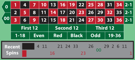
Why then is the gambler presented with a simple visualization of the history? The data is visualized to provide gamblers with a false sense of knowledge; to suggest to a hesitant gambler that a bet is an informed decision rather than a random choice. A gambler may infer that the recent streak of black suggests more black spins. Alternatively, the gambler may infer an imminent return to red. To the casino, it does not matter what predictive inference is drawn as long as it provides a sense of confidence that leads to increased betting.
It is tempting to dismiss this scenario as one in which the gambler should be more informed about basic statistics. The small sample size and the independence of each roulette spin should make it clear that the display is not especially informative. However, relatively sophisticated users performing visual analysis of data from more complex underlying systems can make similarly poor predictive assessments on the basis of visual representations that don’t properly convey the underlying limits of their predictive power.
For example, consider a business analyst attempting to learn about why sales are declining, or a physician using historical patient data to compare treatment efficacy. In these complex real-world cases, in which it is essentially impossible to fully understand the underlying statistical processes, it is natural for analysts to turn to visualization as a predictive model for their problem. Visualization allows these users to see what has happened and, based on trends or patterns in the representation, make assumptions about what will happen in the future.
However, just as the casino gambler draws inference from a not-so-meaningful visualization, these power users can be led to make poor predictions on the basis of visualizations that are essentially “overfit” models based on poor representations of the underlying process. This problem has even been documented even in highly quantitative fields such as epidemiology, where public health analysts have had trouble discounting statistics from small sample sizes when visualized [32].
Issues of poor sampling and overfit are especially problematic during exploratory visualization in which users can interactively apply arbitrary combinations of filters to produce new ad hoc subsets of data for visualization. Such systems are at greater risk of generating non-representative visualizations that occur “by chance” rather than due to real properties of the underlying problem. The same is true for visualization systems that utilize sampled or progressive queries to address issues of scale.
The potential for this sort of “visual model overfitting” is analogous to the overfitting problem in more traditional modeling tasks. In the machine learning community, this is addressed in part by cross-validation, a widely used technique for assessing the quality and generalizability of a model [14]. Rather than relying on a single model, cross-validation methods create and compare multiple models, one for each of several partitions of a dataset (often called “folds”). This allows for an assessment of model repeatability, with models that work consistently across partitions considered more trustworthy.
If one considers—as we argue here—that a visualization is often used as a form of predictive model, then validation becomes a critical guard against problems associated with overfitting. When a visualization is zoomed and filtered to focus on a specific subset, is the visual representation repeatable? Are the conclusions drawn from the visualization generalizable? Can an approach similar to cross-validation be embedded within the visualization pipeline so that each new view produced during user interaction is evaluated? The IR method outlined in the next section is designed to support this form of validation as an integrated part of the visualization process.
4 Inline Replication
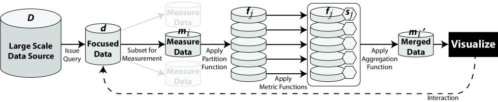
Inline Replication (IR) is an approach to visualization in which the dataset associated with each visualized measurement is partitioned into multiple subsets (which we call folds), processed independently to calculate derived statistics or metrics, then aggregated together to be mapped to a set of graphical marks and rendered. This partitioned approach embeds an automated and non-parametric workflow for replication within the visualization pipeline as illustrated in Figure 1. The result is that visualizations based on IR provide users with important information about the repeatability of observed visual trends, reducing the likelihood of certain types of erroneous conclusions.
The IR pipeline begins with the same initial step as a traditional visualization pipeline. As illustrated in Figure 1, a set of query or filter constraints is applied to a primary data source to produce a focused dataset . The data in is then organized into subsets for which statistical measurements are calculated, creating measure-specific subsets of data which we note as . For example, a visualization pipeline configured to generate the bar chart in Figure 2, showing the distribution between black and red spins for a roulette wheel, would include the subset containing data for the most recent spin results (black or red). If the visualization included multiple bar charts (e.g., past 10 spins, past 100 spins, and past 1000 spins) then multiple subsets would be defined because each requires the calculation of a distinct set of measurements.
Traditionally, the data for each subgroup would immediately be processed to compute the measurements required for visualization (e.g., the fraction of spins resulting in black, and the fraction of spins resulting in red). Those measures would then be mapped to visual properties of objects within the visualization (e.g., the size of each bar in the bar chart).
The IR pipeline, however, behaves differently. Each is first partitioned into distinct folds , each of which is analyzed independently via a metric function. The results are then aggregated to form a merged dataset . It is this merged representation of the measures, , that is mapped to the visual representation and rendered to the screen for interaction using methods designed to convey the repeatability of the visual model across each of the folds.
This section provides an overview of the IR pipeline, focusing on the three functions at the core of the design: the partition function, the metric function, and the aggregation function. It then describes the IR approach to visual display and interaction, and concludes with a discussion of useful variations to the core design.
4.1 Partition Function
Conceptually, the partition function is designed to subdivide the data in a given measure-specific subset into multiple partitions. The goal of this stage in the IR pipeline is the creation of several independent datasets, which we call folds, to use as the basis for calculating each measurement. Later in the IR process, derived measures (e.g., proportions, or statistical significance) will be calculated for each fold.
Formally, we define the function as an operator that subdivides a measure-specific set of data into folds such that each fold .
| (1) |
This function is applied to the raw data in , prior to any other aggregating transformations (such as the summation in the roulette example). Following an approach inspired by -fold cross-validation [14], the baseline partition function creates folds that are disjoint, approximately equal in size, and randomly partitioned such that:
| (2) |
As discussed previously, multiple folds are created with the goal of supporting repeated calculations for each measure. Increasing the value of to produce more folds increases the replication factor. However, higher values also produce smaller . If is too large for given , the folds may be too small to compute useful measures. Therefore, can be dynamically determined so as to require a minimum fold size. If represents a “large enough” subset of data, it will produce a full set of folds. If, however, is too small for the minimum fold size, fewer than folds will be produced. The threshold for “large enough” depends on many factors, including the specific metrics that will be calculated.
Partitioning with results in the identity partition function where regardless of the size of . Because no partitioning is performed, an IR process using the identity partition function produces results that are identical to a traditional visualization pipeline: a single metric is calculated and visualized. In this way, the traditional approach to visualization can be seen as a special case of the IR process in which replication is not performed because there is only one fold.
Choosing a proper value is necessarily a compromise between increased replication and smaller sample size. We can look to the machine learning community for guidance, however, where empirical studies have shown that there is no meaningful benefit for values of over 10 [14]. Moreover, as datasets grow larger in many fields, smaller samples become less of a concern.
Finally, there are certain conditions (e.g., very small datasets with little data to partition, or very large datasets where sampled queries are required) where the basic formulation for the partition function can be problematic. Variations to the partitioning process, designed to help address these challenges of scale, are discussed in Section 4.6.
To illustrate the partitioning process, consider the roulette example from earlier in this paper. The example bar chart showing the fraction of spins resulting in black or red is based on a single measure-specific subset of data . The function would be applied to this subset to create a set of multiple folds, each of which would contain a subset of the recent spin results. For example, would produce a set of five folds, each containing results from one-fifth of the overall set of recent spins.
4.2 Metric Function
The folds produced during partitioning are sent to a metric function which is applied independently to each fold as illustrated in Figure 1. The goal of the metric function is to derive a set of one or more derived statistics for each fold . Because the metric function is applied to all folds, multiple sets of statistics are created for each . These statistics can then be aggregated and compared during the eventual visualization rendering process.
The specific measures computed by the metric function are necessarily application specific, but could range from simple descriptive statistics (e.g., sums, averages) to more complex analyses (e.g., classification, regression). Generally speaking, the metric function is defined to produce the same derived values that would normally be computed as part of a more traditional visualization process. The key difference in IR is that the metrics are computed multiple times for (once for each fold), where traditionally such values would be computed just once.
For example, consider the roulette use case described earlier. The metric function in this example would compute the fraction of spins resulting in black and red in each fold . This fraction is the same measure that the original bar chart is designed to display. However, with the IR approach, the metric is calculated for each of the five folds produced by .
An actual implementation of IR using a similar “fraction of the population” metric function is discussed in Section 5. However, more sophisticated systems may adopt more advanced measures. For example, correlation statistics, p-values, metrics of model “fit”, and regression lines are all compatible with the IR approach. Examples of IR using linear regression, correlation, and statistical significance testing are all described in Section 5.
4.3 Aggregation Function
The metric function produces a set of statistical measures for each of the folds that are produced by the partition function. Prior to visualization, the multiple metrics must be aggregated to a single representation to invert the partition process. As illustrated in Figure 1, this is accomplished via an aggregation function which we define as follows.
| (3) |
The Aggregate function is designed to produce one aggregate value for each of the different measures computed by the metric function. For instance, if a metric function computes two measures for each fold (e.g., count and correlation), then the aggregation function would produce two corresponding aggregate measures.
A variety of aggregation algorithms can be employed, with different approaches appropriate to different types of metrics. For example, for count-based metrics which capture the frequency of data items in each fold, a summation across all folds might be the most appropriate because a sum of counts for each fold provides an accurate total for the overall data subset . For a metric that captures a mean or rate, averaging the values across all folds may be most appropriate. For categorical metrics, meanwhile, such as those produced by classification algorithms, a “majority vote” aggregation method [15] can be applied to capture the most frequently assigned category. The same voting approach can be used when aggregating thresholded measures (e.g., tests of statistical significance) across all folds. This approach is demonstrated in Section 5.2.
The summary measures produced by the aggregation function are combined with the set of statistics computed for the folds to form a merged data representation . This merged representation is then used to drive the mapping and rendering process of the final visualization.
As a concrete example, consider again the roulette scenario. The metric function described previously computed the fraction of spins resulting in black and red numbers for each of the five folds created by . Because the partitions are by definition equal in size, aggregate rates for both colors can be obtained by averaging the five fold-specific rates. The overall average, along with the individual values for each fold, are combined to form .
4.4 Visual Display And Unfolding of Partition Data
Once aggregation has been performed, the merged data is mapped to its corresponding visual marks and displayed as part of the visualization. This is shown as the final step in Figure 1. The IR approach to visualizing has two elements, which correspond to the two distinct types of information in the merged data structure: (a) the aggregate measures and (b) the individual fold measures.
First, an initial visualization is created using only the aggregate measures. The process for this stage is similar to a traditional visualization pipeline. The aggregate measures are mapped to visual properties of the corresponding graphical marks, which we call aggregate marks. These marks are then rendered to the screen for display and interaction. In the roulette example, for instance, the aggregate data for black and red spin rates (produced by the function) can be used to generate a basic bar chart that is identical to what is shown in Figure 2.
Second, an IR visualization allows aggregate marks to be unfolded. An unfolding operation—typically triggered by a user interaction event such as selection or brushing—augments the aggregate marks with a visualization of the individual fold statistics that contribute to the aggregate measures. In the ongoing roulette example, the fold data would show the variation in proportion of spins that result in black and red numbers across each of the independent folds. Additional examples from our experimental prototypes are described in Section 5.
4.5 Discussion
The ability to unfold aggregate measures into repeated measurements is a central contribution of the IR approach. By graphically depicting the repeatability of a particular measure across multiple folds, IR provides users with important and easy-to-interpret cues as to the variability of a given measure. Traditional visualization methods do not convey this information, meaning it is often not considered when predictive conclusions are made by users.
Another benefit of IR comes from the aggregation function. In particular, embedding within the visualization pipeline an ability to aggregate categorical values such as statistical significance classification can lead to more accurate results. Repeated measures combined with voting-based aggregation can, for instance, reduce the exposure to Type 1 errors when looking for statistically significant p-values. For example, a statistically significant () run of black spins on the roulette wheel is less likely to occur “by chance” across a majority of folds than it is across a single group of spins. This is a major benefit for exploratory visualization techniques that allow users to visually “mine” through large numbers of variables in search for meaningful correlations.
4.6 Variations
Following the traditional approach to -fold cross-validation, the baseline function defined in Section 4.1 specifies that the constructed folds are disjoint, randomly partitioned, and exhaustive (Equation 2). However, relaxing these constraints leads to several valuable variations to the baseline IR procedure.
Partial Partitioning. Relaxing the requirement of Equation 2 allows for the creation of partitions that do not contain all data points within . For very large datasets, this can allow for approximate analyses that use only a subset of the available data. This approach provides significant performance benefits for metric functions that have poor scaling properties, and it allows IR to work directly with recently proposed techniques for progressive visualization (e.g., [8, 31]).
Partitioning With Replacement. Relaxing the requirement that all folds are disjoint allows for partitioning with replacement. Similar to statistical bootstrapping, this approach allows the same data point to be included in multiple folds (or even multiple times within the same fold). When allowing replacement, the dataset in becomes a sample distribution from which the partitioning algorithm can generate a larger population. This is especially useful for small datasets—a frequent occurrence in exploratory visualization where multiple filters can be quickly applied—because the larger generated population can allow the IR process to run with less concern about producing fold sizes that are too small.
Incremental Partitioning. A number of progressive or sampled methods have been proposed in recent years to address the challenges of “Big Data” visualization (e.g., [9, 31]). In these approaches, the full dataset is often never fully retrieved. To utilize an IR approach in these cases, an incremental partitioning process is needed. During this process, data points should be distributed to folds as they are retrieved such that all folds are kept roughly equal in size. This will allow IR to work with continuing improvement in metric quality as more data arrives. However, we note that IR will not overcome selection bias that may be introduced as part of the progressive query process. Therefore, the determination of a progressive sampling order that is both representative and balanced remains a critical concern.
5 Use Cases
The IR approach is compatible with a broad range of visual metaphors and interaction models, from basic charts to more sophisticated exploratory visual analysis systems. To demonstrate this flexibility and to explore the impact of adopting an IR pipeline, we developed two prototype IR systems: (a) a reference prototype to study IR in isolation, and (b) a more sophisticated visual analysis system to examine IR within a more complex analysis environment.
5.1 Prototype 1: Reference Prototype
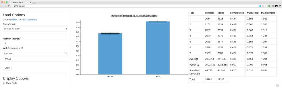
We developed a reference IR implementation as part of a simplified visual analysis prototype with the goal of exploring the IR parameter space in isolation, without concern for the more complex interactions that are part of a real-world application such as the one described in Section 5.2. The prototype supports two basic visualization metaphors: (a) bar charts and (b) scatter plots with linear regression lines. The prototype was tested using a dataset of electronic medical data containing over 40,000 intensive care unit (ICU) stays [10].
The prototype interface, shown in Figure 3, includes three panels. In the center is the visualization canvas itself. A left-side panel allows users to issue queries and control key parameters to the IR process. Options include the number of folds () for the partition function, the use of sampling with replacement, support for random or ordered incremental sampling, and controls to unfold the merged statistics to show individual folds within the visualizations. The right-side panel shows detailed descriptive statistics for both the individual folds () and the aggregate dataset ().
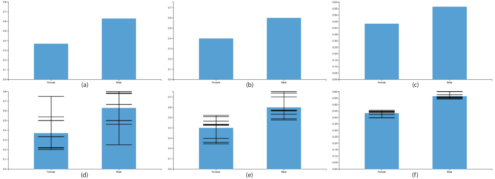
Figure 4 shows a series of bar charts rendered using the IR prototype to visualize the gender distribution across three subpopulations from the ICU stay database. This example is directly analogous to the roulette wheel bar chart example introduced in Section 3, as both summarize the distribution of a binary variable in a given population.
The top row of charts in Figure 4 shows the aggregate gender distribution for each of the three populations. The charts show a relatively similar distribution across all three populations, with a moderate increase in female representation moving from panel (a) to (b) to (c). The bar chart shows the gender breakdown in each population quite clearly. However, there is no indication of the distribution’s stability across different groups of patients. Consumers of the visualization are left to assume that the bar charts provide an accurate depiction.
Panels (d-f) in Figure 4 show the exact same populations as panels (a-c), respectively. However, these views incorporate measures computed for multiple folds () using the IR process of partitioning and merging. These unfolded views provide a more accurate picture regarding the repeatability of the gender distributions in the top row of the figure. In particular, we see from Figure 4(d) that the population visualized in the left column of the figure is not very predictable. Meanwhile, far less variation across folds is visible in Figure 4(f). In this case, the major difference is the size of the respective populations which range from about 100 to roughly 10,000 patients. This is a critical factor to interpretation which is invisible in the original bar charts and easily overlooked even by expert users (e.g., [32]).
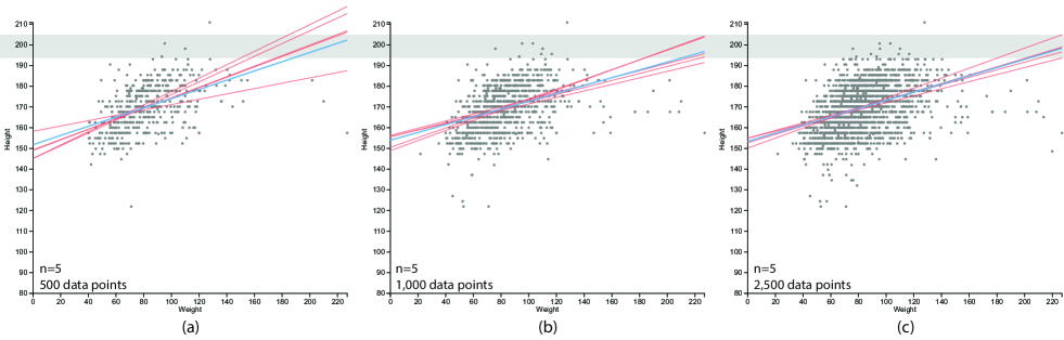
Figure 5, meanwhile, shows three screenshots of the linear regression portion of the IR prototype applied to data from the same ICU repository used for the bar charts. In this case, the examples show data for populations of neonates on a scatter plot, with the x position determined by weight and the y position determined by height. A linear regression model was calculated in all three cases using the IR pipeline with . The five regression lines, one for each fold, are visible (“unfolded”) in the visualizations as red lines. In addition, an aggregate best-fit linear model is shown in blue.
To explore how IR helps convey uncertainty during progressive analysis, we used the incremental sampling feature of the prototype to vary the number of samples while keeping all IR parameters constant. In Figure 5(a), only 500 patients are included in the scatter plot. As the varying slopes between the five red lines captures, there is relatively large disagreement across folds in the linear models they produce. This uncertainty would be invisible in a traditional plot rendered without the folds.
As expected, the spread between the individual fold regression lines decreases as more patients are retrieved by the incremental query feature. For example, Figure 5(b) shows the same visualization with the same folds. However, this version includes data for 1,000 patients. The larger sample size results in increased stability across the folds. Part (c) of the same figure shows the same visualization with 2,500 patients. We see little improvement in agreement across folds compared to 1,000 patients, suggesting that the rate of further gains in agreement will be slower to develop.
As previously stated, the improvement in agreement as sample size increases is as expected. However, as evidenced by the “recent history” charts at casino roulette tables and the other examples referenced throughout this paper, visualizations are often assumed to be accurate. Users often fail to consider issues of sample size or variation. This use case shows that IR can effectively convey this variation in the data without careful modeling, and in a non-parametric way that avoids assumptions about the underlying distributions.
5.2 DecisionFlow2
To test IR within a more fully-featured exploratory visual analysis environment, we developed DecisionFlow2, a new IR-based version of our existing visual analysis system for high-dimensional temporal event sequence data [13]. A screen capture of the DecisionFlow2 interface is shown in Figure Visual Model Validation via Inline Replication.
5.2.1 Original DecisionFlow Design
The original version of DecisionFlow made heavy use of p-values to help users identify event types that had a statistically significant correlation to a user-specified outcome measure. When visualizing medical data, for example, this approach allows users to find types of medical events (such as specific diagnoses, medications, and procedures) that—when appearing in a particular pattern in a patient’s history—are associated with better or worse medical outcomes.
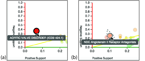
In the original DecisionFlow design, an interactive timeline at the top of the screen allows users to segment a cohort of event sequences based on the presence of so-called “milestone” events. For a given subgroup, DecisionFlow visualizes statistics for the potentially thousands of different types that occur between milestones with the goal of helping users identify good candidates for new milestones. DecisionFlow conveys the event type statistics via an interactive bubble chart similar to the one seen in Figure Visual Model Validation via Inline Replication.
In the bubble chart, each event type is represented by a circle whose x-axis position is determined by its positive support (the fraction of “good outcome” event sequences that contain the event type). Similarly, each circle’s y-axis position is determined by its negative support (the fraction of “bad outcome” sequences with the event type). Circle size and color encode correlation and odds ratio, respectively. Importantly, circles representing event types whose presence correlates significantly () with outcome are drawn with a distinct border to make it easier for users to visually distinguish between expected variation and potentially meaningful associations.
5.2.2 Design Adaptation for IR
In the IR-based DecisionFlow2 system developed for this paper, a similar bubble chart design design is adopted to visualize the event type statistics. However, rather than showing data for measures computed for the overall population , the circles encode aggregate measures computed by an aggregation function. For example, Figure Visual Model Validation via Inline Replication shows the system with a bubble chart focused on subset of data containing 45,278 individual events with 1,148 distinct event types. The support values (used to position the circles) and other measures were all computed across 5 folds.
The aggregate view in Figure Visual Model Validation via Inline Replication(a) looks essentially identical to the original DecisionFlow design. This is as intended, with the goal of making IR compatible with typical visualization designs. However, while the visual encoding is similar, the number of statistically significant correlations scores is reduced. In particular, a number of event types that were labeled as statistically significant in the original design were no longer found to be significant once majority-voting across the five folds was used to determine which event types were significant. This makes the visualization system more selective in rejecting the null hypothesis. The result is a reduction in the likelihood of Type 1 errors, which are a common problem in high-dimensional exploratory analysis. More detailed results and discussion are provided in Section 5.2.3.
Another important part of the IR-based DecisionFlow2 is the ability to unfold the aggregate statistics for each event type. Users can unfold an event type by hovering the mouse pointer over the corresponding circle. For example, after hovering the mouse pointer for a few seconds over the circle shown in Figure Visual Model Validation via Inline Replication(a), the unfolded representation shown in Figure Visual Model Validation via Inline Replication(b) is added to the visualization.
As this example shows, the DecisionFlow2 displays the unfolded data as a convex region drawn around the original circle and outlined with a dashed border. This region corresponds to the convex hull determined by the locations for each of the folds that contribute to the aggregate measures that determine the position of the original circle. In other words, the size and position of the unfolded region represent the variation across folds in both the positive and negative support measures. Smaller unfolded regions indicate that the values have little variation across folds. Larger unfolded regions, such as the one shown in Figure Visual Model Validation via Inline Replication(b), suggest a high degree of variation between folds and therefore lower confidence in the repeatability of the aggregate measure.
The typical behavior observed when utilizing the IR-based implementation of DecisionFlow2 is shown in Figure 6. Part (a) of the figure shows an event type from a very large subset of data that shows very limited variation across folds. This is represented by the very small unfolded region located near the center of the red circle just above the mouse pointer. Part (b) of the figure, meanwhile, shows an event type with much higher variation. This figure, visualizing data from a smaller sample size, demonstrates what one might expect: findings based on smaller sample sizes have more variability and therefore should be given less weight in a decision making process.
However, this very critical difference is not observable via the original bubble chart. The size of the dataset is made available elsewhere in the user interface for users who consciously seek it out, but the implications of the differences in data size are left to the user’s imagination. It is only through the unfolding process that the visualization itself conveys the difference in confidence that users should place in one view versus the other.
Moreover, it is critical to note that the size of the dataset is not the sole determinant of repeatability for a given measure across folds. Major differences in measure values can be seen even for similarly sized datasets. For example, Figure 7 shows three different event types from the exact same subset of event sequences. While the number of event sequences was the same, the association between ACE Inhibitors and the user-defined outcome (eventual diagnosis with heart failure) was far more consistent across folds.

5.2.3 Results and Analysis
The IR-based DecisionFlow2 prototype provides visual feedback regarding the variation in positive and negative support. As previously described, the system also uses IR to assess the statistical significance of each event type’s correlation with patient outcome. For a given event type, correlation coefficients and p-values are computed for each fold, then aggregated via majority-vote. Event types with more than folds showing statistical significant correlation are displayed in the visualization with a distinct visual encoding.
To better understand the impact of IR and the choice of on the visualized results, we conducted a quantitative experiment in which we compared performance for a sample user interaction sequence under various conditions. More specifically, we experimented repeatedly by performing the exact same exploratory analysis steps using DecisionFlow2, using the exact same input data, varying only the number of folds. The experiment was conducted at three partition settings: .
In all three cases, the input dataset consisted of event data from the medical records of 2,899 patients containing 1,074,435 individual medical events. These timestamped events contained 3,631 distinct medical event types: specific diagnoses, lab tests, or medication orders that were present in the patients’ records.
Of the 3,631 distinct event types, 381 were deemed prevalent enough by the DecisionFlow2 system to be the target of correlation analysis within the metric function. The same threshold was used across all three partition settings, allowing us to compare analysis results across the exact same control conditions. The results of our analysis are shown in Table 1.
With , the DecisionFlow2 system flagged statistically significant results in the same way as in the original paper [13]. Using a threshold of , 144 statistically significant event types were detected. When was increased to three, the numbers were reduced dramatically. Only 50 of the original 144 statistically significant event types remained after applying a majority-vote aggregation algorithm. Of those 50, only 43 were significant across all three folds. For , the number of significant event types was even smaller. The stricter requirements for replication resulted in just 24 event types being flagged as significant given a majority-vote aggregation algorithm, and just 15 event types were significant across all 5 folds.
| Number of Folds | |||
| Unanimously Significant | 144 | 43 | 15 |
| Majority Significant | 144 | 50 | 24 |
| At Least One Significant | 144 | 56 | 29 |
| Total Number of Measurements Made | 381 | ||
| Total Number of Event Types | 3,631 | ||
As expected—and as intended—the number of statistically significant findings is reduced as grows from one to five. There are two primary reasons for this reduction. First, because each condition is applied to the same set of event sequences for the same patients, the partition size is smaller as increases. The smaller number of patients reduces the statistical power for each partition. The expected impact of this is higher p-values and fewer statistically significant findings. With the ever-growing size of datasets in many applications, however, the impact on statistical power due to partitioning should be minimal in many use cases. At the same time, the majority vote aggregation function requires that a significant level be repeatedly observed across multiple partitions ( for , or for ). This reduces the likelihood of random variation being misinterpreted.
While statistical significance based on p-value thresholds has known limitations to medical research and beyond (e.g., [11]), it is a widely used metric in exploratory visualization because it allows for a rough filtering of data to manage visual complexity and the user’s analytic attention. Follow-up analysis of any discovered insights is required. For this reason, reducing Type 1 errors becomes critical for modern visual analysis applications where vast numbers of data points can be tested and prioritized for user analysis. As the results presented here show, IR applies a higher bar for statistical significance which has the potential to limit unsupported conclusions from the data in cases where users make quick predictive assessments directly from a visualization. It can also save significant effort in cases where follow-up analysis is performed by reducing the number of falsely generated hypotheses.
6 Discussion of Limitations
The IR approach is designed to embed the process of replication directly within the visualization pipeline, providing a non-parametric approach to calculating and visualizing the repeatability of derived measures. As the examples in Section 5 demonstrate, the approach can be effective when applied to a variety of different measures and visual metaphors. However, there are limitations to IR that must be acknowledged.
First, the proposed approach does nothing to combat selection bias or other problems in the creation of the original dataset. Any systemic sampling biases in the original data will be present across all folds created by the partitioning algorithm. Therefore, even measures that generalize well across multiple partitions are not necessarily generalizable to entirely new datasets.
Second, the IR approach is not truly predictive in nature. While information about the ability of various measures to replicate across multiple folds can be useful in vetting potential conclusions, findings uncovered via IR should be considered hypotheses that require testing using more rigorous methods when important decisions are to be made.
In particular, hypothesis testing often requires the collection and analysis of new data to fully understand the conditions under which a given insight holds true. Our method does not replace this step. Instead, IR helps reduce the number of Type 1 errors, which can lower the number of conclusions that need testing. However, IR does not eliminate the necessity of a post-hypothesis validation process.
7 Conclusion
Traditional data visualizations show retrospective views of existing datasets with little or no focus on prediction or generalizability. However, users often base decisions about future events on the findings made using retrospective visualizations. In this way, visualization can be considered to be a visual predictive model that is subject to the same problems of overfitting as traditional modeling methods. As a result, visualization users can often make invalid inferences based on unreliable visual evidence.
This paper described an approach to visual model validation called Inline Replication (IR). Similar to the cross-validation technique used widely in machine learning, IR provides a nonparametric and broadly applicable approach to visual model assessment and repeatability. The IR pipeline was defined, including three key functions: the partition function, the metric function, and the aggregation function. In addition, methods for visual display and interaction were discussed. Uses cases were described, including a new IR-based implementation of the existing DecisionFlow system for exploratory analysis. The use cases demonstrated the successful compatibility of IR with a variety of visual metaphors and derived measures.
While the results presented in this paper are promising, they represent only one step in a growing effort to bring high repeatability and predictive power to visualization-based analysis systems. There are many areas for future work including: improved techniques for detecting and conveying issues related to missing data, techniques for addressing and visually warning users regarding selection bias, and improved methods for conveying the degree of compatibility between a given statistical model’s assumptions and the actual underlying data.
8 Acknowledgements
This research was made possible, in part, by funds from a 2015 Data Fellow Award from the National Consortium for Data Science (NCDS).
References
- [1] K. Brodlie, R. A. Osorio, and A. Lopes. A review of uncertainty in data visualization. In Expanding the Frontiers of Visual Analytics and Visualization, pages 81–109. Springer, 2012.
- [2] Cammegh Limited. Cammegh - the world’s finest roulette wheel. http://www.cammegh.com/product.php?product=displays, Mar. 2015.
- [3] S. Card, J. Mackinlay, and B. Shneiderman. Readings in information visualization: using vision to think. 1999.
- [4] H. Chen, S. Zhang, W. Chen, H. Mei, J. Zhang, A. Mercer, R. Liang, and H. Qu. Uncertainty-aware Multidimensional Ensemble Data Visualization and Exploration. IEEE Transactions on Visualization and Computer Graphics, pages 1–1, 2015.
- [5] E. H. Chi. A taxonomy of visualization techniques using the data state reference model. In IEEE Symposium on Information Visualization, 2000. InfoVis 2000, pages 69–75, 2000.
- [6] C. Correa, Y.-H. Chan, and K.-L. Ma. A framework for uncertainty-aware visual analytics. In Visual Analytics Science and Technology, 2009. VAST 2009. IEEE Symposium on, pages 51–58. IEEE, 2009.
- [7] D. Feng, L. Kwock, Y. Lee, and R. M. Taylor. Matching Visual Saliency to Confidence in Plots of Uncertain Data. IEEE transactions on visualization and computer graphics, 16(6):980–989, 2010.
- [8] D. Fisher, S. M. Drucker, and A. C. Konig. Exploratory Visualization Involving Incremental, Approximate Database Queries and Uncertainty. IEEE Computer Graphics and Applications, 32(4):55–62, 2012.
- [9] D. Fisher, I. Popov, S. Drucker, and M. Schraefel. Trust Me, I’m Partially Right: Incremental Visualization Lets Analysts Explore Large Datasets Faster. In Proceedings of the SIGCHI Conference on Human Factors in Computing Systems, CHI ’12, pages 1673–1682, New York, NY, USA, 2012. ACM.
- [10] A. L. Goldberger, L. A. N. Amaral, L. Glass, J. M. Hausdorff, P. C. Ivanov, R. G. Mark, J. E. Mietus, G. B. Moody, C.-K. Peng, and H. E. Stanley. PhysioBank, PhysioToolkit, and PhysioNet Components of a New Research Resource for Complex Physiologic Signals. Circulation, 101(23):e215–e220, June 2000.
- [11] S. N. Goodman. Toward Evidence-Based Medical Statistics. 1: The P Value Fallacy. Annals of Internal Medicine, 130(12):995–1004, June 1999.
- [12] L. Gosink, K. Bensema, T. Pulsipher, H. Obermaier, M. Henry, H. Childs, and K. I. Joy. Characterizing and visualizing predictive uncertainty in numerical ensembles through bayesian model averaging. Visualization and Computer Graphics, IEEE Transactions on, 19(12):2703–2712, 2013.
- [13] D. Gotz and H. Stavropoulos. DecisionFlow: Visual Analytics for High-Dimensional Temporal Event Sequence Data. IEEE Transactions on Visualization and Computer Graphics, Early Access Online, 2014.
- [14] R. Kohavi. A Study of Cross-validation and Bootstrap for Accuracy Estimation and Model Selection. In Proceedings of the 14th International Joint Conference on Artificial Intelligence - Volume 2, IJCAI’95, pages 1137–1143, San Francisco, CA, USA, 1995. Morgan Kaufmann Publishers Inc.
- [15] L. Lam and S. Y. Suen. Application of Majority Voting to Pattern Recognition: An Analysis of Its Behavior and Performance. Trans. Sys. Man Cyber. Part A, 27(5):553–568, Sept. 1997.
- [16] A. MacEachren, R. Roth, J. O’Brien, B. Li, D. Swingley, and M. Gahegan. Visual Semiotics and Uncertainty Visualization: An Empirical Study. IEEE Transactions on Visualization and Computer Graphics, 18(12):2496–2505, Dec. 2012.
- [17] M. Majumder, H. Hofmann, and D. Cook. Validation of Visual Statistical Inference, Applied to Linear Models. Journal of the American Statistical Association, 108(503):942–956, Sept. 2013.
- [18] T. Muhlbacher and H. Piringer. A Partition-Based Framework for Building and Validating Regression Models. IEEE Transactions on Visualization and Computer Graphics, 19(12):1962–1971, Dec. 2013.
- [19] T. Munzner. Visualization Analysis and Design. A K Peters/CRC Press, Boca Raton, har/psc edition edition, Dec. 2014.
- [20] B. Ostle and others. Statistics in research. Statistics in research., (2nd Ed), 1963.
- [21] A. Perer, E. Bertini, R. Maciejewski, and J. Sun. IEEE VIS 2014 Workshop on Visualization for Predictive Analytics. http://predictive-workshop.github.io/, 2014.
- [22] K. Potter, S. Gerber, and E. W. Anderson. Visualization of uncertainty without a mean. Computer Graphics and Applications, IEEE, 33(1):75–79, 2013.
- [23] K. Potter, P. Rosen, and C. R. Johnson. From quantification to visualization: A taxonomy of uncertainty visualization approaches. In Uncertainty Quantification in Scientific Computing, pages 226–249. Springer, 2012.
- [24] K. J. Rothman. No adjustments are needed for multiple comparisons. Epidemiology (Cambridge, Mass.), 1(1):43–46, Jan. 1990.
- [25] J. Sanyal, S. Zhang, G. Bhattacharya, P. Amburn, and R. Moorhead. A User Study to Compare Four Uncertainty Visualization Methods for 1d and 2d Datasets. IEEE Transactions on Visualization and Computer Graphics, 15(6):1209–1218, Nov. 2009.
- [26] D. J. Sheskin. Handbook of Parametric and Nonparametric Statistical Procedures: Third Edition. CRC Press, Aug. 2003.
- [27] B. Shneiderman. The eyes have it: a task by data type taxonomy for information visualizations. In , IEEE Symposium on Visual Languages, 1996. Proceedings, pages 336–343, Sept. 1996.
- [28] N. S. Sipes, M. T. Martin, D. M. Reif, N. C. Kleinstreuer, R. S. Judson, A. V. Singh, K. J. Chandler, D. J. Dix, R. J. Kavlock, and T. B. Knudsen. Predictive models of prenatal developmental toxicity from ToxCast high-throughput screening data. Toxicological Sciences, page kfr220, 2011.
- [29] M. Skeels, B. Lee, G. Smith, and G. G. Robertson. Revealing uncertainty for information visualization. Information Visualization, 9(1):70–81, 2010.
- [30] M. R. Stoline. The Status of Multiple Comparisons: Simultaneous Estimation of All Pairwise Comparisons in One-Way ANOVA Designs. The American Statistician, 35(3):134–141, Aug. 1981.
- [31] C. Stolper, A. Perer, and D. Gotz. Progressive Visual Analytics: User-Driven Visual Exploration of In-Progress Analytics. IEEE Transactions on Visualization and Computer Graphics, 20(12):1653–1662, Dec. 2014.
- [32] A. Sutcliffe, O. d. Bruijn, S. Thew, I. Buchan, P. Jarvis, J. McNaught, and R. Procter. Developing visualization-based decision support tools for epidemiology. Information Visualization, 13(1):3–17, Jan. 2014.
- [33] S. Tak, A. Toet, and J. van Erp. The Perception of Visual Uncertainty Representation by Non-Experts. IEEE transactions on visualization and computer graphics, Oct. 2013.
- [34] E. R. Tufte. Envisioning Information. Graphics Pr, Cheshire, Conn., May 1990.
- [35] S. van den Elzen and J. van Wijk. BaobabView: Interactive construction and analysis of decision trees. In 2011 IEEE Conference on Visual Analytics Science and Technology (VAST), pages 151–160, Oct. 2011.
- [36] C. Ware. Information visualization: perception for design (interactive technologies). Morgan Kaufmann, 2004.
- [37] Y. Wu, G.-X. Yuan, and K.-L. Ma. Visualizing Flow of Uncertainty through Analytical Processes. IEEE Transactions on Visualization and Computer Graphics, 18(12):2526–2535, Dec. 2012.