Patterns of residential segregation
Abstract
The spatial distribution of income shapes the structure and organisation of cities and its understanding has broad societal implications. Despite an abundant literature, many issues remain unclear. In particular, all definitions of segregation are implicitely tied to a single indicator, usually rely on an ambiguous definition of income classes, without any consensus on how to define neighbourhoods and to deal with the polycentric organization of large cities. In this paper, we address all these questions within a unique conceptual framework. We avoid the challenge of providing a direct definition of segregation and instead start from a definition of what segregation is not. This naturally leads to the measure of representation that is able to identify locations where categories are over- or underrepresented. From there, we provide a new measure of exposure that discriminates between situations where categories co-locate or repel one another. We then use this feature to provide an unambiguous, parameter-free method to find meaningful breaks in the income distribution, thus defining classes. Applied to the 2014 American Community Survey, we find 3 emerging classes – low, middle and higher income – out of the original 16 income categories. The higher-income households are proportionally more present in larger cities, while lower-income households are not, invalidating the idea of an increased social polarisation. Finally, using the density – and not the distance to a center which is meaningless in polycentric cities – we find that the richer class is overrepresented in high density zones, especially for larger cities. This suggests that density is a relevant factor for understanding the income structure of cities and might explain some of the differences observed between US and European cities.
Introduction
Challenges posed by the constantly growing urbanisation are complex and difficult to handle. They range from the increasing dependence on energy, to serious environmental and sustainability issues, and socio-spatial inequalities UN . In particular, we observe the appearance of socially homogeneous zones and dynamical phenomena such as urban decay Jacobs:1961 ; Andersen:2002 and gentrification Atkinson:2004 that reinforce the heterogeneity of the spatial distribution of social classes in cities. Such a segregation – characterized by an important social differentiation of the urban space – has significant social, economic Massey:1993 and even health costs Lobmayer:2002 which justify the attention it has attracted in academic studies over the past century. Despite the abundant literature in sociology and economics, however, there is no consensus on the adequate way to quantify and describe patterns of segregation. In particular, the identification of neighbourhoods where the different groups gather is still in its infancy.
As stated many times, and at different periods in the sociology literature Duncan:1955 ; James:1982 ; Massey:1988 ; Reardon:2002 , the study of segregation is cursed by its intuitive appeal. The perceived familiarity with the concept favours what Duncan and Duncan Duncan:1955 called ‘naive operationalism’: the tendency to force a sociological interpretation on measures that are at odds with the conceptual understanding of segregation. As a matter of fact, segregation is a complex notion, and the literature distinguishes several conceptually different dimensions. Massey Massey:1988 first proposed a list of dimensions (and related existing measures), which was recently reduced to by Reardon Reardon:2004 . (i) exposure which measures the extent to which different populations share the same residential areas; (ii) the evenness (and clustering) to which extent populations are evenly spread in the metropolitan area; (iii) concentration to which extent populations concentrate in the areal units they occupy; and (iv) centralization to which extent populations concentrate in the center of the city.
We identify several problems with this picture. The first – fundamental – issue lies in the lack of a general conceptual framework in which all existing measures can be interpreted. Instead, we have a patchwork of seemingly unrelated measures that are labelled with either of the aforementioned dimensions. Although segregation can indeed manifest itself in different ways, it is relatively straightforward to define what is not segregation: a spatial distribution of different categories that is undistinguishable from a uniform random situation (with the same percentages of different categories). Therefore, we can define segregation as any pattern in the spatial distribution of categories that deviates significantly from a random distribution Winship:1977 . The different dimensions of Massey:1988 ; Reardon:2004 then correspond to particular aspects of how a multi-dimensional pattern can deviate from its randomized counterpart. The measures we propose here are all rooted in this general definition of segregation.
The other issues are technical in nature. First, several difficulties are tied to the existence of many categories in the underlying data. Historically, measurements of racial segregation were limited to measures between population groups. However, most measures generalise poorly to a situation with many groups, and the others do not necessarily have a clear interpretation Reardon:2002 . Worse, in the case of groups based on a continuum (such as income), the thresholds chosen to define classes are usually arbitrary Jargowsky:1996 . We propose in the following to solve this issue by defining classes in a unambiguous and non-arbitrary way through their pattern of spatial interaction. Applied to the distribution of income categories in US cities, we find emergent categories, which are naturally interpreted as the lower-, middle- and higher-income classes. Second, most authors systematically design a single index of segregation for territories that can be very large, up to thousands of square kilometers Apparicio:2000 . In order to mitigate segregation, a more local, spatial information is however needed: local authorities need to locate where the poorest and richest concentrate if they want to design efficient policies to curb, or compensate for the existing segregation. In other words, we need to provide a clear spatial information on the pattern of segregation. Previous studies Ellis:2004 ; Lobo:2007 ; Wong:2010 ; Sharma:2012 were interested in the characterisation of intra-urban segregation patterns, but they suffer from the limitations of the indicators they use. In particular, the values they map come with no indication as to when a high value of the index indicates high segregation levels. As a result, the maps are not necessarily easy to read. Furthermore, all the descriptions are cartographic in nature and while maps are a powerful way to highlight patterns, we would like to provide further, quantitative, information about the spatial distribution that goes beyond cartographic representation.
The lack of a clear characterization of the spatial distribution of individuals is not tied to the problem of segregation in particular, but pertains to the field of spatial statistics Ripley:1981 ; Cressie:1993 ; Chun:2013 . Many studies avoided this spatial problem by assuming implicitely that cities are monocentric and circular, and rely on either an arbitrary definition of the city center boundaries, or on indices computed as a function of the distance to the center (whatever this may be). However, most if not all cities are anisotropic, and the large ones, polycentric (see Louf:2013 and references therein). Many empirical studies and models in economics aim to explain the difference between central cities and suburbs Glaeser:2008 ; Brueckner:1999 . Yet, the sole stylized fact upon which they rely – city centers tend to be poorer than suburbs (in the US) – lacks a solid empirical basis.
In the first part of the paper, we define a null model – the unsegregated city – and define the representation, a measure that identifies significant local departures from this null case. We further introduce a measure of exposure that allows us to quantify the extent to which the different categories attract or repel one another. This exposure is the starting point for the non-parametric identification of the different social classes. In the second part, we define neighbourhoods by clustering adjacent areal units where classes are overrepresented and show that there an increased spatial isolation of classes as population size of cities grows. We also show that larger cities are richer in the sense that the wealthiest households tend to be overrepresented and the low-income underrepresented in large cities. Finally, we discuss how density is connected to the spatial distribution of income, and how to go beyond the traditional picture of a poor center and rich suburbs.
We focus here on the income distribution, using the data for the 2014 Core-Based Statistical areas. However, the methods presented in this paper are very general, and can be applied github:marble to different geographical levels, to an arbitrary number of population categories, and to different variables such as ethnicity, education level, etc.
I The importance of a null model
Most studies exploring the question of spatial segregation define measures before comparing their value for different cities. Knowing that two quantities are different is however not enough: we also have to know whether this difference is significant. In order to assess the significance of a result, we have to compare it to what is obtained for a reasonable null model.
I.1 Definitions
We assume that we have areal units dividing the city and that individuals can belong to different categories. The elementary quantity is which represents the number of individuals of category in the unit . The total number of individuals belonging to a category is and the total number of individuals in the city is given by .
In the context of residential segregation, a natural null model is the unsegregated city, where all households are distributed at random in the city with the constraints that
-
•
The total number of households living in the areal unit is fixed (from data).
-
•
The numbers are given by the data;
The problem of finding the numbers in this unsegregated city is reminiscent of the traditional occupancy problem in combinatorics Feller:1950 . If we assume that for all categories , we have , they are then distributed according to the multinomial denoted by , and the number of people of category in the areal unit is distributed according to a binomial distribution. Therefore, in an unsegregated city, we have
| (1) | ||||
| (2) |
The fundamental quantity we will use in the following is the representation of a category in the areal unit , defined as
| (3) |
The representation thus compares the relative population in the areal unit to the value that is expected in an unsegregated city where individuals choose their location at random. Or, equivalently, the representation compares the proportion of individuals in the unit to their proportion in the city as a whole.
In metropolitan areas, is large compared to , and the distribution of the can be approximated by a Gaussian with the same mean and variance. Therefore we have in the unsegregated case
| (4) | ||||
An important merit of the representation is the possibility to define rigorously the notion of over-representation and under-representation of a category in a geographical area. A category is overrepresented (with a confidence) in the geographical area if . A category is underrepresented (with a confidence) in the geographical area if . If the value falls in between the two previous limits, the representation of the category is not statistically different (at this confidence level) from what would be obtained if individuals were distributed at random. Existing measures output levels of segregation (typically a number between 0 and 1) but do not indicate whether these levels are abnormally high. To this respect, the representation is a significant improvement over previous measures.
Note that the above null model is reminiscent of the ‘counterfactuals’ used in the empirical literature on agglomeration economies Duranton:2005 ; Marcon:2009 ; Billings:2012 . Also, the expression of the representation (Eq. 3) is very similar to the formula used in economics to compute comparative advantages Balassa:1965 , or to the localisation quotient used in various contexts Apparicio:2000 ; Schwabe:2011 . To our knowledge, however, this formula has never been justified by a null model in the context of residential location. The representation allows to assess the significance of the deviation of population distributions from the unsegregated city. As we will show below, it is also the building block for measuring the level of repulsion or attraction between categories allowing us to uncover the different classes and to identify the neighbourhoods where the different categories concentrate. Last, but not least, the representation defined here does not depend on the category structure at the city scale, but only on the spatial repartition of individuals belonging to each category. This is essential in order to be able to compare different cities where the group compositions – or inequality – might differ. Inequality and segregation are indeed two separate concepts, and the way they are measured should be distinct from one another.
Finally, we would like to mention that using the uniform distribution as a null model can have implications broader than the study of residential segregation. Indeed, from a very abstract perspective, the study of residential segregation is the study of labelled objects in space. The methods presented here can therefore be applied to the study of the distribution of any object in space. In particular, it can be used to identify the locations in a territory where populations with different characteristics (not necessarily socio-economic) concentrate.
I.2 Attraction and repulsion of categories
Another shortcoming of the literature about segregation is the lack of indicator to quantify to what extent different populations attract or repel one another. Such a measure of attraction or repulsion is however important to understand the dynamics and scale (intensity of attraction/repulsion) of residential segregation.
Our indicator is inspired by the M-value first introduced by Marcon and Puech in the economics literature to measure the concentration of industries Marcon:2009 and used as a measure of interaction between retail store categories in Jensen:2006 . These authors were interested in measuring the geographic concentration of different type of industries. While previous measures (such as Ripley’s K-value) allow to identify departures from a random (Poisson) distribution, the M-value’s interest resides in the possibility to evaluate different industries’ tendency to co-locate. The idea, in the context of segregation is simple: we consider two categories and and we would like to measure to which extent they are co-located in the same areal unit. To quantify the tendency of households to co-locate, we measure the representation of the category as witnessed on average by individuals in category , and obtain the following quantity
| (5) |
Although it is not obvious with this formulation, this measure is symmetric: (see Supplementary Information below. Effectively, this ‘E-value’ in this context is a measure of exposure, according to the typology of segregation measures proposed in Massey:1988 . However, unlike the other measures of exposure found in the literature Bell:1954 , we are able to distinguish between situations where categories attract () or repel () one another. In the case of an unsegregated city, every household in sees on average and we have . If populations and attract each other, that is if they tend to be overrepresented in the same areal units, every household sees and we have at the city scale. On the other hand, if they repel each other, every household sees and we have at the city scale. The minimum of the exposure for two classes and is obtained when these two categories are never present together in the same areal unit and then
| (6) |
The maximum is obtained when the two classes are alone in the system (see Supplementary Information below for more details) and in this case we get
| (7) |
In the case , the previous measure represents the ‘isolation’ defined as
| (8) |
and measures to which extent individuals from the same category interact which each other. In the unsegregated city, where individuals are indifferent to others when chosing their residence, we have . In contrast, in the extreme situation where individuals belonging to the class live isolated from the others, the isolation reaches its maximum value
| (9) |
Of course, in order to discuss the significance of the values of exposure and isolation, one needs to compute the variance of the exposure in the unsegregated situation defined earlier. The calculations for the variance as well as for the extrema are presented in the Supplementary Information below.
Finally, we note that co-location is not necessarily synonymous with interaction, as pointed out by Chamboredon Chamboredon:1970 , and we should rigorously talk about potential interactions. Nevertheless, in the absence of large scale data about direct interactions between individuals, co-location is the best proxy available.
II Emergent social classes
II.1 Defining classes
Studies that focus on the definition of a single segregation index for cities as a whole can avoid the problem of defining classes, either by measuring the between-neighbourhood variation of the average income (examples are the standard deviation of incomes Jargowsky:1996 , the variance of logged incomes Ioannides:2004 and Jargowsky’s Neighbourhood Sorting Index Jargowsky:1996 ), or by integrating over the entire income distribution (for instance the rank-order information theory index defined in Reardon:2006 ). However, when they investigate the behaviour of households with different income and their spatial distribution, studies of segregation must be rooted in a particular definition of categories (or classes). Unfortunately, there is no consensus in the literature about how to separate households in different classes according to their income, and studies generally rely on more or less arbitrary divisions Massey:1996 ; Massey:2003 ; Jenkins:2006 .
While in some particular cases grouping the original categories in pre-defined classes is justified, most authors do so for mere convenience reasons. However, as some sociologists have already pointed out Emirbayer:1997 , imposing the existence of absolute, artificial entities is necessarily going to bias our reading of the data. Furthermore, in the absence of recognized standards, different authors will likely have different definitions of classes, making the comparisons between different results in the literature difficult.
From a theoretical point of view, entities such as social classes do not have an existence of their own. Grouping the individuals into arbitrary classes when studying segregation is thus a logical fallacy: it amounts to imposing a class structure on the society before assessing the existence of this structure (which manifests itself by the differentiated spatial repartition of individuals with different income). Here, instead of imposing an arbitrary class structure, we let the class structure emerge from the data themselves. Our starting hypothesis is the following: if there is such a thing as a social stratification based on income, it should be reflected in the households’ behaviours: households belonging to the same class should tend to live together, while households belonging to different classes should tend to avoid one another. In other words, we aim to define classes using the way they manifest themselves through the spatial repartition of the different categories.
II.2 Finding breaks in the income distribution
We choose as a starting point the finest income subdivision given by the US Census Bureau ( subdivisions) and compute the matrix of values for all cities. We then perform a hierarchical clustering on this matrix, succesively aggregating the subdivisions with the highest values. The process, that we implemented in the Python library Marble github:marble , goes as follows:
-
1.
Check whether there exists a pair , such that (i.e. two categories that attract one another with at least 99% confidence according to the Chebyshev inequality). If not, stop the agregation and return the classes;
-
2.
If there is at least one couple satisfying (1), normalize all values by their respective maximum values. Find then the pair , whose normalized exposure is the maximum;
-
3.
Aggregate the two categories and ;
-
4.
Repeat the process until it stops.
In order to aggregate the categories at step 3, we need to compute the exposure between and any category , as well as its variance. The corresponding calculations are presented in the Supplementary Information (below).
We stress that the obtained classification does not rely on any arbitrary threshold. Indeed, we stop the aggregation process when the only classes left are indifferent ( with confidence) or repel each other ( with confidence).
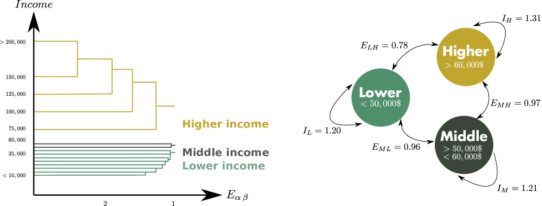
II.3 The US income structure
Strikingly, the outcome of this method on US data is the emergence of 3 distinct classes (Fig. 1): the higher-income ( of the US population) and the lower-income classes ( of the US population) – which repel each other strongly while being respectively very coherent – and a somewhat small middle-income class ( of the population) that is relatively indifferent to the other classes. This result implies that there is some truth in the conventional way of dividing populations into income classes, and that what we casually perceive as the social stratification in our cities actually emerges from the spatial interaction of people.
Our method has several advantages over a casual definition: it is not arbitrary in the sense that it does not depend on a tunable parameter (besides the significance threshold) and on who performs the analysis. Its origins are tractable, and can be argued on a quantitative basis. Because it is quantitative, it allows comparison of the stratification over different points in time, or between different countries. It can also be compared to other class divisions that would be obtained using a different medium for interaction, for instance mobile phone communications Eagle:2010 .
In the following, we will systematically use the classes obtained with this method.
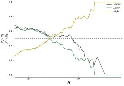
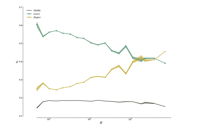
II.4 Larger cities are richer
At the scale of an entire country, segregation can manifest itself in the unequal representation of the different income classes across the urban areas. We plot on Fig. 2 the ratio where is the number of cities of population greater than , and the number of cities of population greater than for which the class is overrepresented. A decreasing curve indicates that the class tends to be underrepresented in larger urban areas, while an increasing curve shows that the category tends to be overrepresented in larger urban areas (the representation is here measured with respect to the total population at the US level). These results challenge Sassen’s thesis on social polarization, according to which world (very large) cities host proportionally more higher-income and lower-income individuals than smaller cities Sassen:1991 . If this thesis were correct, we should observe an overrepresentation of both higher-income and lower-income households in larger cities. Instead, as shown on Fig. 2, higher-income households are overrepresented in larger cities, while lower-income households tend to be underrepresented (see Supplementary Information for a detailed discussion). These results support the previous critique of the social polarisation thesis by Hamnett Hamnett:1994 .
III Characterizing spatial patterns
The representation measure introduced at the beginning of this article allows to draw maps of overrepresentation and thus to identify the areas of the city where categories are overrepresented. In the following, we propose to characterise the spatial arrangement of these areas for the different categories.
III.1 Poor center, rich suburbs?
III.1.1 A density-based method
In many studies, the question of the spatial pattern of segregation is limited to the study of the center versus suburbs and is usually adressed in two different ways.
In the first case, a central area is defined by arbitrary boundaries and measures are performed at the scale of this central area and the rest is labelled as ‘suburbs’. The issue with this approach is that the conclusions depend on the chosen boundaries and there is no unique unambiguous definition of the city center: while some consider the Central Business District Glaeser:2008 , others choose the urban core (urbanized area) where the population density is higher.
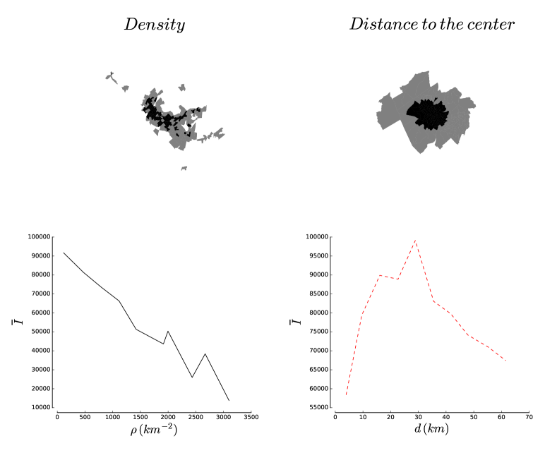
The second approach, in an attempt to get rid of arbitrary boundaries, consists in plotting indicators of wealth as a function of distance to the center Glaeser:2008 ; Brueckner:2009 . This approach, inspired by the monocentric and isotropic city of many economic studies such as the Von Thunen or the Alonso-Muth-Mills model Brueckner:1987 , has however a serious flaw: cities are not isotropic and are spread unevenly in space, leading to very irregular shapes Makse:1995 . Representing any quantity versus the distance to a center thus amounts to average over very different areas and in polycentric cases (as it is the case for large cities Louf:2013 ) is necessarily misleading. As we show below, this method mixes together areas that are otherwise very different.
We propose here a different approach that does not require to draw boundaries between the center and the suburbs. In fact, it does not even require to define and locate the ‘center’ at all. In the case of a monocentric and isotropic city, our method gives results similar to those given by the other measures. In the more general case where cities are not necessarily monocentric neither isotropic, our method allows to compare regions of equivalent densities.
The center of a city is usually defined as the region which has the highest population (or employment) density. We therefore propose the density as a proxy to measure of how ‘central’ an area is. We thus plot quantities computed over all areal units (blockgroups in this dataset) that have a density population in a given interval where decreases from its maximum to its minimum value. We illustrate this idea and compare its results to the traditional ‘distance to the center’ method on Fig. 3. With very anisotropic and polycentric cities such as Los Angeles, the order in which the areal units are considered is very different with both methods. As a result, measurements as simple as the average income will yield very different results. This is particularly striking with the example of Seattle, WA shown on Fig. 3. The average income as a function of the distance to the center (areal unit with the highest density) increases from the center to a peak at roughly km (bottom left figure). On the other hand, the bottom left figure shows that average income is, in fact, a simple decreasing function of residential density.
Where does the discrepancy come from? As one can see on the maps on the top of Fig 3, the units considered in a given distance range can be very different in terms of density. Because real cities are neither monocentric or isotropic, units at a same distance from the center can in fact be very different. This shows, if anything, the importance of expliciting what one means by ‘central’ before presenting measures. In the following, we express centrality in terms of residential density.
III.1.2 Results
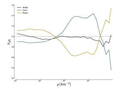
Here, we compute the representation of groups as a function of residential density. This method sheds a new light on the difference of social composition between the high-density and low-density areas in cities. Indeed, as shown on Fig. 4, we find that low-density regions in cities are on average rich neighbourhoods and that higher density regions are on average lower-income neighbourhoods, in agreement with the dichotomy rich suburbs/poor centers usually found in the literature. But the dichotomy is not the full picture. The method indeed entails a surprising result: areas with very large densities (typically above inhabitant) are on average rich neighbourhoods. Only few cities in the US have neighbourhoods that reach the threshold of inhabitants per km2, which can explain why people have reported in most cases the existence of poor centers and rich suburbs. In fact, among all blockgroups with a population density greater than inhabitants, are located in New York, NY. Most high-density blockgroups belonging to other metropolitan areas exhibit an overrepresentation of the higher-income group and it is thus difficult to conclude at this stage that we are observing an effect specific to Manhattan. In any case, this result suggests that density is very relevant in the usual discussion about income strucutre differences between north american and european cities.
III.2 Neighbourhoods and their properties
Intra-unit measures such as the representation or the exposure are not enough to quantify segregation. Indeed, areal units where a given class is overrepresented can arrange themselves in different ways, without affecting intra-unit measures of segregation White:1983 . In order to illustrate this, we consider the schematic cases represented on Fig. 5, and assume that they are obtained by reshuffling the various squares around. Obviously, the checkerboard on the left depicts a very different segregation situation from the divided situation on the right while intra-unit measures would give identical results.

III.2.1 Defining neighbourhoods
Defining neighbourhoods in which categories tend to gather is a difficult task. Indeed, what individuals call neighbourhoods often depend on their perception of the city, and field work is often necessary to identify which areas are socially recognised as being a large, middle or low income neighbourhood. However, it is often not possible to do field work and finding a way to define neighbourhoods from population counts is by more convenient and reliable.
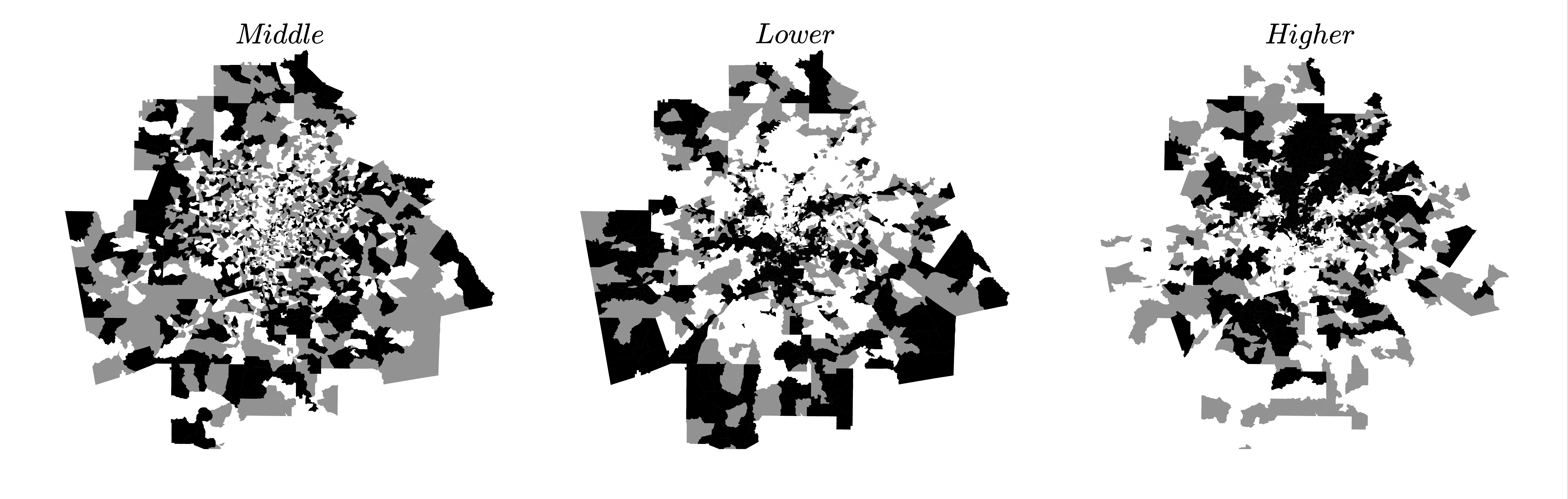
What is usually defined as a neighbourhood defies the most naive measures. For instance, to be a member of an ‘ neighbourhood’ (where is here higher, middle or low income class) it is not necessary for an area to have a majority of individuals from the class Logan:2011 . More sophisticated methods are thus required and the literature is not exempt of such measures, that are all rooted in different assumptions about the nature of neighbourhoods Shevky:1961 ; Sampson:1997 ; Logan:2011 ; Spielman:2013 . For instance, Logan et al. Logan:2011 use local K-functions in order to assess the prevalence of individuals from a class in an area. The areas are then clustered using a standard k-means clustering algorithm. The main issue with this approach is the use of K-functions which measure absolute concentration and are based on the null hypothesis of a completely random distribution of individuals across space. As mentioned earlier in this manuscript, it is more accurate to consider deviations from the null hypothesis of a random distribution of individuals among existing locations. We thus propose here an improvement over Logan et al.’s definition based on data given at the areal unit level (but could easily be generalised to data with exact locations). As in Logan:2011 , we start with the intuitive idea that an neighbourhood is an area of the city where the category is more present than in the rest of the city. In other words, an areal unit belongs to an neighbourhood if and only if the category is overrepresented in , i.e. . We then build neighbourhoods by aggregating the adjacent areal units where the income class is also overrepresented (see for example of Atlanta Fig. 6).
III.2.2 Clustering
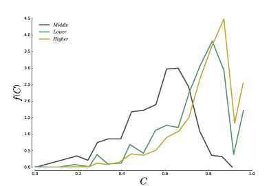
A way to distinguish between different spatial arrangements is to measure how clustered the overrepresented areal units are. The ratio of the number of -neighbourhoods (clusters) to the total number of areal units when the class is overrepresented (before constructing the neighbourhood as defined above) gives a measure of the level of clustering and the quantity
| (10) |
is such that in a checkerboard-like situation, and when all areal units form a unique neighbourhood. We show on Fig. 7 the distribution of for the three classes over all cities in our dataset. As one could infer from the maps on Fig. 6, the higher-income and lower-income areal units are well clustered, with a respective average clustering of and . The middle class is on the other hand less spatially coherent, with a average clustering .
III.2.3 Concentration
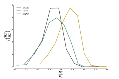
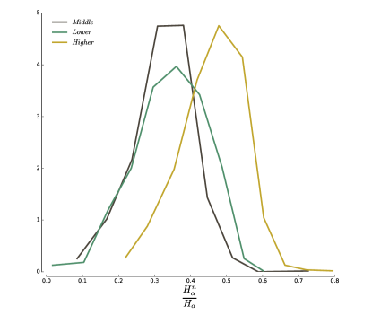
If a given class is overrepresented in a neighbourhood, it does not necessarily mean that most of the individuals belonging to this neighbourhood are members of this class Logan:2011 . Conversely, the majority of individuals belonging to a class do not necessarily all live in the above-defined neighbourhoods. We thus compute the ratio of households of each income class that lives in a neighbourhood over the total number of individuals for that income class (rich, poor, and middle class). Our results (Fig. 8) indicate that about of the households belonging to live in a -neighbourhood, while the rest is dispatched across the rest of the city. The average concentration decreases from higher-income households (), to lower-income () and middle-income household ().
III.2.4 Fragmentation
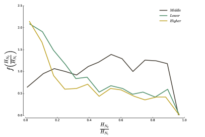
Finally, large values of clustering can hide different situations. We could have on one hand a ‘giant’ neighbourhood and several isolated areal units, which would essentially mean that each class concentrates in a unique neighbourhood. On the other hand, we could observe several neighbourhoods of similar sizes, meaning that the different classes concentrate in several neighbourhoods across the city. In order to distinguish between the two situations, we plot
| (11) |
where is the population of the largest neighbourhood, and the population of the second largest neighbourhood. The results are shown on Fig. 9, and again display a different behaviour for the middle-income on one side, and higher-income and lower-income on the other side. The size of the middle-income neighbourhoods are more balanced, with on average . In contrast, higher- and lower-income neighbourhoods are dominated by a single large neighbourhood with on average and , respectively.
III.3 Larger cities are more segregated
As seen in Fig. 7, the clustering values are high, indicating that the neighbourhoods occupied by households of different classes are sound. We can now wonder whether there is an effect of the city size on the number of neighbourhoods. We plot on Fig. 10 the number of neighbourhoods found for all three classes as a function of population. For each class, The curve is well-fitted by a powerlaw function of the form
| (12) |
where the exponent is less than one and depends on the class, indicating that there are proportionally less neighbourhoods in larger cities (the number areal units scales proportionally with the population size). In other words, different classes become more spatially coherent as the population increases (see Supplementary Information below for more details). The values of the exponents are
These values show that the tendency to cluster as the city size increases is larger for higher-income households than for lower- and middle-income households. In other words, segregation increases with city size.
IV Discussion
In this paper, we propose a general conceptual framework in which residential segregation can be quantified and understood. Instead of enumerating its different aspects, we took a radically different – yet simpler – approach. We define segregation by what it is not: a random distribution of the different households throughout the urban space. This naturally leads to define the measure of representation, which is used in turn to improve upon previous ways Logan:2011 to define neighbourhoods. We further define the exposure (still based on the representation), which measures the extent to which different categories attract, repel or are indifferent to one another.
We show that we can define classes in a non-parametric way and 3 main income classes emerge for the 2014 American Community Survey data. The middle-income class corresponds to a smaller income range than what is usually admitted, a curiosity that certainly deserves further investigations. These complex systems can thus be described by considering a small number of categories only. This is an important piece of information which will simplify the description and modelling of stratification mechanisms.
In terms of spatial arrangement, although the fraction of the population that is contained in neighbourhoods does not change with city size, the neighbourhoods are geographically more coherent as cities get larger, which corresponds in effect to an increased level of segregation as the city size increases.
Our results also point to the intriguing fact that higher-income households are on average overrepresented in very dense areas. Such high density areas are relatively rare in the US, which might explain in part why we observe poor centers and rich suburbs and rich centers essentially in Europe where the density is very large. This result echoes Jacobs’ analysis Jacobs:1961 that neighbourhoods with the highest dwelling densities are usually the ones exhibiting the largest vitality, and are therefore the most attractive. Obviously, a high density is not the only determinant and in some cases high-density neighbourhoods can also be lower-income neighbourhoods. Further investigations along these lines may provide quantitative insights into the mechanisms leading to urban decline or urban regeneration.
In this study, we also have tried to highlight the spatial pattern of segregation. We believe that the identification of neighbourhoods that our method permits will allow a finer-scale investigation of these spatial patterns. However, the fundamental issue that runs beneath – the need for new tools in the analysis of spatial patterns – is still open. It goes beyond the problem of segregation and has a huge number of potential applications.
V Materials and methods
V.1 Data
In this study, we use the American Census Bureau’s 2014 American Community Survey data on the income of households at the census block-group level, grouped per Core-based Statistical Areas. The households are divided in 16 income categories, ranging from below annual income to above . All data of the 2014 American Community Survey are available from the Census Bureau. 2140 delineations of the Core-based Statistical Areas are available from the Office of Budget Management. The reader interested in obtaining a cleaned version of these data ready for analysis and/or reproduce the results of this analysis can consult the online repository (The code necessary to download, assemble the data and reproduce the analysis performed in this article is freely available online at http://github.com/rlouf/patterns-of-segregation).
V.2 Software
The methods described in this manuscript are very general, and not limited to the study of income segregation. In order to facilitate their application to other datasets, all the measures have been packaged in a python library, Marble, open-source and freely available online github:marble .
VI Supplementary Materials
The following supporting information provide more details on the calculations made to obtain the maximum and minimum value of exposure and isolation, and their variance. We also detail the process through which we agregate the original categories into classes, and the results we obtain for the American Community Survey. Finally, we discuss in more details some of the results presented in the manuscript; in particular, our claim that larger cities are richer.
VII Exposure
VII.1 Definition
Given two different categories and , we define their intra-unit exposure as the average representation (resp. ) of the (resp. ) that is seen on average by the members of (resp. )
| (13) |
It can also be re-written
| (14) |
where
| (15) |
This expression symmetric by permutation of the categories and , which is what one would expect from an index measuring the interaction between two categories.
VII.2 Expected value and variance in the random configuration
In order to know whether the attraction or repulsion mesured between two classes is significant, we need to be able to compute . Assuming that and are independent (which is rigorously not true for tracts with a fixed capacity ), it follows
Thus
The covariance is non-zero because the of two different tracts and are not independent, and we have
| (16) |
VII.3 Minimum and maximum values
In order to be able to make sense of the values of exposure () and isolation (), and compare different cities, we need to know their respective maximum and minimum values. We will consider the following cases:
- Maximum isolation
-
Situation where each areal unit contains households from one and only one category. This situation corresponds to the minimum of and the maximum of .
- The unsegregated city
-
When the distribution of households in the different areal units cannot be distinguished from a random distribution. This is what we call the ‘unsegregated city’ and gives a point of reference. It corresponds to the minimum of .
VII.3.1 Isolation
In the unsegregated city case, there is no way to tell the difference between the distribution of the different categories in the different tracts and a random distribution. In this situation, isolation indices reach their minimum value
when .
In the maximum isolation case, all categories are alone in their own tract. In other words, and we have iff . We thus obtain for the isolation
where is the set of areal units where the category is present. In these unit, . Therefore
VII.3.2 Exposure
In the maximum isolation case, all categories are alone in their own tract. In other words, and we have iff . In this situation, we trivially have
The maximum of the exposure is however more difficult to obtain in general. We fix and and we denote by a category all the rest. By definition we have , , and .
We will look for the ‘global’ maximum by keeping the only constraint that in each unit we have . We obtain for the exposure
| (17) |
The maximization of the exposure with respect to thus gives
| (18) |
which leads to
| (19) |
The exposure for these values reads
| (20) |
The quantity is in the compact set and the maximization is not necessarily given by taking the derivative equal to zero. Indeed, in this case the maximum of is obtained for for all (while the derivative equal to zero would lead to the minimum obtained for for all t) and reads
| (21) |
This maximum is the global one, obtained when there are no constraints. One can easily add the constraint by using a Lagrange multiplier and we have then to maximize the function
| (22) |
The derivative with respect to leads to
| (23) |
where we expressed the constraint in order to eliminate the Lagrange multiplier . We can then express the maximum obtained for these values of and as above the maximum is obtained for for all t and reads
| (24) |
which is obviously smaller than the global maximum .
These maxima were obtained when there are no constraints on the total number . When there is such a constraint, the construction of the maximum of Eq. (20) is not trivial. Very likely, when is fixed, we have to fill the smallest tracts with this class and we are then left with the classes and only. It seems difficult to obtain an analytical derivation of this maximum and we will keep as a reference in our calculations the global maximum .
VIII Agregating categories into classes
The study of segregation must be rooted in a particular definition of class. However, the income is a continuous variable, and there is no clear definition of incomes classes in the litterature: a class means different things to different people. We thus start by finding out the class structure as it manifests itself in the spatial arrangement of people.
VIII.0.1 Method
We take as a starting point the finest income subdivision given by the Census Bureau ( subdivisions) and compute the matrix of values at the scale of each cities. We then perform hierarchical clustering on this matrix, successively aggregating the subdivisions with the highest values. The process, implemented in the library Marble github:marble , goes as follows:
-
1.
Check whether there exists a pair , such that (i.e. two categories that attract one another with at least 99% confidence according to the Chebyshev inequality). If not, stop the agregation and return the classes;
-
2.
If there are some couples satisfying (1), normalize all values by their respective maximum values. Find then the pair , whose normalized exposure is the maximum;
-
3.
Aggregate the two categories and ;
-
4.
Restart the process until it stops.
In order to aggregate the categories at step 3, we need to compute the distance betweence and any category once and have been aggregated. Using the definition of , it is easy to show that
| (25) |
The variance is also easily calculated as:
| (26) |
VIII.0.2 Computing the class structure at the country scale
We computed the class structure at the scale of the whole US. We assume that the country is a juxtaposition of the different cities, with independent values of . We then compute the average over the whole country and obtain
| (27) |
where is the population of the city , and the urban population of the US. The sum runs over all MSAs in the US. The variance is then given by
| (28) |
VIII.0.3 Results
Starting from categories (the poorest) to (the wealthiest), our methods finds the following classes for the US
| (L - 59%) | |||
| (M - 11%) | |||
| (H - 29%) |
with in parenthesis the percentage of the total US population that is included in the corresponding classes.
IX Larger cities are richer and more unequal
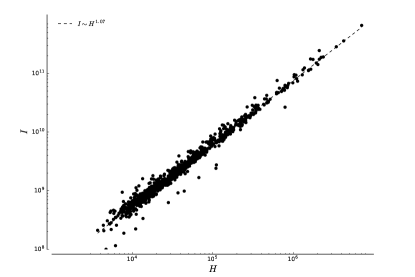
Although intuitively appealing, the idea that larger Metropolitan areas are richer is not as straightforward as it seems. The first question one can ask is if people are richer on average in large cities ? As shown in Fig. 11, the total income in a city scales (slightly) superlineary with population size
| (29) |
which suggests that the income per household is on average higher in larger cities than in smaller ones. In other words, there are proportionally more households belonging the to the wealthiest categories in large cities. In other words, the income inequality is higher in large cities than in small ones.
In order to measure levels of income inequality, we compute the Gini coefficient of the income distribution for every Core-based Statistical Area using the formula proposed in Dixon:1987
| (30) |
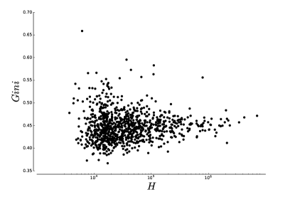
The results, shown in Fig. 12 do not show any dependence of the Gini coefficient on the metropolitan population. This example shows that the Gini coefficient is not always a good measure of inequality and can be too aggregated to detect finer details.
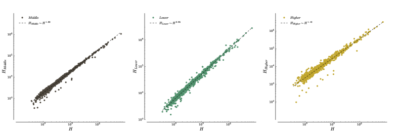
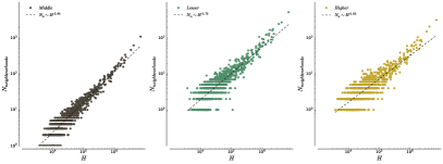
In order to confirm the consequence of the superlinear scaling of income in terms of larger cities having proportionally more higher-income households, we plot the number of households belonging to the different classes as a function of the total number of households on Fig. 13. We find that for three classes, the data are well approximated by a power-law relationship
The problem with writing scaling relationships in this case is that it the constraint is hidden (ie. the numbers of households belonging to each category must sum to the total number of households). We therefore write
| (31) |
where is the fraction of households in the city that belong to the class . The constraint that the numbers of households in each class should sum to is equivalent to
| (32) |
We plot these ratios on Fig. 14 and we indeed see that the number of households belonging to the higher-income class is proportionally larger in larger cities (for ), while the number of households belonging to the lower-income class is proportionally smaller. The proportion of Middle-income class households stays essentially the same across all metropolitan areas.
In this work, we take a different approach and ask if the different classes are more or less represented in a given MSA, compared to the average US result. In this context, a city is richer if the higher-income class is over-represented in this city, while the lower-income class is under-represented. The measure stems from the realisation that ’rich’ and ’poor’ are not absolute concepts, but must be related to the environment. In this case, it makes sense to compare the representation of the different income classes between metropolitan areas.
X Proportion of households in neighbourhoods
Neighbourhoods identify the areas in the city where the categories are overrepresented, but this does not necessarily mean that most households belonging to a category live in either of the corresponding neighourhood. We plot the distribution of the proportion of households belonging to the lower-, middle- and higher- income classes that also live in a corresponding neighbourhood on Fig. 15.
One can see that higher-income households tend to be more concentrated in the regions where they are represented, with an average of . Followed by the lower-income households, with and average of . The middle-income households are equally evenly spread across the city, with an average of .
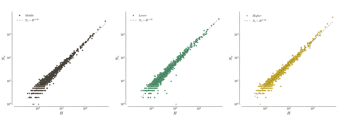
XI Number of over-represented units and city size
In the main text, we find that the number of neighbourhoods for the classes grows sublinearly with the size of a city, with a behaviour that is well approximated by a power-law
| (33) |
with () for all classes together. We claim this shows the tendency of classes to cluster more in larger cities than in smaller ones. This is only true, however, if the number of areal units in which each class is overrepresented does not itself vary sublinearly with population size. We plot on Fig. 16 these numbers for each class and each city as a function of the size of the city. We find that the behaviour of the number of overrepresented units is consistent with a linear behaviour for all three classes
| (34) |
And our claim of increased clustering is thus justified.
References
- (1) UN-HABITAT. State of the world’s cities 2012/2013: Prosperity of cities. New-York, NY: Routledge; 2013.
- (2) Andersen HS. Excluded places: the interaction between segregation, urban decay and deprived neighbourhoods. Housing, Theory and Society. 2002;19(3-4):153–169.
- (3) Jacobs, Jane. (1961) The death and life of great American cities. New-York, NY: Vintage; 1961.
- (4) Atkinson R, Bridge G. Gentrification in a global context. New-York, NY: Routledge; 2004.
- (5) Massey DS, Denton NA. American apartheid: Segregation and the making of the underclass Cambridge, MA: Harvard University Press; 1993.
- (6) Lobmayer P, Wilkinson RG. Inequality, residential segregation by income, and mortality in US cities. J Epidemiol Community Health 2002;56(3):183–187.
- (7) Duncan OD, Duncan B. A methodological analysis of segregation indexes. American Sociological Review. 1955;20(2):210–217.
- (8) James DR, Taeuber KE. Measures of segregation; 1982. Working Paper.
- (9) Massey DS, Denton NA. The Dimensions of Residential Segregation. Social Forces. 1988;67(2):281–315.
- (10) Reardon SF, Firebaugh G. Measures of Multigroup Segregation. Sociological Methodology. 2002;32(1):33–67.
- (11) Reardon SF, O’Sullivan D. Measures of Spatial Segregation. Sociological Methodology. 2004;34(1):121–162.
- (12) Winship C. Revaluation of Indexes of Residential Segregation. Social Forces. 1977;55: 1058–1066.
- (13) Jargowsky PA. Take the money and run: economic segregation in US metropolitan areas. American Sociological Review. 1996;61(6):984–998.
- (14) Apparicio P. Les indices de ségrégation résidentielle : un outil intégré dans un système d’information géographique. Cybergeo: European Journal of Geography. 2000.
- (15) Ellis M, Wright R, Parks V. Work Together, Live Apart? Geographies of Racial and Ethnic Segregation at Home and at Work. Annals of the Association of American Geographers. 2004; 94(3):620–637.
- (16) Lobo AP, Flores RO, Joseph JS. The Overlooked Ethnic Dimension of Hispanic Subgroup Settlement in New York City. Urban Geography 2007;28(7):609–34.
- (17) Wong, DWS., Shaw S-L. Measuring Segregation: An Activity Space Approach. Journal of Geographical Systems. 2010;13(2):127–245.
- (18) Sharma M, Brown LA. Racial/Ethnic Intermixing in Intra-Urban Space and Socioeconomic Context: Columbus, Ohio and Milwaukee, Wisconsin. Urban Geography. 2012;33(3):317–347.
- (19) Ripley BD. Spatial statistics Hoboken, NJ: John Wiley & Sons. 1981.
- (20) Cressie N. Statistics for Spatial Data. Wiley: New York, NY, USA; 1993.
- (21) Chun Y, Griffith DA. Spatial statistics and geostatistics: theory and applications for geographic information science and technology. Sage. 2013.
- (22) Louf R, Barthelemy M. Modeling the polycentric transition of cities. Phys Rev Lett. 2013;111(19):198702.
- (23) Glaeser EL, Kahn ME, Rappaport J. Why do the poor live in cities? The role of public transportation. Journal of urban Economics. 2008;63(1):1–24.
- (24) Brueckner JK, Thisse JF, Zenou Y. Why is downtown Paris so rich and Detroit so poor? An amenity based explanation. European Economic Review. 1999;43:91–107.
- (25) Louf, R (2015) Marble, a python library to study patterns of segregation. Code and documentation freely available online at http://github.com/scities/marble
- (26) Feller V. An Introduction to Probability Theory and Its Applications: Volume One Hoboken, NJ: John Wiley & Sons; 1950.
- (27) Duranton G, Overman HG. Testing for Localization Using Micro-Geographic Data. Review of Economic Studies. 2005;72: 1077–1106.
- (28) Marcon E, Puech F. Measures of the geographic concentration of industries: improving distance-based methods. Journal of Economic Geography. 2009;lbp056.
- (29) Billings SB, Johnson EB. A non-parametric test for industrial specialization. Journal of Urban Economics. 2012;71: 312–331.
- (30) Balassa B. Trade liberalisation and revealed comparative advantage. The Manchester School. 1965;33(2):99–123.
- (31) Schwabe M. Residential segregation in the largest French cities (1968-1999): in search of an urban model. Cybergeo: European Journal of Geography. 2011.
- (32) Jensen P. Network-based predictions of retail store commercial categories and optimal locations. Physical Review E. 2006;74(3):035101.
- (33) Bell W. A probability model for the measurement of ecological segregation. Social Forces. 1954;32(4):357–364.
- (34) Chamboredon J.-C. and Lemaire M. Proximité spatiale et distance sociale. Les grands ensembles et leur peuplement Revue française de sociologie. 1970;3–33.
- (35) Ioannides Yannis M. Neighborhood income distributions. Journal of Urban Economics. 2004;56(3):435–457.
- (36) Reardon SF, Bischoff K. Income inequality and income segregation. American Journal of Sociology. 2011;116(4):1092–1153.
- (37) Massey DS. The age of extremes: Concentrated affluence and poverty in the twenty-first century. Demography. 1996;33(4):395–412.
- (38) Massey, Douglas S., Mary J. Fischer, William T. Dickens, and Frank Levy. The Geography of Inequality in the United States, 1950-2000 [with Comments]. Brookings-wharton Papers on Urban Affairs. 2003;1–40.
- (39) Jenkins SP, Micklewright J, Schnepf SV. Social segregation in secondary schools: how does England compare with other countries? Oxford Review of Education. 2008;34(1):21–37.
- (40) Emirbayer M. Manifesto for a relational sociology. American Journal of Sociology. 1997;103(2):281–317.
- (41) Eagle N, Macy M, Claxton R. Network diversity and economic development. Science. 2010;328:1029–1031.
- (42) Sassen S. The Global City: New York, London, Tokyo. Princeton, NJ: Princeton University Press. 1991.
- (43) Hamnett, C. Social Polarisation in Global Cities: Theory and Evidence. Urban Studies. 1994;31(3):401–424.
- (44) Brueckner JK, Rosenthal SS. Gentrification and neighbourhood housing cycles: will America’s future downtowns be rich? The Review of Economics and Statistics. 2009;91: 725-743.
- (45) Brueckner JK. The structure of urban equilibria: A unified treatment of the Muth-Mills model. Handbook of regional and urban economics. 1987;2:821–845.
- (46) Makse HA, Havlin H, Stanley HE. Modelling urban growth. Nature. 1995;277:608–612.
- (47) White MJ. The measurement of spatial segregation. American Journal of Sociology. 1983;88(5):1008–1018.
- (48) Logan JR, Seth S, Hongwei X, Philip NK. Identifying and Bounding Ethnic Neighborhoods. Urban Geography. 2011;32(3):334–359.
- (49) Spielman SE, Logan JR. Using High-Resolution Population Data to Identify Neighborhoods and Establish Their Boundaries. Annals of the Association of American Geographers. 2013;103(1):67–84.
- (50) Shevky E, Bell W Social area analysis: Studies in human ecology. Berkeley, CA: University of California Press. 1961.
- (51) Sampson R, Raudenbush S, Earls F. Neighborhoods and violent crime: A multilevel study of collective efficacy. Science. 1997;277:918-24.
- (52) Dixon, PM et al. (1987) Bootstrapping the Gini coefficient of inequality. Ecology 1548-1551.