Probabilistic Formal Analysis of App Usage
to Inform Redesign
Abstract
This paper sets out a process of app analysis intended to support understanding of use but also redesign. From usage logs we infer activity patterns – Markov models – and employ probabilistic formal analysis to ask questions about the use of the app. The core of this paper’s contribution is a bridging of stochastic and formal modelling, but we also describe the work to make that analytic core utile within a design team. We illustrate our work via a case study of a mobile app presenting analytic findings and discussing how they are feeding into redesign. We had posited that two activity patterns indicated two separable sets of users, each of which might benefit from a differently tailored app version, but our subsequent analysis detailed users’ interleaving of activity patterns over time – evidence speaking more in favour of redesign that supports each pattern in an integrated way. We uncover patterns consisting of brief glances at particular data and recommend them as possible candidates for new design work on widget extensions: small displays available while users use other apps.
category:
D.2.2 Software Engineering Design Tools and Techniqueskeywords:
User Interfacescategory:
D.2.4 Software Engineering Software/Program Verificationkeywords:
Statistical methods, Model checkingkeywords:
Log Analysis, Inference, Markov Models, Model Checking1 Introduction
Good design of user-intensive applications (henceforth referred to as apps) is challenging – because users are seldom homogeneous or predictable in the ways they navigate around and use the functionality presented to them. Different populations of users will engage in different ways, and redesign may be desirable or even required to support populations’ different styles of use.
This simple hypothesis raises many questions, including: how should we identify the different populations, what characterises a population, and does that characterisation evolve, e.g. over an individual use session, and/or over a number of sessions over days and months? This paper attempts to answer these questions, in the context of informing future redesign of an app. We propose that formal, probabilistic analysis of inferred patterns of logged app usage is key, and we refer to these patterns as activity patterns. Our concept of population is therefore based on inferred temporal behaviours, i.e. activity patterns, rather than on static or slowly changing user attributes such as gender and age. The novelty of our approach is realising the concept of population through a combination of three powerful ‘ingredients’:
-
•
inference of Markov models of activity patterns from automatically logged data on user sessions,
-
•
characterisation of the activity patterns by probabilistic temporal logic properties using model checking,
-
•
longitudinal analysis of usage data drawn from different time cuts (e.g. logged sessions over the first day, first month, second month, etc.).
The focus of this paper is how populations of users are identified and characterised, and how they evolve. The contribution is defining the whole process from identifying questions that give us insight into an application, to event and attribute logging, data pre-processing and abstraction from logs, model inference, temporal logic property formulation using the probabilistic temporal logic PCTL with rewards [2], and visualisation of results. We illustrate throughout with a case study of AppTracker [4], a freely available mobile app that allows users to collect quantitative statistics about the usage of apps installed on one’s phone. AppTracker users can measure, for example, which apps one uses the most, how much time one has spent on each app, the average daily use, and the most and least active days. The application comprises several screens that display statistics in numerical as well as graphical formats.
A notable conclusion of our work is that, while our analysis of AppTracker’s use identifies several clearly distinct activity patterns, it also reveals the distribution of activity patterns over the population of users and over time. For AppTracker, this mitigates against a simple partitioning of the app into two different versions, each specific to one activity pattern. However, our analysis does offer a more principled way of selecting glanceable information.
The paper is organised as follows. First we give an overview of our approach followed by a technical background including probabilistic models, logics, and inference. Section 4 contains an overview of AppTracker and Sect. 5 describes how the methods of our approach are applied. Section 6 presents results from the analysis and Sect. 7 discuss how they offer insights into redesign of the app. Related work is discussed in Sect. 8, followed by a discussion about generalising our approach to analysis of other type of apps. Conclusions and future work are in Sect. 10.
2 Approach
Our approach begins with instrumenting an app, so that we can log usage behaviours. In our case, the app was instrumented by the developers, using the SGLog data logging infrastructure [10]. SGLog detects user events (such as button taps or screen changes within the app), stores log entries in a local text file on the device, and periodically uploads this data back to the developers’ servers. The raw logged data are processed to create sets of user traces expressed in terms of higher level actions. The higher level actions are carefully selected to relate to the intended analysis, namely to the underlying atomic propositions. The choice of these propositions is key: they determine the scope of properties that can be revealed by temporal property analysis and also determine the dimensions of the state space underlying the model. They are defined jointly by analysts and developers; in the case study, the propositions are the high level states relating to the core functionality of app, e.g. select main view, show selected statistics of device and app use, close app, etc. The sets of traces can be partitioned into different time cuts, e.g. the first days of usage, the first week, the second month, so that we can determine how activity patterns evolve over time and experience with the app.
We run a non-linear optimisation algorithm for parameter estimation on a set of user traces in order to infer admixture models of activity patterns. The activity patterns represent the set of user traces bottom up rather than imposing a set of categorising features a priori. Each activity pattern is a discrete-time Markov chain, and we can then characterise each user trace as a weighted mix of activity patterns. We note an aspect of the paper’s contribution here: to the best of our knowledge, inferring such temporal structures has not been described in prior work outside our group.
We then hypothesise temporal probabilistic properties, expressed in the probabilistic temporal logic PCTL extended with rewards [2, 12], to explore the inferred activity patterns. A typical probabilistic temporal property is the expected number of visits to a given state within steps from the start of a session, for each activity pattern and for different time cuts. Analysts define the temporal properties for various admixture models and time cuts, and discuss the results with developers. The discussions prompt the analysis of more properties, models and time cuts, and hypotheses to test, but more generally provide new insights into app usage and afford new ideas for redesign that are solidly grounded in observed activity patterns.
This is unlike standard use of model checking, where we are given a discrete-time Markov chain with fixed rates and requirements as temporal properties (which we attempt to verify). Our approach here is a combination of bottom up statistical inference from user trace data and top down probabilistic temporal logic analysis of the inferred models.
3 Technical Background
We assume familiarity with Markov models, bigram models and Expectation-Maximisation algorithms [5, 15, 16], the probabilistic temporal logic PCTL and probabilistic model checking for DTMC [2, 12]; basic definitions are below.
3.1 Discrete-time Markov chains
A discrete-time Markov chain (DTMC) is a tuple where:
-
•
is a set of states;
-
•
is the initial state;
-
•
is the transition probability function (or matrix) such that for all states we have ;
-
•
is a labelling function associating to each state in a set of valid atomic propositions from a set .
A path (or execution) of a DTMC is a non-empty sequence where and for all . A transition is also called a time-step.
3.2 Probabilistic logics and model checking
Probabilistic Computation Tree Logic (PCTL) [2] allows one to express a probability measure of the satisfaction of a temporal property. The syntax is:
| State formulae | |
|---|---|
| Path formulae |
where ranges over a set of atomic propositions , , , and . State formulae are also called temporal properties.
A state in a DTMC satisfies an atomic proposition if . A state satisfies a state formula , written , if the probability of taking a path starting from and satisfying meets the bound , i.e., , where is the probability measure defined over paths from state . The path formula is true on a path starting with if is satisfied in the state following ; is true on a path if holds in the state at some time step and at all preceding states holds. The propositional operators , disjunction and implication can be derived using basic logical equivalence. In this paper we use the eventually operator where . If then superscripts are omitted.
3.3 The probabilistic model checker PRISM
The PRISM probabilistic model checker [13] allows us to leave the bound unspecified and computes the satisfaction probability by verifying the property . Additionally, PRISM allows for experimentation: the verification of an open formula, when the range, and step size of the variable(s) are specified. PRISM supports a reward-based extension of PCTL called rPCTL. A reward structure assigns non-negative real values to states and/or transitions. We employ rewards assigned to transitions and cumulative and reachability reward properties. Then whenever a transition is taken, the reward associated with it is earned. The cumulative reward property, , computes the accumulated reward along all paths within time-steps. The reachability reward property, , computes the reward accumulated along all paths until the state formula is satisfied. The reward properties are usually annotated with specific reward structures.
The PRISM default is to reason over state formulae from the initial state of the DTMC under analysis. Filtered probabilities check for properties that hold from sets of states satisfying given propositions. In the examples illustrated in this paper we always use as the filter operator: e.g., where is a state formula and a Boolean proposition uniquely identifying a state in the DTMC.
3.4 Inference of admixture bigram models
Given a vocabulary of size , an observation sequence (or trace) over is a finite non-empty sequence of symbols from . Let be a data sample of traces over , . Consider transition matrices denoted , for , such that denotes the probability of moving to state from . At any point in time is used by the trace with probability . Let be the parameters of the statistical model. Then we estimate the likelihood of observing the trace given , i.e., , which takes the form:
We use a non-linear optimisation algorithm to find the (locally) maximum likelihood parameter estimation. Our algorithm of choice is the Expectation-Maximisation (EM) algorithm [5] and we restart it whenever the log-likelihood has multiple-local maxima. Each trace can be represented as a DTMC as follows:
-
•
the set of states where is the size of ,
-
•
the initial state is ,
-
•
the transition probability matrix is the transition-occurrence matrix such that on position gives the number of times the pair occurs in the trace ,
-
•
is a bijective function such that is the symbol on the first position in the trace .
Let all traces in start with the same symbol. Then the EM algorithm finds maximum log-likelihood estimates for consisting of DTMCs with the same sets of states and initial state , and an weighting matrix . The result is a -weighted mixture of the DTMCs forming an admixture bigram model: indicates the probability of using to transition between states. The model is bigram because only dependencies between adjacent symbols in the trace are considered.
4 Case study: AppTracker
AppTracker is an iOS application that provides a user with information on the usage of his/her device. The app operates on iPhones, iPads and iPod Touches, running in the background and monitoring the opening and closing of apps as well as the locking and unlocking of the device. AppTracker was released in August 2013. To date it has been downloaded over 35,000 times.
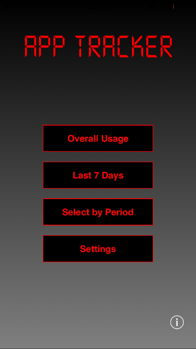
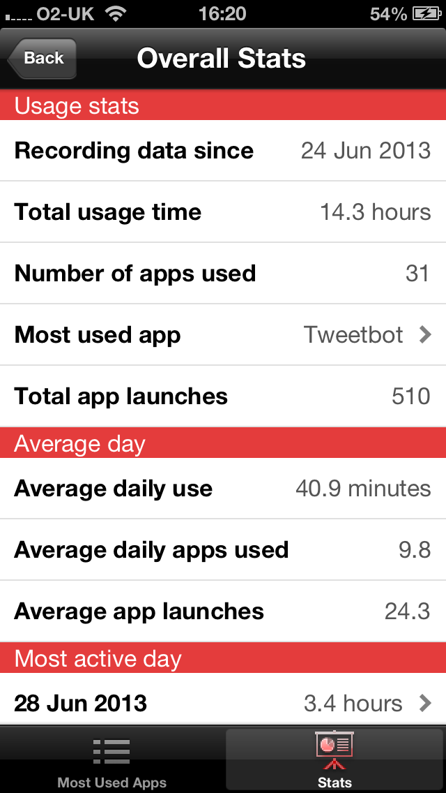
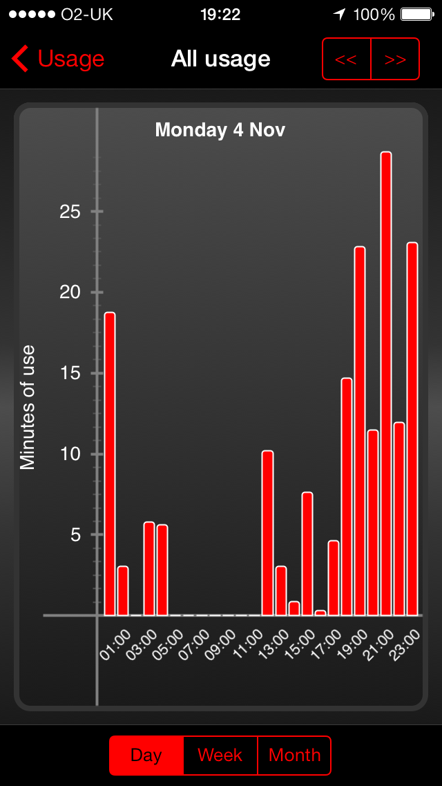
AppTracker’s interface displays a series of charts and statistics to give insight into how long one is spending on one’s device, the most used apps, and how these stats fluctuate over time. Figure 1 shows three views from the app. The AppTracker interface has a main menu screen (Main), presenting four main options (Fig. 1(a)). The first menu item, Overall Usage, contains quick summaries of all the data recorded since AppTracker was installed: the view TopApps shows a list of the user’s most-used apps and the view Stats shows summary statistics such as the number of apps used in an average day (Fig. 1(b)). The second menu item, Last 7 Days, displays a chart limited to the last week’s activity, showing a stacked bar graph of usage of the top 5 apps during that period; this view is called Last7Days. The third menu item, Select by Period, opens up the PeriodSelector view where a user can see usage statistics by any day, week or month, and drill down to a particular period of interest. For example, one could investigate which apps one used the most last Saturday, see how time one spent on Facebook varied each day across last month, or examine patterns of use over a particular day (Fig. 1(c)). The final menu option, Settings, allows a user to start and stop the tracker, or to reset his/her recorded data.
A Terms and Conditions screen is shown to a user on first launch, that explains the nature of AppTracker as a research project, describes all the data that will be recorded during its use and provides contact details to allow the user to opt out of the study at any time. These terms must be agreed to before the user has access to any other part of the app. The overall functional behaviour of AppTracker is illustrated in Figure 2.
| Id | State | Description |
| 0 | TermsAndConditions | Terms and conditions page |
| 1 | Main | Main display |
| 2 | TopApps | Summary of all recorded data |
| 3 | Last7Days | The last 7 days of top 5 apps used |
| 4 | PeriodSelector | Choose a time period |
| to see app usage | ||
| 5 | AppsInPeriod | Apps used for a selected period |
| 6 | Settings | Settings view |
| 7 | UseStop | Close AppTracker |
| 8 | Stats | Select statistics of app usage |
| 9 | UsageBarChartTopApps | App usage when picked from TopApps |
| 10 | UsageBarChartStats | App usage when picked from Stats |
| 11 | Feedback | Screen for giving feedback |
| 12 | UsageBarChartApps | App usage when picked from |
| AppsInPeriod | ||
| 13 | Info | Information about the app |
| 14 | Task | A feedback question chosen from |
| the Feedback view |
5 Methods Applied to AppTracker
5.1 Preparing the raw SGLog data
SGLog data
Data collected by SGLog [10] (the logging framework used to instrument AppTracker) consists of timestamped logs of events, such as user actions. Each log contains information about the user and device, and the event that took place. For our analysis, we are interested in the events resulting in a switch between views within the app, and from that we focus on which view the user transitions to. We therefore transform the raw logs of events into user traces of views, which is a list of views visited within the app. A special view denotes when the user leaves the app (UseStop). This results in a total of 15 unique views listed in Table 1. These views and transitions between views are used as states and transitions between states, and relate directly to the underlying atomic propositions. Figure 3 illustrates a fragment of a logged user trace: information about the user’s device, start and end data of AppTracker usage, and the first session. The log data is stored in a MySQL database by the SGLog framework. Raw data is extracted from the database and processed using JavaScript to obtain user traces.
[{"deviceid":"xx:xx:xx:xx:xx:xx","totalevents":230,"firstSeen":"2013-08-20 09:10:59","lastSeen":"2014-03-24 09:57:32",
  "sessions":[[{"timestamp":"2013-08-20 09:11:02","data":"TermsAndConditions"},{"timestamp":"2013-08-20 09:11:23", "data":"Main"},
  {"timestamp":"2013-08-20 09:11:46","data":"TopApps"},{"timestamp":"2013-08-20 09:11:50", "data":"Main"},{"timestamp":"2013-08-20
  09:11:52","data":"Last7Days"},{"timestamp":"2013-08-20 09:11:56", "data":"Main"},{"timestamp":"2013-08-20 :11:59",
  "data":"PeriodSelector"},{"timestamp":"2013-08-20 09:12:04", "data":"Main"},{"timestamp":"2013-08-20 09:12:06","data":"UseStop"}],...
All data analysed for this paper was gathered between August 2013 and May 2014, from 489 users. The average time spent within the app per user is 626s (median 293s), the average number times going into the app is 10.7 (median 7), the average user trace length is 73.6 view transitions. (median 46).
Time cuts
We use JavaScript to segment the log data into time cuts of the interval form , which returns the user traces from the -th up until the -th day of usage.
Computing transition-occurrence matrices
We use JavaScript for mapping each user trace to a transition-occurrence matrix: the number in position denotes how many times the -th view is followed by the -th view in the trace. A transition represents an action performed by the user to switch to one of the 15 views obtained from the SGlog data, including UseStop.
5.2 Inferring activity patterns
For each value of and time cut of the app usage we obtain DTMCs with transition matrices called activity patterns and an matrix , where is the number of user traces, and with each row a distribution over the activity patterns.
For each activity pattern , for , we generate automatically a PRISM model with one variable for the views of the app with values ranging from 0 to 14. For each state value of we have a PRISM command defining all possible 15 probabilistic transitions. Each value is the transition probability from state to the updated state in activity pattern , for all . For each state value we associate the label corresponding to a higher level state in AppTracker (see the mapping in Table 1) as well as a reward structure which assigns a reward of 1 to that state. The PRISM file for each activity pattern also includes a reward structure assigning a rewards of 1 to each transition (or time step) in the DTMC. All PRISM models have at most 15 states and at most 51 transitions for all values of and types of time cut. The template of such a PRISM model is illustrated in Table 2.
| ⋮ |
| ⋮ |
| ⋮ |
We implemented the EM algorithm in Java, applying the algorithm to datasets with iterations maximum and restarts maximum. Running the EM algorithm takes about 119s for , 162s for , and 206s for on a 2.8GHz Intel Xeon. Timings are obtained by running the algorithm 90 times. The algorithm is single threaded and runs on one core.
5.3 Temporal properties for activity patterns
We use the following types of rPCTL properties to analyse activity patterns for different states in PRISM.
Property 1
The probability of reaching a given state labelled by for the first time from the initial state within time steps: .
Property 2
The expected number of visits to a given state labeled by from the initial state within time steps: .
Property 3
The expected number of time steps to reach a given state from the initial state: .
Property 4
The probability of reaching for the first time a state labelled by from another state labelled by during the same session:
The next property generalises Property 3 by starting from a state not necessarily the initial one:
Property 5
The expected number of time steps to reach a state labelled by from another state labelled by :
Properties 1, 2, and 3 are generic temporal properties used for sketching a first image of a DTMC. They become more app-specific when we apply them for specific states prompted by designers’ hypotheses. Properties 4 and 5 were identified during the rPCTL analysis stage for specific pairs of states when more in-depth analysis was required to make sense of the activity patterns.
While we cannot give a general interpretation of the results of the latter two properties because they depend on the state labels, we interpret the results of first three properties above as follows:
6 Analysis Results
In this section we analyse different admixture bigram models for taking values in the set , and for various time cuts of the logged data. We verify rPCTL temporal properties enumerated in Sect. 5.3 on all activity patterns and then compare longitudinally the weightings given by . In this paper we show only properties concerning the following five states: TopApps, Stats, PeriodSelector, Last7Days, UseStop, because these states showed significant results and differences across time cuts and temporal properties when we analysed the entire set of states and, in the same time, the designers showed particular interest in them when formulating hypotheses about the actual app usage.
| Prop. | Time | TopApps | Stats | PeriodSelector | Last7Days | UseStop | |||||
|---|---|---|---|---|---|---|---|---|---|---|---|
| cut | AP1 | AP2 | AP1 | AP2 | AP1 | AP2 | AP1 | AP2 | AP1 | AP2 | |
| Property 1 | 0.99 | 0.99 | 0.99 | 0.83 | 0.47 | 0.79 | 0.49 | 0.96 | 0.99 | 0.99 | |
| 0.99 | 0.99 | 0.98 | 0.80 | 0 | 0.93 | 0 | 0.98 | 0.99 | 0.99 | ||
| 0.99 | 0.99 | 0.99 | 0.64 | 0.01 | 0.94 | 0.84 | 0.96 | 0.99 | 0.99 | ||
| 0.99 | 0.99 | 0.99 | 0.75 | 0.21 | 0.92 | 0.44 | 0.98 | 0.99 | 0.99 | ||
| 0.99 | 0.99 | 0 | 0.90 | 0.73 | 0.83 | 0.56 | 0.98 | 1 | 0.99 | ||
| 1 | 0.95 | 0.96 | 0.72 | 0 | 0.94 | 0 | 0.97 | 1 | 0.99 | ||
| Property 2 | 13.94 | 7.44 | 7.63 | 2.15 | 0.79 | 1.82 | 0.70 | 3.13 | 11.41 | 6.17 | |
| 17.22 | 5.77 | 4.00 | 2.31 | 0 | 3.97 | 0 | 4.03 | 12.91 | 6.30 | ||
| 14.93 | 7.15 | 5.43 | 1.47 | 0.01 | 4.61 | 1.78 | 3.41 | 12.86 | 5.74 | ||
| 14.67 | 6.48 | 5.08 | 1.90 | 0.24 | 3.58 | 0.58 | 3.99 | 11.00 | 6.51 | ||
| 13.40 | 6.83 | 0 | 3.76 | 4.41 | 2.04 | 0.85 | 4.54 | 12.46 | 5.61 | ||
| 17.30 | 5.83 | 2.94 | 2.60 | 0 | 3.26 | 0 | 4.43 | 13.96 | 5.63 | ||
| Property 3 | 3.31 | 8.41 | 8.18 | 28.67 | 79.32 | 32.46 | 74.87 | 15.56 | 4.86 | 7.88 | |
| 2.05 | 10.70 | 12.44 | 31.90 | 19.12 | 12.38 | 3.85 | 7.55 | ||||
| 2.52 | 9.68 | 9.70 | 48.61 | 17.78 | 26.61 | 14.58 | 3.88 | 8.44 | |||
| 3.05 | 9.73 | 11.01 | 36.03 | 209.68 | 19.94 | 87.54 | 12.19 | 4.67 | 7.43 | ||
| 4.04 | 10.34 | 22.33 | 38.21 | 28.28 | 61.74 | 11.08 | 1 | 8.82 | |||
| 2.02 | 15.28 | 16.53 | 39.68 | 17.41 | 11.56 | 3.57 | 8.90 | ||||
6.1 rPCTL analysis for
We verify Prop. 1, 2 and 3 on the two activity patterns AP1 and AP2 for six time cuts: first day , first week minus the first day , the first month minus the first week , the first month , the second month and the third month , and for ranging from to with step-size . The results for are listed in Table 3; the conclusions drawn in this section hold also for the other values of we considered. In the following we interpret the results from Table 3.
Property 1 computes the probability of reaching for the first time a given state within 50 time steps. Both AP1 and AP2 have very good results for TopApps and UseStop. AP2 has better results for PeriodSelector and Last7Days than AP1, with Last7Days slightly more popular than PeriodSelector; Stats also discriminates between the two activity patterns – better results for AP1 than for AP2, except for the time interval .
Property 2 computes the expected number of visits to a state within 50 time steps while Property 3 returns the expected number of time step taken before reaching a state. We see similar results for these two properties: AP1 has better results for TopApps and Stats than AP2, while AP2 has better results for PeriodSelector and Last7Days than AP1. The results indicate that the state is unlikely to be reached, therefore we can treat such results as zero for this property. A session is delimited by two UseStop states, except the initial session which starts from the initial state. Thus by looking at UseStop, on average we see twice as many sessions under AP1 than under AP2 and the average session length in terms of time steps under AP2 is double the average session length under AP1.
The three properties above show slightly different results for the time interval compared to the more consistent results for the other five time intervals. For this interval, a high number of visits to and a relative low number of time steps to reach Stats no longer belongs to AP1, but to AP2. Also, Prop. 1 and Prop. 2 for PeriodSelector no longer discriminate clearly between AP1 and AP2 due to very close results. As a consequence we analyse additional rPCTL properties (see Table 4) for the time interval in order to gain more insight into the two activity patterns. The results show that under AP1 it is very unlikely to go to PeriodSelector and Last7Days from TopApps and also it is unlikely to move between PeriodSelector and Last7Days, while under AP2 these behaviours are more likely. The expected numbers of time steps to PeriodSelector and Last7Days from TopApps are lower under AP1 than in AP2, while it takes fewer steps to reach TopApps from PeriodSelector or Last7Days under AP1. Also it takes fewer steps to move between PeriodSelector and Last7Days under AP2 than under AP1. It takes fewer time steps on average to reach TopApps from Main than it takes to reach PeriodSelector or Last7Days under AP1 than under AP2, and vice versa. All these results tell us that the two activity patterns learnt from the time cut are respectively similar to the two activity patterns earned for the rest of time cuts analysed. The difference in the behaviour around Stats could be explained by a new usage behaviour of the AppTracker around the day of usage due to a full month worth of new statistics, leading to a spurt of more exploratory usage of AppTracker. We note that in the third month of usage, the time cut , the results listed in Table 3 make again a clear distinction between the two activity patterns with respect to the states PeriodSelector and Last7Days. We might say that in the third month the exploratory usage of AppTracker settles down and users know exactly what to look for and where. A finer-grained longitudinal analysis based on one-week time cuts could reveal additional insight into the behaviour involving Stats around the day of usage.
We conclude that there are two distinct activity patterns:
-
•
Overall Viewing pattern corresponds to viewing mainly TopApps and Stats, thus more higher level stats visualisations, and
-
•
Time-partitioned Viewing pattern corresponds to viewing in particular Last7Days and PeriodSelector, and also to some extent viewing TopApps and Stats (but less than for the Overall Viewing pattern), thus more in-depth stats visualisations.
This conclusion meets the developers’ hypothesis about two distinct usages of the apps. However developers expected also to see one pattern revolving around TopApps and Stats, one around PeriodSelector and another one around Last7Days. The choice of showed only 2 distinct patterns, the last two patterns conjectured by developers being aggregated into a single one. As a consequence, we investigate higher values for in Sect. 6.3.
6.2 -based Longitudinal Analysis for
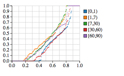
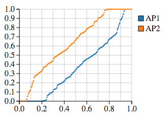
In addition to analysing rPCTL properties, we also compare how the distribution of the two activity patterns for the entire population of users changes in time. For each time cut considered for the rPCTL analysis above and activity pattern AP2, we order non-decreasingly the second column of and re-scale its size to the interval to represent the horizontal axis, while the ordered values are projected on the vertical axis. Figure 4 shows the values for AP2 for the population of user across the first three months of usage. Since each row of sums up to 1, it is easy to picture a similar chart for AP1. We conclude that during the first day of usage, up to 40% of users exhibit exclusive Time-partitioned Viewing behaviour (probability close to 1 on the -axis) corresponding to an initial exploration of the app with significant number of visits to TopApps, Stats, PeriodSelector, and Last7Days. Also, at most 10% of the users exhibit exclusive Overall Viewing behaviour maybe because they feel less adventurous in exploring the app, preferring mostly the first menu option of looking at TopApps and subsequently at Stats. We note that the distributions of the two activity patterns in the population of users are similar for the time intervals and – probably because more users exhibit a more exploratory behaviour during these times (new types of usage statistics become available after one month of usage). At the same time, the plots for the time intervals , , and are also similar, and we think that they correspond to a settled (or routine) usage behaviour.
6.3 rPCTL Analysis for
Let us consider the admixture model inferred for . We verify Props. 1, 2, and 3 on the time interval (first month of usage) and , and list the results in Table 5. Based on these results we conclude that:
-
•
AP1 is an Overall Viewing pattern because TopApps and Stats have best results for all three properties; PeriodSelector and Last7Days are absent.
-
•
AP2 is an Overall Viewing pattern ’weaker’ than AP1 because TopApps has poorer results, and better results than Stats and Last7Days; PeriodSelector is absent.
-
•
AP3 is a Time-partitioned Viewing pattern because PeriodSelector has the best results, followed closely by TopApps and Last7Days.
As for , the sessions for the Overall Viewing pattern are twice as short and twice more frequent than for the Time-partitioned Viewing pattern.
6.4 rPCTL Analysis for
We now consider the admixture model inferred for . We verify Props. 1, 2, and 3 on the time interval (first month of usage) and for , and list the results in Table 6. Based on these results we conclude that:
-
•
AP1 is mainly a TopApps Viewing activity pattern because it has the best results for TopApps, compared to Stats, PeriodSelector, and Last7Days which score very weak results.
-
•
AP2 is a Stats – TopApps Viewing activity pattern, with very weak results from Last7Days, PeriodSelector is absent.
-
•
AP3 is a Time-partitioned Viewing pattern with dominant Last7Days followed closely by TopApps and PeriodSelector; Stats is absent.
-
•
AP4 is mainly a TopApps Viewing pattern because TopApps has the best results, while all other states need on average an infinite number of time steps to be reached. The fact that it takes on average an infinite number of time steps to reach the end of a session (i.e., the state UseStop), pushed us to analyse this pattern with other temporal properties and for other states. As a consequence we saw that UsageBarChartTopApps has similar properties as TopApps, meaning that this pattern corresponds to repeatedly switching between TopApps and UsageBarChartTopApps.
6.5 rPCTL Analysis for
Let us consider the admixture model inferred for . We analyse Props. 1, 2, and 3 on the time interval (first month of usage) and for , and list the results in Table 7. Based on these results we conclude that:
- •
-
•
AP2 is a Time-partitioned Viewing pattern with dominant PeriodSelector and slightly less Last7Days, and almost no TopApps or Stats.
-
•
AP3 is an Overall Viewing pattern weaker than AP4 and AP5 because TopApps has poorer results, and better results than Stats and Last7Days; PeriodSelector is absent.
-
•
AP4 is an Overall Viewing pattern because TopApps has the best results, Stats comes in second. PeriodSelector and Last7Days are absent.
-
•
AP5 is an Overall Viewing pattern weaker than AP4 with Stats scoring slightly better results than TopApps, and Last7Days scores poorer results, while PeriodSelector is absent.
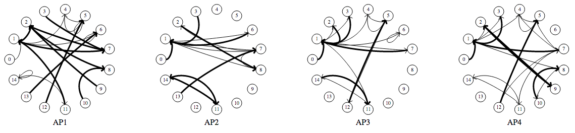
We do not show the probability transition matrix for the activity patterns analysed in this section for the sake of simplicity. The properties investigated here create an overall image of the likelihood of correlations between what we identified as most relevant five states. Figure 5 illustrates the state-transition diagrams of all activity patterns with thickness of the transitions corresponding to ranges of transition probabilities: the thicker the line, the higher the probability of that transition, while transitions with very small probabilities are not shown. Such graphs offer a high-level characterisation of patterns, but we note that a high probability from one state to a state in such a graph does not mean that the transition is very likely within the execution of the DTMC: if the probability of reaching is very low, then the transition from to will have a low probability to take place during execution. However, when considering the characteristics of each pattern as discovered through rPCTL analysis, such graphs aid in pattern identification and understanding. In particular AP4 stands out with a very thick transition between states TopApps (state id 2) and UsageBarChartTopApps (state id 9).
| Prop. | TopApps | Stats | PeriodSelector | Last7Days | UseStop | ||||||||||
|---|---|---|---|---|---|---|---|---|---|---|---|---|---|---|---|
| AP1 | AP2 | AP3 | AP1 | AP2 | AP3 | AP1 | AP2 | AP3 | AP1 | AP2 | AP3 | AP1 | AP2 | AP3 | |
| 1 | 0.99 | 0.99 | 0.93 | 0.99 | 0.91 | 0.39 | 0 | 0 | 0.97 | 0 | 0.91 | 0.96 | 0.99 | 0.99 | 0.99 |
| 2 | 15.45 | 6.94 | 6.74 | 5.56 | 2.57 | 0.99 | 0 | 0 | 8.46 | 0 | 2.32 | 3.98 | 13.65 | 8.20 | 6.00 |
| 3 | 2.45 | 7.35 | 17.43 | 9.33 | 22.01 | 98.96 | 11.74 | 20.99 | 12.55 | 3.78 | 5.86 | 8.08 | |||
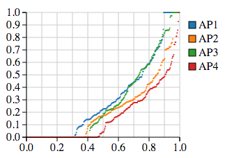
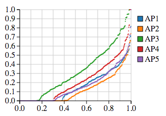
6.6 -based analysis for the time cut
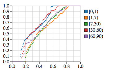
In Fig. 6 we plot the weightings of all 485 users in the time cut for each activity patterns for . Figure 6(a) tells us that for the Time-partitioned Viewing has higher weightings across the user population with almost 25% of the users using the app exclusively like this, hence either exploring the app or genuinely interested in in-depth usage statistics. Figure 6(b) tells us that almost 10% of the users are exclusively interested in TopApps, Stats and Last7Days but not PeriodSelector; this behaviour is the most popular among users. From Fig. 6(c) we see that almost 50% of the users do not behave according to AP4 – switching repeatedly between TopApps and UsageBarChartTopApps. Note that for , , and no pattern stands out as very different than the others.
7 Informing App Redesign
The results of our analysis offer several insights into the usage of AppTracker, which can be drawn upon by developers in the design of future versions.
Our analysis initially uncovered two activity patterns for AppTracker. These patterns can largely be characterised by the type of app usage data the user is examining: either Overall Viewing – more higher level usage statistics visualisations for the entire recorded period, or Time-partitioned Viewing – more in-depth usage statistics visualisation for specific periods of interest. We have not found one usage pattern to be significantly dominant over the other. For the majority of users, usage is fairly evenly distributed between the two patterns, suggesting that a revised version of AppTracker should continue to support both rather than focusing on only one.
The two patterns identified in the admixture model with correspond quite closely to options presented on AppTracker’s main menu (see Fig. 1(a)), which is the initial page shown when AppTracker launches. Overall Viewing shows more usage of TopApps and Stats, which are interface screens accessed through the Overall Usage menu item. Time-partitioned Viewing sees higher probabilities for reaching PeriodSelector and Last7Days, which are accessed through Select by Period and Last 7 Days, but also some usage of TopApps and Stats. Our results indicate that usage sessions corresponding to Overall Viewing are generally shorter. This means that during these sessions, users are performing fewer actions between launching AppTracker and exiting back to the device’s home screen. The diverse patterns suggest that, in a future version of AppTracker, if developers wanted to keep the two major styles of usage separated between different screens, they could explicitly design for these glancing-like short interactions in Overall Usage and longer interactions in a new Select by Period screen along with the initial Last 7 Days screen. Also more filtering and querying tools could be added to Select by Period.
In noting that activity patterns divide between main menu options in this way, we might be concerned that users are simply following the suggested paths as defined by the interface. Have our processes uncovered the inherent usage styles of AppTracker that users favour, and revealed that the initial menu design was sensible, matching these inherent styles well? Or is it the case that the menu acts as a prompt and users are simply following these suggestions given by the interface? If this latter explanation was correct, then it could be argued that our analysis has merely recovered AppTracker’s menu structure. We therefore probed further, running further admixture bigram models for , and . For the case of , if the analysis was merely mirroring the menu structure, we might expect to see one pattern centered around each of the first three menu items. Although we see a pattern AP2 centered around TopApps, Stats, and Last7Days but no PeriodSelector, we do not see a pattern centered around PeriodSelector and not including Last7Days. For we find these two views together in a pattern, with Last7Days slightly more popular than PeriodSelector. This combination also occurred for and .
For , we see a distinct new cluster of activity showing users repeatedly switching between TopApps and UsageBarChartTopApps. TopApps is an ordered list of the user’s most used apps; selecting an item from this list opens UsageBarChartTopApps, a bar chart showing daily minutes of use of this app. This persistent switching suggests a more investigatory behaviour, which is more likely to be associated with the Time-partitioned Viewing. Yet this behaviour is occurring under the Overall Usage menu item which we hypothesised and then identified as being associated with more glancing-like behaviour. This suggests that our results are providing more nuanced findings than simple uncovering of existing menu structure. Also, if developers wanted to separate the two types of usage between different menu items even more, they could move the TopApps – UsageBarChartTopApps loop from Overall Usage to Select by Period).
Discovering glancing activity patterns has significant benefits in app redesign. Since the release of the iOS 8 SDK in 2014, Apple has allowed the development of ’Today widgets’. These are extensions to apps comprising of small visual displays and limited functionality that appear in the device’s Notification Centre, accessible by swiping down from the top of the screen. On the subject of Today widgets, Apple’s Human Interface Guidelines (HIG) 111https://developer.apple.com/library/ios/documentation/UserExperience/Conceptual/MobileHIG/AppExtensions.html state that “it’s best when your Today widget displays the right amount of information and limits interactivity”, encouraging developers to “keep user interactions limited and streamlined” and explaining that “Because your Today widget provides a narrowly focused experience, it can work well to direct people to your app for more information or functionality.” Beyond these pieces of advice, however, developers might struggle to decide which pieces of their app’s contents would best suit inclusion in a Today widget. Few conventions have built up on this in the limited time the SDK has been available, and most developers would have to rely on their own judgement to select appropriate content from their app to populate this view. In our analysis, we have explicitly uncovered the specific screens that people look at when they are undertaking short sessions of glancing-type behaviour, i.e. the typical glancing patterns for AppTracker – the Overall Viewing pattern and the TopApps-centered patterns. In identifying such activity patterns, our methods provide a more principled method of selecting content appropriate for an app extension such as a Today widget.
We conclude that our approach presented in this paper is one additional way of influencing the iterative process of redesign while collecting more data based on updated release and analysing them.
8 Related Work
Logging software is also frequently used to understand program behaviours, and typically to aid program comprehension – building an understanding of how the program executes [17]. There are various techniques that use logs of running software, such as visualising logs (e.g. [6]) and capture and replay (e.g. [14], [9]). The motivations for doing this is often failure analysis, evaluating performance, and to better understand the system behaviour (as it executes). In contrast, we are interested in what ways users are interacting with the software, and we are doing so by analysing logs captured during the use of the software. The difference here is important. In the case of program comprehension, log analysis is used to understand better what is going on within the code and how the artifact is engineered (in order to be better prepared for improvements and maintenance). In the second case however, analysing usage logs is done to learn about distinct uses of the software to inform improvements on the higher-level design. There is however an interest from software engineer practitioners to learn about the use of an app through data science [3].
The approach of [7] also employs usage logs as a resource for improvement on design, and applies temporal logical analysis. A key difference is that their models are based on relatively static user attributes (e.g. city location of user) rather than on inferred behaviours. Their approach assumes within-class use to be homogeneous, but our research demonstrates within-class variation. We take a different approach to inference. We have found the common representations of context – such as location, operating system, or time of day – to be poor predictors of mobile application use in a first instance. For this reason we construct user models based on the log information alone, without any ad-hoc specification of static user attributes. By letting the data speak for itself, we hope to uncover interesting activity patterns and meaningful representations of users.
We first introduced the concept of representing the behaviour of users through a weighted mixture over data generating distributions [11], refining the concept substantially in [1] where we defined activity patterns for an individual user as user meta models (DTMCs), with respect to a population of users. We then inferred behaviours for individual user activity from large scale logged usage data for a mobile game app and analysed them using probabilistic temporal properties (without rewards). This current work builds on that approach, but differs substantially in that here our goal is redesign in the context of a different app. To this end we investigate a range of values for the number of activity patterns and completely different temporal properties (e.g. using rewards) for longitudinal analysis. In [1] we analysed individual user models, whereas in this paper we analysed the whole population of users as we compared the distributions of activity patterns across the user population longitudinally for a fixed value as well as for three different values for .
9 Discussion
In this section we shift emphasis from analysis and redesign of the AppTracker app to more general discussion of this type of analysis, offering suggestions and guidelines for how it can be used with other apps, and how analysts and developers may use it in their work together.
At present, the kind of approach we describe here is likely to involve collaboration between developers familiar with app development and instrumentation, and analysts familiar with statistics and formal modelling. With this in mind, we note some methodological issues that those considering such joint work may wish to consider.
Firstly, our approach gains from having significant volumes of log data to work on, in order to allow the statistical methods to be applied more reliably. However, the volume of log data to analyse is not relevant for the probabilistic model checking, only the number of higher level states for analysis selected from the raw data determines the complexity of the model checking problem. Our case study involved a vocabulary of 15 states, which was comfortably manageable, but we note that the combinatorial growth of the complexity of model checking argues against very large vocabularies.
Our second point follows on from the first: the issue of what to log is not trivial. Clearly, it is possible to instrument an app with logging in many different ways. This is typically decided during development, and the resulting logs – both between apps but also within apps – are therefore diverse. Unless it is strictly decided precisely what to log, the collection of log entries can include anything from a button press, to the change of WiFi signal of the device, and so on. For the method of analysis as used in this paper, one needs to go from these logs to transitions between states. One therefore needs to identify what these higher level states are, and how they correlate with the logs, as the choice of states is the choice of the lens through which one interprets the use of the app. In [7] states were related to web page views (similar to views in AppTracker, to some extent). In contrast, in [1], the states were related to specific game actions in the game. The two perspectives (and associated atomic propositions) are different in nature, and they each capture something different about what users do with the system under investigation.
In the case of AppTracker, we decided to use states corresponding to individual screens possible to transition to within the app. This highlights the rather simple nature of AppTracker – it is essentially a browser of information. In contrast, a game such as Angry Birds allows the user to perform a much more complex set of actions. Even after pruning the logs to include only user actions (rather than lower level device events), one still needs to decide how to model these actions as a state space. In the end, the chosen state space will ultimately influence what activity patterns become visible. We also note the need for care over the choice of what to log, the possibility of revision of that choice in the light of ongoing analysis, and the potential cost of reconciliation or integration of log data from different logging regimes. We therefore suggest that discussion and preliminary analysis be done early in the development process, so that the decisions about what to log and what the state space should be are made by developers and analysts jointly in a well-informed way.
Thirdly, the value of is clearly key to analysis, but what is the most appropriate value for ? While we could use model selection or non-parametric methods to infer , there might be reasons to fix a value of based in domain knowledge and/or developer’s knowledge of the app. We suggest that the analyst should expect to work in an incremental and exploratory way, using results from ongoing analysis as well as the developers’ knowledge of the app and the application domain. In the case study, we noted that AppTracker’s developers expected that two or three particular activity patterns would be uncovered by the analysis. Two major different patterns were in fact found – one of which subsumed the developers’ expected patterns. The findings from were useful in themselves, but also led to analysing higher values of and thus to findings that required developer knowledge for full interpretation.
Lastly, we note the complementarity of our methods based on inferred behaviours to methods using attributes selected a priori (such as [7], discussed in Sect. 8), and also to more everyday analysis such as counting how often a particular UI state was reached (e.g. via simple SQL queries over the log data). In our case study, we often used SQL queries and JavaScript visualisations to explore and prepare for more complex temporal analysis, with developers and analysts working together via those queries to frame more specialised analytic work – which in turn often led on to further SQL and JavaScript work. Similarly, we suggest that attributes selected a priori can be used to express domain knowledge in ways that both generate useful findings and lead on to other questions and analyses. We propose that the presented temporal logical analysis should be seen as adding to the toolkit available to developers, analysts and researchers, rather than competing with other methods.
10 Conclusions
We have outlined our approach to informing redesign based on probabilistic formal analysis of actual app usage. Our approach is a combination of bottom up statistical inference from user traces, and top down probabilistic temporal logic analysis of inferred models. We have illustrated this via a mobile app, and discussed how the results of this analysis inform app redesign that is grounded in existing patterns of behaviour.
Future work lies in two directions. First, we have developed and employed a prototype web-based environment for creating the time cuts, preparing data for and running the EM algorithm, and for generating PRISM models from the EM outputs and visualisations. Manual interventions are still required at various stages, particularly when analysing PRISM properties and generating visualisations, and ongoing work focuses on developing an analysis framework that encompasses all the stages within one easily adaptable web based environment, easing and speeding up the collaborative work of analysis. Second, our choice of bigram admixture models is based on the work of [8] in modelling web-browsing activity across populations of individuals. What type of probabilistic model would help us investigate possible causes for a user to transition from one type of behaviour to another one? Can we determine the context in which they are likely to make that transition? Future work involves Hierarchical Hidden Markov models [15], where the first abstract level in the hierarchy consists of contextual features and then the activity patterns learned for each feature.
11 Acknowledgments
This research is supported by the EPSRC Programme Grant A Population Approach to Ubicomp System Design (EP/J007617/1). The authors thank all members of the project.
References
- [1] O. Andrei, M. Calder, M. Higgs, and M. Girolami. Probabilistic Model Checking of DTMC Models of User Activity Patterns. In G. Norman and W. H. Sanders, editors, Proc. of QEST’14, volume 8657 of Lecture Notes in Computer Science, pages 138–153. Springer, 2014.
- [2] C. Baier and J.-P. Katoen. Principles of Model Checking. The MIT Press, 2008.
- [3] A. Begel and T. Zimmermann. Analyze This! 145 Questions for Data Scientists in Software Engineering. In Proc. of ICSE14, pages 12–23, New York, NY, USA, 2014. ACM.
- [4] M. Bell, M. Chalmers, L. Fontaine, M. Higgs, A. Morrison, J. Rooksby, M. Rost, and S. Sherwood. Experiences in Logging Everyday App Use. In Proc. of Digital Economy’13. ACM, 2013.
- [5] A. P. Dempster, N. M. Laird, and D. B. Rubin. Maximum Likelihood from Incomplete Data via the EM Algorithm. Journal of the Royal Statistical Society. Series B (Methodological), 39(1):pp. 1–38, 1977.
- [6] F. Fittkau, J. Waller, C. Wulf, and W. Hasselbring. Live trace visualization for comprehending large software landscapes: The ExplorViz approach. In Proc. of VISSOFT’13, pages 1–4, 2013.
- [7] C. Ghezzi, M. Pezzè, M. Sama, and G. Tamburrelli. Mining Behavior Models from User-Intensive Web Applications. In P. Jalote, L. C. Briand, and A. van der Hoek, editors, Proc. of ICSE’14, pages 277–287. ACM, 2014.
- [8] M. Girolami and A. Kaban. Simplicial Mixtures of Markov Chains: Distributed Modelling of Dynamic User Profiles. In S. Thrun, L. Saul, and B. Schölkopf, editors, Advances in Neural Information Processing Systems 16. MIT Press, Cambridge, MA, 2004.
- [9] L. Gomez, I. Neamtiu, T. Azim, and T. Millstein. RERAN: Timing- and Touch-sensitive Record and Replay for Android. In Proc. of ICSE’13, ICSE ’13, pages 72–81, Piscataway, NJ, USA, 2013. IEEE Press.
- [10] M. Hall, M. Bell, A. Morrison, S. Reeves, S. Sherwood, and M. Chalmers. Adapting ubicomp software and its evaluation. In Proc. of EICS’09, pages 143–148, New York, NY, USA, 2009. ACM.
- [11] M. Higgs, A. Morrison, M. Girolami, and M. Chalmers. Analysing User Behaviour Through Dynamic Population Models. In Proc. of CHI’13, Extended Abstracts on Human Factors in Computing Systems, CHI EA’13, pages 271–276. ACM, 2013.
- [12] M. Z. Kwiatkowska, G. Norman, and D. Parker. Stochastic Model Checking. In M. Bernardo and J. Hillston, editors, SFM, volume 4486 of LNCS, pages 220–270. Springer, 2007.
- [13] M. Z. Kwiatkowska, G. Norman, and D. Parker. PRISM 4.0: Verification of Probabilistic Real-Time Systems. In Proc. of CAV’11, volume 6806 of LNCS, pages 585–591. Springer, 2011.
- [14] J. Mickens, J. Elson, and J. Howell. Mugshot: Deterministic Capture and Replay for Javascript Applications. In Proc. of the 7th USENIX Conference on Networked Systems Design and Implementation, NSDI’10, pages 11–11. USENIX Association, 2010.
- [15] K. P. Murphy. Dynamic Bayesian Networks: Representation, Inference and Learning. PhD thesis, University of California, Berkley, 2002.
- [16] S. D. Stoller, E. Bartocci, J. Seyster, R. Grosu, K. Havelund, S. A. Smolka, and E. Zadok. Runtime Verification with State Estimation. In Proc. of RV’11, volume 7186 of LNCS, pages 193–207. Springer, 2011.
- [17] A. von Mayrhauser and A. Vans. Program comprehension during software maintenance and evolution. Computer, 28(8):44–55, 1995.