Quantifying Controversy on Social Media
Abstract.
Which topics spark the most heated debates on social media? Identifying those topics is not only interesting from a societal point of view, but also allows the filtering and aggregation of social media content for disseminating news stories. In this paper, we perform a systematic methodological study of controversy detection by using the content and the network structure of social media.
Unlike previous work, rather than study controversy in a single hand-picked topic and use domain-specific knowledge, we take a general approach to study topics in any domain. Our approach to quantifying controversy is based on a graph-based three-stage pipeline, which involves () building a conversation graph about a topic; () partitioning the conversation graph to identify potential sides of the controversy; and () measuring the amount of controversy from characteristics of the graph.
We perform an extensive comparison of controversy measures, different graph-building approaches, and data sources. We use both controversial and non-controversial topics on Twitter, as well as other external datasets. We find that our new random-walk-based measure outperforms existing ones in capturing the intuitive notion of controversy, and show that content features are vastly less helpful in this task.
1. Introduction
Given their widespread diffusion, online social media have become increasingly important in the study of social phenomena such as peer influence, framing, bias, and controversy. Ultimately, we would like to understand how users perceive the world through the lens of their social media feed. However, before addressing these advanced application scenarios, we first need to focus on the fundamental yet challenging task of distinguishing whether a topic of discussion is controversial. Our work is motivated by interest in observing controversies at societal level, monitoring their evolution, and possibly understanding which issues become controversial and why.
The study of controversy in social media is not new; there are many previous studies aimed at identifying and characterizing controversial issues, mostly around political debates (Adamic and Glance, 2005; Conover et al., 2011; Mejova et al., 2014; Morales et al., 2015) but also for other topics (Guerra et al., 2013). And while most recent papers have focused on Twitter (Conover et al., 2011; Guerra et al., 2013; Mejova et al., 2014; Morales et al., 2015), controversy in other platforms, such as blogs (Adamic and Glance, 2005) and opinion fora (Akoglu, 2014), has also been analyzed.
However, most previous papers have severe limitations. First, the majority of previous studies focus on controversy regarding political issues, and, in particular, are centered around long-lasting major events, such as elections (Adamic and Glance, 2005; Conover et al., 2011). More crucially, most previous works can be characterized as case studies, where controversy is identified in a single carefully-curated dataset, collected using ample domain knowledge and auxiliary domain-specific sources (e.g., an extensive list of hashtags regarding a major political event, or a list of left-leaning and right-leaning blogs).
We aim to overcome these limitations. We develop a framework to identify controversy regarding topics in any domain (e.g., political, economical, or cultural), and without prior domain-specific knowledge about the topics in question. Within the framework, we quantify the controversy associated with each topic, and thus compare different topics in order to find the most controversial ones. Having a framework with these properties allows us to deploy a system in-the-wild, and is valuable for building real-world applications.
In order to enable such a versatile framework, we work with topics that are defined in a lightweight and domain-agnostic manner. Specifically, when focusing on Twitter, a topic is specified as a text query. For example, “#beefban” is a special keyword (a “hashtag”) that Twitter users employed in March 2015 to signal that their posts referred to a decision by the Indian government about the consumption of beef meat in India. In this case, the query “#beefban” defines a topic of discussion, and the related activity consists of all posts that contain the query, or other closely related terms and hashtags, as explained in Section 4.1.
We represent a topic of discussion with a conversation graph. In such a graph, vertices represent users, and edges represent conversation activity and interactions, such as posts, comments, mentions, or endorsements. Our working hypothesis is that it is possible to analyze the conversation graph of a topic to reveal how controversial the topic is. In particular, we expect the conversation graph of a controversial topic to have a clustered structure. This hypothesis is based on the fact that a controversial topic entails different sides with opposing points of view, and individuals on the same side tend to endorse and amplify each other’s arguments (Adamic and Glance, 2005; Akoglu, 2014; Conover et al., 2011).
Our main contribution is to test this hypothesis. We achieve this result by studying a large number of candidate features, based on the following aspects of activity: () structure of endorsements, i.e., who agrees with whom on the topic, () structure of the social network, i.e., who is connected with whom among the participants in the conversation, () content, i.e., the keywords used in the topic, () sentiment, i.e., the tone (positive or negative) used to discuss the topic. Our study shows that all features, except from content-based ones, are useful in detecting controversial topics, to different extents. Particularly for Twitter, we find endorsement features (i.e., retweets) to be the most useful.
The extracted features are then used to compute the controversy score of a topic. We offer a systematic definition and provide a thorough evaluation of measures to quantify controversy. We employ a broad range of topics, both controversial and non-controversial ones, on which we evaluate several measures, either defined in this paper or coming from the literature (Guerra et al., 2013; Morales et al., 2015). We find that one of our newly-proposed measures, based on random walks, is able to discriminate controversial topics with great accuracy. In addition, it also generalizes well as it agrees with previously-defined measures when tested on datasets from existing work. We also find that the variance of the sentiment expressed on a topic is a reliable indication of controversy.
The approach to quantifying controversy presented in this paper can be condensed into a three-stage pipeline: () building a conversation graph among the users who contribute to a topic, where edges signify that two users are in some form of agreement, () identifying the potential sides of the controversy from the graph structure or the textual content, and () quantifying the amount of controversy in the graph.
The rest of this paper is organized as follows. Section 2 discusses how this work fills gaps in the existing literature. Subsequently, Section 3 provides a high level description of the pipeline for quantifying controversy of a topic, while Sections 4, 5, and 6 detail each stage. Section 7 shows how to extend the controversy measures from topics to users who participate in the discussion. We report the results of an extensive empirical evaluation of the proposed measures of controversy in Section 8. Section 9 extends the evaluation to a few measures that do not fit the pipeline. We conclude in Section 10 with a discussion on possible improvements and directions for future work, as well as lessons learned from carrying out this study.
2. Related Work
Analysis of controversy in online news and social media has attracted considerable attention, and a number of papers have provided very interesting case studies. In one of the first papers, Adamic and Glance (2005) study the link patterns and discussion topics of political bloggers, focusing on blog posts about the U.S. presidential election of 2004. They measure the degree of interaction between liberal and conservative blogs, and provide evidence that conservative blogs are linking to each other more frequently and in a denser pattern. These findings are confirmed by the more recent study of Conover et al. (2011), who also study controversy in political communication regarding congressional midterm elections. Using data from Twitter, Conover et al. (2011) identify a highly segregated partisan structure (present in the retweet graph, but not in the mention graph), with limited connectivity between left- and right-leaning users. In another recent work related to controversy analysis in political discussion, Mejova et al. (2014) identify a significant correlation between controversial issues and the use of negative affect and biased language.
The papers mentioned so far study controversy in the political domain, and provide case studies centered around long-lasting major events, such as presidential elections. In this paper, we aim to identify and quantify controversy for any topic discussed in social media, including short-lived and ad-hoc ones (for example, see the topics in Table 2). The problem we study has been considered by previous work, but the methods proposed so far are, to a large degree, domain-specific.
The work of Conover et al. (2011), discussed above, employs the concept of modularity and graph partitioning in order to verify (but not quantify) controversy structure of graphs extracted from discussion of political issues on Twitter. In a similar setting, Guerra et al. (2013) propose an alternative graph-structure measure. Their measure relies on the analysis of the boundary between two (potentially) polarized communities, and performs better than modularity. Differently from these studies, our contribution consists in providing an extensive study of a large number of measures, including the ones proposed earlier, and demonstrating clear improvement over those. We also aim at quantifying controversy in diverse and in-the-wild settings, rather than carefully-curated domain-specific datasets.
In a recent study, Morales et al. (2015) quantify polarity via the propagation of opinions of influential users on Twitter. They validate their measure with a case study from Venezuelan politics. Again, our methods are not only more general and domain agnostic, but they provide more intuitive results. In a different approach, Akoglu (2014) proposes a polarization metric that uses signed bipartite opinion graphs. The approach differs from ours as it relies on the availability of this particular type of data, which is not as readily available as social-interaction graphs.
| Paper | Identifying | Quantifying | Content | Network |
|---|---|---|---|---|
| Choi et al. (2010) | ✓ | ✓ | ||
| Popescu and Pennacchiotti (2010) | ✓ | ✓ | ||
| Mejova et al. (2014) | ✓ | ✓ | ||
| Klenner et al. (2014) | ✓ | ✓ | ||
| Tsytsarau et al. (2011) | ✓ | ✓ | ||
| Dori-Hacohen and Allan (2015) | ✓ | ✓ | ||
| Jang et al. (2016) | ✓ | ✓ | ||
| Conover et al. (2011) | ✓ | ✓ | ||
| Coletto et al. (2017) | ✓ | ✓ | ||
| Akoglu (2014) | ✓ | ✓ | ||
| Amin et al. (2017) | ✓ | ✓ | ||
| Guerra et al. (2013) | ✓ | ✓ | ✓ | |
| Morales et al. (2015) | ✓ | ✓ | ✓ | |
| Garimella et al. (2016b) | ✓ | ✓ | ✓ |
Similarly to the papers discussed above, in our work we quantify controversy based on the graph structure of social interactions. In particular, we assume that controversial and polarized topics induce graphs with clustered structure, representing different opinions and points of view. This assumption relies on the concept of “echo chambers,” which states that opinions or beliefs stay inside communities created by like-minded people, who reinforce and endorse the opinions of each other. This phenomenon has been quantified in many recent studies (An et al., 2014; Flaxman et al., 2015; Grevet et al., 2014).
A different direction for quantifying controversy, followed by Choi et al. (2010) and Mejova et al. (2014), relies on text and sentiment analysis. Both studies focus on language found in news articles. In our case, since we are mainly working with Twitter, where text is short and noisy, and since we are aiming at quantifying controversy in a domain-agnostic manner, text analysis has its limitations. Nevertheless, we experiment with incorporating content features in our approach.
A summary of related work categorized along different dimensions is presented in Table 1. As we mention above, most existing work to date tries to identify controversial topics as case studies on a particular topic, either using content or networks of interactions. Our work is one of the few that quantifies the degree of controversy using language and domain independent methods. Section 8 shows that our method outperforms existing ones (Guerra et al., 2013; Morales et al., 2015).
Finally, our findings on controversy have several potential applications on news-reading and public-debate scenarios. Quantifying controversy can provide a basis for analyzing the “news diet” of readers (Kulshrestha et al., 2015; LaCour, 2012), offering the chance of better information by providing recommendations of contrarian views (Munson et al., 2013), deliberating debates (Esterling et al., 2010), and connecting people with opposing views (Doris-Down et al., 2013; Graells-Garrido et al., 2013).
3. Pipeline

Our approach to measuring controversy is based on a systematic way of characterizing social media activity. We employ a pipeline with three stages, namely graph building, graph partitioning, and controversy measure, as shown in Figure 1. The final output of the pipeline is a value that measures how controversial a topic is, with higher values corresponding to higher degree of controversy. We provide a high-level description of each stage here and more details in the sections that follow.
3.1. Building the Graph
The purpose of this stage is to build a conversation graph that represents activity related to a single topic of discussion. In our pipeline, a topic is operationalized as a set of related hashtags (details in §4.1), and the social media activity related to the topic consists of those items (e.g., posts) that match this set of hashtags. For example, the query might consist simply of a keyword, such as “#ukraine”, in which case the related activity consists of all tweets that contain that keyword, or related tags such as #kyiv and #stoprussianaggression. Even though we describe textual queries in standard document-retrieval form, in principle queries can take other forms, as long as they are able to induce a graph from the social media activity (e.g., RDF queries, or topic models).
Each item related to a topic is associated with one user who generated it, and we build a graph where each user who contributed to the topic is assigned to one vertex. In this graph, an edge between two vertices represents endorsment, agreement, or shared point of view between the corresponding users. Section 4 details several ways to build such a graph.
3.2. Partitioning the Graph
In the second stage, the resulting conversation graph is fed into a graph partitioning algorithm to extract two partitions (we defer considering multi-sided controversies to further study). Intuitively, the two partitions correspond to two disjoint sets of users who possibly belong to different sides in the discussion. In other words, the output of this stage answers the following question: “assuming that users are split into two sides according to their point of view on the topic, which are these two sides?” Section 5 describes this stage in further detail. If indeed there are two sides which do not agree with each other –a controversy– then the two partitions should be loosely connected to each other, given the semantic of the edges. This property is captured by a measure computed in the third and final stage of the pipeline.
3.3. Measuring Controversy
The third and last stage takes as input the graph built by the first stage and partitioned by the second stage, and computes the value of a controversy measure that characterizes how controversial the topic is. Intuitively, a controversy measure aims to capture how sell separated the two partitions are. We test several such measures, including ones based on random walks, betweenness centrality, and low-dimensional embeddings. Details are provided in Section 6.
4. Graph Building
| Hashtag | # Tweets | Retweet graph | Follow graph | Description and collection period (2015) | ||
|---|---|---|---|---|---|---|
| #beefban | Government of India bans beef, Mar 2–5 | |||||
| #nemtsov | Death of Boris Nemtsov, Feb 28–Mar 2 | |||||
| #netanyahuspeech | Netanyahu’s speech at U.S. Congress, Mar 3–5 | |||||
| #russia_march | Protests after death of Boris Nemtsov (“march”), Mar 1–2 | |||||
| #indiasdaughter | Controversial Indian documentary, Mar 1–5 | |||||
| #baltimoreriots | Riots in Baltimore after police kills a black man, Apr 28–30 | |||||
| #indiana | Indiana pizzeria refuses to cater gay wedding, Apr 2–5 | |||||
| #ukraine | Ukraine conflict, Feb 27–Mar 2 | |||||
| #gunsense | Gun violence in U.S., Jun 1–30 | |||||
| #leadersdebate | Debate during the U.K. national elections, May 3 | |||||
| #sxsw | SXSW conference, Mar 13–22 | |||||
| #1dfamheretostay | Last OneDirection concert, Mar 27–29 | |||||
| #germanwings | Germanwings flight crash, Mar 24–26 | |||||
| #mothersday | Mother’s day, May 8 | |||||
| #nepal | Nepal earthquake, Apr 26–29 | |||||
| #ultralive | Ultra Music Festival, Mar 18–20 | |||||
| #FF | Follow Friday, Jun 19 | |||||
| #jurassicworld | Jurassic World movie, Jun 12-15 | |||||
| #wcw | Women crush Wednesdays, Jun 17 | |||||
| #nationalkissingday | National kissing day, Jun 19 | |||||
This section provides details about different approaches to build graphs from raw data. We use posts on Twitter to create our datasets.111From the full Twitter firehose stream. Twitter is a natural choice for the problem at hand, as it represents one of the main fora for public debate in online social media, and is often used to report news about current events. Following the procedure described in Section 3.1, we specify a set of queries (indicating topics), and build one graph for each query. We choose a set of topics which is balanced between controversial and non-controversial ones, so as to test for both false positives and false negatives.
We use Twitter hashtags as queries. Users commonly employ hashtags to indicate the topic of discussion their posts pertain to. Then, we define a topic as the set of hashtags related to the given query. Among the large number of hashtags that appear in the Twitter stream, we consider those that were trending during the period from Feb 27 to Jun 15, 2015. By manual inspection we find that most trending hashtags are not related to controversial discussions (Garimella et al., 2016a).
We first manually pick a set of hashtags that we know represent controversial topics of discussion. All hashtags in this set have been widely covered by mainstream media, and have generated ample discussion, both online and offline. Moreover, to have a dataset that is balanced between controversial and non-controversial topics, we sample another set of hashtags that represent non-controversial topics of discussion. These hashtags are related mostly to “soft news” and entertainment, but also to events that, while being impactful and dramatic, did not generate large controversies (e.g., #nepal and #germanwings). In addition to our intuition that these topics are non-controversial, we manually check a sample of tweets, and we are unable to identify any clear instance of controversy.222Code and networks used in this work are available at http://github.com/gvrkiran/controversy-detection.
As a first step, we now describe the process of expanding a single hashtag into a set of related hashtags which define the topic. The goal of this process is to broaden the definition of a topic, and ultimately improve the coverage of the topic itself.
4.1. From hashtags to topics
In the literature, a topic is often defined by a single hashtag. However, this choice might be too restrictive in many cases. For instance, the opposing sides of a controversy might use different hashtags, as the hashtag itself is loaded with meaning and used as a means to express their opinion. Using a single hashtag may thus miss part of the relevant posts.
To address this limitation, we extend the definition of topic to be more encompassing. Given a seed hashtag, we define a topic as a set of related hashtags, which co-occur with the seed hashtag. To find related hashtags, we employ (and improve upon) a recent clustering algorithm tailored for the purpose (Feng et al., 2015).
Feng et al. (2015) develop a simple measure to compute the similarity between two hashtags, which relies on co-occurring words and hashtags. The authors then use this similarity measure to find closely related hashtags and define clusters. However, this simple approach presents one drawback, in that very popular hashtags such as #ff or #follow co-occur with a large number of hashtags. Hence, directly applying the original approach results in extremely noisy clusters. Since the quality of the topic affects critically the entire pipeline, we want to avert this issue and ensure minimal noise is introduced in the expanded set of hashtags.
Therefore, we improve the basic approach by taking into account and normalizing for the popularity of the hashtags. Specifically, we compute the document frequency of all hashtags on a random 1% sample of the Twitter stream,333From the Twitter Streaming API https://dev.twitter.com/streaming/reference/get/statuses/sample. and normalize the original similarity score between two hashtags by the inverse document frequency. The similarity score is formally defined as
| (1) |
where is the seed tag, is the candidate tag, and are the sets of words and hashtags that co-occur with hashtag , respectively, is the cosine similarity between two vectors, is the document frequency of a tag, and is a parameter that balances the importance of words compared to hashtags in a post.
By using the similarity function in Equation 1, we retrieve the top- most similar hashtags to a given seed. The set of these hashtags along with the initial seed defines the topic for the given seed hashtag. The topic is used as a filter to get all tweets which contain at least one of the hashtags in the topic. In our experiments we use = 0.3 (as proposed by Feng et al. (2015)) and = 20.
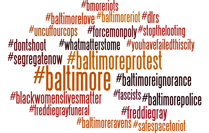
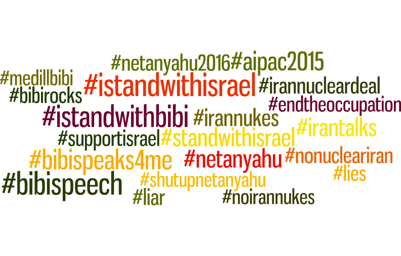
Figure 2 shows the top-20 most similar hashtags for two different seeds: (a) #baltimoreriots, which identifies the discussion around the Baltimore riots against police violence in April 2015 and (b) #netanyahuspeech, which identifies the discussion around Netanyahu’s speech at the US congress in March 2015. By inspecting the sets of hashtags, it is possible to infer the nature of the controversy for the given topic, as both sides are represented. For instance, the hashtags #istandwithisrael and #shutupbibi represent opposing sides in the dicussion raised by Netanyahu’s speech. Both hashtags are recovered by our approach when #netanyahuspeech is provided as the seed hashtag. It is also clear why using a single hashtag is not sufficient to define a topic: the same user is not likely to use both #safespacetoriot and #segregatenow, even though the two hashtags refer to the same event (#baltimoreriots).
4.2. Data aspects
For each topic, we retrieve all tweets that contain one of its hashtags and that are
generated during the observation window.
We also ensure that the selected hashtags are associated with a
large enough volume of activity.
Table 2 presents the final set of seed hashtags,
along with their description and the number of related tweets.444We use a hashtag in Russian,
![]() , which we refer to as #russia_march henceforth, for convenience.
For each topic, we build a graph where we assign a vertex to each user who contributes to it,
and generate edges according to one of the following four approaches,
which capture different aspects of the data source.
, which we refer to as #russia_march henceforth, for convenience.
For each topic, we build a graph where we assign a vertex to each user who contributes to it,
and generate edges according to one of the following four approaches,
which capture different aspects of the data source.
1. Retweet graph. Retweets typically indicate endorsement.555We do not consider ‘quote retweets’ (retweet with a comment added) in our analysis. Users who retweet signal endorsement of the opinion expressed in the original tweet by propagating it further. Retweets are not constrained to occur only between users who are connected in Twitter’s social network, but users are allowed to retweet posts generated by any other user.
We select the edges for graph based on the retweet activity in the topic: an edge exists between two users and if there are at least two () retweets between them that use the hashtag, irrespective of direction. We remark that, in preliminary experimentation with this approach, building the retweet graph with a threshold did not produce reliable results. We presume that a single retweet on a topic is not enough of a signal to infer endorsement. Using retweets as threshold proves to be a good trade-off between high selectivity (which hinders analysis) and noise reduction. The resulting size for each retweet graph is listed in Table 2.
In an earlier version of this work (Garimella et al., 2016b), when building a conversation graph for a single hashtag, we created an edge between two vertices only if there were “at least two retweets per edge” (in either direction) between the corresponding pair of users. When defining topics as sets of hashtags, there are several ways to generalize this filtering step. The simplest approach considers “two of any” in the set of hashtags that defines the topic. However, this approach is too permissive, and results in an overly-inclusive graph, with spurious relationships and a high level of noise. Instead, we opt to create an edge between two nodes only if there are at least two retweets for any given hashtag between the corresponding pair of users. In other words, the resulting conversation graph for the topic is the union of the retweet graphs for each hashtag in the topic, considered (and filtered) separately.
2. Follow graph. In this approach, we build the follow graph induced by a given hashtag. We select the edges for graph based on the social connections between Twitter users who employ the given hashtag: an edge exists between users and if follows or vice-versa. We stress that the graph built with this approach is topic-specific, as the edges in are constrained to connections between users who discuss the topic that is specified as input to the pipeline.
The rationale for using this graph is based on an assumption of the presence of homophily in the social network, which is a common trait in this setting. To be more precise, we expect that on a given topic people will agree more often than not with people they follow, and that for a controversial topic this phenomenon will be reflected in well-separated partitions of the resulting graph. Note that using the entire social graph would not necessarily produce well-separated partitions that correspond to single topics of discussion, as those partitions would be “blurred” by the existence of additional edges that are due to other reasons (e.g., offline social connections).
On the practical side, while the retweet information is readily available in the stream of tweets, the social network of Twitter is not. Collecting the follower graph thus requires an expensive crawling phase. The resulting graph size for each follow graph is listed in Table 2.
3. Content graph. We create the edges of graph based on whether users post instances of the same content. Specifically, we experiment with the following three variants: create an edge between two vertices if the users () use the same hashtag, other than the ones that defines the topic, () share a link to the same URL, or () share a link with the same URL domain (e.g., cnn.com is the domain for all pages on the website of CNN).
4. Hybrid content & retweet graph. We create edges for graph according to a state-of-the-art process that blends content and graph information (Ruan et al., 2013). Concretely, we associate each user with a vector of frequencies of mentions for different hashtags. Subsequently, we create edges between pairs of users whose corresponding vectors have high cosine similarity, and combine them with edges from the retweet graph, built as described above. For details, we refer the interested reader to the original publication (Ruan et al., 2013).
5. Graph partitioning
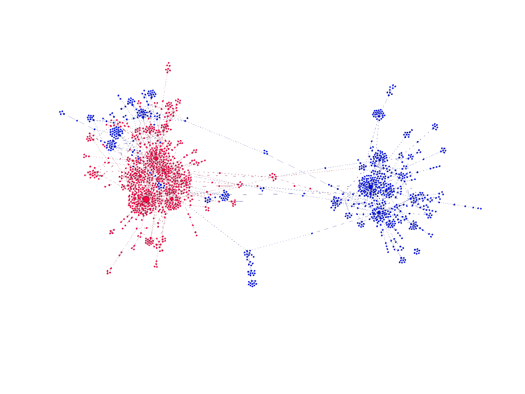
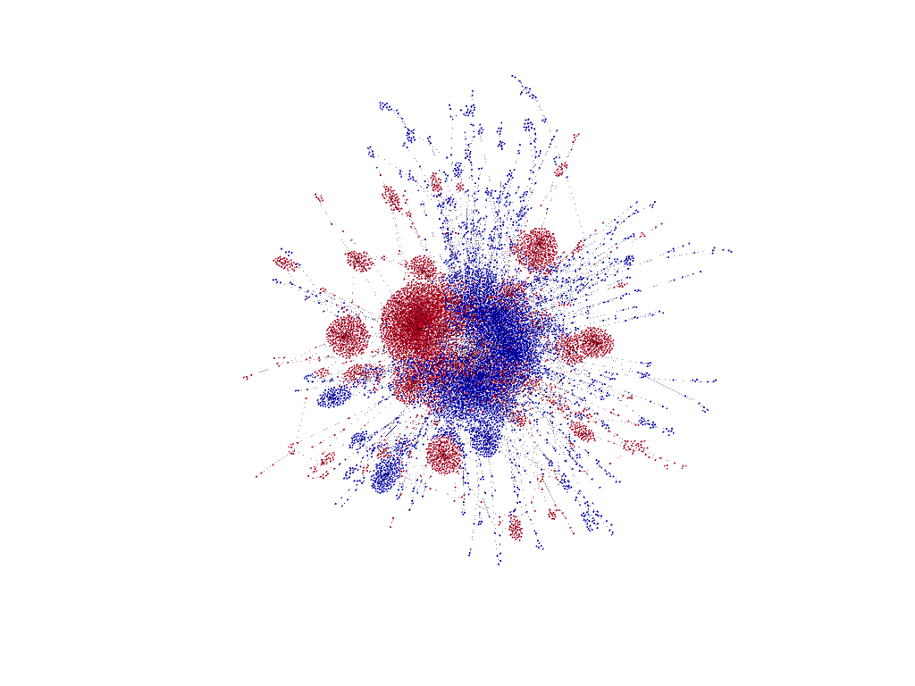
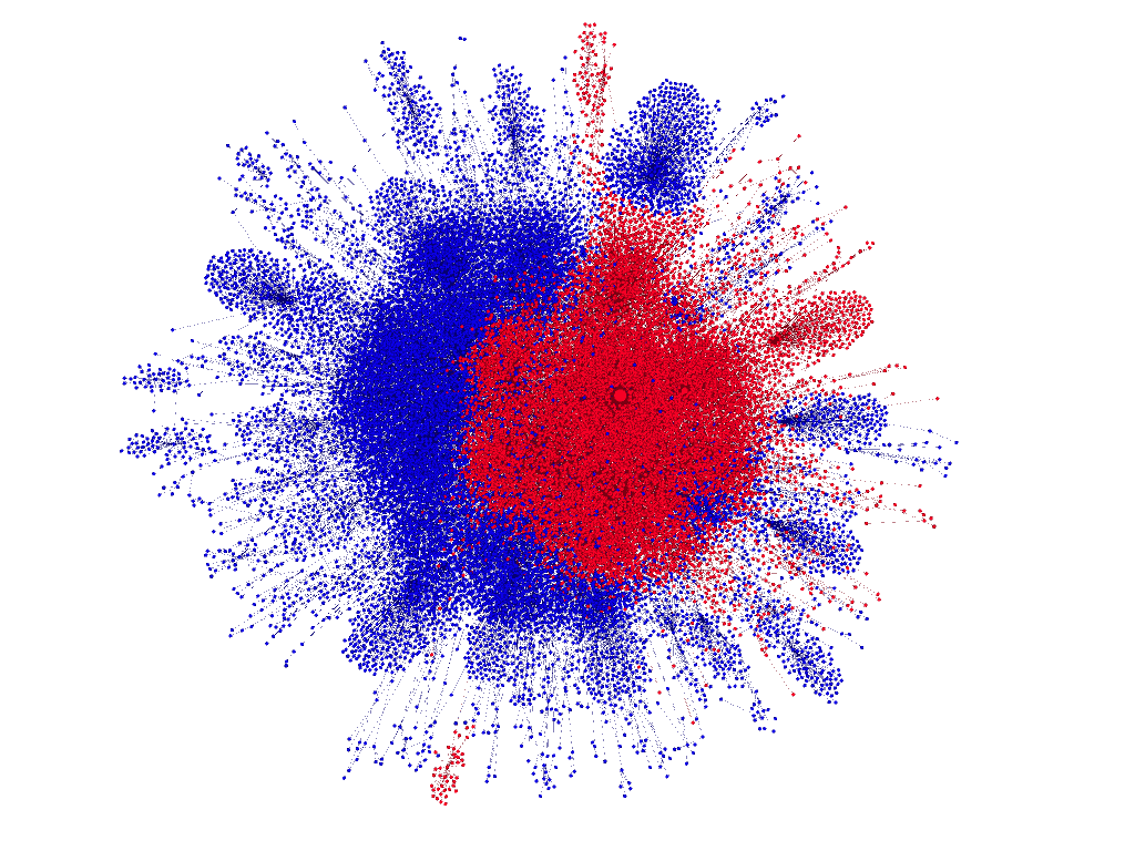
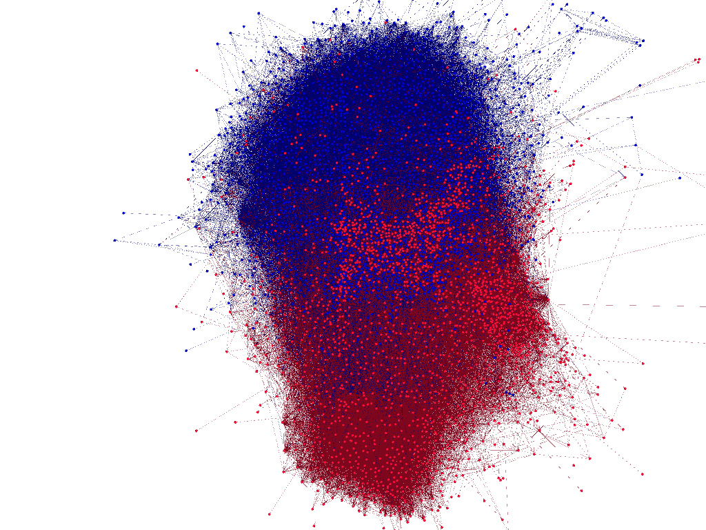
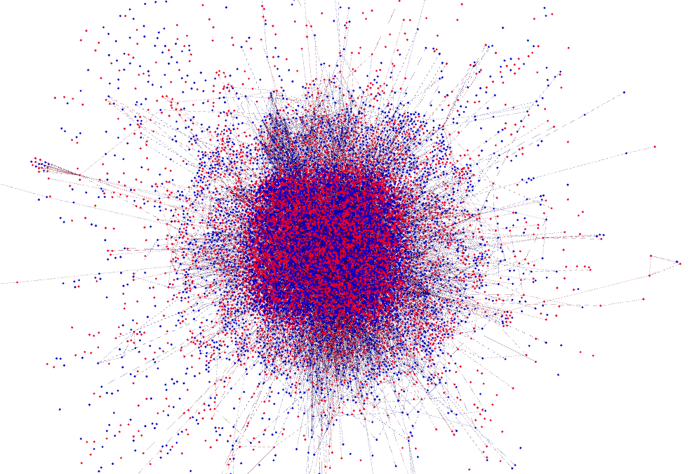
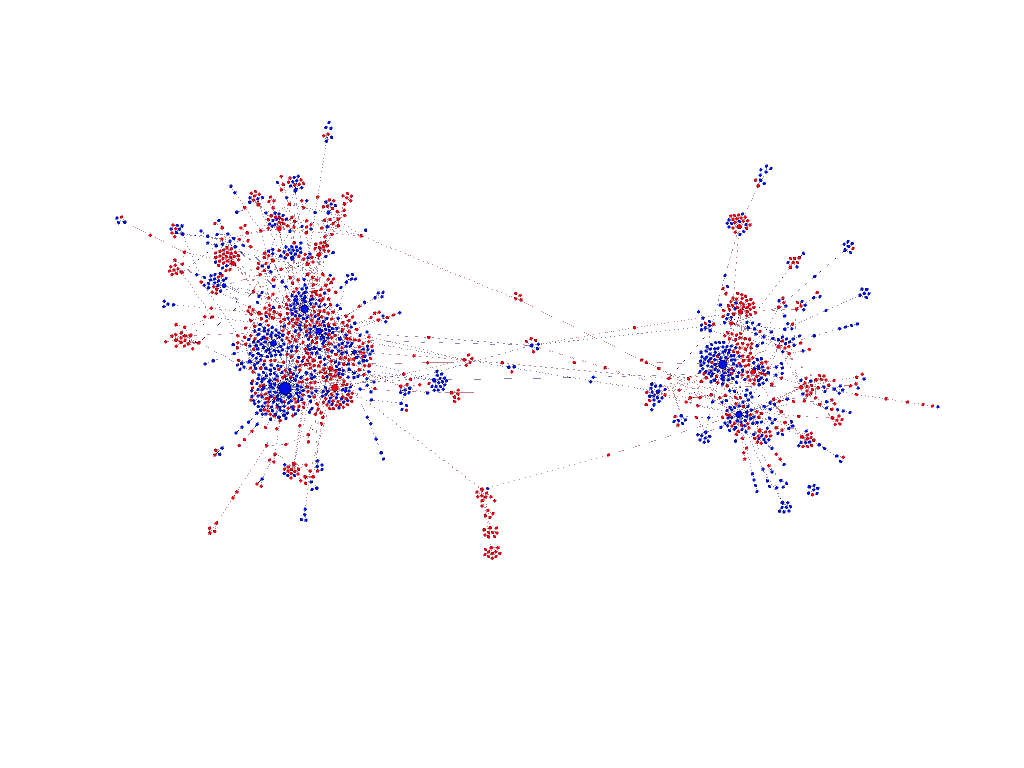
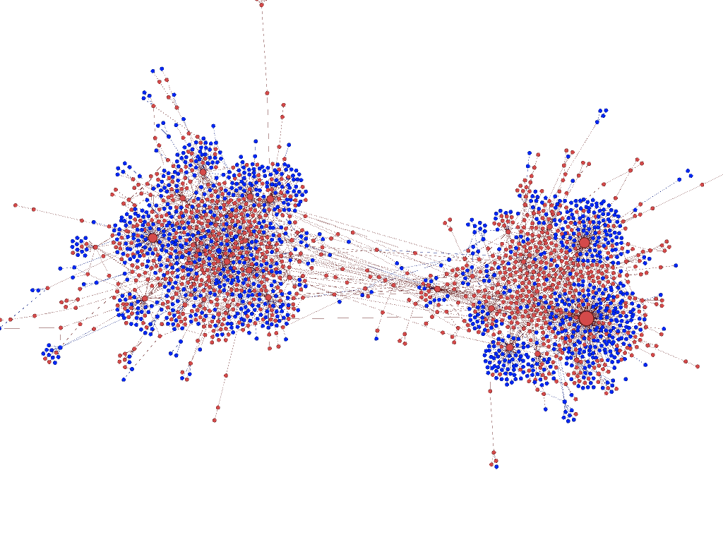
As previously explained, we use a graph partitioning algorithm to produce two partitions on the conversation graph. To do so, we rely on a state-of-the-art off-the-shelf algorithm, METIS (Karypis and Kumar, 1995). Figure 3 displays the two partitions returned for some of the topics on their corresponding retweet and follow graphs (Figures 3(a)-(d) and Figures 3(e)-(h), respectively).666Other topics show similar trends. The partitions are depicted in blue or red. The graph layout is produced by Gephi’s ForceAtlas2 algorithm (Jacomy et al., 2014), and is based solely on the structure of the graph, not on the partitioning computed by METIS. Only the largest connected component is shown in the visualization, though in all the cases the largest connected component contains more than of nodes.
From an initial visual inspection of the partitions identified on retweet and follow graphs, we find that the partitions match well with our intuition of which topics are controversial (the partitions returned by METIS are well separated for controversial topics). To make sure that this initial assessment of the partitions is not an artifact of the visualization algorithm we use, we try other layouts offered by Gephi. In all cases we observe similar patterns. We also manually sample and check tweets from the partitions, to verify the presence of controversy. While this anecdotal evidence is hard to report, indeed the partitions seem to capture the spirit of the controversy.777For instance, of these two tweets for #netanyahuspeech from two users on opposing sides, one is clearly supporting the speech https://t.co/OVeWB4XqIg, while the other highlights the negative reactions to it https://t.co/v9RdPudrrC.
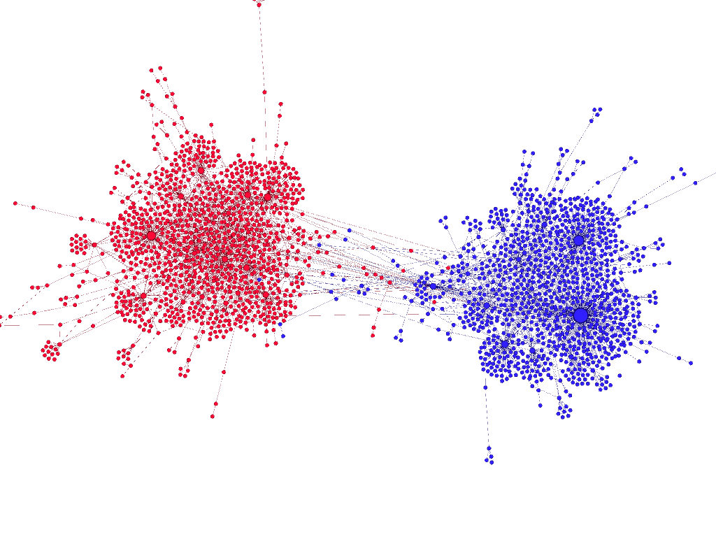
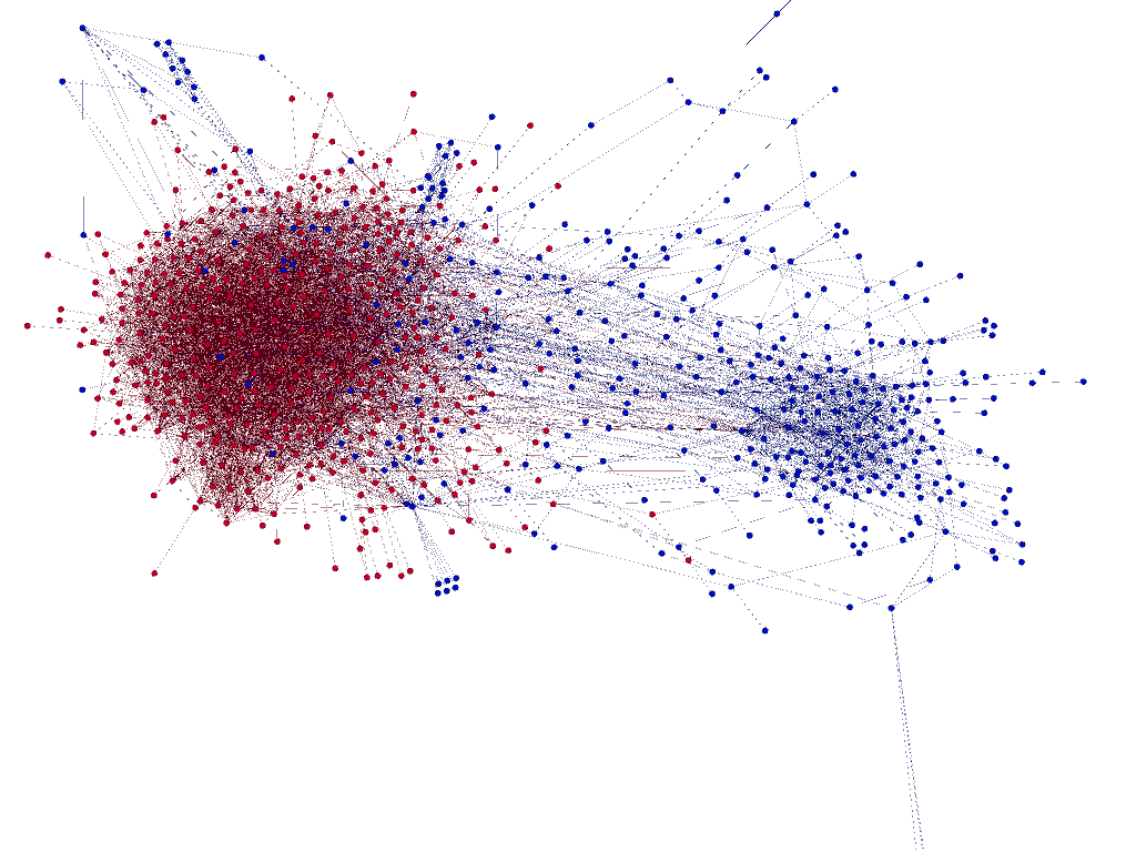
On the contrary, the partitions identified on content graphs fail to match our intuition. All three variants of the content-based approach lead to sparse graphs and highly overlapping partitions, even in cases of highly controversial issues. The same pattern applies for the hybrid approach, as shown in Figure 4. We also try a variant of the hybrid graph approach with vectors that represent the frequency of different URL domains mentioned by a user, with no better results. We thus do not consider these approaches to graph building any further in the remainder of this paper.
Finally, we try graph partitioning algorithms of other types. Besides METIS (cut based), we test spectral clustering, label propagation, and affiliation-graph-based models. The difference among these methods is not significant, however from visual inspection METIS generates the cleanest partitions.
6. Controversy Measures
This section describes the controversy measures used in this work. For completeness, we describe both those measures proposed by us (§6.1, 6.3, 6.4) as well as the ones from the literature that we use as baselines (§6.5, 6.6).
6.1. Random walk
This measure uses the notion of random walks on graphs. It is based on the rationale that, in a controversial discussion, there are authoritative users on both sides, as evidenced by a large degree in the graph. The measure captures the intuition of how likely a random user on either side is to be exposed to authoritative content from the opposing side.
Let be the graph built by the first stage and its two partitions and , (, ) identified by the second stage of the pipeline. We first distinguish the highest-degree vertices from each partition. High degree is a proxy for authoritativeness, as it means that a user has received a large number of endorsements on the specific topic. Subsequently, we select one partition at random (each with probability ) and consider a random walk that starts from a random vertex in that partition. The walk terminates when it visits any high-degree vertex (from either side).
We define the Random Walk Controversy () measure as follows. “Consider two random walks, one ending in partition and one ending in partition , is the difference of the probabilities of two events: (i) both random walks started from the partition they ended in and (ii) both random walks started in a partition other than the one they ended in.” The measure is quantified as
| (2) |
where , is the conditional probability
| (3) |
The aforementioned probabilities have the following desirable properties: () they are not skewed by the size of each partition, as the random walk starts with equal probability from each partition, and () they are not skewed by the total degree of vertices in each partition, as the probabilities are conditional on ending in either partition (i.e., the fraction of random walks ending in each partition is irrelevant). is close to one when the probability of crossing sides is low, and close to zero when the probability of crossing sides is comparable to that of staying on the same side.
6.2. An efficient variant of the random walk controversy score
The most straightforward way to compute is via Monte Carlo sampling. We use this approach in an earlier version of this work (Garimella et al., 2016b), with samples of random walks. Nevertheless, collecting a large number of samples is computationally intensive, and leads to slow evaluation of . In this section, we propose a variant of defined as a special case of a random walk with restart – thus leading to a much more efficient computation. This variant can handle cases where the random walker gets stuck (i.e., dangling vertices), by using restarts. This feature is important for two reasons: () retweet graphs (one of our main considerations in this paper) are inherently directed, hence the direction of endorsement should be taken into account, and () since these directed graphs are very often star-like, there are a few authoritative users who generate information that spreads through the graph. Our previous Monte Carlo sampling does not take into consideration such graph structure, and the direction of information propagation, as the random walk process needs to be made ergodic for the sampling process to function.
To define the proposed variant of , we assume there are two sides for a controversy, defined as two disjoint sets of vertices and . In the original definition of the measure, we start multiple random walks from random vertices on either side, which terminate once they reach a high-degree vertex. For this variant of , random walks do not terminate, rather they restart once they reach a high-degree vertex.
More formally, we consider two instances of a random walk with restart (RWR), based on whether they start (and restart) from () or (). When , the RWR has a restart vector uniformly distributed over , and zero for vertices in (the situation is symmetric for ). Moreover, the random walk runs on a modified graph with all outgoing edges from high-degree vertices removed. This modification transforms the high-degree vertices into dangling vertices, hence forcing the random walk to restart once it reaches one of these vertices.888To compute the stationary distribution of the random walks, we use the implementation of Personalized PageRank from NetworkX https://networkx.github.io/documentation/latest/reference/generated/networkx.algorithms.link_analysis.pagerank_alg.pagerank.html.
To formally define this variant of , let and be the stationary distributions of the RWR obtained for and , respectively. We consider the conditional probability that the random walk had started on side , given that at some step at steady-state it is found in one of the high-degree vertices of side (denoted as ). We thus consider the following four probabilities:
| (4) |
| (5) |
| (6) |
| (7) |
Notice that for the probabilities above we have
and
as we ought to. The variant of the score can be now defined as
| (8) |
which, like the original version, intuitively captures the difference in the probability of staying on the same side and crossing the boundary.
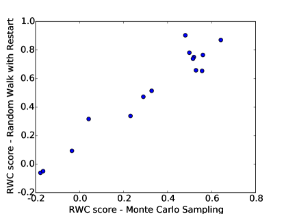
To verify that the new variant of the score works as expected, we compare it to the original version of the score (obtained via Monte Carlo sampling). The results are shown in Figure 5, from which it can be clearly seen that the new variant is almost identical to the original one. However, for the datasets considered in this work, we found empirically that this algorithm based on random walk with restart is up to times faster compared to the original Monte Carlo algorithm.
6.3. Betweenness
Let us consider the set of edges in the cut defined by the two partitions . This measure uses the notion of edge betweenness and how the betweenness of the cut differs from that of the other edges. Note that the cut here refers to the partioning obtained using METIS, as described in Section 3. Recall that the betweenness centrality of an edge is defined as
| (9) |
where is the total number of shortest paths between vertices in the graph and is the number of those shortest paths that include edge .
The intuition here is that, if the two partitions are well-separated, then the cut will consist of edges that bridge structural holes (Burt, 2009). In this case, the shortest paths that connect vertices of the two partitions will pass through the edges in the cut, leading to high betweenness values for edges in . On the other hand, if the two partitions are not well separated, then the cut will consist of strong ties. In this case, the paths that connect vertices across the two partitions will pass through one of the many edges in the cut, leading to betweenness values for similar to the rest of the graph.
Given the distributions of edge betweenness on the cut and the rest of the graph, we compute the KL divergence of the two distributions by using kernel density estimation to compute the PDF and sampling points from each of these distributions (with replacement). We define the Betweenness Centrality Controversy () measure as
| (10) |
which assumes values close to zero when the divergence is small, and close to one when the divergence is large.
6.4. Embedding
This measure is based on a low-dimensional embedding of graph produced by Gephi’s ForceAtlas2 algorithm (Jacomy et al., 2014) (the same algorithm used to produce the plots in Figures 3 and 4). According to Noack (2009), a force-directed embedding also maximizes modularity. Based on this observation, the two-dimensional layouts produced by this algorithm indicate a layout with maximum modularity.
Let us consider the two-dimensional embedding of vertices produced by ForceAtlas2. Given the partition , produced by the second stage of the pipeline, we calculate the following quantities:
-
and , the average embedded distance among pairs of vertices in the same partition, and respectively;
-
, the average embedded distance among pairs of vertices across the two partitions and .
Inpsired by the Davies-Bouldin (DB) index (Davies and Bouldin, 1979), we define the Embedding Controversy measure as
| (11) |
is close to one for controversial topics, corresponding to better-separated graphs and thus to higher degree of controversy, and close to zero for non-controversial topics.
6.5. Boundary Connectivity
This controversy measure was proposed by Guerra et al. (2013), and is based on the notion of boundary and internal vertices. Let be a vertex in partition ; belongs to the boundary of iff it is connected to at least one vertex of the other partition , and it is connected to at least one vertex in partition that is not connected to any vertex of partition . Following this definition, let be the set of boundary vertices for each partition, and the set of all boundary vertices. By contrast, vertices are said to be the internal vertices of partition (similarly for ). Let be all internal vertices in either partition. The reasoning for this measure is that, if the two partitions represent two sides of a controversy, then boundary vertices will be more strongly connected to internal vertices than to other boundary vertices of either partition. This intuition is captured in the formula
| (12) |
where is the number of edges between vertex and internal vertices , while is the number of edges between vertex and boundary vertices . Higher values of the measure correspond to higher degrees of controversy.
6.6. Dipole Moment
This controversy measure was presented by Morales et al. (2015), and is based on the notion of dipole moment that has its origin in physics. Let be a polarization value assigned to vertex . Intuitively, extreme values of (close to or ) correspond to users who belong most clearly to either side of the controversy. To set the values we follow the process described in the original paper (Morales et al., 2015): we set for the top- highest-degree vertices in each partition and , and set the values for the rest of the vertices by label-propagation. Let and be the number of vertices with positive and negative polarization values, respectively, and the absolute difference of their normalized size Moreover, let () be the average polarization value among vertices () and set as half their absolute difference, The dipole moment controversy measure is defined as
| (13) |
The rationale for this measure is that, if the two partitions and are well separated, then label propagation will assign different extreme () -values to the two partitions, leading to higher values of the measure. Note also that larger differences in the size of the two partitions (reflected in the value of ) lead to decreased values for the measure, which takes values between zero and one.
7. Controversy scores for users
The previous sections present measures to quantify the controversy of a conversation graph. In this section, we propose two measures to quantify the controversy of a single user in the graph. We denote this score as a real number that takes values in , with representing a neutral score, and representing the extremes for each side. Intuitively, the controversy score of a user indicates how ‘biased’ the user is towards a particular side on a topic. For instance, for the topic ‘abortion’, pro-choice/pro-life activist groups tweeting consistently about abortion would get a score close to -1/+1 while average users who interact with both sides would get a score close to zero. In terms of the positions of users on the retweet graph, a neutral user would lie in the ‘middle’, retweeting both sides, where as a user with a high controversy score lies exclusively on one side of the graph.
: The first proposed measure is an adaptation of . As input, we are given a user in the graph and a partitioning of the graph into two sides, defined as disjoint sets of vertices and . We then consider a random walk that starts – and restarts – at the given user u. Moreover, as with , the high-degree vertices on each side ( and ) are treated as dangling vertices – whenever the random walk reaches these vertices, it teleports to vertex with probability in the next step. To quantify the controversy of , we ask how often the random walk is found on vertices that belong to either side of the controversy. Specifically, for each user , we consider the conditional probabilities and , and estimate them by using the power iteration method. Assuming that user belongs to side of the controversy (i.e., ), their controversy is defined as:
| (14) |
Expected hitting time: The second proposed measure is also random-walk-based, but defined on the expected number of steps to hit the high-degree vertices on either side. Intuitively, a vertex is assigned a score of higher absolute value (closer to or ), if, compared to other vertices in the graph, it takes a very different time to reach a high-degree vertex on either side ( or ). Specifically, for each vertex in the graph, we consider a random walk that starts at , and estimate the expected number of steps, before the random walk reaches any high-degree vertex in . Considering the distribution of values of across all vertices , we define as the fraction of vertices with . We define similarly. Obviously, we have . The controversy score of a user is then defined as
| (15) |
Following this definition, a vertex that, compared to most other vertices, is very close to high-degree vertices will have ; and if the same vertex is very far from high-degree vertices , it will have – leading to a controversy score . The opposite is true for vertices that are far from but close to , leading to a controversy score .
7.1. Comparison with BiasWatch
BiasWatch (Lu et al., 2015) is a recently-proposed, light-weight approach to compute controversy scores for users on Twitter. At a high level, the BiasWatch approach consists of the following steps:
-
(1)
Hand pick a small set of seed hashtags to characterize the two sides of a controversy (e.g., #prochoice vs. #prolife);
-
(2)
Expand the seed set of hashtags based on co-occurrence;
-
(3)
Use the two sets of hashtags, identify strong partisans in the graph (users with high controversy score);
-
(4)
Assign controversy scores to other users via a simple label propagation approach.
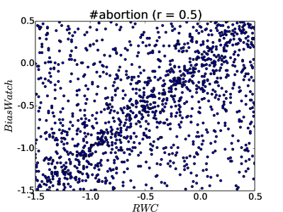
We compare the controversy scores obtained by our approaches to the ones obtained by BiasWatach999For BiasWatch we use parameters , , optimization method ‘COBYLA’, cosine similarity threshold , and nearest neighbors for hashtag extension. on two sets of datasets: tweets matching the hashtags () #obamacare, #guncontrol, and #abortion, provided by Lu et al. (2015) and () the datasets in Table 2. We compute the Pearson correlation between our measure based on Expected hitting time and BiasWatch; the results are shown in Figure 6. We omit the comparison with scores as they are almost identical to the ones by BiasWatch.
The authors also provide datasets which contain human annotations for controversy score (in the range [-2,2]) for 500 randomly selected users. We discretize our controversy scores to the same range, and compute the 5-category Fleiss’ value. The value is 0.35, which represents a ‘fair’ level of agreement, according to Landis and Koch (1977).
| Topic | Pearson correlation |
|---|---|
| #abortion | 0.51 |
| #obamacare | 0.48 |
| #guncontrol | 0.42 |
| #beefban | 0.41 |
| #baltimoreriots | 0.41 |
| #netanyahuspeech | 0.41 |
| #nemtsov | 0.38 |
| #indiana | 0.40 |
| #indiasdaughter | 0.39 |
| #ukraine | 0.40 |
Our approach thus provides results that are similar to the state-of-the-art approach. Our method also has two advantages over the BiasWatch measure: (i) Even though we do not make use of any content information in our measure, we perform at par; and (ii) provides an intuitive extension to our RWC measure. Given this unified framework, it is possible to design ways to reduce controversy, e.g., by connecting opposing views (Garimella et al., 2017b, a), and such a unified formulation can help us define principled objective functions to approach these tasks.
8. Experiments
In this section we report the results of the various configurations of the pipeline proposed in this paper. As previously stated, we omit results for the content and hybrid graph building approaches presented in Section 4, as they do not perform well. We instead focus on the retweet and follow graphs, and test all the measures presented in Section 6 on the topics described in Table 2. In addition, we test all the measures on a set of external datasets used in previous studies (Adamic and Glance, 2005; Conover et al., 2011; Guerra et al., 2013) to validate the measures against a known ground truth. Finally, we use an evolving dataset from Twitter collected around the death of Venezuelan president Hugo Chavez (Morales et al., 2015) to show the evolution of the controversy measures in response to high-impact events.
To avoid potential overfitting, we use only eight graphs as testbed during the development of the measures, half of them controversial (beefban, nemtsov, netanyahu, russia_march) and half non-controversial (sxsw, germanwings, onedirection, ultralive). This procedure resembles a 40/60% train/test split in traditional machine learning applications.101010A demo of our controversy measures can be found at https://users.ics.aalto.fi/kiran/controversy.
| Dataset | C? | |||||||
|---|---|---|---|---|---|---|---|---|
| Political blogs | ✓ | |||||||
| Twitter politics | ✓ | |||||||
| Gun control | ✓ | |||||||
| Brazil soccer | ✓ | |||||||
| Karate club | ✓ | |||||||
| Facebook university | ✗ | |||||||
| NYC teams | ✗ |
8.1. Twitter hashtags
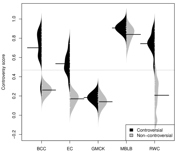
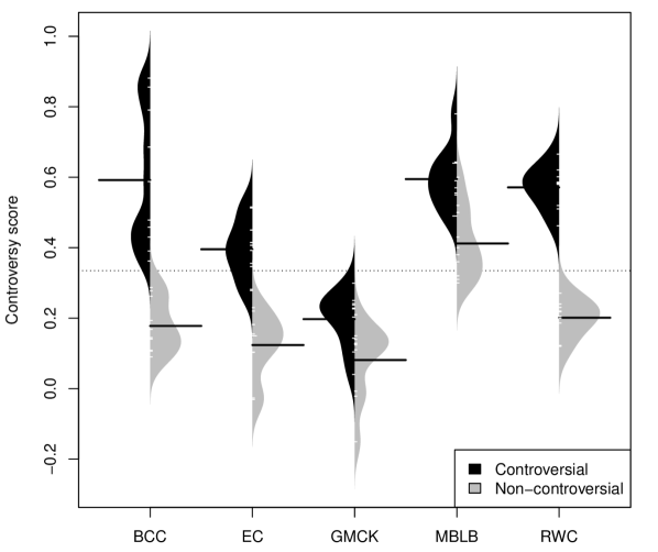
Figure 8 and Figure 8 report the scores computed by each measure for each of the hashtags, on the retweet and follow graph, respectively. Each figure shows a set of beanplots,111111A beanplot is an alternative to the boxplot for visual comparison of univariate data among groups. one for each measure. Each beanplot shows the estimated probability density function for a measure computed on the topics, the individual observations are shown as small white lines in a one-dimensional scatter plot, and the median as a longer black line. The beanplot is divided into two groups, one for controversial topics (left/dark) and one for non-controversial ones (right/light). A larger separation of the two distributions indicates that the measure is better at capturing the characteristics of controversial topics. For instance, this separation is fundamental when using the controversy score as a feature in a classification algorithm.
Figures 8 and 8 clearly show that is the best measure on our datasets. and show varying degrees of separation and overlap, although performs slightly better as the distributions are more concentrated, while has a very wide distribution. The two baselines and instead fail to separate the two groups. Especially on the retweet graph, the two groups are almost indistinguishable.
For all measures the median score of controversial topics is higher than for non-controversial ones. This result suggests that both graph building methods, retweet and follow, are able to capture the difference between controversial and non-controversial topics. Given the broad range of provenience of the topics covered by the dataset, and their different characteristics, the consistency of the results is very encouraging.
8.2. External datasets
We have shown that our approach works well on a number of datasets extracted in-the-wild from Twitter. But, how well does it generalize to datasets from different domains?
We obtain a comprehensive group of datasets kindly shared by authors of previous works: Political blogs, links between blogs discussing politics in the US (Adamic and Glance, 2005); Twitter politics, Twitter messages pertaining to the 2010 midterm election in US (Conover et al., 2011); and the following five graphs used in the study that introduced (Guerra et al., 2013), (a) Gun control, retweets about gun control after the shooting at the Sandy Hook school; (b) Brazil soccer, retweets about to two popular soccer teams in Brazil; (c) Karate club, the well-known social network by (Zachary, 1977); (d) Facebook university, a social graph among students and professors at a Brazilian university; (e) NYC teams, retweets about two New York City sports teams.
Table 3 shows a comparison of the controversy measures under study on the aforementioned datasets.121212The datasets provided by Guerra et al. (2013) are slightly different from the ones used in the original paper because of some irreproducible filtering used by the authors. We use the datasets provided to us verbatim. For each dataset we also report whether it was considered controversial in the original paper, which provides a sort of “ground truth” to evaluate the measures against.
All the measures are able to distinguish controversial graphs to some extent, in the sense that they return higher values for the controversial cases. The only exception is Karate club. Both and report low controversy scores for this graph. It is possible that the graph is too small for such random-walk-based measures to function properly. Conversely, is able to capture the desired behavior, which suggests that shortest-path and random-walk based measures might have a complementary function.
Interestingly, while the Political blogs datasets is often considered a gold standard for polarization and division in online political discussions, all the measures agree that it presents only a moderate level of controversy. Conversely, the Twitter politics dataset is clearly one of the most controversial one across all measures. This difference suggests that the measures are more geared towards capturing the dynamics of controversy as it unfolds on social media, which might differ from more traditional blogs. For instance, one such difference is the cost of an endorsement: placing a link on a blog post arguably consumes more mental resources than clicking on the retweet button.
For the ‘Gun control’ dataset, Guerra et al. need to manually distinguish three different partitions in the graph: gun rights advocates, gun control supporters, and moderates. Our pipeline is able to find the two communities with opposing views (grouping together gun control supporters and moderates, as suggested in the original study) without any external help. All measures agree with the conclusions drawn in the original paper that this topic is highly controversial.
Note that even though from the results in Table 3, , and appear to outperform each other, it is not the case. These methods are not comparable, meaning, a score of 0.5 for is not the same as a 0.5 for . The insight we can draw from these results is that our methods are able to discern a controversial topic from a non-controversial one consistently, irrespective of the domain, and are able to do so more reliably than existing methods ( and ).
8.3. Evolving controversy
We have shown that our approach also generalizes well to datasets from different domains. But in a real deployment the measures need to be computed continuously, as new data arrives. How well does our method work in such a setting? And how do the controversy measures evolve in response to high-impact events?
To answer these questions, we use a dataset from the study that introduced (Morales et al., 2015). The dataset comprises Twitter messages pertaining to political events in Venezuela around the time of the death of Hugo Chavez (Feb-May 2013). The authors built a retweet graph for each of the 56 days around the day of the death (one graph per day).
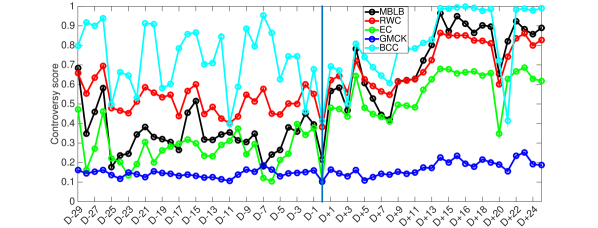
Figure 9 shows how the intensity of controversy evolves according to the measures under study (which occurs on day ‘D’). The measure proposed in the original paper, , which we use as ‘ground truth’, shows a clear decrease of controversy on the day of the death, followed by a progressive increase in the controversy of the conversation. The original interpretation states that on the day of the death a large amount of people, also from other countries, retweeted news of the event, creating a single global community that got together at the shock of the news. After the death, the ruling and opposition party entered in a fiery discussion over the next elections, which increased the controversy.
All the measures proposed in this work show the same trend as . Both and follow very closely the original measure (Pearson correlation coefficients of and , respectively), while shows a more jagged behavior in the first half of the plot (), due to the discrete nature of shortest paths. All measures however present a dip on day ‘D’, an increase in controversy in the second half, and another dip on day ‘D+20’. Conversely, reports an almost constant moderate value of controversy during the whole period (), with barely noticeable peaks and dips. We conclude that our measures generalize well also to the case of evolving graphs, and behave as expected in response to high-impact events.
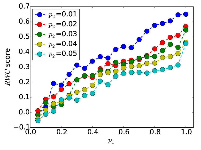
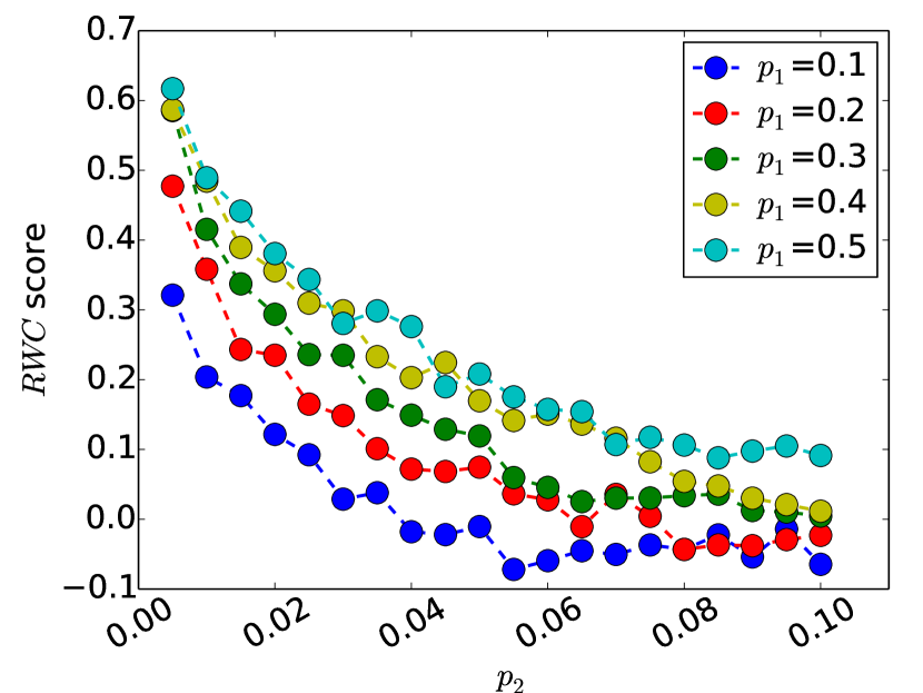
8.4. Simulations
Given that is the best-performing score among the ones in this study, we focus our attention solely on it henceforth. To measure the robustness of the score, we generate random Erdös-Rényi graphs with varying community structure, and compute the score on them. Specifically, to mimic community structure, we plant two separate communities with intra-community edge probability . That is, defines how dense these communities are within themselves. We then add random edges between these two communities with probability . Therefore, defines how connected the two communities are. A higher value of and a lower value of create a clearer two-community structure.
Figure 10 shows the score for random graphs of vertices for two different settings: plotting the score as a function of while fixing (Figure 10a), and vice-versa (Figure 10b). The score reported is the average over ten runs. We observe a clear pattern: the score increases as we increase the density within the communities, and decreases as we add noise to the community structure. The effects of the parameters is also expected, for a given value of , a smaller value of generates a larger score, as the communities are more well separated. Conversely, for a given value of , a larger value of generates a larger scores, as the communities are denser.
8.5. Controversy detection in the wild
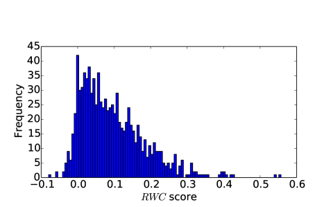
In most of the experiments presented so far, we hand-picked known topics which are controversial and showed that our method is able to separate them from the non-controversial topics. To check whether our system works in a real-world setting, we deploy it in the wild to explore actual topics of discussion on Twitter and detect the ones that are controversial. More specifically, we obtain daily trending hashtags (both US and worldwide) on the platform for a period of three months (June 25 – September 19, 2015). Then, we obtain all tweets that use these hashtags, and create retweet graphs (as described in Section 4). Finally, we apply the measure on these conversation graphs to identify controversial hashtags.
The results can be explored in our online demo (Garimella et al., 2016a).131313https://users.ics.aalto.fi/kiran/controversy/table.php. To mention a few examples, our system was able to identify the following controversial hashtags:
-
#whosiburningblackchurches (score ): A hashtag about the burning of predominantly black churches.141414https://erlc.com/article/explainer-whoisburningblackchurches.
-
#communityshield (score ): Discussion between the fans of two sides of a soccer game.151515https://en.wikipedia.org/wiki/2015_FA_Community_Shield.
-
#nationalfriedchickenday (score ): A debate between meat lovers and vegetarians about the ethics of eating meat.
Moreover, based on our experience with our system, most hashtags that are reported as trending on Twitter concern topics that are not controversial. Figure 11 shows the histogram of the score over the 924 trending hashtags we collected. A majority of these hashtags have an score around zero.
9. Content
In this section we explore alternative approaches to measuring controversy that use only the content of the discussion rather than the structure of user interactions. As such, these methods do not fit in the pipeline described in Section 3. The question we address is “does content help in measuring the controversy of a topic?” In particular, we test two types of features extracted from the content. The first is a typical IR-inspired bag-of-words representation. The second involves sentiment-related features, extracted with NLP tools.
9.1. Bag of words
We take as input the raw content of the social media posts – in our case, the tweets pertaining to a specific topic. We represent each tweet as a vector in a high-dimensional space composed of the words used in the whole topic, after standard preprocessing used in IR (lowercasing, stopword removal, stemming). Following the lines of our main pipeline, we group these vectors in two clusters by using CLUTO (Karypis, 2002) with cosine distance.
The underlying assumption is that the two sides, while sharing the use of the hashtag for the topic, use different vocabularies in reference to the issue at hand. For example, for #beefban a side may be calling for “freedom” while the opposing one for “respect.” We use KL divergence as a measure of distance between the vocabularies of the two clusters, and the I2 measure (Maulik and Bandyopadhyay, 2002) of clustering heterogeneity.
We use an unpaired Wilcoxon rank-sum test at the significance level, but we are unable to reject the null hypothesis that there is no difference in these measures between the controversial and non-controversial topics. Therefore, there is not enough signal in the content representation to discern between controversial and non-controversial topics with confidence. This result suggests that the bag-of-words representation of content is not a good basis for our task. It also agrees with our earlier attempts to use content to build the graph used in the pipeline (see Section 4) – which suggests that using content for the task of quantifying controversy might not be straightforward.
9.2. Sentiment analysis
Next, we resort to NLP techniques for sentiment analysis to analyze the content of the discussion. We use SentiStrength (Thelwall, 2013) trained on tweets to give a sentiment score in to each tweet for a given topic. In this case we do not try to cluster tweets by their sentiment. Rather, we analyze the difference in distribution of sentiment between controversial and non-controversial topics.
While it is not possible to say that controversial topics are more positive or negative than non-controversial ones, we can detect a difference in their variance. Indeed, controversial topics have a higher variance than non-controversial ones, as shown in Figure 12. Controversial ones have a variance of at least , while non-controversial ones have a variance of at most .
In practice, the “tones” with which controversial topics are debated are stronger, and sentiment analysis is able to detect this. While this signal is clear, it is not straightforward to incorporate it into the measures based on graph structure. Moreover, this feature relies on technologies that do not work reliably for languages other than English and hence cannot be applied for topics such as #russia_march.

10. Discussion
The task we tackle in this work is certainly not an easy one, and this study has some limitations, which we discuss in this section. We also report a set of negative results that we produced while coming up with the measures presented. We believe these results will be very useful in steering this research topic towards a fruitful direction. Table 4 provides a summary of the various graph building strategies and controversy measures we tried for quantifying controversy.
| Graphs | Retweet |
|---|---|
| Follow | |
| Content | |
| Mention | |
| Hybrid (content + retweet, mention + retweet) | |
| Measures | Random Walk |
| Edge Betweenness | |
| Embedding | |
| Boundary Connectivity | |
| Dipole Moment | |
| Cut-based Measures (conductance, cut ratio) | |
| Sentiment Analysis | |
| Modularity | |
| SPID |
10.1. Limitations
Twitter only. We present our findings mostly on datasets coming from Twitter. While this is certainly a limitation, Twitter is one of the main venues for online public discussion, and one of the few for which data is available. Hence, Twitter is a natural choice. In addition, our measures generalize well to datasets from other social media and the Web.
Choice of data. We manually pick the controversial topics in our dataset, which might introduce bias. In our choice we represent a broad set of typical controversial issues coming from religious, societal, racial, and political domains. Unfortunately, ground truths for controversial topics are hard to find, especially for ephemeral issues. However, the topics are unanimously judged controversial by the authors. Moreover, the hashtags represent the intuitive notion of controversy that we strive to capture, so human judgement is an important ingredient we want to use.
Overfitting. While this work presents the largest systematic study on controversy in social media so far, we use only 20 topics for our main experiment. Given the small number of examples, the risk of overfitting our measures to the dataset is real. We reduce this risk by using only of the topics during the development of the measures. Additionally, our measures agree with previous independent results on external datasets, which further decreases the likelihood of overfitting.
Reliance on graph partitioning. Our pipeline relies on a graph partitioning stage, whose quality is fundamental for the proper functioning of the controversy measures. Given that graph partitioning is a hard but well studied problem, we rely on off-the-shelf techniques for this step. A measure that bypasses this step entirely is highly desirable, and we report a few unsuccessful attempts in the next subsection.
Multisided controversies. Not all controversies involve only two sides with opposing views. Some times discussions are multifaceted, or there are three or more competing views on the field. The principles behind our measures neatly generalize to multisided controversies. However, in this case the graph partitioning component needs to automatically find the optimal number of partitions. We defer experimental study of such cases to an extended version of this paper.
Evaluation. Defining what is controversial/polarized can be subjective. There are many ways to define what is controversial, depending on the context, subject and field of study, e.g. See (Bramson et al., 2016) for around a dozen ways to define polarization. Our evaluation is based on our intuitive labelling that a topic is controversial/polarized. This might not always be true, but given that the alternative is to hand-label/survey the thousands of users, we presume that this assumption is reasonable for developing methods that can be adapted to large scale systems.
10.2. Negative results
We briefly review a list of methods that failed to produce reliable results and were discarded early in the process of refining our controversy measures.
Mentions graph. Conover et al. (2011) rely on the mention graph in Twitter to detect controversies. However, in our dataset the mention graphs are extremely sparse given that we focus on short-lived events. Merging the mentions into the retweet graph does not provide any noticeable improvement.
Previous studies have also shown that people retweet similar ideologies but mention across ideologies (Bessi et al., 2014). We exploit this intuition by using correlation clustering for graph partitioning, with negative edges for mentions. Alas, the results are qualitatively worse than those obtained by METIS.
Cuts. Simple measures such as size of the cut of the partitions do not generalize across different graphs. Conductance (in all its variants) also yields poor results. Prior work identifies controversies by comparing the structure of the graph with randomly permuted ones (Conover et al., 2011). Unfortunately, we obtain equally poor results by using the difference in conductance with cuts obtained by METIS and by random partitions.
Community structure. Good community structure in the conversation graph is often understood as a sign that the graph is polarized or controversial. However, this is not always the case. We find that both assortativity and modularity (which have been previously used to identify controversy) do not correlate with the controversy scores, and are not good predictors for how controversial a topic is. The work by Guerra et al. (2013) presents clear arguments and examples of why modularity should be avoided.
Partitioning. As already mentioned, bypassing the graph partitioning to compute the measure is desirable. We explore the use of the all pairs expected hitting time computed by using SimRank (Jeh and Widom, 2002). We compute the SPID (ratio of variance to mean) of this distribution, however results are mixed.
10.3. Conclusions
In this paper, we performed the first large-scale systematic study for quantifying controversy in social media. We have shown that previously-used measures are not reliable and demonstrated that controversy can be identified both in the retweet and topic-induced follow graph. We have also shown that simple content-based representations do not work in general, while sentiment analysis offers promising results.
Among the measures we studied, the random-walk-based most neatly separates controversial topics from non-controversial ones. Besides, our measures gracefully generalize to datasets from other domains and previous studies.
This work opens several avenues for future research. First, it is worth exploring alternative approaches and testing additional features, such as, following a generative-model-based approach, or exploiting the temporal evolution of the discussion of a topic (Garimella et al., 2017c).
From the application point of view, the controversy score can be used to generate recommendations that foster a healthier “news diet” on social media. Given the ever increasing impact of polarizing figures in our daily politics and the rise in polarization in the society (Dimock et al., 2014; Garimella and Weber, 2017), it is important to not restrict ourselves to our own ‘bubbles’ or ‘echo chambers’ (Pariser, 2011; Sunstein, 2009). Our methods for identifying controversial topics can be used as building blocks for designing such systems to reduce controversy on social media (Garimella et al., 2017b, a) by connecting social media users with content outside their own bubbles.
Finally, polarization by itself may not be a wholly negative phenomenon. Several studies (Mutz, 2002; Dahlberg, 2007) argue that a democracy needs deliberation, and polarization enable such a deliberation to happen in the public, to a certain extent, thus informing people about the issues and arguments from different sides. Given such a setting, it is of paramount importance to understand to what extent a discussion is polarized, so that things do not spiral out of control, or create isolated echo chambers. Our paper contributes methods that are useful in this setting, and enable measuring the degree of polarization of a topic in a domain-agnostic fashion.
Acknowledgements. This work has been supported by the Academy of Finland project “Nestor” (286211) and the EC H2020 RIA project “SoBigData” (654024).
References
- (1)
- Adamic and Glance (2005) Lada A Adamic and Natalie Glance. 2005. The political blogosphere and the 2004 US election: divided they blog. In LinkKDD. 36–43.
- Akoglu (2014) Leman Akoglu. 2014. Quantifying Political Polarity Based on Bipartite Opinion Networks. In ICWSM.
- Amin et al. (2017) Md Tanvir Al Amin, Charu Aggarwal, Shuochao Yao, Tarek Abdelzaher, and Lance Kaplan. 2017. Unveiling Polarization in Social Networks: A Matrix Factorization Approach. Technical Report. IEEE.
- An et al. (2014) Jisun An, Daniele Quercia, and Jon Crowcroft. 2014. Partisan sharing: Facebook evidence and societal consequences. In COSN. 13–24.
- Bessi et al. (2014) Alessandro Bessi, Guido Caldarelli, Michela Del Vicario, Antonio Scala, and Walter Quattrociocchi. 2014. Social Determinants of Content Selection in the Age of (Mis)Information. In Social Informatics. 259–268.
- Bramson et al. (2016) Aaron Bramson, Patrick Grim, Daniel J Singer, Steven Fisher, William Berger, Graham Sack, and Carissa Flocken. 2016. Disambiguation of social polarization concepts and measures. The Journal of Mathematical Sociology 40, 2 (2016), 80–111.
- Burt (2009) Ronald S Burt. 2009. Structural holes: The social structure of competition. Harvard university press.
- Choi et al. (2010) Yoonjung Choi, Yuchul Jung, and Sung-Hyon Myaeng. 2010. Identifying controversial issues and their sub-topics in news articles. In Pacific-Asia Workshop on Intelligence and Security Informatics. Springer, 140–153.
- Coletto et al. (2017) Mauro Coletto, Kiran Garimella, Aristides Gionis, and Claudio Lucchese. 2017. A Motif-based Approach for Identifying Controversy. In Proceedings of the 10th International on Conference on Web and Social Media. AAAI.
- Conover et al. (2011) Michael Conover, Jacob Ratkiewicz, Matthew Francisco, Bruno Gonçalves, Filippo Menczer, and Alessandro Flammini. 2011. Political Polarization on Twitter. In ICWSM.
- Dahlberg (2007) Lincoln Dahlberg. 2007. Rethinking the fragmentation of the cyberpublic: from consensus to contestation. New media & society 9, 5 (2007), 827–847.
- Davies and Bouldin (1979) David L. Davies and Donald W. Bouldin. 1979. A Cluster Separation Measure. IEEE TPAMI 1, 2 (1979), 224–227.
- Dimock et al. (2014) Michael Dimock, Carroll Doherty, Jocelyn Kiley, and Russ Oates. 2014. Political polarization in the American public: How increasing ideological uniformity and partisan antipathy affect politics, compromise and everyday life. Washington, DC: Pew Research Center (2014).
- Dori-Hacohen and Allan (2015) Shiri Dori-Hacohen and James Allan. 2015. Automated controversy detection on the web. In European Conference on Information Retrieval. Springer, 423–434.
- Doris-Down et al. (2013) Abraham Doris-Down, Husayn Versee, and Eric Gilbert. 2013. Political blend: an application designed to bring people together based on political differences. In C&T. 120–130.
- Esterling et al. (2010) Kevin M Esterling, Archon Fung, and Taeku Lee. 2010. How Much Disagreement is Good for Democratic Deliberation? The CaliforniaSpeaks Health Care Reform Experiment. SSRN (2010).
- Feng et al. (2015) Wei Feng, Jiawei Han, Jianyong Wang, Charu Aggarwal, and Jianbin Huang. 2015. STREAMCUBE: Hierarchical Spatio-temporal Hashtag Clustering for Event Exploration over the Twitter Stream. In ICDE.
- Flaxman et al. (2015) Seth R Flaxman, Sharad Goel, and Justin M Rao. 2015. Filter Bubbles, Echo Chambers, and Online News Consumption. (2015).
- Garimella et al. (2016a) Kiran Garimella, Gianmarco De Francisci Morales, Aristides Gionis, and Michael Mathioudakis. 2016a. Exploring Controversy in Twitter. In CSCW [demo]. 33–36.
- Garimella et al. (2016b) Kiran Garimella, Gianmarco De Francisci Morales, Aristides Gionis, and Michael Mathioudakis. 2016b. Quantifying Controversy in Social Media. In WSDM. 33–42.
- Garimella et al. (2017a) Kiran Garimella, Gianmarco De Francisci Morales, Aristides Gionis, and Michael Mathioudakis. 2017a. Factors in Recommending Contrarian Content on Social Media. In WebSci.
- Garimella et al. (2017b) Kiran Garimella, Gianmarco De Francisci Morales, Aristides Gionis, and Michael Mathioudakis. 2017b. Reducing Controversy by Connecting Opposing Views. In WSDM. 81–90.
- Garimella et al. (2017c) Kiran Garimella, Gianmarco De Francisci Morales, Aristides Gionis, and Michael Mathioudakis. 2017c. The Effect of Collective Attention on Controversial Debates on Social Media. In WebSci. 43–52.
- Garimella and Weber (2017) Kiran Garimella and Ingmar Weber. 2017. A Long-Term Analysis of Polarization on Twitter. In ICWSM.
- Graells-Garrido et al. (2013) Eduardo Graells-Garrido, Mounia Lalmas, and Daniele Quercia. 2013. Data portraits: Connecting people of opposing views. arXiv preprint arXiv:1311.4658 (2013).
- Grevet et al. (2014) Catherine Grevet, Loren G Terveen, and Eric Gilbert. 2014. Managing political differences in social media. In CSCW. 1400–1408.
- Guerra et al. (2013) Pedro Henrique Calais Guerra, Wagner Meira Jr, Claire Cardie, and Robert Kleinberg. 2013. A Measure of Polarization on Social Media Networks Based on Community Boundaries. In ICWSM.
- Jacomy et al. (2014) Mathieu Jacomy, Tommaso Venturini, Sebastien Heymann, and Mathieu Bastian. 2014. ForceAtlas2, a continuous graph layout algorithm for handy network visualization designed for the Gephi software. (2014).
- Jang et al. (2016) Myungha Jang, John Foley, Shiri Dori-Hacohen, and James Allan. 2016. Probabilistic Approaches to Controversy Detection. In Proceedings of the 25th ACM International on Conference on Information and Knowledge Management. ACM, 2069–2072.
- Jeh and Widom (2002) Glen Jeh and Jennifer Widom. 2002. SimRank: A measure of structural-context similarity. In KDD. 538–543.
- Karypis (2002) George Karypis. 2002. CLUTO - A clustering toolkit. (2002).
- Karypis and Kumar (1995) George Karypis and Vipin Kumar. 1995. METIS - Unstructured Graph Partitioning and Sparse Matrix Ordering System. (1995).
- Klenner et al. (2014) Manfred Klenner, Michael Amsler, Nora Hollenstein, and Gertrud Faaß. 2014. Verb polarity frames: a new resource and its application in target-specific polarity classification. In KONVENS. 106–115.
- Kulshrestha et al. (2015) Juhi Kulshrestha, Muhammad Bilal Zafar, Lisette Espin Noboa, Krishna P Gummadi, and Saptarshi Ghosh. 2015. Characterizing Information Diets of Social Media Users. In ICWSM.
- LaCour (2012) Michael LaCour. 2012. A balanced news diet, not selective exposure: Evidence from a direct measure of media exposure. SSRN (2012).
- Landis and Koch (1977) J Richard Landis and Gary G Koch. 1977. The measurement of observer agreement for categorical data. biometrics (1977), 159–174.
- Lu et al. (2015) Haokai Lu, James Caverlee, and Wei Niu. 2015. BiasWatch: A Lightweight System for Discovering and Tracking Topic-Sensitive Opinion Bias in Social Media. In CIKM. 213–222.
- Maulik and Bandyopadhyay (2002) Ujjwal Maulik and Sanghamitra Bandyopadhyay. 2002. Performance evaluation of some clustering algorithms and validity indices. IEEE TPAMI 24, 12 (2002), 1650–1654.
- Mejova et al. (2014) Yelena Mejova, Amy X Zhang, Nicholas Diakopoulos, and Carlos Castillo. 2014. Controversy and Sentiment in Online News. arXiv preprint arXiv:1409.8152 (2014).
- Morales et al. (2015) AJ Morales, J Borondo, JC Losada, and RM Benito. 2015. Measuring political polarization: Twitter shows the two sides of Venezuela. Chaos 25, 3 (2015).
- Munson et al. (2013) Sean A Munson, Stephanie Y Lee, and Paul Resnick. 2013. Encouraging Reading of Diverse Political Viewpoints with a Browser Widget.. In ICWSM.
- Mutz (2002) Diana C Mutz. 2002. The consequences of cross-cutting networks for political participation. American Journal of Political Science (2002), 838–855.
- Noack (2009) Andreas Noack. 2009. Modularity clustering is force-directed layout. Physical Review E 79, 2 (2009), 026102.
- Pariser (2011) Eli Pariser. 2011. The filter bubble: What the Internet is hiding from you. Penguin UK.
- Popescu and Pennacchiotti (2010) Ana-Maria Popescu and Marco Pennacchiotti. 2010. Detecting controversial events from twitter. In Proceedings of the 19th ACM international conference on Information and knowledge management. ACM, 1873–1876.
- Ruan et al. (2013) Yiye Ruan, David Fuhry, and Srinivasan Parthasarathy. 2013. Efficient community detection in large networks using content and links. In WWW. 1089–1098.
- Sunstein (2009) Cass R Sunstein. 2009. Republic. com 2.0. Princeton University Press.
- Thelwall (2013) Mike Thelwall. 2013. Heart and soul: Sentiment strength detection in the social web with SentiStrength. In CyberEmotions. 1–14.
- Tsytsarau et al. (2011) Mikalai Tsytsarau, Themis Palpanas, and Kerstin Denecke. 2011. Scalable detection of sentiment-based contradictions. DiversiWeb, WWW 2011 (2011).
- Zachary (1977) Wayne Zachary. 1977. An Information Flow Model for Conflict and Fission in Small Groups. J. of Anthropological Research 33 (1977), 452–473.