Temperature diagnostics of the solar atmosphere using SunPy
Abstract
The solar atmosphere is a hot (~1MK), magnetised plasma of great interest to physicists. There have been many previous studies of the temperature of the Sun’s atmosphere ([Plowman2012], [Wit2012], [Hannah2012], [Aschwanden2013], etc.). Almost all of these studies use the SolarSoft software package written in the commercial Interactive Data Language (IDL), which has been the standard language for solar physics. The SunPy project aims to provide an open-source library for solar physics. This work presents (to the authors’ knowledge) the first study of its type to use SunPy rather than SolarSoft.
This work uses SunPy to process multi-wavelength solar observations made by the Atmospheric Imaging Assembly (AIA) instrument aboard the Solar Dynamics Observatory (SDO) and produce temperature maps of the Sun’s atmosphere. The method uses SunPy’s utilities for querying databases of solar events, downloading solar image data, storing and processing images as spatially aware Map objects, and tracking solar features as the Sun rotates. An essential consideration in developing this software is computational efficiency due to the large amount of data collected by AIA/SDO, and in anticipating new solar missions which will result in even larger sets of data. An overview of the method and implementation is given, along with tests involving synthetic data and examples of results using real data for various regions in the Sun’s atmosphere.
Index Terms:
solar, corona, data mining, image processing1 Introduction
The solar corona is a hot (~1MK) magnetised plasma. Such an environment, difficult to reproduce in a laboratory, is of great importance in physics (e.g. basic plasma physics, development of nuclear fusion). It is important also in the context of general astronomy, in understanding other stars and the mechanisms which heat the corona - considered one of the major unanswered questions in astronomy. On a more practical level, with our society’s growing reliance on space-based technology, we are increasingly prone to the effects of geo-effective solar phenomena such as flares and Coronal Mass Ejections (CMEs). These can damage the electronic infrastructure which plays an essential role in our modern society. In order to be able to predict these phenomena, we must first understand their formation and development. The sources of energy for these events can cause localised heating in the corona, and coronal temperature distributions are therefore a widely studied topic within solar physics. Active regions, which are regions of newly-emerged magnetic flux from the solar interior associated with sunspots, are of particular interest since they are often the source regions for the most damaging eruptive events and the distribution of temperatures can give us unique and valuable information on the initial conditions of eruptions.
It is not yet technologically feasible to send probes into the low coronal environment. Our current understanding of the corona is based on remote-sensing observations across the electromagnetic spectrum from radio to X-ray. Previous studies have found coronal temperatures ranging from ~0.8MK in coronal hole regions, ~1MK in quiet Sun regions and from 1-3MK within active regions. Eruptive events and flares can produce even higher temperatures in small regions for a short period of time (see, e.g., [Awasthi2014]). This work is based exclusively on images of the low corona taken in Extreme Ultra-Violet (EUV) using AIA/SDO [Lemen2011]. AIA allows us, for the first time, to produce reliable maps of the coronal temperature with very fine spatial and temporal resolution.
An overview of the AIA instrument is given in Section 2, along with an introduction to the theory of estimating temperature from spectral observation. The method is tested by creating synthetic AIA data created from a coronal emission model in Section 3. The method is applied to AIA data in Section 4 and the results compared to those of previous studies. Discussion and Conclusions are given in Section 5.
2 Instrumentation & Method
2.1 Overview of AIA/SDO
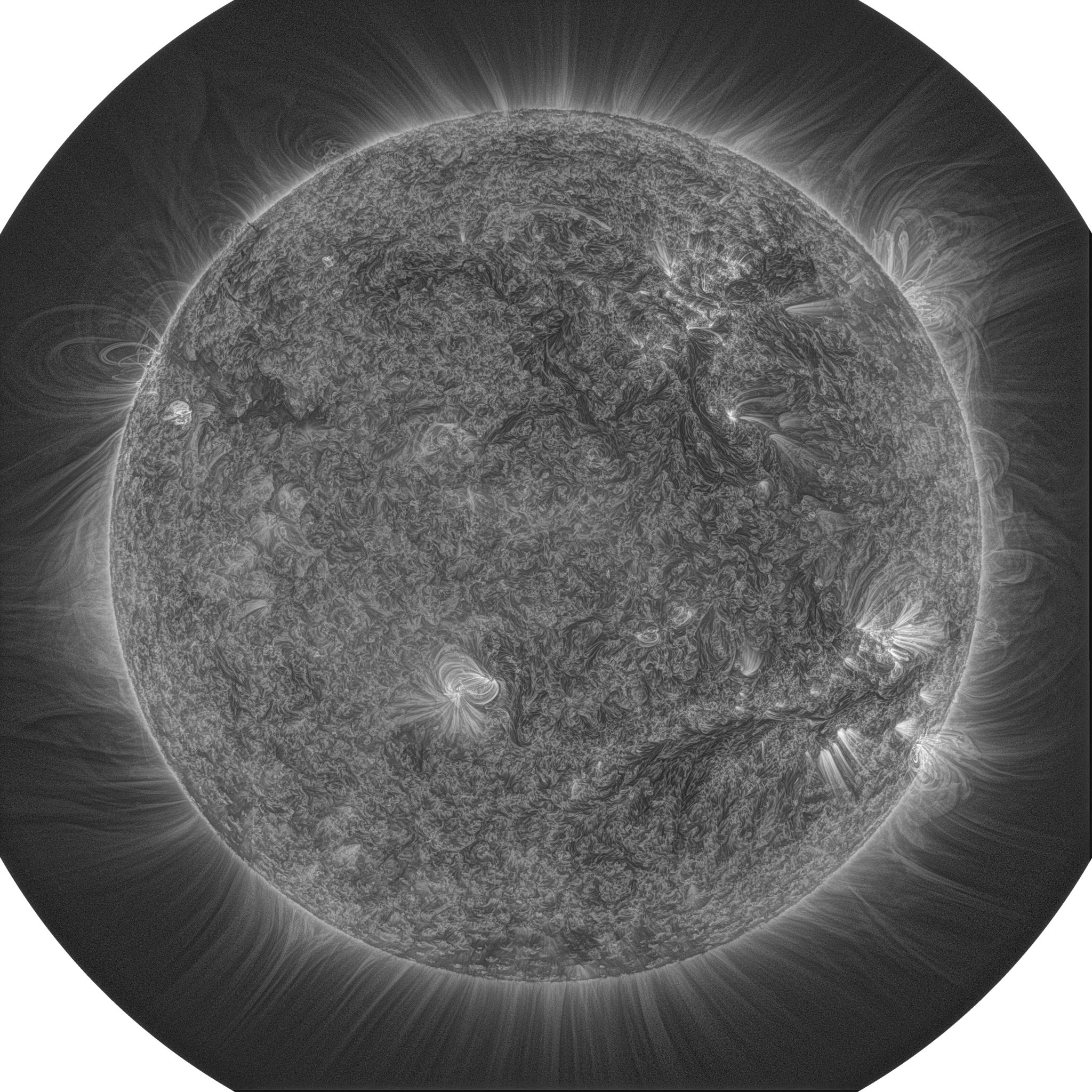
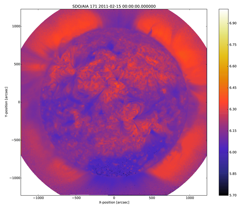
The AIA on NASA’s SDO satellite [Lemen2011] was launched in February 2010 and started making regular observations in March 2010. AIA takes a 4096 x 4096 full-disk image of the corona in each of ten wavelength channels every ~12 seconds, with a resolution of ~1.2 arcsec per pixel. Seven of these channels observe within the EUV wavelength range, of which six are each dominated by emission from a different Fe ion. Figure 1 shows an example AIA image using the 17.1nm channel. It has been processed to enhance smaller-scale features using a newly-developed method [Morgan2014]. The intensity measured in each of the six narrow-band Fe channels (9.4nm, 13.1nm, 17.1nm, 19.3nm, 21.1nm and 33.5nm) is dominated by a spectral line of iron at a specific stage of ionisation. Simply speaking, therefore, they correspond to different temperatures of the emitting plasma. The fact that there are six channels observing simultaneously means that the temperature of the corona can be effectively constrained [Guennou2012]. Another advantage is that relative elemental abundances do not need to be considered when using emission from only one element, thus reducing the associated errors. AIA is therefore beginning to be widely used for this type of study (e.g. [Aschwanden2013]), as its very high spatial, temporal and thermal resolution make it an excellent source of data for investigating the temperatures of small-scale and/or dynamic features in the corona, as well as for looking at global and long-term temperature distributions.
It is important that the large amount of data produced by AIA can be analysed quickly. A way of calculating coronal temperatures in real-time or near real-time would be extremely useful as it would allow temperature maps to be produced from AIA images as they are taken. Computational efficiency was therefore one of our most important criteria when designing the method for use with AIA data.
2.2 The Differential Emission Measure
Coronal emission lines originate from a wide range of ions which form at different temperatures. By using multi-wavelength observations of the corona to compare the brightnesses of the emission due to these ions, one can infer the temperature of the corona at the location of the emission. Since the plasma may have a range of temperatures rather than being isothermal, it is common to describe the amount of plasma emitting along a given line-of-sight (LOS) as a function of temperature. This function is called the Differential Emission Measure (DEM). The DEM is usally expressed in terms of the electron density, (which is not known unless already determined by some other method):
where is the distance along the LOS and is electron temperature. Determining the DEM therefore gives us an estimate of the column electron density. The width of the DEM provides a measure of how multi-thermal the plasma is. The temperature of peak of the DEM is the dominant temperature, i.e.: the temperature of the majority of the plasma.
The intensity measured by pixel of a particular channel on an instrument can be expressed as a convolution of the DEM and the temperature response function of the instrument:
| (1) |
The temperature response combines the wavelength response of the instrument and the contribution function, which describes the emission of the plasma at a given temperature based on atomic physics models. Unfortuately, (1) is an ill-posed problem and as such there exists no unique solution without imposing physical contraints [Judge1997]. Multiple schemes have been designed to invert this equation and infer the DEM by applying various physical assumptions. However, these assumptions are sometimes difficult to justify and the accuracy of the results is also reduced by the typically high errors on solar measurements. The physical constraints assumed by this method are discussed in Section 2.5.
This work presents an extremely fast method of estimating the temperature of coronal plasma from AIA images. This method is implemented using the SunPy solar physics library (www.sunpy.org) and produces results comparable to those of other methods but in a fraction of the time. The current implementation of the method is designed primarily with efficiency in mind.
2.3 Preprocessing
Level 1.0 AIA data were obtained using SunPy’s wrappers around the Virtual Solar Observatory. These data were corrected for exposure time and further processed to level 1.5. This extra level of processing provides the correct spatial co-alignment necessary for a quantitative comparison of the different channels. To this end, the AIA images used were processed using the SunPy aiaprep() function to ensure that all images used were properly rescaled and co-aligned. aiaprep() rotates the images so that solar north points to the top of the image, scales them so that each pixel is exactly 0.6 arcsec across (in both the x and y directions), and recentres them so that solar centre coincides with the centre of the image. This is achieved using an affine transform and bi-cubic interpolation. All images were then normalised by dividing the intensity measured in each pixel by the intensity in the corresponding pixel in the 17.1nm image. The 17.1nm image was therefore 1 in all pixels, and the images from all other channels are given as a ratio of the 17.1nm intensity.
2.4 Temperature response functions
Temperature response functions can be calculated for each of the AIA channels using the equation:
| (2) |
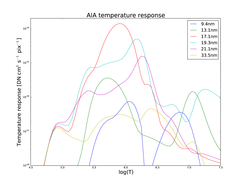
where is the wavelength, is the wavelength response of each channel and is the contribution function describing how radiation is emitted by the coronal plasma. For this work the AIA temperature response functions were obtained using the IDL aia_get_response function (for which no equivalent exists yet in SunPy) and an empirical correction factor of 6.7 was applied to the 9.4nm response function for , following the work of [Aschwanden2011]. These response functions were saved and reloaded into Python for use with this method. As with the AIA images, each of these response functions was normalised to the 17.1nm response by dividing the value at each temperature by the corresponding value for 17.1nm. The response functions used in this method (before normalisation) are shown in Figure 2.
2.5 DEM-finding procedure
The general method for estimating the DEM is an iterative procedure which systematically tests a range of possible DEMs. Each DEM is substituted into (1) to produce a synthetic pixel value for each AIA wavelength channel (). This expected outcome is then compared to the actual values measured for all pixel positions () in each wavelength, giving a goodness-of-fit value for each pixel for a given DEM (equation 3), defined by the difference in pixel values averaged over all wavelength channels:
| (3) |
Since the synthetic emission values do not change unless one wishes to apply different assumptions which affect the temperature response (electron density, ionisation equilibrium, etc.), the calculation time for the method can be reduced by saving these emission values and reusing them for each comparison. By repeating this calculation with a number of assumed DEMs, the DEM corresponding to the smallest goodness-of-fit value provides an estimate of the actual plasma temperature distribution.
For this kind of iterative method to find a solution within a feasible amount of time, a general DEM profile must be assumed. A Gaussian profile is a good choice for the following reasons:
-
•
it can be fully described by only three parameters, i.e.: the mean, variance and amplitude of the Gaussian (henceforth the peak temperature, width and height of the DEM), which correspond to the dominant temperature, the degree of multithermality and the peak emission measure respectively. Because of this parameterisation, a Gaussian is well-suited to this type of method and is also a useful way to describe important properties of the plasma even if it does not perfectly represent the actual distribution of temperatures;
-
•
other authors have typically found multithermal DEMs, but with relatively narrow widths ([Warren2008]). [Aschwanden2011] found that a narrow Gaussian DEM fit the observations with for 66% of cases studied, so this distribution should provide a good approximation for the plasma in the majority of pixels. In particular, it is likely that active region loops have a distribution of temperature and density which makes a narrow Gaussian a physically sensible choice for the shape of the plasma DEM. It is likely that emission from loops will dominate the measured emission in the corresponding pixels;
-
•
since other studies have used a Gaussian DEM, using the same shape in this work allows a direct comparison between the relative merits of the methods themselves, without any disparity in the results caused by different DEM profiles.
Though this particular study uses a Gaussian DEM, the method could also be used with DEMs of any other form, such as a delta function, top hat function, polynomial, etc. A comparison of the effect of using some of these shapes can be found in [Guennou2012a]. An active area of research is the emission of plasma with a Kappa energy distribution—which approximates the bulk Gaussian DEM with a high-energy population [Mackovjak2014].
The code takes a simplified approach by finding only the peak temperature of the DEM, and assuming the height and width to be fixed. The width was set to be 0.1 and since the data are normalised relative to a given wavelength, the DEM height is also normalised to unity. A narrow width is selected for the DEM because, as shown by [Guennou2012a], the greater the width of the plasma DEM, the less likely it is that the inversion will correctly determine the DEM peak temperature (this is also shown by the tests described in section 3. With a narrow assumed width, plasmas which do have narrow DEMs will at least be correctly identified, whereas plasmas with a wide DEM would not necessarily be correctly identified by using a model DEM with a similar width. A Gaussian with a width of ~0.1 is the narrowest multi-thermal distribution which can be distinguished from an isothermal plasma [Judge2010], so a narrower distribution would not necessarily provide meaningful results.
A Fortran extension to the main code was written to iterate through each DEM peak temperature value for each pixel in the image, and to calculate the corresponding goodness-of-fit value. Since the images used are very large (six 4096 x 4096 images for each temperature map), only the running best fit value and the corresponding temperature are stored for each pixel. The temperatures which best reproduce the observations (i.e., the temperatures with the lowest goodness-of-fit values in each pixel) are returned to the main Python code. Although the DEM inherently describes a multi-thermal distribution, only the temperature of the peak of the DEM is stored and displayed in the temperature maps. This value is useful as it is the temperature which corresponds to the bulk temperature, and expressing the DEM as a single value also aids visualisation.
The DEM peak temperatures considered ranged from , in increments of 0.01 in log temperature. Outside this range of temperatures, AIA has significantly lower temperature response and cannot provide meaningful results. Within this range, however, the temperature is well constrained by the response functions of the AIA channels [Guennou2012] and can in principle be calculated with a precision of ~0.015 in log(T) [Judge2010].
This method is very similar in principle to the Gaussian fitting methods used by [Warren2008] and [Aschwanden2013]. However, great computational efficiency is achieved by only varying one parameter (the bulk temperature). Since the height and width of the DEM are not investigated, this method may be less accurate than a full parameter search would be and does not provide a full DEM which could be used to estimate the emission measure. The width and height of the Gaussian would need to be taken into account for a more formal determination of the thermal structure, but this approach aims only to estimate the dominant temperature along the LOS. The introduction of a full parameter search will be investigated in a future work by comparing the temperature maps produced using this implementation with those of a multi-parameter version. The simpler implementation means that full AIA resolution temperature maps (4096 x 4096 pixels) can be calculated within ~2 minutes. This is extremely fast when compared to, for example, the multi-Gaussian fitting method used by [DelZanna2013] (which took ~40 minutes to compute temperatures for 9600 pixels), and even beats the fast DEM inversion of [Plowman2012] (estimated ~1 hour for a full AIA-resolution temperature map) by a significant margin.
2.6 Software features
The method presented in this work stores the temperature maps as instances of SunPy’s Map object. As such, temperature maps can easily be manipulated using any of the Map methods. For example, a temperature map of the full solar disk can be cropped using Map.submap() in order to focus on a smaller region of the image. The Map.plot() method also makes displaying the temperature maps very easy.
Another advantage to using SunPy for this work is that SunPy’s abilities to query online databases makes it very easy to get AIA data and to search for events and regions worth investigating.
The method is also able to ’track’ regions over time. Since the object returned by a database query for solar regions or events usually contains coordinate information, those coordinates can be given to the temperature map method as a central point around which to display the temperatures. Since the motion of solar features is usually only dependent on the rotation of the Sun, these features can be given a single pair of coordinates which will describe the location of the region at any time using the Carrington Heliographic coordinate system (which rotates at the same rate as the Sun). Therefore, any feature can easily be ’tracked’ across the Sun by this method by repeatly mapping around these coordinates.
3 Validation using synthetic data
Given the non-uniform nature of the instrument temperature response functions and the "smoothing" effect of the integral equations, the accuracy of any DEM solution will not necessarily be the same for all plasma DEMs. For instance, if the plasma has a wide temperature distribution, the inverted DEM is less likely to correctly identify the peak temperature than if the plasma is isothermal, due to a reduced dependence of the DEM function on temperature [Guennou2012a]. It is therefore important to quantify the accuracy of DEM solutions with respect to different plasma conditions as well as looking at the performance of the method overall.
To achieve this, the method was tested by using a variety of model Gaussian DEMs to create synthetic AIA emission, which was used as the input to the method. The peak temperature of the model DEMs varied between 4.6 and 7.4 in increments of 0.005, the width varied from 0.01 to 0.6 in increments of 0.005, and the height was set at values of 15, 25 and 35. Values outside the range scanned by the method were used in order to investigate how such values would manifest in the temperature maps should they be present in the corona. Similarly, the peak temperatures of the model DEMs have reduced spacing relative to the resolution of the method in order to determine the effect this has on the output. Only Gaussian model DEMs were used because different multi-thermal distributions are difficult to distinguish using only AIA data [Guennou2012a] and other such shapes would therefore likely be reproduced with similar accuracy to Gaussian DEMs. Gaussians were therefore used for consistancy with the method itself. In any case, a full comparison of different forms of DEM is beyond the scope of this study.
Attempting to reconstruct known DEM functions also makes it possible to directly compare the input and output DEM functions, which is of course not possible when using real observations. This allows a better assessment of the accuracy of the inversions.
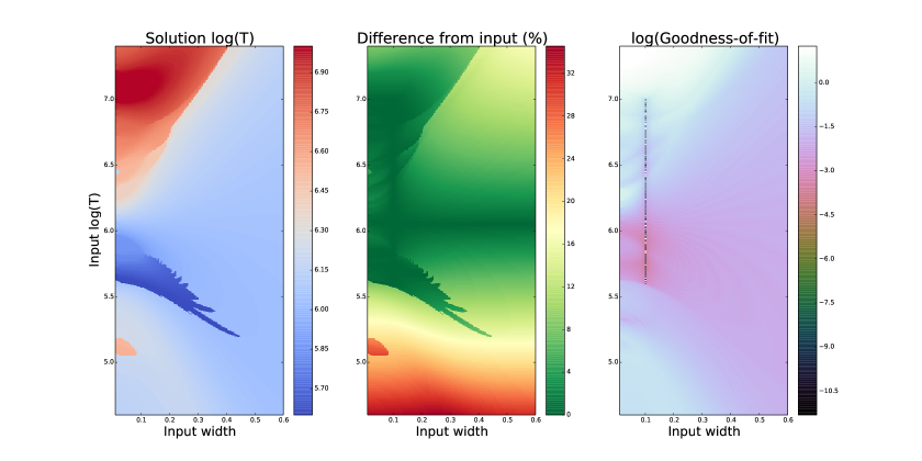
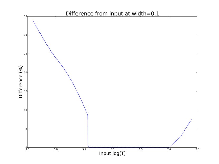
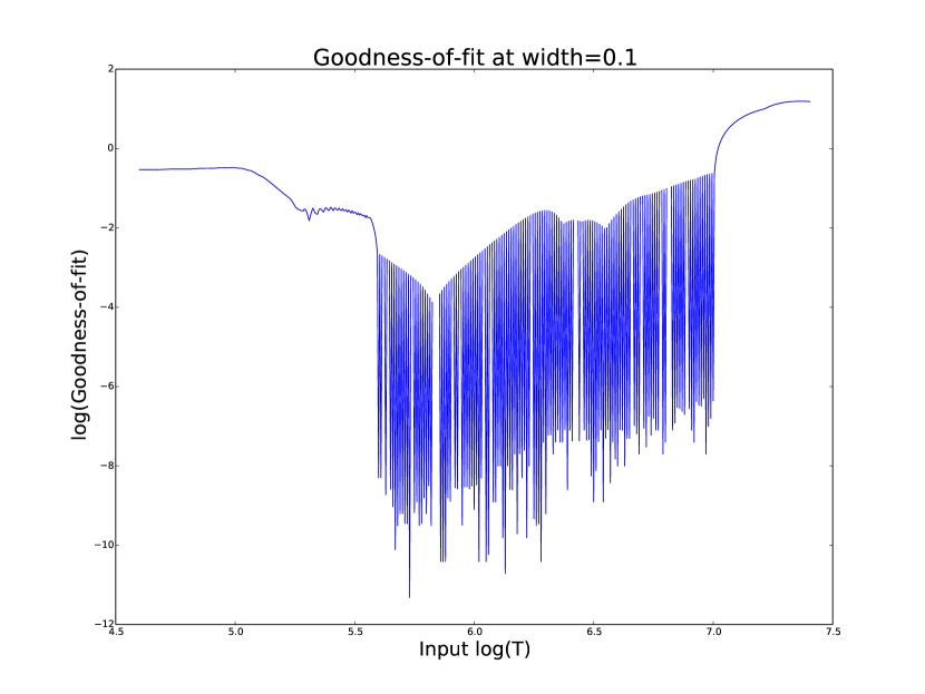
Figure 3 demonstrates the accuracy of the temperature map method when used to find model DEMs from synthesised emission. For a range of model DEM peak temperatures and Gaussian widths and a fixed height, the plot shows (from left to right), the peak DEM temperature inferred by the method, the percentage diference between the solution and the true DEM peak temperature, and the goodness-of-fit values associated with the solutions. The temperatures obtained using this method vary only with the peak temperature and width of the model DEM; varying the height of the model DEM appears to cause no change in the solution.
For model DEM widths of < 0.1, model DEM peak temperatures within the range considered by the temperature map method are generally found with reasonable accuracy, and with similar accuracy for all temperatures in this range apart from a sharp drop in solution temperature at a model DEM temperature of log(T) = 6.4 - 6.45. Hotter model DEMs are also fairly well matched as they produce solution temperatures of log(T) 7.0, though the solution temperature drops off slightly as the model DEM peak temperature increases, reducing the accuracy. Cooler model DEMs are less well reproduced by the method, with the solution increasing as the model peak temperature decreases down to log(T) 5.1, and falling again thereafter. The goodness-of-fit values are lowest for model DEM peaks between log(T) = 5.6 and 6.1, and generally increase for temperatures above this range, whereas they are relatively low at cooler temperatures.
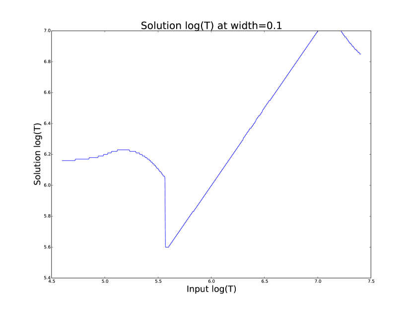
The results are significantly better for model DEMs with a width of 0.1, which is equal to the width assumed by the method. Model temperatures within the range of the method are reproduced almost exactly and with goodness-of-fit values 1 in most cases. Again, the solution temperature drops with increasing model temperature above log(T) = 7.0. Below log(T) = 5.6, however, the method returns a temperature of log(T) 6.1 for all model temperatures. Goodness-of-fit values at temperatures above and below the method’s range are relatively low (~0.01 - 1.0), with those at higher temperatures being larger.
In the case of much wider model DEMs (> 0.45) the solution temperature has no dependence at all on the model peak temperature, and returns log(T) 6.1 for all model DEMs. However, the goodness-of-fit values are still quite low ( 0.01) for all model DEMs despite the significant failure of the method for these conditions.
4 Results
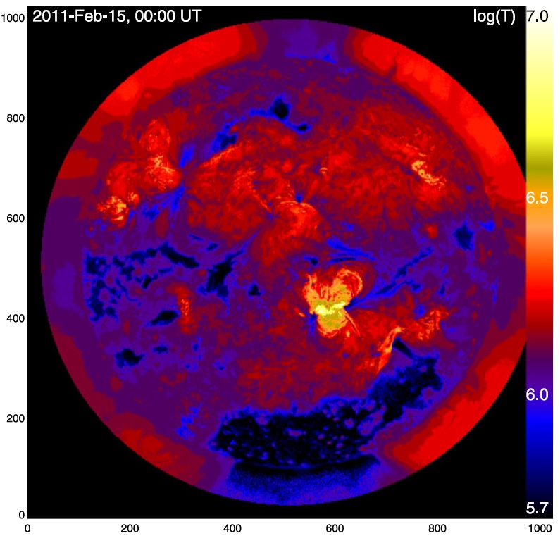
The temperature maps calculated using the proposed method and the method described in [Aschwanden2013] are shown in Figures 7 and 8 respectively. The Aschwanden method is used for this comparison because it is recent and similar to the propsed method, and because few other papers present full-disk temperature maps. For ease of comparison, the results of this work are plotted using a similar colour map to the one used by [Aschwanden2013] and with the same upper and lower temperature limits.
The two methods find similar temperatures for the majority of the corona, though regions found to have extreme hot or cool temperatures using Aschwanden’s method were closer to average in the map calculated with the proposed method. Also note that Figure 7 was calculated using full-resolution AIA data, whereas Aschwanden’s method rebins the original data into 4x4 macropixels (i.e. 1024x1024 images).
The remaining results have been sectioned into three general regions of the corona - quiet sun, coronal holes and active regions. All regions studied were selected from January and February 2011.
4.1 Quiet sun
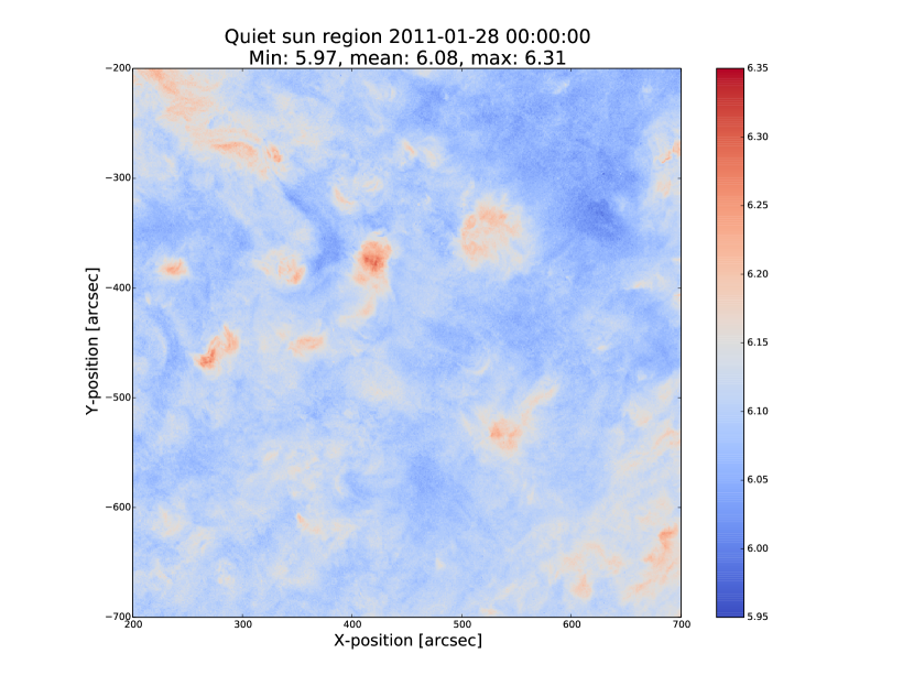
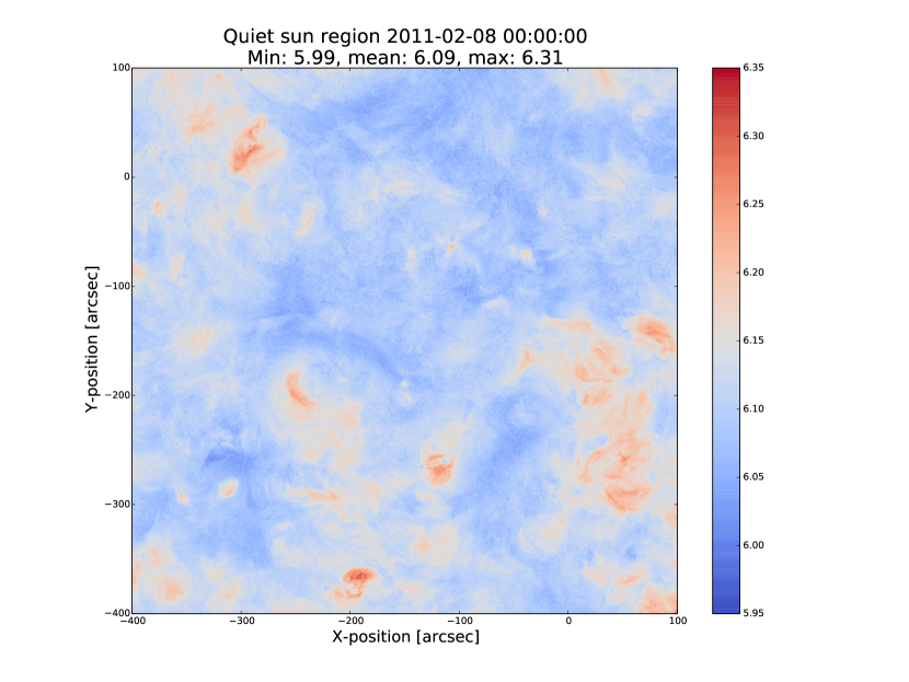
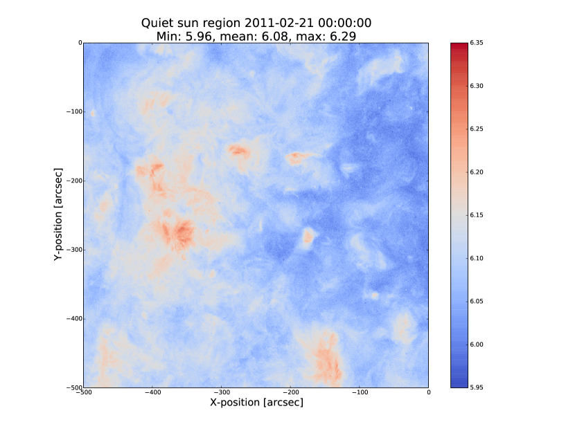
The term ’quiet sun’ refers to the portions of the Sun in which there is little or no activity. In many cases this will be the majority of the solar disk. Three large regions of quiet sun were selected. The criterion for selection was simply a nondescript region of the disk near disk centre not containing active regions, coronal holes or dynamic events (e.g. coronal jets). Figures 9, 10 and 11 show three regions on 2011-01-28 00:00, 2011-02-08 00:00 and 2011-02-21 00:00 respectively (these figures have all been plotted to the same colour scale for ease of comparison). The quiet sun regions on 2011-01-28 and 2011-02-08 were found to have very similar temperature distributions, with minima of log(T) = 5.97 and 5.99, means of log(T) = 6.08 and 6.09, and maxima of log(T) = 6.31 and 6.31 respectively. The temperature map for 2011-02-21 found mostly similar temperatures to the previous two regions, apart from a few isolated pixels with spurious values. The mean for this region was log(T) = 6.08. The minimum value, excluding spurious pixels, is log(T) = 5.96 and the maximum is log(T) = 6.29.
In all three temperature maps the hottest temperatures are found in relatively small, localised regions (which appear in red in Figures 9 and 10), with the temperatures changing quite sharply between these regions and the cooler background plasma. These hotter regions appear to consist of small loop-like structures, though none of these correspond to any active region (see section 4.3). The hot structures in the region shown in Figure 11 take up a slightly larger portion of the region and are more strongly concentrated in one location. Temperatures of around log(T) 6.15 also appear to form even smaller loops in some cases, which are more evenly distributed than the hotter regions. Temperatures below this are more uniform and have no clearly visible structure.
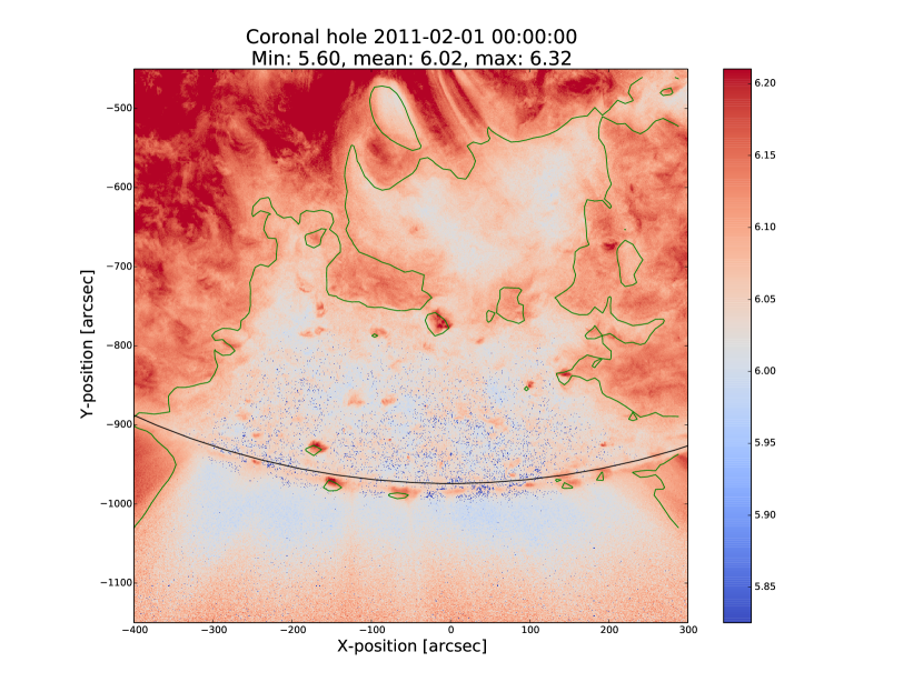
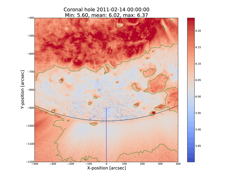
4.2 Coronal holes
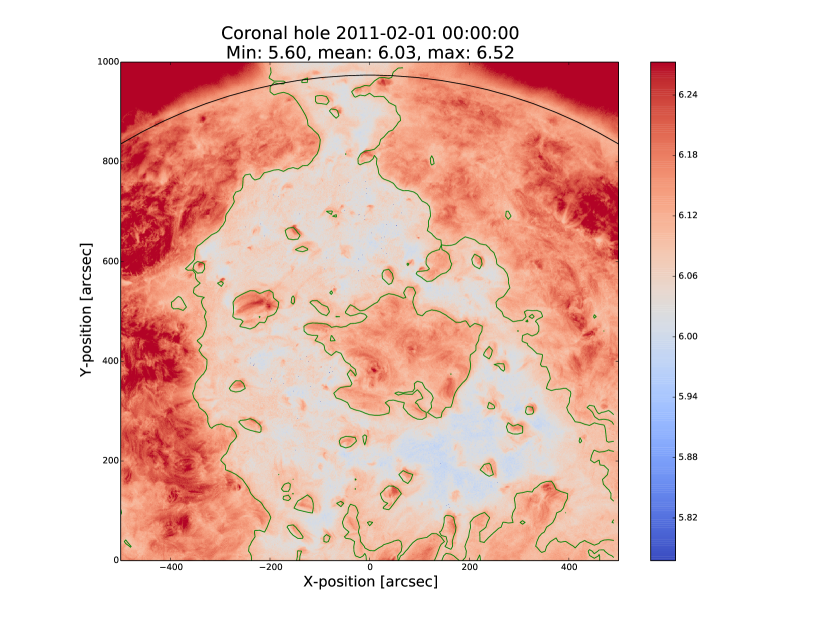
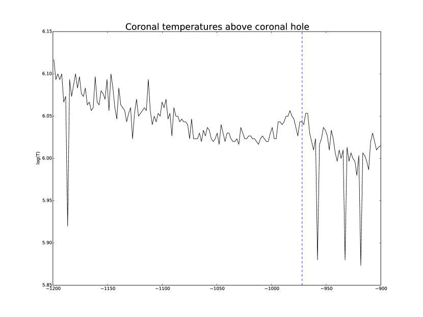
Coronal holes are regions of effectively open magnetic field which exhibit very low levels of emission in EUV and X-ray wavelengths. Figures 12, 13 and 14 show temperature maps for coronal holes. Note that these figures are shown with different colour scales to each other and to figures 9, 10 and 11. In Figures 13 and 14 the solar limb (the edge of the disk of the Sun) is marked with a black line. Figure 15 shows the temperatures along the vertical line shown in Figure 14. The coronal holes shown in figures 12 and 13 (henceforth coronal holes 1 and 2), were observed at 2011-02-01 00:00 in the northern and southern hemispheres respectively, and the one in figure 14 (coronal hole 3) was observed at 2011-02-14 00:00. The minimum, mean and maximum temperatures found for the regions mapped were: log(T) = 5.6, 6.03 and 6.52 for coronal hole 1; log(T) = 5.6, 6.02 and 6.32 for coronal hole 2; and log(T) = 5.6, 6.02 and 6.37 for coronal hole 3. The somewhat higher maximum temperature for coronal hole 1 appears to be due to hotter material above the solar limb over the quiet sun regions. Such unavoidable contamination of the coronal hole data by other non-coronal hole structures along the line of sight can, in principle, be reduced using tomographical reconstruction techniques such as the one described by [Kramar2014].
In all three figures, the coronal hole region is clearly visible as a region of significantly cooler plasma than the surrounding quiet sun regions, with the former mostly exhibiting temperatures in the range log(T) 5.9 - 6.05, and the latter being mostly above log(T) 6.1. In all three coronal holes, though to a much greater extent in coronal holes 2 and 3, a ’speckling’ effect is observed, which is caused by numerous very small low temperature regions. Each of these consists only of a few pixels and were found to have temperatures of log(T) 5.6-5.7. This speckling is similar to the individual low-temperature pixels found for the quiet sun region for 2011-02-21 (Figure 11), but is much more prominent.
All three coronal holes also contain small hotter regions (log(T) 6.1), which appear to be similar to quiet sun regions and in some cases seem to consist of closed loop-like structures within the larger open magnetic field of the coronal hole. In addition to these regions, coronal hole 1 contains a large quiet sun region.
The temperature over coronal holes 2 and 3 (i.e. below the limb in Figures 13 and 14) was found to increase slightly with distance from the centre of the image. This temperature gradient is plotted for coronal hole 3 in Figure 15. In both cases, the temperature is log(T) 6.0 at the limb and rises to log(T) 6.05 at the edge of the mapped region.
4.3 Active regions
Active regions are areas of concentrated magnetic field, and consist of many magnetic field lines (’coronal loops’, or often simply ’loops’) which are seen in EUV and X-rays as strands of bright material. The points at which these loops are rooted in the lower corona are called footpoints.
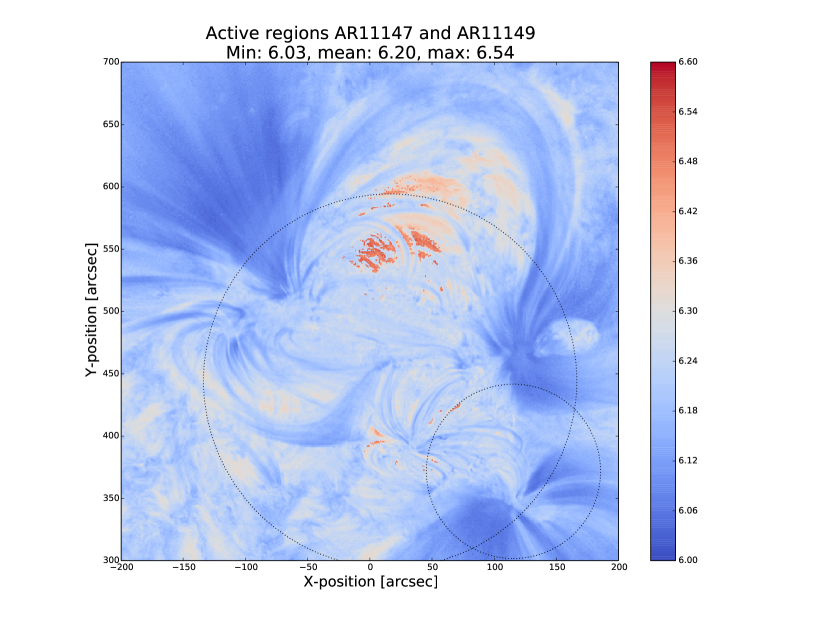
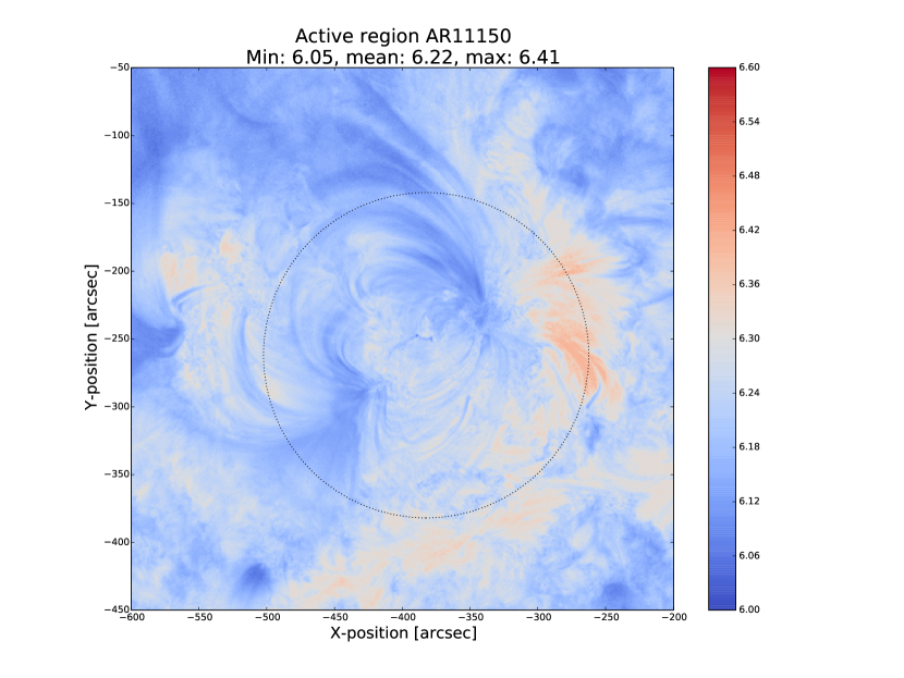
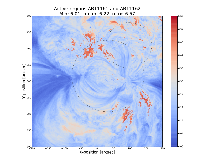
Active regions show the greatest variation in temperature, as can be seen in Figures 16, 17 and 18. These figures show temperature maps of active regions AR11147 and AR11149 (henceforth region 1), active region AR11150 (region 2) and active regions AR11161 and AR11162 (region 3), respectively. Regions 1 and 3 are much more complex than region 2, as each consists of a larger main active region and a smaller region which has emerged nearby. The minimum, mean and maximum temperatures found were: log(T) = 6.03, 6.2 and 6.54 for region 1; log(T) = 6.05, 6.22 and 6.41 for region 2; and log(T) = 6.01, 6.22 and 6.57 for region 3.
In each of these regions, the coolest temperatures are found in the largest loops with footpoints at the edges of the active region, which were found to have temperatures between log(T) = 6.05 and log(T) = 6.1. Smaller loops with footpoints closer to the centre of the active region show higher temperatures (log(T) 6.1 - 6.3). Hotter temperatures again (log(T) 6.3) were also found in all three active regions, though in different locations. In region 1 these temperatures can be seen in parts of the very small loops in AR11149, as well as in what may be small loops or background in AR11147. In region 2 they are found in loops which appear to be outside the main active region. In region 3 they are found in a few relatively large loops - in contrast to the much smaller loops found to have those temperatures in the other regions - and there are also several small hot regions around AR11162 near the top of Figure 18. The noisy nature of the hot regions in this figure appears to be due to unusually high relative values in the typically noisy 9.4nm and 13.1nm channels, which correspond to high temperature plasma.
All three regions also show the presence of cooler quiet sun-like plasma surrounding the active regions (log(T) 6.1 - 6.2), and Figure 17 shows a filament found to have a fairly uniform temperature of log(T) 6.3.
5 Discussion
The proposed method produces results many times faster than typical DEM methods, with a full-resolution temperature map being produced in ~2 minutes. The great efficiency of the method makes it well suited for realtime monitoring of the Sun. The challenge lies in finding connections between changes of temperature with time, or between changes in the spatial distribution of temperature, with events of interest (e.g. large flares). The realtime prediction of large events would be a very desirable goal. This is work we are currently undertaking. Results over the whole solar disk with reasonably high time resolution also allows us to make statistical studies of the way temperature changes within certain regions over long time periods. This is another approach we are currently using to study active regions in particular.
For some quiet sun regions and coronal holes, the method found low-temperature values for isolated pixels or for small groups of pixels. It is possible that these isolated pixels are due to one or more channels being dominated by noise which is amplified by the normalisation of the images. However, these pixels are also seen far more in coronal holes 2 and 3 (Figures 13 and 14), which were observed at the pole, than in coronal hole 1 (Figure 12), which ranged from near the pole to near the equator. It is therefore also possible these cold pixels are at least partly due to some LOS effect.
The temperature values found for active regions are largely as was expected, though they are slightly cooler in places than some other studies have found. It is important to bear in mind when considering active regions that the assumptions on which the temperature map method depends may not be met, such as the assumption of local thermal equilibrium. Additionally, no background subtraction has been applied to the AIA images used, which may account for some of the discrepancy between these results and those of other authors.
Figure 17 includes a filament, which was found to have a fairly uniform temperature of log(T) 6.3. This contradicts the established wisdom that filaments consist of cooler plasma than much of the rest of the corona, and probably indicates a failing of this temperature method. Since filaments are relatively dense structures and this method does not take into account density, it is likely that the plasma conditions found in filaments are poorly handled by the method. This suggests it may be unwise to rely too heavily on this method for temperatures of filaments or similarly dense coronal structures.
As discussed in Section 3, narrow DEMs widths are reconstructed much more accurately than wide ones, with solutions tending towards ~1MK with increasing DEM width. Such results in these temperature maps should therefore be treated with a certain amount of caution. Overall, however, the temperature map method performs very well and produces temperatures which are consistent with the results of previous studies. A slower but more complete version which fits a full DEM to the observations will be the focus of a later work and will provide more information on the corona’s thermal structure.
An important point is that producing temperature maps across such large regions was impossible until AIA/SDO began observations. The results presented in this paper are therefore unique and new. Code written almost exclusively in the Python language has been used to produce the results, and Python has been instrumental in ensuring the efficiency of the processing. Whilst many other groups are using AIA/SDO to estimate or constrain temperatures, our approach is to develop the most efficient and quick code that will allow us to make large statistical studies, studies of temporal changes, and search for predictable connections between temperature changes and large events.
6 Acknowledgements
This work is funded by an STFC student grant.
This research has made use of SunPy, an open-source and free community-developed solar data analysis package written in Python [Mumford2013].
References
- [Plowman2012] J. Plowman, C. Kankelborg, and P. Martens, "Fast Differential Emission Measure Inversion of Solar Coronal Data", arXiv preprint arXiv: . . . , 2012.
- [Wit2012] T. D. D. Wit, S. Moussaoui, C. Guennou, F. Auchere, G. Cessateur, M. Kretzschmar, L. Vieira, and F. Goryaev, “Coronal Temperature Maps from Solar EUV images: a Blind Source Separation Approach,” Solar Physics, 2012.
- [Hannah2012] I. G. Hannah and E. P. Kontar, “Differential emission measures from the regularized inversion of Hinode and SDO data,” Astronomy & Astrophysics, vol. 539, p. A146, Mar. 2012.
- [Aschwanden2013] M. J. Aschwanden, P. Boerner, C. J. Schrijver, and A. Malanushenko, “Automated Temperature and Emission Measure Analysis of Coronal Loops and Active Regions Observed with the Atmospheric Imaging Assembly on the Solar Dynamics Observatory (SDO/AIA),” Solar Physics, vol. 283, pp. 5–30, Nov. 2013.
- [Awasthi2014] A. K. Awasthi, R. Jain, P. D. Gadhiya, M. J. Aschwanden, W. Uddin, A. K. Srivastava, R. Chandra, N. Gopalswamy, N. V. Nitta, S. Yashiro, P. K. Manoharan, D. P. Choudhary, N. C. Joshi, V. C. Dwivedi, and K. Mahalakshmi, "Multiwavelength diagnostics of the precursor and main phases of an M1.8 flare on 2011 April 22", Monthly Notices of the Royal Astronomical Society, vol. 437, pp. 2249-2262, Nov. 2014.
- [Lemen2011] J. R. Lemen, A. M. Title, D. J. Akin, P. F. Boerner, C. Chou, J. F. Drake, D. W. Duncan, C. G. Edwards, F. M. Friedlaender, G. F. Heyman, N. E. Hurlburt, N. L. Katz, G. D. Kushner, M. Levay, R. W. Lindgren, D. P. Mathur, E. L. McFeaters, S. Mitchell, R. a. Rehse, C. J. Schrijver, L. a. Springer, R. a. Stern, T. D. Tarbell, J.-P. Wuelser, C. J. Wolfson, C. Yanari, J. a. Bookbinder, P. N. Cheimets, D. Caldwell, E. E. Deluca, R. Gates, L. Golub, S. Park, W. a. Podgorski, R. I. Bush, P. H. Scherrer, M. a. Gummin, P. Smith, G. Auker, P. Jerram, P. Pool, R. Soufli, D. L. Windt, S. Beardsley, M. Clapp, J. Lang, and N. Waltham, "The Atmospheric Imaging Assembly (AIA) on the Solar Dynamics Observatory (SDO)", Solar Physics, vol. 275, pp. 17-40, June 2011.
- [Morgan2014] H. Morgan and M. Druckmüller, "Multi-Scale Gaussian Normalization for Solar Image Processing", Solar Physics, vol. 289, pp. 2945-2955, Apr. 2014.
- [Guennou2012] C. Guennou, F. Auchère, E. Soubrié, K. Bocchialini, S. Parenti, and N. Barbey, "On the Accuracy of the Differential Emission Measure Diagnostics of Solar Plasmas. Application To Sdo /Aia. I. Isothermal Plasmas", The Astrophysical Journal Supplement Series, vol. 203, p. 25, Dec. 2012.
- [Judge1997] P. G. Judge, V. Hubeny, and J. C. Brown, "Fundamental Limitations of Emission-Line Spectra as Diagnostics of Plasma Temperature and Density Structure", The Astrophysical Journal, vol. 475, pp. 275-290, Jan. 1997.
- [Aschwanden2011] M. J. Aschwanden and P. Boerner, "Solar Corona Loop Studies With the Atmospheric Imaging Assembly. I. Cross-Sectional Temperature Structure", The Astrophysical Journal, vol. 732, p. 81, May 2011.
- [Warren2008] H. P. Warren, I. Ugarte-Urra, G. a. Doschek, D. H. Brooks, and D. R. Williams, "Observations of Active Region Loops with the EUV Imaging Spectrometer on Hinode", The Astrophysical Journal, vol. 686, pp. L131-L134, Oct. 2008.
- [Guennou2012a] C. Guennou, F. Auchère, E. Soubrié, K. Bocchialini, S. Parenti, and N. Barbey, "On the Accuracy of the Differential Emission Measure Diagnostics of Solar Plasmas. Application To Sdo /Aia. II. Multithermal Plasmas", The Astrophysical Journal Supplement Series, vol. 203, p. 26, Dec. 2012.
- [Mackovjak2014] S. Mackovjak, E. Dzifcáková, and J. Dudík, "Differential emission measure analysis of active region cores and quiet Sun for the non-Maxwellian -distributions", Astronomy & Astrophysics, vol. 564, p. A130, Apr. 2014.
- [Judge2010] P. G. Judge, "Coronal Emission Lines As Thermometers", The Astrophysical Journal, vol. 708, pp. 1238-1240, Jan. 2010.
- [DelZanna2013] G. Del Zanna, "The multi-thermal emission in solar active regions", Astronomy & Astrophysics, vol. 558, p. A73, Oct. 2013.
- [Kramar2014] M. Kramar, V. Airapetian, Z. Mikic, and J. Davila, "3D Coronal Density Reconstruction and Retrieving the Magnetic Field Structure during Solar Minimum", Solar Physics, pp. 1-22, 2014.
- [Mumford2013] S. Mumford, D. Pérez-suárez, S. Christe, F. Mayer, and R. J. Hewett, "SunPy : Python for Solar Physicists", no. Scipy, pp. 74.77, 2013.