pdfoutput=1
0 \vgtccategoryResearch \vgtcinsertpkg
A novel display for situational awareness at a network operations center
Abstract
As modern industry shifts toward significant globalization, robust and adaptable network capability is increasingly vital to the success of business enterprises. Large quantities of information must be distilled and presented in a single integrated picture in order to maintain the health, security and performance of global networks. We present a design for a network situational awareness display that visually aggregates large quantities of data, identifies problems in a network, assesses their impact on critical company mission areas and clarifies the utilization of resources. This display facilitates the prioritization of network problems as they arise by explicitly depicting how problems interrelate. It also serves to coordinate mitigation strategies with members of a team.
Introduction
The Visual Analytics for Science and Technology Challenge 2013 commissions an innovative graphical design to support situation awareness for large-scale computer networks. The scenario depicts a company, Big Enterprise, which requires a big board display to be used in their Network Operations Center (NOC) for visually assessing the health, security and performance of the network at a glance. This interactive display must be designed to provide a concise visual representation of the state of the Big Enterprise network, comprised of thousands of systems in major cities spread over four continents.
We present a design that will allow the network operations manager to quickly identify and classify problems in the network, assess their impact on critical mission areas, prioritize the utilization of resources, and coordinate mitigation strategies with other members of the team. The display is interactive; users can augment the comprehensive network overview with additional layers of information that highlight particular problem areas. The NOC manager can use the highlighted overlays to feature company mission areas, geographical regions, or functional categories in the network (e.g. all facilities affected by an outdated patch). Multiple highlights are simultaneously possible, creating a visual representation of the impact of network problems on several domains, as well as how the domains intersect one another. This display will significantly enhance the ability of the NOC manager to quickly prioritize multiple problems, and coordinate a strategy with her team.
1 Display Design
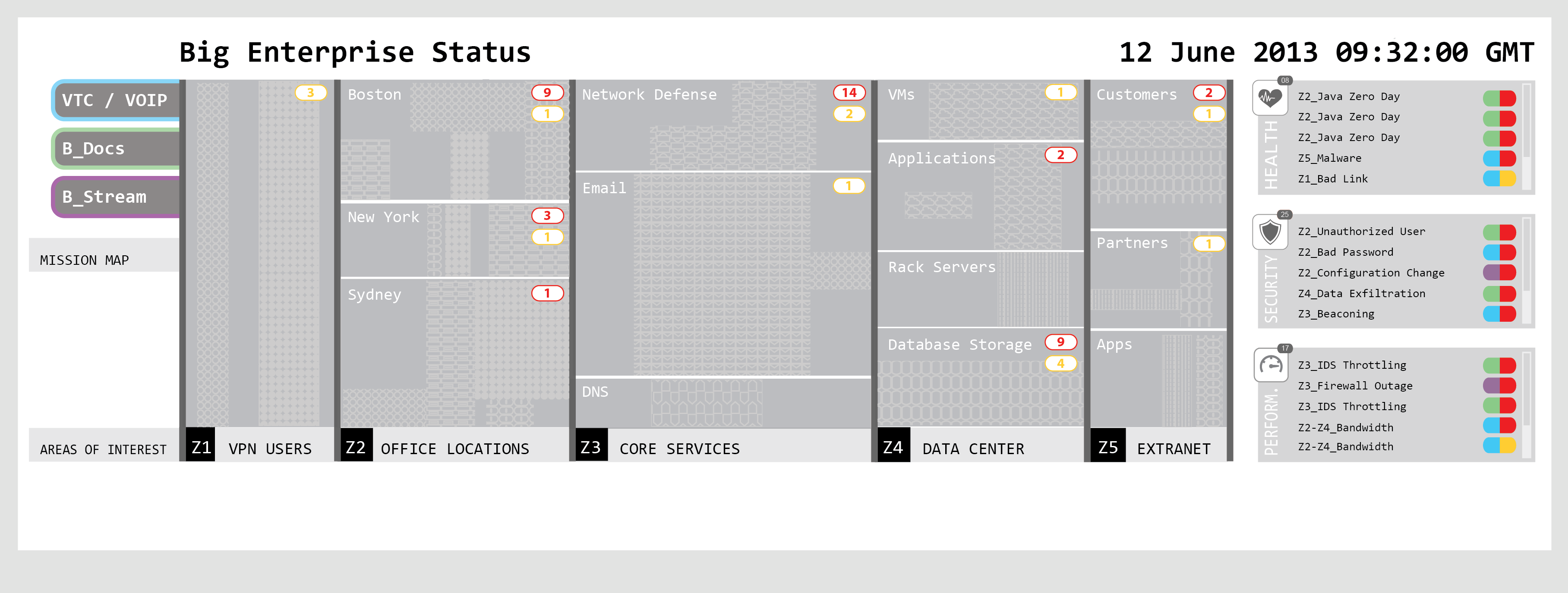
The Big Enterprise Big Board display is an interactive visual display designed to provide a concise visual representation of the state of the company network. The goal of the display is to facilitate the prioritization of network problems as they arise, by explicitly depicting how problems interrelate. The board depicts how network problems are geographically or functionally distributed, and illustrates how they impact critical enterprise mission areas. Two images of the board can be seen in Figure 1.
1.1 Layout
The layout of the Big Enterprise Big Board is designed to aggregate information to provide a high level overview of the network, while simultaneously drawing attention to potential network problems. The underlying philosophy of the design is that properly functioning portions of the network are depicted with representative aggregates only, whereas systems that are not functioning properly are highlighted in a more individual way. Visual alerts quickly draw users’ attention to problems arising in the network. The layout has four main sections, shown in Figure 1; the central panel, the warning menu to the right, the mission maps and functional queries for dynamic overlay to the left, and the net flow pipes at the bottom. The network name appears in the top left of the display, and the time at the top right.
1.1.1 The central panel
The central portion of the display shows the aggregated network resources of the company. These are broken down into a number of zones that organize the assets of the network according to broad functional categories. In the case of the hypothetical company Big Enterprise, there are five zones shown in Figure 1: Virtual Private Network users, office locations (which are organized geographically), core services, the data center and the extranet. Within each zone, the resources are further subdivided into more specific functional categories, for example, the core services in Figure 1 include network defense, E-mail, and Domain Name Servers. Different shading schemas within these subdivisions can be used to further specify details of the network hierarchy. The zones and sub-zones are customizable and should reflect the functional breakdown of whichever company is using the display.
1.1.2 Icons and warnings
When specific problems arise, pipes and icons appear on the central panel of the board, with details about the affected systems displayed in the warning menus to the right of the central panel. Alerts are divided into three main categories; health, performance and security. New problems are triaged and added to the board with a red flag, indicating that these are problems that need to be assigned for resolution. When problems are tasked to an individual or a team, the red flag is changed to yellow, indicating that the problem is being actively addressed but is not yet resolved. The aggregation of multiple assets into different grey zones significantly simplifies the view of healthy systems, while the pop-up notifications draw attention to portions of the network that currently require action. Because the network is so large, it is also necessary to aggregate the alerts. The aggregated flags for each sub-zone can be seen in red and yellow ovals; for example in Figure 1, the Boston sub-zone has nine red alerts and one yellow one. Figure 1(b) also shows alert badges that indicate individual unaggregated problems in the network, such as the heart shaped badge in Sydney. There are three possible icons used for these alert badges: a heart for health, a shield for security, and a speedometer for performance. These individual alert badges are discussed in more detail in section 1.1.3.
The warning menus on the right hand side provide more detail about the aggregated alerts in the central panel. When there are more alerts than can fit into the display, the alerts in each category scroll slowly by, so that within a few moments, any alert in any zone can be identified. Each item in the warning menu is accompanied by a pill shaped capsule to the right. The right portion of the capsule indicates whether the alert has been tasked out for resolution (yellow), or is still unassigned (red). The left hand portion of the capsule is color coded to indicate which mission area is most significantly affected by this particular outage or problem. This mission context is discussed further in section 1.1.3.
With thousands of machines distributed globally, it is not useful to depict all network connections and their available bandwidth. Nonetheless, the display is designed to indicate connectivity issues. Pipes at the bottom of the display are used to visualize bandwidth problems between elements in different zones. The pipe is labeled at each end to indicate which specific zone subdivisions are experiencing problems, for example, in Figure 1(b) a pipe shows a connectivity issue between VPN users and the Sydney offices. Pipe alerts are also included in the warning menu on the right. The outer layer of the pipe is a qualitative visual indicator of the available bandwidth, while the inner pipe shows the current capacity, updated in real time. The color coding is consistent with the health, security, and performance icons; the pipes are colored red if the connectivity problem has been noted but not assigned to anyone, and turn yellow once a service ticket has been issued. The pipes disappear when the problem is resolved.
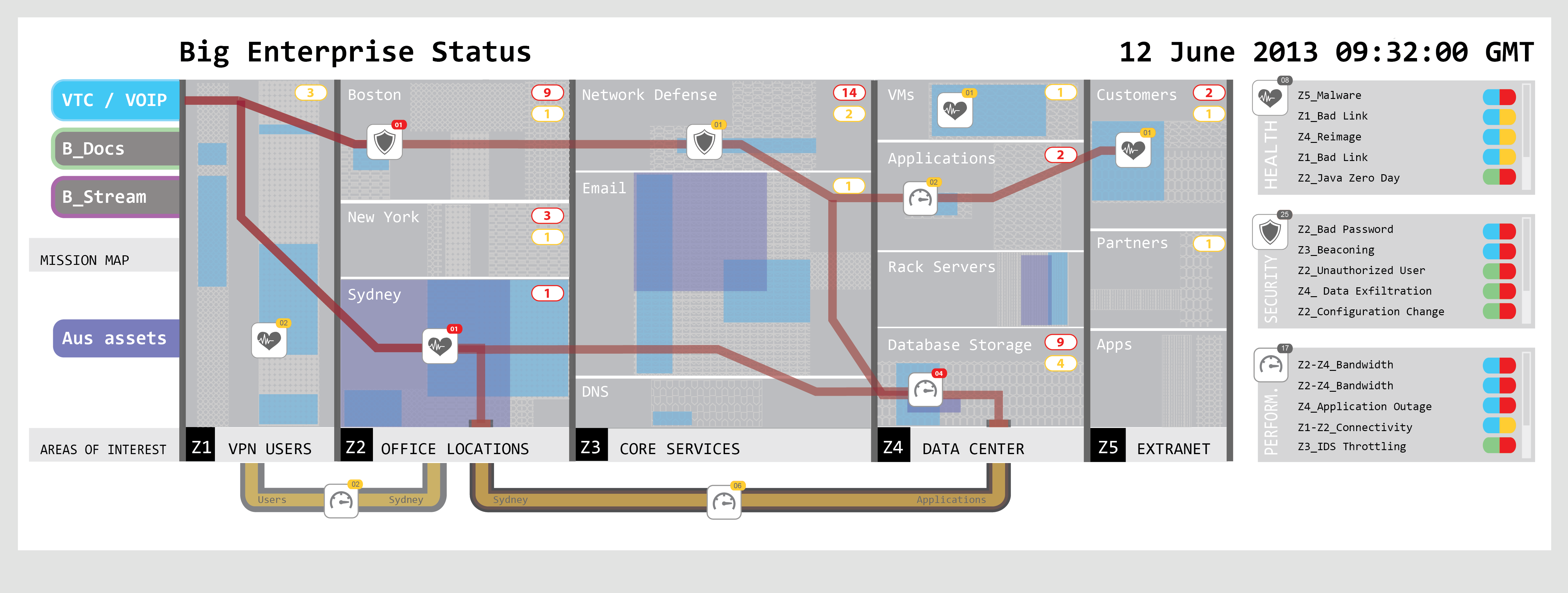
1.1.3 The mission map
The most powerful feature of this design is the ability to illustrate visually how problems in the network impact specific company missions. An enterprise mission area is a key business objective, the loss of which would damage the company holdings or reputation. The Big Enterprise scenario has three: VTC/VOIP internet voice capability, B_Docs in analogy with Google Docs, and B_Stream akin to Rhapsody or iTunes. The company missions are displayed in color coded tabs at the top left of the display. These tabs can be active or inactive. In Figure 1(b), the VTC/VOIP mission is activated, while the B_docs and B_stream are inactive. Activating the tab changes it to a solid color, and results in several additional layers being added to the display. First, the network assets that directly impact this particular mission are highlighted on the central panel, color coordinated with the tab and the warning menu capsules. This is seen in Figure 1(b) in the blue shaded areas on the central panel. Second, a map connecting unresolved (red) network problems is drawn with a red strip. The strip connects larger icons, whose symbols classify the issue as relevant to security, health or performance. These icons represent individual (non-aggregated) problems that specifically impact this mission area. All network problems pertaining to this mission are displayed individually, but the map brings focus to network anomalies that must be tasked in order to keep this mission functional.
Clicking the tab also simplifies the display and helps the network manager to sort the information based on its mission impact. Activating the tab causes unrelated pipes at the bottom to temporarily disappear, and changes the ordering of the items in the warning menu to highlight the warnings specific to this particular mission.
1.1.4 Dynamic overlay
The Big Board design also incorporates an adaptable feature that helps the network manager augment the situational awareness of her team. This feature implements a dynamic overlay of areas of interest. Functionally, it is a search tool with the flexibility to highlight either geographical or functional categories. One example, a search for assets in Australia, is shown in Figure 1(b) in purple. The search is intended to be flexible enough to accommodate a variety of queries. Some examples might be “hosts with unpatched Java,” “Beaconing activity,” “hosts bypassing the proxy,” or “hosts connecting to 194.220.1.0.” Activating a functional search causes a colored tab to appear in the lower left of the display below the mission map tabs, and color coordinated highlighting to be overlaid on the central panel. This highlighting intersects alert icons and the assets in each zone, conveying the dependency of company assets on the functional category being highlighted. There can be as many as eight color coded areas of interest. These can be saved and toggled on and off in much the same way as the mission maps.
1.2 Interaction channels
The Big Board display is controlled primarily though a tablet device such as an iPad belonging to the NOC manager. However, the app can be used by any team member to check out a local copy of the Big Board on a mobile device or computer. The local copies can be interacted with as a mini version of the actual Big Board. This will allow individual team members to explore network problem interdependencies, helping them to triage problems. Red alerts can be added to the Big Board at any time from any of the local copies. Red alerts are coordinated with the ticket system, so that they turn yellow when a ticket has been accepted by a team member for resolution. Any local copy of the Big Board can access notes about the particular network problem that have been made in the ticket system. Once the tickets are resolved, the yellow alerts can be removed using the local copy of the application.
The NOC manager is responsible for the view presented on the Big Board, namely which missions are highlighted at this time, and which dynamic functional searches are visible. Functional searches are initiated through a search tool deployed on her mobile platform, and the highlighting can be toggled on and off as she deems necessary to communicate her priorities with her team.
2 Summary
The VAST Mini-Challenge 2013 commissioned the design of a Big Board display for a hypothetical multinational company with a globalized network, Big Enterprise. In this paper we have presented a visual display that concisely summarizes the health, security and performance of the Big Enterprise network. The display illustrates how network problems are geographically or functionally distributed, and how they affect critical mission areas within Big Enterprise. The principle features of the display are listed below.
-
•
Network assets are divided into functional zones, which are further divided by geography or by category.
-
•
Correctly functioning assets are aggregated while network problems are organized and displayed with clarity.
-
•
Color coding clearly differentiates unaddressed network problems from those that are currently tasked out.
-
•
Mission highlighting illustrates the intersection space of mission critical assets with current network problems.
-
•
Functional search queries dynamically add a highlighting layer that show the intersection of that function with company assets in each zone, and with mission areas.
This display significantly increases network situation awareness in a global context, and provides critical insight into the optimal way to prioritize problems and allocate resources and labor.
This work is sponsored by the Assistant Secretary of Defense for Research & Engineering under Air Force Contract #FA8721-05-C-0002. Opinions, interpretations, conclusions and recommendations are those of the authors and are not necessarily endorsed by the United States Government.