Research \vgtcinsertpkg \authorfooter Yifan Hu is with Yahoo Labs. E-mail: yifanhu@yahoo.com. Lei Shi is with State Key Laboratory of Computer Science, Institute of Software, Chinese Academy of Sciences. E-mail: shil@ios.ac.cn. \shortauthortitleHu & Lei: A Coloring Algorithms
A Coloring Algorithm for Disambiguating Graph and Map Drawings
Abstract
Drawings of non-planar graphs always result in edge crossings. When there are many edges crossing at small angles, it is often difficult to follow these edges, because of the multiple visual paths resulted from the crossings that slow down eye movements. In this paper we propose an algorithm that disambiguates the edges with automatic selection of distinctive colors. Our proposed algorithm computes a near optimal color assignment of a dual collision graph, using a novel branch-and-bound procedure applied to a space decomposition of the color gamut. We give examples demonstrating the effectiveness of this approach in clarifying drawings of real world graphs and maps.
keywords:
graph drawing, virtual maps, edge coloring, branch-and-bound algorithm, global optimizationIntroduction
Graphs are widely used for depicting relational information among objects. Typically, graphs are visualized as node-link diagrams [1]. In such a representation, edges are shown as straight lines, polylines or splines. Graphs that appear in real world applications are usually non-planar. For such graphs, edge crossings in the layout are unavoidable. It is a commonly accepted principle that the number of edge crossings should be minimized whenever possible, this principle was confirmed by user evaluations which showed that human performance in path-following is negatively correlated to the number of edge crossings [31, 35]. Later studies found that the effect of edge crossings varies with the crossing angle. In particular, the task response time decreases as the crossing angle increases, and the rate of decrease levels off when the angle is close to 90 degree [24, 25]. This implies that it is important not only to minimize the number of edge crossings, but also to maximize the angle of the crossings. Consequently, generating drawings that give large crossing angles, or even right crossing angles, became an active area of research (e.g., [10]). Nevertheless, for general non-planar graphs, there is no known algorithm that can guarantee large crossing angles for straight line drawings. Therefore, techniques to mitigate the adverse visual effect of small angle crossings are important in practice.
In this paper we propose to use colors to help differentiate edges. Our starting point is an existing layout, and our working assumption is that the graph is to be displayed as a static image on paper, or on screen. The motivation comes from users of our graph drawing software. These users were generally happy with the layouts of their graphs, but were asking whether there was any visual instrument that can help them follow edges better. Examining their layouts, we realized that because edges were drawn using the same color (e.g., black), when there were a lot of edge crossings, it was difficult to visually follow these edges. Thus the feedback from our users, and our own observation, echo the findings by Huang et al. [24, 25]. When explaining why small crossing angles are detrimental to the task of following a path, they found, with the help of an eye tracking device, that “when edges cross at small angles, crossings cause confusion, slowing down and triggering extra eye movements.” and that “in many cases, it is crossings that cause confusion, making all the paths between two nodes, and branches along these paths, unforeseeable. Due to the geometric-path tendency, human eyes can easily slip into the edges that are close to the geometric path but not part of the target path.”.
Edge crossing is not the only hindrance to the visual clarity of a graph drawing. An additional problem is that when an edge from node passes underneath the label of a node and connects to a node , it is impossible to tell visually whether there is one edge , or two edges and , when all edges are of the same color (e.g., Fig. 3(b)). While these problems can be solved with user interactions by clicking on an edge of interest, or on a node to bring its neighbors closer (see, e.g., [28]), this involves an extra step for the user that may not be necessary if edges can be differentiated with a proper visual cue. Furthermore, there are situations where interaction is not possible, e.g., when looking at a static image of a graph on screen, or in print. These are the situations that are of particular interest in this paper.
We believe all the above mentioned problems of visually distinguishing and following edges can be greatly alleviated by choosing appropriate colors or line styles to differentiate edges. We first identify edge pairs that need to be differentiated (we call them colliding edges), and represent them as nodes of a dual collision graph. We then propose an algorithm to assign colors to the nodes of this dual graph, in a way that maximizes the color difference between nodes that share an edge. Thus our main contributions are:
-
•
An approach for establishing a dual graph among colliding edges/regions, and coloring the nodes of the dual graph to disambugate graph/map drawings.
-
•
A novel branch-and-bound graph coloring algorithm that finds the globally optimal color embedding of each node with regard to its neighbors, and that works with both continuous color spaces and discrete color palettes.
-
•
A user study that establishes the effectiveness of the coloring approach, as well as its limitations.
We were made aware of the work of Jianu et al. [26], who proposed a similar idea. We believe our work is substantially different and better than that of [26]. We will discuss in more details in the next section, and in Section 3.
1 Related Work
Graph coloring is a classic problem in algorithmic graph theory. Traditionally the problem is studied in a combinatorial sense. For example, finding the smallest number of colors on the vertices of a graph so that no two vertices sharing an edge have the same color. The difference between this and our work is that in colorability problem, a solution is valid as long as any pairs of vertices that share an edge have different colors, no consideration is given to maximizing the actual color differences. So in essence, the distance between colors are binary – either 0, or 1. For our problem we assume that even among distinctive colors, the differences are not equal, and are measured by color distances. In the special case when only colors are allowed, our algorithm degenerate to find the optimal color assignment among all solutions of the colorability problem.
This last problem of assigning colors was also studied by Gansner et al. [15] and by Hu et al. [23], in the context of coloring virtual maps to maximize the color difference between neighboring regions In these work, maps were colored by an optimal permutation of a fixed list of colors, with the number of countries in the map. On the other hand, we assume that the color space can be either continuous or discrete, and we select among all colors in the color space to increase color differences.
Dillencourt et al. [11] studied the problem of coloring geometric graphs so that colors on nodes are as different as possible. The problem they studied is very related to ours, except that in their case the application is the coloring of geometric regions, while we are also interested in coloring edges of a graph. Dillencourt et al. used a force-directed gradient decent algorithm to find a locally optimal coloring of each node with regard to its neighbors. We propose a new algorithm based on a branch-and-bound process over an octree decomposition of the color space, that finds a globally optimal coloring for each node with regard to its neighbors. Furthermore, our approach is more flexible and works for discrete color palettes, in addition to continuous color spaces.
Given the findings by Huang et al. [24, 25] that edge crossings at close to 90 degree hamper human performance less than those at smaller angles, there are active researches in the so called RAC drawings of graphs. In such a drawing, edges cross at the right angle (e.g., [10]). This is a practice employed in hand and algorithm drawn metro maps as well (e.g., [36]). However, it was shown [10] that a straight-line RAC drawing can have at most edges, with the number of vertices. As far as we are aware, even that is only a necessary, but not sufficient, condition. Therefore techniques to help alleviate the effect of small angle crossings, when RAC or larger angle drawings are not feasible, are important in practice.
The angular resolution of a drawing is the sharpest angle formed by any two edges that meet at a common vertex of the drawing. In addition to maximizing crossing angles, for the same reason of visual clarity, there have been researches to maximize the angular resolution of the drawing. Most recently, Lombardi Drawing of graphs was proposed [12, 6], in which edges are drawn as arcs with perfect angular resolution. However, Purchase et al. [33] found that even though users prefer the Lombardi style drawings, straight-line drawings created by spring-embedder gives better performance for path following and neighbor finding tasks. For straight-line drawings, while it is possible to adjust the layout to improve the angular resolution (e.g., [9, 18]), the extent to which this can be done is limited. Although previous study by Purchase et al. [32] did not find sufficient support for maximizing angular resolution, we do find that when two edges connected to the same node are almost on top to each other, it is difficult to tell whether these are two edges or one. For this reason we consider such edges as in collision too.
Edge bundling is another useful tool for decluttering the tangled mess in drawings of complex graphs [16, 20, 7, 22, 14]. However when edges are bundled, it is no longer possible to follow an individual edge to its exact destination. Pupyrev et al. [30] proposed to separates edges belonging to the same bundle by a small gap. While this makes it possible in theory to follow individual edges, in practice the edges in each bundle are drawn very close to each other. We believe whether fully bundled, or separated by a small amount, bundled or routed edges can benefit from using colors to differentiate among them (see Fig. 8).
For directed graph drawings, a number of studies were conducted to evaluate the most effective way to convey the direction of edges. Holten et al. [21] found that tapered edges are most effective amongst 5 different representations, including using standard arrows. Burch et al. [5] found that partially drawn links can lead to shorter task completion times. The idea of partially drawn edges were also used for avoiding visual clutter at edge crossings. Rusu [34] proposed a solution of breaking edges at edge crossings to improve graph readability. Bruckdorfer [4] conducted a theoretical study of graphs that can be drawn with partial edges to avoid crossings. Interestingly, the idea of using partially drawn edges can be dated at least as far back as 1997, when Becker et al. [2] visualized the network overload between the 110 switches of AT&T’s long distance network during San Francisco Bay area earthquake in 1989. The large amount of edges occludes much of the map of the US. They solved this problem using partially drawn edges, making the resulting picture much clearer.
We note that a nice way to follow an edge, or to find the neighbors of a node, is to use interactive techniques such as “link sliding” and “bring & go” [27]. The algorithm we propose is primarily aimed at disambiguating a static drawing displayed on screen or printed on paper, it can nevertheless be used in conjunction with such interactive techniques.
Finally, we were made aware of the work of Jianu et al. [26] after the completion of this work. Jianu et al. [26] proposed a similar idea of using colors to differentiate edges. However there are multiple important differences between that work and ours. The construction of dual graph is different: Jianu et al. set the edge weights among all edges to be the inverse of either the intersection angle, or the edge distance if the edges do not intersect, which is not optimal since it is perfectly harmless to color edges that have no conflict with the same color. In fact, their method always results in a complete dual graph, making it more expensive for relatively large graphs. Furthermore, because of the complete dual graph, all edges of the original graph must have different colors. Therefore the drawings in [26], which are all of very small graphs, always contains a multitude of colors, which is unnecessary. Our collision graph almost always contains disconnected components (e.g., Fig. 4). This decomposes the coloring problem into smaller ones, and allows us to use the same (black) colors for many edges. Jianu et al. [26] solved the coloring problem using a force-directed algorithm, motivated by Dillencourt et al. [11]. We obtained the code for [26] from one of the authors. Based on reading the code, we found that it applies force directed algorithm to nodes of the dual graph in the 2D subspace of the LAB color space (the AB subspace). It then sets a fixed L value of 75 (L is the lightness, between 0 to 100). This observation is consistent with the drawings in [26], where black background is used for all drawings due to the high lightness value (see also Fig. 6(d)). This makes the algorithm limited to a small subset of all possible colors. Finally, the force-directed algorithms of Dillencourt et al. [11] and Jianu et al. [26] can only be applied to continuous color space in 2D or 3D. Neither works for user specified color palettes, or 1D colors. Our algorithm works for both continuous or discrete color spaces. Overall, we believe that the idea of using colors for disambiguating edges are quite natural to think of. It is how to use the appropriate algorithm to make the idea work effectively in practice that is crucial and that differentiates our work and [26]. Furthermore, we present a first user study to evaluate this idea with real users. The results suggest possible scenarios when the edge coloring approach is effective.
2 The Edge Coloring Problem and a Coloring Algorithm
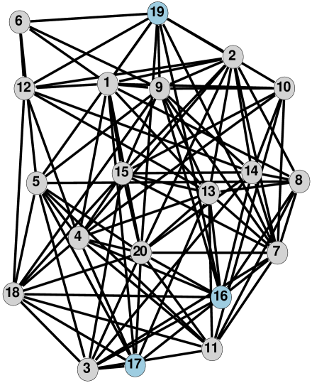
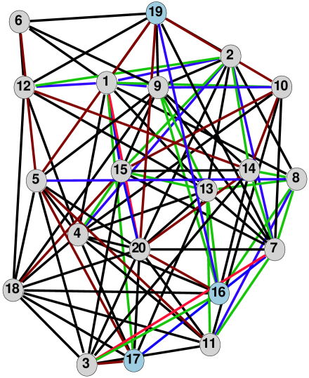
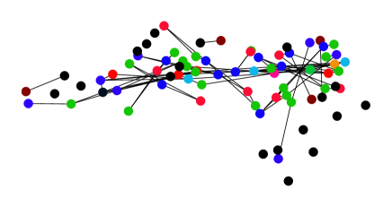
Appropriate coloring can help greatly in differentiating edges that cross at a small angle. Fig. 1 (left) illustrates such a situation. With many crossing edges, it is difficult to follow the edge from node 19 (top-middle, blue) to node 16 (lower-right, blue). In comparison, in Fig. 1 (right), it is easier to see that 19 is connected to 16 by a blue edge. The objective of this section is to identify situations where ambiguities in following edges can occur, and propose an edge coloring algorithm to resolve such ambiguities.
 |
 |
||
| (a) original graph | (b) dual collision graph | ||
 |
 |
||
| (c) dual graph colored | (d) original graph colored |
2.1 Edge collisions
Two edges are considered in collision if an ambiguity arises when they are drawn using the same color. The following are four conditions for edge collision:
-
•
C1: they cross at a small angle.
-
•
C2: they are connected to the same node at a small angle.
-
•
C3 (optional): they are connected to the same node at an angle close to 180 degree.
-
•
C4: they do not cross or share a node, but are very close to each other and are almost parallel.
We now explain the rationale for considering each of these four conditions as being in collision. C1 is considered a collision following the user studies described in Section A Coloring Algorithm for Disambiguating Graph and Map Drawings by Huang et al. [24, 25]. When eyes try to follow an edge to its destination, small crossing angles between this edge and other edges create multiple paths along the direction of the eye movement, either taking eyes to the wrong path, or slowing down the eye movement. C2 creates a situation where one edge is almost on top of the other, making it difficult to visually follow one of these edges.
C3 could create confusion as to whether the two edges connected at close to 180 degree are one edge, or two edges, when node labels are drawn. For example in Fig. 1 (left), it is difficult to tell whether nodes 19 and 17 are connected, or whether 19 is connected to 20 and 20 is connected to 17. When edges are properly colored (Fig. 1 (right)), it is clear that the latter is true. Note that if edges are allowed to be drawn on top of nodes, then an edge between 19 and 17 would be seen over the label of 20, thus this kind of confusion can be eliminated. Therefore we consider C3 as optional. But drawing edges over the label of nodes does introduce extra clutter and make it harder to read the node labels.
C4 causes a problem because when two edges are very close and almost parallel, it is difficult to differentiate between them. In addition, it can cause confusion when node labels are drawn. Fig. 3(a) shows two lines very close and almost parallel. While it is possible to differentiate between the two edges, when node labels are added (Fig. 3(b)), it is difficult to tell whether there are two edges ( and ), or three edges (, and ), or whether there even exists an edge . This confusion can be avoided if suitable edge coloring is applied (Fig. 3(c)).
| (a) | (b) |
| (c) |
To resolve these collisions, we propose to color the edges so that any two edges in collision have as different colors as possible. We first construct a dual edge collision graph.
2.2 Constructing the dual collision graph
Let the original graph be . Denote by the set of neighbors of a node . The dual collision graph is , where each node in corresponds to an edge in the original graph. In other word, there is a one-to-one mapping . Two nodes of the dual graph and are connected if and collide in the original graph.
The problem of coloring the edges of then becomes that of coloring nodes of the dual graph . Let be the color space, and be the color of a node , we want to find a coloring scheme such that the color of each node in the dual graph is as different to its neighbors as possible. This task can be posed as a MaxMin optimization problem:
| (1) |
where is a weight inversely proportional to how important it is to differentiate colors of nodes and , and is a measure of the difference between the colors assigned to the two nodes.
Note that (1) is stated rather generally: could be a discrete, or continuous, color space. This is intentional since we are interested in both scenarios. All we assume is that sits in a Euclidean space of dimension .
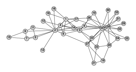
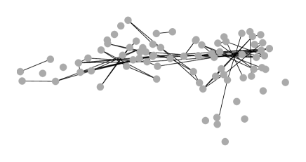
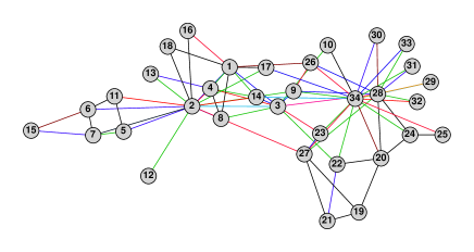
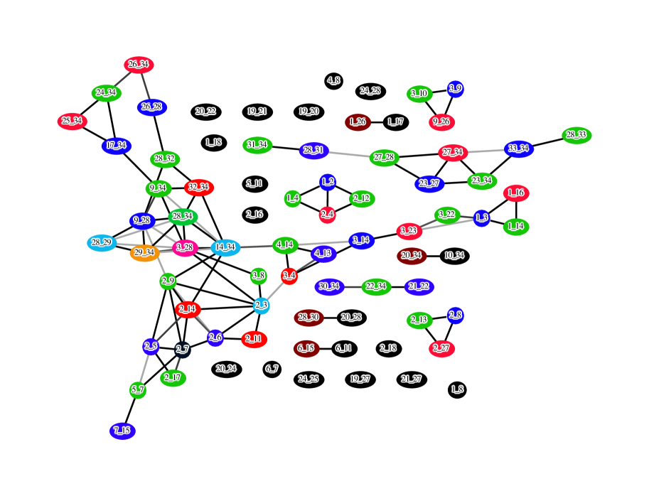
Once we colored the dual graph, we can use the same coloring scheme for the edges of the original graph. The complete pipeline of our proposed approach is illustrated in Fig. 2. Notice that the dual graph in Fig. 2(b) (displayed more clearly using a force-directed layout in Fig. 4) is disconnected. We apply our algorithm on each component of the dual graph.
2.3 A color optimization algorithm
Dillencourt et al. [11] proposed a force-directed algorithm in a Euclidean color space. They wanted all pairs of nodes to have distinctively different colors. Consequently their algorithm used a force model where repulsive forces exist among all pairs of nodes.
Because in our case edges can have the same color as long as they do not collide, there is no need to push all pairs of nodes of the dual graph apart in the color space. Therefore we can not use the algorithm of Dillencourt et al. [11] as is. Although it is possible to adapt their algorithm, we opt to propose an alternative algorithm. One reason is that we like to be able to use not only continuous color spaces, but also discrete color palettes (Sec. 3.1). Another reason is due to the fact that even when deciding the optimal color for one node of the dual graph with regard to all its neighbors, this seemingly simple problem can have many local maxima.
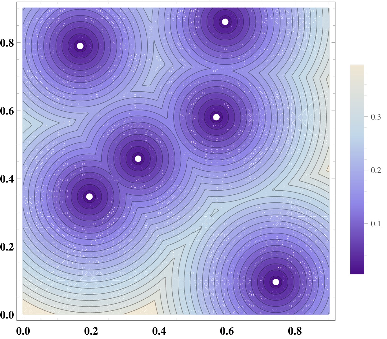
As an example, for simplicity of illustration we assume that our color space is 2D, and that the color distance is the Euclidean distance. Suppose we want to find the best color embedding for a node in the dual graph with six neighbors, and the six neighbors are currently embedded as shown in Fig. 5 (left). We want to place as far away from the set of six points as possible. Fig. 5 (left) shows a color contour of the distance from the set of six points (the distance of a point to a set of point is defined as the minimum distance between this point and all the points in the set, assuming unit weighting factors). Color scale is given in the figure, with blue for low values and off-white for large. From the contour plot it is clear that there are seven or more local maxima. In 3D there could be even more local maxima. A force-directed algorithm such as [11], even with the random jumps and swaps, is likely to settle in one of the local maxima.
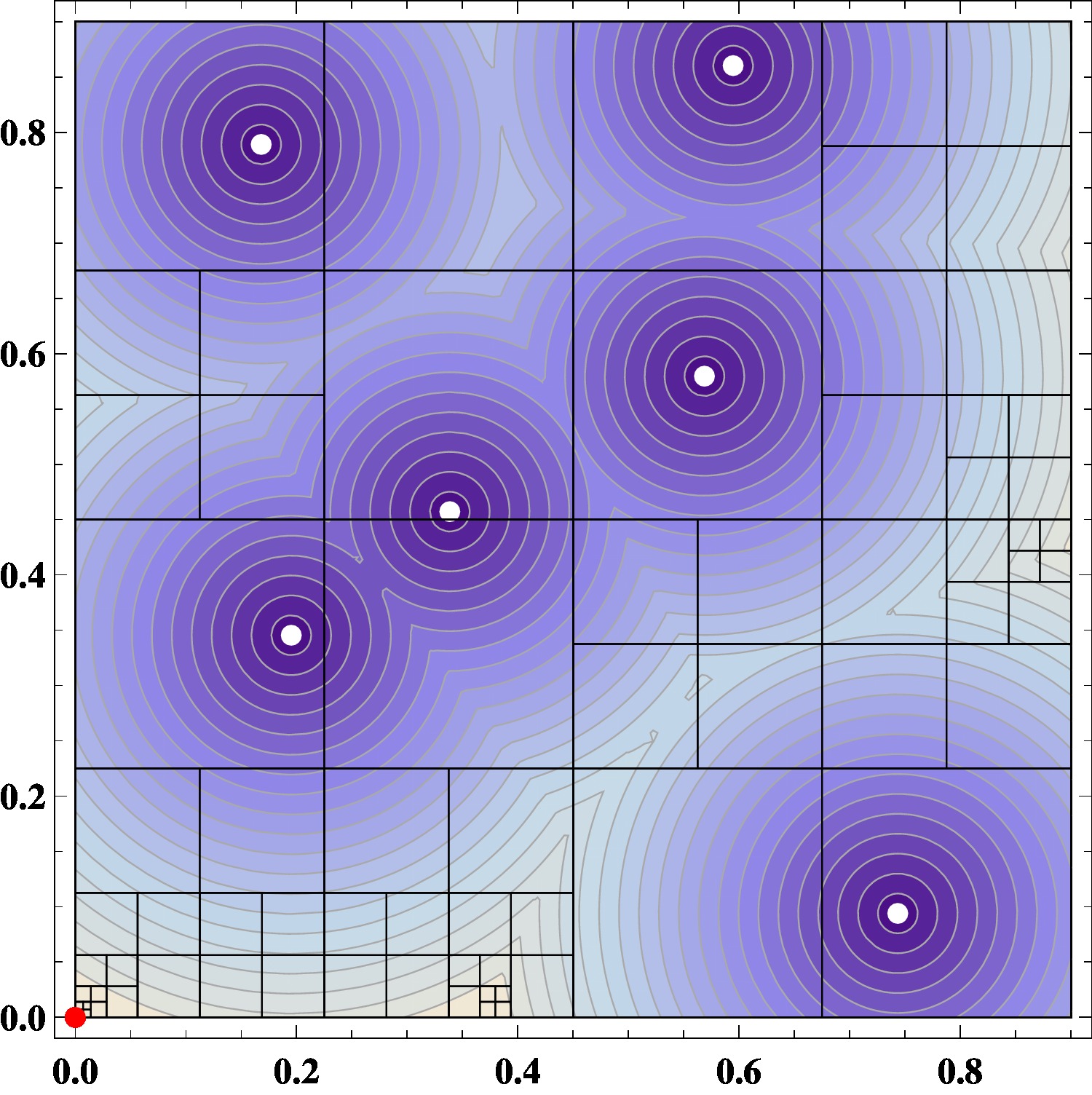
Instead we hope to find the global maximum. A naive way to find the global maximum position in the color space with regard to a set of points is to search exhaustively by imposing a fine grid over the color space, and calculating the distance from each mesh point to the set. However, given that the color space are typically of three dimensions, even at a resolution of 100 subdivisions along each dimension, we need distance calculations. This is computationally too expensive, bear in mind that this computation needs to be performed for each and every node of the dual graph repeatedly until the overall embedding in the color space converges.
We propose a more efficient algorithm based on the octree data structure (quadtree for 2D) that does not require evaluations of the distance over all mesh points. Using Fig. 5 (left) as an example, we want to find a point in the color space that is of maximal distance to a target set of points. Define the objective function value of a square to be the distance from the center of the square to the target set. We start with a queue of one square covering the color space, and define the current optimal value as the maximal distance over all squares in the queue to the target set. Taking a square from the current queue, we subdivide it into four squares. If the distance of one of the four square to the point set, plus the distance from the center of the square to a corner of the square, is less than the current optimal distance, this square is discarded. This is because no point in this square can have a larger distance to the target set than the current optimal distance. If the square is outside of the color space, it is also discarded. Otherwise the square is entered into the queue, and the optimal value updated. This continues until the half width of all squares in the queue are smaller than a preset threshold . The point that achieves the current optimal value is taken as the optimum. We know that the current optimal value should be within a value to the global optimal value, where is the half diagonal of the final square in -dimensional space.
-
1input: graph , color space , threshold 2compute a dual collision graph of 3randomly choose in for all 4set: , 5repeat 6 set: , , 7 for 8 define 9 10 11 12until ( ( && )) 13return:
-
1input: a set of points , a threshold 2set: a square/cube covering the color space 3set: a first-in-first-out queue 4set: 5set: 6for 7 if break 8 9 for 10 if 11 continue 12 if 13 14 15 16return:
This algorithm is in essence a branch-and-bound algorithm operating on the octree (quadtree for 2D) decomposition of the color space. When applied to the problem in Fig. 5 (right), we can see that in the top-left quadrant, the quadtree branched twice and stopped, because the function values are relatively small in that quadrant. The top-right and bottom-right quadrants branched 3 and 4 times, respectively. The final optimal point is found in the bottom-left quadrant. Initially the algorithm homed in on two regions, one around and the other around , eventually settled around the latter.
Of course this branch-and-bound algorithm only finds the global optimum embedding for one node. After applying the algorithm to every node of the dual graph once (one outer iteration), if the minimal color difference increases, or if it does not change, but the total sum of color difference across all nodes increases, we repeat.
We name the algorithm CLARIFY (Edge Coloring for CLARIFYing a Graph Layout) and formally state it in Algorithm 1. First, we give some notations used in the presentation of the algorithm. For a point and a finite point set in the Euclidean color space , we define the point-set distance as . We denote the center of a square or cube as , its children (by dividing a square into 4 or a cube into 8) as , and its half width as . We define the distance between and a set of point as that between the center of and , that is, .
The CLARIFY algorithm utilizes the global optimization algorithm for embedding one node, given in Algorithm 2 as EmbedOneNode.
3 Implementation and Results
We now give details on the implementation of CLARIFY, and results of using the algorithm on real world graphs.
3.1 Color space
CLARIFY works for both continuous color spaces (as long as it is a metric space), as well as discrete ones.
The RGB color space. An often used color model is RGB. This model defines color by a combination of three color intensities, red, green, and blue. Thus colors in the RGB model can be considered as residing in a three-dimensional cube.
The LAB color space. RGB color model is widely used for the representing and displaying images in electronic systems, such as LCD/LED display. However, distance between two colors in the RGB space is not an accurate measure of perceived difference by human eyes. For that purpose, the LAB color model is consider better [13].
The LAB color space (a rectangular box ) includes all perceivable colors, and more. While we can use CLARIFY directly in the LAB color space, since eventually we need to render the resulting drawing on screen and in print, we need to convert the coloring to RGB. Therefore we need to work within the LAB color gamut – the part of the LAB space that corresponds to the RGB space. It has a complex shape. Applying CLARIFY requires checking whether a cube is outside of the LAB gamut, which is considerably more complicated than checking whether a point is outside of the gamut.
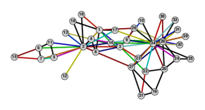
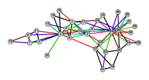
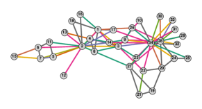
Instead, because CLARIFY works just as well on a discrete set of colors, we modify CLARIFY slightly as follows. We first sample the LAB gamut: we subdivide L, A and B at one unit increment, and check whether the resulting points are inside the LAB gamut by converting the point to RGB space, and back to the LAB space. If the double-conversion ends at the same point (within a threshold of 0.02 in Euclidean distance), the point is considered inside the LAB gamut. This resulted in 826816 points (12.4% of the LAB space). Note that we only have to find this sample set once and store as a file. We then construct an octree over this point set. The CLARIFY algorithm works with this octree, without worrying about staying inside the LAB gamut. This sampling technique also makes it very easy to control the lightness of the color – if we need to display the drawing in a dark background and thus light colors are desired, we can simply filter out points with a low value in the sample. Fig. 6(b) shows the result of apply CLARIFY in the LAB space with .
In terms of CPU time, we found that working in LAB space with the sampling technique gives very similar CPU time to working in the RGB space. Speed can be further improved if we take a coarser sample.
 |
|
 |
| (a) RGB | (b) LAB () | (c) ColorBrewer Accent_8 |
 |
|
|
| (d) ColorBrewer Dark2_8 | (e) applying Jianu et al. [26] | (f) LAB () |
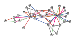
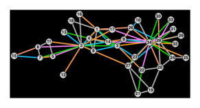
User-define color palettes. Any user defined color palette can be handled in a similar way to the LAB gamut – we convert the color palette consists of colors to the LAB space, then interpolate these colors to get sample points. We do so by subdividing the path linking these points in the LAB space into segments of equal distance. The path can be constructed along a natural ordering of the palette, or along a shortest path/tour by solving a Traveling Salesman Problem in 3D. An octree is then constructed using the sample points and CLARIFY is applied over the octree. Fig. 6 gives some examples of using two ColorBrewer [3] color palettes, with .
Other color spaces. There are situations where other color space may be more appropriate. For example, for disambiguating the edges in Fig. 4, we avoided using colors for edges in order to accurately display colors of the nodes. For this drawing we used CLARIFY with the gray scale, so that edges are in black or gray. We could even map the gray scale to line styles, with black for solid line and gray for dashed line of different weights.
3.2 Complexity of the CLARIFY algorithm
The CLARIFY algorithm consists of two main steps: finding the dual collision graph, and computing a color assignment.
The dual graph is calculated by checking whether edge pairs are in collision. Conditions C2 and C3 can be checked by looping through each node of the original graph, and testing if a pair of edges starting from the node nearly overlap, or run in almost opposite directions. This check can be done after sorting the angles, hence on a node with neighbors, assuming that the edges are not entirely on top of each other, the cost should be around , so the cost of checking over all nodes is (the pathological case of all edges on top of each other would give a complete dual graph thus a complexity of ).
Condition C1 can be checked using the Bentley-Ottmann algorithm [29] with a complexity of , where is the number of edge crossings. If is or more, a naive algorithm which checks all edges should be used. We are not aware of a good algorithm for checking C4, one possibility is to replace each edge with a rectangle in the shape of a thicker edge, then apply the Bentley-Ottmann algorithm, which should give us the same complexity as checking C1.
The second step of CLARIFY, that of assigning colors, applies the EmbedOneNode algorithm repeatedly over all nodes. EmbedOneNode is a branch-and-bound algorithm over an octree data structure. Its complexity is dependent on the number of local maxima, and how close they are to the global maximum (in terms of the objective function value). If the local maxima have much smaller function values compared with the global maximum, as in the case of Fig. 5, then branches of the octree/quadtree corresponding to the local maxima will terminate at an early stage, and the complexity of the algorithm is around , otherwise the complexity is around where is the average number of local maxima. Overall the worst case complexity is per iteration over all nodes. is a value hard to quantify, we believe it is related to the average degree of the dual graph.
Taking both the collision graph formation and the optimization into account, the CLARIFY algorithm has an average case complexity of , with the number of edge crossing, the average number of local maxima, and the number of iterations of Algorithm 1. The worst case complexity is , in the pathological situation where all edges are on top of each other.
In practice we found that the optimization step dominates the computation time even when we use the naive algorithm for computing the collision graph (see Table 1). Therefore for the rest of the paper we use the naive algorithm for the first step of forming the collision graph, which makes computation of C4 much simpler.
3.3 Choice of parameters
For checking collision conditions, we need to define what is a “small angle” and what is “close to 180 degree.” Based on empirical observations, by default we set these to be degree and degree. We define two lines being “very close” if their distance (the smallest distance between two points on the lines) is less than 1% of the larger of the length of the lines. We consider two lines as “almost parallel” if they form an angle that is less than one degree. The parameter controls the accuracy with which we find the global optimal embedding for one node. Through numerical experiment we found that the CPU time increases almost linearly with , as predicted by the complexity analysis. The color difference achieved is also in-line with expectation: from to , it changes roughly proportionally to or less, where is the dimension of the color space. This fits our analysis in Section 2.3. Perceptually, we found that gives very similar coloring to , hence we set by default.
 |
 |
| (a) | (b) |
 |
 |
 |
 |
| (a) | (b) | (c) | (d) |
 |
|
3.4 Examples
We now apply CLARIFY to graphs from real applications. Table 1 gives results on six of the graphs we tested, including running time and objective function (1) (color diff) achieved in LAB color space. These come either from the University of Florida Sparse Matrix Collection [8], or from the test graphs distributed with Graphviz [17], and originate from different application areas. We intentionally avoided choosing mesh-like graphs – such graphs are easy to layout aesthetically. Their layouts also tend to exhibit a low perceptual complexity, making it relatively easy to follow edges and paths. Compared with a non-mesh-like graph, a mesh-like graph is easier for our algorithm because there are typically fewer colliding edges. We ran the experiment on a Macbook Pro laptop with a 2.3 GHz Intel Core i7 processor.
| graph | CPU | cdiff | |||
|---|---|---|---|---|---|
| ngk_4 | 50 | 100 | 54 | 0.6 (0.) | 122.69 |
| NotreDame_yeast | 1458 | 1948 | 1685 | 1.3 (0.2) | 67.9 |
| GD00_c | 638 | 1020 | 1847 | 1.7 (0.1) | 64.32 |
| Erdos971 | 429 | 1312 | 4427 | 2.1 (0.1) | 59.3 |
| Harvard500 | 500 | 2043 | 11972 | 2.3 (0.3) | 35.0 |
| extr1 | 5670 | 11405 | 34696 | 14.5 (7.9) | 47.1 |
It can be seen from Table 1 that for graphs of up to a few thousand nodes and edges, CLARIFY runs quickly. The majority of the CPU time is spent on color assignment, while the construction of the dual graph takes relatively little time even with the naive dual graph construction algorithm. The Harvard500 graph gives a large (number of edges in the dual graph) in comparison to the number of edges, because it has a few almost complete subgraphs, which results in a lot of crossings at small angles.
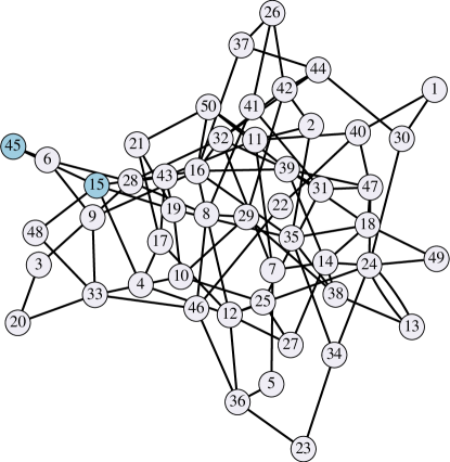
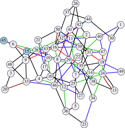
Fig. 7 shows the ngk_4 graph before and after the coloring. It is difficult to tell, from Fig. 7(a), whether nodes 45 and 15 (blue) are connected. From Fig. 7(b) we can tell that they are indeed connected by a red edge.
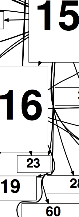
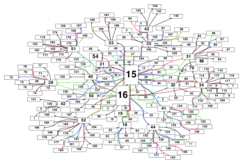
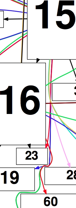
So far we have been applying CLARIFY to straight-line drawings of graphs. The algorithm can also be used for drawings where edges are splines. This could be the result of an edge bundling, or an edge routing. Fig. 8 shows the result of applying our algorithm to a graph from a user of our software, this is one of the examples that motivates our work. As we can see, from the original drawing, it is difficult to differentiate some of the splines. For example, is node 16 connected to node 60, or to node 19 (both below node 16)? With colored splines, we can see that node 16 is connected to node 60 by a red spline.
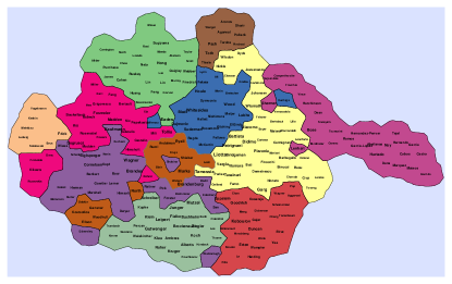
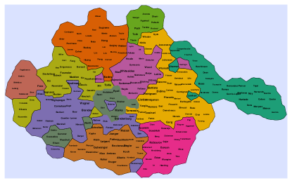
Finally, we applied CLARIFY to color virtual maps where countries could be fragmented. Because of the fragmentation, we have to use as many color as there are countries. Fig. 9 shows colored versions of an author collaboration map (see [15]) using two color palettes. Here each node is an author who published in the International Symposium of Graph Drawing between 1994 to 2004. Authors are connected by edges if they co-authored a paper. This gives a collaboration graph. Nodes are then clustered to form countries. Up to now, for coloring edges of node-link graphs, we assume that it is equally important to differentiate all colliding edge pairs, thus set the in (1) to 1. For coloring virtual maps, it is more important to color adjacent countries with more distinct colors, at the same time, we also want to differentiate all countries. Thus we set to be the inverse of the length of the shortest path that connect countries and in the dual graph of the map. From Fig. 9 we can see that CLARIFY works well in using the specified palettes, keeping neighboring countries colored with very distinct colors. Unlike the coloring algorithm in [15], we also maintain good color distinction among non-neighboring countries. Additional examples of graph and map coloring can be found in the supplemental pdf file.
3.5 Comparison with Jianu et al. [26]
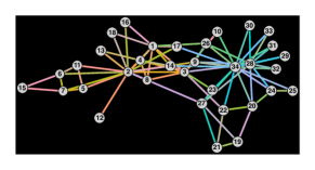
We evaluated our algorithm against that of [26] (hereafter called JRFL), using the code kindly supplied by the authors. Fig. 6(e) gives the result of applying JRFL on the Zachary graph. Following [26], we use a black background, because the code sets lightness to 75. It is seen that near nodes 34 and 28, it is difficult to differentiate edges. E.g., it is not clear whether node 34 is connected to 27 or not, due to the colors of edges 34–27 and 34–23 being very similar. For a like-for-like comparison Fig. 6(f) is the results of CLARIFY with fixed lightness of 75. Despite of the restricted lightness, it does not suffer from the ambiguity seen in Fig. 6(e). We also compared with JRFL on other graphs, and found CLARIFY better both in terms of ability to disambiguate drawings, and in speed. On most graphs, CLARIFY is about 10 times faster. Quantitatively, we found that JRFL always gives much worse (smaller) color differences among colliding edges than CLARIFY, even if we restrict lightness to 75 in CLARIFY.
4 User Study
 |
 |
| (a) | (b) |
 |
 |
| (c) | (d) |
 |
 |
| (e) | (f) |
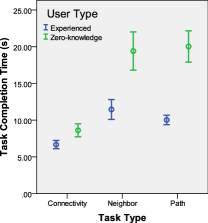 |
| (g) |
We conducted a controlled experiment to study the effect of edge coloring on user’s performance in fundamental graph-related tasks, such as visually following edges, finding neighbors and calculating the shortest path. Generally we compared two approaches, defined as two visualization types: the baseline graph drawing in black-white (B/W) and the improved graph drawing with edges colored by our algorithm (Color).
Experiment design. We recruited 12 participants (8 male, 4 female) for this paper-and-pencil experiment. 10 of the participants were graduate students majoring computer science and the other 2 of them were department assistants with no technology background. A half of the participants ever had experiences on node-link graphs, one student was even an expert on graph. The other half did not have previous knowledge with the node-link graph. The experiment followed a within-subject design that every participant entered all tasks with both visualization types. To eliminate the learning effect over the same task, we used two different layouts of the same graph data. The design ended up full factorial on the choice of two visualization types and two graph layouts. Each participant entered the same task four times in total. The experiment order was randomized across participants. Half of them completed the tasks first with the B/W approach and then with the Color approach. Another half adopted the opposite order. Further, in half of the time when participants were given the colored drawing, the algorithm is fixed to use the LAB palette. In another half, the participants selected their favorite palette and completed tasks with the colored drawings generated by this palette.
Before participants took the experiment, a training session was held to make sure they understood each task and got familiar with both drawing approaches. The training session included one task from each task type on a simple graph. The organizer checked the answer of each training task and explained any ambiguity immediately. In the formal study session, we recorded participant’s answer and completion time in each task. We did not distinguish the task reading time from the completion time, because all tasks were very short.
Data and task. Two layouts of the Zachary’s Karate Club Graph were used. One was exactly the layout in Fig. 2. Another was rotated and re-labeled. Three types of graph-related tasks were designed:
T1 (Connectivity): Determine whether two particular nodes are connected by a direct edge;
T2 (Neighbor): Estimate the number of nodes a particular node connects directly;
T3 (Path): Estimate the minimum number of hops from a particular node to another, including the source and destination.
On each type, four tasks were selected on each graph layout with similar difficulty levels. To eliminate user’s visual node querying time from their task completion time, we annotated the related nodes in each task on the corresponding graph layout before participants took the task.
Result. Results were analyzed separately on each task type. Significant level was set at 0.05 throughout the analysis.
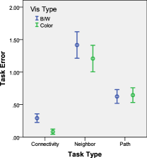
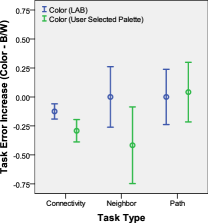
Task error: We computed the task error measure by the absolute deviation of the user’s answer from the ground truth. 111We also computed the task error rate (task error divided by the correct answer). However, there is little difference from the absolute error measure. On Connectivity tasks, task error will be 1 if the answer is incorrect, 0 otherwise. After that, we applied the two-way repeated measure analysis of variance (ANOVA) test where the task error was the dependent variable, the visualization type and the choice of graph layout were two independent variables. On Connectivity tasks, the task error difference between B/W and Color group is statistically significant (). A close look at the error bar in Fig. 10(a) shows that the average task error of the Color group (, ) is less than 30% of the B/W group (, ). On Neighbor tasks, the average task error of the Color group (, ) has a 15% reduction from the average task error in the B/W group (, ), though statistically the difference is not significant. On Path tasks, the error performance of the two groups are almost the same.
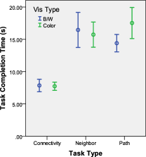
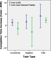
Task completion time: We applied a similar two-way repeated measure ANOVA test on task completion time. On all three types of tasks, there is no significant difference between B/W and Color groups. The detailed task completion time distribution is shown in Fig. 10(b).
Effect of color palette: On each participant, we computed the increase of task error and completion time of the Color approach over the B/W approach on the same task and graph layout. We compared these measures between two groups: one applying the fixed color palette (LAB) to generate the drawing and another applying the user selected color palette from six candidates. Results are shown in Fig. 10(c) and Fig. 10(d). Though in all task types there is no significant difference between the two groups, we observe that on Connectivity and Neighbor tasks, using user selected palette leads to much smaller increases in both task error and completion time, which corresponds to solid performance improvement.
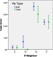
Analysis. The user study results demonstrate that the edge coloring technique on graph drawings can improve user’s performance in identifying 1-hop graph connectivity significantly. This is also echoed by the subjective feedbacks from our participants. Most of them found the colored graph much clearer in showing the graph connectivity. While in the B/W drawings, they found it hard to distinguish the edges that are crossed by or closed to other edges at small angles. On the third task to quantify the shortest path, the Color approach does not have a comparative advantage to the B/W approach. This is reasonable because most cases in this task involve a rather long path. It is difficult for people to figure out the exact path length only by eye, even if the graph is colored. Lastly, the intermediate task to estimate the number of 1-hop neighbors returns some surprising results. We have expected the Color approach to be significantly better than the B/W approach. However, only a 15% reduction in the task error is observed in average and the difference is not significant. To account for this result, we drilled down to the detailed cases and plotted Fig. 10(e) to show the relationship between the Neighbor task error and the number of actual neighbors. It is clear that the task error is large on nodes with a higher number of neighbors, and smaller on other less-connected nodes. On the nodes with a medium number of neighbors (10, 12), the Color approach is better than the B/W approach; while on the node with the highest number of neighbors (17), there is no error reduction for the Color approach. We also asked the participants making the most errors about the challenges in completing Neighbor tasks. Quite a few of them mentioned the same reason: most crossing angles between the edges on the target node are too small, so that they can not determine the exact number of edges on that node, no matter the graph is colored or B/W.
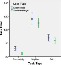
Possible concerns on the user study design are the small number of participants enrolled, and whether the diversified user background can interfere with our main result. We argue that our experiment has a fully within-subject design. Each participant is tested and measured 24 times, adding up to 288 entries in both participant’s answer and completion time. This is sufficient to get an initial idea of the edge coloring effect. We also looked at the impact of the user background. In Fig. 10(f), it is shown that participants with zero knowledge on the node-link graph actually made fewer errors than other experienced users. Further investigation on their task completion time narrates the potential reason: the zero-knowledged participants spent much longer time than the experienced users (Fig. 10(g)) – they are simply more careful in taking the tasks. By a two-way ANOVA test, we found that there is little interaction between the user background and the visualization type on the task error performance. The advantage of edge coloring applies unbiasedly to both experienced and first-time users. Comparing Fig. 10(a) and 10(f), it can be observed that the task error improvement with the edge coloring is similar in magnitude to that brought by more carefully taking the task and spending more time on the questions.
5 Discussions
The approach of coloring edges for disambiguating drawings has its limitations. Our working assumption is that the drawing is to be display as a static image on paper, or on screen. In case when an interactive environment is available, interactive techniques such as “link sliding” and “bring & go” [27] could be more effective. In such a situation, the algorithms proposed here can be used as an additional visual aid to the interactive techniques.
While the algorithm proposed here can run on relatively large graphs, our experience is that for graphs with a lot of edges, a static image is insufficient to allow the user to clearly see and follow each edge. Therefore our approach is best suited for small- to medium- sized graphs. Typical usage scenarios are illustrations of diagrams, such as computer or biological networks.
Finally, we note that sometimes edge colors are used to encode attributes on the edges. To apply our approach without interfering with the need to display such attributes, edges can be differentiated using dashed lines of different style and/or thickness, using the same algorithm in this paper. This can be achieved by mapping different line styles to 1D or 2D spaces.
6 Conclusions
Edge crossings, particularly those at small crossing angles, are known to be detrimental to the visual understanding of graph drawings. This paper proposes an edge coloring algorithm for disambiguating edges that are in collision because of small crossing angles or partial overlaps. The algorithm, based on a branch-and-bound procedure applied to a space decomposition of the color gamut, generates color assignments that maximize color differences of the colliding edges, and works for both continuous color space and discrete color palettes. The algorithm can also be applied to generate coloring for disambiguating virtual maps. Our user study found that that coloring edges in graph drawings helped user’s performance in 1-hop graph connectivity task significantly. Consequently we have made the CLARIFY code available as part of an open source software.
For future work, we plan to investigate better initial coloring strategies, before applying the CLARIFY algorithm. These include coloring high degree nodes first, or use a strategy similar to the register allocation algorithm [19].
References
- [1] G. D. Battista, P. Eades, R. Tamassia, and I. G. Tollis. Algorithms for the Visualization of Graphs. Prentice-Hall, 1999.
- [2] R. A. Becker, S. G. Eick, and A. R. Wilks. Visualizing network data. IEEE Transactions on Visualization and Computer Graphics, pages 16–28, 1995.
- [3] C. Brewer. ColorBrewer - Color Advice for Maps.
- [4] T. Bruckdorfer, S. Cornelsen, C. Gutwenger, M. Kaufmann, F. Montecchiani, M. Nöllenburg, and A. Wolff. Progress on partial edge drawings. In Proc. 20th Intl. Symp. Graph Drawing (GD ’12), volume 7704, pages 67–78, 2013.
- [5] M. Burch, C. Vehlow, N. Konevtsova, and D. Weiskopf. Evaluating partially drawn links for directed graph edges. In Proc. 19th Intl. Symp. Graph Drawing (GD ’11), pages 226–237, 2011.
- [6] R. Chernobelskiy, K. I. Cunningham, M. T. Goodrich, S. Kobourov, and L. Trott. Force-directed Lombardi-style graph drawing. In Proc. 19th Intl. Symp. Graph Drawing (GD ’11), LNCS, pages 320–331, 2011.
- [7] W. Cui, H. Zhou, H. Qu, P. C. Wong, and X. Li. Geometry-based edge clustering for graph visualization. IEEE Transactions on Visualization and Computer Graphics, 14:1277–1284, 2008.
- [8] T. A. Davis and Y. Hu. University of Florida Sparse Matrix Collection. ACM Transaction on Mathematical Software, 38:1–18, 2011.
- [9] G. Di Battista and L. Vismara. Angles of planar triangular graphs. In Proceedings of the twenty-fifth annual ACM symposium on Theory of computing, STOC ’93, pages 431–437, New York, NY, USA, 1993. ACM.
- [10] W. Didimo, P. Eades, and G. Liotta. Drawing graphs with right angle crossings. Theor. Comput. Sci., 412(39):5156–5166, 2011.
- [11] M. B. Dillencourt, D. Eppstein, and M. T. Goodrich. Choosing colors for geometric graphs via color space embeddings. In Proc. 14th Intl. Symp. Graph Drawing (GD ’06), LNCS, pages 294–305, 2006.
- [12] C. Duncan, D. Eppstein, M. T. Goodrich, S. Kobourov, and M. N ollenburg. Lombardi drawings of graphs. J. Graph Algorithms and Applications, 16:85–108, 2012.
- [13] B. Fraser, C. Murphy, and F. Bunting. Real World Color Management (2nd Edition). Peachpit Press, 2004.
- [14] E. Gansner, Y. Hu, S. North, and C. Scheidegger. Multilevel agglomerative edge bundling for visualizing large graphs. In Proceedings of IEEE Pacific Visualization Symposium, pages 187–194, 2011.
- [15] E. R. Gansner, Y. Hu, and S. Kobourov. Visualizing Graphs and Clusters as Maps. IEEE Computer Graphics and Applications, 30:54–66, 2010.
- [16] E. R. Gansner and Y. Koren. Improved circular layouts. In Proc. 14th Intl. Symp. Graph Drawing (GD ’06), LNCS, pages 386–398, 2006.
- [17] E. R. Gansner and S. North. An open graph visualization system and its applications to software engineering. Software - Practice & Experience, 30:1203–1233, 2000.
- [18] A. Garg and R. Tamassia. Planar drawings and angular resolution: Algorithms and bounds. In 2nd European Symposium on Algorithms, pages 12–23. Springer-Verlag, 1994.
- [19] L. George and A. W. Appel. Iterated register coalescing. ACM Trans. Program. Lang. Syst., 18:300–324, 1996.
- [20] D. Holten. Hierarchical edge bundles: Visualization of adjacency relations in hierarchical data. IEEE Transactions on Visualization and Computer Graphics, 12:2006, 2006.
- [21] D. Holten, P. Isenberg, J. J. van Wijk, and J.-D. Fekete. An extended evaluation of the readability of tapered, animated, and textured directed-edge representations in node-link graphs. In G. D. Battista, J.-D. Fekete, and H. Qu, editors, Proceedings of IEEE Pacific Visualization Symposium, pages 195–202. IEEE Computer Society, 2011.
- [22] D. Holten and J. J. van Wijk. Force-directed edge bundling for graph visualization. Computer Graphics Forum, 28:983–990, 2009.
- [23] Y. Hu, S. Kobourov, and S. Veeramoni. On maximum differential graph coloring. In Proc. 18th Intl. Symp. Graph Drawing (GD ’10), LNCS, pages 274–286, 2010.
- [24] W. Huang. Using eye tracking to investigate graph layout effects. In Visualization, 2007. APVIS ’07. 2007 6th International Asia-Pacific Symposium on, pages 97–100, 2007.
- [25] W. Huang, S.-H. Hong, and P. Eades. Effects of crossing angles. In Proceedings of IEEE Pacific Visualization Symposium, pages 41–46. IEEE, 2008.
- [26] R. Jianu, A. Rusu, A. J. Fabian, and D. H. Laidlaw. A coloring solution to the edge crossing problem. In Proceedings of the 13th International Conference in Information Visualization (iV09), pages 691–696. IEEE Computer Society, 2009.
- [27] T. Moscovich, F. Chevalier, N. Henry, E. Pietriga, and J. Fekete. Topology-aware navigation in large networks. In CHI ’09: Proceedings of the 27th international conference on Human factors in computing systems, pages 2319–2328, New York, NY, USA, 2009. ACM.
- [28] T. Moscovich, F. Chevalier, N. Henry, E. Pietriga, and J.-D. Fekete. Topology-aware navigation in large networks. In CHI’09: Proceedings of the 27th international conference on Human factors in computing systems, pages 2319–2328, New York, NY, USA, 2009. ACM.
- [29] J. O’Rourke. Computational Geometry in C (2nd ed.). Cambridge University Press, 1998.
- [30] S. Pupyrev, L. Nachmanson, S. Bereg, and A. Holroyd. Edge routing with ordered bundles. In Proc. 19th Intl. Symp. Graph Drawing (GD ’11), LNCS, pages 136–147. 2011.
- [31] H. C. Purchase. Which aesthetic has the greatest effect on human understanding? In Proc. 5th Intl. Symp. Graph Drawing (GD ’97), LNCS, pages 248–261. Springer-Verlag, 1997.
- [32] H. C. Purchase, D. A. Carrington, and J.-A. Allder. Experimenting with aesthetics-based graph layout. In Proceedings of the First International Conference on Theory and Application of Diagrams, Diagrams ’00, pages 498–501, London, UK, UK, 2000. Springer-Verlag.
- [33] H. C. Purchase, J. Hamer, M. N ollenburg, and S. G. Kobourov. On the usability of Lombardi graph drawings. In Proc. 20th Intl. Symp. Graph Drawing (GD ’12), LNCS, pages 451–462, 2012.
- [34] A. I. Rusu, A. J. Fabian, R. Jianu, and A. Rusu. Using the gestalt principle of closure to alleviate the edge crossing problem in graph drawings. In 15th International Conference on Information Visualisation, IV 2011, London, United Kingdom, July 13-15, 2011, pages 488–493, 2011.
- [35] C. Ware, H. Purchase, L. Colpoys, and M. McGill. Cognitive measurements of graph aesthetics. Information Visualization, 1(2):103–110, June 2002.
- [36] A. Wolff. Drawing subway maps: A survey. Informatik - Forschung und Entwicklung, 22(1):23–44, 2007.