Red and Blueshifts in Multi-stranded Coronal Loops:
A New Temperature Diagnostic
Abstract
Based on observations from the EUV Imaging Spectrometer (EIS) on board Hinode, the existence of a broad distribution of blue and red Dopplershift in active region loops has been revealed; the distribution of Dopplershifts depends on the peak temperature of formation of the observed spectral lines. To reproduce those observations, we use a nanoflare heating model for multi-stranded coronal loops (Sarkar & Walsh, 2008, 2009) and a set of spectral lines covering a broad range of temperature (from 0.25 MK to 5.6 MK). We first show that red- and blueshifts are ubiquitous in all wavelength ranges; redshifts/downflows dominating cool spectral lines (from O v to Si vii) and blueshifts/upflows dominating the hot lines (from Fe xv to Ca xvii). These Dopplershifts are indicative of plasma condensation and evaporation. By computing the average Dopplershift, we derive a new temperature diagnostic for coronal loops: the temperature at which the average Dopplershift vanishes estimates the mean temperature of the plasma along the coronal loop and at the footpoints. To compare closely with observations, we model dense and sparse Hinode/EIS rasters at the instrument resolution. The temperature diagnostic provides the same temperature estimates as the model whatever the type of raster or the viewing angle. To conclude, we have developed a robust temperature diagnostic to measure the plasma temperature of a coronal loop using a broad range of spectral lines.
0.5 \SetWatermarkScale4 \SetWatermarkAngle45
1 Introduction
The coronal heating problem is a long-standing issue in solar physics. It aims at explaining the reason why the solar corona has a mean temperature above 1 MK, while the surface of the Sun has an effective temperature of 5800 K, and also how this high temperature can be maintained during a solar cycle. Hence the solar coronal heating problem is to understand how the thermal energy is continuously and uniformly transported and distributed over a large volume like the corona. One of the favorite model is the heating by small bursts of magnetic energy, the so-called nanoflare heating problem as first mentioned by Parker (1983; 1988): this model explains that the coronal plasma can be heated to high temperatures with a high rate of occurrences of uniformly distributed nanoflares explaining the sustainability of the heating. Parker’s idea has been developed for coronal loops in active regions in which the main source of magnetic energy is located, and with the wealth of observations in different wavelength ranges, which provide strong observational constraints (Cargill, 1993, 1994; Cargill and Klimchuk, 1997; Mendoza-Briceño et al., 2002; Cargill and Klimchuk, 2004). By extension, the nanoflare model refers to the heating of loops by a series of energy releases, and does not refer to any particular mechanisms generating these bursts of energy (e.g., magnetic reconnection, wave mode coupling, turbulence). Even if they account for a small fraction of the total coronal heating budget, the understanding of the heating of coronal loops is a crucial step for solving the global coronal heating problem: loops are well observed in a broad range of temperature bands and thus their thermodynamical properties are well constrained leading to a detailed study of the physical processes at play. The state-of-the-art of this field of research has been reviewed in length by Reale (2010). Despite the large number of loop observations, their nature is still debated: single field line versus multi-stranded flux bundle (e.g., Cirtain et al., 2007), isothermal versus multithermal (e.g., Schmelz et al., 2009). In this paper, we define a loop as a multistranded flux bundle implying a multithermal plasma. The loop temperature is sustained by a series of small, short releases of energy mimicking the nanoflare model. The multi-strandedness of coronal structures has been recently revealed by high-resolution instrumentation (e.g., Kontar et al., 2010; Brooks et al., 2013; Scullion et al., 2014).
There is a long history of modelling coronal loop using 0D/1D hydrodynamic models, 3D mhd models, assuming a monolithic or multistranded loop, including or not thermal conduction, considering different radiative loss functions and/or sources of heating, and considering the ionisation equilibrium. These models have led to a better understanding of the observed loops and their diversity. All modelled loop have a peak of temperature at or near the apex of loop depending on the degree of asymmetry of the loop.
Downflows have been commonly observed in quiet-Sun and active regions since Doschek et al. (1976) using Skylab spectroscopic observations. The authors concluded that, for temperatures between 70000 K and 200000 K, the plasma responsible for the downflows was producing more emission in the UV than the plasma responsible for upflows. However, these observations did not shed light on the nature of those Dopplershifts (transient or persistent). Our work is motivated by recent observations of high blueshift patches in active region outskirts reported by del Zanna (2008) and Baker et al. (2009) lasting for several hours. Murray et al. (2010) have simulated the emergence of an active region similar to the one studied by Baker et al. (2011). The authors found that the blueshifts appear in the surrounding of the active region during the expansion phase of the emergence process and are also owed to the presence of a coronal hole interacting with the emerging flux. Baker et al. (2011) showed that the active region exhibits an enhancement of the blueshifts in the Fe xii line at 194 Å prior to the eruption. Hence, the increase in blueshifts has been considered as a precursor of the Coronal Mass Ejection (CME) associated with this active region. The complex topology of the magnetic field is also a crucial ingredient of the scenario developed by del Zanna et al. (2011) to explain blueshifts observed at the edges of an active region. The authors have combined EUV and radio observations to determine that the blueshifts are occurring at the interface of open and close magnetic field lines, and are sustained by the continuous magnetic reconnection thanks to the growth of the active region. Based on a nanoflare model, our goal is to determine if such a model allows us to show the ubiquitous existence of blueshifts and what are their intrinsic properties at different wavelengths compared to the observations above mentioned. We also rely on the observations by Warren et al. (2011) showing that, within an active region, the amount of blue- and redshifts is strongly dependent on the peak temperature of the spectral line observed: cooler is the spectral line, redder is the Dopplershift distribution, and reciprocally, hotter is the spectral line, bluer is the Dopplershift distribution. Warren et al. (2011) have used the capabilities of Hinode/EIS to obtain simultaneous rasters in several EUV spectral lines covering a wide range of coronal temperatures (from Si vii at 0.63 MK to Fe xv at 2.2 MK). The authors found that the Si vii observations of an active region are dominated by redshifts while hotter lines are dominated by blueshifts. It is also worth mentioning that it seems that the Fe xii and Fe xiii lines correspond to a peak in the distribution of blueshifts, and hence less blueshifts are observed at higher temperatures while blueshifts are still dominating the distribution of Dopplershifts in the active region. Similar observations have also been reported by del Zanna (2008) and Tripathi et al. (2009). Flows in moss have also attracted a lot of interest. The moss observed in active regions corresponds supposedly to the emission of hot, core coronal loops at the transition region (Berger et al., 1999; De Pontieu et al., 1999; Martens et al., 2000; Tripathi et al., 2010). In terms of Dopplershifts, the moss is dominated by redshifts for ions from C iv to Fe xiii, that is to say, from the transition region to the corona at 1.78 MK (Tripathi, Mason, and Klimchuk, 2012; Winebarger et al., 2013).
In Section 2, we describe the nanoflare heating model used to determine Dopplershifts in coronal loops. We describe the different spectral lines used to simulate the observed Dopplershifts (Section 3.1). In Section 3.2, we present the spatial distribution of Dopplershifts for the different spectral lines. In Section 4, we present a new diagnostic method to estimate the temperature of coronal loops based on multi-spectral observations. In Section 5, we discuss the properties of blue- and red-shifts for two simulated loops as seen by an imaging spectrometer rastering a region of the Sun such as Hinode/EIS. The conclusions are drawn in Section 6. In the Appendice A, we describe the effects of changing the observer point of view on the measurements of Dopplershifts and the temperature diagnostic.
2 Multi-stranded model for coronal loops
2.1 Setup of the Model

The corona is a highly conducting medium with a low plasma (ratio of the plasma pressure to the magnetic pressure). Therefore one can assume that the plasma dynamics occur along magnetic field lines, and that there is no or limited feedback between the magnetic field and associated thermodynamic parameters. These particular physical conditions justify the 1D modeling of coronal loops using the hydrodynamic equations projected along the loop (curvilinear abscissa) and, neglecting thermal conduction across magnetic field lines. Despite the increasing number of observations of coronal loops, there is no definitive evidence that the cross section of a coronal loop increases significantly with height (Watko and Klimchuk, 2000; López Fuentes et al., 2006). We thus neglect the expansion of the loop radius with height, which should occur along a coronal loop as a consequence of the solenoidal condition and the decrease of the magnetic field strength with altitude.
A coronal loop is defined as a collection of 128 strands. Each individual strand () evolves following the time-dependent one-dimensional (1D) hydrodynamic model satisfying mass, momentum, and energy conservation as well as the perfect gas law:
| (1) |
| (2) |
| (3) |
| (4) |
where , , and are the density, pressure and temperature of the strand (), is the plasma flow along the strand, is the curvilinear abscissa along the semi-circular loop ( and ). The number density (cm-3) is (kg m-3). The numerical code is based on the Lagrangian remap method developed by Arber et al. (2001), and further developed for multi-stranded coronal loops by Sarkar & Walsh (2008, 2009).
The loop has a total length of 100 Mm, and a radius of 2 Mm, and results from the amalgamation of 128 individual strands. Assuming that the loop is semi-circular, the height of the loop above the solar surface is thus 32 Mm, which is less than the typical pressure scale-height (50 Mm) of a coronal plasma at 1 MK. This fact justifies the use of a constant gravity, . The 100 Mm loop is divided into two main areas: a transition region (width of 5 Mm) in which the temperature is increasing rapidly and the density decreasing rapidly, and a corona. Therefore the coronal part of the loop has a length of 90 Mm. In addition, there is a reservoir of chromospheric plasma at each footpoint, which has a depth of 5 Mm. In combining the strands to form a loop, we assume that the radius of the loop is small compared to the length, and thus all strands have the same length of 100 Mm; in the geometry defined above, however, the inner (resp. outer) loop should be of length 94 Mm (resp. 107 Mm). The latter does not modify the physical prosses analysed in this study. We compute the thermodynamic evolution of the loop during a total time of 4 hours 30 min and taking snapshots every 1 s. The time cadence of the snapshots does not define the time-scales used within the MSHD code; the time-steps used in the Lagrangian remap code are changing with the thermal conduction and radiative losses.
The energy equation contains three terms on the right hand side: the thermal conduction with being a function of the temperature following Spitzer formula, the radiative cooling term where is a piecewise function (see Figure 2) adapted from Cook et al. (1989), and the heating source term .
The latter is defined as a distribution of successive heating bursts. Individual bursts have an energy level comparable to the energy of nanoflares (between - erg). The heating source function has the following properties:
-
(i)
Location: each strand is subject to 64 bursts which are randomly distributed in time, location, duration, and amount of energy injected. An example of such random distribution is given in Figure 3.
-
(ii)
Frequency: we consider a high-frequency heating mechanism. The heating rate is estimated to an average of 6.4 10-4 erg cm-3 s-1 per strand and the frequency is 3.8 mHz per strand. The high frequency regime justifies the quick establishment of a steady state (see Section 2.2).
-
(iii)
Energy distribution: the geometry, location, and frequency of energy bursts are imposing an energy distribution which has power law from small to large energy with a negative slope of .
To analyse the behaviour of Dopplershifts in multi-stranded coronal loops subject to high-frequency heating, we perform two experiments:
-
Loop i: the minimum of energy per bursts is erg giving a total energy injected of 5.131027 erg;
-
Loop ii: the minimum of energy per bursts is erg giving a total energy injected of 5.131028 erg.
We also solve the 1D hydrodynamics equations for three particular energy injection location: at the footpoints (), uniformly distributed along the strand (), and at the apex of the strand (). These three distributions are depicted in Figure 4. We use the three different distributions in Section 2.2 to show that our multi-stranded code is able to reproduce the well-known properties of modelled loops (e.g., Reale, 2002).

2.2 Thermodynamic Properties of the Loop

The thermodynamic parameters are computed independently for individual strands, and then combined to produce averaged values. The initial temperature profile for a single strand is linearly increasing from the chromospheric reservoir at about 10000 K to reach the bottom of the corona at 1 MK, and then remains a constant throughout the corona. In Figure 5, we plot the density profile along the loop which describe the initial density as an hydrostatic equilibrium (exponential decay with height with a constant pressure-scale height). The thermodynamic evolution of the loop is defined by the evolution of the density (sum of strand density ) and the temperature . The multi-stranded loop is characterised by an emission measure weighted temperature Sarkar & Walsh (2008):
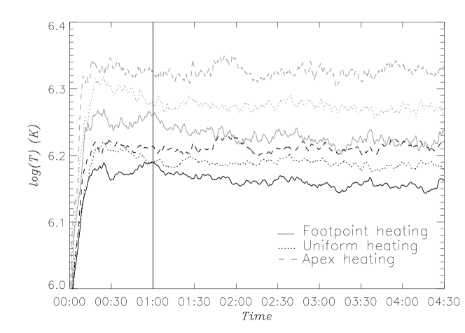
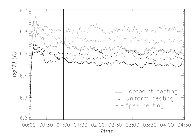
Loop i and Loop ii are classified by their thermal properties: Loop i (warm loop) has a mean temperature of 1.5 MK and an apex temperature of at most 2.2 MK, and Loop ii (hot loop) has a mean temperature around 3 MK and an apex temperature of about 4 MK. Those two experiments have been chosen to study the similarities and differences of warm and hot loops in a steady state, and thus to provide observational constraints. In Figure 6, we plot the time evolution of for Loop i (top) and Loop ii (bottom) averaged along the coronal section of the loop (solid black lines) and at the apex (light-gray lines). All three different heating locations are also considered for the sake of completeness. In each case, the temperature reaches a steady state rapidly after the start of the computation; we will consider that, after one hour, the loops have reached a steady state (solid vertical line in Figure 6). We also note that the loops are filled by the heated plasma at a different rate: as expected, it takes a much longer time (1520 minutes) for the Loop i to reach reasonable thermodynamic values, compared to less than 10 minutes for the Loop ii. This is justified by the improved efficiency of thermal conduction when the total amount of energy injected is increased (Loop ii) considering the same initial equilibrium at 1 MK for both cases. Changing the location of the heating sources does not significantly modify the time taken to reach a steady state.
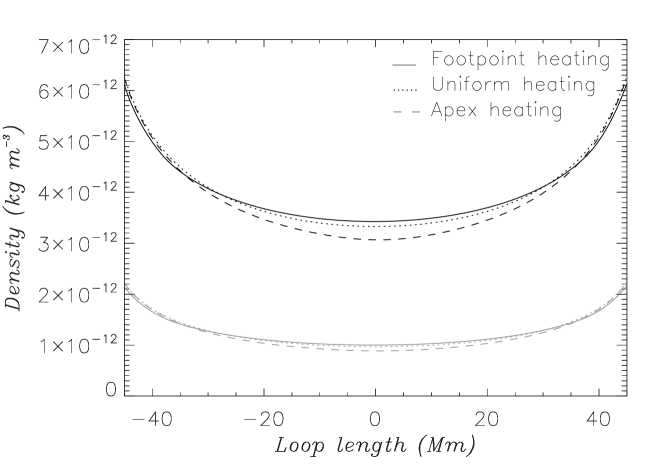
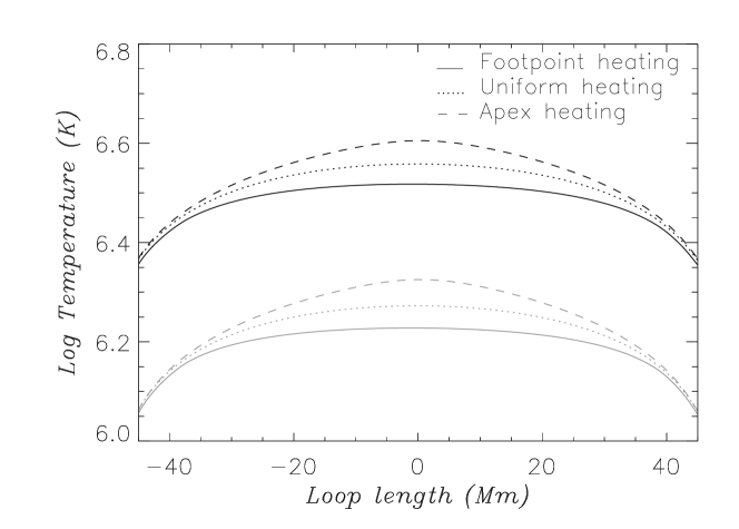
We plot the profiles of density (Figure 7 top) and temperature (Figure 7 bottom) average over two hours for the two experiments (Loop i in black, Loop ii in gray) and for the different heating locations (: solid line, : dotted line, and : dashed line). While both profiles are fairly symmetric with respect to the apex of the loop, individual strands exhibit asymmetric profiles owed to the randomness in the deposition of energy. The loop symmetry is thus a consequence of the collective behaviour of the strands and the time averaging. Keeping in mind that the thermodynamics quantities are averaged in time, the average density at the apex of Loop ii decreases from 3.410-12 kg m-3 for the heating to 3.110-12 kg m-3 for the heating, while the average temperature increases from 3.3 MK to 4 MK. As noted by Reale & Peres (2000) in simulating a multi-stranded loop, the heating can mimick a coronal loop with a constant temperature due to the flatness of the temperature profile. The temperature profiles are similar to those modelled by Galsgaard et al. (1999) in a numerical experiment of flux braiding. Although the change in density and temperature is 1020% between the different heating locations, the observation of coronal loops does not permit a clear identification of the heating source (see e.g., Priest et al., 1998; Mackay et al., 2000; Reale, 2002). It is also important to notice the difference in temperature at the apex of the loop depending on the location of the heating deposition: the apex temperature for Loop ii is 3.3 MK for the heating and 4 MK for the heating. This difference results from the small temperature gradients at the apex compared to the coronal footpoints near the transition to chromospheric temperatures, and also from the bidirectional flows generated by the energy deposition which over-heats the loop top.
As there is no remarkable difference in the physical processes at play between the three heating locations, we only consider the heating in the following sections. The heating is also the most favorable location for heating the corona: the complexity (braiding/twisting/tangling) of the magnetic field which can lead to continuous nanoflare occurrence is most likely to be located near the chromosphere (Régnier et al., 2008) making magnetic reconnection and wave mode coupling two mechanisms highly efficient in this region.
 |
 |
 |
 |
| Spectral | Wavelength | |
|---|---|---|
| Line | (Å) | log(K) |
| O v | 248.46 | 5.4 |
| Mg v | 276.58 | 5.5 |
| Si vii | 275.36 | 5.8 |
| Fe x | 184.54 | 6.05 |
| Fe xii | 195.12 | 6.2 |
| Fe xiii | 202.24 | 6.25 |
| Fe xv | 284.16 | 6.35 |
| Fe xvi | 262.98 | 6.4 |
| Ca xv | 200.97 | 6.65 |
| Ca xvii | 192.85 | 6.75 |

3 Modelling Synthetic Observations
3.1 Spectral Lines
In order to compare the behavior of the simulated Dopplershifts with those observed, ten spectral lines with a peak emission temperature between 250 000 K and 5.6 MK are selected (see Table 1) along with the following criteria:
-
-
the spectral lines are referenced in Warren et al. (2011);
-
-
the spectral lines are also on the list of Hinode/EIS spectral lines suggested by Young et al. (2007) to ensure that the selected lines are not or only weakly blended: for instance, we do not consider the Fe xi line at 188.21 Å studied by Warren et al. (2011) due to its complex blend. Some properties of these spectral lines observed in active regions or quiet-Sun regions can be found in Brown et al. (2008);
-
-
we extend the thermal coverage of the spectral lines, in particular, by adding two relatively cool lines (O v and Mg v) and two hot lines (Ca xv and Ca xvii).
3.2 Dopplershift Measurement
The Doppler velocity for a given spectral line in computed in two steps. The first step is to compute the velocity for a given spectral line with a contribution using the following equation:
| (5) |
As indicated in the previous sub-section, the contributions are depicted in Figure 8 for the ten spectral lines employed in this paper.
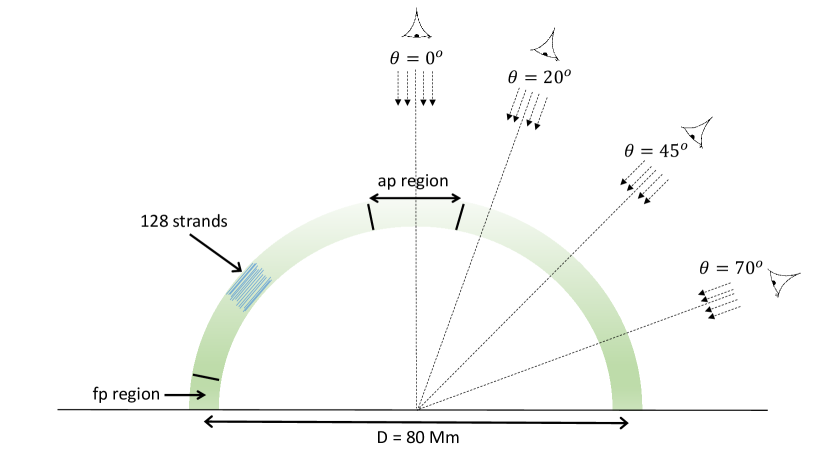
In the second step, the geometry of the loop and the observer point-of-view are defined to obtain the projected velocity along the line-of-sight from which the red (downflows) and blue (upflows) Dopplershifts are derived (see Figure 1).
Assuming that the loop is semi-circular, the line-of-sight is defined perpendicular to the apex of loop and corresponds to a viewing angle of 0o (see Figure 1). For the sake of completeness, the effects of changing the viewing angle on the distributions of Dopplershift and temperature diagnostic are descirbed in Section A.
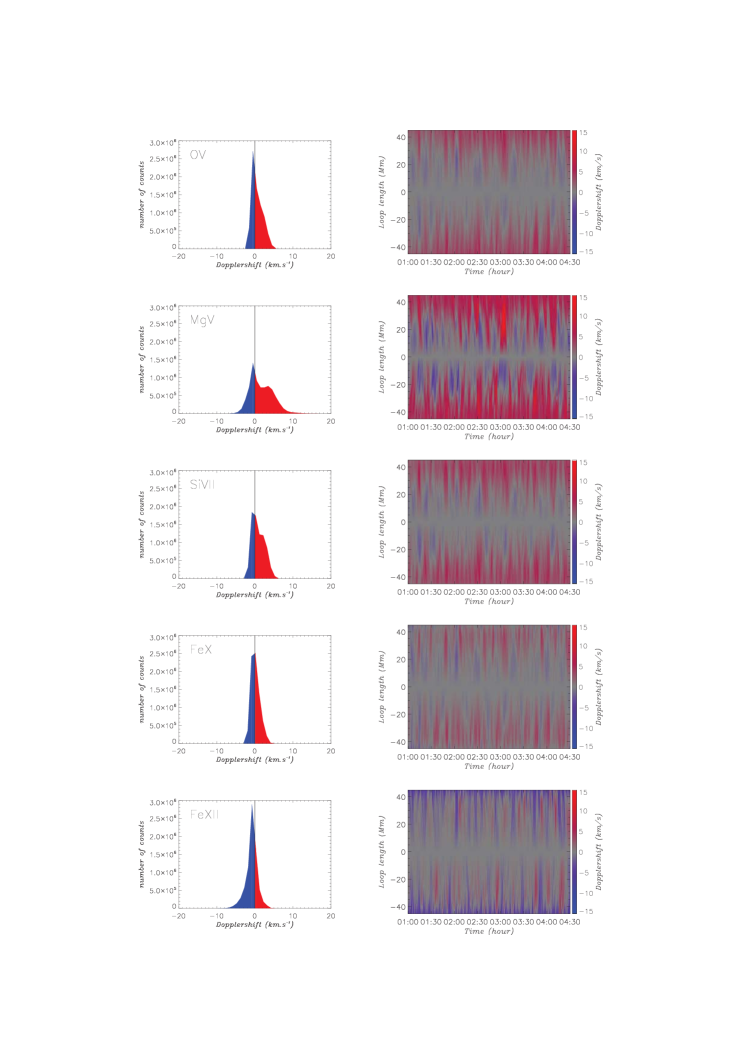
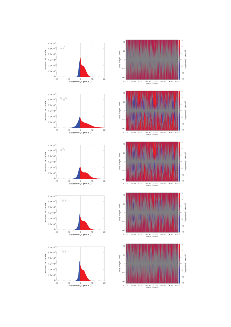
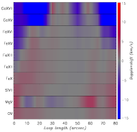
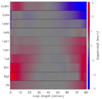
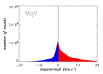
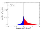
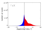
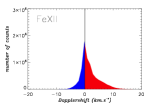
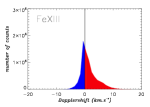
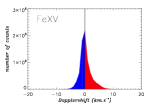
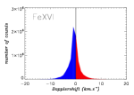
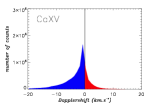
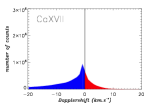
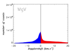
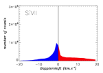
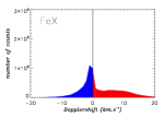
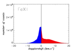
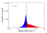
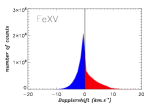
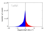
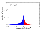
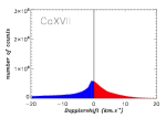
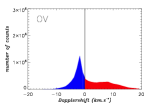
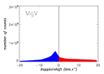
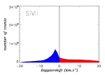
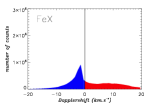
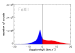
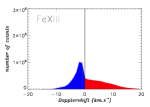
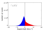
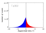
Figure 9 plots the statistical and spatial map of the Dopplershift distributions for all ten spectral lines under consideration for Loop i where all 128 sub-strands are amalgamated together and where the simulation has reached a quasi-steady equilibrium. The statistical Dopplershift distribution (left column for each wavelength) describes the number of occurrences of a specific Doppler speed during the simulation whereas the spatial map (right column for each wavelength) displays the variation in time of the Dopplershift speed along the loop from -45 Mm to 45 Mm (the apex is at the origin). The red and blue colours indicate the red- and blue-shifts respectively. Note that the Dopplershift statistical distributions are plotted between -20 and 20 km s-1, while the spatial maps are scaled between -15 and 15 km s-1. It is clear from both types of distributions that blue- and redshifts are ubiquitous in all spectral lines. However, there is an obvious change in behaviour of the Dopplershift as the temperature is altered; specifically, from red to blue dominance as the temperature of the spectral line increases.
There are three physical process operating in the system that can be identified within the results of Figure 9 and summarised in Figure 11. There is (i) the localised, short duration red and blue shift distribution centred on zero velocity that arises from the randomised heating bursts along the strands; (ii) a separate red-shift profile resulting from plasma cooling down, condensing and being observed in the cooler lines; and (iii) a separate component due to the evaporation of material into the loop from the chromospheric reservoir at its base. In Figure 11, the velocity distributions are depicted as Gaussian distributions: the plasma condensation is described on the left-hand side with a redshifted distribution corresponding to positive velocity going away from the observer, and the plasma evaporation is described on the right-hand side with a blueshifted distribution. The relative importance of the peak distribution is just indicative.
Considering Loop i further (see Figure 9), the Dopplershift statistical distributions and the spatial Dopplermaps are clearly dominated by redshifts for cooler lines from O v to Fe x. Also, the overall Dopplershift statistical distribution is clearly double-peaked for the Mg v and Si vii lines and corresponds to the localised, red and blue shift distribution from the randomised heating events as well as the condensation of hotter material to cooler temperatures. The downflow near the footpoints at about 3-5 km s-1. On the other hand, blueshifts start to become more dominant above the Fe xii line with the evaporation process observed as a long distribution tail. It should be noted that for all spectral lines, the maximum of redshift velocity is around 10 km s-1, while for the blueshift distribution, the tail towards high Doppler velocity develops from a maximum of 10 km s-1 in Fe xii to 30 km s-1 in Ca xvii.
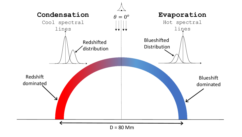
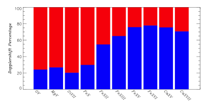
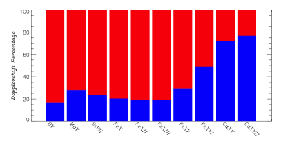
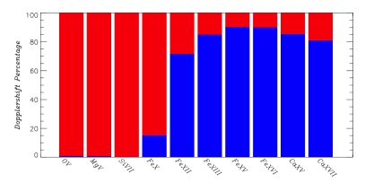
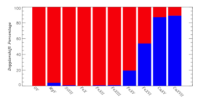
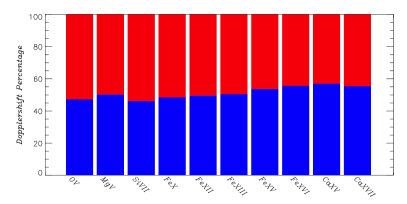
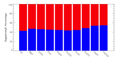
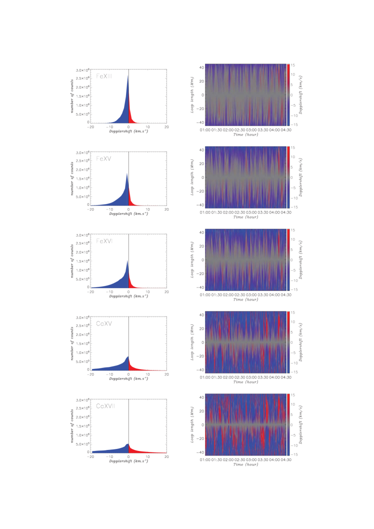
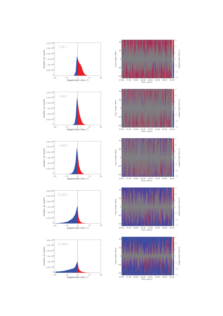
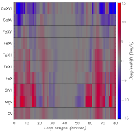
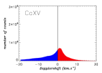
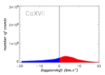
Figure 10 displays the same quantities as in Figure 9 but for Loop ii. To facilitate the comparison between the two loop models, we use the same ranges of velocities as in Figure 9.
As for Loop i, red- and blueshifts are ubiquitous at all wavelengths. The Dopplershift statistical distributions show a similar double-peak to that in Figure 9 but now from the O v line to the Fe xii line, which is again an evidence of a downflow/condensation at about 4-6 km s-1 (see Figure 11). For the cooler lines (below Fe xiii), the redshifts are concentrated near the footpoints, while for hotter lines (from Fe xv to Ca xvii) the blueshifts dominate in this region. The physical processes at play are identical to the ones described for Loop i but shitfed towards higher temperatures as the transition between red- and blueshift dominated plasma occurs for Fe x for Loop i and for Fe xii for Loop ii. This is reasonable given the overall increase in total energy into the system of Loop ii compared to Loop i.
4 Temperature Diagnostic
4.1 Hot vs Warm Loop
Given that the synthesised Doppler-shift observations can be related back directly to known physical parameters in the loops (and their sub-strands), it is instructive to further compare the properties of the warm (Loop i) and hot (Loop ii) loops in terms of their Dopplershift distributions. Therefore, Figure 12 plots the percentage of red- and blue-shifts occurring within the loop over the simulation period for the ten spectral lines sorted by increasing peak formation temperature . This percentage is calculated in different parts of the loop (along the entire coronal loop, near the loop base and finally around the apex as defined in Figure 1) once the quasi-steady state has been established. As examined in Figures 10 and 9, although red- and blue-shifts are ubiquitous in all wavelengths, it is very clear that red (blue) shifts dominate in the cool (hotter) lines.
Focusing on Loop i only and considering the entire loop plot (Figure 12 top left), the blue shift component begins to increase in percentage from the Fe x line. A maximum in the percentage of blue-shifts (about 80%) is reached for the Fe xvi line.The distribution of blue-shift for Loop i then decreases after the Fe xvi line.
In Figure 12 is also plotted the red- and blueshift contribution at the loop-base (middle row, left) and at the loop apex (bottom row, left) for Loop i . The Dopplershifts at the loop base are highly redshifted dominant for cooler lines and abruptly increase in blue-shift to 80-90% after Fe x and subsequently peaking at the Fe xii line. In contrast, the percentage of Dopplershift around the apex is relatively flat for this loop with a very slight blue dominance in the hotter lines.
The same thermodynamic processes are operating Loop ii but are scaled upwards in temperature due to the increase in injected total energy into this loop. As shown in In Figure 12 (right column), the entire loop blue shift component begins to increase from Fe xv line with a maximum in blue-shift calculated for Caxvii line (though we need to note that this is the highest temperature line under consideration). Similarly, the loop base blue raises from the Fe xv line and peaks in the Ca xvii line. The distribution red and blue shifts in the Loop ii apex region is once again approximately evenly split.
Another way of demonstrating this but focusing upon actual values for the average Dopplershifts over the simulation period can be found in Figure 13 (a)-(b) for Loop i and Figure 13 (c)-(d) for Loop ii. In these Figures the average Dopplershift velocity (left column) plus that average split into its positive and negative Dopplershift velocity components (right column) for the entire loop (solid line) and at the footpoint area (dash line, see 1) are plotted against the spectral line peak formation temperature.
For Loop i, the average Dopplershift approximately crosses the zero velocity point between the Fe x and Fe xii lines for the entire loop and at the loop base. Similarly for Loop ii, the average Dopplershift vanishes between the Fe xvi and Ca xv lines for both the entire loop and for the loop base.
For the average velocity above the Fe xvi in Figure 13 (b), the contribution of the footpoints (dash line) is large with a maximum of -24 km s-1 for blueshift and 11 km s-1 for redshift in the Ca xvii line, compared to -15 km s-1 and 7 km s-1 respectively for the entire loop (solid line). For Loop ii (Figure 13 (d)), the distribution is shifted towards higher temperatures, and the distribution at the footpoints exhibits a maximum average redshift in the Ca xvii line at 5 km s-1 while the average blueshift reaches -17 km s-1.
| (a) | (b) |
 |
 |
| (c) | (d) |
 |
 |
Therefore the temperature at which the average Dopplershift vanishes depends on the total energy injected in the loop; it corresponds to the temperature at which there is a balance between red- and blueshifts, similar to an equilibrium position. The evolution of the average positive and negative Dopplershifts is consistent with the evolution of the width of the Dopplershift distributions as depicted in Figures 10 and 9.
Thus, there are a number of aspects to note from Figures 12 to 13. Firstly, the effect of the increase in the total energy into the loop model is clear - the qualitative behaviour from Loop i to Loop ii scales up in temperature, across the spectral lines under consideration. Secondly, the modelling qualitatively reproduces the behaviour observed in loops where cool lines are dominated by red-shifts while hotter lines are predominantly bluer. Thirdly, while the entire loop statistics are usefully employed in the simulation (where all spatial positions are known), this would not be as applicable to actual observations. Thus, the localised loop base or loop apex analyses are better observational proxies. However, it should be noted that in this model simulation where the random heating bursts are localised at the loop based, the loop apex Dopplershift measurements in Figures 12 (bottom panels) are merely a symptom of the motions generated after these bursts have occurred (and hence has a weak dependence on temperature).
Consequently, as will be outlined in the next section, this new approach could be employed to determine the mean temperature of an observed loop bundle.
4.2 A Temperature Diagnostic Tool
Using the analysis performed in the previous Section, we develop a new tool to approximate the temperature of a coronal loop which can be used in conjunction with observations.
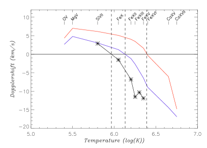
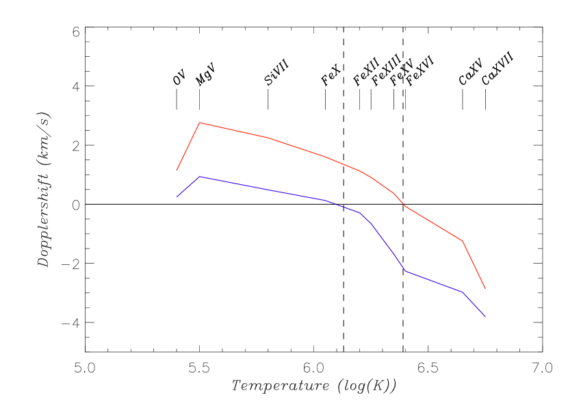
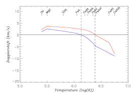
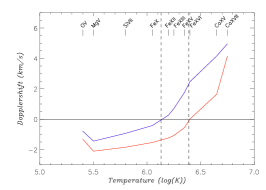
By plotting the evolution of the average Dopplershift at the footpoints with increasing temperature (see Figure 14 left), the mean temperature of the loop is obtained by finding the temperature at which the average Dopplershift vanishes. In Figure 14 left, we plot the average Dopplershift curves for Loop i (blue) and Loop ii (red). The estimated temperatures (indicated by the vertical dash lines) are MK, and MK, which have to be compared to the temperatures mentioned in Section 2.2, i.e, MK, and MK. It is worth noting that our estimate of the temperatures relies on piecewise linear interpolation between consecutive points, which, in this case, tends to give a lower value of the mean temperature.
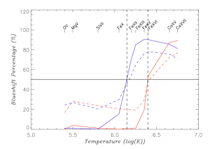
We also notice that the mean temperature of the loop can be estimated from the percentage of blueshifts at the footpoint or along a coronal loop. In Figure 14 right, we plot the percentage of blueshift as a function of temperature for Loop i (blue) and Loop ii (red) cases computed at the footpoint of the loop (solid curve) and along the loop (dash curve). The 50% level of blueshift crosses the different curves at an approximation of the mean temperature similar to the average Dopplershifts at the footpoints (see Figure 14 left). That is to say, MK, and MK. However, the percentage of blueshifts is not a quantity accessible with the current observations due to the spatial resolution of the instruments. One possible proxy will be the variation in time of the Dopplershift at a given location assuming that the loop is stable, and considering that the exposure time is small (typically of the order of 1–2 s).
As an example, we use the analysis if Tripathi et al. (2009) of an active region observed by Hinode/EIS. Tripathi et al. (2009) have studied two areas observed by Hinode/EIS and thus have computed the average Dopplershift in these regions. They show that the average Doppler velocity decreases with increasing temperature (with the exception of a Fe xiv line). In their examples, the average Dopplershift vanishes for a temperature between the Si vii and Fe x line. Thus following our model these regions will correspond to warm loops (i.e., corresponding the Loop i). To confirm our temperature diagnostic, we also plot the results obtained by Tripathi et al. (2009) as a black solid curve in Figure 14 left for the footpoints of coronal loop using the Hinode/EIS spectrometer. The estimated temperature of the coronal loop is K. Using an EM loci method, Tripathi et al. (2009) have estimated that the temperature of coronal loops in the observed region is between 800000 K and 1.5 MK depending on the height of the loop. Therefore, our temperature diagnostic is a good approximation of the mean temperature of coronal loops in this example. As the loop length and viewing angle are different from the modelled loops, we conclude that the temperature diagnostic seems to be robust (see also Appendix A for a discussion on the viewing angle).
This new temperature diagnostic can only be performed from a series of spectral lines covering a broad range of temperature, typically between 105 and 107 K.
5 Discussion
5.1 Simulated Hinode/EIS Raster
| (a) | (b) | (c) | (d) |
|---|---|---|---|
 |
 |
 |
 |
| (a) | (b) | (c) | (d) |
|---|---|---|---|
 |
 |
 |
 |
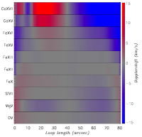
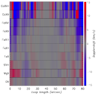
To compare our simulation results with the Hinode/EIS observations, we first construct a raster in a similar way to the EIS spectrometer. We raster the loop assuming a viewing angle of 0∘ (see Figure 1). In these simulated observations, the 100 Mm long semi-circular loop correspond to an observed coronal structure of projected length 80 Mm. We resample the simulated loop in order to obtain a pixel size of 1″ and an exposure time of 50 s. We neglect the CCD camera reading time. We simulate the observations by Warren et al. (2011) by constructing a raster with a 3″ step between successive observations. The stepping is introduced to speed up the scanning of the region. As mentioned in Warren et al. (2011), the EIS raster takes about 52 minutes for scanning a length of 180″ (about 130 Mm). For our simulated loop of 80 Mm long in the corona, it will take about 30 min. The data are then interpolated between two consecutive exposure times as in Warren et al. (2011). The resulting rasters for each spectral lines are shown in Figure 15 for Loop i, and in Figure 16 for Loop ii. In both Figures 15 and 16 (a) and (b), we construct two consecutive rasters. The first raster starts at t = 3600 s and lasts for 30 min, so the second one starts at t = 5400 s for the same duration. The Dopplershift distribution depends on the time the raster has started. For instance, while the cool lines exhibit only redshifts for the first raster, the second raster evidence blueshifts in the Mg v and Si vii lines. The distributions are smooth due to the interpolation between consecutive exposure times. Qualitatively, the rasters indicate the same behavior as the modelled loop: redshift dominated for cool lines below Fe xii and Fe xv for both modelled loops respectively, and blueshift dominated above Fe xii and Fe xv for both modelled loops respectively. The strong blue and redshifts are located at the footpoints of the loop owe to a combined effect of high density and integration along the line-of-sight. There is no symmetry between the two footpoints of the loop due to the randomness of the energy deposition in individual strands.
Warren et al. (2011) reported Hinode/EIS observations of two different active regions with a broad temperature coverage from Si vii to Fe xv (nine different lines). Both observations show evidence of temperature dependence of the downflow and upflow regions: downflows (redshifts) are dominating cool lines such as the Si vii, while upflows (blueshifts) dominate the hot lines (from Fe xi to Fe xv). Their first observation (see Figure 3 of Warren et al. 2011) shows a clear sudden increase of the blueshift in the Fe xi line, while their second observation (see Figure 4 of Warren et al. 2011) shows an increase in the Fe x line. According to the above results for the multistranded model (see Figures 15 and 16), we can complement Warren et al. (2011) article by concluding that the active region loops are warm loops with a characteristic temperature at the apex of about 2 MK, and that the overall temperature of the first active region is larger than the temperature of the second active region.
We now compare the typical Hinode/EIS raster with a 3″ step with two other possible observations: (i) the instantaneous observation with an exposure time of 50 s in Figures 15 and 16 (c), (ii) the dense raster without the stepping of 3″ (consecutive 50 s exposures) in Figures 15 and 16 (d). The latter raster takes about 2 hours to be completed. All three types of observations are reproducing the main features of the Dopplershifts: (i) cool spectral lines dominated by redshifts and hot spectral lines by blueshifts, (ii) both modelled loops have a blueshift distribution dependent on their characteristic temperature that is to say on the total amount of energy injected in the loop. However, the Dopplershift distribution for the instantaneous observation is smooth owe to the continuity of the different physical quantities at a given time, the distribution of 3″ step raster is also smooth due to the interpolation, while the distribution of the 1″ continuous raster is patchy due to the different times of observations and the bursty nature of the heating mechanism (and the possible occurrence of shocks). Thus, only a series of instantaneous observations or the dense raster with sufficient time and spatial resolutions evidence the nature of the heating mechanism along the loop.
5.2 Temperature diagnostic from simulated rasters
We apply the temperature diagnostic described in Section 4.2 by computing the average Dopplershift along the loop. Note that, at the resolution of Hinode/EIS, there are not enough points to obtain a statistically significant average Dopplershift at the footpoints of the loop. In Figure 17, we plot the avearge Dopplershift for Loop i (blue) and Loop ii (red) ass a function of the peak temperature of a spectral line. We only plot the temperature diagnostic for the sparse raster (with the 3″ step); we have obtained identical results for the dense raster, the instantaneous observation.
It is clear that the proposed temperature diagnostic method also works for a raster observation as we obtain the same estimates for the plasma temperature of the coronal loop.
6 Conclusions
We have defined a new temperature diagnostic tool relying on the measure of the avearge Dopplershift for a broad range of observed spectral lines.
First, we have complemented the work of Sarkar & Walsh (2008, 2009) regarding the thermodynamic properties of coronal loops defined a collection of strands. We have computed the physical properties of a 100 Mm loop with two different energy inputs with a particular focus on the Dopplershifts distribution for different spectral lines. The recent Hinode/EIS observations have put forward the existence of both blueshift and redshift velocities in active region loops (del Zanna, 2008; Warren et al., 2011), the amount of Dopplershifts depending on the peak temperature of the observed spectral line. The multistranded coronal loop model has reproduce the main observed features: (1) red and blueshifts exist in active region loops of realistic length (100 Mm); (2) the amount of red and blueshifts depends on the peak temperature of the observed spectral line: cooler lines being redder, hotter lines being bluer; (3) the amount of red and blueshifts depends on the mean/average temperature of the loop (as an amalgamation of strands). These properties are now well-known for coronal loops and have been reproduced with other numerical experiments (see, for instance, Taroyan and Bradshaw 2014).
Second, the 1D multistranded hydrodynamic model offers more information on the spatial and temporal evolution of heated coronal loops, and thus on the physical processes at play. The comparison between the multistranded model and modelled observations leads to the following physical interpretations:
-
-
redshifts in the cooler spectral lines evidence the condensation of the plasma mostly located near the footpoints of the loop: dense plasma cooling;
-
-
blueshifts in the hotter spectral lines is a signature of the evaporation of the plasma: hot plasma evacuate towards less dense regions;
-
-
the coexistence of condensation and evaporation for the entire coronal loop is owed to the multistrandedness nature of the loop.
More importantly for future analysis of multi-spectral observations, this study suggests that it is possible to estimate the mean/average temperature of a coronal loop: the transition from redshift-dominated loop to blueshift-dominated loop gives an estimate of the mean temperature of the coronal loop.
As an example, we refer to the study by Li et al. (2014) of two flare loops observed by SDO/AIA and Hinode/EIS. The authors measured the Dopplershifts at both footpoints of two coronal loops related to the flaring process. The Hinode/EIS lines used in their study are Fe x at 184.54Å (log()=6.0), Fe xii at 192.39Å (log()=6.09), Fe xiii at 202.04Å (log()=6.17), and Fe xv at 284.16Å (log()=6.3). From their Figure 2 showing the average Dopplershifts for the spectral lines mentioned above, we can derive from the temperature diagnostic that (assuming a view from the top of the loop):
-
-
the first set of loops has a temperature close to 1 MK for the first half an hour ofthe observation as the average Dopplershift in all spectral lines is negative;
-
-
the first set of loops is then heated to a temperature above 2 MK for about 1h45min for the northern footpoints and for about 15min for the southern footpoints;
-
-
the second set of loops shows a very different behavior: the heating of the loop is seen as less and less blueshift dominated curve for the northern footpoints; whilst the southern footpoints exhibit two consecutive heating events.
-
-
the ordering of the spectral lines is consistent with a top view of the loops for the northern footpoints of both sets of loops; whilst the ordering for the southern footpoints is characteristic of an highly inclined field (see Appendix A).
Our temperature diagnostic allows us to deduce the same properties of the loop plasma than Li et al. (2014). The temperature diagnostic from average Dopplershift measured along the loop or at the footpoints is thus a robust diagnostic of the temperature of the loop. As a study case, the active region moss is observed to be dominated by redshift velocities for spectral lines of peak temperature less than 1.78 MK (Fe xiii) according to Tripathi, Mason, and Klimchuk (2012) and Winebarger et al. (2013). From the temperature diagnostic detailed above, we then conclude that the temperature of the coronal loop associated with moss is above 1.78 MK, which is consistent with the moss being the transition region counter-part of hot core coronal active region loops (Martens et al., 2000; Tripathi et al., 2010).
In a forthcoming paper, we discuss the temperature diagnostic discussed here applied to IRIS and Solar Orbiter/SPICE characteristic spectral lines.
Knowing that the coronal loop temperature can be derived using multi-spectral observations in the frame of this multi-stranded model, the future work will be to produce temperature maps within active regions as well as further estimate of the energy release. The temperature diagnostic will fail at locations where the heating mechanism is different than the impulsive release of energy considered in this paper. Therefore, the multi-standed hydrodynamic model can give us more information on the plausible heating mechanisms at play in active regions.
References
- Arber et al. (2001) Arber, T. D., Longbottom, A. W., Gerrard, C. L., Milne, A. M. 2001, Journal of Computational Physics, 171, 151
- Baker et al. (2009) Baker, D., van Driel-Gesztelyi, L., Mandrini, C. H., Démoulin, P., Murray, M. J. 2009, ApJ, 705, 926
- Baker et al. (2011) Baker, D., van Driel-Gesztelyi, L., Green, L. M. 2011, Sol. Phys., in press
- Berger et al. (1999) Berger, T. E., de Pontieu, B., Fletcher, L., Schrijver, C. J., Tarbell, T. D., Title, A. M. 1999, Sol. Phys., 190, 409
- Boutry et al. (2012) Boutry, C., Buchlin, E., Vial, J.-C., Régnier, S. 2012, submitted to ApJ
- Bradshaw et al. (2011) Bradshaw, S. J. and Aulanier, G. and Del Zanna, G. 2011, ApJ, 743, 66
- Brooks et al. (2013) Brooks, D. H., Warren, H. P., Ugarte-Urra, I., Winebarger, A. R. 2013, ApJ, 772, L19
- Brown et al. (2008) Brown, C. M., Feldman, U., Seely, J. F., Korendyke, C. M., Hara, H. 2008, ApJS, 176, 511
- Cargill (1993) Cargill, P. J. 1993, Sol. Phys., 147, 263
- Cargill (1994) Cargill, P. J. 1994, ApJ, 422, 381
- Cargill and Klimchuk (1997) Cargill, P. J. and Klimchuk, J. A. 1997, ApJ, 478, 799
- Cargill and Klimchuk (2004) Cargill, P. J. and Klimchuk, J. A. 2004, ApJ, 605, 911
- Cirtain et al. (2007) Cirtain, J. W., Del Zanna, G., DeLuca, E. E., Mason, H. E., Martens, P. C. H., Schmelz, J. T. 2007, ApJ, 655, 598
- Cook et al. (1989) Cook, J. W., Cheng, C.-C., Jacobs, V. L., Antiochos, S. K. 1989, ApJ, 338, 1176
- del Zanna (2008) del Zanna, G. 2008, A&A, 481, L49
- del Zanna et al. (2011) del Zanna, G., Aulanier, G., Klein, K.-L., Török, T. 2011, A&A, 526, 137
- De Pontieu et al. (1999) De Pontieu, B., Berger, T. E., Schrijver, C. J., Title, A. M. 1999, Sol. Phys., 190, 419
- De Pontieu et al. (2014) De Pontieu, B., Title, A. M., Lemen, J., Kushner, G. D., Akin, D. J. et al. 2014, in press
- Dere et al. (2009) Dere, K. P., Landi, E., Young, P. R., del Zanna, G., Landini, M., Mason, H. E. 2009, A&A, 498, 915
- Doschek et al. (1976) Doschek, G. A., Bohlin, J. D., Feldman, U. 1976, ApJ, 205, L177
- Galsgaard et al. (1999) Galsgaard, K., Mackay, D. H., Priest, E. R., Nordlund, Å. 1999, Solar Phys., 189, 95
- Harra et al. (2011) Harra, L. K., Archontis, V., Pedram, E., Hood, A. W., Shelton, D. L., van Driel-Gesztelyi, L. 2011, Sol. Phys., in press
- Li et al. (2014) Li, Y., Qiu, J., Ding, M. D. 2014, ApJ, 781, 120
- López Fuentes et al. (2006) López Fuentes, M. C., Klimchuk, J. A., Démoulin, P. 2006, ApJ, 639, 459
- Kontar et al. (2010) Kontar, E. P., Hannah, I. G., Jeffrey, N. L. S., Battaglia, M. 2010, ApJ, 717, 250
- Mackay et al. (2000) Mackay, D. H., Galsgaard, K., Priest, E. R., Foley, C. R. 2000, Solar Phys., 193, 93
- Martens et al. (2000) Martens, P. C. H., Kankelborg, C. C., Berger, T. E. 2000, ApJ, 537, 471
- Mendoza-Briceño et al. (2002) Mendoza-Briceño, C. A., Erdélyi, R., Di G. Sigalotti, L. 2002, 579, L49
- Müller et al. (2013) Müller, D., Marsden, R. G., St. Cyr, O. C., Gilbert, H. R. 2013, Sol. Phys., 285, 25
- Murray et al. (2010) Murray, M. J., Baker, D., van Driel-Gesztelyi, L., Sun, J. 2010, Sol. Phys., 261, 253
- Parker (1983) Parker, E. N. 1983, ApJ, 264,642
- Parker (1988) Parker, E. N. 1988, ApJ, 330, 474
- Priest et al. (1998) Priest, E. R., Foley, C. R., Heyvaerts, J., Arber, T. D., Culhane, J. L., Acton, L. W. 1998, Nature, 393, 545
- Reale (2002) Reale, F. 2002, ApJ, 580, 566
- Reale (2010) Reale, F. 2010, Living Reviews in Solar Physics, 7, 5
- Reale & Peres (2000) Reale, F. and Peres, G. 2000, ApJL, 528, L45
- Régnier et al. (2008) Régnier, S., Parnell, C. E., Haynes, A. L. 2008, A&A, 484, L47
- Rosner et al. (1978) Rosner, R., Tucker, W. H., Vaiana, G. S. 1978, ApJ, 220, 643
- Sarkar & Walsh (2008) Sarkar, A. and Walsh, R. W. 2008, ApJ, 683, 516
- Sarkar & Walsh (2009) Sarkar, A. and Walsh, R. W. 2009, ApJ, 699, 1480
- Schmelz et al. (2009) Schmelz, J. T., Nasraoui, K., Rightmire, L. A., Kimble, J. A., del Zanna, G., Cirtain, J. W., DeLuca, E. E., Mason, H. E. 2009, ApJ, 691, 503
- Scullion et al. (2014) Scullion, E., Rouppe van den Voort, L., Wedemeyer, S., Antolin, P. 2014, ApJ, 797, 36
- Spadaro et al. (2003) Spadaro, D., Lanza, A. F., Lanzafame, A. C., Karpen, J. T., Antiochos, S. K., Klimchuk, J. A., MacNeice, P. J. 2003, ApJ, 582, 486
- Taroyan and Bradshaw (2014) Taroyan, Y. and Bradshaw, S. J. 2014, Sol. Phys.
- Tripathi et al. (2009) Tripathi, D., Mason, H. E., Dwivedi, B. N., del Zanna, G., Young, P. R. 2009, ApJ, 694, 1256
- Tripathi et al. (2010) Tripathi, D., Mason, H. E., Del Zanna, G., Young, P. R. A&A, 518, A42
- Tripathi, Mason, and Klimchuk (2012) Tripathi, D., Mason, H. E., Klimchuk, J. A. 2012, ApJ, 753, 37
- Warren et al. (2011) Warren, H. P., Ugarte-Urra, I., Young, P. R., Stenborg, G. 2011, ApJ, 727, 58
- Watko and Klimchuk (2000) Watko, J. A., Klimchuk, J. A. 2000, Sol. Phys., 193, 77
- Winebarger et al. (2013) Winebarger, A., Tripathi, D., Mason, H. E., Del Zanna, G. 2013, ApJ, 767, 107
- Young et al. (2007) Young, P. R., Del Zanna, G., Mason, H. E., Dere, K. P., Landi, E., Landini, M., Doschek, G. A., Brown, C. M., Culhane, L., Harra, L. K., Watanabe, T., Hara, H. 2007, PASJ, 59, 857
Appendix A Viewing Angle Effects
In Section 3.2, we studied the distributions of Dopplershifts when looking at the loop from the top. We now study the distributions when the observer’s direction is making an angle of 20∘, 45∘ and 70∘ with respect to the vertical direction (see Figure 1). In Figures 18, 19 and 20, we plot the Dopplershifts statistical distributions for the ten selected spectral lines (see Table 1).
 |
 |
 |
 |
 |
 |
 |
 |
 |
 |
 |
 |
 |
 |
 |
 |
 |
 |
 |
 |
 |
 |
 |
 |
 |
 |
 |
 |
 |
 |
Comparing the distributions of Dopplershifts for the different viewing angles, we clearly see the increase of blueshifts for spectral lines with increasing peak temperature for angles between 0∘ and 45∘, while this behaviour is not obvious for a viewing angle of 70∘. The peak of the distribution of blueshifts is shifted towards larger values when the angle increases: for instance, from about 0 to -2 km s-1 for the Fe xii line. Whilst the distribution of redshifts is flattened to reach a more uniform velocity distribution.
Refering to the schematic Gaussian distributions of Figure 11, the 20∘ case is similar to the 0∘ case exhibiting a double-peak distribution which is redshifted for cooler lines and blueshifted for hotter lines. As discussed in Section 3.2, these double-peak distributions are characteristic of plasma condensation and evaporation. For the 45∘ and 70∘ cases, the distributions are often double peaked (see for instance the distribution for Fe xii at a 70∘ viewing angle) with both a blueshifted peak and a redshifted peak. This scenario is different from the one discussed in Section 3.2 and appears when both plasma condensation and evaporation are at play in the integrated line-of-sight.
| (a) | (b) | (c) |
|---|---|---|
 |
 |
 |
In Figure 21(a)-(c), we test our temperature against the change in viewing angle. We thus plot the average Dopplershift for a given spectral line or temperature. The temperature diagnostic that we have defined states that a vanishing average Dopplershift marks the temperature of the modelled coronal loop. The average temperature of the modelled loops is indicated by the dash lines. For a viewing angle of 20∘, the curves of average Dopplershift are similar to those for a viewing angle of 0∘ (see Figure 14 left). The temperature diagnostic at 20∘ provides the same temperature as the diagnostic at 0∘. For a viewing angle of 45∘, the average Dopplershift has been significantly reduced even if the curve has kept the same shape. The average Dopplershift is below 0.5 km s-1 in absolute value. In addition the vanishing average Dopplershift is for a temperature of 1.25 MK for Loop i and 2.24 MK for Loop ii. This implies a change of about 8% in the estimated temperature of the loops. For a viewing angle of 70∘, the curves of average Dopplershift are reversed with a dominant blueshift velocity for the low peak temperature spectral lines. Nevertheless, the temperature diagnostic at 70∘ is similar to the diagnostic at 0∘.
From this analysis of the behaviour of Dopplershifts as a function of the viewing angle, we conclude that our temperature diagnostic is robust for a wide range of viewing angles; however, a moderate viewing angle (like 45∘) leads to an increase of the errors on the estimated temperature. On the observational point-of-view, we note that the average Dopplershift for a viewing angle of 45∘ is small ( 0.5 km s-1), and thus difficult to observe with the current instrumentation.