multiDimBio: An R Package for the Design, Analysis, and Visualization of Systems Biology Experiments
Abstract
The past decade has witnessed a dramatic increase in the size and scope of biological and behavioral experiments. These experiments are providing an unprecedented level of detail and depth of data. However, this increase in data presents substantial statistical and graphical hurdles to overcome, namely how to distinguish signal from noise and how to visualize multidimensional results. Here we present a series of tools designed to support a research project from inception to publication. We provide implementation of dimension reduction techniques and visualizations that function well with the types of data often seen in animal behavior studies. This package is designed to be used with experimental data but can also be used for experimental design and sample justification. The goal for this project is to create a package that will evolve over time, thereby remaining relevant and reflective of current methods and techniques.
Introduction
Two terms, trait and phenotype, are fundamental in biology. Traditionally, a trait is defined as any character of an organism that can be described and/or measured, while a phenotype is the sum total of the measured traits. For example, in systematics, traits are used as diagnostics, and phenotypes as descriptors, of species; in other words, traits are the divisible units of phenotypes and phenotypes are assemblages of traits. Although traits originally referred to observable characters such as morphology and behavior, this definition was expanded with technical advances to include the physiological, developmental, and genetic processes that produce these characters ( Moore et al. (1997); Nijhout (2005)). Despite these important distinctions, it is not uncommon to see these two terms used synonymously. For example, in studies of genetically modified organisms one often sees “phenotype" referring to the product of the gene manipulation while other traits, that may or may not have been measured, are disregarded.
Another issue to keep in mind is that all traits, whether it is a morphological feature of the organism, its behavior, physiology, or even the patterns of gene expression during the formation of a tissue, change throughout the life history of the individual, which lead to changes in the phenotype ( Crews et al. (2006)). Even the genome might change under unusual circumstances such as environmentally induced mutation ( Crews and McLachlan (2006)). This history can be evaluated on a scale of seconds, minutes, days, an individual’s lifetime, or at the population level over the course of generations. The challenge then is how to calculate this constant yet ever changing complexity in ways that inform, rather than oversimplify.
Many classic studies have focused on the outcome of manipulating a single variable in an experimental setting, e.g. vaccine exposure prior to challenge with an infectious agent. However, these studies oversimplify the phenotype, relegating the phenotype to a simple trait as opposed to the manifestation of a complex network of traits. A systems biology approach can place the results of experiments in the broader context of how phenotypes arise from sets of interacting traits ( Kitano (2002)). These analyses can be restricted to single levels of biological organization or can be used to integrate across levels; either alternative gives a fuller understanding of the phenotype of the individual. Fortunately, more researchers are coming to appreciate the interrelated nature of traits at all levels of biological organization and, in so doing, have begun to look at the interactions of traits rather than considering them as if they were independent variables.
When multiple traits of complex phenotypes are examined as a unit, e.g., the suite of genes known to be involved in sex determination and gonadal differentiation or the neural circuitry underlying sociosexual behavior, conventional analytic and presentation methods make it difficult to quantify and illustrate the information. This paper introduces an adaptation of established methods for analyzing complex data sets that takes a computational systems biology approach, integrating data, analysis, and visualization. Our method of depicting complex phenotype analysis, which we have called the Functional Landscape Method, can be viewed as a recent addition to the long history of imagery to depict complex concepts in all areas of science. Well-known images in Biology would include the Waddington (1957) developmental landscape depicting the genes that shape tissues and, more recently, the Nijhout (2003) schematic of the importance of context in trait development. Similarly, in Psychology, there is the Gottesman (1997) depiction of the contribution of genes to cognitive ability and that of Grossman et al. (2003) illustrating how genetic and experiential factors push the individual to thresholds of pathology. Notably, all share the use of three dimensions to illustrate complex traits whose individual components are two-dimensional in nature. The shared quality of these images is predicated on the fact that the mind can process 3D comparisons much better than complex bar graphs or tabulated results, a fact verified many times in cognitive psychology.
Models Implemented in multiDimBio
multiDimBio was designed to support a research project involving multidimensional data from design through publication and as such the package will continue to grow and change as new methods are developed. Researchers interested in contributing to multiDimBio are encouraged to contact the authors. The models implemented section is organized from design to analysis and visualization, as one would conduct a research project.
Power Analysis
Methods are implemented to compute the statistical power, in terms of the type II error rate, based on anticipated sample and effect sizes for FSelect() and PermuteLDA(). By default, the power of both tests are determined by iterating over a range of effect and sample sizes. The default settings were selected to be representative of many behavioral genetic studies; however, users can input alternative sample and effect sizes. The algorithm for the power analysis proceeds as follows:
-
1.
Input sample and effect sizes
-
2.
Set the number of significant effects, e to 0. Note - Total number of traits is fixed at 6
-
3.
Draw random deviates for the given sample size for 6 traits. Note - All traits not significant under this iteration are drawn from a N(0,1) distribution.
-
4.
Perform either FSelect() or PermuteLDA() and record the results.
-
5.
Return to step 3 N times, recording the results each time. Note - N is set using the trials input
-
6.
If e<5 return to step 2 and set the number of significant effects to e+1
-
7.
Proceed to the next combination of sample and effect size.
-
8.
Output the results for each combination of sample and effect size as a function of the number of significant traits.
Power(func, N, effect.size, trials)
-
•
func = The function being used in the power analysis, either PermuteLDA or FSelect.
-
•
N= A vector of group sizes. The group size is N/2. Default = c(0.1,0.4,0.8,1.6)
-
•
effect.size = A vector of effect sizes. Default = c(6,12,24,48,96)
-
•
trials = The number of iterations for each combination to determine the type II error rate.
Data Preprocessing
A number of methods are implemented in multiDimBio to aid in the necessary preprocessing of data.
Incomplete data
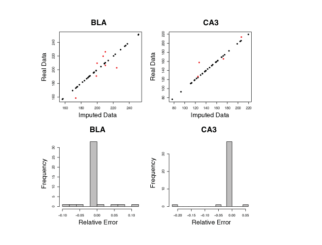
A recurrent challenge in analyzing data from behavioral research is missing observations. Because our methodologies require individuals with the same number of observations, addressing this problem is critical. We use a three-step process to solve the missing data problem. First, all traits measured on fewer than 50 percent of the individuals are removed. Second, all individuals missing more than 50 percent of the remaining traits are removed. Importantly, the user can modify each of these arbitrary thresholds. Finally, missing data is imputed using a probabilistic principle component framework. Our implementation is a wrapper around the pcaMethods functions ppca and svdimpute ( Stacklies et al. (2007)). Unlike traditional principle component analysis, probabilistic principle component analysis (PPCA) can handle missing data ( Tippping and Bishop (1999)). In the implementation of PPCA used in pcaMethods an Expectation Maximization (EM) algorithm is used to fit a Gaussian latent variable model ( Tippping and Bishop (1999)). Missing values are then imputed as a linear combination of the principle components ( Troyanskaya et al. (2001)). The output is a complete matrix of principle component scores, a vector of individuals and/or traits removed during the first two steps, and a diagnostic plot illustrating the performance of the data estimation step. Although not currently implemented, one could also estimate the statistical uncertainty associated with each interpolated point. We use the following algorithm to assess the performance of the data imputation:
-
1.
Determine the percentage of missing data from the complete data frame, pmiss.
-
2.
Remove all individuals without complete observations.
-
3.
Randomly censor the observations with probability pmiss.
-
4.
Use the three-step method outlined in section 0.2.2 to impute the missing data.
-
5.
Compare the observed data to the imputed.
-
6.
Analyze the residuals using a qq-plot. If the method performs appropriately the error should be normally distributed.
The PPCA method was adapted from Roweis (1997) and a Matlab script developed by Jakob Verbeek. The data estimation method was proposed by Troyanskaya et al. (2001).
CompleteData(DATA, cut.trait=0.5, cut.ind=0.5,show.test=TRUE)
-
•
DATA = a non-empty numeric matrix with missing values
-
•
cut.trait = Threshold for removing a trait, 0 = remove all traits, 1 = keep all traits
-
•
cut.ind = Threshold for removing an individual, 0 = remove all individuals, 1 = keep all individuals
-
•
show.test = Logical, TRUE = run a diagnostic on the methods performance and plot the results, FALSE = do not run a diagnostic.
Centering and scaling methods
Multivariate analyses are often sensitive to traits with significantly different means or variances from other traits and therefore it is necessary to center and scale the data. There have been countless ways proposed to center and scale data, so please consider these only as suggested methods. PercentMax() scales all data by the maximum value observed for that trait, as a result each trait score will have a range from 0 to 1, with 1 indicating the maximum observed value. ZTrans() converts each trait measurement into a z-score based on the mean and variance of the trait. MeanCent() centers each trait to have mean 0. MeanCent() can be combined with one of several proposed methods for scaling the variance of a population
Multivariate Analyses
The multivariate analyses provided in this package are not novel. It is their joint application to data that offers a new approach to analyzing higher-dimensional data. Multivariate Analysis of Variance, MANOVA, has been an established statistical approach for analyzing multivariate data for decades. The underlying statistical framework for FSelect was developed in the 1970s and 80s (see Jennrich (1977) for step-wise discriminant analysis and Costanza and Afifi (1979) for the use of F-statistics). PermuteLDA was developed by Collyer and Adams (2007) as a method to perform linear discriminant analyses on sparse data sets.
MANOVA
MANOVA is performed using the R function manova from the stats package and is the classic implementation of the method in R ( Team (2011)). Readers unfamiliar with this method should see Everitt and Hothorn (2011). The MANOVA functionality of this package was designed in combination with interaction plots and categorical variables to control for random effects.
FSelect
Habbema and Hermans (1977) first described the use of F-statistics to select variables for inclusion in a discriminant analysis. The rational was that selecting variables for inclusion in a discriminant analysis should be based on criteria associated with the desired use of the test, in this case to differentiate two or more groups. F-statistics are an ideal metric in this case because they summarize how different two groups are. In the current implementation of the method only two groups can be compared; this arose from the complication of calculating partial F-statistics when there are more than two groups. Partial F-statistics are calculated using equation 1.
| (1) |
where number of individuals in group 1, number of individuals in group 2, the number of discriminant axes, the F statistic for the full model, the F statistic for the single trait, and . FSelect performs discriminant analysis using the lda function as implemented in the MASS package and corrects for multiple comparison using the p.adjust function in the stats package ( Venables and Ripley (2002); Team (2011)).
The algorithm proceeds as follows:
-
1.
Input the group IDs, data, and desired number of axes
-
2.
Set the number of selected axes, s, equal to 0 and the number of non-selected axes, c, equal to the number of columns imputed.
-
3.
For each axis in c perform a linear discriminant analysis using only that trait and calculate the resulting F-statistic.
-
4.
Select the axis, trait, with the largest F-statistic and move that axis from c into s.
-
5.
Set s = 1
-
6.
For all axes in c perform a linear discriminant analysis using that axis and all axes in s.
-
7.
Calculate the partial F-static for each model using equation 1.
-
8.
Select the trait with the largest partial F- statistic and move that trait from c into s.
-
9.
Set s to s+1
-
10.
If s is < the desired number of axes and c>0 return to step 6.
-
11.
Perform a final model using all axes in s and calculate a p-value for each axis.
-
12.
Control for multiple comparisons using a pre-specified method, the default being a Bonferroni-Holm correction as implemented in the stats package function p.adjust
-
13.
Output the results.
FSelect(Data,Group, target, p.adj.method="holm", Missing.Data="Complete")
-
•
Data = a (non-empty) numeric matrix of data values
-
•
Group = a (non-empty) vector indicating which group the rows in Data belong to
-
•
target = Number of axes selected
-
•
p.adj.method = Multiple comparison correction. Using the function p.adjust in stats
-
•
Missing.Data = Missing data must either be removed or imputed. Complete uses CompleteData to impute missing data, Remove censors individuals with missing values for one or more traits.
PermuteLDA
Determining the statistical significance of a discriminant function analysis along with performing that analysis on sparse data sets, e.g., many traits observed on comparatively few individuals, is a challenge. Collyer and Adams (2007) developed a Monte Carlo based algorithm for addressing both of those issues. Briefly, the test uses the underlying VarCov structure of the data and randomizes the group membership to calculate a null distribution. This test simultaneously controls for heteroscedasticity, a common problem in sparse data sets, and allows the approximation of a p-value for the test. For the original implementation and formulation of the method see Collyer and Adams (2007) or http://www.public.iastate.edu/~dcadams/software.html. Unlike the FSelect implementation, PermuteLDA will work properly with an arbitrary number of groups. The time required to run the algorithm is non-linear in the number of groups. The algorithm proceeds as follows:
-
1.
Input the data and group IDs.
-
2.
A pairwise comparison matrix is generated such that each possible unique pair of groups will be analyzed. The number of combinations is simply choose(n,2), where n is the total number of groups.
-
3.
Fit a linear model with group ID as the independent variable and the data as the dependent variables.
-
4.
Calculate the distance between the multivariate group means resulting from the linear model and store the result.
-
5.
For the desired number of permutations, default = 1000, randomize the residuals resulting from the linear model in step 3 and add those to the group means estimated in step 4.
-
6.
Calculate the difference in-group means and store the results.
-
7.
Use the resulting distribution as a null distribution for determining whether the two groups are further away in multivariate space than you would expect given the Var/Cov structure of the data.
-
8.
Repeat steps 3 -7 for each pair of groups generated in step 2.
PermuteLDA(Data, Groups, Nperm, Missing.Data="Complete")
-
•
Data = a (non-empty) numeric matrix of data values
-
•
Groups = a (non-empty) vector indicating which group the rows in Data belong to
-
•
Nperm = Number of permutations used to generate the null distribution
-
•
Missing.Data = Missing data must either be removed or imputed. Complete uses CompleteData to impute missing data, Remove censors individuals with missing values for one or more traits.
Visualizations implemented in multiDimBio
Visualization is an essential ingredient in any statistical analysis; however, multivariate data presents unique challenges to established visualization methods. Here we have implemented a number of methods to serve either exploratory or illustrative purposes. The visualizations rely heavily on the ggplot2 package ( Wickham (2009)).
Exploratory Methods
We have implemented three methods for exploring the data. The first creates box and whisker plots of the data. Importantly, the data can be either transformed using one of our pre-processing methods or left in raw form, see section 0.2.2. We also provide methods for visualizing the loading of data onto principle components and discriminant functions.
BoxWhisker
The BoxWhisker function will produce a box and whisker plot of each trait or variable in the data subdivided into groups, Figure 1.
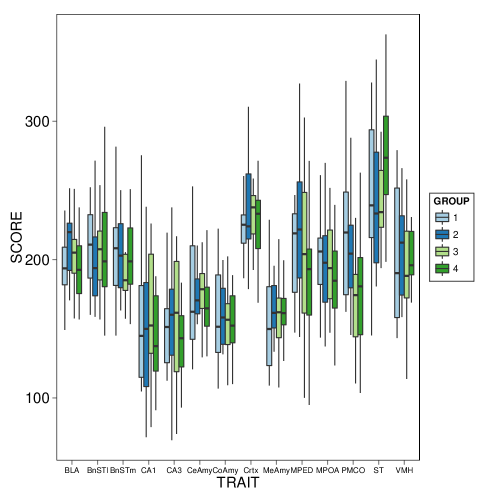
data("Nuclei")data("Groups")BoxWhisker(Nuclei, Groups, palette="Paired")
Loadings
The Loadings function will produce a bar plot of each the loading of each trait or variable in the data onto the principle component or discriminant function axes. The principle component analysis is performed using the pcaMethods package ( Stacklies et al. (2007), Figure 2.
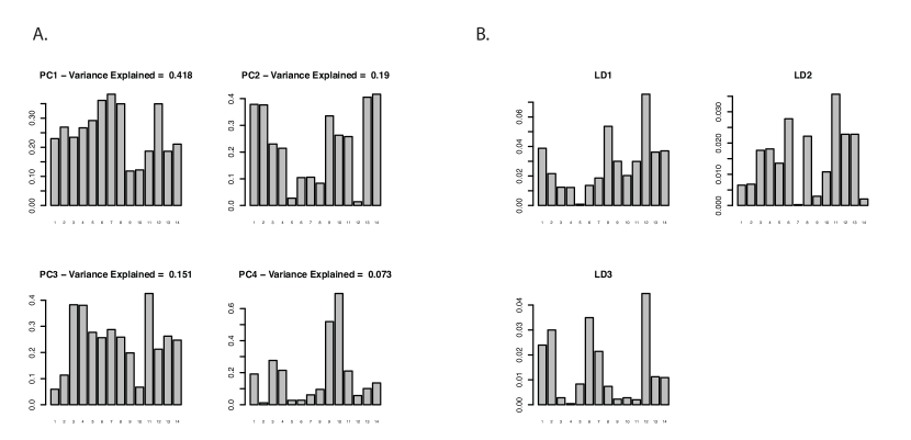
data("Nuclei")data("Groups")Loadings(Nuclei, Groups, method=c("PCA", "LDA"))
Illustrative Methods
MANOVA visualizations
To visualize the results of MANOVAs we use a series of interaction plots. The interaction plots illustrate the effect of different treatments on the response variables. This method is most effective when the response variables are first transformed into principle components; however, the method will work with any form of data.
IntPlot(Scores, Cov.A, Cov.B, pvalues=rep(1,8), int.pvalues=rep(1,4))
-
•
Scores = Data for the analysis, preferably in the form of principle component scores
-
•
Cov.A = Vector indicating the bivariate indicator for each row in Scores.
-
•
Cov.B = Vector indicating the bivariate indicator for each row in Scores.
-
•
pvalues = A vector of p values. For each column in Scores there should be a p value for Cov.A and Cov.B.
-
•
int.pvalues = A vector of p values for the interaction terms. For each column in Scores there should be an entry in int.pvalues.
Discriminant function visualizations
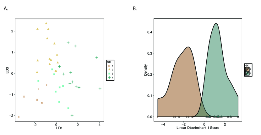
The visualization of discriminant analysis results is implemented in the ldaPlot function. The function takes as input the traits and group IDs and will perform a discriminant function analysis and visualize the results. For the pair-wise comparison of groups we use density histograms with points along the x-axis denoting the actual data, Figure 3. For multi-group comparisons we plot a bivariate scatter for all pairwise combinations of discriminant axes. The color of plotting symbols can be altered using the palette argument and the linear discriminant comparisons using the axes argument (with max axis number of groups - 1).
data("Nuclei")data("Groups")ldaPlot(Nuclei, Groups, palette=``BrBG", axes=c(1,2,2,3,1,3))
Landscape Plots
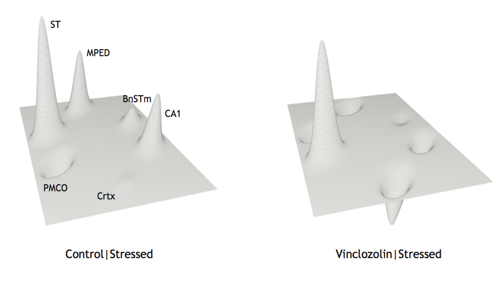
To visualize the composite phenotype for each group, and thus compare the phenotype between groups, a functional landscape can be constructed. The peak of each node in the landscape is calculated as the percent of maximum from the highest group mean. The width of each node was adjusted to optimally fit the number of nodes in each landscape and has no statistical significance. A percent change landscape is then created to visualize the differences between groups. The direction of the node, either below or above the plane, indicates in which direction the mean is influenced by the effect of treatment or group. A node above the plane indicates the mean in the treated group is higher than the mean of the control group and vice versa. This method allows one to visualize the composite change in the phenotype of a control group to that of a treated group. This graphical method is implemented in the LandscapePlot function, which relies on the persp function in the graphics package to render the three-dimensional image.
data("Nuclei")data("Groups")Data.Z <- ZTrans(Nuclei)LandscapePlot(Data.Z[,1:6], Groups)
Example: an analysis of neural response to stress
We illustrate the methods and visualizations in the package using an experiment designed to disentangle the effects of ancestral (inherited) versus proximate (acquired) environmental stressors on the phenotype ( Crews et al. (2012)). The hypothesis is that ancestral exposures cause epigenetic reprogramming that changes how descendant individuals respond to life challenges. A two “hit" paradigm was used. The first “hit" consisted of embryonic exposure to a common-use fungicide Vinclozolin. This has been shown to create an epigenetic imprint that is incorporated into the germline and, hence, is manifest each generation in the absence of the original causative agent ( Skinner et al. (2010)). The second “hit", 3 generations removed from the first, consists of chronic restraint stress (CRS) during adolescence. Stress in adolescence has powerful and permanent effects on brain and behavior, including epigenetic modifications to the nervous system ( Cicchetti and Walker (2001)). We have provided four data sets from the above study to illustrate the methods in this paper. Briefly, the data set Nuclei is a numeric matrix containing observed brain activity in 14 nuclei for 71 individuals, the Groups object contains the group ID for each of the 71 individuals in Nuclei, CondA is a factor vector indicating whether and animal is from a lineage treated with the fungicide Vinclozolin, CondB is a factor vector indicating whether an animal was subjected to CRS, Scores are the results of a PPCA of Nuclei, and Dyad is a factor vector indicating housing dyad. The below example uses these data to explore the hypothesis that Vinclozolin and stress affect brain chemistry. A detailed discussion of the data, methods, and results of this study can be found in Crews et al. (2012).
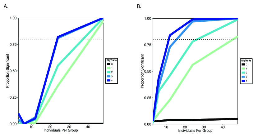
Before embarking on any research, one of the first statistical steps is to determine the necessary sample size for the desired experiments. This can be accomplished using the Power function. Importantly, these calculations can be used in animal care and use protocols and for grant applications.
Power(func = "PermuteLDA", N = "DEFAULT.N", effect.size = 0.8, trials = 100)Power(func = "FSelect", N = "DEFAULT.N", effect.size =0.8, trials = 100)
The results of the power analysis demonstrate differences between FSelect and PermuteLDA in the trade-off between sensitivy and specificity as the number of traits with significant effects increase, Figure 4. Specifically, PermuteLDA has faster rate of increase in power. Importantly, the type-I error, or false positive, rate is very low for both methods, being effectively 0 for FSelect and much less than 10 percent for PermuteLDA, Figure 4 black lines.
Before pre-processing the data and performing statistical tests, it is important to visualize the data. Our package provides methods for visualizing the raw and transformed data, Figure 1.
data("Nuclei")data("Groups")BoxWhisker(Nuclei,Groups)
To impute missing data use the function CompleteData. The output will be a figure illustrating the performance of the method and matrix of complete observations, Figure 5. This function relies on methods implemented in the MASS and pcaMethods packages ( Venables and Ripley (2002); Stacklies et al. (2007)).
CompleteData(Nuclei,cut.trait=0.5, cut.ind=0.5, NPCS=4, show.test=TRUE)
Here we present an example where all the tests included in this package are performed successively on data from the aforementioned experiment.
data(Nuclei)data(Groups)DAT.comp<-CompleteData(Nuclei, NPCS=4)Groups.use<-c(1,2)use.DAT<-which(Groups==Groups.use[1]|Groups==Groups.use[2])DAT.use<-Nuclei[use.DAT,]GR.use<-Groups[use.DAT]FSelect(DAT.use,GR.use,3)Missing data imputed using CompleteData to exlude missing dataset Missing.Data=RemoveFinal lda model saved as an R objectAn object of class "FSELECT"Slot "Selected":[1] 7 6 11Slot "F.Selected":[1] 1.2137438 0.3684986 0.1744205Slot "PrF":[1] 1 1 1Slot "PrNotes":[1] "PrF has been holm adjusted for 3 comparisons"
PermuteLDA(Nuclei,Groups,100) Group 1 Group 2 Pr Distance1 1 2 0.89108911 30.859682 1 3 0.91089109 32.276433 1 4 0.22772277 53.908604 2 3 0.57425743 42.872415 2 4 0.03960396 66.601406 3 4 0.50495050 46.34542
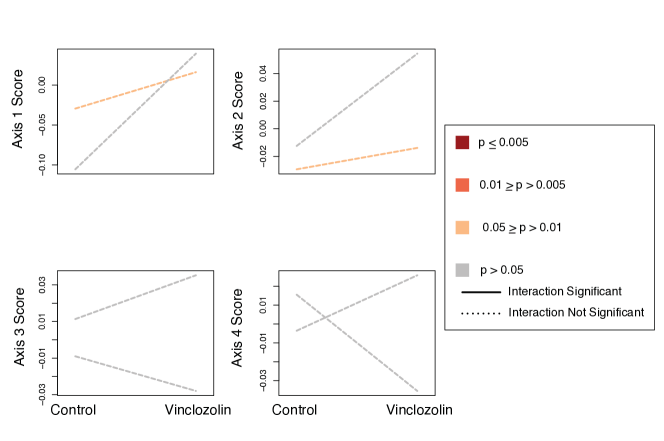
data("CondA")data("CondB")data("Scores")data("Dyad")m1<-manova(Scores~CondA*CondB+Dyad)summary(m1) Df Pillai approx F num Df den Df Pr(>F)CondA 1 0.38916 4.7781 4 30 0.004206 **CondB 1 0.18402 1.6914 4 30 0.178001Dyad 34 3.15420 3.6196 136 132 3.628e-13 ***CondA:CondB 1 0.28280 2.9573 4 30 0.035818 *Residuals 33---Signif. codes: 0 ’’***’’ 0.001 ’’**’’ 0.01 ’’*’’ 0.05 ’’.’’ 0.1 ’’ ’’ 1
The final step is to visualize the results. The approach is a combination of interaction plots for MANOVA results and either density or scatter plots for the discriminant function analysis. The results for the discriminant function analysis can be seen in Figure 3. The interaction plots for the MANOVA results can be seen in Figure 6. The p-values for the different covariates must be given as arguments to the function IntPlot. To illustrate the effect of Vinclozolin on stress response, the only significant difference identified using PermuteLDA, we created a functional landscape (see section 0.3.3) using the LandscapePlot function, see Figure 7. This landscape uses the six brain nuclei that best distinguish these two groups, as determined using the FSelect function.
data("Scores")data("CondA")data("CondB")IntPlot(Scores,CondA,CondB,pvalues=c(0.03,0.6,0.05,0.07,0.9,0.2,0.5,0.3), int.pvalues=c(0.3,0.45,0.5,0.12))data("Nuclei")data("Groups")Data.Z<-ZTrans(Nuclei)Traits<-c(1,2,9,10,11,13)LandscapePlot(Data.Z[,Traits], Groups)
Discussion
Our package is a tool for researchers interested in applying a systems approach to their research. We provide methodology for multivariate analysis, visualization, and data pre-processing. Our quantitative framework supports a research project from inception through publication, suggesting visualizations and statistical methods along the way. With the growing size of data sets collected under a range of scientific experiments, the emerging challenge is how to analyze and visualize that data. Here we are not simply referring to processing large quantities of data, but are instead referring to the challenge of distinguishing patterns from noise. Presumably the experiment will not affect all traits measured and those showing a response could do so in different directions and/or with different magnitudes. Therefore, we advocate for a dimension reduction approach that seeks to find patterns in the aggregate while simultaneously removing those variables which either fail to improve the model fit or are misleading.
Visualizations are an important, but often overlooked, aspect of communicating the results of scientific research. A great visualization should be informative and functional; informative in that it effectively conveys the results and functional in that it uses our understanding of human behavioral psychology to engage the reader. The image must also use colors and symbols that are evident to a broad audience. We have provided some suggested visualizations for the types of multivariate data common in biological studies. Important future development of this package will incorporate additional graphical methods.
One important caveat is that our methods are somewhat lacking in statistical power. For effect sizes typical of behavioral studies, 35 individuals per group would be needed for FSelect and 20 individuals per group for permuteLDA to achieve 80 percent power, see Figure 4. However, our methods perform very well with respect to minimizing the type-I error rate. Future work should focus on adapting existing methods and developing new methods to allow for smaller sample and effect sizes. As stated earlier this package is meant to be a project that will grow and develop; therefore, we welcome suggestions and contributions and plan regular updates to both the statistical and visual methods.
References
- Cicchetti and Walker (2001) D. Cicchetti and E. Walker. Editorial: Stress and development: Biological and psychological consequences. Development and Psychopathology, 13:413–418, 2001.
- Collyer and Adams (2007) M. Collyer and D. Adams. Analysis of two-state multivariate phenotypic change in ecological studies. Ecology, 88(3):683–692, 2007.
- Costanza and Afifi (1979) M. Costanza and A. Afifi. Comparison of stopping rules in forward stepwise discriminant analysis. Journal of the American Statistical Association, pages 777–785, 1979.
- Crews and McLachlan (2006) D. Crews and J. McLachlan. Epigenetics, evolution, endocrine disruption, health, and disease. Endocrinology, 147(6):s4–s10, 2006.
- Crews et al. (2006) D. Crews, W. Lou, A. Fleming, and S. Ogawa. From gene networks underlying sex determination and gonadal differentiation to the development of neural networks regulating sociosexual behavior. Brain Research, pages 109–121, 2006.
- Crews et al. (2012) D. Crews, R. Gillette, S. Scarpino, M. Manikkam, M. Savenkova, and M. Skinner. Epigenetic transgenerational alterations to stress response in brain gene networks and behavior. Proc. Natl. Acad. Sci. USA, 109(23):9143–9148, 2012.
- Everitt and Hothorn (2011) B. Everitt and T. Hothorn. An Introduction to Applied Multivariate Analysis with R (Use R). Springer, 2011.
- Gottesman (1997) I. Gottesman. Twins: En route to qtls for cognition. Science, 276:1522–1523, 1997.
- Grossman et al. (2003) A. Grossman, J. Churchill, B. McKinney, I. Kodish, S. Otte, and W. Greenough. Experience effects on brain development: Possible contributions to psychopathology. J. Child Psych., 44:33–63, 2003.
- Habbema and Hermans (1977) J. Habbema and J. Hermans. Selection of variables in discriminant analysis by f-statistics and error rate. Technometrics, 19(4):487–493, 1977.
- Jennrich (1977) R. Jennrich. Stepwise Discriminant Analysis, volume 3. New York: John Wiley & Sons, 1977.
- Kitano (2002) H. Kitano. Systems biology: A brief overview. Science, 1(295):1662–1664, 2002.
- Moore et al. (1997) A. Moore, E. Brodie, and J. Wolf. Interacting phenotypes and the evolutionary process: I. direct and indirect genetic effects of social interactions. Evolution, 51(5):1352–1362, 1997.
- Nijhout (2003) H. Nijhout. The importance of context in genetics. American Scientist, 91:416–418, 2003.
- Nijhout (2005) H. Nijhout. Problems and paradigms: Metaphors and the role of genes in development. BioEssays, 12(9):441–446, 2005.
- Roweis (1997) S. Roweis. Em algorithms for pca and sensible pca. Neural Inf. Proc. Syst., 10:626–632, 1997.
- Skinner et al. (2010) M. Skinner, M. Manikkam, and C. Guerrero-Boasagna. Epigenetic transgenerational actions of environmental factors in disease etiology. Trends in Endocrinology and Metabolism, 21(4):214–222, 2010.
- Stacklies et al. (2007) W. Stacklies, H. Redestig, M. Scholz, D. Walther, and J. Selbig. pcaMethods – a bioconductor package providing pca methods for incomplete data. Bioinformatics, 23:1164–1167, 2007.
- Team (2011) R. D. C. Team. R: A Language and Environment for Statistical Computing. R Foundation for Statistical Computing, Vienna, Austria, 2011.
- Tippping and Bishop (1999) M. Tippping and C. Bishop. Probabilistic principle componenet analysis. Journal of the Royal Statistical Society B, 61(3):611–622, 1999.
- Troyanskaya et al. (2001) O. Troyanskaya, M. Cantor, G. Sherlock, P. Brown, T. Hastie, R. Tibshirani, D. Botstein, and R. Altman. Missing value estimation methods for dna microarrays. Bioinformatics, 17(6):520–5252, 2001.
- Venables and Ripley (2002) W. Venables and B. Ripley. Modern Applied Statistics with S. Springer, fourth edition, 2002.
- Waddington (1957) C. Waddington. The Strategy of the Genes: A Discussion of Some Aspects of Theortical Biology. London: Allen and Unwin, 1957.
- Wickham (2009) H. Wickham. ggplot2: Elegant Graphics for Data Analysis. Springer, 2009.