Threshold-free Evaluation of Medical Tests for Classification and Prediction: Average Precision versus Area Under the ROC Curve
Abstract
When evaluating medical tests or biomarkers for disease classification, the area under the receiver-operating characteristic (ROC) curve is a widely used performance metric that does not require us to commit to a specific decision threshold. For the same type of evaluations, a different metric known as the average precision (AP) is used much more widely in the information retrieval literature. We study both metrics in some depths in order to elucidate their difference and relationship. More specifically, we explain mathematically why the AP may be more appropriate if the earlier part of the ROC curve is of interest. We also address practical matters, deriving an expression for the asymptotic variance of the AP, as well as providing real-world examples concerning the evaluation of protein biomarkers for prostate cancer and the assessment of digital versus film mammography for breast cancer screening.
† These authors contributed equally to this paper.
Key Words: AUC; average precision; prevalence; ROC curve; screening test.
1 Introduction
There are many different metrics for evaluating diagnostic and screening tests in medical sciences; the book by Pepe (2003) is an authoritative reference in this field. Commonly used metrics include sensitivity, specificity, positive and negative predictive values, positive and negative diagnostic likelihood ratios, among many others. All the aforementioned metrics require the underlying test to make a binary decision, that is, whether the patient being tested has a certain disease or not. Making such a binary decision usually requires a decision threshold, as the underlying test often gives continuous measurements, such as the serum concentration of a metabolite, or the size and density of a mass seen from a medical image. So, for example, the concentration of serum bilirubin has to exceed a certain level for the test to flag the patient as being likely to have liver dysfunction. Changing the decision threshold always will affect both the sensitivity and the specificity of the test simultaneously — in particular, raising one while reducing the other.
The receiver operating characteristic (ROC) curve traces the tradeoff between sensitivity and specificity as the decision threshold varies. Looking at the entire ROC curve is especially useful when we are not ready to commit to a particular decision threshold. Nonetheless, sometimes we still prefer to have a single, numeric performance metric, for example, when we are evaluating hundreds of potential biomarkers — comparing hundreds of ROC curves is simply not practical or efficient. The Area Under the ROC Curve (AUC) is a much widely used choice in this context — tests with larger AUC values are considered more powerful. Thus, researchers may pre-screen hundreds of the potential biomarkers using the AUC, and then compare just a handful of top biomarkers using the entire ROC curve. Again, we refer the readers to the book by Pepe (2003) and its extensive bibliography for more detailed discussions of these issues.
Despite its popularity, the AUC is not perfect. We have encountered two common criticisms about the AUC:
- (C1)
- (C2)
A natural response to criticism (C2) is the notion of the “partial AUC” — the area under the ROC curve up to a certain cutoff value (see, e.g., McClish 1989; Thompson and Zucchini 1989; Jiang et al. 1996). We find the partial AUC somewhat unsatisfying because it depends on a subjective cutoff value, which must be supplied a prior. And, to date, we have known of few effective responses to criticism (C1).
The information retrieval (IR) community faces a similar problem. Mathematically, the following two questions are equivalent:
-
1.
How effective can a retrieval algorithm tell if a document is relevant or not?
-
2.
How effective can a diagnostic (or screening) test tell if a patient is diseased or not?
However, to answer their question, the IR community tends to rely much more heavily (though not exclusively) on another performance metric known as the average precision (AP) — see, e.g., Peng et al. (2003) and references therein. Like the AUC, the AP is another single, numeric performance metric that does not require us to commit to a decision threshold priori to the analysis. The relationship between these two threshold-free evaluation metrics seems poorly understood, though, if at all. We studied both metrics out of curiosity. After doing so, we found that, to some extent, the AP actually seems to address both criticisms (C1) and (C2) of the AUC.
We proceed as follows. In Section 2, we define various quantities of interest using a common set of notations. In Section 3, we develop some theoretical insights. More specifically, we introduce two notions, which we call stamina and momentum, and show that, for the AUC, stamina and momentum are equally important, whereas for the AP, momentum is more important. In Section 4, we address some practical issues. In particular, we show how the AP is calculated in practice, and derive its asymptotic variance. In Section 5, we provide two examples. In Section 6, we discuss various practical implications of our result. In particular, we discuss when the AP may be considered a more attractive performance metric than the AUC.
2 Definitions
Suppose there are a total of subjects, some () of which are diseased (class 1) and the rest () of which are not (class 0). For every subject , a diagnostic (or screening) test produces a score, , which we can use to rank (or order) the subjects — e.g., a high score (large ) means the subject is more likely to be diseased, and vice versa. In this section, we define various concepts associated with evaluating the effectiveness of such a test. The ultimate objective, of course, is to formally define the AUC and the AP so that they can be studied together. In order to do so, it is convenient to start with the so-called hit curve.
2.1 The hit curve
Let denote the ordered subject index, that is, . If we threshold the scores at , declaring all those with scores to be class-1 and all those with scores to be class-0, we will have a confusion matrix as displayed in Table 1, where is the number of subjects with scores , and is the number of subjects truly belonging to class-1 out of those declared to be class-1. Clearly, is a discrete function, defined only on the set of nonnegative integers up to .
In the literature, it is also common to represent the confusion matrix (Table 1) in terms of proportions rather than in terms of counts. This is given explicitly in Table 2, where
| (1) |
When is relatively large, it is convenient to think of the function , defined on the interval , as a continuous object. In fact, we will further assume that it is differentiable almost everywhere. This allows us to use the language of calculus — i.e., differentiation and integration — to discuss various concepts. The collection of points, , traces out a so-called hit curve. For simplicity, we will refer to itself as the hit curve as well. Like the ROC curve, the hit curve also is a signature of the underlying test’s effectiveness. Proposition 1 below lists a few properties of the hit curve that will be useful later; proofs are given in Appendix A.
Declared Class-1 Declared Class-0 Total Class-1 Class-0 Total
Declared Class-1 Declared Class-0 Total Class-1 Class-0 Total
Proposition 1
Let be a hit curve (see Table 2), assumed to be continuous and differentiable almost everywhere. Then,
-
(a)
and ;
-
(b)
, for all ;
-
(c)
.
Remark
In what follows, we will not distinguish between and . Whenever we write , we will be referring to the quantity defined in Table 1 and thinking of it as a discrete function on the set . Whenever we write , we will be referring to the quantity defined in Table 2 and thinking of it as a continuous function on , with .
2.2 The AUC
Suppose we threshold the scores at , a level such that of the subjects are declared to be class-1. The quantities
and
are called the true positive fraction (TPF) and the false positive fraction (FPF), respectively — refer to Tables 1–2. The ROC curve refers to the collection of points, . The AUC is simply its area underneath, defined as
| AUC | (2) |
Using the definitions of and above, it is straight-forward to see that
| AUC | (3) | ||||
where the final step is due to Proposition 1(c).
2.3 The AP
Instead of the TPF and the FPF, the IR community often speaks of the recall and the precision. Again, suppose we threshold the scores at , a level such that of the subjects are declared to be class-1. Then,
which is the same as the TPF, and
The average precision (AP) is defined as (e.g., Zhu 2004)
| AP | (4) |
which can be thought of as the area under the precision versus recall curve. Using the definitions of and above, it is straight-forward to see that
| AP | (5) | ||||
2.4 Examples
For those not familiar with either of these concepts, they are often abstract and confusing enough at first sight that a few examples are warranted. For those already comfortable with the ideas, this section can be skipped.
2.4.1 A random test
2.4.2 A perfect test
2.5 Remarks
Notice that both the AUC and the AP, as we have defined them, are random variables, a point that will become even clearer later in Section 4. Furthermore, according to Eqs. (3) and (5), both the AUC and the AP are functionals of the hit curve , a point that we will sometimes emphasize by writing and .
3 Theory
In this section, we use a simple, parametric, quasi-concave model for the hit curve to gain some important insight about the AUC and the AP.
3.1 The quasi-concave model
Consider a quasi-concave hit curve (Figure 1), parameterized as follows:
| (6) |
There are two parameters: is the initial true positive rate of the underlying test, and is the change point at which the test’s true positive rate drops. The requirement ensures that the model is describing a test that is as least as good as random; worse-than-random procedures are not interesting and practically irrelevant. The requirement is due to Proposition 1(b). And, finally, the requirement is because, with a true positive rate of , all class-1 subjects will have been identified by , leaving no more for .
3.2 Momentum and stamina
Despite its overwhelming simplicity, there are good reasons why the quasi-concave model (6) is useful.
First, hit curves are typically concave, reflecting the fact that the true positive rate typically drops as the scores decrease — that is, higher-ranked subjects are more likely than lower-ranked ones to belong to class-1. Eq. (6) is arguably the simplest approximation possible to any concave function. When , it is easy to see that the slope of the second segment, , is smaller than that of the first segment, , which is why we use the name “quasi-concave”. This idea of using a quasi-concave function to approximate a concave function is inspired by Laibson (1997), who used “quasi-hyperbolic” discount functions to study time-inconsistent intertemporal choices in behavioral economics.
Second, the two parameters, and , each capture an essential feature of the underlying diagnostic (or screening) test:
-
:
As the change point at which the true positive rate drops, this parameter measures the stamina of the test — how long can the initial, relatively high true positive rate “last”?
-
:
As the initial true positive rate, this parameter measure the momentum of the test — performing at its best level, how fast can the test identify the subjects that it is supposed to identify?
3.3 Momentum-stamina trade-off
For a quasi-concave hit curve, , given by Eq. (6), it is easy to see that
| (7) |
Then, by Eq. (3),
| AUC | (8) | ||||
which immediately implies Theorem 1 below.
Theorem 1
If two hit curves, and , both belong to the quasi-concave family (6), and are parameterized respectively by and , then if and only if
| (9) |
Theorem 1 explains that two diagnostic (or screening) tests and can have the same AUC for different reasons. The trivial case is when both and ; this is when and are truly identical — same stamina and same momentum. However, if , then Theorem 1 implies that we must necessarily have , and vice versa. That is, on the AUC-scale, mediocre momentum can be compensated by greater stamina, and vice versa. This provides a mathematically explicit explanation for the reason behind criticism (C1), namely why two qualitatively different tests can end up having similar AUC values.
3.4 AP versus AUC
What about the AP? If is a quasi-concave hit curve given by Eq. (6), then
So,
| AP | ||||
Using the Taylor approximation that , the expression above can be simplified to
| (10) |
Recall from Section 2.4 that , , , and . We can rescale the AP and the AUC to both lie between and :
| (11) |
and
| (12) |
Then,
by Eq. (8) and Eq. (12), while
by Eq. (10) and Eq. (11). These results establish Theorem 2 below.
Theorem 2
If a hit curve, , belongs to the quasi-concave family (6), then
| (13) |
Theorem 2 suggests that, if two diagnostic (or screening) tests have the same AUC, then the AP will “reward extra points” to the one with the larger momentum (larger ). Since momentum is the initial true positive rate, this means the AP places more emphasis on the initial part of the ROC curve. Hence, the AP can be seen as being based upon the AUC but having incorporated a self-correcting factor in response to criticism (C2).
3.5 A simple simulation
The theoretical insights derived in the previous sections are based on using a quasi-concave model for the hit curve. Here, we report a simple simulation study to investigate the applicability of Theorem 2 to general hit curves, i.e., those outside the quasi-concave family, Eq. (6).
In the literature (see, e.g., Pepe 2003), it is customary to simulate diagnostic/screening tests in the following way: Without loss of generality, scores given by the test to subjects in class-0 are simulated from , and those given to subjects from class-1 are simulated from for some . How well the scores rank the subjects (in terms of the AP and/or the AUC) is then studied. The parameter, , controls the strength of the simulated test — a large means the test tends to give much higher scores to subjects in class-1 than to those in class-0; it is thus a more powerful test.
Given , we first generated scores from ) and scores from . Using these scores, we plotted the resulting hit curve, , as well as computed and . Then, we computed
| (14) |
and plotted the line on top of . This procedure was easily repeated for many combinations of .
Fixing , Figure 2 shows four representative scenarios, generated by all combinations of (low prevalence) or (high prevalence), and (weak test) or (strong test). Our results, including those not shown in Figure 2, suggest that , as given by equation (14), is a good approximation of the initial true positive rate. This, in turn, verifies that the approximate relationship (13) established by Theorem 2 is still useful even if the hit curve does not belong to the quasi-concave family (6).

4 Practice
While conceptually it is convenient to think of as a continuous function, in practice we are often faced with its discrete cousin, . In this section, we first describe the typical set-up (Section 4.1). In Section 4.2, we derive explicit expressions for the AUC and the AP under this set-up. These expressions not only show how the AUC and the AP can be computed in practice, but they also confirm, from a slightly different point of view, our earlier result that the AP places more emphasis on initial true positives. To actually use the AP as a performance metric in practice, we need not only the AP, but also its standard error. In Section 4.3, we derive the asymptotic variance for the AP by considering the set-up given in Section 4.1.
Score Partition ¦ Total Class-1 ¦ Class-0 ¦ Total ¦
4.1 A typical set-up
In general, suppose a diagnostic (or screening) test gives distinct scores for a total of subjects, with . If , it means that some subjects’ scores are tied. The case of “no ties” simply corresponds to the special case of . With distinct scores, the subjects are partitioned into groups. Within each group, some may belong to class-1 and others may belong to class-0, but the test cannot distinguish them. We will use to denote the set of all subjects receiving the top score, to denote the set of all subjects receiving the next top score, and so on for . Furthermore, let
Table 3 summarizes the set-up and the notations we have just introduced.
4.2 AP versus AUC, again
Under the typical set-up (Table 3), if we threshold the scores at , then all those in partitions will be declared class-1 and the rest, declared class-0. Therefore, we have
As a result, Eq. (3) becomes
| AUC | ||||
where the term inside the curly brackets can be simplified further as follows:
| (15) | |||||
| (16) |
Likewise, Eq. (5) becomes
| AP | (17) | ||||
| (18) |
Eqs. (15) and (17) give convenient and explicit expressions for how the AUC and the AP are calculated in practice. They also reveal that both the AUC and the AP can be expressed as weighted averages of , except that they use different weights: for the AUC and for the AP.
The difference between and can most clearly be seen in the case of “no ties”, i.e., . Under such circumstances, each contains just one subject, so for all , and each is either zero or one. Then, it is easy to see from Eqs. (15)-(16) and Eqs. (17)-(18) that
The main difference, therefore, is that the weights used by the AUC are independent of, whereas the ones used by the AP are adaptive to, the test itself. Suppose and both belong to class-1, where . When calculating the AUC for two different tests, A and B, these true positives will each receive a fixed weight, and , respectively. For the AP, the weights they receive will depend on the strength of the test itself; in particular, if test A identified more class-1 subjects before than did test B, the relative weight on would be bigger for test A than for test B. This shows, from a different point of view, that the AP places more emphasis on early true positives than does the AUC.
4.3 Asymptotic variance of the AP
In order to use the AP as an evaluation metric, we need to obtain a formula for its variance, so that its standard error can be computed in practice. To derive such a formula, notice that the data in Table 3 follow the ensuing distributions:
| (19) | |||||
| (20) | |||||
| (21) |
where
and is the distribution of the scores in class- (). In addition,
Therefore, the log-likelihood function (aside from a constant) is given by
| (22) |
where ,
Let denote the MLEs of . Then, by classical theory (e.g., Cox and Hinkley 1974), the asymptotic variance of is simply , where is the Fisher information matrix associated with the log-likelihood function, Eq. (22). Thus, if we can express the AP as a function of , say , then we easily can estimate its asymptotic variance using the delta method, i.e.,
| (23) |
where denotes the observed Fisher information matrix. Indeed, this can be done based on Eq. (17) and the fact that
In particular, it is easy to see that
| (24) |
Let and . The calculations of
are straight-forward; details are given in Appendix B.
5 Examples
We now provide two illustrative examples.
5.1 Mass spectrometry data for prostate cancer
Our first example concerns protein biomarkers for prostate cancer. By analyzing serum samples obtained from the Virginia Prostate Center Tissue and Body Fluid Bank, Adam et al. (2002) identified 779 potential biomarkers using a technology called “surface-enhanced laser desorption/ionization time-of-flight mass spectrometry” (Issaq et al. 2002). Wang and Chang (2011) used this data set to illustrate the partial AUC (see Section 1). We focused on the patients with late-stage prostate cancer (class 1) and the normal individuals (class 0) in the data set, although the original data set also included patients with early-stage cancer and patients with benign prostate hyperplasia.

Figure 3 shows the AP versus the AUC for the top 15 biomarkers as ranked by the AP. We can see clearly that, while some biomarkers (e.g., ) are ranked similarly on both scales, others (e.g., , , , , ) are ranked very differently. For example, according to both the AP and the AUC, is a top biomarker. On the other hand, according to the AUC, there is little difference between and whereas, according to the AP, is more powerful.
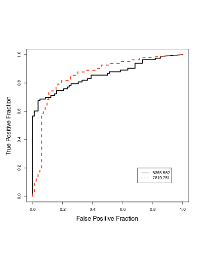
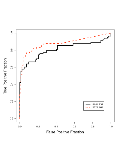
Figure 4 compares the ROC curves of two selected pairs of biomarkers: A ( and ), which scored quite similarly on the AUC-scale but very differently on the AP-scale; and B ( and ), which scored more or less similarly on the AP-scale but very differently on the AUC-scale. We clearly can see from this figure that the two biomarkers in pair A have qualitatively different ROC curves, yet their AUC-values are very similar. This is an unmistakable case of the momentum-stamina tradeoff that we discussed in Section 3.3 — even though the areas under their ROC curves are obviously very similar, the biomarker also can be recognized from its ROC curve to have a much larger momentum, which is why it scored much higher on the AP-scale, since the AP awards extra points to momentum (Section 3.4). For the two biomarkers in pair B, one immediately can discern from Figure 4 that has a much larger area under its ROC curve (i.e., larger AUC), yet their AP-values are more or less the same — in fact, the AP of is slightly higher than that of . Again, this is due to the biomarker having a slightly larger momentum, a fact also noticeable from the figure.
Table 4 contains various standard error estimates for the top biomarkers displayed in Figure 3. Here, we can see that the asymptotic estimates (Section 4.3) do, in fact, agree closely with standard bootstrap estimates (Efron and Tibshirani 1996). To obtain the parametric bootstrap estimates, we first estimated the multinomial models (19)–(21), and then used the estimated parameters () to generate multinomial samples. For the nonparametric bootstrap, we simply drew bootstrap samples, each by resampling from the original data set with replacement.
Standard Error of AP Biomarker AP Asymptotic P-Bootstrap NP-Bootstrap 1 3896.641 0.878 0.0345 0.0344 0.0344 2 8355.562 0.856 0.0336 0.0339 0.0340 3 8141.232 0.850 0.0319 0.0324 0.0321 4 8295.641 0.833 0.0328 0.0327 0.0327 5 5074.164 0.833 0.0403 0.0405 0.0403 6 4071.184 0.831 0.0368 0.0364 0.0366 7 6949.220 0.824 0.0414 0.0415 0.0413 8 9149.121 0.822 0.0378 0.0380 0.0378 9 5914.398 0.811 0.0355 0.0345 0.0355 10 28142.463 0.803 0.0395 0.0394 0.0402 11 7819.751 0.802 0.0424 0.0427 0.0423 12 7195.206 0.796 0.0317 0.0316 0.0318 13 16264.029 0.790 0.0320 0.0321 0.0319 14 7775.625 0.786 0.0441 0.0451 0.0442 15 8544.842 0.776 0.0388 0.0389 0.0390
Mammography Standard Error of AP Type AUC AP Asymptotic P-Bootstrap NP-Bootstrap Digital 0.753 0.144 0.0197 0.0197 0.0194 Film 0.735 0.166 0.0219 0.0216 0.0215
5.2 Mammography data for breast cancer
Our second example concerns the Digital Mammographic Imaging Screening Trial (DMIST; Pisano et al. 2005), comparing digital versus film mammography for breast cancer screening. Over 42,000 women were enrolled in the trial and underwent both digital and film mammography. Using a seven-point malignancy scale, each pair of mammograms were rated separately by two independent radiologists. At 15-month follow-up, a total of 335 breast cancers were confirmed in the final cohort, and the question was: which type of mammography better predicted these cases of cancer?
We analyzed the data from Pisano et al. (2005, Table 3). The AUC and the AP for the two technologies are given in Table 5, together with various standard error estimates of the AP. As in the previous example (Table 4), the different standard error estimates are in good agreement with each other.
Overall, digital mammography fared slightly better than film mammography on the AUC-scale, but the AP favored film mammography slightly over digital mammography. Thus, depending on the performance measure, we could arrive at different conclusions about which technology was more effective for detecting breast cancer. The difference in AP (or in AUC) between the two types of mammography was relatively small. We could not test formally whether these small differences were statistically significant because the malignancy scores based on digital mammograms and those based on film mammograms were not independent, as the mammograms were taken on the same group of patients and rated by the same group of radiologists. While
estimating the covariance term, even by the bootstrap, would require us to have information about which pair of scores — one from digital and another from film mammography — was for the same patient. We didn’t have such information but, given the context, it was safe to conjecture that the covariance term most likely would have been positive. Hence, by using the standard error estimates in Table 5 and letting be the (unknown) correlation coefficient between and , we can estimate the standard error of the difference, , as a function of :
These simple calculations suggest that a difference of about on the AP-scale can still be statistically significant if the correlation between digital and film mammography is relatively high, which most likely is the case in reality.
The DMIST publication (Pisano et al. 2005) used the AUC as the main performance measure. Despite their enthusiasm about the effectiveness of digital mammography, the U.S. Preventive Services Task Force recently concluded that “[e]vidence is lacking for benefits of digital mammography and MRI of the breast as substitutes for film mammography” (U.S. Preventive Services Task Force 2009). The assessment provided by the AP seems to be in line with the latter conclusion.
6 Discussions
We have shown in Section 3 that, relative to the AUC, the AP places additional emphasis on the initial true positive rate — or simply momentum, as we have defined it in Section 3.2. In practice, when do we care more about the momentum of a test? We think the momentum is especially important when is relatively small, that is, when the prevalence is low. This is because, when the prevalence is low, we naturally would like to avoid raising too many red flags, but for the precious few flags that we do raise (i.e., the few top-ranked cases), we’d like to have as many true positives as possible.
Most medical screening tests do indeed operate under such circumstances, i.e., low prevalence, because the purposes of these tests are to identify diseases in their early stages, when no symptoms are present, so as to facilitate early intervention with the hope to improve outcomes (Thorner and Remein 1961). Therefore, they target a general, asymptomatic population (Raffle and Gray 2007), among which the prevalence is typically very low. By contrast, most diagnostic tests are aimed at patients who already display some kind of symptoms, so they typically are meant for situations where the prevalence is considerably higher. For assessing screening (as opposed to diagnostic) tests, therefore, a performance metric that emphasizes the test’s momentum, such as the AP, may be more attractive than a metric that treats momentum and stamina as being equally important, such as the AUC. In the breast cancer example (Section 5.2), the disease prevalence was at 15 months post-screening. In practice, radiologists do consider these very low prevalence numbers when assigning malignancy scores so as to avoid too many false positives (Rosenberg et al. 2006). In other words, precision is of particular interest for screening, and clinicians may very well prefer a screening test that is favored by the AP to one that is favored by the AUC.
AUC AP Biomarkers A 8355.562 0.849 0.783 0.783 0.856 0.606 0.571 7819.751 0.850 0.857 0.857 0.802 0.370 0.062 B 8141.232 0.810 0.773 0.773 0.850 0.572 0.468 5074.164 0.886 0.869 0.869 0.833 0.306 0.043
Sometimes, we may have conducted a case-control study (for which by design), but would like to use the case-control data to identify biomarkers for the purpose of performing future screening tests (for which is expected to be much smaller). In such applications, it also may be much better to use the AP rather than the AUC to assess the potential biomarkers. In the prostate cancer example (Section 5.1), biomarkers were evaluated under a case-control design () for their potential as screening tools for prostate cancer. To see how their relative evaluations would change if the prevalence were much lower, we conducted a simple thought experiment on the two pairs of biomarkers shown in Figure 4, and examined what would happen if we artificially inflated the number of control subjects by creating copies of each existing control subject in the data set (Table 6). For pair A , we already have seen in Section 5.1 that the two scored similarly on the AUC-scale despite having very different ROC curves — a clear case of momentum-stamina tradeoff, and that the marker scored higher on the AP-scale due to its large momentum. Here, we can see that the difference between the two markers becomes even more dramatic on the AP-scale when the prevalence is reduced. For pair B , we see that, even though the marker scored higher on the AUC-scale, based on the case-control data, the AP is more or less indifferent between the two, but, when the prevalence is reduced, the AP can actually start to favor the other marker by a substantial margin.
Finally, we think the AP is useful not only for medical screening tests, but also for the risk prediction of low probability events in general. Often, models are constructed and covariates are selected in order to predict some future event in a specific population, e.g., the risk of having a cardiovascular event in the next 10 years, or the risk of having a secondary neoplasm in the next 10 years for childhood cancer survivors, and so on. One of the main objectives is to identify patients who have a high risk of developing these conditions. Since many of these events have low probabilities, meaning that the incidence rate is low, the AP may be a better performance measure than the AUC for reasons similar to those discussed above. Currently, however, prediction models and competing risk factors are almost exclusively assessed by ROC curves and more specifically, by the AUC (Buijsse et al. 2011).
Acknowledgments
WS’s research is partially supported by the MacEwan faculty professional development fund. YY’s research is partially supported by the M. S. I. Foundation of of Alberta. MZ’s research is partially supported by the Natural Sciences and Engineering Research Council (NSERC) of Canada.
Appendix A Proof of Proposition 1
-
(a)
This follows from the very definition of the hit curve. Initially (), no subject is declared positive (belonging to class-1), so . In the end (), every subject is declared positive including all true positives, so .
-
(b)
This follows from the fact that, going from to , the worst case is that no additional true positives are identified, and the best case is that every subject identified is a true positive. That is,
for all . Taking the limit on both sides gives
or .
- (c)
Appendix B Asymptotic variance of the AP: Some details
Due to the multinomial constraints, and , in practice we work with -dimensional vectors, and , rather than -dimensional vectors. By direct algebraic calculations, we can obtain that
where , are matrices with
and
Now, let
Again, by direct algebraic calculations, we can obtain that
where , are -dimensional vectors with
for , and
References
- Adam et al. (2002) Adam, B. L., Qu, Y., Davis, J. W., Ward, M. D., Clements, M. A., Cazares, L. H., Semmes, O. J., et al. (2002). Serum protein fingerprinting coupled with a pattern-matching algorithm distinguishes prostate cancer from benign prostate hyperplasia and healthy men. Cancer Research, 62, 3609 –3614.
- Alemayehu and Zou (2012) Alemayehu, D. and Zou, K. H. (2012). Applications of ROC analysis in medical research: Recent developments and future directions. Academic Radiology, 19, 1457 –1464.
- Baker and Pinsky (2001) Baker, S. G. and Pinsky, P. F. (2001). A proposed design and analysis for comparing digital and analog mammography. Journal of the American Statistical Association, 96(454), 421–428.
- Buijsse et al. (2011) Buijsse, B., Simmons, R. K., Griffin, S. J., and Schulze, M. B. (2011). Risk assessment tools for identifying individuals at risk of developing type 2 diabetes. Epidemiologic Reviews, 33(1), 46–62.
- Cox and Hinkley (1974) Cox, D. R. and Hinkley, D. V. (1974). Theoretical Statistics. Chapman and Hall, London.
- Dodd and Pepe (2003) Dodd, L. E. and Pepe, M. S. (2003). Partial AUC estimation and regression. Biometrics, 59(3), 614–623.
- Efron and Tibshirani (1996) Efron, B. and Tibshirani, R. J. (1996). An Introduction to the Bootstrap. Chapman & Hall/CRC.
- Hand (2009) Hand, D. J. (2009). Measuring classifier performance: A coherent alternative to the area under the ROC curve. Machine learning, 77(1), 103–123.
- Issaq et al. (2002) Issaq, H. J., Veenstra, T. D., Conrads, T. P., and Felschow, D. (2002). The SELDI-TOF MS approach to proteomics: Protein profiling and biomarker identification. Biochemical and Biophysical Research Communications, 292, 587–592.
- Jiang et al. (1996) Jiang, Y., Nishikawa, R. M., Wolverton, D. E., Metz, C. E., Giger, M. L., Schmidt, R. A., Vyborny, C. J., and Doi, K. (1996). Malignant and benign clustered microcalcifications: Automated feature analysis and classification. Radiology, 198(3), 671–678.
- Laibson (1997) Laibson, D. (1997). Golden eggs and hyperbolic discounting. Quarterly Journal of Economics, 112, 443 –477.
- McClish (1989) McClish, D. K. (1989). Analyzing a portion of the ROC curve. Medical Decision Making, 9, 190 –195.
- Peng et al. (2003) Peng, F., Schuurmans, D., and Wang, S. (2003). Augmenting naïve Bayes classifiers with statistical language models. Information Retrieval, 7(3), 317–345.
- Pepe (2003) Pepe, M. S. (2003). The Statistical Evaluation of Medical Tests for Classification and Prediction. Oxford University Press, New York.
- Pisano et al. (2005) Pisano, E. D., Gatsonis, C., Hendrick, E., et al. (2005). Diagnostic performance of digital versus film mammography for breast-cancer screening. New England Journal of Medicine, 353(17), 1773–1783.
- Raffle and Gray (2007) Raffle, A. E. and Gray, J. A. M. (2007). Screening: Evidence and Practice. Oxford University Press.
- Rosenberg et al. (2006) Rosenberg, R. D., Yankaskas, B. C., Abraham, L. A., Sickles, E. A., Lehman, C. D., Geller, B. M., Carney, P. A., Kerlikowske, K., Buist, D. S., Weaver, D. L., Barlow, W. E., and Ballard-Barbash, R. (2006). Performance benchmarks for screening mammography. Radiology, 241(1), 55–66.
- Thompson and Zucchini (1989) Thompson, M. L. and Zucchini, W. (1989). On the statistical analysis of ROC curves. Statistics in Medicine, 8, 1277 –1290.
- Thorner and Remein (1961) Thorner, R. M. and Remein, Q. R. (1961). Principles and Procedures in the Evaluation of Screening for Disease. Government Printing Office, Washington, DC. Public Health monograph no. 67. Public Health Service publication no. 846.
- U.S. Preventive Services Task Force (2009) U.S. Preventive Services Task Force (2009). Screening for breast cancer: U.S. Preventive Services Task Force recommendation statement. Annals of Internal Medicine, 151, 716–726.
- Wang and Chang (2011) Wang, Z. and Chang, Y.-C. I. (2011). Marker selection via maximizing the partial area under the ROC curve of linear risk scores. Biostatistics, 12(2), 369–385.
- Zhu (2004) Zhu, M. (2004). Recall, precision, and average precision. Technical Report, University of Waterloo. See also http://en.wikipedia.org/wiki/Information_retrieval.
- Zweig and Campbell (1993) Zweig, M. H. and Campbell, G. (1993). Receiver-operating characteristic (ROC) plots: A fundamental evaluation tool in clinical medicine. Clinical Chemistry, 39, 561–577.