Elliptical Insights: Understanding Statistical Methods through Elliptical Geometry
Abstract
Visual insights into a wide variety of statistical methods, for both didactic and data analytic purposes, can often be achieved through geometric diagrams and geometrically based statistical graphs. This paper extols and illustrates the virtues of the ellipse and her higher-dimensional cousins for both these purposes in a variety of contexts, including linear models, multivariate linear models and mixed-effect models. We emphasize the strong relationships among statistical methods, matrix-algebraic solutions and geometry that can often be easily understood in terms of ellipses.
doi:
10.1214/12-STS402keywords:
abstract skip 20 \setattributekeyword skip 8 \setattributeabstractwidth360pt \setattributekeywordwidth360pt
, and
1 Introduction
Whatever relates to extent and quantity may be represented by geometrical figures. Statistical projections which speak to the senses without fatiguing the mind, possess the advantage of fixing the attention on a great number of important facts.
In the beginning, there was an ellipse. As modern statistical methods progressed from bivariate to multivariate, the ellipse escaped the plane to a 3D ellipsoid, and then grew onward to higher dimensions. This paper extols and illustrates the virtues of the ellipse and her higher-dimensional cousins for both didactic and data analytic purposes.
When Francis Galton (1886) first studied the relationship between heritable traits of parents and their offspring, he had a remarkable visual insight—contours of equal bivariate frequencies in the joint distribution seemed to form concentric shapes whose outlines were, to Galton, tolerably close to concentric ellipses differing only in scale.
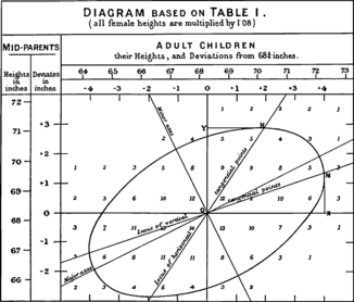
Galton’s goal was to to predict (or explain) how a characteristic, , (e.g., height) of children was related to that of their parents, . To this end, he calculated summaries, , and, for symmetry, , and plotted these as lines of means on his diagram. Lo and behold, he had a second visual insight: the lines of means of () and () corresponded approximately to the locus of horizontal and vertical tangents to the concentric ellipses. To complete the picture, he added lines showing the major and minor axes of the family of ellipses, with the result shown in Figure 1.
It is not stretching the point too far to say that a large part of modern statistical methods descends from these visual insights:111Pearson [(1920), page 37] later stated, “that Galton should have evolved all this from his observations is to my mind one of the most noteworthy scientific discoveries arising from pure analysis of observations.” correlation and regression [Pearson (1896)], the bivariate normal distribution, and principal components [Pearson (1901), Hotelling (1933)] all trace their ancestry to Galton’s geometrical diagram.222Well, not entirely. Auguste Bravais [1811–1863] (1846), an astronomer and physicist first introduced the mathematical theory of the bivariate normal distribution as a model for the joint frequency of errors in the geometric position of a point. Bravais derived the formula for level slices as concentric ellipses and had a rudimentary notion of correlation but did not appreciate this as a representation of data. Nonetheless, Pearson (1920) acknowledged Bravais’s contribution, and the correlation coefficient is often called the Bravais-Pearson coefficient in France [Denis (2001)].
Basic geometry goes back at least to Euclid, but the properties of the ellipse and other conic sections may be traced to Apollonius of Perga (ca. 262 BC–ca. 190 BC), a Greek geometer and astronomer who gave the ellipse, parabola and hyperbola their modern names. In a work popularly called the Conics [Boyer (1991)], he described the fundamental properties of ellipses (eccentricity, axes, principles of tangency, normals as minimum and maximum straight lines to the curve) with remarkable clarity nearly 2000 years before the development of analytic geometry by Descartes.
Over time, the ellipse would be called to duty to provide simple explanations of phenomena once thought complex. Most notable is Kepler’s insight that the Copernican theory of the orbits of planets as concentric circles (which required notions of epicycles to account for observations) could be brought into alignment with the detailed observational data from Tycho Brahe and others by an exquisitely simple law: “The orbit of every planet is an ellipse with the sun at a focus.” One century later, Isaac Newton was able to connect this elliptical geometry with astrophysics by deriving all three of Kepler’s laws as simpler consequences of general laws of motion and universal gravitation.
This paper takes up the cause of the ellipse as a geometric form that can provide similar service to statistical understanding and data analysis. Indeed, it has been doing that since the time of Galton, but these graphic and geometric contributions have often been incidental and scattered in the literature [e.g., Bryant (1984), Campbell and Atchley (1981), Saville and Wood (1991), Wickens (1995)]. We focus here on visual insights through ellipses in the areas of linear models, multivariate linear models and mixed-effect models. Our goal is to provide as comprehensive a treatment of this topic as possible in a single article together with online supplements.
| Size | Conceptual formula | Geometry | Function |
|---|---|---|---|
| (a) Generalized variance: | area, (hyper)volume | geometric mean | |
| (b) Average variance: | linear sum | arithmetic mean | |
| (c) Average precision: | harmonic mean | ||
| (d) Maximal variance: | maximum dimension | supremum |
The plan of this paper is as follows: Section 2 provides the minimal notation and properties of ellipsoids333As in this paragraph, we generally use the term “ellipsoid” as to refer to “ellipse or ellipsoid” where dimensionality does not matter or context is clear. necessary for the remainder of the paper. Due to length restrictions, other useful and important properties of geometric and statistical ellipsoids have been relegated to the Appendix. Section 3 describes the use of the data ellipsoid as a visual summary for multivariate data. In Section 4 we apply data ellipsoids and confidence ellipsoids for parameters in linear models to explain a wide range of phenomena, paradoxes and fallacies that are clarified by this geometric approach. This view is extended to multivariate linear models in Section 5, primarily through the use of ellipsoids to portray hypothesis (H) and error (E) covariation in what we call HE plots. Finally, in Section 6 we discuss a diverse collection of current statistical problems whose solutions can all be described and visualized in terms of “kissing ellipsoids.”
2 Notation and Basic Results
There are various representations of an ellipse (or ellipsoid in three or more dimensions), both geometric and statistical. Some basic notation and properties are described below.
2.1 Geometrical Ellipsoids
We refer to the common notion of a bounded ellipsoid (with nonempty interior) in the -dimensional space as a proper ellipsoid. An origin-centered proper ellipsoid may be defined by the quadratic form
| (1) |
where equality in equation (1) gives the boundary, is a vector referring to the coordinate axes and is a symmetric positive definite matrix. If is only positive semi-definite, then the ellipsoid will be improper, having the shape of a cylinder with elliptical cross-sections and unbounded in the direction of the null space of . To extend the definition to singular (sometimes known as “degenerate”) ellipsoids, we turn to a definition that is equivalent to equation (1) for proper ellipsoids. Let denote the unit sphere in ,
| (2) |
and let
| (3) |
where is a nonsingular matrix. Then is a proper ellipsoid that could be defined using equation (1) with . We obtain singular ellipsoids by allowing to be any matrix, not necessarily nonsingular or even square. A more general representation of ellipsoids based on the singular value decomposition (SVD) of is given in Appendix .1. Some useful properties of geometric ellipsoids are described in Appendix .2.
2.2 Statistical Ellipsoids
In statistical applications, will often be the inverse of a covariance matrix (or a sum of squares and cross-products matrix) and the ellipsoid will be centered at the means of variables or at estimates of parameters under some model. Hence, we will also use the following notation:
For a positive definite matrix we use to denote the ellipsoid
| (4) |
When is the covariance matrix of a multivariate vector with eigenvalues , the following properties represent the “size” of the ellipsoid in (see Table 1).
For testing hypotheses for parameters of multivariate linear models, these different senses of “size” correspond (with suitable transformations) to (a) Wilks’s , (b) the Hotelling–Lawley trace, (c) the Pillai trace, and (d) Roy’s maximum root tests, as we describe below in Section 5.
Note that every nonnegative definite matrix can be factored as , and the matrix can always be selected so that it is square. will be nonsingular if and only if is nonsingular. A computational definition of an ellipsoid that can be used for all nonnegative definite matrices and that corresponds to the previous definition in the case of positive-definite matrices is
| (5) |
where is a unit sphere of conformable dimension and is the centroid of the ellipsoid. One convenient choice of is the Choleski square root, , as we describe in Appendix .3. Thus, for some results below, a convenient notation in terms of is
| (6) |
where emphasizes that the ellipsoid is a scaling and rotation of the unit sphere followed by translation to a center at and . This representation is not unique, however: (i.e., they generate the same ellipsoid) iff and . From this result, it is readily seen that under a linear transformation given by a matrix the image of the ellipse is
3 The Data Ellipse and Ellipsoid
The data ellipse [Monette (1990)] [or concentration ellipse, Dempster (1969), Chapter 7] provides a remarkably simple and effective display for viewing and understanding bivariate marginal relationships in multivariate data. The data ellipse is typically used to add a visual summary to a scatterplot, indicating the means, standard deviations, correlation and slope of the regression line for two variables. Under classical (Gaussian) assumptions, the data ellipse provides a statistically sufficient visual summary, as we describe below.
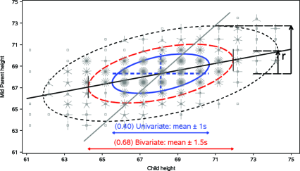
It is historically appropriate to illustrate the data ellipse and describe its properties using Galton’s [(1886), Table I] data, from which he drew Figure 1 as a conceptual diagram,444These data are reproduced in Stigler [(1986), Table 8.2, page 286]. shown in Figure 2, where the frequency at each point is represented by a sunflower symbol. We also overlay the 40%, 68% and 95% data ellipses, as described below.
In Figure 2, the ellipses have the mean vector as their center; the lengths of arms of the central cross show the standard deviations of the variables, which correspond to the shadows of the 40% ellipse. In addition, the correlation coefficient can be visually represented as the fraction of a vertical tangent line from to the top of the ellipse that is below the regression line , shown by the arrow labeled “r.” Finally, as Galton noted, the regression line for (or ) can be visually estimated as the locus of the points of vertical (or horizontal) tangents with the family of concentric ellipses. See Monette [(1990), Figures 5.1–5.2] and Friendly [(1991), page 183] for illustrations and further discussion of the properties of the data ellipse.
 |
 |
| (a) | (b) |
More formally [Dempster (1969), Monette (1990)], for a -dimensional sample, , we recognize the quadratic form in equation (4) as corresponding to the squared Mahalanobis distance, , of the point from the centroid of the sample, . Thus, we use a more explicit notation to define the data ellipsoid of size (“radius”) as the set of all points with less than or equal to ,
| (8) |
where is the sample covariance matrix. In the computational notation of equation (6), the boundary of the data ellipsoid of radius is thus
| (9) |
Many properties of the data ellipsoid hold regardless of the joint distribution of the variables; but if the variables are multivariate normal, then the data ellipsoid approximates a contour of constant density in their joint distribution. In this case has a large-sample distribution or, in finite samples, approximately ).
Hence, in the bivariate case, taking encloses approximately 95% of the data points under normal theory. Other radii also have useful interpretations:
-
•
In Figure 2 we demonstrate that gives a data ellipse of 40% coverage with the property that its projection on either axis corresponds to a standard interval, and . The same property of univariate coverage pertains to any linear combination of and .
-
•
By analogy with a univariate sample, a 68% coverage data ellipse with gives a bivariate analog of the standard and intervals. The univariate shadows, or those of any linear combination, then correspond to standard Scheffé intervals taking “fishing” (simultaneous interfence) in a -dimensional space into account.
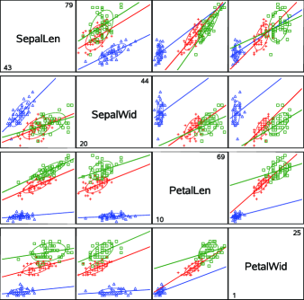
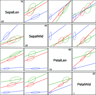
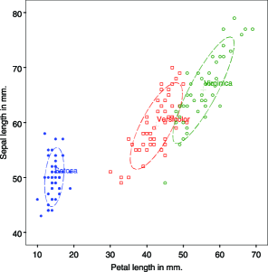
As useful as the data ellipse might be for a single, unstructured sample, its value as a visual summary increases with the complexity of the data. For example, Figure 3 shows scatterplot matrices of all pairwise plots of the variables from Edgar Anderson’s (1935) classic data on three species of iris flowers found in the Gaspé Peninsula, later used by Fisher (1936) in his development of discriminant analysis. The data ellipses show clearly that the means, variances, correlations and regression slopes differ systematically across the three iris species in all pairwise plots. We emphasize that the ellipses serve as sufficient visual summaries of the important statistical properties (first and second moments)555We recognize that a normal-theory summary (first and second moments), shown visually or numerically, can be distorted by multivariate outliers, particularly in smaller samples. In what follows, robust covariance estimates can, in principle, be substituted for the classical, normal-theory estimates in all cases. To save space, we do not explore these possibilities further here. by removing the data points from the plots in the version at the right.
4 Linear Models: Data Ellipses and Confidence Ellipses
Here we consider how ellipses help to visualize relationships among variables in connection with linear models (regression, ANOVA). We begin with views in the space of the variables (data space) and progress to related views in the space of model parameters ( space).
4.1 Simple Linear Regression
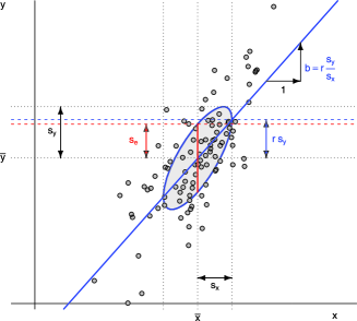
Various aspects of the standard data ellipse of radius 1 illuminate many properties of simple linear regression, as shown in Figure 4. These properties are also useful in more complex contexts:
-
•
One-half of the widths of the vertical and horizontal projections (dotted black lines) give the standard deviations and , respectively.
-
•
Because the perpendicular projection onto any line through the center of the ellipse, (), corresponds to some linear combination, , the half-width of the corresponding projection of the ellipse gives the standard deviation of this linear combination.
-
•
With a multivariate normal distribution the line segment through the center of the ellipse shows the mean and standard deviation of the conditional distribution on that line.
-
•
The standard deviation of the residuals, , can be visualized as the half-width of the vertical (red) line at .
-
•
The vertical distance between the mean of and the points where the ellipse has vertical tangents is . (As a fraction of , this distance is in the figure.)
-
•
The (blue) regression line of on passes through the points of vertical tangency. Similarly, the regression of on (not shown) passes through the points of horizontal tangency.
 |
 |
 |
| (a) Total sample, marginal ellipse, | (b) Individual sample, | (c) Pooled, within-sample ellipse |
| ignoring species | conditional ellipses — species |
4.2 Visualizing a Confidence Interval for the Slope
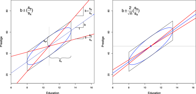
A visual approximation to a 95% confidence interval for the slope, and thus a visual test of , can be seen in Figure 5. From the formula for a 95% confidence interval, , we can take and , leading to
| (10) |
To show this visually, the left panel of Figure 5 displays the standard data ellipse surrounded by the “regression parallelogram,” formed with the vertical tangent lines and the tangent lines parallel to the regression line. This corresponds to the conjugate axes of the ellipse induced by the Choleski factor of as shown in Figure 3 in Appendix .3. Simple algebra demonstrates that the diagonal lines through this parallelogram have slopes of
So, to obtain a visual estimate of the 95% confidence interval for (not, we note, the 95% CI for the regression line), we need only shrink the diagonal lines of the regression parallelogram toward the regression line by a factor of , giving the red lines in the right panel of Figure 5. In the data used for this example, , so the factor is approximately 0.2 here.666The data are for the rated prestige and average years of education of 102 Canadian occupations circa 1970; see [Fox and Suschnigg (1989)]. Now consider the horizontal line through the center of the data ellipse. If this line is outside the envelope of the confidence lines, as it is in Figure 5, we can reject via this simple visual approximation.
4.3 Simpson’s Paradox, Marginal and Conditional Relationships
Because it provides a visual representation ofmeans, variances and correlations, the data ellipse is ideally suited as a tool for illustrating and explicating various phenomena that occur in the analysis of linear models. One class of simple, but important, examples concerns the difference between the marginal relationship between variables, ignoring some important factor or covariate, and the conditional relationship, adjusting (controlling) for that factor or covariate.
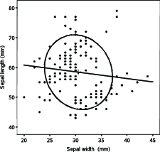
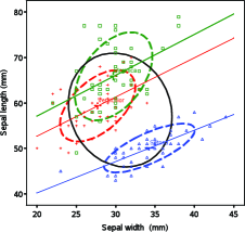
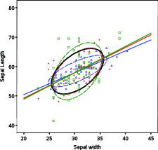
Simpson’s paradox [Simpson (1951)] occurs when the marginal and conditional relationships differ in direction. This may be seen in the plots of Sepal length against Sepal width for the iris data shown in Figure 6. Ignoring iris species, the marginal, total-sample correlation is slightly negative as seen in panel (a). The individual-sample ellipses in panel (b) show that the conditional, within-species correlations are all positive, with approximately equal regression slopes. The group means have a negative relationship, accounting for the negative marginal correlation.
A correct analysis of the (conditional) relationship between these variables, controlling or adjusting for mean differences among species, is based on the pooled within-sample covariance matrix,
where , and the result is shown in panel (c) of Figure 6. In this graph, the data for each species were first transformed to deviations from the species means on both variables and then translated back to the grand means.
In a more general context, appears as the matrix in a multivariate linear model, adjusting or controlling for all fitted effects (factors and covariates). For essentially correlational analyses (principal components, factor analysis, etc.), similar displays can be used to show how multi-sample analyses can be compromised by substantial group mean differences and corrected by analysis of the pooled within-sample covariance matrix, or by including important group variables in the model. Moreover, display of the individual within-group data ellipses can show visually how well the assumption of equal covariance matrices, , is satisfied in the data, for the two variables displayed.
4.4 Other Paradoxes and Fallacies
Data ellipses can also be used to visualize and understand other paradoxes and fallacies that occur with linear models. We consider situations in which there is a principal relationship between variables and of interest, but (as in the preceding subsection) the data are stratified in samples by a factor (“group”) that might correspond to different subpopulations (e.g., men and women, age groups), different spatial regions (e.g., states), different points in time or some combination of the above.
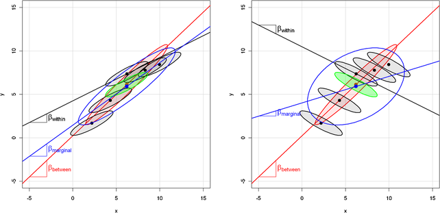
In some cases, group may be unknown or may not have been included in the model, so we can only estimate the marginal association between and , giving a slope and correlation . In other cases, we may not have individual data, but only aggregate group data, , from which we can estimate the between-groups (“ecological”) association, with slope and correlation . When all data are available and the model is an ANCOVA model of the form , we can estimate a common conditional, within-group slope, , or, with the model , the separate within-group slopes, .
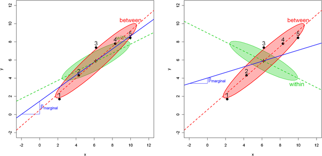
Figure 7 illustrates these estimates in a simulation of five groups, with , means and , so that. Here represents the uniform distribution between and , and represents the normal distribution with mean and variance . For simplicity, we have set the within-group covariance matrices to be identical in all groups, with , and in the left and right panels, respectively, giving .
In the left panel, the conditional, within-group slope is smaller than the ecological, between-group slope, reflecting the smaller within-group than between-group correlation. In general, however, it can be shown that
which is also evident in the right panel, where the within-group slope is negative. This result follows from the fact that the marginal data ellipse for the total sample has a shape that is a convex combination (weighted average) of the average within-group covariance of , shown by the green ellipse in Figure 7, and the covariance of the means , shown by the red between-group ellipse. In fact, the between and within data ellipses in Figure 7 are just (a scaling of) the and ellipses in an hypothesis-error (HE) plot for the MANOVA model, , as will be developed in Section 5. See Figure 8 for a visual demonstration, using the same data as in Figure 7.
The right panels of Figures 7 and 8 provide a prototypical illustration of Simpson’s paradox, where and can have opposite signs. Underlying this is a more general marginal fallacy (requiring only substantively different estimates, but not necessarily different signs) that can occur when some important factor or covariate is unmeasured or has been ignored. The fallacy consists of estimating the unconditional or marginal relationship () and believing that it reflects the conditional relationship, or that those pesky “other” variables will somehow average out. In practice, the marginal fallacy probably occurs most often when one views a scatterplot matrix of and believes that the slopes of relationships in the separate panels reflect the pairwise conditional relationships with other variables controlled. In a regression context, the antidote to the marginal fallacy is the added-variable plot (described in Section 4.8), which displays the conditional relationship between the response and a predictor directly, controlling for all other predictors.
 |
 |
| (a) Original data | (b) Low leverage, Outlier |
 |
 |
| (c) High leverage, good fit | (d) High leverage, Outlier |
The right panels of Figures 7 and 8 also illustrate Robinson’s paradox [Robinson (1950)], where and can have opposite signs.777William Robinson (1950) examined the relationship between literacy rate and percentage of foreign-born immigrants in the U.S. states from the 1930 Census. He showed that there was a surprising positive correlation, at the state level, suggesting that foreign birth was associated with greater literacy; at the individual level, the correlation was , suggesting the opposite. An explanation for the paradox was that immigrants tended to settle in regions of greater than average literacy. The more general ecological fallacy [e.g., Lichtman (1974), Kramer (1983)] is to draw conclusions from aggregated data, estimating or , believing that they reflect relationships at the individual level, estimating or . Perhaps the earliest instance of this was André-Michel Guerry’s (1833) use of thematic maps of France depicting rates of literacy, crime, suicide and other “moral statistics” by department to argue about the relationships of these moral variables as if they reflected individual behavior.888Guerry was certainly aware of the logical problem of ecological inference, at least in general terms [Friendly (2007a)], and carried out several side analyses to examine potential confounding variables. As can be seen in Figure 7, the ecological fallacy can often be resolved by accounting for some confounding variable(s) that vary between groups.
Finally, there are situations where only a subset of the relevant data are available (e.g., one group in Figure 7) or when the relevant data are available only at the individual level, so that only the conditional relationship, , can be estimated. The atomistic fallacy (also called the fallacy of composition or the individualistic fallacy), for example, Alker (1969), Riley (1963), is the inverse to the ecological fallacy and consists of believing that one can draw conclusions about the ecological relationship, , from the conditional one.
The atomistic fallacy occurs most often in the context of multilevel models [Diez-Roux (1998)] where it is desired to draw inferences regarding variability of higher-level units (states, countries) from data collected from lower-level units. For example, imagine that the right panel of Figure 7 depicts the negative relationship of mortality from heart disease () with individual income () for individuals within countries. It would be fallacious to infer that the same slope (or even its sign) applies to a between-country analysis of heart disease mortality vs. GNP per capita. A positive value of in this context might result from the fact that, across countries, higher GNP per capita is associated with less healthy diet (more fast food, red meat, larger portions), leading to increased heart disease.
4.5 Leverage, Influence and Precision
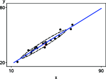
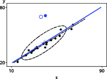
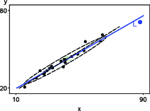
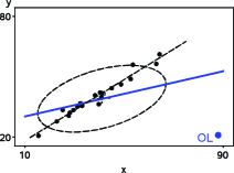
The topic of leverage and influence in regression is often introduced with graphs similar to Figure 9, what we call the “leverage-influence quartet.” In these graphs, a bivariate sample of points was first generated with and . Then, in each of panels (b)–(d) a single point was added at the locations shown, to represent, respectively, a low-leverage point with a large residual,999In this context, a residual is “large” when the point in question deviates substantially from the regression line for the rest of the data—what is sometimes termed a “deleted residual;” see below. a high-leverage point with small residual (a “good” leverage point) and a high-leverage point with large residual (a “bad” leverage point). The goal is to visualize how leverage [] and residual () (where is the fitted value for observation , computed on the basis of an auxiliary regression in which observation is deleted) combine to produce influential points—those that affect the estimates of .
The “standard” version of this graph shows only the fitted regression lines for each panel. So, for the moment, ignore the data ellipses in the plots. The canonical, first-moment-only, story behind the standard version is that the points added in panels (b) and (c) are not harmful—the fitted line does not change very much when these additional points are included. Only the bad leverage point, “OL,” in panel (d) is harmful.
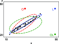
Adding the data ellipses to each panel immediately makes it clear that there is a second-moment part to the story—the effect of unusual points on the precision of our estimates of . Now, we see directly that there is a big difference in impact between the low-leverage outlier [panel (b)] and the high-leverage, small-residual case [panel (c)], even though their effect on coefficient estimates is negligible. In panel (b), the single outlier inflates the estimate of residual variance (the size of the vertical slice of the data ellipse at ).
To make the added value of the data ellipse more apparent, we overlay the data ellipses from Figure 9 in a single graph, shown in Figure 10, to allow direct comparison. Because you now know that regression lines can be visually estimated as the locus of vertical tangents, we suppress these lines in the plot to focus on precision. Here, we can also see why the high-leverage point “L” [added in panel (c) of Figure 9] is called a “good leverage point.” By increasing the standard deviation of , it makes the data ellipse somewhat more elongated, giving increased precision of our estimates of .
Whether a “good” leverage point is really good depends upon our faith in the regression model (and in the point), and may be regarded either as increasing the precision of or providing an illusion of precision. In either case, the data ellipse for the modified data shows the effect on precision directly.
4.6 Ellipsoids in Data Space and Space
It is most common to look at data and fitted models in “data space,” where axes correspond to variables, points represent observations, and fitted models are plotted as lines (or planes) in this space. As we’ve suggested, data ellipsoids provide informative summaries of relationships in data space. For linear models, particularly regression models with quantitative predictors, there is another space—“ space”—that provides deeper views of models and the relationships among them. In space, the axes pertain to coefficients and points are models (true, hypothesized, fitted) whose coordinates represent values of parameters.
In the sense described below, data space and space are dual to each other. In simple linear regression, for example, each line in data space corresponds to a point in space, the set of points on any line in space corresponds to a pencil of lines through a given point in data space, and the proposition that every pair of points defines a line in one space corresponds to the proposition that every two lines intersect in a point in the other space.
Moreover, ellipsoids in these spaces are dual and inversely related to each other. In data space, joint confidence intervals for the mean vector or joint prediction regions for the data are given by the ellipsoids . In the dual space, joint confidence regions for the coefficients of a response variable on are given by ellipsoids of the form . We illustrate these relationships in the example below.
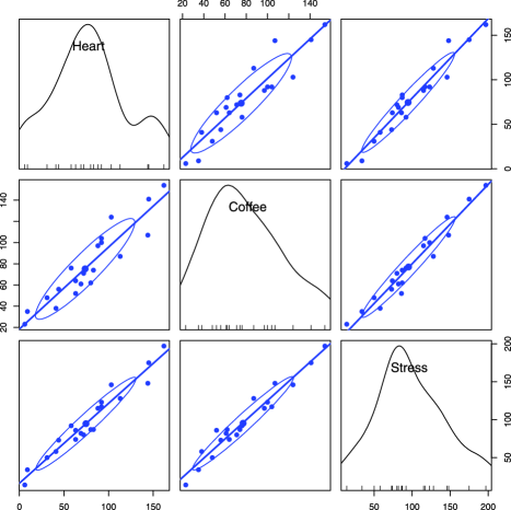
Figure 11 shows a scatterplot matrix among the variables Heart (), an index of cardiac damage, Coffee (), a measure of daily coffee consumption, and Stress (), a measure of occupational stress, in a contrived sample of . For the sake of the example we assume that the main goal is to determine whether or not coffee is good or bad for your heart, and stress represents one potential confounding variable among others (age, smoking, etc.) that might be useful to control statistically.
The plot in Figure 11 shows only the marginal relationship between each pair of variables. The marginal message seems to be that coffee is bad for your heart, stress is bad for your heart and coffee consumption is also related to occupational stress. Yet, when we fit both variables together, we obtain the following results, suggesting that coffee is good for you (the coefficient for coffee is now negative, though nonsignificant). How can this be? (See Table 2).
| Estimate () | Std. error | value | ||
|---|---|---|---|---|
| Intercept | 5.7927 | 0.1961 | ||
| Coffee | 0.2918 | 0.1789 | ||
| Stress | 1.1993 | 0.2244 | 5.34 | 0.0001 |
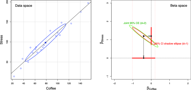
Figure 12 shows the relationship between the predictors in data space and how this translates into joint and individual confidence intervals for the coefficients in space. The left panel is the same as the corresponding (Coffee, Stress) panel in Figure 11, but with a standard (40%) data ellipse. The right panel shows the joint 95% confidence region and the individual 95% confidence intervals in space, determined as
where is the number of dimensions for which we want coverage, is the residual degrees of freedom for , and is the covariance matrix of the predictors.
Thus, the green ellipse in Figure 12 is the ellipse of joint 95% coverage, using the factor and covering the true values of () in 95% of samples. Moreover:
-
•
Any joint hypothesis (e.g., ) can be tested visually, simply by observingwhether the hypothesized point, here, lies inside or outside the joint confidence ellipse.
-
•
The shadows of this ellipse on the horizontal and vertical axes give the Scheffé joint 95% confidence intervals for the parameters, with protection for simultaneous inference (“fishing”) in a 2-dimensional space.
-
•
Similarly, using the factor would give an ellipse whose 1D shadows are Bonferroni confidence intervals for posterior hypotheses.
Visual hypothesis tests and confidence intervals for the parameters separately are obtained from the red ellipse in Figure 12, which is scaled by . We call this the “confidence-interval generating ellipse” (or, more compactly, the “confidence-interval ellipse”). The shadows of the confidence-interval ellipse on the axes (thick red lines) give the corresponding individual 95% confidence intervals, which are equivalent to the (partial,Type III) -tests for each coefficient given in the standard multiple regression output shown above. Thus, controlling for Stress, the confidence interval for the slope for Coffee includes 0, so we cannot reject the hypothesis that in the multiple regression model, as we saw above in the numerical output. On the other hand, the interval for the slope for Stress excludes the origin, so we reject the null hypothesis that , controlling for Coffee consumption.
Finally, consider the relationship between the data ellipse and the confidence ellipse. These have exactly the same shape, but the confidence ellipse is exactly a rotation and rescaling of the data ellipse. In directions in data space where the slice of the data ellipse is wide—where we have more information about the relationship between Coffee and Stress—the projection of the confidence ellipse is narrow, reflecting greater precision of the estimates of coefficients. Conversely, where slice of the the data ellipse is narrow (less information), the projection of the confidence ellipse is wide (less precision). See Figure 2 for the underlying geometry.
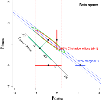
The virtues of the confidence ellipse for visualizing hypothesis tests and interval estimates do not end here. Say we wanted to test the hypothesis that Coffee was unrelated to Heart damage in the simple regression ignoring Stress. The (Heart, Coffee) panel in Figure 11 showed the strong marginal relationship between the variables. This can be seen in Figure 13 as the oblique projection of the confidence ellipse to the horizontal axis where . The estimated slope for Coffee in the simple regression is exactly the oblique shadow of the center of the ellipse through the point where the ellipse has a horizontal tangent onto the horizontal axis at . The thick blue line in this figure shows the confidence interval for the slope for Coffee in the simple regression model. The confidence interval does not cover the origin, so we reject in the simple regression model. The oblique shadow of the red 95% confidence-interval ellipse onto the horizontal axis is slightly smaller. How much smaller is a function of the -value of the coefficient for Stress?
We can go further. As we noted earlier, all linear combinations of variables or parameters in data or models correspond graphically to projections (shadows) onto certain subspaces. Let’s assume that Coffee and Stress were measured on the same scales so it makes sense to ask if they have equal impacts on Heart disease in the joint model that includes them both. Figure 13 also shows an auxiliary axis through the origin with slope corresponding to values of . The orthogonal projection of the coefficient vector on this axis is the point estimate of and the shadow of the red ellipse along this axis is the 95% confidence interval for the difference in slopes. This interval excludes 0, so we would reject the hypothesis that Coffee and Stress have equal coefficients.
4.7 Measurement Error
In classical linear models, the predictors are often considered to be fixed variables or, if random, to be measured without error and independent of the regression errors; either condition, along with the assumption of linearity, guarantees unbiasedness of the standard OLS estimators. In practice, of course, predictor variables are often also observed indicators, subject to error, a fact that is recognized in errors-in-variables regression models and in more general structural equation models but often ignored otherwise. Ellipsoids in data space and space are well suited to showing the effect of measurement error in predictors on OLS estimates.
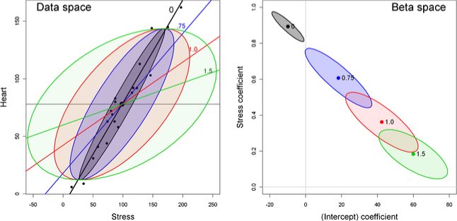
The statistical facts are well known, though perhaps counter-intuitive in certain details: measurement error in a predictor biases regression coefficients, while error in the measurement in increases the standard errors of the regression coefficients but does not introduce bias.
In the top row of Figure 11, adding measurement error to the Heart disease variable would expand the data ellipses vertically, but (apart from random variation) leaves the slopes of the regression lines unchanged. Measurement error in a predictor variable, however, biases the corresponding estimated coefficient toward zero (sometimes called regression attenuation) as well as increasing standard errors.
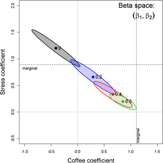
Figure 14 demonstrates this effect for the marginal relation between Heart disease and Stress, with data ellipses in data space and the corresponding confidence ellipses in space. Each panel starts with the observed data (the darkest ellipse, marked ), then adds random normal error, , with , to the value of Stress, while keeping the mean of Stress the same. All of the data ellipses have the same vertical shadows (), while the horizontal shadows increase with , driving the slope for Stress toward 0. In space, it can be seen that the estimated coefficients, , vary along a line and approach for sufficiently large. The vertical shadows of ellipses for along the axis also demonstrate the effects of measurement error on the standard error of .
Perhaps less well-known, but both more surprising and interesting, is the effect that measurement error in one variable, , has on the estimate of the coefficient for an other variable, , in a multiple regression model. Figure 15 shows the confidence ellipses for in the multiple regression predicting Heart disease, adding random normal error , with , to the value of Stress alone. As can be plainly seen, while this measurement error in Stress attenuates its coefficient, it also has the effect of biasing the coefficient for Coffee toward that in the marginal regression of Heart disease on Coffee alone.
4.8 Ellipsoids in Added-Variable Plots
In contrast to the marginal, bivariate views of the relationships of a response to several predictors (e.g., such as shown in the top row of the scatterplot matrix in Figure 11), added-variable plots (aka partial regression plots) show the partial relationship between the response and each predictor, where the effects of all other predictors have been controlled or adjusted for. Again we find that such plots have remarkable geometric properties, particularly when supplemented by ellipsoids.
Formally, we express the fitted standard linear model in vector form as , with model matrix . Let be the model matrix omitting the column for variable . Then, algebraically, the added variable plot for variable is the scatterplot of the residuals from two auxillary regressions,101010These quantities can all be computed [Velleman and Welsh (1981)] from the results of a single regression for the full model. fitting and from ,
Geometrically, in the space of the observations,111111The “space of the observations” is yet a third, -dimensional, space, in which the observations are the axes and each variable is represented as a point (or vector). See, for example, Fox [(2008), Chapter 10]. the fitted vector is the orthogonal projection of onto the subspace spanned by . Then and are the projections onto the orthogonal complement of the subspace spanned by , so the simple regression of on has slope in the full model, and the residuals from the line in this plot are identically the residuals from the overall regression of on .
Another way to describe the added-variable plot (AVP) for is as a 2D projection of the space of , viewed in a plane projecting the data along the intersection of two hyperplanes: the plane of the regression of on all of , and the plane of regression of on . A third plane, that of the regression of on , also intersects in this space and defines the horizontal axis in the AVP. This is illustrated in Figure 17, showing one view defined by the intersection of the three planes in the right panel.121212Animated 3D movies of this plot are included among the supplementary materials for this paper.
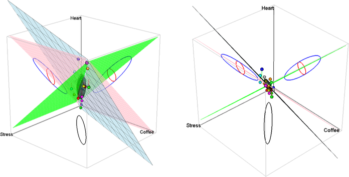
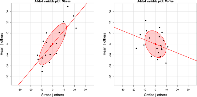
Figure 16 shows added-variable plots for Stress and Coffee in the multiple regression predicting Heart disease, supplemented by data ellipses for the residuals . With reference to the properties of data ellipses in marginal scatterplots (see Figure 4), the following visual properties (among others) are useful in this discussion. These results follow simply from translating “marginal” into “conditional” (or “partial”) in the present context. The essential idea is that the data ellipse of the AVP for is to the estimate of a coefficient in a multiple regression as the data ellipse of is to simple regression. Thus:
[(1)]
The simple regression least squares fit of on has slope , the partial slope for in the full model (and intercept = 0).
The residuals, , shown in this plot are the residuals for in the full model.
The correlation between and , seen in the shape of the data ellipse for these variables, is the partial correlation between and with the other predictors in partialled out.
The horizontal half-width of the AVP data ellipse is proportional to the conditional standard deviation of remaining after all other predictors have been accounted for, providing a visual interpretation of variance inflation due to collinear predictors, as we describe below.
The vertical half-width of the data ellipse is proportional to the residual standard deviation in the multiple regression.
The squared horizontal positions, , in the plot give the partial contributions to leverage on the coefficient of .
Items (3) and (7) imply that the AVP for shows the partial influence of individual observations on the coefficient , in the same way as in Figure 9 for marginal models. These influence statistics are often shown numerically as DFBETA statistics [Belsley, Kuh and Welsch (1980)].
The last three items imply that the collection of added-variable plots for and provide an easy way to visualize the leverage and influence that individual observations—and indeed the joint influence of subsets of observations—have on the estimation of each coefficient in a given model.
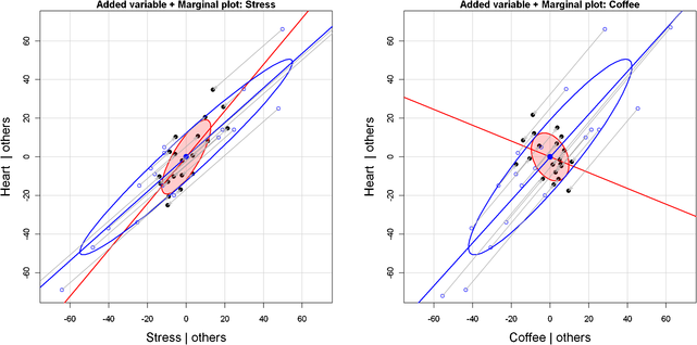
Elliptical insight also permits us to go further, to depict the relationship between conditional and marginal views directly. Figure 18 shows the same added-variable plots for Heart disease on Stress and Coffee as in Figure 16 (with a zoomed-out scaling), but here we also overlay the marginal data ellipses for , and marginal regression lines for Stress and Coffee separately. In 3D data space, these are the shadows (projections) of the data ellipsoid onto the planes defined by the partial variables. In 2D AVP space, they are just the marginal data ellipses translated to the origin.
The most obvious feature of Figure 18 is that the AVP for Coffee has a negative slope in the conditional plot (suggesting that controlling for Stress, coffee consumption is good for your heart), while in the marginal plot increasing coffee seems to be bad for your heart. This serves as a regression example of Simpson’s paradox, which we considered earlier.
Less obvious is the fact that the marginal and AVP ellipses are easily visualized as a shadow versus a slice of the full data ellipsoid. Thus, the AVP ellipse must be contained in the marginal ellipse, as we can see in Figure 18. If there are only two ’s, then the AVP ellipse must touch the marginal ellipse at two points. The shrinkage of the intersection of the AVP ellipse with the axis represents improvement in fit due to other ’s.
More importantly, the shrinkage of the width (projected onto a horizontal axis) represents the square root of the variance inflation factor (VIF), which can be shown to be the ratio of the horizontal width of the marginal ellipse of , with standard deviation to the width of the conditional ellipse of , with standard deviation . This geometry implies interesting constraints among the three quantities: improvement in fit, VIF, and change from the marginal to conditional slope.
Finally, Figure 18 also shows how conditioning on other predictors works for individual observations, where each point of is the image of along the path of the marginal regression. This reminds us that the AVP is a 2D projection of the full space, where the regression plane of on becomes the vertical axis and the regression plane of on becomes the horizontal axis.
| Criterion | Formula | “mean” of | Partial |
|---|---|---|---|
| Wilks’s | geometric | ||
| Pillai trace | arithmetic | ||
| Hotelling–Lawley trace | harmonic | ||
| Roy maximum root | supremum |
5 Multivariate Linear Models: HE Plots
Multivariate linear models (MvLMs) have a special affinity with ellipsoids and elliptical geometry, as described in this section. To set the stage and establish notation, we consider the MvLM [e.g., Timm (1975)] given by the equation , where is an matrix of responses in which each column represents a distinct response variable; is the model matrix of full column rank for the regressors; is the matrix of regression coefficients or model parameters; and is the matrix of errors, with , where is the Kronecker product.
A convenient feature of the MvLM for general multivariate responses is that all tests of linear hypotheses (for null effects) can be represented in the form of a general linear test,
| (12) |
where is a rank matrix of constants whose rows specify linear combinations or contrasts of the parameters to be tested simultaneously by a multivariate test.
For any such hypothesis of the form given in equation (12), the analogs of the univariate sums ofsquares for hypothesis () and error () are the sum of squares and cross-products (SSP) matrices given by
| (13) |
and
| (14) |
where is the matrix of residuals. Multivariate test statistics (Wilks’s , Pillai trace, Hotelling–Lawley trace, Roy’s maximum root) for testing equation (12) are based on the nonzero latent roots of the matrix relative to the matrix , that is, the values of for which or, equivalently, the latent roots for which . The details are shown in Table 3. These measures attempt to capture how “large” is, relative to in dimensions, and correspond to various “means” as we described earlier. All of these statistics have transformations to statistics giving either exact or approximate null-hypothesis distributions. The corresponding latent vectors provide a set of orthogonal linear combinations of the responses that produce maximal univariate statistics for the hypothesis in equation (12); we refer to these as the canonical discriminant dimensions.
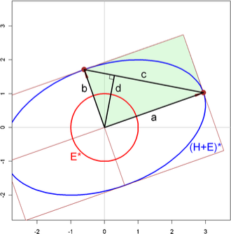
Beyond the informal characterization of the four classical tests of hypotheses for multivariate linear models given in Table 3, there is an interesting geometrical representation that helps one to appreciate their relative power for various alternatives. This can be illustrated most simply in terms of the canonical representation, , of the ellipsoid generated by relative to , as shown in Figure 19 for .
 |
 |
| (a) Data ellipses | (b) H and E matrices |
With as described above, the eigenvalues and squared radii of are , so the lengths of the major and minor axes are and , respectively. The diagonal of the triangle comprising the segments (labeled ) has length . Finally, a line segment from the origin dropped perpendicularly to the diagonal joining the two ellipsoid axes is labeled .
In these terms, Wilks’s test, based on , is equivalent to a test based on which is proportional to the area of the framing rectangle, shown shaded in Figure 19. The Hotelling–Lawley trace test, based on , is equivalent to a test based on . Finally, the Pillai Trace test, based on , can be shown to be equal to for . Thus, it is strictly monotone in and equivalent to a test based directly on .
The geometry makes it easy to see that if there is a large discrepancy between and , Roy’s test depends only on while the Pillai test depends more on . Wilks’s and the Hotelling–Lawley trace criterion are also functional averages of and , with the former being penalized when is small. In practice, when , all four test criteria are equivalent, in that their standard transformations to statistics are exact and give rise to identical -values.
5.1 Hypothesis-Error (HE) Plots
The essential idea behind HE plots is that any multivariate hypothesis test, equation (12), can be represented visually by ellipses (or ellipsoids beyond 2D) that express the size of covariation against a multivariate null hypothesis () relative to error covariation (). The multivariate tests, based on the latent roots of , are thus translated directly to the sizes of the ellipses for various hypotheses, relative to the size of the ellipse. Moreover, the shape and orientation of these ellipses show something more—the directions (linear combinations of the responses) that lead to various effect sizes and significance.
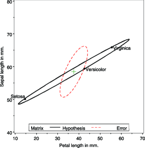
Figure 20 illustrates this idea for two variables from the iris data set. Panel (a) shows the data ellipses for sepal length and petal length, equivalent to the corresponding plot in Figure 3. Panel (b) shows the HE plot for these variables from the one-way MANOVA model testing equal mean vectors across species, . Let be the matrix of fitted values for this model, that is, . Then (where is the grand-mean vector), and the ellipse in the figure is then just the 2D projection of the data ellipsoid of the fitted values, scaled as described below. Similarly, , and , so the ellipse is the 2D projection of the data ellipsoid of the residuals. Visually, the ellipsoid corresponds to shifting the separate within-group data ellipsoids to the centroid, as illustrated above in Figure 6(c).
In HE plots, the matrix is first scaled to a covariance matrix , dividing by the error degrees of freedom, . The ellipsoid drawn is translated to the centroid of the variables, giving . This scaling and translation also allows the means for levels of the factors to be displayed in the same space, facilitating interpretation. In what follows, we show these as “standard” bivariate ellipses of 68% coverage, using , except where noted otherwise.
The ellipse for reflects the size and orientation of covariation against the null hypothesis. In relation to the ellipse, the ellipse can be scaled to show either the effect size or strength of evidence against (significance).
For effect-size scaling, each is divided by to conform to . The resulting ellipse is then exactly the data ellipse of the fitted values, and corresponds visually to a multivariate analog of univariate effect-size measures [e.g., where is the within-group standard deviation].
For significance scaling, it turns out to be most visually convenient to use Roy’s largest root statistic as the test criterion. In this case, the ellipse is scaled to , where is the critical value of Roy’s statistic.131313The test based on Roy’s largest root uses the approximation with degrees of freedom , where and . Inverting the statistic gives the critical value for an -level test: . Using this scaling gives a simple visual test of : Roy’s test rejects at a given level iff the corresponding -level ellipse protrudes anywhere outside the ellipse.141414Other multivariate tests (Wilks’s , Hotelling–Lawley trace, Pillai trace) also have geometric interpretations in HE plots [e.g., Wilks’s is the ratio of areas (volumes) of the and ellipses (ellipsoids); Hotelling–Lawley trace is based on the sum of the ], but these statistics do not provide such simple visual comparisons. All HE plots shown in this paper use significance scaling, based on Roy’s test. Moreover, the directions in which the hypothesis ellipse exceed the error ellipse are informative about the responses and their linear combinations that depart significantly from . Thus, in Figure 20(b), the variation of the means of the iris species shown for these two variables appears to be largely one-dimensional, corresponding to a weighted sum (or average) of petal length and sepal length, perhaps a measure of overall size.
5.2 Linear Hypotheses: Geometries of Contrasts and Sums of Effects
Just as in univariate ANOVA designs, important overall effects () in MANOVA may be usefully explored and interpreted by the use of contrasts among the levels of the factors involved. In the general linear hypothesis test of equation (12), contrasts are easily specified as one or more matrices, each of whose rows sums to zero.
As an important special case, for an overall effect with degrees of freedom (and balanced sample sizes), a set of pairwise orthogonal matrices ( for ) gives rise to a set of rank-one matrices that additively decompose the overall hypothesis SSCP matrix (by a multivariate analog of Pythagoras’ Theorem),
exactly as the univariate may be decomposed in an ANOVA. Each of these rank-one matrices will plot as a vector in an HE plot, and their collection provides a visual summary of the overall test, as partitioned by these orthogonal contrasts. Even more generally, where the subhypothesis matrices may be of rank 1, the subhypotheses will have hypothesis ellipses of dimension rank() that are conjugate with respect to the hypothesis ellipse for the joint hypothesis, provided that the estimators for the subhypotheses are statistically independent.
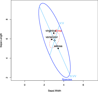
To illustrate, we show in Figure 21 an HE plot for the sepal width and sepal length variables in the iris data, corresponding to panel (1:2) in Figure 3. Overlayed on this plot are the one-df matrices obtained from testing two orthogonal contrasts among the iris species: setosa vs. the average of versicolor and virginica (labeled “S:VV”), and versicolor vs. virginica (“V:V”), for which the contrast matrices are
where the species (columns) are taken in alphabetical order. In this view, the joint hypothesis testing equality of the species means has its major axis in data space largely in the direction of sepal length. The 1D degenerate “ellipse” for , representing the contrast of setosa with the average of the other two species, is closely aligned with this axis. The “ellipse” for has a relatively larger component aligned with sepal width.
5.3 Canonical Projections: Ellipses in Data Space and Canonical Space
HE plots show the covariation leading toward rejection of a hypothesis relative to error covariation for two variables in data space. To visualize these relationships for more than two response variables, we can use the obvious generalization of a scatterplot matrix showing the 2D projections of the and ellipsoids for all pairs of variables. Alternatively, a transformation to canonical space permits visualization of all response variables in the reduced-rank 2D (or 3D) space in which covariation is maximal.
In the MANOVA context, the analysis is called canonical discriminant analysis (CDA), where the emphasis is on dimension reduction rather than hypothesis testing. For a one-way design with groups and -variate observations in group , , CDA finds a set of linear combinations, , so that: (a) all are mutually uncorrelated; (b) the vector of weights maximizes the univariate statistic for the linear combination ; (c) each successive vector of weights, , maximizes the univariate -statistic for , subject to being uncorrelated with all other linear combinations.
The canonical projection of to canonical scores is given by
| (15) |
where is the matrix whose columns are the eigenvectors of associated with the ordered nonzero eigenvalues, . A MANOVA of all linear combinations is statistically equivalent to that of the raw data. The are proportional to the fractions of between-group variation expressed by these linear combinations. Hence, to the extent that the first one or two eigenvalues are relatively large, a two-dimensional display will capture the bulk of between-group differences. The 2D canonical discriminant HE plot is then simply an HE plot of the scores and on the first two canonical dimensions. (If , an analogous 3D version may also be obtained.)
Because the scores are all mutually uncorrelated, the and matrices will always have their axes aligned with the canonical dimensions. When, as here, the scores are standardized, the ellipse will be circular, assuming that the axes in the plot are equated so that a unit data length has the same physical length on both axes.
Moreover, we can show the contributions of the original variables to discrimination as follows: Let be the matrix of the correlations of each column of with each column of , often called canonical structure coefficients. Then, for variable , a vector from the origin to the point whose coordinates are given in row of has projections on the canonical axes equal to these structure coefficients and squared length equal to the sum squares of these correlations.
Figure 22 shows the canonical HE plot for the iris data, the view in canonical space corresponding to Figure 21 in data space for two of the variables (omitting the contrast vectors). Note that for groups, , so and the representation in 2D is exact. This provides a very simple interpretation: Nearly all (99.1%) of the variation in species means can be accounted for by the first canonical dimension, which is seen to be aligned with three of the four variables, most strongly with petal length. The second canonical dimension is mostly related to variation in the means on sepal width, and this variable is negatively correlated with the other three.
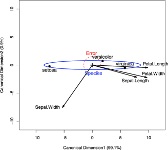
Finally, imagine a 4D version of the HE plot of Figure 21 in data space, showing the four-dimensional ellipsoids for and . Add to this plot unit vectors corresponding to the coordinate axes, scaled to some convenient constant length. Some rotation would show that the ellipsoid is really only two-dimensional, while is 4D. Applying the transformation given by as in Figure 4 and projecting into the 2D subspace of the nonzero dimensions of would give a view equivalent to the canonical HE plot in Figure 22. The variable vectors in this plot are just the shadows of the original coordinate axes.
6 Kissing Ellipsoids
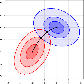
In this section we consider some circumstances in which there is a data stratification factor or there are two (or more) principles or procedures for deriving estimates of a parameter vector of a linear model, each with its associated estimated covariance matrix, for example, with covariance matrix and with covariance matrix . The simplest motivating example is two-group discriminant analysis (Section 6.2). In data space, solutions to this statistical problem can be described geometrically in terms of the property that the data ellipsoids around the group centroids will just “kiss” (or osculate) along a path between the two centroids. We call this path the locus of osculation, whose properties are described in Section 6.1.
Perhaps more interesting and more productive is that the same geometric ideas apply equally well in parameter () space. Consider, for example, method A to be OLS estimation and several alternatives for method B, such as ridge regression (Section 6.3) or Bayesian estimation (Section 6.4). The remarkable fact is that the geometry of such kissing ellipsoids provides a clear visual interpretation of these cases and others, whenever we consider a convex combination of information from two sources. In all cases, the locus of osculation is interpretable in terms of the statistical goal to be achieved, taking precision into account.
6.1 Locus of Osculation
The problems mentioned above all have a similar and simple physical interpretation: Imagine two stones dropped into a pond at locations with coordinates and . The waves emanating from the centers form concentric circles which osculate along the line from to . Now imagine a world with ellipse-generating stones, where instead of circles, the waves form concentric ellipses determined by the shape matrices and . The locus of osculation of these ellipses will be the set of points where the tangents to the two ellipses are parallel (or, equivalently, that their normals are parallel). An example is shown in Figure 23, using , , and
| (16) |
where we have found points of osculation by trial and error.
An exact general solution can be described as follows: Let the ellipses for be given by
and denote their gradient-vector functions as
| (17) |
so that
Then, the points where and are parallel can be expressed in terms of the condition that their vector cross product , where is the skew-symmetric matrix
satisfying . Thus, the locus of osculation is the set , given by , which implies
| (18) |
Equation (18) is a bilinear form in , with central matrix , implying that is a conic section in the general case. Note that when or , equation (18) is necessarily zero, so the locus of osculation always passes through and .
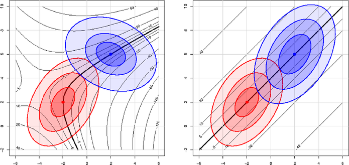
A visual demonstration of the theory above isshown in Figure 24 (left), which overlays the ellipses in Figure 23 with contour lines (hyperbolae, here) of the vector cross-product function contained in equation (18). When the contours of and have the same shape (), as in the right panel of Figure 24, equation (18) reduces to a line, in accord with the stones-in-pond interpretation. The above can be readily extended to ellipsoids in a higher dimension, where the development is more easily understood in terms of normals to the surfaces.
6.2 Discriminant Analysis
The right panel of Figure 24, considered in data space, provides a visual interpretation of the classical, normal theory two-group discriminant analysis problem under the assumption of equal population covariance matrices, . Here, we imagine that the plot shows the contours of data ellipsoids for two groups, with mean vectors and , and common covariance matrix .
The discriminant axis is the locus of osculation between the two families of ellipsoids. The goal in discriminant analysis, however, is to determine a classification rule based on a linear function, , such that an observation will be classified as belonging to Group 1 if , and to Group 2 otherwise. In linear discriminant analysis, the discriminant function coefficients are given by
All boundaries of the classification regions determined by will then be the tangent lines (planes) to the ellipsoids at points of osculation. The location of the classification region along the line from to typically takes into account both the prior probabilities of membership in Groups 1 and 2, and the costs of misclassification. Similarly, the left panel of Figure 24 is a visual representation of the same problem when , giving rise to quadratic classification boundaries.
6.3 Ridge Regression
In the univariate linear model, , high multiple correlations among the predictors in lead to problems of collinearity—unstable OLS estimates of the parameters in with inflated standard errors and coefficients that tend to be too large in absolute value. Although collinearity is essentially a data problem [Fox (2008)], one popular (if questionable) approach is ridge regression, which shrinks the estimates toward (introducing bias) in an effort to reduce sampling variance.
Suppose the predictors and response have been centered at their means and the unit vector is omitted from . Further, rescale the columns of to unit length, so that is a correlation matrix. Then, the OLS estimates are given by
| (19) |
Ridge regression replaces the standard residual sum of squares criterion with a penalized form,
| (20) | |||
| (21) |
whose solution is easily seen to be
where . Thus, as the “ridge constant” increases, decreases, driving toward [Hoerl and Kennard (1970a, 1970b)]. The addition of a positive constant to the diagonal of drives away from zero even if .
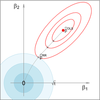
The penalized Lagrangian formulation in equation (6.3) has an equivalent form as a constrained minimization problem,
| (23) | |||
| (24) |
which makes the size constraint on the parameters explicit, with an inverse function of . This form provides a visual interpretation of ridge regression, as shown in Figure 25. Depicted in the figure are the elliptical contours of the OLS regression sum of squares, around . Each ellipsoid marks the point closest to the origin, that is, with . It is easily seen that the ridge regression solution is the point where the elliptical contours just kiss the constraint contour.
Another insightful interpretation of ridge regression [Marquardt (1970)] sees the ridge estimator as equivalent to an OLS estimator, when the actual data in are supplemented by some number of fictitious observations, , with uncorrelated predictors, giving rise to an orthogonal matrix, and where for all supplementary observations. The linear model then becomes
| (25) |
which gives rise to the solution
| (26) |
But because is orthogonal, is a scalar multiple of , so there exists some value of making equation (26) equivalent to equation (6.3). As promised, the ridge regression estimator then reflects a weighted average of the data with observations biased toward . In Figure 25, it is easy to imagine that there is a direct translation between the size of the constraint region, , and an equivalent supplementary sample size, , in this interpretation.
This classic version of the ridge regression problem can be generalized in a variety of ways, giving other geometric insights. Rather than a constant multiplier of as the penalty term in equation (6.3), consider a penalty of the form with a positive definite matrix . The choice gives rise to a version of Figure 25 in which the constraint contours are ellipses aligned with the coordinate axes, with axis lengths inversely proportional to . These constants allow for differential shrinkage of the OLS coefficients. The visual solution to the obvious modification of equation (6.3) is again the point where the elliptical contours of kiss the contours of the (now elliptical) constraint region.
6.3.1 Bivariate ridge trace plots
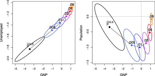
Ridge regression is touted (optimistically we think) as a method to counter the effects of collinearity by trading off a small amount of bias for an advantageous decrease in variance. The results are often visualized in a ridge trace plot [Hoerl and Kennard (1970b)], showing the changes in individual coefficient estimates as a function of . A bivariate version of this plot, with confidence ellipses for the parameters, is introduced here. This plot provides greater insight into the effects of on coefficient variance.151515Bias and mean-squared error are a different matter: Although Hoerl and Kennard (1970a) demonstrate that there is a range of values for the ridge constant for which the MSE of the ridge estimator is smaller than that of the OLS estimator, to know where this range is located requires knowledge of . As we explain in the following subsection, the constraint on incorporated in the ridge estimator can be construed as a Bayesian prior; the fly in the ointment of ridge regression, however, is that there is no reason to suppose that the ridge-regression prior is in general reasonable.
Confidence ellipsoids for the OLS estimator are generated from the estimated covariance matrix of the coefficients,
For the ridge estimator, this becomes [Marquardt (1970)]
which coincides with the OLS result when .
Figure 26 uses the classic Longley (1967) data to illustrate bivariate ridge trace plots. The data consist of an economic time series () observed yearly from 1947 to 1962, with the number of people Employed as the response and the following predictors: GNP, Unemployed, Armed.Forces, Population, Year, and GNP.deflator (using 1954 as 100).161616Longley (1967) used these data to demonstrate the effects of numerical instability and round-off error in least squares computations based on direct computation of the cross-products matrix, . Longley’s paper sparked the development of a wide variety of numerically stable least squares algorithms (QR, modified Gram-Schmidt, etc.) now used is almost all statistical software. Even ignoring numerical problems (not to mention problems due to lack of independence), these data would be anticipated to exhibit high collinearity because a number of the predictors would be expected to have strong associations with year and/or population, yet both of these are also included among the predictors. For each value of , the plot shows the estimate , together with the variance ellipse. For the sake of this example, we assume that GNP is a primary predictor of Employment, and we wish to know how other predictors modify the regression estimates and their variance when ridge regression is used.
For these data, it can be seen that even small values of have substantial impact on the estimates . What is perhaps more dramatic (and unseen in univariate trace plots) is the impact on the size of the variance ellipse. Moreover, shrinkage in variance is generally in a similar direction to the shrinkage in the coefficients. This new graphical method is developed more fully in Friendly (2013), including 2D and 3D plots, as well as more informative representations of shrinkage by ellipsoids in the transformed space of the SVD of the predictors.
6.4 Bayesian Linear Models
In a Bayesian alternative to standard least squares estimation, consider the case where our prior information about can be encapsulated in a distribution with a prior mean and covariance matrix . We show that under reasonable conditions the Bayesian posterior estimate, , turns out to be a weighted average of the prior coefficients and the OLS solution , with weights proportional to the conditional prior precision, , and the data precision given by . Once again, this can be understood geometrically as the locus of osculation of ellipsoids that characterize the prior and the data.
Under Gaussian assumptions, the conditional likelihood can be written as
To focus on alternative estimators, we can complete the square around to give
With a little manipulation, a conjugate prior, of the form , can be expressed with an inverse gamma distribution depending on the first term on the right-hand side of equation (6.4) and a normal distribution,
| (29) | |||
The posterior distribution is then , whence, after some simplification, the posterior mean can be expressed as
| (30) |
with covariance matrix . The posterior coefficients are therefore a weighted average of the prior coefficients and the OLS estimates, with weights given by the conditional prior precision, , and the data precision, . Thus, as we increase the strength of our prior precision (decreasing prior variance), we place greater weight on our prior beliefs relative to the data.
6.5 Mixed Models: BLUEs and BLUPs
In this section we make implicit use of the duality between data space and space, where lines in one map into points in the other and ellipsoids help to visualize the precision of estimates in the context of the linear mixed model for hierarchical data. We also show visually how the best linear unbiased predictors (BLUPs) from the mixed model can be seen as a weighted average of the best linear unbiased estimates (BLUEs) derived from OLS regressions performed within clusters of related data and the overall mixed model GLS estimate.
The mixed model for hierarchical data provides a general framework for dealing with dependence among observations in linear models, such as occurs when students are sampled within schools, schools within counties and so forth [e.g., Raudenbush and Bryk (2002)]. In these situations, the assumption of OLS that the errors are conditionally independent is probably violated, because, for example, students nested within the same school are likely to have more similar outcomes than those from different schools. Essentially the same model, with provision for serially correlated errors, can be applied to longitudinal data [e.g., Laird and Ware (1982)], although we will not pursue this application here.
The mixed model for the response vector in cluster can be given as
| (31) | |||||
where is a vector of parameters corresponding to the fixed effects in the model matrix ; is a vector of coefficients corresponding to the random effects in the model matrix ; is the covariance matrix of the random effects in ; and is the covariance matrix of the errors in .
Stacking the , , and so forth in the obvious way then gives
| (32) |
where and are assumed to have normal distributions with mean and
| (33) |
where , and is the number of clusters. The variance of is therefore , and when and , the mixed model in equation (32) reduces to the standard linear model.
We now consider the case in which and we wish to predict , the vector of parameters for the th cluster. At one extreme, we could simply ignore clusters and use the common mixed-model generalized-least-square estimate,
| (34) |
whose sampling variance is . It is an unbiased predictor of since . With moderately large , the sampling variance may be small relative to and .
At the other extreme, we ignore the fact that clusters come from a common population and we calculate the separate BLUE estimate within each cluster,
| (35) | |||
| (36) |
Both extremes have drawbacks: whereas the pooled overall GLS estimate ignores variation between clusters, the unpooled within-cluster BLUE ignores the common population and makes clusters appear to differ more than they actually do.
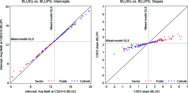
This dilemma led to the development of BLUPs (best linear unbiased predictor) in models with random effects [Henderson (1975), Robinson (1991),Speed (1991)]. In the case considered here, the BLUPs are an inverse-variance weighted average of the mixed-model GLS estimates and of the BLUEs. The BLUP is then
This “partial pooling” optimally combines the information from cluster with the information from all clusters, shrinking toward . Shrinkage for a given parameter is greater when the sample size is small or when the variance of the corresponding random effect, , is small.
Equation (6.5) is of the same form as equation (30) and other convex combinations of estimates considered earlier in this section. So once again, we can understand these results geometrically as the locus of osculation of ellipsoids. Ellipsoids kiss for a reason: to provide an optimal convex combination of information from two sources, taking precision into account.
6.5.1 Example: Math achievement and SES
To illustrate, we use a classic data set from Bryk and Raudenbush (1992) and Raudenbush and Bryk (2002) dealing with math achievement scores for a subsample of 7185 students from 160 schools in the 1982 High School & Beyond survey of U.S. public and Catholic high schools conducted by the National Center for Education Statistics (NCES). The data set contains 90 public schools and 70 Catholic schools, with sample sizes ranging from 14 to 67.
The response is a standardized measure of math achievement, while student-level predictor variables include sex and student socioeconomic status (SES), and school-level predictors include sector (public or Catholic) and mean SES for the school (among other variables). Following Raudenbush and Bryk (2002), student SES is considered the main predictor and is typically analyzed centered within schools, , for ease of interpretation (making the within-school intercept for school equal to the mean SES in that school).
For simplicity, we consider the case of CSES as a single quantitative predictor in in the example below. We fit and compare the following models:
| (38) | |||||
| (39) | |||||
| (41) |
and also include a fixed effect of sector, common to all models; for compactness, the sector effect is elided in the notation above.
In expositions of mixed-effects models, such models are often compared visually by plotting predicted values in data space, where each school appears as a fitted line under one of the models above (sometimes called “spaghetti plots”). Our geometric approach leads us to consider the equivalent but simpler plots in the dual space, where each school appears as a point.
Figure 27 plots the unpooled BLUE estimatesagainst the BLUPs from the random effects model, with separate panels for intercepts and slopes to illustrate the shrinkage of different parameters. In these data, the variance in intercepts (average math achievement for students at ), , among schools in each sector is large, so the mixed-effects estimates have small weight and there is little shrinkage. On the other hand, the variance component for slopes, , is relatively small, so there is greater shrinkage toward the GLS estimate.
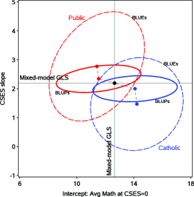
For the present purposes, a more useful visual representation of these model comparisons can be shown together in the space of , as in Figure 28. Estimates for individual schools are not shown, but rather these are summarized by the ellipses of 50% coverage for the BLUEs and BLUPs within each sector. The centers of the ellipsoids indicate the relatively greater shrinkage of slopes compared to intercepts. The sizes of ellipsoids show directly the greater precision of the BLUPs, particularly for slopes.
6.6 Multivariate Meta-Analysis
A related situation arises in random effects multivariate meta-analysis [Berkey et al. (1998), Nam, Mengersen and Garthwaite (2003)], where several outcome measures are observed in a series of similar research studies and it is desired to synthesize those studies to provide an overall (pooled) summary of the outcomes, together with meta-analytic inferences and measures of heterogeneity across studies.
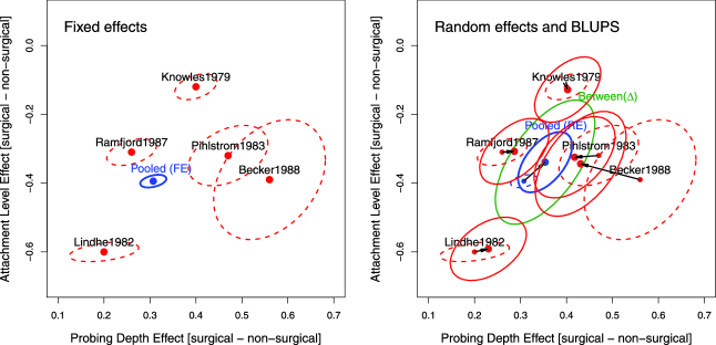
The application of mixed model ideas in this context differs from the standard situation in that individual data are usually unavailable and use is made instead of summary data (estimated treatment effects and their covariances) from the published literature. The multivariate extension of standard univariate methods of meta-analysis allows the correlations among outcome effects to be taken into account and estimated, and regression versions can incorporate study-specific covariates to account for some inter-study heterogeneity. More importantly, we illustrate a graphical method based (of course) on ellipsoids that serves to illustrate bias, heterogeneity and shrinkage in BLUPs, and the optimism of fixed-effect estimates when study heterogeneity is ignored.
The general mixed-effects multivariate meta-analysis model can be written as
| (42) |
where is a vector of outcomes (means or treatment effects) for study ; is the matrix of study-level predictors for study or a unit vector when no covariates are available; is the population-averaged vector of regression parameters or effects (intercepts, means) when there are no covariates; is the -vector of random effects associated with study , whose covariance matrix represents the be-tween-study heterogeneity unaccounted for by ; and, finally, is the -vector of random sampling errors (independent of ) within study , having the covariance matrix .
With suitable distributional assumptions, themixed-effects model in equation (42) implies that
| (43) |
with . When all the , and thus , equation (42) reduces to a fixed-effects model, , which can be estimated by GLS to give
| (44) | |||||
| (45) |
where and are the stacked and , and is the block-diagonal matrix containing the . The fixed-effects model ignores unmodeled heterogeneity among the studies, however, and consequently the estimated effects in equation (44) may be biased and the estimated uncertainty of these effects in equation (45) may be too small.
The example we use here concerns the comparison of surgical (S) and nonsurgical (NS) procedures for the treatment of moderate periodontal disease in five randomized split-mouth design clinical trials [Antczak-Bouckoms et al. (1993), Berkey et al. (1998)]. The two outcome measures for each patient were pre- to post-treatment changes after one year in probing depth (PD) and attachment level (AL), in mm, where successful treatment should decrease probing depth and increase attachment level. Each study was summarized by the mean difference, , between S and NS treated teeth, together with the covariance matrix for each study. Sample sizes ranged from 14 to 89 across studies.
The left panel of Figure 29 shows the individual study estimates of PD and AL together with their covariances ellipses in a generic form that we propose as a more useful visualization of multivariate meta-analysis results than standard tabular displays: individual estimates plus model-based summary, all with associated covariance ellipsoids.171717The analyses described here were carried out using the mvmeta package for R [Gasparrini (2012)].
It can be seen that all studies show that surgical treatment yields better probing depth (estimates are positive), while nonsurgical treatment results in better attachment level (all estimates are negative). As well, within each study, there is a consistently positive correlation between the two outcome effects: patients with a greater surgical vs. nonsurgical difference on one measure tend to have a greater such difference on the other, and greater within-study variation on PD than on AL.181818Both PD and AL are measured on the same scale (mm), and the plots have been scaled to have unit aspect ratio, justifying this comparison. The overall sizes of the ellipses largely reflect (inversely) the sample sizes in the various studies. As far as we know, these results were not noted in previous analyses of these data. Finally, the fixed-effect estimate, , and its covariance ellipse suggest that these effects are precisely estimated.
The random-effects model is more complex because and must be estimated jointly. A variety of methods have been proposed (full maximum likelihood, restricted maximum likelihood, method of moments, Bayesian methods, etc.), whose details [for which see Jackson, Riley and White (2011)] are not relevant to the present discussion. Given an estimate , however, the pooled, population-averaged point estimate of effects under the random-effects model can be expressed as
| (46) |
where . The first term in equation (46) gives the estimated covariance matrix of the random-effect pooled estimates. For the present example, this is shown in the right panel of Figure 29 as the blue ellipse. The green ellipse shows the estimate of the between-study covariance, , whose shape indicates that studies with a larger estimate of PD also tend to have a larger estimate of AL (with correlation = 0.61). It is readily seen that, relative to the fixed-effects estimate , the unbiased estimate under the random-effects model has been shifted toward the centroid of the individual study estimates and that its covariance ellipse is now considerably larger, reflecting between-study heterogeneity. In contrast to the fixed-effect estimates, inferences on pertain to the entire population of potential studies of these effects.
Figure 29 (right) also shows the best linear unbiased predictions of individual study estimates and their associated covariance ellipses, superposed (purely for didactic purposes) on the fixed-effects estimates to allow direct comparison. For random-effects models, the BLUPs have the form
| (47) |
with covariance matrices
| (48) |
Algebraically, the BLUP outcome estimates inequation (47) are thus a weighted average of the population-averaged estimates and the study-specific estimates, with weights depending on the relative sizes of the within- and between-study covariance matrices and . The point BLUPs borrow strength from the assumption of an underlying multivariate distribution of study parameters with covariance matrix , shrinking toward the mean inversely proportional to the within-study covariance. Geometrically, these estimates may be described as occurring along the locus of osculation of the ellipses and .
Finally, the right panel of Figure 29 also shows the covariance ellipses of the BLUPs from equation (47). It is clear that their orientation is a blending of the correlations in and , and their size reflects the error in the average point estimates and the error in the random deviation predicted for each study.
7 Discussion and Conclusions
I know of scarcely anything so apt to impress the imagination as the wonderful form of cosmic order expressed by the “[Elliptical] Law of Frequency of Error.” The law would have been personified by the Greeks and deified, if they had known of it It is the supreme law of Unreason. Whenever a large sample of chaotic elements are taken in hand and marshaled in the order of their magnitude, an unsuspected and most beautiful form of regularity proves to have been latent all along.
We have taken the liberty to add the word “Elliptical” to this famous quotation from Galton (1889). His “supreme law of Unreason” referred to univariate distributions of observations tending to the Normal distribution in large samples. We believe he would not take us remiss, and might perhaps welcome us for extending this view to two and more dimensions, where ellipsoids often provide an “unsuspected and most beautiful form of regularity.”
In statistical data, theory and graphical methods, one fundamental organizing distinction can be made depending on the dimensionality of the problem. A coarse but useful scale considers the essential defining distinctions to be among:
-
•
ONE (univariate),
-
•
TWO (bivariate),
-
•
MANY (multivariate).
This scale191919This idea, as a unifying classification principle for data analysis and graphics, was first suggested to the first author in seminars by John Hartigan at Princeton, c. 1968. at least implicitly organizes much of current statistical teaching, practice and software. But within this classification, the data, theory and graphical methods are often treated separately (1D, 2D, D), without regard to geometric ideas and visualizations that help to unify them.
This paper starts from the premise that one geometric form—the ellipsoid—provides a unifyingframework for many statistical phenomena, with simple representations in 1D (a line) and 2D (an ellipse) that extend naturally to higher dimensions (an ellipsoid). The intellectual leap in statistical thinking from ONE to TWO in Galton (1886) was enormous. Galton’s visual insights derived from the ellipse quickly led to an understanding of the ellipse as a contour of a bivariate normal surface. From here, the step from TWO to MANY would take another 20–30 years, but it is hard to escape the conclusion that geometric insight from the ellipse to the general ellipsoid in D played an important role in the development of multivariate statistical methods.
In this paper, we have tried to show how ellipsoids can be useful tools for visual statistical thinking, data analysis and pedagogy in a variety of contexts often treated separately and from a univariate perspective. Even in bivariate and multivariate problems, first-moment summaries (a 1D regression line or 2D regression surface) show only part of the story—that of the expectation of a response given predictors . In many cases, the more interesting part of the story concerns the precision of various methods of estimation, which we’ve shown to be easily revealed through data ellipsoids and elliptical confidence regions for parameters.
The general relationships among statistical methods, matrix algebra and geometry are not new here. To our knowledge, Dempster (1969) was the first to exploit these relationships in a systematic fashion, establishing the connections among abstract vector spaces, algebraic coordinate systems, matrix operations and properties, the dualities between observation space and variable space, and the geometry of ellipses and projections. The roots of these connections go back much further—to Cramér (1946) (the idea of the concentration ellipsoid), to Pearson (1901) and Hotelling (1933) (principal components), and, we maintain, ultimately to Galton (1886).Throughout this development, elliptical geometry has played a fundamental role, leading to important visual insights.
The separate and joint roles of statistical computation and computational graphics should not be underestimated in appreciation of these developments. Dempster’s analysis of the connections among geometry, algebra and statistical methods was fueled by the development and software implementation of algorithms [Gram-Schmidt orthogonalization, Cholesky decomposition, sweep and multistandardize operators from Beaton (1964)] that allowed him to show precisely the translation of theoretical relations from abstract algebra to numbers and from there to graphs and diagrams.
Monette (1990) took these ideas several steps further, developing interactive 3D graphics focused on linear models, geometry and ellipsoids, and demonstrating how many statistical properties and results could be understood through the geometry of ellipsoids. Yet, even at this later date, the graphical facilities of readily available statistical software were still rather primitive, and 3D graphics was available only on high-end workstations.
Several features of the current discussion may help to present these ideas in a new light. First, the examples we have presented rely heavily on software for statistical graphics developed separately and jointly by all three authors. These have allowed us to create what we hope are compelling illustrations, all statistically and geometrically exact, of the principles and ideas that form the body of the paper. Moreover, these are now general methods, implemented in a variety of R packages, for example, Fox and Weisberg (2011), Friendly (2007b), and a large collection of SAS macros (http://datavis.ca/sasmac), so we hope this paper will contribute to turning the theory we describe into practice.
Second, we have illustrated, in a wide variety of contexts, comprising all classical (Gaussian) linear models, multivariate linear models and several extensions, how ellipsoids can contribute substantially to the understanding of statistical relationships, both in data analysis and in pedagogy. One graphical theme underlying a number of our examples is how the simple addition of ellipses to standard 2D graphical displays provides an efficient visual summary of important bivariate statistical quantities (means, variances, correlation, regression slopes, etc.). While first-moment visual summaries are now common adjuncts to graphical displays in standard software, often by default, we believe that the second-moment visual summaries of ellipses (and ellipsoids in 3D) now deserve a similar place in statistical practice.
Finally, we have illustrated several recent or entirely new visualizations of statistical methods and results, all based on elliptical geometry. HE plots for MANOVA designs [Friendly (2007b)] and their projections into canonical space (Section 5) provide one class of examples where ellipsoids provide simple visual summaries of otherwise complex statistical results. Our analysis of the geometry of added variable-plots suggested the idea of superposing marginal and conditional plots, as in Figure 18, leading to direct visualization of the difference between marginal and conditional relationships in linear models. The bivariate ridge trace plots described in Section 6.3.1 are a direct outgrowth of the geometric approach taken here, emphasizing the duality between views in data space and in parameter () space. We believe these all embody von Humboldt’s (1811) dictum, quoted in the Introduction.
Appendix: Geometrical and Statistical Ellipsoids
This appendix outlines useful results and properties concerning the representation of geometric and statistical ellipsoids. A number of these can be traced to or have more general descriptions within the abstract formulation of Dempster (1969), but casting them in terms of ellipsoids provides a simpler and more easily visualized framework.
.1 Taxonomy and Representation of Generalized Ellipsoids
Section 2.1 defined a proper (origin-centered) ellipsoid in by that is bounded with nonempty interior (call these “fat” ellipsoids). For more general purposes, particularly for statistical applications, it is useful to give ellipsoids a wider definition. To provide a complete taxonomy, this wider definition should also include ellipsoids that may be unbounded in some directions in (an infinite cylinder of ellipsoidal cross-section) and degenerate (singular) ellipsoids that are “flat” in with empty interior, such as when a 3D ellipsoid has no extent in one dimension (collapsing to an ellipse), or in two dimensions (collapsing to a line). These ideas are made precise below with a definition of the signature, , of a generalized ellipsoid.
The motivation for this more general representation is to allow a notation for a class of generalized ellipsoids to be algebraically closed under operations (a) image and preimage under a linear transformation, and (b) inversion. The goal is to be able to think about, visualize and compute a linear transformation of an ellipsoid with central matrix or its inverse transformation via an analog of , which applies equally to unbounded and/or degenerate ellipsoids. Algebraically, the vector space of is the dual of that of [Dempster (1969), Chapter 6] and vice-versa. Geometrical applications can show how points, lines and hyperplanes in are all special cases of ellipsoids. Statistical applications concern the relationship between a predictor data ellipsoid and the corresponding confidence ellipsoid (Section 4.6): The ellipsoid will be unbounded (some linear combinations will have infinite confidence intervals) iff the corresponding data ellipsoid is flat, as when or some predictors are collinear.
Defining ellipsoids with produces proper ellipsoids for positive definite and unbounded, fat ellipsoids for positive semi-definite. But it does not produce degenerate (i.e., flat) ellipsoids. On the other hand, the representation in equation (3), , with the unit sphere, produces proper ellipsoids when where is a nonsingular matrix and degenerate ellipsoids when is a singular, but does not produce unbounded ellipsoids.
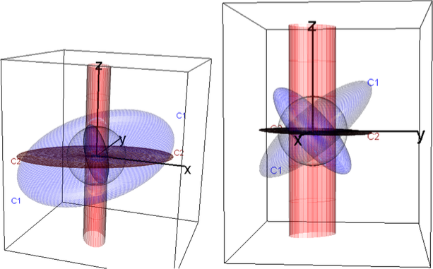
One representation that works for all ellipsoids—fat or flat and bounded or unbounded—can be based on a singular value decomposition (SVD) representation , with
| (1) |
where is orthogonal and is diagonal with nonnegative reals or infinity.202020Note that the parentheses in this notation are obligatory: as defined transforms the unit sphere, which is then transformed by . , also orthogonal, plays no role in this representation, because an orthogonal transformation of is still a unit sphere. The “inverse” of an ellipsoid is then simply . The connection with traditional representations is that, if is finite, , where can be any orthogonal matrix, and if is finite, .
The representation also allows us to characterize any such generalized ellipsoid in by its signature,
| (2) | |||
| (3) |
a 3-vector containing the number () of positive, zero and infinite singular values. For example, in , any proper ellipsoid has the signature ; a flat, 2D ellipsoid has ; a flat, 1D ellipsoid (a line) has . Unbounded examples include an infinite flat plane, with , and an infinite cylinder of elliptical cross-section, with .
Figure 1 illustrates these ideas, using two generating matrices, and , in this more general representation,
where generates a proper ellipsoid and generates an improper, flat ellipsoid. and its dual, , both have signatures . has the signature , while its inverse (dual) has the signature . These varieties of ellipsoids are more easily understood in the 3D movies included in the online supplements.
.2 Properties of Geometric Ellipsoids
-
•
Translation: An ellipsoid centered at has the definition or in the notation of Section 2.2.
-
•
Orthogonality: If is diagonal, then the origin-centered ellipsoid has its axes aligned with the coordinate axes and has the equation
(4) where are the radii (semi-diameter lengths) along the coordinate axes.
-
•
Area and volume: In two dimensions, the area of the axis-aligned ellipse is . For , the volume is . In the general case, the hypervolume of the ellipsoid is proportional to and is given by [Dempster (1969), Section 3.5], where the first two factors are familiar as the normalizing constant of the multivariate normal density function.
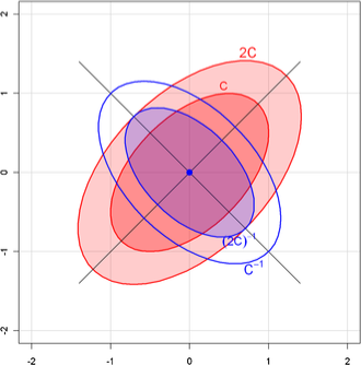
Figure 2: Some properties of geometric ellipsoids, shown in 2D. Principal axes of an ellipsoid are given by the eigenvectors of , with radii . For an ellipsoid defined by equation (1), the comparable ellipsoid for has radii multiplied by . The ellipsoid for has the same principal axes, but with radii , making it small in the directions where is large and vice-versa. -
•
Principal axes: In general, the eigenvectors, , of define the principal axes of the ellipsoid and the inverse of the square roots of the ordered eigenvalues, , are the principal radii. Eigenvectors belonging to eigenvalues that are 0 are directions in which the ellipsoid is unbounded. With , we consider the singular-value decomposition , with and orthogonal matrices and a diagonal nonnegative matrix with the same dimension as . The column vectors of , called the left singular vectors, correspond to the eigenvectors of in the case of a proper ellipsoid. The positive diagonal elements of , , are the principal radii of the ellipsoid with . In the singular case, the left singular vectors form a set of principal axes for the flattened ellipsoid.212121Corresponding left singular vectors and eigenvectors are not necessarily equal, but sets that belong to the same eigenvalue/singular value span the same space.
-
•
Inverse: When is positive definite, the eigenvectors of and are identical, while the eigenvalues of are . It follows that the ellipsoid for has the same axes as that of , but with inversely proportional radii. In , the ellipsoid for is, with rescaling, a rotation of the ellipsoid for , as illustrated in Figure 2.
-
•
Generalized inverse: A definition for an inverse ellipsoid that is equivalent in the case of proper ellipsoids,
(5) generalizes to all ellipsoids. The inverse of a singular ellipsoid is an improper ellipsoid and vice versa.
-
•
Dimensionality: The ellipsoid is bounded if is positive definite (all ). Each increases the dimension of the space along which the ellipsoid is unbounded by one. For example, with , gives a cylinder with an elliptical cross-section in 3-space, and gives an infinite slab with thickness . With , the dimension of the ellipsoid is equal to the number of positive singular values of .
-
•
Projections: The projection of a -dimensional ellipsoid into any subspace is , where is an idempotent (projection) matrix, that is, . For example, in and , the matrices
project, respectively, an ellipse onto the line and an ellipsoid into the () plane. If is symmetric, then is the matrix of an orthogonal projection, and it is easy to visualize as the shadow of cast perpendicularly onto . Generally, is the shadow of onto along the null space of .
-
•
Linear transformations: A linear transformation of an ellipsoid is an ellipsoid, and the pre-image of an ellipsoid under a linear transformation is an ellipsoid. A nonsingular linear transformation maps a proper ellipsoid into a proper ellipsoid in the form shown in Section 2.2, equation (2.2).
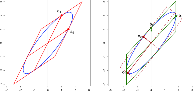
Figure 3: Conjugate axes of an ellipse with various factorizations of and corresponding basis vectors. The conjugate vectors lie on the ellipse, and their tangents can be extended to form a parallelogram framing it. Left: for an arbitrary factorization, given in equation (.3). Right: for the Choleski factorization (solid, green, ) and the principal component factorization (dashed, brown, ). -
•
Slopes and tangents: The slopes of the ellipsoidal surface in the directions of the coordinate axes are given by . From this, it follows that the tangent hyperplane to the unit ellipsoidal surface at the point , where , has the equation .
.3 Conjugate Axes and Inner-Product Spaces
For any nonsingular in equation (5) that generates an ellipsoid, the columns of form a set of “conjugate axes” of the ellipsoid. (Two diameters are conjugate iff the tangent line at the endpoint of one diameter is parallel to the other diameter.) Each vector lies on the ellipsoid, and the tangent hyperplane at that point is parallel to the span of all the other column vectors of . For this result is illustrated in Figure 3 (left) in which
Consider the inner-product space with inner product matrix
| (7) |
Because , we see that and are orthogonal unit vectors (in fact, an orthonormal basis) in this inner product:
Now, if is any other factorization of , then the columns of have the same properties as the columns of . Particular factorizations yield interesting and statistically useful sets of conjugate axes. The illustration in Figure 3 (right) shows two such cases with special properties: In the Choleski factorization (shown solid in green), where is lower triangular, the last conjugate axis, , is aligned with the coordinate axis . Each previous axis (, here) is the orthogonal complement to all later axes in the inner-product space of . The Choleski factorization is unique in this respect, subject to a permutation of the rows and columns of . The subspace is the plane of the regression of the last variable on the others, a fact that generalizes naturally to ellipsoids that are not necessarily centered at the origin.
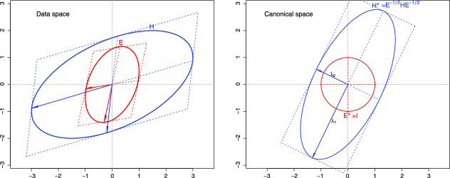
In the principal-component (PC) factorization(shown dashed in brown in Figure 3, right) , where and, hence, is the spectral decomposition of . Here, the ellipse axes are orthogonal in the space of the ellipse (so the bounding tangent parallelogram is a rectangle) as well as in the inner-product space of . The PC factorization is unique in this respect (up to reflections of the axis vectors).
As illustrated in Figure 3, each pair of conjugate axes has a corresponding bounding tangent parallelogram. It can be shown that all such parallelograms have the same area and equal sums of squares of the lengths of their diameters.
.4 Ellipsoids in a Generalized Metric Space
In Appendix .3, we considered the positive semi-definite matrix and corresponding ellipsoid to be referred to a Euclidean space, perhaps with different basis vectors. We showed that various measures of the “size” of the ellipsoid could be defined in terms of functions of the eigenvalues of .
We now consider the generalized case of an analogous positive semi-definite symmetric matrix , but where measures of length, distance and angles are referred to a metric defined by a positive-definite symmetric matrix . As is well known, the generalized eigenvalue problem is to find the scalars and vectors , such that , that is, the roots of .
For such and , we can always find a factor of , so that , whose columns will be conjugate directions for and whose rows will also be conjugate directions for , in that , where is diagonal. Geometrically, this means that there exists a unique pair of bounding parallelograms for the and ellipsoids whose corresponding sides are parallel. A linear transformation of and that transforms the parallelogram for to a square (or cuboid), and hence to a circle (or spheroid), generates an equivalent view in what we describe below as canonical space.
In statistical applications (e.g., MANOVA, canonical correlation), the generalized eigenvalue problem is transformed to an ordinary eigenvalue problem by considering the following equivalent forms with the same , :
where the last form gives a symmetric matrix, . Using the square root of defined by the principal-component factorization produces the ellipsoid , the orthogonal axes of which correspond to the , whose squared radii are the corresponding eigenvalues . This can be seen geometrically as a rotation of “data space” to an orientation defined by the principal axes of , followed by a re-scaling, so that the ellipsoid becomes the unit spheroid. In this transformed space (“canonical space”), functions of the squared radii of the axes of give direct measures of the “size” of relative to . The orientation of the eigenvectors can be related to the (orthogonal) linear combinations of the data variables that are successively largest in the metric of .
To illustrate, Figure 4 (left) shows the ellipses generated by
together with their conjugate axes. For , the conjugate axes are defined by the columns of the right factor, , in ; for , the conjugate axes are defined by the columns of . The transformation to is shown in the right panel of Figure 4. In this “canonical space,” angles and lengths have the ordinary interpretation of Euclidean space, so the size of can be interpreted directly in terms of functions of the radii and .
Acknowledgments
We acknowledge first the inspiration we found in Dempster (1969) for this geometric approach to statistical thinking. This work was supported by Grant OGP0138748 from the National Sciences and Engineering Research Council of Canada to Michael Friendly, and by grants from the Social Sciences and Humanities Research Council of Canada to John Fox. We are grateful to Antonio Gasparini for helpful discussion regarding multivariate meta-analysis models, to Duncan Murdoch for advice on 3D graphics and comments on an earlier draft, and to the reviewers and Associate Editor for many helpful suggestions.
[id=suppA] \stitleSupplementary materials for Elliptical insights: Understanding statistical methods through elliptical geometry \slink[doi]10.1214/12-STS402SUPP \sdatatype.pdf \sfilenamests402_supp.pdf \sdescriptionThe supplementary materials include SAS and R scripts to generate all of the figures for this article. Several 3D movies are also included to show phenomena better than can be rendered in static print images. A new R package, gellipsoid, provides computational support for the theory described in Appendix .1. These are also available at http:// datavis.ca/papers/ellipses and described inhttp://datavis.ca/papers/ellipses/supp.pdf[Friendly, Monette and Fox (2012)].
References
- Alker (1969) {bincollection}[auto:STB—2012/11/28—19:21:31] \bauthor\bsnmAlker, \bfnmH. R.\binitsH. R. (\byear1969). \btitleA typology of ecological fallacies. In \bbooktitleSocial Ecology (\beditor\bfnmM.\binitsM. \bsnmDogan and \beditor\bfnmS.\binitsS. \bsnmRokkam, eds.) \bpages69–86. \bpublisherMIT Press, \baddressCambridge, MA. \bptokimsref \endbibitem
- Anderson (1935) {barticle}[auto:STB—2012/11/28—19:21:31] \bauthor\bsnmAnderson, \bfnmE.\binitsE. (\byear1935). \btitleThe irises of the Gaspé peninsula. \bjournalBulletin of the American Iris Society \bvolume35 \bpages2–5. \bptokimsref \endbibitem
- Antczak-Bouckoms et al. (1993) {barticle}[pbm] \bauthor\bsnmAntczak-Bouckoms, \bfnmA.\binitsA., \bauthor\bsnmJoshipura, \bfnmK.\binitsK., \bauthor\bsnmBurdick, \bfnmE.\binitsE. and \bauthor\bsnmTulloch, \bfnmJ. F.\binitsJ. F. (\byear1993). \btitleMeta-analysis of surgical versus non-surgical methods of treatment for periodontal disease. \bjournalJ. Clin. Periodontol. \bvolume20 \bpages259–268. \bidissn=0303-6979, pmid=8473536 \bptokimsref \endbibitem
- Beaton (1964) {bmisc}[mr] \bauthor\bsnmBeaton, \bfnmAlbert Eugene\binitsA. E. \bsuffixJr (\byear1964). \bhowpublishedThe use of special matrix operators in statistical calculus. Ph.D. thesis, Harvard Univ., ProQuest LLC, Ann Arbor, MI. \bptokimsref \endbibitem
- Belsley, Kuh and Welsch (1980) {bbook}[mr] \bauthor\bsnmBelsley, \bfnmDavid A.\binitsD. A., \bauthor\bsnmKuh, \bfnmEdwin\binitsE. and \bauthor\bsnmWelsch, \bfnmRoy E.\binitsR. E. (\byear1980). \btitleRegression Diagnostics: Identifying Influential Data and Sources of Collinearity. \bpublisherWiley, \baddressNew York. \bidmr=0576408 \bptokimsref \endbibitem
- Berkey et al. (1998) {barticle}[pbm] \bauthor\bsnmBerkey, \bfnmC. S.\binitsC. S., \bauthor\bsnmHoaglin, \bfnmD. C.\binitsD. C., \bauthor\bsnmAntczak-Bouckoms, \bfnmA.\binitsA., \bauthor\bsnmMosteller, \bfnmF.\binitsF. and \bauthor\bsnmColditz, \bfnmG. A.\binitsG. A. (\byear1998). \btitleMeta-analysis of multiple outcomes by regression with random effects. \bjournalStat. Med. \bvolume17 \bpages2537–2550. \bidissn=0277-6715, pii=10.1002/(SICI)1097-0258(19981130)17:22¡2537::AID-SIM953¿3.0.CO;2-C, pmid=9839346 \bptokimsref \endbibitem
- Boyer (1991) {bincollection}[mr] \bauthor\bsnmBoyer, \bfnmCarl B.\binitsC. B. (\byear1991). \btitleApollonius of Perga. In \bbooktitleA History of Mathematics, \bedition2nd ed. \bpages156–157. \bpublisherWiley, \baddressNew York. \bptokimsref \endbibitem
- Bravais (1846) {barticle}[auto:STB—2012/11/28—19:21:31] \bauthor\bsnmBravais, \bfnmA.\binitsA. (\byear1846). \btitleAnalyse mathématique sur les probabilités des erreurs de situation d’un point. \bjournalMémoires Présentés Par Divers Savants à L’Académie Royale des Sciences de l’Institut de France \bvolume9 \bpages255–332. \bptokimsref \endbibitem
- Bryant (1984) {barticle}[auto:STB—2012/11/28—19:21:31] \bauthor\bsnmBryant, \bfnmP.\binitsP. (\byear1984). \btitleGeometry, statistics, probability: Variations on a common theme. \bjournalAmer. Statist. \bvolume38 \bpages38–48. \bptokimsref \endbibitem
- Bryk and Raudenbush (1992) {bbook}[auto:STB—2012/11/28—19:21:31] \bauthor\bsnmBryk, \bfnmA. S.\binitsA. S. and \bauthor\bsnmRaudenbush, \bfnmS. W.\binitsS. W. (\byear1992). \btitleHierarchical Linear Models: Applications and Data Analysis Methods. \bpublisherSage, \baddressThousand Oaks, CA. \bptokimsref \endbibitem
- Campbell and Atchley (1981) {barticle}[auto:STB—2012/11/28—19:21:31] \bauthor\bsnmCampbell, \bfnmN. A.\binitsN. A. and \bauthor\bsnmAtchley, \bfnmW. R.\binitsW. R. (\byear1981). \btitleThe geometry of canonical variate analysis. \bjournalSystematic Zoology \bvolume30 \bpages268–280. \bptokimsref \endbibitem
- Cramér (1946) {bbook}[mr] \bauthor\bsnmCramér, \bfnmHarald\binitsH. (\byear1946). \btitleMathematical Methods of Statistics. \bseriesPrinceton Mathematical Series \bvolume9. \bpublisherPrinceton Univ. Press, \baddressPrinceton, NJ. \bidmr=0016588 \bptokimsref \endbibitem
- Dempster (1969) {bbook}[auto:STB—2012/11/28—19:21:31] \bauthor\bsnmDempster, \bfnmA. P.\binitsA. P. (\byear1969). \btitleElements of Continuous Multivariate Analysis. \bpublisherAddison-Wesley, \baddressReading, MA. \bptokimsref \endbibitem
- Denis (2001) {barticle}[auto:STB—2012/11/28—19:21:31] \bauthor\bsnmDenis, \bfnmD.\binitsD. (\byear2001). \btitleThe origins of correlation and regression: Francis Galton or Auguste Bravais and the error theorists. \bjournalHistory and Philosophy of Psychology Bulletin \bvolume13 \bpages36–44. \bptokimsref \endbibitem
- Diez-Roux (1998) {barticle}[pbm] \bauthor\bsnmDiez-Roux, \bfnmA. V.\binitsA. V. (\byear1998). \btitleBringing context back into epidemiology: Variables and fallacies in multilevel analysis. \bjournalAm. J. Public Health \bvolume88 \bpages216–222. \bidissn=0090-0036, pmcid=1508189, pmid=9491010 \bptokimsref \endbibitem
- Fisher (1936) {barticle}[auto:STB—2012/11/28—19:21:31] \bauthor\bsnmFisher, \bfnmR. A.\binitsR. A. (\byear1936). \btitleThe use of multiple measurements in taxonomic problems. \bjournalAnnals of Eugenics \bvolume8 \bpages379–388. \bptokimsref \endbibitem
- Fox (2008) {bbook}[auto:STB—2012/11/28—19:21:31] \bauthor\bsnmFox, \bfnmJ.\binitsJ. (\byear2008). \btitleApplied Regression Analysis and Generalized Linear Models, \bedition2nd ed. \bpublisherSage, \baddressThousand Oaks, CA. \bptokimsref \endbibitem
- Fox and Suschnigg (1989) {barticle}[auto:STB—2012/11/28—19:21:31] \bauthor\bsnmFox, \bfnmJ.\binitsJ. and \bauthor\bsnmSuschnigg, \bfnmC.\binitsC. (\byear1989). \btitleA note on gender and the prestige of occupations. \bjournalCanadian Journal of Sociology \bvolume14 \bpages353–360. \bptokimsref \endbibitem
- Fox and Weisberg (2011) {bbook}[auto:STB—2012/11/28—19:21:31] \bauthor\bsnmFox, \bfnmJ.\binitsJ. and \bauthor\bsnmWeisberg, \bfnmS.\binitsS. (\byear2011). \btitleAn R Companion to Applied Regression, \bedition2nd ed. \bpublisherSage, \baddressThousand Oaks, CA. \bptokimsref \endbibitem
- Friendly (1991) {bbook}[auto:STB—2012/11/28—19:21:31] \bauthor\bsnmFriendly, \bfnmM.\binitsM. (\byear1991). \btitleSAS System for Statistical Graphics, \bedition1st ed. \bpublisherSAS Institute, \baddressCary, NC. \bptokimsref \endbibitem
- Friendly (2007a) {barticle}[mr] \bauthor\bsnmFriendly, \bfnmMichael\binitsM. (\byear2007a). \btitleA.-M. Guerry’s Moral statistics of France: Challenges for multivariable spatial analysis. \bjournalStatist. Sci. \bvolume22 \bpages368–399. \biddoi=10.1214/07-STS241, issn=0883-4237, mr=2399897 \bptokimsref \endbibitem
- Friendly (2007b) {barticle}[mr] \bauthor\bsnmFriendly, \bfnmMichael\binitsM. (\byear2007b). \btitleHE plots for multivariate linear models. \bjournalJ. Comput. Graph. Statist. \bvolume16 \bpages421–444. \biddoi=10.1198/106186007X208407, issn=1061-8600, mr=2370948 \bptokimsref \endbibitem
- Friendly (2013) {bmisc}[auto:STB—2012/11/28—19:21:31] \bauthor\bsnmFriendly, \bfnmM.\binitsM. (\byear2013). \bhowpublishedThe generalized ridge trace plot: Visualizing bias and precision. J. Comput. Graph. Statist. 22. To appear. \bptokimsref \endbibitem
- Friendly, Monette and Fox (2012) {bmisc}[auto:STB—2012/11/28—19:21:31] \bauthor\bsnmFriendly, \bfnmM.\binitsM., \bauthor\bsnmMonette, \bfnmG.\binitsG. and \bauthor\bsnmFox, \bfnmJ.\binitsJ. (\byear2012). \bhowpublishedSupplement to “Elliptical Insights: Understanding Statistical Methods Through Elliptical Geometry.” DOI:\doiurl10.1214/12-STS402SUPP. \bptokimsref \endbibitem
- Galton (1886) {barticle}[auto:STB—2012/11/28—19:21:31] \bauthor\bsnmGalton, \bfnmF.\binitsF. (\byear1886). \btitleRegression towards mediocrity in hereditary stature. \bjournalJournal of the Anthropological Institute \bvolume15 \bpages246–263. \bptokimsref \endbibitem
- Galton (1889) {bbook}[auto1] \bauthor\bsnmGalton, \bfnmF.\binitsF. (\byear1889). \btitleNatural Inheritance. \bpublisherMacmillan, \baddressLondon. \bptokimsref \endbibitem
- Gasparrini (2012) {bmisc}[auto:STB—2012/11/28—19:21:31] \bauthor\bsnmGasparrini, \bfnmA.\binitsA. (\byear2012). \bhowpublishedMVMETA: multivariate meta-analysis and meta-regression. R package version 0.2.4. \bptokimsref \endbibitem
- Guerry (1833) {bmisc}[auto:STB—2012/11/28—19:21:31] \bauthor\bsnmGuerry, \bfnmA. M.\binitsA. M. (\byear1833). \bhowpublishedEssai sur la statistique morale de la France. Crochard, Paris. [English translation: Hugh P. Whitt and Victor W. Reinking, Edwin Mellen Press, Lewiston, NY (2002).] \bptokimsref \endbibitem
- Henderson (1975) {barticle}[auto:STB—2012/11/28—19:21:31] \bauthor\bsnmHenderson, \bfnmC. R.\binitsC. R. (\byear1975). \btitleBest linear unbiased estimation and prediction under a selection model. \bjournalBiometrics \bvolume31 \bpages423–448. \bptokimsref \endbibitem
- Hoerl and Kennard (1970a) {barticle}[auto:STB—2012/11/28—19:21:31] \bauthor\bsnmHoerl, \bfnmA. E.\binitsA. E. and \bauthor\bsnmKennard, \bfnmR. W.\binitsR. W. (\byear1970a). \btitleRidge regression: Biased estimation for nonorthogonal problems. \bjournalTechnometrics \bvolume12 \bpages55–67. \bptokimsref \endbibitem
- Hoerl and Kennard (1970b) {barticle}[auto:STB—2012/11/28—19:21:31] \bauthor\bsnmHoerl, \bfnmA. E.\binitsA. E. and \bauthor\bsnmKennard, \bfnmR. W.\binitsR. W. (\byear1970b). \btitleRidge regression: Applications to nonorthogonal problems. \bjournalTechnometrics \bvolume12 \bpages69–82. \bnote[Correction: 12 723.] \bptokimsref \endbibitem
- Hotelling (1933) {barticle}[auto:STB—2012/11/28—19:21:31] \bauthor\bsnmHotelling, \bfnmH.\binitsH. (\byear1933). \btitleAnalysis of a complex of statistical variables into principal components. \bjournalJournal of Educational Psychology \bvolume24 \bpages417–441. \bptokimsref \endbibitem
- Jackson, Riley and White (2011) {barticle}[mr] \bauthor\bsnmJackson, \bfnmDan\binitsD., \bauthor\bsnmRiley, \bfnmRichard\binitsR. and \bauthor\bsnmWhite, \bfnmIan R.\binitsI. R. (\byear2011). \btitleMultivariate meta-analysis: Potential and promise. \bjournalStat. Med. \bvolume30 \bpages2481–2498. \biddoi=10.1002/sim.4172, issn=0277-6715, mr=2843472 \bptokimsref \endbibitem
- Kramer (1983) {barticle}[auto:STB—2012/11/28—19:21:31] \bauthor\bsnmKramer, \bfnmG. H.\binitsG. H. (\byear1983). \btitleThe ecological fallacy revisited: Aggregate-versus individual-level findings on economics and elections, and sociotropic voting. \bjournalThe American Political Science Review \bvolume77 \bpages92–111. \bptokimsref \endbibitem
- Laird and Ware (1982) {barticle}[pbm] \bauthor\bsnmLaird, \bfnmN. M.\binitsN. M. and \bauthor\bsnmWare, \bfnmJ. H.\binitsJ. H. (\byear1982). \btitleRandom-effects models for longitudinal data. \bjournalBiometrics \bvolume38 \bpages963–974. \bidissn=0006-341X, pmid=7168798 \bptokimsref \endbibitem
- Lichtman (1974) {barticle}[auto:STB—2012/11/28—19:21:31] \bauthor\bsnmLichtman, \bfnmA. J.\binitsA. J. (\byear1974). \btitleCorrelation, regression, and the ecological fallacy: A critique. \bjournalThe Journal of Interdisciplinary History \bvolume4 \bpages417–433. \bptokimsref \endbibitem
- Longley (1967) {barticle}[mr] \bauthor\bsnmLongley, \bfnmJames W.\binitsJ. W. (\byear1967). \btitleAn appraisal of least squares programs for the electronic computer from the point of view of the user. \bjournalJ. Amer. Statist. Assoc. \bvolume62 \bpages819–841. \bidissn=0162-1459, mr=0215440 \bptokimsref \endbibitem
- Marquardt (1970) {barticle}[auto:STB—2012/11/28—19:21:31] \bauthor\bsnmMarquardt, \bfnmD. W.\binitsD. W. (\byear1970). \btitleGeneralized inverses, ridge regression, biased linear estimation, and nonlinear estimation. \bjournalTechnometrics \bvolume12 \bpages591–612. \bptokimsref \endbibitem
- Monette (1990) {bincollection}[auto:STB—2012/11/28—19:21:31] \bauthor\bsnmMonette, \bfnmG.\binitsG. (\byear1990). \btitleGeometry of multiple regression and interactive 3-D graphics. In \bbooktitleModern Methods of Data Analysis, Chapter 5 (\beditor\bfnmJ.\binitsJ. \bsnmFox and \beditor\bfnmS.\binitsS. \bsnmLong, eds.) \bpages209–256. \bpublisherSage, \baddressBeverly Hills, CA. \bptokimsref \endbibitem
- Nam, Mengersen and Garthwaite (2003) {barticle}[pbm] \bauthor\bsnmNam, \bfnmIn-Sun\binitsI.-S., \bauthor\bsnmMengersen, \bfnmKerrie\binitsK. and \bauthor\bsnmGarthwaite, \bfnmPaul\binitsP. (\byear2003). \btitleMultivariate meta-analysis. \bjournalStat. Med. \bvolume22 \bpages2309–2333. \biddoi=10.1002/sim.1410, issn=0277-6715, pmid=12854095 \bptokimsref \endbibitem
- Pearson (1896) {barticle}[auto:STB—2012/11/28—19:21:31] \bauthor\bsnmPearson, \bfnmK.\binitsK. (\byear1896). \btitleContributions to the mathematical theory of evolution—III, regression, heredity and panmixia. \bjournalPhilosophical Transactions of the Royal Society of London \bvolume187 \bpages253–318. \bptokimsref \endbibitem
- Pearson (1901) {barticle}[auto:STB—2012/11/28—19:21:31] \bauthor\bsnmPearson, \bfnmK.\binitsK. (\byear1901). \btitleOn lines and planes of closest fit to systems of points in space. \bjournalPhilosophical Magazine \bvolume6 \bpages559–572. \bptokimsref \endbibitem
- Pearson (1920) {barticle}[auto:STB—2012/11/28—19:21:31] \bauthor\bsnmPearson, \bfnmK.\binitsK. (\byear1920). \btitleNotes on the history of correlation. \bjournalBiometrika \bvolume13 \bpages25–45. \bptokimsref \endbibitem
- Raudenbush and Bryk (2002) {bbook}[auto:STB—2012/11/28—19:21:31] \bauthor\bsnmRaudenbush, \bfnmS. W.\binitsS. W. and \bauthor\bsnmBryk, \bfnmA. S.\binitsA. S. (\byear2002). \btitleHierarchical Linear Models: Applications and Data Analysis Methods, \bedition2nd ed. \bpublisherSage, \baddressNewbury Park, CA. \bptokimsref \endbibitem
- Riley (1963) {bincollection}[auto:STB—2012/11/28—19:21:31] \bauthor\bsnmRiley, \bfnmM. W.\binitsM. W. (\byear1963). \btitleSpecial problems of sociological analysis. In \bbooktitleSociological Research I: A Case Approach (\beditor\bfnmM. W.\binitsM. W. \bsnmRiley, ed.) \bpages700–725. \bpublisherHarcourt, Brace, and World, \baddressNew York. \bptokimsref \endbibitem
- Robinson (1950) {barticle}[auto:STB—2012/11/28—19:21:31] \bauthor\bsnmRobinson, \bfnmW. S.\binitsW. S. (\byear1950). \btitleEcological correlations and the behavior of individuals. \bjournalAmerican Sociological Review \bvolume15 \bpages351–357. \bptokimsref \endbibitem
- Robinson (1991) {barticle}[mr] \bauthor\bsnmRobinson, \bfnmG. K.\binitsG. K. (\byear1991). \btitleThat BLUP is a good thing: The estimation of random effects. \bjournalStatist. Sci. \bvolume6 \bpages15–32. \bidissn=0883-4237, mr=1108815 \bptnotecheck related\bptokimsref \endbibitem
- Saville and Wood (1991) {bbook}[auto:STB—2012/11/28—19:21:31] \bauthor\bsnmSaville, \bfnmD.\binitsD. and \bauthor\bsnmWood, \bfnmG.\binitsG. (\byear1991). \btitleStatistical Methods: The Geometric Approach. Springer Texts in Statistics. \bpublisherSpringer, \baddressNew York. \bptokimsref \endbibitem
- Simpson (1951) {barticle}[mr] \bauthor\bsnmSimpson, \bfnmE. H.\binitsE. H. (\byear1951). \btitleThe interpretation of interaction in contingency tables. \bjournalJ. Roy. Statist. Soc. Ser. B. \bvolume13 \bpages238–241. \bidissn=0035-9246, mr=0051472 \bptokimsref \endbibitem
- Speed (1991) {barticle}[mr] \bauthor\bsnmSpeed, \bfnmT.\binitsT. (\byear1991). \btitleThat BLUP is a good thing: The estimation of random effects: Comment. \bjournalStatist. Sci. \bvolume6 \bpages42–44. \bptokimsref \endbibitem
- Stigler (1986) {bbook}[mr] \bauthor\bsnmStigler, \bfnmStephen M.\binitsS. M. (\byear1986). \btitleThe History of Statistics: The Measurement of Uncertainty Before 1900. \bpublisherThe Belknap Press of Harvard Univ. Press, \baddressCambridge, MA. \bidmr=0852410 \bptokimsref \endbibitem
- Timm (1975) {bbook}[mr] \bauthor\bsnmTimm, \bfnmNeil H.\binitsN. H. (\byear1975). \btitleMultivariate Analysis with Applications in Education and Psychology. \bpublisherBrooks/Cole Publishing Co., \baddressMonterey, CA. \bidmr=0443216 \bptokimsref \endbibitem
- Velleman and Welsh (1981) {barticle}[auto:STB—2012/11/28—19:21:31] \bauthor\bsnmVelleman, \bfnmP. F.\binitsP. F. and \bauthor\bsnmWelsh, \bfnmR. E.\binitsR. E. (\byear1981). \btitleEfficient computing of regression diagnostics. \bjournalAmer. Statist. \bvolume35 \bpages234–242. \bptokimsref \endbibitem
- von Humboldt (1811) {bmisc}[auto:STB—2012/11/28—19:21:31] \bauthor\bparticlevon \bsnmHumboldt, \bfnmA.\binitsA. (\byear1811). \bhowpublishedEssai Politique sur le Royaume de la Nouvelle-Espagne. (Political Essay on the Kingdom of New I: Founded on Astronomical Observations, and Trigonometrical and Barometrical Measurements), Vol. 1. Riley, New York. \bptokimsref \endbibitem
- Wickens (1995) {bbook}[auto:STB—2012/11/28—19:21:31] \bauthor\bsnmWickens, \bfnmT. D.\binitsT. D. (\byear1995). \btitleThe Geometry of Multivariate Statistics. \bpublisherLawrence Erlbaum Associates, \baddressHillsdale, NJ. \bptokimsref \endbibitem