A graphical analysis of cost-sensitive regression problems
Abstract
Several efforts have been done to bring ROC analysis beyond (binary) classification, especially in regression. However, the mapping and possibilities of these proposals do not correspond to what we expect from the analysis of operating conditions, dominance, hybrid methods, etc. In this paper we present a new representation of regression models in the so-called regression ROC (RROC) space. The basic idea is to represent over-estimation on the -axis and under-estimation on the -axis. The curves are just drawn by adjusting a shift, a constant that is added (or subtracted) to the predictions, and plays a similar role as a threshold in classification. From here, we develop the notions of optimal operating condition, convexity, dominance, and explore several evaluation metrics that can be shown graphically, such as the area over the RROC curve (). In particular, we show a novel and significant result, the is equal to the error variance (multiplied by a factor which does not depend on the model). The derivation of RROC curves with non-constant shifts and soft regression models, and the relation with cost plots is also discussed.
Keywords: ROC Curves, Asymmetric loss, Regression, Error variance, MSE decomposition
1 Motivation
In classification, the traditional notion of operating condition is common and well understood. Classifiers may be trained for one cost proportion and class distribution (both making the operating condition) and then deployed on a different operating condition. Some of the techniques and notions for addressing these cases are cost matrices, cost-sensitive classification [10] and very especially ROC analysis [39, 48, 5, 49, 21, 38, 11, 37]. ROC space decomposes the performance of a classifier in a dual way. On the -axis we show the false positive rate (FPR) and on the the -axis we show the true positive rate (TPR). ROC curves neatly visualise how the TPR and the FPR change for different (crisp) classifiers or evolve for the same (soft) classifier (or ranker) for a range of thresholds. The notion of threshold is the fundamental idea to adapt a soft classifier to an operating condition. ROC analysis is the tool that illustrates (among other things) how classifiers and threshold choices perform. The number and variety of applications and areas (radiology, medicine, statistics, bioinformatics, machine learning, pattern recognition, to name a few) have been increasing over the years [23, 40, 34, 35]. Also, some metrics derived from the ROC curve, such as the Area Under the ROC Curve (AUC) are now key for the evaluation and construction of classifiers [12, 41, 51, 27, 44, 36]
The adaptation of ROC analysis for regression has been attempted on many occasions. However, there is no such a thing as the ‘canonical’ adaptation of ROC analysis in regression, since regression and classification are different tasks, and the notion of operating condition may be completely different. In fact, the mere extension of ROC analysis to more than two classes has always been difficult because the degrees of freedom grow quadratically with the number of classes (see, e.g., [47, 18, 46]). The inclusion of probabilities (and other magnitudes) in ROC curves or the use for abstaining classifiers [16, 42, 13] has not paved the way on how to do similar things for regression. Consequently it is even questionable whether a similar graphical representation of ROC curves in regression (or other tasks [29]) can even be figured out. Notable efforts towards ROC curves (or graphical tools) for regression are the Regression Error Curves (REC) [4], the Regression Error Characteristic Surfaces (RECS) [52], the notion of utility-based regression [53] and the definition of ranking measures [45]. These approaches are based on gauging the tolerance, rejection rules or confidence levels. Some of these approaches actually convert a regression problem into a classification problem (tolerable estimation vs. intolerable estimation). Another recent approach has been based on the calculation of Kendall’s rank correlation coefficient between the predicted and actual values [14], so disregarding the magnitudes. However, none of these previous approaches started from a notion of ‘operating condition’, related to an asymmetric loss function. Also, the notion of threshold was not replaced by a similar concept playing its role for adjusting to the operating condition, and the dual positive-negative character in ROC analysis was blurred.
In this paper we present a graphical representation of regression performance based on a very usual view of operating condition, in regression. Many regression applications have deployment contexts where over-estimations are not equally costly as under-estimations (or vice versa). This is called the loss asymmetry. Loss asymmetry is just a kind of operating condition (or one of its constituents), but a very important one in many applications.
The ROC space for regression is then defined by placing the total over-estimation on the -axis and the total under-estimation on the -axis. This duality leads to regions and isometrics in the ROC space where over-estimations have less cost than under-estimations and vice versa, and we can plot different regression models to see the notions of dominance. We also consider the construction of hybrid regressors. The plot leads to curves when we use the notion of shift, which is just a constant that we can add (or subtract) to example predictions in order to adjust the model to an operating condition. This notion is parallel to the notion of threshold in classification. Interestingly, while we can derive the best shift for a dataset given an existing model (which boils down to shift it to make its average error equal to zero), there are some effective methods to determine this shift for the deployment data given an operating condition, as has been recently explored by [1][56]. Also, there are some other ways to make this shift dependent to each example [28]. All this leads to a more meaningful interpretation of what the ROC curves in regression mean, and what their areas represent. This will also be explored in this paper.
The paper is organised as follows. Section 2 introduces some notation, the problem of context-sensitive evaluation and the use of asymmetric costs in regression. The RROC space is introduced in section 3, where we represent several regression models as points, derive the isometrics of the space and develop the notions of hybrid models, dominance and convex hull. Section 4 introduces RROC curves, which are drawn by ranging a constant shift over the predictions. We introduce an algorithm for plotting them and determine some of its properties in terms of segment slopes and convexity. The area over the RROC curve () is also introduced and analysed. Section 5 discusses RROC curves with non-constant shifts and soft regression models, and the relation with cost plots. Finally, section 6 closes the paper with an enumeration of issues for future investigation.
2 Context-sensitive problems
In this section we introduce some notation and the basic concepts about context-sensitive regression and the need of asymmetric loss functions.
2.1 Notation
Let us consider a multivariate input domain and a univariate output domain . The domain space is then . The length of the dataset will usually be denoted by . Examples or instances are just pairs , and datasets are subsets of . A crisp regression model is a function . A soft regression model accompanies each prediction with a reliability, confidence or, more generally, a conditional probability density function with and . When the regression model is crisp, we just represent the true value by and the estimated value by . Subindices will be used when referring to more than one example in a dataset.
Vectors (unidimensional arrays) are denoted in boldface and its elements with subindices, e.g., . Operations mixing arrays and scalar values will be allowed, specially in algorithms, as usual in the matrix arithmetic of many statistical computing languages. For instance, means that the constant is added to all the elements in the vector . The mean of a vector is denoted by and its standard deviation as —over the population, i.e., divided by . Given a dataset with instances , the error vector is defined as . The value is known as the mean squared error (), is known as the mean error (or error bias), is known as the mean absolute error () and as the error variance.
2.2 Context-sensitive problems and loss functions
In context-sensitive learning [10], there are several features which describe a context, such as the data distribution, the costs of using some input variables and the loss of the errors over the output variables [54]. In this paper, we focus on loss functions over the output, which is the kind of costs which ROC analysis deals with (typically integrated, along with the class distribution, within the notion of skew). A loss function is defined as follows:
Definition 1.
A loss function is any function which compares elements in the output domain. For convenience, the first argument will be the estimated value, and the second argument the actual value, so its application is usually denoted by .
Typical examples of loss functions are the absolute error () and the squared error (), with and . These two loss functions are symmetric, i.e. for every and we have that . Two of the most common metrics for evaluating regression, the mean absolute error () and the mean squared error () are derived from these losses.
2.3 Asymmetric costs
Actually, although symmetric loss functions (and derived metrics) are common for the evaluation of regression models, it is rarely the case that a real problem has a symmetric cost. For instance, the prediction of sales, consumptions, calls, prices, demands, etc., has almost never a symmetric loss. For instance, a retailing company may need to predict how many items will be sold next week for stock (inventory) management purposes, e.g., in order to calculate how many items must be ordered to refill the stock. Depending on the kind of product, it is usually not the same to over-estimate (increasing stocking costs) than under-estimate (an item is exhausted and it cannot be sold or sold with delays). In fact, it is also rare to find applications where even an asymmetric cost is invariable. For instance, depending on the warehouse saturation, the cost (and the asymmetry) may change in a weekly or daily fashion. We wish to remark here that a specialised model for a fixed given asymmetry is not the solution in many occasions, either. This motivates the adaptation (or reframing) of models, rather than their re-training for each new asymmetric loss. This is at the core of ROC analysis.
There has been an extensive amount of work on regression using asymmetric loss functions. In some cases, the loss function is embedded in the learning algorithm (see, e.g., [8, 33]), which is useful if we know the operating condition during training. However, the adaptation (or reframing) of an existing model to a different operating condition has also been investigated for regression (e.g., Granger [24, 25]. Many different kinds of asymmetric functions have been explored: Lin-Lin (asymmetric linear), Quad-Quad (asymmetric quadratic), Lin-Exp (approximately linear on one side and exponential on the other side) and Quad-Exp (approximately quadratic on one side and exponential on the other side) [55, 6, 7, 2, 50]. Some of these approaches try to adapt to the operating condition using complex (generally non-parametric) density functions, which is problematic in general. There are many other approaches. We just mention some of these approaches as an illustration of how important it is in practice to adjust regression models to work with a specific loss function.
As mentioned above, there are many possible asymmetric loss functions. The simplest (and perhaps most common) one is the asymmetric absolute error :
Definition 2.
The asymmetric absolute error is a loss function defined as follows:
| otherwise |
with being the cost proportion (or asymmetry) between 0 and 1, with increasing values meaning higher cost for low predictions (underestimation). In other words, when we mean that predictions below the actual value have no cost. When we mean that predictions above the actual value have no cost. When we mean that costs above and below are symmetric.
3 The RROC space
For every regression model deployed to a new dataset we can determine the error for each example and whether it is an over-estimation or under-estimation. More formally:
Definition 3.
The total over-estimation is given by and the total under-estimation is given by .
The following example illustrate this:
Example 1.
Consider a regression model which is applied to a dataset with examples , issuing the predicted values and actual values :
| -0.082 | 3.323 | 2.320 | 1.080 | 7.893 | 4.983 | 5.121 | 3.442 | 2.083 | 1.112 | |
| 0.211 | 2.725 | 1.933 | 3.242 | 7.858 | 6.061 | 7.173 | 3.082 | 0.894 | 1.203 | |
| -0.293 | 0.598 | 0.387 | -2.162 | 0.035 | -1.078 | -2.052 | 0.360 | 1.189 | -0.091 |
The error row () shows the difference, which is positive for over-estimations and negative for under-estimations. The sum of over-estimations () is while the sum of under-estimations () is . This regression model clearly under-estimates (it has a negative error bias, since ). The () and the () do not show the asymmetry of predictions.
3.1 Showing models in RROC space
Certainly, different regression models would show different error asymmetries (or error bias). The basic idea of the ROC space for regression is to show this asymmetry:
Definition 4.
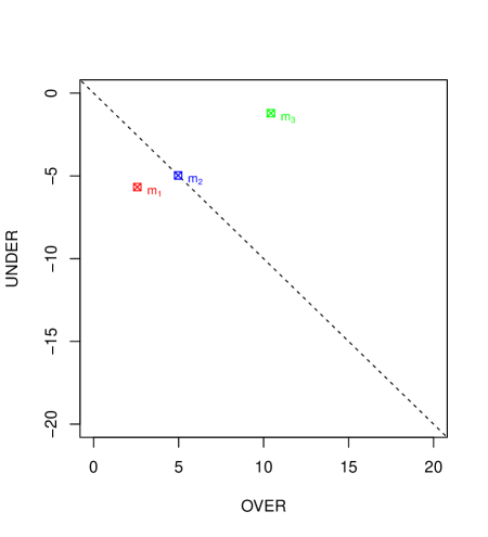
The Regression Receiver Operating Characteristic (RROC) space is defined as a plot where we depict total over-estimation () on the -axis and total under-estimation () on the -axis. Since is always positive (but unbounded) and is always negative (but unbounded), we typically will place the point on the upper left corner (the RROC heaven), and will clip both the -axis and -axis as necessary to show the region of interest.
Figure 1 shows the RROC space and the regression model in example 1. We will occasionally draw a diagonal line to show the points where the under-estimation equals the over-estimation.
One might argue why we use absolute values for the -axis and -axis instead of relative values. In fact, ROC analysis uses relative values. There are two reasons for this. First, using relative values would not make the RROC space finite. Second, and more importantly, using relative values we could have cases where changing a single infinitesimal change on one example could end up at very different locations. For instance, consider the error vectors and . While and are almost the same, the relative and would be and for two almost equal error vectors. This justifies that the RROC space shows absolute values. In this sense, and strictly speaking, the parallel with ROC analysis for classification can be done with the ‘coverage curves’ [20], which are the absolute variant of ROC curves.
Let us now consider a second model:
Example 2.
Consider a regression model which is applied to the same dataset as example 1:
| 0.786 | 2.078 | 0.587 | 1.676 | 9.052 | 5.875 | 6.885 | 3.038 | 4.097 | 0.308 | |
| 0.211 | 2.725 | 1.933 | 3.242 | 7.858 | 6.061 | 7.173 | 3.082 | 0.894 | 1.203 | |
| 0.575 | -0.647 | -1.346 | -1.566 | 1.194 | -0.186 | -0.288 | -0.044 | 3.203 | -0.895 |
The sum of over-estimations () is while the sum of under-estimations () is . This regression finds an equilibrium between over and under-estimations (it is unbiased, since ). The () and the () are worse than in example 1.
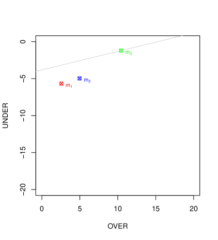
This model () with is also shown in Figure 1. Clearly it is on the diagonal.
Finally let us consider a third model:
Example 3.
Consider a regression model as follows:
| 1.253 | 4.232 | 1.734 | 5.325 | 6.842 | 9.325 | 8.232 | 3.525 | 1.352 | 1.778 | |
| 0.211 | 2.725 | 1.933 | 3.242 | 7.858 | 6.061 | 7.173 | 3.082 | 0.894 | 1.203 | |
| 1.042 | 1.507 | -0.199 | 2.083 | -1.016 | 3.264 | 1.059 | 0.443 | 0.458 | 0.575 |
In this case, the sum of over-estimations () is while the sum of under-estimations () is . This regression model clearly over-estimates (it has a positive error bias, since ). The () and the () show that this model is, in terms of overall error, worse than models and .
From each point in RROC space, we can derive its very easily. For model , for example, we have that , so it is just half the perimeter of the rectangle that each point creates with the RROC heaven (0,0). In other words, the (more precisely the absolute error) is just the Manhattan distance to RROC heaven. It is important to note that the diagonal (the Euclidean distance) is just given by , which we call (as a macro-averaged version of ). This measure is interesting in itself, because highly penalises models for which there is a high imbalance in over and under-estimations, and can be seen, in some way, as a measure of ‘symmetric calibration’ [3].
In RROC space we denote the regression model always outputting and the model always outputting as the (trivial) extreme regression models, which fall at and respectively in RROC space.
3.2 RROC space isometrics
We have mentioned above that ( of) the perimeter of the rectangle from RROC heaven to the regression model corresponds to . Can we extend this observation to the asymmetric loss? The following straightforward lemma shows that total asymmetric absolute loss can be calculated graphically as the sum of the distance to the -axis () and to the -axis (), using the appropriate asymmetry factor .
Lemma 1.
The total asymmetric absolute loss is given by:
Proof.
∎
Clearly, for , we have that this is the absolute error. All this also shows that the closer we are to RROC heaven (in terms of a Manhattan distance) the better. Finally, this leads to loss isometrics:
Definition 5.
RROC isometrics are defined by varying over:
We can get any of the infinite (and parallel) isometrics. The following proposition just gets the slope of each isometric:
Proposition 2.
Given an isometric , the slope only depends on and is given by:
Proof.
By isolating the variable we have:
The is then given by the second term ∎
Clearly, for (under-estimations have no cost) and we have infinite slope. For (over-estimations have no cost), we would have a slope 0.
This notion of isometric is very similar to the notion already present in ROC analysis for classification [19]. In fact, this means that we can slide isometrics to find optimal points in RROC space, in the very same way as we do in ROC space.
Let us illustrate this. Figure 2 shows the RROC space and the regression models , and in examples 1, 2 and 3 respectively. We also consider the operating condition , meaning that under-estimations are 4 times more expensive than over-estimations. This leads to a slope of . By sliding through all the parallel isometric lines from the one crossing the RROC heaven to the first isometric touching a point corresponding to any model, we touch at first. In fact, the is given by isolating it from the line equation , i.e., , which, in this case, leads to . The line is then shown on Figure 2, touching regression model . Even though model has a worse mean (symmetric) absolute error than , for this operating condition , it leads to lower total asymmetric absolute error. While has a loss of , we have that has a loss of .
3.3 Hybrid models, dominance and convex hull
Another construction that is also originally present in ROC analysis for regression is the notion of hybrid models. Given any two models, we can construct a hybrid model by randomly choosing each prediction from any of both models using a (biased) coin. Note that this is very different to averaging both models.
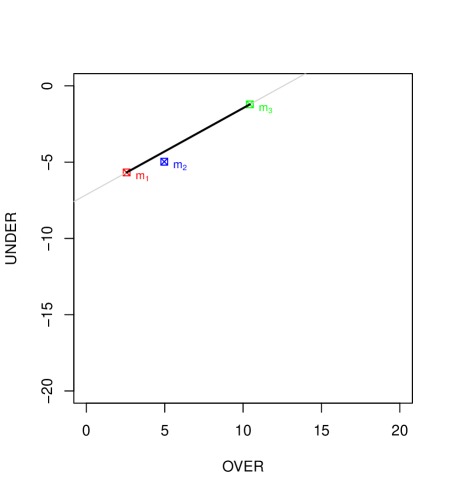
Figure 3 shows the isometric (in light grey) passing through models and . The solid black segment connecting both models shows that any model along the segment can be constructed. More precisely, each point in that segment would represent the expected value of a model constructed in this way. Consequently, we can just connect both points since any point in between is technically achievable (at least in expectation).
In this particular case, we just draw a line between the point representing : and the point representing : , leading to . From this slope of , we just calculate . Obviously, for this both models have the same loss. and .
Given these two models, we say that, for slopes lower than and asymmetries greater than , model dominates, while we have that model dominates for the rest of operating conditions.
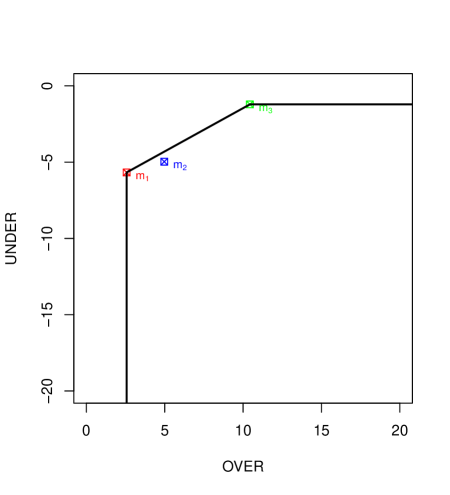
This leads to the notion of dominance and convex hull. In fact, when connecting all the points by the segments representing the hybrid models (and also including the extreme classifiers at and , we can calculate the convex hull, since any model under the convex hull can be discarded, in the same way as traditional ROC analysis DOES. Figure 4 shows the convex hull of the three models and the extreme models. We see that model can be discarded. It cannot be optimal for any operating condition.
4 RROC curves
In ROC analysis for classification, we can tweak the predictions of a crisp classifier by changing the predicted class to a random percentage of examples. With this, we can move the classifier in the ROC space, but this just moves the classifier along the two straight lines that connect the original point with the points at and (the trivial, or extreme, classifiers). For this reason, occasionally a crisp classifier is represented in ROC space as trapezium111A trapezoid in American English., connecting the point which corresponds to the classifier with the extreme classifiers. This two-segment ‘curve’ does not bring more information than the original point, but shows that other TPR and FPR can be achieved by this random swapping of examples. In the end, it just shows the hybrid classifier constructed with the extreme classifiers.
In general, however, in ROC analysis, curves are constructed by the use of soft classifiers, i.e., classifiers which output a rank, score or probability estimation. By moving a threshold from the lowest possible valuable to the highest possible value (or vice versa) we get many possible crisp classifiers, each of them represented by a point in ROC space.
Interestingly, in RROC space, we do not need soft regression models in order to create a curve. It is just sufficient to use a shift, which works as a parallel concept to the notion of threshold. For each example we can get a modified prediction as , where is the shift. Although there are, as we will see, many ways of determining this shift, it seems natural to consider first that is constant, i.e., that we apply the same value for all the examples.
Definition 6.
Given a regression model , a (constant-)shifted regression model, denoted by , is the result of adding the same shift to all its predictions, i.e., for all predictions .
This shift can be moved from the lowest possible value () to the maximum possible value (). This leads to the notion of RROC curve.
Definition 7.
Given a regression model , its RROC curve using a (constant) shift is given by plotting all the models with ranging in .
We can instantly plot the curves pointwise, by just using a sufficient dense range of values for . However, there is a more direct way of plotting and analysing the RROC curve if we investigate a little bit. This is what we do next.
4.1 Algorithm for drawing RROC curves
We can realise that if we move the shift from to and no example changes from to or vice versa, then the increment/decrement in and is linear, as the following proposition shows:
Proposition 3.
Given a model , for any two shifts and such that the examples for which and over-estimate are the same (and hence the rest that under-estimate are also the same for both), then for any other shift with we have that the points for the three models , and lie on the same straight line.
Proof.
We have that for is calculated as: while for is calculated as: . Since, by assumption, the examples which over-estimate are the same for and , let us call this number . The previous two expressions can then be rewritten as:
Note that the second term is also rewritten with , since the elements are the same. In this way, we express that the second term is equal. Also, since the examples which over-estimate are the same for and they have to be the same necessarily for every with as well. So, we also have:
We can see that these three co-ordinates only differ on the first term, which is linearly related to (, or ). We can obtain similar expressions for , and and their examples. This means that the three points are related by a linear term on , expressed as so they lie on the same line. ∎
From proposition 3 we can introduce a very simple algorithm to draw RROC curves:
From the first line of the algorithm, we see that the RROC Curve can be drawn by just giving the error vector (e.g., the last row in examples 1, 2 and 3).
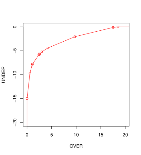
Figure 5 shows a RROC curve using this algorithm for in example 1. The points where the slope of the RROC Curve change are called vertex points, and the rest of points are said to fall onto the segments. Consequently a RROC Curve for a regression model applied to a dataset with instances has vertex points (typically, only are visible on the plot, because two are the extreme points) and segments, denoted by with . We clearly see points on Figure 5.
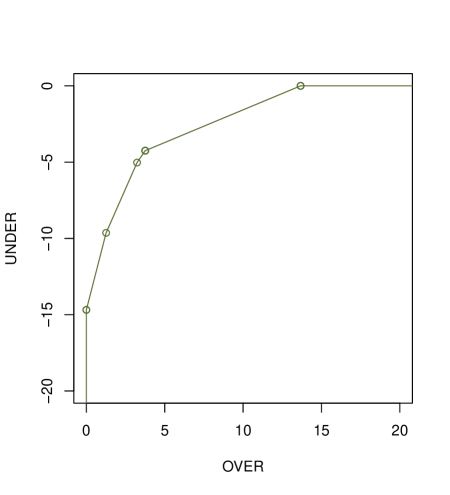
In case there are some ties in the error vector, then some of these vertex points and segments collapse into a single point. Figure 6 shows
Example 4.
Consider a regression model as follows:
| 0.123 | 1.221 | 1.845 | 4.573 | 8.558 | 7.392 | 5.669 | 1.578 | 0.806 | 1.245 | |
| 0.211 | 2.725 | 1.933 | 3.242 | 7.858 | 6.061 | 7.173 | 3.082 | 0.894 | 1.203 | |
| -0.088 | -1.504 | -0.088 | 1.331 | 0.700 | 1.331 | -1.504 | -1.504 | -0.088 | 0.042 |
We see a triple tie between examples 1, 3 and 9, another triple tie between examples 2, 7 and 8, and a double tie between examples 4 and 6. With this, there are only 5 different error values.
4.2 Properties: slope and convexity
From the new RROC curve, we may want to determine the slopes of each segment, in order to exactly determine where each possible isometric (and asymmetry ) would lead to on the curve. This can be done very easily, as the following lemma shows:
Lemma 4.
The slope of each segment in the RROC curve is given by , with .
Proof.
Let us assume no ties in the error vector. As shown in proposition 3, there is one example changing from to (from bottom-left to top-right) at each vertex point. At the first vertex point , all the examples are under-estimated, and the shift change moves along an infinite slope. For the next vertex point , we have under-estimated examples and over-estimated example. This means that the shift change moves along one unit right and units up, with a slope of . By induction, this leads to , with the last segment having 0 slope. If there are ties, the result is similar with more than one example changing from under-estimation to over-estimation at a time. ∎
Thus, and somewhat surprisingly, given a fixed number of examples, several regression models will have exactly the same slopes. The difference between the curves will be given by the length of the segments, not their slopes. From the equation in proposition 2 relating asymmetries and slopes, we have that each segment corresponds to an , leading to with .
Finally, from the previous Figure 5, we see that the curve is convex. Is this true in general? The following proposition shows it is.
Proposition 5.
For every regression model, the RROC Curve is convex222Note that in ROC analysis we typically say ‘convex’ when the region below is a convex set, while, generally, in mathematics, this refers to the region above being a convex set..
Proof.
It is direct from lemma 4 since the sequence of the segment slopes of the curve is non-increasing. ∎
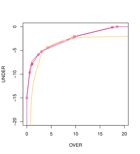
The convexity of a single RROC curve does not mean that the notion of convex hull seen in the previous section is useless for curves. More on the contrary. Whenever we have more than one model, we can see concavities. Figure 7 precisely shows this.
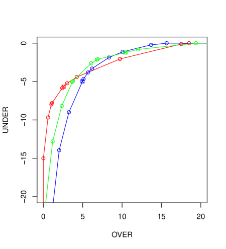
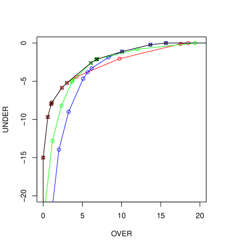
From these three curves, we can calculate their convex hull, as shown in Figure 8.
4.3 Areas and metrics
RROC analysis, as ROC analysis, can be especially useful for analysing models under different operating conditions and select the best one for a single operating condition or a region, or even better, to create hybrids through the notion of convex hull. Nonetheless, in ROC analysis we are also interested in evaluating models that can work well for a wide range of operating conditions. One measure that gives us a good indication of a classifier performing well in a wide range of operating conditions is the Area Under the ROC Curve (). Can we develop a similar measure for RROC curves?
The good mapping so far between ROC curves and RROC curves in terms of what they represent suggests that this is possible. The following definition introduces such a measure:
Definition 8.
The Area Over the RROC Curve () is defined as follows:
Lower values for are better.
The previous area can be calculated very easily using the sum of the upward trapeziums given between the elements 1 and n+2 from and in algorithm 1. Actually, for models always outputting finite values, this can be calculated from 2 to , since the extreme trapezium 1 to 2 has area 0 and the trapezium to as well, so this only need to sum trapeziums. Consequently:
The first question about this area is why we have defined the area over the curve and not under the curve. This has an easy answer: since the RROC space is unbounded, the area under the curve is always infinite. But what about the ? The following proposition gives an answer:
Proposition 6.
For any regression model which always outputs finite values, the is finite.
Proof.
Since the model always outputs finite values, there is a shift , such that for any shift we have that and there is also a shift , such that for any shift we have that . This means that the curve touches (and stays at) both the -axis and the -axis. Then the area is finite. ∎
For the three models in Figure 7, the is 56.1387, 88.0933 and 63.9295 for models , and respectively. Although a single number loses most of the information we can see on the curve, these numbers summarise their overall performance.
From the notion of , we can investigate what exactly means to have low and high . The ‘best’ model in terms of (a perfect square with top-left corner at the RROC heaven (0,0)) means that there is a shift that achieves 0 error. This is rarely the case, except for datasets for one single example (where there is always a shift getting 0 loss). It is also very rare to have a dataset for which the error is always the same, another possible situation where we would have 0 . Note that a model with very high or could, in principle, have . This would suggest that the shift was very badly chosen. The parallel with classical ROC analysis here is clear, where we can have bad accuracy for a model with optimal by choosing a bad threshold.
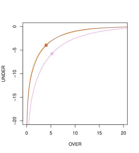
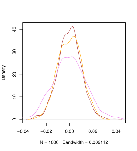
What about the ‘worst’ model in terms of ? Of course we can have a value of as high as we want. We can even get an infinite , if the model outputs or for one single example. So, the question must be stated more precisely: given a model with a certain , what is the worst value for ? This is difficult to answer. At first sight, it seems that the degree of dispersion of the error may affect, since it may make the shift more effective. Also, the degree of correlation between the actual and predicted values could be important. Figure 9 shows how a random model looks (in violet), which typically shows low performance. Also, it compares two models with similar performance, but one which is just generated adding random noise to the true values (in orange) and the other by calculating the mean of the true values (in brown). While these two last models have very different dispersion (the last model has null dispersion) and very different correlation (the last model has null correlation), their metrics and RROC curves are very similar. This is explained because their error distributions are similar. Hence, one possible way of looking at RROC curves is precisely this. They represent the distribution of errors.
A different question is to give a numerical interpretation of the . While its definition suggests that it may be the expected value of the total under-estimation given a uniform value for the total over-estimation, this is not well-defined because both and are not bounded. A possible interpretation is that it aggregates the macro-average squared error () with a distribution which depends on the model333Note that the length of each segment may represent the frequency of each possible value of the asymmetry parameter ., which is similar to one recent interpretation given to [26]. Other interpretations as an aggregation of expected loss may be possible444We suggest some possible pathways for exploration. Since is related to the magnitude of predictions (and errors), it cannot be directly related to rank-based correlation measures in regression. However, it could be related to this sum , which would work as a counterpart of the Wilcoxon-Mann-Whitney interpretation of the ., as it has happened to recently, where new interpretations have been introduced [22, 32].
Having said all this, our previous idea of the being related to the distribution of errors seems more appealing. If we have a compact error distribution, then will be low. If we have a sparse error distribution, then will be high. One classical measure of dispersion is precisely the variance, defined and decomposed as follows:
Definition 9.
The error variance is defined as:
where represents the mean of the vector .
Note that we define the population variance, by dividing by (instead of ). The reason is just to keep the expressions that will follow next as simple as possible. We will use just (instead of ) and (instead of ) when clear from the context. The last term in definition 9 is just a different way of showing the classical decomposition as the sum of the squared error bias () and the error variance ().
Quite surprisingly, the observation that the and the error variance are related can be made extremely precise, as the following theorem shows:
Theorem 7.
The area over the RROC curve equals the population variance of the errors multiplied by a factor which is independent of the model. Namely:
Proof.
We start with an error vector of length , which we assume is sorted in decreasing order, as in algorithm 1. We use a different notation for the points in the RROC curve. Instead of using points, we will just ignore the two extremes (which do not contribute to the area for finite cases) and we will just work with points, denoted by . The components of each point are . Note that using the notation in algorithm 1 and . We will also introduce the error differences , which are defined from to . Note that since the error vector is in decreasing order. It is easy to see that and . According to this notation:
In order to prove this theorem, we will proceed by induction.
Base case
The base case will consider any error vector of size . In this case, we only have two points and . From here,
Inductive step
We assume that
| (1) |
holds for any dataset of size .
Without loss of generality, we consider that the case for is constructed by adding example , assumed to be lower than the other examples in the case for . Consequently, the error vector for the case is . The difference vector is also an extension for , denoted by . Note that since we assume that eq. 1 holds for any dataset of examples, we can choose the order of examples that we prefer in order to build any case with examples.
The for the case is given by:
The for the case is given by
| (2) |
We will use a wide tilde to denote the , , , etc., for the case. The first thing we can see is that , , etc. We use these latter expressions on (2):
The second thing we realise is that and are equal for . From here, we can calculate the delta between and as follows:
But we have that . So, we rewrite:
Using the expression of the square of a sum: , and joining/distributing terms, we see that the above expression can be rewritten as:
From here, we can now write:
From the induction step (equation 1), we have:
This last expression completes the induction step and so does the proof. ∎
Corollary 8.
If the model is unbiased (i.e. ) then:
For the models , and in examples 1, 2 and 3 we have a variance of , and respectively. The is , and respectively. Since is unbiased, its is precisely , its error variance. The constant factor is in the three cases. Similarly, for the third model (in brown) in Figure 9, as it always outputs the mean of a distribution with standard deviation and examples, we have that the was 50.31. The expected result is . The difference is not given because theorem 7 is approximate, but just because the sample is generated with a distribution with , but the sample does not exactly have this variance (it is actually ).
Given the connection between the area over the RROC curve and the population variance, we can explore the connection between the RROC curve and an error density plot. As we can see in Figure 10, there is a high correspondence between the density plots and the RROC curve, but the cumulative character of the RROC curve make the latter smoother.
Note that this connection between and the error variance indicates that it is the dispersion that counts when trying to adapt our models to cost-sensitive situations with asymmetries, and not the position, which can be ignored by assuming that the optimal shift will be chosen for each particular operating condition. This again shows a parallel with ROC analysis. In ROC analysis, the absolute values of the scores do not affect the . Only their order matters. Here, for RROC curves, the position of the mean error (the error bias) does not affect the , only the dispersion of the error.
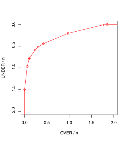
This is a fundamental result as well because it is a graphical representation of the error variance, which can sum up to the applicability of RROC curves. The factor in theorem 7 also suggests that a scaled representation of RROC curves could be done by dividing both the -axis and -axis by , i.e., plotting against . This would make the curves independent of the number of examples, but the meaning of each point would be somewhat blurred, as the ‘average over-estimation or (under-estimation) per example’. Nonetheless, this could be the standard representation in many application, especially when the number of examples in the datasets may vary or we may even compare several models (or the same model) against different datasets (with different sizes). Figure 11 shows the same plot as Figure 5 but normalising by the number of examples (in this case ).
5 ROC curves for non-constant shifts and soft regressors
In classification, there are many possibilities for choosing the threshold [32]. In regression, there are many possibilities as well for the shift. Until now, we have considered that the shift is chosen as a constant. Other possibilities rely on the use of any function of the prediction and the operating condition. Figure 12 shows the model from example 1 using a constant shift, the same model using a third-degree polynomial, and the same model using a third-degree polynomial combining and . As we can see on the figure, there are places where the use of a different shift formula can reach places where the constant shift cannot. Actually, we can find functions such that the predictions are modified in such a way that they can attain any point on the RROC space. However, in order to get close to the RROC heaven, we would need very ad-hoc functions, basically embedding an error correction inside.
In general, we are interested in shift functions and methods that are systematic (i.e., a procedure which is the same for all models). Clearly, a constant shift is a systematic method, provided we find a way to find the appropriate constant for each operating condition. Recently, a method to find the appropriate shift for each operating condition (asymmetry) has been introduced [1]. Simply, given a value of , the method calculates the best shift for the training set. Then, this shift can be applied to the test set. This method does not obtain the optimal shift for every , but if the training set and test set are similar, the approximation can be good. By ranging over operating conditions (instead of shifts), and using this method, we can construct a RROC curve which does not show the evolution of and for an optimal (or ideal) shift choice method, but an actual, feasible one. This reinforces the view expressed by [32] for classification: we evaluate pairs of models and threshold choice methods. The translation to regression and RROC curves is that we plot models assuming a shift choice method (both threshold choice methods and shift choice methods are types of reframing methods). In the previous sections, we have assumed an optimal constant-shift choice method, but many other options exist and may lead to other curves for the same model (which are not necessarily convex). The good thing about the RROC space is that we can visualise several options in the same plot, as done with Figure 12, and evaluate both models and shift choice methods at the same time.
Overall, there are many shift choice methods to be explored. For instance, [56] generalise the constant-shift choice method from [1] by using any polynomial function. A different, and more powerful, perspective is introduced by [28], where instead of using crisp models, the regression model accompanies a standard deviation to each prediction. This standard deviation is used to better adjust the shift according to each example, which is now a function of two variables instead of one. The adjustment is found by risk minimisation.
This also suggests the exploration of the connection between RROC curves and its corresponding cost curves.
Definition 10.
The cost space for regression is defined as a plot where the expected loss (e.g., the asymmetric absolute loss) is shown on the -axis for a range of operating conditions (e.g., the asymmetry ).
Figure 13 shows this cost space, which is similar to the cost space of Drummond and Holte’s cost curves for classification[9]. The investigation of the mapping between the regression cost space and the RROC space can lead to new important findings as has been recently done for classification [31].
6 Concluding remarks
We said in the introduction that there is no such a thing as the ‘canonical’ ROC space for regression, corresponding exactly to the ROC space for classification, since regression and classification are very different tasks. Having said this, we think that the RROC space, curves and analysis that we have introduced in this paper present so many parallelisms and share so many notions and procedures, that their curves could reasonably called the ROC curves for regression, with arguable more support than other previous attempts. We have seen that the notions of operating condition, cost asymmetry, RROC space, points, segments, RROC heaven, RROC isometrics, hybrid models, convexity, dominance, convex hull, curves, shift choice methods, etc., derive smoothly and work almost the same as in the classification case, so the practitioners which are used to ROC curves can directly apply their expertise on ROC analyse to regression quite easily.
There are naturally several issues which could lead to more general (or slightly different) notions of RROC curve for regression, keeping the same basic structure. The first issue that could be explored and generalised is the very notion of operating condition. We have only considered the asymmetry while, in classification, the class distribution can also be integrated (along with the cost proportion) in what is usually referred to as skew. In regression, the distribution of the output value (and not only the loss asymmetry) may also be considered part of the operating condition as well. This integration does not seem to be direct, but it is worth being investigated.
A second issue is the use of other loss functions. For instance, instead of an asymmetric absolute error, we could use an asymmetric squared error Quad-Quad. We guess that this would lead to non-straight isometrics and non-straight segments in the RROC curve, but the basic ideas would remain. Again, plotting different isometrics in RROC space for many different loss functions (Lin-Lin, Quad-Quad, Lin-Exp, Quad-Exp, etc.) would be a work on its own, very much resembling the celebrated paper [19] on isometrics for ROC curves in classification.
A third important avenue of future work would be to further investigate the connection with the error variance we have unveiled here and to analyse the relation of to other metrics, as well as the relation of RROC space with other plots to analyse the performance of regression. We think that RROC curves represent the expected loss for a range of operating conditions on one side, and the distribution of the error on the other side. There may be important connections to be unveiled between regression techniques trying to minimise the error variance (which we have shown here to be equal to the AOC) instead of squared error and those classification techniques trying to maximise the AUC (which has recently been shown to be equivalent to the refinement loss term of the MSE decomposition using the ROC curve [32]) instead of accuracy [12][15]. So we anticipate a plethora of connections between RROC curves and many other performance metrics in regression, as has been done for classification in the past years [17, 26, 22, 30, 32].
Overall, we think that RROC curves could become a fundamental tool in the assessment, improvement and deployment of regression models. In order to facilitate their use in real applications, we have developed a library for plotting RROC curves, calculating their areas and deriving their convex hulls. The software, in R [43], is available at http://users.dsic.upv.es/~jorallo/RROC/. The availability of software, the ubiquitous appearance of asymmetric losses in regression applications, and the success of ROC analysis for classification in the past decades suggests that RROC curves may soon become mainstream in all the areas where ROC analysis has shown to be useful: medicine, bioinformatics, decision making, statistics, machine learning and pattern recognition.
Acknowledgments
I would like to thank Peter Flach and Nicolas Lachiche for some very useful comments and corrections on earlier versions of this paper, especially the suggestion of drawing normalised curves (dividing -axis and -axis by ). This work was supported by the MEC/MINECO projects CONSOLIDER-INGENIO CSD2007-00022 and TIN 2010-21062-C02-02, GVA project PROMETEO/2008/051, the COST - European Cooperation in the field of Scientific and Technical Research IC0801 AT, and the REFRAME project granted by the European Coordinated Research on Long-term Challenges in Information and Communication Sciences & Technologies ERA-Net (CHIST-ERA), and funded by the respective national research councils and ministries.
References
- [1] G. Bansal, A. Sinha, and H. Zhao. Tuning data mining methods for cost-sensitive regression: A study in loan charge-off forecasting. J. Management Information System, 25:315–336, December 2008.
- [2] A. P. Basu and N. Ebrahimi. Bayesian approach to life testing and reliability estimation using asymmetric loss function. Journal of statistical planning and inference, 29(1-2):21–31, 1992.
- [3] A. Bella, C. Ferri, J. Hernandez-Orallo, and M. J. Ramirez-Quintana. Calibration of machine learning models. In Handbook of Research on Machine Learning Applications, pages 128–146. IGI Global, 2009.
- [4] J. Bi and K. P. Bennett. Regression error characteristic curves. In Twentieth International Conference on Machine Learning (ICML-2003). Washington, DC, 2003.
- [5] A. P. Bradley. The use of the area under the ROC curve in the evaluation of machine learning algorithms. Pattern Recognition, 30(7):1145 – 1159, 1997.
- [6] P. F. Christoffersen and F. X. Diebold. Further results on forecasting and model selection under asymmetric loss. Journal of applied econometrics, 11(5):561–571, 1996.
- [7] P. F. Christoffersen and F. X. Diebold. Optimal prediction under asymmetric loss. Econometric Theory, 13:808–817, 1997.
- [8] S. Crone. Training artificial neural networks for time series prediction using asymmetric cost functions. In Proceedings of the 9th International Conference on Neural Information Processing, 2002.
- [9] C. Drummond and R.C. Holte. Cost Curves: An Improved Method for Visualizing Classifier Performance. Machine Learning, 65:95–130, 2006.
- [10] C. Elkan. The foundations of Cost-Sensitive learning. In Bernhard Nebel, editor, Proceedings of the seventeenth International Conference on Artificial Intelligence (IJCAI-01), pages 973–978, San Francisco, CA, 2001.
- [11] T. Fawcett. An introduction to ROC analysis. Pattern Recognition Letters, 27(8):861–874, 2006.
- [12] C. Ferri, P. Flach, and J. Hernández-Orallo. Learning decision trees using the area under the ROC curve. In International Conference on Machine Learning, pages 139–146, 2002.
- [13] C. Ferri, P. Flach, J. Hernández-Orallo, and A. Senad. Modifying ROC curves to incorporate predicted probabilities. Proceedings of the second workshop on ROC analysis in machine learning, pages 33–40, 2005.
- [14] C. Ferri, P. Flach, N. Lachiche, and J. Hernández-Orallo. ROC curves for regression rankers. Technical note, 2008.
- [15] C. Ferri, P. A. Flach, and J. Hernández-Orallo. Improving the AUC of probabilistic estimation trees. In Machine Learning: ECML 2003, 14th European Conference on Machine Learning, Proceedings, Lecture Notes in Computer Science, pages 121–132. Springer, 2003.
- [16] C. Ferri and J. Hernández-Orallo. Cautious classifiers. Proceedings of the 1st International Workshop on ROC Analysis in Artificial Intelligence (ROCAI-2004), pages 27–36, 2004.
- [17] C. Ferri, J. Hernández-Orallo, and R. Modroiu. An experimental comparison of performance measures for classification. Pattern Recognition Letters, 30(1):27–38, 2009.
- [18] C. Ferri, J. Hernández-Orallo, and M. Salido. Volume under the ROC surface for multi-class problems. Machine Learning: ECML 2003, pages 108–120, 2003.
- [19] P. Flach. The geometry of ROC space: Understanding machine learning metrics through ROC isometrics. In Machine Learning, Proceedings of the Twentieth International Conference (ICML 2003), pages 194–201, 2003.
- [20] P. Flach. Machine Learning: The Art and Science of Algorithms that Make Sense of Data. Cambridge University Press, 2012.
- [21] P. Flach, H. Blockeel, C. Ferri, J. Hernández-Orallo, and J. Struyf. Decision support for data mining. Data Mining and Decision Support, pages 81–90, 2003.
- [22] P. Flach, J. Hernández-Orallo, and C. Ferri. A coherent interpretation of AUC as a measure of aggregated classification performance. In Proceedings of the 28th International Conference on Machine Learning, ICML2011, 2011.
- [23] J. E. Goin. ROC curve estimation and hypothesis testing: applications to breast cancer detection. Pattern Recognition, 15(3):263 – 269, 1982.
- [24] C. W. J. Granger. Prediction with a generalized cost of error function. OR, pages 199–207, 1969.
- [25] C. W. J. Granger. Outline of forecast theory using generalized cost functions. Spanish Economic Review, 1(2):161–173, 1999.
- [26] D. J. Hand. Measuring classifier performance: a coherent alternative to the area under the ROC curve. Machine learning, 77(1):103–123, 2009.
- [27] D. J. Hand. Evaluating diagnostic tests: the area under the ROC curve and the balance of errors. Statistics in Medicine, 29(14):1502–1510, 2010.
- [28] J. Hernández-Orallo. Probabilistic reframing for context-sensitive regression. submitted, preliminary version at http://arxiv.org/abs/1211.1043, 2012.
- [29] J. Hernández-Orallo, C. Ferri, N. Lachiche, and P. Flach. The 1st workshop on ROC analysis in artificial intelligence(rocai-2004). ACM SIGKDD Explorations Newsletter, 6(2):159–161, 2004.
- [30] J. Hernández-Orallo, P. Flach, and C. Ferri. Brier curves: a new cost-based visualisation of classifier performance. In Proceedings of the 28th International Conference on Machine Learning, ICML2011, 2011.
- [31] J. Hernández-Orallo, P. Flach, and C. Ferri. ROC curves in cost space. submitted. A preliminary version available as arXiv preprint arXiv:1107.5930, 2012.
- [32] J. Hernández-Orallo, P. Flach, and C. Ferri. A unified view of performance metrics: Translating threshold choice into expected classification loss. Journal of Machine Learning Research (JMLR), 13:2813–2869, 2012.
- [33] M. Jino, B. T. de Abreu, et al. Machine learning methods and asymmetric cost function to estimate execution effort of software testing. In Software Testing, Verification and Validation (ICST), 2010 Third International Conference on, pages 275–284. IEEE, 2010.
- [34] W. Khreich, E. Granger, A. Miri, and R. Sabourin. Iterative boolean combination of classifiers in the ROC space: An application to anomaly detection with hmms. Pattern Recognition, 43(8):2732 – 2752, 2010.
- [35] W. Khreich, E. Granger, A. Miri, and R. Sabourin. Adaptive ROC-based ensembles of HMMs applied to anomaly detection. Pattern Recognition, 45(1):208 – 230, 2012.
- [36] Y. Kim, K. A. Toh, A. Beng J. Teoh, H. L. Eng, and W. Y. Yau. An online AUC formulation for binary classification. Pattern Recognition, 45(6):2266 – 2279, 2012. ¡ce:title¿Brain Decoding¡/ce:title¿.
- [37] W. J. Krzanowski. ROC curves for continuous data, volume 111. Chapman & Hall/CRC, 2009.
- [38] T. A. Lasko, J. G. Bhagwat, K. H. Zou, L. Ohno-Machado, et al. The use of receiver operating characteristic curves in biomedical informatics. Journal of biomedical informatics, 38(5):404–415, 2005.
- [39] L. B. Lusted. Signal detectability and medical decision-making. Science, 171:1217–1219, 1971.
- [40] H. Mamitsuka. Selecting features in microarray classification using ROC curves. Pattern Recognition, 39(12):2393 – 2404, 2006.
- [41] C. Marrocco, R. P. W. Duin, and F. Tortorella. Maximizing the area under the ROC curve by pairwise feature combination. Pattern Recognition, 41(6):1961 – 1974, 2008.
- [42] T. Pietraszek. Optimizing abstaining classifiers using ROC analysis. In Proceedings of the 22nd international conference on Machine learning, ICML ’05, pages 665–672, New York, NY, USA, 2005. ACM.
- [43] R Team et al. R: A language and environment for statistical computing. R Foundation for Statistical Computing, Vienna, Austria, 2012.
- [44] M. T. Ricamato and F. Tortorella. Partial AUC maximization in a linear combination of dichotomizers. Pattern Recognition, 44(10 11):2669 – 2677, 2011. ¡ce:title¿Semi-Supervised Learning for Visual Content Analysis and Understanding¡/ce:title¿.
- [45] S. Rosset, C. Perlich, and B. Zadrozny. Ranking-based evaluation of regression models. Knowledge and Information Systems, 12(3):331–353, 2007.
- [46] C. M. Schubert, S. N. Thorsen, and M. E. Oxley. The ROC manifold for classification systems. Pattern Recognition, 44(2):350 – 362, 2011.
- [47] A. Srinivasan. Note on the location of optimal classifiers in n-dimensional ROC space. Technical Report PRG-TR-2-99, Oxford University Computing Laboratory, Wolfson Building, Parks Road, Oxford., 1999.
- [48] J. A. Swets. Measuring the accuracy of diagnostic system. Science, 240:1285–1293, 1986.
- [49] J. A. Swets, R. M. Dawes, and J. Monahan. Better decisions through science. Scientific American, 283(4):82–87, October 2000.
- [50] R. D. Thompson and A. P. Basu. Asymmetric loss functions for estimating system reliability. Bayesian Analysis in Statistics and Econometrics, John Wiley & Sons, pages 471–482, 1996.
- [51] K-A. Toh, J. Kim, and S. Lee. Maximizing area under ROC curve for biometric scores fusion. Pattern Recognition, 41(11):3373 – 3392, 2008.
- [52] L. Torgo. Regression error characteristic surfaces. In Proceedings of the eleventh ACM SIGKDD international conference on Knowledge discovery in data mining, pages 697–702. ACM, 2005.
- [53] L. Torgo and R. Ribeiro. Precision and recall for regression. In Discovery Science, pages 332–346. Springer, 2009.
- [54] P. Turney. Types of cost in inductive concept learning. Canada National Research Council Publications Archive, 2000.
- [55] A. Zellner. Bayesian estimation and prediction using asymmetric loss functions. Journal of the American Statistical Association, pages 446–451, 1986.
- [56] H. Zhao, A. P. Sinha, and G. Bansal. An extended tuning method for cost-sensitive regression and forecasting. Decision Support Systems, 2011.