Data analysis and graphing in an introductory physics laboratory: spreadsheet versus statistics suite
Abstract
Two methods of data analysis are compared: spreadsheet software and a statistics software suite. Their use is compared analyzing data collected in three selected experiments taken from an introductory physics laboratory, which include a linear dependence, a non-linear dependence, and a histogram. The merits of each method are compared.
1 Introduction
An experiment is not completed when the experimental data are collected. Usually, the data require some processing, an analysis, and possibly some sort of visualization. The three most commonly encountered approaches to data analysis and graphing are
-
•
manual method using grid paper
-
•
general purpose spreadsheet software
-
•
statistics software suite
The manual method involving grid paper and a pencil often still seems to be the one favoured by the teachers. Indeed it has a certain pedagogical merit, for it does not hide anything in black boxes: the student has to work through all the steps him- or herself. It is also the preferred option in the environments where students cannot be expected to own a personal computer. However, an increasing proportion of students does have access to a computer, either on their own initiative or as part of an organized initiative (e.g., [1]), and they find the method tedious, painstaking and old-fashioned. In all honesty, their teachers do not use this method in their own research work.
General purpose spreadsheet software like Excel (Microsoft), Quattro Pro (formerly Borland, Inc. now Corel, Inc.), or the freely available OpenOffice Calc (formerly Sun Microsystems, Inc., now Oracle Corporation) contain most functions required for data analysis and graphing. They are commonly available and the students are generally well-versed in their use. However, spreadsheets have their drawbacks. They are difficult to debug, and they often require an educated operator in order to produce a visually satisfying graph without visual distractions.
Due to volume academic licenses, statistical software suites like SPSS (formerly SPSS,Inc., now IBM), SAS (SAS Institute, Inc.), Stata (StataCorp, Inc.), Statistica (StatSoft, Inc.), Minitab (Minitab, Inc.), or S-PLUS (TIBCO Software, Inc.) have also become a viable option. They usually allow both a spreadsheet-like access and programming using a scripting language, and generally produce an excellent graphical output.
Finally, one also needs to mention the fourth group: specialized software for scientific graphing such as Origin (formerly MicroCal, Inc., now OriginLab), SigmaPlot (formerly Jandel Scientific, now Aspire Software International), IGOR Pro (Wavemetrics, Inc.), or Prism (GraphPad Software). This is usually the preferred option in a research laboratory, but with a price of around 1000 EUR per license, it is usually considered too expensive for a classroom or student laboratory use.
In this paper, we illustrate two methods, one involving a spreadsheet and another one a statistics software suite, on a set of three problems taken from the laboratory course prepared for first year students of medicine, dental medicine and veterinary medicine [2]. Two of them involve bivariate data (illustrating a linear and a non-linear dependence) and one involves univariate data (a histogram of radioactive decay). As typical examples of each class, two programs were selected: Microsoft Excel (version 12, included in Microsoft Office 2007) and R (version 2.10.1). Even though one is a commercial software product and the other is a free one, we consider them the most popular representatives of their respective groups, which justifies their comparison. Furthermore, the features presented in R work unchanged in S-Plus, the commercial implementation of S, while the spreadsheet examples work, except where noted, besides in Excel also in the freely available OpenOffice Calc.
Microsoft first introduced Excel for Apple Macintosh in 1985, while the version for Microsoft Windows followed two years later. It started to outsell its then main competitor, Lotus 1-2-3, as early as 1988, and the introduction of Microsoft Windows 3.0 in 1990 cemented its position as the leading spreadsheet product with a graphical user interface (GUI). Microsoft Excel is now available for Microsoft Windows and the MacOS X environments.
R [3, 4] is both a language and an environment for data manipulation, statistical computing and scientific graphing. R is founded on the S language and environment [5] which was developed at Bell Laboratories (formerly AT&T, now Lucent Technologies) by John Chambers, Richard Becker and coworkers. S strove to provide an interactive environment for statistics, data manipulation and graphics. Throughout the years, S evolved into a powerful object-oriented language [6, 7]. Nowadays, two descendants exist which build on its legacy: S-Plus, a commercial package developed by Tibco Software, Inc., and the freely available GNU R. Its primary source is the Comprehensive R Archive Network (CRAN), http://cran.r-project.org/.
In the rest of the paper, we first compare Excel and R on three cases taken from a introductory physics laboratory: a linear and a non-linear regression and a histogram. We then discuss the positive and the negative aspects of using either approach, and finally present the main conclusions.
2 Comparison
2.1 Case 1: Linear dependence
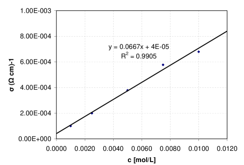
Let us start with a simple example, in which the linear dependence between the concentration and the conductivity of a dilute electrolyte is examined. At 5 different concentrations of electrolyte, the student takes measurement of the resistance of a beaker filled with electrolyte to the mark, with a pair of electrodes immersed and connected into a Wheatstone bridge. Using one known value for conductivity, the student calculates the rest of conductivities from the resistances, plots the points into a scatterplot, fits the best line through the data points, and, measuring its resistance, finally determines the unknown concentration of an additional sample.
The spreadsheet solution is straightforward: data points can be plotted as a scatterplot, then with a right-hand click on any data point, “Add trendline” is selected (figure 1). In order to learn the slope and the intercept of the straight line, one can choose “Display equation on chart” in the “Options” tab. Alternatively, one can find the slope, the intercept and the correlation coefficient through built-in functions SLOPE(), INTERCEPT(), and CORREL(). More statistical parameters can be obtained through a matrix function LINEST(). Individual cells from within the result of a matrix function can be extracted by embedding LINEST() inside a INDEX() function. A fully worked example is given in the on-line Supplementary Material.
In R, the task can be achieved with a simple script, shown in Appendix A. The resulting graph is shown in figure 2. The example shows a few features of R which we want to comment on:
-
•
Since we only have five data points, the data were entered directly into the program rather than being read from an external data file. The c() function is used to concatenate data into a vector.
-
•
R encourages programming with vectors. In the expression k/resistance, each element of the resulting vector is computed as a reciprocal value of the element of the original vector, multiplied by k.
-
•
Inspired by the TeX typesetting system, R offers a capable method of entering mathematical expressions into graph labels using the expression() function [8].
-
•
The plot() function is the generic function for plotting objects in R; here we used it to produce a scatterplot.
-
•
The lm() function is used to fit any of several linear models [9]; we used it to perform a simple bivariate regression. R is not overly talkative, and lm() does not produce any output on screen, it merely creates the object cond.fit, which we can later manipulate at will. In the example we used abline(cond.fit) to plot the regression line atop the data points. If we want to print the coefficients, we can use coef(cond.fit).
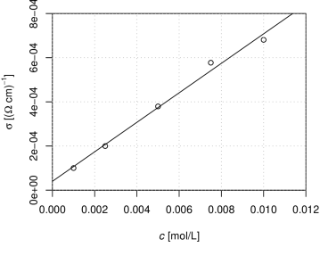
In a simple case like linear dependence, spreadsheet offers a somewhat simpler solution. R, however, gives more control over its graphical output and generally produces a visually more pleasing output.
2.2 Case 2: Nonlinear dependence
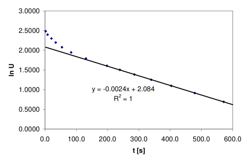
Not all dependencies are linear. Sometimes, they can be linearized by an appropriate transformation (e.g., logarithmic), which reduces the task of finding the optimal fitted curve back to the linear case. With a computer at hand, however, this is not necessary. In this example, we examine the time dependence of voltage in a circuit with two capacitors (figure 3). The student first charges the capacitor and then monitors the voltage as discharges. The voltage can be written as a sum of two exponentials:
| (1) |
The task is to determine the two amplitudes, and , and both relaxation times, and .

Solving the problem with a spreadsheet, one first learns that the otherwise convenient “Add trendline” feature cannot be applied to this case—while it offers a few functions beyond linear (polynomial, logarithmic, exponential, power and running average), a sum of several exponential functions is not among them. Instead, we present two other solutions in Excel. The first one emulates the manual graphical method, while the second one uses the built-in “Solver” tool.
The first solution (Supplementary Material, worksheet “2exp log”) takes into account the properties of the exponential function. After a certain period—this threshold value can be most easily obtained graphically (figure 4) by plotting (Supplementary Material, supplement1.xls, worksheet “2exp log”, column C) vs. —the fast component, , dies away, and only the slow component remains:
| (2) |
Taking logarithm of (2) one obtains as the intercept (D13) and as the slope (D12). and are computed in D16 and D17, respectively. Once the slow component is determined, one can compute the fast component (column F) by subtracting the slow component from the whole:
| (3) |
From (1) one can see that , therefore by taking the logarithm of (3), one obtains as the intercept (H13) and as the slope (H12), yielding and . This solution retraces the same steps one would take if equipped only with a grid paper and a pocket calculator; spreadsheet only makes it slightly more convenient.
While the linearized solution certainly possess certain pedagogical merits, one needs to realize that the transformation needed to linearize the data inevitably distorts the experimental error and alters the relationship between the - and -values, yielding an incorrect final result. Instead, one can use the built-in “Solver” tool (the “Solver” included in the recent (3.1.1) release of OpenOffice Calc is restricted to linear models and thus inappropriate for the task) to maximize the coefficient of determination,
| (4) |
The spreadsheet solution is given in the Supplementary Material (supplement1.xls, worksheet “2exp nonlin”). As before, column A contains the independent variable () and column B the dependent variable (). Column C contains the model curve (1), with the cells J3…J6 containing the coefficients , , and , respectively. Column D contains the squared difference between the experimental values of the dependent variable and the model curve, and column E the squared difference between the individual values of the dependent variable and their average value, the average value itself being saved in the cell J7. Finally, the cell J10 contains the coefficient of determination (4).
We fill the cells J3…J6 with the initial guesses for the parameters and start the Solver tool (Tools Solver). We want to maximize the coefficient of determination [10], therefore we set J10 as our target cell, and set the “Equal to” option to “Max”. We enter the range J3:J6 into “By changing cells” option and start the optimizer by clicking “Solve”. After the solver has finished, we are asked whether we want the optimized values of parameters to be written into the given cell range J3:J6.
The solution in R is shown in Appendix B. It assumes that the data data is saved in a CSV format:
"t [s]";"U [V]"
2,3;12,0
8,7;11,0
...
The resulting graph is shown in figure 5. A few features of R used in the example need some comment:
-
•
read.table() returns the object of a class data.frame; we may visualize it as a table. Individual columns in the table are addressed as table$column. Column names are constructed from the table header, with all illegal characters being replaced by dots. For easier manipulation, two vectors, t and U, were created from the appropriate columns of the table.
-
•
The actual nonlinear fitting is performed by the nls() function, which returns an object of the nls class. Apart from the formula, we also supplied the initial guesses for the fitting parameters. The values of the coefficients can be extracted by coef(U.nls), yielding , , , and . The command summary(U.nls) produces an even more informative report.
-
•
An object of an nls class also provides methods for the predict() function, which we used to plot a piecewise linear curve, which appears as a smooth curve due to the small step used.

In this case, the solution in R does not appear any more complex than the linear case—the considerably more difficult mathematics of the non-linear regression are hidden from the user. On the other hand, a spreadsheet like Excel has no direct support for non-linear regression, and subsequently the user has to work through some of the necessary steps manually.
2.3 Case 3: Histogram
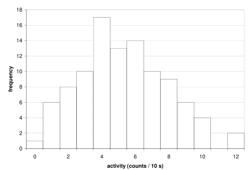
Our third example examines the statistics of radioactive decay. Using a Geiger counter, the student is required to record the number of decays detected in a period of time (in our case, 10 s), and repeat the measurement 100 times. After subtracting the base activity, the student computes the mean value , the standard deviation , and plots a histogram.
In a histogram, one plots the frequencies of the cases falling into each of several categories, where the categories are usually specified as non-overlapping intervals of the variable in question. In a spreadsheet, the FREQUENCY() function can be used to compute the frequencies. This is a matrix functions, which takes two ranges of cells as input—the data array and the bins array—and returns as output an array of the same length as the bins array. While calculating the frequencies is supported, neither Excel nor OpenOffice Calc provide a direct support for histogram plotting. Since the bins were chosen to be of the same size in our example, we can emulate them with bar charts (figure 6). While one can eliminate the gaps between bars in the chart setting, label positions reveal the fact that we are dealing with a bar chart rather than a histogram.
The script shown in Appendix C demonstrates computing and plotting the histogram in R. The final result is shown in figure 7. Again, a few comments.
-
•
Since the format of the input data file is very simple (one figure—the number of detected decays per 10 s—per line), we have used the scan() function instead of read.table(); x is thus a vector rather than a data frame.
-
•
The histogram is plotted using the hist() function. The breaks option is used to specify bin size and boundaries. By default, R uses Sturges’ formula for distributing samples into bins:
-
•
The normal probability distribution function dnorm() is plotted over the histogram with the curve() function and add = TRUE option.

With a direct support for histograms, R is clearly the preferred solution over a spreadsheet in this case, a fact which would become even more apparent if the nature of the problem would require histograms with unequal bin widths.
3 Discussion
The amount of information a working physicist—or most any scientist—has to cope with often exceeds the human capacity of processing in a tabular form and requires some visualization technique. A certain degree of graphic, or visual literacy is therefore required. As a result, a fair amount of emphasis is given to teaching this skill in the course of a physics curriculum [11, 12, 13]. Producing graphs manually involves some processing of data with a pocket calculator, determining the minimal and the maximal values of data in - and direction, choosing the appropriate scales on the - and -axis, plotting the data points, drawing the best-fit line and possibly using it in the subsequent analysis. In the case of histogram plotting, the student has to choose the bin size and manually arrange the samples into bins. It is instructive to perform this whole process once or possibly a few times in order to get familiar with all the steps required. However, we can not overlook the fact that the processes involved in a manual production of a graph are time-consuming, error-prone, and do not contribute significantly to a better understanding of the problem studied. In this respect, we have to agree with earlier studies [14] that if the purpose of the graph is data analysis rather than acquiring the skill of plotting a graph, the time spent with manual graph plotting is better spent discussing its meaning.
By employing the “variable equals spreadsheet cell” paradigm where users can see their variables and their contents on screen, spreadsheets have been extremely successful in bringing data processing power to the profile of users who would have otherwise not embraced a traditional approach to computer programming. The usefulness of spreadsheets in education in general (cf. [15] and the references therein) and for teaching physics in particular [16, 17, 18], including laboratory courses [19, 20], has been recognized early on.
However, the approach taken by spreadsheets also has its drawbacks. By placing emphasis on visualizing the data itself, the relations between data are less emphasized than in traditional computer programs, and it is generally more difficult to debug a spreadsheet than a traditional computer program of comparable complexity (cf. [21] and the references therein). The fact that the variables are referred to by their grid address rather than by some more meaningful name is an additional hindrance factor. Leaving aside the questioned validity of some of statistics functions built into Excel [22, 23, 24, 25], which is outside the scope of this paper, we wish to deal with another sort of criticism concerning the graphical output of spreadsheet programs. While a skilled user can produce clear, precise and efficient graphs with Excel (cf. [26] and the references therein), it is perceived [27] that less skilled users are easily misled into excessive use of various embellishments (dubbed as “chartjunk”, [28]) that do not add to the information content. Telling good graphs from bad ones is not merely a subject of aesthetics, there exists an extensive body of work in this area (cf. [29, 30, 31, 32, 28, 33]).
Where does R stand in comparison? As expected from a statistics suite, R outperforms Excel in terms of statistical accuracy [34]. R also does a much better job at graphing. Except for the obvious required modifications like axes labels, the default settings are often already satisfactory. We have nevertheless demonstrated in figure 2 how features like grid lines can be added, should they be considered necessary. Excel charts, on the other hand, come by default with an obtrusive grey background and horizontal grid lines (as seen in figure 6), which do not convey any information (“non-data ink”, in Edward Tufte’s terminology). In terms of ease-of-use, Excel excels if the relationship between the data assumes any of the four pre-defined possibilities: linear, polynomial, exponential or logarithmic. Aside from these, more or less clever techniques need to be adopted in order to use Excel for data analysis, most of them being too complex for the students to be expected to invent them on their own. In R, even the linear modelling requires a few lines of code. On the other hand, however, non-linear modelling is hardly any more complex than linear modelling for the end user, and is considerably easier than in Excel. The same is also true for plotting histograms.
The potential of R in a classroom environment has already been examined in various disciplines, e.g., statistics [35], econometrics [36], and computational biology [37]. The extent of its use in student laboratories throughout the world is, however, hard to estimate. On the other hand, we can observe that R receives an explosive growth of use in research laboratories, where one would actually expect slower adoption due to the additional competition it faces both from the commercial scientific graphing software and from the commercial statistical software suites. Thomson Reuters ISI Web of Science® shows that the R manual [4] has accumulated over 10.000 citations since 1999, over 4000 of these in the year 2009 alone.
The main obstacle preventing its more widespread adoption is the fact that students entering the laboratory course usually have no previous experience with R, while they usually do have previous experience with spreadsheets. Even though spreadsheet users essentially engage in functional programming [38], they generally don’t perceive it as programming. Experience shows [37] that the students can not be expected to self-learn R even in the case of graduate students of computational biology and that a quick introduction course is recommended. The best synergy might be achieved when students take an introductory course in statistics before the physics laboratory course or simultaneously with it.
Before we conclude, we would like to mention another weak aspect of the spreadsheet paradigm: collaboration in spreadsheet authoring is inherently difficult. The changes are introduced to the spreadsheet on the level of spreadsheet cells, and a minor change, replicated across hundreds or thousands of cells, renders traditional revision control systems practically useless, meaning it very difficult to determine who changed what and when did the change occur. R scripts are ASCII text, and revision control systems either as basic as RCS [39] or arbitrarily more complex (CVS, Subversion, BitKeeper, etc.) can be easily employed. By running scripts in batch mode rather than using R interactively, reproducible research techniques [40] are encouraged. One further step in this direction is Sweave [41], which allows creating integrated script/text documents.
4 Conclusions
In the paper, two methods of data analysis and graphing were compared: spreadsheet software, represented by Microsoft Excel, and a statistics software suite, represented by GNU R. Both methods were tried on three typical tasks taken from an introductory physics laboratory; similar tasks can be, however, encountered in any science laboratory course. The tasks encompass linear dependence, non-linear dependence and histogram. It has been determined that spreadsheet offers an easier approach when the data model is simple (in our case, linear dependence). Beyond a few simple models, R offers a more user-friendly solution. Histogram plotting, considered one of the basic tools for data analysis, is also inadequately supported in Excel (the same is true also for other popular spreadsheet software like OpenOffice Calc and Apple Numbers). Using default settings, R produces charts with a higher ratio of data conveying information to data conveying no information.
Spreadsheets are often the only software solution for data analysis students encounter during their education. We believe the described shortcomings of spreadsheets make it worth exposing them to other existing solutions as well. A statistical software suite is a solution which can most easily replace a spreadsheet in data analysis and graphing tasks, and in particular their use should be encouraged in situations where they can be reused in a statistics course. Among the statistical software, we emphasized R. It is free; students can install a copy at home. Using R, well-designed publication-quality plots can be produced with ease. It is an object-oriented matrix language, which encourages thinking on a more abstract level. The extent of utilization that R has recently experienced in various scientific disciplines signifies it is more than a marginal phenomenon, making it more likely that students who acquire a certain degree of proficiency with R/S/S-Plus in the course of their studies will be able to make use of this skill later in their careers.
Supplementary material
Worked-out examples employing spreadsheet are available free of charge on the IOP web site. An Excel (version 11; Microsoft Office 2003) spreadsheet supplement1.xls contains four worksheets with the solutions for linear regression, two solutions for a two-exponential functions (“2exp log” and “2exp nonlin”) and a histogram.
References
References
- [1] Andrew A. Zucker and Sarah T. Hug. Teaching and learning physics in a 1:1 laptop school. J. Sci. Educ. Technol., 17:586–594, 2008.
- [2] Bojan Božič, Jure Derganc, Gregor Gomišček, Vera Kralj-Iglič, Janja Majhenc, Primož Peterlin, Saša Svetina, and Boštjan Žekš. Vaje iz biofizike. Inštitut za biofiziko MF, 6th edition, 2003. In Slovenian.
- [3] Ross Ihaka and Robert Gentleman. R: A language for data analysis and graphics. J. Comput. Graph. Stat., 5:299–314, 1996.
- [4] R Development Core Team. R: A Language and Environment for Statistical Computing. R Foundation for Statistical Computing, Vienna, Austria, 2008. ISBN 3-900051-07-0.
- [5] R. A. Becker and J. M. Chambers. S: An Interactive Environment for Data Analysis and Graphics. Wadsworth & Brooks/Cole, Pacific Grove, CA, USA, 1984.
- [6] R. A. Becker, J. M. Chambers, and A. R. Wilks. The New S Language: A Programming Environment for Data Analysis and Graphics. Wadsworth & Brooks/Cole, Pacific Grove, CA, USA, 1988.
- [7] John M. Chambers. Programming with Data: A guide to the S language. Springer, New York, NY, USA, 1998.
- [8] Paul M. Murrell and Ross Ihaka. An approach to providing mathematical annotation in plots. J. Comput. Graph. Stat., 9:582–599, 2000.
- [9] John M. Chambers. Linear models. In John M. Chambers and Trevor J. Hastie, editors, Statistical Models in S, chapter 4. Chapman & Hall/CRC, Boca Raton, FL, USA, 1991.
- [10] Angus M. Brown. A step-by-step guide to non-linear regression analysis of experimental data using a Microsoft Excel spreadsheet. Comput. Meth. Prog. Biomed., 65:191–200, 2001.
- [11] Lillian Christie McDermott, Mark L. Rosenquist, and Emily H. van Zee. Student difficulties in connecting graphs and physics: Examples from kinematics. Am. J. Phys., 55:503–513, 1987.
- [12] Robert J. Beichner. Testing student interpretation of kinematics graphs. Am. J. Phys., 62:750–762, 1994.
- [13] Vida Kariž Merhar, Gorazd Planinšič, and Mojca Čepič. Sketching graphs—an efficient way of probing students’ conceptions. Eur. J. Phys., 30:163–175, 2009.
- [14] Roy Barton. Why do we ask pupils to plot graphs? Phys. Educ., 33:366–367, 1998.
- [15] John Baker and Steve Sugden. Spreadsheets in education—the first 25 years. Spreadsheets Educ., 1:18–43, 2003.
- [16] R. Dory. Spreadsheets for physics. Comput. Phys., 2:70–74, 1988.
- [17] Linda Webb. Spreadsheets in physics teaching. Phys. Educ., 28:77–82, 1993.
- [18] B. A. Cooke. Some ideas for using spreadsheets in physics. Phys. Educ., 32(2):80–87, 1997.
- [19] Rick Guglielmino. Using spreadsheets in an introductory physics lab. Phys. Teach., 27:175–178, 1989.
- [20] M. Krieger and J. Stith. Spreadsheets in the physics laboratory. Phys. Teach., 28:378–384, 1990.
- [21] Stephen G. Powell, Kenneth R. Baker, and Barry Lawson. A critical review of the literature on spreadsheet errors. Decis. Support Syst., 46:128–138, 2008.
- [22] Leo Knüsel. On the accuracy of statistical distributions in Microsoft Excel 2003. Comput. Stat. Data Anal., 48:445–449, 2005.
- [23] B. D. McCullough and Berry Wilson. On the accuracy of statistical procedures in Microsoft Excel 2000 and Excel XP. Comput. Stat. Data Anal., 40:713–721, 2002.
- [24] B. D. McCullough and David A. Heiser. On the accuracy of statistical procedures in Microsoft Excel 2007. Comput. Stat. Data Anal., 52:4570–4578, 2008.
- [25] A. Talha Yalta. The accuracy of statistical distributions in Microsoft Excel 2007. Comput. Stat. Data Anal., 52:4579–4586, 2008.
- [26] Gaj Vidmar. Statistically sound distribution plots in Excel. Metodol. Zv., 4(1):83–98, 2007.
- [27] Yu-Sung Su. It’s easy to produce chartjunk using Microsoft Excel 2007 but hard to make good graphs. Comput. Stat. Data Anal., 52:4594–4601, 2008.
- [28] Edward R. Tufte. The Visual Display of Quantitative Information. Graphics Press, Cheshire, CT, USA, 2nd edition, 2001.
- [29] Paul A. Tukey. Exploratory Data Analysis. Adddison-Wesley, 1977.
- [30] John M. Chambers, William S. Cleveland, Beat Kleiner, and Paul A. Tukey. Graphical Methods for Data Analysis. Wadsworth & Brooks/Cole, Pacific Grove, CA, USA, 1983.
- [31] William S. Cleveland. Visualizing Data. Hobart Press, Summit, NJ, USA, 1993.
- [32] William S. Cleveland. The Elements of Graphing Data. Hobart Press, Summit, NJ, USA, 1994.
- [33] Leland Wilkinson. The Grammar of Graphics. Springer-Verlag, New York, NY, USA, 2nd edition, 2005.
- [34] Kellie B. Keeling and Robert J. Pavur. A comparative study of the reliability of nine statistical software packages. Comput. Stat. Data Anal., 51:3811–3831, 2007.
- [35] Nicholas J. Horton, Elizabeth R. Brown, and Linjuan Qian. Use of R as a toolbox for mathematical statistics exploration. Am. Stat., 58:343–357, 2004.
- [36] Jeff Racine and Rob Hyndman. Using R to teach econometrics. J. Appl. Econ., 17:175–189, 2002.
- [37] Stephen J. Eglen. A quick guide to teaching R programming to computational biology students. PLOS Comput. Biol., 5:e1000482, 2009.
- [38] Simon Peyton Jones, Alan Blackwell, and Margaret Burnett. A user-centred approach to functions in Excel. In Colin Runciman and Olin Shivers, editors, Proceedings of the Eighth ACM SIGPLAN International Conference on Functional Programming, ICFP 2003, pages 165–176. ACM, 2003.
- [39] Walter F. Tichy. RCS — A system for version control. Software Pract. Exper., 15:637–654, 1985.
- [40] Matthias Schwab, Martin Karrenbach, and Jon Claerbout. Making scientific computations reproducible. Comput. Sci. Eng., 2(6):61–67, 2000.
- [41] Friedrich Leisch and Anthony J. Rossini. Reproducible statistical research. Chance, 16(2):46–50, 2003.
Appendix A Linear dependence
1 concentration ¡- c(1.e-3, 2.5e-3, 5.e-3, 7.5e-3, 1.e-2) resistance ¡- c(5.31, 2.66, 1.40, 0.92, 0.78)
# calculate the conductivity k ¡- 1.e-4*resistance[1] conductivity ¡- k/resistance
# define the labels on the x- and y-axis xlabel ¡- expression(paste(italic(c),” [mol/L]”)) ylabel ¡- expression(paste(sigma,” [(”,Omega,” cm)”^-1,”]”))
# plot the data plot(concentration, conductivity, xlab = xlabel, ylab = ylabel, xaxs = ”i”, yaxs = ”i”, xlim = c(0, 0.012), ylim = c(0, 8.e-4)) grid(col = ”darkgray”)
# calculate the best-fit line cond.fit ¡- lm(conductivity concentration, data = data.frame(concentration, conductivity))
# plot the best-fit line abline(cond.fit)
Appendix B Nonlinear dependence
1 C1 ¡- read.table(”capacitor.csv”, dec=”,”, sep=”;”, header = TRUE)
U ¡- C1t..s.
U.nls ¡- nls(U A*exp(-t/t1) + B*exp(-t/t2), start = list(A = 5, B = 5, t1 = 10, t2 = 100))
plot(C1, xlab = expression(paste(italic(t),” [s]”)), ylab = expression(paste(italic(U),” [V]”)), xlim = c(0,600))
lines(0:600, predict(U.nls, list(t = 0:600)))
Appendix C Histogram
1 # detected decays per 10 s x ¡- scan(”decay.txt”)
# subtract the base (normalized per 10 s) x ¡- x - 2.68
avg ¡- mean(x) stdev ¡- sd(x)
# draw the histogram hist(x, breaks = seq(floor(min(x)), ceiling(max(x))), xlab = ”decays / 10 s”, ylab = ”frequency”)
# overlay the probability density function curve(length(x)*dnorm(x, mean = avg, sd = stdev), add = TRUE)