Putting Recommendations on the Map – Visualizing Clusters and Relations
Abstract
For users, recommendations can sometimes seem odd or counterintuitive. Visualizing recommendations can remove some of this mystery, showing how a recommendation is grouped with other choices. A drawing can also lead a user’s eye to other options. Traditional 2D-embeddings of points can be used to create a basic layout, but these methods, by themselves, do not illustrate clusters and neighborhoods very well. In this paper, we propose the use of geographic maps to enhance the definition of clusters and neighborhoods, and consider the effectiveness of this approach in visualizing similarities and recommendations arising from TV shows and music selections. All the maps referenced in this paper can be found in www.research.att.com/~volinsky/maps.
1 Introduction
Information visualization techniques are often essential in helping to make sense out of large data sets. High-dimensional data can be visualized as a collection of points in 2-dimensional space using principal component analysis [12], multidimensional scaling [15], force directed algorithms [6], or non-linear dimensionality reduction like LLE/Isomap [20, 22]. These embedding algorithms tend to put similar items next to each other. Visual examination often suffices to identify the presence of clusters. Sometimes, however, the clusters are not as easy to see and additional visual clues are needed to highlight them. One possibility is to use cluster analysis algorithms, such as -means or hierarchical clustering algorithms [11, 16] to explicitly define clusters. The points and labels can then be colored based on the clustering. While in small examples it is possible to convey the cluster information just with the use of colors and proximity, this becomes difficult to do with large data. Common problems include dense clusters where labels overlap each other and clusters that lack clearly defined boundaries.
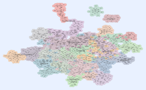
In this paper we propose the use of maps as a way to achieve this explicit visual definition of clusters. There are several reasons that such a representation can be more useful. First, by explicitly defining the boundary of the clusters and coloring the regions, we make the clustering information clear. Second, as most dimensionality reduction techniques lead to a 2-dimensional positioning of the data points, a map is a natural generalization. Finally, while graphs, charts, and tables often require considerable effort to comprehend, a map representation is more intuitive, as most people are very familiar with maps and even enjoy carefully examining maps. Applying this approach to a data set containing show-show similarities between 1000 TV programs results in the map in Figure 1, which conveys clustering information much better.111 This paper contains zoomable high resolution images; all the images are also available at www.research.att.com/~volinsky/maps.
We have considered several different approaches for generating maps, depending on (1) how we obtain the 2D positions for the data points, (2) how we cluster the data points, and (3) how we represent the resulting layout and clustering as a map. Depending on the application, some choices are more suitable than others. Consider the case when the data points are TV programs and the goal is to visualize “TVLand”. In this case, it is highly desirable to obtain a map in which similar programs are placed close to each other and, even better, grouped in countries such as Sportsitania, Newsistan, ToddlerSprawl, etc. Once the data is represented as countries on a map, recommendations can be visualized statically and interactively.
The map metaphor becomes more powerful as a user becomes familiar with the canonical map layout. Humans are comfortable with map-related concepts: items within a country are similar to each other; areas separated by a mountain range are difficult to connect; islands might have atypical qualities, etc. We hope through this work to extend the familiar map metaphor to the world of recommendations. Thus, by putting items like TV shows on a map, we can borrow map-related cognitive concepts. In a user-driven mode, a personalized “heat map” is generated, where regions of low interest are colored with cool colors and regions containing highly recommended shows are colored with a hot color. These maps are generated dynamically based on user preference and the available TV shows at this moment in time. The user can interactively explore the map to find related shows in the same region, or in neighboring regions. Building “roads” between regions, visiting “islands” and “traveling cross-country” are all metaphors that can have meaning in the recommendation space. In a user-passive mode, recommendations are highlighted on the map. These maps help the user (as well the designers of the recommender system) understand why certain shows are recommended. By highlighting both the recommended shows and shows the user has watched on the same map, the user understands the proximity of the recommended items and watched items, thus the rationale for the recommendation.
2 The mapping algorithm

(a) (b) (c) (d)
The input to our algorithm is a relational data set from which we extract a graph with and . The set of vertices corresponds to the objects in the data, e.g., TV programs, and the set of edges corresponds to the relationship between pairs of objects, e.g., the similarity between a pair of shows. In its full generality, the graph is vertex-weighted and edge-weighted, with vertex weights corresponding to some notion of the importance of a vertex and edge weights corresponding to some notion of the distance between a pair of vertices. In the case of TV programs, the importance of a vertex can be determined by the popularity of a show as derived from the total number of viewers or by the number of hours watched by one particular user. The weight of an edge connecting two programs can be determined by textual comparison of their program description using a content based model (e.g., [2]), or by analyzing viewership using a collaborative filtering based model [8].
In the next step, the graph is embedded in the plane. Possible embedding algorithms include principal component analysis [12], multidimensional scaling (MDS) [15], force directed algorithm [6], or non-linear dimensionality reduction like LLE/Isomap [20, 22]. A cluster analysis is then performed in order to group vertices into clusters. It is important to match the clustering algorithm to the embedding algorithm. For example, a geometric clustering algorithm such as -means [16] may be suitable for an embedding derived from MDS, as the latter tends to place similar vertices in the same geometric region with good separation between clusters. On the other hand, with an embedding derived from a force directed algorithm [6], a modularity based clustering algorithm [17] is appropriate. The two algorithms are strongly related, as pointed out in the recent findings by Noack et al. [18], and therefore we can expect vertices that are in the same cluster to also be geometrically close to each other in the embedding.
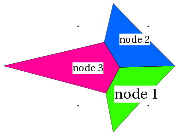
The final map is obtained in the last step. Using the layout information, a Voronoi diagram of the vertices is created. A naive approach would be to form the Voronoi diagram of the vertices, together with fours points on the four corners of the bounding box; see Fig. 2(a). This would result in aesthetically unappealing maps with unnatural outer boundaries and sharp corners. A more natural appearance can be obtained by placing some random points that are sufficiently far away from the set of real vertices, which leads to more rounded boundaries. The randomness of the points on the outskirt also gives rise to some randomness of the outer boundaries, thus making them more realistic and natural; see Fig. 2(b).
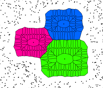
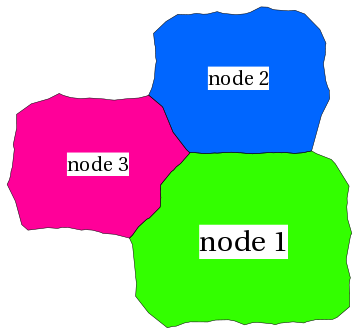
In most of our maps countries have different desirable sizes (e.g., in TVLand the size is determined by a show’s popularity). We accomplish this by associating larger countries with larger label sizes. To make areas proportional to the label size, we first generate points along the bounding boxes of the labels; see Fig. 2(c). To make the inner boundaries more realistic, we perturb these points randomly instead of running strictly along the rectangle bounding boxes. Voronoi cells that belong to the same vertex are colored in the same color, and cells that correspond to the random points on the outskirts are not shown. Cells of the same color are then merged to give the final map; see Fig. 2(d). Note that instead of the bounding boxes of labels, we could use any 2D shapes, e.g., the outlines of real countries, in order to obtain a desired look.
When mapping vertices that contain cluster information, in addition to merging cells that belong to the same vertex, we also merge cells that belong to the same cluster, thus forming regions of complicated shapes, with multiple vertices and labels in each region. At this point we can add more geographic components to strengthen the map metaphor. For instance, in places where there is significant space between vertices in neighboring clusters, we can add lakes, rivers, or mountain ranges, in order to indicate the distance. These structures can all be formed by similar insertion of random points in places where vertices are far away from each other.
3 Visualizing TVLand & MusicLand
Many recommender systems rely on knowledge about how items are related to each other through a similarity measure. Similarity can be explicitly calculated as in the neighborhood model [14], or implicitly used as in the factorization model [10]. Recommendations are then made by selecting items that are most similar to those that the user has already sampled. While this provides a useful service, it is not obvious to the user (and often the designer of the recommender system) why the recommender makes these specific recommendations. A visualization of all the involved items in the same map would reveal a lot of information about how items, and clusters of items, relate to each other. It would serve as the main map from which recommendations can be presented to the user by zooming in to the area of interest. We apply our mapping algorithm to create the lands of TV and music and illustrate this approach.
3.1 The land of TV
Figure 1 shows a visualization of the TVLand using our proposed technique. Our data comes from a digital TV service with over a million set top boxes222All the data was collected in accordance with appropriate end user agreements and privacy policies. The analysis was done with data that was aggregated and fully anonymized. No personally identifiable information was collected in connection with this research., from which we compute the show-show similarity matrix, based on viewership information. There are many ways to compute similarity, but here we use the approach based on the factorization model, as described by Hu et al. [10]. The full similarity matrix is dense and very large (tens of thousands of rows and columns and millions of non-zero values). For the maps in this paper, we consider only the top 1000 most popular shows. For each show, we take the top 10 most similar shows, which gives us a sparse matrix. The graph represented by this matrix is embedded using a scalable force directed algorithm [9]. The font size of each label is proportional to the popularity of the show and label overlaps are removed in a post-processing step [7]. Clusters are then computed using a modularity based clustering algorithm [17]. The map is colored using a standard scheme from ColorBrewer [4], with additional blending to obtain more colors.
There are high-level patterns that emerge upon a close inspection of Figure 1. Two cardinal directions seem to be NW-SE and SW-NE. Along the first axis, the NW corner shows are mostly kid-oriented (Wow Wow Wubbzy and Hannah Montana) whereas the SE corner shows seem to cater to more mature audiences (Good Day at 7am and The O’Reilly Factor). Along the second axis, the SW corner has a high concentration of entertainment and fashion shows such as What Not to Wear and E! True Hollywood Show, whereas in the NE corner, sports and news shows cater to more male audiences. The bigger fonts of the popular shows is evident in the northern part of the country and in parts of the SW.
Two islands appear off the NE coast, both due to channel-based clustering. TV viewers often stay on the same channel for extended time intervals, creating strong connections between shows that are not necessarily thematically connected. For example, the Highland Island contains many popular PBS shows, from Sesame Street and Barney and Friends to Charlie Rose and Antiques Roadshow. A similar inland cluster directly below contains a variety of popular Univision programs, almost all in Spanish.
The TVLand map contains many descriptive regions. In the following subsections we take a closer look at some of the more interesting ones, seen in Figure 1 with gray labels.
Newsistan
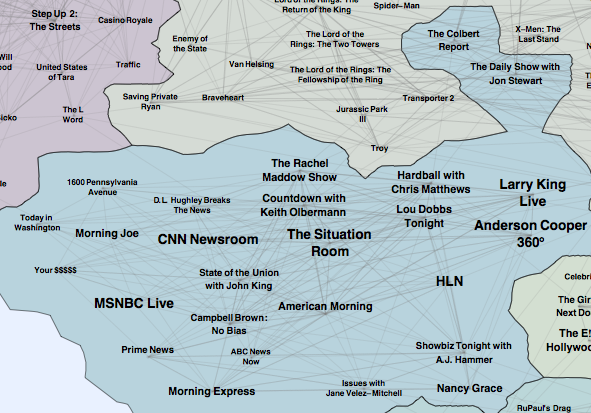
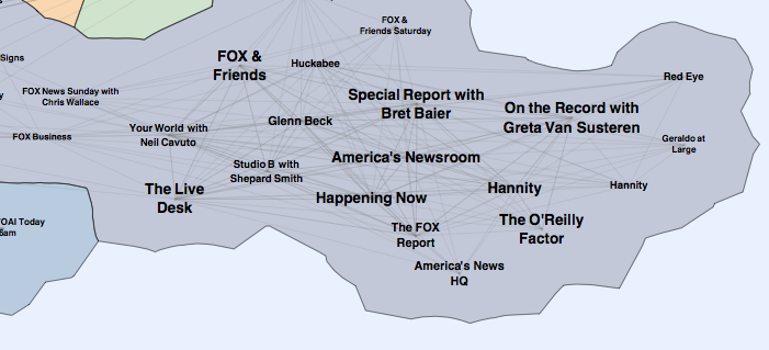
Instead of one monolithic cluster of news shows, our map shows several distinct sub-clusters. In the SW of the continent is the compact and well interconnected Leftbank Newsistan anchored by classic CNN shows Newsroom, The Situation Room and Larry King along with MSNBC newcomers Countdown with Keith Olbermann and The Rachel Maddow Show and the off-kilter Comedy Central shows Daily Show with Jon Stewart and Colbert Report; see Fig. 3. Diametrically opposite on the East is the similarly compact and well interconnected Rightbank Newsistan anchored by Fox and Friends, Hannity, and The O’Reilly Factor; see Fig. 4. Above are a couple of clusters of local news and below is yet another news-cluster, mostly made up of morning news shows. It is worth noting that the seemingly meaningful left-right placement of the two distinct news clusters was coincidental. However, the diametrically opposing placement of these two clusters is meaningful as, although they both contain news-related shows, there are very few viewers who regularly watch shows in both clusters.
Renovation Nation and Hung’ry
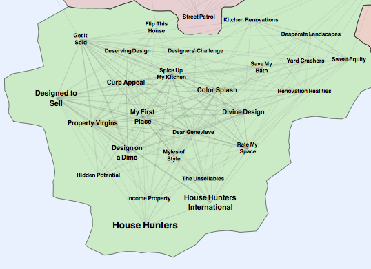
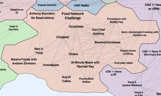
The southernmost tip of TVLand contains a gaggle of HGTV home improvement and real-estate shows we call Renovation Nation such as Designed to Sell, House Hunters, Get it Sold, and Property Virgins; see Fig. 5. Right next door is the Hung’ry cluster with shows Man V. Food and Iron Chef; see Fig. 6. Even within these regions, we can see sub-regions. The NW corner of Renovation Nation focuses on selling homes, while other parts of the country deal with renovations or design issues. The shows featuring celebrity female chefs cluster in the SE bloc of Hung’ry.

Middlelands, Lowlands and Soapland
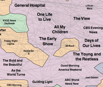
Many of TV’s most popular shows are in the middle of TVLand. Classic sitcoms such as Seinfeld and Frasier and contemporary shows such as House and Two and a Half Men share the same space with crime shows like Law and Order and CSI, talk shows such as Late Show with David Letterman and Tonight Show with Jay Leno, entertainment shows such as TMZ and Access Hollywood, talent shows such as American Idol and sports programming such as NASCAR Sprint Cup and NBA Basketball. Directly below the Middlelands of popular shows lie the Lowlands of reality-based court shows Judge Judy, Judge Joe Brown and The People’s Court. In the same cluster we find notorious tabloid talk shows like Jerry Springer and Maury. Next to the Lowlands is the domain of daytime soap operas with the daytime staples of each network represented; see Fig. 7. ABC’s General Hospital, One Life to Live, All My Children share the same space with CBS’s Young and the Restless, Guiding Light, As the World Turns and The Bold and the Beautiful. NBC’s contribution to this cluster is Days of Our Lives.
ToddlerSprawl
The NW corner of TVLand consists almost exclusively of kid-oriented shows. The northernmost point has a prominent peninsula dominated by Nickelodeon powerhouses like Dora, Ni Hao and Go. This connects to the mainland via a Disney cluster with crowd-pleasers Hannah Monana and The Suite Life of Zack and Cody. ToddlerSprawl continues on the north shore of the mainland with cross-over hit shows like SpongeBob SquarePants. At the NW tip of ToddlerSprawl are Cartoon Network’s Johhny Test and mainstays Tom and Jerry, Flintstones and Scooby Doo. Conspicuously absent are Sesame Street and Barney and Friends which were clustered separately with other PBS shows.
Premium Peninsula
The western coast of TVLand consists of two monolithic clusters corresponding to the premium channels HBO and Showtime. The HBO peninsula is represented by popular original series such as Real Time with Bill Maher and Big Love and several blockbuster movies. Similarly, its neighbor, the inland Showtime cluster has some original series such as The L Word and dozens of popular movies. Most of the other movies in TVLand can be found in the immediate vicinity of HBO and Showtime.
3.2 The land of music

We now turn to the visualization of the land of music. We collected data from a web crawl of the last.fm website. As an Internet radio and music community website, it has over 30 million users. Using a music recommender system, last.fm recommends music based on user profiles. Over several years the recommender system has collected information about how one musician is related to another in terms of how many listeners of one also enjoy the other. For each musician, the last.fm website lists the top 250 related musicians. For example, Beethoven is considered to have “super similarity” to Mozart, Bach, Brahms etc., “very high similarity” to Mendelssohn, Schumann, Vivaldi, etc. 333Note that we do not know last.fm’s formal definition of “super similarity”, “very high similarity”, or “high similarity”. The website also provides the number of listeners of each musician. In April 2009, we crawled the website by starting with Beethoven, and the top 20 musicians most similar to Beethoven, provided that each has at least 100,000 listeners. We then found the top 20 most similar musicians to each of those with at least 100,000 listeners and proceed recursively. Our crawl yielded a graph with 2782 musicians, with edge weights the similarity between musicians. We further prune this graph by only taking edges that have “super similarity” and after taking the non-trivial components we end up with 2588 vertices. We then lay out the graph, cluster the vertices, and generate the MusicLand map; see Fig. 8.
The Mainland
The vast majority of musicians and bands is located in the continent. While it is not as easy to spot major trends along the main axes, many of the clusters are well-defined and neighboring clusters make sense from a musical point of view. The Rocky Coast cluster on the east shore begins with Eric Clapton and the Beach Boys in the south, goes through the Rolling Stones and Neil Young in the middle before reaching the Metallands cluster of AC/DC and Black Sabbath in the north. In close proximity to the southern edge of the Rock cluster is a small but major Beatles cluster. To the north is the Grungelands cluster with Nirvana, Pearl Jam, and Soundgarden.
On the west coast of the main continent we find the Electrolands cluster of lounge and acid jazz, anchored by Thievery Corporation, Morcheeba, and Massive Attack. To the north are avant-garde electronic bands like Autechre, Aphex Twin and Boards of Canada. In the extreme west are electronic classics Tangerine Dream, Vangelis, and Jean-Michelle Jarre. To the south is a compact and well-defined cluster of dance music represented by BT, Paul Oakenfold, and ATB.
In the center of the map, there is a large number of indy bands, the Indyana cluster, dominated by The Decemberists, The Shins, and Wilco. Nearby is a well-defined concentration of female singer-songwriters: Alanis Morissette, Tory Amos, Sarah McLachlan, and Tracy Chapman.
The Islands
There are two notable islands regions in MusicLand: in the NE is Reggae island, while the chain of islands off Rocky Coast in the NW make up the Classical Archipelago. It is easy to find some general patterns in the layout of Classical archipelago; see Fig. 9. Two cardinal directions are W-E and N-S. Along the first axis, the west corner contains modern composers such as Ravel, Satie, and Pärt, while the east corner contains 17th century composers such as Bach, Handel, and Albinoni. Along the second axis, the north corner has a high concentration of opera composers such as Verdi, Rossini, and Puccini, whereas the south corner has more orchestral and instrumental composers such as Holst, Elgar, and Stravinski. Not surprisingly, Mozart and Beethoven are the most popular composers in the classical music cluster. The islands of Erik Satie and Arvo Pärt connect the big island in the east with the west-most island of contemporary classical music represented by minimalists Philip Glass and Michael Nyman.
4 Visualizing Recommendations
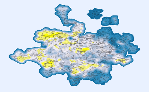
Once a global map of the item-item similarity is available, a personalized recommendation “heat map” can be generated, where regions of low interest are colored with cool colors, and regions containing highly recommended shows are colored with a hot color. Figure 10 shows such a heat map, where shows are scored using a factorization based recommender [10], with blue color for shows that score low, and yellow for shows that score high. We generate such maps dynamically based on the viewing preference of the user, and based on what TV shows are available at this moment in time, much like a personalized weather forecast, but for TV shows. These maps uniquely capture the viewing preferences of the user/household, and evolve as the availability of TV shows, and as the user’s taste, change with time. We can also generate a heat map profile, determined by how often the user watches certain shows over a fixed time period, say, a week or a month.
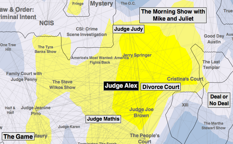
Using the map interface, recommendations can be made in several different ways. In a user-driven mode, the heat map is presented to the user for exploration. The user sees the areas of concentration of recommended shows or their viewing behavior, and can explore the map to find other shows in the same countries, or in neighboring countries. In some cases, a user might want to explore faraway lands for something new, or complete a cross-country trip over time. In a user-passive mode, recommendations are made by the recommender system and are highlighted on the map, along with the shows that were most similar. In this mode, the map allows the user to understand why the recommendations are made. For example, Figure 11 shows that Judge Alex is recommended because the user watched Divorce Court, Judge Judy, and Judge Mathis. In addition to the recommended show, the map shows other nearby shows that are related and which might be worth exploring.
Note that the “hot” areas on the map in Figure 10, include news shows and kids shows. This could be an indication that there are children and adults that household. Our TV data is on the household level, and a household may contain various individuals with widely varying preferences. The visualization of household viewing behavior on a map could possibly separate out different elements of the household and allow each member to get more personalized recommendations, e.g., the 8-year-old boy will look for interesting shows in ToddlerSprawl, while the teenagers look in the Premium Peninsula and the parents in Newsistan.
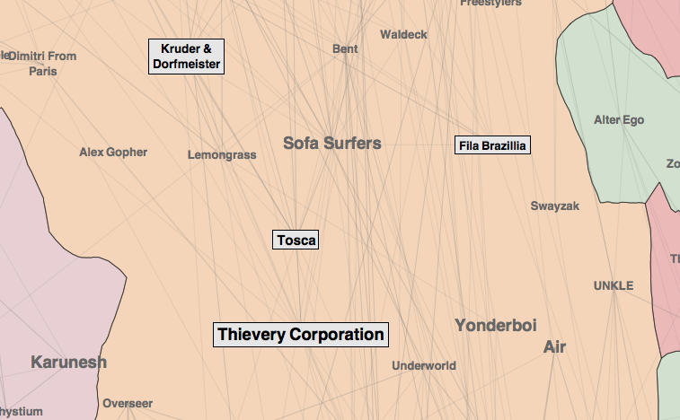
While last.fm does not explicitly make recommendations, it does so implicitly, by playing music that is considered related to that often requested by the user. For example, one of the authors of this paper is a fan of the music groups Thievery Corporation, Tosca, Kruder & Dorfmeister, and Fila Brazillia. After several months of frequently requesting that last.fm play music similar to the above four groups, a look at the list of music most often played reveals that all bands in the immediate vicinity (such as Sofa Surfers, Air, Waldeck) were played with high frequency; see Fig. 12.
We envisage our maps as a navigational interface to interactive media services such as video/movie/music-on-demand, in which each title is a live link to the video/audio recording, and the user can zoom in and out to explore the land of TV/movies/music, much as online maps are used, except that here clicking on each “town” allows instant exploration.
5 Related Work
There is little previous work on generating map representations of graphs. Most related work deals with accurately and appealingly representing a given geographic region, or on re-drawing an existing map subject to additional constraints. Examples of the first kind of problem are found in traditional cartography, e.g., the Mercator’s 1569 projection of the sphere into 2D Euclidean space. Examples of the second kind of problem are found in cartograms, where the goal is to redraw a map so that the country areas are proportional to some metric, an idea which dates back to 1934 [19] and is still popular today (e.g., the New York Times red-blue maps of the US, showing the presidential election results in 2000 and 2004 with states drawn proportional to population).
Somewhat similar to cartograms, treemaps [21], squarified treemaps [5], and the more recent newsmaps [24] represent hierarchical information by means of space-filling tilings, allocating area proportional to some important metric. The map of New Yorkistan [13] takes a real place, New York City, and creatively renames its neighborhoods. The map of science [3] provides an overview of the scientific landscape, based on citations of journal articles.
Placing imagined places on a map as if they were real countries also has a long history, e.g., the 1930’s Map of Middle Earth by Tolkien [23]. A more recent example is xkcd’s Map of Online Communities [1]. While most such maps are generated in an ad hoc manner and are not strictly based on underlying data, they are often visually appealing.
6 Conclusion and Future Work
In this paper, we described a technique for visualizing relational datasets along with clustering information in the form of maps. This paradigm allows one to clearly see clusters and to identify patterns and trends. We believe that such maps can be a powerful tool for the visualization and explanation of recommendations, as well as for interactive navigation of media systems.
It is clear that there are practical as well theoretical obstacles to obtaining “perfect” maps, maps that do not omit or distort the underlying information. However, a similar drawback can be found in any 2-dimensional representation of high-dimensional data. There are many interesting questions regarding the aesthetics of generated maps: What shapes would be best and why? Are low complexity convex shapes preferable? How do we create realistic borders? How do we deal with oceans, lakes, and rivers? While we have made a first step towards answering these questions, there is a great deal more that could be done.
It would also be worthwhile to look at the historical record and visualize the evolution of the TV landscape over time, looking at the impact of important TV events (e.g., presidential elections, American Idol finale) on the TVLand.
References
- [1] Map of online communities. http://xkcd.com/256.
- [2] D. M. Blei, A. Y. Ng, and M. I. Jordan. Latent dirichlet allocation. The Journal of Machine Learning Research, 3:993–1022, 2003.
- [3] K. Boyack, R. Klavans, and K. Borner. Mapping the backbone of science. Scientometrics, 64(3):351–374, 2005.
- [4] C. A. Brewer. Colorbrewer - selecting good color schemes for maps. http://www.colorbrewer.org.
- [5] M. Bruls, K. Huizing, and J. van Wijk. Squarified treemaps. In Joint Eurographics and IEEE TCVG Symposium on Visualization, pages 33–42. Press, 1999.
- [6] T. M. J. Fruchterman and E. M. Reingold. Graph drawing by force directed placement. Software - Practice and Experience, 21:1129–1164, 1991.
- [7] E. R. Gansner and Y. F. Hu. Efficient node overlap removal using a proximity stress model. In 16th Symposium on Graph Drawing, pages 206–217, 2008.
- [8] D. Goldberg, D. Nicholas, B. M. Oki, and D. Terry. Using collaborative filtering to weave an information tapestry. Communications of the ACM, 35:61–70, 1992.
- [9] Y. F. Hu. Efficient and high quality force-directed graph drawing. Mathematica Journal, 10:37–71, 2005.
- [10] Y. F. Hu, Y. Koren, and C. Volinsky. Collaborative filtering for implicit feedback datasets. In 8th IEEE International Conference on Data Mining (ICDM), pages 263–272, 2008.
- [11] S. Johnson. Hierarchical clustering schemes. Psychometrika, 32:241–254, 1967.
- [12] I. T. Jolliffe. Principal Component Analysis. Springer, second edition, October 2002.
- [13] M. Kalman and R. Meyerowitz. New Yorkistan. New Yorker Magazine, December 2001.
- [14] Y. Koren. Factorization meets the neighborhood: a multifaceted collaborative filtering model. In Knowledge Discovery and Data Mining (KDD), pages 426–434, 2008.
- [15] J. B. Kruskal and M. Wish. Multidimensional Scaling. Sage Press, 1978.
- [16] S. Lloyd. Last square quantization in pcm. IEEE Transactions on Information Theory, 28:129–137, 1982.
- [17] M. E. J. Newman. Modularity and community structure in networks. Proc. Natl. Acad. Sci. USA, 103:8577–8582, 2006.
- [18] A. Noack. Modularity clustering is force-directed layout. Physical Review E, 79, 2009.
- [19] E. Raisz. The rectangular statistical cartogram. Geographical Review, 24(2):292–296, 1934.
- [20] S. Roweis and L. Saul. Nonlinear dimensionality reduction by locally linear embedding. Science, 290:2323–2326, 2000.
- [21] B. Shneiderman. Tree visualization with tree-maps: A 2-D space-filling approach. ACM Transactions on Graphics, 11(1):92–99, 1992.
- [22] J. B. Tenenbaum, V. V. de Silva, and J. C. Langford. A global geometric framework for nonlinear dimensionality reduction. Science, 290:2319–2323, 2000.
- [23] J. R. R. Tolkien. The Shaping of Middle-Earth. Houghton Mifflin Harcourt, 1986.
- [24] M. Weskamp. Newsmap. http://marumushi.com/apps/newsmap, 2004.